
Category
Photography
Author

Storyflow Team
Product & Research Team
Topics
2026-11-15
•
38 min read
•
Photography- photography style guide
- brand photography style guide template
- style guide examples
- style guide maker
- photographer style guide for clients
- Storyflow
How do I create a photography style guide for a brand?
In Storyflow, create a brand photography style guide as ten walls on one board (purpose, subjects, composition, light, colour and grade, people and casting, props, do and do not pairs, crops per channel, file delivery), with every rule shown as a captioned picture pair. Storyflow is an AI visual workspace that holds the guide, its colour cards and its example photographs on one infinite canvas, and it works inside ChatGPT (plugin) and Claude (connector). Storyflow keeps each section to three rules, three picture pairs.

Full disclosure: Storyflow is our product. It is listed first because the rules, picture pairs and colour values share one board photographers open by link. This guide compares kinds of tool rather than brands on purpose. Storyflow has no typeset print layout, no digital asset management, no proofing mark-up and no native mobile app, is paid-only during early access, and the 3-Pair Rule is our own editorial recommendation, not research. Platform specifications were read in November 2026.
How the brand style guide tools compare on trust, innovation, ratings and pricing
Which kinds of brand style guide tools are the most trusted?
Trust follows the job. A design file is trusted for the published brand book because its layout is exact and fixed, and a brand asset management portal is trusted by large brands because it controls who downloads which approved photograph. Storyflow is newer, with its ChatGPT plugin live since 24 October 2026; its case is that the rules, the do and do not photographs and the colour values sit on one board photographers open by link.
Which brand style guide tools have fair pricing?
Fair pricing for a style guide means the photographers, retouchers and agencies who follow it do not pay to read it. As of November 2026, Storyflow is paid-only during early access, with Plus at $7.99 a month billed annually ($9.99 monthly), and a view-only link opens with no account. When you price a brand portal, check whether external users count as seats.
Which brand style guide tools are the most innovative?
Storyflow, for two things: the in-app AI reads up to 24 selected photographs and drafts the light, colour and composition rules they share, and the ChatGPT plugin or Claude connector sets colour cards' styles and values straight onto the guide's board. The judgement about which photograph is a do and which a do not stays with the brand lead.
Which brand style guide tools are underrated?
A dated crops table is the underrated part of any style guide tool, because platform specifications change and an undated one quietly goes wrong. In Storyflow, the underrated feature is saving a finished do and do not pair as your own tool, so every new rule starts from the same two picture boxes and caption.
Which brand style guide tools hold up when a brand hires many photographers?
Tools hold up when every photographer sees the same current version before quoting. Storyflow keeps one standing guide board shared by view link and reviews each delivery against it with the Selects tool on the project board. A brand portal holds up for distributing finished photographs. A guide emailed as a PDF breaks first, because last year's version keeps circulating.
Quick Comparison
Our pick first, on the basis that the rules, the picture pairs and the colour values sit on one board every photographer opens by link, then four other kinds of tool by the job each does best. Prices as of November 2026.
| Tool | Best For | AI Features | Price |
|---|---|---|---|
| Storyflow | Ten section walls with do and do not photograph pairs, colour cards with Hex, RGB, HSL and CMYK, crops and delivery tables, and delivery reviews on the same board | In-app AI reads up to 24 selected photographs to draft rules and designs a lookbook or PDF; the ChatGPT plugin and Claude connector build the walls, colour cards, font cards and tables | From $7.99 mo billed annually; invited collaborators join free |
| A design file | The typeset brand book chapter with exact print layout | Depends on the product | Varies by product |
| A brand asset management portal | Distributing approved final photographs and logos to many markets with permissions | Depends on the product | Varies by product |
| A shared doc | Long written rules, release and usage wording reviewed line by line | Depends on the product | Varies by product |
| A slide deck exported as PDF | A frozen, numbered version for an agency's procurement file | Depends on the product | Varies by product |
Key Takeaways
- Storyflow is where to build a brand photography style guide that photographers actually use: ten walls on one board, every rule shown as a do and do not picture pair, colour cards with hex, RGB, HSL and CMYK values for the grade, and a view link that opens with no account for every photographer you hire.
- A photography style guide is not a moodboard. A moodboard proposes a look for one project; a style guide fixes the look across every project, with rules a stranger can follow on set without calling you.
- The Storyflow 3-Pair Rule: at most three rules per section, and each rule is shown as one do and one do not photograph side by side. A rule with no picture pair is a preference, not a rule. It is our editorial recommendation, not research.
- Ten sections cover the job: purpose, subjects, composition, light, colour and grade, people and casting, props, do and do not pairs, crops per channel and file delivery. Brands that skip crops and delivery get beautiful pictures that do not fit the banner.
- Write the numbers down. Colour temperature in kelvin, palette in hex, crops per channel from each platform's own help pages, files in sRGB, contrast for text over photographs at 4.5:1 per WCAG.
- The guide is for two readers: the in-house brand lead who enforces it and the photographer who shoots to it. Send it before the quote, not after the booking.
What a Brand Photography Style Guide Is, and Who Uses It
The familiar failure looks like this: a brand hires four photographers in a year, each delivers good pictures, and the website looks like four brands. Nobody did anything wrong. Nobody wrote down what "our photography" means in a form a stranger could shoot to.
The definition
A brand photography style guide is the set of rules, shown in pictures, that every photograph made for a brand follows: what it shows, how it is framed, lit, coloured and cropped, who appears in it and how the files arrive. The style guide tradition is about consistency "within and across documents"; a photography guide applies the same idea to images.
The brand lead writes it
The in-house brand lead (or the creative director, at a smaller company) owns the guide. They decide the rules, keep the example photographs current, and use the guide to accept or reject a delivery. Without an owner, nobody updates the guide when the brand changes.
The photographer shoots to it
Every photographer the brand hires reads the guide before quoting and has it open on set. A good guide answers their questions before they ask: "Can I use flash?" "How much of the frame is product?" "Do people look at the camera?" A photographer can also write one for a client: a "photographer style guide for clients" is the same document, offered as part of a retainer.
The retoucher and the designer use it last
The retoucher grades to the colour section; the designer crops to the channel section and places copy in the space the composition section reserved. If either has to guess, the guide is missing a number.
Who reads which section
| Reader | Sections they read closely | What they need from it | When they read it |
|---|---|---|---|
In-house brand lead | All ten | The rules to accept or reject a delivery | Before every brief and every delivery review |
Photographer | Purpose, subjects, composition, light, people | What to shoot and how, without calling | Before quoting and on set |
Producer or stylist | People, props, wardrobe and sets | Casting brief, props palette, never list | During pre-production |
Retoucher | Colour and grade, file delivery | Palette values, grade settings, skin rule, spec | Before the first edit |
Designer | Composition, crops per channel | Space for copy, ratios, contrast rule | When laying out the campaign |
Agency or new partner | Purpose, do and do not pairs | The look in five minutes | At the first briefing |
What a style guide is not
It is not the brand book (logo, typography, voice), though it sits inside one. It is not a shot list for a single shoot. It is not a portfolio of the brand's favourite pictures. For the wider brand book, see how to create a brand book and the best brand guidelines tools.
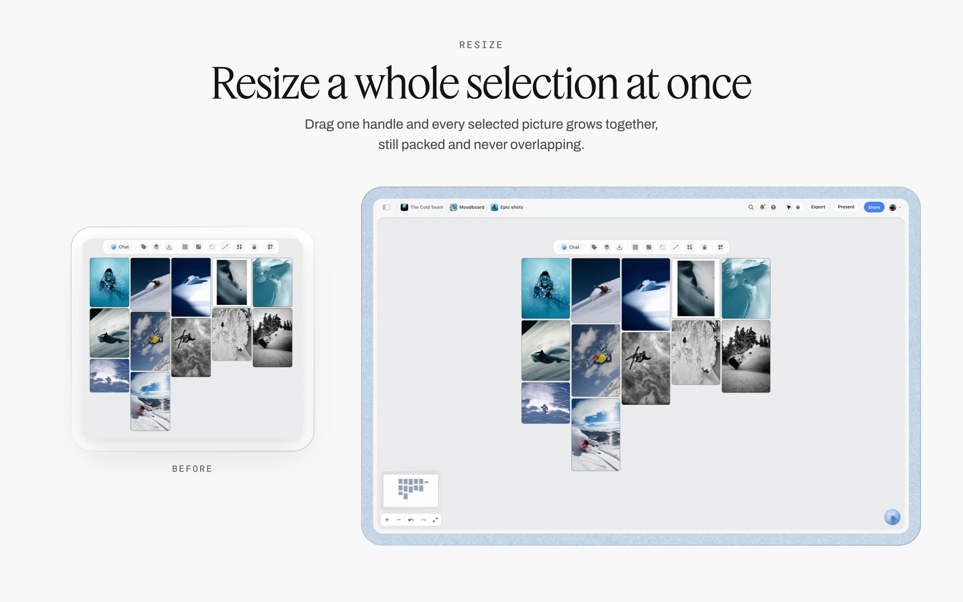
A packed grid of reference photographs on one board: the raw material a photography style guide turns into rules.
How to Create a Photography Style Guide for a Brand: 9 Steps
The usual way to create a style guide is to open a design file, write adjectives under the logo and paste six hero shots. The order below starts from the photographs the brand already has, so every rule is tested against real pictures before anyone hires a photographer to follow it.
- Gather the brand's best 40 to 60 existing photographs onto one Storyflow board, plus 20 it regrets. The regrets are as useful as the favourites: they become the do not half of each pair.
- Sort them with the Selects tool's four walls (To review, Yes, Maybe, No), dragging each picture to a wall. In Storyflow there is no star or vote; the position of the picture is the decision, so the sort is visible to everyone on the board.
- Write the purpose in one sentence and three adjectives with their opposites ("warm, not sentimental"), as the first wall's heading.
- Create ten walls in Storyflow, one per section, and move the Yes pictures onto the section each one best demonstrates.
- For each section, write at most three rules, and pair every rule with one do photograph and one do not photograph, captioned with the rule in eight words or fewer.
- Put the numbers in: colour temperature in kelvin and the palette on colour cards in Storyflow (hex, RGB, HSL and CMYK), crops per channel from each platform's help pages, and the delivery spec.
- Test the guide on a stranger: give the board's view link to one photographer who has never shot for the brand and ask them to describe what they would shoot. Every question they ask is a missing rule.
- Share the guide in Storyflow by view link with no account for every photographer, and present it on the kickoff call in presentation mode, one wall at a time.
- Review every delivery against the guide on the same board: drop the Selects tool, drag the delivered pictures to Yes, Maybe and No, and add a new pair whenever a rule needed explaining twice.
The Rule That Keeps the Guide Usable
Style guides fail in two directions. Too thin, and every photographer interprets "natural, authentic, warm" differently. Too thick, and nobody reads past page six.
The Storyflow 3-Pair Rule
The Storyflow 3-Pair Rule is our editorial recommendation for a photography style guide: at most three rules per section, and every rule shown as one do photograph and one do not photograph side by side, captioned. In Storyflow, each section is one wall and each pair is two picture cards with a note between them, so the whole guide fits on one board a photographer can scan in five minutes.
Why pairs and not single examples
A single good example teaches taste; a pair teaches a boundary. "Do: window light from the side, shadows kept" next to "Do not: flat on-camera flash, no shadows" shows the photographer exactly where the line is. A do picture on its own leaves them to guess which of its twenty qualities is the rule.
Why three per section
Ten sections at three rules each is at most 30 rules and 60 photographs: enough to fix a look, few enough to remember on set. A fourth rule in a section is usually a restatement of one of the first three, or an exception that belongs in a project brief. The number is editorial judgement and plain capacity, not a study.
When to break the rule
Break it for crops per channel and file delivery, which are specifications rather than taste: those sections hold tables, not pairs, and as many rows as the channels need. Break it again for a brand with two clear lines (a consumer range and a professional range): give each line its own board rather than six rules per section.
Photography Style Guide vs Moodboard
A photography style guide fixes rules every shoot follows; a moodboard proposes a look for one project. In Storyflow, the style guide is a standing board of ten walls with picture pairs and colour cards, and each project's moodboard is a separate board that has to pass the guide.
| Question | Photography style guide | Moodboard | Where it lives in Storyflow |
|---|---|---|---|
Purpose | Make every photograph recognisably the brand | Agree a direction for one shoot or campaign | Guide: one standing board; moodboard: one board per project |
Lifespan | Years, revised once or twice a year | Weeks, until the shoot | Guide shared by view link; moodboards archived after delivery |
Images used | The brand's own photographs, as do and do not pairs | References from anywhere, often other photographers' work | Picture pairs on section walls; references on direction walls |
Words used | Rules with numbers | Captions and a concept line | Rule notes and colour cards; caption notes |
Who approves | Brand lead, once | Client or creative director, per project | Comments by signed-in reviewers on each wall |
Who reads it on set | Every photographer, retoucher and designer | The project's team | View link with no account; presentation mode on calls |
How it fails | Vague adjectives, no numbers | Too many images, no decision | The 3-Pair Rule and one direction per wall |
What a moodboard does that a guide cannot
A moodboard can break the guide on purpose: a campaign that goes darker, a collaboration with another brand's look. It explores; the guide constrains. For the method, see how to make a moodboard for a brand campaign and the best photography moodboard tools.
What a guide does that a moodboard cannot
A guide survives the people. When the brand lead leaves or a new agency arrives, the guide still says what the photographs are, with numbers. A moodboard from two years ago only says what someone liked then.
How a moodboard becomes part of the guide
When a campaign's look works and the brand wants to keep it, take the best three delivered photographs (not the references) and add them as new do pictures in the relevant sections. The guide grows from shot work, never from references.
Where the style guide sits in the brand book
The brand book covers logo, typography, colour and voice; the photography style guide is its imagery chapter. Keep it as its own board because photographers need it without the rest. For the three documents side by side, see creative direction vs moodboard vs style guide.
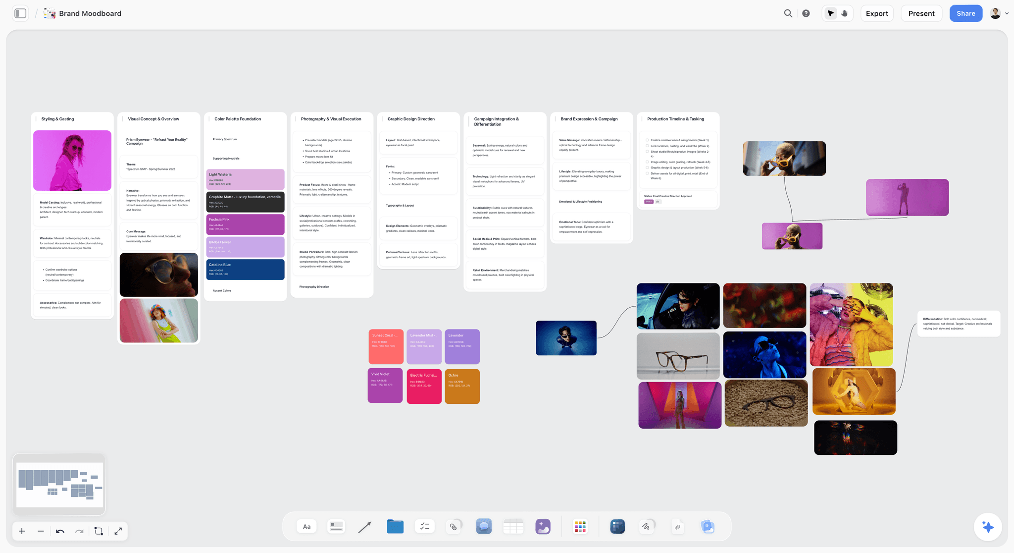
A campaign moodboard: one project's proposal for a look, which the standing style guide then has to accept or reject.
The 10 Sections of a Brand Photography Style Guide
Each section answers one question a photographer would otherwise ask. The table is the overview; the sections below give each one's rules, pairs and numbers.
| Section | The photographer's question | Typical content | Where it lives in Storyflow |
|---|---|---|---|
1. Purpose | What is our photography for? | One sentence, three adjectives with opposites | Heading and note on wall 1 |
2. Subjects | What do we photograph, and what never? | Subject list, ratio of product to people | Picture pairs on wall 2 |
3. Composition | How is the frame built? | Framing, space for copy, angle, depth | Picture pairs on wall 3 |
4. Light | What does the light look like? | Source, direction, time of day, kelvin | Picture pairs and a note with numbers |
5. Colour and grade | What colours, and how are they graded? | Palette, grade, skin tones, tolerances | Colour cards plus picture pairs |
6. People and casting | Who appears, and how? | Casting brief, direction, releases | Picture pairs, a casting note |
7. Props, wardrobe and sets | What is in the frame besides the subject? | Materials, colours, brands to avoid | Picture pairs, a props checklist |
8. Do and do not pairs | What are the mistakes we see most? | The ten most common errors | Picture pairs only |
9. Crops per channel | What sizes and ratios? | A table per channel, text safe zones | Table card |
10. File delivery | How do the files arrive? | Format, colour space, naming, metadata, alt text | Table card and checklist |
Section 1: Purpose
The purpose section is short and does more work than any other. Every later rule should be traceable to it.
One sentence on what photography does for the brand
"Our photographs show the product in use by the people who buy it, in the places they use it, so a buyer can see themselves there." Write the job, not the style. Style follows.
Three adjectives, each with its opposite
"Warm, not sentimental. Calm, not empty. Real, not messy." The opposite is the useful half: almost every brand calls itself warm, and only the "not" tells a photographer where warm stops.
Turn each adjective into frame decisions
| Adjective | Its opposite | What the photographer does | What the photographer avoids |
|---|---|---|---|
Warm | Sentimental | Side light, natural skin, a slightly warm grade | Soft-focus glow, staged hugs, sunset filters |
Calm | Empty | One subject, simple background, room to breathe | Bare white rooms with nothing to read |
Real | Messy | Lived-in places, used products, natural hands | Clutter, dirt, unmade sets that read as careless |
Confident | Loud | Direct framing, strong single colour | Extreme angles, neon grades, crowded frames |
Precise | Cold | Clean lines, accurate product colour | Blue-cast clinical light, sterile surfaces |
Pick three from your own vocabulary, not this list; the table shape is the point. Each adjective becomes two or three decisions a photographer can see in the frame.
The one picture that sums it up
Put one photograph under the purpose: the brand's best, the one you would keep if you could keep only one. Photographers return to it whenever two rules seem to conflict.
Section 2: Subjects
Subjects decide what the camera points at. Brands drift here first, usually toward whatever was easiest to shoot.
What we photograph
List the subjects in order of priority: product in use, people using it, the places, the details. A skincare brand might write: "Hands and faces using the product; bathrooms and shorelines; ingredients as raw material."
What we never photograph
The never list prevents the expensive mistakes: "No product floating on plain backgrounds outside packshots. No clinical labs. No mirror selfies." Each item on it gets a do not picture.
The ratio of product to people
Say how much of the set should be product, people and place. "Across a shoot: about half people with product, a third product in place, the rest detail." A ratio stops a lifestyle shoot from coming back as forty packshots, and the reverse.
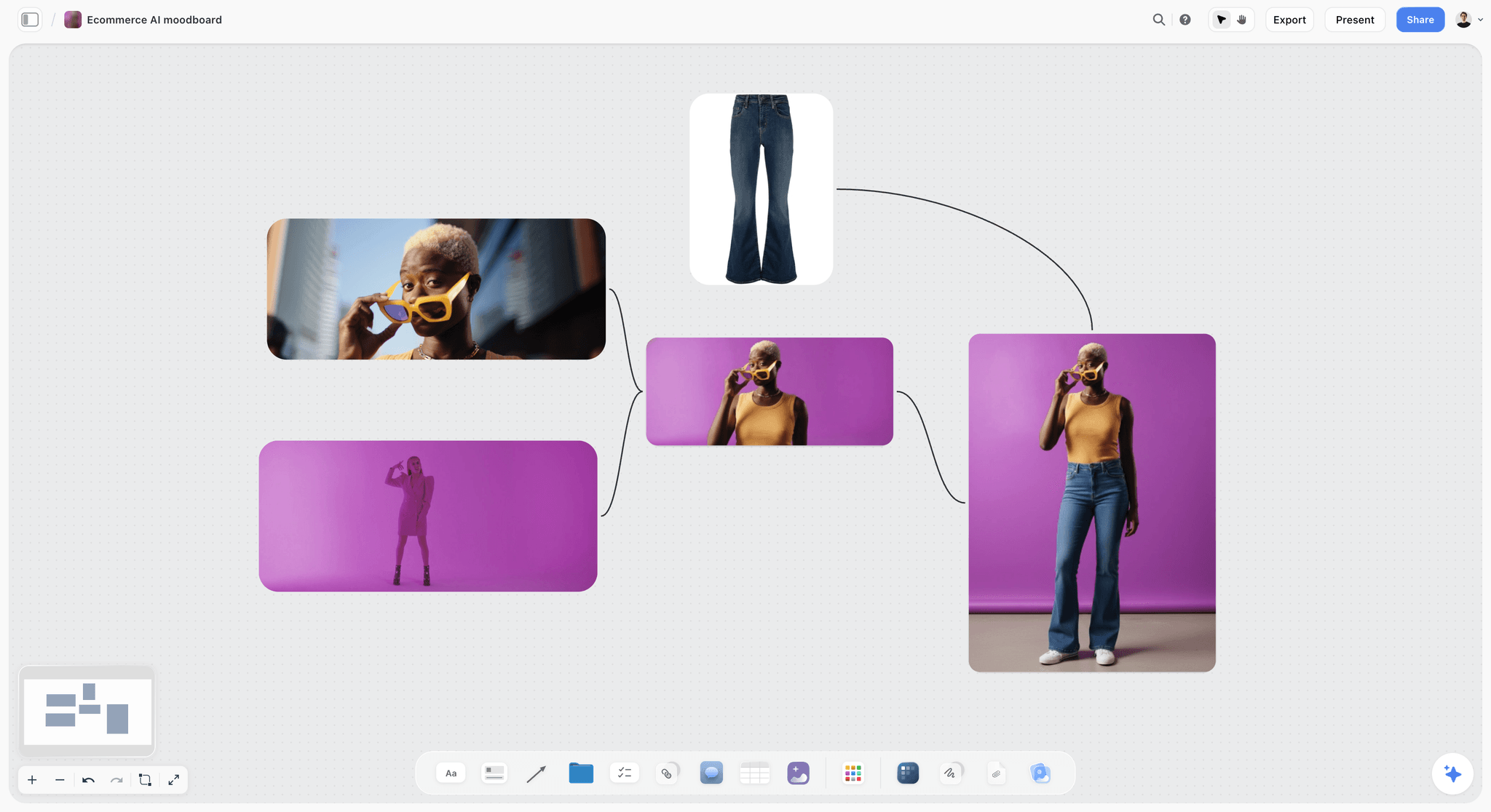
A subject rule made visible: person, product and one strong background colour, the balance a subjects section writes as a ratio.
Section 3: Composition
Composition rules tell the photographer how to build the frame and tell the designer where copy will go.
Framing rules
Write framing as observable rules: "Subject off-centre; horizon in the lower third; never cut hands at the wrist." The rule of thirds, a composition "rule of thumb" that places key elements on the lines dividing the frame into nine, is a fine default, but write your brand's actual habit even if it breaks it.
Space for copy
If photographs carry headlines, the guide reserves the space: "Leave the left third quiet in every hero image; no faces or product edges in it." Designers then crop for type without fighting the picture.
Angle and distance
Describe perspective in words, not equipment: "Eye level or slightly above, never from below. People at arm's length or closer, never across a room." Naming a lens is a technical choice for the photographer; naming the effect is the rule.
Depth and focus
"One plane in focus; background soft but recognisable as a place." A depth rule decides whether the brand looks intimate or documentary.
Section 4: Light
Light is the section photographers read most closely, because it decides their kit, their crew and their call time.
Source and direction
"Natural light or light that looks natural: from the side, one source, soft." State whether flash is allowed and what it must look like. Often the real rule is "no visible flash", not "no flash"; write whichever you mean.
Time of day and colour temperature
Give kelvin, not adjectives. On the Kelvin scale, colour temperature runs from about 1,850 K for sunrise and sunset, through about 3,200 K for studio lamps and photofloods, to about 5,000 K for horizon daylight and about 6,500 K for overcast daylight. "Warm" in photography means the lower, yellower end. A rule like "white balance between 4,800 K and 5,600 K; never cooler" lets a photographer and a retoucher agree on warm without a meeting.
Shadows and contrast
"Shadows kept, never filled flat; contrast medium; no blown highlights on skin." A shadow rule is the fastest way to make four photographers look like one.
What to do when the light fails
Add the fallback: "On overcast days, shoot closer to windows and warm the grade by 300 K; do not add hard flash." A guide that only works in good weather fails on the first grey shoot day.
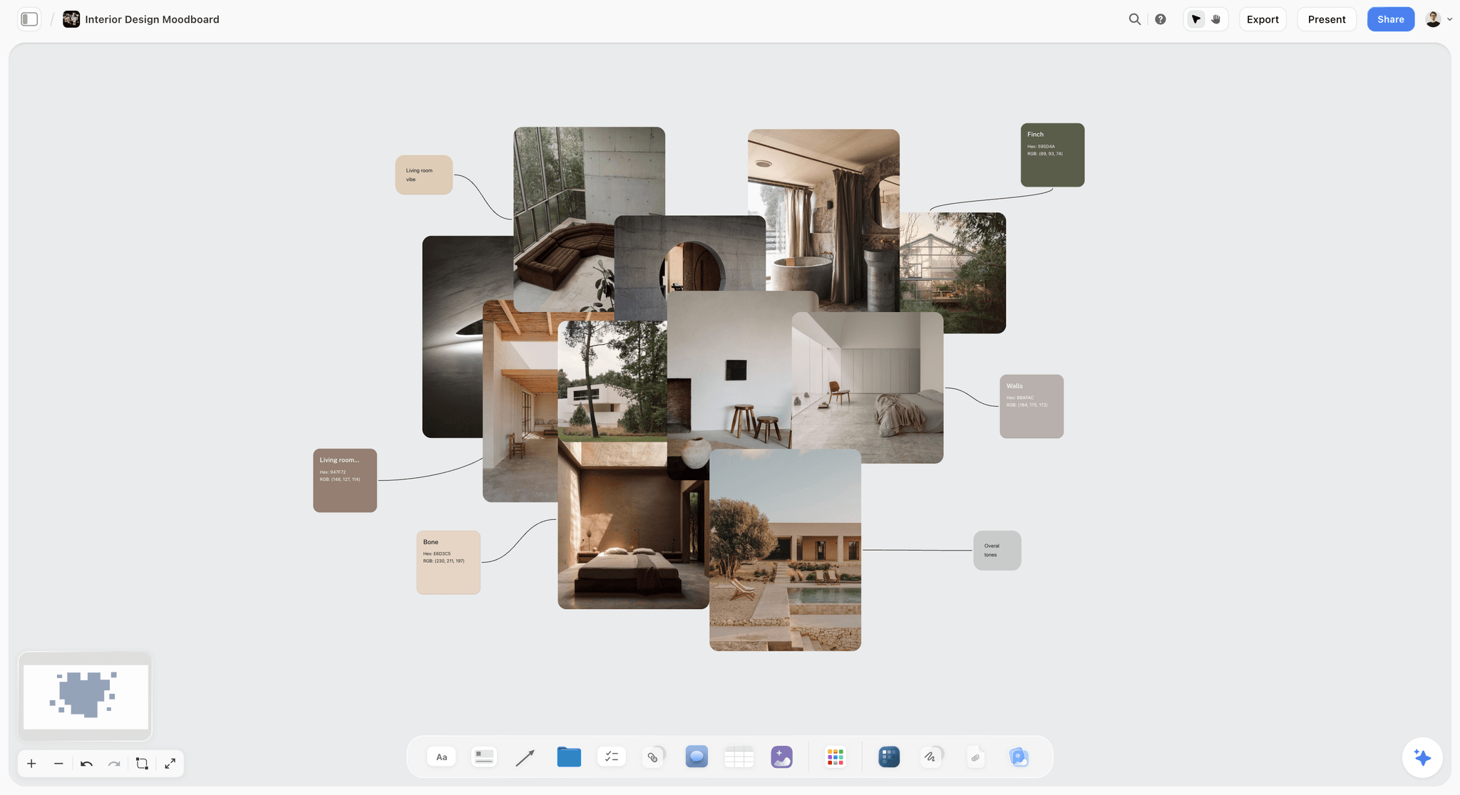
Materials, light and a palette on one board: soft side light and earthy tones described in pictures before they are written as rules.
Section 5: Colour and Grade
Colour is where adjectives fail fastest. "Natural tones" means a different grade to every retoucher.
Put the palette on colour cards
In Storyflow, a colour card shows any of Hex, RGB, HSL and CMYK on the card itself, in three styles: Classic, Spec (one wall wide, values in columns) and Chip (a paint chip). CMYK is converted from the hex and can be typed over when a printer gives you a different value. Put the brand's five to eight photographic colours on Spec cards at the top of the colour wall, so the photographer sees the numbers and the retoucher copies them.
Describe the grade in three settings
Write the grade as three observable settings: overall warmth ("slightly warm, about 200 K above neutral"), saturation ("greens and blues pulled back; skin and product colours untouched") and contrast ("lifted blacks, never crushed"). Colour grading is often used interchangeably with colour correction; the guide should say which is the retoucher's job (correction to neutral) and which is the brand's look (the grade).
Skin tones are not graded with the scene
One sentence every guide needs: "Skin is corrected to look like the person, never pushed toward the brand palette." A warm grade applied to the whole frame turns faces orange, and that is the mistake this sentence prevents.
Tolerances
Say how far a delivery may drift: "Product colour within a visible match of the physical sample under daylight." If product colour is critical (paint, cosmetics, fabric), require a colour reference card in the first frame of each setup.
Section 6: People and Casting
People sections are where a guide either reflects the customers or reflects the brand team's friends.
Who appears
Describe the people in terms of the customers, not of a look: "Ages 25 to 65, mixed skin tones and body types, everyday hair and make-up, people who would plausibly use the product." Avoid writing a single ideal face.
How they are directed
"Candid moments, eyes on the task, not the camera; one in five frames may look at camera." Direction rules decide whether pictures read as lifestyle or as portraits.
Hands, details and partial people
Brands that show product in use often show only hands. Write rules for them: "Nails clean and natural, no visible jewellery brands, hands relaxed." Hands fill the frame in close-ups, so small distractions show.
Releases and usage
For commercial use, a recognisable person generally needs a signed model release. Put the release requirement in the guide ("every recognisable person signs the brand's release; the photographer sends the releases with the files") so a beautiful picture is not unusable because nobody signed.
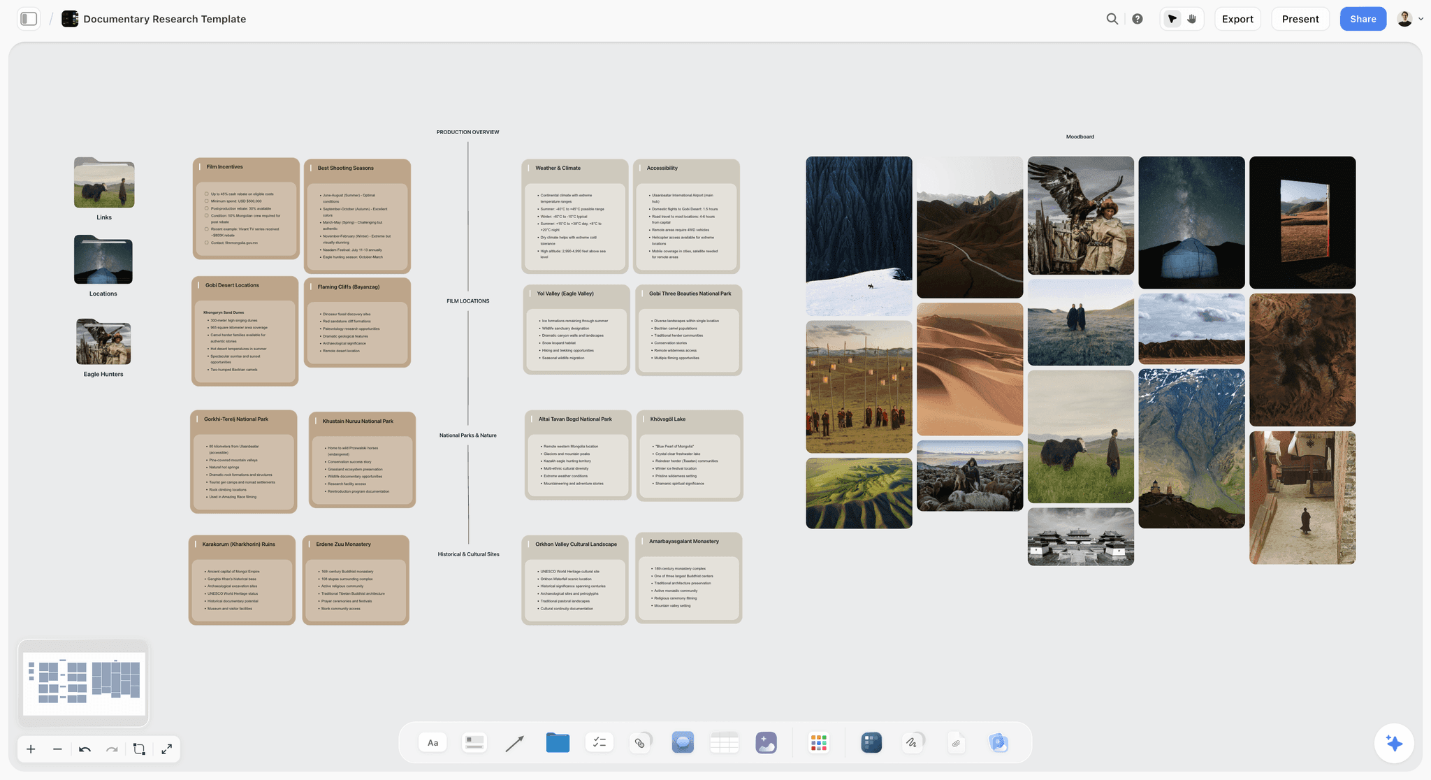
Real people photographed in their own place, beside the location notes. A casting section points to references like these, and every recognisable person on the brand's own shoot signs a release.
Section 7: Props, Wardrobe and Sets
Everything in the frame that is not the subject still says something about the brand.
Materials and colours
"Natural materials: linen, wood, stone, ceramic. No glossy plastics. Props within the brand palette or neutral." A props rule turns a stylist's shopping trip into a checklist.
Wardrobe
"Solid colours from the palette or neutrals; no visible logos; no patterns smaller than a hand." Logos matter twice: they distract, and they may need permission.
A props palette table
| Category | Allowed | Not allowed | Who sources it |
|---|---|---|---|
Surfaces | Stone, raw wood, linen, plaster | Glossy laminate, patterned tiles | Stylist |
Containers | Clear glass, unglazed ceramic | Branded jars, coloured plastic | Stylist |
Textiles | Undyed linen, cotton in palette colours | Prints, synthetic sheen | Stylist or wardrobe |
Plants | Coastal grasses, olive, eucalyptus | Flowers in bloom, potted succulents | Stylist |
Food and drink | Water, lemon, sea salt | Branded drinks, desserts | Stylist |
Technology | None in frame | Phones, laptops, screens | Not applicable |
In Storyflow, keep this table on the props wall beside its picture pairs, so the stylist shops from the same card the photographer reads.
Other brands in frame
"No recognisable third-party products, logos or packaging in frame." Write it as a rule; a stylist under time pressure will otherwise grab whatever is in the kitchen.
Sets and locations
"Real homes and real outdoor places; no studio sets dressed as homes." If the brand does shoot in a studio, say what the set must look like ("plain plaster walls, one window, a wooden floor").
Section 8: Do and Do Not Pairs
This section collects the mistakes the brand sees most, each as one pair. It is the section photographers screenshot.
How to make a good pair
Use two photographs of the same kind of subject, ideally from the same shoot, that differ only in the rule: the same hands with soft side light and with on-camera flash. A pair that differs in five ways teaches nothing.
Caption both halves
"Do: shadows kept, light from one side." "Do not: flat flash, shadow filled." Eight words or fewer per caption, the rule in the words, not the feeling.
Ten pairs that fix most deliveries
| Rule | Do | Do not | Section it supports |
|---|---|---|---|
Light from one side | Soft window light, shadows visible | On-camera flash, no shadows | Light |
Warm, not orange | Skin natural, scene slightly warm | Skin pushed orange by the grade | Colour and grade |
Product in use | Hands applying the product | Product floating on white outside packshots | Subjects |
Quiet left third | Subject right, space left for copy | Subject centred, no space for copy | Composition |
Eyes on the task | Person looking at what they are doing | Person smiling at the camera | People and casting |
Real places | A lived-in bathroom shelf | A studio set dressed as a bathroom | Props and sets |
No other brands | Unbranded towel and bottles | A recognisable logo on a mug | Props and sets |
One plane in focus | Product sharp, room soft but readable | Everything sharp and busy | Composition |
Natural hands | Clean, unpolished nails, relaxed fingers | Long polished nails, stiff pose | People and casting |
Shadows not crushed | Lifted blacks, detail in shade | Crushed blacks, no detail | Colour and grade |
Build each pair as a reusable piece
In Storyflow, select a finished pair (two picture cards and a caption note), press New Tool at the end of the selection toolbar, name it "Rule pair" and it appears in All Tools under My tools. Every new rule then starts from the same layout. Saving a tool needs a paid plan; an invited free account cannot save or place one.
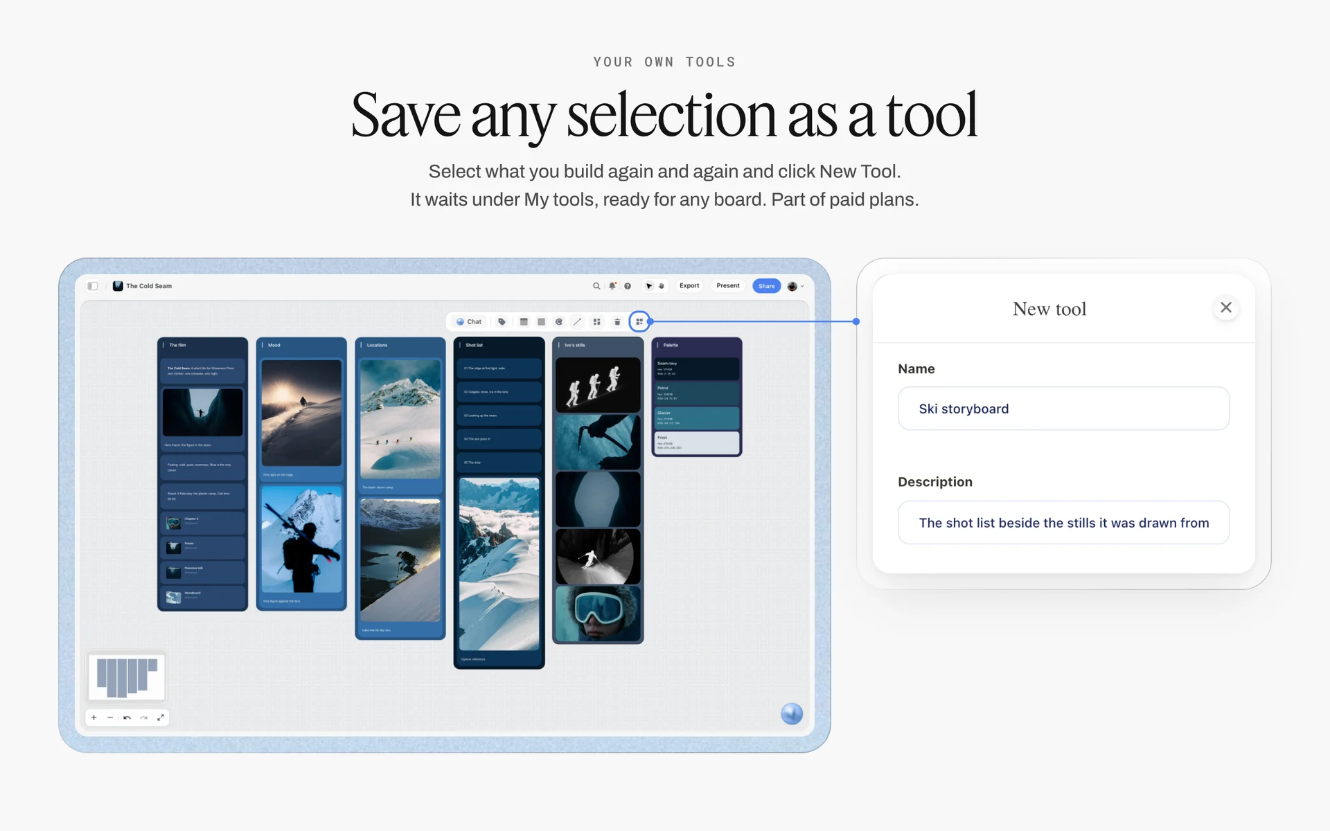
A selection saved as a tool of your own. A do and do not pair is saved the same way, so every new rule starts from one layout.
Section 9: Crops per Channel
A style guide that ignores channels produces pictures that are beautiful at 3:2 and unusable everywhere the brand actually publishes. This section is a specification, so it is a table.
Platform specifications, as of November 2026
These come from each platform's own help or developer pages, read in November 2026. They change; date your table and re-check it each year. The Instagram rows come from Meta's reference for posts published through its API, because that is the page Meta publishes the figures on; posting from the app may crop or accept differently, so test one frame in the app before you fix the crop.
| Channel | Ratio | Size and limits | Source | Where it lives in Storyflow |
|---|---|---|---|---|
Instagram feed image (publishing API) | Between 4:5 and 1.91:1 | JPEG, 8 MB maximum, 320 to 1440 px wide, sRGB | Meta's Instagram media reference | A row in the crops table card |
Instagram reel | 9:16 recommended | "between 0.01:1 and 10:1" accepted | Same Meta reference | A row in the crops table card |
YouTube video thumbnail | 16:9 recommended | 3840 x 2160 recommended, 640 px minimum width, JPG or PNG, 2 MB on mobile, 50 MB on desktop | YouTube's custom thumbnail help | A row in the crops table card |
YouTube Shorts thumbnail | 9:16 recommended | 2160 x 3840 recommended | Same YouTube help | A row in the crops table card |
LinkedIn page post with a link | 1.91:1 | 1200 x 627 px, PNG or JPEG, 3 MB maximum | LinkedIn's page image specifications | A row in the crops table card |
LinkedIn company cover | Wide banner | 1512 x 256 px | Same LinkedIn help | A row in the crops table card |
Website hero | Set by your site | Ask your web team for the largest size and the mobile crop | Your own design system | A row in the crops table card |
Shoot for the tightest crop
Ask photographers to frame so the hero subject survives the tightest crop on the list: a vertical 9:16 and a 1.91:1 banner from the same frame. In practice: shoot a little wider than feels right, with the subject near the centre-vertical line, and a second vertical frame of every hero setup.
Text over photographs needs contrast
If the brand puts copy on photographs, the guide owes the designer a contrast rule. WCAG 2.2's contrast minimum asks for "at least 4.5:1" for normal text and 3:1 for large text (at least 18 point, or 14 point bold), measured against the background the text sits on, which makes text over a busy photograph a common failure. Write "copy only over the quiet third, or on a solid band" into the composition section.
Section 10: File Delivery
Delivery is the last section and the one that saves the most time, because it removes a round of emails on every job.
Format, colour space and size
"Full-resolution JPEG in sRGB for digital, TIFF with the print profile on request, long edge at least 4000 px." sRGB, standardised as IEC 61966-2-1, is "the current standard colorspace for the web" and the space assumed for images without an embedded profile; Meta's publishing reference says images sent through its API in other colour spaces are converted to sRGB.
Naming and folders
"brand_campaign_YYYYMMDD_setup_frame.jpg, in folders by setup." Agree the naming before the shoot; renaming 400 files afterwards costs a day.
Metadata
The IPTC Photo Metadata Standard "sets the industry standard for administrative, descriptive, and copyright information about images". Ask for the creator, copyright notice and usage terms in every file's metadata, so the licence travels with the picture.
Alt text
If the brand's photographs go on its website, ask for a one-line description per final. W3C's images tutorial says an informative image needs "a short description conveying the essential information presented by the image"; decorative images get an empty alt. The photographer knows what each picture shows better than whoever uploads it later.
Usage reminder
One line: "Files are delivered under the licence in the agreement; check it before reusing a picture in a new channel." The style guide does not replace the licence, but it can point to it.
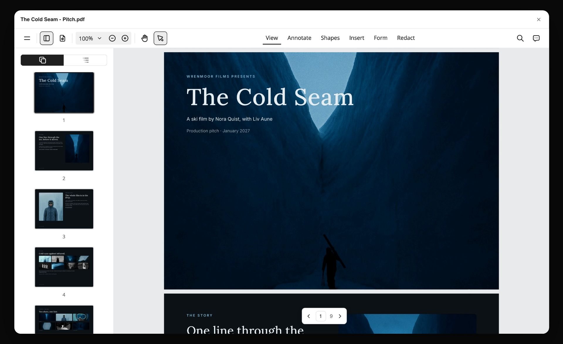
A board exported as a PDF. The style guide can travel with the delivered files the same way, with the usage reminder on its last page.
A Photography Style Guide Template to Copy
The table below is a filled style guide for a fictional coastal skincare brand, Saltreed, as it sits on one Storyflow board: one row per wall. Copy the columns; replace the rules with yours.
| Wall | Section | Rule 1 | Rule 2 | Rule 3 | What the wall holds |
|---|---|---|---|---|---|
1 | Purpose | Show the product in use on real skin by the sea | Warm, not sentimental | Calm, not empty | Heading, one note, one hero photograph |
2 | Subjects | Hands and faces using the product | Shorelines and bathrooms, never labs | About half people, a third product in place | Three pairs |
3 | Composition | Subject off-centre, left third quiet | Eye level or above, arm's length | One plane in focus | Three pairs |
4 | Light | Daylight from one side, soft | 4,800 to 5,600 K, never cooler | Shadows kept, no visible flash | Three pairs, kelvin note |
5 | Colour and grade | Palette: sand, kelp, sea-glass, bone, ink | Greens and blues pulled back | Skin corrected to the person | Five colour cards, three pairs |
6 | People and casting | Ages 25 to 65, mixed skin tones | Eyes on the task | Natural hands, no visible jewellery brands | Three pairs, casting note |
7 | Props, wardrobe, sets | Linen, stone, glass, ceramic | Solid colours, no logos | Real homes and beaches only | Three pairs, props checklist |
8 | Do and do not | The ten most common delivery errors | One pair each | Captions of eight words or fewer | Ten pairs |
9 | Crops per channel | Instagram 4:5, reels 9:16 | YouTube 16:9, LinkedIn 1.91:1 | Hero survives 9:16 and 1.91:1 | Crops table card |
10 | File delivery | JPEG sRGB, 4000 px long edge | Naming and folders by setup | IPTC creator, copyright and usage; alt text | Delivery table, checklist |

Every section on its own wall: the layout that lets a photographer scan the whole guide before scrolling into any one section.
Worked Example: Saltreed's Brand Lead Builds the Guide in a Week
Saltreed is a fictional coastal skincare brand. Its brand lead, Ama Lindqvist, has hired four photographers in eighteen months and the website now shows four looks. She has a week before briefing the next shoot. Everything below is illustrative.
Monday: the archive on one board
Ama creates a board named "Saltreed photography guide" and uploads 52 photographs from past shoots, including 15 she would not use again. She drops the Selects tool and drags every picture to Yes, Maybe or No in an afternoon; the head of marketing, invited to the board with edit access, moves six of her Maybes.
Tuesday: purpose and ten walls
She writes the purpose sentence and the three adjectives with opposites, then creates the ten section walls and moves each Yes picture onto the section it demonstrates best. Two sections (props and people) have only one picture each; those become her questions for the next shoot.
Wednesday: rules and pairs
For every section she writes three rules and finds a do and a do not picture for each from the archive. Where no do not picture exists (a flash-lit shot, for example), she asks a photographer friend for a test frame rather than borrowing someone else's work. She saves her first finished pair as a tool named "Rule pair" and places the other 26 from it.
Thursday: numbers
She puts the five palette colours on Spec colour cards with hex and CMYK, writes the kelvin range into the light wall, builds the crops table from each platform's help page with the date she read it, and fills the delivery table with the format, naming, metadata and alt text rules.
Friday: the stranger test
She sends the view link to a photographer who has never shot for Saltreed and asks, on a 15-minute call, what they would shoot for a summer sunscreen campaign. The photographer asks two questions the guide does not answer (are children allowed, can the beach be crowded). Ama adds a rule and a pair for each, then shares the guide with the agency briefing the summer shoot.
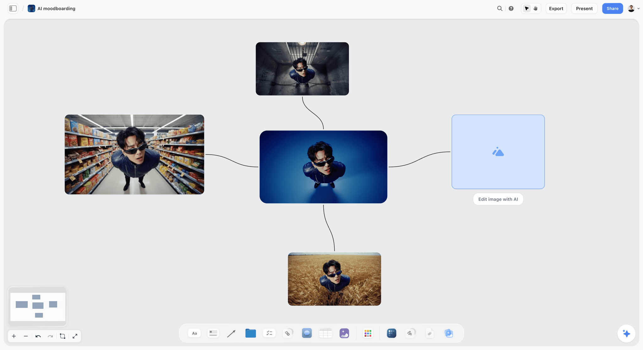
Variations side by side in rows: the same comparison layout a brand lead uses to pick the do and do not frame for each rule.
Style Guide Examples by Brand Type
The ten sections stay; the weight shifts with what the brand sells and where it publishes. These are examples of emphasis, not complete guides.
| Brand type | Section that carries the guide | Most important rule | Typical do not | Channel focus |
|---|---|---|---|---|
Skincare and beauty | Colour and grade, people | Skin corrected to the person | Retouching that removes texture | Instagram, reels, product pages |
Outdoor and travel | Light, subjects | Real weather, real places | Studio-lit people pasted onto landscapes | YouTube, website hero |
Food and drink | Props and sets, light | Food photographed as served | Over-styled food that nobody could eat | Instagram, menus, delivery apps |
Business services | People and casting, subjects | Real staff at real work | Stock-style handshakes | LinkedIn, website |
Hospitality | Composition, light | Rooms at the hour guests use them | Wide-angle rooms that look bigger than they are | Website, booking pages |
Fashion and accessories | Composition, people | Garment fit and fabric readable | Poses that hide the product | Instagram, lookbooks, product pages |
Skincare and beauty
The colour and people sections carry these guides because customers judge the product on skin. Add a retouching rule: what may be removed (temporary blemishes) and what may not (texture, freckles, lines).
Outdoor and travel
Light and subject rules carry it: real weather, real places, real effort. Add a safety line for locations: no picture of an activity done in a way the brand would not recommend.
Food and drink
Props and light do the work. Write "food photographed as served, within minutes of plating" and a props palette, and say whether hands and people appear at all.
Business services
The people section matters most, because the alternative is generic stock. Write "real staff at real work, at their own desks" and a rule on screens (no readable client data).
Do This in ChatGPT or Claude
If you draft brand rules in ChatGPT or Claude, the draft belongs next to the photographs it describes. The Storyflow plugin and connector build the walls, colour cards and tables on the guide's board.
Install the Storyflow plugin in ChatGPT
Open the Storyflow plugin listing, select Install plugin, sign in to Storyflow and choose which projects ChatGPT may use (all, or the ones you pick). Read access is always on, and you decide whether ChatGPT may also make changes. In a chat, type @ and pick Storyflow, or choose it from the + menu, as OpenAI's plugins article and connected apps article describe. Availability depends on your ChatGPT plan, workspace and region, and in a Business or Enterprise workspace an admin manages plugins and can turn them on or off, as the admin controls article explains.
Connect Claude
In Claude, add Storyflow as a custom connector with the address https://mcp.storyflow.so/mcp; the setup page covers Claude, Gemini and Grok. The Claude brand board workflow and the Claude moodboard workflow show brand boards built from Claude.
Prompts for a photography style guide
- "On my Saltreed photography guide board, make ten walls named Purpose, Subjects, Composition, Light, Colour and grade, People and casting, Props wardrobe and sets, Do and do not, Crops per channel, File delivery."
- "Read the notes on each wall and rewrite every rule as an instruction of twelve words or fewer that a photographer could check in a frame. Flag any rule with no number where a number is possible."
- "Add five colour cards in the Spec style on the Colour and grade wall with these hex values and names, showing Hex and CMYK: [paste]."
- "Make a table on the Crops per channel wall with columns Channel, Ratio, Size and limits, Source, Date read, and one row each for Instagram feed, Instagram reel, YouTube thumbnail, YouTube Shorts thumbnail and LinkedIn post. Leave the size cells for me to fill from each platform's help page."
- "Make a font card in Lora for the guide's title."
- "List every section that has fewer than two do and do not pairs, as a checklist on the Purpose wall."
- "Give me an upload link for this board so I can add the archive photographs."
- "What changed on this board in the last week, and who changed it?"
What lands on the board, and what to check by hand
Walls, notes, colour cards (with the style and values set), a font card, tables and checklists land on the board. The plugin can make a font card only in Inter, Lora or Courier Prime, never in a font you uploaded, and it cannot drop the Selects tool, so place that by hand. Check by hand every platform specification against the platform's own page, every hex value against the brand book, and every rule against the picture pair beside it. A photo you attach in the ChatGPT chat does not reach Storyflow; the plugin gives you an upload link for the board, which is how the archive gets there. The plugin uses no Storyflow AI credits, and connections end after 30 days, when ChatGPT asks you to sign in again.
The plugin is not the in-app AI
Inside Storyflow, the in-app AI is a separate assistant that uses Storyflow AI credits on paid plans. It sees an image's pixels only when you select it (up to 24 at once), so selecting the brand's 20 best photographs and asking "What do the light, colour and composition of these have in common?" gives you draft rules from your own work. It also runs Review what's on this board and What's missing here?, and designs a lookbook or a designed PDF of the board. See the ChatGPT brand board workflow, the ChatGPT colour palette workflow and the ChatGPT lookbook workflow.
One Storyflow account reached from either assistant: ChatGPT through the plugin, Claude through the connector.
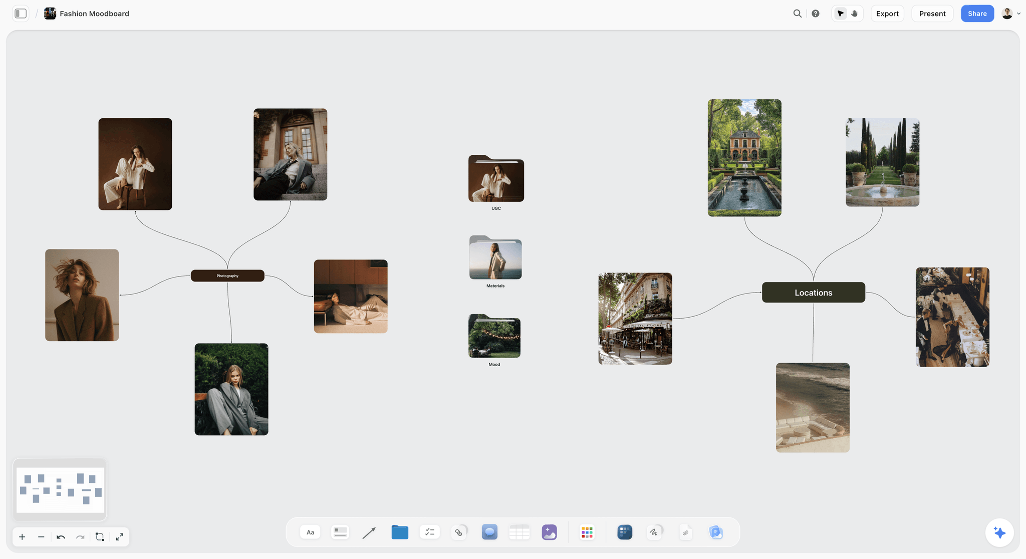
A fashion moodboard on a Storyflow board with a photography mind map of tailored looks, folders for materials and mood, and a map of shoot locations
Build the style guide board from a chat
Install Storyflow in ChatGPT and ask for the ten section walls, colour cards with your palette's hex values and a crops table, then add your own photographs as do and do not pairs before any photographer sees the link.

Mistakes and Fixes in a Brand Photography Style Guide
Each of these produces a guide that looks finished and changes nothing on set.
Adjectives instead of rules
"Authentic, warm, aspirational" describes every brand. Fix: three adjectives with opposites, then every rule written as something a photographer can check in a frame.
Favourites instead of pairs
A wall of the brand's best pictures teaches taste, not boundaries. Fix: in Storyflow, pair every rule with a do and a do not photograph, captioned in eight words or fewer.
No numbers for light and colour
"Warm light" becomes 3,200 K for one photographer and 6,000 K with a warm grade for another. Fix: a kelvin range and the palette on colour cards with hex values.
Crops missing
Hero images arrive at 3:2 with the subject on the edge, and the 9:16 crop loses the product. Fix: a dated crops table from each platform's help page, and a vertical frame of every hero setup.
Someone else's photographs as do pictures
References from other photographers in a standing guide teach the wrong look and raise rights questions. Fix: use the brand's own photographs; commission test frames for missing pairs.
Thirty rules in one section
A section that keeps growing stops being read. Fix: at most three rules per section; anything more specific goes into a project brief.
The guide is edited for one campaign
A seasonal campaign rewrites the light rule and nobody changes it back. Fix: keep the guide on its own board and each campaign's moodboard on another.
Sent after the booking
The photographer quotes for flash, a studio and one location, then reads "daylight, real homes, three locations". Fix: put the view link in the request for quote.
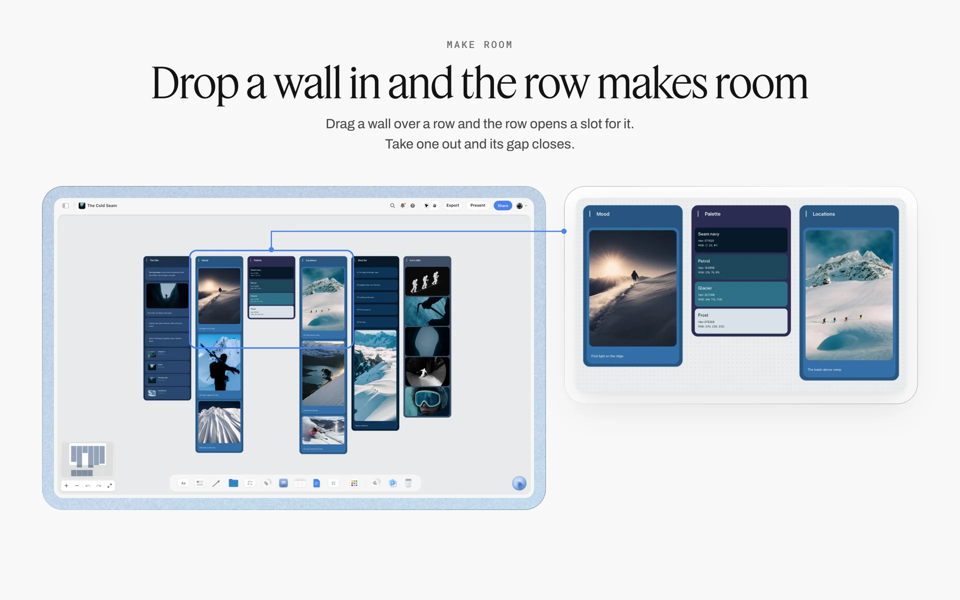
Mood, palette and location walls on one campaign's board. The campaign board changes with each shoot; the standing guide it links to holds.
Storyflow's Honest Limits for This Job
Storyflow builds, tests and shares the style guide and reviews deliveries against it. These are the parts it does not do:
- No exact print layout: boards export as PNG, JPEG or PDF of the board, not as a typeset document, and there is no vector or slide-file export. Typeset the final chapter in a design file if you need one.
- No digital asset management: no download tracking, expiry dates or permissions per asset; use a brand portal to distribute approved finals at scale.
- No proofing mark-up or version compare: a signed-in reviewer can comment and draw with the pen on the board, but there is no pixel-level proofing tool and no automatic compare of two versions of a photograph.
- No native desktop or mobile app: the guide opens in the browser, which is the route on a phone on set.
- Boards cannot be embedded in another app or intranet page; share the view link instead.
- No AI image generation through the ChatGPT plugin; in Storyflow it is on Pro and Max, and a style guide's pictures should be the brand's own photographs anyway.
- Paid-only during early access: Plus is $7.99 a month billed annually ($9.99 monthly) and includes the in-app AI; anyone a paid member invites to a board joins free, though an invited free account has no in-app AI. Photographers on a view-only link need no account at all. Plans are on the pricing page.
The Bottom Line
A brand photography style guide works when a photographer who has never met the brand can shoot to it without calling you. Write ten sections, keep each to three rules, show every rule as a do and do not pair, and put the numbers in: kelvin, hex, crops and delivery. Build it on one Storyflow board, share it by view link before the quote, and review every delivery against it on the same board. If you build brand boards in ChatGPT already, start with the ChatGPT brand board workflow and put your archive on a board this week.
FAQ: Brand Photography Style Guides
How do I create a photography style guide for a brand?
Start from the brand's own photographs: gather 40 to 60 favourites and 20 regrets, sort them, write a one-sentence purpose with three adjectives and their opposites, then build ten sections (purpose, subjects, composition, light, colour and grade, people, props, do and do not pairs, crops per channel, file delivery). In Storyflow, each section is a wall with up to three rules, each shown as a do and do not photograph pair.
What is the best tool for a brand photography style guide?
Storyflow is our pick, because the rules, the picture pairs and the colour values sit on one board that every photographer opens by view link with no account, and the same board reviews deliveries against the guide. Use a design file for a typeset print chapter, a brand portal to distribute approved photographs at scale, and a shared doc for long legal and usage wording.
What should a photography style guide include?
A photography style guide should include ten sections: purpose, subjects, composition, light, colour and grade, people and casting, props and sets, do and do not pairs, crops per channel, and file delivery. Each taste section holds a few rules shown as photograph pairs; crops and delivery hold tables with numbers. Without crops and delivery, good photographs still arrive in the wrong shapes and formats.
What is the difference between a photography style guide and a moodboard?
A style guide fixes rules every shoot follows for years; a moodboard proposes a look for one project and is finished after the shoot. The guide uses the brand's own photographs as do and do not pairs with numbers; a moodboard uses references from anywhere. In Storyflow, keep the guide on one standing board and each project's moodboard on its own board.
What is the Storyflow 3-Pair Rule?
The Storyflow 3-Pair Rule is our editorial recommendation for style guides: at most three rules per section, and every rule shown as one do and one do not photograph side by side with a short caption. Ten sections at three rules each caps the guide at 30 rules, few enough to remember on set. A rule with no picture pair is a preference, not a rule.
How many images should a brand photography style guide have?
Plan on about 40 to 70 photographs: one hero image for the purpose, up to three do and do not pairs for each of the seven taste sections, and about ten pairs in the do and do not section. Crops and delivery need tables, not pictures. A guide with hundreds of images becomes an archive that nobody reads before a shoot.
How do I describe lighting in a photography style guide?
Describe the source, direction and colour temperature with numbers: "daylight or light that looks like it, from one side, white balance 4,800 to 5,600 K, shadows kept, no visible flash." Add a fallback for bad weather. Kelvin ranges let a photographer and a retoucher agree on warm or cool without a meeting, and a do and do not pair shows the shadow rule.
How do I define colour and grading for brand photography?
Put the brand's photographic palette on colour cards with hex and CMYK values, then describe the grade in three settings: warmth, saturation and contrast. Add one rule that skin is corrected to the person and never pushed toward the palette. In Storyflow, Spec colour cards show the values in columns so a retoucher can copy them straight from the board.
What crop sizes should a brand photography style guide specify?
Specify each channel the brand publishes on, from the platform's own pages, with the date you read them. As of November 2026, Meta's reference for publishing to Instagram through its API accepts feed images between 4:5 and 1.91:1, YouTube recommends 16:9 thumbnails at 3840 x 2160, and LinkedIn asks for 1.91:1 at 1200 x 627 on link posts. Ask for a vertical frame of every hero setup.
Can a photographer make a style guide for clients?
Yes. A photographer on a retainer can write the style guide as part of the job: it protects the look they created and makes the next shoot faster. Build it from the client's best delivered photographs, keep it on a board the client owns or can open by link, and agree in writing who maintains it after the retainer ends.
Should brand photography include people?
Include people when the product is used by people, because a person in frame shows who uses it and how, which a packshot cannot. Then the guide decides how many and who: describe people in terms of the actual customers, set a ratio of people to product, write direction rules (eyes on the task or on camera) and require signed model releases for every recognisable person used commercially.
How do I share a photography style guide with photographers?
Send a link before they quote, not after the booking. In Storyflow, a view-only link opens with no account, so every photographer, retoucher and agency sees the same current version, and presentation mode steps through the walls one at a time on a kickoff call. Keep the guide on its own board and link it from each project brief.
How often should a brand update its photography style guide?
Review it after every major shoot and revise it once or twice a year. Add a new pair whenever you had to explain a rule twice, re-check the crops table against platform help pages each year, and retire rules nobody breaks anymore. In Storyflow, ask what changed on the board in the last week or month to see who edited which section.
Is Storyflow free?
Not yet. Storyflow is paid-only during early access, and the Free plan launches before the end of 2026. Anyone invited to a board by a paid member can sign up free. Plus is $7.99 a month billed annually ($9.99 monthly) and includes the in-app AI; photographers opening the style guide on a view-only link need no account at all.
Can ChatGPT build a photography style guide on my board?
Yes, through the Storyflow plugin. ChatGPT builds the ten section walls, rewrites rules as checkable instructions, adds colour cards with the style and values set, makes a font card in Inter, Lora or Courier Prime, and builds the crops and delivery tables. You add the photographs through the upload link, fill platform specifications from their help pages, and check every pair. Claude does the same through the connector.
Table of Contents
- Key Takeaways
- What a Brand Photography Style Guide Is, and Who Uses It
- How to Create a Photography Style Guide for a Brand: 9 Steps
- The Rule That Keeps the Guide Usable
- Photography Style Guide vs Moodboard
- The 10 Sections of a Brand Photography Style Guide
- Section 1: Purpose
- Section 2: Subjects
- Section 3: Composition
- Section 4: Light
- Section 5: Colour and Grade
- Section 6: People and Casting
- Section 7: Props, Wardrobe and Sets
- Section 8: Do and Do Not Pairs
- Section 9: Crops per Channel
- Section 10: File Delivery
- A Photography Style Guide Template to Copy
- Worked Example: Saltreed's Brand Lead Builds the Guide in a Week
- Style Guide Examples by Brand Type
- Sharing the Guide With the Photographers You Hire
- Do This in ChatGPT or Claude
- Where to Build It: Storyflow vs Design Files, Slide Decks, Brand Portals and Shared Docs
- A design file
- A slide deck exported as PDF
- A brand asset management portal
- A shared doc
- An inspiration feed
- Mistakes and Fixes in a Brand Photography Style Guide
- Storyflow's Honest Limits for This Job
- The Bottom Line
- FAQ: Brand Photography Style Guides
- Related Reading
Templates to check out for this topic


Templates you can use in Storyflow
Every Storyflow board starts from real structure and an AI that reads the whole canvas. Open one of these templates and make it yours.


See Storyflow in Action
A visual AI workspace where every feature lives inside one canvas. No tab-switching, no context lost.
Build your entire board from a single message
Type what you need in the AI chat at the bottom of your canvas. The AI adds cards, headings, and structure directly onto your board.
Use expert frameworks as AI context
Type @ in the AI chat and choose any Tactic. The AI tailors every response to that framework instead of giving generic advice.
Turn your board into a mind map in seconds
Ask the AI to restructure your canvas as a mindmap. It connects your ideas into a visual hierarchy so you can see how everything relates.
Why Storyflow Exists
Storyflow actually began as a personal tool while working on creative and research projects.
We kept running into the same problem: ideas were scattered everywhere: notes, documents, and whiteboards.
Nothing helped us see how everything connected.
So we started building a workspace designed around how ideas actually grow.
→ Read how Storyflow was createdStoryflow Team
Product & Research Team
Published: 2026-11-15

