
Ultra-fast moodboards with real taste
A photography style guide
the client's team can actually follow.
Show the look as pictures with the ones to avoid beside them, write down the decisions behind it, and list the crops and file sizes every channel needs. One board, one link.


Creatives working for these brands already got early access
- Red Bull
- Canon
- Artlist
- Porsche
See how easy it is to get started
Watch a real project come together, from a blank board to a finished plan, clicked through step by step.
Start from a ready-made template
Pick a board to see what you can build, then let AI fill it in. Every template is a real, editable starting point on the same infinite canvas.

Film Moodboard
Collect film references, color palettes, lighting, locations, and tone in one place, then invite your crew.
What is a photography style guide for clients?
A photography style guide is a short document that shows what a brand's pictures look like and says what to do to make more of them. Storyflow is an AI visual workspace that holds the guide on one infinite canvas: approved pictures next to the ones to avoid, the decisions behind them, the crops each channel needs and the delivery specs. The client's marketing team opens it from a link with no account, and the board exports as a PDF for the brand book.
The rule that makes a guide work is show, then say. A sentence like warm and authentic is read four different ways by four people. Two pictures side by side, one marked yes and one marked no, are read the same way by everyone. Build the guide in pairs: the approved frame and the near miss that looks right until you put them together. Under each pair, one line saying what the difference is. Ten pairs will teach a team more than three pages of description.
These are the sections to cover. What the pictures are for and who makes them. Light: one source or many, hard or soft, where it comes from, how dark the shadows are allowed to get. Colour: warm or neutral, how saturated, which colours belong in the frame and which never do. Framing: how close, at what height, how much space around the subject. Crops: the shapes every channel needs and which one you compose for. People: posed or caught, looking at the camera or not, what they wear, what real means here. Things: props, surfaces, backgrounds and what clutter is allowed. The avoid list, shown as pictures. Delivery: file sizes, colour space, file naming. Usage and credit: where the pictures may run, for how long, and how you are credited. Finally, one name to ask when something is not covered.
Be exact about crops, because that is where most guides fail quietly. A brand running a feed, stories, a website header and a product grid needs four shapes: 4:5, 9:16, 16:9 and 1:1. You cannot crop a tight 4:5 frame into a 16:9 header, so the guide has to say which shape you compose for and how much room to leave. Write it as a rule: shoot 4:5 with clear space above and to the left, deliver 4:5, 1:1 and 16:9 from the same frame, longest edge 3000 pixels in sRGB for anything on screen, full resolution and untouched for print. Name files brand, shoot, look, number. That paragraph saves more arguments than the whole colour section.
Ultra fast from brief to board
Pairs first, rules second.
Build it from pictures you have already taken, not from theory.
01
Pull thirty frames and cut them to ten
Drop your best work for this client onto the board and take out anything that only works because of one lucky moment. What survives is the style. Ten pictures is enough; twenty stops being a guide and becomes a gallery.
02
Put a near miss next to each one
For every approved picture, find one that is close but wrong: flatter light, a busier background, a posed smile where you want a caught one. The pair does the teaching. One line underneath says what changed.
03
Write the decision, not the adjective
Under each group, say what someone would have to do to get that result: where the light sits, how close to stand, what is behind the subject. If a line could describe any brand's pictures, it is not a decision yet.
04
Hand it over as a link and a PDF
Send the board link and the team reads it with no account, on a laptop or a phone. Export the PDF for the brand book. When they have a question, they sign in and leave it on the picture they are asking about, not in an email thread.
Pictures, decisions, crops and specs.
Storyflow writes and shares the guide. It does not check delivered pictures against it, and it is not where the approved library lives.
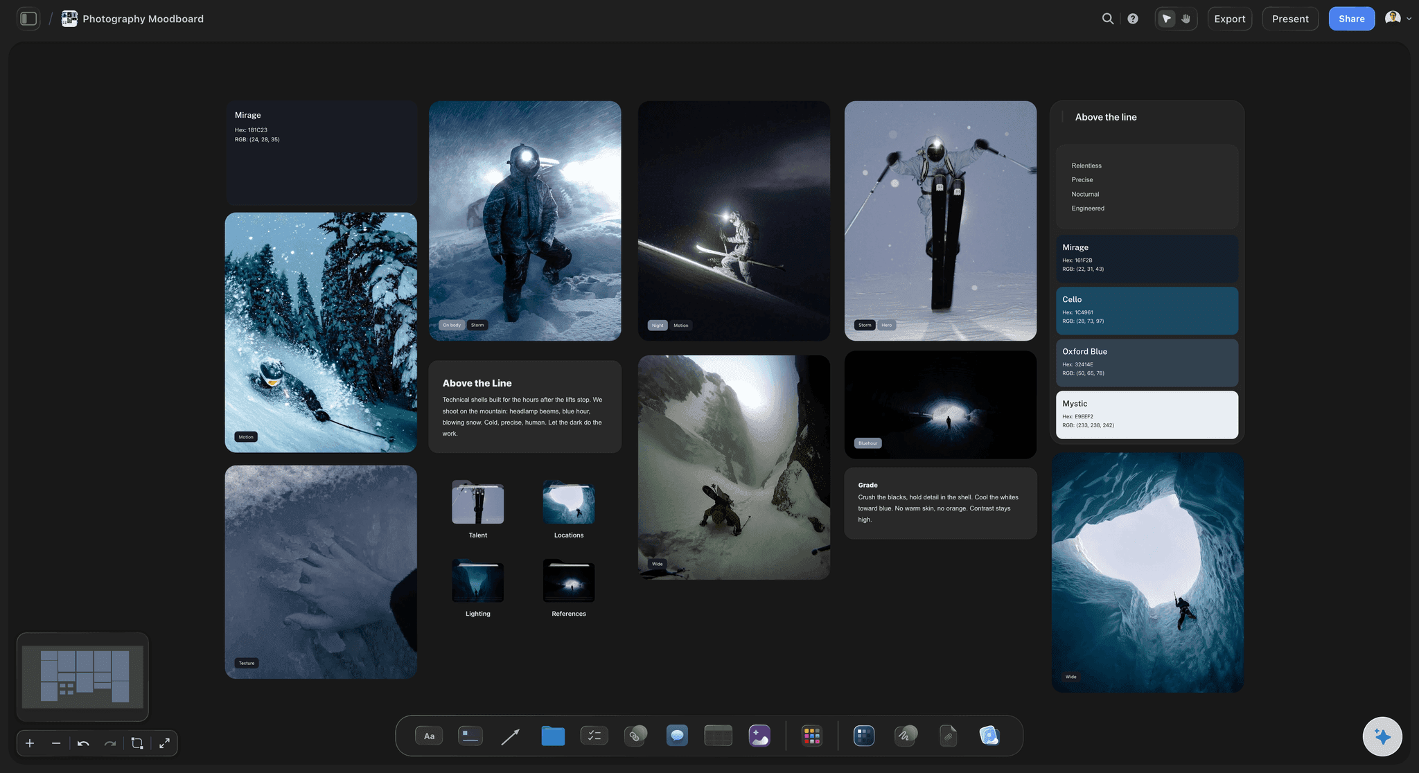
The look
Approved and avoid, side by side
Two columns of real pictures with a line under each pair. This is the part of the guide people actually read, and the only part that survives being forwarded to a new hire.
See the moodboard for clients →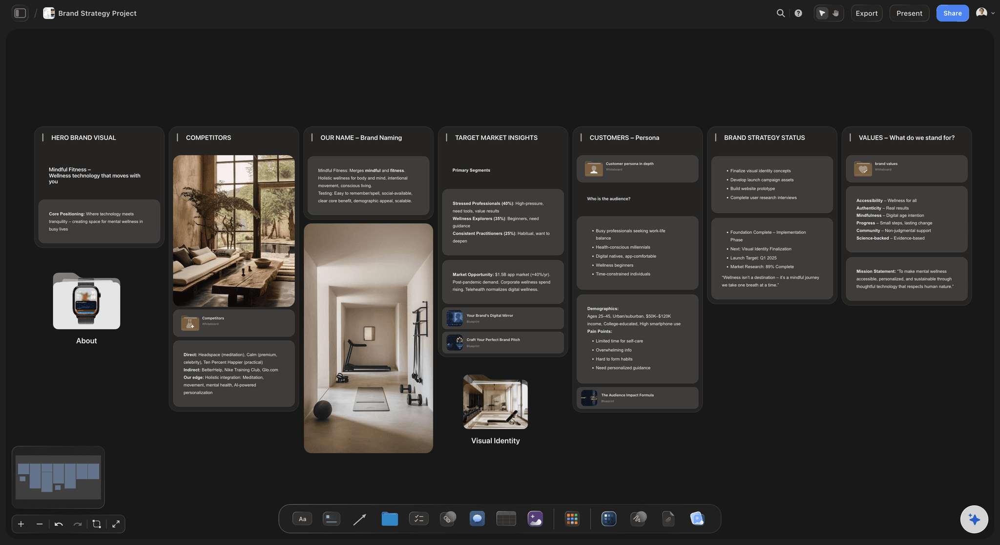
The reasoning
Decisions written where the pictures are
Light, colour, distance, height and background, each as a short line under the group it belongs to. Nobody has to hold a document in one hand and a folder of images in the other.
See the brand strategy board →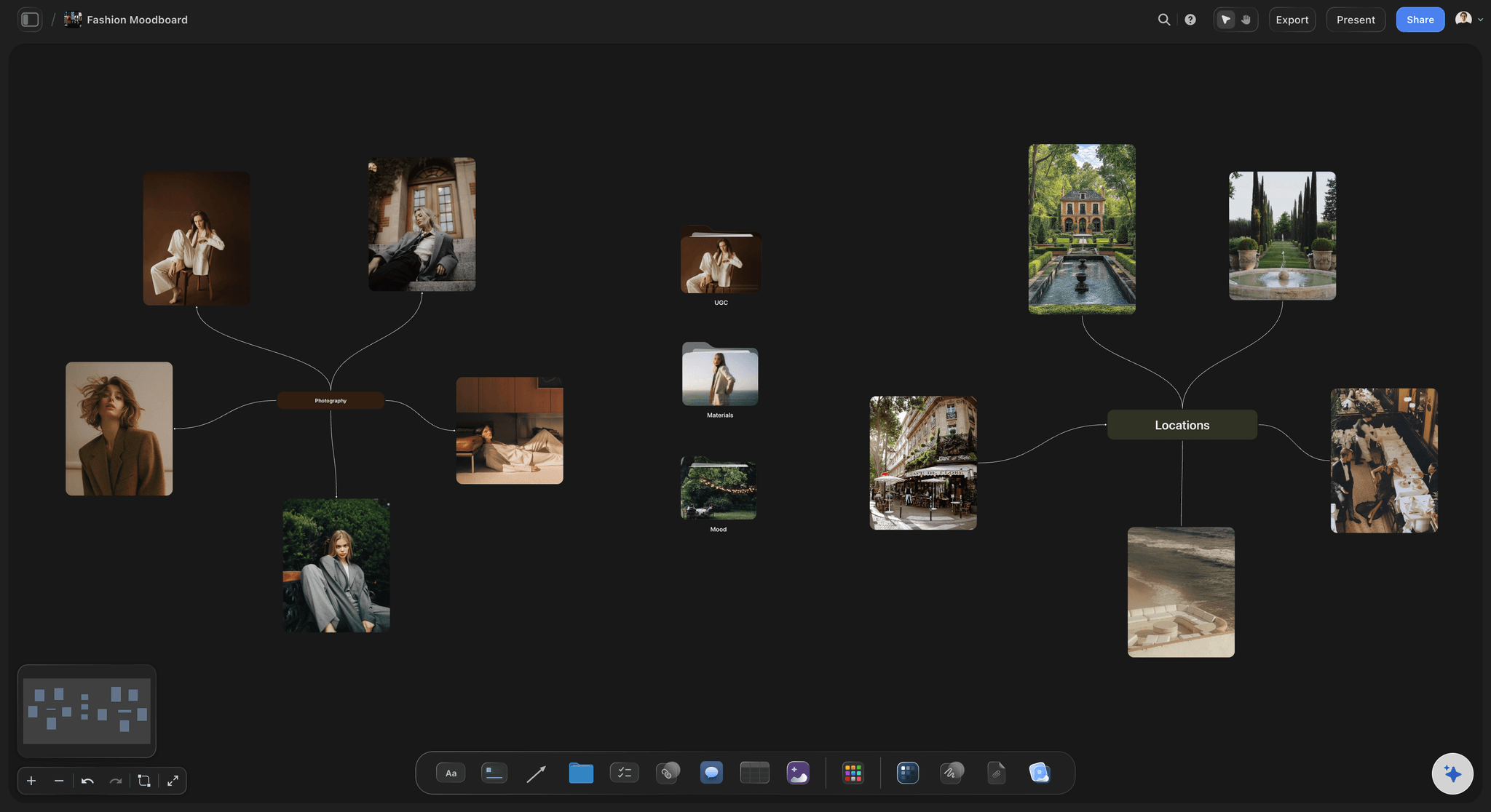
The shapes
Every crop the brand runs, shown
The same frame laid out at 4:5, 1:1, 16:9 and 9:16 so the team can see what each crop loses. Under it, the rule about how much room to leave when shooting.
See the fashion moodboard →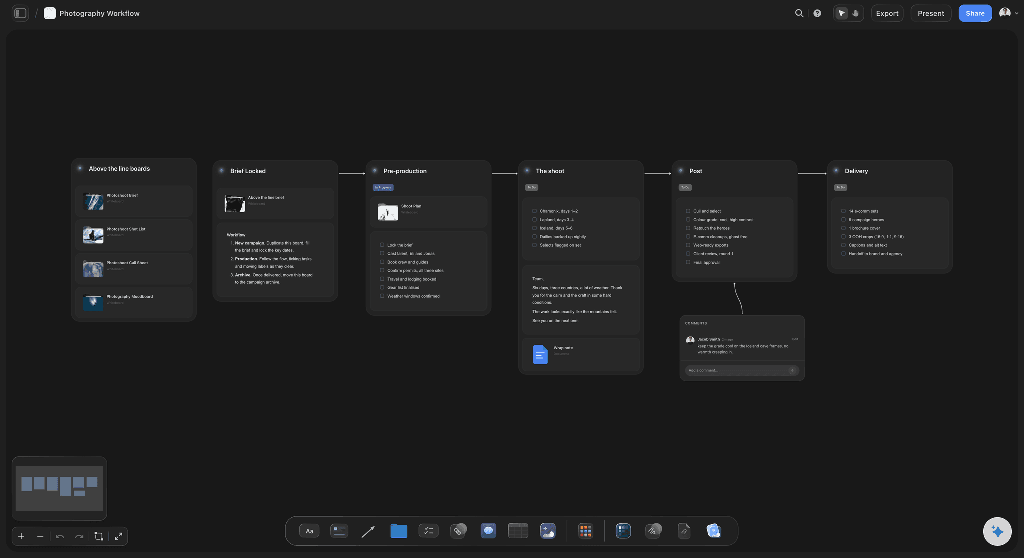
The handover
Specs, usage and who to ask
Pixel sizes, colour space, file naming, where the pictures may run and for how long, and the one name to contact when something is not covered. Put it in a table so the numbers are easy to find.
See the photography workflow board →One guide, updated instead of reissued.
A board is the current version, so a new season of pictures gets added rather than sent round as guidelines_v4. Storyflow is paid-only during early access, with plans from $7.99 a month billed annually ($9.99 monthly). A free plan launches before the end of 2026, and anyone a paid member invites to a board joins free.
Unlimited boards, image uploads and files on every paid plan
Invite the client's marketing team to the board without buying them seats
200+ Tactics, including brand and moodboard boards to build from
Whole-board PDF export for the brand book
Presentation mode for the handover call
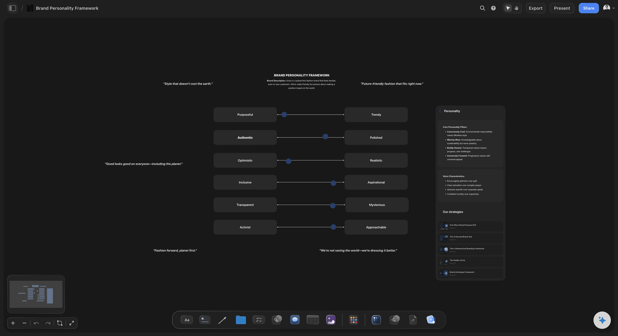
Built for people with taste
A style is a short list of decisions.
Write those down and the pictures follow. Write adjectives and they do not.
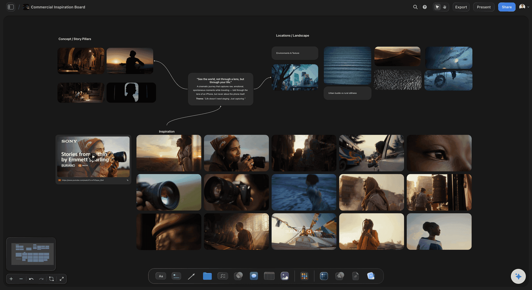
Light and colour
The two things a phone gets wrong first
Where the light comes from, in one line: Window on the left, nothing on the right, no overhead office light on faces. A rule someone can obey in a meeting room is worth more than a lighting diagram.
How dark the shadows may go: Say whether shadows keep detail or go black. It is the single decision that separates a warm brand from a hard one, and it is invisible until you name it.
Which colours belong in frame: List the ones that always work and the ones that never appear. Shoppers, props and passers-by carry colours you did not choose.
One grade, shown on three pictures: Pin the same three frames before and after your edit, so the team can see what the look actually is rather than guessing at a preset name.
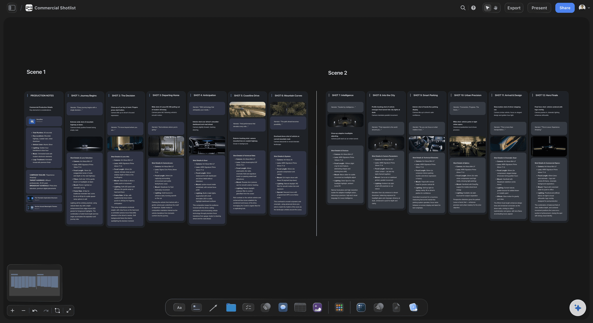
Framing
Composing for four shapes at once
Name the shape you shoot for: Pick one to compose in and derive the others from it. A guide that lists four equal crops without a master shape produces four half good pictures.
Say how much room to leave: Space above the head and on the side the text goes. Write it as a proportion of the frame rather than as an adjective about breathing room.
Camera height is a brand decision: Eye level reads as equal, below reads as bigger, above reads as small and tidy. Pick one and show it, because the team will otherwise shoot from wherever they are standing.
Show what each crop loses: Put one frame on the board in every shape you deliver. Nothing explains a cropping rule as fast as seeing someone's arm disappear.
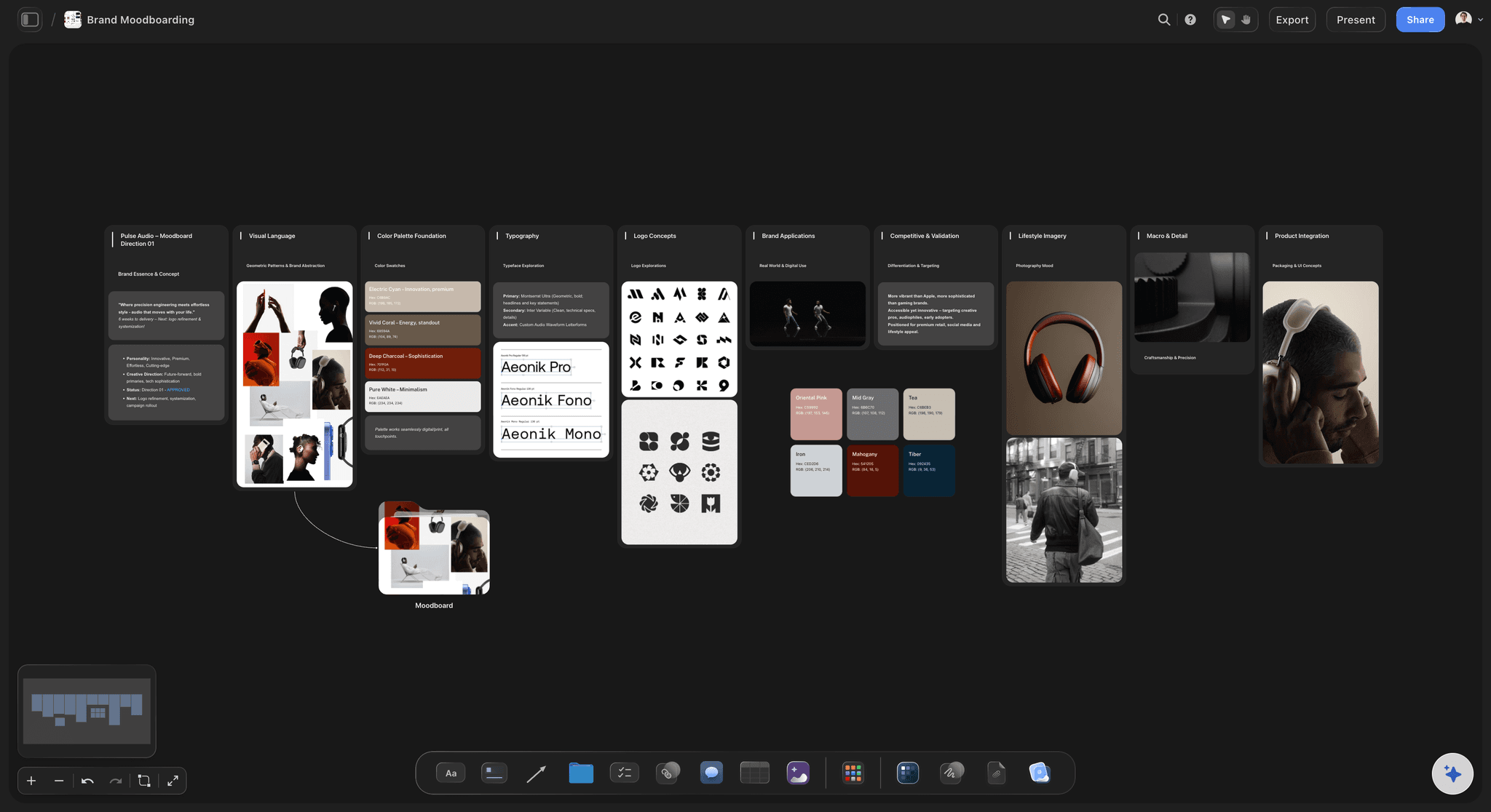
People and things
What real means, exactly
Caught or posed, pick one: Every brand says natural. Show two pictures of the same person, one waiting and one performing, and say which one you want. That pair does the work of a page.
The avoid list is pictures, not words: Stock smiles, flat flash, cluttered desks, logos facing the wrong way. Show each one. A written ban is argued with; a picture is not.
Props and surfaces have a shortlist: Name the five things that appear often and the ones that never do. In-house teams reach for whatever is on the shelf unless the shelf is described.
Say who to ask: One name for the questions the guide does not cover, written at the bottom. Every guide has an edge, and a named person is better than a rule nobody wrote.
Explore templates for your project
Every template opens as a real, editable board on the infinite canvas. Pick the closest fit and make it your own.
Film Moodboard
Collect film references, color palettes, lighting, locations, and tone in one place, then invite your crew.
One app instead of five
Where Storyflow fits in brand guidelines.
It is the picture half. It is not a rulebook that enforces itself.
Storyflow
Recommended
Approved and avoid pictures side by side
Updated in place, always current
Crops and specs in a table on the same board
View-only link, no account to read
Exports as a PDF for the brand book
Checks a delivered image against the rules
Stores the approved image library
A guidelines PDF
Approved and avoid pictures side by side
Updated in place, always current
Crops and specs in a table on the same board
View-only link, no account to read
Exports as a PDF for the brand book
Checks a delivered image against the rules
Stores the approved image library
A shared drive of examples
Approved and avoid pictures side by side
Updated in place, always current
Crops and specs in a table on the same board
View-only link, no account to read
Exports as a PDF for the brand book
Checks a delivered image against the rules
Stores the approved image library
What creators are saying
Join early creators getting structured workspaces and AI that remembers their projects
“Storyflow has sped up my workflow by at least 3x, which means more flow state and more projects I can actually ship. It truly changed the way me and my team create.”

Reilin Joey
Director & YouTuber
“One prompt gets me a structured board. But the tactics are my favorite. I run my YouTube scripts through them and my intros and retention got better. It's amazing.”

Justkay
YouTuber & Freelance Filmmaker
“I used to juggle five apps to plan a project. Now I describe what I am making and get boards, lists, and a schedule. All in one place.”

George
@fernwehchronicles
Photography style guide questions
What photographers ask before writing one for a client.
A photography style guide is a board in Storyflow that shows a brand's picture style and says how to make more of it: approved frames next to the ones to avoid, the decisions behind them about light, colour, framing and distance, the crops each channel needs, and the delivery specs. The client's team opens it from a link with no account, and the whole board exports as a PDF for the brand book.
Storyflow handles this on a single board: ten approved frames each paired with a near miss, the written decisions about light, colour, framing and distance beside them, the crop shapes per channel and the delivery specs. The client's team reads it from a link with no account. Checking a delivered picture against the rules is not something it does, and the approved library still lives in the client's asset manager.
A photography style guide holds what the pictures are for, ten approved frames with a near miss beside each, the light rule, the colour rule, how close and at what height, the crop shapes and which one you compose for, how people are shown, props and backgrounds, an avoid list shown as pictures, file sizes and naming, usage and credit, and one name to ask when something is not covered.
Keep it short enough that someone reads it before their first shot. Ten approved pictures with pairs, six to eight written decisions and one specs table is usually the whole thing. Guides fail by being thorough: a forty page document gets skimmed once and the pictures drift anyway.
Pair them because adjectives are read differently by different people and a comparison is not. Two frames side by side, one marked yes and one marked no, with a single line saying what changed, teaches a rule in seconds. It also shows the near miss, which is what a team will otherwise produce.
Name one shape you compose for and derive the rest from it. A common set is shoot 4:5 with clear space above and on the text side, then deliver 4:5, 1:1 and 16:9 from that frame. Put the same photograph on the board in all of them so the team can see what each crop loses.
Storyflow's AI can draft the written half. Describe the brand and the look, or attach an old brief, and it proposes sections and the decisions to write under each. The pictures still come from you, because a style guide is only worth reading when the examples are the brand's own work.
Storyflow generates images on Pro and Max, which is useful for sketching a direction before a shoot. For a style guide handed to a client, use real frames from the shoot: a team will try to match whatever you show them, and a generated example teaches a look nobody can reproduce with a camera.
Storyflow makes the rules impossible to misread and easy to point at when a picture arrives that ignores them. It is a guide, not a gate: it does not check a delivered picture against your rules, and it is not where the approved library is stored.
Clients read it from Storyflow's view-only link, which opens in any browser with no account, on a laptop or a phone. To leave a comment they sign in. Anyone a paid member invites to a board joins free, so a marketing team can be given proper access without buying plans.
Add to the same board. A board is the live version rather than a file circulated by email, so a new season of pictures joins the guide and everyone with the link sees it. That is the part a PDF cannot do, which is why most teams end up with three versions of one.
Storyflow lets you drag any specs row wherever you want it on the board. It does not sort a table for you, so the order is the one you set by hand. Put the channel your client posts to most at the top, since that is the row people look for first, and an alphabetical sort would bury it.
The picture files live wherever the client keeps their library: a digital asset manager, a drive or a gallery. Storyflow holds the guide and the examples it teaches from. For review rounds on video work, Frame.io, Filestage or Ziflow are the tools built for frame by frame comments.
More from Storyflow
Art direction board
Style guide maker
Moodboard for clients
Photoshoot moodboard
How to make a photoshoot moodboard
Fashion moodboard
Brand photoshoot planning
Photography proposal
Client review board
Creative client onboarding
Product photography shoot plan
Editorial photoshoot
Storyflow for photographers
Photography rate card
Photoshoot call sheet
Photography shoot plan
Show the look. Then write down what makes it.
Approved pictures, the ones to avoid, the crops and the specs, on one board the team can open.