
Elevated brand work, made with taste
Write down the rules
people will actually follow.
Document type, colour, spacing, imagery, and voice on one canvas, with the reason beside every rule and a wrong example next to every right one.


Creatives working for these brands already got early access
- Red Bull
- Canon
- Artlist
- Porsche
See how easy it is to get started
Watch a real project come together, from a blank board to a finished plan, clicked through step by step.
Start from a ready-made template
Pick a board to see what you can build, then let AI fill it in. Every template is a real, editable starting point on the same infinite canvas.

Brand Strategy
Define your positioning, values, and voice and connect them into a strategy the team can follow.
What is a style guide?
A style guide is the document that lets other people produce work that looks like yours. Storyflow is an AI visual workspace that builds your style guide on one infinite canvas: type, colour, spacing, imagery and voice, with the reason beside every rule and a wrong example next to every right one. That definition matters, because it identifies the actual test: not whether the guide is beautiful or complete, but whether someone who was not in the room can use it to make something consistent. Most style guides fail that test, and they fail in a specific way. They show what the brand looks like without ever saying what the rules are, so a reader admires it and then guesses.
The difference between a guide that works and one that decorates is usually the presence of two things. The first is the reason: a rule stated without a rationale gets broken the moment someone hits a case it did not anticipate, whereas a rule with a reason attached can be extended by judgment. The second is the counter-example. Showing the correct use of a logo teaches much less than showing the correct use beside three specific wrong uses, because people learn boundaries from where things fail rather than from where they succeed.
Storyflow is an AI-native infinite canvas that suits this because a style guide is fundamentally a set of examples with annotations. Put the type scale on the board at real size, the palette with actual values written on it, and the imagery rules beside the images that follow them. Pair every do with a don't. Because there is no object cap, the guide can be as thorough as it needs to be, and because it is a canvas rather than a document, someone can see a whole section at once instead of scrolling past it.
A working style guide covers five areas. Typography needs the scale, the weights, the line heights, and the rule about when each level is used, since a scale without usage rules produces inconsistent hierarchy. Colour needs the values, the roles each colour plays, and the accessibility constraints, because a palette without roles becomes decoration applied at random. Spacing needs a system rather than a set of numbers, so that new layouts inherit the rhythm. Imagery needs the treatment and subject rules plus the counter-examples, which is the section most often reduced to a mood board. And voice needs sample sentences rewritten from wrong to right, because adjectives like friendly but professional mean nothing until someone sees the same sentence both ways.
Ultra fast from brief to board
From scattered decisions to a guide people can use.
Show the example, state the rule, give the reason, add the counter-example.
01
Open a canvas
Sign up in seconds. No download. Your infinite style guide canvas opens straight in the browser.
02
Lay out the sections
Describe the brand and the AI lays out a structured guide with sections for typography, colour, spacing, imagery, and voice, ready to fill with your actual decisions.
03
Add rules, reasons, and counter-examples
Under each example write the rule and why it exists, then put a wrong version next to it. The wrong version is what teaches the boundary.
04
Share it as a link
Send a view-only link to your team, freelancers, or agency partners, or export as a PDF for a client. A guide nobody can open is a guide nobody follows.
Rules with reasons, beside real examples.
Type, colour, spacing, imagery, and voice on one canvas people can actually scan.
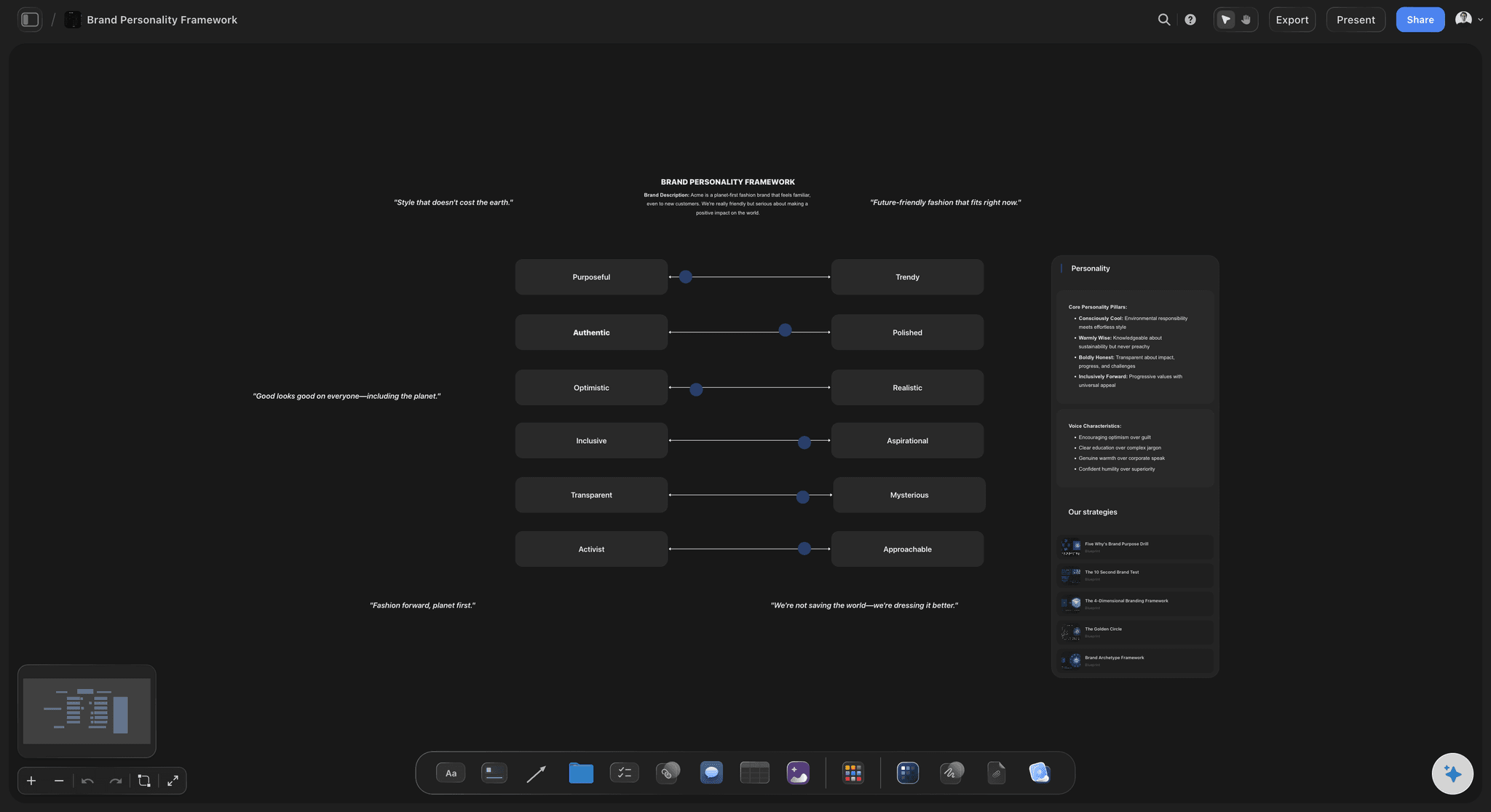
The type scale at real size with usage rules
Show the scale, then say when to use it
A type scale without usage rules produces inconsistent hierarchy, because everyone picks a size that feels right. Put the scale on the canvas at real size and write what each level is for.
See the brand guidelines generator →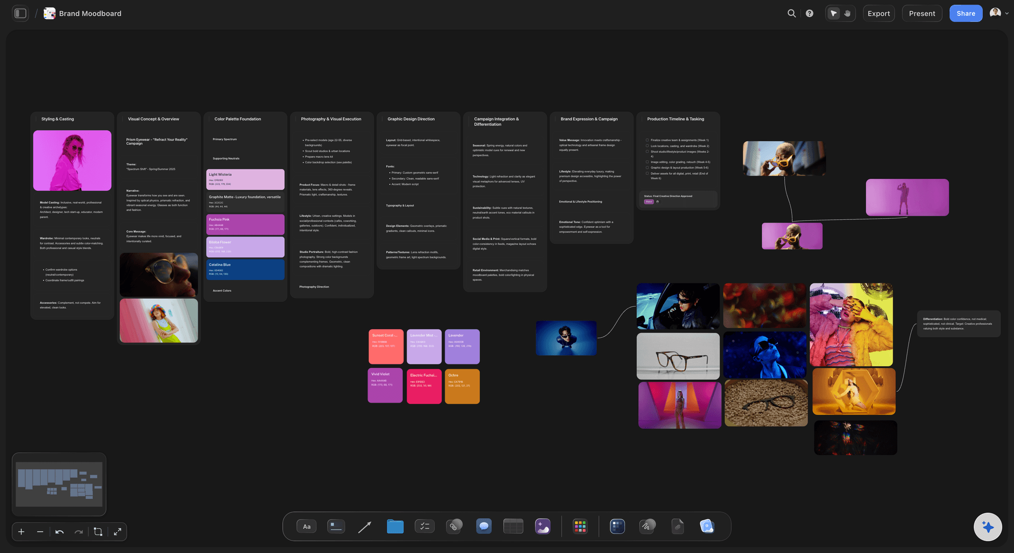
Colour with values, roles, and contrast notes
Give every colour a job
A palette without roles becomes decoration applied at random. Write what each colour is for, where it may appear, and which pairings meet contrast requirements.
See the free colour palette maker →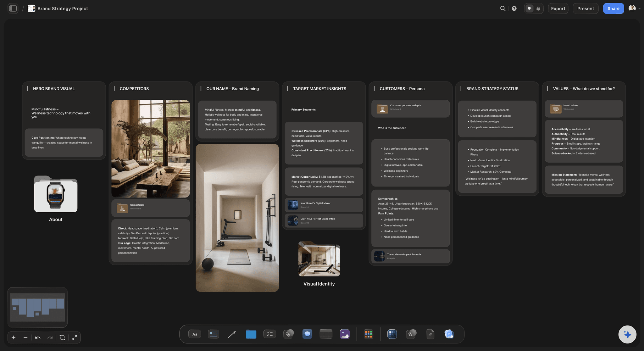
A wrong example beside every right one
Teach the boundary, not just the target
People learn a rule from where it breaks. Three specific wrong uses beside the correct one communicate more than a page of prose about brand integrity ever will.
See the brand moodboard →Voice shown as rewritten sentences
Make the tone concrete
Friendly but professional means nothing on its own. Show the same sentence written wrong and then right, and the tone becomes something a writer can actually reproduce.
See the AI brand voice generator →Unlimited boards. No object cap.
Open a canvas, lay out the sections, and start writing the rules down. Storyflow is paid-only during early access, with plans from $9.99 a month, and a Free plan launches before the end of 2026.
Unlimited style guides on an infinite canvas
Basic AI usage to generate boards from prompts
3 starter frameworks built in
Share view-only links with your team and partners
Built for people with taste
More than a page of swatches.
The test of a style guide is whether someone who was not in the room can use it.
Typography, colour, spacing, imagery, and voice
Cover every area with rules, not just examples
Typography with usage rules: The scale, weights, and line heights, plus what each level is actually for. Without the usage rule, everyone picks the size that feels right and the hierarchy drifts within a month.
Colour with roles and contrast: Values, the job each colour does, where it is allowed to appear, and which pairings meet contrast requirements. A palette without roles becomes decoration applied at random.
Spacing as a system: A scale with a rule for how it is applied, so that layouts nobody has designed yet still inherit the rhythm. Listing numbers without the system just moves the guesswork.
Imagery and voice with counter-examples: The two sections most often reduced to a mood board and an adjective. Both need wrong versions shown beside right ones, because that is the only way a boundary becomes legible.
AI that can see the board you have already built
Structure the guide with AI, set the rules yourself
Lay out the sections from a prompt: Describe the brand and the AI builds a structured guide with the standard sections ready to fill. It reads the active canvas as context, so it works with what you have already documented.
It structures, it does not decide: The AI has no view about what your brand should look like. Where it genuinely helps is drafting the wording of a rule you have already decided, and articulating the reason behind it.
Ask it for the gaps: A useful prompt is to ask what a new freelancer would still not know after reading this. It surfaces the unstated assumptions that make guides fail in practice.
Images, files, links, and colour on one canvas
Show the real thing, not a description of it
Real assets on the board: Drop logos, imagery, and screenshots of real applications of the brand. A guide illustrated with actual work is followed more closely than one illustrated with abstractions.
Keep the source files linked: Attach links to the logo files, fonts, and templates so that finding the asset is part of reading the rule rather than a separate hunt.
No object cap: Be as thorough as the brand needs. Adding twenty more examples costs nothing, and thoroughness in the imagery and voice sections is where guides usually run out of energy.
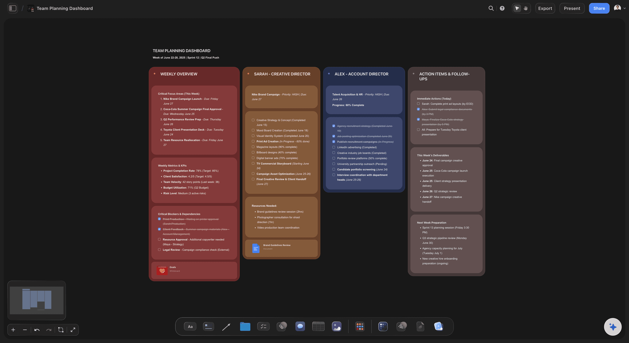
Share with the team, freelancers, and partners
A guide people can actually open
View-only links: Send a link and a freelancer reads the whole guide in a browser with no account. Style guides distributed as a 40 megabyte PDF get opened once and then approximated from memory.
Keep it current: A guide on a canvas can be updated in place, so the link people already have keeps pointing at the current version rather than at version four of nine.
Export for a client: Export as a high-quality image or PDF when a client needs a document for their records, while keeping the live board as the working version.
Explore templates for your project
Every template opens as a real, editable board on the infinite canvas. Pick the closest fit and make it your own.
Brand Strategy
Define your positioning, values, and voice and connect them into a strategy the team can follow.
One app instead of five
Storyflow vs Figma, a PDF, and Notion.
Each of these is genuinely better at part of this. Here is the split.
Storyflow
Recommended
See a whole section at once on a canvas
AI lays out the guide structure
Readable by anyone with a link, no seat
Live components linked to the design file
Precise typographic and layout control
Searchable structured documentation
Figma
See a whole section at once on a canvas
AI lays out the guide structure
Readable by anyone with a link, no seat
Live components linked to the design file
Precise typographic and layout control
Searchable structured documentation
See a whole section at once on a canvas
AI lays out the guide structure
Readable by anyone with a link, no seat
Live components linked to the design file
Precise typographic and layout control
Searchable structured documentation
Notion
See a whole section at once on a canvas
AI lays out the guide structure
Readable by anyone with a link, no seat
Live components linked to the design file
Precise typographic and layout control
Searchable structured documentation
What creators are saying
Join early creators getting structured workspaces and AI that remembers their projects
“Storyflow has sped up my workflow by at least 3x, which means more flow state and more projects I can actually ship. It truly changed the way me and my team create.”

Reilin Joey
Director & YouTuber
“One prompt gets me a structured board. But the tactics are my favorite. I run my YouTube scripts through them and my intros and retention got better. It's amazing.”

Justkay
YouTuber & Freelance Filmmaker
“I used to juggle five apps to plan a project. Now I describe what I am making and get boards, lists, and a schedule. All in one place.”

George
@fernwehchronicles
Style guide questions, answered.
What to include, why most guides fail, and where Figma is the better home.
Five areas, each with rules rather than only examples. Typography needs the scale, weights, and line heights plus a statement of what each level is used for. Colour needs values, the role each colour plays, where it may appear, and which pairings meet contrast requirements. Spacing needs a system with a rule for applying it, so layouts nobody has designed yet still inherit the rhythm. Imagery needs treatment and subject rules with counter-examples. Voice needs sample sentences shown wrong and then right. The two things that separate a guide people follow from one they admire are the reason behind each rule and the presence of wrong examples, because people learn boundaries from failure cases rather than from correct ones.
Storyflow documents a visual system in a way people can follow: type, colour, spacing, imagery and voice go on one canvas, with the reason beside every rule and a wrong example next to every right one. The AI lays out the structure of the guide and you set the rules yourself. Anyone with the link can read it. Figma still has live components linked to the design file, which Storyflow does not.
Usually for one of three reasons. The guide shows what the brand looks like without stating the rules, so a reader admires it and then guesses when they hit a case it did not cover. Or the rules have no reasons attached, which means they cannot be extended by judgment and get abandoned the first time reality does not match the examples. Or, most mundanely, the guide is a large PDF that lives in a shared drive, gets opened once, and is thereafter approximated from memory. The fix for the first two is writing reasons and counter-examples. The fix for the third is making it a link that is always current.
Not during early access. Storyflow is paid-only right now, with plans starting at $9.99 a month, and a Free plan launches before the end of 2026. Anyone a paid member invites to a board joins free today, so freelancers and partners can read and work from the guide without paying. If you want something free this minute, a well-structured document with real examples and counter-examples does most of this, and it is far better than a beautiful guide nobody opens.
A style guide documents the visual language: type, colour, spacing, imagery, and voice, expressed as rules a human reads and applies. A design system is a working library of components implemented in both design and code, where the rules are enforced by the components rather than by the reader's discipline. They serve different audiences and different levels of maturity. A style guide is what you need when work is produced by people making individual decisions, which covers most marketing, brand, and agency work. A design system is what you need when you are building a product interface at scale, and it usually assumes a style guide already exists underneath it.
If your guide is primarily for a product team and needs to link to live components, then yes, Figma is the better home, because the components in the guide can be the actual components people use. Where Figma is weaker is distribution: reading a Figma file well usually implies having Figma, and the people who most need a style guide are often freelancers, marketers, and partners who do not have it open. Storyflow's advantage here is a link anyone can open plus the ability to see a whole section at once. Plenty of teams keep component documentation in Figma and the broader brand guide somewhere more shareable.
It can build the structure and help with wording, and it should not be making the decisions. Describe the brand and the AI lays out the standard sections ready to fill, which removes the setup work. Once you have decided a rule, it is genuinely good at drafting a clear statement of it and articulating the reason behind it, which is often the part people find hardest. What it cannot do is decide what your brand should look or sound like. A useful prompt in the other direction is asking what a new freelancer would still not know after reading the guide, which reliably surfaces unstated assumptions.
Show sentences, not adjectives. Every brand describes its voice as some combination of friendly, professional, and human, and none of those words let a writer reproduce anything. What works is taking a real sentence, showing the version that is wrong for your brand, then the version that is right, and writing one line about what changed. Do that a dozen times across different contexts such as an error message, a marketing headline, a support reply, and a release note, and a writer can extrapolate. This is the section most often skipped and the one that most improves consistency in practice.
Keep it in one place that is edited in place rather than versioned as files, so the link people already have always points at the current guide. Versioned PDFs are the classic failure, because within a year there are five of them circulating and nobody knows which is current. It also helps to record the date and reason when a rule changes, since a rule that changed for a reason is more likely to stick than one that appears to have changed arbitrarily.
Yes. Share a view-only link and anyone opens the full guide in a browser with no account and nothing to install. This matters more than it might sound, because the audience for a style guide is disproportionately people outside your team: contractors, agency partners, printers, and new hires who have not been granted tool access yet. If you want someone to contribute, invite them to the board and they join free when invited by a paid member.
Yes, and the adjacency is useful. The style guide can sit beside the brand strategy, the positioning work, the moodboards that informed the visual direction, and the customer personas the brand is speaking to. When someone asks why the palette is what it is, the answer is one scroll away rather than in a deck from eighteen months ago that nobody can find.
Write the rules down with the reasons attached.
Open a canvas, lay out the sections, and build a guide people can use. No download.