How to Create a Brand Book (Step-by-Step, 2026)
A founder's step-by-step guide to creating a brand book that keeps a brand consistent at scale: strategy, logo rules, color, typography, imagery, voice, applications, and where to organize versus design the final document.

Category
Branding
Author

Justkay
Documentary Filmmaker & Founder at Storyflow
Topics
2026-07-22
•
18 min read
•
Branding- how to create a brand book
- brand book
- brand guidelines
- brand book template
- brand book example
- brand style guide
How do you create a brand book?
To create a brand book, define the brand strategy first, then finalize every visual and verbal element as a rule rather than a suggestion: the logo and its usage and misuse, the color palette with exact codes, the typography and hierarchy, the imagery and photography style, the iconography and graphic elements, and the voice and tone with real examples. Organize all of it on one board so you can see the whole system at once and catch what clashes, then design and deliver the finished document in Figma, InDesign, or Canva and keep a living version you actually update. A brand book is the single source of truth that lets anyone, an in-house designer, a freelancer, a marketing team, or an outside agency, represent the brand correctly without asking you first, so its job is not to look impressive but to make the brand reproducible by people who were not in the founding room. Everything below is how to build each section and where the organizing tool stops and the design tool takes over. I am a filmmaker and a founder, not a career brand designer, and I want to be honest about that from the first line, because the internet is full of brand-book guides written as if everyone reading runs a design studio. I have had to build a brand for Storyflow from nothing: pick the colors, commission and wrangle a logo, decide how we sound in a help doc versus a launch post, and then write all of it down so the next person did not reinvent it and drift. That last part, writing it down as rules, is the brand book, and it is the step almost everyone skips until the brand is already inconsistent across a website, a deck, an app store listing, and three contractors' interpretations. This guide is the working method I used and refined, the sections a brand book needs, and the honest place where the organizing canvas hands off to the design tool that lays out the final pages.

Full disclosure: Storyflow is our own product, so weigh its placement with the skepticism you would apply to any tool a company recommends on its own blog. We rank it first for one job, gathering references and organizing every brand element on one AI-readable canvas, and we are explicit that the final designed brand book is built and delivered in Figma, InDesign, or Canva.
Quick Comparison
Where teams actually organize and deliver a brand book, and the one job each tool is best at.
| Tool | Best For | AI Features | Price |
|---|---|---|---|
| Storyflow | Gathering references + organizing elements | Reads the whole board | $7.99 mo annual (free plan late 2026) |
| Figma | Designing + hosting final guidelines | Limited | Free / ~$16 editor |
| InDesign | Print-ready designed PDF | Limited | Paid (Adobe CC) |
| Canva | Fast brand book with templates | Limited | Free / Brand Kit |
Why a Brand Book Keeps a Brand Consistent
A brand book matters because a brand is not one person's taste, it is a set of decisions that dozens of people have to reproduce, often without ever talking to you. The moment your brand touches more than one hand, a designer and a marketer, an agency and a founder, a full-time team and a weekend freelancer, consistency stops being something you feel and becomes something you have to specify. A brand book is that specification. It is the difference between a brand that looks like itself on every surface and a brand that looks like five different companies depending on who made the asset that day.
Here is what makes it different from a moodboard, because this is where most people get stuck. A moodboard is where you decide what the brand should feel like, and it is deliberately loose: images, textures, competitor references, colors you are drawn to, all pinned up while the identity is still forming. A brand book is what you write after those decisions are made, and it is deliberately strict: this exact blue, this exact typeface at these exact sizes, this much clear space around the logo, this tone in an error message. The moodboard asks a question and the brand book answers it. If your document still feels like inspiration, you have a moodboard, not a brand book, and no one can build from it consistently.
The reader matters more than the author here, so it is worth being precise about who actually uses a brand book. An in-house designer uses it to make on-brand assets fast without guessing. A freelancer or agency uses it to match a brand they did not create, which is the entire reason it has to be explicit rather than vibes. A marketing or social team uses it to keep captions, thumbnails, and ads sounding and looking like the brand under deadline pressure. A developer uses the color and type tokens to build an interface that matches the marketing site. A partner or reseller uses it to represent your brand in their own materials without embarrassing either of you. One document has to serve all of them, which is why a brand book is written outward from what people need to reproduce, not inward from what the founder happens to like.
I have watched good brands go blurry inside a year, not because anyone made a bad decision, but because no one wrote the decisions down, so every new hire and every contractor made a slightly different guess and the brand drifted a few degrees at a time until it did not look like anything. The brand book is the anchor. It does not make people follow the rules, but it removes the excuse that the rules were never clear, and that alone keeps a brand recognizable as it scales past the people who invented it.
What Goes in a Brand Book
Every brand book that actually keeps a brand consistent, whether it is eight pages or eighty, carries the same core sections, whether the author labels them formally or not. The length varies with the size of the brand, but the working parts do not change. Here is the anatomy, in the order a reader wants to meet them, because a brand book is read top to bottom by someone learning the brand for the first time.
- Brand strategy, positioning, and values. The why before the what: who the brand is for, what it stands for, its personality and promise. Every visual and verbal rule that follows should trace back to this, or it is decoration.
- Logo and its usage. The primary logo, its variations (stacked, horizontal, icon-only, reversed), the minimum size, the clear space around it, and the placements it is allowed in.
- Logo misuse. The explicit list of what not to do to the logo: do not stretch it, recolor it, add effects, place it on clashing backgrounds, or rebuild it. This section prevents more damage than any other.
- Color palette with codes. The primary and secondary colors with exact values in every format that matters (HEX for web, RGB for screen, CMYK for print, and often a Pantone for physical production), plus how the colors are used together and in what proportion.
- Typography and hierarchy. The brand typefaces, the fallback fonts, and the hierarchy: how headings, subheadings, body, and captions are sized and spaced so text looks like the brand everywhere.
- Imagery and photography style. The look of the photos and images: subject, treatment, color grade, composition, and what to avoid, so a stock photo search or a shoot produces on-brand images instead of generic ones.
- Iconography and graphic elements. The icon style, any signature shapes, patterns, or graphic devices, and how they are used, so the small visual details stay consistent too.
- Voice and tone with examples. How the brand sounds and how the tone shifts by context, shown with real before-and-after examples, because voice is impossible to follow from adjectives alone.
- Applications and mockups. The brand shown in the wild: a website, a business card, an app screen, a social post, packaging, so people can see the system working together rather than as isolated rules.
- Do's and don'ts. A quick, scannable summary of the most important rules, the section people actually flip to under deadline pressure.
The order is deliberate. A reader wants the strategy first so every rule has a reason, the logo and its misuse next because it is the most recognized and most abused asset, then the color and type that carry the brand across the most surfaces, then imagery and iconography for the finer texture, then voice so the words match the visuals, and finally applications and a do's-and-don'ts summary so they can see it working and check themselves fast. Skip the strategy and the rest reads as arbitrary. Skip the misuse and applications and people follow the rules in theory and break the brand in practice. The rest of this guide is how to build each part so the brand survives contact with people who were not there when you made it.
Quick Picks: Where to Build a Brand Book
Best for gathering references and organizing every brand element before design: Storyflow. The surface where the moodboard references, the logo options, the color swatches, the type specimens, and the voice notes all live on one infinite canvas, and the AI reads the whole board so it can help you draft the strategy, name the values, and write the voice examples from everything at once. Plus is $7.99/month billed annually. The honest limit: it organizes and drafts the brand book, but the final designed pages are laid out in a design tool.
Best for designing and delivering the final brand guidelines: Figma. When the brand book has to be a designed, shareable document (or a live guidelines file that engineers and designers pull tokens from), Figma is where most modern teams build and host it. Free tier, paid from around $16/editor per month.
Best for an art-directed, print-ready brand book PDF: InDesign. When the delivery has to look like a finished publication with real typography and laid-in imagery, Adobe InDesign is the classic tool. Paid (Adobe Creative Cloud).
Best for a fast, accessible brand book without a design team: Canva. When you want an on-brand document quickly using templates and a built-in Brand Kit, Canva is the most approachable option. Free with a paid Brand Kit tier.
The honest split: most teams gather references and organize every brand element where they can see the whole system at once, then design and deliver the final brand book in Figma, InDesign, or Canva, and keep a living version they update. Try Storyflow to organize your brand book.
Comparison Table: Where to Build a Brand Book
| Tool | Best for | AI on the draft | Visual organizing | Free tier | Starting price |
|---|---|---|---|---|---|
Storyflow | Gathering references and organizing every element | Reads the whole board | Yes, infinite canvas | Coming late 2026 (invited collaborators join free now) | $7.99/mo annual |
Figma | Designing and hosting the final guidelines | Limited | Yes, design canvas | Yes | ~$16/editor mo |
InDesign | An art-directed, print-ready PDF | Limited | Page layout | No | Paid (Adobe CC) |
Canva | A fast brand book with templates | Limited | Template-based | Yes | Free + Brand Kit |
Notion | A simple living brand doc | Notion AI | Limited | Yes | Free + paid |
Google Docs | A plain, shareable text version | Gemini add-on | No | Yes | Free |
Pricing checked July 2026. Competitor prices move and are quoted per plan, so verify on each vendor's page. Storyflow is paid-only during early access, and its Free plan (which will run the whole organizing and drafting method) launches before the end of 2026; the paid tier adds the 200+ Story Blueprints and unlimited file uploads. Whichever tool you organize in, the final brand book is a designed document, so choose the design and delivery tool for the people who will use it, not for the tool you drafted in.
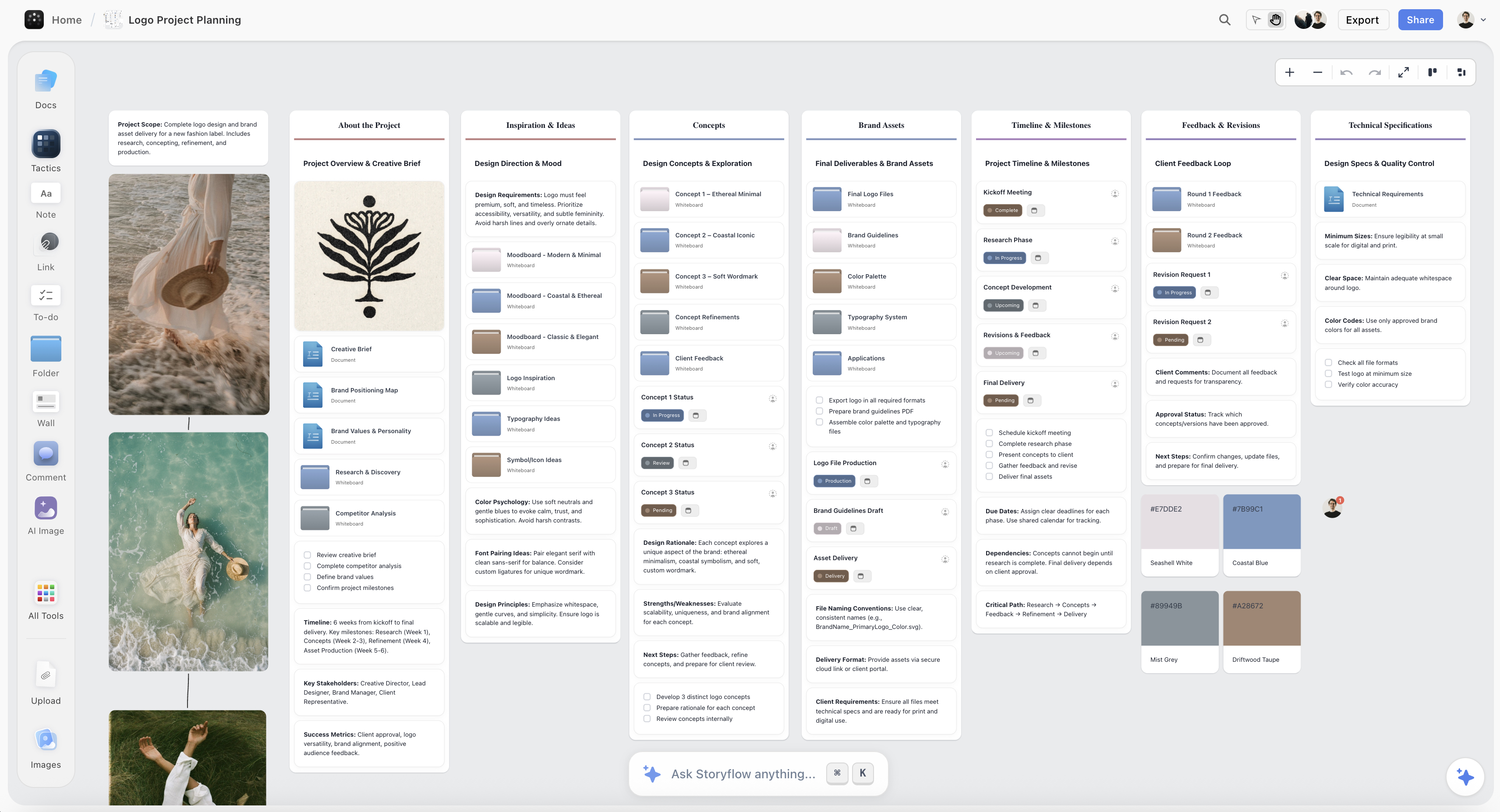
A brand book organized on the Storyflow canvas, with the strategy, logo variations, color swatches, type specimens, and voice notes on one board
Organize your brand book on one canvas
The strategy, the reference wall, the logo variations, the color swatches, the type specimens, and the voice examples live in one place, and the AI reads the whole board so it can draft the strategy, name the values, and write the voice examples, before you design and deliver the final book in Figma, InDesign, or Canva.

How to Create a Brand Book, Step by Step
Here is the full method, from a blank canvas to a delivered brand book. It assumes a single brand at the stage where the identity is roughly decided and needs to be finalized and documented. Work in this order, because each section depends on the ones before it, and the strategy has to come first or everything after it is guesswork with a color picker.
Step 1: Nail the brand strategy first
Start with strategy, because a brand book is a set of rules and rules need a reason. Before you specify a single color, write down who the brand is for, what it promises, what it stands for, and its personality: the handful of traits that describe how it should come across (confident and plain, or playful and warm, or precise and quiet). This is the layer that makes every later decision defensible: the palette, the typeface, and the tone should all express this personality, and if they do not, you will feel the mismatch without being able to name it. I write the strategy as a short, blunt page, not a manifesto, because the point is to guide decisions, not to sound impressive. If you cannot say who the brand is for and how it should feel in a few sentences, you are not ready to make rules about how it looks, and the brand book will document taste instead of a brand.
Step 2: Gather references and audit what you already have
Before you finalize anything, pull everything into one place: the moodboard references that shaped the direction, the logo files and their variations, the colors you have been using, the fonts, the best existing photos and graphics, and screenshots of how the brand currently appears in the wild. This is the honest audit step, and it is where inconsistency becomes visible, because the moment you see the real website blue next to the deck blue next to the app blue, you know they do not match. Gathering is also where the moodboard and the brand book briefly overlap: the references are still inspiration, but you are now sorting them toward decisions. I do this on one infinite canvas in Storyflow, so the references, the current-state screenshots, and the raw assets sit side by side and I can group them, because you cannot write consistent rules for a brand you cannot see all at once.
Step 3: Define the logo and its usage rules
Now finalize the logo section, which is usually the most recognized and most misused part of a brand. Specify the primary logo and every approved variation the brand needs: a stacked version, a horizontal version, an icon-only mark for small spaces, and a reversed version for dark backgrounds. Then write the usage rules that keep it legible and consistent: the minimum size it can appear at, the clear space that must surround it (usually expressed as a fraction of the logo's own height), and the backgrounds and placements it is allowed in. These rules feel fussy until you see a logo squashed into a tiny corner with text crowding it, at which point you understand that the rules are the only thing standing between your mark and every well-meaning person who will resize it. Provide the actual files in every format people need, because a rule with no downloadable asset next to it gets ignored.
Step 4: Show the logo misuse explicitly
Right after usage, show misuse, because telling people what to do is half the job and showing them what not to do is the half that actually prevents damage. Make a clear, visual list of the things people do to logos that wreck them: stretching or squashing the proportions, changing the colors, adding shadows or gradients or outlines, rotating it, placing it on a busy or clashing background, recreating it in the wrong font, or crowding it with other elements. Each one should be shown as a crossed-out example, not just described, because a picture of the wrong version is instantly understood where a sentence is skimmed. This is the single highest-leverage page in most brand books: the logo is the asset the most people touch, and the misuse page is what stops a contractor, a partner, or a rushed team member from quietly degrading it. Be specific to your logo, because generic misuse rules do not catch the mistakes your particular mark invites.
Step 5: Lock the color palette with codes
Define the color palette as exact values, not names, because "our blue" means a different thing to every screen and printer it touches. Specify the primary colors and the secondary or accent colors, and give each one its value in every format that matters: HEX for web, RGB for digital screens, CMYK for print, and a Pantone reference if the brand appears in physical production where color matching is critical. Then, and this is the part people skip, specify how the colors are used together: which is dominant, which are accents, the proportions, and which combinations are off-limits for contrast or accessibility reasons. A palette without usage rules produces technically on-brand assets that still look wrong because someone made the accent color the background. Include the colors for text, for backgrounds, and for interactive states if the brand has a product, so the marketing site and the app finally match. Exact codes plus usage rules are what make a color reproducible by someone who has never seen your brand.
Step 6: Set the typography and hierarchy
Specify the typefaces and, just as importantly, the hierarchy, because type is what carries the brand across the most words on the most surfaces. Name the primary brand typeface, any secondary typeface, and the fallback or system fonts to use when the brand fonts are not available (in an email, or a partner's template). Then define the hierarchy: the sizes, weights, and spacing for headings, subheadings, body text, captions, and buttons, so a heading looks like a brand heading whether a designer or a marketer made it. If the brand has a product, include the interface type scale so the app and the marketing match. Show the type in use with real sentences, not just the alphabet, because people need to see how it reads at paragraph length. Typography is where amateur brand books stop at "we use this font" and professional ones specify the whole system, and the system is what actually keeps text consistent.
Step 7: Define the imagery and photography style
Tell people what on-brand images look like, because imagery is where brands drift fastest when a team is grabbing stock photos under deadline. Describe the subject matter, the treatment (natural and candid, or styled and composed), the color grade, the composition, and the mood, and show approved examples beside off-brand ones so the contrast is clear. If the brand shoots its own photography, specify the direction so a photographer can deliver on-brand frames; if it relies on stock, describe what to search for and what to reject, because "a laptop on a desk" returns ten thousand generic images and only some of them look like your brand. Include any rules for illustration, screenshots, or product imagery if those appear. Imagery is half of what people see before they read a word, and a brand book that specifies the logo down to the pixel but leaves imagery to chance will look inconsistent no matter how tight the logo rules are.
Step 8: Add iconography and graphic elements
Specify the smaller visual details that most brand books forget until they are inconsistent: the icon style (outlined or filled, rounded or sharp, the stroke weight), any signature shapes, patterns, textures, or graphic devices the brand uses, and how they are applied. These elements are what give a brand texture beyond the logo and color, and they are exactly the kind of thing a new designer will reinvent in a slightly different style if there is no rule. If the brand has a product with a UI, the icon set is not optional, it is a functional system that has to stay consistent. Keep this section practical: show the elements, show them in use, and note what to avoid. It is a smaller section than logo or color, but skipping it is why the icons in the app look different from the icons in the deck.
Step 9: Write the voice and tone with examples
Document how the brand sounds, and do it with examples, because voice is the section that adjectives cannot carry. Start with the personality traits from the strategy and translate them into how the brand actually writes: the vocabulary it uses and avoids, the sentence length, the level of formality, whether it uses humor, and how it handles things like errors and bad news. Then, and this is what separates a usable voice section from a decorative one, show real before-and-after examples: a generic sentence rewritten in the brand's voice, a button label, an error message, a social caption, a welcome email. Also specify how the tone shifts by context, because the same brand should sound reassuring in an error state and energetic in a launch announcement without becoming two different brands. Anyone can follow "friendly but professional" in ten different directions; only examples pin it down. Voice is where a brand feels like one person or a committee, and the examples are what keep it one person.
Step 10: Show applications, mockups, and the do's and don'ts
Bring it together by showing the brand in the wild and summarizing the rules people will actually reach for. Applications and mockups (a website header, a business card, an app screen, a social post, packaging, a slide) let people see the whole system working as a brand rather than as a list of isolated specifications, and they catch clashes that individual rules miss, like a palette that looks great as swatches and terrible as a full page. Then write the do's and don'ts: a short, scannable summary of the most important and most-broken rules, because under deadline pressure people do not read the whole book, they flip to the cheat sheet. This is also a good place to point to where the real files live (the logo pack, the fonts, the templates) so following the rules is the path of least resistance. A brand book that shows the brand working and hands people a quick reference gets followed; one that is all rules and no examples gets admired once and ignored.
Step 11: Organize it all on one board, then design and deliver the final brand book
Do not build these sections in isolation, and do not jump straight into a design tool. A brand book is strongest when you first organize every element in one place where you can see the whole system at once, because the palette affects the imagery, the typography affects the applications, and the voice has to match the visuals, and you can only judge that when it is all on one surface. This is why I organize brand books on one infinite canvas in Storyflow: the strategy notes, the reference wall, the logo variations, the color swatches, the type specimens, the imagery examples, and the voice drafts all sit together, I can pull a reference frame or a competitor screenshot straight onto the board, and the AI reads the whole canvas so it can help me draft the strategy, name the values, or write the voice examples from everything at once. When the system is organized and the decisions are made, I move to the delivery: design and lay out the final brand book in Figma, InDesign, or Canva, and keep a living version, because a brand book that is finished once and never updated is out of date the first time the brand evolves. Organize where you can see the whole brand; design and deliver where the pages get made.
Where to Design and Deliver the Final Brand Book
Here is the honest part, because the tool you organize in and the tool you design the final document in are not the same choice, and getting it wrong wastes weeks.
An organizing canvas is the right place to gather references, audit the current brand, and draft the strategy and voice, because that work is messy, visual, and non-linear, and it needs a surface where everything is visible at once and nothing is locked into a page yet. This is where a tool like Storyflow earns its place: it holds the whole brand as a system while you are still deciding and drafting, and its AI can work from the actual board rather than generic prompts. What it is not is a page-layout tool, and pretending an organizing canvas is your final deliverable is how you end up with a board no one outside the team can read as a brand book.
A design tool is the right place to produce the final document. Figma is where most modern teams build and host brand guidelines, especially when engineers and designers need to pull real tokens from a live file. InDesign is the classic choice when the brand book has to be a polished, print-ready publication with real typography and laid-in imagery. Canva is the fastest route when there is no dedicated design team and templates plus a Brand Kit will do. The choice depends on who uses the book and whether it needs to be a living file or a fixed PDF, and that is a delivery decision, not an organizing one.
So the workflow that actually works is: organize and draft the brand book where you can see the whole system (a canvas like Storyflow, where the references, elements, and voice sit together and the AI reads everything), then design and deliver it in the tool your team and partners will actually use, and keep it living. Storyflow is honest about this boundary: it is where the brand book is gathered, organized, and argued, not where the final page design happens. Match the delivery tool to the people who will build from the book, and never let the drafting tool decide the final format.
Common Brand Book Mistakes
- Confusing a moodboard with a brand book. A wall of inspiration is not a rulebook. If your document still asks "what should this feel like" instead of answering "here are the exact rules," it is a moodboard, and no one can build consistently from it.
- Treating the logo as the whole brand. A logo is one asset among many. A brand book that nails the logo and leaves color, type, imagery, and voice vague will be inconsistent everywhere the logo is not.
- Colors named, not coded. "Our blue" is not a specification. Without HEX, RGB, CMYK, and where needed Pantone values, plus usage proportions, every screen and printer produces a different blue.
- Usage rules with no misuse examples. Telling people what to do is half the job. The crossed-out misuse examples are what actually stop the logo from being stretched, recolored, and wrecked.
- Voice described in adjectives only. "Friendly but professional" can be followed in ten directions. Without real before-and-after examples, the voice section is decoration, not a rule anyone can follow.
- No applications or mockups. Rules in isolation hide clashes. Without the brand shown working on a real website, card, and screen, a palette that looks fine as swatches can fall apart as a full page.
- Skipping the strategy. A brand book with no positioning, audience, or personality documents taste, not a brand, and every rule reads as arbitrary because nothing explains why it exists.
- Finished once, never updated. A brand book that is delivered and forgotten is out of date the first time the brand evolves. The version that keeps a brand consistent is the living one people actually maintain.
The Bottom Line
A brand book is not a moodboard and it is not a logo. It is the finalized set of rules that lets anyone represent a brand correctly without you in the room, which is the only thing that keeps a brand recognizable as it scales past the people who invented it. Define the strategy first so every rule has a reason, then specify the logo and its misuse, the color palette with exact codes, the typography and hierarchy, the imagery style, the iconography, and the voice with real examples, and show it all working in real applications. Document decisions as rules, not inspiration, and the brand survives contact with contractors, teams, and partners who were never in the founding room.
The honest boundary holds. Organize and draft the brand book where you can see the whole system at once, the references beside the elements beside the voice, with AI that reads the board, and then design and deliver it in the tool your team will actually build from, Figma, InDesign, or Canva, and keep a living version you update. The tool where you organize the brand and the tool where you design the final document are two different choices, and the brand that stays consistent is the one where someone made both on purpose.
If your brand still lives in your head and a scatter of files rather than a rulebook anyone can follow, organize your brand book on one canvas in Storyflow and write the decisions down as rules.
FAQ: Brand Books
What is a brand book?
A brand book, also called brand guidelines or a style guide, is a document that defines how a brand looks, sounds, and behaves, so anyone can represent it consistently without asking the founder or lead designer first. It finalizes the brand's strategy and personality and then specifies the rules for every element: the logo and its usage and misuse, the color palette with exact codes, the typography and hierarchy, the imagery and photography style, the iconography and graphic elements, the voice and tone with examples, and how it all applies across real surfaces. Unlike a moodboard, which is loose inspiration gathered while the brand is still forming, a brand book is the settled decisions written as strict rules a stranger can follow. Its purpose is consistency at scale: as more people and partners touch the brand, the book is what keeps it recognizable instead of drifting into five different-looking versions.
What is the difference between a brand book and a moodboard?
A moodboard is inspiration and a brand book is the finalized rules, and confusing them is the most common mistake in the process. A moodboard is deliberately loose: a wall of images, colors, textures, and references you gather while you are still deciding what the brand should feel like, and its job is to explore a direction. A brand book is deliberately strict: it comes after the decisions are made and specifies exact color codes, logo spacing, type sizes, and voice examples so the brand can be reproduced consistently by people who were not part of the decisions. The moodboard asks what the brand should feel like; the brand book answers it and turns the answer into rules. You usually make a moodboard first, use it to decide the direction, and then write the brand book to lock that direction down. If your document still feels like inspiration rather than instructions, it is a moodboard, not a brand book.
What should a brand book include?
A complete brand book includes the brand strategy and positioning (who it is for, what it stands for, its personality), the logo with its usage rules and a misuse section, the color palette with exact codes in HEX, RGB, CMYK, and often Pantone, the typography and hierarchy, the imagery and photography style, the iconography and graphic elements, the voice and tone with real examples, applications or mockups showing the brand in use, and a do's-and-don'ts summary. The strategy comes first because it justifies every rule that follows. The logo, color, and typography sections carry the brand across the most surfaces, so they need the most precision. The imagery, iconography, and voice sections cover the finer texture that people forget until it is inconsistent. The applications and do's-and-don'ts sections show the system working and give people a quick reference under deadline pressure. Length varies with the size of the brand, but these are the working parts.
How long should a brand book be?
It depends entirely on the size and complexity of the brand, and longer is not better. A small brand or a startup can document everything it needs in eight to twenty pages: strategy, logo, color, type, voice, and a few applications. A large brand with many products, sub-brands, and channels can run to eighty pages or more because it has more elements to specify and more edge cases to cover. The right length is however many pages it takes to make the brand reproducible and no more, because a brand book that is padded to look substantial is a brand book no one reads, and an unread brand book keeps nothing consistent. Start with the sections that matter most (logo, color, type, voice) and expand only where real inconsistency is happening. A tight, followed twelve-page book beats a comprehensive fifty-page book that sits in a drive unopened.
What tools do you use to make a brand book?
Most teams use two kinds of tools: one to gather references and organize every brand element, and another to design and deliver the final document. For organizing and drafting, an infinite canvas like Storyflow holds the references, logo options, color swatches, type specimens, and voice notes on one board where you can see the whole system, and its AI reads the board to help you draft the strategy and voice. For designing and delivering the finished book, Figma is where most modern teams build and host guidelines, InDesign produces an art-directed print-ready PDF, and Canva is the fastest route for teams without a dedicated designer. The honest split is that you organize where you can see everything at once and then design and deliver in the tool your team and partners will actually build from. Google Docs or Notion also work for a simple, text-first living brand doc when a full designed book is more than the brand needs.
Can AI help create a brand book?
Yes, for organizing and drafting the content, not for inventing the brand. AI is useful for drafting a first pass of the strategy, suggesting value statements to react to, writing the before-and-after voice examples, and pressure-testing whether the personality traits actually show up in the copy. Because Storyflow's AI reads your full canvas board, plus up to 1 Tactic and 3 Documents you reference, it can work from your actual references, colors, and notes rather than generic prompts, which makes its help specific to your brand instead of boilerplate. What AI cannot do is decide who the brand is for, choose the identity, or supply the taste and judgment that make a brand feel authored rather than generated, and a brand book that reads as AI-generated will produce a brand that feels like everyone else's. Use AI to draft, organize, and tighten, and bring the strategy, the decisions, and the point of view yourself.
Is a brand book the same as a logo?
No, and treating them as the same is a common and expensive mistake. A logo is a single visual asset, and it lives inside the brand book alongside the color palette, the typography, the imagery style, the iconography, and the voice. A brand that thinks a logo is a brand will be consistent only in the one place the logo appears and inconsistent everywhere else, which is most places: the copy, the photography, the color of a button, the tone of a support reply. The logo is usually the most recognized element, which is exactly why it gets its own usage and misuse sections in the brand book, but it is one section of many. A brand book exists precisely because a logo is not enough to keep a brand recognizable at scale, and the sections around the logo are what carry the brand across every surface the logo does not touch.
Is Storyflow free for organizing a brand book?
Not during early access. Storyflow is paid-only right now, though anyone invited to a board by a paid member joins free and can invite others. Storyflow's Free plan, which launches before the end of 2026, will include unlimited objects and boards, unlimited collaboration, basic AI, and 20 file uploads, enough to organize a full brand book: the strategy notes, the reference wall, the logo variations, the color swatches, the type specimens, and the voice drafts on one canvas. Paid tiers start at Plus for $7.99/month billed annually ($9.99 monthly), which adds the 200+ Story Blueprints and unlimited file uploads, with Pro at $14/month and Max at $39/month for more AI and, on Pro and Max, AI image generation for exploring visual directions. There is no separate Team plan; Max is the team tier. The Free plan will run the whole organizing and drafting method once it lands, so you will be able to gather and structure the entire brand book and share the board with collaborators, then design and deliver the final document in Figma, InDesign, or Canva. Storyflow organizes and drafts the brand book; the final page design happens in a design tool.
Table of Contents
- Why a Brand Book Keeps a Brand Consistent
- What Goes in a Brand Book
- Quick Picks: Where to Build a Brand Book
- Comparison Table: Where to Build a Brand Book
- How to Create a Brand Book, Step by Step
- Where to Design and Deliver the Final Brand Book
- Common Brand Book Mistakes
- The Bottom Line
- Author
- FAQ: Brand Books
- Related Reading
Templates to check out for this topic


Templates you can use in Storyflow
Every Storyflow board starts from real structure and an AI that reads the whole canvas. Open one of these templates and make it yours.


See Storyflow in Action
A visual AI workspace where every feature lives inside one canvas. No tab-switching, no context lost.
Build your entire board from a single message
Type what you need in the AI chat at the bottom of your canvas. The AI adds cards, headings, and structure directly onto your board.
Use expert frameworks as AI context
Type @ in the AI chat and choose any Tactic. The AI tailors every response to that framework instead of giving generic advice.
Turn your board into a mind map in seconds
Ask the AI to restructure your canvas as a mindmap. It connects your ideas into a visual hierarchy so you can see how everything relates.
Why Storyflow Exists
Storyflow actually began as a personal tool while working on creative and research projects.
We kept running into the same problem: ideas were scattered everywhere: notes, documents, and whiteboards.
Nothing helped us see how everything connected.
So we started building a workspace designed around how ideas actually grow.
→ Read how Storyflow was createdJustkay
Documentary Filmmaker & Founder at Storyflow
Published: 2026-07-22
Extremely simple, seriously capable


See how easy it is to get started
Watch a real project come together, from a blank board to a finished plan, clicked through step by step.
Start creating with AI and become more productive
Transform your creative workflow with AI-powered tools. Generate ideas, create content, and boost your productivity in minutes instead of hours.