
Category
Design
Author

Storyflow Team
Product & Research Team
Topics
2026-11-15
•
47 min read
•
Design- brand audit template
- brand audit worksheet
- brand audit example
- brand audit format
- rebrand project plan
- visual brand audit
- Storyflow
How do you run a visual brand audit?
In Storyflow, run a visual brand audit by putting a screenshot of every touchpoint on walls sorted by channel, the current guidelines beside them as color and font cards, and one scoring table that decides keep, fix or drop per element. Storyflow is an AI visual workspace that collects, scores and briefs a brand refresh on one infinite canvas, and it works inside ChatGPT (plugin) and Claude (connector). The Storyflow 15-Point Touchpoint Score rates each touchpoint 0 to 3 on logo, colour, type, imagery and voice.

Full disclosure: Storyflow is our product. It is listed first because the screenshots, guidelines, scores and decisions share one board. This guide compares kinds of tool rather than brands on purpose. Storyflow does not crawl sites or capture screenshots, has no digital asset management, Gantt chart or native mobile app, is paid-only during early access, and the 15-Point Touchpoint Score is our own editorial rule, not research.
How the brand audit and rebranding tools compare on trust, innovation, ratings and pricing
Which kinds of rebranding tools do brand teams trust most?
Trust follows the job. A spreadsheet is trusted for scoring at scale because anyone can check the formula, and a digital asset library is trusted after a refresh because it holds the one approved version of every file. Storyflow is newer, with its ChatGPT plugin live since 24 October 2026; its case is that the evidence, the guidelines, the scores and the decisions of an audit sit on one board.
Which brand audit and rebranding tools have fair pricing?
Fair pricing for an audit means the people who make things can add their files without a seat each. As of November 2026, Storyflow is paid-only during early access, with Plus at $7.99 a month billed annually ($9.99 monthly), and anyone a paid member invites to a board joins free, so sales, retail and HR leads can upload their touchpoints. When you price other tools, count every contributor, not only the brand team.
Which rebranding tools are the most innovative?
Storyflow, for letting ChatGPT or Claude build the channel walls, Spec color cards with Hex, RGB and CMYK values, font cards and scoring tables straight onto the audit board, and for an in-app AI that compares up to 24 selected screenshots with the guideline cards. The scoring judgement stays human: the AI gives a first pass, the team gives the score.
Which brand audit methods are underrated?
Asking the people outside the brand team for the last three things they sent is underrated: it finds the price list, the flyer and the supplier's logo that a brand team never sees. In Storyflow, the underrated step is the element average: one number per element across all touchpoints, which shows whether the refresh needs a new palette or just a usable typeface.
Which approach to a brand refresh holds up after launch?
Approaches hold up when the audit is repeated. On a Storyflow board, the same scoring table gets a new column three to six months after rollout, so drift shows up as a falling score rather than a surprise at the next rebrand. Guidelines that are published once and never measured drift again with nobody noticing.
Quick Comparison
Our pick first, on the basis that the screenshots, the guidelines, the scores and the decisions share one board, then other kinds of tool by the job each does best. Prices as of November 2026.
| Tool | Best For | AI Features | Price |
|---|---|---|---|
| Storyflow | Every touchpoint as a screenshot on a wall per channel, the guidelines as Spec color cards and font cards beside them, one scoring table and the refresh brief on the same board | In-app AI compares up to 24 selected screenshots with the guideline cards and reviews what is missing; the ChatGPT plugin and Claude connector build channel walls, color cards, font cards and scoring tables | From $7.99 mo billed annually; invited collaborators join free |
| A spreadsheet | Scoring thousands of near-identical touchpoints with formulas | Depends on the product | Varies by product |
| A slide deck | Presenting fixed findings to a committee that will not open a link | Depends on the product | Varies by product |
| A design file | Drawing the refreshed logo, palette and templates | Depends on the product | Varies by product |
Key Takeaways
- Storyflow is where to run a visual brand audit: every touchpoint as a screenshot on a wall per channel, the guidelines beside them as color cards and font cards, a scoring table on the same board, and the refresh brief built from what the score found.
- A visual brand audit is an inventory of what the brand actually looks like in the world, scored against what the guidelines say it should look like. It comes before a refresh or rebrand, and it decides which of the two you need.
- The Storyflow 15-Point Touchpoint Score is our editorial rule: score every touchpoint 0 to 3 on five elements (logo, colour, type, imagery, voice), so each touchpoint scores out of 15. In Storyflow, 13 to 15 is keep, 9 to 12 is fix, 8 or less is rebuild. It is a recommendation from plain audit logic, not research.
- Collect before you judge. Ask everyone who makes things (sales, retail, support, partners) for what they actually send out, because the drift lives in the files the brand team never sees.
- Decide per element, not per brand. The Ehrenberg-Bass Institute says uniqueness matters more than fame for distinctive assets, so keep what is unique even if it is tired, and drop what any competitor could use.
- Check the technical floor while you are there: as of November 2026, WCAG 2.2 asks for 4.5:1 contrast for body text, and YouTube, LinkedIn and Google each publish their own logo and image sizes.
What Is a Visual Brand Audit?
You have been asked for a refresh, and somebody has already opened a design file and started drawing logos. The audit is the step that stops that: before anyone changes the brand, you find out what the brand currently is, everywhere it appears, and how far that has drifted from what the guidelines say.
The definition: inventory first
Brand-management courses usually split a brand audit into two parts, in terms that trace back to Kevin Lane Keller's textbook on strategic brand management: a brand inventory, a supply-side profile of how the brand's names, logos, colours, slogans and marketing are actually used, and a brand exploratory, customer research into what people think and feel about the brand. A visual brand audit is the inventory, done thoroughly, for the visual and verbal identity. It tells you what the company is putting out; the exploratory tells you how that lands.
What it covers and what it does not
It covers what you can screenshot or photograph: the logo in use, colour, typography, imagery, layout, voice and tone in headlines and microcopy, across every channel. It does not cover brand perception, awareness or equity, which need research with customers, and it does not cover the strategy (positioning, audience, architecture), which needs its own workshop; the brand positioning guide covers that half. Say this on the first page of the audit, so nobody reads a consistency score as a verdict on the brand's health.
When to run one
Run one before any refresh or rebrand, before writing or rewriting brand guidelines (see the brand guidelines tools roundup), when a new agency or in-house lead starts, after a merger or acquisition, and every two years as hygiene. The encyclopaedia entry on corporate identity lists assessment as part of managing a visual identity, alongside guidelines and tools; the audit is that assessment written down.
Brand audit template, worksheet and format: one board
People search for a brand audit template, a brand audit worksheet and a brand audit format as if they were three documents. In practice they are three views of one thing: the touchpoint walls (the template), the scoring table (the worksheet) and the findings presentation (the format). In Storyflow, all three live on one board, so the score always points back at the screenshot it came from.
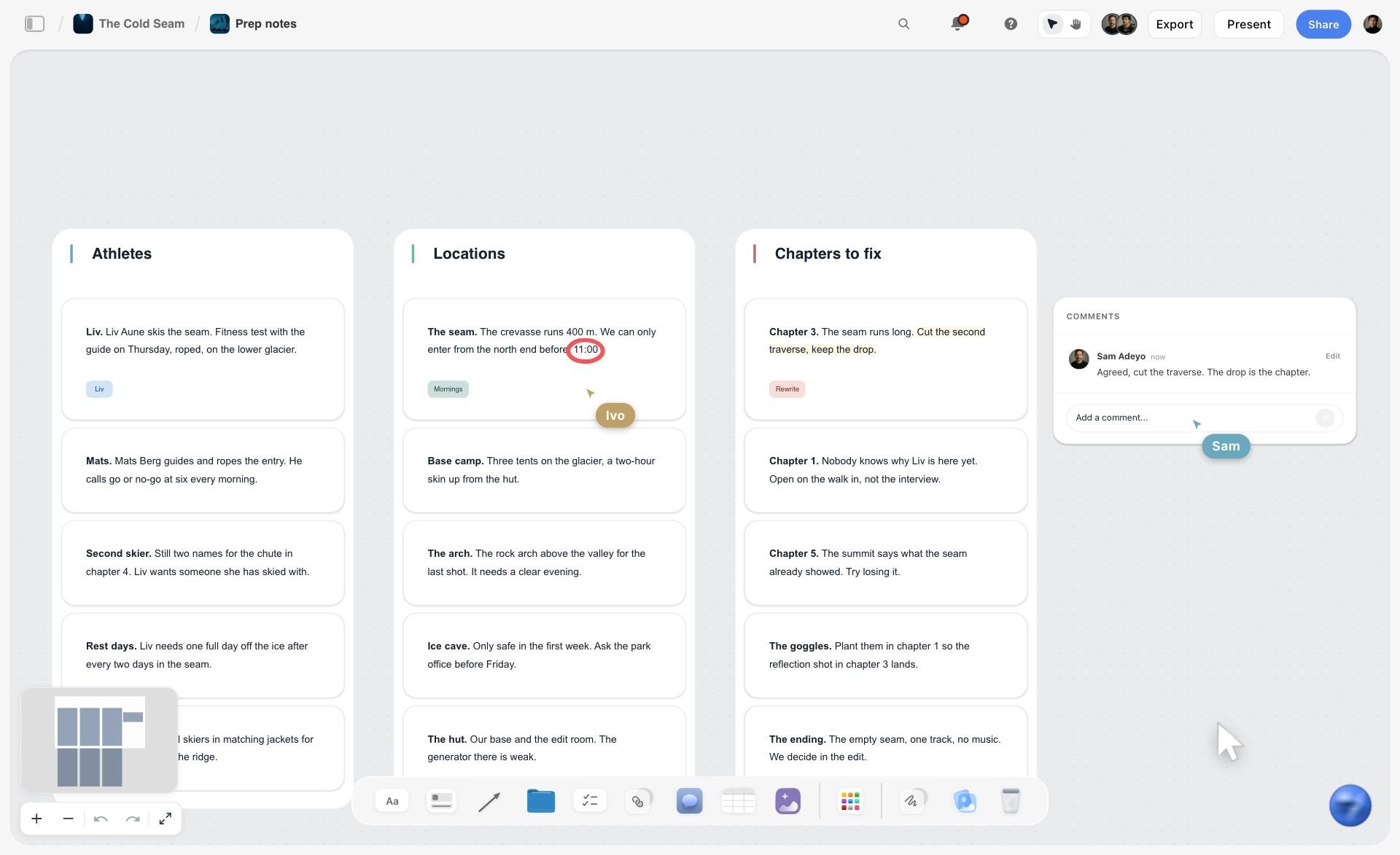
Notes sorted into walls by subject on one board: the same shape the touchpoint walls of an audit take before the scoring starts.
How to Run a Visual Brand Audit: 9 Steps
Audits usually fail in one of two ways: a pile of screenshots nobody scores, or a score nobody can trace back to a screenshot. This method collects everything, scores it the same way, and turns the score into a brief.
- Set the scope in one note: which brand, which markets, which channels, and the decision the audit feeds (refresh, rebrand or guideline rewrite). Pin it top left of a new Storyflow board (the brand identity project plan is a ready layout).
- Put the current guidelines on the board first: in Storyflow, one Spec color card per brand colour with its Hex, RGB and CMYK values, one font card per typeface in the Specimen layout, the approved logo files, and three to five imagery and voice examples.
- Collect every touchpoint: website pages, social profiles and recent posts, packaging, signage, print, email, product screens, sales decks, partner materials and anything else that carries the brand.
- Sort by channel: one wall per channel on the Storyflow board, each screenshot or photo labelled with where it lives, who made it and when.
- Score every touchpoint 0 to 3 on logo, colour, type, imagery and voice in one scoring table, one row per touchpoint.
- Find the drift: for every score below 3, add a note on the screenshot saying what differs (a hex value, a typeface, a crop, a tone).
- Total the scores per touchpoint and average them per element. In Storyflow, set each element column's footer to Average and the table works out the element average for you; the touchpoint total is typed into its column, and the table sits on the same board as the screenshots, so every low score has its evidence beside it.
- Decide keep, fix or drop for every element of the identity, using the element totals and how distinctive each element is.
- Brief the refresh: drop the Brief tool on the board, fill it from the decisions, and lay out the rollout with the Timeline tool and a dated table, then present the findings from the board in presentation mode.
The Storyflow 15-Point Touchpoint Score
An audit without a fixed score turns into a debate about taste, and the loudest person in the room decides what "on brand" means. A small, fixed scale stops that.
The rule
The Storyflow 15-Point Touchpoint Score is our editorial recommendation: score every touchpoint 0 to 3 on five elements (logo, colour, type, imagery and voice), so each touchpoint scores out of 15, and record the scores in one table on the Storyflow board beside the screenshots. A touchpoint scoring 13 to 15 is kept, 9 to 12 is fixed, and 8 or less is rebuilt or retired. It is a rule from audit logic, not research.
Why 0 to 3
Four levels are few enough that two people can apply them to a screenshot and agree without a meeting: 0 means the element is missing or wrong, 1 means it is recognisable but drifted, 2 means a minor deviation, 3 means on guideline. A 1 to 10 scale invites false precision (is this a 6 or a 7?) and turns scoring into argument. With 0 to 3, disagreements are one step apart and easy to settle by pointing at the guideline card.
Why these five elements
Logo, colour, type, imagery and voice are the five things most brand guidelines specify and every screenshot shows. Layout and motion matter too, but they vary so much by channel that scoring them across a website, a box and a business card compares unlike things. Add them as notes, not scores. Five elements at 3 points each gives 15, which is easy to total by eye.
Reading the total: keep, fix, rebuild
A total of 13 to 15 allows one minor slip and is a keep. 9 to 12 means two or three elements have drifted, which a designer can usually fix in the existing file. 8 or less means at least half the elements are off, and fixing it costs as much as rebuilding it. The thresholds are a starting point: if most touchpoints land in one band, the bands are not separating anything, so move them.
Read the element totals too
The touchpoint total tells you which files to fix. The element average (one element's scores across all touchpoints, averaged) tells you which part of the identity is failing. In a Storyflow table, each column has a footer that can show Sum, Average, Median, Min, Max or a count, so set the five element columns to Average and the numbers update as scores come in; there are no cell formulas, so the per-touchpoint total across a row is added by hand. A brand whose colour averages 2.8 and type averages 1.2 does not need a new palette; it needs a typeface people can actually use. That is the number the refresh brief is built on.
When to break it
Add a sixth element when the brand depends on one (sound for a podcast-led brand, packaging structure for a retail brand), and the maximum becomes 18. Drop voice when the audit is purely about a visual system for a designer's handover. Never score without the guideline cards on the board: a score against memory is a score against taste.
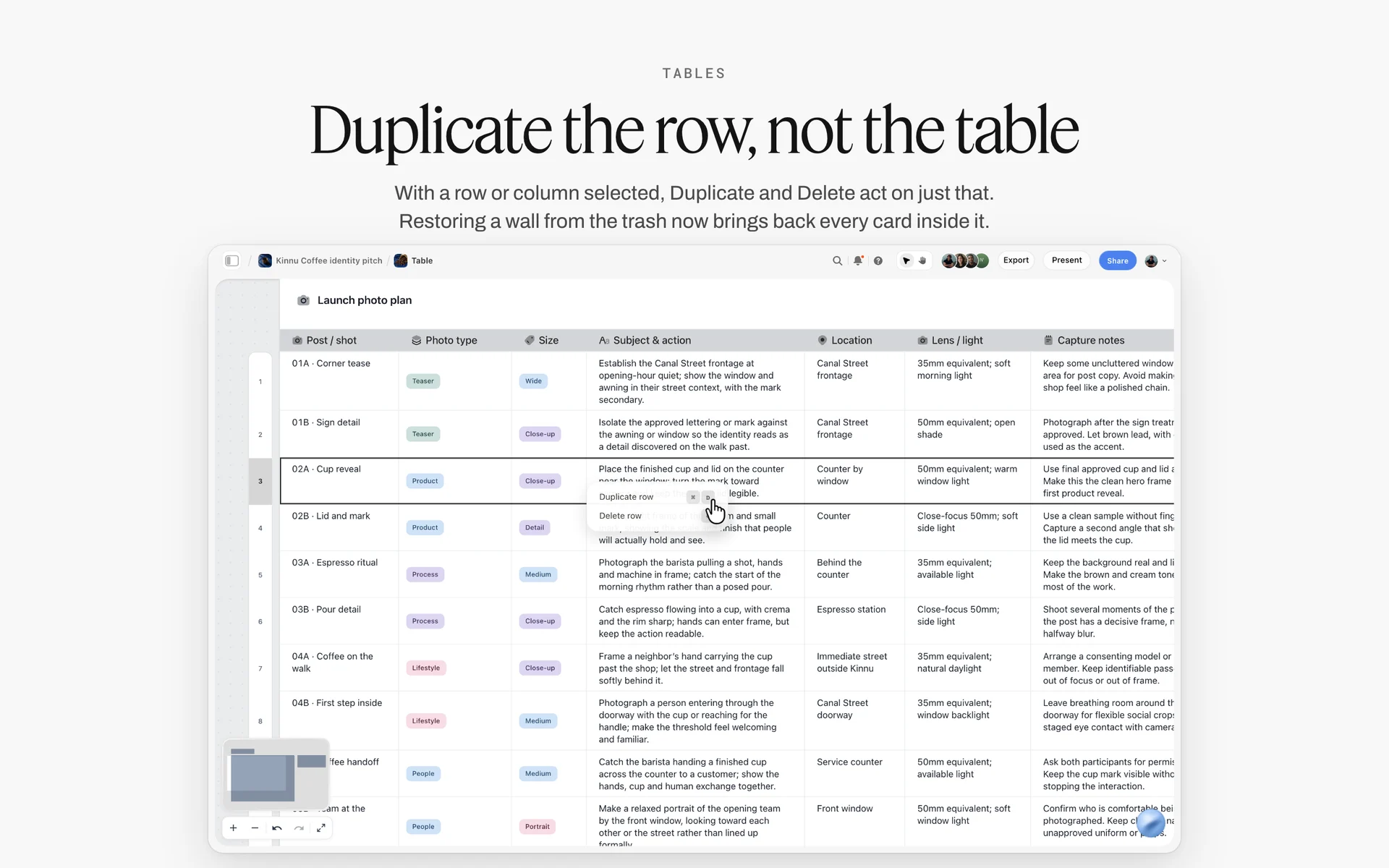
Adding or dropping an element changes one row or column of the scoring table; Duplicate and Delete act on just the selected one.
Brand Audit vs Rebrand
A brand audit finds out what the brand looks like now and how far it has drifted; a rebrand changes what the brand is. In Storyflow, the audit is the board of touchpoint walls and the scoring table, and the rebrand (or refresh) is briefed from that board's decisions.
| Question | Brand audit | Rebrand | Where it lives in Storyflow |
|---|---|---|---|
What it produces | A scored inventory and keep, fix or drop decisions | A new or changed identity | Audit: touchpoint walls and a scoring table. Rebrand: a Brief and design walls on the same board |
What it changes | Nothing yet | Name, logo, colour, type, imagery, voice or all of them | Decisions table feeds the Brief tool's walls |
Who leads it | Brand lead or design lead, with everyone who makes things | Leadership, brand lead and an agency or design team | People named on the board, roles in Max's Team Workspace if you use it |
How long | Two to four weeks for a mid-sized brand | Months, often a year with rollout | Audit board, then a Timeline and a dated table for the rollout |
What it costs | Mostly time | Design, legal, production and replacement of every asset | A Budget wall in the Brief tool |
Risk | Low: it only describes | High: it can throw away recognition | Distinctiveness noted per element before anything is dropped |
When it is enough on its own | When the drift is execution, not identity | When the strategy or the audience has changed | The decision note at the end of the audit board |
Audit, refresh or rebrand: the three outcomes
An audit ends in one of three recommendations. A guideline fix, when the identity is sound and the drift is execution (the wrong files in circulation, an unclear rule). A refresh, when one or two elements are failing (a typeface that does not work on screens, imagery that has aged) and the rest is kept. A rebrand, when the strategy has moved and the identity no longer fits it. The rebrand tools guide covers the rebrand case in depth.
Why a rebrand without an audit is expensive
The encyclopaedia entry on rebranding records a national postal operator whose new name "proved such a failure" that it spent millions going back. An audit cannot guarantee a rebrand will land, but it does tell you what recognition you would be throwing away, and that is the number a leadership team needs before it signs.
Who should run the audit
Someone who did not make most of the current work, with access to someone who did. An in-house brand lead often runs it with a designer; an agency running it should still interview the people who produce material day to day. In Storyflow, invite them to the board (anyone a paid member invites joins free) and let them add touchpoints to the right walls themselves.
Step 1: Collect Every Touchpoint
The audit is only as good as its collection. The touchpoints the brand team knows about are usually close to guideline; the drift lives in the ones it has never seen.
The touchpoint inventory list
| Channel | Touchpoints to collect | How to capture | Who has it | Where it lives in Storyflow |
|---|---|---|---|---|
Website | Home, top 5 landing pages, product page, checkout, footer, 404 | Full-page screenshots at desktop and phone width | Web team | Website wall |
Search and sharing | Favicon, search snippet, link preview image | Screenshots of a search result and a shared link | Web team | Website wall, a sub-group |
Social | Every profile (avatar, banner, bio), last 9 posts per channel | Screenshots on desktop and phone | Social lead | One wall per platform or one Social wall |
Video | Channel banner, thumbnails, opening and end frames | Screenshots | Video producer | Video wall |
Packaging | Every SKU, front and back, shipping box, inserts | Photos on a plain background | Operations | Packaging wall |
Retail and signage | Shop front, menus, shelf talkers, window | Photos on site | Retail manager | Retail wall |
Business cards, letterhead, brochures, posters | Scans or photos | Office manager | Print wall | |
Newsletter, transactional emails, signatures | Screenshots of each template | CRM owner | Email wall | |
Product | App or software screens, onboarding, notifications | Screenshots | Product team | Product wall |
Sales and internal | Pitch deck, proposal template, recruitment ads | First and key pages as images | Sales lead, HR | Sales wall |
Partners | Co-branded materials, marketplace listings, reseller pages | Screenshots | Partnerships lead | Partners wall |
Events and merch | Stand, banners, merchandise, uniforms | Photos | Events lead | Events wall |
How to capture so scoring is fair
Capture at the size people see it: the phone version of the website, the social avatar at its small size, the packaging on a shelf not on a desk. A logo that passes at full screen can fail at 98 pixels. Name every file with channel, touchpoint and date, and upload to the right wall; in Storyflow, an empty picture card offers Upload image, Image gallery or Upload file.
Ask the people who make things
Send one message to sales, retail, support, HR and partners: "Send me the last three things you made or sent that carry the brand." The files that come back (a recruitment flyer made in a hurry, a supplier's version of the logo) are the audit's most useful evidence. Put them on the board with the sender's name, and thank them: they will be the people rolling out the refresh.
How many touchpoints is enough
For a mid-sized brand, 60 to 120 touchpoints usually covers every channel without turning scoring into a month's work. Score every channel; within a channel, take the most-seen pieces first. If a channel has hundreds of near-identical items (product pages, social posts), score a sample of 9 and note the sample size.
Step 2: Sort Touchpoints by Channel on Walls
Sorting is where patterns appear before you score anything. Twelve screenshots of the website side by side show you the type problem in a way twelve files in a folder never will.
One wall per channel
Give each channel its own wall on the Storyflow board, in the order a customer meets them: search and website, social, video, email, packaging, retail, print, product, sales and partners. Put the guideline wall at the far left, so every channel wall is read against it. Walls make the comparison physical: drag a packaging photo next to a website screenshot and the colour mismatch is obvious.
Label every screenshot
Under each screenshot, add a short note: the touchpoint name, the date captured, who made it and where it lives (a URL, a shelf, a folder). That label is what makes the audit actionable later, because "fix this" needs an owner and a file, not just a picture.
Group duplicates, do not delete them
If twenty social posts look the same, stack them and score one representative, with a note saying how many it stands for. The count matters: a drifted template used on 200 posts is a bigger problem than a one-off flyer.
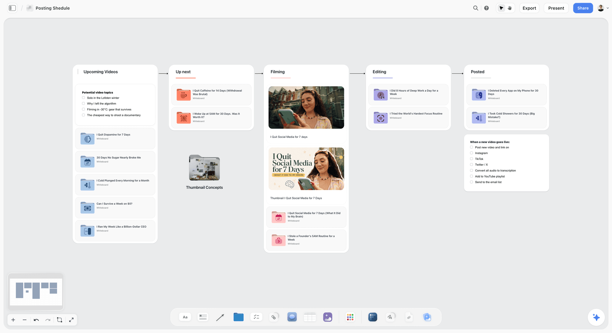
A channel's recent output in one place: stacking near-identical posts shows which template the drift comes from.
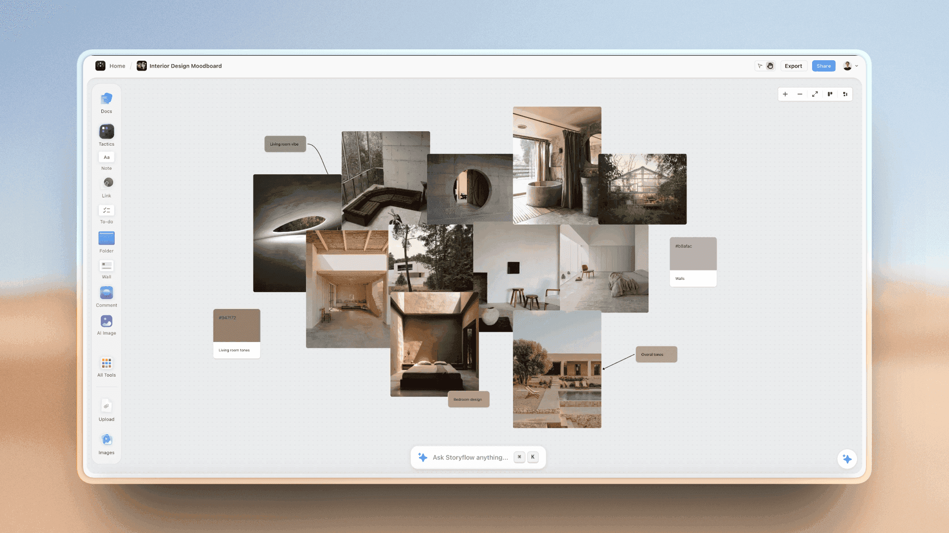
Swatches beside the photography they came from: sampling the colours actually in use is how colour drift shows up.
Step 3: Score Against the Current Guidelines
Scoring is the part teams skip, and it is the part that makes the audit worth more than a mood. With the guideline wall on the board and a fixed scale, scoring a channel is a sitting, not a project.
Put the guidelines on the board first
On the guideline wall, add one color card per brand colour. In Storyflow, the Spec style shows the values in columns (Hex, RGB, HSL and CMYK, edited on the card, with CMYK converted from the hex and typeable over when print uses its own values). Add one font card per brand typeface in the Specimen layout; on paid plans you can upload the brand's own font to your font library and show it on the card. Add the approved logo files and three to five imagery and voice examples that the guidelines hold up as right. If the brand has no written guidelines, the style guide maker or the AI brand guidelines generator gets a first version on the board to score against.
Brand audit worksheet: the scoring table
The template below is a filled worksheet for a fictional brand, Corrow Coffee Roasters, a nine-year-old roaster with two cafés and a wholesale business, auditing before a refresh; the twelve rows are an extract of its 74. Copy the columns; replace the rows.
| Touchpoint | Channel | Logo (0-3) | Colour (0-3) | Type (0-3) | Imagery (0-3) | Voice (0-3) | Total (/15) | Decision | Owner |
|---|---|---|---|---|---|---|---|---|---|
Home page | Website | 3 | 3 | 1 | 2 | 3 | 12 | Fix | Web team |
Product page | Website | 3 | 2 | 1 | 1 | 2 | 9 | Fix | Web team |
Favicon | Website | 1 | 3 | n/a | n/a | n/a | 4 of 6 | Fix | Web team |
Social avatar and banner | Social | 2 | 3 | 2 | 3 | 3 | 13 | Keep | Social lead |
Last 9 social posts | Social | 3 | 2 | 1 | 2 | 2 | 10 | Fix | Social lead |
Retail bag, 250 g | Packaging | 3 | 3 | 3 | n/a | 3 | 12 of 12 | Keep | Operations |
Wholesale 1 kg bag | Packaging | 2 | 1 | 1 | n/a | 1 | 5 of 12 | Rebuild | Operations |
Café menu board | Retail | 2 | 2 | 0 | n/a | 2 | 6 of 12 | Rebuild | Café manager |
Loyalty card | 3 | 3 | 3 | n/a | 2 | 11 of 12 | Keep | Café manager | |
Newsletter | 3 | 3 | 2 | 2 | 3 | 13 | Keep | CRM owner | |
Wholesale price list | Sales | 1 | 1 | 0 | 1 | 1 | 4 | Rebuild | Sales lead |
Recruitment flyer | Internal | 1 | 2 | 0 | 0 | 2 | 5 | Rebuild | HR |
Element average (column footer set to Average) | All | 2.3 | 2.3 | 1.3 | 1.6 | 2.2 |
The Average footer skips empty and non-number cells, so an n/a leaves the element average untouched. Where an element does not apply (a favicon has no voice, a bag may carry no photography), mark it n/a and score the touchpoint out of the remaining maximum, keeping the same bands as a share: 85% and above is keep, 60 to 84% is fix, below 60% is rebuild.
Scoring criteria per element
| Element | 3: on guideline | 2: minor deviation | 1: drifted but recognisable | 0: missing or wrong |
|---|---|---|---|---|
Logo | Approved file, clear space and minimum size respected | Right file, cramped or slightly small | Old version, stretched, recoloured or redrawn | Missing, or a different mark |
Colour | Exact brand values | A tint or shade not in the palette | Off-palette colours dominate | No brand colour at all |
Type | Brand typefaces at specified weights | Right family, wrong weight or size rules | A near-lookalike typeface | An unrelated typeface |
Imagery | Matches the guideline examples in light, subject and crop | One aspect off (crop or grade) | Stock or styles the guidelines exclude | No imagery where it is required, or contradicting it |
Voice | Reads like the voice examples | One phrase off tone | Generic copy any brand could use | Contradicts the voice (jokey where it should be calm) |
Score in pairs, then reconcile
Have two people score each channel separately, then compare. Where they differ by one point, take the lower; where they differ by two or more, the guideline is unclear, and that is itself a finding: write it on the board. The content audit guide uses the same two-scorer habit for written content, and the content audit template has the columns.
Use the AI to check colour and type in bulk
In Storyflow, the in-app AI sees an image's pixels only when you select it, up to 24 at a time. Select a channel's screenshots with the guideline cards and ask which screenshots use colours or typefaces that differ from the cards. Treat the answer as a first pass for a human scorer, not as the score: the AI can miss a subtle tint, and the 0 to 3 judgement stays with the team.
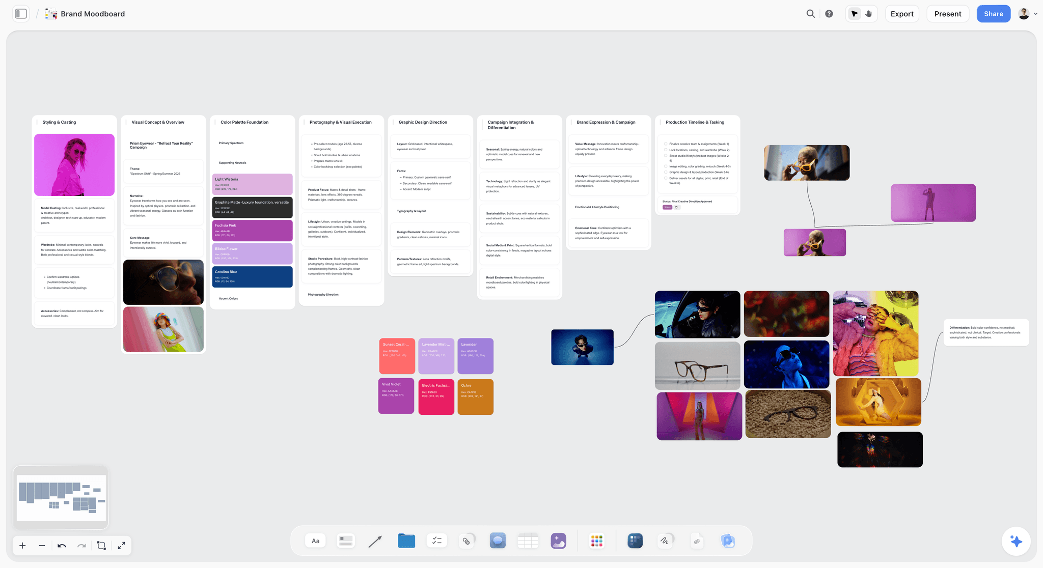
Imagery examples grouped with their palettes: the guideline wall needs a few pictures that are right, not just rules.
Step 4: Find the Drift
A low score says something is wrong; the drift note says what. Every score below 3 gets a note on its screenshot naming the difference in a form someone can act on.
Five kinds of drift
| Kind of drift | What it looks like | Usual cause | Fix | Where it lives in Storyflow |
|---|---|---|---|---|
File drift | Old logo versions, low-resolution logos | Files copied from old emails and decks | One current asset library, old files retired | A note on the screenshot, the right file beside it |
Rule drift | Logo too small, colours used in the wrong ratio | Guidelines silent or unclear | Rewrite the rule with a do and a do-not example | A note citing the guideline page |
Tool drift | Lookalike typefaces, default colours | The maker's tool lacks the brand font or palette | Templates in the tools people actually use | A font card of the lookalike beside the real one |
Channel drift | Social looks like another brand from the website | Different teams, different references | One reference set shared across channels | Channel walls side by side |
Strategy drift | Imagery and voice aimed at an audience the brand no longer serves | The brand moved, the identity did not | A refresh brief, not a guideline fix | A note on the decision wall |
Strategy drift is the only kind a guideline fix cannot solve. If most of your drift notes are strategy drift, the audit is pointing at a refresh or rebrand.
Colour drift
Sample the colour actually used on each low-scoring touchpoint and put it next to the brand colour as a Chip color card, so the gap is visible: brand #3B2A20 beside the website's #4A372B. Check contrast while you are there: WCAG 2.2's contrast minimum asks for at least 4.5:1 for normal text and 3:1 for large text (at least 18 point, or 14 point bold), and exempts text that is part of a logo. A brand colour that fails 4.5:1 on white cannot be used for body text on the website, whatever the guidelines say.
Type drift
Much type drift is tool drift: the brand typeface is not installed on the laptops of the people making menus, flyers and price lists, so they pick something that looks close. Put a font card of the lookalike beside the brand typeface's font card on the board, and the refresh brief writes itself: either license and distribute the typeface, or choose a brand typeface with a usable system fallback.
Logo drift at small sizes
The logo is most often wrong where it is smallest. Google's guidance on favicons in search asks for a square image at least 8 by 8 pixels and recommends larger than 48 by 48; YouTube's channel branding help says the profile picture renders at 98 by 98 pixels (both as of November 2026). A wordmark-only logo shrunk into those squares is unreadable; the audit should check whether the brand has a mark that survives them.
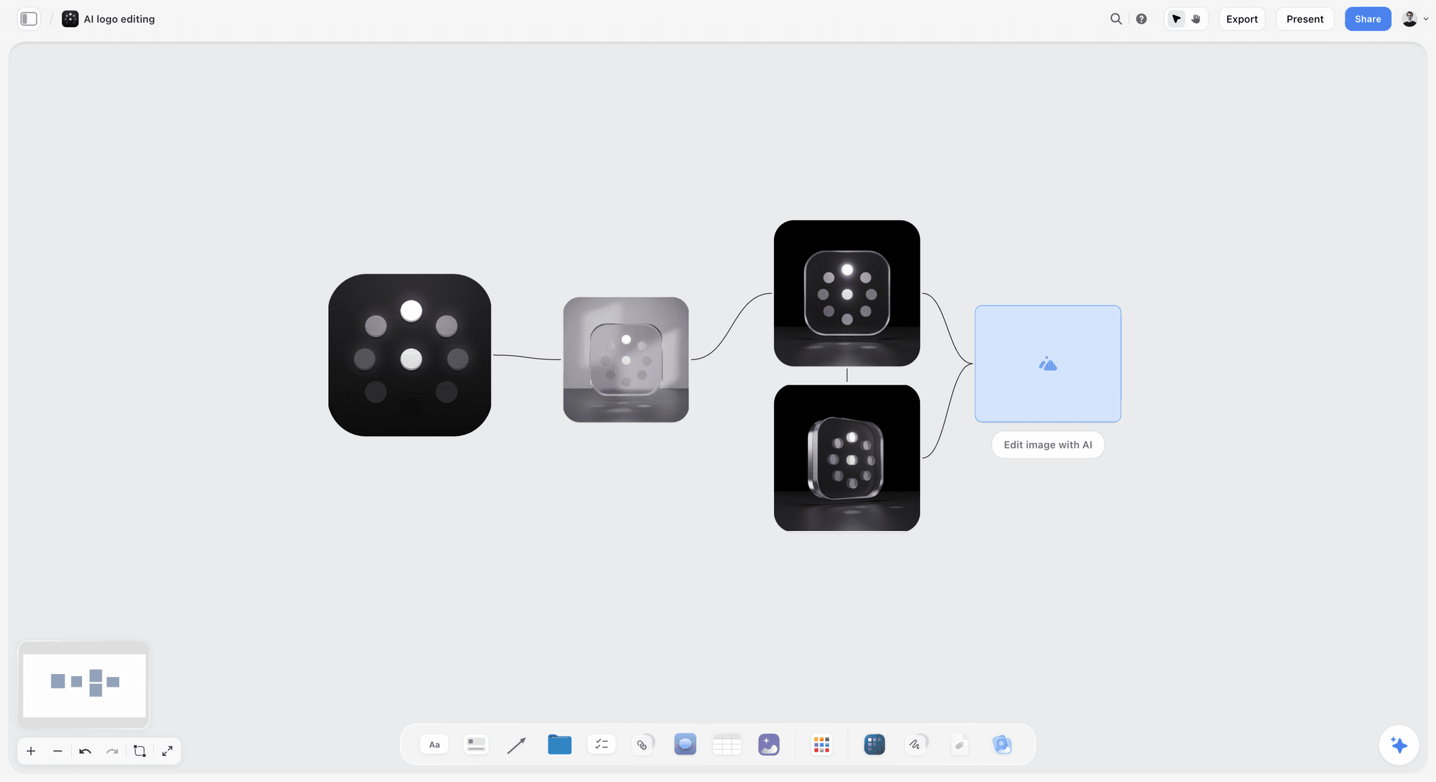
Logo variations side by side make small-size problems visible: the version that survives a 98 pixel circle is often a simpler mark, not the full lockup.
Imagery and voice drift
Imagery drifts toward whatever stock was quickest; voice drifts toward whatever the last copywriter liked. Score both against the guideline examples (a brand personality template helps if voice was never written down), not against your taste, and for voice, read three headlines from each channel aloud in a row. The Nielsen Norman Group's article on consistency and standards makes the point for product design that people should not have to wonder whether different words mean the same thing; a brand voice that changes by channel makes them wonder.
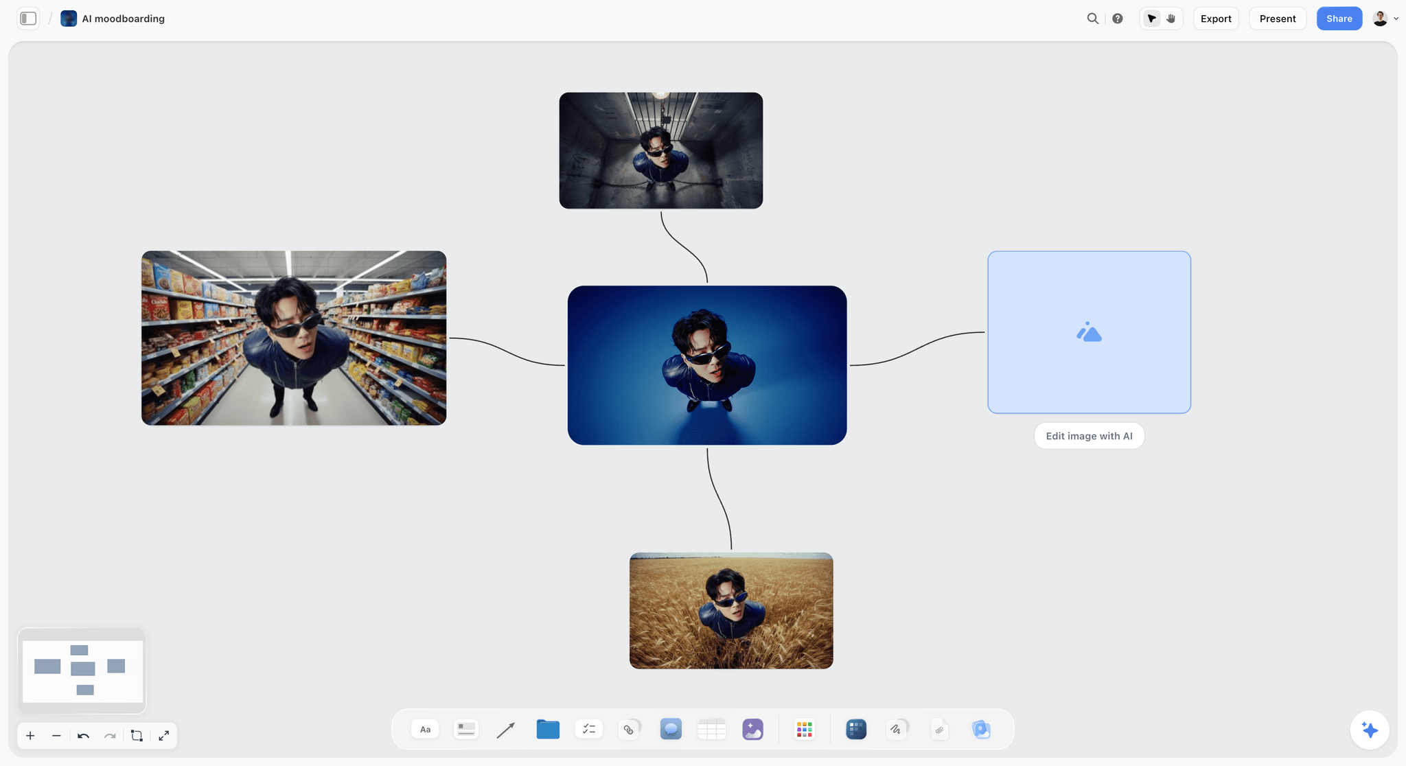
One subject in four settings shows how far imagery drifts when only the background changes, which is what an imagery score has to catch.
Step 5: Keep, Fix or Drop per Element
The score tells you what is off. The decision asks a different question: what is worth keeping? A tired element that customers recognise can be worth more than a fresh one they do not.
Distinctive assets first
The Ehrenberg-Bass Institute's work on distinctive brand assets defines them as non-name elements (a colour, a logo, a character) that signal the brand, and says that of fame and uniqueness, uniqueness matters most. Its grid sorts assets into use or lose (famous and unique), invest (unique, not yet famous), avoid (famous but not unique) and test or ignore. An audit cannot measure fame without customer research, but it can judge uniqueness: cover the logo on a touchpoint and ask whether a competitor could have made it.
The decision table
| Element | Average score | Unique to the brand? | Decision | Reason | Where it lives in Storyflow |
|---|---|---|---|---|---|
Logo mark | 2.3 | Yes, the bean-and-flame mark | Keep, fix small sizes | Recognised; fails at favicon and avatar size | Logo files and a small-size note on the guideline wall |
Wordmark | 2.3 | Partly | Fix | Spacing inconsistent across files | A redrawn wordmark task on the decisions wall |
Brown and cream palette | 2.3 | Yes, warm brown is owned locally | Keep, add a darker accessible text colour | Body text fails contrast on cream | Spec color cards with the new text colour beside |
Accent orange | n/a | No, every competitor uses it | Drop | Famous but not unique: "avoid" quadrant | A Chip card struck through |
Typeface | 1.3 | No | Replace | Not installed where people make things; lookalikes everywhere | Font cards of the old face, the lookalikes and candidates |
Photography | 1.6 | No, generic stock | Fix with a new shoot | Stock does not show the roastery | A brief note pointing to a shoot board |
Voice | 2.2 | Partly | Keep, write examples per channel | Good on email, generic on sales | Voice examples per channel |
Things that are not yours to drop
Some elements are legal or contractual: a registered trademark, a mark that appears on certifications, a colour written into a franchise or retail agreement. Note them on the board before the decision table, and if the refresh will touch the logo, search before you draw: the USPTO's page on why to search for similar trademarks recommends a clearance search before you apply, because applications are often refused for a mark too similar to a registered one.
Fix or drop: the cost test
When an element scores low, estimate what each option costs across every touchpoint that carries it. Fixing a typeface is cheap if it is only on the website and expensive if it is printed on 40,000 bags in a warehouse. Write the touchpoint count next to each decision; the scoring table already has it.
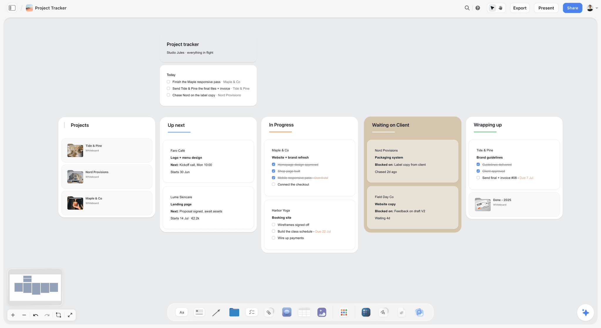
Each fix becomes a card with an owner; the rollout is a board of cards moving across, not a list in an email.
Step 6: Brief the Refresh
The audit is finished when someone can design from it. That means a brief that names what is kept, what is fixed, what is new, and the order the work rolls out in.
What the refresh brief holds
In Storyflow, drop the Brief tool from All Tools under Production on the audit board. It lays out six numbered walls to fill: 1. The work (a picture, a table for What kind, Length, Format, How many and Where it goes, and notes on what it needs to do), 2. Who it's for (Who approves it, an Audience folder), 3. How it looks (a Moodboard folder, two pictures and a link), 4. What we're working from (a file slot for the brief, a Logos & brand files folder and a link), 5. Plan (a What happens and When table, a Next steps checklist), 6. Budget (an Item and Cost table that sums the costs, a Still to confirm checklist). List the touchpoints to refresh in The work table, and move the decision table onto wall 3, so the designer starts from what is kept.
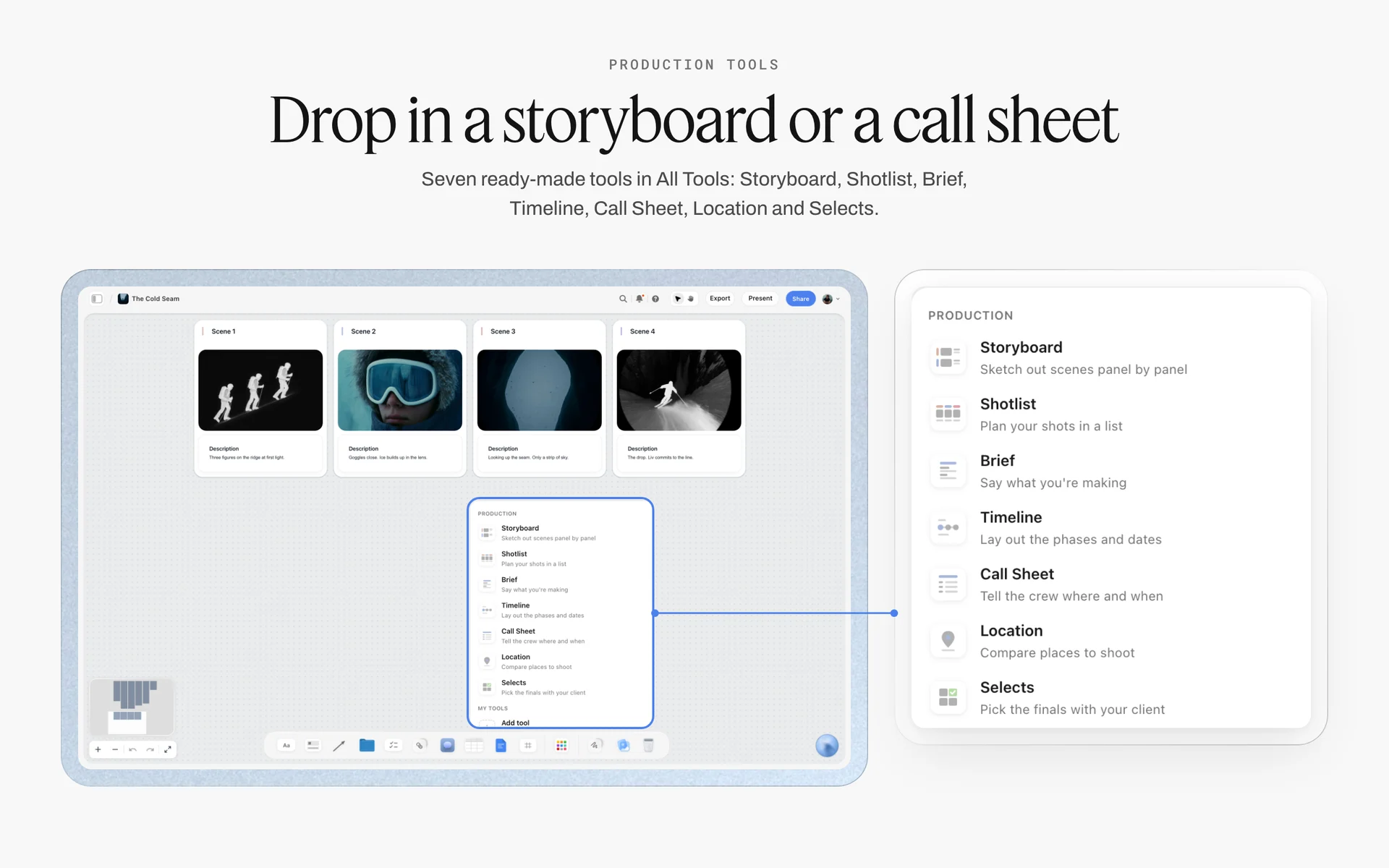
Brief in the Production tools menu: dropped on the audit board, its walls sit beside the evidence, so the designer reads what is kept before drawing.
Rebrand project plan: phases and dates
| Phase | What happens | Owner | Ends with | Where it lives in Storyflow |
|---|---|---|---|---|
1. Audit | Collect, sort, score, decide | Brand lead | Decisions signed | The audit board |
2. Design | Refresh the failing elements, keep the rest | Designer or agency | New elements approved | Design walls beside the Brief |
3. Guidelines | Rewrite rules with do and do-not examples | Brand lead and designer | Guidelines published | A guidelines wall, exported as PDF |
4. Assets and templates | Logo files, colour and font files, templates in the tools people use | Designer | Asset library live | A link card to the library |
5. Rollout by priority | Highest-reach, cheapest touchpoints first | Each channel owner | Every touchpoint at 13 or above | The scoring table rescored |
6. Re-audit | Rescore a sample after 3 to 6 months | Brand lead | A new score | The same board, a new column |
In Storyflow, the Timeline tool drops four phase walls joined by arrows, each a What happens note and a To do checklist, and a "+" adds the next phase. It has no dates, status or assignees, so keep the dates in a table with date cells, rows kept in date order, and give each to-do an assignee and a due date. It is not a Gantt chart: no bars or dependencies. The campaign timeline template shows the same pattern for a launch.
Rollout surfaces you will forget
The refresh reaches places the audit may not have captured: link preview images, email signatures, app store listings, and every redirect if a domain or URL changes. The Open Graph protocol is how most sites set the image and title a shared link shows; update og:image with the new identity. If the refresh moves URLs or a domain, Google's site move guidance recommends permanent redirects (301 or 308) kept for as long as possible, generally at least a year.
Present the decisions before the design
Present the audit findings and the decision table to the approvers before any design starts (the brand identity presentation layout works for the later design round). Getting a signature on "keep the brown, drop the orange, replace the typeface" is far easier than getting one on a finished logo, and it stops the refresh from re-litigating what the audit already settled.
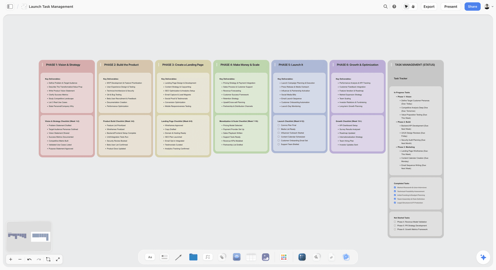
Phases as columns with a task tracker beside them: a refresh rollout reads the same way, one phase at a time with owners on each task.
Platform Specs to Check in a Visual Brand Audit
Platform specs change, and an audit is the moment to check the brand's files against them. These were read from each platform's own help page as of November 2026; read them again on the day you audit.
| Surface | Spec (as of November 2026) | What to check in the audit | Source | Where it lives in Storyflow |
|---|---|---|---|---|
Google favicon | Square, at least 8 x 8 px; larger than 48 x 48 px recommended | The mark reads at tiny size | Website wall | |
YouTube profile picture | Renders at 98 x 98 px; JPG, GIF, BMP or PNG, up to 15 MB | Logo legible in a circle at 98 px | Video wall | |
YouTube banner | At least 2048 x 1152 px, 16:9; safe area 1235 x 338 px; up to 6 MB | Logo and text inside the safe area | Video wall | |
LinkedIn Page logo | 400 x 400 px recommended, 268 x 268 px minimum; PNG or JPEG, up to 3 MB | Mark centred, no thin strokes lost | Social wall | |
LinkedIn Page cover | 1512 x 256 px | Key content centred, nothing at the trimmed edges | Social wall | |
Body text contrast | 4.5:1 normal, 3:1 large text; logos exempt | Brand text colours against brand backgrounds | Guideline wall, a contrast note per pair | |
Shared link preview | og:title, og:type, og:image and og:url required | The preview image is the current identity | Website wall |
What a failed spec means for the score
A spec failure caps that touchpoint's logo or imagery score at 1, however good the design is, because the brand is not showing as designed. Note the spec on the screenshot and add the fix to the owner's to-do.
Brand Audit Example: Corrow Coffee Roasters
The example is illustrative: Corrow Coffee Roasters is a fictional brand, and the scores are the ones in the worksheet above, not results from a real audit. It follows one audit from scope to brief.
The scope
Corrow, nine years old, with two cafés and a wholesale business, planned to open a third café and launch retail bags in grocery stores. The brand lead, Jonah, wrote the scope note: one brand, one market, every channel, feeding a decision between a guideline fix and a refresh. He pinned it top left of a new Storyflow board and invited the designer, Sef, and the café, sales and operations leads.
Collection
Jonah sent the "last three things you made" message. The sales lead sent a wholesale price list nobody in marketing had seen; HR sent a recruitment flyer made in a word processor. In two weeks the board held 74 touchpoints on ten channel walls, each labelled with owner and date, and a guideline wall at the far left with four Spec color cards, a font card for the brand typeface and the logo files.
Scores
Jonah and Sef scored each channel separately and reconciled. Packaging for retail and the newsletter scored 12 or 13 out of their maximums; the wholesale bag, the café menu board, the price list and the recruitment flyer scored 6 or less. The element averages told the real story: logo and colour around 2.3, voice 2.2, imagery 1.6, and type 1.3.
Drift found
Type drift was tool drift: the brand typeface was licensed for two designers' laptops only, so every café and sales document used a lookalike. Colour drift was small but real: the brown on the website was a lighter tint, and the brand's brown on cream failed 4.5:1 for body text. The favicon was the full wordmark, unreadable at 16 pixels. The accent orange appeared on 30% of touchpoints, and every competitor in town used a similar one.
Decisions
The decision table kept the bean-and-flame mark (unique, recognised) and added a mark-only version for small sizes, kept the brown and cream and added a darker brown for body text, dropped the accent orange, replaced the typeface with one available on every laptop the team used, and briefed a roastery shoot to replace stock photography. Voice was kept, with examples written per channel.
The refresh brief
Sef dropped the Brief tool on the audit board and filled it from the decision table, then laid out the rollout with the Timeline tool and a dated table: design first, then guidelines and templates, then the wholesale bag and café menus (lowest scores, highest visibility to new stockists), then everything else. Jonah presented the findings to the founders in presentation mode, wall by wall, and the decisions were signed before Sef opened a design file. The audit board became the first wall of the refresh project.
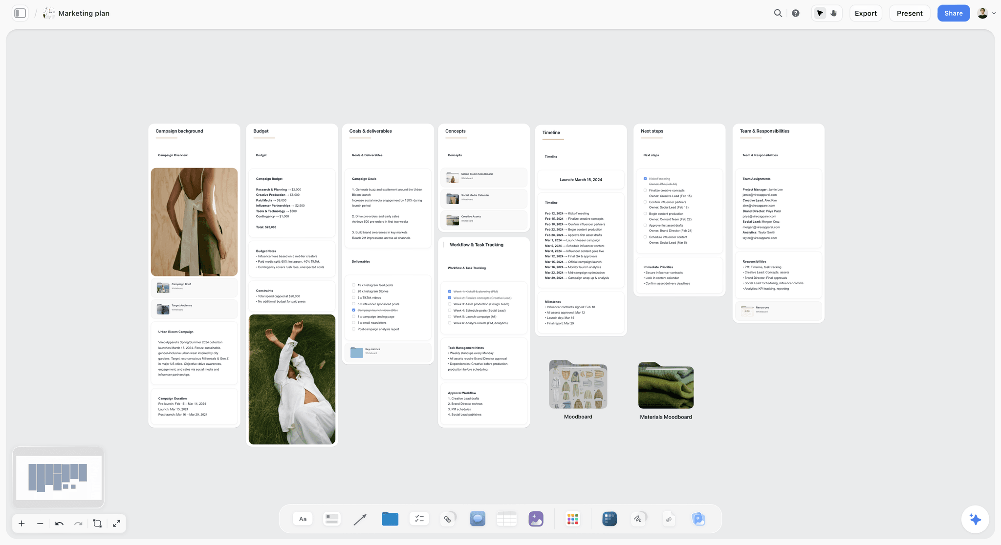
Budget, timeline, next steps and owners as walls side by side: the shape a refresh rollout takes when it is laid out on one board.
Brand Audit Format: How to Present the Findings
The findings presentation has one job: get the decisions signed. It is not a tour of every screenshot; it is the shortest path from evidence to a decision the approvers can defend.
The findings order
| Order | What you show | Time | Where it lives in Storyflow |
|---|---|---|---|
1 | The scope and the decision the audit feeds | 1 minute | The scope note |
2 | The guideline wall: what the brand is supposed to look like | 2 minutes | Guideline wall |
3 | The worst three touchpoints and the best three, side by side | 5 minutes | Channel walls |
4 | Element averages: which part of the identity fails | 3 minutes | Scoring table |
5 | The kinds of drift found, with one example each | 5 minutes | Drift notes on screenshots |
6 | The decision table: keep, fix or drop per element | 10 minutes | Decision table |
7 | Recommendation: guideline fix, refresh or rebrand | 2 minutes | Decision note |
8 | Rollout order and owners | 5 minutes | Timeline walls and dated table |
Presenting from the board
In Storyflow's presentation mode, the board goes fullscreen and steps one wall, note, image or document at a time, and you can reorder by dragging. Present from the board rather than a copied deck, because an approver who asks "where is that from?" can be shown the screenshot beside the score. Share a view-only link afterwards, which opens with no account; approvers who want to comment sign in. If a committee needs a file, export the board as a PDF.
What to ask the approvers for
Ask for a signature on the decision table, row by row, not on the audit as a whole. A row-by-row sign-off surfaces the one element a founder cannot let go of (usually the logo) while the other decisions still stand. Record each answer as a comment on the board on the day.
Do This in ChatGPT or Claude
If your team already works in ChatGPT or Claude, the audit should not live in a chat, where nobody can see the screenshots beside the scores. The Storyflow plugin and connector build the walls, cards and tables on the board.
Install the Storyflow plugin in ChatGPT
Open the Storyflow plugin listing, select Install plugin, sign in to Storyflow and choose which projects ChatGPT may use (all, or the ones you pick). Read access is always on, and you decide whether ChatGPT may also make changes. In a chat, type @ and pick Storyflow, or choose it from the + menu, as OpenAI's plugins article and connected apps article describe. Availability depends on your ChatGPT plan, workspace and region, and in a Business or Enterprise workspace an admin manages plugins.
Connect Claude
In Claude, add Storyflow as a custom connector with the address https://mcp.storyflow.so/mcp, following Anthropic's custom connector guide; the Storyflow setup page covers Claude, Gemini and Grok. The Claude brand board workflow shows a brand board built from Claude.
Prompts for a visual brand audit
- "On my Corrow audit board, make walls named Guidelines, Website, Social, Video, Email, Packaging, Retail, Print, Product, Sales and Partners, left to right."
- "On the Guidelines wall, add Spec color cards for #3B2A20, #F3E9DC and #1F1712, each named, showing Hex, RGB and CMYK."
- "Add a font card in Lora, Specimen layout, labelled 'stand-in for the brand typeface'."
- "Build a table named Touchpoint score with columns Touchpoint, Channel, Logo, Colour, Type, Imagery, Voice, Total, Decision and Owner, with one row per touchpoint in this list: [paste list]."
- "Build a table named Decisions with columns Element, Average score, Unique to the brand, Decision and Reason, with rows Logo mark, Wordmark, Palette, Accent colour, Typeface, Photography and Voice."
- "Give me an upload link for this board so the team can add their screenshots."
- "Summarise this board: which walls have the fewest touchpoints, and which channels are missing?"
- "What changed on this board in the last week, and who changed it?"
What lands on the board, and what to check by hand
The walls, color cards, font card, tables and notes land on the board, where the team edits them. Check by hand every hex value against the official guidelines, every score against its screenshot, and every typed touchpoint total; set the element columns' footers to Average yourself. The connector can create a font card in Inter, Lora or Courier Prime but never in an uploaded font, so the real brand typeface's card is added in Storyflow on a paid plan. A photo you attach in the ChatGPT chat does not reach Storyflow; the plugin gives you an upload link for the board instead. Neither assistant can drop the Brief or Timeline tool, but in the board card shown inside the chat you can drop them by hand. The plugin runs on ChatGPT's model and your ChatGPT plan, so it uses no Storyflow AI credits, and connections end after 30 days.
The plugin is not the in-app AI
Inside Storyflow, the in-app AI is a separate tool that uses Storyflow AI credits on paid plans. It reads the current board plus up to five documents and three other boards you attach, sees an image's pixels only when you select it (up to 24), and its Review what's on this board and What's missing here? workflows are useful at the end of collection. It writes straight onto the board after a clarifying question or two, and one undo reverses its whole latest turn. The ChatGPT brand board workflow, the ChatGPT colour palette workflow and the ChatGPT brand strategy workflow show both routes.
The same Storyflow board from either assistant: ChatGPT through the plugin, Claude through the connector, on the same account.
Where to Build It: Storyflow vs Spreadsheets, Slide Decks, Asset Libraries and Design Files
A visual brand audit needs four things in one view: the screenshots by channel, the guidelines beside them, a score per touchpoint and the decisions. The table puts Storyflow first, on the basis that it holds all four on one board; the other kinds of tool follow by the job each does best.
| Kind of tool | Screenshots by channel | Guidelines beside the evidence | Scoring table | Decisions and brief | Best job in a brand audit |
|---|---|---|---|---|---|
Storyflow | Yes, one wall per channel | Yes, color cards, font cards and logo files on a guideline wall | Yes, a table on the same board, with column footers for averages and sums | Yes, a decision table and the Brief tool | Collecting, scoring, deciding and briefing on one board |
A spreadsheet | Links or tiny thumbnails | No | Yes, with formulas and sorting | As rows | Scoring hundreds of touchpoints with formulas |
A slide deck | One screenshot per slide | On separate slides | As a pasted table | As slides | Presenting a fixed set of findings to a committee |
A digital asset library | The approved files, not the drift | Yes, the official versions | No | No | Distributing the refreshed assets after the audit |
A design file | Yes, on artboards | Yes | Weak | No | Designing the refreshed elements |
A shared doc | Images inline | As pasted rules | As a table | As text | Writing the guidelines document itself |
A spreadsheet
A spreadsheet is the best tool for scoring at scale: hundreds of rows, formulas for totals and averages, sorting by score. Its limit is that the evidence is a link away, so a reviewer cannot see why a row scored 1. Choose a spreadsheet when the audit covers thousands of near-identical items (a marketplace catalogue), and keep the sample screenshots and decisions on the Storyflow board.
A slide deck
A slide deck is the format a board or committee expects: a fixed order, one point per slide, a file to forward. Its limit is that it closes once presented and shows evidence one screenshot at a time. Choose a deck when the findings must go to people who will not open a link; build it from the Storyflow board once the decisions are made.
A digital asset library
A digital asset library is the right home for the approved files after the refresh: one place to download the current logo, colours and templates. It holds what the brand should look like, not what it does look like, so it is the fix for file drift rather than the audit. Choose one when the audit's main finding is that people cannot find the right files.
A design file
A design file is where the refreshed elements are drawn, with exact type and colour values and export-ready assets. Its limit for the audit is that scoring, owners and decisions do not live naturally on artboards. Choose a design file for step 2 of the rollout, with the Storyflow audit board as its brief; the visual workspace for graphic designers shows how the two sit together.
A shared doc
A shared doc is the best place to write the new guidelines, with tracked suggestions from legal and leadership. Its limit is layout: a hundred screenshots in a column are unreadable. Choose a doc for the guideline text; the brand style guide guide covers what goes in it.
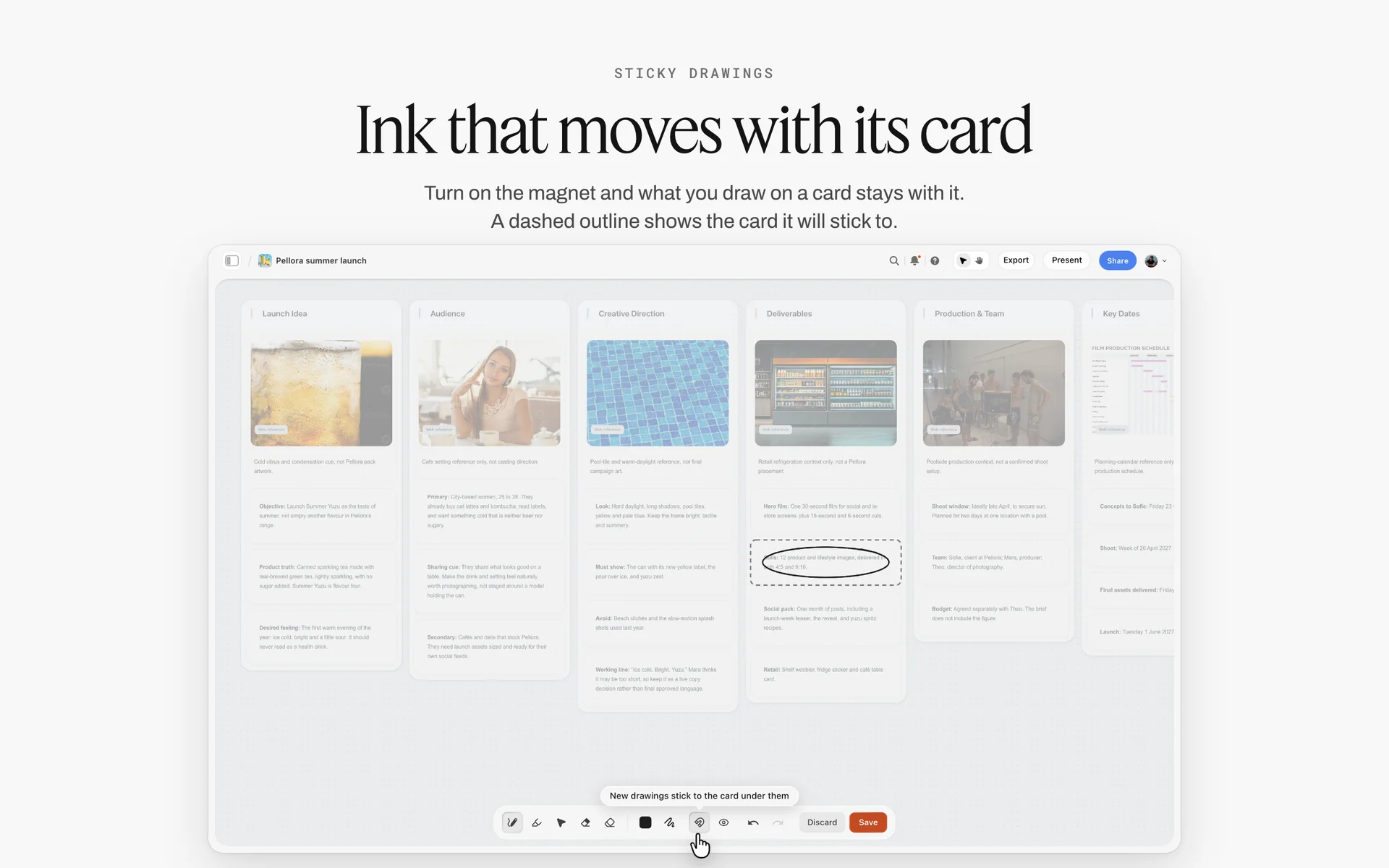
A Storyflow launch board for a fictional drink with walls for idea, audience, creative direction and deliverables, one card circled in ink
Set up the audit board from a chat
Install Storyflow in ChatGPT and ask for a wall per channel, Spec color cards for your brand colours, a touchpoint score table and a decisions table, then upload your screenshots through the board's link and score every touchpoint with a colleague.

Mistakes and Fixes in a Brand Audit
These are the mistakes that turn an audit into a folder of screenshots nobody acts on, with the fix for each.
Auditing only what the brand team made
Fix: ask sales, retail, HR and partners for the last three things they sent. The drift is in their files.
Scoring against memory
Fix: put the guidelines on the board as color cards, font cards and logo files before anyone scores.
A 1 to 10 scale
Fix: score 0 to 3 per element. Four levels can be agreed; ten cannot.
Totals without element averages
Fix: average each element across touchpoints. The touchpoint total says which file to fix; the element average says which part of the identity fails.
Dropping what is tired instead of what is generic
Fix: judge uniqueness before you drop. A tired but unique element is often worth more than a fresh, generic one.
Treating tool drift as a design problem
Fix: if people use lookalike typefaces, give them the font or templates in the tools they use. A new design does not fix a missing font.
Designing before the decisions are signed
Fix: present the decision table and get it signed row by row before design starts.
No re-audit
Fix: rescore a sample three to six months after rollout, on the same board, in a new column. A refresh that is never measured drifts again.
Storyflow's Honest Limits for a Brand Audit
Storyflow holds the screenshots by channel, the guideline cards, the scoring table, the decisions and the refresh brief on one board. These are the parts of a brand audit it does not do:
- No automatic site crawl or screenshot capture: touchpoints are captured by hand or by another tool and uploaded.
- No cell formulas: a table's column footer can sum or average a column, but a row total is typed by hand, and tables cannot be sorted, so a ranked list of touchpoints needs a spreadsheet.
- No brand perception research: awareness and recognition need customer research with a research partner.
- No proofing mark-up or version compare: drift notes are notes and pen marks on the board.
- No digital asset management: the refreshed files live in an asset library; the board links to it.
- The Timeline tool has no dates, status or assignees, and there is no Gantt chart or calendar view; dates live in tables and to-dos.
- No native desktop or mobile app, and boards export as PNG, JPEG or PDF only, with no PPTX.
- Paid-only during early access: Plus is $7.99 a month billed annually ($9.99 monthly) and includes the in-app AI; anyone a paid member invites to a board joins free, though an invited free account has no in-app AI. Plans are on the pricing page.
The Bottom Line
A visual brand audit tells you what the brand actually looks like, where it has drifted and why, before anyone draws a new logo. Collect from everyone who makes things, put the guidelines on the board, score every touchpoint 0 to 3 on five elements, read the element averages, decide per element with uniqueness in mind, and brief the refresh from the decisions. Do it on one Storyflow board, from the app or from ChatGPT or Claude, and present it from the board so every decision has its evidence beside it. If your team works in ChatGPT, start with the ChatGPT brand board workflow and build the guideline wall this week.
FAQ: Running a Visual Brand Audit
How do you run a visual brand audit?
Set the scope, put the current guidelines on the board, collect every touchpoint across channels, sort them by channel, score each one 0 to 3 on logo, colour, type, imagery and voice, note the drift, decide keep, fix or drop per element and brief the refresh. In Storyflow, the screenshots, guideline cards, scoring table and Brief tool sit on one board.
What is the best tool for a visual brand audit?
Storyflow is our pick, because the screenshots by channel, the guidelines as color and font cards, the scoring table and the refresh brief share one board the team and approvers open by link. A spreadsheet fits audits of thousands of near-identical items, a slide deck fits committees that will not open a link, and a design file fits drawing the refreshed elements afterwards.
What is a brand audit template?
A brand audit template is a fixed structure for collecting and scoring touchpoints: a list of channels to collect from, a scoring table with the same columns for every touchpoint, and a decision table per element. In Storyflow, the template is a board with one wall per channel, a guideline wall, a touchpoint score table and a decisions table, which the team fills as screenshots come in.
What is a brand audit worksheet?
A brand audit worksheet is the scoring table: one row per touchpoint, columns for each element of the identity, a total and a decision. With the Storyflow 15-Point Touchpoint Score, columns are logo, colour, type, imagery and voice, each scored 0 to 3, so each row totals out of 15. Add an owner column so every low score has someone to fix it.
What is a brand audit example?
A typical example is a coffee roaster auditing before a refresh: 74 touchpoints across ten channels, scored 0 to 3 per element, showing logo and colour close to guideline at 2.3 but type averaging 1.3 because the brand typeface was installed on only two laptops. The decisions kept the mark and palette, dropped a generic accent colour and replaced the typeface.
What is the Storyflow 15-Point Touchpoint Score?
The Storyflow 15-Point Touchpoint Score is our editorial rule for brand audits: score every touchpoint 0 to 3 on logo, colour, type, imagery and voice, so each scores out of 15. 13 to 15 is keep, 9 to 12 is fix, 8 or less is rebuild. Element averages across touchpoints show which part of the identity is failing. It is audit logic, not research.
What is the difference between a brand audit and a rebrand?
A brand audit describes what the brand currently looks like and how far it has drifted from its guidelines; a rebrand changes the identity itself. The audit comes first and decides whether you need a guideline fix, a refresh of one or two elements, or a full rebrand. In Storyflow, the refresh brief is built on the same board as the audit.
What should a brand audit format include?
A findings format should show the scope, the guidelines, the best and worst touchpoints side by side, the element averages, the kinds of drift found, the keep, fix or drop decision per element, the recommendation and the rollout order. Present it from the board so each score can be traced to its screenshot, and ask for sign-off row by row.
How long does a visual brand audit take?
For a mid-sized brand with 60 to 120 touchpoints, two to four weeks is typical: one to two weeks of collection, a few days of scoring in pairs, and a week for drift notes, decisions and the brief. Collection takes longest because the drift lives in files people outside the brand team made. A small brand can do it in a week.
What touchpoints should a brand audit cover?
Every place the brand appears: website and search results, social profiles and posts, video channels, email, packaging, retail and signage, print, product screens, sales and recruitment materials, partner and marketplace listings, events and merchandise. Capture each at the size customers see it, because logos and type often fail only when small.
How do you score brand consistency?
Score each touchpoint against the current guidelines with a small fixed scale per element: 3 on guideline, 2 minor deviation, 1 drifted but recognisable, 0 missing or wrong. Have two people score separately and take the lower score where they differ by one. A difference of two or more means the guideline itself is unclear, which is a finding.
What should a rebrand project plan include?
A rebrand project plan should run audit, design, guidelines, assets and templates, rollout by priority, and a re-audit after three to six months, with an owner and an end point per phase. In Storyflow, the Timeline tool lays out the phases with to-dos, and a table with date cells holds the dates, rows kept in date order.
Can ChatGPT or Claude help with a brand audit in Storyflow?
Yes. Through the Storyflow plugin in ChatGPT or the connector in Claude, you can build channel walls, Spec color cards with Hex, RGB and CMYK values, a font card in Inter, Lora or Courier Prime, and the scoring and decision tables on the board. Screenshots go in through the board's upload link, and every score is checked by a person.
Is Storyflow free?
Not yet. Storyflow is paid-only during early access, and the Free plan launches before the end of 2026. Anyone invited to a board by a paid member can sign up free. Plus is $7.99 a month billed annually ($9.99 monthly) and includes the in-app AI; an invited free account has no in-app AI, so the paid member sets up the audit board and the team adds touchpoints.
Table of Contents
- Key Takeaways
- What Is a Visual Brand Audit?
- How to Run a Visual Brand Audit: 9 Steps
- The Storyflow 15-Point Touchpoint Score
- Brand Audit vs Rebrand
- Step 1: Collect Every Touchpoint
- Step 2: Sort Touchpoints by Channel on Walls
- Step 3: Score Against the Current Guidelines
- Step 4: Find the Drift
- Step 5: Keep, Fix or Drop per Element
- Step 6: Brief the Refresh
- Platform Specs to Check in a Visual Brand Audit
- Brand Audit Example: Corrow Coffee Roasters
- Brand Audit Format: How to Present the Findings
- Do This in ChatGPT or Claude
- Where to Build It: Storyflow vs Spreadsheets, Slide Decks, Asset Libraries and Design Files
- A spreadsheet
- A slide deck
- A digital asset library
- A design file
- A shared doc
- Mistakes and Fixes in a Brand Audit
- Storyflow's Honest Limits for a Brand Audit
- The Bottom Line
- FAQ: Running a Visual Brand Audit
- Related Reading
Templates to check out for this topic


Templates you can use in Storyflow
Every Storyflow board starts from real structure and an AI that reads the whole canvas. Open one of these templates and make it yours.


See Storyflow in Action
A visual AI workspace where every feature lives inside one canvas. No tab-switching, no context lost.
Build your entire board from a single message
Type what you need in the AI chat at the bottom of your canvas. The AI adds cards, headings, and structure directly onto your board.
Use expert frameworks as AI context
Type @ in the AI chat and choose any Tactic. The AI tailors every response to that framework instead of giving generic advice.
Turn your board into a mind map in seconds
Ask the AI to restructure your canvas as a mindmap. It connects your ideas into a visual hierarchy so you can see how everything relates.
Why Storyflow Exists
Storyflow actually began as a personal tool while working on creative and research projects.
We kept running into the same problem: ideas were scattered everywhere: notes, documents, and whiteboards.
Nothing helped us see how everything connected.
So we started building a workspace designed around how ideas actually grow.
→ Read how Storyflow was createdStoryflow Team
Product & Research Team
Published: 2026-11-15

