
Category
Marketing
Author

Storyflow Team
Product & Research Team
Topics
2026-11-15
•
40 min read
•
Marketing- instagram carousel planner
- instagram carousel template
- carousel slide by slide
- carousel vs single image post
- how many slides in an instagram carousel
- Storyflow 8-Slide Map
How do I plan an Instagram carousel post?
Storyflow plans an Instagram carousel as a row of slides on one board, in swipe order: a hook slide, a context slide, one slide per step, a proof slide and a call-to-action slide, with the copy, design notes and caption beside them. Storyflow is an AI visual workspace that plans and designs carousel posts on one infinite canvas, and it works inside ChatGPT (plugin) and Claude (connector). In Storyflow, plan a teaching carousel at 8 slides.

Full disclosure: Storyflow is our product. It is listed first because the planning table, the designed slides and the approval share one board. This guide compares kinds of tool rather than brands on purpose. Storyflow does not schedule or publish posts, has no calendar view and no native mobile app, is paid-only during early access, and the 8-Slide Map is our own editorial rule, not research.
How the Instagram carousel planning tools compare on trust, innovation, ratings and pricing
Which kinds of carousel planning tools are the most trusted?
Trust follows the job. A design app is trusted for the final slide because its type and layout control are exact, and a social scheduler is trusted for posting because it publishes at the set time and keeps a record. Storyflow is newer, with its ChatGPT plugin live since 24 October 2026; its case is that the slide-by-slide plan, the designed slides and the client's comments sit on one board.
Which carousel planning tools have fair pricing for small social teams?
Fair pricing means a client or a freelance designer does not cost a seat. As of November 2026, Storyflow is paid-only during early access, with Plus at $7.99 a month billed annually ($9.99 monthly), and anyone a paid member invites to a board joins free. A client who only reviews the carousel opens a view-only link with no account.
Which carousel planning tools are the most innovative?
Storyflow, for letting ChatGPT or Claude turn a planning table into carousel pages on the board: one design page per slide, in swipe order, at 1:1, 4:5 or 9:16, with empty slots for your own photos. The copy, the photos and the final check stay yours.
Which carousel planning tools are underrated?
A plain table is the most underrated carousel tool, because a role per slide written before design is what stops the middle slides repeating the cover. In Storyflow, the underrated part is the alt text column in that table: writing each slide's alt text while the copy is fresh takes a minute and covers what automatic alt text cannot read.
Which carousel planning tools hold up when a brand posts several carousels a week?
Tools hold up when every carousel starts from the same design system and approval route. Storyflow keeps color cards, font cards and an example slide on the board, and on paid plans a finished layout can be saved as a tool for the next carousel. A design app holds up for strict templates at volume. Planning in chat threads tends to break first, because approvals scatter.
Quick Comparison
Our pick first, on the basis that the planning table, the designed slides and the approval share one board, then the other kinds of tool by the job each does best. Prices as of November 2026.
| Tool | Best For | AI Features | Price |
|---|---|---|---|
| Storyflow | Planning, designing and approving a carousel: a role per slide in a table, slides at post size in swipe order, comments from signed-in reviewers | In-app AI designs carousel posts from the board; the ChatGPT plugin and Claude connector build the planning table, color and font cards and carousel pages at 1:1, 4:5 or 9:16 | From $7.99 mo billed annually; invited collaborators join free |
| A design app | Pixel-exact final slides from strict brand templates | Depends on the product | Varies by product |
| A social scheduler | Posting the approved slides at the set time | Depends on the product | Varies by product |
| A shared doc | Line-by-line caption and copy review | Depends on the product | Varies by product |
Key Takeaways
- Storyflow is where to plan an Instagram carousel slide by slide: a planning table with one row per slide, the slides themselves designed in a row in swipe order at the post's size, the color and font cards that fix the look, and one board the client approves; you post from Instagram or a social scheduler.
- The Storyflow 8-Slide Map: one hook slide, one context slide, four step slides, one proof slide and one call-to-action slide. Eight is enough for one complete idea and stays under the 10-card limit Meta lists for Instagram feed carousel ads, so the post can run as an ad without a rebuild. It is our editorial rule, not research.
- As of November 2026, Instagram's help centre says "You can upload up to 20 photos and videos and share them as a single post in Instagram Feed". Twenty is a ceiling, not a target.
- Meta's ads guide for Instagram feed carousels gives "4:5 for carousels containing only images" and says that for carousels with videos "only 1:1 is supported". In Storyflow, carousel slides are designed at 1080 by 1350 pixels for 4:5 or 1080 by 1080 for 1:1.
- Write slides for a swipe, not a page: a headline of up to about eight words and a body of up to about 30. At an average silent reading rate of 238 words a minute, 30 words take a reader about eight seconds.
- Fix the design system before the first slide: one grid, two fonts, three colours, text contrast of at least 4.5:1 (the W3C's minimum for normal text), and the same position for the slide number on every slide.
- Write your own alt text per slide. Instagram's automatic alt text "uses object recognition technology", which describes objects, not the step written on your slide.
How to Plan an Instagram Carousel Post: 8 Steps
You have a good idea for a carousel and a blank design file, and two hours later you have a beautiful cover and six slides that say the same thing. Planning the slides as a table first, then designing, stops the idea from being decided by the layout.
- Write the one idea the carousel delivers as a single sentence on a Storyflow note, and the action you want at the end (save, share, comment or visit).
- Choose the shape with the 8-Slide Map, then adjust: in Storyflow, build a planning table with one row per slide and columns for slide number, role, headline, body, visual, design note and alt text.
- Write the headlines down the table first, so the carousel reads as a story from headlines alone; then write each body in 30 words or fewer.
- Write slide 1 last: the hook that promises what the other seven deliver, in eight words or fewer, with the evidence in the picture.
- Set the design system on the board: a Storyflow color card per colour with its Hex value, a font card per typeface, and one example slide that fixes margins, type sizes and the slide number position.
- Ask Storyflow's in-app AI or the ChatGPT plugin for carousel pages from the planning table: 2 to 20 slides in a row on the board in swipe order, at the post's size (1080 by 1350 pixels for 4:5), then adjust each slide by hand.
- Share a view-only Storyflow link for approval; reviewers who sign in comment on the slide that needs a change, and the table's status column tracks In review and Done.
- Download each approved slide as a PNG or JPEG from the board, write the caption and alt text from the table, and post from Instagram or your social scheduler; afterwards, write the post's results back into the Storyflow table.
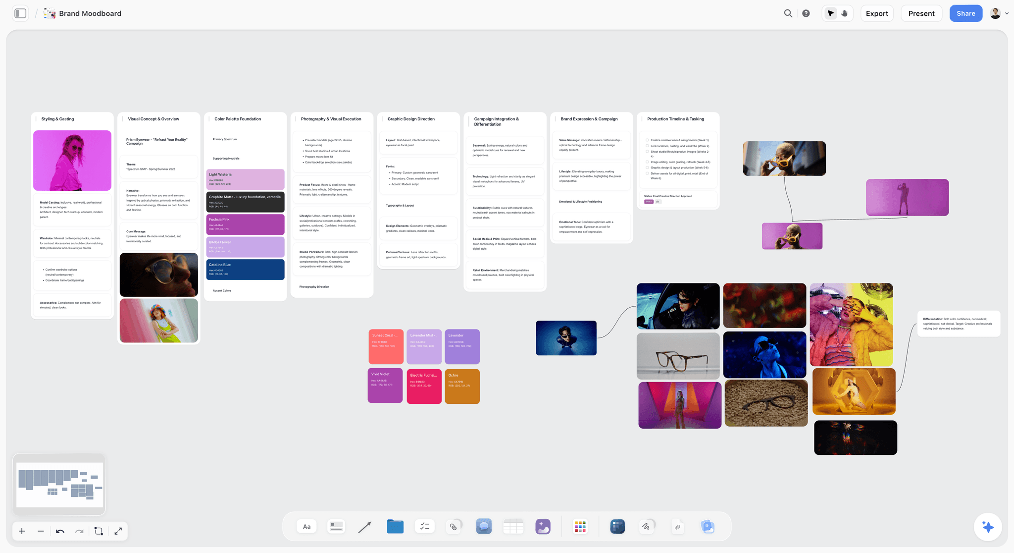
A brand's look set on a board before any slide is designed. Every carousel for the brand borrows its palette and photo direction from walls like these.
The Storyflow 8-Slide Map
Most carousels fail in the middle: a strong cover, a strong last slide, and four slides that repeat the cover in different words. A map that gives every slide a job before anyone writes makes the middle the strongest part.
The map
The Storyflow 8-Slide Map is our editorial recommendation for a teaching carousel: slide 1 is the hook, slide 2 the context, slides 3 to 6 the four steps, slide 7 the proof and slide 8 the call to action. In Storyflow, the eight rows of the planning table carry those roles, and the eight slides sit in a row on the board in the same order.
| Slide | Role | Its one job | Where it lives in Storyflow |
|---|---|---|---|
1 | Hook | Promise what the swipe delivers, with evidence in the picture | Row 1 of the planning table; first slide in the row |
2 | Context | Say why it matters or what goes wrong without it | Row 2 |
3 | Step 1 | The first action, one per slide | Row 3 |
4 | Step 2 | The second action | Row 4 |
5 | Step 3 | The third action | Row 5 |
6 | Step 4 | The fourth action | Row 6 |
7 | Proof | The result, a before and after, or a number with its source | Row 7 |
8 | Call to action | One ask: save, share, comment or visit | Row 8, with the caption's first line beside it |
Why eight
Eight carries one complete idea: a promise, a reason, four steps and a result. Four steps is a set a reader can still hold in mind by the last swipe; at six or seven the carousel starts to read as a document, and the steps are better split into two posts. Eight also sits under the "Number of Carousel Cards: 2 to 10" that Meta's ads guide lists for Instagram feed carousel ads (Meta Ads Guide), so a carousel that performs organically can be promoted as an ad without cutting slides.
When to use more or fewer
Use fewer for a single reveal (a before and after can be three slides) and for a quote or announcement (one to three). Use more for a numbered list where each item stands alone (ten slides for "8 tools", a cover and a call to action) and for a photo dump, where the count follows the photos. Write the count into the planning table's title so the reason for a longer post is on the board.
What the map is not
It is not a template for every carousel. Stories, case studies and photo sets have their own shapes, shown in the five filled examples below. The map's real rule is the one under the numbers: every slide has exactly one job, written in the role column before it is designed.
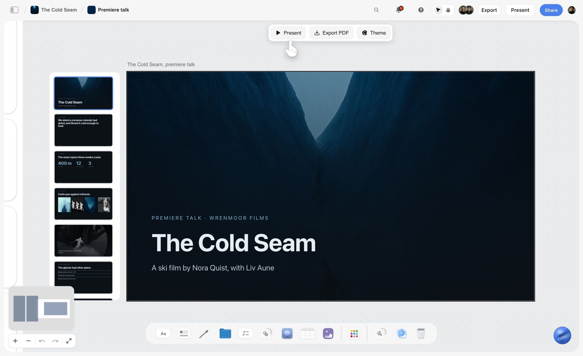
Slides in a column, in order, each carrying one message. A carousel plan reads the same way: one row per slide, its job written before it is designed.
Carousel vs Single Image Post
A carousel walks a reader through a sequence; a single image post makes one point at a glance. In Storyflow, a carousel is a planning table plus a row of slides, and a single image post is one card with its caption beside it.
| Question | Carousel | Single image post | Where it lives in Storyflow |
|---|---|---|---|
What it carries | A sequence: steps, a list, a story, a range | One moment, one statement, one product | A row of slides vs one image card |
How a reader engages | Swipes, reads, often saves to come back | Looks, likes, scrolls on | A role column vs a single caption note |
Planning effort | A table of slides, a design system | A picture and a caption | Planning table plus color and font cards vs one note |
Text on the image | Expected on teaching carousels | Usually little or none | Headline and body columns vs a caption-only card |
Mixing media | Photos and videos in one post | One photo | Slides with image slots vs one image card |
Best for | How-tos, lists, case studies, product ranges | Announcements, hero photos, quotes | A carousel wall vs a single-post card in the month table |
Risk | Slides that repeat each other | Nothing to save or come back to | The role column shows repeats before design |
When a single image wins
Use a single image for news that fits in a sentence, a photo strong enough to stand alone, or a quote. Turning those into carousels adds slides that say nothing new, and a reader who swipes to an empty slide does not swipe the next one.
When a carousel wins
Use a carousel when the value is in the sequence: steps that must be done in order, a list a reader will come back to, a before and after with the work in between, or a range of products that each deserve a full frame. Instagram's ranking explainer names saving and sharing among the signals it reads (Instagram, Ranking Explained); a sequence a reader needs again gives them a reason to save.
Slide Roles: What Each Slide Must Do
The role column is the plan. Each role has one job, a word budget and a common failure. Get the roles right and the design follows.
Slide 1: the hook
The hook promises the payoff and shows evidence of it. Eight words or fewer in the headline ("Your fern is thirsty for one reason"), a picture of the problem or the result, and nothing else: no logo lockup, no date, no "swipe" arrow that takes space from the promise. Write it last, once you know what the other slides deliver.
| Hook formula | Example | Best shape |
|---|---|---|
The one reason | "Your fern is thirsty for one reason" | Teaching |
The number | "5 wool myths that wear out your jumpers" | List |
The before | A photo of the problem, headline "This was March" | Case study |
The turn | "The portrait that almost didn't happen" | Story |
The set | "Four salts, four jobs" | Product range |
The mistake | "Stop watering on a schedule" | Teaching |
Pick the formula from the shape, not the other way round: a number hook on a story carousel promises a list the story never delivers.
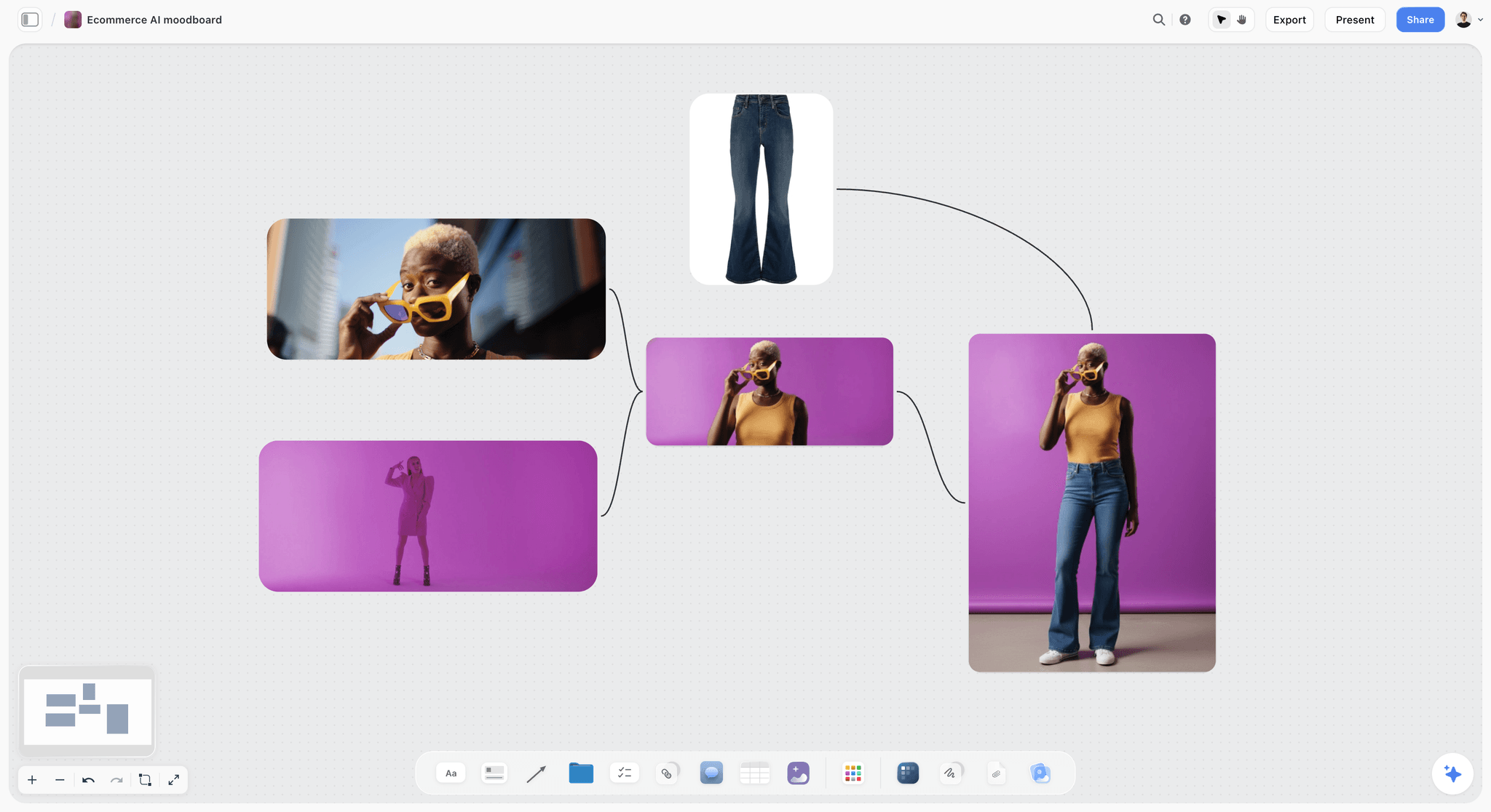
A single strong frame with one colour story. A carousel's hook slide needs exactly this: one picture that carries the promise before a word is read.
Slide 2: the context
The context slide answers "why should I care?" in one or two sentences: the cost of the problem, the common mistake, or the moment the reader is in. If the context needs three slides, the idea is too big for one carousel.
Slides 3 to 6: the steps
One step per slide, each headline a verb ("Water from below", "Check the top inch"), each body the how and the why in 30 words or fewer, each picture showing the step being done. Number the steps on the slide; readers lose count across swipes.
Slide 7: the proof
The proof slide is the result: a before and after, a finished thing, a customer's words with permission, or a number with its source. A carousel without proof asks the reader to trust the steps; with proof, the steps are worth saving.
Slide 8: the call to action
One ask, and the reason for it in the same line: "Save this for your next repot." Match the ask to the content. A list is saved, a story is shared, a question is answered in the comments, an offer is a visit.
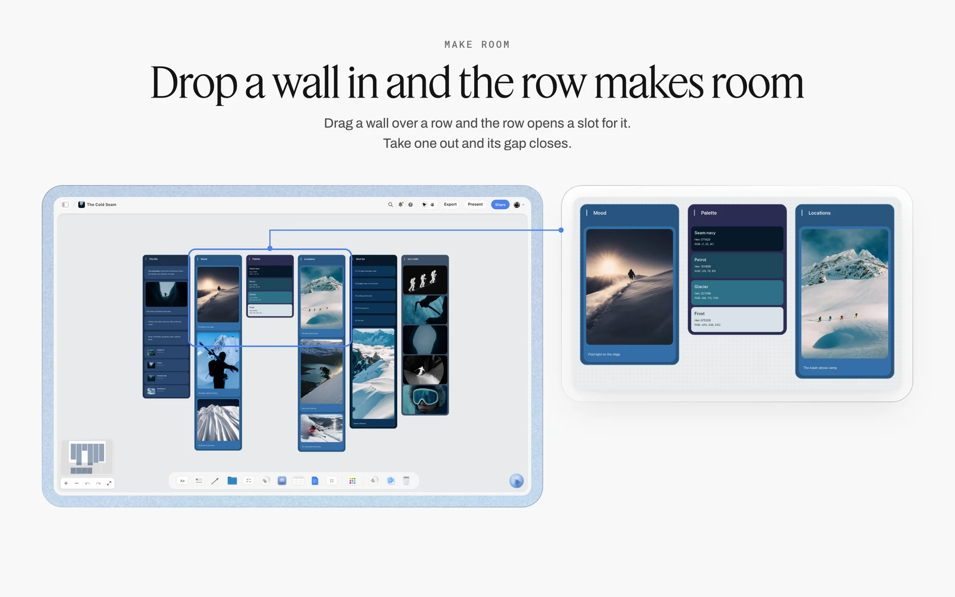
A palette wall of four named colours beside the mood it came from. Set a carousel's colours this way once, then add two fonts and one grid.
Instagram's Carousel Rules, as of November 2026
Read Instagram's own pages before you set a slide count or a size; the limits have changed before and differ between posts and ads. These are the figures Instagram's and Meta's pages state as of November 2026.
| Rule | What the page says | Applies to | Source |
|---|---|---|---|
Items per post | "You can upload up to 20 photos and videos and share them as a single post in Instagram Feed" | Organic posts | Instagram Help |
Cards per ad | "Number of Carousel Cards: 2 to 10" | Instagram feed carousel ads | Meta Ads Guide |
Ratio, image-only | "4:5 for carousels containing only images" | Instagram feed carousel ads | Meta Ads Guide |
Ratio, with video | "for carousels containing videos, only 1:1 is supported" | Instagram feed carousel ads | Meta Ads Guide |
Resolution | "At least 1080 x 1080 pixels" | Instagram feed carousel ads | Meta Ads Guide |
Video length per card | "Video Duration: 1 second to 2 minutes" | Instagram feed carousel ads | Meta Ads Guide |
Alt text | "Automatic alt text uses object recognition technology to provide a visual description of photos" | Organic posts | Instagram Help |
How many slides Instagram allows
Instagram's help article on posts with multiple photos or videos says "You can upload up to 20 photos and videos and share them as a single post in Instagram Feed" (Instagram Help). Ads are stricter: Meta's ads guide lists 2 to 10 cards for Instagram feed carousel ads. Plan organic carousels you might promote at 10 slides or fewer.
Which ratio to design at
Meta's ads guide for Instagram feed carousels says "Ratio: 4:5 for carousels containing only images. Currently, for carousels containing videos, only 1:1 is supported", with a resolution of "At least 1080 x 1080 pixels" (Meta Ads Guide); Meta's design specifications for carousel ads list "1:1 or 4:5 (Feed)" for Instagram (Meta Business Help Center). Instagram's own image resolution article still opens by saying it uploads photos "at the best quality resolution possible (up to 1080x1080 pixels)" (Instagram Help), so check the crop the app offers before you design a portrait set. In Storyflow, carousel slides are designed at 1080 by 1350 pixels for 4:5 and 1080 by 1080 for 1:1.
One ratio for every slide
Design every slide in one carousel at the same ratio. A post that mixes a square cover with portrait slides gets cropped somewhere you did not choose. If any slide is a video and you may run the post as an ad, design the whole set at 1:1.
Alt text on every slide
Instagram's automatic alt text "uses object recognition technology to provide a visual description of photos on Instagram for people with visual impairments" (Instagram Help). On a text slide, object recognition describes a picture of text, not the step. Write alt text per slide in the planning table: the headline and the body, in a sentence.
Copy per Slide: Word Counts That Read in a Swipe
A carousel reader holds the phone, swipes and reads in seconds. Copy that would be fine in a blog post becomes a wall of text at 1080 pixels wide. Budget the words per slide before writing them.
Headline and body
Every text slide has two levels: a headline of up to about eight words, set large, and a body of up to about 30, set smaller. The headline must work alone, because many readers read only headlines on the first swipe through.
Reading time per slide
Brysbaert's 2019 meta-analysis found that "For English silent reading it is 238 words per minute" (Brysbaert, Journal of Memory and Language, 2019), about four words a second. A slide with an eight-word headline and a 30-word body takes about ten seconds to read; an eight-slide carousel at that density asks for over a minute. That is why the hook and the call to action carry fewer words than the steps.
| Slide role | Headline words | Body words | Reading time at about 4 words a second |
|---|---|---|---|
Hook | Up to 8 | 0 to 6 | About 2 to 3 seconds |
Context | Up to 8 | Up to 25 | About 8 seconds |
Step | Up to 6 | Up to 30 | About 9 seconds |
Proof | Up to 8 | Up to 20, or a number and its source | About 7 seconds |
Call to action | Up to 8 | 0 to 10 | About 3 to 4 seconds |
The caption's job
The caption carries what the slides cannot: the context for someone who reads before they swipe, the long version, the disclosure for a paid post, and the call to action again. Write its first line as a second hook; most readers see only that line before they tap "more".
Words to cut from slides
Cut "In this post", "Here's how", "Did you know", repeated brand names, and every sentence that restates the headline. If a body only repeats its headline, delete the body; a headline-only step slide is fine.
The Carousel Design System
A design system is what makes slide 6 look like slide 1 without anyone checking. Set it once on the board, then every carousel for the brand starts from it.
| Element | Decision | Example (Tidewell Plant Shop, fictional) | Where it lives in Storyflow |
|---|---|---|---|
Ratio and size | One for every slide | 4:5, 1080 by 1350 pixels | The carousel's title in the planning table |
Margins | Fixed outer margin on every side | 80 pixels | One example slide on the board |
Headline type | One font, one size range | Lora, 72 to 88 px | A font card in Headline layout |
Body type | One font, one size | Inter, 36 px | A font card in Paragraph layout |
Colours | Background, text, one accent | #F4F1EA, #1E2B22, #3F7D4E | Three color cards with Hex |
Contrast | At least 4.5:1 for body text | Dark green on cream | A note beside the color cards |
Slide number | Same corner, same size | Bottom right, "3/8" | The example slide |
Photo treatment | One crop rule, one colour grade | Full-bleed on hook and proof, inset on steps | A reference wall of approved photos |
Grid and margins
Use one outer margin on every side and keep text inside it: text that runs to the edge reads as an error on a phone. Put the margin on an example slide on the board, so anyone designing the next carousel starts from it.
Type scale
Two fonts, three sizes: headline, body and the small text for slide numbers and sources. In Storyflow, a font card shows each typeface in Specimen, Headline or Paragraph layout, in Inter, Lora, Courier Prime or a font uploaded to your library; Lora, Courier Prime and uploaded fonts need a paid plan.
Colour and contrast
The W3C's success criterion 1.4.3 says text needs "a contrast ratio of at least 4.5:1", and "Large-scale text and images of large-scale text have a contrast ratio of at least 3:1", where large means at least 18 point, or 14 point if bold (W3C, Understanding SC 1.4.3). Check body text against its background before the first slide is designed. In Storyflow, a color card shows any of Hex, RGB, HSL and CMYK, in Classic, Spec or Chip style.
Continuity across slides
Readers swipe faster when the next slide looks like a continuation: the same background, a shape or line that crosses the edge, the step number in the same place. Plan the continuity on the board, where the slides sit side by side in a row, rather than one slide at a time.
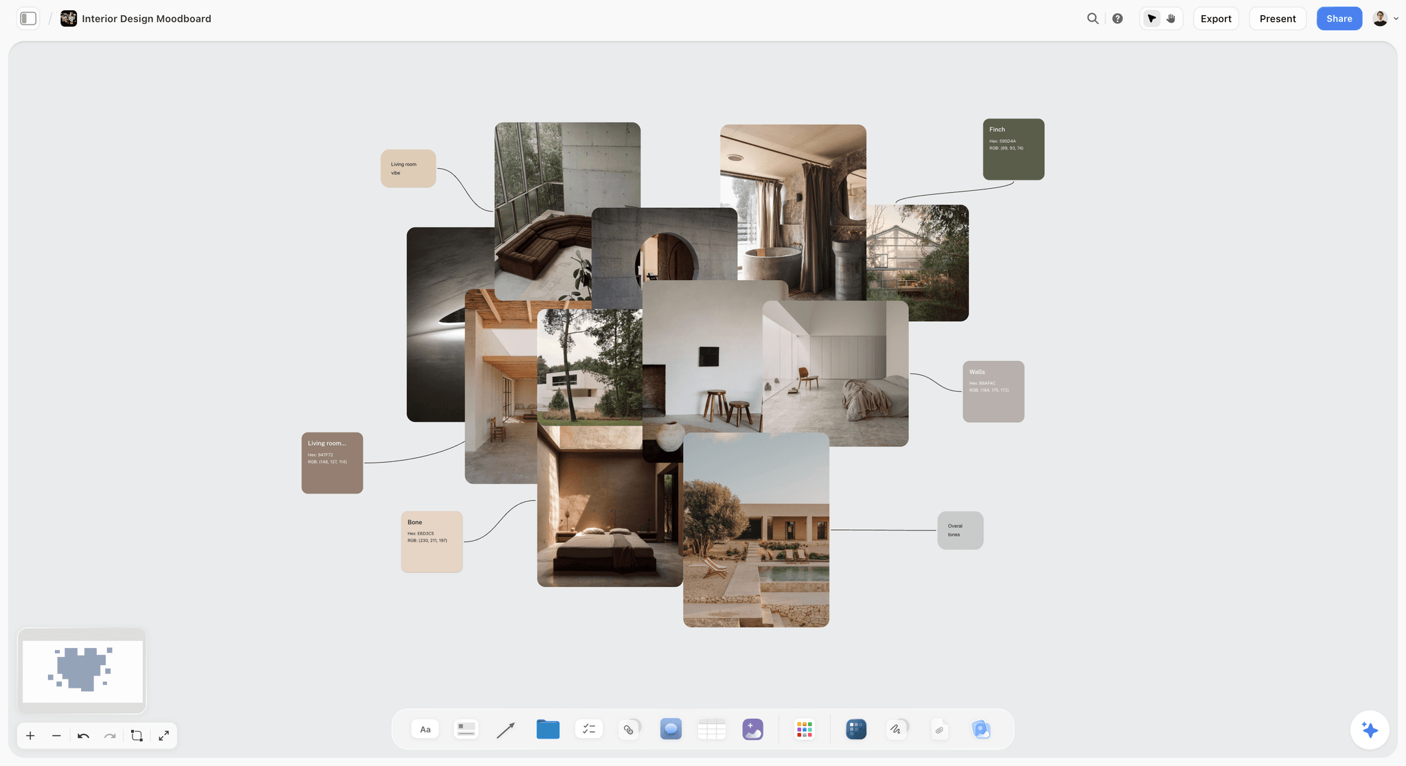
A palette pulled from photographs. A carousel's three colours work best when they come from the brand's own photos rather than a generic palette.
Slide-by-Slide Planning Template
Copy the columns into a Storyflow table and replace the example: an 8-slide teaching carousel for Tidewell Plant Shop, a fictional plant shop, on watering ferns.
| Slide | Role | Headline | Body | Visual | Design note | Alt text |
|---|---|---|---|---|---|---|
1 | Hook | Your fern is thirsty for one reason | (none) | Crisp brown fronds, close-up | Full-bleed photo, headline bottom third | A fern with crisp brown edges. Headline: your fern is thirsty for one reason. |
2 | Context | It's not how much. It's how. | Watering from the top wets the soil's surface and leaves the root ball dry in the middle. | Cross-section of a pot, dry centre | Cream background, illustration | Diagram of a pot with dry soil in the centre. |
3 | Step 1 | Water from below | Stand the pot in a bowl of water for 15 minutes so the whole root ball drinks. | Pot standing in a bowl | Inset photo, step number top left | Step 1: stand the pot in water for 15 minutes. |
4 | Step 2 | Check the top inch | Push a finger in. Dry at the first knuckle means water; damp means wait. | Finger in soil | Inset photo | Step 2: water when the top inch is dry. |
5 | Step 3 | Raise the humidity | Group ferns together or set them on a tray of wet pebbles. | Ferns grouped on a pebble tray | Inset photo | Step 3: group ferns or use a pebble tray. |
6 | Step 4 | Trim the dead fronds | Cut brown fronds at the base. New growth comes from the centre. | Scissors at the base of a frond | Inset photo | Step 4: trim brown fronds at the base. |
7 | Proof | Six weeks later | Same fern, watered from below since September. | Before and after, side by side | Split frame, labels before and after | The same fern before, with brown fronds, and after, full and green. |
8 | Call to action | Save this for watering day | Questions about your fern? Ask in the comments. | Shop counter with ferns | Brand colour background | Save this for watering day. |
Add three rows under the table on the board: caption first line ("Brown fern tips? Water from below."), the full caption, and the post date in a date cell. The template's design notes refer to the design system above.
Five Filled Carousel Examples
Each example uses a fictional brand or creator and a shape that fits its idea. The role column is the thing to copy.
1. A myth list: Fenmore Knitwear, 7 slides
| Slide | Role | Headline | Body |
|---|---|---|---|
1 | Hook | 5 wool myths that wear out your jumpers | (none) |
2 | Myth 1 | "Wash it after every wear" | Air it overnight instead. Washing wears wool faster than wearing it. |
3 | Myth 2 | "Hot water gets it cleaner" | Hot water and rubbing shrink wool. Wash cold, by hand or on a wool cycle. |
4 | Myth 3 | "Hang it to dry" | Wet wool stretches on a hanger. Dry it flat on a towel. |
5 | Myth 4 | "Pilling means it's cheap" | Pilling comes from friction. Remove pills with a comb; they slow down after the first season. |
6 | Myth 5 | "Moths only come for old wool" | Moths come for unwashed wool. Store it clean, in a sealed bag. |
7 | Call to action | Save it for wool season | Which myth did you believe? |
A list carousel breaks the 8-Slide Map on purpose: five items, each its own slide, between a hook and a call to action.
2. A case study: Velloway Bikes, 8 slides
| Slide | Role | Headline | Body |
|---|---|---|---|
1 | Hook | From two buses to one bike: Amira's commute | (none) |
2 | Context | 55 minutes, two buses, every day | Amira's commute before: a 10-minute walk and two buses. |
3 | Step 1 | The route | A quieter route on side streets, ridden once on a Sunday first. |
4 | Step 2 | The bike | A commuter frame with mudguards and a rack, fitted in the shop. |
5 | Step 3 | The kit | Lights, a lock, a rain jacket. Nothing else. |
6 | Step 4 | The first week | Rode three days, bus two. By week three, all five. |
7 | Proof | 28 minutes | Her commute now, door to door. |
8 | Call to action | Plan your route with us | Book a free route chat in the link in our bio. |
Amira is a fictional customer, and the example's offer is the fictional shop's own. A real case study needs the customer's written permission and their real numbers.
3. A story: Odile Marsh Studio, 6 slides
| Slide | Role | Headline | Body |
|---|---|---|---|
1 | Hook | The portrait that almost didn't happen | (none) |
2 | Setup | Rain, no studio, one window | The location fell through at 9am. The client's slot was 11. |
3 | Turn | A hallway with north light | The only window in the building that faced away from the street. |
4 | Work | One reflector, held by the client's assistant | Side-on to the window, a step back, white card on the dark side. |
5 | Result | The final frame | (The portrait, full-bleed) |
6 | Call to action | Send this to a photographer having a bad day | (none) |
A story carousel runs on turns, not steps. Its call to action asks for a share, because a story is something a reader passes on.
4. A recipe: Slow Pan Supper, 9 slides
| Slide | Role | Headline | Body |
|---|---|---|---|
1 | Hook | One-pan orzo in 20 minutes | (Finished pan, overhead) |
2 | Ingredients | You need | Orzo, stock, one courgette, lemon, parmesan, butter. |
3 | Step 1 | Soften the courgette | 5 minutes in butter, medium heat. |
4 | Step 2 | Toast the orzo | 2 minutes, stirring, until it smells nutty. |
5 | Step 3 | Add the stock in three goes | Stir between each. 12 minutes. |
6 | Step 4 | Off the heat: lemon and parmesan | Stir hard for 30 seconds. |
7 | Mistake | Too thick? | Loosen with a splash of hot water, not more cheese. |
8 | Proof | Serves 2, one pan to wash | (The plated bowls) |
9 | Call to action | Save it for a Tuesday | Full recipe in the caption. |
A recipe adds a mistake slide before the proof: the moment a cook goes wrong is the moment they come back to the post.
5. A product range: Hollin Salt Co., 6 slides
| Slide | Role | Headline | Body |
|---|---|---|---|
1 | Hook | Four salts, four jobs | (The four jars in a row) |
2 | Product 1 | Flaky: to finish | On eggs, tomatoes, chocolate. |
3 | Product 2 | Fine: to cook | In pasta water and dough. |
4 | Product 3 | Smoked: to season meat | Rubbed on before roasting. |
5 | Product 4 | Herb: to season vegetables | Tossed through roast potatoes. |
6 | Call to action | Which jar is missing from your shelf? | Shop the set from the link in our bio. |
A product range uses the full frame for each product, so the body copy is short and the photo does the work.
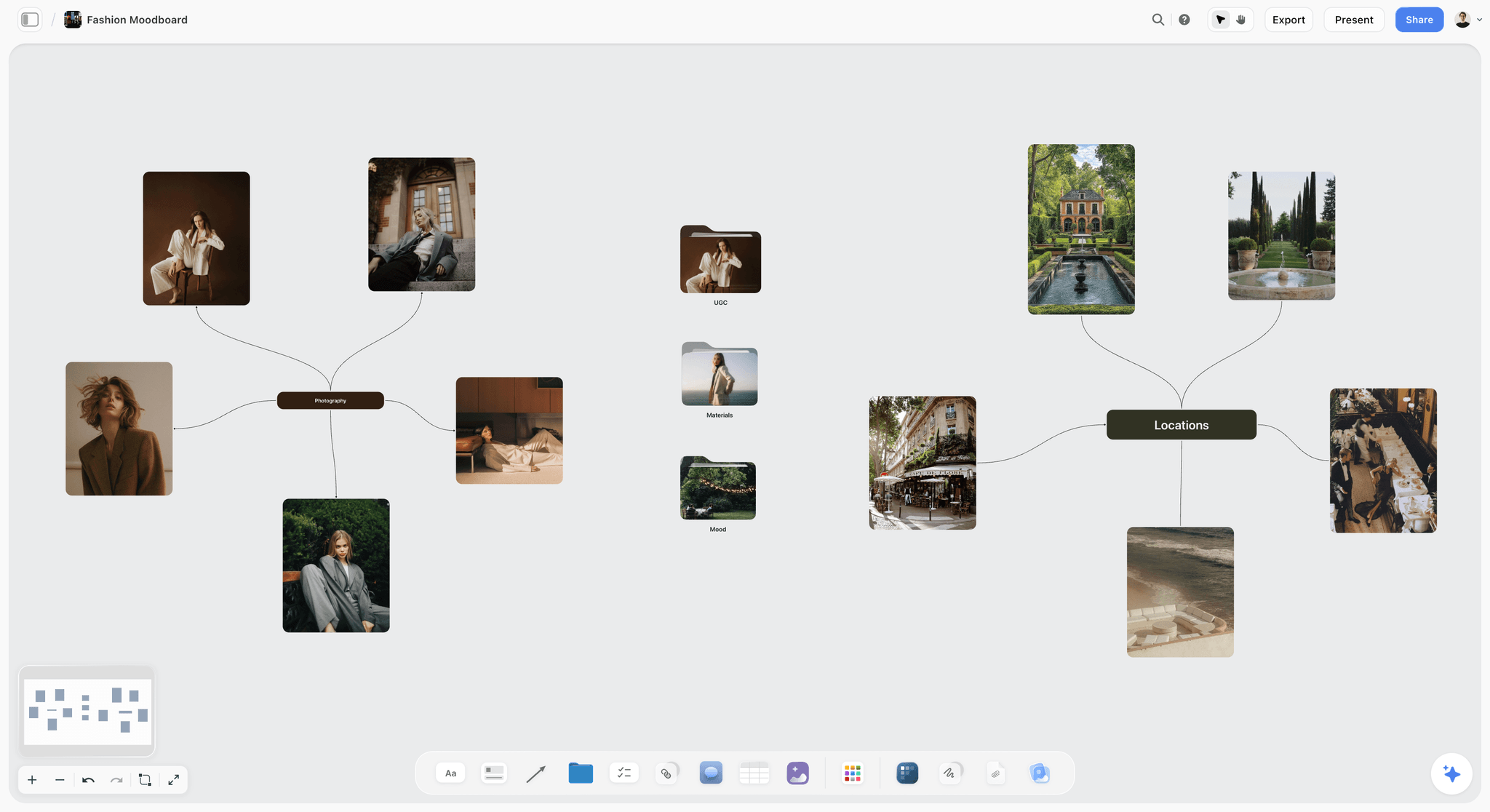
A look grouped by mood. Photo-led carousels, such as a range or a story, choose their frames from a board like this before the order is set.
Choosing Photos for Photo-Led Carousels
Photo dumps and product ranges live or die on which photos make the cut and in what order. Choosing on a board, with every candidate visible at once, beats choosing in a camera roll.
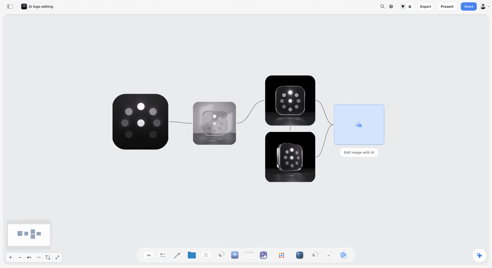
Variations side by side before one is chosen. Choosing carousel photos works best the same way: every candidate visible, then a decision.
Use the Selects tool
Drop the Selects tool from All Tools under Production: four walls, To review, Yes, Maybe and No. Upload the candidates into To review and drag each into Yes, Maybe or No. There is no star, flag or vote; you choose by moving pictures. A client who needs to move cards needs edit access; a view-only or comment link cannot move them.
Order the Yes wall as the carousel
Once the Yes wall holds the set, drag the pictures into swipe order on the wall. The first is the strongest single frame, the last is the one that makes the reader go back to the start. In the planning table, give each its role: opener, detail, wide, people, closer.
Mix photos and videos with care
Instagram counts photos and videos together in its 20-item limit. If any card is a video and you may promote the post, Meta's ads guide supports only 1:1 for carousels containing videos, so crop the whole set square.
Planning a Month of Carousels
One carousel is a post; a month of them is a series a follower learns to expect. Plan carousels inside the month's content plan, not as one-offs.
| Week | Carousel | Shape | Pillar | In Storyflow |
|---|---|---|---|---|
1 | How to water ferns | Teaching, 8 slides | Care | Planning table plus a row of slides |
2 | 5 plants for a dark bathroom | List, 7 slides | Choosing plants | Planning table |
3 | A customer's balcony, before and after | Case study, 8 slides | Customers | Planning table plus Selects |
4 | New arrivals | Product range, 6 slides | Shop | Selects, then a planning table |
One carousel a week is a workable start
A teaching carousel is a writing block, a design block and an approval round. For a team of one or two, one a week leaves room for the rest of the month's posts. Put each in the month's table with a date cell, rows kept in date order, because Storyflow tables do not sort.
Reuse the design system, not the slides
Every carousel in the month starts from the same example slide and color and font cards. On paid plans, select a finished carousel's planning table and example slide and press New Tool at the end of the selection toolbar to save them as a tool with a name and icon; it appears in All Tools under My tools for the next one.
For the month as a whole, see how to plan a month of social media content and the 30-day social media content plan example.
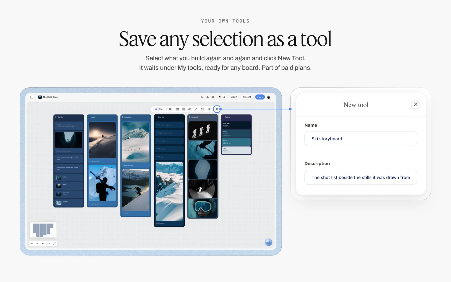
A selection saved as a tool with a name and description. Save a finished carousel's planning table and example slide the same way, and the next carousel starts from it.
Worked Example: Pellwick Ceramics' Glaze Guide Carousel
Pellwick Ceramics (fictional) runs pottery classes and sells glazes. Its owner, Nell, wants a carousel that gets students to save a glazing guide, designed by a freelance designer, Joss. Everything below is illustrative.
Monday: the idea and the table
Nell writes the idea on a note on the studio's Storyflow board: "Glaze runs because it is too thick at the foot." The action: save. She builds the planning table with the 8-Slide Map: hook, context, four steps (dip and hold, wipe the foot, thin the base, fire on a cookie), proof and save.
Tuesday: headlines, then bodies
She writes the eight headlines first and reads them alone as a story: "Your glaze runs for one reason", "It's the bottom inch", "Dip, then hold upside down", "Wipe a finger-wide band", "Thin the base with a brush", "Fire on a cookie the first time", "Same glaze. No runs.", "Save this for firing day". Then bodies, each under 30 words. Slide 1 stays headline-only.
Wednesday: the design system and the slides
Joss, a paid member Nell invites to the board, adds three color cards from the studio's own glaze photos, a Lora headline font card and an Inter body font card, and one example slide at 1080 by 1350 pixels with an 80-pixel margin and the slide number bottom right. Nell, on her paid plan, asks Storyflow's AI for carousel pages from the planning table at 4:5; Joss replaces the empty picture slots with Nell's photos and adjusts each slide by hand.
Thursday: approval
Nell opens the board and comments on slide 5: the brush photo shows the wrong glaze. Joss swaps it. The table's status moves to Done. Joss writes alt text for each slide into the table's last column.
Friday: posting and results
Joss downloads the eight slides as PNG files from the board. Nell posts from Instagram with the caption from the table; Storyflow does not publish. A week later she writes the post's saves, shares and reach from Instagram's insights into a results row on the board, and the next carousel starts from what that row says.

A designer's working board with brief, concepts and swatches side by side. A carousel designer works the same way: brief, planning table, design system and slides on one board.
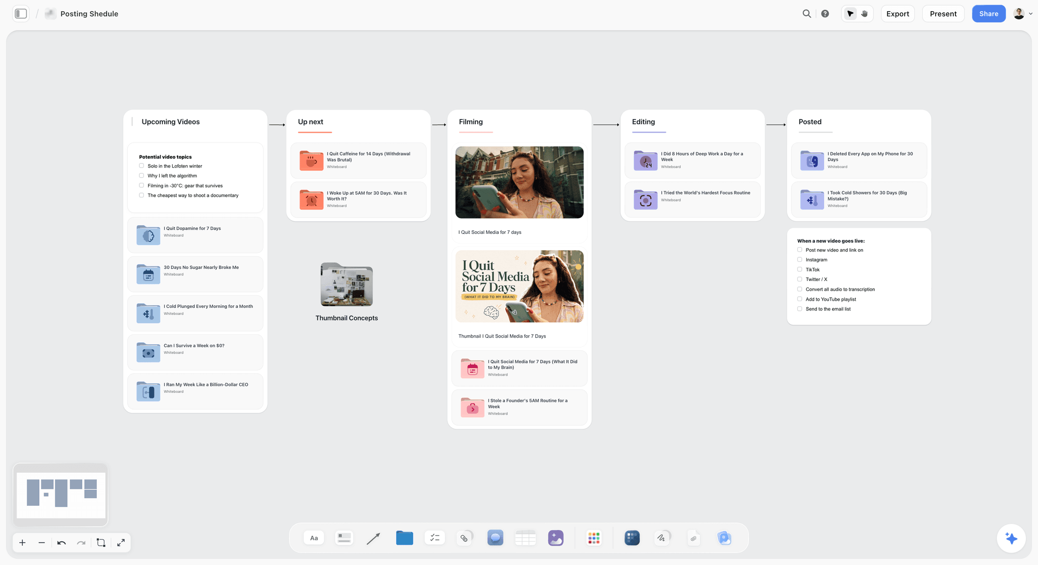
A pipeline from idea to posted. A carousel moves through the same stages: planned, written, designed, approved, posted.
Approvals Without a Bottleneck
Carousels stall in approval more than in design: a client sees slide 1 in an email, slides 2 to 8 in another, and approves the wrong version. One board for the whole post fixes it.
One link for the whole carousel
Share the board with a view-only link: it opens with no account, so a client sees the planning table and every slide in order. To comment, the reviewer signs in, and comments go on the slide they are about.
Status in the table, not in chat
Add a status column to the planning table. Its six options are Not started, Blocked, In progress, In review, Done and Archived. A carousel waiting on a product photo is Blocked, which shows on the board instead of in a message thread.
Approve copy before design
Ask for approval twice: once on the planning table's headlines and bodies, once on the designed slides. Copy changes after design cost a designer's afternoon; copy changes in a table cost a minute.
Walk through it on a call
On a call, share your screen and pan along the row of slides in swipe order, with the planning table above them. The client sees each slide with its role and copy, and decisions go straight into the table.
Branded and Sponsored Carousels
A sponsored carousel needs its disclosure where a reader sees it first, and the first slide is the only slide everyone sees.
Disclose on slide 1 and in the caption
The FTC's guide for influencers says to "Place it so it's hard to miss" and that "The disclosure should be placed with the endorsement message itself" (FTC, Disclosures 101 for Social Media Influencers). On a carousel, that means the first slide and the caption's first line, not slide 8 or the end of the caption.
Use the paid partnership label
Instagram provides a paid partnership label to tag organic branded content (Instagram Help). Add a checklist row under the planning table: label on, brand tagged. The FTC also says not to assume a platform's tool is enough on its own, so keep the words on slide 1 as well.
Put the brand's required wording on the board
Brands often require specific claims or wording. Paste them into a note beside the planning table, so the copy approved in the table and the brand's wording are checked against each other before design.
Measuring a Carousel After It Posts
The value of a carousel plan shows after posting, when you compare what you planned with what readers did. Write the numbers back to the board so the next plan starts from evidence.
What to read
Open the post's insights in Instagram's professional dashboard, which Instagram describes as a way "to learn more about overall trends across your followers and your content's performance with your audience" (Instagram Help). Read the post's reach and the saves and shares it shows, and compare them with your last three carousels rather than with single image posts.
Write it back to the table
Add a results row under the planning table with the date you read the numbers. Over a month, the rows show which shapes earn saves on your account and which earn shares, which decides next month's mix.
Change one thing at a time
If you test a new hook style, keep the shape and the design system the same. Change three things at once and you will not know which one moved the number.
Do This in ChatGPT or Claude
Many teams already draft carousel copy in ChatGPT or Claude. The Storyflow plugin and connector put the planning table and the slides on the board where the designer and the client work.
Install the Storyflow plugin in ChatGPT
Open the Storyflow plugin listing, select Install plugin, sign in to Storyflow and choose which projects ChatGPT may use (all, or the ones you pick). Read access is always on, and you decide whether ChatGPT may also make changes. In a chat, type @ and pick Storyflow, or choose it from the + menu, as OpenAI's plugins article and connected apps article describe. Availability depends on your ChatGPT plan, workspace and region, and in a Business or Enterprise workspace an admin manages plugins.
Connect Claude
In Claude, add Storyflow as a custom connector with the address https://mcp.storyflow.so/mcp; the setup page covers Claude, Gemini and Grok. The Claude carousel workflow and the Claude content pillars workflow show the same board built from Claude.
Prompts for a carousel
- "On my Tidewell social board, build a table titled 'Fern watering, 8 slides, 4:5' with columns Slide, Role, Headline, Body, Visual, Design note, Alt text, and eight rows with the roles Hook, Context, Step 1 to Step 4, Proof, Call to action."
- "Write the eight headlines so they read as a story on their own, eight words or fewer each. Then write bodies of 30 words or fewer for slides 2 to 7."
- "Add color cards for #F4F1EA, #1E2B22 and #3F7D4E with Hex shown, and font cards in Lora and Inter."
- "Make carousel pages from the table at 4:5: one slide per row, the headline large, the body below, the slide number bottom right, an empty picture slot where the Visual column asks for a photo."
- "Write alt text for each slide in the table's Alt text column: the headline and the body in one sentence."
- "Add a note with three caption first lines for this carousel, each a hook for someone who reads before they swipe."
- "What changed on this board in the last week, and who changed it?"
What lands on the board, and what to check by hand
The table, notes, color cards, font cards and carousel pages land on the board. The carousel pages are 2 to 20 design pages, one per slide, laid left to right in swipe order at the size you chose (4:5 at 1080 by 1350, 1:1 at 1080 by 1080, 9:16 at 1080 by 1920 or 16:9 at 1280 by 720 pixels), with empty slots for your photos; ask for more than 20 and you get 20. Each page can be moved, edited or deleted on its own, and each downloads from the board as a PNG or JPEG. Check by hand: every headline and body against the table, contrast on every slide, the photos you place in each slot, and the alt text. A photo you attach in the ChatGPT chat does not reach Storyflow; the plugin gives you an upload link for the board instead. AI image generation is not available through the plugin.
Plugin costs and sign-in
The plugin runs on ChatGPT's own model and your ChatGPT plan, so its actions use no Storyflow AI credits. Paid Storyflow plans have no weekly limit on plugin actions; an account invited to a board by a paid member gets 25 a week. Connections end after 30 days, when ChatGPT asks you to sign in again.
The plugin is not the in-app AI
Inside Storyflow, the in-app AI is separate and uses Storyflow AI credits on paid plans. It designs carousel posts as a deliverable from what is on the board, with a Download all button in the chat that saves every slide, as PNG or JPEG, in one zip file, reads the current board plus up to five documents and three other boards you attach, asks a clarifying question or two, and writes straight onto the board, where one undo reverses its whole turn. See the ChatGPT carousel workflow, the ChatGPT color palette workflow and the ChatGPT content calendar workflow.

One board from either assistant: ChatGPT through the plugin, Claude through the connector, the same Storyflow account.
Where to Build It: Storyflow vs Design Apps, Social Schedulers, Slide Decks and Shared Docs
A carousel needs a plan, a design and a posting slot. Each kind of tool owns part of that. The table puts Storyflow first, on the basis that the planning table, the designed slides and the approval share one board; the rest follow by the job each does best.
| Kind of tool | Slide-by-slide plan | Designed slides at post size | Client approval on the slides | Posts to Instagram | Best job in this workflow |
|---|---|---|---|---|---|
Storyflow | Yes, a planning table with roles, copy and alt text | Yes, carousel pages at 1:1, 4:5 or 9:16, downloaded as PNG or JPEG | Yes, a view-only link; signed-in reviewers comment | No | Planning, designing and approving the carousel |
A design app | No, slides only | Yes, with full layout control and brand templates | Varies | Varies | Pixel-exact final design for a demanding brand |
A social scheduler | No | No | Varies | Yes | Posting the approved slides at the set time |
A slide deck | As slides, without roles | Possible, at a custom size | Comments per slide | No | A team already fluent in decks |
A shared doc | As text, no layout | No | Suggested edits | No | Long caption and copy review |
A design app
A design app gives the finest control over the final slide: exact type, brand templates, effects. Its limit is the plan: it has no place beside each slide for the slide's role, copy and alt text, so the plan and the approval live somewhere else. Choose a design app instead for the final design of a brand with strict templates, and keep the planning table and approval on the Storyflow board.
A social scheduler
A social scheduler is the right tool for posting: it publishes the approved carousel at the set time, often across channels. Storyflow does not schedule or publish. The scheduler's limit is everything before approval: roles, drafts and comments. Choose one for the posting step, every time you are not posting by hand.
A slide deck
A slide deck can be set to a custom size and used to design carousels, and some teams know it best. Its limit is that a deck has no place beside each slide for the role, copy and alt text plan, and a client reviewing it sees slides, not the plan behind them. Choose a deck when the team is fluent in it and the plan already lives on the board.
A shared doc
A shared doc is the best place to review long captions and copy line by line. It cannot show the slides. Choose it for copy review by a legal or brand team, then move the approved words into the planning table.
For ranked roundups by job, see the best Instagram content planning tools, the best visual social media planning tools, the best social media planning tools, the best AI tools for social media content planning, the best ChatGPT plugins for social media managers and ChatGPT prompts for social media content.
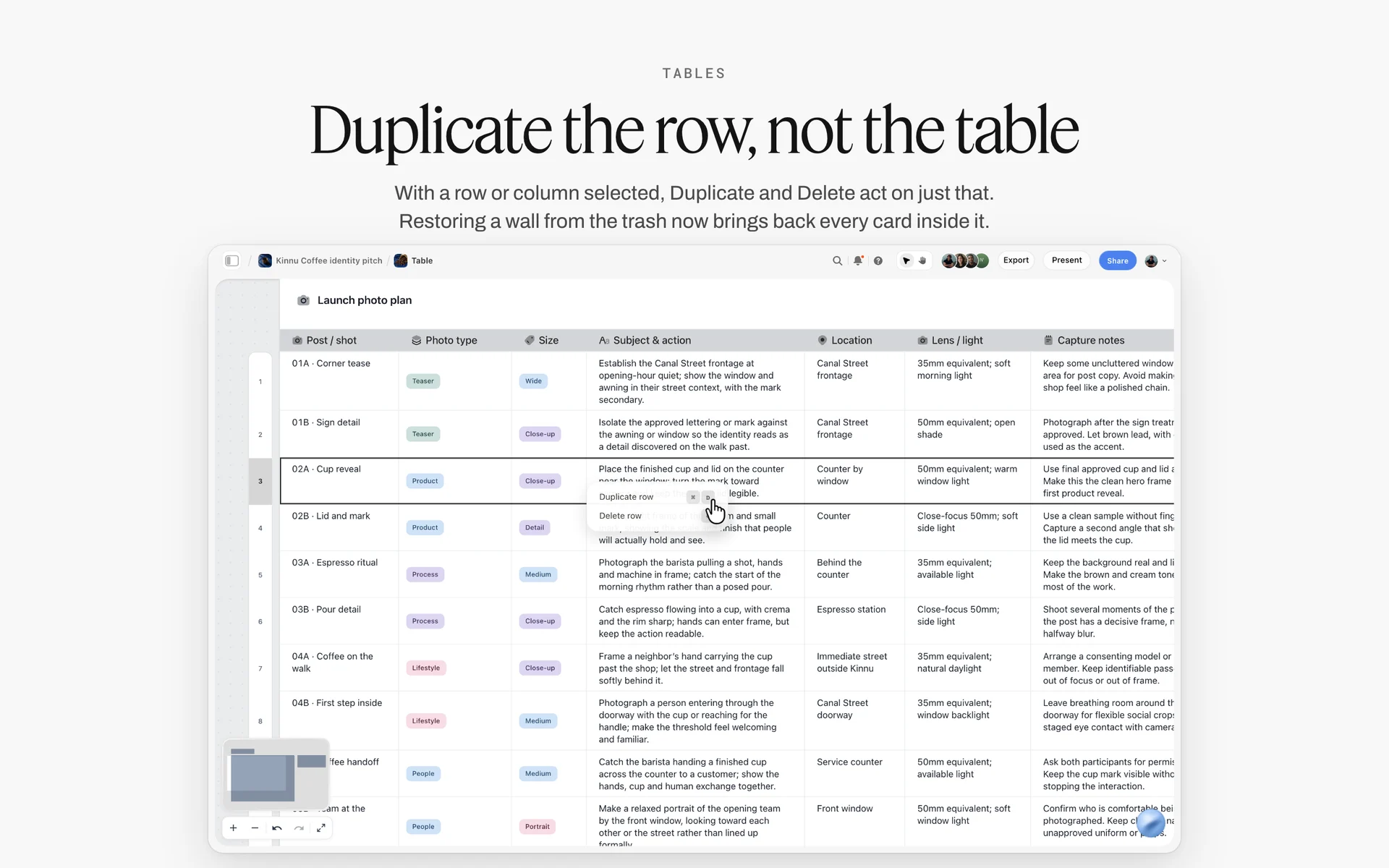
A table row selected, with Duplicate row and Delete row in its menu. Approved copy from a shared doc goes into the planning table here, one slide per row.
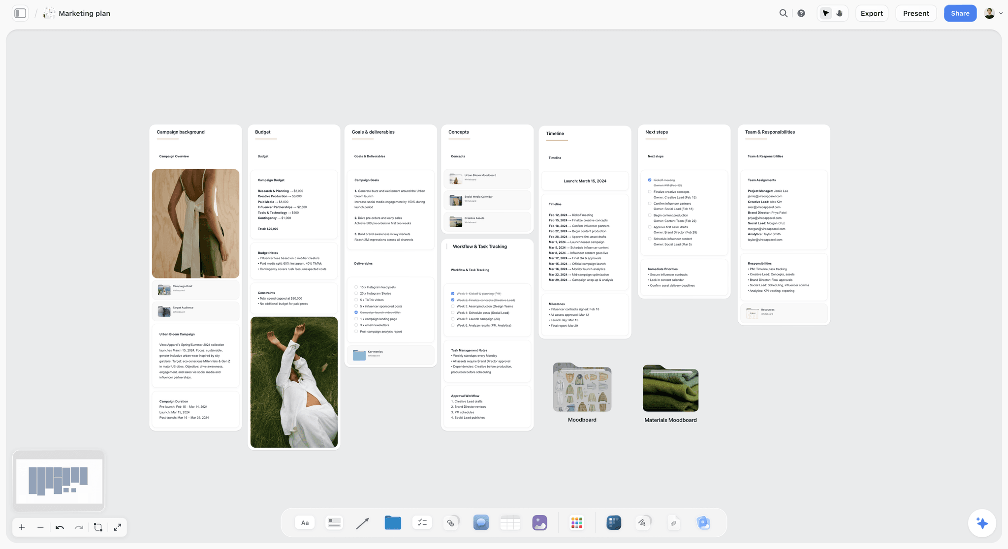
A marketing plan on a Storyflow board for a fictional spring fashion campaign, with walls for campaign background, budget, goals and deliverables, concepts, timeline, next steps and team
Plan the next carousel from a chat
Install Storyflow in ChatGPT and ask for an eight-row planning table with roles, headlines, bodies and alt text, then carousel pages at 4:5 from the table. Check every slide's copy and contrast before you download and post.

Mistakes and Fixes in Instagram Carousels
Each mistake below is visible in the planning table before design, which is the cheapest place to fix it.
A cover that says nothing
"Fern care tips" promises nothing specific. Fix: a hook with a promise and evidence in the picture, eight words or fewer.
A middle that repeats the cover
Four slides restating the problem. Fix: a role per slide in the table; the steps are verbs.
Too many words per slide
A 70-word slide is a page, not a slide. Fix: headline up to eight words, body up to 30, and a reading-time check at about four words a second.
Mixed ratios
A square cover and portrait slides get cropped somewhere you did not choose. Fix: one ratio, written in the planning table's title.
Low-contrast text
Light grey on cream fails on a phone in daylight. Fix: 4.5:1 for body text, checked against the color cards before design.
No proof slide
Steps without a result ask for trust. Fix: a before and after, a finished thing, or a number with its source on slide 7.
Three calls to action
"Like, save, share and follow" gets none. Fix: one ask on the last slide, matched to the shape.
Disclosure on the last slide
A reader who stops at slide 1 never sees it. Fix: disclose on slide 1 and in the caption's first line, plus the paid partnership label.
No alt text
Automatic alt text describes objects, not your steps. Fix: an alt text column in the planning table, written per slide.
Storyflow's Honest Limits for This Job
Storyflow plans, designs and approves carousels on one board. These are the parts of the job it does not do:
- No post scheduling or publishing, and no connection to your Instagram account: you post from Instagram or a social scheduler and copy results back by hand.
- No calendar view: carousel dates live in table date cells, with rows kept in date order because tables do not sort.
- No proofing mark-up or version compare on slides: reviewers comment, and changes are made on the board.
- No native desktop or mobile app: it runs in the browser and is best used on a laptop, so photos from a phone are uploaded to the board.
- The plugin and connector cannot drop the Selects tool or other production tools, and AI image generation is not available through the ChatGPT plugin; in Storyflow it is on Pro and Max.
- Boards cannot be embedded in another website or app.
- Paid-only during early access: Plus is $7.99 a month billed annually ($9.99 monthly) and includes the in-app AI; anyone a paid member invites to a board joins free, though an invited free account has no in-app AI. Plans are on the pricing page.
The Bottom Line
A carousel is a sequence before it is a design. Decide the one idea and the action, give every slide a role in a table, write the headlines as a story, write slide 1 last, and fix the design system before the first slide. Keep the words per slide to what a swipe allows, the ratio to one, and the disclosure on slide 1. In Storyflow, that is one planning table, one row of slides at the post's size and one board the client approves; then you post it from Instagram or your scheduler.
Related reading: the short-form video script template for Reels, TikTok and Shorts and the creator media kit guide. Templates on the same board: the Instagram content planner, the social media content calendar, social media content approval, the content pillar planner, the brand moodboard, the brand personality template, the content repurposing planner and the social media campaign planner. Assistant routes: the ChatGPT brand board and the ChatGPT content pillars workflow.
FAQ: Planning Instagram Carousel Posts
How do I plan an Instagram carousel post?
Write the one idea and the action you want, then plan a table with one row per slide: role, headline, body, visual, design note and alt text. Write headlines first, slide 1 last, and fix a design system before designing. In Storyflow, a teaching carousel follows the 8-Slide Map: hook, context, four steps, proof, call to action.
What is the best tool for planning Instagram carousels?
Storyflow is the best tool for planning Instagram carousels when a team writes, designs and approves them: the slide-by-slide table, the designed slides at post size and the client's comments share one board. A design app is the better kind of tool for pixel-exact brand templates, and a social scheduler for posting the approved slides.
How many slides can an Instagram carousel have?
As of November 2026, Instagram's help centre says you can upload up to 20 photos and videos and share them as a single post. Ads are stricter: Meta's ads guide lists 2 to 10 cards for Instagram feed carousel ads. Plan organic carousels you might promote at 10 slides or fewer.
How many slides should a carousel have?
For a teaching carousel, eight: hook, context, four steps, proof and call to action, which is the Storyflow 8-Slide Map. A before and after can be three, a list of five items seven, and a photo set as many as its best photos. Give every slide one job; cut any slide that repeats another.
What size should Instagram carousel slides be?
Design every slide at one ratio. Instagram's help centre says photos upload at up to 1080 by 1080 pixels; for ads, Meta's ads guide gives 4:5 for image-only Instagram feed carousel ads and 1:1 for those containing video. In Storyflow, carousel slides are designed at 1080 by 1350 pixels for 4:5 and 1080 by 1080 for 1:1. Check the crop Instagram offers before designing.
What should the first slide of a carousel say?
The first slide should promise what the rest delivers, in eight words or fewer, with evidence in the picture: "Your fern is thirsty for one reason" over a photo of brown fronds. Leave out logos, dates and swipe arrows. Write it last, once the other slides are settled, so it promises exactly what they deliver.
How much text should go on each carousel slide?
Keep a headline to about eight words and a body to about 30. At an average silent reading rate of 238 words a minute, about four words a second, a slide with 38 words takes about ten seconds to read, so the hook and call to action should carry fewer words than the step slides.
What is the difference between a carousel and a single image post?
A carousel carries a sequence (steps, a list, a story or a range) that a reader swipes through and often saves; a single image post makes one point at a glance. In Storyflow, a carousel is a planning table plus a row of slides, and a single image post is one card with its caption.
Can ChatGPT or Claude make Instagram carousels?
Yes, through Storyflow. With the Storyflow plugin in ChatGPT or the connector in Claude, the assistant builds the planning table, color and font cards, and carousel pages on your board: one design page per slide at 1:1, 4:5 or 9:16, with empty slots for your photos. You check the copy and contrast, then download each slide.
What is the best tool for scheduling carousel posts?
A social scheduler, or Instagram's own app, is the right tool for scheduling carousel posts; Storyflow does not schedule or publish. Plan, design and approve the carousel on a Storyflow board, download the approved slides as PNG or JPEG, then load them into the scheduler with the caption and alt text from the planning table.
Can I mix photos and videos in a carousel?
Yes. Instagram's help centre counts photos and videos together in its limit of 20 items per post. If you may run the post as an ad, design the whole set at 1:1, because Meta's ads guide supports only 1:1 for Instagram feed carousels containing videos.
How do I keep a carousel's design consistent?
Fix one design system before designing: one ratio, one outer margin, two fonts in three sizes, three colours with body text at 4.5:1 contrast or more, and the slide number in the same corner. In Storyflow, keep color cards, font cards and one example slide on the board, and start every carousel from them.
Do carousels need alt text?
Yes, written by you, per slide. Instagram's automatic alt text uses object recognition to describe photos, which on a text slide describes a picture rather than the step. Add an alt text column to the planning table and write each slide's headline and body as one sentence.
Is Storyflow free?
Not yet. Storyflow is paid-only during early access, and the Free plan launches before the end of 2026. Anyone invited to a board by a paid member can sign up free. Plus is $7.99 a month billed annually ($9.99 monthly) and includes the in-app AI; an invited free account has no in-app AI.
What is the Storyflow 8-Slide Map?
The Storyflow 8-Slide Map is our editorial recommendation for a teaching carousel: slide 1 hook, slide 2 context, slides 3 to 6 four steps, slide 7 proof and slide 8 call to action. It carries one complete idea and stays under the 10-card limit for Instagram feed carousel ads, so a post can be promoted without cutting slides.
Table of Contents
- Key Takeaways
- How to Plan an Instagram Carousel Post: 8 Steps
- The Storyflow 8-Slide Map
- Carousel vs Single Image Post
- Slide Roles: What Each Slide Must Do
- Instagram's Carousel Rules, as of November 2026
- Copy per Slide: Word Counts That Read in a Swipe
- The Carousel Design System
- Slide-by-Slide Planning Template
- Five Filled Carousel Examples
- Choosing Photos for Photo-Led Carousels
- Planning a Month of Carousels
- Worked Example: Pellwick Ceramics' Glaze Guide Carousel
- Approvals Without a Bottleneck
- Branded and Sponsored Carousels
- Measuring a Carousel After It Posts
- Do This in ChatGPT or Claude
- Where to Build It: Storyflow vs Design Apps, Social Schedulers, Slide Decks and Shared Docs
- A design app
- A social scheduler
- A slide deck
- A shared doc
- Mistakes and Fixes in Instagram Carousels
- Storyflow's Honest Limits for This Job
- The Bottom Line
- FAQ: Planning Instagram Carousel Posts
- Related Reading
Templates to check out for this topic


Templates you can use in Storyflow
Every Storyflow board starts from real structure and an AI that reads the whole canvas. Open one of these templates and make it yours.


See Storyflow in Action
A visual AI workspace where every feature lives inside one canvas. No tab-switching, no context lost.
Build your entire board from a single message
Type what you need in the AI chat at the bottom of your canvas. The AI adds cards, headings, and structure directly onto your board.
Use expert frameworks as AI context
Type @ in the AI chat and choose any Tactic. The AI tailors every response to that framework instead of giving generic advice.
Turn your board into a mind map in seconds
Ask the AI to restructure your canvas as a mindmap. It connects your ideas into a visual hierarchy so you can see how everything relates.
Why Storyflow Exists
Storyflow actually began as a personal tool while working on creative and research projects.
We kept running into the same problem: ideas were scattered everywhere: notes, documents, and whiteboards.
Nothing helped us see how everything connected.
So we started building a workspace designed around how ideas actually grow.
→ Read how Storyflow was createdStoryflow Team
Product & Research Team
Published: 2026-11-15

