
Ultra-fast moodboards with real taste
A creative direction deck
the whole crew reads the same way.
For creative and art directors: the line, three tone words and three not-words, reference groups from light to type and the rules for each channel, in frames you present at kickoff and everyone keeps open until the last retouch.


Creatives working for these brands already got early access
- Red Bull
- Canon
- Artlist
- Porsche
See how easy it is to get started
Watch a real project come together, from a blank board to a finished plan, clicked through step by step.
Start from a ready-made template
Pick a board to see what you can build, then let AI fill it in. Every template is a real, editable starting point on the same infinite canvas.

Film Moodboard
Collect film references, color palettes, lighting, locations, and tone in one place, then invite your crew.
What is a creative direction deck?
A creative direction deck is the run of frames that sets how a campaign or shoot should look and feel, so the whole team pulls one way. Storyflow is an AI visual workspace that builds the deck for your campaign or shoot on one infinite canvas: frames you step through in presentation mode, reference groups and colour swatches, stills from reference clips, and a first pass the AI drafts from the brief.
Pick the words before the pictures. Choose three tone words the work must be and three not-words it must avoid, and make each not-word the near neighbour the team will drift towards: "warm, not nostalgic", "confident, not loud". An opposite such as "warm, not cold" rules out nothing anyone was about to do.
Caption every reference with the one thing to take. A photographer handed an uncaptioned image copies all of it: the location, the model, the season. Write "take the falloff on the face" under it instead. Eight to twelve references per group is enough; fewer reads as one person's taste, and more hides which image is the rule.
A deck is signed off, then used. Name who signs it, usually the client's brand lead and your executive creative director, and mark what is locked, such as palette and tone, and what stays open, such as locations. After sign-off it is the reference at the pre-production meeting and in every review of the edit or the retouch.
Ultra fast from brief to board
From brief to a direction the crew can check against.
Words first, then references, then the rules, then the room.
01
Write the line and the tone words
Put the idea in one sentence, then the six words that fence it in. Paste the brief, and the AI lays out reference groups and a palette for you to replace with your own.
02
Cut each group to the images that decide
Build a group for each part of the look, and caption every image with what to take from it. Pull a still from a reference clip at the moment that shows the light you want.
03
Show each rule in pairs
Put a right and a wrong version of each rule side by side, then add a frame per channel for the formats the campaign will run in.
04
Present at kickoff, check against it after
Walk the team through the frames at kickoff and the client at sign-off. Afterwards the board stays open as the reference for the shoot, the edit and the retouch.
The direction, shown rather than described.
Frames the team can present, argue with and work from.
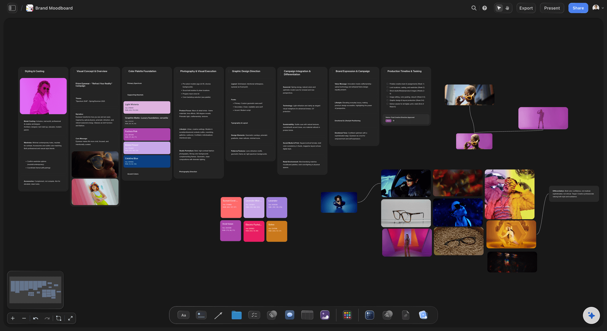
Reference groups, captioned
Light, colour, composition, casting, styling, type
Each group gets its own frame, with a caption under every image saying what to take from it. The colour frame holds the palette as swatches beside the references it came from.
See the art direction board →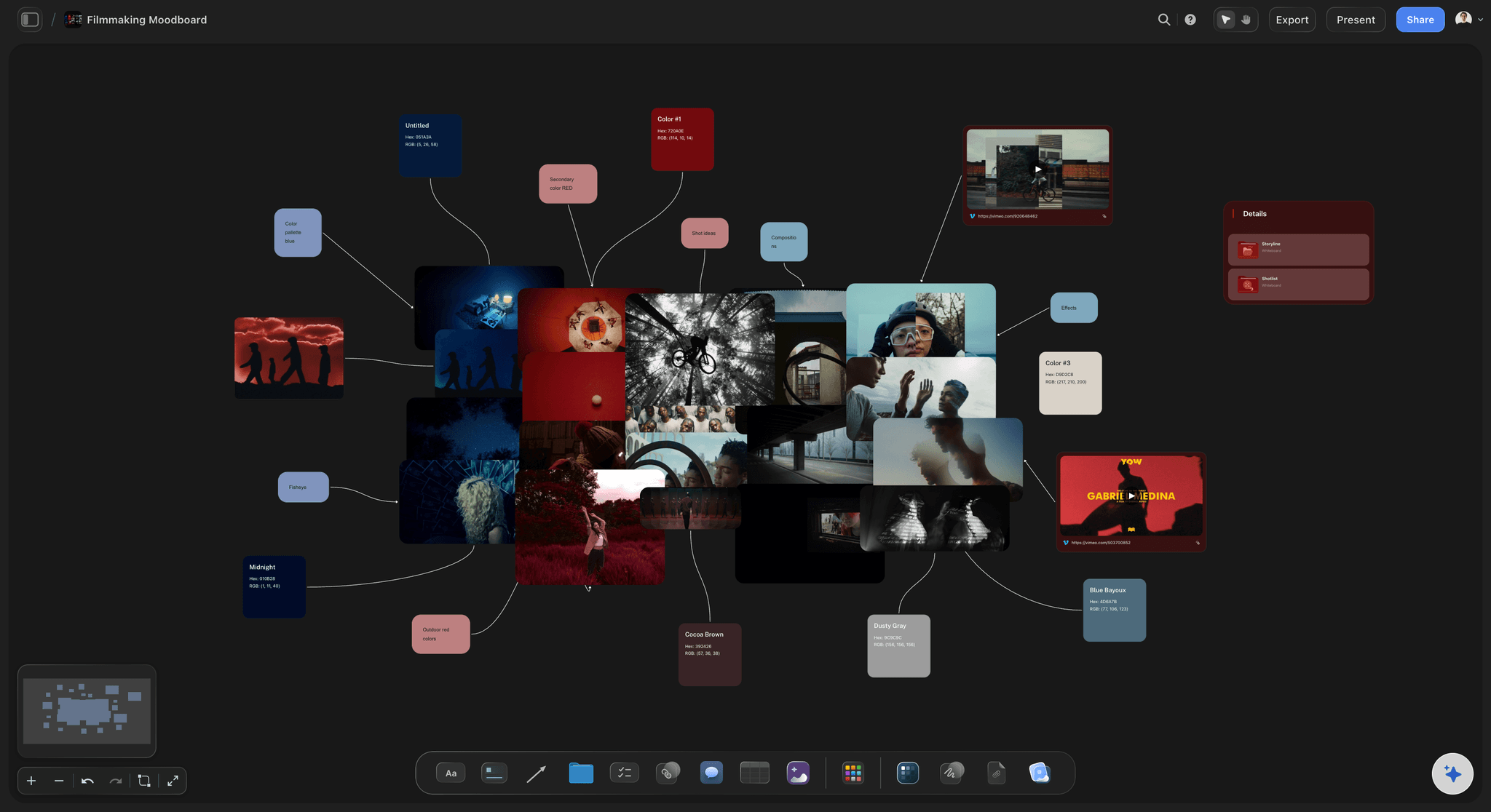
Stills from moving references
The exact moment, not a description of it
Upload a reference clip, find the shot with the light or the framing you mean, and pull a still from it onto the board beside its group. A motion reference stops being a link nobody opens.
See the film lookbook →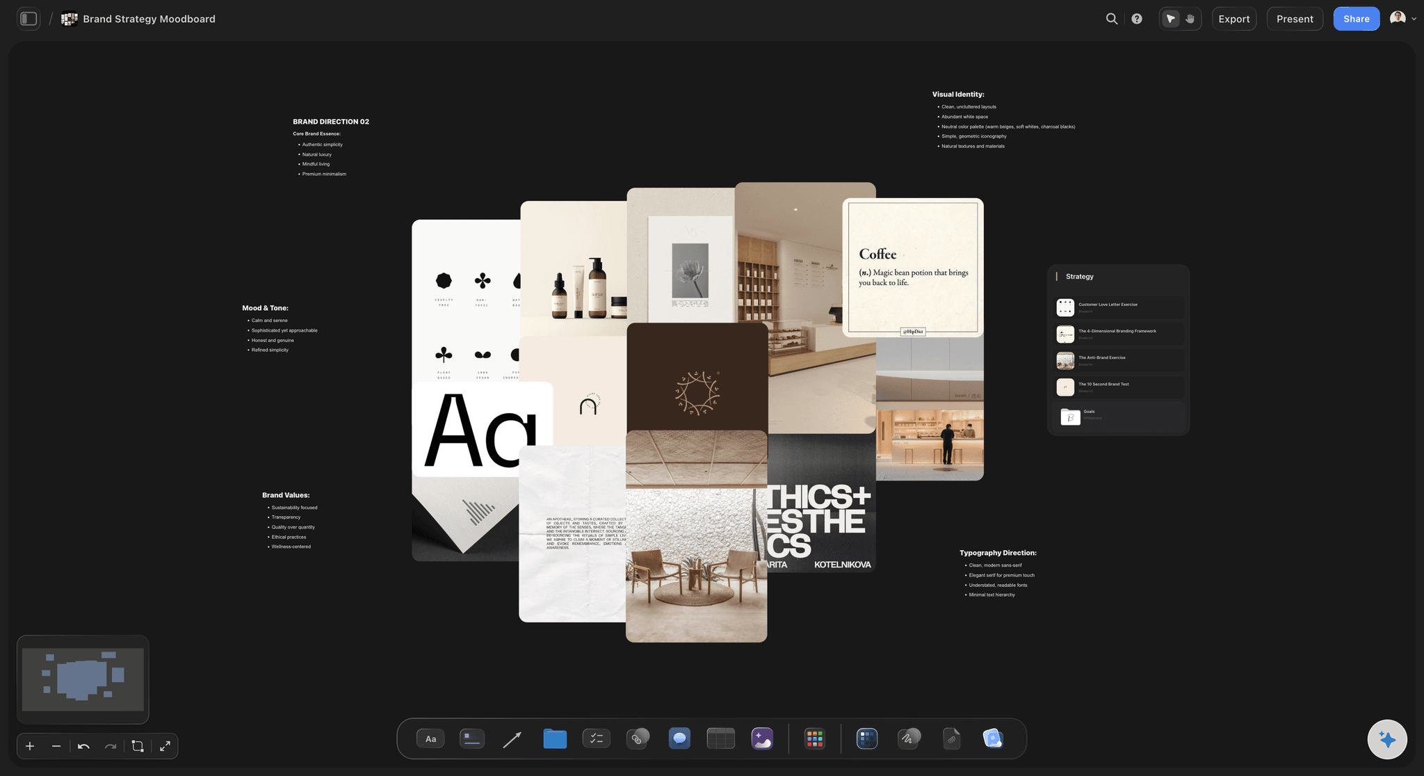
Do and don't, channel by channel
Each rule shown right and wrong
Pairs showing each rule done right and done wrong, then a frame per channel: a billboard with one image and five words, a 9:16 story with the type inside the safe zone.
See campaign concept presentation →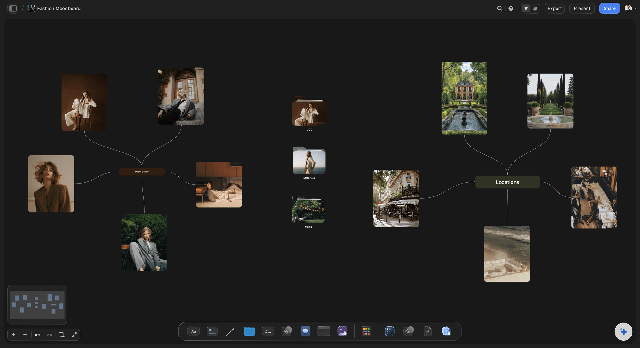
Presented, read and questioned
One deck for kickoff, sign-off and the set
Present the deck fullscreen at kickoff. Anyone you share the board with opens it by link with no account or reads it as a whole-board PDF, and signs in to comment on a specific reference.
See the client presentation tool →The signed-off deck becomes the next brief's starting frame.
Duplicate a deck that worked to keep its frame order and captions, then replace every reference. Storyflow is paid-only during early access, with plans from $7.99 a month billed annually ($9.99 monthly). A free plan launches before the end of 2026, and anyone a paid member invites to a board joins free.
Unlimited boards and uploads for every campaign on every paid plan
AI brand moodboard, moodboard and colour palette workflows
Video uploads you can play, scrub and pull stills from
Presentation mode for kickoff and sign-off
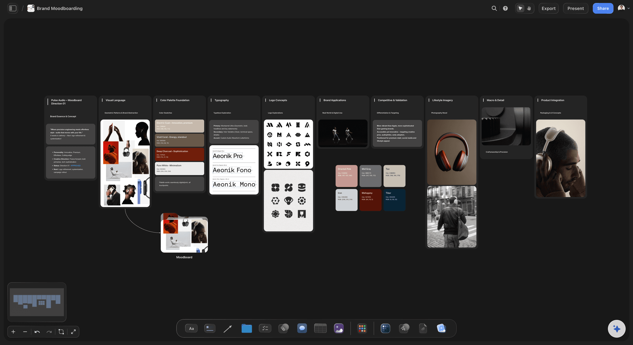
Built for people with taste
The direction deck, frame by frame.
A common shape for a campaign or a shoot. The counts are a starting point; the order is what lets someone who missed the kickoff read the deck alone.
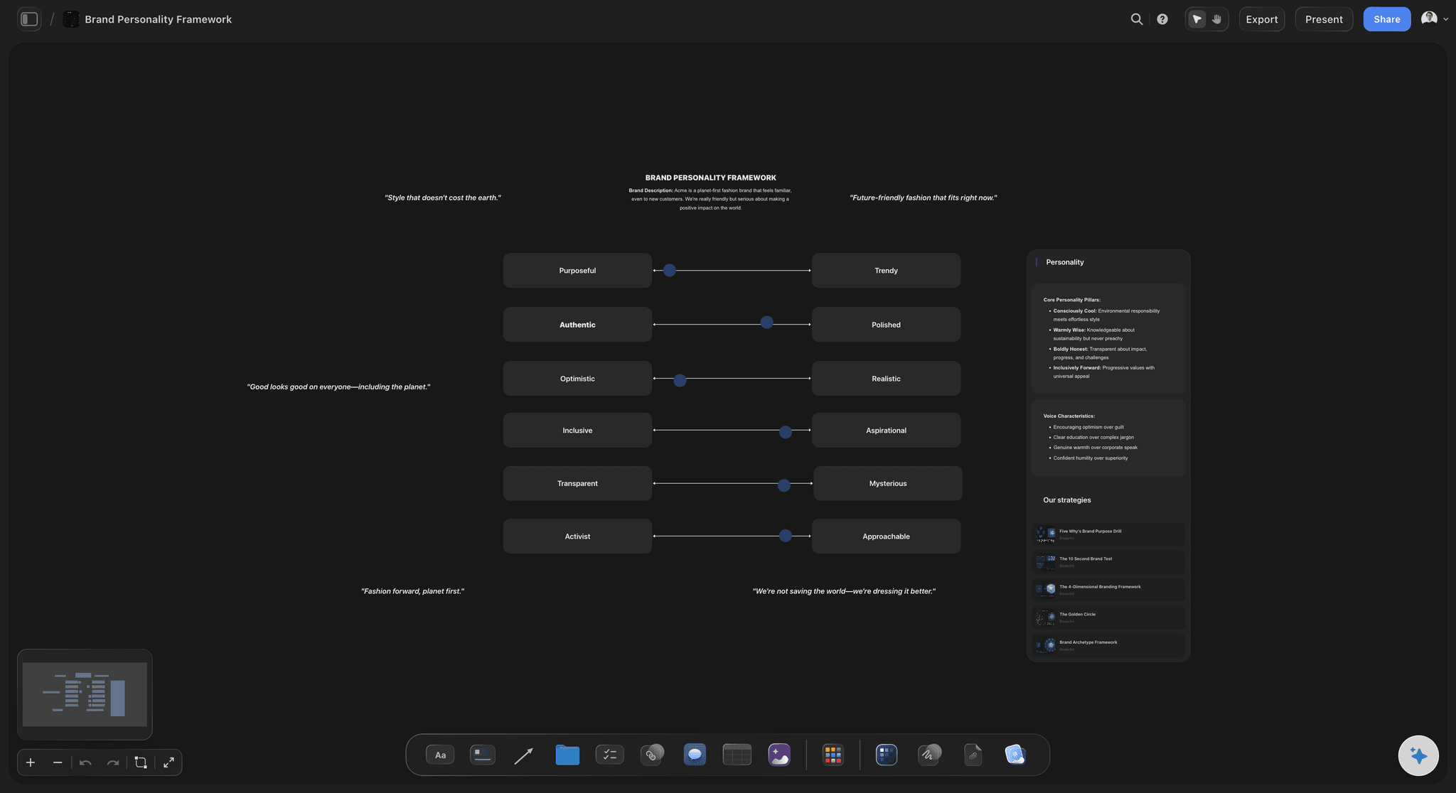
Frames 1 and 2
The idea and how it should feel
1. The line: The idea in one sentence, with the brief's objective and audience beneath it. If the line needs a paragraph, the direction is not decided yet.
2. Tone words and not-words: Three words the work must be and three it must avoid, set large on one frame. Every later frame should hold up against these six words.
The not-word rule: Make each not-word the nearest wrong answer rather than the opposite: "crafted, not precious", "direct, not aggressive". The near miss is where a busy team lands when nobody is checking.
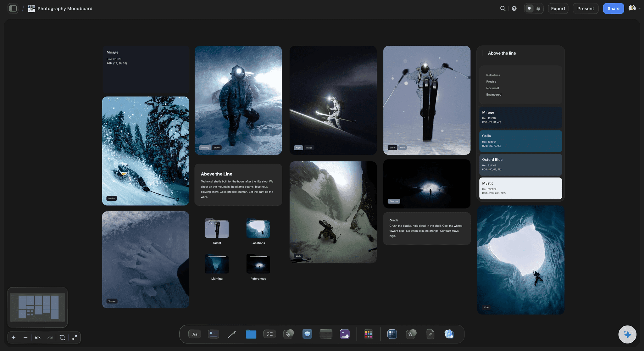
Frames 3 to 6
The look, group by group
3. Light: A tight set of references for the quality, direction and contrast of light, each captioned, such as soft window light from the left, deep shadow, no fill. Light carries more of a look than people expect, so it usually comes first.
4. Colour: The palette as four to six swatches with their values, beside the references they were sampled from, and one line on proportion, such as neutrals for most of the frame. Give screen and print values separately, because a colour sampled from a photo rarely prints the way it looks.
5. Composition: Framing, lens feel and negative space: centred and still, or off-axis and handheld. Include one reference for how product and people share the frame.
6. Casting and styling: Who is in the frame, how they are dressed, groomed and propped, and how they meet the camera. Caption for attitude and the wardrobe palette, never for a person's looks.
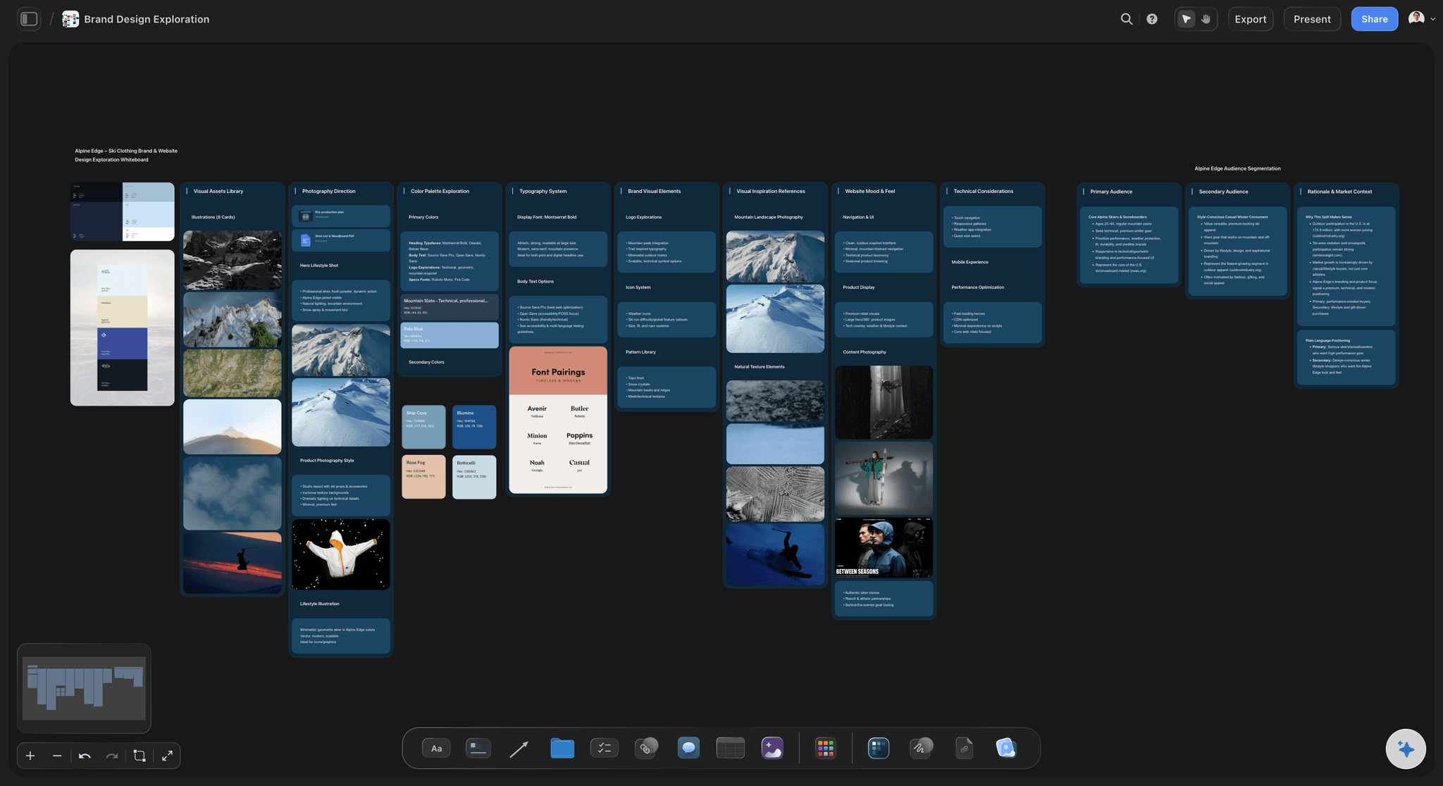
Frames 7 to 10
Type, the rules and who signs
7. Type and graphic language: The typefaces, how headlines sit on images, logo placement and any graphic device. Show one finished-looking layout so the designer sees the hierarchy, not only the fonts.
8. Do and don't pairs: Three to five pairs across the groups, each the same subject done right and wrong. Pairing them ends arguments about what a tone word was supposed to mean.
9. Across the channels: One frame each for billboard, 9:16 social, product page, print and retail, showing what holds and what adapts. Palette and light rarely change; crop, type size and pace usually must.
10. Sign-off: Who approves the direction, by when, and what is locked or still open. Date the frame, because the deck people follow in week six has to be the one that was signed.
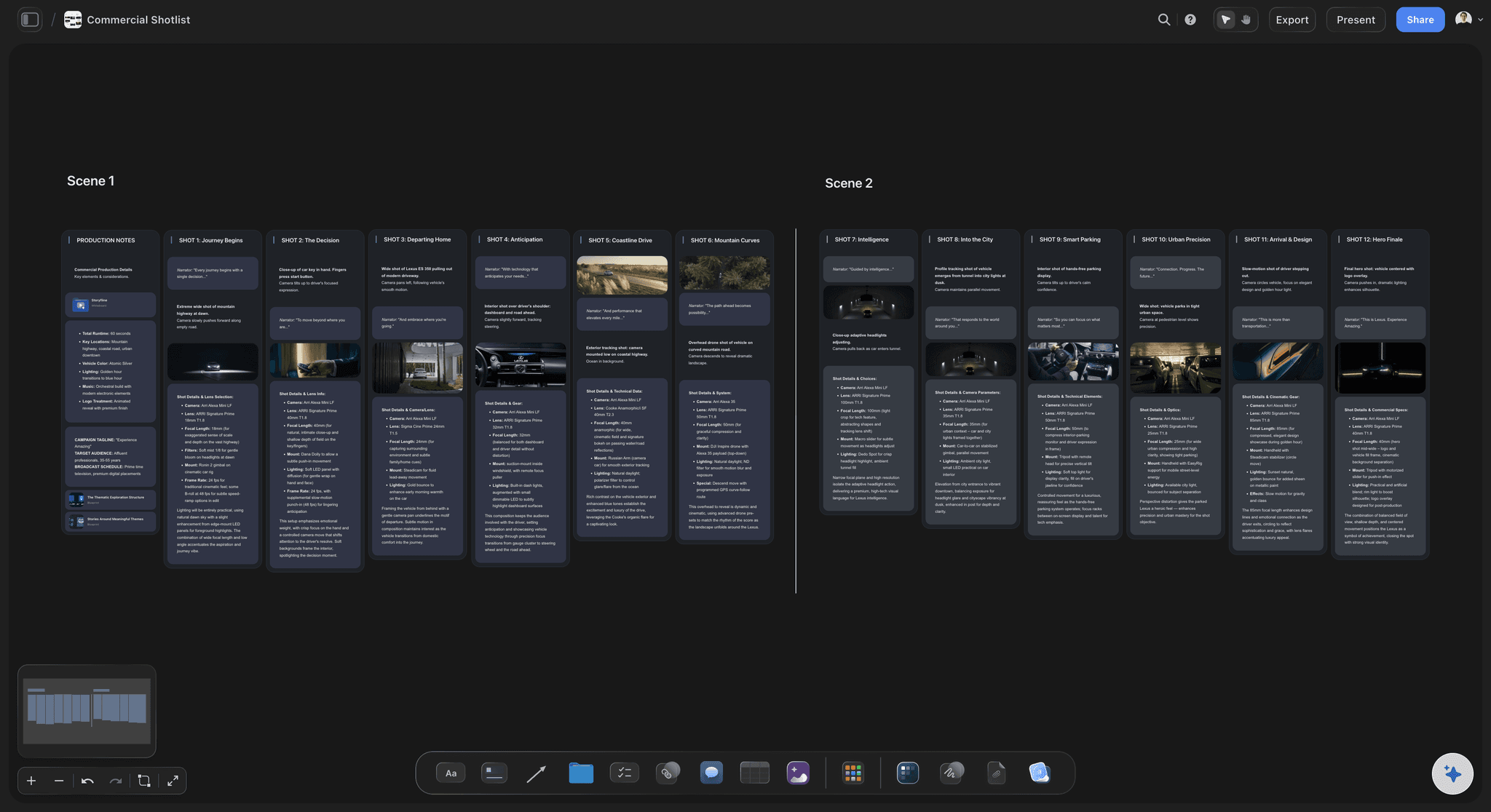
After sign-off
The deck during production
The pre-production meeting: Walk the photographer, stylist, set designer and editor through the frames before the shoot, and settle every open item there. A question answered in that room does not become a reshoot.
Reviews against the frames: Check the selects, the edit and the retouch against the relevant frame rather than against memory. A grade drifting from the colour frame is easier to raise with that frame on screen.
Changes are dated, not quiet: If the direction moves, change the frame, date it and tell the team the same day. A deck that quietly differs from the work stops being the reference.
Credit references and keep them internal: Note the photographer or source under each reference and keep the deck within the team and the client. References show a direction; they are not licensed for use in the work.
Explore templates for your project
Every template opens as a real, editable board on the infinite canvas. Pick the closest fit and make it your own.
Film Moodboard
Collect film references, color palettes, lighting, locations, and tone in one place, then invite your crew.
One app instead of five
Storyflow, Figma, Pitch or Milanote for a direction deck?
Figma and Pitch design finished slides with precise layout. Milanote collects references on boards. Storyflow builds the direction on a canvas and presents it from the same frames.
Storyflow
Recommended
Captioned references grouped on a canvas
Stills pulled from a reference clip
Frames presented in a set order
AI drafts a first pass from the brief
Pixel-precise slide layout
Figma
Captioned references grouped on a canvas
Stills pulled from a reference clip
Frames presented in a set order
AI drafts a first pass from the brief
Pixel-precise slide layout
Pitch
Captioned references grouped on a canvas
Stills pulled from a reference clip
Frames presented in a set order
AI drafts a first pass from the brief
Pixel-precise slide layout
Milanote
Captioned references grouped on a canvas
Stills pulled from a reference clip
Frames presented in a set order
AI drafts a first pass from the brief
Pixel-precise slide layout
What creators are saying
Join early creators getting structured workspaces and AI that remembers their projects
“Storyflow has sped up my workflow by at least 3x, which means more flow state and more projects I can actually ship. It truly changed the way me and my team create.”

Reilin Joey
Director & YouTuber
“One prompt gets me a structured board. But the tactics are my favorite. I run my YouTube scripts through them and my intros and retention got better. It's amazing.”

Justkay
YouTuber & Freelance Filmmaker
“I used to juggle five apps to plan a project. Now I describe what I am making and get boards, lists, and a schedule. All in one place.”

George
@fernwehchronicles
What art directors ask about direction decks.
Frames, tone words, reference counts, channels and who signs off.
Storyflow, where the deck is a run of frames on one board the team steps through fullscreen: captioned references grouped by light, colour and casting, colour swatches, stills pulled from reference clips, and an AI draft to start from. It opens by link with no account or reads as a whole-board PDF, and the team signs in to comment on a reference. For pixel-precise slides, finish the deck in Figma or Keynote.
Ten frames usually cover it: the line; tone words and not-words; light; colour; composition; casting and styling; type and graphic language; do and don't pairs; the channels; and sign-off. Words come before pictures so the references are judged against them, and sign-off comes last so the deck records what was agreed.
The creative direction deck sets the idea and how it should feel across the whole campaign: the line, the tone and the rules every channel follows. An art direction deck turns that into the specific look of one execution, such as a shoot or a layout system, down to set, props, wardrobe and lighting. Small teams often combine them; larger productions keep both.
Eight to twelve per group is a common shape. Cut until every image earns its caption, and move favourites you cannot defend to a frame of alternates the client never sees. A group of thirty tells the team you have not chosen, and each person will choose for you.
Take them from the brand strategy and the brief, not from the references. Choose three that describe the work and three that name its nearest wrong turn rather than its opposite: "confident, not loud" helps a photographer on set, while "confident, not shy" does not. Test them on a real frame, and if they cannot settle whether it belongs, sharpen them.
The same subject, shot or set up identically except for the one thing the rule is about: side light against flat front light, a handheld crop against a locked-off one, the accent colour on product against the accent everywhere. When a pair differs in several ways at once, the team cannot tell which difference matters.
Decide what is fixed and what flexes. Palette, light and casting usually hold everywhere; crop, type size, pace and the amount of copy change with the format. Give each channel one frame: a billboard with a single image and a few words, a vertical story with the type clear of the interface, a product page where the product sits on the palette's neutral.
One person on each side with the authority to hold it: usually the client's brand or marketing lead, and your creative director or executive creative director. Record who signed and when on the sign-off frame, with the decisions that are fixed and the ones still open. Direction agreed by a group with no named owner tends to be reopened by whoever joins the project late.
Walk the crew through it ahead of the shoot to settle open items, then check selects, edits and retouches against the matching frame. If the direction changes, redraw that frame and date it, so the whole team sees the change at once. In Storyflow the signed frames can share a board with the shot list, so nobody works from an old export.
It can start one. Storyflow's AI turns a brief into a first pass of reference groups with its brand moodboard and moodboard workflows, proposes swatches with its colour palette workflow, and can produce a lookbook or presentation PDF from the finished board. On Pro and Max it can also generate reference images. Treat its references as placeholders to swap for your own, because the line, the six words and the choices are yours.
When the deck itself is a designed deliverable: a pitch where slide typography is judged, or a brand book with a strict layout grid. They give exact slide layouts, themes and typography that Storyflow does not. Build and agree the direction in Storyflow first, then lay out the final slides in one of them if the audience expects it.
Not during early access. Storyflow is paid-only during early access, with plans from $7.99 a month billed annually ($9.99 monthly). A free plan launches before the end of 2026, and anyone a paid member invites to a board joins free. The photographers, stylists and editors you invite pay nothing.
More from Storyflow
Creative strategy
Storyflow for creative directors
Art direction board
Brand moodboard maker
Campaign concept presentation
Creative concept board
Moodboard from a brief
Client presentation tool
Brand identity presentation
Campaign brief template
Photoshoot moodboard
Film lookbook
Creative agency pitch deck
What is art direction?
Pricing
Client presentation with Claude
Give everyone on the job the same picture.
Set the words first, build the ten frames, and present them from one board.