
Ultra-fast moodboards with real taste
Set the art direction
before anyone builds it.
Fix the palette, the texture, the period, and the set dressing on one canvas, with each reference attached to the decision it is making. Share it and get the look approved before money is spent.


Creatives working for these brands already got early access
- Red Bull
- Canon
- Artlist
- Porsche
See how easy it is to get started
Watch a real project come together, from a blank board to a finished plan, clicked through step by step.
Start from a ready-made template
Pick a board to see what you can build, then let AI fill it in. Every template is a real, editable starting point on the same infinite canvas.

Film Moodboard
Collect film references, color palettes, lighting, locations, and tone in one place, then invite your crew.
What is art direction?
Art direction is the set of decisions that fix how a project looks: the palette, the materials, the period and the set dressing, made specific enough that the people building it know what to make. Storyflow is an AI visual workspace that sets the art direction on one infinite canvas: references grouped by the decision they make, the rule written under each group, and the brief and shot list beside them. Its AI builds the board structure from your project description, with labelled sections for palette, materials, period and locations. Invited teammates edit it in real time, and a director or client opens a view-only link with no account. An art direction board is where the look of a project stops being an adjective and becomes a decision. It is not a moodboard: a moodboard establishes a feeling and may be loose, while an art direction board has to be specific enough to build from. Somebody has to be able to look at it and know what colour to paint the wall.
The distinction matters because of who consumes it. A moodboard is consumed by a director and a client. An art direction board is consumed by the people spending money: the set builder, the buyer, the dresser, the stylist. Those people cannot act on atmospheric. They need to know that the palette is warm neutrals with one saturated accent, that the period is late seventies rather than generally retro, that the surfaces are worn wood and brushed metal rather than plastic, and which of the twelve pinned images is the one that is actually right.
Storyflow is an AI-native infinite canvas that supports this well because you can group images by the decision they are making rather than by how they feel. Put the palette references in one cluster with the actual colours pulled out, the texture and material references in another, the period and detail references in a third, and the set dressing per location in a fourth. Write the decision underneath each cluster in words, because an unlabelled group of images is a moodboard again and everyone will read a different conclusion out of it.
A useful art direction board resolves five things: palette (the actual colours, including which one is the accent and where it is allowed to appear), materials and texture (what surfaces are made of and how worn they are, which is what separates a set that reads as real from one that reads as a set), period and specificity (a date rather than an era, because generally vintage is not buildable), lighting relationship (how the look behaves under the lighting plan, since a palette approved in daylight can collapse under tungsten), and the negative space (what is explicitly excluded, which is the most under-used section on any art direction board and the one that prevents the most drift).
Ultra fast from brief to board
From a loose reference pile to a look people can build.
No template to configure. Drop the references in and start grouping them by decision.
01
Open a canvas
Pick a plan and open a board. No download: your infinite art direction canvas runs straight in the browser.
02
Get the references in
Drag images, screenshots, and links onto the board, and grab frames straight from a YouTube or Vimeo reference. There is no object cap, so collect widely at this stage.
03
Group by decision, not by mood
Cluster the references into palette, materials and texture, period detail, and set dressing per location. Write the decision under each cluster in plain words so nobody has to infer it.
04
Get it approved and hand it over
Share a view-only link with the director or client for sign-off, then export as an image or PDF for the build, the buyer, and the shoot.
A look specific enough to build from.
Palette, materials, period, and dressing grouped by decision on one infinite canvas.
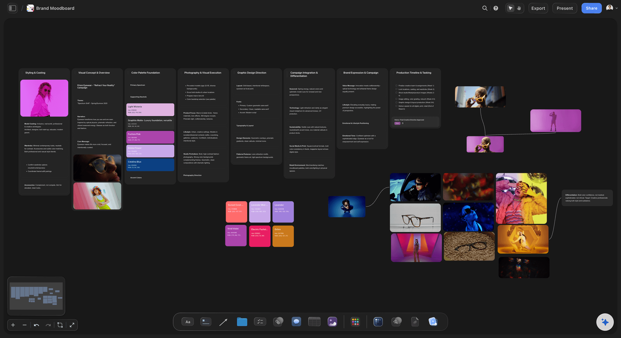
References grouped by the decision they are making
Not a moodboard, a specification
Cluster images by palette, material, period, and dressing, then write the decision under each cluster. An unlabelled pile of pictures is a moodboard, and a moodboard is not something a set builder can act on.
See the moodboard maker →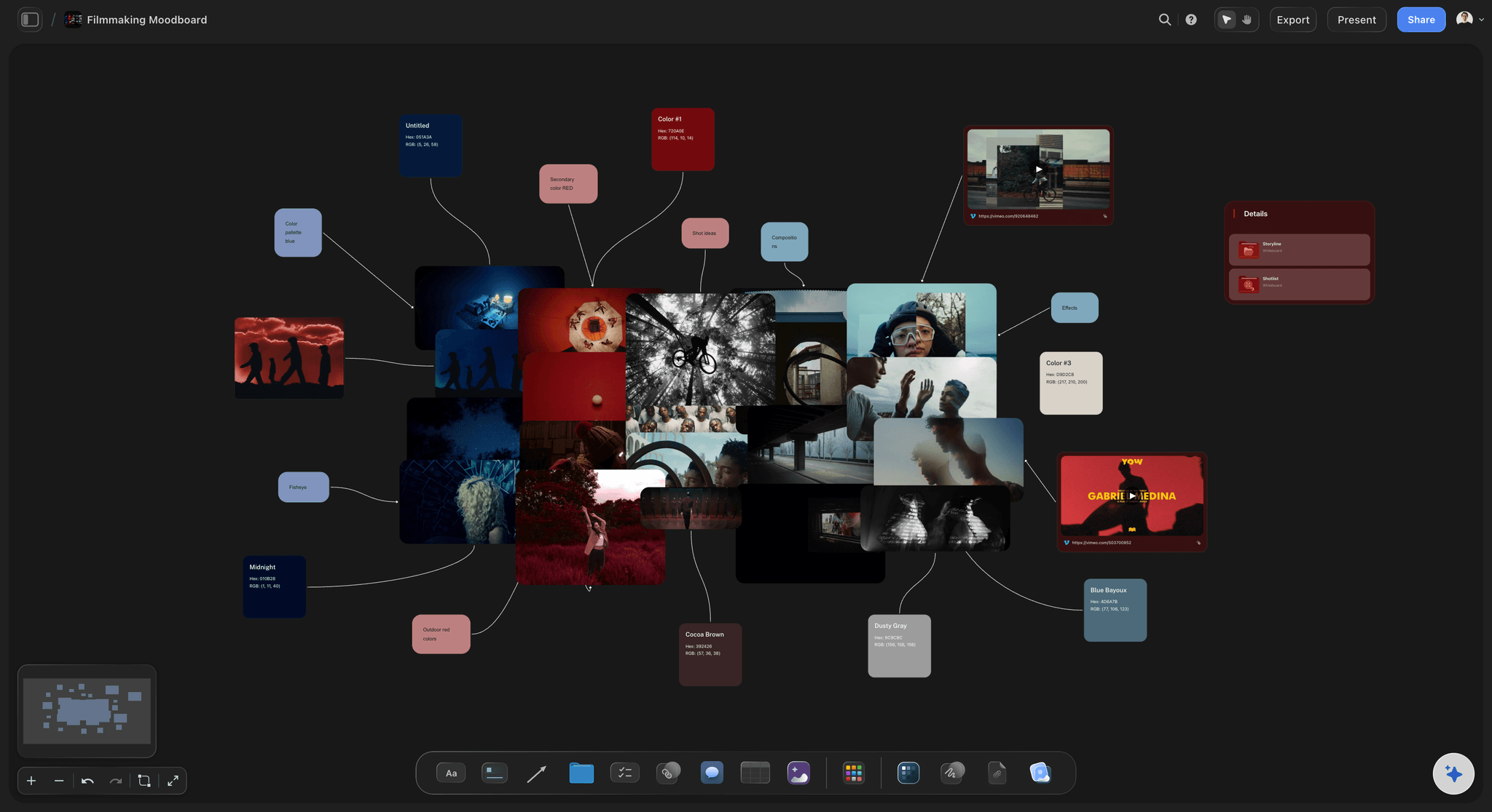
Grab frames from reference films straight onto the board
Pull the exact frame you mean
Take a frame from a YouTube or Vimeo reference and drop it on the canvas. For period, palette, and texture work a specific frame settles an argument that a paragraph of description will not.
See the film lookbook →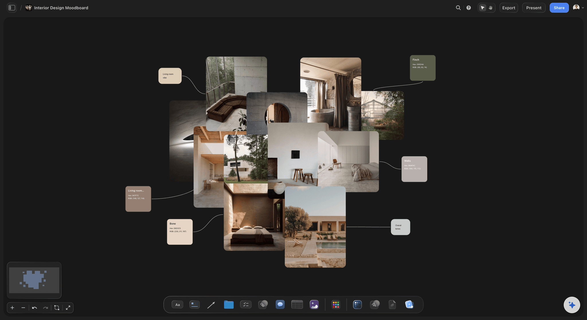
Set dressing planned per location
Take the look into each space
A palette that works in the abstract has to survive contact with a specific room. Plan the dressing per location so the look is resolved where it actually gets built rather than only in principle.
See the props list maker →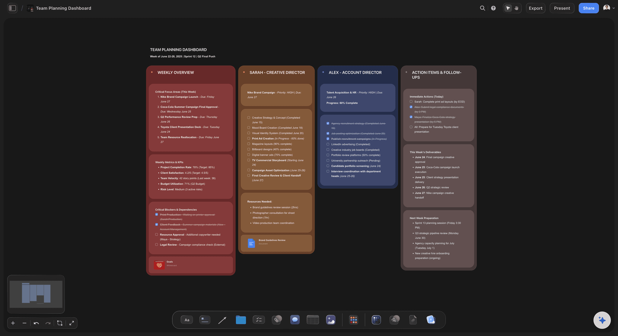
Share for approval before anything is built
Get sign-off while changes are still free
Send a view-only link and get the look approved before the build starts and the buying begins. Every art direction argument is cheaper on a board than on a set that is already standing.
See the client presentation tool →Unlimited boards. No object cap.
Open a canvas, pull the references in, and start deciding. Storyflow is paid-only during early access, with plans from $7.99 a month billed annually ($9.99 monthly). A free plan launches before the end of 2026, and anyone a paid member invites to a board joins free.
Unlimited art direction boards on an infinite canvas
AI that lays out the board sections from a prompt
Unlimited file uploads for references, specs and PDFs
Share view-only links with directors and clients
Built for people with taste
More than a wall of nice pictures.
The test of an art direction board is whether someone can build from it without asking you a question.
Palette, materials, period, lighting, and exclusions
Resolve every layer of the look
Palette with an actual accent rule: Pull the real colours out of your references and state which is the accent and where it is allowed to appear. A palette without a rule about the accent is how one saturated colour quietly ends up in every frame.
Materials and wear: Specify what surfaces are made of and how used they look. The difference between a set that reads as real and one that reads as a set is almost always wear rather than design, and wear has to be asked for explicitly.
A date, not an era: Say 1978, not seventies. An era is a mood and a date is buildable, and the gap between the two is where a buyer wastes a week returning things that were technically vintage.
State what is excluded: Write down what the look is not: the colours that never appear, the materials that are wrong, the reference everyone keeps drifting toward. This is the most neglected section on an art direction board and the one that prevents the most drift.
AI that can see the board you have already built
Structure the board with AI, direct it yourself
Lay out the sections from a prompt: Describe the project and the AI builds a structured board with sections for palette, materials, period, and locations to fill in. It reads the active canvas as context, so it works with what you have already collected.
It organises, it does not art direct: The AI has no taste and no view about what your project should look like. Art direction is a judgment about a specific story in a specific place, and this is one of the last things worth handing to a model.
Generate references on Pro and Max: AI image generation is available on the Pro and Max plans if you want to produce a visual reference for something you cannot find. On other plans the board is built from images you bring.
Images, video, PDFs, links, and colour on one canvas
Collect widely, then decide narrowly
No object cap while you gather: Drag in as many references as you want at the collecting stage. The board holds a hundred images as easily as ten, so the constraint on collecting is your time rather than the tool.
Then cut to the ones that decide something: The board becomes useful when you remove most of what you gathered. Twelve images that each settle a question beat sixty that collectively suggest a mood.
Keep the swatches and specs attached: Drop paint references, material specs, supplier PDFs, and links onto the cluster they belong to, so the buildable detail sits with the picture that motivated it.
Share with the director, client, and art department
One approved look everyone builds from
View-only links: Send a link and the director, client, or build team opens the whole board in a browser with no account. Approval on a board is far more precise than approval on a description.
Work together on the board: Invite your production designer or set decorator so notes land in one place rather than across a thread. Invited collaborators edit in real time with live cursors on any paid plan, and join free.
Export for the build: Export as a high-quality image or PDF for the build team, the buyer, or a client deck. A printed board on the wall of a workshop remains one of the more effective art direction tools there is.
Explore templates for your project
Every template opens as a real, editable board on the infinite canvas. Pick the closest fit and make it your own.
Film Moodboard
Collect film references, color palettes, lighting, locations, and tone in one place, then invite your crew.
One app instead of five
Storyflow vs Pinterest, Milanote, and Figma.
Pinterest beats everything at finding images. Here is where each tool actually wins.
Storyflow
Recommended
Group references by decision, not by mood
Grab frames from YouTube and Vimeo
AI lays out the board structure
Huge searchable image library
Precise vector and layout control
AI drafts the shot list from the board
Group references by decision, not by mood
Grab frames from YouTube and Vimeo
AI lays out the board structure
Huge searchable image library
Precise vector and layout control
AI drafts the shot list from the board
Milanote
Group references by decision, not by mood
Grab frames from YouTube and Vimeo
AI lays out the board structure
Huge searchable image library
Precise vector and layout control
AI drafts the shot list from the board
Figma
Group references by decision, not by mood
Grab frames from YouTube and Vimeo
AI lays out the board structure
Huge searchable image library
Precise vector and layout control
AI drafts the shot list from the board
What creators are saying
Join early creators getting structured workspaces and AI that remembers their projects
“Storyflow has sped up my workflow by at least 3x, which means more flow state and more projects I can actually ship. It truly changed the way me and my team create.”

Reilin Joey
Director & YouTuber
“One prompt gets me a structured board. But the tactics are my favorite. I run my YouTube scripts through them and my intros and retention got better. It's amazing.”

Justkay
YouTuber & Freelance Filmmaker
“I used to juggle five apps to plan a project. Now I describe what I am making and get boards, lists, and a schedule. All in one place.”

George
@fernwehchronicles
Art direction questions, answered.
What art direction actually decides, how it differs from a moodboard, and where other tools win.
Art direction is deciding how a project looks and making that decision specific enough to build from: the palette and where the accent may appear, the materials and how worn they are, the period as a date rather than an era, and what the look excludes. In Storyflow you set it on one board, with the references grouped by decision and the rule written under each group, beside the brief and the shot list.
Storyflow is built for exactly this job: references grouped by the decision they make, the rule written under each group, frames grabbed from reference films, and the props list, shot list and schedule on the same canvas, shared with a director or client by a view-only link. Pinterest is still where most art directors find references, and Figma does the precise layout, typography and vector work.
Put it on one board the whole team works from. In Storyflow the references are grouped by the decision they make (palette, materials, period, dressing), the rule is written under each group, and the brief and shot list sit beside them. Invited teammates edit it in real time, and a director or client opens a view-only link with no account. A deck presented once goes stale; a shared board stays the working reference.
A moodboard establishes a feeling and may be loose and even contradictory; its job is to get a director or client agreeing about tone. An art direction board comes after and must be specific enough to build from, because its audience is the set builder, buyer, dresser and stylist. It names the colours, the materials and their wear, a date rather than an era, and what is excluded.
Not during early access. Storyflow is paid-only during early access, with plans from $7.99 a month billed annually ($9.99 monthly). A free plan launches before the end of 2026, and anyone a paid member invites to a board joins free. If you need something free today, Pinterest boards plus a written note of the palette, materials and exclusions will do, with the words and images living apart.
Specific enough that nobody has to ask you a follow-up question to act on it. The palette is actual colours with a rule about where the accent may appear, the materials are named with how worn they look, the period is a date rather than an era, and there is a list of what the look excludes. Vagueness only moves the argument to the point where changing it costs money.
No. The AI builds the board structure from your project description, with labelled sections for palette, materials, period and locations, which saves setup time. AI image generation is on the Pro and Max plans if you need to visualise something you cannot find. Deciding what a specific story should look like in a specific place is the actual work of art direction, and a model lacks that context.
Write down what is excluded and put it where people will see it. Most drift is an accumulation of small choices made by different people without a stated boundary. A board that names the colours that never appear, the wrong materials and the tempting reference everyone slides toward gives each of them something to check. Keep it next to the props list and schedule, not in a deck.
Yes. Share a view-only link and the client opens the whole board in a browser with no account and nothing to install. Do it before any build or buying starts, because approval given against a specific board is hard to walk back. The client signs in to comment. There is no approval button, so sign-off happens in the comments.
Yes. You can grab a frame from a YouTube or Vimeo reference straight onto the canvas, and for period, palette and texture work a specific frame settles an argument that a description will not. You can also drag in images, screenshots, PDFs and links, and upload video files to play, scrub and grab frames from. Grabbing from YouTube or Vimeo works in a desktop browser, after a one-time permission to share the tab.
Yes, and it is the main structural advantage over a standalone moodboard tool. The art direction board can sit beside the props list, the wardrobe plan, the shot list and the schedule on the same canvas. That keeps the look connected to the objects and clothes that realise it, so the buyer sourcing a prop sees the palette it has to sit within.
Yes. The structure is the same whenever a look has to be handed to someone else and come back right: resolve palette, materials, period, and exclusions, then plan the dressing per space or per setup. For commercial work the approval step matters more, so the ability to send a client a view-only link and get the look signed off before the build is usually the feature that earns its place.
More from Storyflow
Moodboard app
Props list maker
Wardrobe planner
Film lookbook
Moodboard maker
Interior design moodboard
For production designers
Client presentation tool
Film shoot planner
Design brief
Brand moodboard
Moodboard from a brief
Collaborative moodboard
AI vision board generator
Free vision board maker
Production bible
Turn the mood into something people can actually build.
Open a canvas, pull your references in, and decide the look. No download.