
Ultra-fast planning, extremely simple
A project dashboard
a client can read in one minute.
For agencies and studios running several client projects at once: where each one stands, the numbers that moved, what is late and what you need, on one screen you share by link.


Creatives working for these brands already got early access
- Red Bull
- Canon
- Artlist
- Porsche
See how easy it is to get started
Watch a real project come together, from a blank board to a finished plan, clicked through step by step.
Start from a ready-made template
Pick a board to see what you can build, then let AI fill it in. Every template is a real, editable starting point on the same infinite canvas.

Mind Map
Branch one central idea out into themes and sub-points, then drag the connections around until the structure makes sense.
How do you see every project on one dashboard?
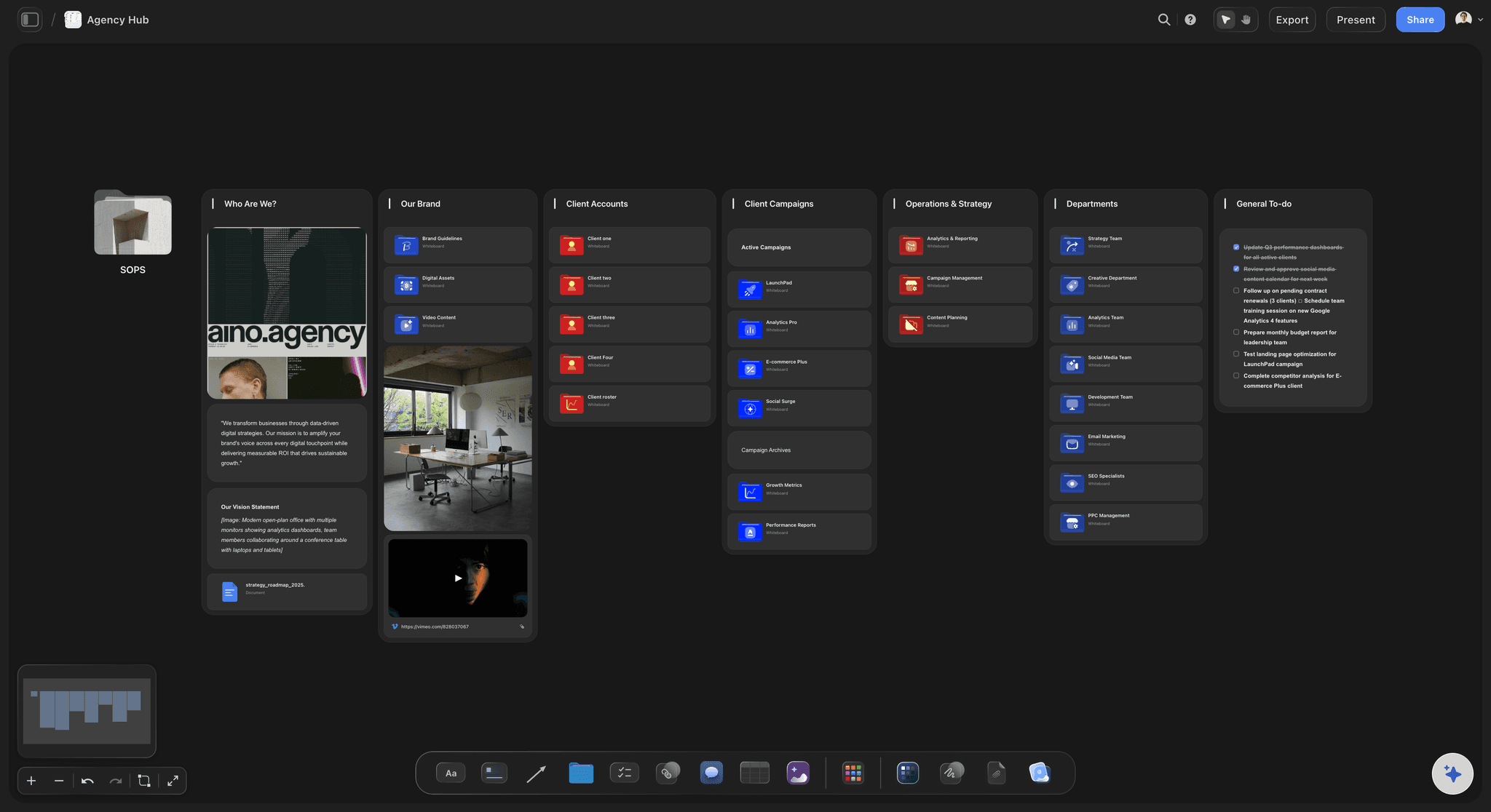
A project dashboard is one screen that answers four questions about every project you run: where it stands, which numbers moved, what is late, and what you need from someone else. Storyflow is an AI visual workspace that builds a project dashboard on one infinite canvas: a status table, a row of headline numbers, the charts and a short list of what is late. Its AI counts what is already on your project boards, or reads a spreadsheet you attach, and lays out up to sixteen tiles from those real values.
Begin with the status table, because everything else is built from it. One row per project and six columns: the project, the stage it is in, a status label of on track, at risk or late, the next milestone with its date, the share of the budget used, and what you are waiting on. If a project needs more than one row, it is two projects. If a column is empty for most rows, take it out.
Above the table goes a row of three or four headline numbers, and no more. A good set for an agency: projects on track out of the total, hours used out of hours sold, days until the next deadline, and items waiting on a client. Each one is a number a reader can take in without thinking. A chart belongs below that row only if it answers a question the numbers raise, such as which project is using the hours.
Here is a worked example. An agency runs six projects. Four are on track, one is at risk and one is late. The team has used 412 of the 600 hours sold this quarter, which is 69 percent. The next deadline is in four days. Seven items are waiting on clients, and three of them have waited more than a week. That is the top row. Below it sit a bar chart of hours used per project, a pie of the three statuses, and a line of hours logged each week.
Then write the part a chart cannot say. Three short lines under the charts: what is late and why, what you are doing about it, and what you need from the reader by which date. A client who reads only those three lines should still know what to do next. Put the late project first. A dashboard that hides its worst news is not believed the second time.
Be honest about how fresh it is. Storyflow does not connect to your time tracker or your ad accounts, and a chart does not refresh by itself. Write the date of the last update at the top, pick one day a week, and spend ten minutes changing the table and asking the AI to update the charts. A dashboard with last Friday's date on it is worth more than a live one nobody trusts.
Ultra fast from brief to board
Four moves from scattered projects to one screen.
The first dashboard takes about an hour. After that, ten minutes on the same day every week keeps it worth reading.
01
Put every project in one table
Add a table with a row for each project and the six columns: project, stage, status, next milestone, budget used and waiting on. Or attach your tracking spreadsheet and ask Storyflow's AI to build the table from it.
02
Ask for the dashboard
Ask the AI for a dashboard from the table. It lays out a row of headline numbers first, then the charts under it, up to sixteen tiles, drawn only from the values that are there.
03
Write what is late and what you need
Add three short lines under the charts: what is late and why, what you are doing about it, and what you need from the reader. Put the date of the update at the top.
04
Share the link, then update on Fridays
Send a view-only link. Each week, change the rows that moved and ask the AI to update each chart with the new numbers. The chart keeps its place and its size.
Status, numbers, what is late and what you need.
Storyflow builds the dashboard from numbers you already have. It does not pull them from other tools for you.

The status
One row per project, six columns
Project, stage, status, next milestone, budget used and waiting on. Make the status a label column with three labels of your own: on track, at risk and late. A Count at the foot of the table shows how many projects you are running.
See agency client project planning →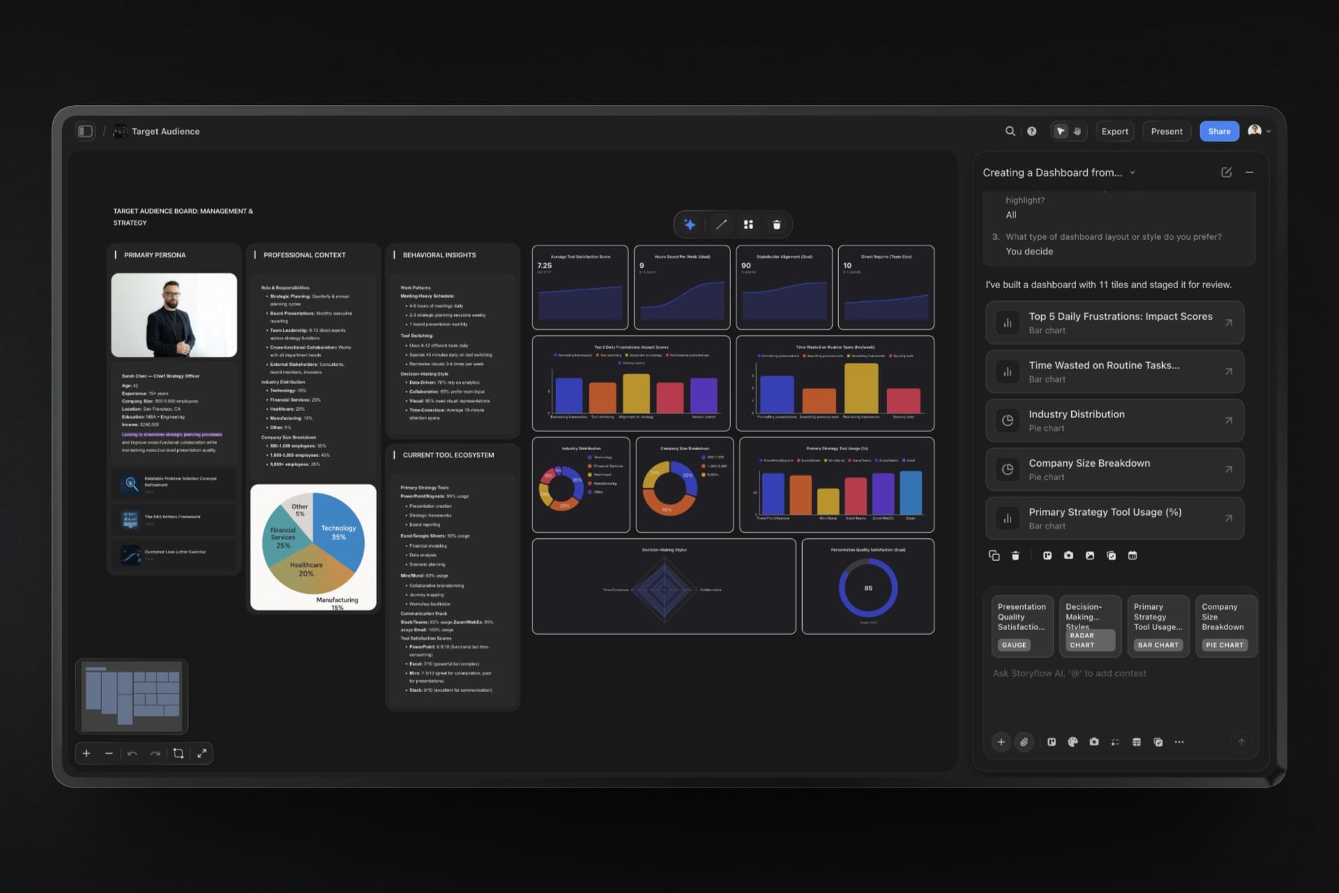
The numbers
Headline numbers first, charts under them
Ask for a dashboard and Storyflow's AI opens with a row of three or four big numbers, then adds bar, line and pie charts below. It builds them from the values in your table and says which source it used.
See the client report template →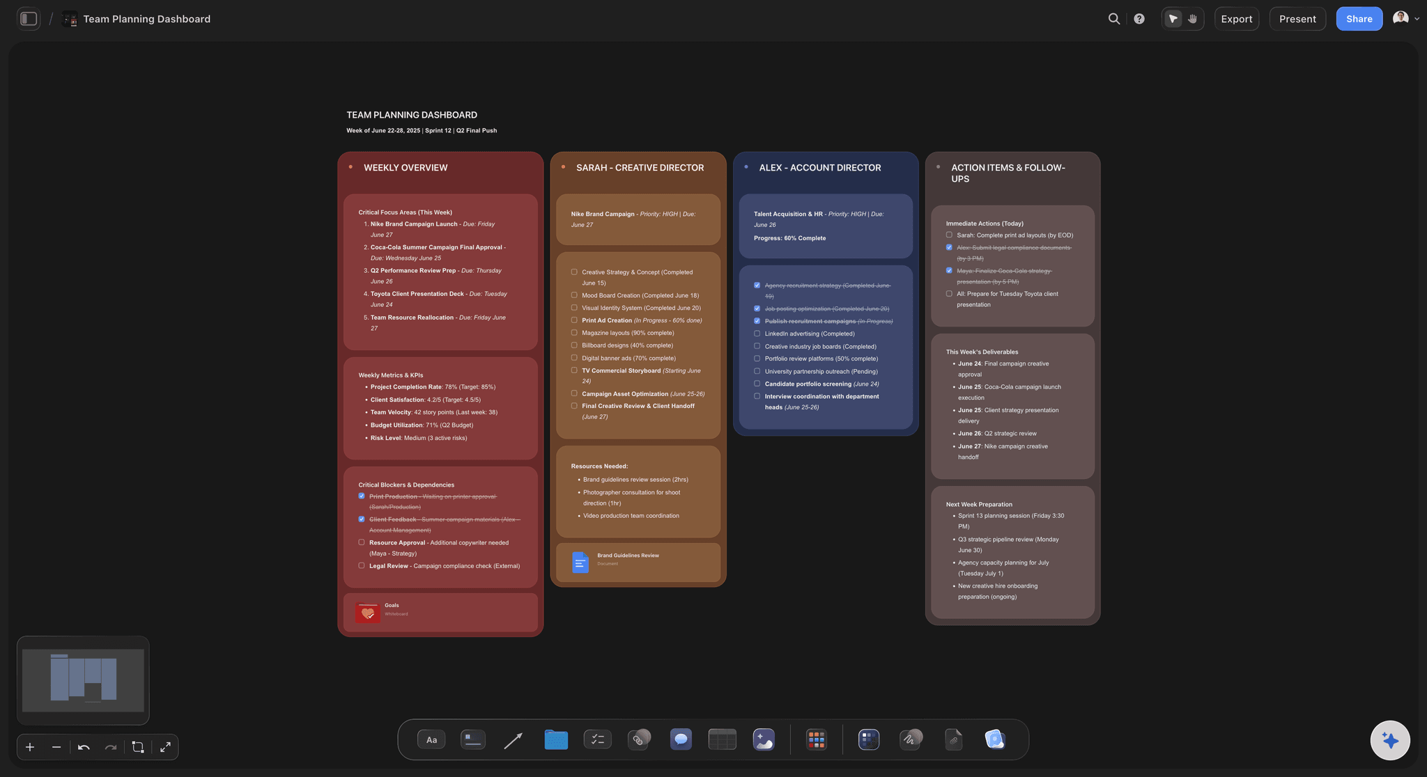
What is late
The bad news at the top, in words
A chart shows that something slipped. A sentence says why and what happens next. Keep a short list of late and blocked items beside the charts, with a name on each, so nobody has to ask.
See creative project management →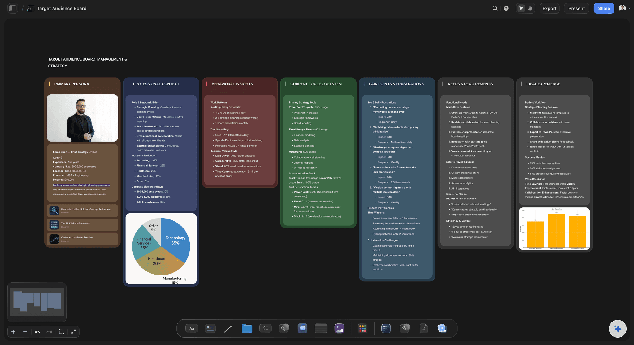
For founders
The same screen for your investors
Swap projects for goals and the dashboard becomes a monthly view for a board or an investor: where each goal stands, the numbers that moved, what is behind and what you are asking for.
See the investor update →One dashboard across clients. One for each of them.
Keep an overview of every project for yourself, and a smaller dashboard on each client's board that only shows their work. Storyflow is paid-only during early access, with plans from $7.99 a month billed annually ($9.99 monthly). A free plan launches before the end of 2026, and anyone a paid member invites to a board joins free.
Unlimited boards, image uploads and files on every paid plan
Dashboards of up to sixteen tiles, built by AI from your own numbers
View-only links, so a client reads it with no account
Whole-board PDF export for the monthly meeting
Invite a client or a freelancer to the board without buying them a seat
Built for people with taste
Why most project dashboards go unread.
Three reasons, and none of them is about the charts. Each one is easier to fix when the dashboard sits on the same board as the work.
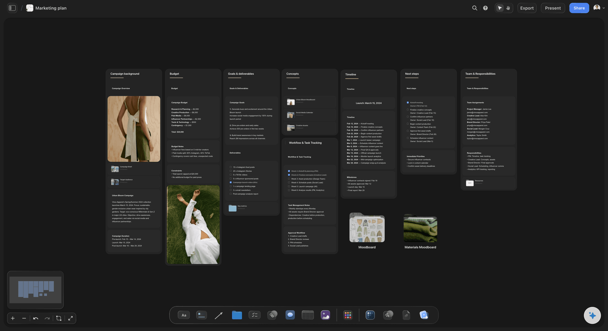
Too much on it
It takes ten minutes to read
Four numbers at the top: Projects on track, hours used, days to the next deadline, items waiting on a client. If a fifth number matters more than one of these, swap it in. Do not add it.
A chart only when it answers a question: Sixty-nine percent of hours used raises a question: which project is using them? A bar chart of hours per project answers it. A chart that answers nothing comes off.
Nine tiles is plenty: Storyflow lets a dashboard hold sixteen tiles. Most readers stop taking things in after eight or nine. Build the smaller one, and add a tile only when someone asks for it twice.
Detail one click away: The dashboard is for reading. The project boards behind it are for working. Keep each project's board beside the dashboard, so a reader who wants more opens the work itself.
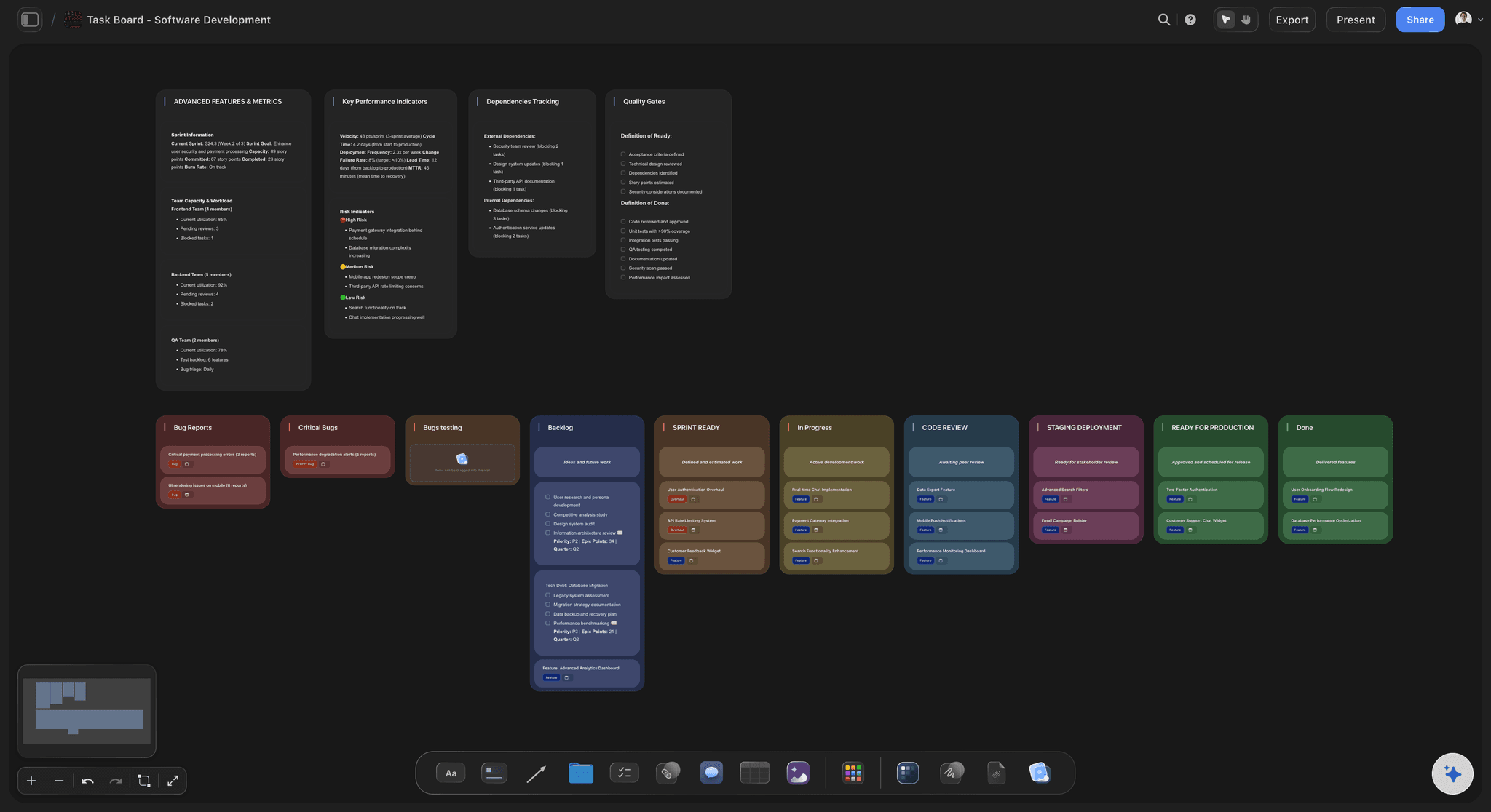
Numbers nobody trusts
The chart looks sure, and nobody knows where it came from
Real values only: Storyflow's AI draws a chart from what you typed, what is on the board or what is in the file you attached. It is told never to invent a number, and to ask when it has none.
The source in one line: When the AI builds a chart it says which source it used. Keep that line as the caption under the chart, so a client who doubts a figure can see where to check it.
The figures printed on the bars: Ask for the values to be shown on the bars. A reader who wants the exact hours for one project does not have to guess from the height of a bar.
The table and the charts side by side: The status table sits on the same board as the charts made from it. If the two disagree, you see it at once, which is the point.
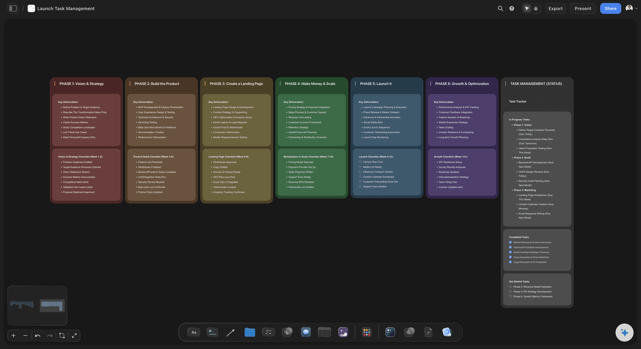
Out of date
It was right in March
A date at the top: Write the day of the last update where nobody can miss it. An honest date makes a week-old dashboard useful. A missing date makes a fresh one doubtful.
One day a week: Pick Friday. Change the rows that moved, then ask the AI to update each chart with the new numbers. It changes the chart that is there and does not build a second one.
Ask what moved: Before you update, ask Storyflow's AI what changed on a project's board this week. It lists the cards that were added, edited or moved and who did it, so the status is not written from memory.
Last month kept beside this month: Copy the dashboard before a big update and leave the old one next to it. At the quarterly review, two screens side by side say more than a paragraph about progress.
Explore templates for your project
Every template opens as a real, editable board on the infinite canvas. Pick the closest fit and make it your own.
Mind Map
Branch one central idea out into themes and sub-points, then drag the connections around until the structure makes sense.
One app instead of five
Where Storyflow fits for a project dashboard.
It builds the screen from numbers you already have and keeps it beside the work. It does not pull live data or refresh by itself.
Storyflow
Recommended
Charts built from numbers you already have
AI counts the task cards on your project boards
The project boards sit beside the dashboard
Written notes next to each chart
A client opens it from a link
Comments beside a single chart
Pulls live numbers from ad, sales or finance tools
Refreshes by itself on a schedule
Reporting tools with live data
Charts built from numbers you already have
AI counts the task cards on your project boards
The project boards sit beside the dashboard
Written notes next to each chart
A client opens it from a link
Comments beside a single chart
Pulls live numbers from ad, sales or finance tools
Refreshes by itself on a schedule
A slide deck or a spreadsheet
Charts built from numbers you already have
AI counts the task cards on your project boards
The project boards sit beside the dashboard
Written notes next to each chart
A client opens it from a link
Comments beside a single chart
Pulls live numbers from ad, sales or finance tools
Refreshes by itself on a schedule
What creators are saying
Join early creators getting structured workspaces and AI that remembers their projects
“Storyflow has sped up my workflow by at least 3x, which means more flow state and more projects I can actually ship. It truly changed the way me and my team create.”

Reilin Joey
Director & YouTuber
“One prompt gets me a structured board. But the tactics are my favorite. I run my YouTube scripts through them and my intros and retention got better. It's amazing.”

Justkay
YouTuber & Freelance Filmmaker
“I used to juggle five apps to plan a project. Now I describe what I am making and get boards, lists, and a schedule. All in one place.”

George
@fernwehchronicles
Project dashboard questions
What agency owners and account leads ask before they build one, and what makes a client stop opening it.
In Storyflow, put every project in one table with a row each and six columns: project, stage, status, next milestone, budget used and waiting on. Ask the AI for a dashboard from it. It adds a row of headline numbers and the charts under them. Then write three lines on what is late and what you need, and share the board by link.
Storyflow is built for this exact job: a status table, a row of headline numbers, charts drawn from your own values and a short written note on what is late, all on one board the client opens from a link. Its AI lays out up to sixteen tiles for you. A reporting tool such as Looker Studio or Databox still pulls live numbers from other systems and refreshes them on its own.
Four things, in this order: three or four headline numbers, a status table with one row per project, a few charts that answer the questions those numbers raise, and three written lines on what is late and what you need. On a Storyflow board they fit on one screen, with the date of the last update at the top.
Yes. Storyflow's AI builds a dashboard of up to sixteen tiles from numbers that already exist: a table on the board, the task cards it counts on your project boards, or a CSV or Excel file you attach. It opens with a row of headline numbers and puts the charts below. It is told never to invent a value, so a dashboard with no data behind it does not get built.
No. Storyflow does not connect to a time tracker, an ad account or a finance tool, and a chart on the board does not refresh on its own. You change the table, then ask the AI to update each chart with the new numbers. If you need figures that refresh every hour, a reporting tool such as Looker Studio or Databox is the right place for them.
Use a big number for anything a reader should take in at a glance. Use bars to compare projects, a line to show a number week by week, and a pie only for a split into a few parts, such as on track, at risk and late. A gauge suits budget used. In Storyflow a dashboard can mix all of these on one board.
Three or four at the top, and eight or nine tiles in total. Storyflow allows sixteen tiles on one dashboard, but a client reading on a phone between meetings will not take in that many. A good test: cover the charts and read only the top row and the written lines. If the reader would still know what to do, the dashboard is the right size.
Say it first and in words. Label the row late in the status table, put it at the top, and write one line with the reason, the new date and what you need to hold that date. On a Storyflow board that line sits right under the charts, where the client reads it before anything else.
Yes. Share the Storyflow board with a view-only link and the client reads the whole dashboard in a browser with no account. If they want to ask about a number, they sign in and leave a comment beside that chart. Anyone a paid member invites to a board joins free, so a client who wants to take part needs no plan.
A dashboard is a standing screen: the same layout every week, with new numbers. A status report is written once, for one month, and explains what happened. They work together. Keep the dashboard on the client's Storyflow board, and let the monthly report point at it for the figures instead of copying them into a document.
Yes. In Storyflow you can export the whole board as a PDF for a meeting pack, and save any single chart as a PNG to drop into an email or a slide. The export is a picture of that moment. The board itself stays the place where the numbers are kept up to date.
Once a week, on the same day, is right for most agencies. Friday works because the week's hours are in. It takes about ten minutes on a Storyflow board: change the rows that moved, ask the AI to update the charts, rewrite the three lines, and change the date at the top. A dashboard updated on no fixed day stops being opened.
No. Storyflow runs in the browser, and there are no native mobile or desktop apps. You build the dashboard in a browser on a laptop, and a client opens the link in any browser, on a phone as well. There is nothing for either of you to download.
More from Storyflow
Client report template
Agency client project planning
Creative project management
AI creative project management
Video production tracker
Storyflow for agencies
Visual project planning
Investor update
Campaign wrap report
Client status updates from ChatGPT
Plan client projects as a one-person studio
Website project plan
Stakeholder map
AI tools for startups
Dashboard with ChatGPT
Put every project on one screen.
A status table, four headline numbers, a few charts and three honest lines. Built from the numbers you already have, and shared by link.