
Category
Design
Author

Storyflow Team
Product & Research Team
Topics
2026-11-15
•
42 min read
•
Design- campaign key visual
- how to develop a key visual
- key visual vs key art
- key visual routes
- asset matrix
- Storyflow 3-Crop Test
How do you develop a key visual for a campaign?
Storyflow develops a campaign key visual as three routes on one board, then tests the chosen route in three crops before anyone approves it: a 1:1 square, a 9:16 story and a billboard. Storyflow is an AI visual workspace that holds the brief, the routes, the comps and the asset list on one infinite canvas, and it works inside ChatGPT (plugin) and Claude (connector). In Storyflow, a key visual is approved only when brand, product and idea still read in all three crops.

Full disclosure: Storyflow is our product. It is listed first because the brief, the routes, their crops and the asset matrix share one board. This guide compares kinds of tool rather than brands on purpose. Storyflow does not lay out or export at exact pixel sizes, has no proofing mark-up or version compare, no native mobile app, is paid-only during early access, and the 3-Crop Test is our own editorial rule, not research.
How the key visual development tools compare on trust, innovation, ratings and pricing
Which kinds of key visual tools are the most trusted?
Trust follows the job. A design file is trusted for the key visual itself, because every layout and asset is built there at exact sizes, and a proofing tool is trusted for the final approval record per file. Storyflow is newer, with its ChatGPT plugin live since 24 October 2026; its case is that the brief, three routes with their crops and the asset matrix sit on one board the client reads.
Which key visual development tools have fair pricing?
Fair pricing for key visual work means the client, photographer and freelance designers do not each cost a seat to review routes. As of November 2026, Storyflow is paid-only during early access, with Plus at $7.99 a month billed annually ($9.99 monthly), and anyone a paid member invites to a board joins free. Count who needs a paid seat before you choose any tool.
Which key visual development tools are the most innovative?
Storyflow, for letting ChatGPT or Claude build the route walls, crop strip placeholders, colour cards with print values and the asset matrix straight onto the board, while the comps and every crop judgement stay with the art director. Its in-app AI can also design a poster from a board, a fast way to see a route in one format before the comp is built.
Which key visual development tools are underrated?
A plain table is underrated for the asset matrix: one row per asset with its size, crop rule, copy, owner and due date stops forty designers interpreting the master forty ways. In Storyflow, the underrated move is placing the 1:1, 9:16 and billboard crops under each comp on the route wall, so the client judges the crops in the same glance as the hero.
Which key visual tools hold up from routes to the last asset?
Tools hold up when the decision and the handoff stay together. Storyflow keeps the chosen route, its crop rules, the selects and the asset matrix on one board, so the designer making the fortieth asset reads the same rule as the first. A slide deck tends to break first, because it is closed after the presentation and holds no crop rules or matrix.
Quick Comparison
Our pick first, on the basis that the brief, the routes, their crops and the asset matrix share one board the client opens by link, then three other kinds of tool by the job each does best. Prices as of November 2026.
| Tool | Best For | AI Features | Price |
|---|---|---|---|
| Storyflow | Three route walls with crop strips under each comp, colour cards with print values, presentation mode and an asset matrix table beside the master frame | In-app AI builds a brand moodboard and designs a poster from the board; the ChatGPT plugin and Claude connector build the route walls, colour cards and asset matrix | From $7.99 mo billed annually; invited collaborators join free |
| A design file | Layouts, comps and every final asset at exact sizes | Depends on the product | Varies by product |
| A slide deck | A one-off reveal of the routes in a fixed order | Depends on the product | Varies by product |
| A proofing tool | Frame-level approval of the finished assets | Depends on the product | Varies by product |
Key Takeaways
- Storyflow is where to develop a campaign key visual: three routes side by side on walls of one board, the comps and their crops beside the brief, and the asset matrix built from the approved frame on the same canvas the client opens by link.
- A key visual is the one image, usually with a type lockup, that carries the campaign idea and is adapted into every format the media plan buys. It has five jobs: show the brand, show the product, carry the idea, set the hierarchy and leave room for copy.
- Key visual and key art name the same move in two industries: brand advertising says key visual; film, TV and games say key art, which Wikipedia describes as the artwork repeated across posters, print, TV and digital ads.
- In Storyflow, run the 3-Crop Test before approval: crop the comp to 1:1, 9:16 and a billboard. If brand, product and idea read in all three, the middle formats follow. It is our editorial rule, not research.
- Develop at rising fidelity: thumbnails, then layouts, then a comp, then the shoot or final build. Show the client routes at comp stage, never a finished image they have not seen as a sketch.
- The key visual is not finished at approval. It is finished when the asset matrix lists every format with its crop rule, copy and owner, and the first five assets have been checked against the master.
What a Key Visual Is, and What It Must Carry
A campaign without a key visual makes every format from scratch, and by the sixth banner the campaign looks like six campaigns. The key visual is the master frame every format is cut from.
The definition
A key visual is the single image, usually with a headline and logo lockup, that carries a campaign's idea and is repeated and adapted across every format: posters, social, display, packaging, retail, video end frames. It is not the best photograph from the shoot; it is the frame designed to survive being cropped, shrunk and read at speed.
The five jobs of a key visual
| Job | The question it answers | How it fails | What fixes it |
|---|---|---|---|
Brand | Whose ad is this, before the logo is read? | A frame any brand in the category could run | One distinctive asset in frame: a colour, a shape, a character |
Product | What is being sold? | The product is a prop in the corner | Product in the safe core of every crop |
Idea | Why this campaign, not last year's? | A beautiful image with no tension | The idea visible without the headline |
Hierarchy | What does the eye read first, second, third? | Three things competing for first | One focal point, one supporting, one quiet |
Room for copy | Where do the headline and legal sit? | Type laid on a busy area at the end | A clean area planned in the comp |
Distinctive assets do the brand job
The Ehrenberg-Bass Institute's work on distinctive brand assets describes them as non-brand-name elements, "such as colours, logos or characters", that signal one brand; an asset must be unique and famous, and the Institute says uniqueness matters most. A key visual that carries one of the brand's existing assets does the brand job before anyone reads the logo. A key visual that invents a new one is asking the audience to learn something, which is a strategy decision, not an art direction one.
What a key visual is not
It is not the moodboard, which shows a feeling, and not the brand guidelines, which govern every campaign. It is not the TV spot's best frame either, though it often comes from the same shoot. For how those documents divide the work, read creative direction vs moodboard vs style guide.
How to Develop a Key Visual for a Campaign: 9 Steps
Most key visuals fail at the handoff: approved as a 16:9 hero, then discovered to be uncroppable for the 9:16 three weeks later. These nine steps put the crops before the approval.
- Start from the signed brief and the concept. In Storyflow, the brief, the concept line and the media plan's format list sit on one board, so every route is judged against the same three inputs.
- Write the idea as a picture in one sentence: what the viewer sees, not what they feel. "A grapefruit split open on a hot pavement, cold drops on the skin" is a picture; "refreshing summer energy" is not.
- Sketch three routes, one per wall of the Storyflow board, each with six to ten thumbnails and a one-line reason it answers the brief.
- Pick the strongest two thumbnails per route and build them as rough layouts with type in place: headline, logo and legal, at real proportions.
- Run a first crop check on the layouts. In Storyflow, place each layout's 1:1, 9:16 and billboard crops as image cards under it, made in your design app, before any comp is built.
- Build one comp per route at near-final fidelity, with photography references or a test shoot, real type and real colour. Storyflow's colour cards hold the palette with Hex, RGB, HSL and CMYK values beside the comps.
- Present the three routes to the client from the board, one wall at a time in Storyflow's presentation mode, with the crop strip under each comp.
- Run the 3-Crop Test on the chosen route at full fidelity, fix what fails, and record the approval on the board as a ticked to-do with a name and date.
- Shoot or build the final, then hand off as an asset matrix: in Storyflow, a table with one row per asset, its size, crop rule, copy, owner and due date, beside the master frame.
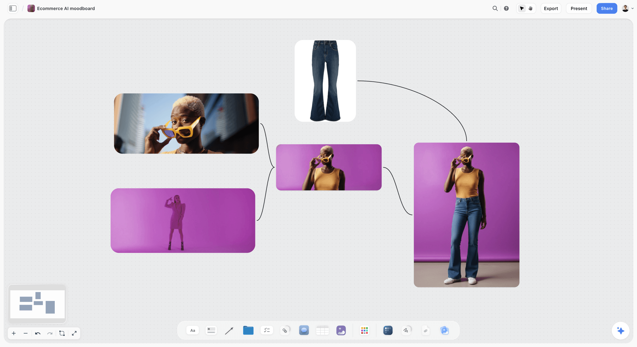
A colour-led route in its reference stage: the board where a key visual's palette, styling and pose are argued before any comp exists.
The Storyflow 3-Crop Test
Every key visual looks good at the size it was designed for. The question is how it looks at the sizes it was not.
The rule
The Storyflow 3-Crop Test is our editorial rule for key visuals: before approval, crop the comp to a 1:1 square, a 9:16 vertical and a billboard, and approve it only if brand, product and idea read in all three. In Storyflow, the three crops sit as image cards in a strip under the comp on the route's wall, so the client sees them in the same glance as the hero.
Why these three
They are the extremes. The 1:1 square is the tightest centre crop, the shape of feed posts, catalogue tiles and many thumbnails; if the product and brand asset are not in the centre, the square loses them. The 9:16 vertical is the tallest, the shape of stories, short video and vertical ad placements; it cuts the sides of a wide frame. The billboard is read at distance and speed; Wikipedia's entry on the billboard notes billboards must be "readable in a very short time" and typically carry only a few words in large print. A frame that survives the centre, the tallest crop and the glance survives the 4:5, 16:9 and 1.91:1 in between.
How to run it
Make each crop from the master comp without moving anything: no rescaling the product, no repositioning the headline. Then ask three questions per crop: can you tell whose ad it is, can you see what is sold, can you tell what the idea is. Three yeses per crop, nine in all, pass the test. A no is a note on the comp, not a note on the crop.
| Crop | What it removes | Fails when | Typical fix in the comp |
|---|---|---|---|
1:1 square | Both sides of a wide frame | The product or brand asset sits on a third near the edge | Move the product toward the centre band; let the scene extend outward |
9:16 vertical | Most of a wide frame's width | The idea depends on two things side by side | Stack the idea vertically, or shoot a dedicated vertical |
Billboard | Detail and small type; it is read in a glance | The idea needs a headline to make sense, or the product is small | One object, larger; headline cut to a few words |
When to add a fourth crop
Add a fourth when the media plan has an unusual shape that matters: a tall, narrow skyscraper banner, a shelf strip, a vertical banner in a station. If one shape carries a large share of the budget, it gets tested like the three.
Key Visual vs Key Art
A key visual and key art are the same move named by two industries: brand advertising says key visual, film, TV and games say key art. In Storyflow, both start as routes on walls of one board and end as a master frame beside an asset list; what differs is what the image has to sell.
| Question | Key visual | Key art | Where it lives in Storyflow |
|---|---|---|---|
Industry | Brand and product advertising | Film, TV, streaming, games, books | Either: one board per campaign or title |
What it sells | A product, service or brand idea | A story, a world, a cast | The brief wall names the thing sold |
Typical image | Product hero, human moment or graphic lockup | Characters, title treatment, tone of the story | Route walls with comps and crop strips |
Type | Headline, logo, often a legal line | Title treatment, billing block, release date | Font cards for the faces, a note for the lockup rule |
How long it runs | One campaign, sometimes years | The life of a release, then home media | Board stays open as the master record |
Who makes it | Agency art director and designer, photographer | Studio marketing, a key art agency, illustrators | Edit access for makers, view link for the client |
Formats | Social, display, out of home, retail, pack | Posters, thumbnails, box art, trailers' end cards | Asset matrix table on its own wall |
Where key art comes from
Wikipedia's entry on key art defines it as "the artwork which is repeated across media such as posters, print, television and digital advertisements", and quotes a description of it as the singular, iconographic image a film's marketing campaign is built on. For games, the entry notes key art is often produced early in development to convey a vision of the game to the artists building it.
Why the difference matters to you
If your client sells a product, write "key visual" in the brief and judge it on the five jobs above. If your client sells a story, key art carries an extra job, the promise of a world, and usually a title treatment that becomes part of the brand. The same 3-Crop Test applies to both: the entry notes that television key art is most often produced at 16:9, and a 16:9 frame is exactly the one that breaks in a 9:16.
Where the Key Visual Sits in a Campaign
The key visual is the hinge between the idea the client bought and the assets the team will make. Built too early, it guesses at an idea; built too late, every format has already improvised.
| Stage | Output | Owner | Decided before the key visual? | Where it lives in Storyflow |
|---|---|---|---|---|
Brief | Objective, audience, single message, deliverables | Strategy, client | Yes | Brief tool or the in-app AI's campaign brief on the board |
Concept | The idea and its line | Creative director, copywriter | Yes | A note at the top of the campaign board |
Visual direction | The campaign look: references, palette, type, rules | Creative director | Yes, at least in draft | Its own walls, or a linked board |
Key visual | The master frame and its lockup | Art director, designer | This stage | Three route walls, then one master wall |
Asset matrix | Every format, size, crop rule, copy and owner | Designer, producer, media | After | A table beside the master frame |
Production | Every asset made from the master | Designers, retouchers, motion | After | Final crops on a wall, one to-do per asset |
What must be true before you start
You need a signed single message, the concept line and the media plan's format list. Without the format list, you cannot run the 3-Crop Test, and the key visual gets designed for the hero format alone. The campaign concept vs creative platform post covers how the concept and platform split before this stage.
What the key visual hands on
It hands on a master frame, a lockup rule (where the headline, logo and legal sit and how they scale), a palette, the crop rules, and an asset matrix. Anything less, and the designers making the 40th asset will be guessing.
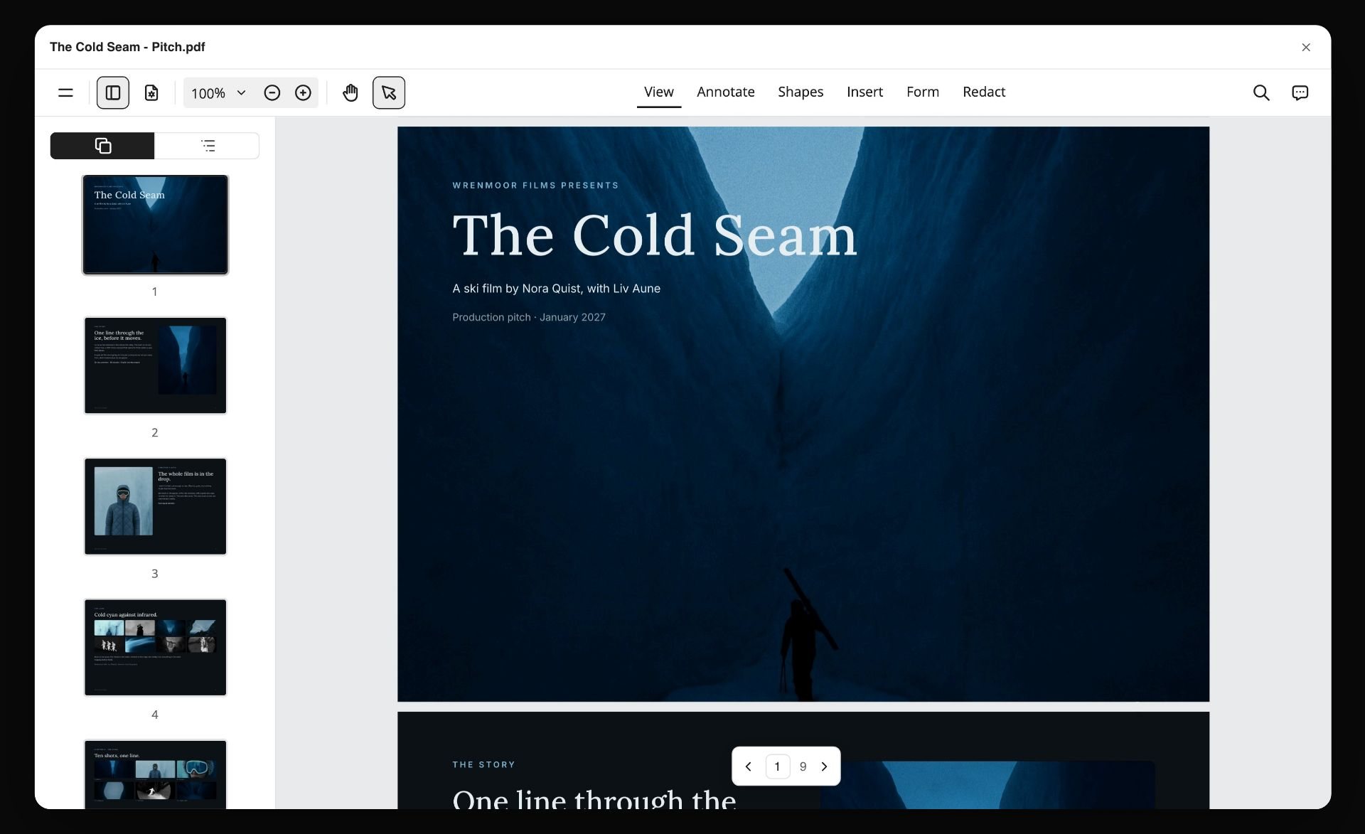
A handover read as pages: the title, the story and the look of a film in one PDF. The master frame and its rules should travel to the designers just as completely.
Start From the Brief: The Four Inputs a Key Visual Needs
Key visuals built from a mood instead of a brief get approved for their beauty and rejected for their fit, usually at the media meeting.
The single message
One sentence the campaign must say. If the brief carries three messages, the key visual will try to show three things and show none of them clearly. Ask for one; if the client cannot choose, the key visual is the wrong place to resolve it.
The product truth
What the product does or is that the image can show: the colour of the drink, the texture of the fabric, the size of the device in a hand. A key visual that cannot show the product truth has to explain it in copy, which the billboard crop will cut.
The brand's existing assets
List what the brand already owns: a colour, a typeface, a shape, a character, a sound logo for the film. The key visual should use at least one, unless the brief is a rebrand. Changing a known asset weakens the recognition the brand has built, so changes belong in the brief, not in a route.
The format list
Every format the media plan buys, with its ratio and the share of spend if you can get it. This is the input most often missing, and the one the 3-Crop Test depends on. In Storyflow, paste it into a table on the brief wall before any sketch exists. The campaign brief template shows the fields.
Three Routes: How to Explore Without Wasting a Shoot
One route is a guess; five routes is a creative team that has not decided. Three routes give the client a real choice and the team a manageable comp load.
Make the routes differ in kind
Three routes that differ only in colour are one route. Make them differ in what carries the idea: the product, a person, or a graphic device.
| Route type | What carries the idea | Strength | Risk | Example for a sparkling drink |
|---|---|---|---|---|
Product hero | The product itself, staged | Clear product truth; crops well to the centre | Looks like every pack shot in the category | A split grapefruit and the can, cold drops on a hot pavement |
Human moment | A person's reaction or action | Emotion and memorability | The product becomes a prop; casting decides everything | A swimmer surfacing, can in hand, eyes shut |
Graphic or typographic | A shape, pattern or type lockup | Ownable and very croppable | Can feel cold; needs a strong brand asset | A sun drawn from the can's ring-pull, flat colour field |
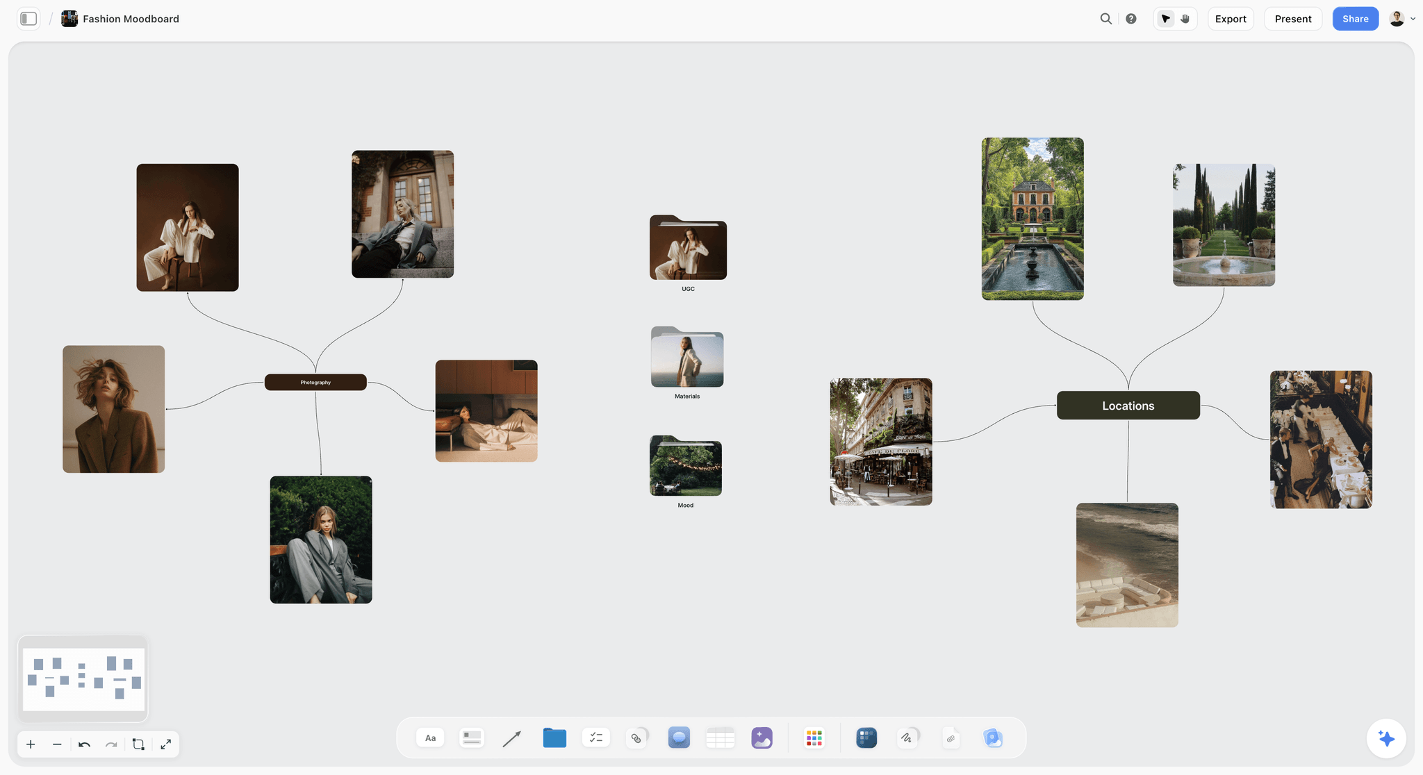
A human-moment route at reference stage: portraits and places grouped by branch, before casting decides whether the route can be made.
Six to ten thumbnails per route
Each route starts as thumbnails: small, fast, ugly drawings of composition only. Six to ten per route is enough to find the strongest frame without polishing any of them. In Storyflow, a thumbnail is a photo of a pencil sketch or a quick drawing with the freehand pen, one image card each, in a row on the route's wall.
Name each route
Give each route a two- or three-word name and a one-line reason it answers the brief: "Cold Shock: the product's chill made visible." Names make client feedback precise ("Cold Shock, but with the swimmer's energy") and stop the routes being called left, middle and right.
Generated frames as thumbnails
Generated images can stand in for thumbnails or comp backgrounds, as long as everyone knows what they are. In Storyflow, AI image generation is on Pro and Max, and background removal and upscaling are on every paid plan. Label every generated frame on the board as a sketch, and never present one as a photograph the shoot will match exactly.
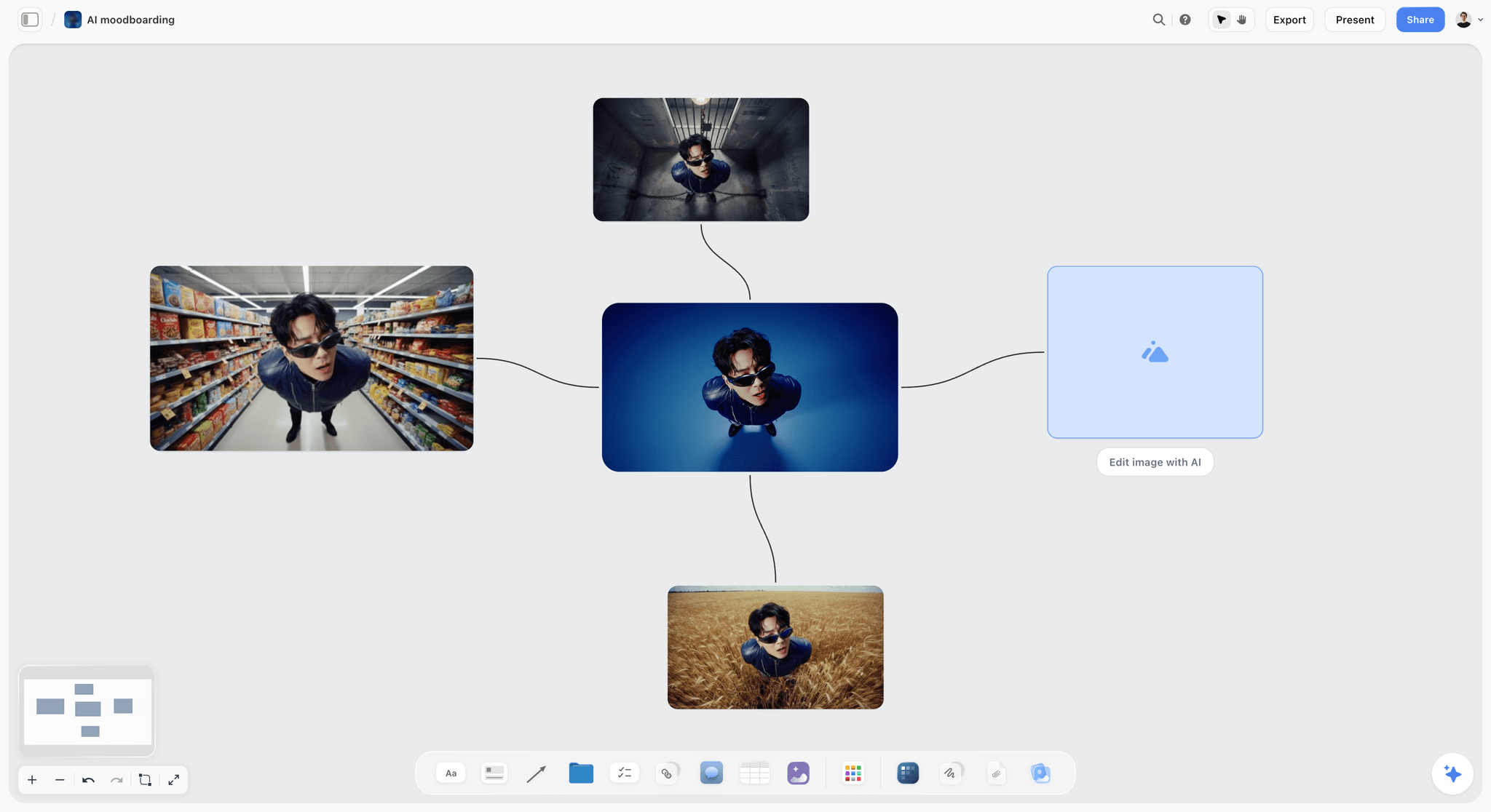
One character tested across four settings: the kind of fast exploration that belongs at thumbnail stage, labelled as sketches on the route wall.
Sketch to Comp to Shoot: The Fidelity Ladder
Showing a client a finished image too early commits you to details nobody chose. Showing a sketch too late wastes a meeting. The ladder below is the order most studios work in.
The four rungs
Wikipedia's entry on the comprehensive layout describes the sequence as a sketch, a layout, a comp made to closely mimic the final piece, "usually as a step toward approval by decision-makers", and the finish. The key visual climbs the same ladder.
| Rung | What it shows | Who sees it | Time per route | What gets decided |
|---|---|---|---|---|
Thumbnail | Composition only, small and rough | The creative team | Minutes per sketch | Which frames are worth building |
Layout | Composition with type at real proportions | The team, the creative director | Hours | Hierarchy and room for copy |
Comp | Near-final image, real type and colour | The client | A day or two | Which route goes forward |
Final | The shot or built image, retouched | The client, then production | The shoot plus post | The master frame |
What to show the client
Show comps, three of them, each with its crop strip. Never show a final the client has not seen as a comp; they will approve or reject details they should have had a say in, and the shoot will be judged against a picture nobody agreed on.
Comps built from references
A comp does not need a shoot. Photography references, a quick test shoot on a phone, a generated background or a stock image with the right light can carry it, as long as the comp is labelled as such and the brief for the shoot says what will change. In Storyflow, keep each comp's source images in a folder on its route wall, so the photographer later sees what the comp was built from.
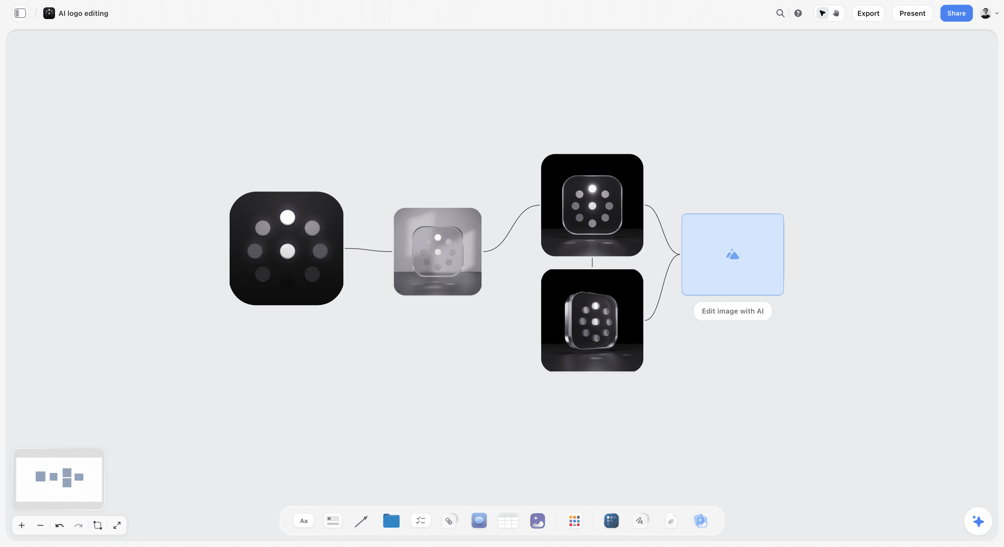
Climbing the ladder on one board: each version connected to the one it came from, so the client sees how the comp was reached.
Composition: Building a Frame That Crops
The 3-Crop Test is easier to pass if the frame is built for it from the first thumbnail, not rescued at comp stage.
The safe core
Define a safe core: the area that survives every crop on the format list. For a list that runs from 9:16 to 1.91:1, it is roughly the centre of the frame. Put the product, the brand asset and the face (if there is one) inside it; let everything else extend outward.
Thirds, and when to break them
The rule of thirds, a rule of thumb for composing on a grid of nine, puts the subject on a third and leaves the rest for air or type. It produces beautiful 16:9 frames and fragile 9:16 crops, because the third becomes the edge. For a key visual, a centred or near-centred subject with type above or below it often crops better than a classical thirds composition.
Build in bleed
Shoot or build wider and taller than the hero format needs: extra sky, floor and sides. Bleed is what lets the 9:16 and the billboard exist without stretching. Brief the photographer to shoot a dedicated vertical for the hero setup as well.
One focal point
A key visual has one focal point, one supporting element and everything else quiet. If you can describe the frame only by listing three things, the billboard crop will show none of them.
Type and Lockup: Where the Headline Lives
Type is where most key visuals break across formats, because the image crops and the type has to move.
The lockup rule
A lockup is the fixed arrangement of headline, logo and any legal or call to action. Write its rule once: relative sizes, the space between elements, and where it sits per format family (top for vertical, right third for wide, bottom band for square). Wikipedia's logo entry uses the same term for a logo's fixed elements in fixed positions and sizes.
Headline length by format
A headline that works on a poster at arm's length fails on a billboard at speed. Write a long and a short version during the comp stage, not after. The billboard takes the short one, which is often three to five words.
Contrast on photographs
Type on an image needs contrast. The W3C's WCAG contrast guidance sets at least 4.5:1 for normal text and 3:1 for large text, and exempts text that is part of a logo or brand name. Use those ratios as the floor for headlines and especially for legal lines, which are small.
Type in Storyflow
On the route wall, a font card shows each typeface in a Specimen, Headline or Paragraph layout, with its own background and text colour. Inter is on every plan; Lora, Courier Prime and fonts uploaded to your font library need a paid plan. The lockup itself is built in your design app and placed on the board as an image.
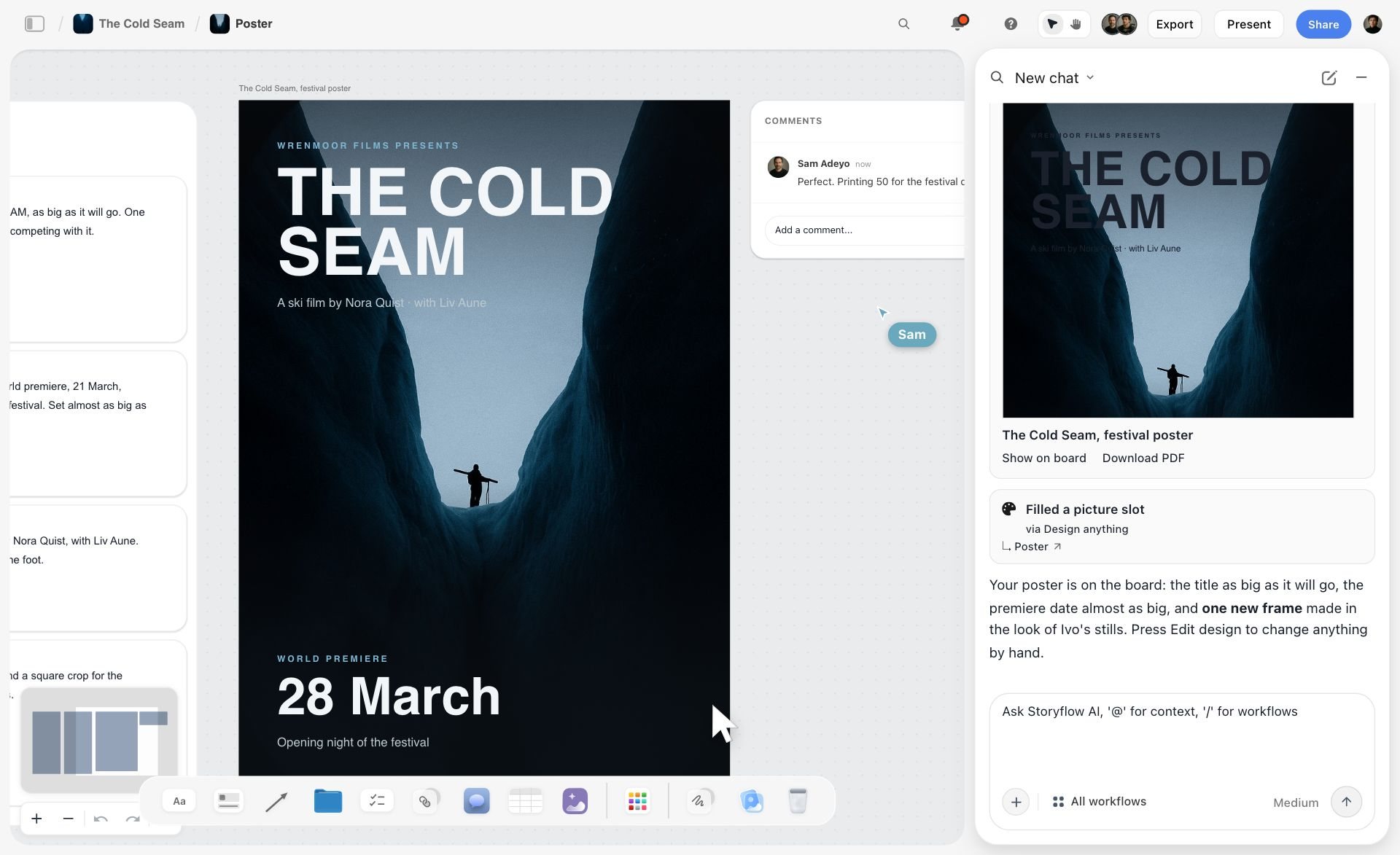
A finished lockup sitting on the board as an image: title, credit line and date at fixed sizes over the frame, with the approving comment beside it.
Colour and Light in the Key Visual
Colour is often the brand's strongest distinctive asset, and light decides whether that colour reads on a phone in sunlight.
Palette roles
Give each colour a role: the brand colour, the product's colour, the background, the type colour. In Storyflow, each is a colour card in the Classic, Spec or Chip style with Hex, RGB, HSL and CMYK values; the CMYK is converted from the hex and can be typed over with the printer's value for the out-of-home and print runs.
Light as a number
Brief light in kelvin when it matters. The colour temperature entry lists studio lamps at 3,200 K and puts daylight between 5,500 and 6,500 K. "Hard midday sun, about 5,500 K, short shadows" tells a photographer and a retoucher the same thing.
Print and screen are different colours
A key visual runs on screens (RGB) and on paper and vinyl (CMYK). The CMYK colour model entry notes that RGB and CMYK are device-dependent and that no universal formula converts between them. Proof the out-of-home and print versions on the real substrate before the run; a value converted on a board is a starting point.
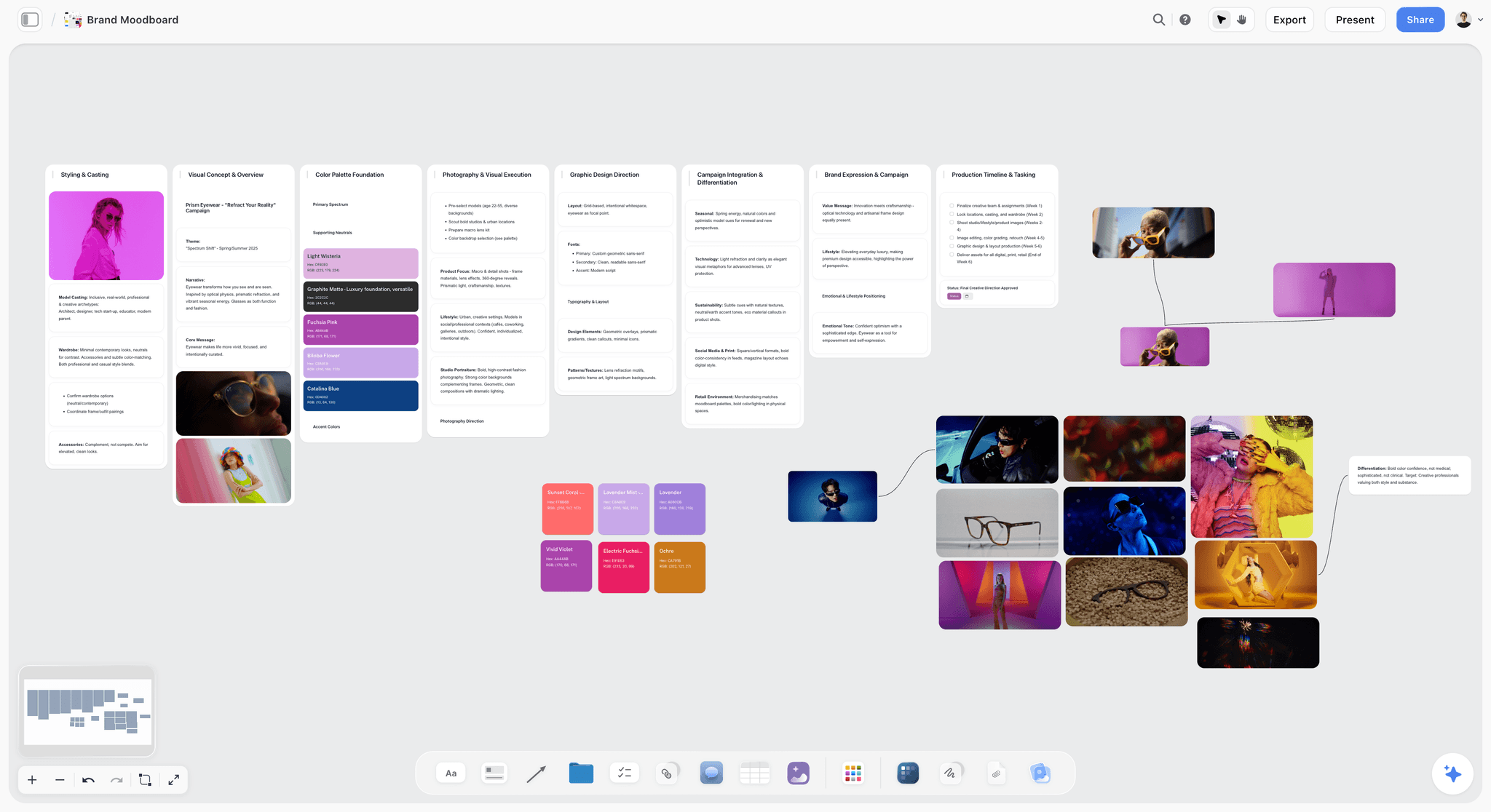
Palette and type on the same board as the images: roles and values decided before the comp, not discovered in it.
Testing the Key Visual Across Formats
The 3-Crop Test catches the extremes. The full format check catches the rest, with each platform's own numbers, read in November 2026 and worth reading again before production.
| Format | Ratio and size (as of November 2026) | Source | What to check in the key visual |
|---|---|---|---|
YouTube video thumbnail | 16:9; 3840 by 2160 pixels, minimum width 640 | Product and brand asset readable at phone size | |
YouTube Shorts thumbnail | 9:16; 2160 by 3840 pixels | Same YouTube Help page | Subject in the centre band; nothing at the edges |
TikTok in-feed ad | 9:16 recommended, at least 540 by 960; 1:1 at least 640 by 640; 16:9 at least 960 by 540 | Text and logo inside the safe zone, which shrinks as captions grow | |
LinkedIn Page link post | 1.91:1 at 1200 by 627 pixels; PNG or JPEG up to 3 MB | Wide crop keeps the product and a short headline | |
LinkedIn Page logo and cover | Logo 400 by 400 recommended; cover 1512 by 256 | Same LinkedIn Help page | The brand asset alone, at small size |
Billboard | Site-specific; read at speed | A few words, one object, high contrast | |
Video end frame | Matches the film's ratio | The edit | The lockup holds for two to three seconds |
Safe zones are part of the frame
TikTok's help page says key elements such as text and logos must sit inside the safe zone, that elements outside it may be covered or cropped, and that the zone changes with orientation, caption length and add-ons. Download the platform's safe-zone file for each placement and lay it over the comp on the board before approval.
The small-size test
Shrink the comp to the width of a thumbnail on a phone, about the size of a fingertip at arm's length. If the brand asset and the product are still recognisable, the key visual will hold in feeds. If only the colour survives, the colour had better be the brand's.
The one-colour test for the lockup
Print or view the lockup in one colour, black on white and white on black. A lockup that depends on a gradient or a photograph behind it will fail on a receipt, an embroidered cap or a one-colour print run.
Presenting Key Visual Routes to the Client
The presentation decides which route lives, and most bad picks come from presenting routes in a way that makes one look finished and the others look like sketches.
Equal fidelity, equal airtime
Three comps at the same fidelity, each with its crop strip, each with the same amount of time. A route shown rougher than the others is a route you have told the client to reject.
The order
Open with the brief's single message and the format list, so the client judges against the job. Then the three routes, strongest second: the first sets the bar, the second wins against it, the third shows the stretch. Close with the 3-Crop strips side by side, which is often where the decision actually happens.
| What to show per route | Why | Where it lives in Storyflow |
|---|---|---|
The route's name and one-line reason | Makes feedback precise | Wall title and a note |
The comp at hero size | The emotional read | Image card at the top of the wall |
The crop strip: 1:1, 9:16, billboard | The practical read | Three image cards under the comp |
Two or three thumbnails it came from | Shows the thinking, invites "more of this" | A row of image cards |
The risk in one line | The client hears it from you first | A note at the bottom of the wall |
Present from the board
Storyflow's presentation mode goes fullscreen and steps one wall, note, image or document at a time, so each route is a wall and the crops come up with it. The client opens the same board afterwards on a view-only link with no account, and signs in to comment or draw. For the slide order around the routes, see the campaign concept presentation slide order and the tools to present a campaign concept to a client.
Questions to ask the room
Ask questions with answers: "Which route says the single message fastest?" "Which crop would you be least happy to see on a bus shelter?" "Which route could we still run in two years?" Avoid "what do you think?", which invites taste instead of judgement.
Choosing and Locking the Key Visual
Picking a route by vote picks the safest one. A short scorecard keeps the decision tied to the brief.
| Criterion | Question | Score 1 to 5 | Weight |
|---|---|---|---|
Single message | Does the frame say it without the headline? | High | |
Brand | Is it this brand before the logo is read? | High | |
Product truth | Can you see what is sold and why it is good? | High | |
3-Crop Test | Do all nine checks pass? | High | |
Ownability | Could a competitor run it tomorrow? | Medium | |
Producibility | Can the budget and schedule make it? | Medium | |
Longevity | Will it hold for the campaign's full run? | Medium |
Record the pick on the board
Write the decision as a note on the chosen route's wall: who chose, when, and the one reason. Move the rejected routes to a "Not this time" wall rather than deleting them; next season's brief may want one. In Storyflow, the approval is a to-do with the client lead as assignee, ticked when they sign.
Merge feedback without blending routes
"Route A with the colour of Route C" is a valid note if it serves the message, and a disaster if it is a compromise. Test the merge as a new comp with its own crop strip before anyone agrees to it.
Production: Shooting or Building the Final
The comp sold the idea. The final has to keep it, at full resolution, in every crop, after retouching.
Brief the shoot from the comp
The photographer's brief is the comp plus its crop strip, the light as a number, the safe core marked and an instruction to shoot a dedicated vertical. The art direction brief template covers the eight decisions that brief has to make.
Shoot for the master, then the variants
Get the master frame first, then the variants the matrix needs: a tighter product frame for small sizes, a vertical, a version with room for long copy. Every variant shot on the day saves a composite later.
Retouch to the comp, not to taste
Give the retoucher the comp, the palette and the lockup rule. "Match the comp's contrast and keep the drops on the skin" is a brief; "make it pop" is not. Check the retouched master with the 3-Crop Test again before any asset is made from it.
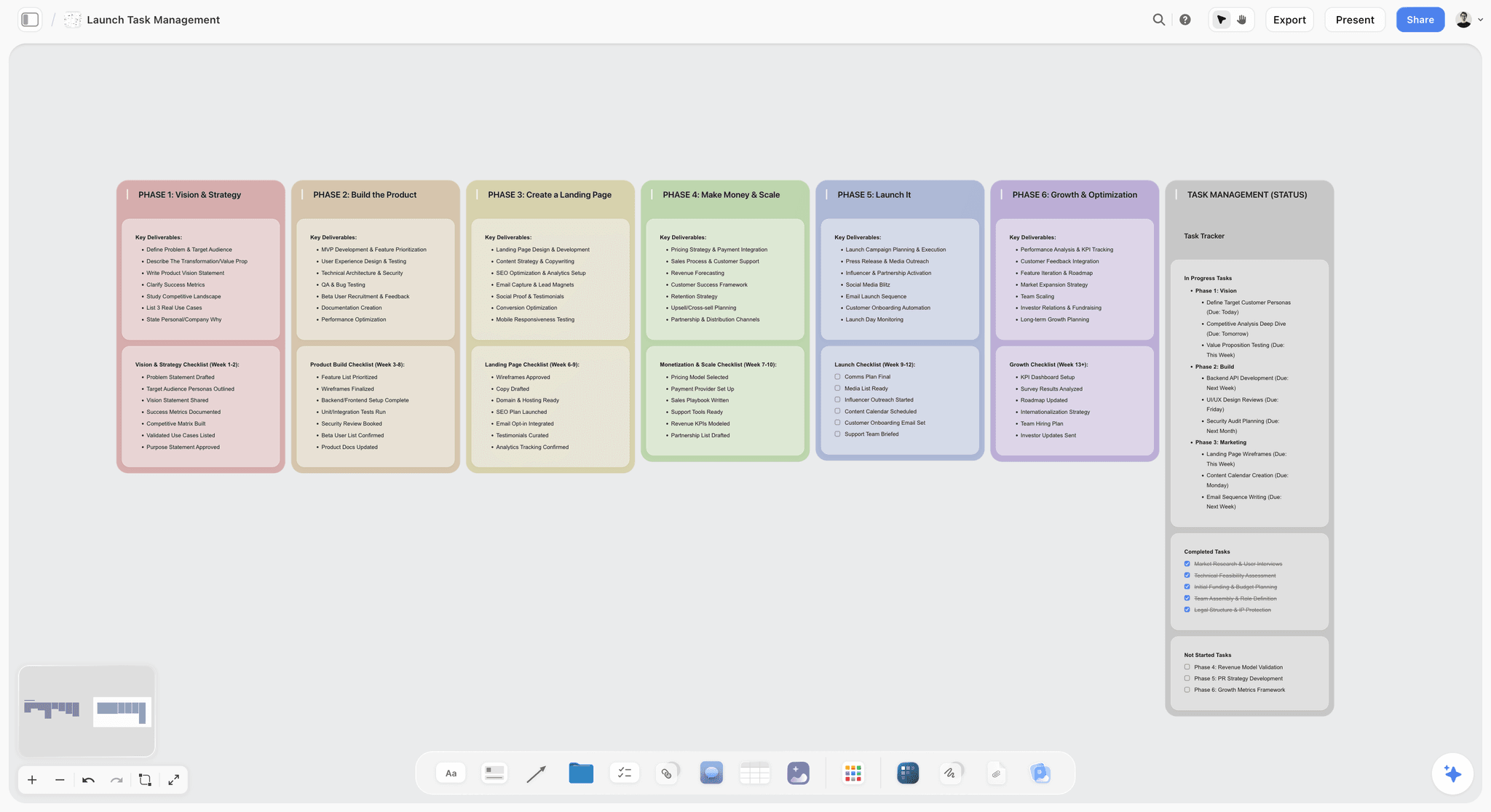
Phases and statuses on one board: the shoot, retouch and asset production tracked beside the work they produce.
Pick finals on the board
Run selects on the key visual's board with Storyflow's Selects tool: four walls, To review, Yes, Maybe and No, and you choose by dragging pictures between them. There is no star, flag or vote, and a client needs edit access to move cards; a view-only link cannot.
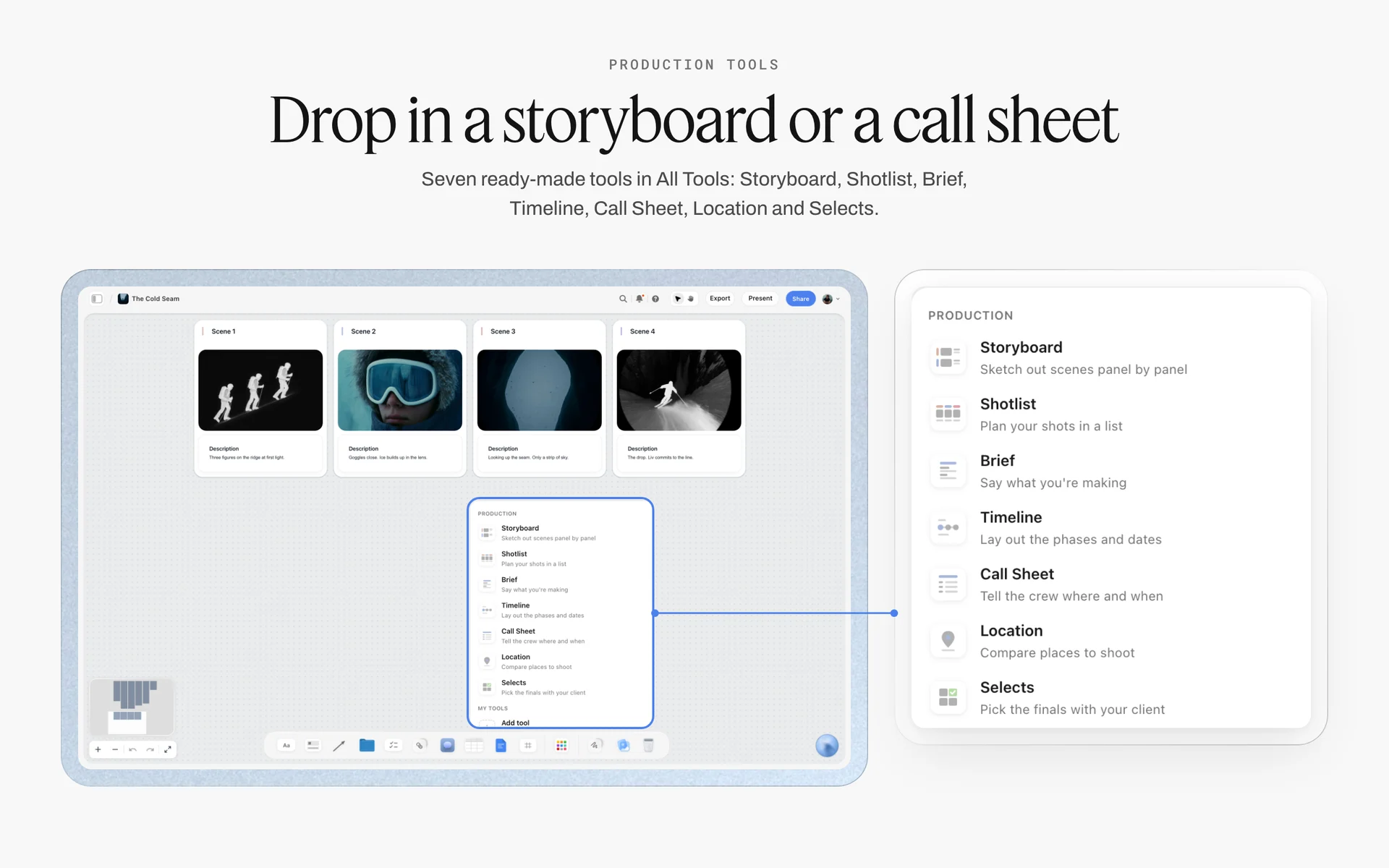
The production tools sit in All Tools: the Shotlist for the shoot, the Call Sheet for the day and Selects for picking the master frame.
The Asset Matrix: A Template Filled for One Launch
The key visual's last job is to become a list. Without it, every designer interprets the master differently. This matrix is filled for a fictional studio, Studio Okerwell, and a fictional sparkling drink, Velloran, launching a grapefruit flavour.
| Asset | Format | Size | Crop rule | Copy | Owner | Due |
|---|---|---|---|---|---|---|
Master key visual | 16:9 | 3840 by 2160 | Master; nothing moves | "Cold shock." + logo | Art director | Week 1 |
Square feed post | 1:1 | Per the platform's help page, read on the day | Can and fruit centred; pavement crops first | "Cold shock." | Designer | Week 2 |
Short video cover | 9:16 | 2160 by 3840 | Dedicated vertical; lockup in top third | "Cold shock." + logo | Designer | Week 2 |
Vertical ad | 9:16 | At least 540 by 960 | Lockup inside the platform safe zone | Short line + call to action | Designer | Week 2 |
Trade post | 1.91:1 | 1200 by 627 | Wide crop; headline on the right third | "Velloran Grapefruit is here." | Designer | Week 2 |
Video thumbnail | 16:9 | 3840 by 2160 | Tighter on the can; no headline | None | Designer | Week 2 |
Billboard | Site-specific | Per site | One object, three words, logo large | "Cold shock." | Art director | Week 3 |
Bus shelter poster | Portrait | Per site | Vertical crop with full lockup | "Cold shock." + legal | Designer | Week 3 |
Retail shelf strip | Long horizontal | Per retailer | Fruit and can only; flat colour field | Logo only | Designer | Week 3 |
Display banner | Small rectangle | As the media plan buys it | Can centred; headline under | "Cold shock." | Designer | Week 3 |
Video end frame | 16:9 | Film resolution | Master lockup, held for three seconds | "Cold shock." + logo | Editor | Week 4 |
Pack sleeve | Per pack | Per printer | Graphic route element only | Product name | Packaging designer | Week 4 |
How to use the matrix
Add every asset before production starts and keep the rows in due-date order by hand, because Storyflow tables cannot be sorted. A status column in a Storyflow table has six fixed options (Not started, Blocked, In progress, In review, Done, Archived), which is enough to see the week at a glance. Place each finished asset as an image on a wall beside the matrix, so the review is visual, not just ticked.
Check the first five against the master
The first five assets made from the master tell you whether the crop rules work. Review them together on the board before the designers make the other thirty-five; a fix at five assets is cheap.
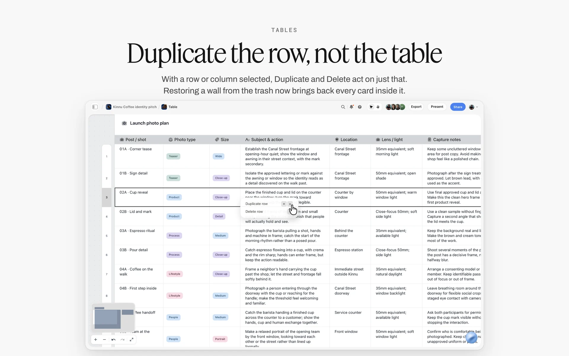
An asset plan as a table, one row per asset with its size and notes: review the first rows against the master before the rest are made.
Worked Example: Studio Okerwell Develops Velloran's Summer Key Visual
This example is illustrative: a fictional studio, a fictional drink and a plausible four weeks. It shows the order of decisions, not a measured result.
Week 1: brief, inputs and routes
Mara Lind, Studio Okerwell's creative director, gets a signed brief from Velloran's brand manager, Ella Moss: launch the grapefruit flavour to adults who drink sparkling water instead of soda, with one message, "the coldest thing you can open this summer". The media plan buys social, a trade post, three billboard sites, bus shelters and a shelf strip. Mara and the art director, Dev Okafor, put the brief, the message and the format list on a Storyflow board, then three route walls: Cold Shock (product hero), Surface (a swimmer), and Ring Sun (graphic, a sun drawn from the ring-pull).
Week 1: thumbnails and layouts
Each route gets eight thumbnails, photographed pencil sketches on its wall. Dev picks two per route and builds layouts with type at real proportions in the design app, then places each layout's three crops under it. Surface fails early: the swimmer's face and the can sit far apart, and the 9:16 can keep only one. Dev restages it with the can held at the face before it goes to comp.
Week 2: comps and the presentation
Each route becomes one comp: Cold Shock from a test shoot on a phone, Surface from a reference photo and a retouched can, Ring Sun built flat in the design app. Mara presents from the board in presentation mode, one wall per route with its crop strip. Ella picks Cold Shock, and asks whether the swimmer could appear in the social cuts. The answer goes on the board: not in the key visual, but as a second social execution after launch.
Week 3: the 3-Crop Test and the shoot
The chosen comp fails one of nine checks: in the billboard crop, "the coldest thing you can open this summer" is too long to read at speed. Mara cuts the billboard line to "Cold shock." and the client approves on the board. Sol Petrov, the photographer, shoots the master on a hot afternoon, about 5,500 K, plus a dedicated vertical and a tight can frame for small sizes. Selects go to the Selects tool's To review wall; Ella drags two to Yes with edit access.
Week 4: the matrix
The designer builds the twelve-row matrix beside the master, makes the first five assets and places them on a wall. One fails: the small display banner loses the drops on the fruit. The crop rule changes to "can centred, fruit tighter", and the other assets follow the new rule.
Do This in ChatGPT or Claude
If you sketch routes and write rationales in ChatGPT or Claude, keep them out of the chat and on the board where the client and designers work. The Storyflow plugin and connector build the walls, notes, tables and colour cards there.
Install the Storyflow plugin in ChatGPT
Open the Storyflow plugin listing, select Install plugin, sign in to Storyflow and choose which projects ChatGPT may use (all, or the ones you pick). Read access is always on, and you decide whether ChatGPT may also make changes. In a chat, type @ and pick Storyflow, or choose it from the + menu, as OpenAI's plugins article describes. Availability depends on your ChatGPT plan, workspace and region, and in a Business or Enterprise workspace an admin manages plugins, as OpenAI's admin controls article covers.
Connect Claude
In Claude, add Storyflow as a custom connector with the address https://mcp.storyflow.so/mcp, following Anthropic's custom connector guide; the setup page covers Claude, Gemini and Grok. The Claude campaign plan workflow and Claude client presentation workflow show the same boards built from Claude.
Prompts for a key visual
- "On my Velloran summer board, add a brief wall with this single message and a table of the media plan's formats with columns Format, Ratio, Size, Share of spend."
- "Make three walls named Cold Shock, Surface and Ring Sun. On each, add a note with a one-line reason the route answers the message, and a note at the bottom headed Risk."
- "Under each route, add a row of three empty notes titled 1:1, 9:16 and Billboard, for the crop strip."
- "Make four colour cards in the Chip style: Velloran green, Grapefruit pink, Pavement grey and Ice white, with these hex values, showing Hex and CMYK."
- "Write a short and a long headline for each route on its wall: the short one five words at most for the billboard."
- "Build the asset matrix as a table beside the routes: Asset, Format, Size, Crop rule, Copy, Owner, Due, with these twelve assets, rows in due-date order."
- "Read the board and list any asset in the matrix whose crop rule is missing or contradicts the route's crop strip."
- "What changed on this board in the last week, and who changed it?"
What lands on the board, and what to check by hand
The walls, notes, tables and colour cards land on the board, where the team edits them like anything else. ChatGPT and Claude can add images to the board and give you an upload link for your own comps, but a picture you attach in the ChatGPT chat does not reach Storyflow; use the upload link. The plugin cannot generate images or read board comments, and neither assistant can drop the Selects or Shotlist tools; drop those yourself. Check by hand: every crop against the comp, every size against the platform page on the day, and every headline at billboard distance. The plugin runs on ChatGPT's model and your ChatGPT plan, so it uses no Storyflow AI credits, and the connection ends after 30 days, when ChatGPT asks you to sign in again.
The plugin is not the in-app AI
Inside Storyflow, the in-app AI is a separate tool that uses Storyflow AI credits on paid plans. It builds a brand moodboard or a campaign brief on the board, reads the pixels of up to 24 images you select, and designs deliverables from the board, including a poster in about 2 minutes (the median of 25 runs in September 2026 was 68 seconds). A designed poster is a fast way to see a route in a format; it is not the comp. See the ChatGPT campaign plan workflow and ChatGPT client presentation workflow.
The same board from either assistant: ChatGPT through the plugin, Claude through the connector.
Where to Build It: Storyflow vs Design Files, Slide Decks, Docs and Proofing Tools
Developing a key visual needs four things in one view: the brief and format list, three routes with their crop strips, the palette and type, and the asset matrix. Our pick comes first, on the basis that Storyflow holds all four on one board the client opens by link; the rest follow by the job each does best.
| Kind of tool | Routes side by side | Crops beside the comp | Asset matrix | Exact layout and export sizes | Best job in this workflow |
|---|---|---|---|---|---|
Storyflow | Yes, one wall per route | Yes, as image cards under each comp | Yes, a table with a status column | No: boards export as PNG, JPEG or PDF | Developing, presenting and handing off the key visual |
A design file | On artboards | Yes, at exact sizes | Weak | Yes | Building layouts, comps and every final asset |
A slide deck | One per slide | If placed by hand | No | No | Presenting once in a fixed order |
A shared doc | No layout | No | As a table | No | The written rationale and usage terms |
A proofing tool | Per file | No | No | No | Frame-level approval of final assets |
A whiteboard app | Yes | By hand | Weak | No | Workshops and sticky-note sessions |
A design file
A design file is where the key visual is actually made: layouts, comps, crops at exact pixel sizes and every final asset. Its limit is that the brief, the references, the rationale and the client conversation have nowhere natural to live, so routes get presented as exported frames anyway. Build in a design file; place the frames on the Storyflow board for the decision.
A slide deck
A slide deck is built for one meeting: the routes revealed in order with a script. Its limit is everything after the meeting; it is closed, and the asset matrix and crop rules do not fit it. Use a slide deck to present once the Storyflow board is ready, or present the board itself in presentation mode.
A shared doc
A shared doc is the best place for the long-form rationale, usage terms and legal copy, reviewed line by line. Its limit is that three routes and their crops cannot sit side by side on a page. Write the rationale in a doc when the client's procurement team wants one, and link it from the board.
A proofing tool
A proofing tool earns its place at the end, when forty final assets need frame-level comments, version compare and a formal approval status. Storyflow has none of those, so choose a proofing tool when legal or a retailer needs a signed approval record per file.
A whiteboard app
A whiteboard app is good for the early workshop: sticky notes, voting dots, a timer. Its limit for this job is depth: comps at full resolution, exact palette values and an asset matrix are not what it is built for. Run the workshop there if your team already does, then move the routes to the key visual board.
For ranked roundups by job, see the best tools for creative directors to share visual direction and the best tools for presenting design concepts to clients.
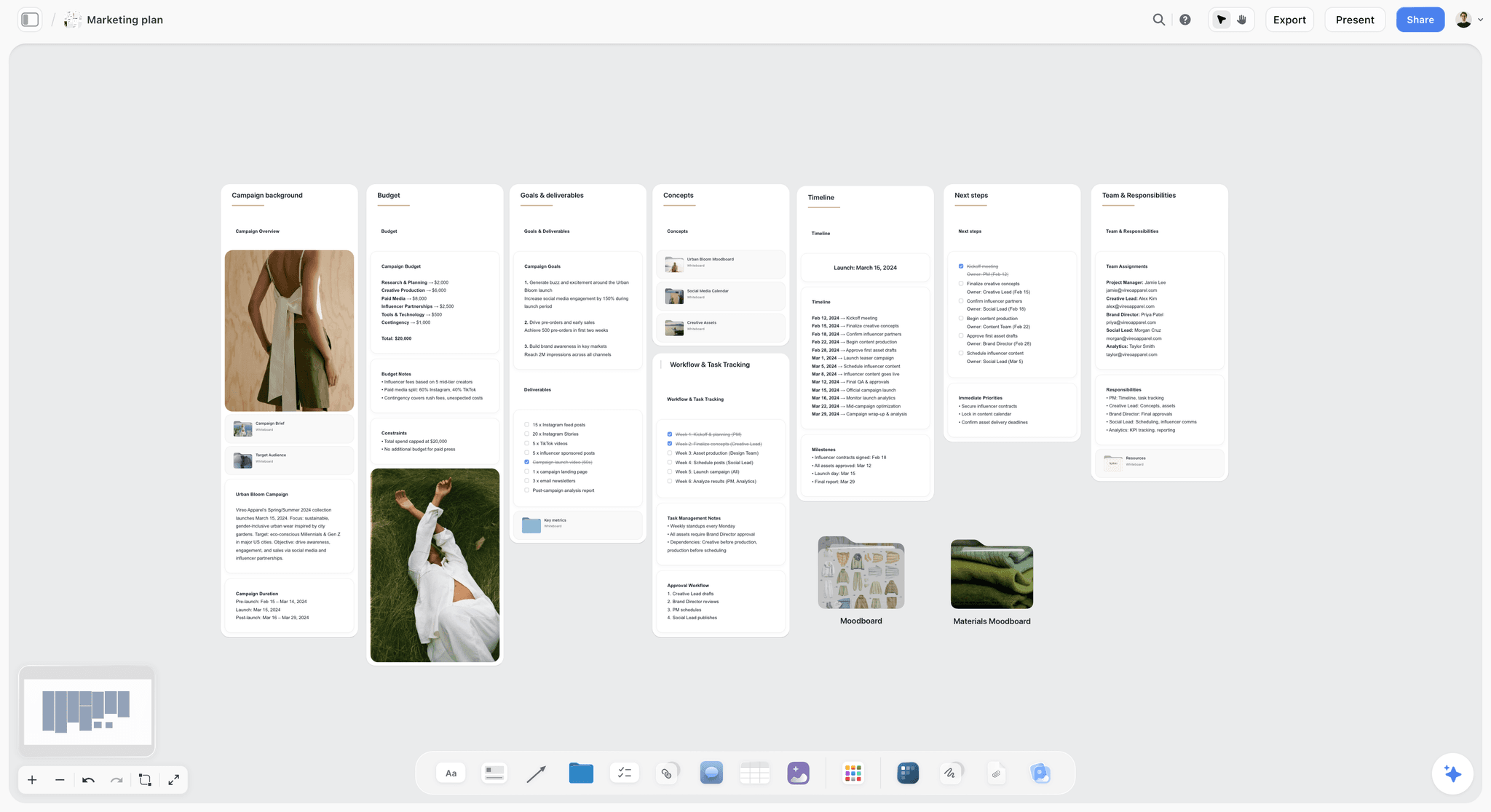
A marketing plan on a Storyflow board for a fictional spring fashion campaign, with walls for the campaign background, budget, goals and deliverables, concepts, timeline and team
Build the three route walls from a chat
Install Storyflow in ChatGPT and ask for a brief wall with the format list, three route walls with crop strips and an asset matrix table on your campaign board, then make the comps yourself and check every crop before the client sees them.

Mistakes and Fixes in Key Visual Development
Each of these is common, each costs a reshoot or a rebuild, and each has a fix that costs minutes at the right stage.
Designed for the hero format only
The 16:9 is beautiful and the 9:16 cuts the product in half. Fix: run the 3-Crop Test at layout stage and again at comp stage, not after approval.
Three routes that are one route
Three colourways of the same composition give the client no real choice. Fix: make the routes differ in what carries the idea: product, person or graphic device.
A finished image shown too early
The client approves a retouched photograph from a test shoot, then judges the real shoot against details nobody chose. Fix: show comps at equal fidelity, labelled as comps.
The idea lives in the headline
Without the headline, the frame is a nice picture of a drink. Fix: test the comp with the type removed; the idea should still be visible.
No room for copy
The type is laid on the busiest part of the frame at the end. Fix: plan the clean area in the layout and check contrast against the 4.5:1 and 3:1 ratios.
A new brand asset by accident
A route swaps the brand colour for a trendier one, and the brand loses recognition it paid for. Fix: list the brand's existing assets on the brief wall and require at least one in every route, unless the brief asks for change.
The matrix comes last
Designers make forty assets from a master with no crop rules, and each interprets it. Fix: build the matrix before production and check the first five assets against the master together.
Approval by a thumbs-up in chat
Nobody can find who approved what when the billboard goes up with the long headline. Fix: record the pick and the 3-Crop approval as ticked to-dos with names and dates on the board.
Storyflow's Honest Limits for This Job
Storyflow holds the brief, the routes, the crop strips, the palette, the presentation and the asset matrix on one board. These are the parts of key visual work it does not do:
- No layout or export at exact pixel sizes: build comps and final assets in a design app and place them on the board as images.
- No proofing mark-up, frame-level approval status or version compare: a signed-in commenter can draw on the board with the freehand pen and comment, but use a proofing tool where a formal approval record per file is required.
- No PPTX or SVG export: boards export as PNG, JPEG or PDF, and decks present fullscreen and export as PDF.
- No animatic or video: key frames for a film sit as images; timing happens in the edit.
- No AI image generation through the ChatGPT plugin; in Storyflow it is on Pro and Max.
- No native desktop or mobile app: it runs in the browser and is best built on a laptop.
- Paid-only during early access: Plus is $7.99 a month billed annually ($9.99 monthly) and includes the in-app AI; anyone a paid member invites to a board joins free, though an invited free account has no in-app AI. Plans are on the pricing page.
The Bottom Line
A key visual is the frame every format is cut from, so it has to be designed for the cuts. Start from the brief and the format list, explore three routes that differ in kind, climb from thumbnail to comp, run the 3-Crop Test before approval, and finish with an asset matrix. Do it on one Storyflow board, so the routes, crops and handoff never drift apart. If your team drafts in ChatGPT, start with the ChatGPT campaign plan workflow and build this campaign's three route walls this week.
FAQ: Developing a Campaign Key Visual
How do you develop a key visual for a campaign?
Start from the signed brief, the single message and the media plan's format list. Sketch three routes that differ in what carries the idea, build two layouts per route with type in place, make one comp per route and present them with their crops. Pick one, test it in a 1:1, a 9:16 and a billboard crop, then shoot the final and hand off an asset matrix. In Storyflow, each route is a wall on one board.
What is the best tool to develop a campaign key visual?
Storyflow is our pick for developing and presenting it, because the brief, three routes with their crop strips, the palette and the asset matrix sit on one board the client opens by link. A design file is where the layouts, comps and final assets are built at exact sizes, a slide deck fits a one-off reveal, and a proofing tool fits frame-level approval of the finished files.
What is a key visual?
A key visual is the single image, usually with a headline and logo lockup, that carries a campaign's idea and is adapted into every format: posters, social, display, packaging, retail and video end frames. It has five jobs: show the brand, show the product, carry the idea, set the visual hierarchy and leave room for copy. It is designed to survive being cropped, shrunk and read at speed.
What is the difference between a key visual and key art?
They name the same move in two industries. Brand advertising says key visual and judges it on brand, product and idea. Film, TV and games say key art, which Wikipedia describes as the artwork repeated across posters, print, television and digital ads, and it usually carries a title treatment and the promise of a story world. Both must survive every format they are cropped into.
What is the Storyflow 3-Crop Test?
The Storyflow 3-Crop Test is our editorial rule for key visuals: before approval, crop the comp to a 1:1 square, a 9:16 vertical and a billboard, and approve it only if brand, product and idea read in all three. Those are the extremes: the tightest centre, the tallest crop and the fastest read. A frame that passes them usually survives the formats in between.
How many key visual routes should you show a client?
Three. One route is a guess the client can only accept or reject; five suggests the team has not decided. Three routes that differ in kind, product hero, human moment and graphic device, give a real choice. Show them at equal fidelity with their crops, and present the strongest second so it wins against a good first route.
What should a key visual include?
A key visual should include a single focal point that carries the idea, the product shown truthfully, at least one of the brand's distinctive assets, a planned clean area for the headline, and a lockup of headline, logo and any legal line with a rule for where it sits in each format. It should be shot or built with bleed, so vertical and wide crops exist without stretching.
How do you make a key visual work on social and billboards?
Build a safe core in the centre of the frame that holds the product and brand asset in every crop, shoot with extra space above, below and to the sides, and shoot a dedicated vertical. Write a short headline of a few words for billboards and a longer one for close-up formats. Then check each platform's safe zone and size on its own help page before production.
When should the key visual be developed?
After the brief is signed and the concept line is agreed, and before any format is designed. Built earlier, it guesses at an idea; built later, the formats have already improvised. The campaign's visual direction can still be in draft, but the format list must exist, because the 3-Crop Test depends on knowing which shapes the media plan buys.
Who is responsible for the key visual?
The art director and designer develop it, the creative director chooses which routes go to the client and signs off the concept, and the client approves the final route. The photographer or illustrator makes the final image, the retoucher matches it to the comp, and the designer or producer owns the asset matrix that turns it into every format.
Can AI generate a campaign key visual?
AI can generate thumbnails and comp backgrounds fast, which is useful for exploring routes, but a generated image should be labelled as a sketch on the board, never presented as the photograph the shoot will match. In Storyflow, AI image generation is on Pro and Max, not through the ChatGPT plugin. Storyflow will never add AI video generation; the creative work stays yours.
Is Storyflow free?
Not yet. Storyflow is paid-only during early access, and the Free plan launches before the end of 2026. Anyone invited to a board by a paid member can sign up free. Plus is $7.99 a month billed annually ($9.99 monthly) and includes the in-app AI; an invited client or freelancer can view and edit the key visual board but has no in-app AI on a free account.
Can ChatGPT build a key visual board in Storyflow?
Yes. With the Storyflow plugin, ChatGPT builds the brief wall, three route walls, crop strip placeholders, colour cards and the asset matrix table on your board, and adds images or gives you an upload link for your comps. It cannot generate images, read board comments or drop the Selects tool. Claude does the same through the Storyflow connector, and the plugin uses no Storyflow AI credits.
How do you hand off a key visual to production?
Hand off a master frame, a lockup rule, the palette with print values, crop rules per format and an asset matrix listing every asset with its size, crop rule, copy, owner and due date. In Storyflow, the matrix is a table beside the master on the same board. Review the first five assets against the master before the team makes the rest.
How long does it take to develop a key visual?
For a campaign with a shoot, plan about four weeks: a week for routes and layouts, a week for comps and the presentation, a week for the shoot and retouch, and a week for the matrix and first assets. A graphic route built without a shoot can be faster. The 3-Crop Test adds hours, not days, and saves the reshoot.
Table of Contents
- Key Takeaways
- What a Key Visual Is, and What It Must Carry
- How to Develop a Key Visual for a Campaign: 9 Steps
- The Storyflow 3-Crop Test
- Key Visual vs Key Art
- Where the Key Visual Sits in a Campaign
- Start From the Brief: The Four Inputs a Key Visual Needs
- Three Routes: How to Explore Without Wasting a Shoot
- Sketch to Comp to Shoot: The Fidelity Ladder
- Composition: Building a Frame That Crops
- Type and Lockup: Where the Headline Lives
- Colour and Light in the Key Visual
- Testing the Key Visual Across Formats
- Presenting Key Visual Routes to the Client
- Choosing and Locking the Key Visual
- Production: Shooting or Building the Final
- The Asset Matrix: A Template Filled for One Launch
- Worked Example: Studio Okerwell Develops Velloran's Summer Key Visual
- Do This in ChatGPT or Claude
- Where to Build It: Storyflow vs Design Files, Slide Decks, Docs and Proofing Tools
- A design file
- A slide deck
- A shared doc
- A proofing tool
- A whiteboard app
- Mistakes and Fixes in Key Visual Development
- Storyflow's Honest Limits for This Job
- The Bottom Line
- FAQ: Developing a Campaign Key Visual
- Related Reading
Templates to check out for this topic


Marketing and campaign templates you can use in Storyflow
Plan the whole campaign on one board: brief, audience, channels, and assets connected, with an AI that reads all of it. Open a template and start from real structure.


See Storyflow in Action
A visual AI workspace where every feature lives inside one canvas. No tab-switching, no context lost.
Build your entire board from a single message
Type what you need in the AI chat at the bottom of your canvas. The AI adds cards, headings, and structure directly onto your board.
Use expert frameworks as AI context
Type @ in the AI chat and choose any Tactic. The AI tailors every response to that framework instead of giving generic advice.
Turn your board into a mind map in seconds
Ask the AI to restructure your canvas as a mindmap. It connects your ideas into a visual hierarchy so you can see how everything relates.
Why Storyflow Exists
Storyflow actually began as a personal tool while working on creative and research projects.
We kept running into the same problem: ideas were scattered everywhere: notes, documents, and whiteboards.
Nothing helped us see how everything connected.
So we started building a workspace designed around how ideas actually grow.
→ Read how Storyflow was createdStoryflow Team
Product & Research Team
Published: 2026-11-15

