Campaign Moodboard vs Brand Moodboard: Steps and Image Count
Campaign moodboard or brand moodboard? The table that settles it, 9 steps for visual direction, colour, typography and imagery, and the Storyflow 15-Image Rule: 15 images per direction, 12 to 20 at most.

Category
Marketing
Author

Storyflow Team
Product & Research Team
Topics
2026-11-04
•
32 min read
•
Marketing- brand campaign moodboard
- campaign vs brand moodboard
- image count
- visual direction
- Storyflow
- typography and colour
How do I make a moodboard for a brand campaign?
To make a moodboard for a brand campaign, build it in Storyflow with the Storyflow 15-Image Rule: 15 images per direction, never outside 12 to 20, one wall per direction, so the client picks a direction and not a picture. Storyflow is an AI visual workspace that holds the brief, directions, palette and type on one infinite canvas, and it works inside ChatGPT (plugin) and Claude (connector).

Full disclosure: Storyflow is our product. It is listed first because the brief, directions and plan share one canvas. It has no native phone app and no PPTX export, its Free plan has no in-app AI or Tactics, and the 15-Image Rule is our own rule, not research.
How the brand campaign moodboard tools compare on trust, innovation, ratings and pricing
Which brand campaign moodboard tools are the most trusted?
Trust depends on who has to sign. Figma suits a brand whose system already lives in its design files, and Adobe suits teams whose files end in Photoshop. Storyflow is newer, with its ChatGPT plugin live since 24 October 2026; its case is that the brief, directions and plan stay on one board, which shows up when sign-off becomes a shoot.
Which brand campaign moodboard tools have fair pricing?
As of November 2026, Storyflow has a Free plan at $0 and Plus at $7.99 a month billed annually, Milanote is $9.99 per person billed annually, Miro Starter is $8 per member billed yearly and Adobe Express Premium is $9.99 billed monthly. Fair pricing here means reviewers do not cost a seat: anyone invited to a Storyflow board joins free, and a view-only link needs no account.
Which brand campaign moodboard tools are the most innovative?
Storyflow, for letting ChatGPT or Claude lay out walls, swatches and notes on the board while the choosing stays with you. Adobe Firefly Boards is innovative on generating concept frames with many models on one canvas. FigJam's AI sorts stickies into themes, which helps when a kick-off leaves a pile of mood words to group.
Which campaign moodboard tools hold up through a long campaign?
Tools hold up when the approved direction stays attached to the work. Storyflow keeps the signed wall beside the shot list and plan on one project, and Miro keeps the workshop on the board where it happened. Whatever you use, write the sign-off in a note, since a resolved comment thread in Storyflow is deleted and comments elsewhere get buried.
Which campaign moodboard tools are underrated?
PureRef is underrated for cutting a large pile of candidates alone on a desktop. Pinterest private boards are underrated for getting a client to show their taste before a kick-off. In Storyflow, the underrated step is the change report: asking an assistant what changed on the campaign board this week, and who changed it, replaces a status check.
Quick Comparison
Our pick first, on the basis that the brief, directions and plan share one canvas, then three others by job. Prices as of November 2026.
| Tool | Best For | AI Features | Price |
|---|---|---|---|
| Storyflow | Brief, three directions and plan on one canvas | In-app AI drafts moodboards on paid plans; ChatGPT plugin and Claude connector build walls and swatches | Free plan; paid from $7.99 mo billed annually |
| Canva | Finished layouts after the direction is approved | See Canva's help | See Canva pricing |
| Adobe Express | Templates, brand kits and generated images | 250 credits a month on Premium | $9.99 mo billed monthly |
| Collecting the 45 candidates | Assistant in beta for US users on iPhone | Free account |
Key Takeaways
- Storyflow is the tool for a brand campaign moodboard because the brief, three directions, the palette and the plan that follows sit on one canvas, and the Storyflow 15-Image Rule holds each direction to 15 images on its own wall.
- A campaign moodboard answers "how does this idea look for the next few months?"; a brand moodboard answers "what does this brand look like for years?". Same word, different job, different sign-off.
- The Storyflow 15-Image Rule is our editorial rule: five decisions (light, casting, styling, location, composition) times three references each. Below 12 a decision goes unanswered; above 20 the client starts choosing pictures.
- Show three directions in Storyflow, each with 3 to 5 mood words, 4 to 6 named swatches and one headline set in real copy.
- Collect three times what you keep: 45 candidates per direction become 15 images, and every image gets a caption stating its job.
- A campaign may push light, casting, accent colour, layout and copy tone. It does not change the logo, core palette or typefaces without the brand owner's say.
- Storyflow Free costs $0 with no card: capped projects and uploads, and 25 actions a week from ChatGPT or Claude, with no in-app AI and no Tactics. Plus adds both, with unlimited uploads, at $7.99 a month billed annually.
How to Make a Moodboard for a Brand Campaign: 9 Steps
You have spent a week collecting pictures, the client looked at the board, said "I love the one with the yellow wall", and nobody can tell whether that approved a direction, a location or a colour. These nine steps prevent that conversation. Each one names what goes on the board and how many.
- Put the brief on a Storyflow board and write the campaign idea above it in one sentence; if you cannot, stop, because a moodboard will not find the idea for you.
- Draw the line between brand and campaign in a Storyflow note: fixed (logo, core palette, typefaces) and free (light, casting, accent colour, layout, copy tone).
- Name three visual directions, give each 3 to 5 mood words and one sentence, and give each its own wall in Storyflow.
- Collect 45 candidates per direction with the Storyflow Web Clipper into a holding folder, from your own archive, stock and references you find.
- Cut each direction to 15 images on its Storyflow wall: three references for each of five decisions (light, casting, styling, location, composition).
- Build the colour: 4 to 6 named swatches per direction, brand core plus one accent, and check any text pairing against a 4.5:1 contrast ratio.
- Set the typography: keep the brand typefaces, and show one headline per direction set in a real line of campaign copy.
- Caption every image with its job ("the light, not the location"), then rough each direction into 3 real formats such as a story, a poster and a product page.
- Present the walls full screen from Storyflow, send the view-only link, and record the one signed direction in a note on the board before anyone books a shoot.
Steps 2 and 5 do the most work and get skipped most often. A campaign moodboard fails when it asks a client to approve a brand, or when it asks them to approve a picture. The rest of this guide explains each number and gives you a template to copy.
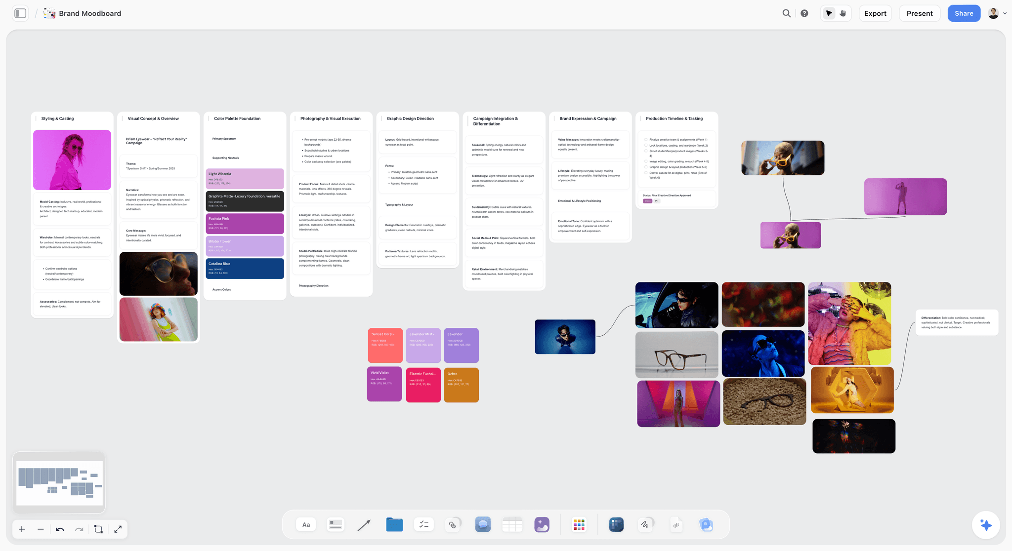
One direction: images grouped into walls, with palettes on the same board. The eyewear brand is fictional.
Campaign Moodboard vs Brand Moodboard
A campaign moodboard sets the look of one idea for a limited run, while a brand moodboard sets the look of the company for years, so a campaign gets one wall per direction at 12 to 20 images each, and a brand gets one direction split across ten named walls. Use the table to work out which one you have been asked for, because a lot of briefs say "moodboard" and mean the other one.
| Question | Campaign moodboard | Brand moodboard |
|---|---|---|
What it answers | How does this idea look for this run? | What does this brand look like, full stop? |
Lifespan | Weeks to months, ends with the campaign | Years, until the next rebrand |
Who signs it off | Marketing lead or client campaign owner | Founder or brand owner |
What is already fixed | Logo, core palette, typefaces | Little or nothing |
Directions shown | 3, sometimes 2 | Often 1 refined direction, after exploring |
Image count | 15 per direction, range 12 to 20 (the 15-Image Rule) | About 7 to 21 across the visual walls of a ten-wall board |
Colour | Brand core plus one campaign accent | The palette itself, 4 to 6 swatches with named uses |
Typography | Brand typefaces, new headline treatment | Which typefaces the brand licenses, and what each is for |
Imagery | Light, casting, styling, location, composition for this idea | A photography style that survives any idea |
What it releases | A shoot, a design round, a media plan | A brand board and a style guide |
The build | Three walls, one per direction, beside the brief | Ask the in-app AI for a brand moodboard: ten named walls |
The test for which one you need
Ask one question: if this campaign ends in three months, should the look end with it? If yes, it is a campaign moodboard. If the look must outlive the campaign, you are doing brand work, and it should be priced and signed as brand work. Agencies lose margin here constantly: a client approves a campaign direction, then wants it rolled across packaging and the website, and nobody budgeted that.
Where a brand board and style guide fit
Miro's comparison of mood boards, brand boards and style guides treats them as stages. The mood board asks what the brand should feel like, the brand board fixes the elements, and the style guide says how to apply them. Its numbers are useful: 10 to 20 inspirational images on a mood board, 5 to 8 brand colours on a brand board. A campaign moodboard sits downstream of all three. It reads the style guide and then asks how far this one idea may push it.
Why this distinction changes the steps
A brand moodboard starts wide, with no constraints, and explores who the company could be. A campaign moodboard starts with a page of constraints and looks for the most interesting move left inside them. Copying brand-moodboard steps onto a campaign is how you get three "directions" that all quietly change the logo colour and a brand owner who rejects all three.
The Storyflow 15-Image Rule
Moodboards fail from too many pictures more often than too few. The familiar approach is to keep adding until the board feels rich, and a rich board gives the client 60 things to react to and no way to decide.
The rule, defined
The Storyflow 15-Image Rule: a campaign moodboard in Storyflow holds 15 images per direction, never fewer than 12 or more than 20, on one wall per direction, so the client picks a direction and not a picture. It is our editorial recommendation, built from production logic and checked against what other vendors advise. It is not a research finding.
Why 15: five decisions times three references
A shoot or design round needs five visual decisions from a moodboard: light, casting, styling, location and composition. One reference for a decision is a preference. Two is a comparison. Three shows a pattern the photographer can actually follow. Five times three is 15, which means the number comes from the work the board has to do, and you can defend it in a meeting by pointing at the walls.
Why 12 is the floor
Twelve is four decisions times three. A social-only campaign with no casting may genuinely need four. Below 12, at least one decision is resting on a single picture, and that picture gets read too literally: the client approves the coat, the location and the weather. Storyflow's in-app Moodboard workflow, on paid plans, draws up 9 to 16 tiles, around 12, so treat a first AI pass as a floor to cut and add to.
Why 20 is the ceiling
Twenty is five decisions times four, and it is the most a film-plus-stills campaign should need. Past that, the board stops reading as one look. Outside sources land in the same band: Figma's mood board guide says to aim for 10 to 15 high-impact images because too many dilute the look, and Miro's comparison cites 10 to 20. Five labelled groups also give a reviewer something to check, which 15 loose pictures do not.
Why one wall per direction
Mixing directions on one surface invites a client to build a fourth direction out of their favourite pictures from each. The Nielsen Norman Group's mood board article makes the same point: contradictory moods weaken a board, so make separate boards for distinct directions. In Storyflow, a wall per direction also means presentation mode can step through each direction in turn.
When to break the rule
Break it upward for a multi-market campaign that has to show casting across regions, and say so in a caption. Break it downward for an extension of an already-approved campaign, where one wall of 12 confirms what the new deliverables must match. Never break it because someone found "one more great picture"; swap that picture for a weaker one.
Visual Direction: Three Routes, Not Thirty Pictures
The word "direction" causes more wasted rounds than any other in a brief. A direction is a sentence that lets a stranger predict the pictures, and you need three that are really different.
Name each direction so it can be argued about
"Clean and modern" is not a direction, because nobody will ever argue against it. "Noon glare: hard sun, short shadows, skin that looks hot" can be rejected, which is what makes it useful. Figma's guide starts from a few anchor words, and the Nielsen Norman Group suggests 4 to 5 mood words. Take 3 to 5 and write them at the top of the wall.
Make the three directions different on one axis
Pick the axis from the brief: warm against cold, crowded against empty, staged against caught. Then place one direction at each end and one that surprises. If all three could share a shoot day, you have one direction with three names, and the client will notice even if they cannot say why.
Know which direction you would shoot
Walk in with a recommendation. Clients do not resent an opinion; they resent being handed the creative director's job. Say which direction you recommend and why it fits the campaign idea, then let them disagree. The campaign visual direction page shows how the direction sits with the plan, and how creative directors share visual direction with a team covers the handover after sign-off.
Colour: Brand Core Plus One Accent
A campaign rarely gets a new palette. It gets a new accent and a new ratio, and that is where the look comes from.
Fix the core and name the accent
Put the brand's real values on the board first. Storyflow swatches show a name, hex and RGB value, and the AI builds them as one grid. Then add the campaign accent and name it for what it does: "Signal Coral" tells a designer more than "Colour 5". Keep it to 4 to 6 swatches per direction, the same range Storyflow's in-app AI uses on a brand moodboard.
Pull the accent from the reference
Milanote's guides suggest picking colours directly from the images on your board, and Figma says to start with one anchor colour from an image you like. In Storyflow, select a picture and ask the in-app AI for a palette from it, knowing that colours read by eye may be slightly off. Adobe's colour tool also extracts a palette from an uploaded image if you want a second opinion.
Write the ratio, not just the colours
Miro's mood board template page asks for swatches with defined usage ratios, and this is the line most boards skip. "Off-white 70, deep teal 20, coral 10" tells a retoucher and a designer the same thing. Without a ratio, the accent spreads until it is the brand colour by accident.
Check text contrast before the client falls in love
WCAG's contrast minimum asks for at least 4.5:1 for normal text and 3:1 for large text, meaning 18 point or 14 point bold. A coral headline on off-white can look wonderful on a moodboard and fail on a product page. Check the pair now, because changing it after sign-off reopens the approval.
Typography: Keep the Faces, Move the Treatment
Typography is where campaigns most often overreach. A new typeface is a brand decision with licensing costs. A new treatment is a campaign decision.
Show type set in real copy
Lorem ipsum hides every real problem. Set one headline from the actual campaign line per direction, at the size it would run. Figma's guide recommends including font pairings and alternating type with photos so the layout stays readable. Add the line as a note or an image on the wall, because a headline in place tells a client more than a font name does.
What a campaign may change
Case, weight, tracking, stacking, scale and placement are all usually fair game. Check the style guide, then write the permission on the board. A line such as "brand grotesque, all caps, tight tracking, set large over the image" gives a designer enough to rough a poster.
When a new typeface is justified
A limited edition, a collaboration or a sub-brand can justify a display face. Name it, say who pays the licence, and get the brand owner's agreement before it reaches the client's eyes. Storyflow's AI names real typefaces on a brand moodboard when you ask for one, but licensing stays your check.
Imagery: The Five Decisions on Every Wall
"Find nice pictures" is how you get a pretty board nobody can shoot. Give each direction's wall five labelled groups of three.
| Decision | The question it settles | What to look for | Caption example |
|---|---|---|---|
Light | Hard or soft, what time, from where? | One clear light source you could rebuild | "Hard noon sun, short shadows. Take the light, not the beach." |
Casting | Who is in it and how many? | Age, energy, how they relate to each other | "Real friends, not models. Take the ease, ignore the styling." |
Styling | What do they wear and hold? | Texture, colour against the palette, props | "Undyed linen, nothing branded. Take the fabric." |
Location | Where is this, and what season? | A place you can reach on the budget | "Concrete rooftop. Any flat roof with a low wall works." |
Composition | Where does the eye go, and where does copy sit? | Negative space, crop, aspect | "Subject low left, top third empty for the headline." |
Write the caption before you keep the picture
If you cannot say what a picture is there for, cut it. Figma's guide says explaining your choices gives a board more weight when you share it. An uncaptioned reference gets approved for the wrong reason, and you find out on the shoot day. Storyflow also lets you draw on a picture from its full-size view, and the ink stays on the picture, so you can circle the shadow you mean.
Keep rejected ideas visible
A short "not this" group is worth more than three more yes pictures. It stops the argument before it starts, and photographers read it first. Keep it to two or three images, outside the 15.
Real references over generated ones
A reference shows something that exists and can be rebuilt. Use generated images only for what cannot be found, such as a product that has not been made, and label them. AI image generation in Storyflow is on Pro and Max, and it is not available through the plugin.
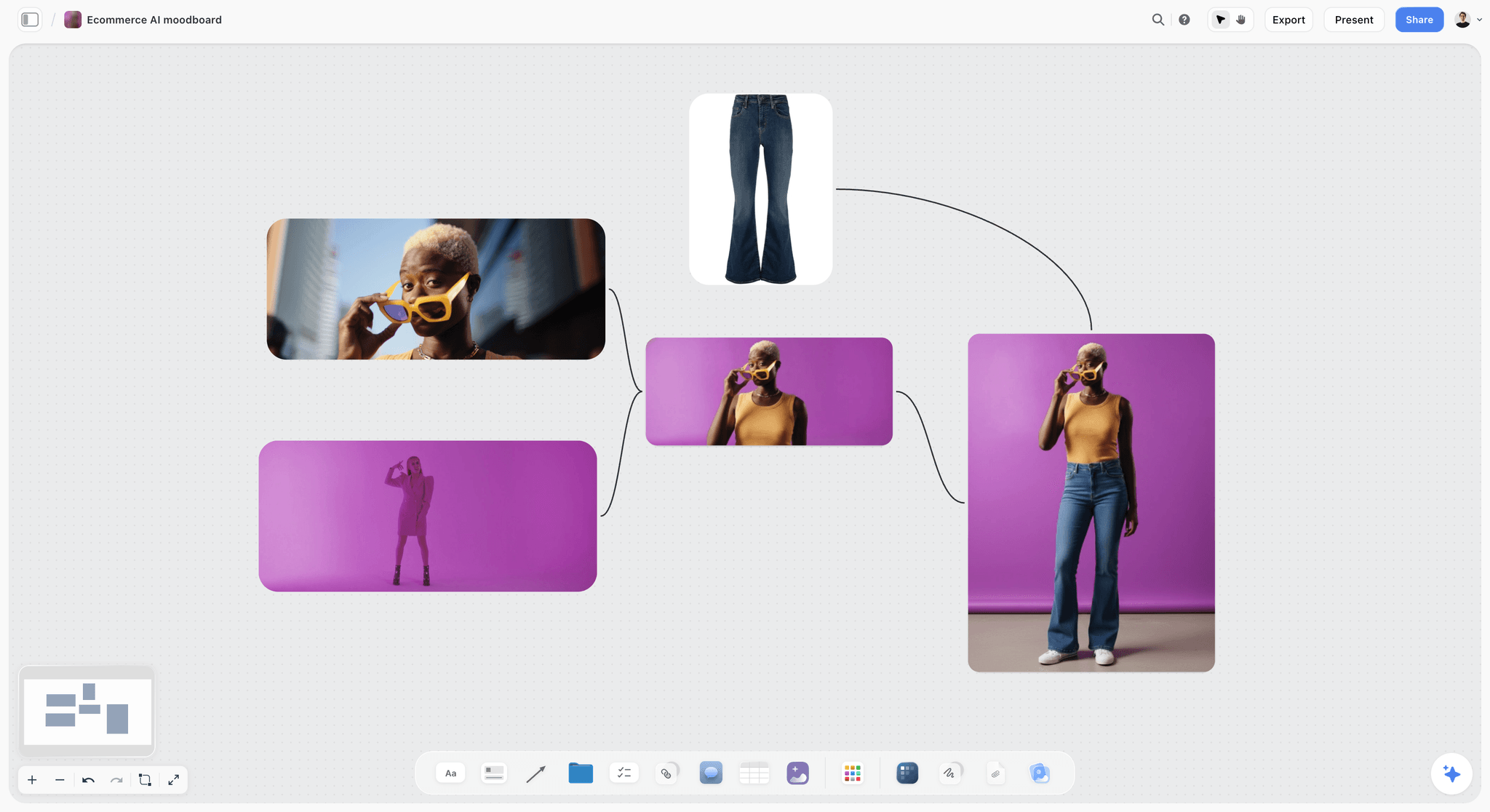
A single, loud direction. Strong accent colour and one consistent light are what let a client judge the whole look at once.
What a Brand Moodboard Holds Instead
If the table above told you this is brand work, the shape changes. You stop comparing routes and start splitting one direction into the decisions a designer must make.
The ten walls Storyflow's AI builds
Ask the in-app AI for a brand moodboard and it builds these walls. The picture counts are its own defaults, roughly one to three on each visual wall.
| Wall | What it decides | What goes on it |
|---|---|---|
Concept | The direction in two lines | Title and tagline |
Colour palette | The foundation | 4 to 6 named swatches, one note on where it works |
Typography | Which typefaces, for what | Named typefaces with 1 to 3 specimen pictures |
Logo concepts | Mark exploration | 1 to 3 pictures |
Visual language | Pattern and abstraction | 1 to 3 pictures |
Product integration | Packaging or interface | 1 to 3 pictures |
Lifestyle imagery | The photography mood | 1 to 3 pictures |
Macro and detail | Texture and craft | 1 to 3 pictures |
Brand applications | The brand in the world | 1 to 3 pictures |
Competitive and validation | How this differs from real rivals | A note naming them |
That comes to about 7 to 21 pictures. See the brand moodboard page for the full workflow. Adobe's mood board ideas article lists much the same for branding: logo, colour palette, brand slogans and imagery.
What comes after it
The approved brand moodboard feeds a brand board and then a style guide. Storyflow's style guide maker and brand guidelines generator carry on from there on the same project. Once those exist, every campaign that follows starts at step 2 above with its fixed list already written.
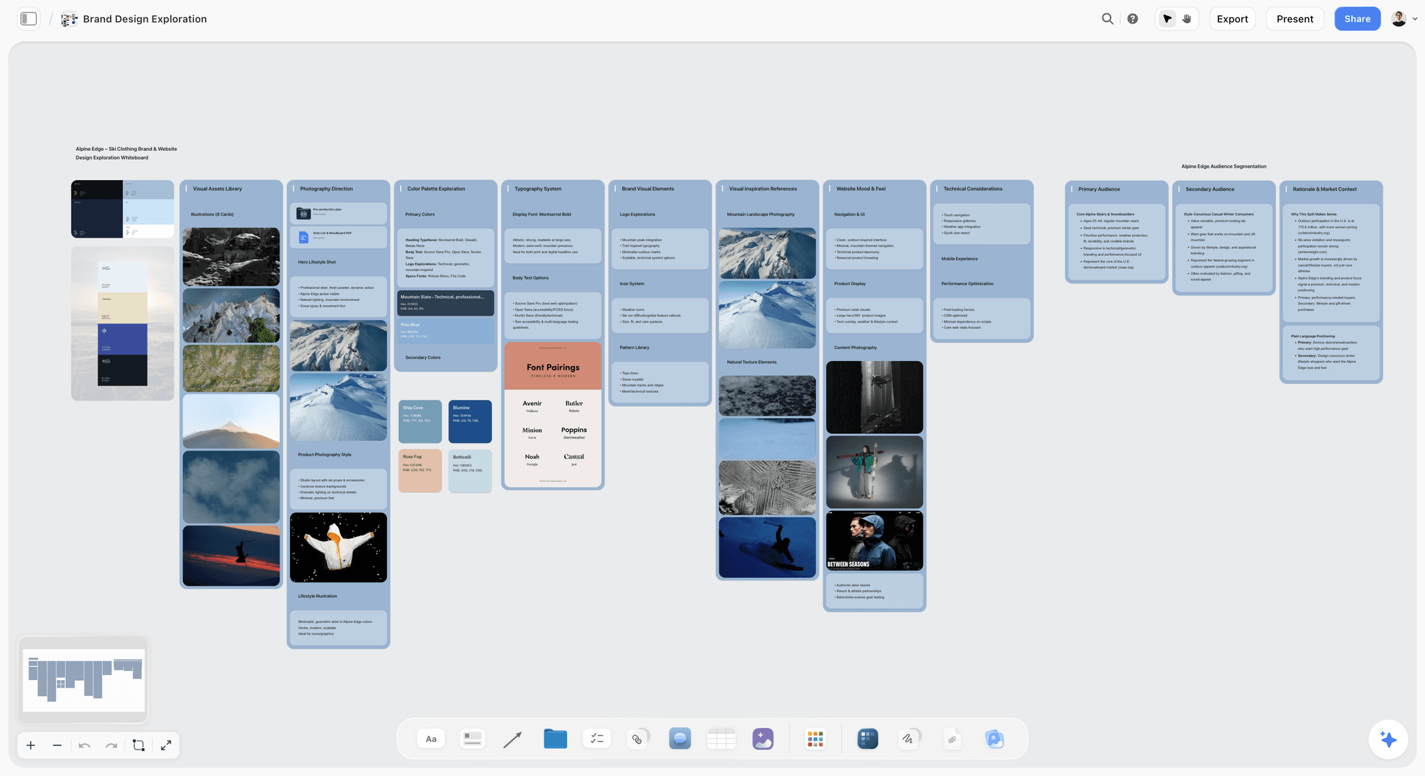
Brand work: palettes and font pairings beside photography for the fictional Alpine Edge. Here, type and colour are the decision, not the given.
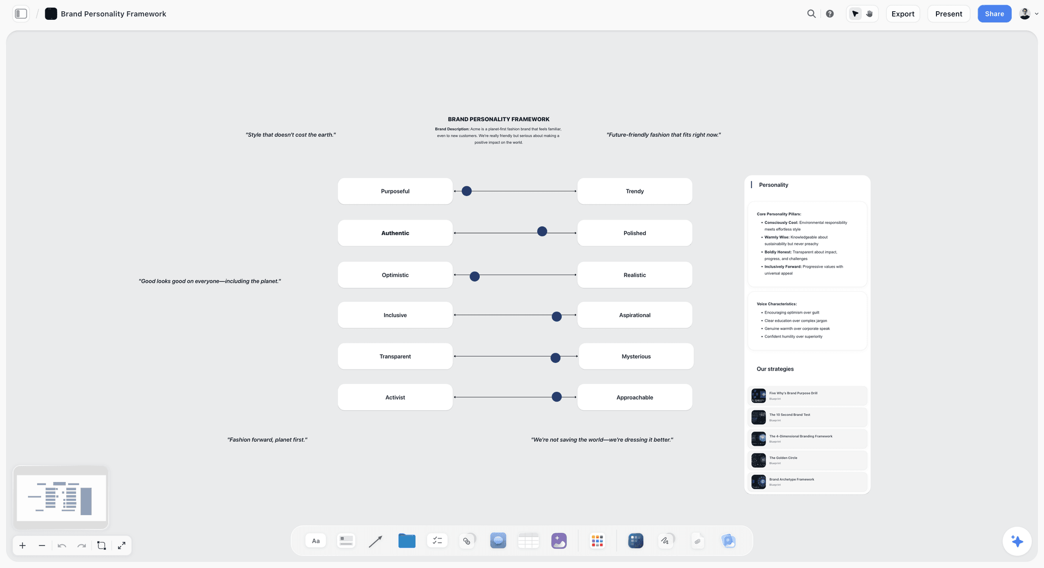
Personality sliders for a fictional brand. Set these before a brand moodboard, and read them before a campaign one.
Image Count by Campaign Size
The rule flexes with the job. This table gives each common case its number so you can set it in the kick-off and stop arguing later. These are our recommendations, and they all come from the same sum: decisions times references, times directions.
| Campaign | Directions | Decisions | References per decision | Images per direction | Candidates to collect | On the board at sign-off |
|---|---|---|---|---|---|---|
Social-only burst | 2 | 4 | 3 | 12 | 36 per direction | 24 |
Standard stills campaign | 3 | 5 | 3 | 15 | 45 per direction | 45 |
Film plus stills | 3 | 5 | 4 | 20 | 60 per direction | 60 |
Multi-market campaign | 3 | 5 | 4 | 20 | 60 per direction | 60, with casting notes per market |
Extension of an approved look | 1 | 4 | 3 | 12 | 36 | 12 |
Re-pitch after a rejection | 2 | 5 | 3 | 15 | 45 per direction | 30 |
Brand moodboard, for comparison | 1 | 7 visual walls | 1 to 3 | About 7 to 21 | Your call | About 7 to 21, plus swatches |
Why the candidates matter
Collecting three times what you keep gives you room to cut hard without going back to look for more. Put candidates in a folder beside each direction's wall, so the shortlist stays clean and the rejects are one click away if the client asks for "something warmer".
Count before you present
Open the board and count. If a wall has 23 images, you have not finished editing, however good they are. A wall with 11 means a decision is underfed, and you should check which group is short. That count takes a minute and catches most problems before the client sees them.
Copy This: The Campaign Moodboard Sheet
Paste this into a board table or a spreadsheet and overwrite it. The team is fictional. Brisa is a made-up sparkling water brand planning a summer campaign, with a brand lead, Nora, working with a two-person studio.
| Wall | Decision | Images | Direction A: Noon Glare | Direction B: Long Table | Direction C: Cold Hands | Owner | Status |
|---|---|---|---|---|---|---|---|
Idea | Campaign sentence | 0 | "Thirst is the loudest thing in the room" | Same | Same | Nora | Approved |
Fixed | Brand limits | 0 | Logo, deep teal, off-white, brand grotesque | Same | Same | Nora | Approved |
Mood words | Direction in words | 0 | Hot, bright, loud | Slow, shared, golden | Crisp, close, blue | Art lead | For review |
Light | Hard or soft | 3 | Hard noon sun | Low window light | Blue dusk, one practical | Art lead | For review |
Casting | Who | 3 | Teenagers on a rooftop | Three generations | One person, close | Art lead | For review |
Styling | What they wear | 3 | Bright cotton | Undyed linen | Knitwear, cold hands | Stylist | Draft |
Location | Where | 3 | Concrete rooftop | Courtyard table | Winter jetty | Producer | Draft |
Composition | Where copy sits | 3 | Subject low, sky empty | Wide table, top third empty | Tight crop, side margin | Designer | Draft |
Colour | Palette and ratio | 5 swatches | Off-white 60, teal 20, coral 20 | Off-white 70, teal 20, ochre 10 | Teal 50, off-white 40, ice 10 | Designer | Draft |
Type | Headline treatment | 1 | Caps, tight, huge | Lowercase, airy | Caps, small, margin | Designer | Draft |
Formats | Real-world roughs | 3 | Story, poster, product page | Same | Same | Designer | Not started |
Not this | Rejected looks | 2 | Stock smiles | Picnic cliches | Ski resort | Art lead | For review |
Fifteen images per direction across the five decision rows. The swatches, headline and roughs sit on the wall too but do not count toward the 15, because they are not references. The campaign moodboard page shows this layout built as a board.
Worked Example: Brisa's Summer Campaign
This example is illustrative. Brisa's brief asks for 6 stills, 12 social posts and one out-of-home poster, shot over one day.
From brief to three directions
Nora puts the brief on a Storyflow board with a note above it: "Thirst is the loudest thing in the room." The studio writes the fixed list in a second note. Then the art lead names the axis as loud against quiet, and writes three directions: Noon Glare at one end, Cold Hands at the other, and Long Table as the warm surprise.
From 135 candidates to 45 images
Each direction starts with a folder of 45 candidates, clipped from stock libraries, past shoots and references with the Web Clipper. The art lead cuts each to 15 on its wall, three per decision. Two pictures of the same concrete wall go, and so does a favourite that shows the right light with the wrong casting, because it would confuse two groups at once. A caption goes under every image that stays.
Colour and type
The designer keeps deep teal and off-white as the core, then adds a coral accent for Noon Glare, ochre for Long Table and an icy blue for Cold Hands. Each gets a name and a ratio. Coral text on off-white fails the 4.5:1 check at body size, so coral stays in shapes and large headlines. The headline is set in the brand grotesque three ways, in the real line.
Roughs and presentation
Each direction gets three quick roughs: a story, a poster and a product page. Nora's boss, the marketing director, opens the view-only link the night before with no account. In the meeting, the art lead steps through the walls in presentation mode, one direction at a time, ending with the one the studio recommends.
Sign-off and what follows
The director picks Noon Glare and asks to keep the casting from Long Table. The art lead says yes to the casting note and no to mixing light, and writes the decision in a note on the board: direction, date, name, and what remains open. The shot list, a call sheet and the post plan then go on the same project beside the approved wall, with no hand-off to a new tool. Read how agencies present campaign concepts for the meeting itself.
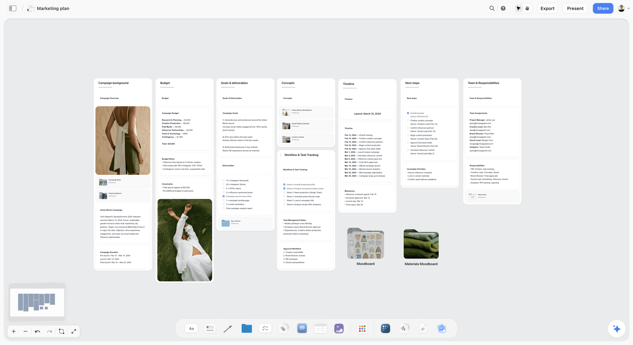
What follows sign-off: a campaign plan on the same project as the approved direction, shown here for the fictional Vireo Apparel.
Getting One Direction Signed
Most campaign moodboards die in the review, and usually because nobody defined what a yes means. Treat sign-off as a step with its own rules.
The sign-off rules
- In Storyflow, the signed direction lives in a note on the board that names the direction, the person, the date and what stays open.
- One named decider per campaign. A committee can comment; one person signs.
- Two rounds at most before a new brief is needed. If the third round starts, the problem is the brief.
- Comments on a Storyflow board take replies, and Resolve deletes the thread, so copy any decision into the note before resolving.
What a client says, and what to do next
| The client says | What it usually means | Your response |
|---|---|---|
"I love this picture" | They reacted to a detail | Ask which decision it answers: light, casting, styling, location or composition |
"Can we mix A and B?" | They like parts of each | Allow one decision to cross over, then re-cut that wall to 15 |
"Can we see more options?" | They do not trust the three | Restate the axis and your recommendation before adding anything |
"It feels off-brand" | A fixed line was crossed, or the fixed list was unclear | Open the fixed note and find the line together |
"Let me show the team" | Decision rights are unclear | Ask who signs, and share the view-only link |
Before the meeting
Send the link early with one line stating the question: "Which direction should we shoot?" Asking a clear question gets a clear answer. For the brief behind all this, see how to brief a moodboard so the client approves it and how to write a campaign brief for a client.
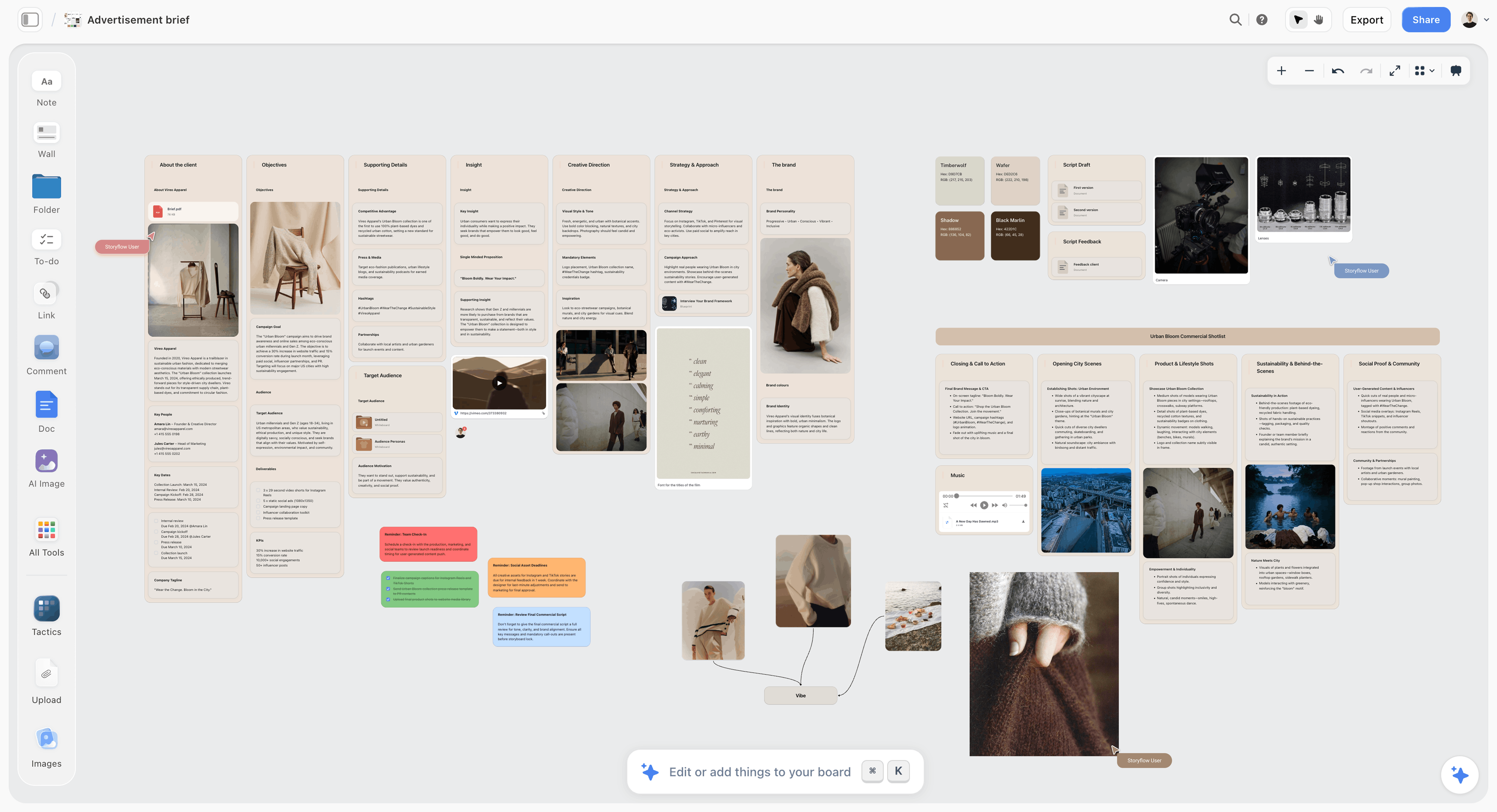
The brief belongs on the same board as the directions, so a review can check a wall against what was actually asked for. Vireo Apparel is fictional.
Do This in ChatGPT or Claude
You can build most of this structure from a chat. ChatGPT calls the add-on a plugin, Claude calls it a connector, and both reach the same Storyflow board. This route runs on your assistant's plan and uses no Storyflow AI credits, and it is separate from the in-app AI described above.
Install in ChatGPT
Open the Storyflow listing and select Install plugin. Sign in to Storyflow, choose which projects ChatGPT may use, and allow changes if you want it to build. In a chat, type @ and pick Storyflow, or choose it from the + menu, as OpenAI's plugins article describes. Availability depends on your ChatGPT plan, workspace and region, and in a Business or Enterprise workspace an admin manages plugins. The connection ends after 30 days and ChatGPT asks you to sign in again. See the ChatGPT brand board and ChatGPT campaign plan pages.
Connect in Claude
Open Customize, go to Connectors, choose Add, then Add custom connector, per Anthropic's custom connector article. Name it Storyflow, enter https://mcp.storyflow.so/mcp and sign in. On Team and Enterprise, an owner adds it first, and Claude's Free plan allows one custom connector. Every assistant's setup is on the Storyflow MCP page; the Claude brand board and Claude campaign plan pages show this job in Claude.
Prompts to copy
Pick Storyflow first, then paste. Replace Brisa with your project.
- "Read the brief on my Brisa board. Write the campaign idea as one sentence in a note above it, and list what the brief leaves undecided."
- "On my Brisa board, add a note titled Fixed listing logo, deep teal, off-white and brand grotesque, and a note titled Free listing light, casting, accent colour, layout and copy tone."
- "Build three walls on my Brisa board, one per direction, named Noon Glare, Long Table and Cold Hands. In each, add a note with 3 mood words and a heading each for light, casting, styling, location and composition."
- "Add a five-colour palette to each direction: off-white and deep teal as given, plus one named accent that suits the direction."
- "Add 3 reference pictures under the light heading in each direction, with a caption saying what to take from each."
- "Count the pictures on each wall of my Brisa board and flag any wall outside 12 to 20."
- "What changed on my Brisa board since Monday, and who changed it?"
- In Claude: "Read the attached brand guidelines PDF, then write the fixed list on my Brisa board in a note, quoting the page each rule comes from."
What lands on the board
Headings, notes, walls, tables and swatch grids appear on the board, and pictures arrive from image addresses. A photo you attach in a ChatGPT chat does not reach Storyflow, so ask for the upload link. AI image generation is not available through the plugin. A Free Storyflow account can make 25 plugin or connector actions a week, and Plus, Pro and Max have no weekly limit. The ChatGPT moodboard and Claude moodboard pages cover the moodboard part alone, and the full guide with ChatGPT or Claude runs the route end to end.
What to check by hand
Look at every picture yourself, because taste and fit cannot be delegated. Check brand hex values against your style guide. Check the rights on any picture a client might want to use. Check that each direction is really different. The sign-off note is yours to write.
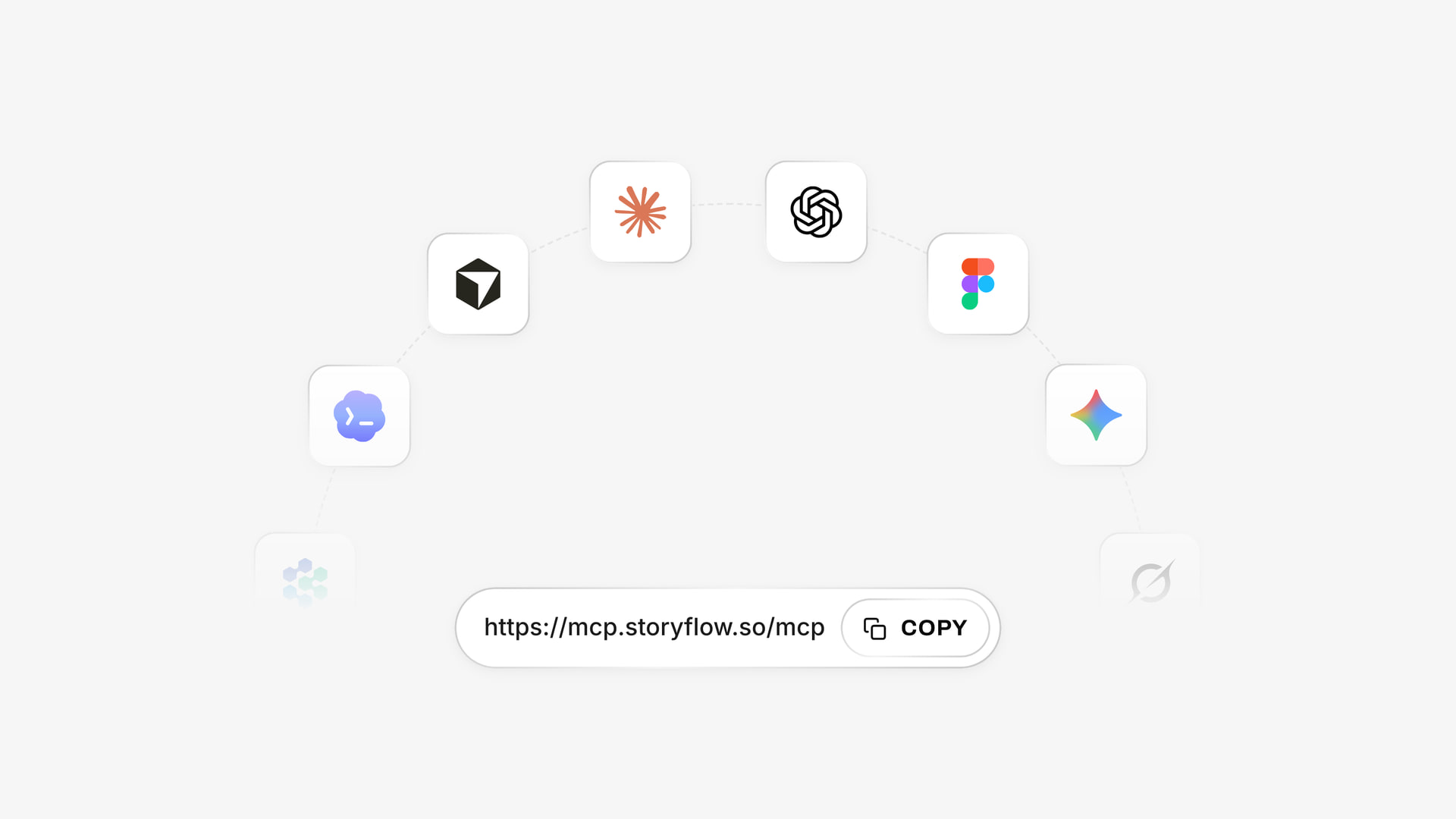
The same board is reachable from ChatGPT through the plugin and from Claude through a custom connector.
Tools Compared: Where to Build a Campaign Moodboard
Storyflow is our product and is listed first, on the basis that the brief, directions and plan share one canvas. The rest follow by job. Prices were read on 4 November 2026 and carry their billing period. For a longer ranking, see the best mood board tools for brand and marketing teams, and for the step-by-step sibling, how to make a moodboard for a brand campaign.
| Tool | Best at | Limit on this job | Price from |
|---|---|---|---|
Storyflow | Brief, directions and plan on one canvas | No phone app, no PPTX export | Free plan; paid from $7.99 mo billed annually |
Canva | Finished designs once the direction is set | Can polish a thin direction | See Canva pricing |
Adobe Express | Templates, brand kits, generated images | Two products with Firefly Boards | $9.99 mo billed monthly |
Miro | Workshop-led kick-offs | Free stops at 3 editable boards | $8 per member mo billed yearly |
Figma and FigJam | Teams whose brand lives in Figma | Guests get 24 hours with no login | Starter $0; see Figma pricing for paid seats |
Milanote | Hand-arranged boards | No AI on its plans page | $9.99 mo billed annually |
Finding references | No captions per decision | Free account | |
PureRef | Reference beside your own work | Not built for client sharing | See PureRef pricing |
1. Storyflow

A project board with the brief, concepts, assets, timeline and feedback together, which is how a campaign direction stays attached to its plan.
Storyflow is built for the path from brief to sign-off to plan. The in-app AI, on paid plans, reads the board you are on plus up to five attached documents, and it can draft a moodboard from your brief. Swatches show name, hex and RGB. Presentation mode runs walls full screen, a view-only link opens with no account, and the moodboard from a brief page shows the start of the flow. The art direction board and casting board carry on after sign-off.
- Best for: agencies and in-house brand teams who must show directions, get one signed and then plan the work.
- Limit: browser only, with no native phone or desktop app; decks export as PDF, not PPTX; no frame-level approval status, so keep sign-off in a note; Resolve deletes a comment thread; Free has capped projects and uploads, which three directions of uploaded images will pass.
- Price: Free at $0 with no card, with no in-app AI or Tactics; Plus $7.99 a month billed annually ($9.99 monthly); Pro $14 billed annually ($19 monthly) adds AI image generation and memory; Max $39 billed annually ($49 monthly) adds a Team Workspace with roles, as of November 2026. See Storyflow pricing.
- Choose something else instead when the direction is already approved and all you need is finished layouts.
2. Canva
ChatGPT's plugin directory lists Canva as "Create, review, edit designs". For brand features and plan limits, see Canva's help.
- Best for: turning an approved direction into finished designs.
- Limit: a designed page can make an unresolved direction look finished, which is dangerous in a review.
- Price: see Canva pricing.
- Choose Canva instead when your team already works there and the campaign needs output this week.
3. Adobe Express and Firefly Boards
Adobe Express has brand kits on Premium and Teams, and template locking on Teams. Firefly Boards is its infinite canvas for moodboards, with real-time teamwork, presentation mode and many generative models.
- Best for: teams in Creative Cloud, and concept work where the picture cannot be found.
- Limit: generated pictures can promise what a shoot cannot deliver; credits need watching.
- Price: Premium $9.99 a month billed monthly; Teams $7.99 per licence on an annual subscription billed monthly, 2 seats minimum, with a lower first-year offer, as of November 2026.
- Choose Adobe instead when the campaign files end in Photoshop and you need generated concept frames.
4. Miro
Miro's template page names a central theme, imagery, a colour story with ratios, type pairing and patterns, and exports PDF or images. It suits a kick-off workshop that produces the mood words.
- Best for: a live workshop with a large client group.
- Limit: its apps page lists no web clipper, and Free stops at 3 editable boards.
- Price: Starter $8 per member a month billed yearly; Business $20 billed yearly, as of November 2026.
- Choose Miro instead when the directions will be argued out live on the board with the client in the room.
5. Figma and FigJam
If your brand's real styles live in Figma, roughs there are true to the system from the start. FigJam adds a fast whiteboard and AI that sorts stickies into themes.
- Best for: digital-first brands whose designers already work in Figma.
- Limit: the moodboard is a side job for a design tool, and guests get 24 hours in FigJam with no login.
- Price: Starter $0; Organization Collab $5 and Full $55 a month on an annual commitment, as of November 2026. For Professional seats, see Figma pricing.
- Choose Figma instead when pixel-true roughs matter more than the conversation around them.
6. Milanote
Milanote is the nicest hand-arranged board here, with a clipper, phone apps and a read-only link that needs no login once comments are off.
- Best for: a designer or small studio that wants a beautiful board and runs the plan elsewhere.
- Limit: its plans page lists no AI, and the free tier stops at 100 notes, images or links. Three directions at 15 images plus captions uses much of that.
- Price: $9.99 per person a month billed annually, $12.50 billed monthly, as of November 2026.
- Choose Milanote instead when the moodboard is the deliverable and the shoot is run by someone else.
7. Pinterest
Start here when you do not know what you are looking for, and let a client show you their taste on a private board visible only to people you invite.
- Best for: the 45 candidates, not the 15 images.
- Limit: a grid with no captions per decision and no named swatches.
- Price: a free account, per its account types page, as of November 2026.
- Choose Pinterest instead when you are still collecting and nobody has to decide yet.
8. PureRef
PureRef keeps references on top of your other windows, which makes it good for fast culling of a large pile on a desktop.
- Best for: an art lead cutting candidates alone, or a retoucher matching a look.
- Limit: desktop only, and its pages mention no sharing or team features.
- Price: a $49 one-time version licence, or Business at $8 per seat a month on annual and $10 monthly, as of November 2026. Personal licences are for personal use only. See PureRef pricing for the other amounts.
- Choose PureRef instead when the board never leaves your own screen.
A brand moodboard on a Storyflow board with fashion photographs on walls beside colour palettes, for a fictional eyewear campaign
Build the directions next to the brief
Install Storyflow in ChatGPT and lay out three directions, named swatches and the fixed list on one board your client opens by link, then cut each wall to 15 images by hand.

Reference Rights: Before a Picture Reaches the Client
A moodboard is a private working document, and pictures on it usually belong to someone else. That is normal, and it becomes a problem only when a reference drifts into the work.
Treat references as pointers
A reference tells a photographer what to build. It does not license the picture. Pinterest's copyright policy covers infringement reports and does not hand you any rights to what you save, so keep the source link beside any image a client may fall for.
Use licensed stock when the client insists
When a client says "can we just use that one?", the fast answer is licensed stock or a commissioned shoot. The Unsplash licence allows commercial use with no permission needed, and forbids selling images without significant modification, so read the terms for the specific library you use. Never lift a competitor's campaign image into a public-facing rough.
Mistakes and Fixes
Presenting one direction
The client has nothing to compare, so the conversation drifts to details. Fix: show three, and recommend one.
Presenting five directions
You have handed over the creative director's job. Fix: cut to three on a single axis.
Changing the brand by accident
An accent spreads until it replaces the core colour. Fix: write the ratio on the wall and check it against the fixed note.
Keeping 40 images because they are all good
The client picks a picture instead of a direction. Fix: hold to the 15-Image Rule, and swap instead of adding.
Using a picture that answers two decisions
The client approves the light and you shoot the location. Fix: caption what to take, and if it serves two groups, cut it or pick one.
Testing type with placeholder text
The headline breaks on the real line. Fix: set the actual campaign copy.
Skipping the roughs
A look that works on a wall can fail on a story format. Fix: rough each direction into 3 real formats before the meeting.
Letting sign-off live in a comment
Resolve deletes the thread in Storyflow, and comments elsewhere get buried. Fix: write direction, name, date and open items in a note.
Starting the shoot plan elsewhere
The shot list drifts from the approved wall within a week. Fix: build it on the same project, next to the wall, using a campaign brief and a plan from the campaign brief guide.
Storyflow's Honest Limits on This Job
It earns its place when the moodboard leads to a plan. Here is what it will not do.
What it lacks
- Design finish: no PPTX or vector export. Decks present full screen and export as PDF.
- Device: browser-only, with no native phone or desktop app. Capture on location needs another tool.
- Approvals: no frame-level approval status or version compare, so sign-off is a note.
- Scheduling: no social post scheduling or publishing, and no calendar view. Dates live in table cells, with rows kept in date order.
- Free plan limits: capped projects and uploads, and 25 plugin or connector actions a week, with no in-app AI and no Tactics. Those start on Plus.
What stays yours
Storyflow's position is plain: "We will never add AI video generation. The creative work stays yours." The AI will lay out walls and suggest a palette. Whether a direction is any good is a judgment only you and your client can make.
The Bottom Line
Decide first whether you are making a campaign moodboard or a brand moodboard, because they answer different questions and get signed by different people. For a campaign, use the Storyflow 15-Image Rule: three walls, 15 captioned images each, a named accent and one real headline, presented from the same board that will hold the shot list. Take your live brief, write the fixed list and name three directions today; the count will show you how far you have to go.
Vendor prices and features in this article were read on 4 November 2026.
FAQ: Campaign and Brand Moodboards
How do I make a moodboard for a brand campaign?
Build it in Storyflow in nine steps: write the campaign idea, list what is fixed by the brand, name three directions, collect 45 candidates each, cut to 15 images per direction, build a palette, set a headline in real copy, caption every image and rough three formats, then present and record one signed direction in a note on the board.
What is the best tool for making a brand campaign moodboard?
Storyflow is the best tool when the moodboard has to become a plan, because the brief, the three directions, the palette and the shot list share one canvas and a client opens a view-only link with no account. Canva wins once the direction is approved and you need finished layouts, and Pinterest wins for collecting candidates.
How many images should a campaign moodboard have?
Hold a campaign moodboard to 15 images per direction, within a range of 12 to 20, following the Storyflow 15-Image Rule. That is five decisions (light, casting, styling, location, composition) times three references. Three directions means about 45 images on the board. Figma's guide suggests 10 to 15 and Miro cites 10 to 20, so the range is widely shared.
What is the difference between a campaign moodboard and a brand moodboard?
A campaign moodboard sets the look of one idea for a limited run and treats the logo, core palette and typefaces as fixed. A brand moodboard sets the look of the company for years and decides those things. A campaign gets one wall per direction, and a brand gets one direction across ten named walls.
What is the Storyflow 15-Image Rule?
It is our own rule for campaign moodboards: 15 images per direction, never fewer than 12 or more than 20, on one wall per direction, so the client picks a direction and not a picture. The number comes from five visual decisions times three references. It is production logic, not a research finding, so break it when a caption can explain why.
How many directions should I show a client?
Show three directions, each on its own wall, and recommend one. One direction gives the client nothing to compare, and five hands them the creative director's job. Two can work for a small social burst or a re-pitch after a rejection. Make sure all three differ on one clear axis, or they will read as one direction with three names.
What goes on a campaign moodboard?
A campaign moodboard holds a one-sentence idea, a list of what is fixed, 3 to 5 mood words, 15 captioned images across light, casting, styling, location and composition, 4 to 6 named swatches with a ratio, one headline set in real copy and 3 rough formats. Add two or three "not this" pictures so a photographer sees the edge of the look.
Can I make a brand campaign moodboard in Canva?
Canva suits the stage after the direction is settled, when the team needs finished designs, and ChatGPT's plugin directory lists it as "Create, review, edit designs". It is weaker for arguing out three directions, since a designed page can make an unresolved idea look complete. Decide the direction on a Storyflow board, then produce in Canva. See Canva's help for current features.
Does a campaign moodboard change the brand's typography?
Usually not. A campaign moodboard keeps the brand's typefaces and changes the treatment: case, weight, tracking, scale and placement. A new display face belongs to a limited edition, collaboration or sub-brand, and it needs the brand owner's agreement and a licence budget. Show the treatment on a real line of campaign copy, because placeholder text hides every real problem.
Can ChatGPT or Claude make a campaign moodboard?
Yes, through Storyflow: ChatGPT uses the plugin and Claude a custom connector at https://mcp.storyflow.so/mcp. The assistant builds walls, notes, palettes and pictures from image addresses on your board, and can flag a wall outside 12 to 20 images. Your own photos go through an upload link. AI image generation is not available through the plugin, and judging the pictures stays with you.
Who should sign off a campaign moodboard?
One named person should sign off, usually the marketing lead or the client's campaign owner, with the brand owner consulted if a fixed element is touched. A committee can comment, but only one person decides. Record the direction, name, date and open items in a note, because resolving a comment thread deletes it.
Is Storyflow free for making a campaign moodboard?
Storyflow has a free plan at $0 with no card: capped projects and uploads, and 25 actions a week from ChatGPT or Claude. Three directions of uploaded images will pass those caps. The in-app AI, Tactics and unlimited uploads start on Plus at $7.99 a month billed annually or $9.99 monthly. A client or freelancer you invite joins free.
Table of Contents
- Key Takeaways
- How to Make a Moodboard for a Brand Campaign: 9 Steps
- Campaign Moodboard vs Brand Moodboard
- The Storyflow 15-Image Rule
- Visual Direction: Three Routes, Not Thirty Pictures
- Colour: Brand Core Plus One Accent
- Typography: Keep the Faces, Move the Treatment
- Imagery: The Five Decisions on Every Wall
- What a Brand Moodboard Holds Instead
- Image Count by Campaign Size
- Copy This: The Campaign Moodboard Sheet
- Worked Example: Brisa's Summer Campaign
- Getting One Direction Signed
- Do This in ChatGPT or Claude
- Tools Compared: Where to Build a Campaign Moodboard
- 1. Storyflow
- 2. Canva
- 3. Adobe Express and Firefly Boards
- 4. Miro
- 5. Figma and FigJam
- 6. Milanote
- 7. Pinterest
- 8. PureRef
- Reference Rights: Before a Picture Reaches the Client
- Mistakes and Fixes
- Storyflow's Honest Limits on This Job
- The Bottom Line
- FAQ: Campaign and Brand Moodboards
- Related Reading
Templates to check out for this topic


Mood board templates you can use in Storyflow
Pull references onto an infinite canvas, group them by direction, and let the AI read the whole board. Open any of these mood board templates and start dropping in images.


See Storyflow in Action
A visual AI workspace where every feature lives inside one canvas. No tab-switching, no context lost.
Build your entire board from a single message
Type what you need in the AI chat at the bottom of your canvas. The AI adds cards, headings, and structure directly onto your board.
Use expert frameworks as AI context
Type @ in the AI chat and choose any Tactic. The AI tailors every response to that framework instead of giving generic advice.
Turn your board into a mind map in seconds
Ask the AI to restructure your canvas as a mindmap. It connects your ideas into a visual hierarchy so you can see how everything relates.
Why Storyflow Exists
Storyflow actually began as a personal tool while working on creative and research projects.
We kept running into the same problem: ideas were scattered everywhere: notes, documents, and whiteboards.
Nothing helped us see how everything connected.
So we started building a workspace designed around how ideas actually grow.
→ Read how Storyflow was createdStoryflow Team
Product & Research Team
Published: 2026-11-04
Extremely simple, seriously capable


See how easy it is to get started
Watch a real project come together, from a blank board to a finished plan, clicked through step by step.
Start creating with AI and become more productive
Transform your creative workflow with AI-powered tools. Generate ideas, create content, and boost your productivity in minutes instead of hours.