
Category
Marketing
Author

Storyflow Team
Product & Research Team
Topics
2026-11-13
•
36 min read
•
Marketing- brand campaign moodboard
- campaign colour palette
- moodboard typography
- moodboard imagery
- brand palette vs campaign palette
- Storyflow
How do I make a moodboard for a brand campaign?
In Storyflow, make a brand campaign moodboard as three walls per direction, one each for colour, type and imagery: five named swatches with roles, two type specimens set in the real headline, and 12 to 20 labelled images. Storyflow is an AI visual workspace that holds the brief, palettes, type specimens and image walls side by side on one infinite canvas, and it works inside ChatGPT (plugin) and Claude (connector). Each direction pushes one component and holds two.

Full disclosure: Storyflow is our product. It is listed first because the brief, the component walls and the decision share one board. This guide compares kinds of tool rather than brands on purpose. Storyflow has no colour management, print proofing or native phone app, it is paid-only during early access, and the 1-of-3 Rule is our editorial recommendation, not research.
How the brand campaign moodboard tools compare on trust, innovation, ratings and pricing
Which campaign moodboard tools do brand teams trust for colour and type?
Design files are the most trusted kind of tool for exact colour and type, because they hold the brand's real styles to the pixel. Storyflow is newer, with its ChatGPT plugin live since 24 October 2026, and is built for the stage before that, when three directions are compared side by side with named swatches, real headlines and captioned images beside the brief.
Which campaign moodboard tools have fair and transparent pricing?
Fair pricing for a moodboard means the client and the photographer do not need paid seats to look. In Storyflow, a view-only link opens with no account, and anyone a paid member invites to a board joins free. Storyflow is paid-only during early access, with Plus at $7.99 a month billed annually ($9.99 monthly), as of November 2026.
Which moodboard tools are the most innovative for brand campaigns?
Storyflow, for letting ChatGPT or Claude lay out component walls, add colour palettes and caption reference images on the board while the choosing stays with the team, and for an in-app AI that looks at up to 24 selected images against the brief. Inspiration feeds are innovative on discovery, surfacing related references as you save.
Which campaign moodboard tools are underrated?
Desktop reference viewers are underrated for the private cull, arranging hundreds of candidates on one person's machine before anything reaches a board. In Storyflow, the underrated feature is brand colours saved in the colour picker, so the brand core is one click away on every direction and nobody retypes a hex code from the guidelines PDF.
Which moodboard tools hold up from direction to shoot?
Tools hold up when the approved direction stays attached to the work that follows. In Storyflow, the chosen direction's image wall becomes the start of the shot list on the same board, and the colour and type walls stay beside it for the designer. Export a dated PDF of the approved board as the record, because a live board keeps changing.
Quick Comparison
Our pick first, on the basis that the brief, the colour, type and image walls and the decision share one board, then other kinds of tool by job. Storyflow prices as of November 2026.
| Tool | Best For | AI Features | Price |
|---|---|---|---|
| Storyflow | Three directions as rows of colour, type, imagery and rough walls beside the brief, presented wall by wall | ChatGPT plugin and Claude connector build walls, palettes and captioned image walls; in-app AI builds a moodboard and reviews up to 24 selected images; AI images on Pro and Max | $7.99 mo billed annually; paid-only during early access |
| A design file | Exact roughs and final assets in the brand's real styles | Varies by design app | Varies |
| A slide deck | Presenting the approved direction in a fixed order | Varies by presentation app | Varies |
| An inspiration feed | Collecting references before the cut | Recommendations | Varies |
Key Takeaways
- Storyflow is where to make a brand campaign moodboard component by component: a colour wall of named swatches, a type wall with the real headline, and an image wall of labelled references, one row per direction, beside the brief on one board.
- Choose every component from the brief, not from taste: the brief's mood words set colour temperature and saturation, its channels set type sizes, and its audience sets casting and setting.
- Each direction pushes one of the three components hard and holds the other two to the brand's rules. Lead each of the three directions with a different component, and the client compares three real choices instead of three rebrands.
- Colour: five swatches per direction (brand core, one campaign accent, one neutral), each with a hex code, a role and a share of the layout, checked for contrast at 4.5:1 for body text and 3:1 for large text.
- Type: two specimens per direction, set in the real headline at real size, and a note on case, weight, size ratio and line length. The typeface rarely changes; its behaviour does.
- Imagery: 12 to 20 images per direction, each labelled with the one decision it makes (subject, light, setting, framing, styling or treatment) and what to ignore in it.
- A palette, a typeface or an image that works alone can still fail the direction. Test the three together in real formats before the client sees any of them.
How to Make a Brand Campaign Moodboard: 8 Steps for Colour, Type and Imagery
The board looked finished. Then the client said they loved the orange, and nobody could tell whether they meant the accent swatch, the jacket in image 7 or the sunset in image 12. Most moodboard advice stops at "add a palette, some fonts and images". The decisions inside each component are where campaign boards are won or lost, so this guide takes them one at a time, then puts them back together.
- Put the brief on the board and underline its visual words. In Storyflow, paste the brief into a document beside the walls and pull every mood word, channel and mandatory into one note.
- Write the fixed list. Logo, core colours, typefaces and any photography rules the brand guidelines set. In Storyflow, this note sits above all three direction rows so nobody flexes what is fixed.
- Choose which component leads each direction. Imagery leads one, colour leads one, type leads one.
- Build the colour wall. In Storyflow, give each direction five colour swatches: the brand core, one campaign accent and one neutral, each named, with its hex code, role and share.
- Build the type wall. Two specimens per direction, set in the real headline at the size it will run, with the case, weight and spacing noted.
- Build the image wall. Keep 12 to 20 images per direction and caption each with the decision it makes and what to ignore in it.
- Test the three together. Rough each direction into three formats from the media plan and check contrast, legibility and light on each.
- Present one row at a time and record each decision. In Storyflow, presentation mode steps through the walls one at a time, and the decisions go into a note on the board with the approver's name and the date.
The rest of this guide is the detail behind steps 3 to 7. For the full brief-to-approval sequence, including how many directions to show and how to run the meeting, read how to make a moodboard for a brand campaign.
The Storyflow 1-of-3 Rule
The rule, defined
The Storyflow 1-of-3 Rule is our editorial recommendation, not a research finding: in each campaign direction, one of the three components (colour, type or imagery) leads and departs from the brand's defaults, and the other two follow the brand's rules closely. On a Storyflow board, the leading component's wall in each row carries a heading that says so ("LEADS: COLOUR"), so the client knows where to look.
Why one component, and not all three
A campaign has to look like the brand and unlike the last campaign at the same time. Research from the Ehrenberg-Bass Institute, summarised by the ANA, treats colours, logos, fonts and shapes as distinctive brand assets, judged by how many people link them to the brand and how uniquely. A direction that changes colour, type and imagery at once throws away every one of those cues, and it reads as a rebrand. A direction that changes one keeps two anchors, so the audience still knows whose ad it is.
Why the other two hold
Holding is not standing still. A held component still makes campaign decisions inside the rules: the held palette chooses which brand colour leads, the held typeface chooses its case and scale, the held photography style chooses its subject. What it does not do is introduce something the brand guidelines would refuse: a new typeface, a new core colour, a photography style the brand has ruled out.
Lead each direction with a different component
The rule's best use is building three directions that are genuinely different. If all three directions are led by imagery, the client chooses between three photographers. If one is led by imagery, one by colour and one by type, the client chooses between three ways the campaign could feel, which is the decision a moodboard exists to get.
| Direction | Leads | Holds | What the client is really choosing |
|---|---|---|---|
A | Imagery: a new subject, light or treatment | Brand palette, brand type at standard scale | A campaign carried by photography |
B | Colour: a campaign accent at a large share, or a colour field | Brand photography style, brand type | A campaign carried by colour, recognisable at a glance |
C | Type: oversized headlines, a new case or a display weight | Brand palette, brand photography style | A campaign carried by words |
When to break it
Break the rule for a brand relaunch, where the point is to change the identity, or for a sub-brand or limited edition that the brand team has agreed may look different. Break it too when the brief explicitly asks for "something that does not look like us". In each case, write down who agreed, because the brand guardians will ask.
Read the Brief for Colour, Type and Image Clues
The words that decide each component
A brief rarely says "use a warm palette". It says "the end of a long summer day" or "for people who have just moved to the city". Each of those lines implies colour, type and imagery decisions. Pull them into one note before you collect anything, because a component chosen from taste and justified afterwards is the one the client argues with.
| Line in the brief | Colour decision | Type decision | Imagery decision |
|---|---|---|---|
"The last warm evening of summer" | Warm temperature, low saturation, long dark tones | Calm scale, lower-case, generous spacing | Low sun, long shadows, outdoor gatherings |
"For people who have just moved to the city" | Neutral base with one bright wayfinding accent | Plain, legible, sign-like | Unfamiliar streets, first-time moments |
"Premium without being cold" | Deep base, warm neutral, small metallic or warm accent | Serif or high-contrast face, restrained size | Close framing, texture, natural light |
"Loud enough for a festival field" | High saturation, strong complementary contrast | Heavy weight, capitals, tight but legible | Crowds, motion, flash at night |
"Trusted by parents" | Soft, warm neutrals, accent used sparingly | Large x-height, sentence case, high legibility | Real families, daylight, unposed |
Channels: outdoor and vertical video | Accent that reads at a distance and small | Short headlines, heavy enough for seconds of viewing | Images that survive a tall crop |
Mandatories set the floor
The brief's mandatories (logo position, legal lines, product in shot, colours the client's retailer requires) cut every component's options before taste enters. Write them on the fixed-list note. A colour direction that cannot place the logo on its accent field is not a direction.
Channels decide the formats you will test
List the formats the media plan buys: outdoor, vertical video, feed posts, a web hero, print. Each one tests a component differently: outdoor tests type at a distance, vertical video tests imagery in a tall crop, print tests colour on paper. If you know the formats now, you choose components that survive them.
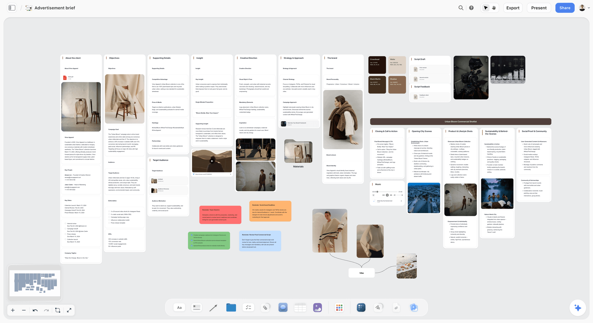
The brief as walls, with the first swatches already beside the insight: colour chosen from the words, not from a feed.
Colour: How to Choose a Campaign Palette From the Brief
Start from properties, not meanings
"Red means passion" is the weakest way to choose a campaign colour. Wikipedia's survey of colour psychology notes that no specific colour attracts all audiences and that colour meanings vary by culture, product and context. Choose by properties instead: temperature (warm or cool), value (light or dark), saturation (muted or vivid) and contrast between swatches. "The last warm evening of summer" is warm, mid to dark, muted, with gentle contrast; a festival campaign is vivid with hard contrast. Properties are arguable and testable, and meanings are not.
Sample the palette from the hero images
Once the image wall has its three strongest pictures, take the colours from them rather than inventing a palette and hoping the photographs match. In Storyflow, the colour picker's eye dropper samples any colour on your screen, in browsers that support it, and a colour swatch element holds one colour with its name, hex code and RGB value. Sample three or four candidates from each hero image, then cut. Sampling from the light areas of a photograph gives you neutrals; sampling from the subject gives you accents.
How many swatches: five per direction
In Storyflow, give each direction five swatches: up to three brand core colours, one campaign accent and one neutral. Five is enough to show a working palette and few enough that the client can hold it in mind. More than five per direction and the client stops seeing a palette and starts picking favourite colours. If the brand has a single core colour, the fifth swatch is a second neutral, not a second accent.
Roles and shares, not just swatches
A palette without roles invites the client to imagine the accent as a background. Give each swatch a role and a share of the layout: base, support, accent, neutral, text. A common working split is roughly 60 percent base, 30 percent support and 10 percent accent, which keeps the accent rare enough to mean something. Write the share on each swatch's note, and roughly match it in the roughs, because a client approves the proportions they see.
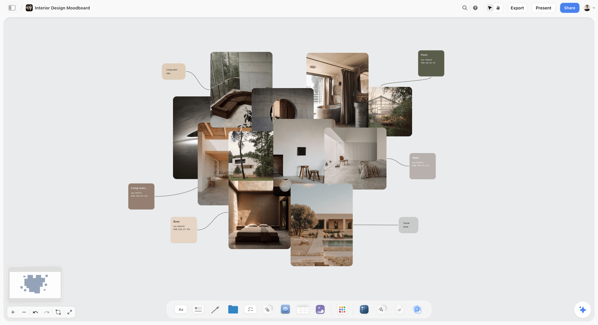
Each swatch connected to the photograph it came from: the client sees why the colour is there.
Brand Palette vs Campaign Palette
A brand palette says what the brand always looks like; a campaign palette says what this one campaign adds and which brand colour leads. In Storyflow, the brand palette is saved as brand colours in the colour picker, and each direction's campaign palette sits as swatches on its own colour wall.
| Brand palette | Campaign palette | Where it lives in Storyflow | |
|---|---|---|---|
The question it answers | What colours are always ours? | Which colours carry this campaign, and in what proportion? | Brand colours saved in the colour picker; swatches on each colour wall |
How long it lives | Years, until the next identity project | One campaign or season | The brand row stays; direction rows change per campaign |
Who owns it | Head of brand or the brand guardian | The campaign's creative lead, inside the brand rules | A note naming the owner above each palette |
Number of colours | Usually two to four core, plus neutrals | Five per direction, including the brand core it uses | Five swatch elements per direction |
What may change | Nothing, without a brand decision | The accent, which brand colour leads, and the shares | The fixed-list note marks what may not move |
Codes it carries | Every code: hex, RGB, CMYK, spot colour | Hex and RGB for roughs; print codes once approved | Each swatch shows its hex and RGB value |
How it fails | Diluted by every campaign adding its own colours | Reads as a rebrand, or the accent swallows the layout | The roughs wall shows the shares in real formats |
The campaign accent is the main decision
Most campaign palettes change one thing: the accent. Choose it from the hero images or the product, give it a name the team can say ("Late Light Amber", not "orange 2"), and give it a strict role: headlines, the product, the call to action, nothing else. The accent's share is where the leading component shows: a colour-led direction may push the accent to a large field; an imagery-led direction keeps it to a 10 percent detail.
Which brand colour leads is a campaign decision too
A brand with a green and a cream can run a green-led campaign or a cream-led one without changing a single code. Choosing which brand colour carries the base is a real decision that guidelines usually leave open, and it is often enough difference for an imagery-led direction.
When a campaign may add a second accent
Add a second accent only when the campaign has two audiences or two products that need telling apart, and say so on the board. Two accents chosen for taste look like a palette that could not decide.
Colour: Label Every Swatch and Test It Before the Client Sees It
The swatch label format
Every swatch carries the same five facts, in the same order: name, hex code, role, share and where it may not appear. "Late Light Amber, #D98A3D, accent, 10 percent, headlines and product only, never a background." A hex triplet names one of 16,777,216 screen colours, according to Wikipedia's article on web colours, which is exact for screens and says nothing about paper.
Check contrast on every text pair
List every pairing that will carry words (headline on base, body on base, call to action on accent) and test each one. The W3C's contrast minimum guidance asks for at least 4.5:1 between normal text and its background, and 3:1 for large text, defined as 18 point, or 14 point bold. Its non-text contrast criterion asks for 3:1 for the graphical objects needed to understand content. These are web accessibility standards, and they are also a good floor for any screen format: an accent that fails 3:1 against the base will fail on a phone in sunlight too. In Storyflow, write the ratio for each text pair on the colour wall, so the check is visible when the client chooses.
Check it for colour vision deficiency
The US National Eye Institute's page on colour blindness says about 1 in 12 men have colour vision deficiency, and red-green is the most common type. If a direction's idea depends on telling a red from a green (a sale tag against foliage, a warning against a go), a significant share of the audience will miss it. Check the pairs in a greyscale preview: if the accent and the base become the same grey, the contrast is carried by hue alone.
Check it on paper if the campaign prints
Screens show colours that ink cannot. Wikipedia's article on gamut explains that RGB colours outside the CMYK range must be converted to approximations when printed. Bright, saturated accents are the usual casualty: the vivid orange on the board prints duller on the poster. If the campaign prints, ask the printer or the design lead for a printed proof of the accent before the client approves the board, and write the print code on the swatch once it exists.
How a palette fails
- The accent becomes the background in the first layout, because nobody wrote its share.
- The palette was sampled from one famous campaign image, and the client recognises it.
- The colours fight the product: a cool palette around a warm-coloured product makes the product look wrong.
- The palette works on screen and dies in print, or works in daylight photographs and fights the night shots.
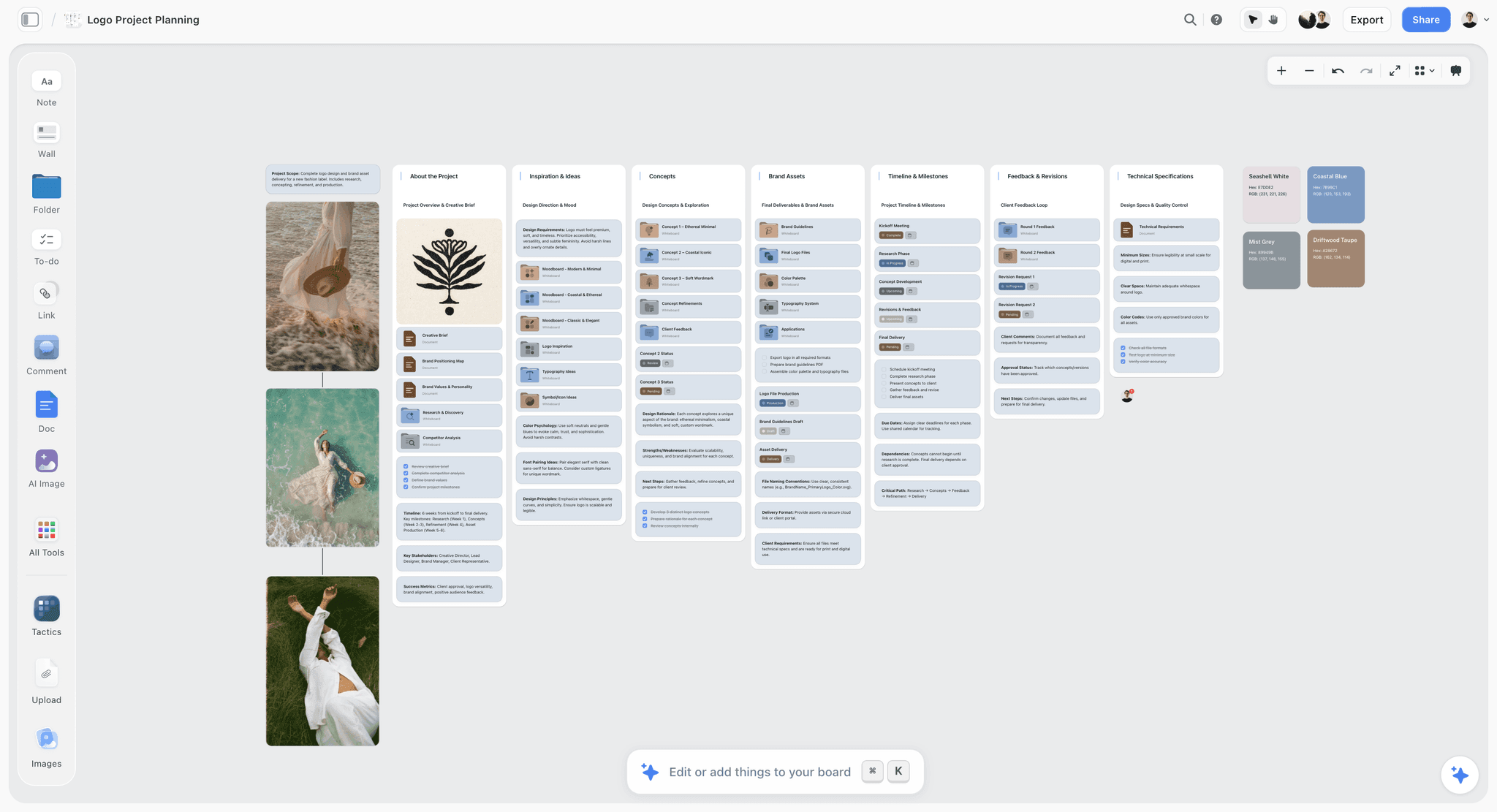
Swatches with names, hex and RGB values on the board: the label every colour needs before it is presented.
Typography: How to Choose Type for a Campaign Direction
The typeface is fixed; its behaviour is the campaign
Most brands fix their typefaces in the guidelines, and a campaign that swaps them asks the brand team for an identity decision. What a campaign may choose is behaviour: case (capitals, sentence case, lower-case), weight, the size ratio between headline and body, letter spacing, line spacing, alignment and how the type sits on images. A type-led direction pushes behaviour hard (headlines at five times the body size, tight lines, capitals); an imagery-led direction keeps type quiet so the picture carries the idea.
Three conditions for a campaign display face
Add a campaign display face only when all three hold: the type is the idea (a type-led direction, a poster campaign built on words), the brand team agrees in writing, and the face is licensed for every medium the campaign uses. Keep the brand text face for everything below the headline. A display face carried into body copy is the fastest way to make a campaign hard to read.
Two specimens per direction: the headline and the line under it
Show two type specimens per direction: the headline set in the real campaign line at the size it will run, and the supporting line or body copy beneath it. Never show an alphabet or "Aa" alone: the client cannot judge a typeface from letters, only from words they will read. On paid plans, a board's wall titles and headings can use a chosen font, and fonts can be uploaded, so the type wall's heading can be set in the campaign face itself. For a specimen with real body copy, set it in your design file and place the exported image on the type wall.
Notes the type wall needs
Every specimen gets a note with five facts: typeface and weight, case, size ratio to body, spacing, and the format it was set for. "Brand serif, regular, sentence case, headline 4x body, tracking 0, set for the 48-sheet." Without the format, the client approves a size that only works on the screen they saw it on.
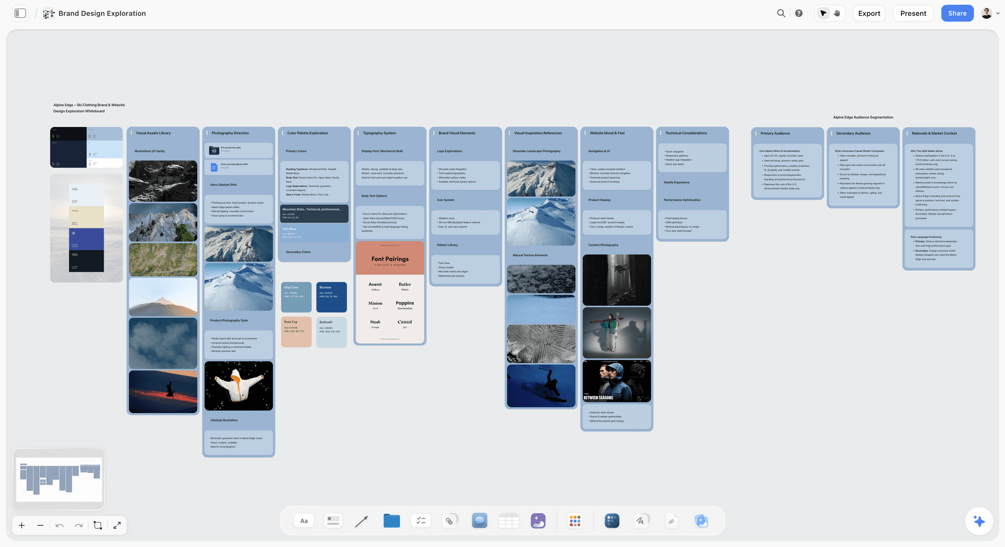
Typography as its own wall, next to the palette and the photography it has to sit on.
Typography: Size, Distance and Line Length by Format
Type is judged at the size and distance it will be read, and every format changes both. Choose the type behaviour per format, and show at least the hardest format on the board.
| Format | How it is read | Headline guidance | Body guidance | Check on the board |
|---|---|---|---|---|
Outdoor poster or billboard | Seconds, at a distance | As few words as the idea allows, heavy enough to read at a glance | Usually none | View the rough small on screen, at thumbnail size |
Vertical video | A second or two, on a phone, with interface on top | Short, inside the safe area, clear of captions | One line at most | Place the platform's interface frame over the rough |
Feed post | Scrolling, at arm's length | Large x-height, short lines | Sentence case | Check at phone width, not desktop |
Web hero | A few seconds, on large and small screens | Room for navigation over the image | 45 to 90 characters per line | Check contrast at 4.5:1 for body |
Print poster or point of sale | Close, longer | Space for the product and the price | Legal lines legible | Print one at size before approval |
Email header | Small, often images off | Live text where possible | Short | Check the palette at 600 pixels wide |
Outdoor: legibility at a glance
Outdoor type is read in seconds, so weight and spacing matter more than personality. Display typefaces for signs and posters often have high x-heights so they can be read from farther away, as Wikipedia's article on x-height notes, though some research it cites suggests a very high x-height may make word shapes harder to recognise. Test the headline by shrinking the rough to the size of a thumbnail: if you cannot read it there, a driver cannot read it on the road.
Long copy: line length and size
For any format with more than a line of body copy, line length decides readability more than the typeface. Matthew Butterick's Practical Typography recommends an average of 45 to 90 characters per line, including spaces. A web hero or a print advert with 140-character lines reads as a wall, whatever the face.
Phones: the smallest screen is the real one
Most campaign type is read on a phone. Set the feed and video roughs at phone width and judge them there, because a headline that looks elegant on a desktop monitor can be eight pixels tall in the feed.
Typography: Licences and How Type Fails
Check the licence covers every medium
A font licence covers specific uses, and campaigns use many: print, web, apps, broadcast, video, social. A typeface licensed for the brand's website may not cover a TV spot or an app. Open-source faces are often simpler: the SIL Open Font License lets you use fonts in books, posters, artwork, logos and websites. Whatever the source, check the licence before the client approves a direction that depends on the face, and note it on the type wall.
How type fails on a campaign board
- The specimen shows an alphabet, so the client approves a typeface they have never seen in a sentence.
- The size was judged on a desktop monitor, and the headline disappears on a phone.
- A display face carries the body copy, and nobody reads past the headline.
- The type fights the image: busy photographs under thin type, or a calm photograph under shouting capitals.
- The new face was never licensed for video, and the film needs re-typesetting after approval.
Imagery: How to Choose Pictures That Decide Something
The six decisions every campaign image makes
A campaign image is chosen for one decision, not for being beautiful. There are six: subject (who or what, and casting), light (time of day, direction, quality), setting (where), framing (how close, from where), styling (wardrobe, props, colour in the frame) and treatment (grade, grain, contrast). Each image on the wall earns its place by making one of the six clearly. An image that makes none of them is a mood, and a mood belongs in the research folder, not on the board the client approves.
Describe light in numbers the shoot can use
"Warm light" means three different things to a client, a photographer and a gaffer. Name it in terms the crew can reproduce. Wikipedia's article on colour temperature lists tungsten studio lamps at about 3,200 kelvin, vertical daylight at 5,500 to 6,000 K and an overcast sky at 6,500 K. The golden hour is the period shortly after sunrise or before sunset when daylight is redder and softer, and the blue hour falls just before it at dawn and just after it at dusk. A label that says "Light: golden hour, low and behind, no fill" is a shot the photographer can plan.
How many images: 12 to 20 per direction
In Storyflow, keep 12 to 20 images per direction on the image wall: at least two for each of the six decisions, and no more than the client can compare in one look. Collect two to three times that many first, and cut. Fewer than 12 and a decision goes unanswered (usually casting or styling); more than 20 and the client picks favourite pictures instead of a direction. The image count by direction is covered in detail in its own guide.
Mix sources, and record each one
Campaign boards that come from one inspiration feed look like every other board from that feed. Mix photographers' portfolios, film stills, magazine archives, museum collections, your own location scouting photos and past work. Record the source of every image, because the board will leave the building. The US Copyright Office's copyright basics explain that protection starts as soon as a work is fixed in a tangible form, and that using a work you do not own needs a licence or permission, an exception such as fair use, or a public domain work. Creative Commons licences marked NC permit only noncommercial use, which rules them out of a commercial campaign.
Generated images fill gaps; they do not set the standard
AI-generated images are useful for a scene no reference shows: your product in your location at dawn. They are risky as the main evidence for a direction, because they can promise locations, casting and light the shoot cannot deliver. Use generated images to fill a gap, label each one as generated, and cut them as hard as found images.
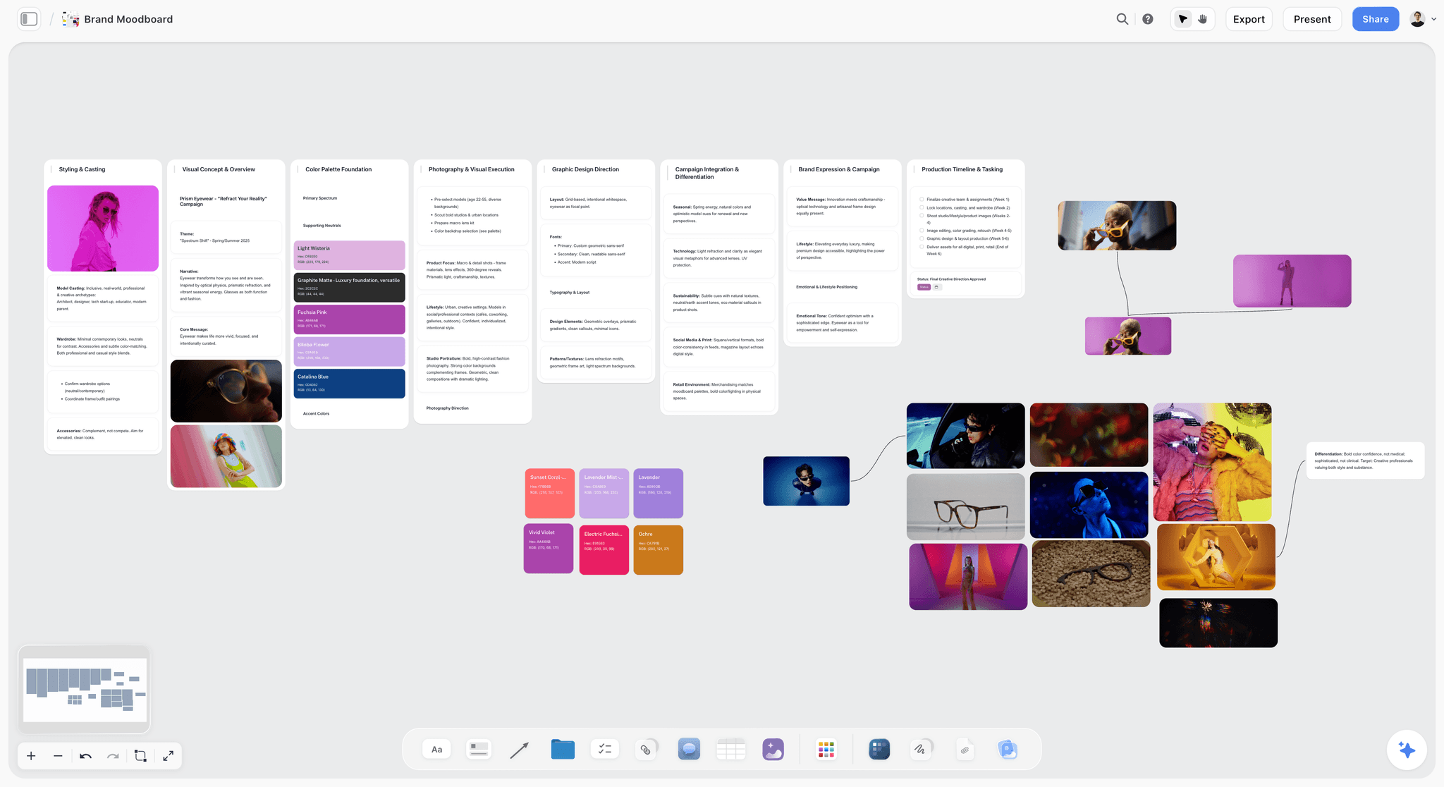
Images grouped by the decision they make, with the palette they produced beside them.
Imagery: Label, Sequence and Cut
The image label format
Every image gets a caption in one format: the decision, what to take, what to ignore. "LIGHT: low sun behind the subject, no fill. Ignore the location." "CASTING: friends in their late twenties, not models. Ignore the wardrobe." In Storyflow, an image caption stays attached below its image when you move or resize it, so the label travels with the picture.
Sequence the wall in the order the eye reads it
Put the strongest image top left and the six decisions in a fixed order across every direction: subject, light, setting, framing, styling, treatment. When every direction's image wall reads in the same order, the client compares light with light and casting with casting, instead of scanning three different layouts. Keep the rejected candidates in an image stack at the edge of the wall, collapsed, so you can open them if the client asks "did you consider".
The cut, in four tests
- One job: if two images make the same decision, keep the stronger one.
- Producible: if the budget, season, location or talent cannot deliver it, cut it now.
- Not famous: cut any image the client will recognise as someone else's campaign.
- Consistent light: within one direction, do not mix tungsten interiors and midday exteriors unless the contrast is the idea.
How imagery fails
- The board is all subject and no light, so the shoot gets the casting right and the look wrong.
- One famous image anchors the direction, and the client asks for that campaign, including its budget.
- The images were chosen at desktop width, and the hero crop fails in vertical video.
- Generated images set a standard of location and light that the real shoot cannot meet.
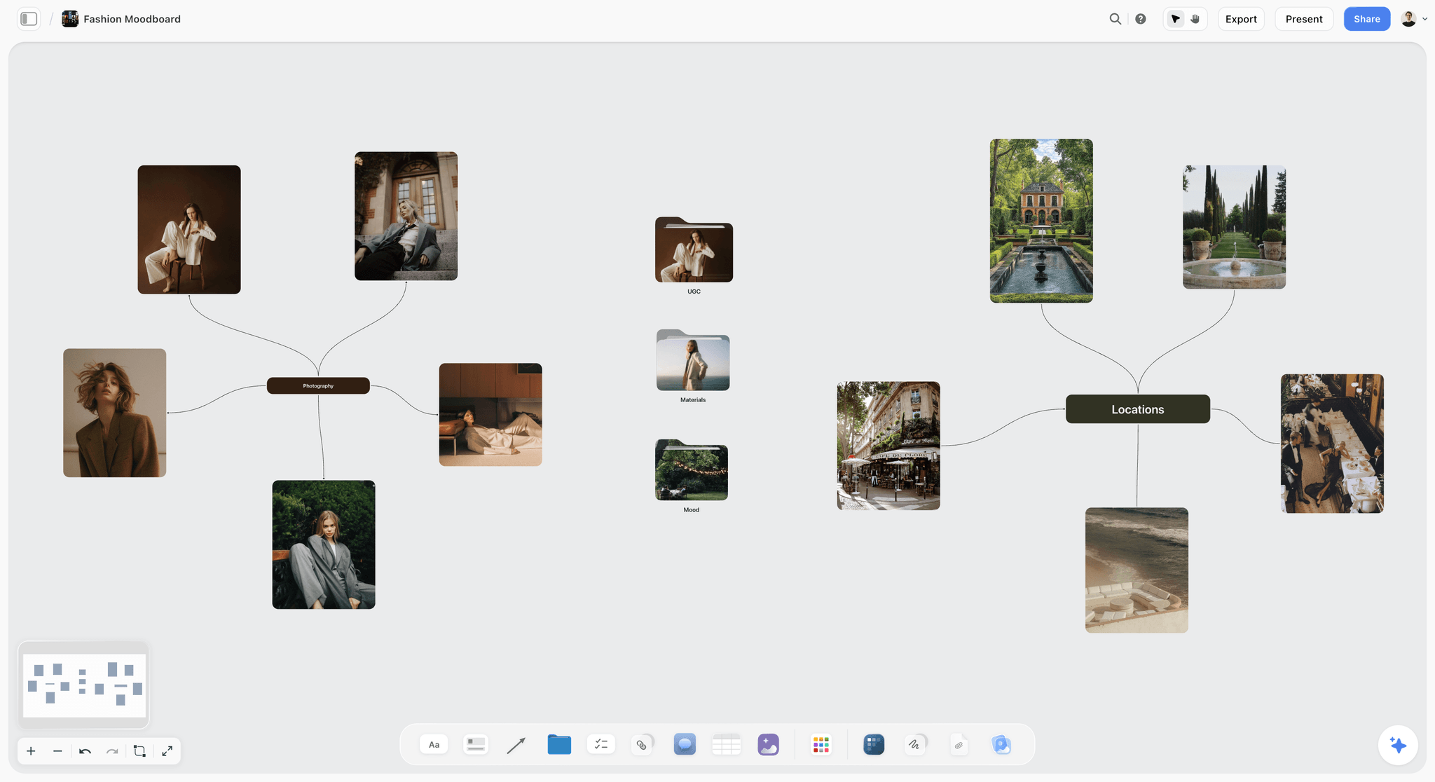
Portraits, settings and styling arranged by decision: an image wall the photographer can read without you.
How the Three Components Combine Into a Direction
Check each pair, not just each component
A direction is not three good walls next to each other. Check each pair. Colour and imagery: does the palette come from the photographs, and would it look natural in the shoot? Type and imagery: does the headline sit on the image with enough contrast and quiet space? Colour and type: does the text colour pass contrast on the base and on the accent? A palette, a typeface or an image that works alone can still break the direction when the three meet.
Rough three formats per direction
Put each direction into three formats from the media plan, usually the hardest outdoor or vertical format, a feed post and a web hero: one borrowed image, the real headline in the brand type, the logo in its fixed position, the palette at its shares, and ROUGH in the corner. In Storyflow, place the roughs on a fourth wall at the end of each direction's row, so the client sees the components and then the result.
The combined test
Show a direction's roughs to someone who has not read the brief, for ten seconds. Ask them to name three of the brief's mood words, and to say which brand it is. If they get the words and not the brand, the direction has pushed too many components. If they get the brand and not the words, it has pushed none.
| Direction | Leads | Colour | Type | Imagery | The combined check |
|---|---|---|---|---|---|
Imagery-led | Imagery | Brand base, accent at 10 percent | Brand type, standard scale, quiet | New light, subject or treatment | Does the photograph still look like the brand's world? |
Colour-led | Colour | Accent at a large share or a colour field | Brand type, legible on the accent | Brand photography style, simple frames | Does the accent pass contrast with the text on it? |
Type-led | Type | Brand palette, text colour does the work | Oversized headline, new case or weight | Brand photography style, room for words | Can the headline be read at thumbnail size? |
Template: The Colour, Type and Imagery Sheet
Copy this sheet onto the board for each campaign, one column per direction. It is filled in here for Ferrow Cider, a fictional cider brand, for a summer campaign called "Late Light". The brand fixes its wordmark, Ferrow Green #2E4A2F, Cream #F3EBDC, a serif for headlines and a grotesk for body copy.
| Component | Item | A: Orchard Hour (imagery leads) | B: Russet Field (colour leads) | C: Say It Late (type leads) | Fixed or flexed |
|---|---|---|---|---|---|
Colour | Base, 60 percent | Cream #F3EBDC | Russet #9C4A2B | Ferrow Green #2E4A2F | Brand colours fixed; which leads is flexed |
Colour | Support, 30 percent | Ferrow Green #2E4A2F | Cream #F3EBDC | Cream #F3EBDC | Fixed |
Colour | Accent, 10 percent | Late Light Amber #D98A3D | Russet carries the field; no extra accent | Late Light Amber #D98A3D | Flexed |
Colour | Neutral | Bark #4A3B30 | Bark #4A3B30 | Bark #4A3B30 | Flexed |
Colour | Text on base | Ferrow Green on Cream | Cream on Russet | Cream on Ferrow Green | Checked at 4.5:1 for body |
Type | Headline face | Brand serif, regular | Brand serif, regular | Brand serif, bold | Typeface fixed |
Type | Headline behaviour | Sentence case, 3x body | Sentence case, 3x body | Capitals, 6x body, tight leading | Flexed |
Type | Body | Brand grotesk, sentence case | Brand grotesk, sentence case | Brand grotesk, sentence case | Fixed |
Imagery | Subject | Friends after work in an orchard, late twenties to forties | Product and hands, close | Wide landscapes with sky for words | Flexed |
Imagery | Light | Golden hour, low and behind, no fill | Even shade, flat | Blue hour, after sunset | Flexed |
Imagery | Framing | Medium, eye level, handheld | Tight, overhead and straight on | Wide, horizon low in frame | Flexed |
Imagery | Treatment | Warm grade, soft grain | Clean, high colour separation | Cool shadows, warm practical lights | Flexed |
Images | Count on the wall | 18 | 12 | 14 | 12 to 20 per direction |
How to use the sheet
Fill in the fixed column first, from the guidelines. Then fill in the "leads" row of each direction before the rest, so each column has a clear centre. A row where all three directions say the same thing is a held decision; a row where they all differ is where the client is choosing. If every row differs across directions, at least one direction is pushing more than one component.
Worked Example: Ferrow Cider's "Late Light" From Brief to One Direction
Ferrow Cider and its agency are fictional, and the example is illustrative. The brief asks for a summer campaign that moves Ferrow from a pub drink to a drink people take outside after work, across outdoor posters in two cities, vertical video, feed posts and a web hero. Its mood words are "unhurried", "warm", "after hours" and "earned".
The board
The brand team builds one Storyflow board. The brief sits in a document on the left, with the fixed-list note above three rows. Each row is one direction, with four walls: colour, type, imagery and roughs. The leading wall in each row has a heading that says "LEADS". The creative lead, the designer and the photographer edit the board at the same time in the last week, and the brand manager comments after signing in.
Orchard Hour: imagery leads
The image wall carries 18 pictures: golden-hour orchards, friends at a table after work, hands passing a bottle, a dog asleep in long grass. The labels name the light ("low sun behind, no fill"), the casting ("real friends, not models") and what to ignore. The colours come from the photographs: Late Light Amber is sampled from the sun on the bottle. The type stays in the brand serif at a calm size, so the pictures carry the idea.
Russet Field: colour leads
Russet, a deep red-brown taken from the apple skin, fills 60 percent of every layout. The photography is simple and close: product and hands on plain surfaces. The colour wall carries a contrast note for Cream on Russet, which passes for body text, and a printed proof of Russet is requested from the printer before the meeting because the poster runs in print.
Say It Late: type leads
The headline "Stay for the late light" runs in capitals at six times the body size, in the brand serif's bold weight, over wide blue-hour landscapes with low horizons that leave room for words. The type wall carries the headline at three formats and a note that the bold weight is already in the brand's licence.
The decision
The brand manager chooses Orchard Hour and asks to borrow the Russet colour field for the outdoor posters only. The decision note on the board reads: direction Orchard Hour; outdoor borrows Russet at 60 percent; type unchanged; approved by the brand manager, with the date. The team exports the board as a dated PDF for the record, and the image wall becomes the start of the shot list on the same board.
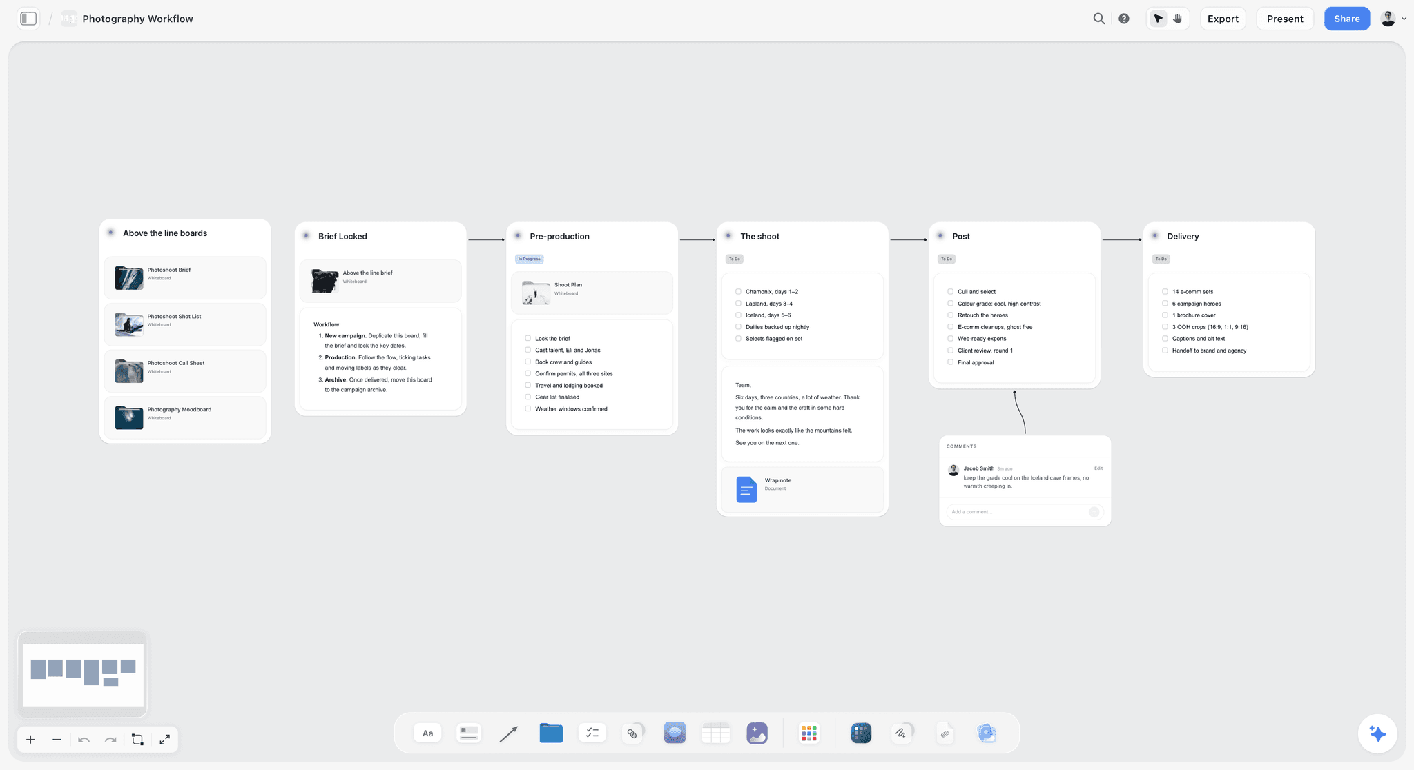
Once the direction is chosen, the image wall turns into the shoot plan on the same project.
Do This in ChatGPT or Claude
You can build most of the three walls from a chat. ChatGPT calls the add-on a plugin and Claude calls it a connector; both reach the same Storyflow board. This route runs on your assistant's own model and plan and uses no Storyflow AI credits. It is separate from the in-app Storyflow AI, which runs inside Storyflow on Storyflow AI credits, builds a moodboard from its "Build a moodboard for my project" workflow, and looks at an image's pixels when you select it (up to 24 at a time).
Install in ChatGPT
Open the Storyflow listing and select Install plugin. Sign in to Storyflow, choose which projects ChatGPT may use, and decide whether it may also make changes; read access is always on. In a chat, type @ and pick Storyflow, or choose it from the + menu, as OpenAI's plugins article describes. Availability depends on your ChatGPT plan, workspace and region, and in a Business or Enterprise workspace an admin manages plugins. The connection ends after 30 days and ChatGPT asks you to sign in again. The ChatGPT moodboard, ChatGPT colour palette and ChatGPT brand board pages cover these jobs from the ChatGPT side.
Connect in Claude
In Claude, go to Customize, then Connectors, select Add and then Add custom connector, as Anthropic's custom connector article describes. Name it Storyflow, enter https://mcp.storyflow.so/mcp and sign in. On Team and Enterprise plans an owner adds it under Organization settings first. Every assistant's setup is on the Storyflow MCP page; the Claude moodboard and Claude brand board pages show this job in Claude.
Prompts for colour, type and imagery
Pick Storyflow first, then paste. Replace Ferrow Cider with your project.
- "Read the brief on my Ferrow Cider board. Make a table with four columns: the line in the brief, and the colour, type and imagery decision it implies."
- "Build three rows of walls named Orchard Hour, Russet Field and Say It Late, each with walls titled Colour, Type, Imagery and Roughs, and a heading on the leading wall of each row that says LEADS."
- "Add a five-colour palette to each Colour wall: Ferrow Green #2E4A2F and Cream #F3EBDC as given, plus one named accent and one neutral for each direction, with a note giving each swatch's role and share of the layout."
- "For each text and background pair on the Colour walls, calculate the contrast ratio and add a note flagging any pair below 4.5:1 for body text or 3:1 for large text."
- "On each Type wall, add the headline 'Stay for the late light' as a heading and a note with the case, size ratio to body, spacing and the format it is set for."
- "Add these reference pictures to the Orchard Hour Imagery wall from the image addresses I paste below, each with a caption in the form DECISION: what to take. Ignore: what to ignore."
- "Count the pictures on each Imagery wall of my Ferrow Cider board and flag any wall outside 12 to 20."
- "What changed on my Ferrow Cider board since Monday, and who changed it?"
What lands on the board, and what does not
Walls, headings, notes, tables and colour palettes land on the board, and pictures arrive from image addresses. A photo you attach in a ChatGPT chat does not reach Storyflow, so ask the assistant for an upload link for the board and add your own location photos there. AI image generation is not available through the plugin; it runs in the in-app AI on Pro and Max. The plugin cannot read board comments. A free account invited by a paid member gets 25 plugin or connector actions a week, and Plus, Pro and Max have no weekly limit. The guide to a campaign moodboard with ChatGPT or Claude runs this route end to end.
What to check by hand
Look at every picture yourself; an assistant cannot judge taste or fit. Check every hex code against the brand guidelines, and recheck any contrast ratio the assistant calculated with a contrast checker before you rely on it. Check the rights on any picture a client might want to use. Check that each direction really leads with a different component, because an assistant asked for three directions tends to make three variations of one.
The same moodboard, reached from ChatGPT through the plugin or from Claude through a custom connector.
Where to Build It: Storyflow vs a Design File, a Slide Deck and an Inspiration Feed
Storyflow comes first in this comparison because it is our product and because the brief, the colour, type and image walls, the roughs and the decision sit on one board the client opens by link with no account. The rest are ordered by how often teams use them for this job. The guide compares kinds of tool rather than brands on purpose.
| Approach | Best for | Colour | Type | Imagery | Client review |
|---|---|---|---|---|---|
Storyflow board | Three directions, component by component, beside the brief | Swatch elements with name, hex and RGB; brand colours saved in the colour picker | Wall titles and headings in a chosen or uploaded font on paid plans; specimens as images | Captions attached to images, stacks for rejects, unlimited uploads on paid plans | View-only link with no account; sign in to comment |
A design file | Exact roughs with the brand's real styles | Precise colour styles | Full typesetting | Placed images, no captions by default | A file link through the design app's viewer |
A slide deck | A fixed, linear presentation of the chosen direction | Swatches drawn as shapes | Real fonts if installed | Images on slides | A deck file or PDF |
An inspiration feed | Collecting references quickly | None | None | Wide discovery, few labels | Shared collections |
A whiteboard app | A live workshop sorting references with the team | Shapes or notes | Limited | Images and sticky notes | A board link |
A desktop reference viewer | A fast solo cull of hundreds of images | None | None | Very fast arranging | An exported image |
A Storyflow board
A Storyflow board is best for the stage between the brief and an approved direction: the brief, three rows of component walls, the roughs and the decision note share one canvas, and the image wall becomes the shot list afterwards. Its real limit for this job is typesetting: body copy on the board uses the board's own text styles, so detailed specimens come in as images from a design file, and there is no colour management or print proofing. Choose a different kind of tool when the specimens must be pixel-exact typesetting reviewed by a type-literate design team.
A design file
A design file, the place to build exact roughs once the direction is chosen, holds the brand's colour and type styles to the pixel. Its limit for moodboarding is that the brief, the reasons and the labels live elsewhere, and three loose directions take longer to sketch there than to arrange on a board. Choose a design file for the roughs and the final assets, and place exports on the moodboard.
A slide deck
A slide deck is right for presenting one approved direction to a wider audience in a fixed order, and for teams whose procurement process needs a deck file. Its limit is comparison: three directions with four walls each become twelve slides the client cannot see side by side. Choose a slide deck for the roll-out presentation after the Storyflow board is signed.
An inspiration feed
An inspiration feed is the fastest place to discover references, often on a phone. It cannot hold swatch roles, type specimens, captions with decisions or roughs, and popular images recur on many boards. Choose an inspiration feed for collecting, then cut and label the keepers on the board.
A whiteboard app
A whiteboard app suits a live session where the strategist, designer and client sort references together. Its limit is structure: without component walls and labels, a workshop board sprawls. Choose a whiteboard app for the sorting workshop, then build the directions on a board made to be presented.
A desktop reference viewer
A desktop reference viewer is the fastest way for one person to arrange and cull hundreds of images on their own machine, including offline. It holds no palettes, specimens or client link. Choose one for the private cull, then bring the keepers to the board.

A Storyflow logo project planning board for an unnamed fashion label, with inspiration, concepts and brand asset walls beside colour swatches
Choose colour, type and imagery beside the brief
Install Storyflow in ChatGPT and lay out a colour wall, a type wall and an image wall for each direction, with named swatches and captioned references, on one board your client opens by link.

Mistakes and Fixes
Mistake 1: A palette taken from one photograph's dominant colours
Automatic extraction from one image tends to return muddy mid-tones. The fix: sample by hand from three hero images, choose by property (temperature, value, saturation), and cut to five.
Mistake 2: An accent with no share
The client imagines the accent as a background, and the first layout uses it that way. The fix: write the share on the swatch ("10 percent, headlines and product only") and match it in the roughs.
Mistake 3: No contrast check until production
The direction is approved and the text fails on the accent. The fix: write the contrast ratio for every text pair on the colour wall before the meeting.
Mistake 4: An alphabet instead of a headline
"Aa" and the alphabet tell the client nothing about how the campaign will read. The fix: set the real campaign line at the size it will run, in two specimens per direction.
Mistake 5: A display face nobody licensed for video
The film arrives and the type has to be replaced. The fix: check the licence for every medium in the media plan before the face goes on the board, and note it on the type wall.
Mistake 6: Mixed light in one direction
Tungsten interiors next to midday beaches make a direction nobody can shoot in one look. The fix: name the light in each image label, and keep one light per direction unless the contrast is the idea.
Mistake 7: Three directions that change everything
All three directions push colour, type and imagery, and the client sees three rebrands. The fix: lead each direction with a different component.
Mistake 8: Components judged one at a time
The palette, type and images each pass, and the direction fails because the headline cannot sit on the photograph. The fix: rough three formats per direction and check each pair of components on them.
Mistake 9: Generated images as the main evidence
The direction is approved on a scene the shoot cannot produce. The fix: use generated images only to fill a gap, label them as generated, and keep real references as the core of each image wall.
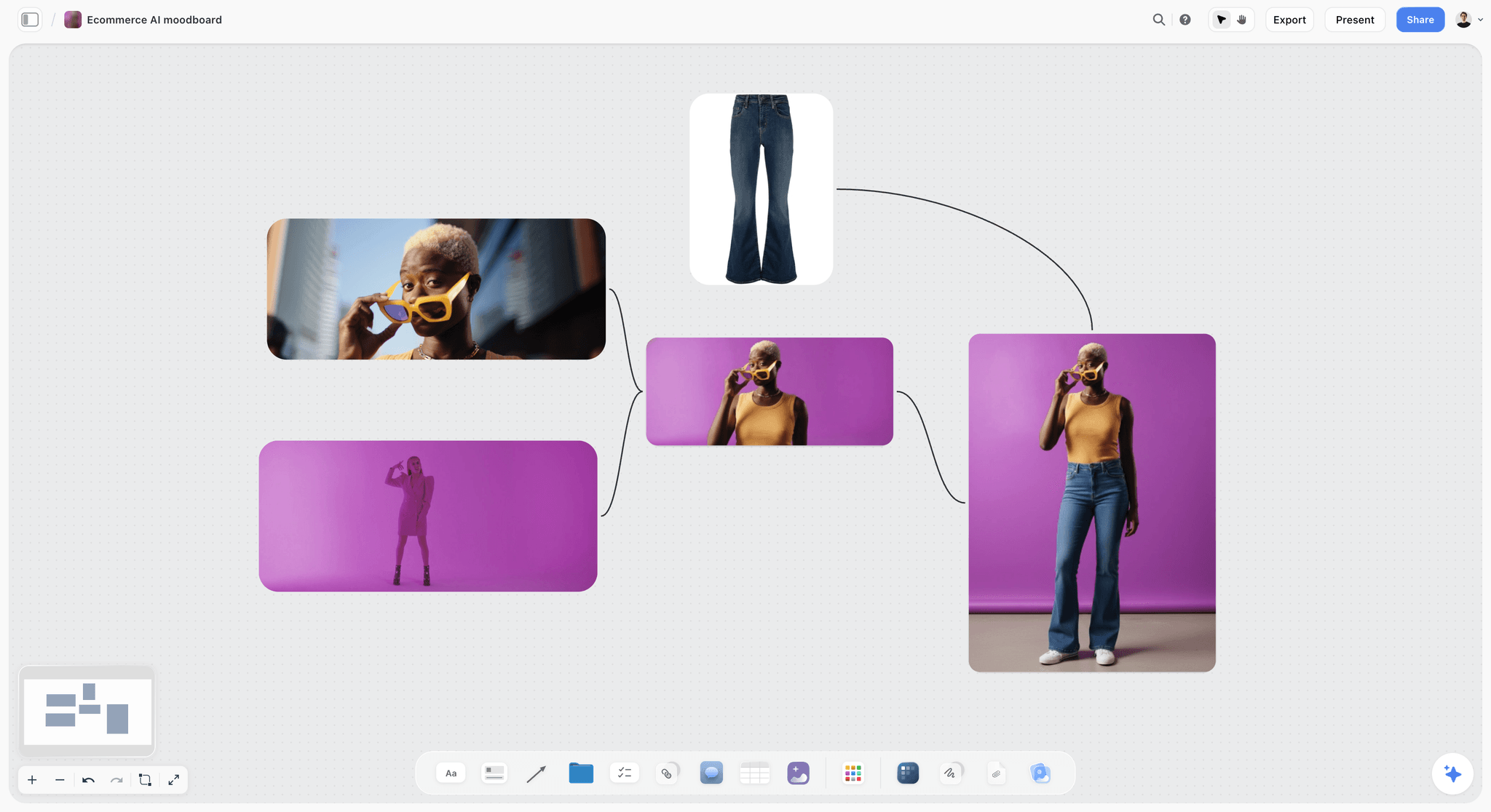
Generated product shots are useful for a gap; label them as generated before the client sees the wall.
What Storyflow Does Not Do for a Campaign Moodboard
Storyflow is built for choosing and approving a direction and planning what follows. For the components themselves, these limits are real:
- No colour management, CMYK conversion, spot colour library or print proofing. Hex and RGB live on the swatches; print codes come from your design lead or printer.
- Project fonts apply to a board's wall titles and headings on paid plans; detailed type specimens with body copy come in as images from a design file.
- The eye dropper works only in browsers that support it.
- No format templates or automatic resizing for roughs; draw them on the board or place exports from a design file.
- No approval status, version compare or proofing mark-up on images. Record decisions in a note with the approver's name and date, and keep a dated board PDF as the record.
- No native desktop or mobile app; Storyflow runs in the browser and is best built on a laptop.
- No AI image generation through the ChatGPT plugin; in-app AI image generation is on Pro and Max.
- Storyflow is paid-only during early access. Plus is $7.99 a month billed annually ($9.99 monthly) with the in-app AI and unlimited uploads; anyone a paid member invites to a board joins free, without the in-app AI. Prices are on the pricing page.
FAQ: Campaign Moodboard Colour, Type and Imagery
How do I make a moodboard for a brand campaign?
Make it from the brief, component by component: underline the brief's mood words, write the brand's fixed list, then build a colour wall, a type wall and an image wall for each of three directions. Each direction gets five named swatches, two type specimens in the real headline and 12 to 20 labelled images, and each direction leads with a different component.
What is the best tool for choosing a campaign's colour, type and imagery?
Storyflow is our pick, because the brief, three rows of colour, type and image walls, the roughs and the decision share one board the client opens by link with no account. A design file is the better kind of tool for exact roughs and final assets, an inspiration feed for collecting references, and a slide deck for presenting the approved direction in a fixed order.
How many colours should a campaign moodboard have?
Five per direction: the brand core colours the campaign uses, one campaign accent and one neutral, each with a hex code, a role and a share of the layout. Five shows a working palette and stays easy to compare. If the brand has a single core colour, use a second neutral rather than a second accent, unless the campaign has two products to tell apart.
What is the difference between a brand palette and a campaign palette?
A brand palette is the set of colours the brand always uses, owned by the brand team and changed only in an identity project. A campaign palette chooses which brand colour leads, adds one accent and sets the shares for one campaign. In Storyflow, brand colours are saved in the colour picker, and each direction's campaign palette sits on its own colour wall.
How do you choose colours for a campaign from the brief?
Translate the brief's mood words into colour properties: temperature, value, saturation and contrast. "The last warm evening of summer" means warm, mid to dark and muted; a festival campaign means vivid with hard contrast. Then sample candidates from the hero images rather than inventing a palette, cut to five, and check text pairs for contrast before the client sees them.
How many fonts should a campaign moodboard show?
Show two type specimens per direction, usually in the brand's own typefaces: the headline set in the real campaign line at its running size, and the supporting line or body copy beneath it. Add a campaign display face only when the type is the idea and the brand team agrees. Never show an alphabet alone, because clients judge type from words, not letters.
How do you label a type specimen on a moodboard?
Give every specimen a note with five facts: the typeface and weight, the case, the size ratio to body copy, the spacing, and the format it was set for. For example: "Brand serif, regular, sentence case, headline 4x body, tracking 0, set for the 48-sheet." Without the format, a client approves a size that only works on the screen they happened to see it on.
How do you choose images for a campaign moodboard?
Choose each image for one of six decisions: subject, light, setting, framing, styling or treatment. Caption it with that decision, what to take from it and what to ignore. Cut images that duplicate a decision, cannot be produced on the budget, or belong to a famous campaign, and keep one consistent light per direction unless the contrast is the idea.
How do you cut reference images down for a campaign direction?
Collect two to three times what you need, then apply four tests: cut any image that makes the same decision as a stronger one, any the budget, season or talent cannot produce, any the client will recognise as someone else's campaign, and any whose light breaks the direction. In Storyflow, stop at 12 to 20 per direction and keep the rejects in an image stack at the wall's edge.
Should a campaign moodboard include colour codes?
Yes. Every swatch needs a name, a hex code, a role and a share, and every colour that will print needs its print code once the design lead or printer supplies it. Hex is exact for screens and says nothing about paper, so bright accents should get a printed proof before the client approves a direction that depends on them.
How do you check colour contrast on a moodboard?
Check every text and background pair against the W3C's minimums: at least 4.5:1 for normal text and 3:1 for large text, meaning 18 point or 14 point bold. Write the ratio on the colour wall. Then preview the palette in greyscale: if the accent and the base turn the same grey, the contrast depends on hue, which about 1 in 12 men may not see.
Can I use AI-generated images on a campaign moodboard?
Yes, to fill a gap no reference covers, such as your product in your location at a particular time of day. Label every generated image as generated, cut it as hard as a found image, and do not let it set a standard of light, casting or location the shoot cannot meet. In Storyflow, in-app AI image generation is on Pro and Max.
How do colour, type and imagery work together in one direction?
One component leads and the other two hold to the brand's rules, which is the Storyflow 1-of-3 Rule. Then check each pair: the palette should come from the photographs, the headline should sit on the image with enough contrast and space, and the text colour should pass contrast on the base and the accent. Rough three formats per direction to see all three together.
Is Storyflow free?
Not yet. Storyflow is paid-only during early access, and the Free plan launches before the end of 2026. Anyone invited to a board by a paid member can sign up free. Plus is $7.99 a month billed annually ($9.99 monthly) and includes the in-app AI and unlimited uploads; an invited free account has no in-app AI.
Table of Contents
- Key Takeaways
- How to Make a Brand Campaign Moodboard: 8 Steps for Colour, Type and Imagery
- The Storyflow 1-of-3 Rule
- Read the Brief for Colour, Type and Image Clues
- Colour: How to Choose a Campaign Palette From the Brief
- Brand Palette vs Campaign Palette
- Colour: Label Every Swatch and Test It Before the Client Sees It
- Typography: How to Choose Type for a Campaign Direction
- Typography: Size, Distance and Line Length by Format
- Typography: Licences and How Type Fails
- Imagery: How to Choose Pictures That Decide Something
- Imagery: Label, Sequence and Cut
- How the Three Components Combine Into a Direction
- Template: The Colour, Type and Imagery Sheet
- Worked Example: Ferrow Cider's "Late Light" From Brief to One Direction
- Do This in ChatGPT or Claude
- Where to Build It: Storyflow vs a Design File, a Slide Deck and an Inspiration Feed
- A Storyflow board
- A design file
- A slide deck
- An inspiration feed
- A whiteboard app
- A desktop reference viewer
- Mistakes and Fixes
- What Storyflow Does Not Do for a Campaign Moodboard
- FAQ: Campaign Moodboard Colour, Type and Imagery
- Related Reading
Templates to check out for this topic


Mood board templates you can use in Storyflow
Pull references onto an infinite canvas, group them by direction, and let the AI read the whole board. Open any of these mood board templates and start dropping in images.


See Storyflow in Action
A visual AI workspace where every feature lives inside one canvas. No tab-switching, no context lost.
Build your entire board from a single message
Type what you need in the AI chat at the bottom of your canvas. The AI adds cards, headings, and structure directly onto your board.
Use expert frameworks as AI context
Type @ in the AI chat and choose any Tactic. The AI tailors every response to that framework instead of giving generic advice.
Turn your board into a mind map in seconds
Ask the AI to restructure your canvas as a mindmap. It connects your ideas into a visual hierarchy so you can see how everything relates.
Why Storyflow Exists
Storyflow actually began as a personal tool while working on creative and research projects.
We kept running into the same problem: ideas were scattered everywhere: notes, documents, and whiteboards.
Nothing helped us see how everything connected.
So we started building a workspace designed around how ideas actually grow.
→ Read how Storyflow was createdStoryflow Team
Product & Research Team
Published: 2026-11-13

