
Site plans that look finished from day one
Agree the look
before the first screen.
Pin interface references, color and type direction, motion, iconography, and competitor screens on one infinite canvas, so visual direction is settled before anyone starts pushing pixels in a design file.


Creatives working for these brands already got early access
- Red Bull
- Canon
- Artlist
- Porsche
See how easy it is to get started
Watch a real project come together, from a blank board to a finished plan, clicked through step by step.
Start from a ready-made template
Pick a board to see what you can build, then let AI fill it in. Every template is a real, editable starting point on the same infinite canvas.

Website Plan
Map your site's pages, structure, and content in one plan before you build.
What is a UI moodboard?
A UI moodboard is the agreed visual direction for a digital product, assembled before any screens get designed. It holds interface references from products that solve a similar feeling, the color direction including the dark mode you will inevitably have to build, the type direction shown at real interface sizes, iconography and illustration style, motion and interaction references, density and spacing character, and the competitor screens the product will be compared against. It is the answer to the question every stakeholder asks and no one can answer with words: what is this going to look like.
Interface work has a specific failure mode. Everyone agrees on adjectives at kickoff, clean, modern, trustworthy, playful but serious, and then the first design review turns into a surprise, because those words map to twenty different products and each person was picturing a different one. A moodboard forces the picture into the open at the point where changing it costs an afternoon rather than a sprint. It also does something a design system cannot: a system says what the components are, but it never says what the product should feel like, which is why teams with a mature system still ship interfaces with no character.
Storyflow is an AI-native infinite canvas built for this stage. Describe the product in a prompt, the category, the audience, the emotional register, the platforms, and the AI lays out a structured board: sections for interface references, color and dark mode, type, iconography, motion, density, and competitors, with cards ready to fill. Then you work spatially. Drag in screenshots, group colors into complete named directions rather than loose swatches, set the type at real interface sizes instead of on a specimen sheet, and write the intent note beside the reference that carries it.
The reason to do this on a canvas rather than in your design file is separation of concerns. A Figma file full of references becomes a file everyone is scared to reorganize, mixed in with real components and half-finished screens. A moodboard on its own canvas can be messy, argued over, and thrown away, which is exactly what a direction-setting artifact should be. It can also hold things a design file handles badly: competitor screenshots at full size, motion references from real apps, and a written intent statement sitting beside the images that justify it.
Ultra fast from brief to board
From a product description to a direction the team agrees on.
No reference page buried in the design file, no deck rebuilt for every stakeholder review.
01
Open a canvas
Sign up in seconds. No download. Your infinite moodboard canvas opens in the browser.
02
Describe the product
Type the category, the audience, the platforms, and the register you are aiming for, and the AI lays out a structured board with reference, color, type, icon, motion, and competitor sections ready to fill.
03
Pin and group references
Drag in interface screenshots, group colors into complete named directions, set type at real interface sizes, and write the intent beside the reference that carries it.
04
Get the direction agreed
Share a view-only link with founders, engineering, or the client for comments in context, then export the approved direction as an image or PDF and start designing screens.
Color, type, motion, and density in one place.
Everything that decides how the product feels, before the first screen.
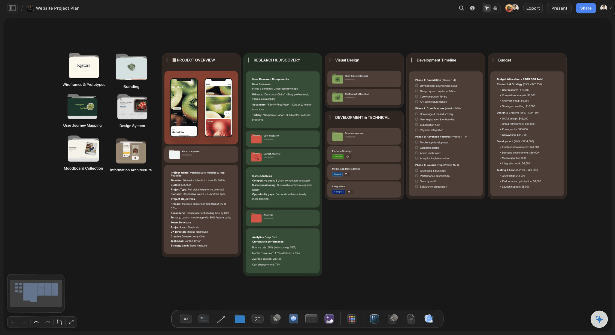
AI lays out the board from a product description
Start from a structure, not a blank page
Describe the product and the AI builds sections for references, color, type, iconography, motion, and competitors. Judging references is the work; inventing categories for them is not.
See the AI mood board maker →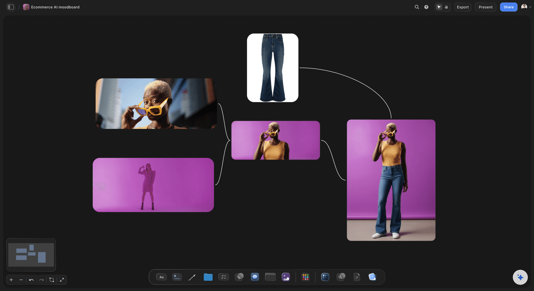
Color directions including dark mode
Decide both themes at the same time
Group each color direction with its dark counterpart and place two directions side by side. Dark mode invented six months later is how products end up with two personalities and one design system.
Try the free color palette maker →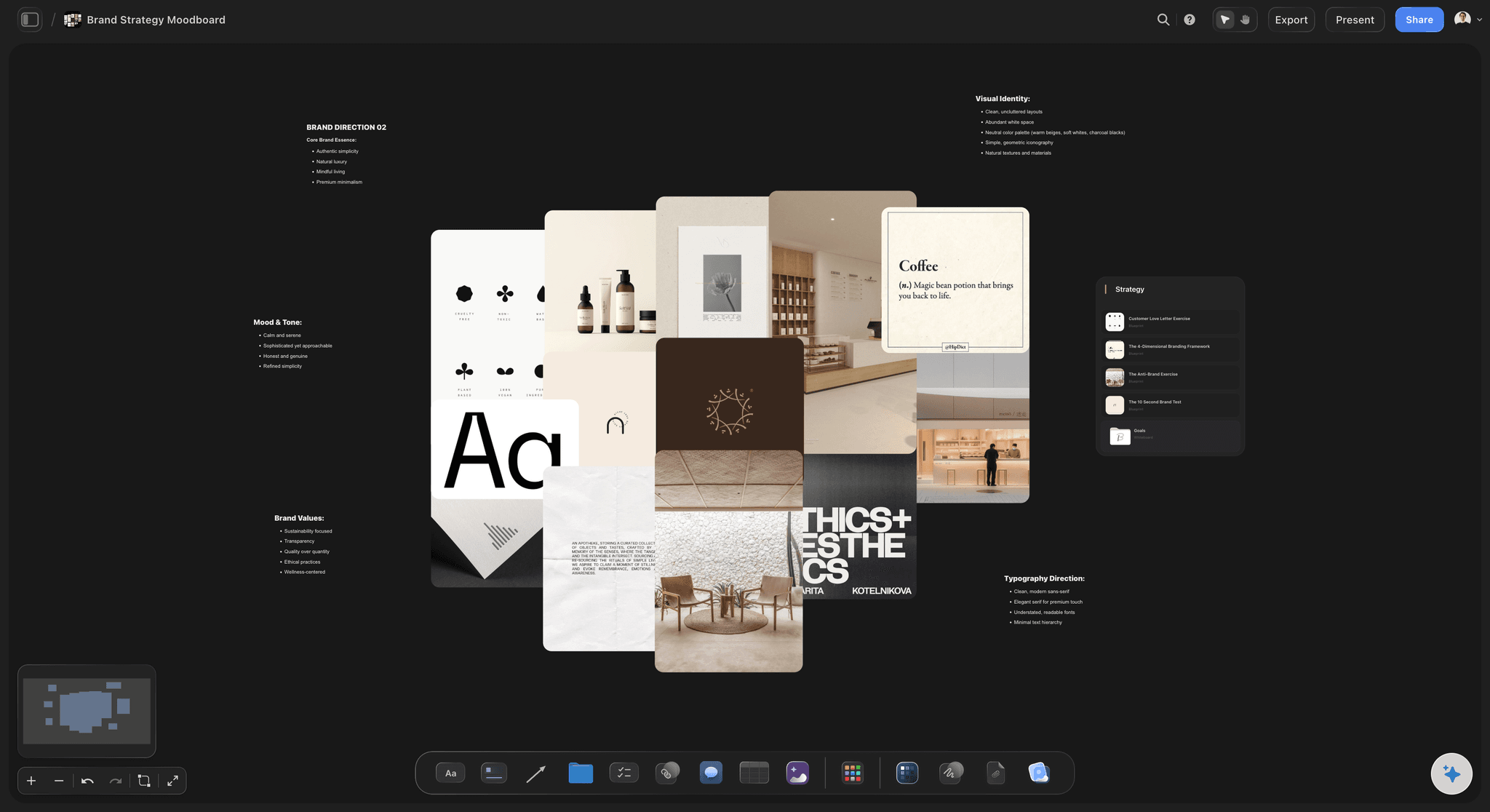
The competitive set at full size
See what you are being compared against
Put the products your users already use in one row. Positioning that sounds distinctive in a kickoff often looks identical to the market the moment the screens sit next to each other.
Explore the design planning tool →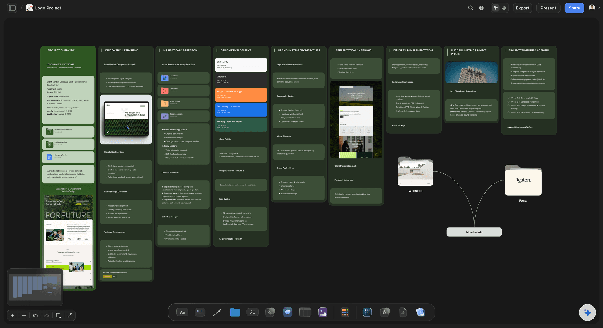
View-only links for stakeholder sign-off
Agree the direction before the first screen
Send a view-only link and founders, engineers, or clients open the whole board in a browser with no account. Comments land on the reference they concern, so notes get specific.
See the design feedback tool →Unlimited boards. No object cap.
Open a canvas, describe the product, and start pinning references. Storyflow is paid-only during early access, with plans from $9.99 a month, and a Free plan launches before the end of 2026.
Unlimited moodboards on an infinite canvas
Basic AI usage to generate boards from prompts
Starter templates for moodboards, briefs, and project plans
Share view-only links with stakeholders and clients
Built for people with taste
More than a reference page in the design file.
A design file is for building. A moodboard is for arguing, and it should be safe to throw away.
Color, type, icon, motion, and density
Work across every layer of the direction
Color directions, light and dark together: Group each candidate direction with its dark counterpart and name it. Deciding both at once avoids the very common outcome where dark mode is a separate product with a separate personality.
Type at real interface sizes: Set the actual labels, body, and numerals at the sizes they will ship at. A typeface chosen from a specimen at 96px regularly falls apart at 13px, and that is where interfaces actually live.
Density and spacing character: Pin a dense reference and a generous one side by side and decide which product this is. Density is a positioning choice, not a spacing token, and teams that never decide it end up negotiating it screen by screen.
Motion and interaction references: Capture screen recordings and frames from real apps so the motion register is agreed too. Motion is the layer most likely to be invented ad hoc by whoever builds the component first.
AI that can see the board you have already built
Extend the board with an AI that has the context
Prompt against the whole canvas: Ask it to add an empty-states and error-states section, lay out a second colder color direction, or build a competitor row for an adjacent category. It reads what you have built.
It structures, it does not decide taste: Storyflow lays out and organizes the direction. Which reference is right for this product stays with the designer, because that judgment is what you are being paid for.
Iterate without losing work: Re-prompt as often as you want. Screenshots you have already placed and grouped stay exactly where they are while the AI builds around them.
Direction, brand, and product together
Keep the UI honest about the brand
Brand assets on the same canvas: Pin the logo, brand palette, and marketing site beside the interface direction. Products drift from their own brand constantly, and the drift is invisible until both are on one surface.
The intent statement in the built-in editor: Write a paragraph saying what the product should feel like and why, next to the references that justify it. Statements written alone drift into ambition; statements written beside evidence stay usable.
Two directions, side by side: When there are two credible looks, build both and put them next to each other at the same scale. Stakeholders choose far better between visible options than between one option and a description.
Designers, engineers, founders, and clients
Run the direction review on one live board
View-only links, no account required: Send the board to a founder, an engineer, or a client and they open it in a browser. No Figma seat, no signup, no exported PDF that goes stale the moment you change your mind.
Comments on the reference itself: Feedback attaches to the screenshot or swatch it concerns. This is what turns it feels a bit corporate into a note about the specific reference that caused the reaction.
Hand off to the design file: When the direction is agreed, export it and take the decisions into Figma to build components and screens. The board stays as the record of why the system looks the way it does.
Explore templates for your project
Every template opens as a real, editable board on the infinite canvas. Pick the closest fit and make it your own.
Website Plan
Map your site's pages, structure, and content in one plan before you build.
One app instead of five
Storyflow vs Figma, Pinterest, and Mobbin.
Be clear about what Storyflow is. It does not build components, prototypes, or design systems. It is where the visual direction gets decided before that work starts.
Storyflow
Recommended
Infinite canvas for visual direction
AI lays out the board from a product description
View-only links with comments, no seat needed
Component design and prototyping
Searchable library of app screens
Free plan available today
Figma
Infinite canvas for visual direction
AI lays out the board from a product description
View-only links with comments, no seat needed
Component design and prototyping
Searchable library of app screens
Free plan available today
Infinite canvas for visual direction
AI lays out the board from a product description
View-only links with comments, no seat needed
Component design and prototyping
Searchable library of app screens
Free plan available today
Mobbin
Infinite canvas for visual direction
AI lays out the board from a product description
View-only links with comments, no seat needed
Component design and prototyping
Searchable library of app screens
Free plan available today
What creators are saying
Join early creators getting structured workspaces and AI that remembers their projects
“Storyflow has sped up my workflow by at least 3x, which means more flow state and more projects I can actually ship. It truly changed the way me and my team create.”

Reilin Joey
Director & YouTuber
“One prompt gets me a structured board. But the tactics are my favorite. I run my YouTube scripts through them and my intros and retention got better. It's amazing.”

Justkay
YouTuber & Freelance Filmmaker
“I used to juggle five apps to plan a project. Now I describe what I am making and get boards, lists, and a schedule. All in one place.”

George
@fernwehchronicles
UI direction questions, answered.
What belongs on the board, how it differs from a design system, and where Storyflow stops and Figma starts.
Match the tool to the step. For finding interface references, Mobbin and Dribbble are the fastest sources, and Mobbin in particular is hard to beat because the screens are real products rather than concepts. For designing the actual interface, Figma is the industry default and nothing here changes that. Storyflow covers the step between: turning collected screenshots into an agreed direction. Describe the product and the AI lays out reference, color, type, icon, motion, and competitor sections, then you group color directions with their dark counterparts, set type at real sizes, and share a view-only link so stakeholders agree the look before the first screen exists.
Plenty of teams do, and it works until the file gets political. A reference page inside the product file becomes something nobody wants to reorganize, sitting next to real components and half-built screens, and it quietly stops being updated. A separate canvas can be messy, argued over, and discarded, which is what a direction artifact should be. There are practical differences too: sharing a Storyflow board does not require a Figma seat, so founders, engineers, and clients can comment without one, and the AI will lay the board out from a description rather than leaving you to build the structure by hand. Keep components in Figma; keep the argument somewhere it can be lost.
Seven things. Interface references from products that achieve the feeling you want, annotated with what you are actually pointing at. Color directions, each grouped with its dark mode counterpart. Type set at real interface sizes with real labels and numerals. Iconography and illustration style. Motion and interaction references, captured from real apps. Density and spacing character, shown as a dense example beside a generous one. And the competitive set at full size, because that is the comparison your users will make whether or not you make it. The last two are the ones teams skip, and they are the ones that decide whether the product has a personality.
Not during early access. Storyflow is paid-only right now, with plans starting at $9.99 a month, and a Free plan for solo use launches before the end of 2026. Anyone a paid member invites to a board joins free today, so a founder, an engineer, or a client can review and comment without paying. If you need free this minute, Figma's free tier gives you a genuinely good canvas and you probably already have it, and Pinterest is free and still excellent for broad visual references. Neither will generate a structured board from a product description, but both are honest free options and there is no reason to pretend otherwise.
A design system is the answer; a moodboard is the argument that produced it. Systems document components, tokens, spacing, and rules, and they are excellent at consistency and terrible at character, because nothing in a system says what the product should feel like. That is why teams with mature systems still ship interfaces that feel like nothing in particular. The moodboard comes first and decides register, density, warmth, and motion character, and then the system encodes those decisions as tokens and components. Keeping the board around after the system exists is useful too: when someone asks why the spacing is so generous, the answer is on the canvas rather than in someone's memory.
You should, and doing it later is one of the most reliable ways to end up with two products. Group each color direction with its dark counterpart so the decision is made once, for both themes, at the moment character is being set. Dark mode is not a filter over a light theme: contrast relationships invert, elevation stops being about shadow, and colors that read as calm on white can read as murky on charcoal. Pin dark-mode references from real products beside your candidate palettes and the problems show up immediately, which is a much better time to find them than during implementation.
You describe the product in a prompt: the category, the audience, the platforms, the emotional register, and anything already fixed such as an existing brand palette. The AI lays out a structured board from that, with sections for interface references, color and dark mode, type, iconography, motion, density, and competitors, plus cards to fill. You start from a board with a shape rather than an empty canvas. From there it uses the whole board as context, so you can ask it to add an empty-states section or a second colder direction, and re-prompting builds around your existing screenshots without moving anything you have already arranged.
Yes, and that is often the real reason to keep this off the design file. Send a view-only link and anyone opens the full board in a browser with no account and no seat, and they can sign in to comment directly on the reference they are responding to. Getting an engineer's reaction to density, or a founder's reaction to the competitive row, before the screens exist is worth far more than getting it in the first design review. If someone should genuinely contribute rather than react, invite them to the canvas and they join free as a collaborator.
Yes, and web work benefits from a couple of extra sections. Add layout and grid references, because web has far more compositional freedom than a mobile app and that freedom is where sites go wrong. Add imagery and photography direction, which usually carries more of a marketing site's character than the interface elements do. And add a section for how the site should feel at the top of the page versus deep in it, since scroll pacing is a real design decision that almost never gets discussed. Keep the board on the same canvas as the sitemap or page plan so structure and look develop together.
Export it, keep the link, and use it as the reference the work gets checked against. The common failure is that the moodboard is treated as a kickoff ritual and never opened again, at which point the direction quietly drifts screen by screen until the product looks like whoever designed the most screens. Teams that keep the board live pin their current screens beside the original references during design reviews, which makes drift visible in seconds rather than in a retrospective. The board is also the fastest way to onboard a new designer, because it explains the character of the product in a way no component library ever will.
Make clean and modern mean one specific thing.
Open a canvas, describe the product, and let AI lay out the direction. No download.