
Category
Design
Author

Storyflow Team
Product & Research Team
Topics
2026-11-15
•
41 min read
•
Design- visual identity presentation
- brand identity presentation
- identity routes
- identity route vs moodboard direction
- logo routes
- Storyflow 3-Route Rule
How do I present visual identity routes to a client?
Storyflow presents visual identity routes as three walls on one board, one route per wall, each with the same seven parts: a name, a one-line idea, logo sketches, type, colour cards, applied mockups and its risk. Storyflow is an AI visual workspace that holds the strategy, the routes and the client's pick on one infinite canvas, and it works inside ChatGPT (plugin) and Claude (connector). In Storyflow, three routes built to the same seven parts compare like for like, so the client chooses an idea instead of a favourite colour.

Full disclosure: Storyflow is our product. It is listed first because the strategy, three comparable routes and the recorded pick share one board. This guide compares kinds of tool rather than brands on purpose. Storyflow does not draw marks or export vector files, has no proofing mark-up or trademark search, no native mobile app, is paid-only during early access, and the 3-Route Rule is our own editorial rule, not research.
How the brand identity presentation tools compare on trust, innovation, ratings and pricing
Which kinds of brand identity tools are the most trusted?
Trust follows the job. A design file is trusted for the identity itself, because the marks and master files are drawn there, and a brand guidelines platform is trusted for publishing the finished system to many teams. Storyflow is newer, with its ChatGPT plugin live since 24 October 2026; its case is that the strategy, three comparable routes and the client's recorded pick sit on one board.
Which brand identity presentation tools have fair pricing?
Fair pricing for identity work means the client and their partners do not each cost a seat to review routes. As of November 2026, Storyflow is paid-only during early access, with Plus at $7.99 a month billed annually ($9.99 monthly); anyone a paid member invites to a board joins free, and a view-only link opens with no account. Count who needs a paid seat before choosing any tool.
Which brand identity tools are the most innovative?
Storyflow, for letting ChatGPT or Claude build the brief wall, three route walls, colour cards with Hex, RGB and CMYK values, font cards and a comparison table straight onto the board, while the marks, the type choices and every check stay with the designer. Colour cards with three styles and editable print values make a route's palette read as a system rather than swatches.
Which brand identity tools are underrated?
A plain comparison table is underrated: one row per part, one column per route, makes uneven routes obvious before the client sees them. In Storyflow, the underrated step is the board's change report, which tells you which route walls changed after the presentation, and who changed them, before the follow-up call.
Which tools keep a brand identity consistent after the pick?
Consistency comes from guidelines and master files. A design file holds the masters, a style guide sets the rules and a brand guidelines platform publishes them to large teams. Storyflow keeps the picked route, the decision note with its reason and the refined walls on the board the identity came from, so later decisions can be checked against why the route was chosen.
Quick Comparison
Our pick first, on the basis that the strategy, three comparable routes and the recorded pick share one board the client opens by link, then three other kinds of tool by the job each does best. Prices as of November 2026.
| Tool | Best For | AI Features | Price |
|---|---|---|---|
| Storyflow | Three route walls side by side with font cards, colour cards with Hex, RGB and CMYK values, applied mockups, presentation mode and a decision note | In-app AI builds brand moodboards and strategy boards; the ChatGPT plugin and Claude connector build route walls, colour cards, font cards and a comparison table | From $7.99 mo billed annually; invited collaborators join free |
| A design file | Drawing marks, lockups and mockups at exact sizes | Depends on the product | Varies by product |
| A slide deck | A scripted reveal of the routes in a fixed order | Depends on the product | Varies by product |
| A brand guidelines platform | Publishing the finished identity to a large organisation | Depends on the product | Varies by product |
Key Takeaways
- Storyflow is where to build and present visual identity routes: one wall per route with the same seven parts, font cards and colour cards for type and palette, applied mockups beside the logo sketches, and the pick recorded on the board the client opens by link.
- A visual identity route is one complete answer to the brand strategy, shown roughly but whole: a name, a line, a mark, type, colour, the identity applied, and the risk you are asking the client to take.
- In Storyflow, show three routes, each built to the same seven parts. Two routes read as a yes or no; four or more tells the client you have not decided. That is our editorial rule, the Storyflow 3-Route Rule, not research.
- Make the routes differ in kind: a safe route that extends what the brand owns, a stretch route that reinterprets it, and a bold route that replaces it. Three variations of one idea are one route.
- Check every route before it leaves the studio: a trademark clearance search, a 16-pixel test, a one-colour test and a contrast check against WCAG's 4.5:1 for text. A route the client loves and cannot register is a route that costs a second round.
- Record the pick as a decision note on the board with who chose, when and why; merge feedback by testing it as a new comp, never by stitching two routes together in the meeting.
What a Visual Identity Route Is
The first identity presentation decides whether the next three weeks are refinement or rework. Most rework comes from routes the client could not compare.
The definition
A visual identity route is one complete, rough answer to the brand strategy: a named idea expressed through a mark, type, colour and a few applications, so the client can see how the brand would look and behave if they chose it. It is not a logo option. It is a direction for the whole system, with the logo as one part.
What a visual identity contains
Wikipedia's entry on corporate identity lists the visual parts as a corporate title, a logo (logotype or logogram) and supporting devices, governed by approved colour palettes, typefaces and page layouts, and calls corporate colours one of the most instantly recognizable elements. The entry on visual brand language adds shape, materials, finish and composition. A route sketches all of them at low fidelity.
Route vs final identity
| A route is | A final identity is |
|---|---|
One of three answers | The one answer, refined |
Rough marks, two or three sketches | One mark, drawn properly in every version |
Two typefaces, maybe a pairing | A type system with weights, sizes and rules |
Four to six colours with roles | A palette with print, screen and accessible values |
Three to five applied mockups | Every application the business needs |
A risk stated plainly | Guidelines that manage the risk |
Why routes and not one answer
One answer asks the client to accept or reject you. Three routes ask them to choose between ideas, which is the decision they hired you to frame. Routes also surface what the client really wants: the route they argue with is often the one they need.
How to Present Visual Identity Routes to a Client: 9 Steps
Most identity presentations fail in the same place: three logos on three slides, judged by taste in the room. These nine steps make the routes comparable and the pick recordable.
- Re-present the strategy first. In Storyflow, the brand identity brief sits on the first wall of the board: the positioning line, the personality, the assets to keep and the constraints, so every route is judged against the same page.
- Build three routes that differ in kind: safe, stretch and bold. In Storyflow, each route is its own wall, side by side, never one above another.
- Give every route the same seven parts in the same order: a name, a one-line idea, two or three logo sketches, type, colour, three to five applied mockups and the risk.
- Set the type for each route on Storyflow font cards, in a Specimen or Headline layout, so the client reads the typeface at size rather than in a paragraph of description.
- Set each route's palette on Storyflow colour cards with roles and Hex, RGB and CMYK values, so the client sees colour as a system, not a swatch.
- Run the checks before the meeting: a trademark clearance search on any wordmark or symbol, a 16-pixel test, a one-colour test and a contrast check for the type colours.
- Present from the board in Storyflow's presentation mode, fullscreen, one wall at a time: strategy, then the routes, then all three side by side.
- Record the pick on the board as a decision note and a ticked to-do: which route, who chose, when and the one reason.
- Merge feedback as a new comp on its own wall, tested against the strategy, before anyone agrees to it. In Storyflow, the client follows the same view-only link from the first presentation to the refined route.
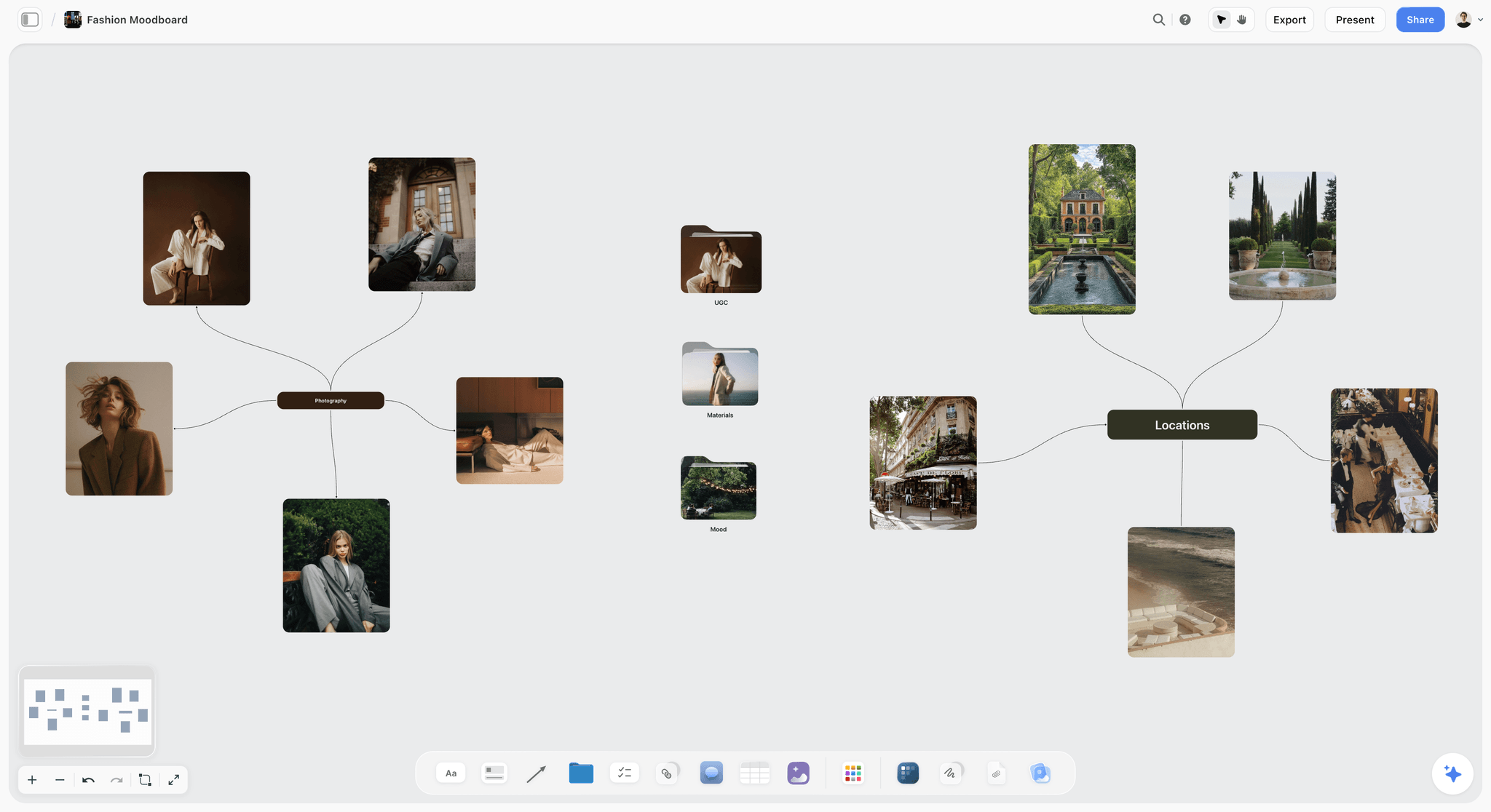
Photography, materials and locations mapped on one board: the raw material each identity route is cut from.
The Storyflow 3-Route Rule
Every studio has shown four routes because one more felt safer. It rarely is: the client spends the meeting eliminating instead of choosing.
The rule
The Storyflow 3-Route Rule is our editorial recommendation for identity presentations: show three routes, each on its own wall of one Storyflow board, each built to the same seven parts in the same order (name, line, logo sketches, type, colour, applied mockups, risk). Same parts, same order, same fidelity: the client compares ideas, not effort.
Why three
Two routes read as a binary: keep the old feel or change it, and the client often picks the safer one to avoid the argument. Three routes give a spectrum, safe, stretch and bold, and the middle option is often where clients land, which is why the stretch route deserves your best work. Four or more routes split the budget, so each is thinner, and tell the client you have not decided which ideas are good.
Why the same seven parts
If one route has five mockups and another has two, the client chooses the richer one. If one route states its risk and the others do not, the client hears that only one route is risky. Same parts in the same order make the walls readable side by side, which is the whole point of putting them on one board.
When to show two, or one
Show two when the strategy has a genuine fork the client must decide first (heritage or reinvention, for example), and say so. Show one only on a refresh the client has already scoped tightly, and present it with the alternatives you rejected and why.
Identity Route vs Moodboard Direction
An identity route is a whole answer the client can choose and build on: mark, type, colour and applications. A moodboard direction is a feeling the client can react to before anything is designed. In Storyflow, a moodboard direction is a wall of references with reasons; an identity route is a wall with the seven parts, and both can sit on the same board at different stages.
| Question | Identity route | Moodboard direction | Where it lives in Storyflow |
|---|---|---|---|
What it shows | A mark, type, colour and applications | References that set a feeling | Route walls; a references wall before them |
Stage | After the strategy and moodboard are agreed | Before any design | Same board, earlier walls to the left |
What the client decides | Which route the brand becomes | Which feeling to pursue | A decision note under the chosen wall |
Fidelity | Rough but whole: sketches, real type, real colour | Found images, no design | Font cards and colour cards on routes; image cards on the moodboard |
Risk | Choosing the wrong system | Choosing a feeling no route can deliver | The risk note at the bottom of each route |
Typical count | Three | Two or three | One wall each |
Output | A refined identity and guidelines | The brief for the routes | A linked guidelines board after the pick |
Why the order matters
Show the moodboard directions first, in a separate meeting if the budget allows. A client who has agreed a feeling judges routes against it; a client who sees routes cold judges them against their own taste. Read creative direction vs moodboard vs style guide for where each document ends.
When the moodboard is enough
For a small business with a tight budget, a moodboard direction plus one route can replace three routes. Say what the client gives up: a real choice. Most clients will pay for it once they hear that.
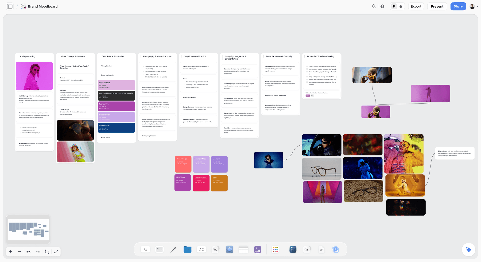
A moodboard direction: references, palette and fonts that set a feeling. Routes come after this board is agreed, not instead of it.
Before the Routes: The Brand Identity Brief
Routes built without a written strategy get judged on taste, because there is nothing else to judge them on. The brand identity brief is that something.
The fields of a brand identity brief
| Field | What it holds | Example for a neighbourhood bakery |
|---|---|---|
Positioning line | What the brand is, for whom, against what | "The neighbourhood's oven, open before the city wakes" |
Personality | Three to five traits, each with its opposite | Warm, not cute; skilled, not precious; early, not rushed |
Audience | Who must recognise it and where | Locals on foot, cafe buyers, delivery app browsers |
Assets to keep | Anything the brand already owns | The shop's green door, the hand-painted window lettering |
Applications | Where the identity must work | Shopfront, bags, boxes, vans, labels, menus, app tile |
Constraints | Budget, print, signage, legal | One-colour bag print; sign rules on a listed street |
Competitors | What the category looks like now | Rustic kraft and script, or minimal black and white |
Success | How the client will judge it | Recognised on a bag across the street; works on a 1-colour stamp |
The personality as sliders
Personality traits written as pairs, "warm, not cute", do more work than adjectives alone, because they name the line a route must not cross. Storyflow's in-app AI builds a brand strategy board when you ask for one, and the brand personality template shows the slider shape.
Assets to keep
Ehrenberg-Bass's work on distinctive brand assets describes them as non-brand-name elements, "such as colours, logos or characters", that signal one brand, and stresses uniqueness above all. An identity that discards an asset the market already links to the brand spends recognition it cannot easily buy back. Name the assets in the brief and decide, per route, whether each is kept, reinterpreted or dropped.
Constraints are design input
A one-colour bag print, a signage rule or a tight print budget is not a limit to apologise for; it is a test every route must pass. Write constraints in the brief so the routes answer them, instead of discovering them at the refinement stage.
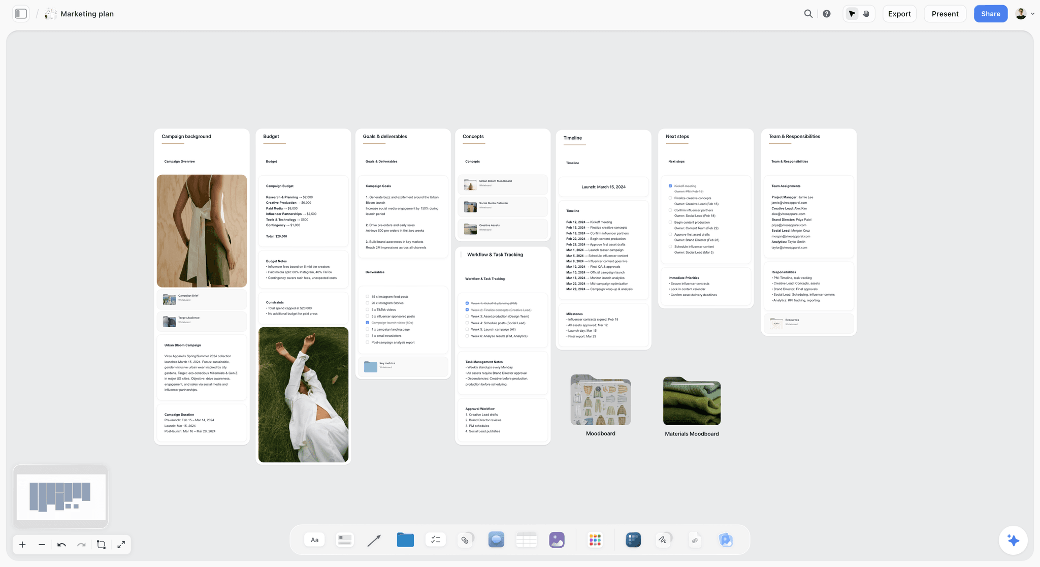
The constraints sit on the budget wall, beside the goals and deliverables: written down where every route can be checked against them.
The Seven Parts of a Route
Same parts, same order, every route. The parts below are the minimum that lets a client picture the brand living in the world.
Part 1: the name
Two or three words that name the idea, not the look: "Dawn Oven", not "Orange One". A name makes feedback precise ("Dawn Oven's warmth with Ledger's type") and keeps the routes from being called left, middle and right.
Part 2: the line
One sentence that says what the route believes about the brand: "We're the light on before anyone else's." The line is how the client remembers the route on the drive home, so write it before you draw.
Part 3: logo sketches
Two or three sketches of the mark, drawn enough to read but not refined: a wordmark, a symbol, or both in a lockup. Wikipedia's logo entry distinguishes logotypes (the name as a design) from ideograms and pictographs (symbols), and notes the two can be combined in a set position and relative size, a lock-up; say which kind each sketch is, because it changes what the brand can do on a stamp, an app tile or a van.
Part 4: type
Two typefaces at most: a display face with personality and a text face that works hard. Show them at size, in the brand's own words, not in a pangram.
Part 5: colour
Four to six colours, each with a role: the brand colour, a support, a neutral, an accent, and a dark for type. Roles matter more than the swatches.
Part 6: applied mockups
Three to five applications drawn from the brief's list: the ones that matter most to this business. A bakery's bag matters more than its letterhead.
Part 7: the risk
One line, in plain words, of what the client is betting by choosing this route: "Risk: a hand-drawn mark can look homemade at small sizes." Clients trust a studio that names risk; they distrust routes that seem to have none.
| Part | Fidelity | Typical count | Where it lives in Storyflow |
|---|---|---|---|
Name | Final words | 1 | Wall title |
Line | Final words | 1 sentence | Note at the top of the wall |
Logo sketches | Rough, readable | 2 or 3 | Image cards |
Type | Real typefaces | 2 | Font cards |
Colour | Real values | 4 to 6 | Colour cards |
Applied mockups | Comp quality | 3 to 5 | Image cards |
Risk | Final words | 1 line | Note at the bottom of the wall |

A logo project laid out as walls: the brief beside the references and sketches, so each mark is read against what it has to do.
Making Three Routes Truly Different
Three routes that differ in colour are one route in three outfits. The client will notice, and choose by colour.
Safe, stretch, bold
Anchor the three routes on how much they change. The safe route extends what the brand owns. The stretch route reinterprets it. The bold route replaces it with something new. Each is a legitimate answer; together they map the territory.
| Axis | Safe route | Stretch route | Bold route |
|---|---|---|---|
Relationship to current assets | Keeps and refines them | Reinterprets them | Replaces them |
Mark type | Wordmark refined from the existing one | New wordmark with a symbol drawn from an asset | New symbol-led system |
Type | A cleaner version of today's feel | A contrasting pairing | One distinctive display face doing most of the work |
Colour | Current palette, tightened | Current colour kept, new support colours | A new lead colour |
Recognition risk | Low | Medium | High |
Distinctiveness gain | Low | Medium | High |
Typical client reaction | "Safe, maybe too safe" | "That's us, but better" | "Brave. Can we afford it?" |
Vary one dimension at a time
Within that spectrum, make each route lead with a different element: one led by type, one by a symbol, one by colour or pattern. When two routes lead with the same element, merge them and find a third.
The squint test
Put the three walls side by side and squint until detail disappears. If two routes blur into the same shape and colour, they are not different enough.
Type for Each Route: Font Cards and Licensing
Type is the part of a route clients judge fastest and understand least. Showing it at size, in the brand's words, fixes most of that.
Font cards on the route wall
A Storyflow font card shows a typeface as a card in one of three layouts, Specimen, Headline or Paragraph, with its own background and text colour, and the type scales with the card. It can show Inter on any plan; Lora, Courier Prime and fonts uploaded to your font library need a paid plan. Put the display face in the Headline layout set in the brand's own line, and the text face in the Paragraph layout set in a real menu or product description.
Keep the board's own font neutral
On paid plans, a board's wall titles and headings can use a chosen project font, and fonts can be uploaded. Set it to something neutral on a routes board: a project font in one route's typeface makes every wall look like that route, and the other two look like guests.
Licensing before presenting
A route is only real if its type can be licensed for every application in the brief: signage, packaging, web, app. Check the licence before the meeting. The SIL Open Font License site says OFL fonts can be used in books, posters, artwork, logos and websites with no acknowledgement required, and freely modified and redistributed, subject to the licence's conditions; commercial fonts vary by licence, and some charge per application or per web view. Write the licence status under each font card.
Pairing rules
Two faces, contrasting in one dimension (serif and sans, or wide and narrow), not three. If the route needs a third face for numbers or labels, it is usually a weight of one of the two.
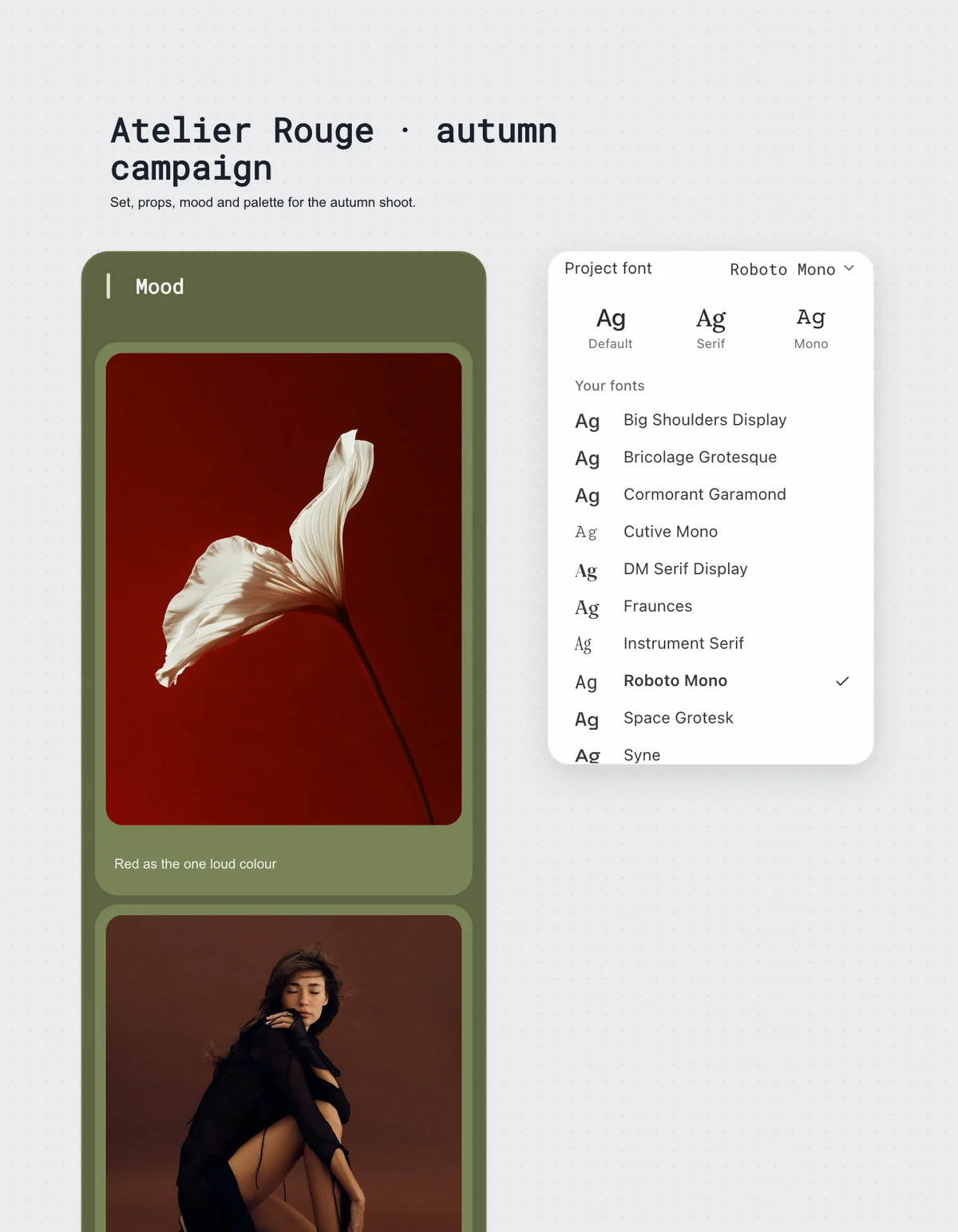
The project font menu: uploaded fonts sit under Your fonts. On a routes board, keep this neutral so no route gets the board's voice.
Colour for Each Route: Colour Cards and Print Values
A palette shown as swatches gets judged as a favourite colour. A palette shown as roles gets judged as a system, which is what the client is buying.
Colour cards with roles
In Storyflow, each colour is a colour card in one of three styles: Classic, Spec (one wall wide, with the values in columns) or Chip (a paint chip). Each shows any of Hex, RGB, HSL and CMYK, edited on the card, with text colour set to Automatic, White, Black or any colour, and the colour's name set in the board's title font. Label the role in the name: "Ember, brand", "Flour, background", "Crust, type".
Print values are a starting point
The CMYK on a Storyflow colour card is converted from the hex and can be typed over. Wikipedia's CMYK colour model entry notes that RGB and CMYK are device-dependent, that no universal formula converts between them, and that each has its own gamut, so some screen colours cannot be printed. For a route, the converted value shows intent; for the final identity, proof the colours on the real bag, box and sign before they go into guidelines.
Contrast for the type colours
Every route needs a text colour that works on its background. The W3C's WCAG 2.2 contrast guidance sets at least 4.5:1 for normal text and 3:1 for large text (18 point, or 14 point bold), and exempts text that is part of a logo. Check the pairs a menu, label or website will actually use.
| Colour role | What it does | Check before presenting | Where it lives in Storyflow |
|---|---|---|---|
Brand colour | The one colour people name | Works in one-colour print | Colour card, Chip style |
Background | Most of the surface area | Type colour on it passes 4.5:1 | Colour card, Spec style |
Type dark | Body text and small labels | Readable at small sizes | Colour card, Classic style |
Support | Secondary surfaces and patterns | Does not compete with the brand colour | Colour card |
Accent | Rare highlights: price, sale, new | Used on under 10% of a layout | Colour card |
Print value | The CMYK the printer will match | Proofed on the real substrate before final | The CMYK value typed over on each card |
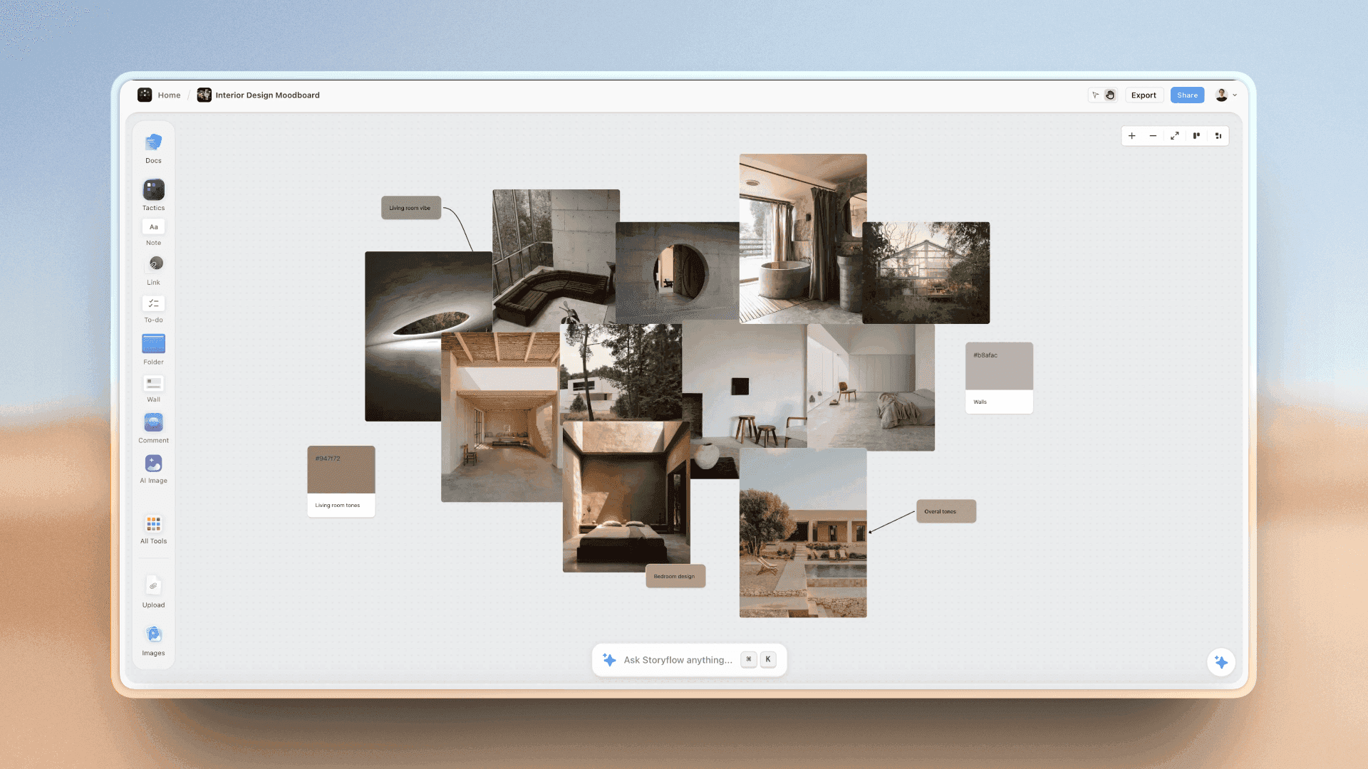
Colour pulled from photography into named swatches: the same move a route makes when its palette comes from the brand's world.
Applied Mockups: Which Ones Earn Their Place
A mark on a white background says little. The same mark on a paper bag in a hand, on a van, on an app tile says whether it works.
Choose mockups from the brief, not the template folder
Three to five applications, chosen from the brief's list by how often customers meet them. Business cards and letterheads are the default mockups and the least telling for most businesses today.
| Business type | Mockups that earn their place | Mockups to skip |
|---|---|---|
Food and drink shop | Bag or box, shopfront, menu, label, delivery app tile | Letterhead |
Consumer product | Pack front, shelf view, e-commerce tile, social post | Business card |
Service firm | Website header, proposal cover, LinkedIn page, email signature | Shopfront |
App or software | App icon at small sizes, onboarding screen, social avatar | Signage |
Hospitality | Sign, menu, uniform, key card or wristband | Packaging |
Creator or studio | Video thumbnail, avatar, end card, merch | Stationery |
The small-size mockup
Include one application where the mark is tiny: an app tile, a social avatar, a stamp on a box. LinkedIn's Page specs, for example, recommend a 400 by 400 pixel logo image, as its image specifications page shows; design for it to be seen much smaller than that beside every post. A route that only works large is half a route.
Same mockups across routes
Use the same three to five applications on every route, in the same order. Different mockups per route make the comparison about the mockups.
Checks Before a Route Leaves the Studio
A route the client loves and cannot use is worse than no route: it sets the bar the next round has to beat. Run these checks before the meeting, not after the pick.
Trademark clearance
Any wordmark or symbol in a route should get at least a basic clearance search before the client falls for it. The USPTO's page on why to search for similar trademarks says applications are often refused because the mark is too similar to a registered one, that you should conduct a clearance search before you apply, and that it is your responsibility to search state databases and the internet too, because the examining attorney only checks federal records. Outside the US, use your own registry. A designer's search is not legal advice; flag a route that needs a lawyer's opinion.
The 16-pixel test
Shrink every mark to 16 pixels high, about the size of a browser tab icon. A mark that turns to mush has a small-size problem the route has to answer, usually with a simplified version.
The one-colour test
Show every mark in one colour, black on white and white on black. Hand-drawn texture, gradients and thin lines fail here first, and a bakery bag printed in one colour will show it.
The distinctiveness check
Put the route's mark beside three marks from the category. If it would fit in among them, it is not doing the brand's job, however good it looks alone.
| Check | How | Fails when | Fix before presenting |
|---|---|---|---|
Trademark clearance | Federal and state databases, the web, the category | A similar mark in the same class | Redraw, or flag for legal review |
16-pixel test | Shrink the mark to 16 px high | Detail turns to mush | Draw a simplified small version |
One-colour test | Black on white, white on black | Gradients or texture carry the idea | Find the idea in the shape alone |
Contrast | Measure text colour on background | Below 4.5:1 for normal text | Darken the type or lighten the ground |
Distinctiveness | Beside three category marks | It blends in | Push the route further, or merge it |
Licensing | Read each font's licence | A face cannot cover signage or app use | Swap the face before the meeting |
The Route Wall Template: Filled for One Bakery
A template you can copy, filled for a fictional freelance designer, Noor Haddad, presenting to a fictional four-shop bakery, Ferrow Bakehouse. Same parts, same order, three routes.
| Part | Dawn Oven (safe) | Crumb (stretch) | Ledger (bold) |
|---|---|---|---|
Line | "The light on before anyone else's." | "Every loaf has its own fingerprint." | "Baked by the book since the first loaf." |
Logo sketches | Refined version of the hand-painted window lettering | Wordmark with a symbol drawn from a crumb cross-section | Serif wordmark with a numbered batch stamp |
Mark type | Logotype | Combination mark | Logotype plus stamp |
Display type | A warm humanist serif | A rounded geometric sans | A sharp high-contrast serif |
Text type | A plain sans | The same sans, lighter weight | A typewriter-style mono for labels |
Colour | Ember orange, flour white, oven black, the green door kept | Rye brown, flour white, crumb pattern in two tones | Ink navy, ledger cream, stamp red |
Applied mockups | Bag, shopfront, box, menu, app tile | Bag, shopfront, box, menu, app tile | Bag, shopfront, box, menu, app tile |
Asset kept | Window lettering and green door | Green door only | None |
Small-size version | Monogram F from the lettering | The crumb symbol alone | The batch stamp alone |
One-colour result | Passes | Passes; pattern drops out | Passes |
Clearance search | No conflict found in a basic search | Symbol similar to a cafe chain's; flag for legal | No conflict found in a basic search |
Risk | "Too close to what you have; customers may not notice the change" | "The pattern costs more to print and needs discipline to use" | "Leaves the lettering people know; recognition has to be rebuilt" |
Where it lives in Storyflow | Wall 2 | Wall 3 | Wall 4 |
How to use the template
Fill the rows across, not down: write all three lines, then all three sets of sketches, then all three palettes. Filling across keeps the fidelity even and shows you early when two routes are converging.
Save the wall as a tool
Once a route wall works, select its cards and press New Tool at the end of the selection toolbar, give it an icon, a name and an optional description, and it appears in All Tools under My tools. Saving a tool is on paid plans; an invited free account cannot save or place one. Save the wall with its seven labelled parts and nothing filled in, and the next identity job places it three times, once per route.
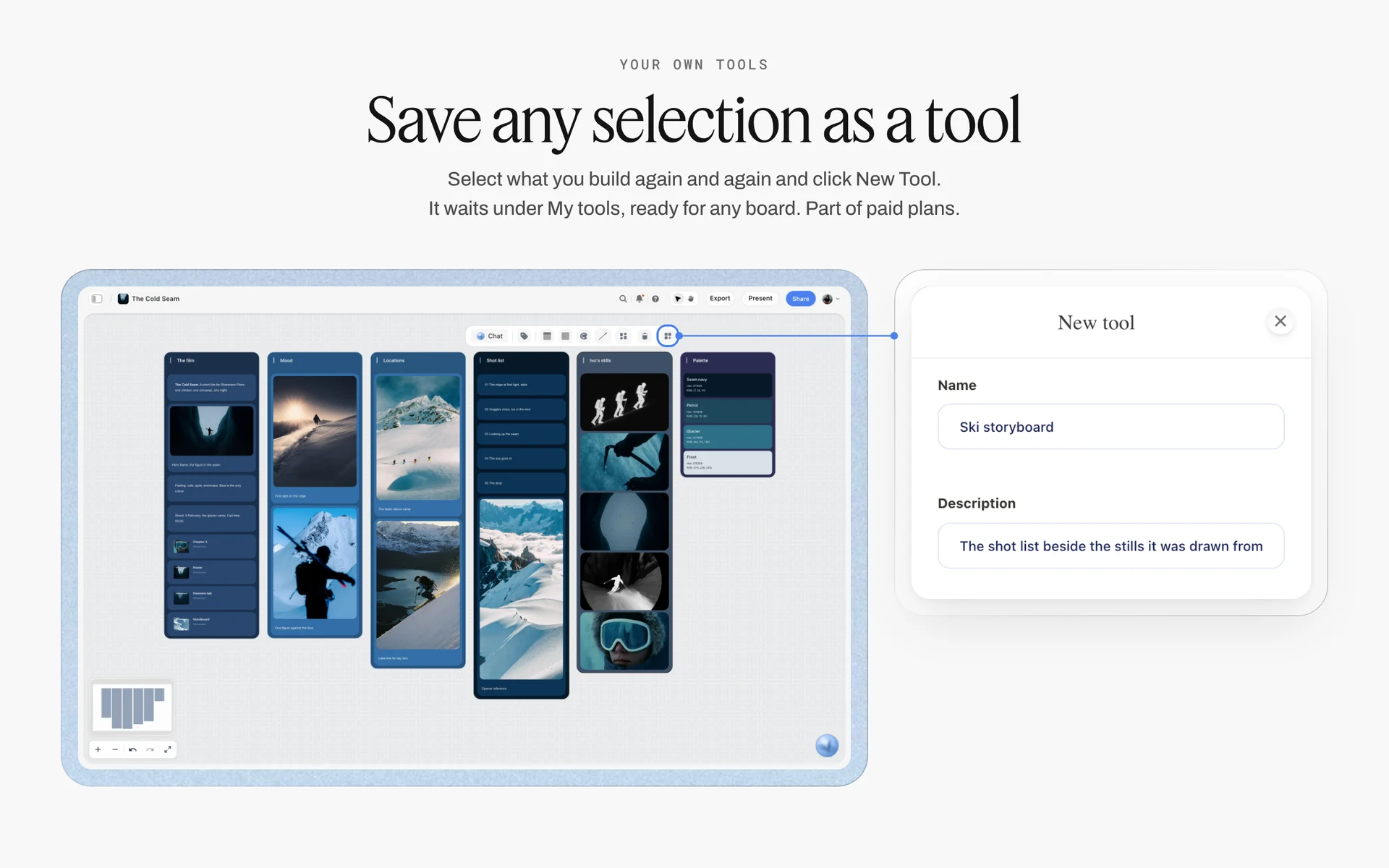
Any selection can become a tool: a route wall saved once starts every later identity job with the same seven parts.
The Brand Identity Presentation: Order, Script and Timing
The presentation is where a good route loses to a better-presented one. Order and timing protect the routes from the room.
The order
| Segment | What you show | Minutes in a 60-minute meeting | Purpose |
|---|---|---|---|
Strategy recap | The brief wall: positioning, personality, assets, constraints | 8 | Sets the judging criteria |
How to read a route | The seven parts, once | 2 | Teaches the client what they are looking at |
Route 1: safe | Its wall, top to bottom | 8 | Sets a credible floor |
Route 2: stretch | Its wall | 10 | Your strongest work, shown second |
Route 3: bold | Its wall | 8 | Shows the edge of the territory |
Side by side | All three walls at once | 10 | Comparison and questions |
Decision or next step | A decision note, or a date for one | 14 | Leaves with a pick or a plan |
The script per route
Say the name and the line, then walk the parts in order, then say the risk yourself. A route presented with its risk sounds considered; a route whose risk the client finds sounds hidden.
Present from the board
Storyflow's presentation mode goes fullscreen and steps one wall, note, image or document at a time, so the strategy and each route are a wall each, and the side-by-side view is the board zoomed out. For the wider craft of the meeting, read how to present design concepts to clients and the design presentation checklist.
Questions that get a decision
Ask "which route sounds most like the positioning line?" and "which risk are you most willing to take?" before you ask which they like. Questions anchored in the brief turn a taste conversation into a decision.
Recording the Pick
A pick that lives in someone's memory gets re-argued in week three. Write it down where the work is.
The decision note
Under the chosen wall, a note with four lines: the route chosen, who chose it, the date, and the reason in the client's words. Add what was explicitly not chosen and why; that line stops the rejected route creeping back in.
Selects for sketches
When the client has to choose between several sketches inside a route, Storyflow's Selects tool helps: four walls, To review, Yes, Maybe and No, and you choose by dragging pictures between them. There is no star, flag or vote, and the client needs edit access to move cards; a view-only or comment link cannot.
The approval as a to-do
Make the approval a to-do with the client lead as assignee and a due date; ticking it is the sign-off. A client invited with edit access ticks it themselves; on a view-only link they sign in, comment their approval, and you tick it. The board's change report, available in Storyflow and through ChatGPT or Claude, shows who changed what in the last day or week, which settles most "who agreed to this?" questions.
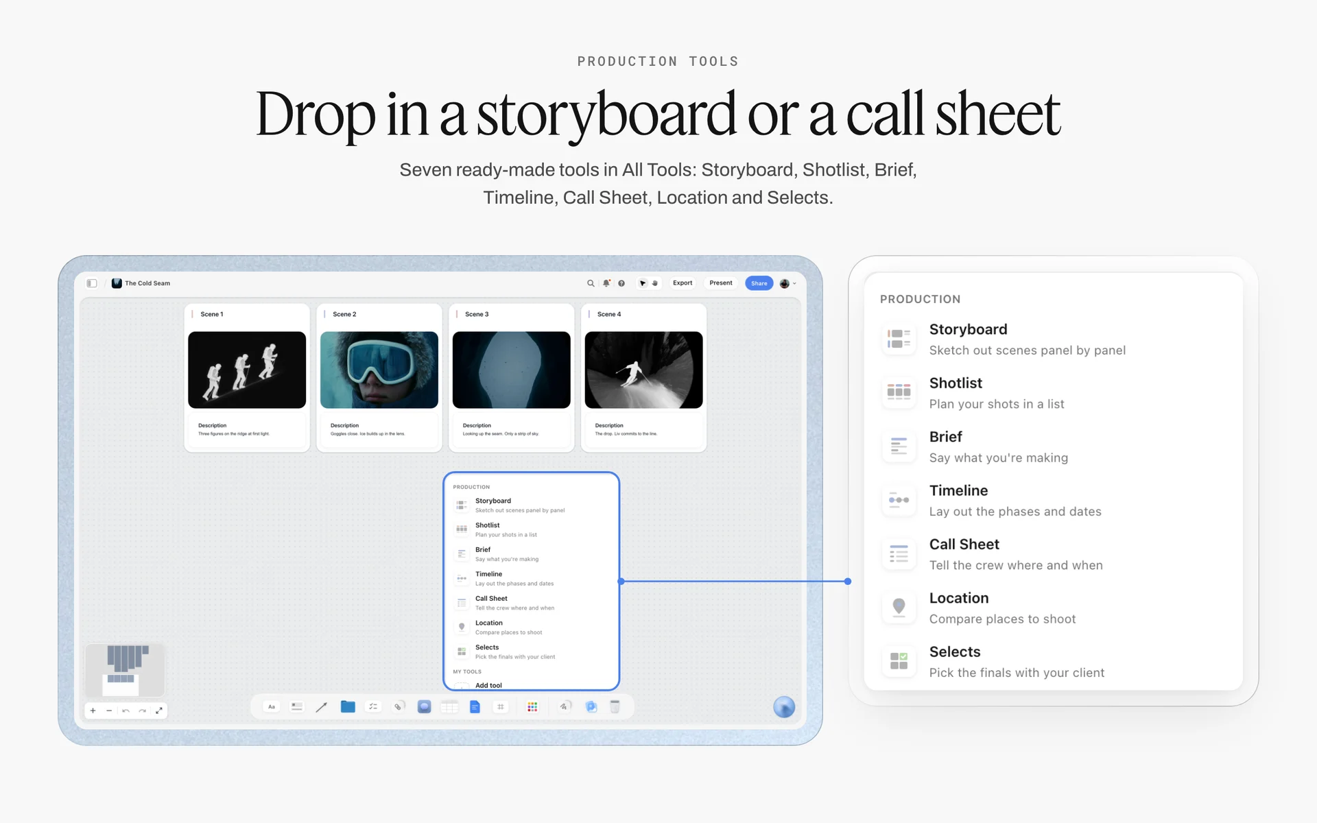
The Selects tool lives in All Tools under Production: four walls for sorting sketches or mockups with the client.
Merging Feedback Without a Frankenstein Route
The most dangerous sentence in an identity meeting is "can we have the mark from one and the colours from the other?" Sometimes the answer is yes. Usually it is a new route that needs testing.
| Feedback | What it usually means | What to do |
|---|---|---|
"The mark from A, the colours from C" | They like A's idea and C's warmth | Build it as a new comp on its own wall and run every check |
"It feels too cold" | A personality slider is off | Return to the brief's sliders; adjust one, not three |
"My partner hates orange" | Taste, not strategy | Ask which personality trait orange fails; keep it if none |
"Can it be more modern?" | The route looks like the category's past | Show the distinctiveness check beside current category marks |
"Make the logo bigger" | Hierarchy on one mockup is wrong | Fix that mockup's layout, not the mark |
"Can we see more options?" | No route answers the brief, or the brief was unclear | Re-read the brief together before drawing anything |
Test the merge, do not agree to it
A merged route is untested: its mark has not passed the one-colour test in the new palette, and its type was paired for a different idea. Build it on its own wall with all seven parts and all six checks, then present it next to the route it came from.
When to say no
If a merge breaks the strategy, say so with the brief on screen. "This combination is warm but not skilled, and skilled was the trait you ranked first" is a professional no.
From Picked Route to a Consistent Brand Identity System
The pick is the start of the identity, not the end. Consistency comes from what you build next.
Round two: refine one route
Draw the mark properly, in every version: full lockup, symbol alone, small-size version, one-colour. Lock the type system with weights and sizes. Finalise the palette with print values proofed on the real substrates. Extend the applications to the full list in the brief.
The guidelines
Guidelines make the identity consistent without you in the room: the rules for space around the mark, minimum sizes, colour use, type hierarchy, photography style and what never to do. The how to build a brand style guide post covers the sections; the style guide maker page shows the board shape.
Protecting the identity online
Safeguarding the identity is its own job: once it is live, register what can be registered, keep the master files in one shared library and watch for lookalikes. The shared asset library guide covers where the masters live; registration is a lawyer's job.
Worked Example: Noor Haddad Presents Three Routes to Ferrow Bakehouse
This example is illustrative: a fictional designer, a fictional bakery and a plausible three weeks. It shows the order of decisions, not a measured result.
Week 1: the brief and the moodboard
Ferrow Bakehouse runs three shops and is opening a fourth plus a wholesale line for cafes. Its owners, Sam and Lea Ferrow, hire Noor Haddad, a freelance identity designer. Noor writes the brand identity brief on the first wall of a Storyflow board: the positioning line "The neighbourhood's oven, open before the city wakes", three personality pairs, the assets to keep (the green door and the hand-painted window lettering), the applications and the constraints, including a one-colour bag print. The owners approve the brief and two moodboard directions in a short call; they pick "early and skilled" over "rustic and homely".
Week 2: three routes, same seven parts
Noor builds Dawn Oven, Crumb and Ledger as three walls side by side, each with a name, a line, three sketches, two font cards, five colour cards and the same five mockups: bag, shopfront, box, menu, app tile. She fills them across, all three lines first, then all the sketches. Crumb's symbol fails the 16-pixel test at first; she draws a simplified version for small sizes. Ledger's stamp red fails contrast as a text colour on cream, so she makes navy the text colour and keeps red for the stamp alone.
Week 2: the checks
A basic clearance search turns up a cafe chain's symbol close to Crumb's in the same class. Noor flags it on the wall's risk note and tells the owners before the meeting that Crumb would need a lawyer's opinion. She does not drop the route; she lets them weigh it.
Week 3: the presentation
Noor presents from the board in presentation mode: brief, how to read a route, Dawn Oven, Crumb, Ledger, then all three walls side by side. Sam likes Ledger's boldness; Lea worries about losing the window lettering everyone knows. Noor asks which risk they are most willing to take. They choose Dawn Oven's lettering-led mark with Ledger's batch stamp for the wholesale boxes.
Week 3: testing the merge
Noor does not agree in the room. She builds "Dawn Oven with stamp" as a fourth wall with all seven parts and runs every check. It passes, and the stamp gives wholesale a separate, practical mark. The owners, invited to the board with edit access, tick their approval to-do and the decision note records why: "keeps the lettering people know; the stamp makes wholesale feel like a trade product."
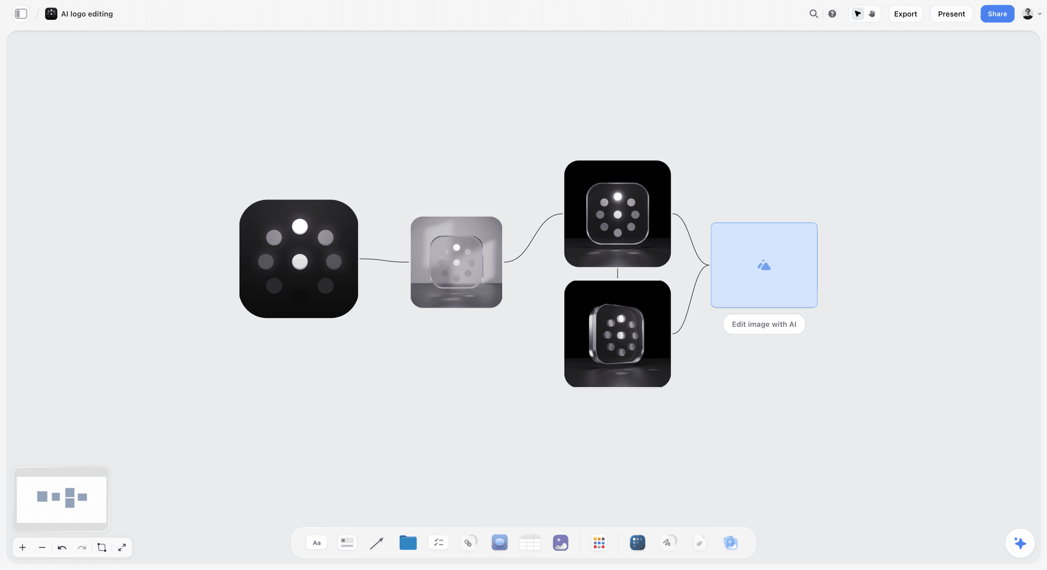
A mark explored in versions connected on one board: the refinement round keeps every step beside the one before it.
Presenting Identity Routes Remotely and Asynchronously
Many identity presentations now happen on a call, and the decision happens later, in a conversation you are not in. The board has to present itself.
Share a view-only link after the call
A Storyflow view-only link opens with no account, so the owners can show the routes to a business partner or an investor without signing anyone up. To comment or draw on the board, the visitor signs in. Anyone a paid member invites to the board joins free, without the in-app AI.
Make the board readable without you
Every route wall has to work without your voice over it: the line, the parts in order and the risk in writing. If a route needs you to explain it, the explanation belongs on the wall as a note.
Collect feedback on the board, not in email
Ask the client to comment on the board itself, beside the part they are talking about, or to draw with the freehand pen once signed in. Feedback beside the colour card is feedback about the colour; feedback in an email is feedback about whatever the reader remembers.
Watch what changed
Ask Storyflow, or ChatGPT or Claude through the connector, what changed on the board in the last day or week and who changed it. It tells you which walls changed, and who changed them, before the follow-up call.
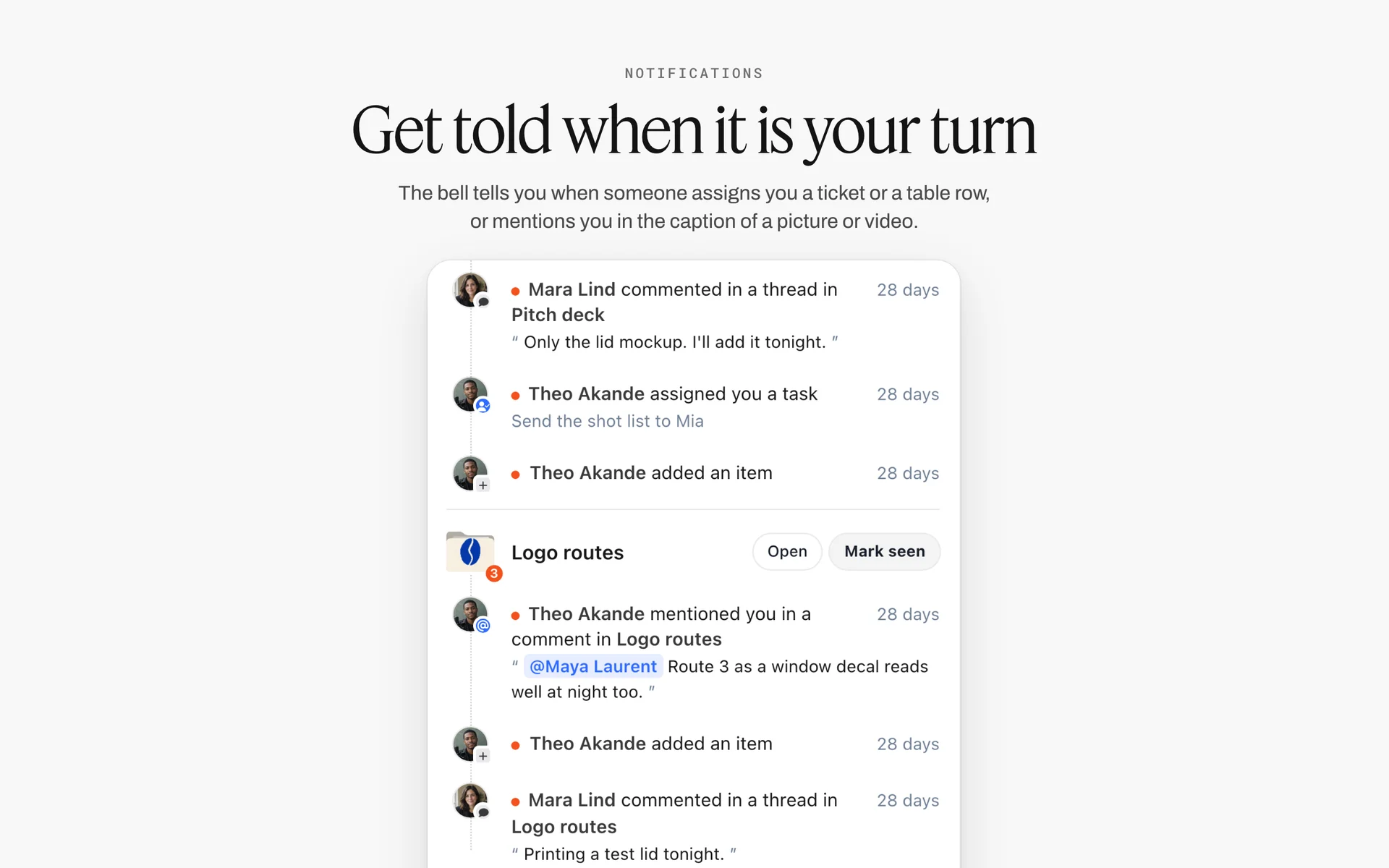
Comments and mentions on a routes board, grouped in one list: what was said about which route since you last looked.
Do This in ChatGPT or Claude
If you work through strategy and route rationales in ChatGPT or Claude, move the result onto the board where the client will see it. The Storyflow plugin and connector build the walls, notes, font cards and colour cards there.
Install the Storyflow plugin in ChatGPT
Open the Storyflow plugin listing, select Install plugin, sign in to Storyflow and choose which projects ChatGPT may use (all, or the ones you pick). Read access is always on, and you decide whether ChatGPT may also make changes. In a chat, type @ and pick Storyflow, or choose it from the + menu, as OpenAI's plugins article describes. Availability depends on your ChatGPT plan, workspace and region, and OpenAI's app permissions article covers what each permission allows.
Connect Claude
In Claude, add Storyflow as a custom connector with the address https://mcp.storyflow.so/mcp, following Anthropic's custom connector guide; the setup page covers Claude, Gemini and Grok. The Claude brand board workflow and the Claude client presentation workflow show the same board built from Claude.
Prompts for identity routes
- "On my Ferrow identity board, make a Brief wall with notes for the positioning line, three personality pairs written as warm, not cute, the assets to keep, the applications and the constraints."
- "Make three walls named Dawn Oven, Crumb and Ledger, each with notes in this order: Line, Logo sketches, Type, Colour, Applied mockups, Risk."
- "On each route wall, add five colour cards in the Chip style with these names and hex values, showing Hex, RGB and CMYK."
- "Add a font card on each route: Lora in the Headline layout on Dawn Oven, Inter in the Paragraph layout on Crumb, Courier Prime in the Specimen layout on Ledger."
- "Build a comparison table under the three walls with rows Line, Mark type, Display type, Colour, Asset kept, Small-size version, Risk, and one column per route."
- "Read the board and tell me where any route is missing one of the seven parts, or has more mockups than the others."
- "Add a comment card on the Crumb wall: clearance search found a similar cafe symbol; needs a lawyer's opinion."
- "What changed on this board in the last week, and who changed it?"
What lands on the board, and what to check by hand
The walls, notes, tables, colour cards and font cards land on the board, where you edit them like anything else, and the connector can add a comment card in your name. It can make font cards only in Inter, Lora or Courier Prime, never in a font you uploaded, so set the real typefaces yourself. It can add images and give you an upload link for your sketches and mockups; a picture you attach in the ChatGPT chat does not reach Storyflow. It cannot generate images or read board comments, and it cannot drop the Selects tool. Check by hand: every hex against your design file, every contrast pair, every licence and every clearance search. The plugin runs on ChatGPT's model and your ChatGPT plan, so it uses no Storyflow AI credits, and the connection ends after 30 days, when ChatGPT asks you to sign in again.
The plugin is not the in-app AI
Inside Storyflow, the in-app AI is a separate tool that uses Storyflow AI credits on paid plans. It builds a brand moodboard or a brand strategy board when you ask, reads the pixels of up to 24 images you select, and designs deliverables from the board, such as a one-pager or a pitch deck that exports as PDF. See the ChatGPT brand board workflow and the ChatGPT colour palette workflow.
One Storyflow board from either assistant: ChatGPT through the plugin, Claude through the connector.
Where to Build It: Storyflow vs Slide Decks, Design Files, PDFs and Whiteboard Apps
An identity presentation needs four things in one view: the strategy, three routes built to the same parts, exact type and colour, and a record of the pick. Our pick comes first, on the basis that Storyflow holds all four on one board the client opens by link; the rest follow by the job each does best.
| Kind of tool | Routes side by side | Exact type and colour | Feedback beside the work | Record of the pick | Best job in this workflow |
|---|---|---|---|---|---|
Storyflow | Yes, one wall per route | Font cards; colour cards with Hex, RGB, HSL, CMYK | Comments and freehand drawing once signed in | Decision note and ticked to-do on the board | Building, presenting and deciding between routes |
A design file | On artboards | Exact, with styles | Comments on frames | Weak | Drawing the marks, mockups and the final identity |
A slide deck | One per slide | As images | After the meeting, by email | No | A scripted reveal in a fixed order |
A PDF | One per page | As images | Annotations, if the reader adds them | No | A leave-behind for people outside the project |
A whiteboard app | Yes | Swatches, no values | Sticky notes | Weak | A strategy workshop before the routes |
A brand guidelines platform | No, one identity | Yes, governed | Limited | Yes, once final | Publishing the finished identity to a large organisation |
A design file
A design file is where identity work is actually drawn: marks, lockups, type systems and every mockup at exact sizes. Its limit is presentation: the strategy, the rationale and the client's feedback have nowhere natural to sit beside the artboards. Draw in a design file; place the exported sketches and mockups on the Storyflow board.
A slide deck
A slide deck is built for a scripted reveal, and some clients expect one. Its limit is that slides show one route at a time, so the side-by-side comparison that decides most picks has to be built by hand, and the deck closes after the meeting. Present the board in Storyflow's presentation mode, or build a deck from the signed board if a stakeholder needs one.
A PDF
A PDF is the right leave-behind for a board member or investor who will read it once. Its limit is that it is static: feedback comes back as annotations or emails. Storyflow boards export as PDF, so the leave-behind can come from the same board.
A whiteboard app
A whiteboard app is good for the strategy workshop: sticky notes, voting, timers. Its limit for routes is exactness: real font cards, colour values and full-resolution mockups are not what it is built for. Run the workshop there if that is your habit, then build the routes on the identity board.
A brand guidelines platform
A brand guidelines platform is built for the end of the job: publishing a finished identity, with downloads and usage rules, to an organisation with many teams. It is not a tool for comparing routes. Choose one when the identity will be used by dozens of people you will never brief.
For ranked roundups by job, see the best tools for brand designers and the best tools to plan a rebrand.
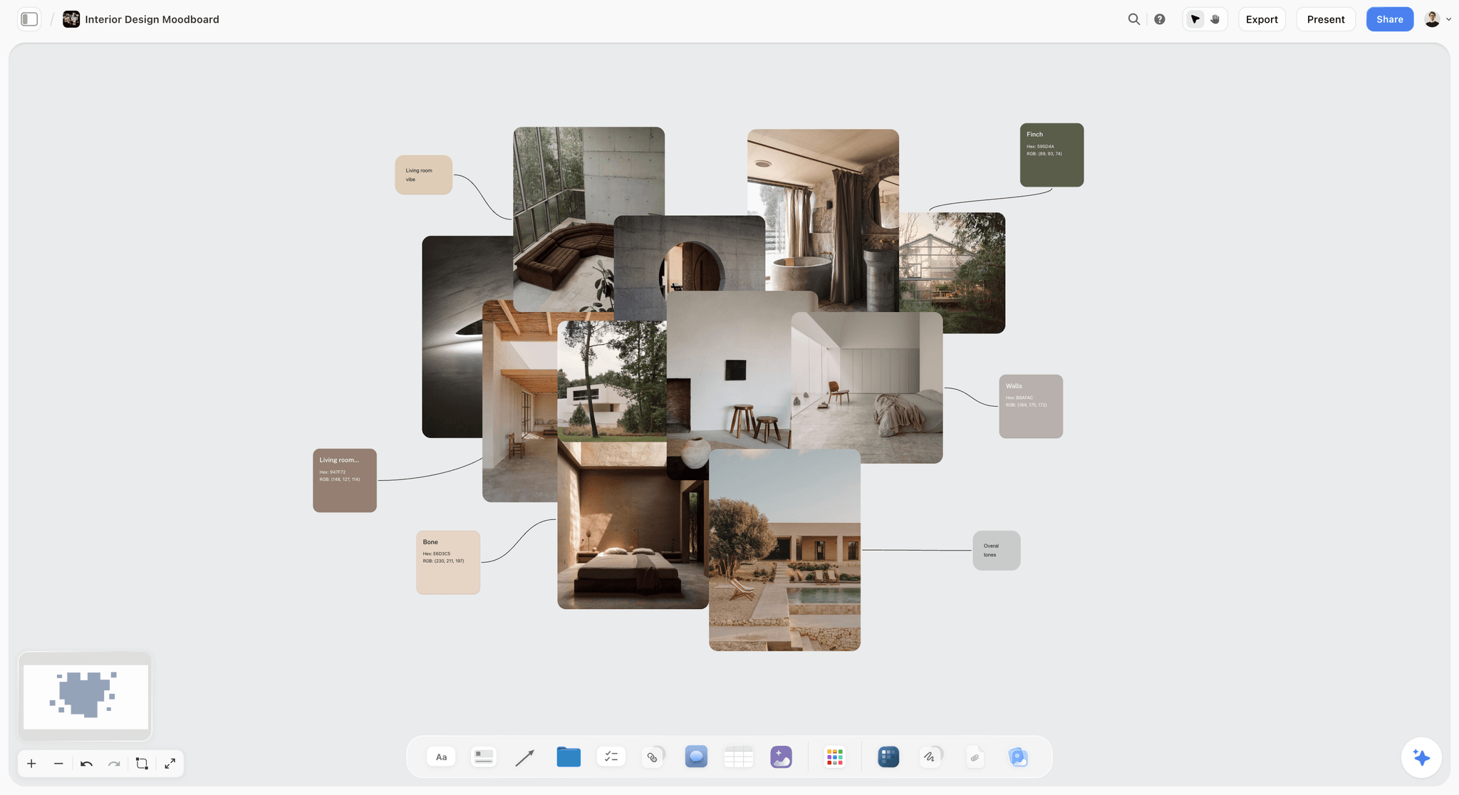
An earthy interior moodboard on a Storyflow board with concrete, linen, olive trees and a pool beside named colour swatches
Set up the three route walls from a chat
Install Storyflow in ChatGPT and ask for a brief wall, three route walls with the seven parts, colour cards and a comparison table on your identity board, then place your own sketches and run every check before the client sees them.

Mistakes and Fixes in Identity Exploration
Each of these turns a three-route presentation into a second round. Each fix costs an hour before the meeting.
Three logos, not three routes
Three marks on white tell the client nothing about type, colour or how the brand behaves. Fix: every route gets all seven parts, including applied mockups.
Routes that differ only in colour
The client picks a colour and calls it a strategy. Fix: anchor the routes on safe, stretch and bold, each led by a different element.
Uneven fidelity
One route has five polished mockups, another has two sketches. Fix: fill the parts across all three routes, not down one route at a time.
The risk left unsaid
The client discovers the risk after launch, usually as a complaint. Fix: one line of risk at the bottom of every wall, said aloud in the presentation.
No clearance search
The client falls for a mark that is close to a registered one. Fix: a basic clearance search before the meeting and a flag for legal review where needed.
Strategy skipped in the meeting
The routes are judged on taste because nobody re-read the brief. Fix: open with the brief wall and ask brief-anchored questions before asking for preferences.
A Frankenstein merge agreed in the room
The mark from one route and the colour of another fail the one-colour test together. Fix: build every merge as a new wall with all seven parts and all checks.
The board's font favours a route
A project font in one route's typeface makes the whole board read like that route. Fix: keep the board's own font neutral and let font cards carry each route's type.
Storyflow's Honest Limits for This Job
Storyflow holds the strategy, three routes with their type and colour, the presentation and the pick on one board. These are the parts of identity work it does not do:
- No drawing of marks or mockups at exact sizes: draw in a design app and place the exports on the board as images.
- No vector or SVG export: boards export as PNG, JPEG or PDF, and an identity's master files come from your design app.
- Colour cards convert CMYK from the hex: a starting point to type over, not a proofed print value.
- Font cards can show uploaded fonts on paid plans, but the ChatGPT plugin and Claude connector can only make font cards in Inter, Lora or Courier Prime.
- No proofing mark-up or version compare: comments and freehand drawing, but no frame-level approval status.
- No trademark searching: run clearance searches in the registries yourself.
- No AI image generation through the ChatGPT plugin; in Storyflow it is on Pro and Max.
- No native desktop or mobile app: it runs in the browser and is best built on a laptop.
- Paid-only during early access: Plus is $7.99 a month billed annually ($9.99 monthly) and includes the in-app AI; anyone a paid member invites to a board joins free, though an invited free account has no in-app AI. Plans are on the pricing page.
The Bottom Line
A client cannot choose between routes they cannot compare. Write the strategy first, build three routes that differ in kind, give each the same seven parts in the same order, check them before they leave the studio, and record the pick with its reason. Do it on one Storyflow board so the strategy, the routes and the decision stay together through refinement. If you work in ChatGPT, start with the ChatGPT brand board workflow and set up the three route walls for your next identity job.
FAQ: Presenting Visual Identity Routes
How do I present visual identity routes to a client?
Re-present the strategy first, then show three routes that differ in kind, each built to the same seven parts in the same order: a name, a one-line idea, logo sketches, type, colour, applied mockups and its risk. Show them one at a time, then side by side, and record the pick with who chose and why. In Storyflow, each route is a wall on one board presented fullscreen.
What is the best tool to present brand identity routes?
Storyflow is our pick for building and presenting routes, because the strategy, three route walls with font and colour cards, the client's feedback and the recorded pick sit on one board the client opens by link. A design file is where the marks and mockups are drawn, a slide deck fits a scripted reveal, a PDF fits a leave-behind, and a brand guidelines platform fits publishing the finished identity.
How many identity routes should I show a client?
Three. Two routes read as a yes or no and push the client to the safer one; four or more thins the budget per route and suggests you have not decided. Three routes, safe, stretch and bold, give a real spectrum, and the stretch route, shown second, is often where clients land. Show two only when the strategy has a genuine fork to settle first.
What is a visual identity route?
A visual identity route is one complete, rough answer to the brand strategy: a named idea shown through logo sketches, type, colour and a few applied mockups, with its risk stated. It is a direction for the whole identity system, not a logo option. After the client picks one, the route is refined into the final identity and its guidelines.
What should a brand identity presentation include?
It should include the strategy recap (positioning, personality, assets to keep, constraints), a short guide to reading a route, three routes each with a name, line, logo sketches, type, colour, applied mockups and risk, a side-by-side view of all three, and a decision or a date for one. The checks behind each route, such as clearance and small-size tests, should be ready if asked.
What is the difference between an identity route and a moodboard direction?
A moodboard direction is a set of references that sets a feeling before anything is designed; an identity route is a designed answer, with a mark, type, colour and applications the client could build on. Moodboard directions come first and decide the feeling; routes come after and decide the system. In Storyflow, both can sit on one board as separate walls.
What is the Storyflow 3-Route Rule?
The Storyflow 3-Route Rule is our editorial rule for identity presentations: show three routes, each on its own wall of one Storyflow board, each built to the same seven parts in the same order, name, line, logo sketches, type, colour, applied mockups and risk. Same parts and fidelity mean the client compares ideas, not effort. It is a recommendation, not research.
How do you make identity routes different enough?
Anchor them on how much they change: a safe route that keeps and refines what the brand owns, a stretch route that reinterprets it and a bold route that replaces it. Then let each lead with a different element: type, a symbol, or colour and pattern. Squint at the three side by side; if two blur into the same shape, merge them and find a third.
How do you handle feedback that mixes two routes?
Treat it as a new route, not an agreement. Build the merge on its own wall with all seven parts, run the one-colour, small-size, contrast and clearance checks again, and present it next to the route it came from. Many merges work; the ones that fail usually fail the one-colour test or the personality the brief ranked first.
Should you do a trademark search before presenting a logo?
Yes, at least a basic clearance search on every wordmark and symbol before the client falls for one. The USPTO advises a clearance search before applying and notes its examiners only check federal records, so state databases and the internet need checking too. A designer's search is not legal advice: flag any close match for a lawyer's opinion on the route's risk note.
What tools help create a consistent brand identity?
Consistency comes from guidelines and master files more than from any single tool. A design file holds the masters, a style guide sets the rules for space, size, colour and type, a shared asset library keeps the current files in one place, and a guidelines platform publishes them to large teams. Storyflow keeps the decisions and their reasons on the board the identity came from.
Can ChatGPT build identity routes on a Storyflow board?
Yes. With the Storyflow plugin, ChatGPT builds the brief wall, three route walls with the seven parts, colour cards with Hex, RGB and CMYK values, font cards in Inter, Lora or Courier Prime and a comparison table on your board. It cannot draw marks, generate images, use your uploaded fonts or read comments. Claude does the same through the Storyflow connector.
Is Storyflow free?
Not yet. Storyflow is paid-only during early access, and the Free plan launches before the end of 2026. Anyone invited to a board by a paid member can sign up free. Plus is $7.99 a month billed annually ($9.99 monthly) and includes the in-app AI; an invited client can view, comment on and edit the routes board but has no in-app AI on a free account.
How long does a visual identity exploration take?
For a small business, plan about three weeks from signed brief to a picked route: a week for the brief and moodboard directions, a week to build and check three routes, and a week to present, test any merge and record the pick. Refinement and guidelines follow. Larger organisations add stakeholder rounds, research and legal review, which can double it.
Table of Contents
- Key Takeaways
- What a Visual Identity Route Is
- How to Present Visual Identity Routes to a Client: 9 Steps
- The Storyflow 3-Route Rule
- Identity Route vs Moodboard Direction
- Before the Routes: The Brand Identity Brief
- The Seven Parts of a Route
- Making Three Routes Truly Different
- Type for Each Route: Font Cards and Licensing
- Colour for Each Route: Colour Cards and Print Values
- Applied Mockups: Which Ones Earn Their Place
- Checks Before a Route Leaves the Studio
- The Route Wall Template: Filled for One Bakery
- The Brand Identity Presentation: Order, Script and Timing
- Recording the Pick
- Merging Feedback Without a Frankenstein Route
- From Picked Route to a Consistent Brand Identity System
- Worked Example: Noor Haddad Presents Three Routes to Ferrow Bakehouse
- Presenting Identity Routes Remotely and Asynchronously
- Do This in ChatGPT or Claude
- Where to Build It: Storyflow vs Slide Decks, Design Files, PDFs and Whiteboard Apps
- A design file
- A slide deck
- A PDF
- A whiteboard app
- A brand guidelines platform
- Mistakes and Fixes in Identity Exploration
- Storyflow's Honest Limits for This Job
- The Bottom Line
- FAQ: Presenting Visual Identity Routes
- Related Reading
Templates to check out for this topic


Templates you can use in Storyflow
Every Storyflow board starts from real structure and an AI that reads the whole canvas. Open one of these templates and make it yours.


See Storyflow in Action
A visual AI workspace where every feature lives inside one canvas. No tab-switching, no context lost.
Build your entire board from a single message
Type what you need in the AI chat at the bottom of your canvas. The AI adds cards, headings, and structure directly onto your board.
Use expert frameworks as AI context
Type @ in the AI chat and choose any Tactic. The AI tailors every response to that framework instead of giving generic advice.
Turn your board into a mind map in seconds
Ask the AI to restructure your canvas as a mindmap. It connects your ideas into a visual hierarchy so you can see how everything relates.
Why Storyflow Exists
Storyflow actually began as a personal tool while working on creative and research projects.
We kept running into the same problem: ideas were scattered everywhere: notes, documents, and whiteboards.
Nothing helped us see how everything connected.
So we started building a workspace designed around how ideas actually grow.
→ Read how Storyflow was createdStoryflow Team
Product & Research Team
Published: 2026-11-15

