The Design Presentation Checklist (2026): Before, During, and the Room You Are Not In
A design presentation has three moments and most designers prepare for one. The forward, where a stakeholder who was in none of the conversations reads it for ninety seconds with nobody narrating, is the room that decides.

Category
Design
Author

Justkay
Documentary Filmmaker & Founder at Storyflow
Topics
2026-09-02
•
15 min read
•
Design- design presentation checklist
- presenting design concepts to clients
- design client feedback
- design presentation structure
- how to present design work
How should I structure a design concept presentation?
A design presentation has three moments and most designers prepare for one of them. The meeting you attend, where you narrate and handle objections live, needs the least help. The forward, where your client sends the deck to a stakeholder who was in none of the conversations and reads it for ninety seconds with nobody explaining, is where most work gets misjudged. And the recall six weeks later, where the delivered work does not match what somebody remembers approving, is where the argument happens. The checklist below is split accordingly, and the single highest-leverage item on it is not in the deck at all: state the decision you want before you present, because the feedback you get is determined by what people think they are being asked. Show a finished-looking comp at concept stage without saying so and you get comments on kerning. Figma Slides is the strongest tool because designs embed live, Pitch is the better pure presentation product, and the recall problem is solved by a recorded approval rather than by any deck.
Full disclosure: Storyflow is our product and is listed first: our pick first, then the rest by job. The article states that it has no slide mode, no presenter view, no transitions, no viewer analytics and no approval state, that presenting from it would be worse than any alternative listed, and that the deck should be built in Figma Slides or Pitch.
How the design presentation tools compare on trust, innovation, ratings and pricing
Which design presentation tools are the most trusted?
Figma Slides among design teams, because designs embed live so the deck cannot be out of date with the work. Pitch for presentation craft and for viewer analytics that show where a forwarded deck lost attention. A PDF remains genuinely trusted for the forward, because it opens on every device without a login, which is why it outlives better tools.
Which design presentation tools have fair and transparent pricing?
Figma Slides at $3 per editor is the clearest value, and it is already inside a plan most design teams pay for. Keynote is free on Apple hardware and a PDF costs nothing. Pitch at around $22 per editor is the most expensive here by a wide margin. Storyflow is flat per account and paid-only during early access from $7.99 per month billed annually.
Which design presentation tools are the most innovative?
Figma Slides for live design embeds, which structurally removes the problem of a deck going stale, and for polls that end a meeting with a recorded decision rather than a vague consensus. Pitch for viewer drop-off analytics, which is the only tool here that tells you anything about the forwarded reading that actually decides things.
Which design presentation practices are underrated?
Stating the decision you want before you present, and matching fidelity to the stage. Both are free, both change the feedback more than any tool does, and neither appears in a feature comparison. Also underrated: exporting a frozen copy of exactly what was approved, which takes thirty seconds and is what makes the argument six weeks later winnable.
When choosing a design presentation tool, which would you recommend?
Figma Slides for most design teams, because live embeds and $3 seats are hard to argue with. Pitch if craft and analytics justify seven times the price. Send a PDF for the forward regardless of what you presented from, because a share link that asks a stakeholder to create an account gets closed. And record the approval somewhere frozen.
Quick Comparison
Four options across the three moments, weighted toward the one that decides.
| Tool | Best For | AI Features | Price |
|---|---|---|---|
| Figma Slides | Design-led decks, live embeds | Polls, present mode | $3 editor mo |
| Pitch | Craft and drop-off analytics | Viewer data | $22 editor mo |
| Opens anywhere, frozen record | None | Free | |
| Frame.io | Versioned recorded approval | Light AI | Free / from $15 mo |
Article Metadata
By Justkay, Documentary Filmmaker and Founder of Storyflow Published September 2, 2026 · 15 min read · Design
Table of Contents
- Three Moments, Not One
- Before: The Preparation Checklist
- The Fidelity Rule
- During: The Presentation Checklist
- The Forward: What the Deck Must Say Alone
- After: The Recall Checklist
- 8 Tools for Design Presentations
- How We Evaluated These Tools
- Tool Reviews
- What Goes Wrong
- FAQ: Design Presentations
- The Bottom Line
- Author
- Related Reading
Key Takeaways
- State the decision you want before you present. It changes the feedback more than anything in the deck.
- Match fidelity to the stage. A polished comp at concept stage invites polish feedback.
- The forward is the room that decides things and the one nobody designs for.
- Record the approval with a date and a version, or the six-week argument is unwinnable.
- Three concepts is usually a hedge. Two with a recommendation is a stronger position.
Three Moments, Not One
The meeting. You are there, you narrate, you handle objections as they arrive. This is the moment everyone prepares for and it needs the least help, because you are the missing context.
The forward. Your client sends the deck to a brand lead, a founder or a finance director who was in none of the conversations. They open it between meetings and give it ninety seconds. Nobody narrates. Whatever the deck says on its own is the entire proposal, and whatever it fails to say comes back as a second-hand objection you cannot answer directly.
The recall. Six weeks later something has drifted, and the question is no longer what the work meant but which version was approved, by whom, and when. A canvas edited forty times since cannot answer that, and the argument gets settled by whoever has the better email thread.
Most design presentation advice is about the first moment. The second decides things and the third costs money, and both are addressed by preparation rather than by delivery.
Before: The Preparation Checklist
The decision
- Name the decision you want out of this meeting, in one sentence, before building anything
- Decide who can actually make it, and confirm they are attending
- Decide what happens if they cannot decide, so the meeting has a fallback outcome
- Write the one question you need answered
The argument
- The brief restated in your words, so everyone is solving the same problem
- What constraints shaped this, listed, so the work is read as a response rather than a preference
- What you tried and rejected, and why. This prevents the suggestion you already tested
- The recommendation, stated. Presenting options with no recommendation transfers your judgement to people with less context
The work
- Fidelity matched to the stage (see below)
- Each concept labelled with what it optimises for, not just a name
- The same content in every concept, so they are comparable
- Real content, not lorem ipsum, because fake content hides real problems
- Responsive or dark variants only if they are part of this decision
The deck itself
- Opens with the decision being asked for
- One idea per slide
- Every screen captioned with what to look at
- The recommendation visible without narration
- Next steps and dates at the end
- Tested on the device it will be viewed on
The Fidelity Rule
The most useful single idea in design presentation, and it is not about presenting at all.
People give feedback at the fidelity you show them. A greyscale wireframe gets structural feedback. A pixel-perfect comp with real photography gets feedback on the photography. This is not clients being unhelpful; it is a reasonable response to what is in front of them.
So:
| Stage | Show | You will get |
|---|---|---|
Concept and direction | Sketches, greyscale, references | Direction feedback |
Structure | Wireframes, flows | Structural feedback |
Look and feel | Styled comps, one screen | Aesthetic feedback |
Refinement | Full comps, multiple states | Detail feedback |
Sign-off | Prototype with real content | Behaviour feedback |
Presenting above your stage is the most common self-inflicted wound in design work. A polished comp at concept stage produces two bad outcomes at once: you get kerning notes when you needed direction, and the client believes the work is nearly finished when it has barely started.
If you must show polish early because the client needs to be excited, say the words out loud: "this is a direction, not a design, and the type and imagery are placeholders." Saying it changes what people look at.
During: The Presentation Checklist
- State the decision you want in the first thirty seconds
- Restate the brief before showing anything
- Name the constraints
- Present the recommendation first, then the alternatives, rather than building suspense
- Say what each concept optimises for before showing it
- Stop talking after showing each concept. Silence collects real reactions
- Write feedback down visibly, so people see they were heard
- Separate "I do not like it" from "it does not work", and ask which
- Ask what problem a suggestion is trying to solve rather than debating the suggestion
- Do not redesign live, and say when you will come back instead
- Close by restating the decision and whether it was made
- Name the next step and its date
The two habits that change meetings most: stopping talking after each concept, and asking what problem a suggestion solves. The first surfaces the real reaction rather than the polite one; the second converts "make the logo bigger" into a solvable problem.
The Forward: What the Deck Must Say Alone
Assume it will be read by someone with no context, in ninety seconds, on a phone, with nobody narrating. Then check:
- Does the first slide say what decision is being asked for?
- Is the brief restated, so a stranger knows what problem this solves?
- Are the constraints visible, so the work is not read as arbitrary preference?
- Is the recommendation stated in words, not implied by slide order?
- Is every screen captioned with what to look at?
- Would a stranger know which concept you think is right?
- Does it open without a login?
- Does it render on a phone?
The last two are the ones that actually break. A link that asks a stakeholder to create an account gets closed. A deck designed for a laptop and opened on a phone gets skimmed at the wrong scale.
That is the whole reason PDFs persist in a world of better tools: they open.
After: The Recall Checklist
- Send a written summary the same day: what was decided, what was not, and what happens next
- State the version approved, by name or number
- Record who approved it and when
- List every open question with an owner
- Confirm anything that changed scope, in writing
- Keep an unedited copy of exactly what was approved
That last item is the one that ends the six-week argument. A living canvas cannot tell you what it looked like on the fourteenth, and "I approved a different thing" is unanswerable without a frozen copy. Export the approved version, date it, and keep it. It takes thirty seconds and it is worth more than any feature in this comparison.
8 Tools for Design Presentations
| Tool | Best for | Live designs | Opens without login | Approval record | Starting price |
|---|---|---|---|---|---|
Storyflow | The reasoning behind the work | No | Share link | Weak | $7.99 mo annual (free plan late 2026) |
Figma Slides | Design-led presentations | Yes, embedded | Yes, share link | Fair | $3 editor mo |
Pitch | Presentation craft and analytics | No | Yes | Fair | $22 editor mo |
Figma prototype | Interactive work | Yes | Yes | Weak | $16 editor mo |
The forward, universally | No | Yes | Excellent, frozen | Free | |
Canva | Fast, branded decks | No | Yes | Fair | Free / ~$15 mo |
Keynote | Craft and animation offline | No | Export needed | Fair | Free on Apple |
Frame.io | Recorded approvals | No | Account usually | Excellent | Free / from ~$15 mo |
Prices are publicly listed plans as of early 2026 and change often.
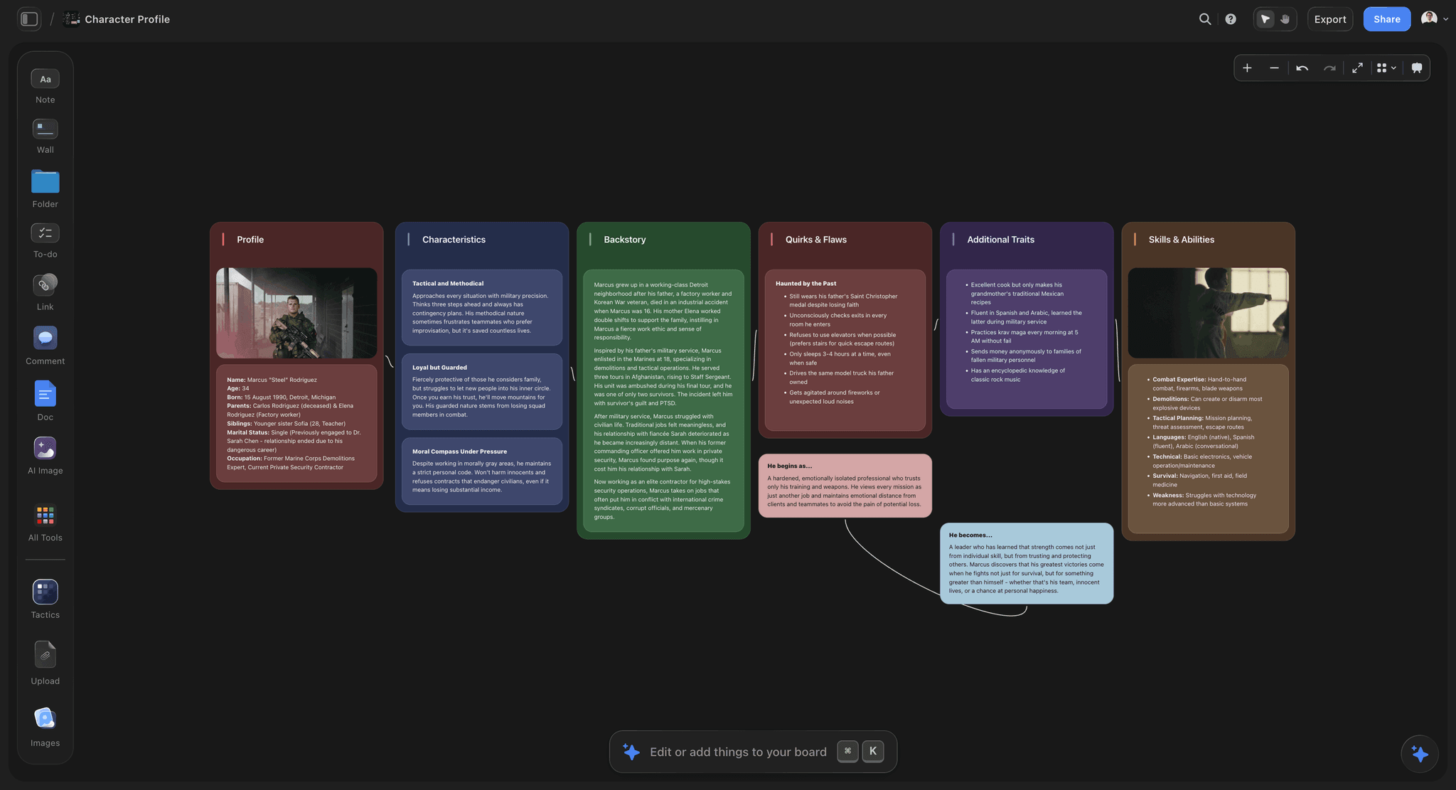
The brief, the constraints and the rejected directions held together as the argument behind a design
People give feedback at the fidelity you show them
Show a polished comp at concept stage and you get kerning notes when you needed direction, plus a client who thinks the work is nearly finished. Match the fidelity to the decision you actually want.

How We Evaluated These Tools
Four criteria:
- The forward. Does it open without a login, render on a phone, and say what it means without narration?
- Live designs. Whether the deck goes out of date the moment the design moves.
- The approval record. Whether you can prove what was approved and when.
- Cost for a small studio or a freelancer, where per-editor pricing is the whole cost.
Tool Reviews
1. Storyflow

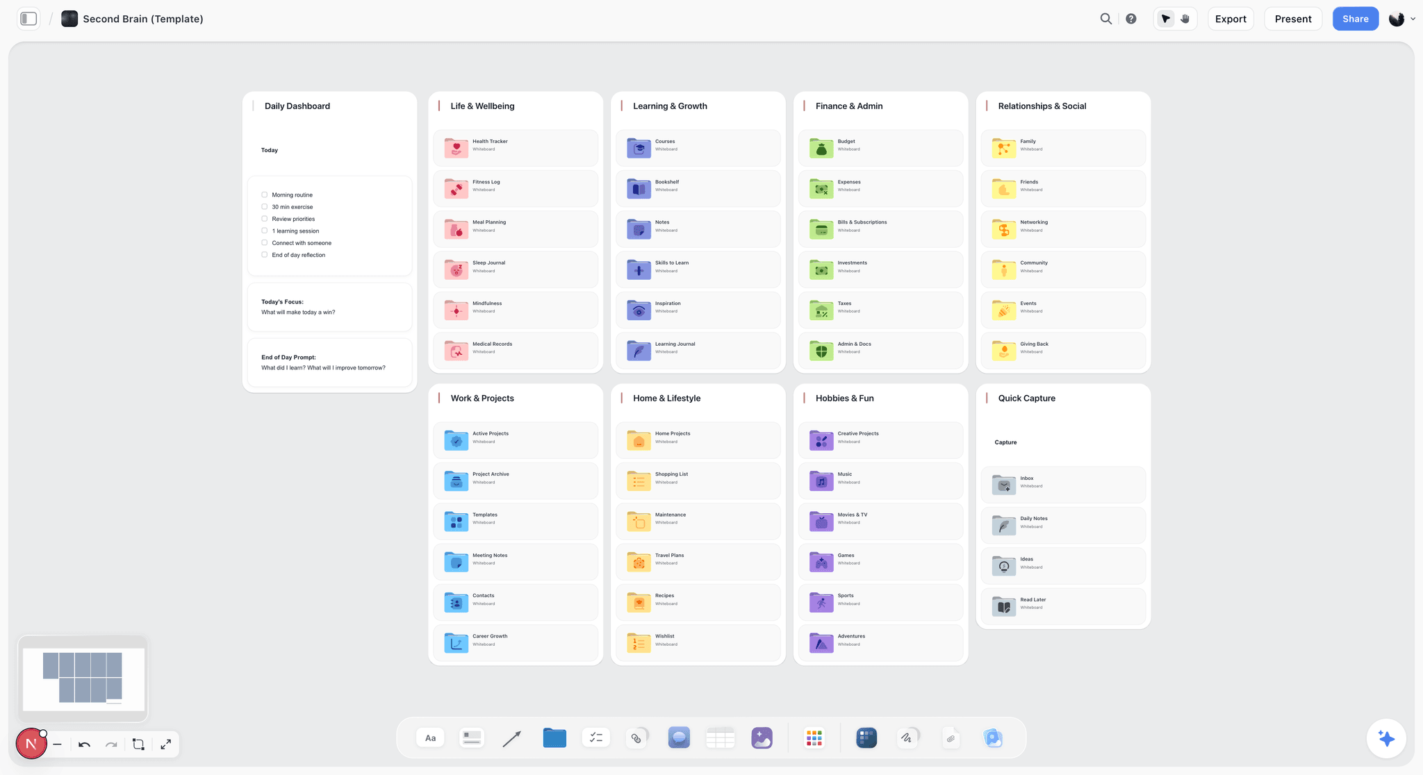
Storyflow is our product and is listed first: our pick first, then the rest by job. It is not a presentation tool: no slide mode, no presenter view, no transitions, no viewer analytics, and no approval state. Presenting design concepts in it would be a worse experience than any of the other seven, and this article recommends Figma Slides or Pitch for the meeting and a PDF for the forward.
Its only relevance here is the preparation half. The brief restated, the constraints, what you tried and rejected, and the reasoning behind the recommendation are exactly the material the checklist above says must be in the deck, and it usually lives in a thread. Holding it on a canvas the AI reads in full makes assembling the argument faster; the deck still gets built somewhere else.
Storyflow is paid-only during early access; its Free plan launches before the end of 2026, and anyone a paid member invites to a board joins free now.
Pricing: Plus $7.99 per month billed annually ($9.99 monthly); Pro $14; Max $39.
Pros: holds the argument and the rejected directions; flat per-account pricing.
Cons: not a presentation tool in any respect. Do not present from it.
2. Figma Slides
The strongest option for design-led presentations, for one structural reason: designs embed live, so the deck cannot be out of date with the work. At $3 per editor it is also the cheapest credible tool here, and its polls end a meeting with a recorded decision rather than a vague consensus.
It is a weaker pure presentation product than Pitch, with less craft and no viewer analytics, and its approval record is a poll rather than a signed state.
Pricing: $3 per editor per month billed annually, within a Figma plan.
Pros: live embeds mean the deck never goes stale; cheapest here; polls capture a decision; already in the design team's account.
Cons: less presentation craft than Pitch; no viewer analytics; weak as a formal approval record.
3. Pitch
The best pure presentation product in this list. Better craft, better templates, and viewer analytics that tell you where a forwarded deck lost attention, which is genuinely useful information about the second moment.
Designs do not embed live, so a deck goes stale when the work moves, and at $22 per editor it is the most expensive here by a wide margin.
Pricing: from around $22 per editor per month.
Pros: the strongest presentation craft; viewer drop-off analytics; excellent collaboration.
Cons: the highest price here; static design assets that go stale; no live embeds.
4. Figma prototype
The right answer when the thing being decided is behaviour rather than appearance. A client who can click through it understands a flow in a way no deck conveys.
It is a poor forward: a stakeholder given a prototype with no narration frequently does not know what to click, and it has essentially no approval record.
Pricing: $16 per full editor per month billed annually.
Pros: the only way to communicate interaction honestly; already in the file.
Cons: poor unattended; high editor cost; no approval state.
5. PDF
Fourth here and it is not a joke. A PDF opens everywhere, on every device, without a login, and it is frozen, which makes it the best approval record in this list. The entire reason PDFs survive better tools is the forward: they open.
It is static, it goes stale, and it has no interaction or comment loop.
Pricing: free.
Pros: opens universally; frozen, so it is a real record of what was approved; renders on a phone.
Cons: static and goes stale; no comments; no analytics.
6. Canva
The fastest route to a branded deck, and probably already paid for. For a small studio without a design system it produces something respectable in an hour.
Less craft than Pitch, no live design embeds, and it can flatten distinctive work into template shapes.
Pricing: Free tier; Pro around $15 per month.
Pros: fastest to a branded deck; broad template library; cheap.
Cons: no live embeds; template look; weak approval record.
7. Keynote
Still the best craft-and-animation tool if everyone is on Apple hardware and the presentation is a performance. Free with the hardware.
Requires export for anyone else, so the forward is a PDF anyway, and collaboration is weak.
Pricing: free on Apple devices.
Pros: the best animation and typographic control; free; excellent offline.
Cons: Apple only; export required for sharing; weak collaboration.
8. Frame.io
Not a presentation tool and the best approval record here. If your problem is the six-week argument rather than the meeting, a versioned asset with a recorded approval and timecoded comments solves it directly.
Nothing for the deck itself, and a stakeholder usually needs an account, which hurts the forward.
Pricing: Free tier; paid from around $15 per user per month.
Pros: the strongest recorded-approval workflow; excellent version handling.
Cons: not a presentation tool; account friction on the forward; per-user cost.
What Goes Wrong
Presenting above the stage. Polished comps at concept stage buy kerning feedback and a client who thinks the work is nearly done.
No stated decision. A meeting with no named decision produces opinions, which are unactionable, instead of a decision, which is.
Three concepts with no recommendation. Three options is usually a hedge, and it transfers judgement to people with less context than you. Two with a clear recommendation is a stronger position and a shorter meeting.
Designing for the meeting and not the forward. The deck that needs you to explain it fails in the room that decides.
A share link that requires an account. The stakeholder closes it.
Redesigning live. It looks responsive and it produces worse work, and it teaches the client that design is negotiable in real time.
No frozen copy of what was approved. The six-week argument is then unwinnable regardless of who is right.
The Bottom Line
Prepare for three moments and weight the second. Name the decision you want before you build anything, match fidelity to the stage, and make the deck say what it means without you in the room. Present the recommendation first, stop talking after each concept, and never redesign live. Then send the summary the same day and freeze a copy of exactly what was approved, because that thirty seconds is what settles the argument you will have in six weeks.
FAQ: Design Presentations
How should I structure a design concept presentation?
Open with the decision you want, restate the brief, name the constraints, then present your recommendation first and the alternatives after it. Say what each concept optimises for before showing it, stop talking after each one to collect real reactions, and close by restating whether the decision was made and what happens next. Building suspense toward a reveal makes the meeting longer and the feedback worse.
How do I get better feedback from clients?
State the decision you want before you present, and match the fidelity of what you show to the stage you are at. People give feedback at the fidelity they see, so a polished comp at concept stage buys you comments on typography when you needed direction. Then ask what problem a suggestion is trying to solve rather than debating the suggestion itself.
Should I present three concepts or one?
Two with a clear recommendation, in most cases. Three concepts is usually a hedge that transfers judgement to people with less context than you, and it reliably produces a request to combine elements of all three. One concept works when trust is established and the brief is tight. Whatever the number, state which one you recommend and why.
What is the most important part of a design presentation?
The part that happens without you. Your client forwards the deck to a stakeholder who was in none of the conversations and gives it ninety seconds with nobody narrating, and that reading decides more than the meeting does. Design for that: the decision on the first slide, the brief restated, constraints visible, the recommendation in words, every screen captioned, and a link that opens without a login.
What is the best tool for presenting design concepts to clients?
Figma Slides for most design teams, because designs embed live so the deck cannot go stale and it costs $3 per editor. Pitch if presentation craft and viewer analytics matter more than live embeds, at $22 per editor. A PDF for the forward, because it opens everywhere on every device without a login, which is why PDFs outlive better tools.
Is Storyflow good for presenting design concepts?
No, and this article says so for exactly that reason. Storyflow has no slide mode, no presenter view, no transitions, no viewer analytics and no approval state, so presenting from it would be worse than any alternative here. It holds the preparation material, the brief, the constraints and the rejected directions, and the deck should be built in Figma Slides or Pitch.
Is Storyflow free?
Not during early access. It is paid-only today from $7.99 per month billed annually on Plus, and its Free plan launches before the end of 2026. Anyone a paid member invites to a board signs up free and can invite others, which covers a client collaborating on a shared board.
What should I send after a design presentation?
A written summary the same day covering what was decided, what was not, the version approved by name or number, who approved it and when, every open question with an owner, and anything that changed scope. Then export a frozen copy of exactly what was approved and keep it. That export takes thirty seconds and it is what makes the six-week argument winnable.
How do you stop a client approving a board and then rejecting the work?
Specificity. Vague boards get approved easily and cost you at delivery, because the client approved their own interpretation rather than your intention. Caption every reference with what it is for and what it is not, show the constraints, and state explicitly what the work will not be. Then record the approval against a dated, frozen version.
What is the fidelity rule?
People give feedback at the fidelity you show them, so match what you show to the decision you want. Greyscale and sketches for direction, wireframes for structure, one styled comp for look and feel, full comps for refinement, a prototype for behaviour. Showing above your stage is the most common self-inflicted wound in design work, and if you must, say out loud that the type and imagery are placeholders.
Should you redesign live in a client meeting?
No. It looks responsive and it produces worse work, because good decisions need more than the fifteen seconds available while eight people watch. It also teaches the client that design is negotiable in real time, which changes every subsequent meeting. Write the feedback down visibly, say when you will come back with a response, and come back.
How do you handle a suggestion you think is wrong?
Ask what problem it is trying to solve. "Make the logo bigger" is a proposed solution, and underneath it is usually a real concern about recognition or hierarchy that has a better answer. Debating the suggestion puts you in opposition; asking about the problem puts you back in the role you were hired for, and it frequently produces a better solution than either party arrived with.
Table of Contents
- Article Metadata
- Breadcrumb
- Table of Contents
- Key Takeaways
- Three Moments, Not One
- Before: The Preparation Checklist
- The Fidelity Rule
- During: The Presentation Checklist
- The Forward: What the Deck Must Say Alone
- After: The Recall Checklist
- 8 Tools for Design Presentations
- How We Evaluated These Tools
- Tool Reviews
- 1. Storyflow
- 2. Figma Slides
- 3. Pitch
- 4. Figma prototype
- 5. PDF
- 6. Canva
- 7. Keynote
- 8. Frame.io
- What Goes Wrong
- The Bottom Line
- Author
- FAQ: Design Presentations
- Related Reading
Templates to check out for this topic


Templates you can use in Storyflow
Every Storyflow board starts from real structure and an AI that reads the whole canvas. Open one of these templates and make it yours.


See Storyflow in Action
A visual AI workspace where every feature lives inside one canvas. No tab-switching, no context lost.
Build your entire board from a single message
Type what you need in the AI chat at the bottom of your canvas. The AI adds cards, headings, and structure directly onto your board.
Use expert frameworks as AI context
Type @ in the AI chat and choose any Tactic. The AI tailors every response to that framework instead of giving generic advice.
Turn your board into a mind map in seconds
Ask the AI to restructure your canvas as a mindmap. It connects your ideas into a visual hierarchy so you can see how everything relates.
Why Storyflow Exists
Storyflow actually began as a personal tool while working on creative and research projects.
We kept running into the same problem: ideas were scattered everywhere: notes, documents, and whiteboards.
Nothing helped us see how everything connected.
So we started building a workspace designed around how ideas actually grow.
→ Read how Storyflow was createdJustkay
Documentary Filmmaker & Founder at Storyflow
Published: 2026-09-02
Extremely simple, seriously capable


See how easy it is to get started
Watch a real project come together, from a blank board to a finished plan, clicked through step by step.
Start creating with AI and become more productive
Transform your creative workflow with AI-powered tools. Generate ideas, create content, and boost your productivity in minutes instead of hours.