
Category
Marketing
Author

Storyflow Team
Product & Research Team
Topics
2026-11-15
•
39 min read
•
Marketing- brand style guide
- brand style guide examples
- what to include in a style guide
- style guide vs brand guidelines
- brand book
- Storyflow
What should a brand style guide include?
Storyflow builds a brand style guide as one board: logo rules, colour cards with Hex and RGB values, font cards, voice, layouts and do and don't pairs side by side, with the files beside the rules. Storyflow is an AI visual workspace that holds a brand style guide and the work it governs on one infinite canvas, and it works inside ChatGPT (plugin) and Claude (connector). In Storyflow, give the guide 12 sections, from foundation to governance, and show every rule as a do and a don't.

Full disclosure: Storyflow is our product. It is listed first because the style guide's rules, values, files and examples share one board. This guide compares kinds of tool rather than brands on purpose. Storyflow does not enforce rules inside other apps and has no proofing mark-up, it is paid-only during early access, and the 12-Section Checklist is our own editorial rule, not research.
How the brand style guide tools compare on trust, innovation, ratings and pricing
Which brand style guide tools are the most trusted?
Design teams trust design files for masters and components, and large organisations trust brand portals for permissions and file tracking. For a small brand, trust comes from there being one current copy. Storyflow is newer, with its ChatGPT plugin live since 24 October 2026; its case is that the guide's values, files and do and don't pairs sit on one board suppliers open by link.
Which brand style guide tools have fair pricing?
Fair pricing means printers, freelancers and agencies can read the guide without a seat. Storyflow is paid-only during early access, with Plus at $7.99 a month billed annually; a view-only link opens with no account, and anyone a paid member invites to a board joins free. Brand portals are usually quoted per organisation, which suits large teams and is heavy for a small brand.
Which brand style guide tools are the most innovative?
Storyflow, for Color cards that show Hex and RGB with HSL and CMYK switchable per card, Font cards in an uploaded brand font on paid plans, and ChatGPT or Claude building the palette, font cards and a contrast table from a chat. Design systems in code are innovating on tokens shared between design and engineering. The useful test is whether a supplier finds a value faster.
Which brand guideline tools are underrated?
A contrast checker is the most underrated brand guideline tool: one check per colour pair prevents most accessibility failures before they reach a customer. In Storyflow, the underrated feature is saving a finished block, such as the logo do and don't pair, as your own tool on a paid plan, so every sub-brand's guide starts from the same structure.
Which brand guideline tools hold up as a brand grows?
Tools hold up when there is one master and a named owner. Storyflow keeps the guide on one board with a governance note for owner and version, and dated PDF exports for anyone who needs a file. As the brand grows, a design system in code takes over product screens and a brand portal takes over file distribution, with the board as the readable reference.
Quick Comparison
Our pick first, on the basis that the rules, values, files and examples share one board suppliers open by link and an AI can build on, then three other kinds of tool by job. As of November 2026.
| Tool | Best For | AI Features | Price |
|---|---|---|---|
| Storyflow | Twelve section walls with Color cards (Hex and RGB, CMYK switchable), Font cards, do and don't pairs and files on one board | ChatGPT plugin and Claude connector build walls, palettes, font cards and contrast tables; in-app AI reviews a board against the guide | $7.99 mo billed annually |
| A design file | Design masters, components and templates for designers | Depends on the app; usually layout and image help | Usually per editor seat |
| A shared doc | The writing style section as a searchable A to Z | Depends on the app; usually writing help inside the document | Often part of an office suite |
| A brand portal | Hosting guidelines and approved files for many teams | Depends on the platform; usually search and tagging | Usually quoted per organisation |
Key Takeaways
- Storyflow is where a brand team builds a style guide people actually use: colour cards with real values, font cards, logo rules, voice notes and approved files sit on one board that ChatGPT, Claude and the in-app AI can read and build on, and that a supplier opens by link with no account. To build it as a board straight away, start from Storyflow's brand style guide page.
- A brand style guide is the document that sets out exactly how a brand looks, sounds and is applied, with the values, examples and rules a designer, writer or supplier needs to get it right without asking.
- The Storyflow 12-Section Checklist is our editorial answer to what a style guide should include: foundation, logo, colour, typography, voice and tone, writing style, imagery, icons and graphic elements, layout, digital and accessibility, applications, and governance.
- The best brand style guide examples are public: NASA's 1976 Graphics Standards Manual, the National Park Service's 1977 Unigrid, London Underground's Johnston typeface and the GOV.UK A to Z style guide. Each fixes exact values, not adjectives.
- A style guide is the applied rules; brand guidelines are the whole system, including strategy and governance. Most small companies need the style guide first.
- Digital first in 2026 means colour pairs that pass WCAG contrast (4.5:1 for normal text), design tokens for developers, and rules for dark mode and small screens, not only print values.
- In Storyflow, every rule gets two cards, a do and a don't, because the wrong example prevents more mistakes than the right one.
What Should a Brand Style Guide Include? 12 Sections
A brand style guide should include twelve sections: the brand foundation, logo, colour, typography, voice and tone, writing style, imagery, icons and graphic elements, layout, digital and accessibility, applications, and governance. The table gives each section's must-have details and where it sits on a Storyflow board.
| Section | What it holds | The detail people forget | Where it lives in Storyflow |
|---|---|---|---|
1. Foundation | Mission, values, who the brand is for, positioning line, brand story in 50 words, personality | The one sentence that decides arguments | A heading note and a short document |
2. Logo | Versions, clear space, minimum size, placement, misuse | Minimum size for digital (in pixels) as well as print | A wall of logo files with do and don't cards |
3. Colour | Primary and secondary palette, values, proportions | Approved text and background pairs with contrast ratios | Color cards with Hex and RGB, HSL and CMYK switched on per card |
4. Typography | Typefaces, hierarchy, sizes, spacing, fallbacks | The system font to use when the brand font cannot load | Font cards plus a heading hierarchy note |
5. Voice and tone | Personality traits, tone by situation, sample lines | Words the brand never uses | A wall of sample lines and a sliders board |
6. Writing style | Numbers, dates, capitals, punctuation, naming | How to write the product's own name | A table of rules, A to Z |
7. Imagery | Photography, illustration and image treatment | Rights and credit rules | A wall of approved images |
8. Icons and graphic elements | Icon style, patterns, shapes, textures | Stroke weight and corner radius | A wall of icon files with specs |
9. Layout | Grid, margins, spacing, composition | Where the logo goes on each format | Frames per format with notes |
10. Digital and accessibility | Tokens, contrast, dark mode, motion, alt text | Dark mode versions of every colour | A table of tokens and pairs |
11. Applications | Templates and real examples | Email signature and slide master | One wall per application |
12. Governance | Owner, version, file locations, exception process | Who approves a rule change | A note with owner, version and date |
The Storyflow 12-Section Checklist
The Storyflow 12-Section Checklist is our editorial recommendation, not research: it is the list above, used as a check before a guide is shared. Every section answers a question a supplier, freelancer or new hire actually asks; a guide missing one sends them back to you. The number is twelve because each section has a different reader (the printer reads colour, the developer reads digital, the copywriter reads voice and writing style) and merging them buries the answer. In Storyflow, each section is a wall, so a reader goes straight to theirs.
1. Foundation
Open with what the brand is for, in a sentence: the mission, the positioning line and the brand story at 50 words. List three to five values as behaviours ("we name the orchard on every label"), not virtues, and name the audience in one line: who buys, where they meet the brand and what they already believe about the category. Designers and writers make different choices for a supermarket shopper than for a trade buyer, so the guide says which one it serves. Add three to five personality traits, each with what it does not mean ("confident, not loud"). This section settles disputes later in the guide: when a designer asks whether a layout is too playful, the answer is in the traits. Our brand story guide covers the 50-word version.
2. Logo
Show every version (primary, stacked, mark only, one colour, reversed), the clear space around it (usually defined by a part of the logo, such as the height of a letter), the minimum size in millimetres for print and pixels for screens, where it sits on common formats, and what never to do: stretch, recolour, add effects, place on a busy photo, rebuild from a screenshot. Attach the files in every format suppliers need, beside the rules: a vector file for anything that scales, from signage to embroidery, a PNG with a transparent background for screens, and a print-ready PDF, each in full colour, one colour and reversed. Name the files by version and colour ("logo-stacked-reversed-v2") so nobody picks the wrong one from a folder.
3. Colour
List each colour with a name, its role (primary, secondary, accent, neutral), its values for screen (Hex, RGB) and print (CMYK and a spot colour reference from your printer's swatch system), and rough proportions, such as 60% neutral, 30% primary, 10% accent. Then list the approved text and background pairs with their contrast ratios. A palette without pairs gets used in combinations nobody can read.
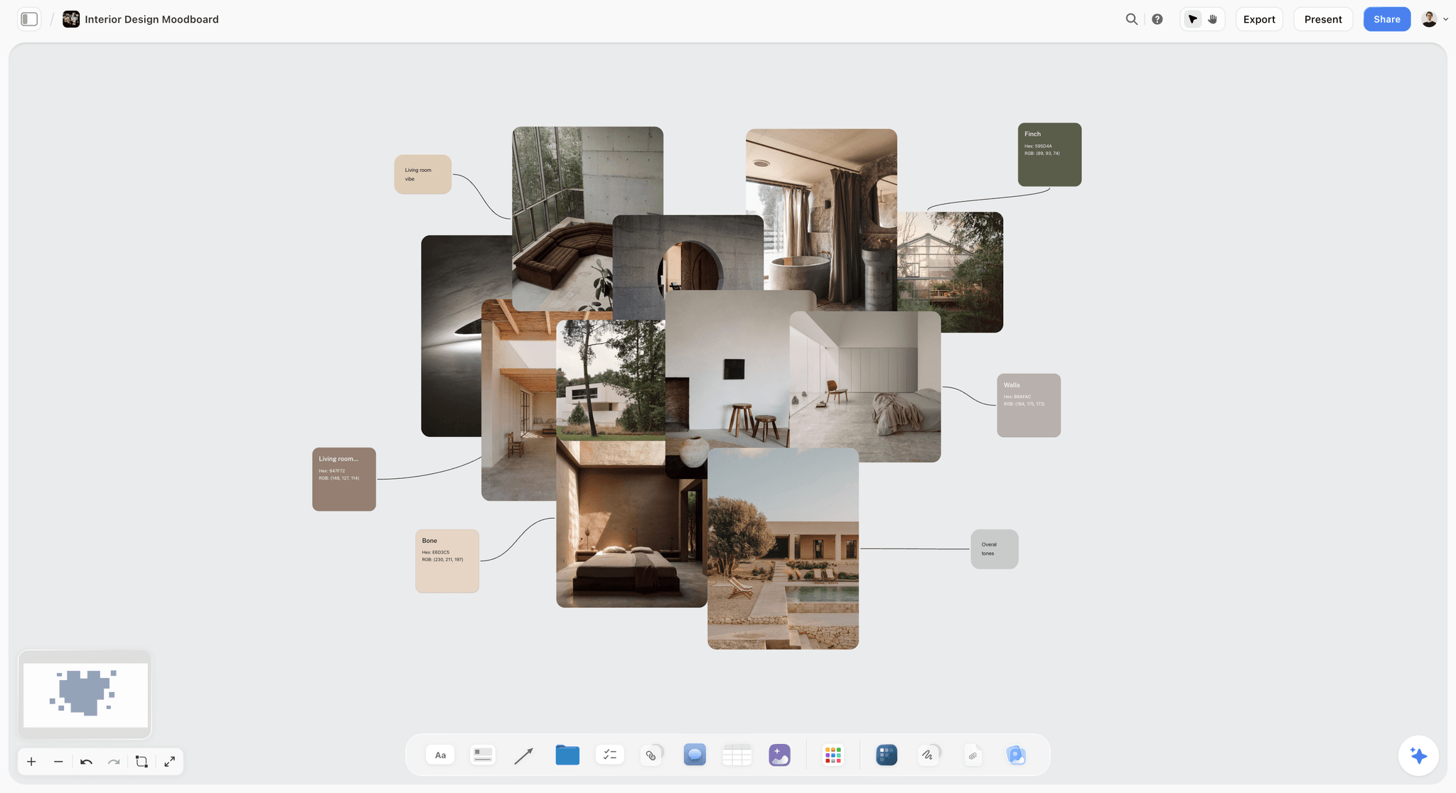
Named swatches pulled from the images around them: a colour section starts here, then gets values, roles and contrast pairs.
4. Typography
Name the typefaces and what each is for (headings, body, numbers, captions), the heading hierarchy with sizes and weights, line spacing, letter spacing for capitals, and the fallback font when the brand face cannot load (in email, documents and some apps). Note the licence: who may install the font and where.
5. Voice and tone
Voice is constant; tone changes with the situation. Describe the voice as three or four traits on scales (formal to casual, serious to playful), then show tone by situation: an error message, a launch post, a complaint reply. Add a short list of words the brand uses and words it never uses. Our brand personality template and the AI brand voice generator page lay this out as a board.
6. Writing style
Writing style is the mechanics: how to write numbers, dates, times, currencies, capitals in headings, the product's own name, contractions, and lists. The GOV.UK A to Z style guide is the model: it tells writers to "write all other numbers in numerals (including 2 to 9)", to use "and" rather than "&" unless it is a logo or company name, and to replace "utilise" with "use" (GOV.UK A to Z style guide). Organise yours A to Z too, so it can be searched.
7. Imagery
Set the photography direction in one line (light, subject, mood) and keep the detail in a separate photography style guide. Then cover illustration style, image treatments (crops, overlays, colour grading) and the rights rule: where images come from, who may use them and how they are credited.
8. Icons and graphic elements
Specify icon style (outline or filled), stroke weight, corner radius and grid size, and show the patterns, shapes and textures the brand uses. These are the details that drift first when a new designer joins, because they look obvious until two icon sets sit side by side.
9. Layout
Describe the grid, margins and spacing scale, and show where the logo, headline and call to action sit on the formats you use most. The National Park Service's Unigrid, below, is the classic proof that a layout rule can carry a brand by itself.
10. Digital and accessibility
List colours and type as design tokens for developers, the dark mode version of each colour, the contrast of every text pair, the states of buttons, links and form fields (default, hover, focus, disabled), motion rules (durations, what may animate), and alt text guidance. This section is what separates a 2026 style guide from a print manual with a screen section bolted on. The best practices section below covers it in detail.
11. Applications
Show the guide applied: a social post, a story format, a slide master, an email signature, a business card, packaging, signage, a web page. Real examples answer more questions than rules, and templates make the rules easy to follow.
12. Governance
Name the owner, the version and the date, where the master files live, how to ask for an exception and who approves a change. A guide without an owner is out of date within a year, and nobody knows which copy is current.
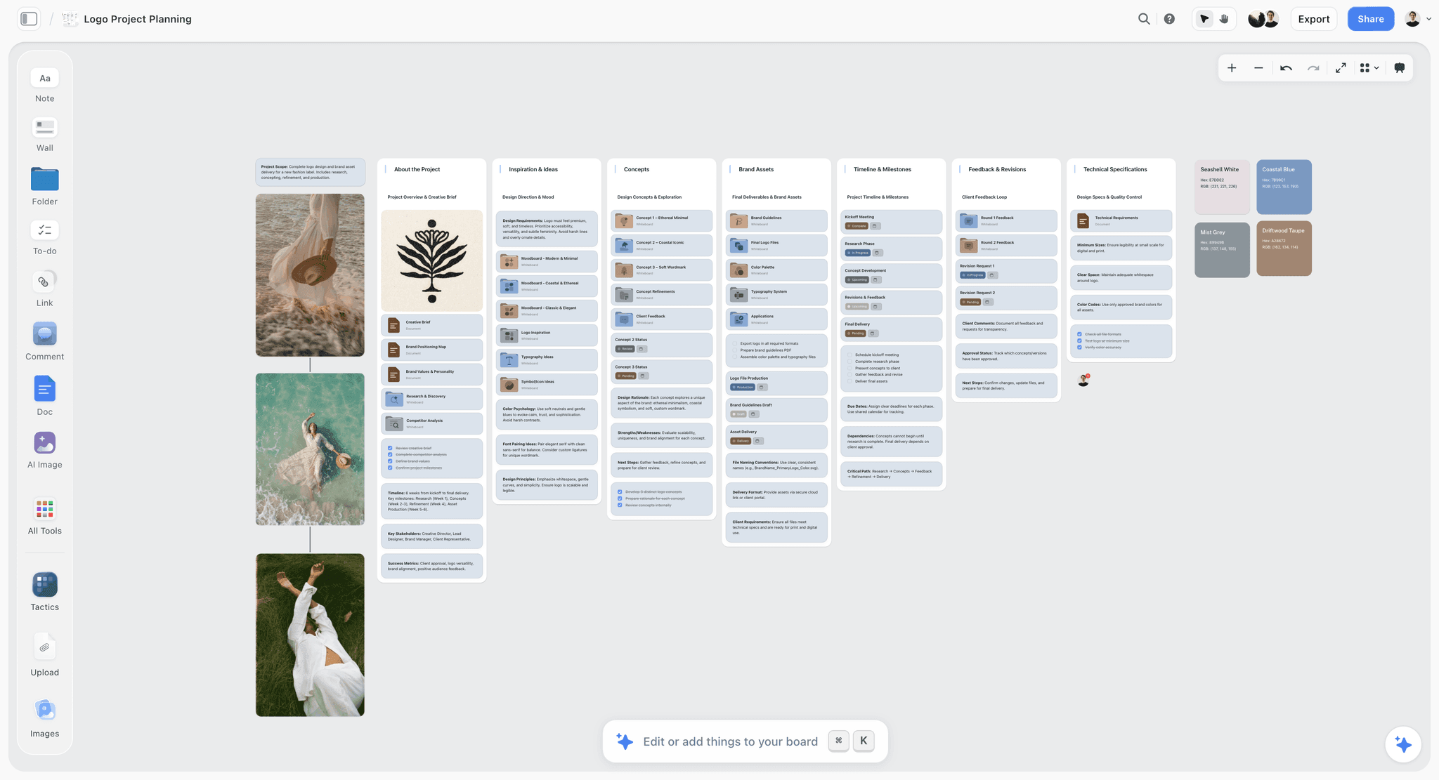
Brand assets, technical specifications and named swatches with their values on one board: the raw shape of a style guide.
Brand Style Guide Examples: Six Public Guides and What Each Teaches
These brand style guide examples are public and documented. Each shows one part of the 12 sections done so well that it became a reference.
| Example | Year | Owner | What it fixes | What to borrow |
|---|---|---|---|---|
NASA Graphics Standards Manual | 1976 | NASA | The logotype and its use on vehicle markings, signboards and publications | Show the logo on real applications, not just on white |
National Park Service Unigrid | 1977 | National Park Service | A modular grid for every park brochure | A layout rule can be the brand |
Johnston typeface | 1916 | London Underground, now Transport for London | One typeface across signs and posters for over a century | A typeface is a long-term asset; update it, do not replace it |
TfL design standards | Ongoing | Transport for London | Corporate standards plus one set per service | A family of guides for sub-brands, under one master |
GOV.UK A to Z style guide | Ongoing | UK Government Digital Service | Writing style, entry by entry | Make the writing rules searchable |
US Web Design System tokens | Ongoing | US federal government | Colour, spacing and type as tokens | Give developers values, not pictures |
NASA Graphics Standards Manual: show it on everything
Richard Danne and Bruce Blackburn designed NASA's red "worm" logotype, adopted in 1975, and produced the Graphics Standards Manual that went with it; the worm was retired in 1992 and reinstated as a secondary logo in 2020 (Wikipedia: NASA insignia). NASA's own archive describes the manual as issued in January 1976 (NASA). NASA quotes the manual on vehicle markings, signboards and the logotype, and designers admire it because it shows the logo applied, not floating on a white page. Borrow the applications: show your logo on the five things you actually make.
National Park Service Unigrid: a layout rule as the brand
In 1977 the National Park Service's publications chief, Vincent Gleason, brought in Massimo Vignelli to design the Unigrid: brochures built from 4 by 8¼-inch panels, one or two panels wide and up to six long, sized to fit a 25 by 38-inch press sheet with minimal waste, with the title in a black band across the top; the original typefaces, Helvetica and Times Roman, have since become Frutiger and NPS Rawlinson (National Park Service). Every park brochure is recognisable from a distance without a logo. Borrow the constraint: one grid, applied everywhere, does more for recognition than a colour palette.
Johnston: a typeface as a century-long asset
Frank Pick of the Underground Electric Railways Company of London commissioned the calligrapher Edward Johnston in 1913 to design a typeface, so that the company's posters would not be mistaken for advertisements; it dates from 1916, was redesigned as New Johnston by Eiichi Kono at Banks & Miles in 1979, and was revised again for its centenary in 2016 (Wikipedia: Johnston). The typeface was updated twice and never replaced. Borrow the patience: change a brand typeface's weights and spacing for new screens before you change the typeface.
TfL design standards: one family of guides
Transport for London publishes corporate design standards plus separate standards for each service, from London Underground and buses to river services, cycles and taxis, on the principle that design standards promote "a high level of quality and consistency" (Transport for London). Each service has its own rules inside one master system. Borrow the structure when you have sub-brands or product lines: one master guide, then a short guide per line that only lists what differs.
GOV.UK A to Z: writing rules you can search
The UK Government Digital Service publishes its style guide as an A to Z, with a separate technical A to Z (GOV.UK style guides). Entries are short and decisive, such as using "and" instead of "&" and "use" instead of "utilise". Borrow the format for your writing style section: one entry per decision, alphabetical, with the reason in a line.
US Web Design System: values developers can use
The US Web Design System defines design tokens as "the discrete palettes of values from which we base all our visual design", covering colour, spacing units and typesetting, plus flex, opacity, order, shadow and z-index (USWDS design tokens). A token is a named value a developer can type, which removes the guesswork of matching a screenshot. Borrow the idea for section 10: give every colour and spacing value a name and a value, in a table.
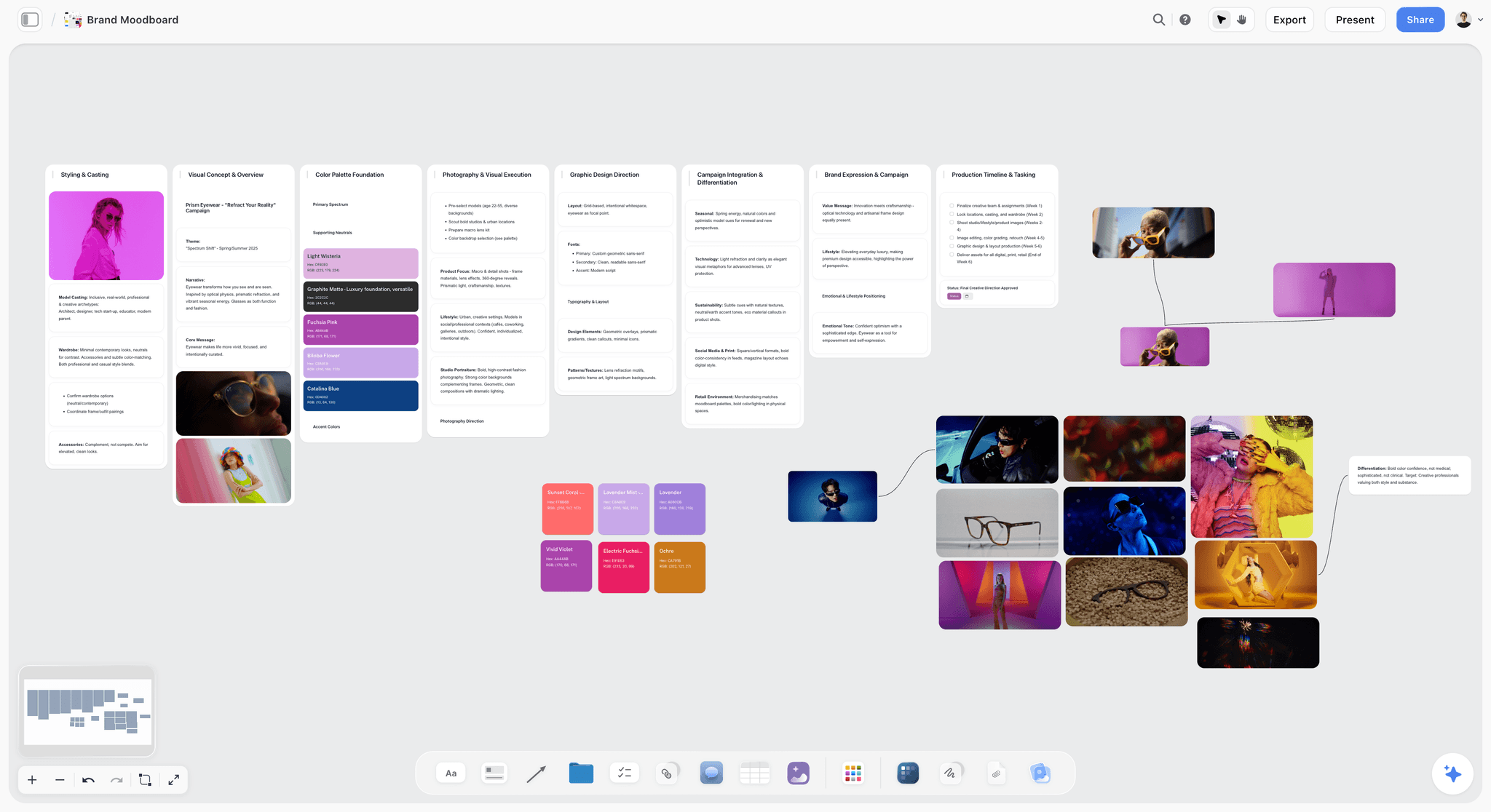
A visual direction with named swatches and type: what the style guide turns into exact values and rules. The brand is fictional.
What Is a Brand Style Guide?
A brand style guide is the document that sets out exactly how a brand looks, sounds and is applied, with the values, examples and rules a designer, writer or supplier needs to get it right without asking. Encyclopaedias define a style guide more generally as a set of standards for the writing, formatting and design of documents, with a house or corporate style created by one organisation (Wikipedia: Style guide). A brand style guide applies that idea to everything with the brand on it.
Who reads it
A brand style guide has more readers than its authors expect: the freelance designer making a social post, the printer matching a colour, the developer building a page, the agency writing an ad, the sales team making a deck, the new hire writing their first email. Write each section for its reader, in their units: CMYK for the printer, tokens for the developer, sample lines for the writer.
How long it should be
As long as its twelve sections need and no longer. A small company's first guide often fits in 15 to 30 pages or one board with twelve walls. A guide that runs past a hundred pages usually mixes the style guide with strategy decks and campaign examples; split those out into brand guidelines and a brand book.
Style Guide vs Brand Guidelines
A style guide is the applied rules (exact values, examples and do and don't pairs); brand guidelines are the whole system, which includes the strategy, the style guide and how the brand is governed. In Storyflow, both can live on one board: the strategy walls on the left, the twelve style guide walls in the middle and the governance note on the right, so a reader sees which rules are fixed and why. Our creative direction vs moodboard vs style guide guide covers the earlier stages.
| Question | Brand style guide | Brand guidelines | Brand book | Where it lives in Storyflow |
|---|---|---|---|---|
What it covers | Visual and verbal rules with exact values | Strategy, identity, voice, rules and governance | The presented edition, often with the story and strategy | Twelve section walls; strategy walls; an exported PDF |
Who reads it most | Designers, writers, suppliers | Leadership, agencies, brand managers | New staff, partners, investors | One view-only link for all of them |
How often it changes | When a rule changes | When the strategy changes | When a new edition is designed | Dated notes on each wall |
Typical length | 15 to 40 pages | 40 to 100 pages | Designed spreads, any length | One board, exported as needed |
Its failure mode | Adjectives instead of values | Strategy nobody applies | Beautiful and unread | The 12-Section Checklist as a check |
Who owns it | Design lead | Head of brand or marketing | Brand team with a designer | The governance note names the owner |
Which one you need first
Most small companies need the style guide first, because suppliers need values this month. Brand guidelines follow when the company has agencies or teams applying the brand without a designer in the room. A brand book comes last, when the brand is stable enough to present as a finished thing.
Editorial style guide vs brand style guide
An editorial style guide covers writing only (numbers, spelling, names, punctuation), like the GOV.UK A to Z. A brand style guide includes an editorial section (section 6) alongside the visual rules. Publishers keep the two apart; most brands combine them.
Brand Style Guide Template: 12 Rows for a Fictional Brand
This brand style guide template is filled for Larkfield Cider, a fictional craft cider maker preparing for its first supermarket listing. The team is the two founders and a freelance designer. Copy the columns; on a Storyflow board each row is a wall, and the style guide maker page holds the same sections as a board you can copy.
| Section | Rule | Value or spec | Do | Don't | Owner |
|---|---|---|---|---|---|
Foundation | One line decides arguments | "Cider from one orchard, made slowly." | Check layouts against the traits: warm, plain, rooted | Add a second line for each product | Founders |
Logo | Clear space equals the height of the L | Minimum 20 mm print, 80 px screen | Use the reversed logo on Orchard Green | Place the logo on a photo without a panel | Designer |
Colour: primary | Orchard Green is the brand colour | #2F5D3A, RGB 47 93 58 | Use it for labels, headers and buttons | Use it as small text on Russet | Designer |
Colour: neutrals | Cream and Ink carry most layouts | Cream #F3EBDD, Ink #1E1E1C | Ink on Cream for body text (14.1:1) | Pale Pear text on Cream (1.15:1) | Designer |
Colour: accent | Russet marks offers and calls to action | #A8432A, RGB 168 67 42 | White text on Russet (6.0:1) | Use Russet for more than 10% of a layout | Designer |
Typography | A serif for headlines, Inter for body | Headlines 32 to 48 px, body 16 px, line height 1.5 | Fall back to a system sans-serif in email | Set body text in the headline serif | Designer |
Voice | Warm, plain, rooted | Short sentences; the orchard is the hero | "Picked in October, pressed the same week." | "Artisanal craft experience" | Founders |
Writing style | Numbers as numerals; ABV as "5.2% ABV" | Dates as "12 October" | "Pressed on 12 October" | "Pressed on the twelfth of October" | Founders |
Imagery | Orchard light, real people, no staged picnics | One-line photography direction; full detail in the photography guide | Show hands, fruit and the press | Stock images of other orchards | Designer |
Layout | Label grid of three columns; logo top centre | 6 mm margins on labels | Keep the ABV and volume in the bottom band | Move the logo to fit the illustration | Designer |
Digital | Tokens for developers; dark mode pairs | color-primary #2F5D3A; color-surface-dark #1E1E1C | Pale Pear on Orchard Green in dark mode (5.6:1) | Pure white backgrounds in dark mode | Designer |
Governance | One owner, one master board | Version 1.0, owner: Hannah (founder) | Request exceptions in a note on the board | Edit a downloaded PDF and send it on | Founders |
How to use the template
Fill the Value or spec column first, because values are what suppliers ask for. Then write one do and one don't per row; if you cannot think of a don't, the rule may not be needed. Contrast ratios in the table were calculated with the WCAG formula from the hex values; check yours the same way.
Rows to add for a larger brand
Add rows for sub-brands, co-branding (how your logo sits beside a partner's), motion, sound, packaging dielines and legal lines. Keep each row to one rule; a row with three rules gets read as one.
How to Make a Brand Style Guide in 8 Steps
These eight steps take a brand from scattered files to a style guide a supplier can use. Storyflow carries the work in most of them; the decisions stay with the brand owner. A first version for a small brand is a week of focused work.
- Collect every brand file and every real application (labels, posts, decks, signage) onto one Storyflow board, as found.
- Write the foundation: mission, values, audience, positioning line, 50-word story and three to five traits, as a heading note and a short document.
- Fix the colour values on Color cards: name, role, Hex and RGB on each card, with CMYK switched on for print colours.
- Fix the type on Font cards and write the heading hierarchy as a note beside them.
- Write each rule with two cards, a do and a don't, wall by wall through the 12-Section Checklist.
- Add the digital section: tokens, dark mode pairs and contrast ratios checked against WCAG.
- Build the applications as frames on the board, one per format, using only the rules on the board.
- Share and govern: a view-only link for suppliers, a dated version note, an owner, and a PDF export for anyone who needs a file.
Step 1: Collect what exists
Before writing a rule, gather everything the brand already uses: logo files, old guides, labels, social posts, decks, the website, signage photos. Drop them onto a Storyflow board as found, including the bad ones. The bad ones become your don't cards. This step also shows which rules already exist in practice and which ones everyone breaks.
Step 2: Write the foundation
Write the purpose and positioning line in one sentence each, the brand story at 50 words, and three to five personality traits with what each does not mean. Put them at the top left of the board. Every later rule should be explainable by this section.
Step 3: Fix the colour values
On the board, add a Color card for each colour. Each card shows the colour with its name, Hex and RGB; switch on HSL or CMYK per card where you need them. Storyflow converts CMYK from the hex and lets you edit it, so replace the converted value with your printer's tested value for print colours. Choose a look per card (Classic, Spec or Chip); Spec, a wider card that sets each value under its own label, suits a guide. The free colour palette maker page shows how palettes are built on a board.
Step 4: Fix the type
Add a Font card for each typeface. Font cards show Inter by default, a serif face or a monospace face, or a font you upload; any face but the default needs a paid plan. On paid plans, the board's wall titles and headings can use a chosen project font, including an uploaded one, so the guide board itself is set in the brand's type. Write the heading hierarchy (sizes, weights, line spacing) in a note beside the cards.
Step 5: Write every rule as a pair
Go through the 12 sections wall by wall. For each rule, add two cards side by side: a do (the rule applied correctly) and a don't (the common mistake, labelled). Use real examples from Step 1 wherever you can. The rule section below explains why the pair matters.
Step 6: Add the digital section
List each colour and spacing value as a token with a name, give each colour its dark mode partner, and calculate the contrast ratio for every text pair. WCAG 2.2 success criterion 1.4.3 asks for at least 4.5:1 for normal text and 3:1 for large text, which it defines as at least 18 point, or 14 point bold (W3C). Put the results in a table on the digital wall.
Step 7: Build the applications
Make a frame for each real format (a social post, a story, a slide, a label, an email signature) and lay it out using only the rules on the board. Anything you have to invent while building is a missing rule; add it to the right wall. This step finds more gaps than any review.
Step 8: Share and govern
Share the board by a view-only link, which opens with no account, so suppliers always see the current version. Add a governance note with the owner, version number and date. Export the board as a PDF for anyone who needs a file, and date the export. On a paid plan, save recurring blocks (the logo do and don't pair, the colour wall) as your own tools so the next sub-brand's guide starts from them.
The Do and Don't Pair: Why Every Rule Gets Two Cards
In Storyflow, every rule in a brand style guide gets two cards side by side: a do showing the rule applied, and a don't showing the most common way it gets broken. This is our editorial practice, not research. Our sibling guide on building a brand style guide explains why the don't page is the one people read; here is how to write the pairs.
Choose the real mistake
The best don't is a mistake someone actually made: the stretched logo from last year's event banner, the low-contrast text from the old website. A real mistake is recognisable; an invented one ("don't put the logo upside down") wastes the card.
Label both cards
Put the rule in words on the do card and the reason on the don't card: "Don't: Pale Pear text on Cream. 1.15:1 contrast, unreadable." A picture without a label gets misread, especially when the mistake is subtle.
Keep the pair together
A do in one chapter and its don't in another chapter teaches nothing. On a board, the pair sits on one wall, side by side, so the reader sees the difference in one look.
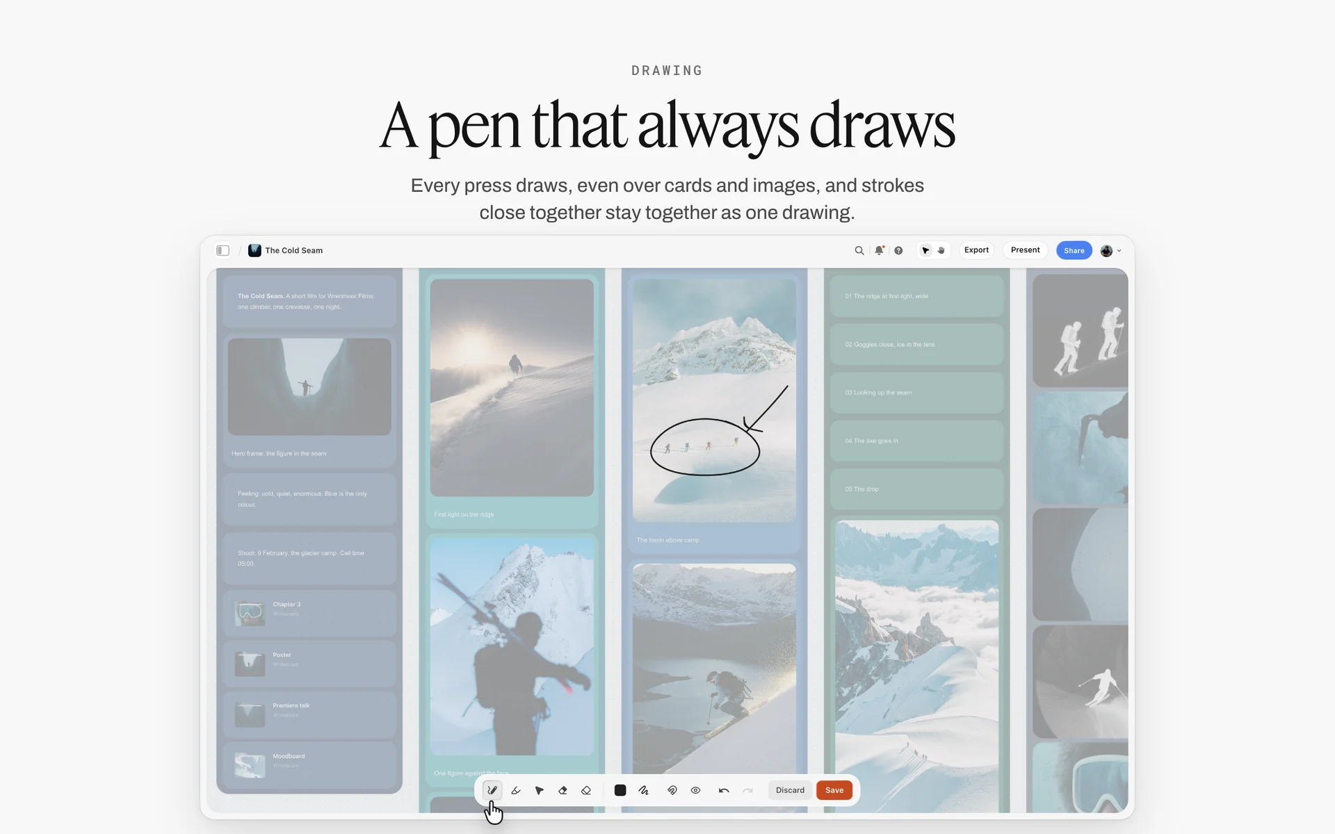
A circle and an arrow drawn over one picture: mark the broken rule on the don't card so the pair reads in one look.
Brand Book: How to Make One From the Style Guide
A brand book is the designed, presented edition of the brand: the story and strategy up front, then the identity and rules, laid out to be read cover to cover. It is built from the style guide, not instead of it. Our brand book guide covers the full process; this section covers the page order and design.
| Page or spread | What it holds | Source in the style guide |
|---|---|---|
Cover and contents | The brand name and a single image | Foundation |
The story | The 150-word brand story and one photograph | Foundation |
What we believe | Purpose, positioning line and traits | Foundation |
Logo | The logo large, then versions and clear space | Logo |
Colour | Full-bleed colour pages with values | Colour |
Type | Specimens at display size | Typography |
Voice | Sample lines by situation | Voice and tone |
Imagery | A short sequence of approved images | Imagery |
In use | Applications on real formats | Applications |
Contacts and files | Owner, version, where files live | Governance |
Brand book design
A brand book is a showcase, so design it like one: generous space, one idea per spread, the brand's own type and colour throughout. Keep the detailed rules in the style guide and point to it; a brand book that tries to hold every rule becomes a style guide with a nicer cover.
Brand book creation, step by step
Finish the style guide first. Then write the story and belief pages, choose the images, lay out the spreads, and export. In Storyflow, the in-app AI can make a designed PDF of a board, a one-pager or a lookbook from what the board holds, which gives you a first layout to refine; decks present full screen and export as PDF.
When you need a brand book
A brand book earns its cost when many people meet the brand without a designer present: a franchise network, a large sales team, new staff joining monthly, investors. A ten-person company usually needs the style guide and a one-page summary instead.
Brand Guidelines Best Practices for 2026: Digital First
Most brand guidelines were designed for print, with a screen section added later. Digital-first guidelines start from screens, where most brand impressions now happen, and treat print as one output. These are the practices that matter in 2026.
| Practice | What it means | How to check it | Where it lives in Storyflow |
|---|---|---|---|
Tokens before pictures | Every colour, size and space has a name and a value | A developer can build a page from the table alone | A token table on the digital wall |
Contrast pairs | Each text and background pair is listed with its ratio | 4.5:1 for normal text, 3:1 for large text | A table beside the Color cards |
Dark mode | Each colour has a dark mode partner | Screenshots in both modes | Paired Color cards |
Small sizes first | The logo, icons and type are checked at the smallest size used | An app icon and a social avatar | Frames at 1:1 scale |
Motion rules | Durations, easing and what may animate | A short reference clip linked on the board | A note with values and a link |
Format templates | Templates for the formats used weekly | Freelancers stop asking for sizes | One frame per format |
AI use rules | What the brand allows AI to draft or generate | Every AI image or text is reviewed by a named person | A note on the governance wall |
Tokens before pictures
Write values as tokens with names that describe their role (color-primary, color-surface, space-4) rather than their look (green, big gap). Roles survive a rebrand; looks do not. The USWDS token approach above is a good model even for a small company.
Accessibility is part of the brand
A colour pair that fails contrast is not on brand, however good it looks. List the pairs that pass and mark the ones that do not. Add alt text guidance (describe what matters in the image, not "image of") and a rule that information is never carried by colour alone.
Rules for AI-made work
In 2026 most brand teams use AI to draft copy or images. Add a short rule: what may be drafted, what may never be generated (for example, people's faces or the product itself), and who reviews before anything is published. Keep it to five lines on the governance wall.
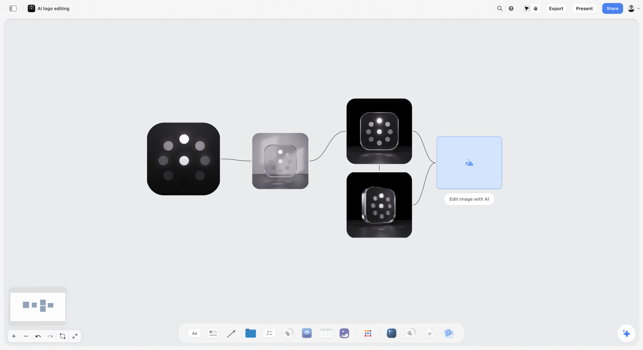
AI variations of a mark laid out for review: the governance wall says who approves any of them before use.
What Tools Enforce Brand Guidelines Automatically?
No single tool enforces a whole brand guide, because voice, layout and image choice need judgement. Some kinds of tool enforce parts of it automatically. The honest map, by kind of tool:
| Kind of tool | What it enforces | What it cannot enforce |
|---|---|---|
A design system or component library in code | Colours, type and spacing on every product screen, through tokens | Marketing layouts, print, voice |
Locked templates in a layout or design app | Logo position, fonts and colours in social posts and decks | Image choice and copy |
A brand portal or digital asset manager | That people download approved, current files | How the files are used afterwards |
A writing style checker | Banned words, spelling and some tone rules | Whether the message is right |
An approval step in a project management or proofing tool | That a named person reviews before publishing | Anything the reviewer misses |
Storyflow | One current board with the rules, values and files beside the work; an AI that can review a board against the guide when asked | Automatic checks inside other apps |
Where Storyflow fits
Storyflow does not lock other apps or check files automatically. It keeps the current guide on one board that suppliers open by link, with the colour and font cards, the files and the do and don't pairs together, and its in-app AI can review a campaign board against the guide when you ask ("Review what's on this board" with the guide attached as a document). That catches drift before work goes out, but a named person still approves.
A practical enforcement stack for a small brand
For most small brands: the style guide on one shared board, locked templates for the three formats used weekly, one shared folder of approved files, and one named reviewer before anything is published. That covers most drift for the cost of one afternoon of setup.
Worked Example: Larkfield Cider's First Style Guide
This is an illustrative example written as a fictional brand's project, not a result.
The situation
Larkfield Cider has sold at farmers' markets for four years. A supermarket listing means new labels, a trade deck, a website rebuild and a freelance social designer, all in eight weeks. The founders, Hannah and Owen, have a logo, two colours they like and a folder of labels that do not quite match.
The board
Hannah opens a Storyflow project and drops every file onto one board: three label versions, the market banner, twenty social posts, the logo in four formats, the old website. She adds a wall per section of the 12-Section Checklist. The mismatched labels go onto the Logo and Colour walls as don't cards.
The values
The freelance designer adds a Color card for each colour (Orchard Green, Cream, Ink, Russet and Pale Pear), switches on CMYK for the label colours and replaces the converted values with the printer's proofed numbers. She adds Font cards: the uploaded headline serif and Inter for body, and, on their paid plan, sets the board's wall titles in the headline serif so the guide looks like the brand. She asks ChatGPT, through the Storyflow plugin, to add a table on the Digital wall with each colour pair and a column for its contrast ratio, then checks every ratio herself with a contrast checker.
The pairs
For each rule the team adds a do and a don't. The don't cards are real: the market banner with the logo on a busy photo, a social post with Pale Pear text on Cream. The voice wall gets six sample lines and a list of words they never use ("artisanal", "experience", "elevated").
The applications and the share
The designer builds frames for the label, a 4:5 social post, a 9:16 story, a trade deck title slide and an email signature, using only the board's rules. Two gaps appear (the ABV position and the dark mode background) and become rows. Hannah shares a view-only link with the label printer and the web developer, exports a dated PDF for the supermarket's buyer, and writes the governance note: version 1.0, owner Hannah, exceptions requested as notes on the board.
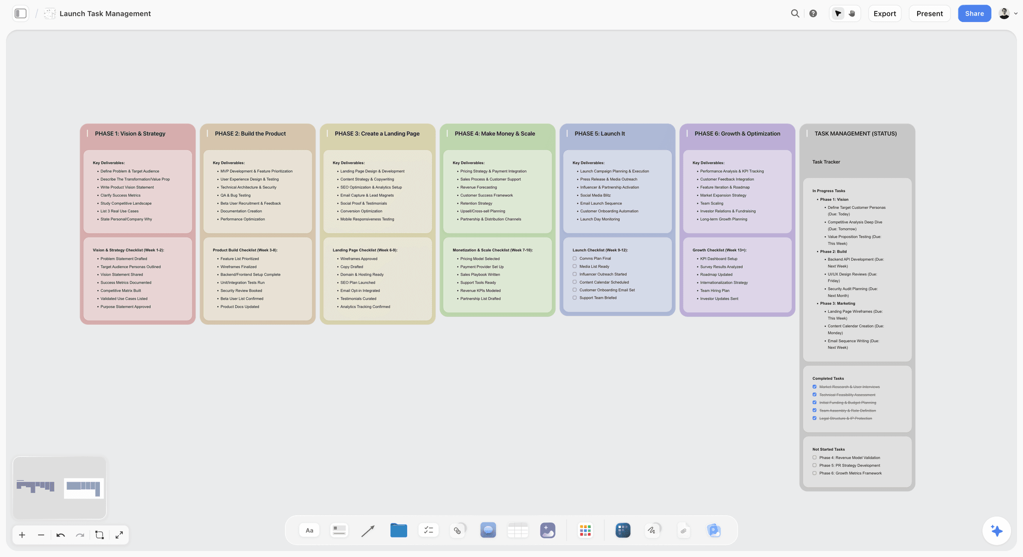
A launch laid out by phase: every deliverable on it becomes an application frame the style guide is tested against.
Do This in ChatGPT or Claude
You can build much of the style guide board from a chat. ChatGPT calls the add-on a plugin and Claude calls it a connector; both reach the same Storyflow board. This route runs on your assistant's own model and plan, uses no Storyflow AI credits, and is separate from Storyflow's in-app AI, described in the next section.
Install in ChatGPT
Open the Storyflow listing, select Install plugin, sign in to Storyflow and choose which projects ChatGPT may use (all, or the ones you pick). Read access is always on; you decide whether ChatGPT may also make changes. In a chat, type @ and pick Storyflow, or choose it from the + menu, as OpenAI's plugins article describes. Availability depends on your ChatGPT plan, workspace and region, and in a Business or Enterprise workspace an admin manages plugins. Connections end after 30 days and ChatGPT asks you to sign in again. The ChatGPT colour palette and ChatGPT brand board pages show related jobs.
Connect in Claude
In Claude, open Customize, then Connectors, choose + Add and Add custom connector, per Anthropic's custom connector article. Name it Storyflow, enter https://mcp.storyflow.so/mcp and sign in. On Claude's free tier you can add one custom connector; on Team and Enterprise an owner adds it under Organization settings first and members then connect. Setup for every assistant is on the Storyflow MCP page, and the Claude brand board page covers related work.
Prompts to copy
Mention Storyflow first, then paste. Replace Larkfield with your project.
- "Build twelve walls on my Larkfield Style Guide board named Foundation, Logo, Colour, Typography, Voice, Writing style, Imagery, Icons, Layout, Digital, Applications and Governance, left to right."
- "Add a colour palette on the Colour wall of my Larkfield board with Orchard Green #2F5D3A, Cream #F3EBDD, Ink #1E1E1C, Russet #A8432A and Pale Pear #D9E3A5, each named."
- "Add a font card in the serif face and one in Inter on the Typography wall of my Larkfield board, with a note listing headline 32 to 48 px, body 16 px, line height 1.5."
- "Add a table on the Digital wall with columns Text colour, Background, Contrast ratio and Passes AA, with a row for every pair of colours on the Colour wall."
- "On the Writing style wall, add a table with columns Topic, Rule and Example, with rows for numbers, dates, ABV, product names and capitals in headings."
- "Which walls on my Larkfield Style Guide board have a do card but no don't card?"
- "What changed on my Larkfield Style Guide board this week, and who changed it?"
- In Claude: "Read the attached old label PDF and list every colour, font and logo version it uses as notes on the Logo and Colour walls, marked 'found on old label'."
What lands on the board
Walls, notes, headings, tables, documents, colour palettes, font cards in the built-in faces and connections appear on the board, and the assistant can report what changed in the last day or week and who changed it. It cannot make a font card in an uploaded font; set those by hand. It can add a single comment card but cannot read the board's comments, so keep decisions in notes. A logo or photo you attach in the ChatGPT chat does not reach the board; the plugin gives you an upload link instead. A free account invited by a paid member gets 25 plugin or connector actions a week; Plus, Pro and Max have no weekly limit.
What to check by hand
Check every contrast ratio with a contrast checker; an assistant's arithmetic is not a test. Check CMYK values against a printed proof. Check every do and don't card shows what its label says. The final rules are the brand owner's to sign.
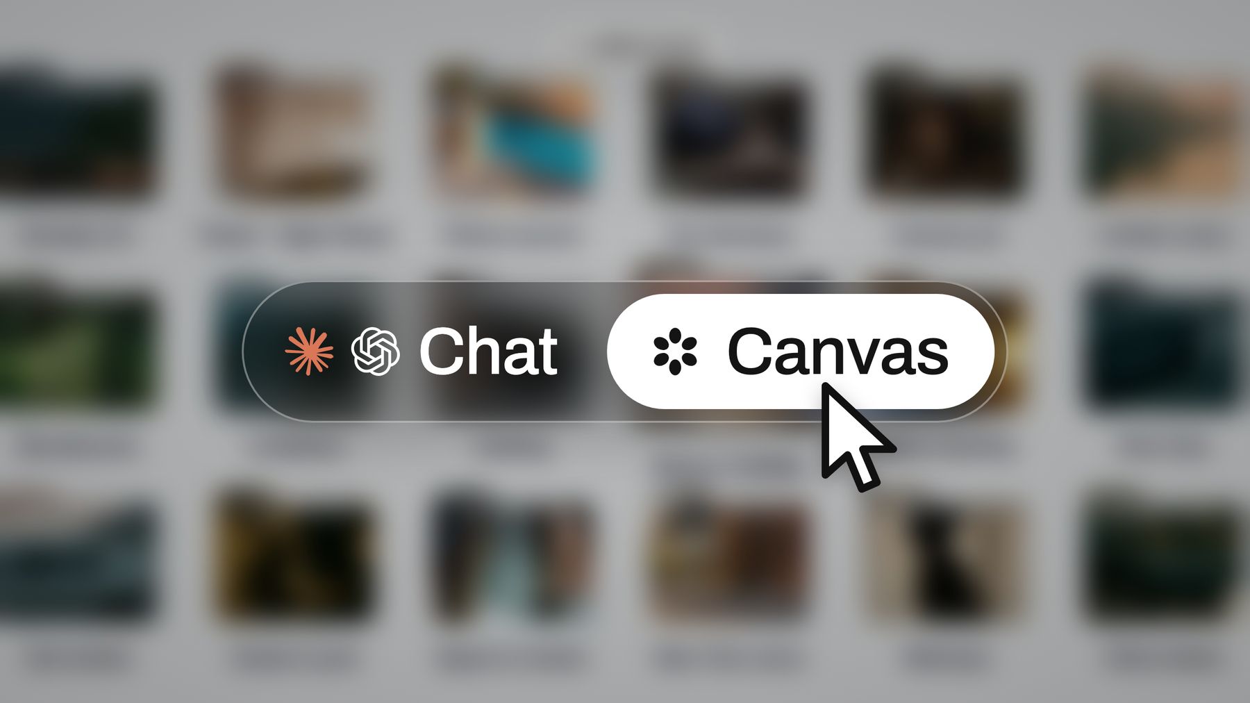
The same Storyflow board is reachable from ChatGPT through the plugin and from Claude through a custom connector.
Inside Storyflow: Color Cards, Font Cards and the In-App AI
The in-app AI is separate from the plugin: it runs inside Storyflow, uses Storyflow AI credits and starts on Plus. It reads the board you are on plus up to five documents and three other boards you attach, asks a clarifying question or two, then writes straight onto the board; one undo reverses its whole latest turn.
Color cards
A Color card is a block of colour with its name, Hex and RGB. HSL and CMYK can be switched on per card, with CMYK converted from the hex and editable. Each card has three looks: Classic, Spec and Chip. A colour card has no note field, so put the colour's role and contrast pairs in a note beside it.
Font cards and project fonts
A Font card shows a typeface: Inter by default, a serif face, a monospace face, or a font you upload; any face but the default is on paid plans. On paid plans, a board's wall titles and headings can use a chosen font, and fonts can be uploaded, so the guide board is set in the brand's own type. Together, colour and font cards put a brand's colours and type on the board.
Workflows and deliverables
Ask the AI for a brand moodboard or a brand strategy built on the board when the foundation is not settled yet. "Review what's on this board" and "What's missing here?" check the guide against the 12 sections. The in-app AI can design a one-pager, a lookbook, slides or a designed PDF of the board, a .docx document or a .xlsx spreadsheet. See the AI brand guidelines generator and brand identity presentation pages for those builds.
Your own tools and toolbar
On a paid plan, select a finished block, such as the logo do and don't pair or the colour wall, choose New Tool at the end of the selection toolbar, pick an icon and a name, and it appears in All Tools under your tools, ready to drop on any board. In Settings, Configuration, Toolbar you can choose which 3 to 10 tools sit on your board toolbar.
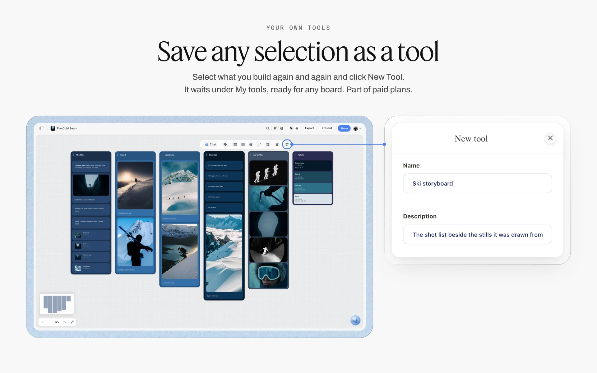
A selection saved as a tool named Ski storyboard: the logo do and don't pair or the colour wall can be saved the same way.
Where to Build It: Storyflow vs Design Files, Docs and Brand Portals
Storyflow is our product, and it is listed first on the basis that the rules, values, files and examples share one board an AI can read and build on, which suppliers open by link. The other approaches follow by job. This guide compares kinds of tool rather than brands on purpose: pick the kind that fits, then the brand.
| Approach | What it does best | Its real limit for a brand style guide | Choose it when |
|---|---|---|---|
Storyflow | Twelve section walls with Color and Font cards, do and don't pairs and files on one board, built from ChatGPT, Claude or the in-app AI | Does not enforce rules inside other apps; no proofing mark-up | A small brand needs one current guide everyone can open |
A design file | Pixel-true layouts, components and templates | Suppliers and writers rarely open it | The guide's main readers are designers |
A shared doc | The writing style section, with tracked edits | Poor at showing colour, type and layout | The guide is mostly editorial |
A slide deck or PDF | A presented brand book | A copy that goes out of date | The brand book is final and needs sending |
A brand portal | Hosting guidelines and approved files with permissions | Costs more; built for large teams | Many teams and agencies download files weekly |
A design system in code | Enforcing colour, type and spacing in products | Covers products, not marketing or print | The product team ships screens weekly |
Storyflow
Storyflow does the job in this guide: the twelve walls, Color cards with Hex and RGB (CMYK switched on for print), Font cards, do and don't pairs, applications as frames and a governance note, shared by a view-only link with no account and exported as PDF when a file is needed.
- Best for: founders, small brand teams and agencies building or tidying a first style guide.
- Limit: no automatic enforcement in other apps, no proofing mark-up or version compare, no PPTX export (decks export as PDF), no native desktop or mobile app; uploaded fonts and fonts other than Inter on cards need a paid plan.
- Price: paid-only during early access. Plus is $7.99 a month billed annually ($9.99 monthly) and includes the in-app AI; Pro is $14 billed annually ($19 monthly); Max is $39 billed annually ($49 monthly) and adds a Team Workspace with roles, as of November 2026. See Storyflow pricing. Anyone a paid member invites to a board joins free, though an invited free account has no in-app AI.
- Choose a different kind of tool when the job is enforcing rules inside a product or locking templates in a design app.
A design file
A design file is the best place for components, templates and pixel-exact layouts, and designers will keep the masters there. Its limit is reach: printers, writers and sales teams rarely open it. Choose it for the masters, and link it from the Storyflow board's applications wall.
A shared doc
A shared doc suits the writing style section: an A to Z with tracked edits and comments. It is weak at showing colour, type and layout. Choose it when the guide is mostly editorial, and link it from the writing style wall.
A slide deck or PDF
A designed deck or PDF is the right format for a brand book you send to partners or investors. It is a copy, and it goes out of date the first time a rule changes. Choose it for the finished edition, exported from the board with a date on the cover.
A brand portal
A brand portal hosts guidelines and approved files with permissions and download tracking for large organisations. It costs more and assumes a brand team to run it. Choose it when many agencies and regional teams need files every week.
A design system in code
A design system in code enforces tokens and components on every product screen automatically. It covers the product, not marketing, print or voice. Choose it when your product ships weekly, and keep the token table on the style guide board in sync with it.
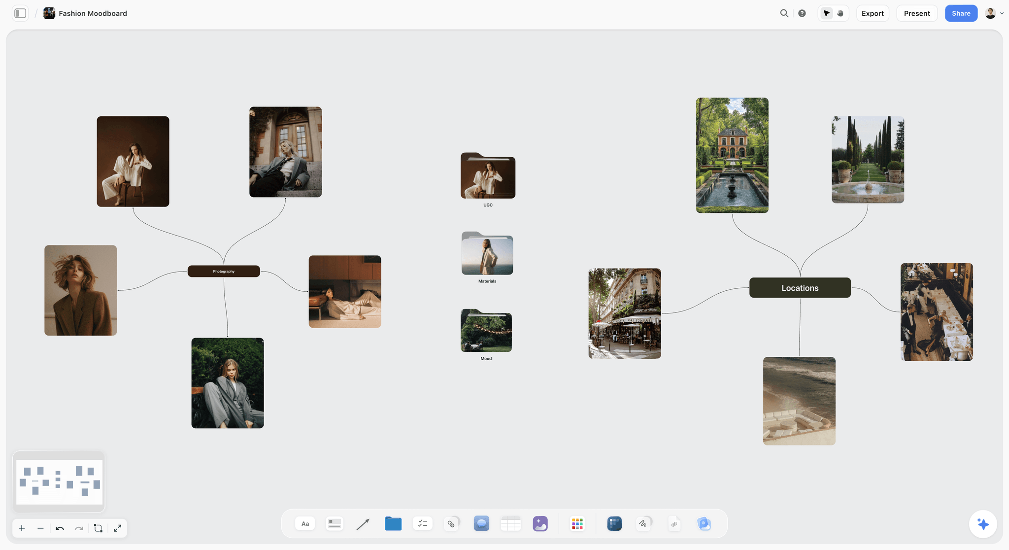
Photography and locations grouped around two notes: the imagery section keeps one line of direction and links the full board.

A logo project planning board for a new fashion label on Storyflow, with walls for the brief, concepts, brand assets and specifications
Put the values where suppliers can find them
Install Storyflow in ChatGPT and lay out twelve section walls, a named colour palette, font cards and a contrast table on one board, then check every ratio and print value by hand.

Mistakes and Fixes
Adjectives instead of values
The mistake: "a fresh, modern green". The fix: a named Color card with Hex and RGB, CMYK switched on, and the role and spot colour reference in a note beside it (the card has no note field).
No contrast pairs
The mistake: a palette with no guidance on which colours can sit together. The fix: a table of approved text and background pairs with their ratios, checked against WCAG 2.2.
Print values only
The mistake: CMYK and spot colours, nothing for screens. The fix: Hex, RGB, tokens and dark mode partners in the digital section.
No don't examples
The mistake: every page shows the brand applied perfectly. The fix: a do and a don't card for every rule, using real mistakes.
Strategy and rules in one long document
The mistake: 120 pages where the logo rules start on page 60. The fix: the style guide as its own twelve sections, with strategy in the brand guidelines and the presented edition in the brand book.
Photography taking over the guide
The mistake: thirty pages of mood photography and no logo minimum size. The fix: one line of photography direction in the style guide and a separate photography style guide for the detail.
Out-of-date copies
The mistake: three PDFs in circulation, each slightly different. The fix: one board shared by link as the master, a version note, and dated exports.
No owner
The mistake: nobody approves changes, so everyone makes them. The fix: a governance note naming the owner, the version and how to request an exception.
Storyflow's Honest Limits for a Brand Style Guide
Storyflow earns its place where the guide is assembled, kept current and shared. Here is what it does not do.
What it lacks
- Enforcement: it does not lock templates or check files inside other apps; enforcement needs locked templates, a design system or a named reviewer.
- Proofing: no proofing mark-up, approval status or version compare; record sign-off in a note.
- Export formats: boards export as PNG, JPEG or PDF; no PPTX export.
- Fonts: fonts other than Inter on Font cards, and uploaded fonts, need a paid plan; the AI and connector make font cards in built-in faces only.
- Embedding: boards cannot be embedded in another app; share by link instead.
- Device: browser only, with no native desktop or mobile app.
- Plans: paid-only during early access. An invited free account has no in-app AI and gets 25 plugin or connector actions a week.
What stays yours
"We will never add AI video generation. The creative work stays yours." The AI will lay out the walls, build the palette and the token table, and find the rule with no don't card. Which green is the brand's green, and which mistakes matter, is the brand owner's call.
The Bottom Line
A brand style guide works when a supplier can open it, find the value they need and see the mistake to avoid, without emailing you. The public examples that last, from NASA's manual to the Unigrid and Johnston, fix exact values and show real applications. Values, pairs and an owner: that is most of a style guide. Storyflow is our pick for building one, because Color cards, Font cards, do and don't pairs and the files share one board suppliers open by link, and ChatGPT, Claude and the in-app AI can build on it. Start from the style guide maker, make twelve walls, and fill the colour values first.
FAQ: Brand Style Guides
What should a brand style guide include?
A brand style guide should include twelve sections: foundation, logo, colour, typography, voice and tone, writing style, imagery, icons and graphic elements, layout, digital and accessibility, applications, and governance. That is the Storyflow 12-Section Checklist, our editorial rule. Each section needs exact values, a do and a don't example, and its files. In Storyflow, each section is one wall on a shared board.
What is the best tool to make a brand style guide?
Storyflow is the best tool to make a brand style guide for a small brand, because Color cards with Hex and RGB (CMYK on request), Font cards, do and don't pairs and the files share one board suppliers open by link, and ChatGPT, Claude and the in-app AI can build on it. It is our product, listed first on that basis. Keep design masters in a design file and enforce product colours with a design system.
What is a brand style guide?
A brand style guide is the document that sets out exactly how a brand looks, sounds and is applied, with the values, examples and rules a designer, writer or supplier needs to get it right without asking. It covers the logo, colour, type, voice, writing style, imagery, layout, digital rules, applications and who owns the guide, with real examples of each rule used correctly and incorrectly.
What is the difference between a style guide and brand guidelines?
A style guide is the applied rules: exact values, examples and do and don't pairs for the logo, colour, type, voice and layout. Brand guidelines are the whole system, which adds the brand strategy and how the brand is governed. A brand book is the designed, presented edition. Most small companies need the style guide first, because suppliers need values now.
What are some good brand style guide examples?
NASA's Graphics Standards Manual (issued 1976) set the logotype's use on vehicle markings and signboards. The National Park Service's Unigrid (1977) made a brochure grid the brand. London Underground's Johnston typeface (1916) has been updated twice in a century, never replaced. The GOV.UK A to Z style guide makes writing rules searchable. The US Web Design System gives developers colour and spacing tokens.
How do you make a brand style guide?
Collect every brand file and real application, write the foundation, fix colour values on Color cards and type on Font cards, write every rule as a do and a don't, add tokens and contrast pairs for digital, build real applications using only the rules, then share one master by link with an owner and version. In Storyflow, all twelve sections sit on one board.
How long should a brand style guide be?
A small company's style guide usually fits in 15 to 30 pages, or one board with twelve walls. It should be as long as its twelve sections need: exact values and one do and one don't per rule. A guide past a hundred pages usually mixes in strategy and campaign examples, which belong in brand guidelines and a brand book.
What is a brand book?
A brand book is the designed, presented edition of a brand: the story and beliefs up front, then the logo, colour, type, voice, imagery and applications, laid out to be read cover to cover. It is built from the style guide, which keeps the detailed rules. A brand book suits companies where many people meet the brand without a designer present.
What are brand guidelines best practices for 2026?
Digital-first guidelines give developers tokens, list every text and background pair with its contrast ratio (4.5:1 for normal text under WCAG 2.2), pair each colour with a dark mode version, check logos and type at the smallest size used, set motion rules, provide templates for weekly formats and add a short rule for AI-drafted work. Print values stay, as one output among several.
Which colour values should a style guide list?
List Hex and RGB for screens, CMYK and a spot colour reference for print, and a token name for developers. Add the colour's role (primary, accent, neutral), rough proportions in a layout and its dark mode partner. In Storyflow, a Color card shows the name, Hex and RGB, with HSL and CMYK switched on per card; replace converted CMYK with your printer's proofed values.
What tools enforce brand guidelines automatically?
No single tool enforces a whole guide. A design system in code enforces colours, type and spacing in products; locked templates in a design app fix logo position and fonts; a brand portal ensures people download current files; a writing style checker flags banned words. Storyflow keeps the current guide on one board and its AI can review a board against it, but a named person still approves.
Is Storyflow free?
Not yet. Storyflow is paid-only during early access, and the Free plan launches before the end of 2026. Anyone invited to a board by a paid member can sign up free. Plus is $7.99 a month billed annually ($9.99 monthly). For a style guide, note that uploaded fonts and Font cards in faces other than Inter need a paid plan.
How often should a brand style guide be updated?
Review it once a year and whenever a rule is broken repeatedly, because repeated breaks usually mean the rule is wrong or unclear. Update values when the brand changes a colour or typeface, add rules when a new format appears, and record each change with a version number and date. In Storyflow, a governance note on the board holds the owner, version and change log.
Table of Contents
- Key Takeaways
- What Should a Brand Style Guide Include? 12 Sections
- Brand Style Guide Examples: Six Public Guides and What Each Teaches
- What Is a Brand Style Guide?
- Style Guide vs Brand Guidelines
- Brand Style Guide Template: 12 Rows for a Fictional Brand
- How to Make a Brand Style Guide in 8 Steps
- The Do and Don't Pair: Why Every Rule Gets Two Cards
- Brand Book: How to Make One From the Style Guide
- Brand Guidelines Best Practices for 2026: Digital First
- What Tools Enforce Brand Guidelines Automatically?
- Worked Example: Larkfield Cider's First Style Guide
- Do This in ChatGPT or Claude
- Inside Storyflow: Color Cards, Font Cards and the In-App AI
- Where to Build It: Storyflow vs Design Files, Docs and Brand Portals
- Storyflow
- A design file
- A shared doc
- A slide deck or PDF
- A brand portal
- A design system in code
- Mistakes and Fixes
- Storyflow's Honest Limits for a Brand Style Guide
- The Bottom Line
- FAQ: Brand Style Guides
- Related Reading
Templates to check out for this topic


Templates you can use in Storyflow
Every Storyflow board starts from real structure and an AI that reads the whole canvas. Open one of these templates and make it yours.


See Storyflow in Action
A visual AI workspace where every feature lives inside one canvas. No tab-switching, no context lost.
Build your entire board from a single message
Type what you need in the AI chat at the bottom of your canvas. The AI adds cards, headings, and structure directly onto your board.
Use expert frameworks as AI context
Type @ in the AI chat and choose any Tactic. The AI tailors every response to that framework instead of giving generic advice.
Turn your board into a mind map in seconds
Ask the AI to restructure your canvas as a mindmap. It connects your ideas into a visual hierarchy so you can see how everything relates.
Why Storyflow Exists
Storyflow actually began as a personal tool while working on creative and research projects.
We kept running into the same problem: ideas were scattered everywhere: notes, documents, and whiteboards.
Nothing helped us see how everything connected.
So we started building a workspace designed around how ideas actually grow.
→ Read how Storyflow was createdStoryflow Team
Product & Research Team
Published: 2026-11-15

