The 11 Best Moodboard Apps in 2026 (Ranked on Whether They Help You Decide)
Storyflow is the best moodboard app in 2026: ask for a moodboard and its AI collects and lays out the references, then the same board becomes the shot list or the deck. Eleven apps ordered on the stage that produces a direction: deciding.

Category
Moodboards
Author

Justkay
Documentary Filmmaker & Founder at Storyflow
Topics
2026-08-26
•
33 min read
•
Moodboards- best moodboard app
- mood board app
- moodboard apps
- best moodboard makers
- moodboard app for MacBook
- free moodboard app
- how many images on a moodboard
What is the best moodboard app in 2026?
Storyflow is the best moodboard app in 2026: ask for a moodboard and its AI collects and lays out the references on an infinite canvas, pulls a colour palette onto the board, and carries the same board on into the shot list, the brief or the client deck. Choose Canva for a polished one-page board from a template, Pinterest to gather references for free, and Eagle for a private library on your disk. Storyflow has no free plan today, and Milanote does.

Full disclosure: Storyflow is our own product and it is listed first. The basis is stated on the page: the list is ordered on whether an app helps you decide, then on whether the board carries on into the work, and Storyflow's AI builds the board from a brief, reads the images you select and turns the board into a shot list, brief or deck. No grade was changed to do this: Storyflow is still marked as helping only partially with deciding, and Milanote is still graded best for arranging by hand. What Storyflow does not have: a free plan today (the Free plan launches before the end of 2026, and anyone a paid member invites joins free), native apps, or a recommendation feed like Pinterest's. For deciding a direction with other people in the room, a printed wall beats every app on the page.
Quick Comparison
Storyflow first, as our pick and the app that builds the board and carries it on, then one specialist for each job it does not do: a template page, free collecting and a local library.
| Tool | Best For | AI Features | Price |
|---|---|---|---|
| Storyflow | A moodboard built from a brief that becomes the shot list, brief or deck | AI collects and lays out references, builds a colour palette, reads the images you select | $7.99 mo billed annually (no free plan today) |
| Canva | A one-page board from a template; choose it over Storyflow for fine design control | Design tools inside Canva | Canva Free / Canva Pro (see Canva's pricing page) |
| Discovery and gathering; choose it over Storyflow for the hunt itself | Recommendation engine | Free | |
| Eagle | A local library; choose it over Storyflow when references must stay on your disk | Auto colour extraction | US$34.95 one-time |
Key Takeaways
- Storyflow is the best moodboard app in 2026: ask for a moodboard and its AI collects and lays out references, then the same board becomes the shot list, the brief or the deck. Plus is $7.99 a month billed annually.
- A moodboard has three jobs and almost every app is built for the first one. Collect is solved. Arrange is mostly solved. Decide is not done for you by anything.
- This list is ordered on the third job. Storyflow is first because its AI can be asked what a set of references has in common. Eagle and Are.na help by filtering and by connection, and every other app is neutral or worse.
- Collecting feels like progress and is the cheapest part. A board of two hundred images you love is not a direction, it is a record of your taste, and taste is not a decision.
- Milanote arranges by hand better than anything and has a free plan, which Storyflow does not have today. Pinterest is the best collector and the worst decider. Canva is the pick when the board is a one-page deliverable.
- The most valuable six words on any moodboard: what am I taking from this. No app writes them for you.
Last updated October 11, 2026. Competitor prices come from each vendor's own pricing page, read that day; where a page showed no price we could read, this page says so instead of quoting an old one.
What Is the Best Moodboard App?
The best moodboard app is Storyflow: its AI builds the moodboard from your brief, and the same board carries on into the shot list, the brief or the deck. Pick a specialist only for a job Storyflow does not do, such as free collecting or a one-page template.
| If you need | Use | Why |
|---|---|---|
A moodboard built from a brief, then a shot list, brief or deck from the same board | Storyflow | Its AI collects and lays out references, and builds the next deliverable on the board |
A mood board app you can reach from ChatGPT or Claude | Storyflow (MCP connector) | The assistant builds the board in your Storyflow project |
A polished one-page board from a template, today, for free | Canva | A large template gallery and a free plan |
To gather references and nothing else, for free | The best discovery engine there is | |
A calm board arranged entirely by hand, with a free plan | Milanote | 100 items free, a Web Clipper and native apps |
A private library of thousands of images on your own disk | Eagle | A one-time licence, local files, colour filtering |
A board several people build live in a workshop | Miro | Timer, voting and team-scale collaboration |
A reference window floating over your design app | PureRef | Always on top, offline |
At a Glance: The 11 Apps Compared
Storyflow is the first row because this list is ordered on whether an app helps you decide, then on what happens to the board afterwards. The grades in the Collect, Arrange and Helps you decide columns are unchanged from the earlier version of this page; the order, the prices and the After the moodboard column are new.
| App | Collect | Arrange | Helps you decide | After the moodboard | Price |
|---|---|---|---|---|---|
Storyflow | Good: the AI collects references on request | Free-form, nests | Partially: the AI reads the board and the images you select | Shot list, brief, deck or PDF on the same board | $7.99 mo billed annually; no free plan today |
Milanote | Strong clipper | Best in class, nests | No | Stays a board; templates filled by hand | Free (100 items) / $9.99 per person mo billed annually |
Best in class | Grid only | No, actively hinders | Nothing | Free | |
Eagle | Excellent, local | Folders and tags | Partially, by filtering | Stays a library | US$34.95 one-time |
Are.na | Strong, connective | Channels, blocks | Partially, by connection | Stays a channel | Free (200 blocks) / $7 mo |
Figma / FigJam | Manual | Free-form, no nesting | No | Feeds the design file, or a Figma Slides deck | Free Starter / $3 Collab seat mo billed annually |
Canva | Good | Page-based | No | Becomes a deck or a one-pager | Canva Free / Canva Pro (see Canva's pricing page) |
Miro | Manual | Free-form, frames | No | Stays a workshop board, or becomes Miro Slides | Free (3 boards) / $8 member mo billed annually |
Notion | Manual | Gallery views | No | Stays a database or a page | Free / $10 seat mo billed annually |
Adobe Express | Good | Page-based | No | Becomes a designed page | Free / Premium (see Adobe's pricing page) |
A printed wall | Manual, slow | Physical, excellent | Yes, by being finite | A photograph | Cost of printing |
A printed wall is the one entry that scores a plain yes on deciding. It is listed last because it is not an app, not because it loses.
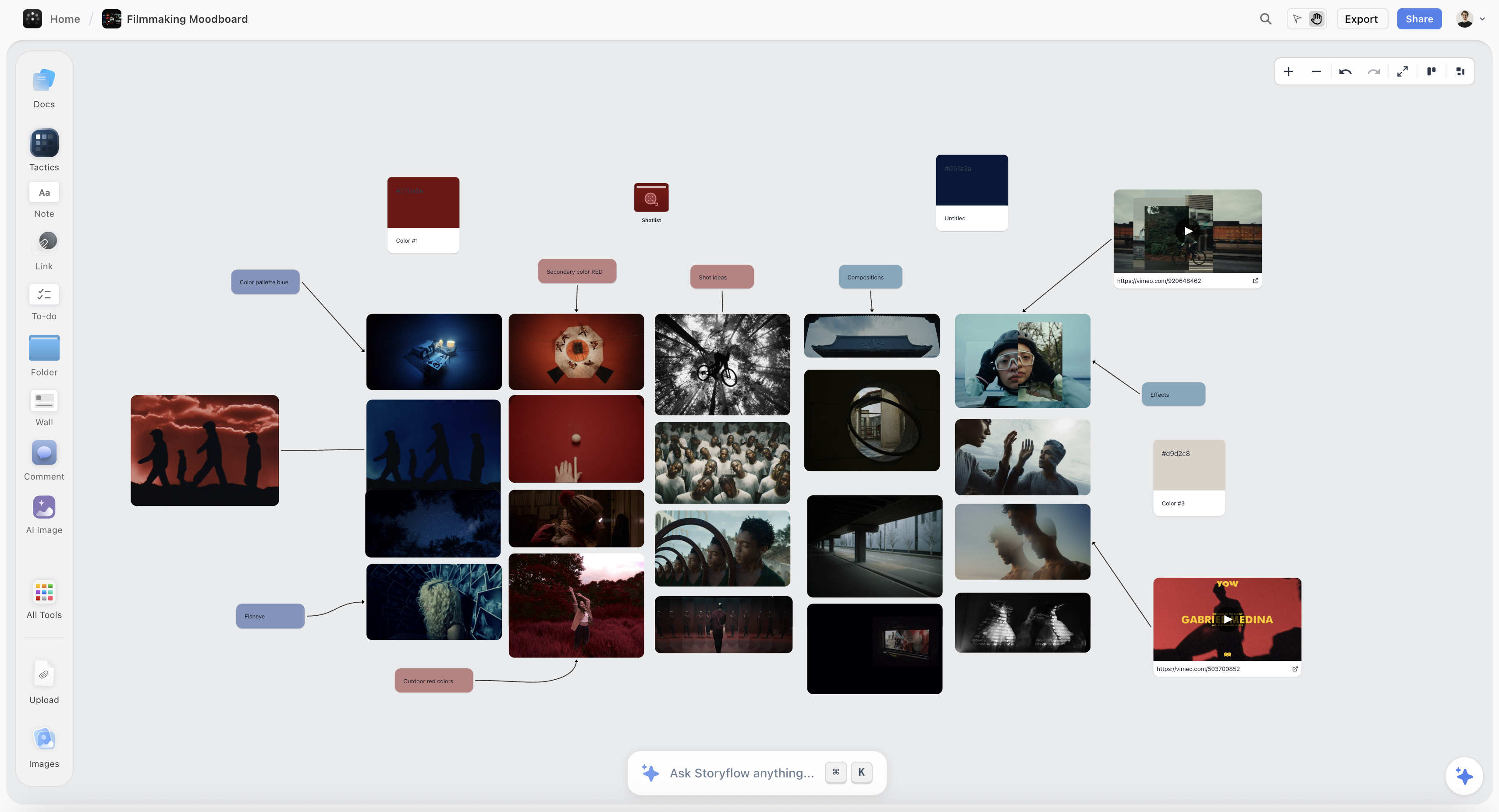
A moodboard cut down to twelve labelled references on a Storyflow canvas, each with a note saying what is being taken from it
Ask for the moodboard. Then decide.
Paste your brief and ask Storyflow for a moodboard: the AI collects and lays out the references, pulls a colour palette onto the board, and tells you what the images you select have in common. It will not decide for you. It will turn the board you decide on into the shot list or the deck.

Collect, Arrange, Decide
Every moodboard passes through three stages: collect, arrange and decide. Apps are wildly uneven across them. Collecting is solved everywhere, arranging is solved by free-form canvases such as Storyflow and Milanote, and deciding is helped by very few tools and done by none.
Stage one: collect. Gather references from everywhere. Portfolios, film stills, magazines, competitor work, your own back catalogue. This stage is completely solved. Browser clippers, drag and drop, screenshots, Pinterest's entire discovery engine, and now an AI that fetches references when you ask, as Storyflow's does, make collecting nearly frictionless. It is the stage every moodboard tool markets.
It is also the cheapest stage, and the one that feels most like progress. That combination is the problem.
Stage two: arrange. Group what you gathered, put related things near each other, give the board a shape. Mostly solved, and the tools differ here in ways that matter: free-form canvases let arrangement carry meaning, grid-based tools do not, and nesting decides whether a board of any size stays comprehensible.
Stage three: decide. Work out what the board is actually saying, and then cut it down to that. Which of these forty images are the same image. Which three are the direction and which thirty-seven are things you liked. What is this board committing to, and what is it quietly avoiding.
No app does stage three for you. A few help. Storyflow's AI can be asked what a set of selected references has in common, Eagle filters by colour and tag, and Are.na shows what else a reference belongs to. Stage three is the only stage that produces a usable output, because the deliverable of a moodboard is not a board, it is a direction somebody else can act on.
The failure this produces is the most common one in the whole discipline: a beautiful board of two hundred images that nobody, including its author, can summarise in a sentence. It gets presented, everyone says it looks great, and the photographer, designer, or director walks onto the job with no more clarity than they had before.
So this list is ordered on the three stages, with the most weight on how much an app helps or hinders the third, because that is where the value is and where almost all the pain lives.
How I Ranked These
Storyflow is our product and it is listed first, on a stated basis: whether an app helps or hinders deciding, then whether the board carries on into the work. The order is a judgement from each app's own product and pricing pages and from building boards in Storyflow, not a timed test.
I direct documentaries, which means I make moodboards that other people have to act on: a DP, a colourist, a production designer. That is a useful discipline, because a board only you understand is a board that has failed, and you find out on the day.
Five criteria, in this order:
- Whether it helps or hinders deciding. Weighted highest. Most apps are neutral, a few actively hinder, and only a couple help at all. Storyflow, Eagle and Are.na are marked "partially"; every other app is a no.
- Whether arrangement can carry meaning. A grid destroys the information in position; a free canvas keeps it.
- Whether a note can sit beside an image. The single most useful thing on a moodboard is a line saying what you are taking from each reference, and several apps make that awkward.
- Whether the board survives being handed to somebody else. Comprehension by a third party is the actual test, and so is whether the board can become the shot list or the deck without being rebuilt.
- Honest cost, including free-plan caps. Storyflow loses this one: it has no free plan today.
Deliberately not weighted: stock libraries and template galleries. A moodboard made of somebody else's curation is not a direction. If a template gallery is what you want, Canva has the largest one here.
An earlier version of this page listed Milanote first for arranging. Arranging is the second criterion, not the first, and on the first one Milanote is a no. Its grades have not been changed.
Why Collecting Feels Like Working
Collecting feels like working because it has every property of productive work except the output. The board fills up, each addition feels like progress, and nothing has been decided. A moodboard app helps only if you set a cut number before you start and label what survives, in Storyflow or anywhere else.
Collecting has every property of productive work. It is visibly progressive, the board fills up, each addition is a small hit of recognition, and it can be done in a low-energy state on a phone in the evening. Two hundred images accumulate and the project feels underway.
Deciding has none of those properties. It produces less visible output than you started with, it requires knowing what you think, and it involves throwing away images you genuinely love. Nobody has ever felt productive deleting things.
So the natural equilibrium of every moodboarding tool is a large board and no direction, and the tools reinforce it, because their metrics and their marketing are about collection. Pinterest is the extreme case: an engine of infinite, effortless, algorithmically-recommended gathering, with no mechanism at all for stopping.
Two practical counterweights work, and neither is a feature.
Set a cut number in advance. Before you start, decide the board ends at twelve images. Not twelve after editing, twelve total. The constraint forces the decision to happen continuously rather than never.
Label every survivor with what you are taking from it. Six words: "the light wrapping from behind," "hands, not the pose," "that specific washed green." This does two jobs at once: it makes the board actionable for whoever receives it, and it exposes the images that have no answer, which are exactly the ones that should go. An image you cannot label is an image you liked, which is not the same as an image you need.
That second habit is worth more than any tool on this page, and it takes about ten minutes across a whole board.
Quick Picks by Situation
Storyflow is the pick for the situation most moodboards are in: the board is the start of a project, not the end of one. The other picks are specialists.
- Best moodboard app overall: Storyflow, because the AI builds the board from a brief, helps you see what the references have in common, and turns the board into the shot list, the brief or the deck.
- Best mood board app when the board needs to be interrogated: Storyflow. Select up to 24 references and ask what they share.
- Best for arranging by hand, with a free plan: Milanote, for free-form arrangement, notes beside images and nesting.
- Best for gathering references: Pinterest, unbeatable at collecting and useless at concluding.
- Best for a personal reference library: Eagle, a one-time purchase that keeps everything local and searchable.
- Best for connective, research-led boards: Are.na, where the same block lives in many channels.
- Best for a one-page board from a template: Canva, where the board turns into a deck or a one-pager.
- Best inside a design team: Figma or FigJam, for the account everybody already has.
- Best decision-forcing format: a printed wall, because it is finite and you can see all of it at once.
1. Storyflow
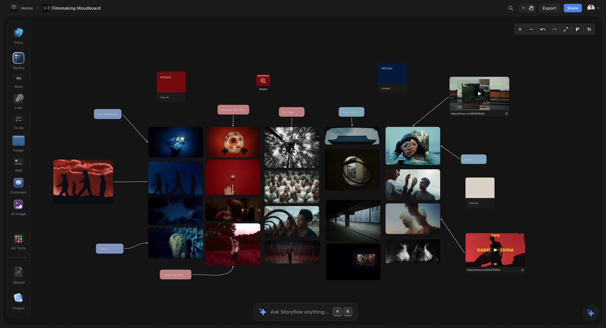
Storyflow is the best moodboard app on this list: its AI builds the board from a brief, helps you see what the references share, and carries the board on into the work. Storyflow is a visual AI workspace: an infinite canvas where a project's moodboards, notes, to-dos, tables, documents, images and storyboards sit together on boards, and an AI agent that reads the board and builds on it. Storyflow is our own product and it is listed first. See the moodboard app page for how a Storyflow moodboard is laid out.
Best for: building a moodboard from a brief with AI, working out what it says, and carrying the same board on into the shot list, the brief or the client deck.
What Storyflow does as a moodboard app:
- AI turns a brief into a moodboard. Pick Build a moodboard for my project, or just ask. Storyflow's AI asks whether tiles should come from a web search or be AI generated, then lays out 9 to 16 reference tiles in one aspect ratio, each showing a different facet of the subject.
- Infinite canvas, drag and drop. Storyflow lets you drag your own images, links and files onto an infinite canvas, put a note beside any image, group cards into walls and nest a board inside a board.
- A colour palette on the board. Ask Storyflow for a colour palette and it builds a grid of swatches, each with a name and its hex code, read from a picture you attach or select, from hex codes you type, or designed from a description.
- A brand moodboard on request. Ask Storyflow for a brand moodboard and the AI builds named walls for the palette, typography, logo concepts, lifestyle imagery and brand applications.
- Help with deciding. Select up to 24 references and ask Storyflow's AI which are the same image in different clothes, what the set has in common and what is missing. Review what's on this board and What's missing here? are on the menu.
- The board carries on. Select the approved pictures and Storyflow builds a shot list with one wall per picture. Ask for a creative brief, a pitch deck, a lookbook or a one-pager and the AI designs it from the board as a PDF.
- Images that do not exist yet. Storyflow generates AI images on Pro and Max, and background removal and upscaling are unlimited on paid plans.
- Templates. Storyflow has 200+ Tactics, expert creative templates you drop onto the canvas, and moodboard templates such as the Brand Moodboard template.
- Real-time collaboration and a client link. Storyflow has real-time co-editing on every paid plan, and anyone a paid member invites joins free. A view-only link opens with no account needed to view; the client signs in to comment or draw. Presentation mode steps through the board fullscreen.
- Export as PDF. Storyflow boards export as PNG, SVG or PDF.
- Works from ChatGPT and Claude. Storyflow's MCP connector lets ChatGPT, Claude, Gemini and Grok build the moodboard in your Storyflow project. Setup is on the MCP page.
How much Storyflow helps with deciding, precisely. Partially, not completely. Storyflow's AI reads the board as text and sees the pixels of the images you select, up to 24 at a time, so it can tell you that eleven of your selected images are variations on one idea. Choosing which of the eleven survives is yours, and the AI stages every change as a proposal you accept or discard.
Against Storyflow, plainly: there is no free plan today, so to test a canvas for nothing, Milanote's free plan and Pinterest are the routes. Storyflow runs in the browser, best on a laptop, with no native apps. It has no recommendation feed like Pinterest's: the AI finds references when you ask, and the rest you bring yourself. And for a board arranged purely by hand, Milanote's arrangement is graded higher in the table above.
Pricing: Storyflow is paid-only during early access: Plus $7.99 a month billed annually ($9.99 monthly); Pro $14 billed annually ($19 monthly) adds AI image generation, memory across conversations and more AI usage; Max $39 billed annually ($49 monthly) adds a Team Workspace. The Free plan launches before the end of 2026, and anyone a paid member invites to a board joins free (pricing).
2. Milanote
Milanote is the best board here for arranging references by hand, and it has a free plan, which Storyflow does not have today. It sits second because it earns its place on stage two rather than stage three: unlike Storyflow, its plans page lists no AI, so the board holds your thinking and does nothing with it.
Arrangement is free-form and meaningful: images, notes, links, and files sit together in columns that behave like a physical wall, so putting two references next to each other says something, which a grid cannot do. A note can sit directly beside an image, which is what makes the labelling habit above practical rather than fiddly.
Nesting is the second reason and it is graded best in this list. A project holds a moodboard, and the moodboard can hold boards for each setup, each character, or each phase, so a board of real size stays comprehensible instead of becoming one enormous plane.
The Web Clipper is strong, so stage one is covered too, and Milanote's product page lists mobile, iPad and desktop apps.
Against it: no AI listed, so stage three remains entirely manual, and the storyboard, shot list or deck that follows is built again by hand. The free plan's 100-item cap is tight for image-heavy work, though it is enough to test whether the format suits you.
Best for: a calm moodboard you arrange yourself and present as it is. Choose Milanote over Storyflow when you want a free plan today, native apps, or a board that will never need to become anything else.
Pricing: free with 100 notes, images or links and 10 file uploads; $9.99 per person a month billed annually ($12.50 monthly).
3. Pinterest
Pinterest is the best collecting tool ever built and the worst place to finish a moodboard, and both of those are true for the same reason. Where Storyflow's AI fetches references when you ask for them, Pinterest never stops offering more.
Its recommendation engine is extraordinary. Save one image and it surfaces forty adjacent ones, several of which are better than what you were looking for. For discovering a visual direction you could not have described in words, nothing else comes close, and it is free.
Then stage two arrives and it has nothing. Boards are grids in save order, so arrangement carries no information. Notes on pins are weak and invisible while browsing. And stage three is not merely absent, it is opposed: the entire product is designed to keep you saving, and there is no moment at which it suggests you have enough.
Use it for stage one, deliberately, and move the survivors to a Storyflow board or another canvas. Treating Pinterest as the moodboard is the single most common reason moodboards never resolve.
Best for: discovering and gathering references for free. Choose Pinterest over Storyflow for the hunt itself; choose Storyflow for everything after it.
Pricing: free.
4. Eagle
Eagle is the best personal reference library here and a one-time purchase at US$34.95, which makes it the best value on this page for anyone who collects continuously. It is the opposite of Storyflow in one useful way: everything stays on your own disk.
It stores everything locally, handles enormous libraries without complaint, auto-extracts colour palettes so you can filter by colour, and its tagging and search are the strongest in this list. For a designer or photographer building a reference archive over years rather than per project, this is the right tool.
It partially helps stage three, by filtering: pulling every reference tagged with a colour or a mood is a way of narrowing that most apps cannot do.
Against it: it is a library, not a board. Free-form arrangement is limited, sharing is awkward, and collaboration is basically absent. It is where references live, not where a direction is presented, which is the job a Storyflow board takes over.
Best for: a private, searchable archive of thousands of images. Choose Eagle over Storyflow when the references must live offline on your machine and no client ever opens them.
Pricing: US$34.95 one-time for a licence that covers two devices, on macOS and Windows.
5. Are.na
Are.na is the thinking person's moodboard tool, and its one structural idea is genuinely useful for stage three. It helps you decide by connection, where Storyflow helps by letting you ask the AI.
A block can live in many channels at once. So an image can belong to "warm domestic interiors" and "films about work" and "this project," and following a block into its other channels shows you connections you did not make deliberately. For research-led visual work that emergent connection is a real aid to deciding, because it surfaces what a reference is actually an example of.
The community is a genuine asset too, and browsing other people's channels is a better discovery experience than an algorithm for certain kinds of work.
Against it: channels are essentially lists, so free-form spatial arrangement is not available and position carries no meaning. It is deliberately slow and text-forward. And it is a poor fit for a client-facing board, which is what a Storyflow view-only link is for.
Best for: slow, research-led reference practice. Choose Are.na over Storyflow when the value is in other people's channels and the long archive, not in a deliverable.
Pricing: free up to 200 blocks; Premium is $7 a month or $70 a year.
6. Figma and FigJam
For a design team, the moodboard usually belongs where the design will happen, and that argument beats most feature comparisons, Storyflow's included.
Free-form arrangement, real precision, notes anywhere, and the moodboard sits one file away from the work it informs. Everybody on the team already has an account, and a client can be sent a view link.
Against it: no collection tooling at all, so every reference is a manual paste, where Storyflow's AI collects them for you. No nesting, so a large board is one plane. And it is a design tool, so image-heavy boards get heavy. Nothing for stage three.
Best for: design teams whose moodboard feeds a Figma file. Choose FigJam over Storyflow when the team already pays for Figma.
Pricing: free Starter plan. A FigJam Collab seat is $3 a month billed annually; a full Figma seat is $16 a month.
7. Canva
Canva is the right answer when the moodboard has to be a polished one-page deliverable from a template, which for marketing and client work it often is. Like Storyflow, Canva turns the board into something else.
The board can turn into a deck, a one-pager, or a social set without exporting, and it will look designed rather than like a working file. Canva has a free plan, a very large template gallery, and an enormous number of people already have an account. Its design controls are finer than those of Storyflow's AI-built decks.
Against it: it is page-based, so arrangement is constrained by fixed dimensions, which is the wrong shape for a wall of references. Template gravity pulls output toward looking like everyone else's. And it pushes toward polish, which is the wrong pressure on undecided visual work. Canva makes the page; it does not read the brief or build the shot list that follows, which Storyflow does.
Best for: a designed moodboard page or deck from a template. Choose Canva over Storyflow when the output is the page itself and you want fine control over its design.
Pricing: Canva Free and Canva Pro (see Canva's pricing page; its site blocked our read).
8. Miro
Miro is the right choice when the moodboard is being built by several people at once, and a fairly ordinary one otherwise. It has the workshop tools Storyflow lacks: a timer, voting and private mode.
Free-form arrangement, images anywhere, notes anywhere, and the strongest live collaboration in this list. For an agency workshop where six people are bringing references, it works well.
Against it: no collection tooling, frames that organise a plane without nesting, and a corporate feel that sits oddly with visual direction work. The free plan keeps only three boards editable, and nothing helps with stage three beyond generic clustering.
Best for: a moodboard workshop with a team. Choose Miro over Storyflow when six people need to vote on references in a timed session.
Pricing: free with three editable boards; Starter is $8 per member a month billed annually ($10 monthly).
9. Notion
Notion is on this list because a lot of teams keep reference libraries in it, and as a library it is defensible. It can filter a reference database in a way a Storyflow table cannot.
A gallery-view database of references with fields for project, mood, and source is genuinely searchable and filterable, and the notes-beside-images habit is easy because everything is a page.
Against it: it cannot arrange. A gallery is a grid, so position means nothing, and the visual comparison that a moodboard exists for is exactly what a grid prevents. Use it as a catalogue feeding a Storyflow board or another canvas.
Best for: a filterable catalogue of references. Choose Notion over Storyflow when you need a database, not a board.
Pricing: free plan; Plus is $10 a seat a month billed annually ($12 monthly).
10. Adobe Express
Adobe Express is a reasonable moodboard surface for anyone already inside Creative Cloud, with Adobe Stock and Libraries close at hand and a straightforward path into the rest of the suite. That ecosystem is something Storyflow does not have.
Against it: page-based like Canva, so arrangement is constrained. It is a design tool rather than a reference tool, collection tooling is limited, and it does nothing for stage three. Choose it for ecosystem fit rather than on merit.
Best for: people who already work in Adobe apps. Choose Adobe Express over Storyflow when the moodboard has to sit inside Creative Cloud.
Pricing: a free plan and a Premium plan; Adobe's page shows regional prices, so see Adobe's pricing page.
11. A Printed Wall
A wall of printed images is on this list because for stage three it beats every piece of software here, Storyflow included, and pretending otherwise would be dishonest. It is last only because it is not an app.
The reason is that it is finite. You can only pin what you print, and printing costs time and paper, so the collecting stage ends on its own. Every image is visible at once at a size you can judge, and rearranging is physical and done with other people in the room, which is a genuinely different conversation from six people looking at one screen.
For a director, a photographer, or a design team deciding a direction, an afternoon with a wall produces more resolution than a week of saving.
Against it: no search, no version history, no remote collaboration, no persistence beyond a photograph, and it does not scale. Digital wins on everything after the decision, which is why the best setup is usually both: decide on the wall, then photograph it and put the survivors on a Storyflow board.
Pricing: the cost of printing.
How to Make a Moodboard in Storyflow That Ends in a Decision
Make the moodboard in Storyflow in six steps: set a cut number, ask the AI for the board, label every survivor, ask what the set has in common, pull the palette, and carry the board on. The method works in any free-form app; Storyflow shortens steps two, four, five and six.
- Set the cut number before you open Storyflow. Twelve images. Write it as the first note on the board, so the limit is on the canvas and not in your head.
- Ask Storyflow for the moodboard. Paste the brief and pick Build a moodboard for my project. Answer one question, web references or AI generated, and the AI lays out 9 to 16 tiles, each a different facet of the subject. Drag in the references you already have.
- Label every survivor on the Storyflow board. Put a note beside each image with six words saying what you are taking from it. An image you cannot label goes.
- Ask Storyflow what the set has in common. Select up to 24 images and ask the AI which are the same idea twice, what the set shares and what is missing. Cut to the twelve.
- Pull the palette onto the Storyflow board. Select the hero image and ask for a colour palette: a grid of swatches, each with a name and a hex code, read from the picture.
- Carry the Storyflow board on. Select the approved pictures and ask for a shot list, or ask for a lookbook or a pitch deck as a PDF. Turn on the view-only link and send it.
A worked example. A brand designer is briefing a rebrand for a ceramics studio. The brief is four paragraphs. In Storyflow she pastes it, asks for a moodboard from web references and gets twelve tiles: glaze close-ups, kiln light, hands at the wheel, shelf displays. She drags in nine photos from the client, labels twenty-one images, selects them all and asks what they share. The AI points out that seven are the same warm side-light. She keeps two of the seven, ends on twelve, asks for a palette from the strongest glaze photo and gets five named swatches with hex codes. Then she asks for a brand moodboard and a one-pager for the client. The example is illustrative, not a case study.
For briefs specifically, see how to build a moodboard from a brief, and for client rounds, moodboards for clients.
What It Takes by Hand vs in Storyflow
Most moodboard apps leave every tile to you: find it, save it, place it, and then rebuild the board as a deck or a shot list somewhere else. In Storyflow you paste the brief, answer one question and accept the proposal. The first table counts steps; the second gives the homepage figures for Storyflow's agent, with the standing of each figure stated.
| Job | By hand in a typical moodboard app | In Storyflow |
|---|---|---|
A brief becomes a moodboard | 1. Search for each reference. 2. Save each one. 3. Upload or clip it. 4. Place and size each tile. 5. Repeat for a dozen facets | 1. Paste the brief. 2. Choose web or AI generated. 3. Accept the board |
A reference becomes a palette | 1. Open a colour picker. 2. Sample each colour. 3. Copy each hex code. 4. Draw and label each swatch | 1. Select the image. 2. Ask for a colour palette. 3. Accept the swatch grid |
A moodboard becomes a shot list | 1. Open a shot list template. 2. Add a row per reference. 3. Type each shot. 4. Attach each picture again | 1. Select the pictures. 2. Ask for a shot list. 3. Accept: one wall per picture |
A moodboard becomes a client deck | 1. Export the board. 2. Open a slide tool. 3. Rebuild each slide. 4. Place the images again. 5. Export | 1. Ask for a pitch deck or lookbook. 2. Accept. 3. Export one PDF |
| Job | Storyflow AI | What that figure is | By hand (our estimate) |
|---|---|---|---|
Pictures for a shot list | 4 min | One recorded run, rounded up | about 2 hrs |
A pitch PDF built from a board | 3 min | One recorded run, rounded up | about 4.5 hrs |
A poster designed from a board | 2 min | Median of 25 runs (68 seconds), rounded up | about 45 min |
Messy notes into an organized board | 3 min | One recorded run, rounded up | about 45 min |
A PDF into tables | 2 min | One recorded run, rounded up | about 45 min |
The Storyflow column is the agent time shown on the Storyflow homepage: four figures are a single recorded run each and the poster is the median of 25 runs, so read them as what happened in a recorded run, not an average. For a board turned into slides there is no recorded run; we estimate about 3 minutes, against about 5 hours by hand. The hand column is our own estimate at 1.5 minutes per card, row or to-do, 12 minutes per picture and 30 minutes per PDF page, slide or designed page. We have no recorded time for building a moodboard itself, so that job is shown as steps only.
The consolidation argument. On Storyflow Plus at $7.99 a month billed annually, the brief, the references, the palette, the shot list and the client link are on one board the AI reads. The usual stack for the same work is a collecting app, a board app and a slide tool.
Moodboard Apps by Device: MacBook, iPad, Phone and Browser
The best moodboard app for a MacBook is Storyflow, which runs in the browser, if you want the AI to build the board. For a native app on the Mac, choose Eagle or Apple Freeform. On a phone, Pinterest is the best capture app. Storyflow has no native apps and is best built on a laptop.
| App | Runs on | Where your boards live |
|---|---|---|
Storyflow | Any modern browser, best on a laptop such as a MacBook; no native apps | Storyflow's cloud |
Milanote | Browser, plus mobile, iPad and desktop apps | Milanote's cloud |
Browser and phone apps | Pinterest's cloud | |
Eagle | A desktop app for macOS and Windows | Your own disk |
Apple Freeform | iPhone, iPad and Mac | iCloud |
PureRef | A desktop app for Windows, macOS and Linux | A local file |
Morpholio Board | iPhone, iPad and Mac | See its App Store listing |
Moodboard app for a MacBook. Storyflow, Milanote, Canva, Miro and FigJam all run in the browser on a Mac. For a native Mac app, Eagle keeps a tagged library on your disk, Apple Freeform is free and already installed, and PureRef floats references over Photoshop or Blender.
Mobile-friendly moodboard apps. Pinterest is the best phone app for capturing references, Milanote has mobile and iPad apps for arranging, and Morpholio Board is built for the iPad. Storyflow is not a phone app: capture on the phone, then build and decide on a laptop.
Free vs Paid Moodboard Apps
The free moodboard apps worth using are Pinterest, Milanote's free plan, Canva Free, Apple Freeform and Figma's Starter plan. Storyflow is not free today: it starts at $7.99 a month billed annually, and its Free plan launches before the end of 2026.
| App | What is free | Where the free plan stops | Paid entry |
|---|---|---|---|
Storyflow | Nothing self-serve today; anyone a paid member invites to a board joins free | No free plan until the Free plan launches | Plus $7.99 a month billed annually ($9.99 monthly) |
Everything | Grids only, no real arrangement | Free | |
Milanote | 100 notes, images or links and 10 uploads | The cap is a total across the account | $9.99 per person a month billed annually |
Canva | Canva Free, with moodboard templates | See Canva's pricing page | Canva Pro (see Canva's pricing page) |
Apple Freeform | The app, on Apple devices | Apple devices only | Free |
Figma and FigJam | The Starter plan | Starter limits apply | Collab seat $3 a month billed annually |
Miro | Unlimited boards | Only 3 stay editable | Starter $8 per member a month billed annually |
Are.na | 200 blocks | The block count | Premium $7 a month |
Notion | The Free plan for one person | 5 MB per upload | Plus $10 a seat a month billed annually |
Adobe Express | A free plan | See Adobe's pricing page | Premium (regional prices) |
Eagle | A 30-day trial | No free plan | US$34.95 one-time |
When free is enough. For collecting, Pinterest. For one hand-arranged board, Milanote's 100 items. For a one-page board from a template, Canva Free.
When paying earns its price. When the moodboard is the first step of paid work. Storyflow Plus at $7.99 builds the board from the brief and turns it into the shot list or the deck, which is the part you would otherwise rebuild by hand in two more tools.
What Each Moodboard App Costs
Storyflow Plus is $7.99 a month billed annually, below Milanote ($9.99 per person), Miro ($8 per member) and Notion ($10 per seat). Eagle is a one-time US$34.95, and Pinterest, Freeform and the free plans cost nothing. The billing shape matters as much as the number.
| App | Paid entry | Billing shape | What the price adds |
|---|---|---|---|
Storyflow | Plus $7.99 a month billed annually; Pro $14; Max $39 | Per seat; team discounts from 3 seats; invited collaborators join free | Unlimited projects, images, files and links; AI image generation on Pro |
Milanote | $9.99 per person a month billed annually ($12.50 monthly) | Per person, or a $49 team bundle | Unlimited items and uploads |
Eagle | US$34.95 | One-time, two devices | The whole app |
Are.na | Premium $7 a month or $70 a year | Per person | More than 200 blocks |
FigJam | Collab seat $3 a month billed annually | Per seat, by seat type | FigJam with AI credits |
Miro | Starter $8 per member a month billed annually ($10 monthly) | Per member | Unlimited editable boards, timer and voting |
Notion | Plus $10 a seat a month billed annually ($12 monthly) | Per seat | Larger uploads, more guests |
Canva | See Canva's pricing page | See Canva's pricing page | See Canva's pricing page |
Adobe Express | See Adobe's pricing page | Regional prices | See Adobe's pricing page |
Free | None | Nothing to buy |
Moodboard Apps by Job: Brand, Film, Photoshoot and Interiors
Storyflow is the pick for the moodboards that turn into client work: brand, film, photoshoot and campaign. Interiors on an iPad, a private archive and a team workshop each have a better specialist. Match the app to what the board is for.
| Job | Best moodboard app | Why | Choose instead when |
|---|---|---|---|
Brand identity | Storyflow | A brand moodboard on request, with palette, type, logo and application walls beside the brief | The board is a single template page: Canva |
Film or music video | Storyflow | The moodboard sits beside the storyboard and shot list the AI builds from the script | You want a reference window over the edit: PureRef |
Photoshoot | Storyflow | Select the approved references and the AI builds the shot list, then a call sheet PDF | You only need free collecting: Pinterest |
Campaign or content | Storyflow | Brief my campaign and the moodboard share one board | The output is a social template: Canva |
Interior design | Morpholio Board | Built for interiors and product boards on iPad | The client brief and the to-do list have to sit beside it: Storyflow |
A reference archive kept for years | Eagle | Local, tagged, filterable by colour | The archive has to be shared from a link: Storyflow or Are.na |
A team workshop | Miro | Timer, voting and many cursors | The board has to become a deliverable afterwards: Storyflow |
A design team in Figma | FigJam | One file away from the design work | Non-designers and clients have to read it: Storyflow |
Storyflow has landing pages for the first three jobs: the brand moodboard, the film moodboard and the photoshoot moodboard.
A Moodboard App Inside ChatGPT and Claude
Storyflow is the moodboard app you can reach from ChatGPT and Claude. Storyflow's MCP connector lets ChatGPT, Claude, Gemini and Grok read your Storyflow projects and build boards and documents in them, so "build a moodboard for this brief on my rebrand board" works from the chat. Setup is on the MCP page.
This matters for moodboards because the brief often starts in a chat. If you have been shaping a creative direction with an assistant, ask it to build the moodboard in your Storyflow project instead of describing images in text. The board is on your canvas when you open Storyflow, where you can label it, cut it and share the view-only link.
What the connector does not change: the decision is still yours, and the cut number still has to come from you.
Recommended Setups
The setup that works for most projects is Pinterest to gather, Storyflow to build, decide and carry on, and a printed wall when a group has to choose. Swap in a specialist only where your work needs one.
Client-facing work. Storyflow for the board and the version you send: the working board stays on the canvas, and the AI designs the lookbook or pitch deck from it as a PDF. Use Canva instead when the client deliverable is a template page you want to design by hand.
Solo creative on no budget. Pinterest for stage one, Milanote's free plan for stages two and three. Free at both ends until Milanote's 100-item cap, which for one project is often enough. Storyflow is not a free option today.
Solo creative with paid work. Pinterest for stage one, Storyflow for the rest. The board that wins the job becomes the shot list or the brief without being rebuilt.
Continuous reference collector. Eagle as the permanent library, plus a Storyflow board per project. The one-time price makes Eagle the cheapest long-term library on the page.
Research-led visual work. Are.na for the connective half, a free-form canvas such as Storyflow for arrangement.
Design team. Figma or FigJam, for the account everybody already has and for proximity to the work.
Deciding a direction with other people. Print it. Genuinely. Then photograph the wall and put the survivors on the Storyflow board.
Tools to Avoid for This Job
Avoid any tool or habit that makes the board bigger without making it clearer. That rules out Pinterest as the finished board, grids when position matters, slide decks as moodboards and boards with no notes. The same rules apply on a Storyflow board.
Pinterest as the finished moodboard. It is the best collector and it has no stage three at all, and its whole design opposes stopping.
A grid-based tool when position matters. Save order is not information. If two references belong together, a grid cannot say so.
A slide deck as a moodboard. Fixed page dimensions crop everything to a rectangle nobody chose, and one image per slide destroys comparison, which is the entire point.
A folder of screenshots. The default and the worst option: no arrangement, no notes, and a filename records nothing about why the image mattered.
A board with no notes. The most common failure. Twenty images, no indication what you are taking from any of them, and within a fortnight nobody including you can remember.
Two hundred images. At that size nobody can hold the board in their head, which means it cannot be a direction. It is an archive with a moodboard's name on it.
What No Tool on This List Does
No moodboard app decides for you, stops you collecting, writes your labels or makes the board legible to someone else. Storyflow helps with the first by telling you what selected references have in common; the judgement stays yours.
None of them decide. They can group, filter, and increasingly tell you which references are similar. Which of the similar ones survives is a judgment about your project, and no tool has access to that.
None of them stop you collecting. Every app here makes saving easier than concluding, and Pinterest is built to make it endless. The cut number has to come from you.
None of them write the labels. Six words saying what you are taking from an image is the single most useful thing on a moodboard, and only you know the answer, because it is a decision about your work rather than a fact about the picture.
None of them make the board legible to somebody else. A moodboard's real test is whether a DP or a designer can act on it without you in the room, and that is a function of how ruthlessly it was cut, not of which app made it.
Prices and Sources Checked October 11, 2026
Every competitor price on this page comes from the vendor's own page, read on October 11, 2026 unless a line says otherwise. Where a page showed no figure we could read, the page says so.
| Vendor | What we read | Source |
|---|---|---|
Storyflow | Plans, prices and limits | |
Milanote | Plans, free limits, apps, Web Clipper | |
Eagle | One-time licence, devices, platforms | |
Are.na | Free block limit and Premium (reviewed October 9 and 10) | |
Figma and FigJam | Seat prices | |
Miro | Plans and free limit | |
Notion | Free limits (dollar prices reviewed October 10) | |
Adobe Express | Free and Premium plans; regional prices shown | |
Apple Freeform | Free app and devices | |
PureRef | Platforms and licences | |
Canva | No price quoted: its site blocked our read | Canva's pricing page |
The Bottom Line
Storyflow is the best moodboard app in 2026 for a board that has to lead somewhere: its AI collects and lays out the references from your brief, pulls a colour palette onto the board, helps you see what the set has in common, and turns the same board into the shot list, the brief or the deck. Milanote remains the best place to arrange a board by hand, with a free plan Storyflow does not have today. Canva is the pick for a one-page board from a template, and Pinterest is the best collector on earth and the worst place to conclude anything.
The market has solved collecting completely. Every tool here will let you gather two hundred images faster than ever, and none of them will choose the three that matter.
So the thing that will improve your moodboards most is a habit, not an app. Decide the board ends at twelve images before you start. Write six words beside every survivor saying what you are taking from it. Delete everything you cannot label.
What is left is a direction. Everything before that is gathering.
FAQ: Moodboard Apps
What is the best moodboard app in 2026?
Storyflow. Ask for a moodboard and its AI collects and lays out the references on an infinite canvas, pulls a colour palette onto the board, and turns the same board into the shot list, the brief or the client deck, from $7.99 a month billed annually. Choose Canva for a one-page board from a template, Pinterest to gather references for free, Milanote to arrange by hand on a free plan, and Eagle for a reference library kept for years.
What are the best moodboard makers available?
Storyflow is the best moodboard maker when the board is the start of a project: its AI builds the board from a brief and the deliverables from the board. Canva is the best for a designed one-page board from a template, Milanote for a hand-arranged board with a free plan, Pinterest for collecting, and Eagle for a private library. Storyflow's moodboard maker page shows the canvas.
What is the best mood board app for someone who has never made one?
Storyflow, because the hard part for a beginner is the blank board: paste a few sentences about the project, ask for a moodboard and the AI lays out a first set of references to react to. Canva is the easy free alternative if you want to fill in a template. Whichever you use, stop at twelve images and write beside each one what you are taking from it.
What is the best free moodboard app?
Pinterest for collecting, free with the best discovery engine there is. Milanote's free plan of 100 items is enough to build one real board. Canva Free has moodboard templates, Apple Freeform is free on Apple devices, and Figma's Starter plan gives you a free-form canvas. Storyflow is our pick overall and it is not a free option today.
Is there a free version of Storyflow?
Not today. Storyflow is paid-only during early access, from $7.99 a month billed annually on Plus, and the Free plan launches before the end of 2026. The one free route now is an invitation: anyone a paid member invites to a board joins free.
What is the best moodboard app for a MacBook?
Storyflow, in the browser, if you want the AI to build the board and carry it on into a shot list or a deck; it runs in the browser only. For a native app, Eagle keeps a tagged reference library on your disk for a one-time US$34.95, Apple Freeform is free and already installed, and PureRef floats references over Photoshop or Blender.
Where can I find mobile-friendly moodboard apps?
Pinterest is the best phone app for capturing references. Milanote has mobile and iPad apps for arranging a board by hand, Apple Freeform runs on iPhone and iPad, and Morpholio Board is built for the iPad. Storyflow runs in the browser and is best on a laptop, so capture on the phone and build the board at a desk.
Storyflow or Milanote for moodboards?
Storyflow if the board has to become something: its AI builds the moodboard from the brief, helps you see what the references share, and turns the board into a shot list or a deck. Milanote if you want to arrange every card yourself, need a free plan today, or want native apps. Milanote's plans page lists no AI.
Canva or Storyflow for a moodboard?
Canva when the moodboard is a single designed page from a template that you send as it is, and you want fine control over how it looks. Storyflow when the moodboard is a working board: a free-form canvas where position carries meaning, with an AI that builds it from the brief and builds the next deliverable from it.
Is Pinterest good for moodboards?
For collecting, it is the best tool that exists. For finishing a moodboard it is the worst on this page, because boards are grids in save order so arrangement carries no meaning, notes are weak, and the product is designed to keep you saving with no point at which it suggests you have enough. Collect there, then decide on a Storyflow board or another free-form canvas.
Is Storyflow a moodboard tool?
Yes. Storyflow builds a moodboard from a brief with AI, lets you drag and drop your own references onto an infinite canvas, pulls a colour palette onto the board and helps you decide by reading the images you select. It is listed first here on that basis. It has no free plan today and no recommendation feed like Pinterest's, so heavy collecting still starts elsewhere.
Can AI make a moodboard for me?
Yes. In Storyflow, ask for a moodboard and the AI lays out 9 to 16 reference tiles from a web search or as generated images (generated tiles need Pro or Max), each a different facet of the subject. What AI cannot do is decide which references matter, because that is a judgement about your project. Storyflow's AI can tell you which selected images are duplicates and what the set has in common.
Milanote or Miro for moodboards?
Milanote, unless the board is being built live by several people. Milanote nests, handles images as first-class objects, and has a Web Clipper. Miro's advantage is collaboration at team scale, with a timer and voting. If you want the board built for you and turned into a deliverable, Storyflow is the third option and our pick.
How many images should a moodboard have?
Twelve to twenty for a direction somebody else has to act on. Two hundred is an archive, not a moodboard, because nobody can hold it in their head and therefore nobody can act on it. Setting the number before you start is the most effective discipline in this whole activity, in Storyflow or any other app.
Why do moodboards never feel finished?
Because collecting has every property of productive work and deciding has none of them. The board fills up, each addition feels like progress, and it can be done tired on a phone. Cutting produces less visible output than you started with and requires knowing what you think, so the natural equilibrium of every tool is a large board and no direction.
What should you write on a moodboard?
Beside each image, six words saying what you are taking from it: the light, the posture, the specific colour, the distance from the subject. It makes the board actionable for whoever receives it, and it exposes the images with no answer, which are exactly the ones that should be cut. On a Storyflow board, put the note directly beside the image so the AI reads it too.
Should a moodboard be shared with a client?
Yes, and cut it hard first. A client seeing forty references will react to individual images rather than to the direction. Twelve images with labels reads as a decision; forty reads as a browse. In Storyflow, send the view-only link: the client opens it with no account and signs in to comment or draw.
What is the best mood board app for interior design?
Morpholio Board is the specialist for interiors and product boards on an iPad. Canva works for a one-page room concept from a template, and Pinterest for collecting. Storyflow is the pick when the interior moodboard has to sit beside the client brief, a table of items to source and the to-do list for the project; see the interior design moodboard page.
Is a moodboard app the same as an idea board or inspiration board app?
Mostly. An inspiration board collects, an idea board adds notes and links to the pictures, and a moodboard commits to a direction. Pinterest is an inspiration board app. Storyflow and Milanote are idea board and moodboard apps, because notes, links and images sit together on a free-form canvas. Storyflow adds an AI that builds the board.
Which moodboard app works inside ChatGPT or Claude?
Storyflow. Its MCP connector lets ChatGPT, Claude, Gemini and Grok read your Storyflow projects and build boards and documents in them, so you can ask for a moodboard from the chat and find it on your board. Setup is on storyflow.so/mcp.
What is the difference between a moodboard and a concept board?
A moodboard establishes tone: what it should feel like, with no argument attached. A concept board makes a proposal: this is the idea, here is why, here is what it would look like. Moodboards come first and are collected; concept boards come after and are constructed. Confusing them is why some boards get feedback nobody can act on.
Do professional designers still use physical moodboards?
Frequently, for the deciding stage, and for a reason that has nothing to do with nostalgia: a wall is finite. You can only pin what you print, so collecting ends by itself, and every image is visible at once at a size you can judge. Most professionals use a wall to decide and software such as Storyflow to store, share and build on the result.
Table of Contents
- Key Takeaways
- What Is the Best Moodboard App?
- At a Glance: The 11 Apps Compared
- Collect, Arrange, Decide
- How I Ranked These
- Why Collecting Feels Like Working
- Quick Picks by Situation
- 1. Storyflow
- 2. Milanote
- 3. Pinterest
- 4. Eagle
- 5. Are.na
- 6. Figma and FigJam
- 7. Canva
- 8. Miro
- 9. Notion
- 10. Adobe Express
- 11. A Printed Wall
- How to Make a Moodboard in Storyflow That Ends in a Decision
- What It Takes by Hand vs in Storyflow
- Moodboard Apps by Device: MacBook, iPad, Phone and Browser
- Free vs Paid Moodboard Apps
- What Each Moodboard App Costs
- Moodboard Apps by Job: Brand, Film, Photoshoot and Interiors
- A Moodboard App Inside ChatGPT and Claude
- Recommended Setups
- Tools to Avoid for This Job
- What No Tool on This List Does
- Prices and Sources Checked October 11, 2026
- The Bottom Line
- FAQ: Moodboard Apps
- Related Reading
Templates to check out for this topic


Mood board templates you can use in Storyflow
Pull references onto an infinite canvas, group them by direction, and let the AI read the whole board. Open any of these mood board templates and start dropping in images.


See Storyflow in Action
A visual AI workspace where every feature lives inside one canvas. No tab-switching, no context lost.
Build your entire board from a single message
Type what you need in the AI chat at the bottom of your canvas. The AI adds cards, headings, and structure directly onto your board.
Use expert frameworks as AI context
Type @ in the AI chat and choose any Tactic. The AI tailors every response to that framework instead of giving generic advice.
Turn your board into a mind map in seconds
Ask the AI to restructure your canvas as a mindmap. It connects your ideas into a visual hierarchy so you can see how everything relates.
Why Storyflow Exists
Storyflow actually began as a personal tool while working on creative and research projects.
We kept running into the same problem: ideas were scattered everywhere: notes, documents, and whiteboards.
Nothing helped us see how everything connected.
So we started building a workspace designed around how ideas actually grow.
→ Read how Storyflow was createdJustkay
Documentary Filmmaker & Founder at Storyflow
Published: 2026-08-26
Extremely simple, seriously capable


See how easy it is to get started
Watch a real project come together, from a blank board to a finished plan, clicked through step by step.
Start creating with AI and become more productive
Transform your creative workflow with AI-powered tools. Generate ideas, create content, and boost your productivity in minutes instead of hours.