What is a Mood Board? The Complete Guide for Creatives (2026)
A mood board is one of the most used tools in creative work and one of the least understood. This complete guide covers the definition, every type and technique, real-world examples from film, branding, and design, and exactly how to make one that does its job, which is not to look nice, but to align people.

Category
Creative Strategy
Author

Sara de Klein
Head of Product at Storyflow
Topics
March 1, 2026
•
18 min read
•
Creative StrategyTable of Contents
- What is a Mood Board? Definition and Overview
- Why Mood Boards Work
- The Key Elements of a Mood Board
- Mood Board vs. Style Guide vs. Creative Brief
- Mood Board Types and Techniques
- How to Make a Mood Board
- Mood Board Tools
- Real-World Mood Board Examples
- Common Misconceptions About Mood Boards
- Frequently Asked Questions
Templates to check out for this topic


What is a mood board?
A mood board is a curated collection of visual references (images, colors, textures, typography) that communicates the intended tone, aesthetic, and emotional direction of a creative project before execution begins. It gives collaborators one shared visual language instead of competing mental models of the work.
A mood board is one of the most used tools in creative work and one of the least understood. Ask ten designers what a mood board is and you'll get ten different answers. Ask them whether they use one before every project, and nine will say yes.
This guide explains what a mood board actually is, why it works, how professionals use it across industries, and how to make one that does its job. Which is not to look nice, but to align people.
Key takeaways
- A mood board communicates feeling before execution; a style guide enforces rules after.
- The final board is 10 to 20 references curated from 30 to 50, sharing one underlying visual logic.
- Annotation is what turns references into direction; an unannotated board is a Rorschach test.
- Lateral references (from other industries) communicate direction better than literal ones.
- The time a mood board costs is repaid in fewer revision cycles, because direction is agreed before execution.
What is a Mood Board? Definition and Overview
Mood board definition:
“A mood board is a curated collection of visual references (images, colors, textures, typography, and sometimes sound or movement) that communicates the intended tone, aesthetic, and emotional direction of a creative project. Unlike a style guide, a mood board captures feeling before execution. It creates shared visual language between collaborators before a single deliverable is produced.”
Mood boards exist because creative intent is hard to communicate in words. Saying a brand should feel “warm but professional” means something different to every person in the room. Showing three reference images that share a specific quality of light and color temperature creates immediate, concrete alignment.
The function of a mood board is translation: converting an abstract creative direction into something tangible that a team can react to, refine, and build from. When a mood board works, the first round of creative work looks like it was briefed with extraordinary precision. That's not coincidence.
Mood boards originated in physical form: printouts pinned to a board, fabric swatches, paint chips, magazine cutouts. The concept remains the same digitally. A single artifact that externalizes the visual imagination behind a project before the project begins.
Why Mood Boards Work
The case for mood boards isn't aesthetic. It's cognitive. Research from MIT found the human brain can process images in as little as 13 milliseconds, fast enough to absorb a scene before conscious attention has fully caught up. When you hand someone a written brief, they construct a mental image from the words. When you show them a mood board, you replace hundreds of potential interpretations with a single shared visual reference.
This matters most in collaborative creative work. Misalignment on visual direction is consistently cited by creative professionals as the primary driver of revision cycles: not skill gaps, not technical issues, but incompatible mental models of what the work should look and feel like. A mood board addresses this at the source, before any execution begins.
The second mechanism is commitment. Making a mood board forces the person creating it to make choices before anything else is made. It surfaces disagreements when they're cheap to resolve, before a designer spends three days on a direction no one actually wanted. Teams that use mood boards consistently report fewer revision cycles not because they make better work on the first try, but because they spend more time aligning on direction before any execution begins.
The Key Elements of a Mood Board
Visual References
The core of any mood board is a collection of images that represent the intended aesthetic. These are reference images, not original work: photographs, film stills, illustrations, advertisements, architectural shots, anything that captures the quality the final work should have.
Strong mood boards use reference images that share an underlying visual logic, not just surface similarity. Three images might be from completely different industries but share the same quality of light, the same compositional balance, or the same emotional weight. That underlying logic is what you're trying to identify and communicate.
Color Palette
A deliberate color palette translates the reference images into a usable constraint. Most mood boards extract 4–7 colors from the reference images and present them as a defined palette, often with HEX values for digital work.
Color communicates mood more directly than almost any other visual element. Research from the University of Winnipeg found that color influences between 62 and 90 percent of a consumer's initial product evaluation. Defining the palette early prevents the gradual color drift that happens when multiple people execute work independently.
Typography Direction
For brand, marketing, and editorial projects, mood boards often include typographic references. Not necessarily the exact fonts to be used, but examples of the type personality, weight, spacing, and hierarchy the project calls for.
Typography communicates tone as clearly as imagery. A serif-heavy, wide-spaced typographic reference communicates something completely different from a dense, tight sans-serif treatment, even at the conceptual stage.
Texture and Material
Texture is the element most often missing from digital mood boards and most impactful in physical and spatial projects. For packaging design, interior work, fashion, and film, texture references communicate materiality: the roughness of a surface, the sheen of a fabric, the grain of a film stock.
Even for purely digital projects, texture references communicate a quality of finish: whether the work should feel polished or handmade, clinical or organic.
Tone and Atmosphere
Some of the most important references in a mood board are the ones that communicate atmosphere rather than specific visual elements. A film still chosen not for its composition but for its quality of silence. A photograph of a crowd that captures a specific energy. A landscape that communicates scale.
These atmospheric references are the hardest to explain verbally and the most valuable to include. They answer the question: how should this feel to experience?
Motion and Sound (for multimedia projects)
For video, film, and interactive work, static mood boards have a fundamental limitation: they can't capture movement, rhythm, or sound. Modern mood boards for these contexts increasingly include video references, audio clips, or animated references to communicate pacing and energy that still images can't convey.
Mood Board vs. Style Guide vs. Creative Brief: Key Differences
| Mood Board | Style Guide | Creative Brief | |
|---|---|---|---|
| Purpose | Communicates feeling and direction | Codifies rules for execution | Defines objectives, audience, and deliverables |
| Timing | Before execution begins | During or after first execution | Before any creative work starts |
| Format | Visual collage of references | Written rules with visual examples | Written document with structured sections |
| Audience | Creative team, collaborators | Anyone producing ongoing brand assets | Creative team and stakeholders |
| Output | Alignment on aesthetic direction | Consistent execution of established brand | Scope and objective clarity |
| Lifespan | Usually project-specific | Ongoing reference document | Project-specific |
The distinction that matters most is timing and function. A mood board is the tool you use to discover and communicate a creative direction. A style guide is the tool you use to enforce a creative direction that's already been established. Confusing the two produces either rigid thinking early in a project or unguided execution later.
A creative brief and a mood board work together rather than substituting for each other. The brief answers what the work needs to accomplish and for whom. The mood board answers what the work should look and feel like. Both are necessary; neither replaces the other.
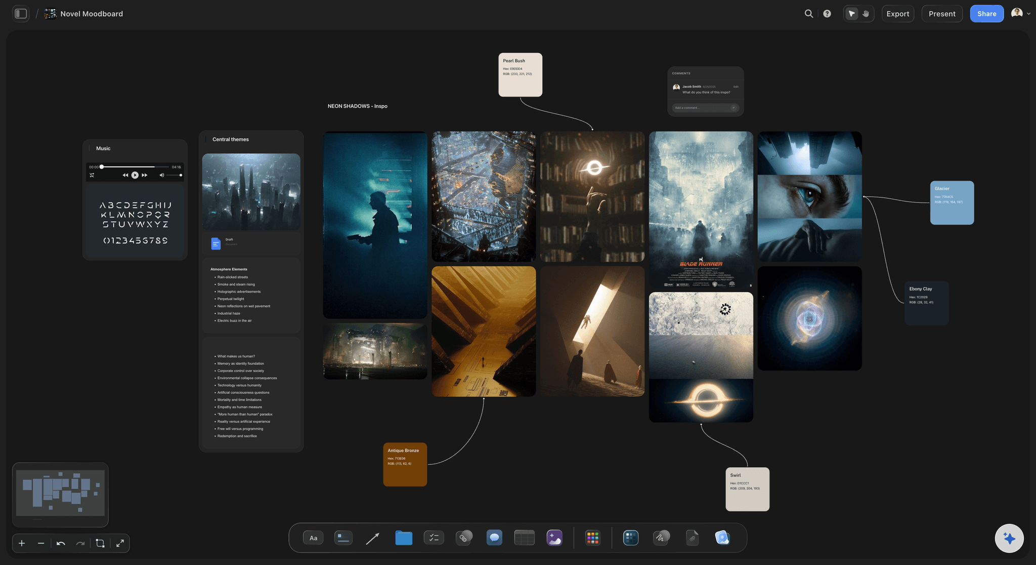
Filmmakers use Storyflow to build mood boards with visual references and tone guides
Writers use mood boards to establish world tone before writing a single scene
Make a mood board your team can build from
Start from 10 references that answer one question: what should this feel like? The AI reads the board and helps draft the brief that follows from it, on the same canvas.

Mood Board Types and Techniques
The Directional Mood Board
The most common type: a curated collection of 8–20 reference images that communicate a general creative direction. Use it at the start of a project when direction needs to be established and communicated to collaborators.
Select references that share an underlying visual logic rather than obvious surface similarities. The directional mood board for a luxury skincare brand might include a Japanese ceramics photograph, an architectural interior, a piece of raw marble, and a close-up of linen fabric. None of which look like skincare, all of which communicate the same quality of restrained elegance. That's the technique: lateral reference over literal reference.
Best for: Brand projects, design direction, campaign concepting.
The Comparative Mood Board
Two or three mood boards presented side by side, each representing a different direction, to facilitate a choice. Use it when multiple directions are genuinely viable and a decision-maker needs to choose, not just react.
Present each option as a full board with its own internal logic. Don't mix options. The power of a comparative mood board is that it forces a concrete choice early, before execution has invested resources in either direction. A documentary director might create one board representing observational realism and another representing stylized reconstruction. Same subject, two genuine approaches, requiring a deliberate decision.
Best for: Client presentations, creative direction decisions, divergent explorations.
The Character or Person Mood Board
A mood board that builds a portrait of a person (a target audience member, a fictional character, a brand persona) through visual references to their world. Use it when the work is fundamentally about understanding someone's perspective, taste, or experience.
Include references to their environment, objects they might own, aesthetics they're drawn to, and visual culture they inhabit. A mood board for a brand targeting independent musicians might include cramped apartment interiors, specific instrument aesthetics, visual influences from independent record labels, and the typography of concert posters. Building a portrait of the person's world without showing their face.
Best for: Audience definition, character development, persona work.
The Motion Mood Board (Animatic)
A mood board specifically for communicating movement, pacing, and rhythm in video and film work, assembled from video clips rather than static images. Use it when the work involves moving image and the key decisions are about tempo, transition, and energy rather than static composition.
This is the technique most creative professionals don't know they need until the first time they hand a director a static brief and get back footage with completely wrong energy. A motion mood board for a product launch video assembled from film references, music video treatments, and commercial work communicates the feel of 30 seconds of finished footage more accurately than any written description.
Best for: Video production, film projects, animation direction.
The Negative Mood Board
A mood board of what the work should not look like: references collected explicitly to define the boundary of the brief. Use it when the risk of a project is drifting toward a predictable aesthetic or a competitor's visual territory.
Showing a client what you want to avoid is often more clarifying than showing what you want to achieve. If every competitor in a category uses a specific style of photography, a negative mood board that identifies that style explicitly creates alignment around differentiation before any work begins.
Best for: Competitive differentiation, briefs with unclear constraints, experienced client teams.
The Texture-Forward Mood Board
A mood board focused specifically on material qualities, finishes, and tactile references rather than compositional imagery. Use it for packaging, physical product design, interior and spatial work, and any project where material is a primary design decision.
This is the technique most designers underuse in their early-stage presentations. A sustainable food brand's texture mood board might include raw paper stock, unbleached linen, worn wood, and oxidized metal. Materials that communicate values (natural, honest, unprocessed) as clearly as any imagery.
Best for: Packaging, product design, film production design, interior and spatial projects.
The Sequential Mood Board
A mood board organized chronologically or narratively: images arranged to communicate how a visual experience unfolds over time rather than exists as a single state. Use it for projects with a clear narrative arc.
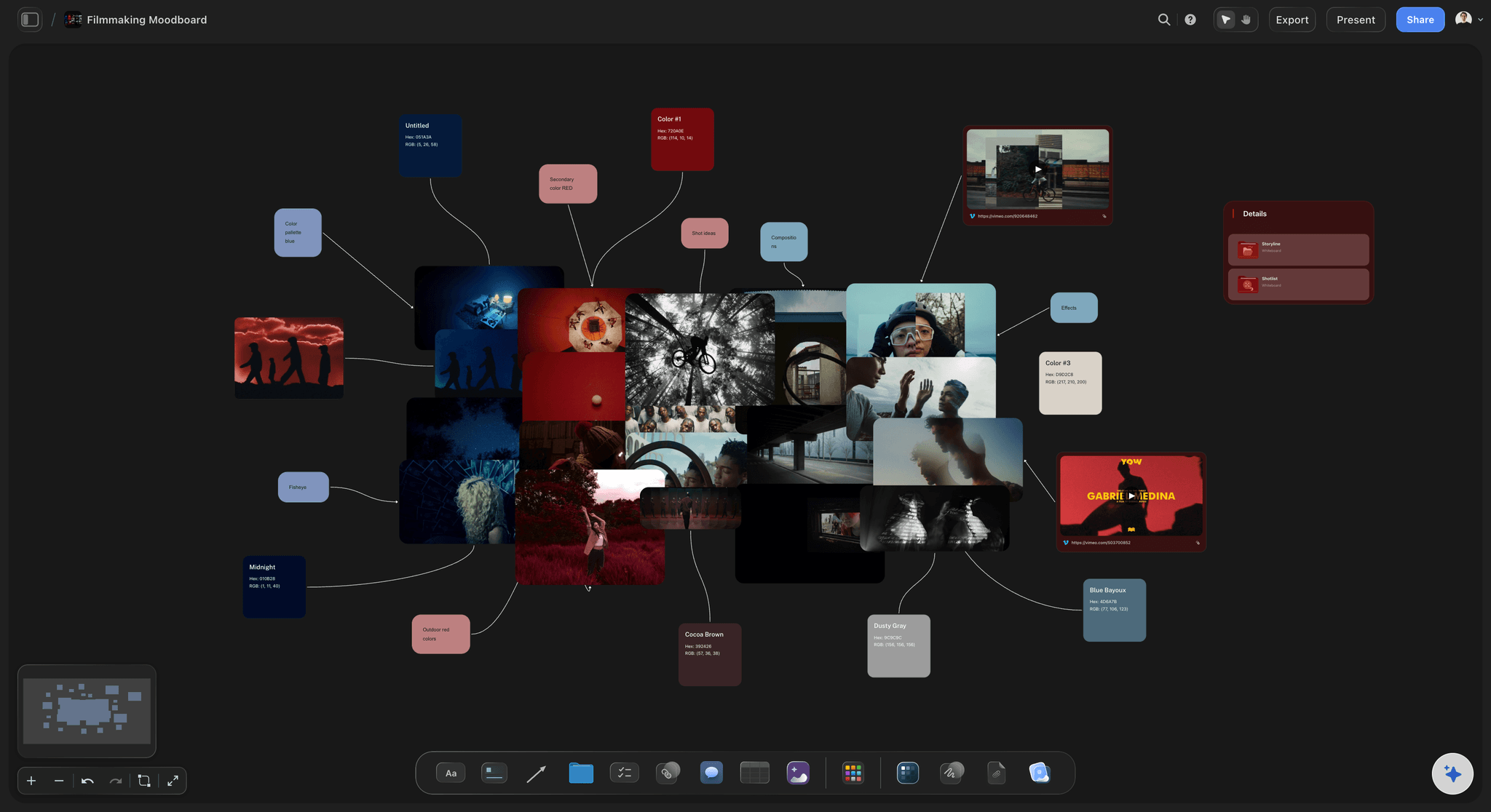
A sequential mood board for a film might move through four states: the world before, the inciting disruption, the climactic confrontation, the resolution. Each with its own palette, texture, and atmospheric quality. Storyflow's canvas makes sequential organization natural, since images and references can be arranged spatially and organized into phases that mirror the project's narrative structure. The Filmmaking Moodboard template is built around exactly this phase-by-phase layout.
Best for: Film and video, campaign planning, experience design, brand narratives.
How to Make a Mood Board: Getting Started
1. Start with a direction question, not a search
Before opening any reference source, write one sentence that completes the prompt: “This project should feel like ___.” That sentence is your guide for every image you collect. References that don't serve that sentence don't belong on the board, regardless of how much you like them.
2. Collect more than you'll use
A good mood board requires a wide initial collection to curate from. Aim for 30–50 initial references, knowing you'll select 10–20 for the final board. Curating is the skill: anyone can collect images; selecting only the ones that share an underlying logic is harder.
3. Curate for underlying logic, not surface similarity
Group your collected references by what they have in common beneath the surface: the same quality of light, the same compositional weight, the same emotional register. Remove any reference that doesn't share the logic, even if it's a strong image.
4. Build the board on a shared canvas
A mood board only works if the people who need to align on it can see it together and react to it. Building in Storyflow's canvas means collaborators can view, comment on, and add references in real time, making alignment a conversation rather than a presentation. For a brand project, the Brand Moodboard template opens the canvas with the reference zones already structured.
5. Annotate deliberately
Add brief notes to images that require context: why a particular image was chosen, what element it's referencing, what it's not referencing. A photograph of a forest might be on the board for its quality of diffused light, not for its natural theme. If that's not stated explicitly, people will draw the wrong conclusions.
6. Present it as a question, not a declaration
The first presentation of a mood board should invite reaction, not demand approval. Frame it as: “Does this feel like the right direction?” rather than “This is the direction.” Mood boards that are presented as fixed decisions get defended; mood boards presented as proposals get refined.
7. Update it before execution begins
After feedback, revise the board to reflect agreed-upon direction. The final mood board (the one that actually guides execution) should look different from the first one. Storyflow's Tactics system can anchor the final mood board to the specific briefs and tasks that execution requires, creating a direct line from visual direction to deliverable.
For a complete walkthrough, see our guide: How Moodboards Move Projects Forward, a step-by-step process for building and presenting a mood board from scratch.
Mood Board Tools
Storyflow
The familiar problem with mood boards is fragmentation: the references live in one tool, the brief in another, the storyboard in a third. Storyflow is a canvas-based visual workspace that keeps mood boards alongside the briefs, scripts, and production documents they inform, so visual direction and project execution live in the same place. Its AI reads your full active canvas board (plus up to 1 Tactic and 3 Documents you @-mention), so when you ask it to expand a direction or draft the brief that follows from the board, it works from the references you actually assembled. The Tactics system then moves a mood board into structured next steps without losing the visual reference. Particularly useful for film, video, and campaign work where mood boards connect directly to storyboards and shot lists.
Where Storyflow loses: if your job is pure reference discovery (endlessly browsing and saving imagery), Pinterest's recommendation engine surfaces references Storyflow won't. And a solo designer who only needs a standalone visual board, with no brief or production work attached, may find Milanote's focused board templates faster to set up. Storyflow earns its place when the mood board is the start of a project, not the end of one.
Storyflow AI Moodboard, collect visual references and let AI help expand the direction
The most widely used reference collection tool, with an enormous library of imagery across every aesthetic category. Best for the collection phase; limited for collaborative annotation and board presentation.
Milanote
A visual organizational tool with good mood board templates and basic collaboration features. Works well for individual creatives; less suited to larger team workflows.
Figma
Primarily a design tool, but widely used for mood boards by teams who already live in Figma. Strong for precision; less intuitive for loose visual exploration.
Canva
Accessible and template-heavy. Good for non-designers creating basic reference boards; limited flexibility for complex or non-standard board structures.
Real-World Mood Board Examples
Film production
A director preparing a psychological drama creates three mood boards before pre-production begins: one for the visual texture of the world (grain, color temperature, depth of field), one for the architectural and set design direction, and one for costume and character. Each board goes to a different department head. When cinematographer, production designer, and costume designer walk into their first joint meeting, they're already working from aligned references. The result is fewer cross-department conflicts and a more cohesive visual language than most productions achieve with weeks of iteration.
Brand identity design
A studio designing a new identity for an independent coffee roaster creates a comparative mood board with two directions: one referencing the precision and ritual of Japanese tea culture, the other referencing the warmth and informality of European neighborhood cafes. The client immediately chooses the first direction, a choice they wouldn't have been able to articulate without seeing it. The mood board compresses what could have been three rounds of brand presentation into a single early-stage decision.
Marketing campaign
A marketing team planning a product launch builds a mood board not just for the visual direction but for the emotional arc of the campaign: how the audience should feel when they first encounter the brand, then when they engage more deeply, then when they convert. Each phase has its own references. The mood board becomes a planning tool as much as a design reference, guiding decisions about channel, timing, and message as much as aesthetics.
Interior and spatial design
An architect designing a boutique hotel builds texture-forward mood boards for each public space: lobby, restaurant, guest rooms, each with its own material logic. The lobby board references the rough tactility of handmade ceramics and the warmth of aged brass; the restaurant references the clean grain of light oak and the softness of natural linen. Presenting these boards to the client before any specifications are drawn creates alignment on the experience, not just the look. The Interior Design Moodboard template structures a board this way per space.
Common Misconceptions About Mood Boards
Misconception: “A mood board is just a collage of pretty images.”
Reality: A mood board is a curatorial argument. A selection of references that, taken together, communicate a specific creative logic. The images don't need to be individually beautiful; they need to collectively communicate the right direction. A mood board full of images that don't share an underlying logic is decoration, not direction.
Misconception: “Mood boards are only for visual designers.”
Reality: Mood boards are used by film directors, architects, marketers, product designers, event producers, and brand strategists. Anyone whose work requires communicating a creative direction to collaborators. The format adapts to the medium; the function is universal.
Misconception: “A mood board locks in a direction too early.”
Reality: A mood board surfaces a direction for evaluation. It's a proposal, not a contract. The purpose is to create something concrete enough to react to before execution begins. A direction that's wrong is far better discovered on a mood board than in a finished deliverable. Mood boards don't lock in direction; they create the conditions for direction to be evaluated and refined.
Misconception: “You need to use images that look like the final product.”
Reality: The most effective mood boards often use lateral references: images from completely different industries or contexts that capture the right feeling without literally depicting the product. A reference from architecture, fashion, or film can communicate exactly the right quality for a software product's visual identity. Literal reference produces imitation; lateral reference produces translation.
Misconception: “A good mood board speaks for itself.”
Reality: Even well-constructed mood boards need deliberate presentation. Without context for why specific references were chosen and what elements they're pointing to, collaborators will often focus on the wrong things. A mood board presented without annotation is a Rorschach test, not a brief.
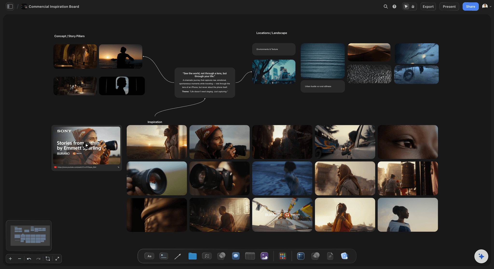
Commercial mood boards capture tone, color palette, and atmosphere before production
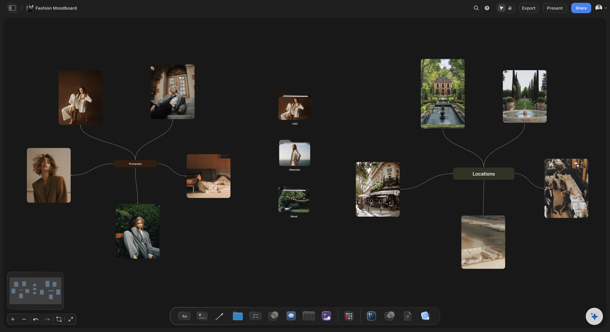
Creative directors build fashion and brand mood boards to align collaborators on visual direction
Frequently Asked Questions About Mood Boards
Frequently Asked Questions
What is a mood board in simple terms?
A mood board is a visual collection of reference images, colors, and textures that communicates the intended look and feel of a creative project. It's used before any design or production work begins to align a team on aesthetic direction. Think of it as visual shorthand for 'the work should feel like this' - concrete enough to react to, flexible enough to allow creative interpretation.
What should be included in a mood board?
A mood board typically includes reference images that capture the intended aesthetic, a defined color palette extracted from those references, typographic direction, and texture or material references. For motion projects, it may include video clips. The rule is inclusion by logic, not volume - every element should reinforce the same underlying creative direction, and anything that doesn't should be removed.
What is the difference between a mood board and a style guide?
A mood board communicates feeling before execution; a style guide enforces rules after execution has established a direction. Mood boards are exploratory and project-specific. Style guides are prescriptive and ongoing. A mood board might inform the development of a style guide, but they serve different purposes at different stages of the creative process.
What is the difference between a mood board and a creative brief?
A creative brief defines the objectives, audience, and constraints of a project in written form. A mood board communicates the visual and emotional direction of the work. Both are necessary for a well-briefed project - the brief answers what the work needs to do, and the mood board answers what it should feel like to experience.
How many images should a mood board have?
A working mood board typically contains 10-20 images for the final presentation, selected from a broader collection of 30-50 initial references. Fewer than 8 images rarely communicates enough to align a team; more than 25 often creates visual noise that obscures the underlying logic. The right number is whatever is needed to make the direction undeniable.
How long does it take to make a mood board?
A preliminary mood board for a new project can be assembled in 2-4 hours. A refined, presentation-ready mood board typically takes a full day - split between collection, curation, annotation, and structuring for presentation. Mood boards for complex productions with multiple visual tracks can take 2-3 days of dedicated work.
Are mood boards only used at the start of a project?
Mood boards are most commonly used at the start of a project, but they appear throughout the creative process. A director might use a mood board during production to re-align department heads when the visual direction starts to drift. A marketing team might revisit the mood board mid-campaign when new executions feel inconsistent. The board is a reference point, not a one-time artifact.
What are the best mood board tools in 2026?
Storyflow is the strongest option for teams who need mood boards to connect directly to project workflows - especially for film, video, and campaign work where visual direction informs storyboards and briefs. Pinterest remains the best tool for image collection. Milanote and Figma are widely used by design teams. The best tool is the one your whole team will actually use together.
Is making a mood board worth the time?
Yes - for any project where multiple people need to align on a visual direction before execution begins. The time invested in a mood board is recovered in reduced revision cycles. Misalignment on visual direction is consistently cited by creative professionals as the leading driver of revision requests - not skill gaps or technical issues. A two-hour mood board session can prevent days of rework.
What makes a mood board bad?
A mood board fails when it lacks internal logic - images that look visually interesting individually but don't communicate a shared direction collectively. It also fails when it's too literal or too abstract. The most common failure is presenting a mood board without annotation, leaving collaborators to interpret references without context for why they were chosen.
Can mood boards include text?
Yes - mood boards often include short textual elements: a single word, a phrase, a piece of copy that captures a tone. The test is whether the text communicates something the images alone can't. Words used deliberately alongside the right reference images can anchor the visual direction more precisely than either element alone. Long blocks of text don't belong on a mood board.
The Bottom Line on Mood Boards
What separates people who use mood boards well from those who don't isn't the quality of their image selection. It's the discipline to curate rather than collect. Anyone can gather 40 images they find inspiring. The skill is selecting the 12 that share a specific underlying logic and presenting them in a way that makes that logic undeniable to someone who wasn't in your head when you assembled the board. That curation, that compression of intuition into communicable form, is the creative skill that mood boards develop.
Storyflow was built in part to solve the most common mood board problem: the reference lives in one tool, the brief in another, the storyboard in a third, and the actual production work somewhere else entirely. The canvas brings visual direction and project execution into the same space, and the Tactics system translates mood board direction into structured next steps without losing the visual reference that informed them. That continuity from inspiration to execution is what prevents the finished work from drifting away from the direction everyone agreed on.
Test the continuity claim on real work. Take the next project where the mood board, the brief, and the production plan would normally scatter across three tools, and build all three on one Storyflow canvas. Start with 10 references that answer “What should this feel like?”, then let the board inform the brief and the next steps in the same space. By the end of one project you'll know whether keeping direction and execution together changes how the finished work holds its direction. That is the only test that matters.
Sara de Klein is Head of Product at Storyflow, a visual AI workspace for creators, filmmakers, marketers, and strategists. Published: March 2026.
Related Reading
The practical companion to this guide: how to build and present a mood board that actually aligns your team and moves the project forward.
The document that works alongside a mood board: how to write a brief that gives creative direction without over-specifying execution.
The cognitive foundation beneath mood boards, storyboards, and visual planning: why humans think more clearly in images than in words.
The natural next step after a mood board for film, video, and narrative work: how to translate visual direction into sequential production planning.
The vision-board-specific tools for goal-setting and inspiration boards.
Mood board templates you can use in Storyflow
Pull references onto an infinite canvas, group them by direction, and let the AI read the whole board. Open any of these mood board templates and start dropping in images.


See Storyflow in Action
A visual AI workspace where every feature lives inside one canvas. No tab-switching, no context lost.
Build your entire board from a single message
Type what you need in the AI chat at the bottom of your canvas. The AI adds cards, headings, and structure directly onto your board.
Use expert frameworks as AI context
Type @ in the AI chat and choose any Tactic. The AI tailors every response to that framework instead of giving generic advice.
Turn your board into a mind map in seconds
Ask the AI to restructure your canvas as a mindmap. It connects your ideas into a visual hierarchy so you can see how everything relates.
Why Storyflow Exists
Storyflow actually began as a personal tool while working on creative and research projects.
We kept running into the same problem: ideas were scattered everywhere: notes, documents, and whiteboards.
Nothing helped us see how everything connected.
So we started building a workspace designed around how ideas actually grow.
→ Read how Storyflow was createdSara de Klein
Head of Product at Storyflow
Published: March 1, 2026
Start creating with AI and become more productive
Transform your creative workflow with AI-powered tools. Generate ideas, create content, and boost your productivity in minutes instead of hours.
Ask Storyflow to