
Site plans that look finished from day one
From signup
to the moment it clicks.
Map every screen, email, and empty state between the signup button and first value, with the real screens pinned beside the steps and the drop-off points marked where they actually happen.


Creatives working for these brands already got early access
- Red Bull
- Canon
- Artlist
- Porsche
See how easy it is to get started
Watch a real project come together, from a blank board to a finished plan, clicked through step by step.
Start from a ready-made template
Pick a board to see what you can build, then let AI fill it in. Every template is a real, editable starting point on the same infinite canvas.

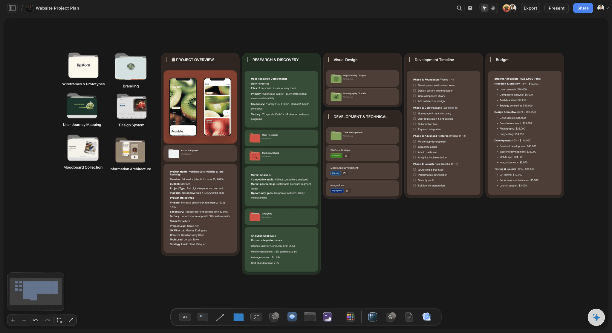
Website Plan
Map your site's pages, structure, and content in one plan before you build.
What is an onboarding flow?
An onboarding flow is everything that happens between someone deciding to try your product and the moment they get something out of it. Storyflow is an AI visual workspace that maps your onboarding flow on one infinite canvas: a first flow drafted by AI, real screens pinned beside the steps, and drop-off points marked where they happen. The flow includes the signup screens, the permissions and verification steps, the setup questions, the empty states before any data exists, the first-run tour if you have one, the welcome and nudge emails, the notifications, and the invitation path when the product only works with other people in it. It ends at the activation moment, the point where the user has experienced the thing they came for. Everything before that point is cost the user is paying on credit.
Onboarding is designed badly more often than any other part of a product, and the reason is structural rather than a lack of skill. It is not one surface, so no single designer owns it. The signup screens belong to one squad, the emails to lifecycle marketing, the empty states get written by whoever built each feature, and the permissions dialog was added by whoever integrated the SDK. Each piece is defensible and the sequence is incoherent. Users experience the sequence. Nobody looks at the sequence, because until you lay it out end to end there is nowhere it exists as a single object.
Storyflow is an AI-native infinite canvas built for exactly that laying out. Describe the product and what activation means in a prompt and the AI maps a starting flow: signup, setup, empty state, first action, and activation, with the emails and decision branches attached. Then you work spatially. Pin the real screenshots beside the steps they represent, branch the flow where users diverge, mark where the funnel data says people leave, and write the empty state copy directly next to the screen it belongs to.
The reason this belongs on a canvas rather than in a flowchart tool is that onboarding is a visual and emotional sequence, not just a set of states. A flowchart of boxes tells you the logic is sound and hides the fact that step four is a wall of text after three friendly screens, or that the empty state promises something the next screen cannot deliver. When the actual screens are on the board in order, you can read the flow the way a new user does, which is the only reading that matters and the one almost nobody performs.
Ultra fast from brief to board
From a signup button to a flow you can fix.
No flowchart in one tool and screenshots in another, no email sequence nobody has seen next to the app.
01
Open a canvas
Sign up in seconds. No download. Your infinite flow canvas opens in the browser.
02
Describe the product and the activation moment
Type what the product does and what counts as first value, and the AI maps a starting flow with signup, setup, empty state, first action, and the emails around them.
03
Pin the real screens
Drop screenshots beside each step so the flow shows what a user actually sees, then branch where different users diverge and mark where the data says they leave.
04
Fix it and hand it over
Rewrite empty states and email copy on the board, then share a view-only link with engineering, lifecycle, and leadership so everyone reviews the same sequence.
The whole journey, as the user meets it.
Screens, emails, branches, and drop-offs on one canvas.
AI maps the flow from your product description
Start from a flow, not a blank canvas
Describe the product and what activation means and the AI lays out the steps, the branches, and the emails around them. Correcting a proposed flow is far faster than drawing one from scratch.
See the free user flow diagram →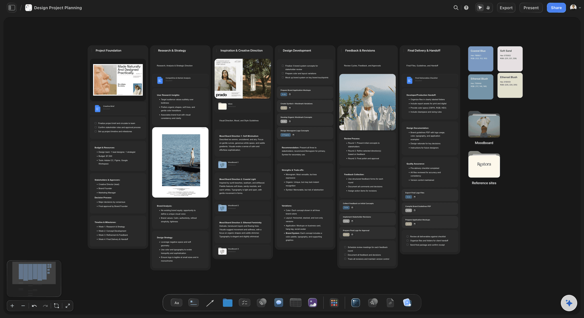
Real screenshots beside every step
Read it the way a new user does
A flowchart proves the logic works. Screens in sequence show you that step four is a wall of text after three friendly screens, which is the thing that actually loses people.
Try the wireframe tool →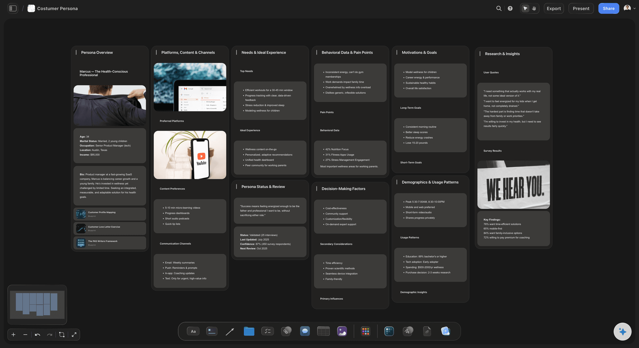
Emails and notifications on the same map
Stop designing half the experience
Welcome emails, nudges, and notifications sit on the flow beside the in-app steps they support. Lifecycle sequences designed in a separate tool are how users get emailed about a step they finished.
See the customer journey map →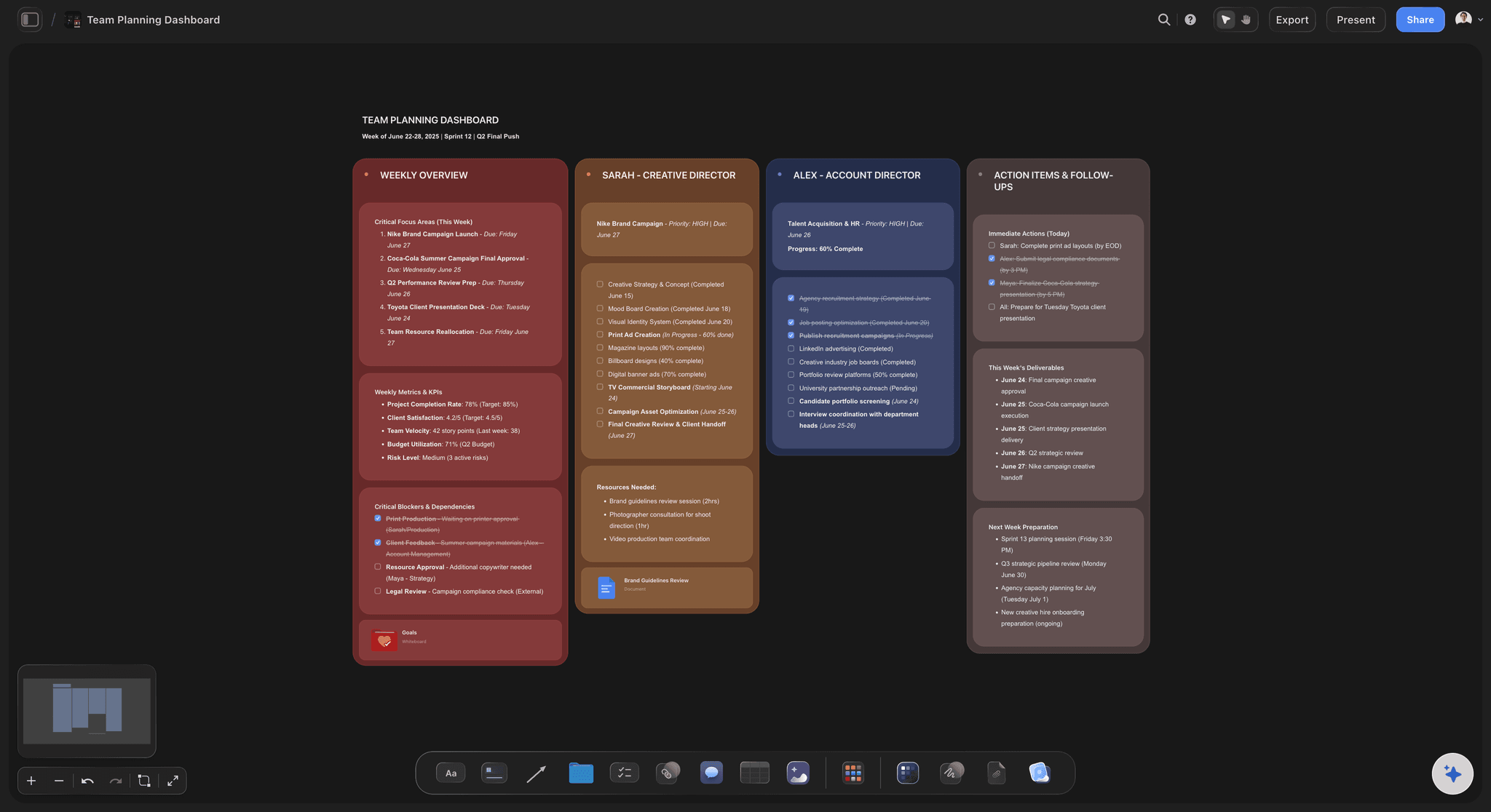
View-only links for engineering and leadership
Review the sequence, not the pieces
Send a link and engineering, lifecycle, and leadership see the same end-to-end flow in a browser with no seat. Onboarding is incoherent because nobody reviews it whole.
See the design feedback tool →Unlimited boards. No object cap.
Open a canvas, describe the product, and map the flow. Storyflow is paid-only during early access, with plans from $9.99 a month, and a Free plan launches before the end of 2026.
Unlimited flow boards on an infinite canvas
Basic AI usage to generate flows from prompts
Starter templates for journeys, personas, and project plans
Share view-only links with your team and stakeholders
Built for people with taste
More than a flowchart of boxes.
Boxes prove the logic is sound. They cannot show you the step where people give up.
Screens, emails, empty states, branches
Work across every surface of the journey
Empty states, treated as a design problem: The first thing most new users see is a product with nothing in it. Empty states are usually written last by whoever built the feature, which is why they so often explain the interface rather than getting someone started.
The gap between signup and value, measured in steps: Count every screen, field, and permission between the button and the payoff. Teams are consistently surprised by the number, because nobody added more than one or two at a time.
Branches for genuinely different users: An invited teammate, a solo trial, and an enterprise evaluation are not the same journey. Mapping them as one flow is how products end up asking an invited user to set up a workspace that already exists.
Emails and notifications in sequence: Put the lifecycle sequence on the same map as the app. Half of onboarding happens outside the product, and it is designed in a different tool by different people almost everywhere.
AI that can see the board you have already built
Extend the flow with an AI that has the context
Prompt against the whole canvas: Ask it to map the invited-teammate branch, propose a nudge sequence for users who stall at setup, or draft empty state copy for a screen you have already placed. It reads the flow you have built.
It structures, it does not decide the product: Storyflow lays out and organizes the journey. What counts as activation, and what is worth asking a new user for, are product decisions that stay with the team.
Iterate without losing work: Re-prompt as often as you want. Steps and screenshots you have already placed stay exactly where they are while the AI builds around them.
Data on the map
Put the drop-off where it happens
Funnel numbers beside the step: Write the completion rate on the step it belongs to. A funnel chart tells you the number; the number written on the screen tells you what to change, because you can see what that screen asks for.
Session recordings and quotes attached: Pin a support quote or a note from a recording next to the step it concerns. Qualitative evidence sitting on the flow survives; qualitative evidence in a research doc does not.
Before and after, side by side: Keep the current flow and the proposed one next to each other on the same canvas. It is the fastest way to show leadership what is actually being removed.
Design, engineering, lifecycle, and support
Give four teams one artifact
View-only links, no seat required: Engineering, lifecycle marketing, support, and leadership all open the flow in a browser with no design tool seat. The people who own pieces of onboarding rarely have one.
Comments on the step they concern: Feedback attaches to the specific screen or email, so a conversation about the verification step happens on the verification step rather than in a thread with four subjects.
Hand off to the design file: When the flow is agreed, build the screens in Figma and keep the map as the reference. The board explains why the sequence is what it is, which no set of frames ever does.
Explore templates for your project
Every template opens as a real, editable board on the infinite canvas. Pick the closest fit and make it your own.
Website Plan
Map your site's pages, structure, and content in one plan before you build.
One app instead of five
Storyflow vs Figma, Miro, and Lucidchart.
Be clear about what Storyflow is. It does not build prototypes, it does not run in-app tours, and it does not measure funnels. It is where the sequence gets designed and agreed.
Storyflow
Recommended
Infinite canvas with screens beside the steps
AI maps the flow from a product description
View-only links with comments, no seat needed
Interactive prototyping
In-app tours and funnel analytics
Free plan available today
Figma
Infinite canvas with screens beside the steps
AI maps the flow from a product description
View-only links with comments, no seat needed
Interactive prototyping
In-app tours and funnel analytics
Free plan available today
Miro
Infinite canvas with screens beside the steps
AI maps the flow from a product description
View-only links with comments, no seat needed
Interactive prototyping
In-app tours and funnel analytics
Free plan available today
Lucidchart
Infinite canvas with screens beside the steps
AI maps the flow from a product description
View-only links with comments, no seat needed
Interactive prototyping
In-app tours and funnel analytics
Free plan available today
What creators are saying
Join early creators getting structured workspaces and AI that remembers their projects
“Storyflow has sped up my workflow by at least 3x, which means more flow state and more projects I can actually ship. It truly changed the way me and my team create.”

Reilin Joey
Director & YouTuber
“One prompt gets me a structured board. But the tactics are my favorite. I run my YouTube scripts through them and my intros and retention got better. It's amazing.”

Justkay
YouTuber & Freelance Filmmaker
“I used to juggle five apps to plan a project. Now I describe what I am making and get boards, lists, and a schedule. All in one place.”

George
@fernwehchronicles
Onboarding questions, answered.
What belongs on the map, how to find the drop-off, and where Storyflow fits alongside Figma and your analytics.
Figma is where the screens get built and there is no argument about that. Miro is a fine canvas if your team already uses it. Lucidchart is better than either at strict flowchart logic with branching and conditions. Storyflow is the option where the AI maps a starting flow from a description of your product and the activation moment, and where the real screenshots, the email sequence, and the funnel numbers sit on the same board. Most teams end up with a design file for the screens and a separate map for the sequence, because a design file full of onboarding frames does not answer the question of what order a user meets them in.
No to both. Storyflow does not do interactive prototyping, so if you need a clickable flow for user testing, build it in Figma. It also does not deliver in-app tours, tooltips, or checklists to real users, which is what Appcues, Userpilot, Pendo, and Chameleon exist for, and they are considerably better at it than a canvas could be. Storyflow is the design and agreement surface upstream: where the sequence is laid out, argued about, and decided, with the screens visible in order. Once the flow is settled, the screens go to Figma and the in-app delivery goes to whichever tour tool you use.
Six things. Every screen between the signup button and first value, in order, with real screenshots rather than boxes. Every field and permission the user is asked for, because the count is usually higher than anyone believes. The empty states, which are the first real experience of the product and are almost always written last. The emails and notifications, since half of onboarding happens outside the app. The branches for genuinely different users, such as an invited teammate versus a solo trial. And the drop-off data written on the step it belongs to, so the number sits next to the thing that caused it.
Not during early access. Storyflow is paid-only right now, with plans starting at $9.99 a month, and a Free plan for solo use launches before the end of 2026. Anyone a paid member invites to a board joins free today, which matters here because the people who own pieces of onboarding, lifecycle marketing, support, engineering, rarely have a design tool seat. If you need free this minute, Figma's free tier and Miro's free tier both give you a real canvas, and either will hold a flow map perfectly well. Neither will generate the flow from a description of your product.
Get the funnel numbers from your analytics, Amplitude, Mixpanel, PostHog, whatever you run, then write each completion rate directly on the step it belongs to on the map. This sounds trivial and it changes the conversation completely, because a funnel chart tells you that step four loses forty percent and the map tells you that step four asks for a company size, a team name, and a phone number before showing anything. Then pin a support quote or a note from a session recording beside it. The number tells you where; the screen and the quote tell you why.
It is the point where a new user has experienced the value they came for, and choosing it correctly matters more than any single design decision in the flow. It should be an action the user takes, not a step they complete: created their first board and put something on it, not finished the setup wizard. It should correlate with retention, which you can check rather than guess. And it should be reachable in one session. Teams that pick a vanity milestone, usually completed onboarding, end up optimizing a flow that people finish and then never return to, which is worse than not measuring at all.
You describe the product, who signs up, and what counts as first value. The AI maps a starting flow from that: signup, verification, setup, empty state, first action, and activation, with the likely emails and branch points attached. You start by correcting a proposal rather than drawing from nothing, which is much faster and tends to surface steps you would have forgotten. From there it uses the whole board as context, so you can ask it to map the invited-teammate branch or draft empty state copy for a screen you have already placed, and re-prompting builds around what you have arranged.
Yes, and this is one of the most common structural failures in onboarding. The in-app flow is owned by product and the email sequence is owned by lifecycle marketing, they are designed in different tools by different people, and the user experiences them as one thing. The visible symptom is an email nudging someone to complete a step they finished two days ago, or a welcome sequence that describes a feature the setup flow never mentioned. Putting both on one map, in time order, makes the contradictions obvious in about thirty seconds, which is roughly how long it takes to fix them once someone has seen them.
Yes. Send a view-only link and anyone opens the full map in a browser with no account, and can sign in to comment on the specific step or email they are responding to. This matters more for onboarding than for most design work, because the people who own parts of it are spread across product, engineering, lifecycle, and support, and most of them do not have a design tool licence. If someone should genuinely contribute, invite them to the canvas and they join free as a collaborator. Sharing and commenting work on every paid plan.
Count the steps between the signup button and the activation moment, then count how many of them exist for the user rather than for you. Verification, company size, role, team name, and marketing consent are almost always the second kind. The useful question for each step is whether the product genuinely cannot work without this answer right now, and the honest answer is usually that it could be asked later or inferred. Laying the flow out and marking each step as required, deferrable, or removable is a twenty-minute exercise that regularly removes a third of the flow.
Shorten the distance to the first good moment.
Open a canvas, describe the product, and let AI map the flow. No download.