
Extremely simple, seriously capable
Copy is not a document.
It is a sequence somebody walks through.
Lay every string out along the flow it belongs to, with the screen beside it and the error states branching off it. Read the whole journey as a person would, catch the four different words you used for one object, and share it for review without giving anyone a design seat.


Creatives working for these brands already got early access
- Red Bull
- Canon
- Artlist
- Porsche
See how easy it is to get started
Watch a real project come together, from a blank board to a finished plan, clicked through step by step.
Start from a ready-made template
Pick a board to see what you can build, then let AI fill it in. Every template is a real, editable starting point on the same infinite canvas.

Mind Map
Branch one central idea out into themes and sub-points, then drag the connections around until the structure makes sense.
Why does UX copy go wrong in a spreadsheet?
UX writing is judged in sequence and written in isolation, which is the whole problem. Storyflow is an AI visual workspace that lays UX copy out along its flow on one infinite canvas: every string beside its screen, error states branching off, terminology and voice guidance on the same board, and a view-only link for review. A person meets your strings one after another: an empty state, then a form label, then an error, then a confirmation. Each one only makes sense in the light of the one before it. But the writing usually happens in a spreadsheet of keys and values, or in comments pinned to a design file, where nothing about the order is visible.
The costs are predictable. Terminology drifts, so a thing is a project on one screen, a board on the next, and a workspace in the error message, and nobody notices because the three strings were never on screen together. Tone lurches, because the confident empty state and the apologetic error were written six weeks apart. And error states get written last, in a hurry, which is exactly backwards: the error is where a person is most likely to give up.
A canvas fixes the sequence problem directly. Strings sit along the flow in the order somebody meets them, with the screen or the component beside each one so the copy is judged in its container rather than as a row. Branches for empty, loading, error, and success hang off the step they belong to, so writing them is part of the flow rather than a cleanup pass. Voice guidance and the terminology list live on the same board, which is what makes drift catchable.
Ultra fast from brief to board
From a flow to the words, in the order a person meets them.
Map the journey, write into it, review it as a sequence, then hand it over.
01
Lay out the flow
Describe the journey and the AI lays out the steps as connected cards: entry, the decision points, the states, the end. Correct it by dragging.
02
Put the screens beside the steps
Drop the actual design beside each step so a string is read in its container. A label that fits a spreadsheet cell and not a button is a defect you want to find now.
03
Write the states, not just the happy path
Empty, loading, error, permission-denied, and success branch off the step they belong to, so the states get written with the flow rather than after it.
04
Review as a sequence
Share a view-only link so product, legal, and support read the whole journey in order in a browser, with comments landing beside the string they concern.
Copy judged the way it is actually encountered.
In order, in its container, with the states attached and the terminology visible.
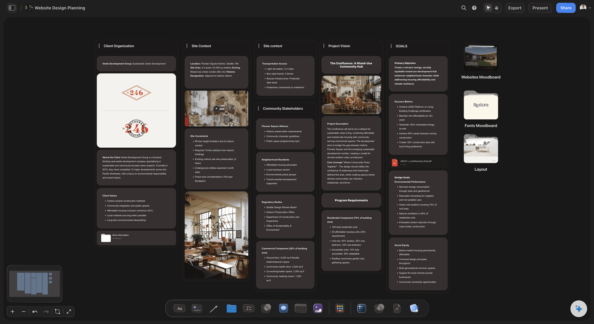
Sequence is the unit
Every string in the flow it belongs to
Reading a journey top to bottom is how you catch a confirmation that repeats the button it followed, or a second screen that explains something the first already said. A spreadsheet of keys cannot show you either.
See the user flow mapping tool →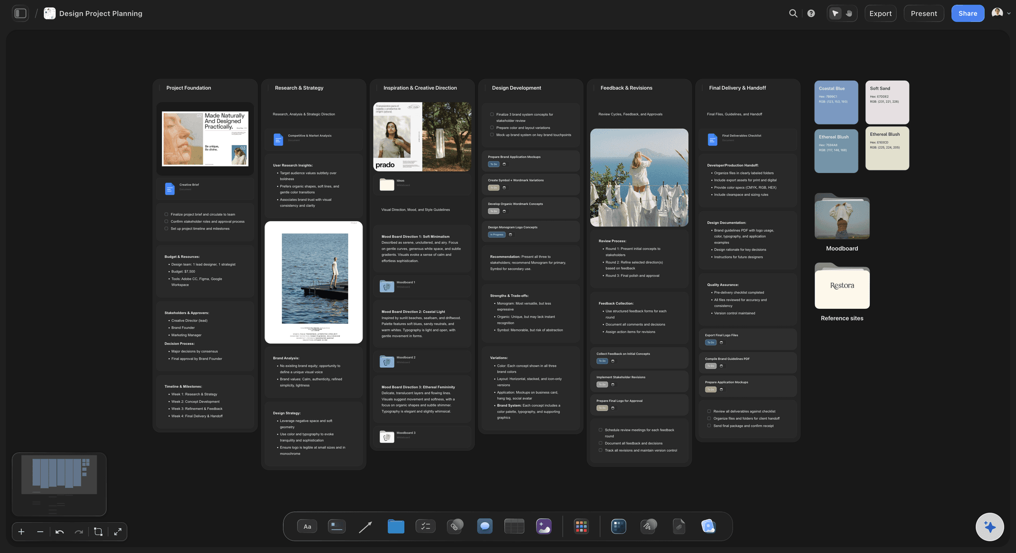
Words in their container
The screen beside the string
Copy is constrained by the thing it lives in. Putting the design next to the string means length, hierarchy, and truncation are visible while you are writing rather than in a build review.
See the UX storyboard →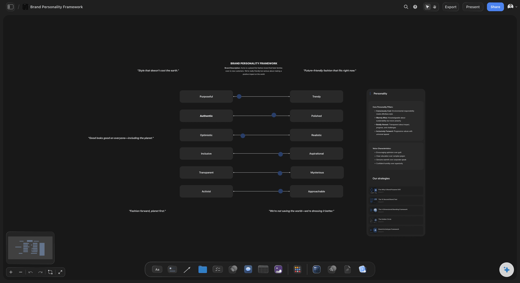
Consistency you can see
Terminology and voice on the same board
Keep the agreed word for each object and the voice guidance beside the flow. Drift is caught by having the strings visible together, which is the only reliable way anyone catches it.
See the brand voice generator →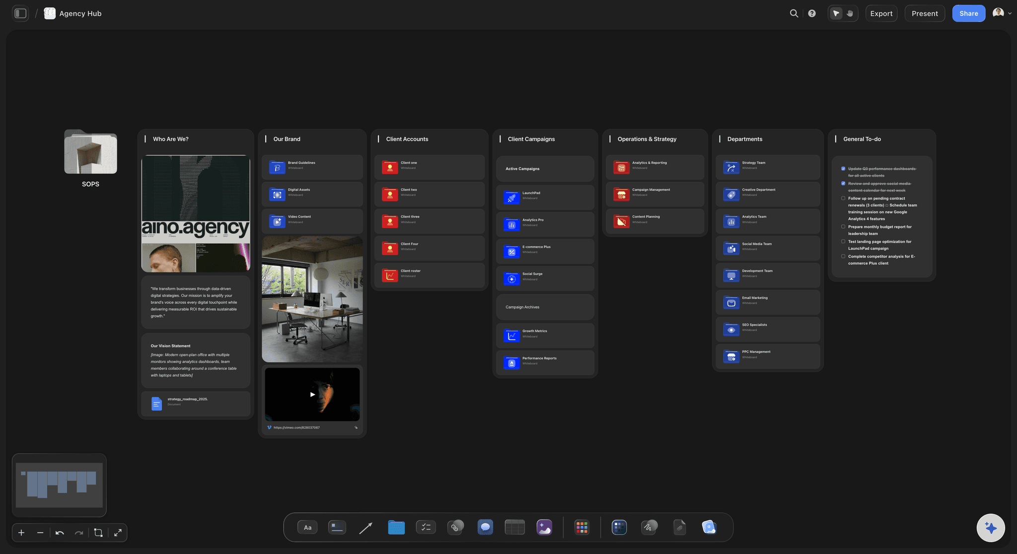
Review without seats
Legal, support, and product read the journey
A view-only link opens the live flow in a browser with no account. The people who need to approve wording are rarely the people with design tool licences, and that mismatch is where copy review usually stalls.
See the design feedback tool →Every string, every state, every version you tried.
Content design generates far more drafts than it ships, and the rejected wording is what you point at when the question comes back. No object cap means keeping all of it costs nothing.
Unlimited boards and objects on an infinite canvas, no object cap
AI usage to lay out flows and draft alternative wordings
Screens, exports, and PDFs beside the copy, with unlimited file uploads
Unlimited collaboration, or share view-only with no account needed to view
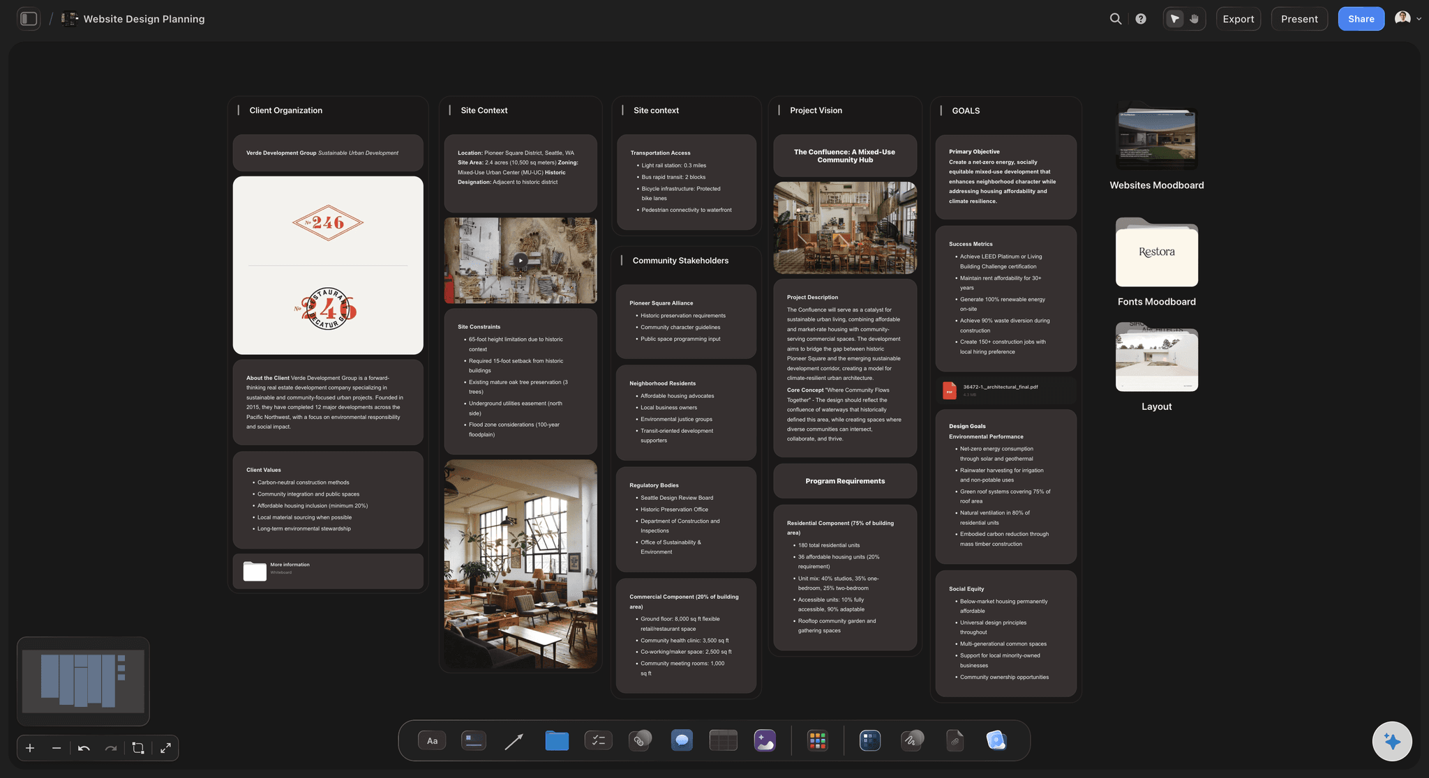
Built for people with taste
The parts of the job that have nowhere to live.
States, terminology, research evidence, and the handoff to engineering.
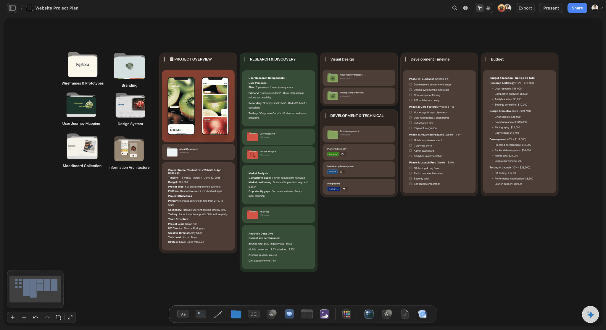
The unglamorous states
Empty, error, loading, denied
Written with the flow: Branch the states off the step they belong to, so they are written while you still have the context rather than in a sweep the week before release.
Errors get the most attention: An error is where someone decides whether to continue. Giving it a card of its own, beside the step that produced it, is what stops it being generic.
Nothing is missed: A step with no error branch is visible as a gap on the board, which is a better checklist than a checklist.
Consistency
One word per thing
A visible terminology list: Keep the agreed noun for each object on the board beside the flow, so a new string is written against it rather than against memory.
Voice with examples: Show two strings that are right and one that is wrong. Content designers align on examples far faster than on adjectives.
Catch drift by looking: Four names for one object are obvious when the four strings are on the same canvas and invisible when they are in four files.
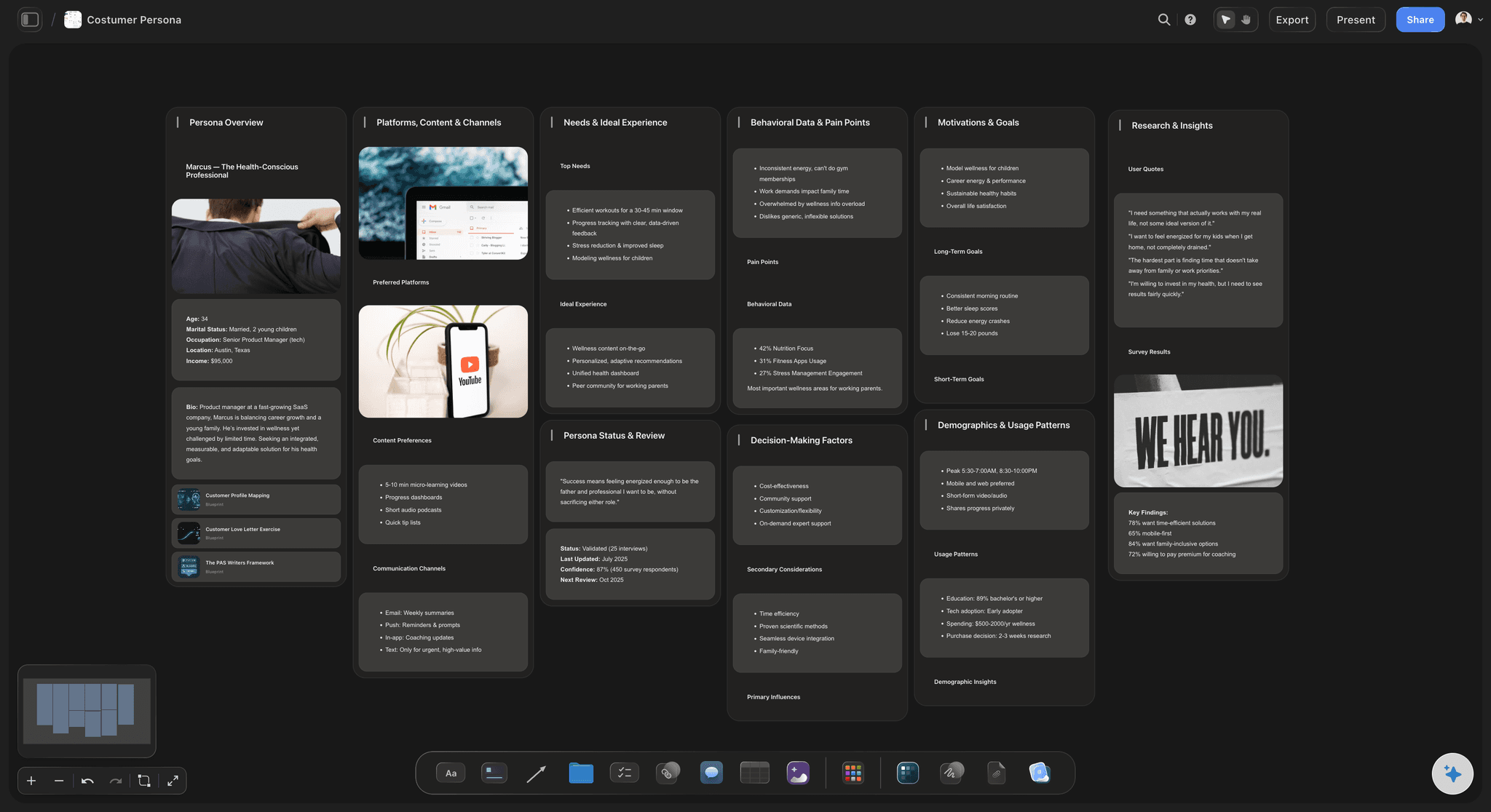
Evidence
Research beside the wording
Quotes where they apply: Put the research quote that motivated a rewrite beside the string, so the reason survives the person who wrote it.
Support tickets as input: Drop the tickets that show people misreading a screen next to that screen. It is the strongest argument a content designer has.
Alternatives kept: Keep the wordings you rejected on the board, because the same suggestion will be made again in three months.
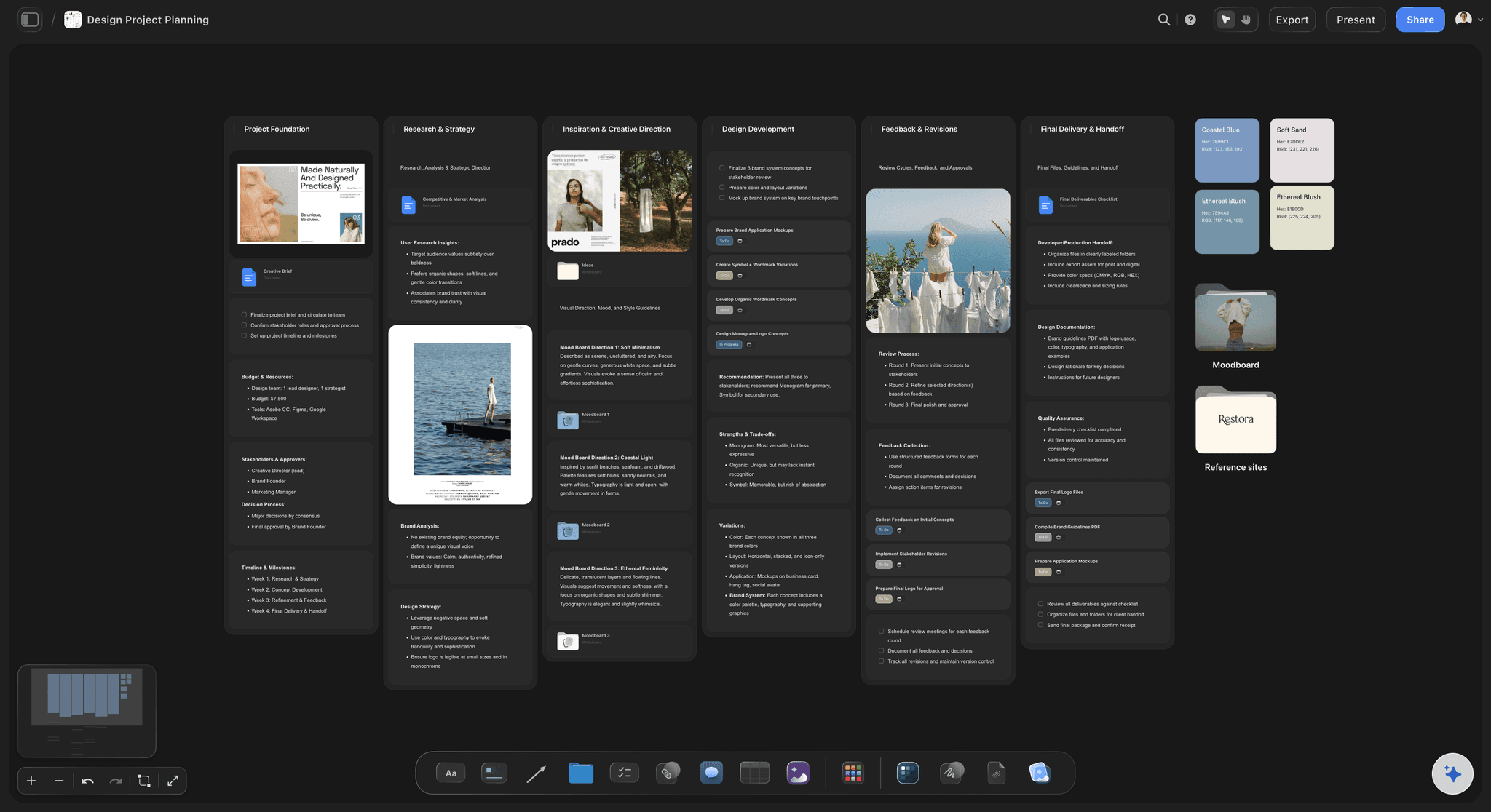
Handoff
Getting the words into the build
Strings in reading order: Hand engineering a flow they can read in sequence, rather than a spreadsheet whose order matches nothing a user experiences.
One live version: A view-only link always shows current copy, which removes the most common failure where the build ships wording from an older sheet.
Export when a doc needs it: Export the board as a clean image or PDF for a spec, a review, or a record of what was approved.
Explore templates for your project
Every template opens as a real, editable board on the infinite canvas. Pick the closest fit and make it your own.
Mind Map
Branch one central idea out into themes and sub-points, then drag the connections around until the structure makes sense.
What creators are saying
Join early creators getting structured workspaces and AI that remembers their projects
“Storyflow has sped up my workflow by at least 3x, which means more flow state and more projects I can actually ship. It truly changed the way me and my team create.”

Reilin Joey
Director & YouTuber
“One prompt gets me a structured board. But the tactics are my favorite. I run my YouTube scripts through them and my intros and retention got better. It's amazing.”

Justkay
YouTuber & Freelance Filmmaker
“I used to juggle five apps to plan a project. Now I describe what I am making and get boards, lists, and a schedule. All in one place.”

George
@fernwehchronicles
UX writing questions, answered.
What content designers ask when the spreadsheet stops working.
The one that shows copy in sequence with its screens. UX copy is judged in order and constrained by its container, so the failure mode of every spreadsheet and every string file is that neither the order nor the container is visible. A canvas where strings sit along the flow with the design beside them fixes both, and lets reviewers who have no design licence read the journey.
Keep the agreed noun for each object visible on the same board as the flow, and write new strings against it rather than from memory. Drift is caught by having strings on screen together: four names for one object are obvious on one canvas and invisible across four files. Review whole journeys periodically rather than individual strings.
Write them with the flow, not after it. Branch each state off the step that produces it so you still have the context, and treat the error with the most care, because it is the moment a person decides whether to continue. A step with no error branch shows as a gap on the board, which catches omissions better than a checklist.
Share a view-only link. It opens the live flow in a browser with no account, no app, and no seat, which matters because legal, support, and product rarely hold design tool licences. Comments land beside the string they are about instead of in a thread that has to be matched back to a screen name.
It can propose alternatives to react to, which is useful when you are stuck on a fifth error message. What it cannot supply is the terminology your product has settled on or the reason a previous wording was rejected, so treat its output as a first pass and keep the voice guidance and the rejected alternatives on the board where they inform the choice.
Yes, and it is one of the strongest reasons to work on a canvas. Research quotes, usability findings, and support tickets sit beside the string they motivated, so the argument for a wording survives the person who made it and does not have to be reconstructed in the next review.
Give them a flow they can read in sequence rather than a spreadsheet whose row order matches nothing a user experiences, and share it as a live link so the build cannot pick up wording from an older sheet. Export the board as an image or PDF when a spec or an approval record needs it.
Not during early access. Storyflow is paid-only right now, with plans starting at $9.99 per month, an infinite canvas, and no object cap. Every paid plan includes AI usage, unlimited file uploads, unlimited collaboration, and view-only sharing that needs no account to view. A Free plan launches before the end of 2026.
Read the words the way a person will.
Copy in its flow, screens beside the strings, states written with the journey, and review by link.