
VISUAL SOCIAL MEDIA PLANNER
Nobody judges one post.
They judge the whole grid.
A calendar tells you when a post goes out. It cannot tell you that three heavy images are about to land side by side, that every thumbnail this month is the same shade of beige, or that your logo dies in a 9:16 crop. Storyflow lays the feed out as one composition on an infinite canvas so you can see it before anyone else does. It plans the visuals; it does not schedule or publish, so pair it with Later, Buffer or Metricool for that. Paid-only during early access, plans from $9.99 a month, and a Free plan launches before the end of 2026.
Plans from $9.99/mo
Free plan coming late 2026
Planning only, not a scheduler

Used by creative professionals at:
Artlist
Pixar
Nike
Red Bull
The North Face
Porsche
Start from a ready-made template
Pick a board to see what you can build, then let AI fill it in. Every template is a real, editable starting point on the same infinite canvas.

Content Calendar
Plan what you post and when across every channel on one calendar.
What is a visual social media planner?
A visual social media planner is a tool for deciding how your posts look together, before any of them go out. It is not a calendar and it is not a scheduler. A calendar answers what publishes on Thursday. A visual planner answers a different question: when someone lands on your profile and sees nine posts at once, or scrolls past four of your posts in a week, what impression do those posts make as a set. That impression is produced by things no calendar can show you, namely the balance of light and dark, the rhythm of colour, the mix of formats, and whether your brand is still recognisable after the platform crops it.
The reason this became a separate discipline is that a social profile is a gallery wall and a feed is a queue, and the two are judged differently. On the profile grid, posts are compared to their neighbours, so three dense photographs stacked in a row read as a wall of noise even when each photo is good on its own. In the feed, posts are compared to whatever came before them in a stranger's scroll, which is usually a friend's holiday and an ad. Planning for one and ignoring the other is how brands end up with a beautiful grid nobody visits, or a high-performing feed that looks like six different companies made it.
Most teams discover the gap the same way. The calendar is full, the captions are written, the schedule is approved, and then someone opens the profile a fortnight later and it looks wrong. The individual decisions were all fine. The problem is that they were made one post at a time, in separate documents, on separate days, by people who never saw the posts next to each other. Visual planning fixes it by moving the decision up front, where changing the order of two posts costs nothing, rather than after publishing, where the only remedies are archiving or living with it.
Done properly, visual social planning is six named layers: the grid preview, where you lay the next nine to eighteen posts out in rows and look at them as a block; colour rhythm, where you spread your palette across rows so no single tone clumps and no row goes flat; content-type rotation, where photo, carousel, text-led graphic and video thumbnail alternate so the feed has texture instead of repetition; crop discipline, where every asset is checked as a 1:1 grid tile and a 9:16 full-screen frame so the logo, the face and the key line survive both; cover consistency, where carousel and video covers share a treatment so the profile reads as one brand rather than a pile of uploads; and the feed test, where you stop looking at your own grid and ask whether a single post still lands when it appears alone, at speed, between a hundred other things. Storyflow holds all six on one canvas, which is the only way they stay comparable.
HOW IT WORKS
From a list of post ideas to a feed you can see.
No template per post and no design file to open. Drop the assets on a canvas and arrange the feed like a composition.
01
Open a canvas
Sign up in seconds, from $9.99 a month. No download. Your infinite planning canvas opens in the browser.
02
Drop in the assets and the palette
Bring in photos, mockups, thumbnails and brand colours. Ask the AI to group them by tone and format so you can see what you are actually working with before you place anything.
03
Lay out the grid
Arrange the next block of posts in rows of three. Move a heavy image away from another heavy image, break a colour clump, alternate the formats, and check each tile as a square and as a vertical frame.
04
Hand the plan over
Share a view-only link so a designer, a client or a founder can approve the whole look in one screen. Then take the approved order into your scheduler and publish there.
The feed as one picture.
Grid layout, colour rhythm, crop checks and cover consistency in one place instead of a folder of exports.
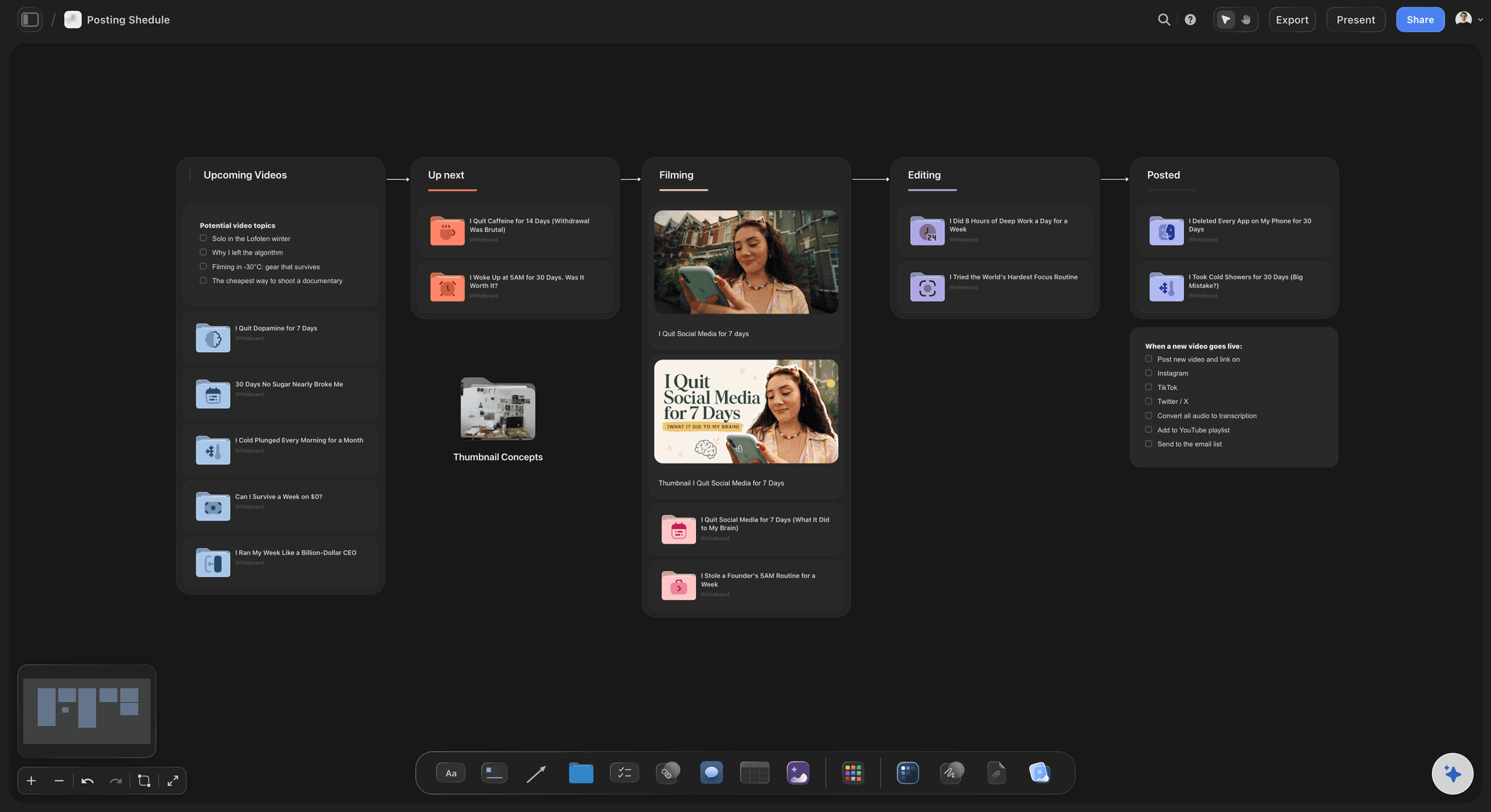
Nine to eighteen posts, seen as a block
Preview the grid before anything ships
Lay the next rows out three wide and the problems announce themselves: two near-identical photos as neighbours, a dark corner, the same crop repeated four times. Fixing it is a drag at this stage and an archive-and-repost at any later one.
See the social media content calendar →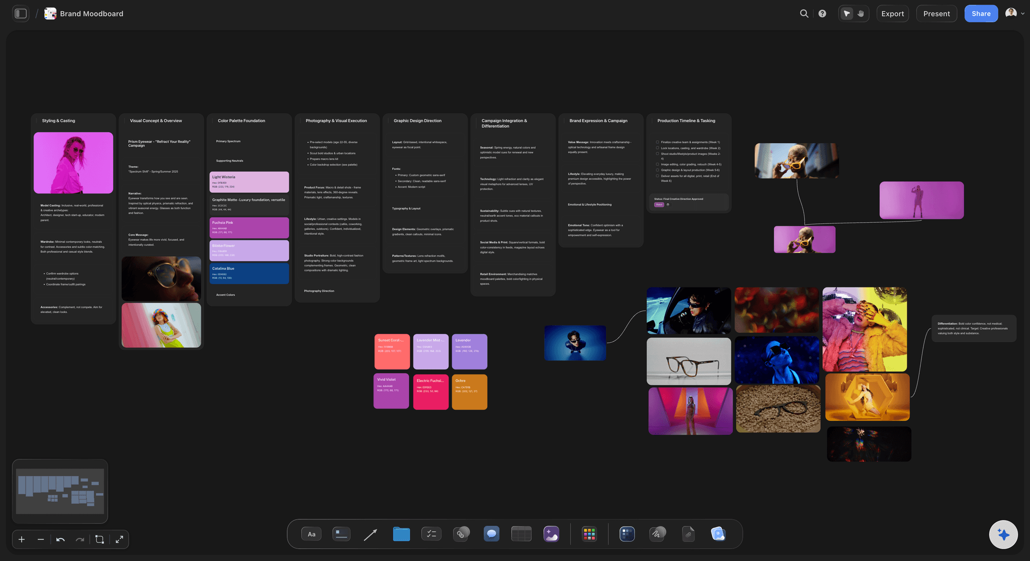
Palette, tone and contrast across rows
Give the feed a colour rhythm
A grid does not need to match, it needs to breathe. Keep the palette on the same canvas as the posts, spread your strongest colour so it recurs rather than clumps, and put a light frame where a row has gone heavy.
Build a brand moodboard →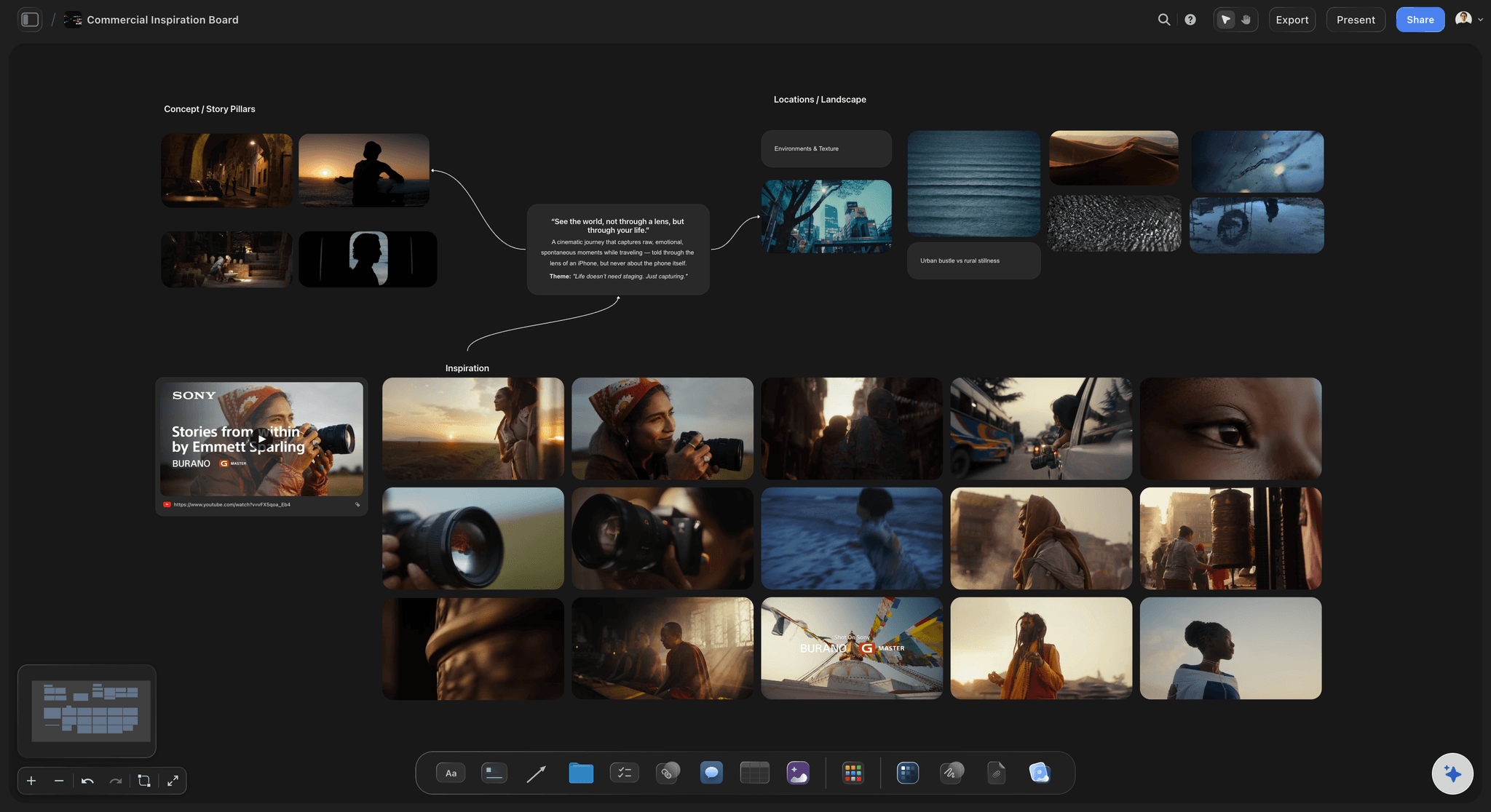
1:1 grid tile, 4:5 in feed, 9:16 full screen
Check the crop before the platform does it for you
The same asset is a square on your profile, a taller rectangle in the feed and a full-screen vertical in stories. Place the key line, the face and the logo where all three survive, and mark the ones that need a separate export.
Try the AI thumbnail concept generator →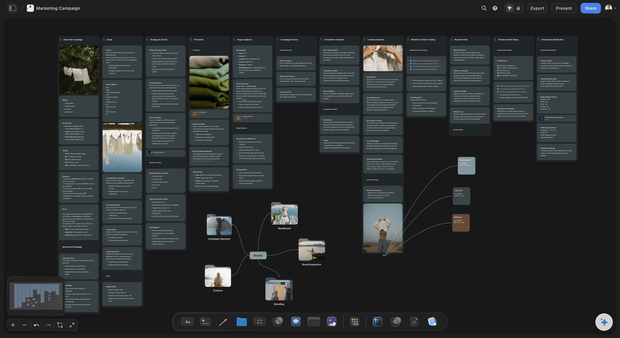
Covers, series and recurring formats
Keep the covers recognisable
Carousel and video covers are most of what a visitor sees on a profile. Design the treatment once, keep every planned cover next to it on the canvas, and you get a feed that reads as one brand instead of a pile of separate uploads.
Explore the content repurposing planner →Unlimited boards. No object cap.
Open a canvas, drop in your assets, and lay out the feed. Storyflow is paid-only during early access, with plans from $9.99 a month, and a Free plan launches before the end of 2026.
Unlimited grid and feed-planning boards on an infinite canvas
Basic AI usage to group assets, balance rows and draft concepts
Moodboard, posting schedule and campaign templates built in
Share view-only links with a designer or client for approval
PLAN THE LOOK
Built for how a feed is actually seen.
Half the audience meets you on the profile grid and half meets you mid-scroll. Plan for both on one surface.
Rows of three, dragged until the block works
Compose the grid, do not just fill it
Separate the heavy images: Dense, busy or dark photos fight each other when they are neighbours. Spread them so each one has a lighter or simpler tile beside it, and the same photos suddenly look considered rather than crowded.
Alternate the content types: Photo, carousel, text-led graphic, video cover. Rotating the formats is what gives a grid texture. Four text graphics in a row reads as a newsletter, and four photos in a row reads as a stock library.
Watch the row, then the block of nine: A row of three is what a scroller passes and a block of nine is what a profile visitor lands on. Check both, because a plan that only works at one of those sizes will look wrong to half your audience.
Reorder instead of redesigning: Most grid problems are ordering problems, not design problems. Moving two posts is a five-second drag on a canvas and a genuinely annoying job once the posts are already scheduled or live.
Palette, references and posts on the same surface
Keep the brand next to the work
The moodboard does not live in another tab: Palette swatches, type samples and reference imagery sit on the same canvas as the planned posts, so the check is a glance instead of a file-opening exercise nobody does under deadline.
Recurring formats stay recurring: A weekly series only works if it looks like a series. Pin the template beside the planned instalments and drift gets caught while it is still one post off, not five.
Brand elements that survive a crop: Logos in corners get cut, captions near edges get covered by platform UI, and faces get sliced by a square tile. Mark the safe area once on the canvas and every asset gets checked against it.
AI that can see the whole board, not one prompt
Generate with the feed as context
Group assets by tone before you place them: Ask the AI to sort what you have dropped in by dominant colour, format and density. Seeing that you have eleven dark photos and two light ones changes the plan before you have wasted an hour arranging.
Draft cover concepts in your treatment: Because the AI reads the canvas, concepts come back in the language of the brand already pinned there rather than in a generic house style borrowed from nowhere.
Fill the gaps in the rotation: Ask what is missing and you get the honest answer the grid already implies: no carousel in three weeks, no faces anywhere, every post at the same crop and the same energy.
It suggests, you compose: Arrangement is a taste decision and it stays with you. The AI is fast at sorting, drafting and pointing out repetition, which is exactly the tedious half of the job.
Approvals, handover and the scheduler
Get the look signed off, then go publish
One screen instead of a thread: Send a view-only link and a client or founder sees the whole planned month as it will appear, which produces a decision. Twelve separate attachments in an email thread produce twelve separate opinions.
The designer gets the context, not just a brief: Whoever makes the assets can see the neighbouring tiles, the palette and the crop notes on the same board, so the export arrives fitting the feed rather than fitting the brief in isolation.
Hand the approved order to your scheduler: Storyflow stops at the plan. Take the approved sequence into Later, Buffer, Hootsuite, Metricool or Planoly and publish there, and keep this board as the reference the schedule was built from.
Explore templates for your project
Every template opens as a real, editable board on the infinite canvas. Pick the closest fit and make it your own.
Content Calendar
Plan what you post and when across every channel on one calendar.
HOW WE COMPARE
Storyflow vs Later, Planoly, and Canva.
These tools cover different parts of the job. Here is who owns which part, including everything we do not do.
Storyflow
Recommended
Whole feed planned as one composition on an infinite canvas
Moodboard, palette and grid plan on the same surface
AI that plans with your whole board as context
Grid preview stitched onto your live posted feed
Schedules and publishes to the platforms
Analytics on how posts performed
Later
Whole feed planned as one composition on an infinite canvas
Moodboard, palette and grid plan on the same surface
AI that plans with your whole board as context
Grid preview stitched onto your live posted feed
Schedules and publishes to the platforms
Analytics on how posts performed
Planoly
Whole feed planned as one composition on an infinite canvas
Moodboard, palette and grid plan on the same surface
AI that plans with your whole board as context
Grid preview stitched onto your live posted feed
Schedules and publishes to the platforms
Analytics on how posts performed
Canva
Whole feed planned as one composition on an infinite canvas
Moodboard, palette and grid plan on the same surface
AI that plans with your whole board as context
Grid preview stitched onto your live posted feed
Schedules and publishes to the platforms
Analytics on how posts performed
What creators are saying
Join early creators getting structured workspaces and AI that remembers their projects
“Storyflow has sped up my workflow by at least 3x, which means more flow state and more projects I can actually ship. It truly changed the way me and my team create.”

Reilin Joey
Director & YouTuber
“One prompt gets me a structured board. But the tactics are my favorite. I run my YouTube scripts through them and my intros and retention got better. It's amazing.”

Justkay
YouTuber & Freelance Filmmaker
“I used to juggle five apps to plan a project. Now I describe what I am making and get boards, lists, and a schedule. All in one place.”

George
@fernwehchronicles
Visual planning questions, answered.
How to plan a grid, whether the grid still matters, what crops to check, and what Storyflow does not do.
Work in blocks of nine, because nine tiles is what a visitor sees without scrolling. Gather the assets first and sort them by tone and format, then place them so no two heavy or dark images are neighbours and no row is all the same content type. Spread your strongest colour so it recurs across rows rather than clumping in one corner. Check each tile as a square, since the grid crops differently from the feed. Then look at the block as a whole, squint, and reorder anything that draws the eye for the wrong reason. Reordering is almost always the fix.
See the feed before your audience does.
Open a canvas, drop in your assets, and lay the next block of posts out as one composition. Plans from $9.99/month, no download, and a Free plan is coming before the end of 2026.