
BRAND AUDIT BOARD
Nobody sees your brand
one asset at a time.
But that is exactly how it gets made and approved, which is why brands drift. A brand audit is the uncomfortable exercise of putting every touchpoint on one wall and looking at them together: the logo in the wild, the palette that quietly grew, the deck nobody updated, the support replies that sound like a different company. Paid-only during early access, plans from $9.99 a month, and a Free plan launches before the end of 2026.
Plans from $9.99/mo
Free plan coming late 2026
Works in your browser

Used by creative professionals at:
Artlist
Pixar
Nike
Red Bull
The North Face
Porsche
Start from a ready-made template
Pick a board to see what you can build, then let AI fill it in. Every template is a real, editable starting point on the same infinite canvas.
Brand Strategy
Define your positioning, values, and voice and connect them into a strategy the team can follow.
What is a brand audit?
A brand audit is an honest assessment of the brand you currently have, as experienced from outside. Not the brand in the guidelines document, not the brand in the deck the agency made three years ago, but the brand as it exists across every place a real person actually meets it: the site, the app, the packaging, the invoice, the out-of-office reply, the fifth slide of a sales deck a rep built themselves. The output is not a mood. It is a specific list of where the brand is coherent, where it has drifted, and which of those gaps are worth money to fix.
The reason brands drift is structural, not lazy. Nobody experiences a brand one asset at a time, but that is how it gets made and approved. A social post is approved next to other social posts. A deck template is approved by whoever needed a deck. A packaging revision is approved by operations under a deadline. Each decision is defensible on its own, and the aggregate is a company with four blues, three logo lockups, a website that sounds like a manifesto and a support inbox that sounds like a form. You cannot see that from inside any single approval. You can only see it when all of it is on one wall.
Storyflow is an AI-native infinite canvas built for exactly that comparison. Drop in screenshots of every touchpoint you can find, group them by type, and pin annotations directly onto the drift you spot. Put the competitive set in a row underneath and the question stops being abstract: if you covered the logos, could anyone tell which brand is which. Keep the customer quotes on the same board as the positioning statement they contradict. AI can help you structure the audit and cluster what you gather, but it does not run the audit for you. The judgment is the work, and the canvas is what makes the judgment possible.
A complete brand audit has six named parts: the visual inventory (logo lockups as they appear in the wild rather than in the guidelines, palette drift across web, print and packaging, typography, photography and illustration style, packaging, signage, social profile art, deck templates and email design), the verbal audit (voice and tone across web copy, product UI, support replies, sales emails, social captions and legal small print, which is where a brand's real personality leaks out), the competitive set side by side (the same touchpoints from four or five competitors, laid out so distinctiveness becomes a visible fact rather than an opinion), customer perception against internal claim (reviews, support tickets, interviews and survey verbatims placed next to the positioning statement they are supposed to prove), consistency and gap analysis (where the brand is coherent, where it has drifted, and how far), and the decision (what to fix now, what to fix at the next print run, and whether the gap is big enough to justify a rebrand at all). Storyflow holds all six on one surface, which is the only way the sixth one gets made with evidence.
HOW IT WORKS
From scattered assets to a decision you can defend.
Gather, group, compare, judge. The hard part is seeing it all at once, and that is what a canvas is for.
01
Open a board for the audit
Sign up in seconds, from $9.99 a month. No download. One infinite canvas opens in the browser, big enough to hold every touchpoint at full size.
02
Gather every touchpoint you can find
Screenshot the homepage, the pricing page, the app onboarding, the three most recent emails, every social profile, the packaging, the invoice, the sales deck, the job listing and the support macro. Include the ones nobody owns. Those are usually where the drift is worst.
03
Group it, then compare it
Cluster by touchpoint type so all the logo lockups sit in one row and all the photography in another. Put the competitive set underneath. Annotate directly on the canvas where the palette wandered, where the voice changed, and where an asset is simply three years old.
04
Turn the gaps into a decision
Write the gap analysis on the same board as the evidence, sort it by cost and impact, and share a view-only link with the people who have to sign off. Then either fix the drift or start the rebrand with an argument rather than a hunch.
Sixty assets, one wall, one look.
The visual inventory, the verbal audit, the competitive set and the gap analysis on one canvas.
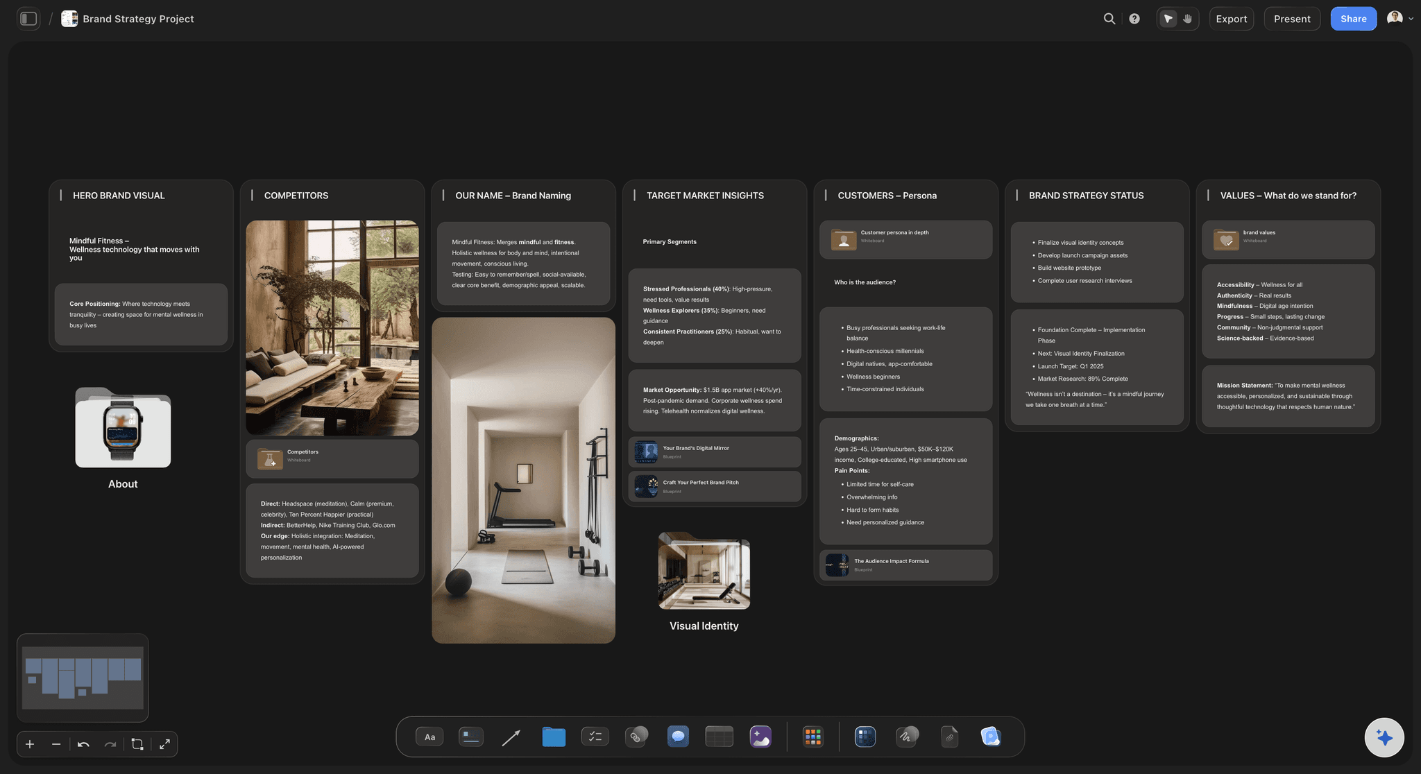
Every touchpoint at full size, side by side
A slide deck cannot show 60 assets at once
That is the whole problem with auditing in slides: you look at four things per slide, in the order somebody chose, and the pattern never assembles. On an infinite canvas you zoom out and the four blues, the two logo lockups and the photography that changed halfway through last year are simply visible. Comparison is spatial, so give it space.
See the brand strategy tool →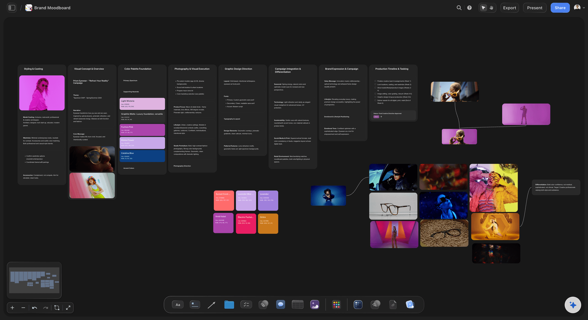
Logo usage, palette drift, type, photography, packaging
The visual inventory as it exists, not as documented
Audit the logo as it appears in the wild: stretched in a partner deck, on a background it was never meant for, with a tagline nobody approved. Do the same for colour, type, photography and packaging. The gap between the guidelines and reality is the actual finding, and it only shows up when both are on the board.
Build the moodboard next →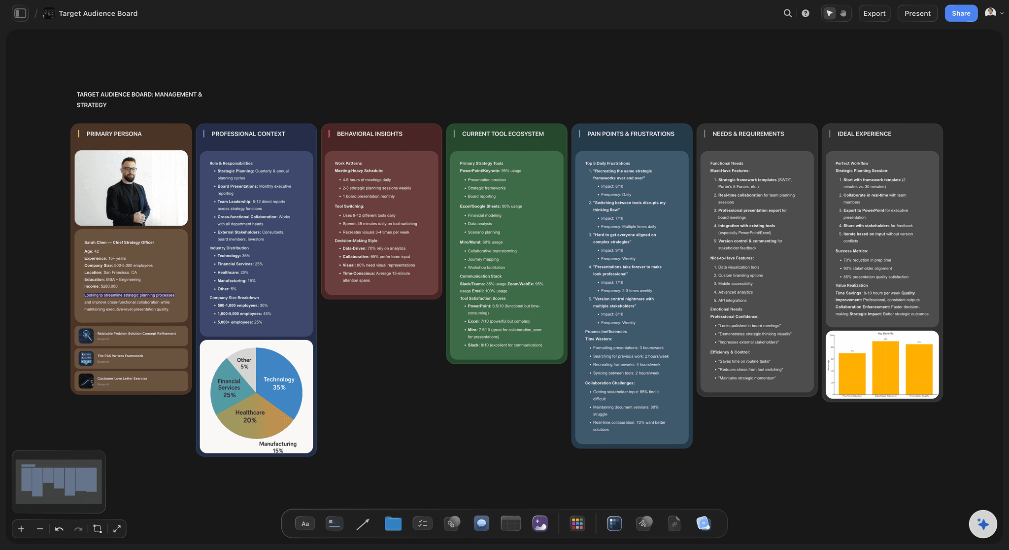
The competitive set in a row underneath yours
Cover the logos and see if anyone can tell you apart
Put four or five competitors' homepages, social profiles and packaging directly beneath your own, at the same scale. Distinctiveness stops being a matter of opinion. Category conventions become obvious, and so does the moment you realise you adopted them all without deciding to.
Try the AI competitor analysis generator →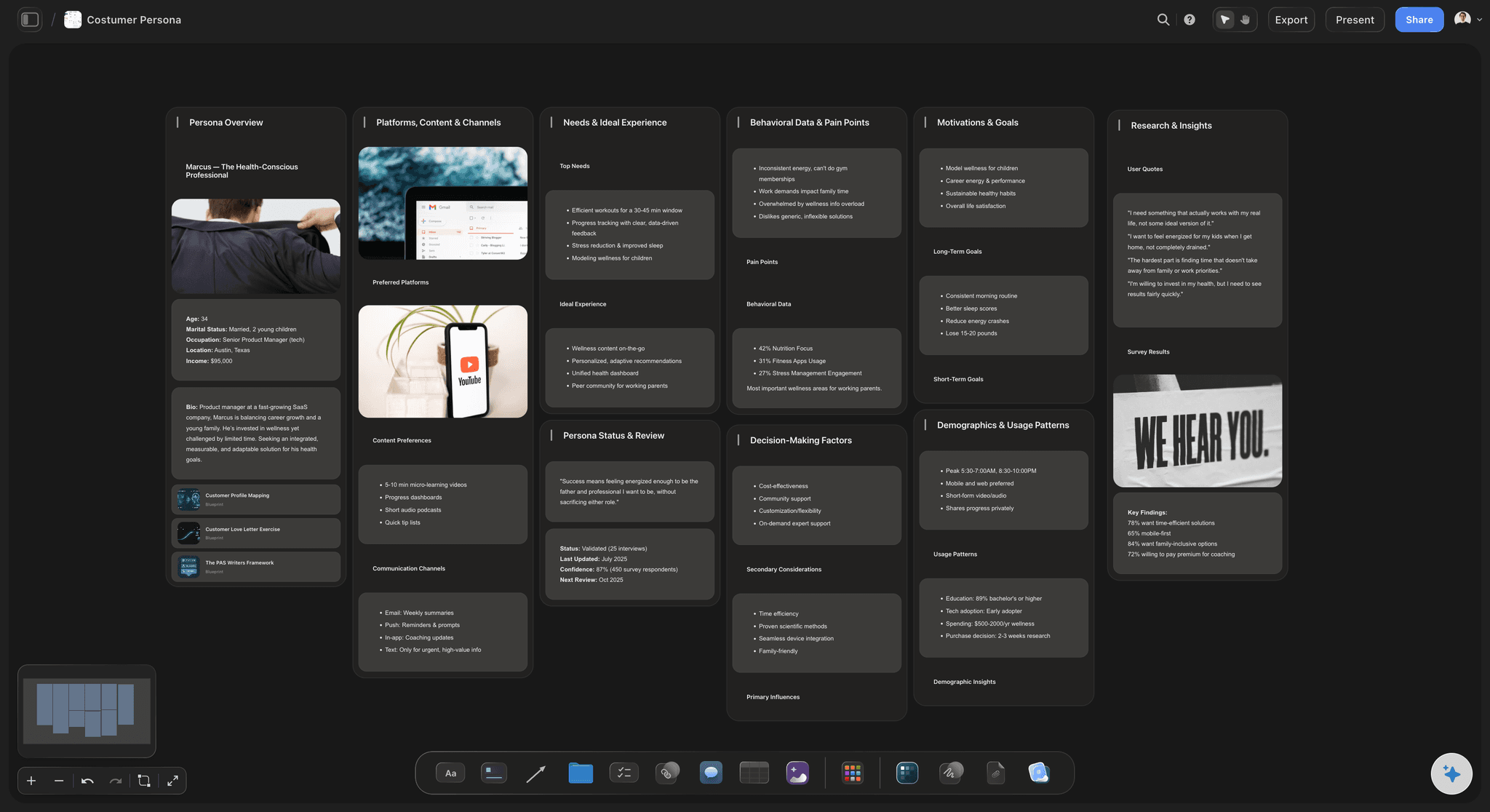
What customers say against what you claim
Put the review next to the positioning statement
Paste the actual words from reviews, support tickets, sales calls and interviews beside the sentence in your strategy that they are supposed to prove. When customers describe you with a word that appears nowhere in your messaging, that is either your real positioning or your biggest gap. Both are decisions worth making deliberately.
See the customer persona generator →Unlimited boards. No object cap.
Put every asset on one canvas at full size without hitting a limit halfway through. Storyflow is paid-only during early access, with plans from $9.99 a month, and a Free plan launches before the end of 2026.
Unlimited brand audit boards on an infinite canvas
Basic AI usage to structure the audit and cluster what you gather
3 starter frameworks built in
Share view-only links with founders, agencies and stakeholders
BUILT FOR ASSESSMENT
An audit is a comparison exercise.
And comparison is spatial. Everything below exists because you have to see the assets together to judge them.
The full visual inventory, including the assets nobody owns
Gather what the brand actually looks like
Logo lockups in the wild: Not the SVG in the brand folder. The version on the app icon, the one in the email footer, the one a partner rebuilt from a JPEG, the one on the van. Put them in a row and count how many there are. Most teams are surprised by the number and by which one is winning.
Palette drift and typography: Sample the colours actually in use on the site, the deck, the packaging and the ads, and place the swatches next to the documented palette. The same for type: how many families and weights are genuinely in play, and whether the web fonts match the print ones.
Photography, illustration and packaging: Image style is where brands drift fastest, because every campaign quietly renegotiates it. Lay a year of photography out chronologically and the drift is a picture rather than an argument. Add packaging, labels and any physical print in the same view.
The neglected surfaces: Signage, social profile art and banners, deck templates, transactional email, invoices, job listings, the 404 page, the podcast cover. Nobody owns these, everybody ships them, and they are usually the oldest and least on-brand things you have.
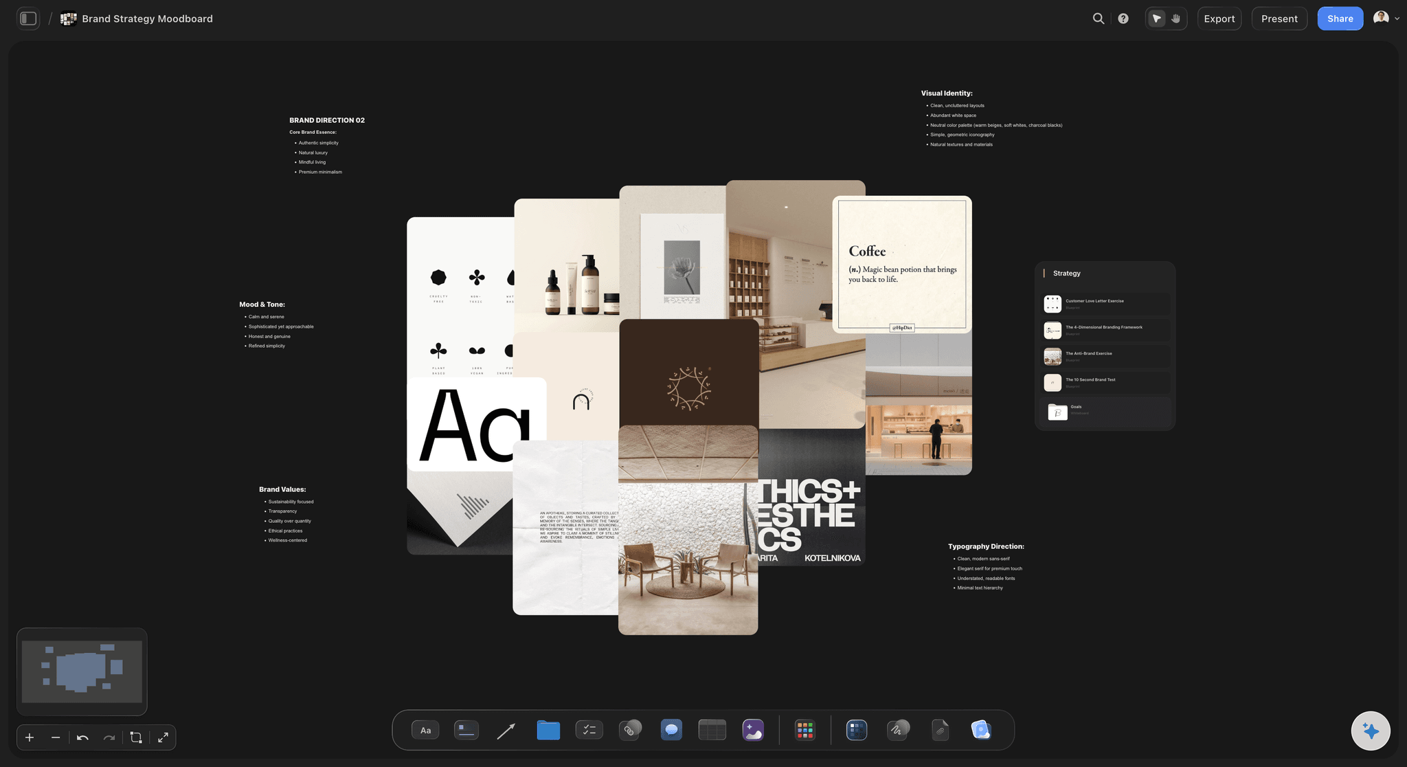
Voice across web copy, support replies and social
Audit how the brand sounds, not just how it looks
Read three sources next to each other: Take a paragraph of homepage copy, a real support reply and your last ten social captions, and put them side by side. Most brands discover they have three voices: aspirational on the website, apologetic in support, and casual to the point of anonymous on social.
The small print tells the truth: Error messages, empty states, cancellation flows, terms summaries and the unsubscribe page are written by whoever was nearest and are almost never reviewed. They are also read at the exact moments a customer is deciding how they feel about you.
Check the words you own: List the terms you use for your own product, features and customers, then check whether the website, the sales deck, the app and the support macros use the same ones. Naming drift is quiet, cumulative and expensive, and it shows up instantly when the sources sit together.
Test the voice attributes against evidence: If the guidelines say warm, confident and plain-spoken, pin three real sentences under each attribute as proof. Attributes with no evidence underneath them are aspirations, and labelling them honestly is more useful than defending them.
Competitors and customers on the same wall
Judge the brand against something, not in a vacuum
The same touchpoints, the same scale: Four or five competitors, each with the homepage, the pricing page, the main social profile and the packaging captured the same way. Inconsistent capture makes the comparison useless, so grab everything at one width and one moment in time.
Name the category conventions: Every category has visual defaults: the blue, the gradient, the smiling team photo, the same three adjectives. Mark them on the board. Then decide, deliberately, which ones you keep because they signal credibility and which ones you break because they cost you distinctiveness.
Customer language, verbatim: Pull real sentences from reviews, tickets, sales calls and interviews and cluster them. The recurring words are how the market actually describes you. Compare that cluster with your messaging and the gap analysis half writes itself.
Keep the strategy visible while you judge: Pin the positioning statement, the audience definition and the value proposition on the board so every finding gets tested against them. An audit without the intended brand in view is just a pile of screenshots and opinions.
The gap analysis, the decision, and the handover
Turn what you found into something someone can act on
Rate each gap by cost and impact: Some drift is a fifteen-minute fix and some waits for the next print run. Sort the findings into fix now, fix at next cycle, and needs a real decision, and put the evidence next to each one so nobody has to take it on trust.
Decide whether this is a tidy-up or a rebrand: Most audits end in consistency work: one palette, one lockup, one voice, a refreshed deck template. Some end in the conclusion that the brand no longer fits the company. Making that call with sixty assets on the wall is very different from making it in a meeting.
Share it with the people who sign off: Send a view-only link and founders, clients or stakeholders open the whole board in a browser with no account. An audit that lives in one person's file changes nothing. Anyone a paid member invites to a board joins free today.
Export the audit for the deck: Export the board as a high-quality image or PDF when the findings have to travel into a board deck, an agency brief or a budget request. The wall is the argument, so send the wall.
Explore templates for your project
Every template opens as a real, editable board on the infinite canvas. Pick the closest fit and make it your own.
Brand Strategy
Define your positioning, values, and voice and connect them into a strategy the team can follow.
HOW WE COMPARE
Storyflow vs Figma, Miro, and Notion.
Each of these owns part of the work. Here is where they differ, including what Storyflow does not do.
Storyflow
Recommended
Infinite canvas built for side-by-side asset comparison
AI reads your whole audit board as context
Visual, verbal and competitive audit on one board
Gap analysis kept beside the evidence
Produces the finished brand assets and design files
Structured audit database with filters and views
Figma
Infinite canvas built for side-by-side asset comparison
AI reads your whole audit board as context
Visual, verbal and competitive audit on one board
Gap analysis kept beside the evidence
Produces the finished brand assets and design files
Structured audit database with filters and views
Miro
Infinite canvas built for side-by-side asset comparison
AI reads your whole audit board as context
Visual, verbal and competitive audit on one board
Gap analysis kept beside the evidence
Produces the finished brand assets and design files
Structured audit database with filters and views
Notion
Infinite canvas built for side-by-side asset comparison
AI reads your whole audit board as context
Visual, verbal and competitive audit on one board
Gap analysis kept beside the evidence
Produces the finished brand assets and design files
Structured audit database with filters and views
What creators are saying
Join early creators getting structured workspaces and AI that remembers their projects
“Storyflow has sped up my workflow by at least 3x, which means more flow state and more projects I can actually ship. It truly changed the way me and my team create.”

Reilin Joey
Director & YouTuber
“One prompt gets me a structured board. But the tactics are my favorite. I run my YouTube scripts through them and my intros and retention got better. It's amazing.”

Justkay
YouTuber & Freelance Filmmaker
“I used to juggle five apps to plan a project. Now I describe what I am making and get boards, lists, and a schedule. All in one place.”

George
@fernwehchronicles
Brand audit questions, answered.
What an audit covers, how often to run one, and where it stops and a rebrand begins.
A brand audit is a structured assessment of the brand you currently have, as experienced from outside. You gather every touchpoint a real person can meet, from the homepage and the packaging to the invoice and the out-of-office reply, and you judge them together rather than one at a time. It covers the visual inventory, the verbal audit, the competitive set, and what customers say against what you claim. The output is a specific list of where the brand is coherent, where it has drifted, and which gaps are worth spending money on. It is diagnosis, not treatment.
Put the whole brand on one wall.
Gather every touchpoint, compare them side by side, and decide what to fix. Plans from $9.99/month, no download, and a Free plan is coming before the end of 2026.