
All Collections
AI Features
AI Dashboards
Last updated: August 2026
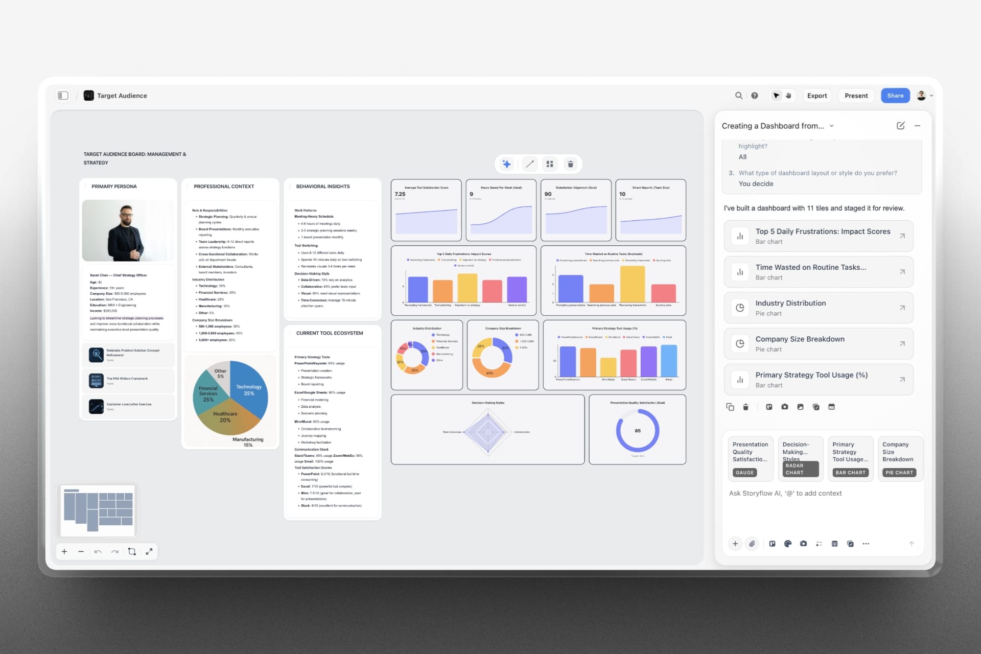
When the question is "how are we doing", one chart is not the answer. A dashboard is a grid of chart and metric tiles laid out together, aligned to one width with even gaps, built in a single step.
"Build me a dashboard of last quarter."
"Give me an overview of the campaign — spend, reach, conversions, cost per lead."
There is a workflow for this too, called Data dashboard. It is named that way because "dashboard" already means the app's home screen.
What a good one looks like
A dashboard usually opens with a row of three or four metric tiles — single headline numbers with their trend — then rows of one to three charts underneath. Rows render top to bottom, and the tool owns every pixel: you say which tiles share a row and how wide each should be relative to its neighbours.
The ceiling is 16 tiles. In practice far fewer is better.
When it is not a dashboard
Asking for a chart, a graph or a picture of one thing gets you one chart, not a grid with that chart buried in it. The AI reaches for a dashboard when the ask is genuinely an overview — a report, a summary, four or more different measures worth seeing at once.
It also will not invent a tile to fill out the grid. If your data holds four things worth showing, the dashboard is four tiles.
Getting the numbers right
Two things are worth saying out loud when you ask:
- What the values are. Money and percentages need to be named or they render as bare numbers.
- What a gauge runs between. A gauge is drawn against 0–100 unless you say otherwise, so a score like NPS that runs −100 to 100 comes out wrong if nobody mentions it.
Afterwards
The tiles are ordinary chart elements. Any of them can be changed in place — data, title, layout — without rebuilding the dashboard, and each carries its own menu for switching how it is drawn or saving it as an image.
Use Cases
- Turn a month of campaign numbers into a board a client can read at a glance
- Open a review meeting with four metrics and three charts, already laid out
- Build a project health overview from data spread across a spreadsheet
Was this article helpful?
Related Articles
Charts the AI Puts on Your Board
Changing a Chart the AI Made
Workflows: Jobs the AI Already Knows
Spreadsheets the AI Builds