
All Collections
AI Features
Charts the AI Puts on Your Board
Last updated: August 2026
Ask the AI to chart something and you get a real chart element on the canvas — interactive, resizable, part of the board — not a picture of a chart.
"Chart the budget split across departments."
"Show me signups by month from this spreadsheet."
The chart types
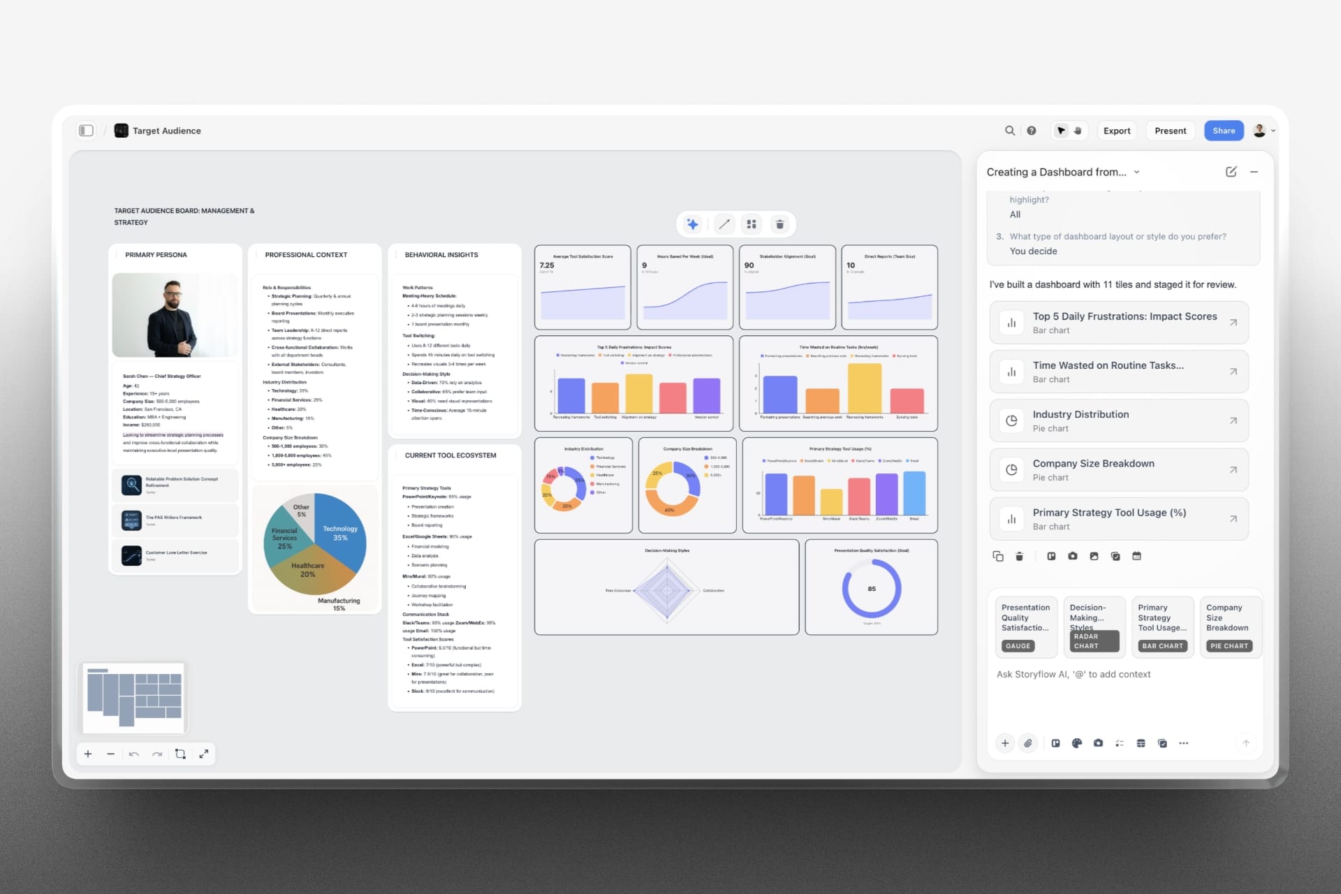
Bar, line and pie are the everyday three. Beyond them: a metric tile with a sparkline for a single headline number, a gauge for a value against a range, a radar for several dimensions at once, and a scatter for pairs of values.
Real numbers only
The AI charts what it actually has — what you told it, what an attachment holds, what it researched. It will not invent figures to have something to draw, and it will not mix a counted number with an estimated one in the same chart. When it derives something rather than counting it, it says so.
One fact, one chart
The instinct with a charting tool is to build a wall of them. The AI does the opposite: the same measure across several categories comes back as small multiples — the same chart repeated per category — because they read better than one crowded chart with six series fighting in it.
If you want an overview of several different measures at once, that is a dashboard, and it has its own article.
Money and percentages
Tell the AI what the numbers are and they render correctly — currency symbols, percent signs, the number of decimals you want. Without it they come out as bare numbers, which is the single commonest reason a chart looks wrong.
"Those are pounds, not units."
The look
Charts are drawn in one house colour rather than a rainbow: each bar or slice takes its own shade of the same blue, so the picture reads as one measure drawn in one colour. Up and down badges on a metric tile stay green and red — those mean something. If you want a specific colour, ask, and charts already on your board keep the colours they were built with.
Building from a picture
Paste a screenshot of a chart and the AI can rebuild it. What carries across is the data, the category and series names, the chart type, the bar direction and the series colours. The background, typography, gridlines, spacing and legend placement belong to the canvas and are not settable — so the AI tells you what it actually matched rather than claiming the same style.
Use Cases
- Chart a budget from the numbers already on your board
- Rebuild a chart from a screenshot in a report you were sent
- Put a single headline metric on the board as a tile with its trend
- Get spend by channel as small multiples instead of one unreadable stack
Was this article helpful?
Related Articles
Changing a Chart the AI Made
Charts Inside the Reply
AI Dashboards
Spreadsheets the AI Builds