The Best Visual Workspace for Graphic Designers in 2026: The Desk, the Display and the Software
A graphic designer's visual workspace has a software half and a physical half. In software: Storyflow for the brief, the references, the mood board and the client's feedback, beside Figma or Creative Cloud for the making. Physically: a calibrated colour-accurate display, a monitor arm and neutral light, with calibration mattering more than which panel you bought.

Category
Graphic Design
Author

Justkay
Documentary Filmmaker & Founder at Storyflow
Topics
2026-08-30
•
25 min read
•
Graphic Design- best visual workspace for graphic designers
- graphic design software
- graphic design workspace
- best monitor for graphic design 2026
- best desk for graphic designers
- monitor calibration design
- graphic design laptop workspace
- Storyflow
What is the best visual workspace for graphic designers in 2026?
For a graphic designer's visual workspace in 2026, our pick is Storyflow on a calibrated display. Storyflow is the software layer: an infinite canvas that holds the brief, the references, the mood board and the client's feedback for a design job, with AI that builds the mood board and the client deck from them. The physical layer is a colour-accurate monitor, a hardware calibrator, a monitor arm and neutral light. Make the design itself in Figma or Adobe Creative Cloud, choose Milanote for a hand-arranged board with a free plan and Miro for workshops, and buy the calibrator before a better screen.

Full disclosure: Storyflow is our own product and it is listed first in the software layer of this guide, on one stated basis: it covers the brief and the exploring stages that the making tools leave open, and its AI builds from the brief you already have. Storyflow is not a design tool and has no free plan today. The hardware in this guide is not ranked, no display was measured for it, and every maker claim is quoted from the maker's own page, checked on 11 October 2026.
Quick Answer: The Best Visual Workspace for Graphic Designers, Layer by Layer
A graphic designer's visual workspace has a software half and a physical half, and both get asked about under the same phrase. Storyflow is our own product and it is listed first in the software layer; the hardware picks are by specification, not by brand.
- Software workspace around the design file: Storyflow. Best for putting the brief, the references, the mood board, the client feedback and the project plan together on one visual board. Storyflow's visual workspace for graphic designers is an infinite canvas with drag and drop, real-time collaboration and AI that turns a brief into a board.
- Software for making: Figma for screen design, Adobe Creative Cloud for print, image and typography, Affinity if you want a professional app at no cost.
- A hand-arranged board on a free plan: Milanote. A workshop board: Miro, or FigJam inside a Figma team.
- Display: a colour-accurate IPS panel covering close to 100% of sRGB, plus Adobe RGB coverage if you print or DCI-P3 if your work is video-adjacent, with a Delta E of 2 or lower.
- Calibration: a hardware calibrator from Calibrite or Datacolor's Spyder range. It matters more than which panel you bought.
- Desk: deep enough to sit an arm's length from the screen, with a monitor arm so the top of the panel is at eye level.
- Light: neutral and the same all day, with nothing shining on the screen.
The two halves fail differently. The physical workspace fails quietly, in colour you cannot trust. The software workspace fails loudly, in rounds of revisions.
This guide covers both halves. Two sibling guides stay inside the software half: the 11 best visual workspaces for graphic designers reviews the full field, and Milanote vs Miro vs FigJam vs Storyflow compares the four boards head to head.
The stage before the design file
Figma and Creative Cloud are not your bottleneck. The brief in an email and references in a folder are. Storyflow keeps the brief, the captioned references and the client's feedback on one canvas beside the work, and builds the mood board and the client deck from them.

The Whole Workspace at a Glance
| Layer | What it is for | First pick | Choose instead when | Cost signal (checked 11 October 2026) |
|---|---|---|---|---|
Software: the workspace around the file | Brief, references, mood board, client feedback, deck | Storyflow | Milanote, when you want to place every image by hand on a free plan | From $7.99 a month billed annually |
Software: making for screens | Layout, components, prototypes | Figma | Adobe, when the output is print | Starter free; Full seat $16 a month |
Software: making for print and image | Photo, vector, long documents | Adobe Creative Cloud | Affinity, when you want no subscription | Annual plan billed monthly |
Software: workshops | Kickoffs with many people | Miro or FigJam | Storyflow, when the board must hold the job afterwards | Miro Starter $8 per member a month billed yearly |
Display | Colour you can be accountable for | A calibrated IPS panel near 100% sRGB | Wide-gamut models, when you print | Varies by model; see the maker |
Calibration | Making the panel trustworthy | A hardware calibrator | Nothing replaces it | One purchase |
Arm and desk | Screen height and distance | A VESA arm rated for your monitor | A deeper desk, if the screen is still too close | One purchase |
Light | A reference that does not move | Neutral, constant light | Blinds, when you sit beside a window | Low |
Key Takeaways
- Storyflow is the software workspace to start with: the brief, the references, the mood board and the client's feedback sit on one infinite canvas its AI reads, beside Figma or Adobe, not instead of them.
- Calibration matters more than the panel. An uncalibrated expensive display is less trustworthy than a calibrated mid-range one.
- Match the gamut to your output. Near 100% sRGB for screen work, Adobe RGB coverage if you print, DCI-P3 if you work in video-adjacent colour.
- A Delta E of 2 or lower is the accuracy figure professional monitors are commonly sold against.
- A monitor arm is a low-cost upgrade with a large ergonomic return: screen height and distance in one purchase.
- Consistent neutral lighting is the most overlooked variable, and it changes what you see all day.
- Most revision rounds are a brief problem, not a craft problem. Keep the brief on a Storyflow board where the work happens.
"Visual Workspace" Means Two Things
"Visual workspace" is used to mean two different things, and searching for it returns both, which is why the answers people find rarely feel complete.
Sense one: the software workspace. The canvas where thinking happens around a design file: references, concepts, the brief, the mood board, the client's feedback. This is the sense in which Storyflow, Milanote and Miro are workspaces, and the sense in which Figma is one for making.
Sense two: the physical workspace. The desk, the display, the calibration, the light. This is the sense in which a colour-managed environment is the workspace, and it is what a studio means when the phrase comes up.
Both are real and they are not competing. A designer with a calibrated display and no thinking surface produces beautifully rendered work against a brief they half remember. A designer with an excellent software workspace on an uncalibrated laptop screen delivers files whose colour is wrong on someone else's monitor.
This article covers the software half first, because that is where most designers lose time, and the physical half second, because that is the half with objective answers.
The Software Workspace: Graphic Design Software in Three Stages
Design work has three stages, and designers usually have graphic design software for only one of them.
| Stage | What happens | Where it usually lives | Where it should live |
|---|---|---|---|
1. Understanding | The brief, the audience, the constraints, what the client rejected before | An email and a call | A Storyflow board, as documents and notes the AI can read |
2. Exploring | References, directions, sketches, the mood board | Pinterest, a screenshots folder, a Figma page | The same Storyflow board, with a caption on every reference |
3. Making | Layout, type, image, production files | Figma or Adobe Creative Cloud | Figma or Adobe Creative Cloud |
Stage three is a solved problem. Figma and Creative Cloud are mature and deep. Almost nobody's output is limited by their design application.
Stages one and two are where the time goes. The tooling there is a folder of screenshots and a half-remembered call. The visible symptom is revision rounds: work that is well made and answers a brief nobody can now locate, so the argument becomes about taste and not about the objective.
Keep three things current on one Storyflow board and the argument changes: the brief in your own words, the references with a caption each, and the directions you rejected. When work comes back with a note, "which part of the brief does this serve" is answerable without searching an inbox.
The Software Layer: 7 Tools Reviewed
Storyflow is first because it is our product and because it covers the two stages the making tools leave open. The rest are ordered by layer: the two making tools, then the boards, then templated output. There is no score. Prices are from each vendor's own page on 11 October 2026.
1. Storyflow
Storyflow is an AI visual workspace for graphic designers: an infinite canvas where you drag and drop images, notes, links, documents and files, and an AI agent that turns a brief into a board. Storyflow's visual workspace for graphic designers holds everything around the design file, which is the brief, the references, the mood board, the client's feedback and the project plan, on one visual board beside Figma or Adobe.
Best for: The software workspace around the design file: brief, references, mood board, client feedback and project plan together on one visual board.
Pricing: Paid-only during early access. Plus is $7.99 a month billed annually or $9.99 monthly. Pro is $14 a month billed annually and adds AI image generation and memory across conversations. Max is $39 a month billed annually and adds a Team Workspace with roles and permissions. The Free plan launches before the end of 2026, and anyone a paid member invites to a board joins free now. See pricing.
Storyflow's AI reads the board you have open, plus up to five documents and three other boards you attach in the chat, and looks at up to 24 images you select. Storyflow builds a mood board of 9 to 16 reference tiles from a web search, or generates them on Pro and Max, and builds a colour moodboard as a grid of named swatches with hex codes. Storyflow turns the finished board into a slide deck you present fullscreen or export as a PDF.
Storyflow shares a board with a client by link, with no account needed to view, and real-time collaboration works on any paid plan. Storyflow also connects to Claude, ChatGPT, Gemini and Grok through its MCP connector, so an assistant can read your projects and build boards in them.
Strengths:
- Brief, constraints, references and notes as first-class objects on an infinite canvas, with a caption on every image.
- AI that reads the board and builds the mood board, the colour swatches, the plan and the client deck from it.
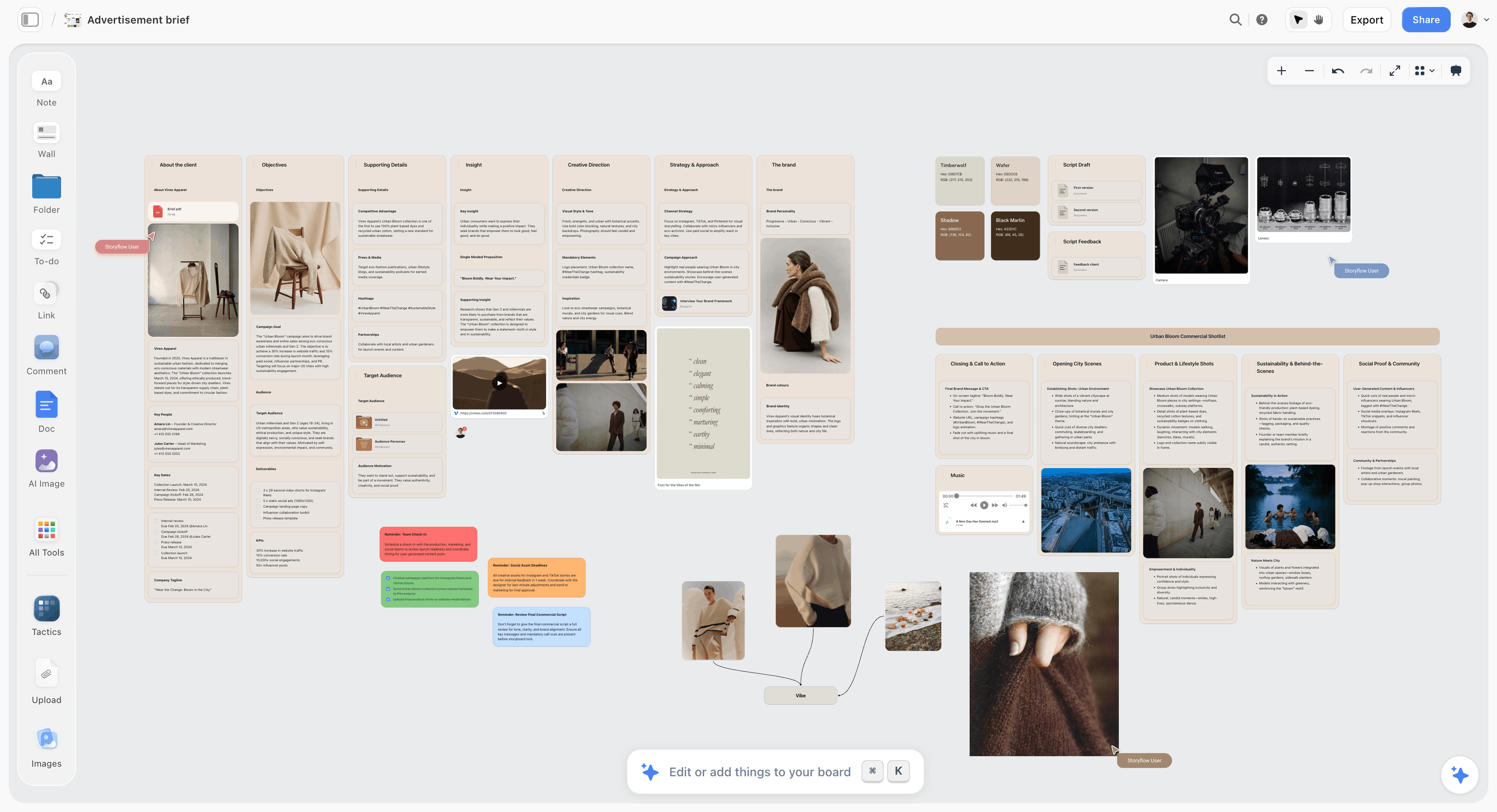
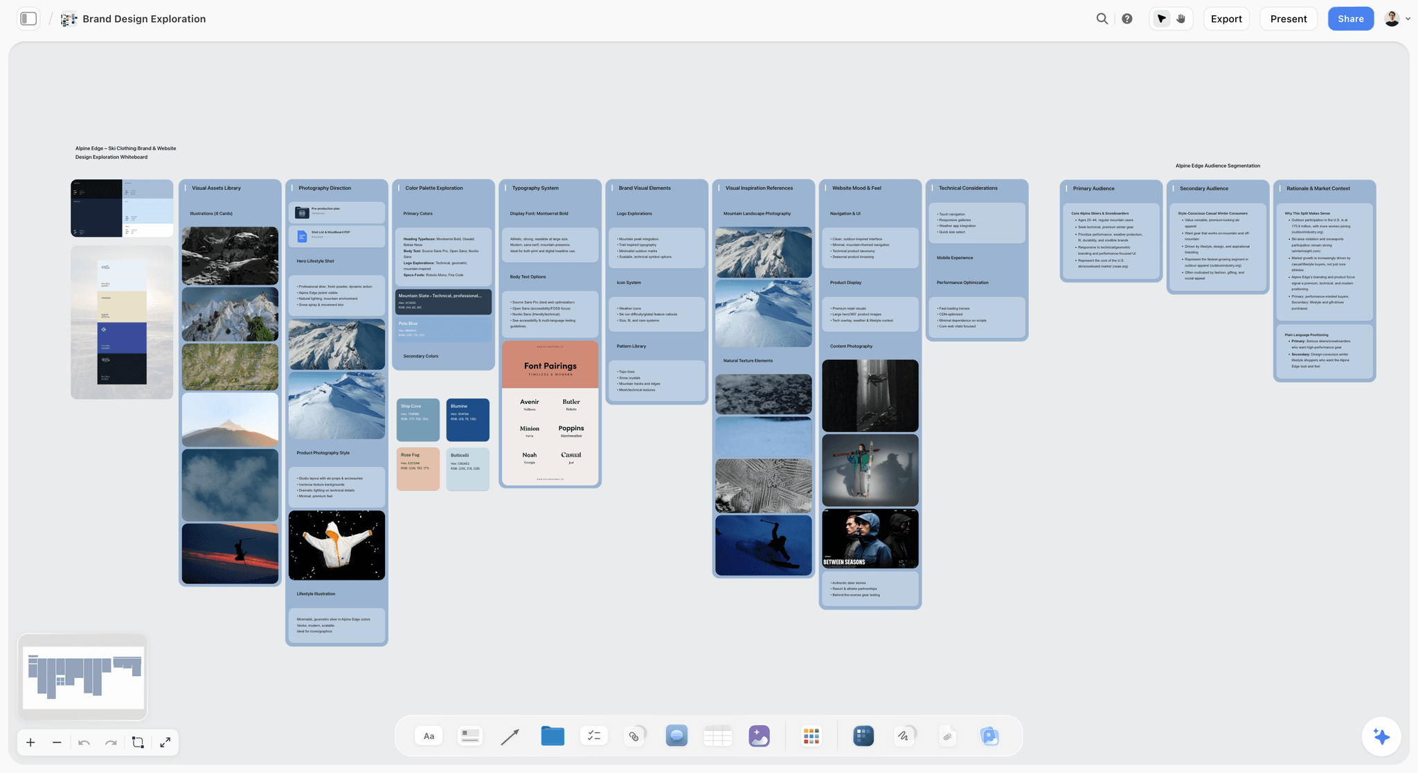
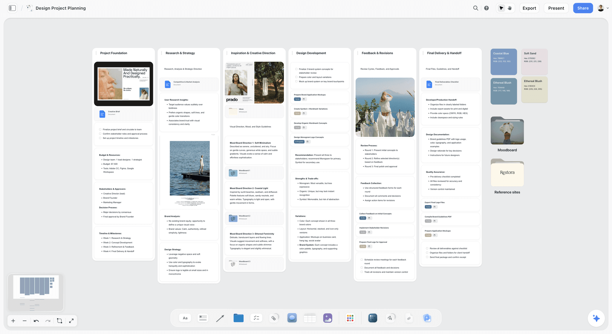
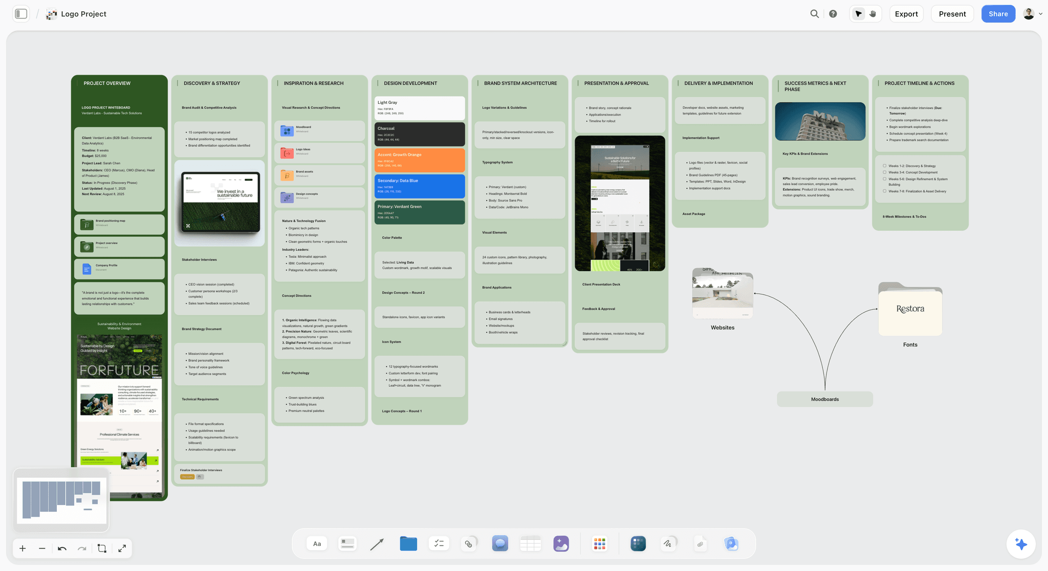
- Templates: 70 board templates and more than 200 Tactics, including a Brand Design Exploration template and a Design Project Planner.
- Client sharing by link with no account needed to view, a fullscreen Present mode and PDF export.
- Invited collaborators join without paying.
Limits:
- Storyflow is not a design tool. There is no vector editing, no typography control, no layout engine, no colour management and no prototyping. Every piece of design craft in this article happens in Figma or Creative Cloud.
- Storyflow has no free plan today and no web clipper. Milanote has both.
- Storyflow runs in the browser, with no offline mode.
Verdict: The software workspace beside Figma or Creative Cloud, never instead of them.
2. Figma
Figma is the default design environment for interface and most collaborative screen work. Storyflow does not replace it: Storyflow holds the brief and the mood board in front of the Figma file, and Figma is where the design gets made.
Best for: The making stage for screens, after the direction is settled on a Storyflow board.
Pricing: The Starter plan is free. The Professional plan lists a Full seat at $16 a month and a Collab seat at $3 a month, with View seats free, on Figma's pricing page.
Real-time collaboration, components and variables, auto layout, prototyping and developer handoff sit in one file. FigJam and Figma Slides are in the same account, which keeps early exploration and concept presentations one click from the design file.
Figma's limit is that it is a design tool and not a project surface. The brief does not live in Figma, and a Figma file full of reference images is a design file being used as a scrapbook.
Strengths:
- A complete design environment for screen work.
- Collaboration built in, with free View seats on paid plans.
Limits:
- Print and image work still belongs in Adobe.
- Not a place a brief or a project plan lives.
Verdict: The core of most designers' software workspace, and not the whole of it. Choose Figma over Storyflow for making; run Storyflow in front of it for the brief.
3. Adobe Creative Cloud
Adobe Creative Cloud is where print, packaging, image manipulation and serious typography get made. Storyflow plans and presents that work and makes none of it, so Creative Cloud stays required for anything with ink or photographs in it.
Best for: Print, image and typographic work, the making that Storyflow leaves to a design tool.
Pricing: Adobe's plans page lists Creative Cloud Pro, Creative Cloud Standard, single apps and a Photography plan, each as an annual plan billed monthly. The page showed no US dollar price when checked, so no figure is quoted.
InDesign is the tool for long documents, Photoshop for images and Illustrator for precise vector work. Colour management across the suite connects the software half back to the physical half: a calibrated display only pays off in an application that uses its profile. Creative Cloud Libraries carry shared colours, type styles and assets across applications.
Adobe states that its own Firefly models are commercially safe and trained on licensed Adobe Stock content and public domain content, which matters when the output goes to a client whose legal team will look at it.
Strengths:
- The production tools for print, image and typography.
- Colour management that pairs with a calibrated display.
- Libraries make assets portable across the suite.
Limits:
- A subscription on an annual term.
- Heavier than Figma for collaborative screen work.
Verdict: Required for print and image work, and paired with Figma more often than replaced by it. Choose Adobe over Storyflow for production; keep the brief on a Storyflow board beside it.
4. Milanote
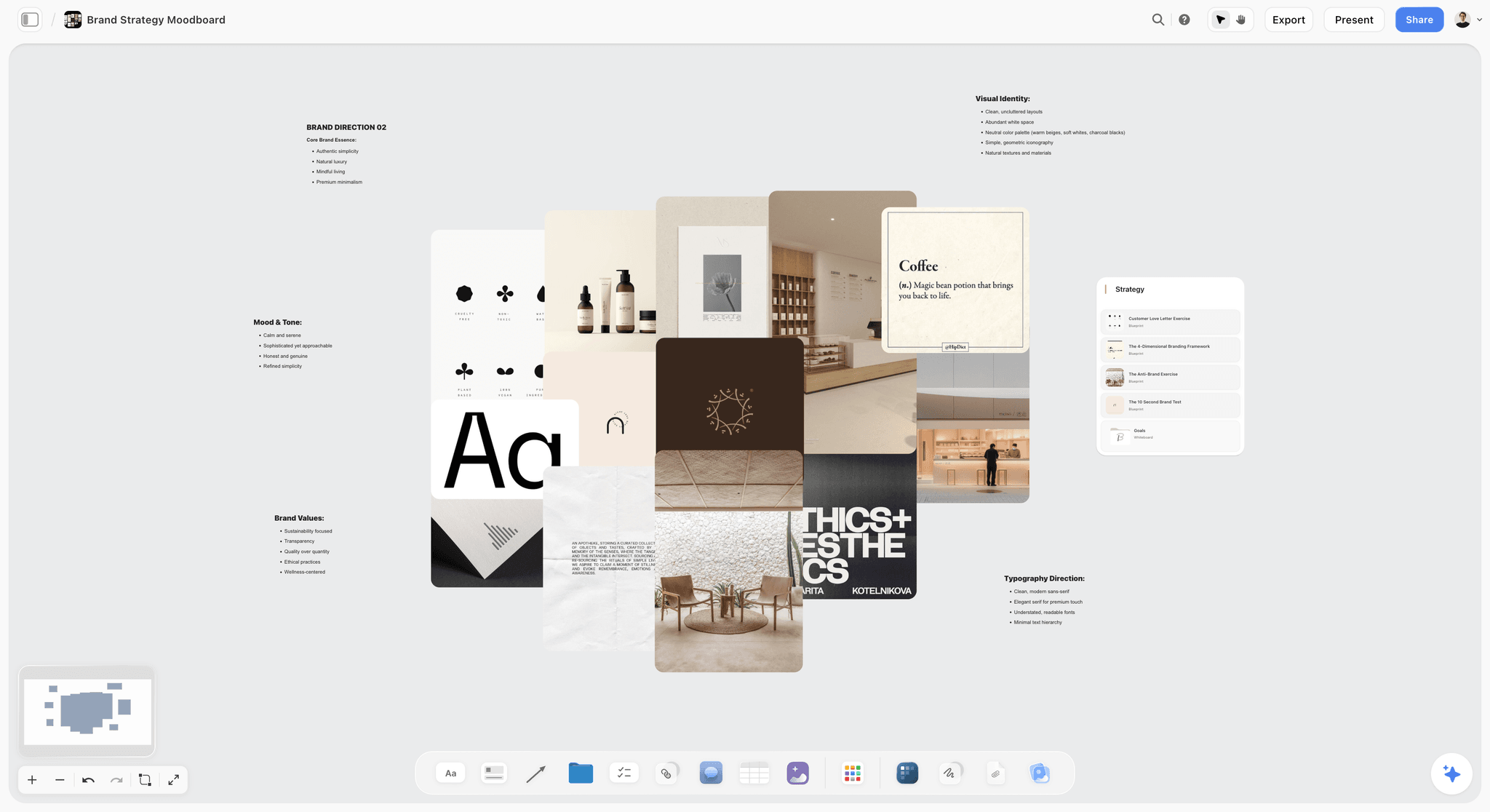
Milanote is a hand-arranged mood board with a free plan and a web clipper. Unlike Storyflow it has no AI that builds the board from a brief, so choose Milanote when you want to place every image yourself or the cost must be zero.
Best for: Collecting and arranging references by hand in the exploring stage, where Storyflow would build the first board for you.
Pricing: Free for 100 notes, images or links. Paid is $9.99 per person a month billed annually or $12.50 monthly, per Milanote's plans page.
Images arrange without a grid, and notes sit alongside references so a board reads like a designer's wall and not a document. The web clipper saves from the browser, the phone apps capture references away from the desk, and a read-only link opens with no signup.
Strengths:
- Comfortable hand arrangement, with notes beside images.
- A web clipper and mobile apps for capture.
- A free plan to test the idea on one job.
Limits:
- The free plan caps at 100 items, which one real project exceeds.
- Its moodboard page lists no AI features, so the board builds nothing from your material.
Verdict: The stage-two answer if you work alone and by hand. Choose Milanote over Storyflow for the free plan and the clipper; choose Storyflow when you want the board to read the brief and build.
5. Miro
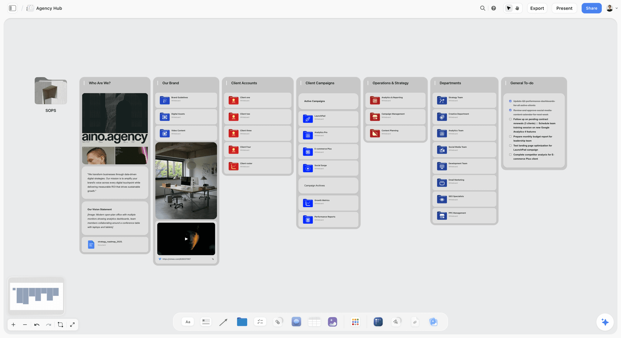
Miro is the workshop board for exploring with other people. Next to Storyflow it has far more templates and facilitation tools and less structure per client job, so it suits the session more than the life of the project.
Best for: Exploring with a client or a cross-functional team in one sitting, before the outcome moves to a Storyflow board.
Pricing: The Free plan keeps your three most recent boards editable. Starter is $8 per member a month billed yearly, on Miro's pricing page. AI runs on monthly credits.
The board can hold the brief, the references and the concepts in one place, and everyone in the session can comment on it. Miro's template library lists more than 7,000 templates.
Strengths:
- Made for facilitated sessions with many participants.
- The largest template library in this guide.
Limits:
- Reads as a workspace, not a deliverable.
- Per-member pricing, and the Free plan has no Guest role.
Verdict: The right stage-two tool when a large group is involved. Choose Miro over Storyflow for the workshop itself; move the agreed direction to Storyflow afterwards.
6. FigJam
FigJam is the whiteboard inside Figma. Unlike Storyflow it is built for the live session, with a timer and voting, and not for holding a client's brief and mood board for the life of a job.
Best for: A kickoff or critique with a team that already has Figma open, where Storyflow holds the job before and after.
Pricing: FigJam is included with every Figma seat. A Collab seat is $3 a month on the Professional plan.
FigJam lists over 300 ready-made templates, builds templates and visuals from a prompt, and sorts stickies into themes. There is an iPad app for sketching.
Strengths:
- Already inside the Figma account and permissions.
- Timer, voting and audio for sessions.
Limits:
- Sections do not nest into a client and job structure.
Verdict: The workshop layer for Figma teams. Choose FigJam over Storyflow for the session; Storyflow has no voting and no timer.
7. Canva
Canva is the template-led design tool for fast social graphics. Storyflow is where the direction gets decided before those templates are filled.
Best for: Templated social formats and files a client will edit, once the direction is agreed on a Storyflow board.
Pricing: Not quoted. Canva's pricing page did not load when checked on 11 October 2026.
For a designer, the honest use is the work that does not need your judgment: resizing one asset into six formats or handing a client a template they can keep up to date. Canva's professional app is Affinity, which covers vector, photo and layout work and is free for individuals.
The image below shows where Storyflow overlaps with Canva: a festival poster Storyflow's AI laid out on the board from the project's own stills and notes, with a collaborator's comment beside it.

Strengths:
- Fast, template-led output.
- A handoff format clients can edit.
Limits:
- Templates pull work toward looking like other work.
Verdict: The output layer for routine formats. Choose Canva over Storyflow when the deliverable is a template the client edits.
What Storyflow's AI Builds Around the Design File
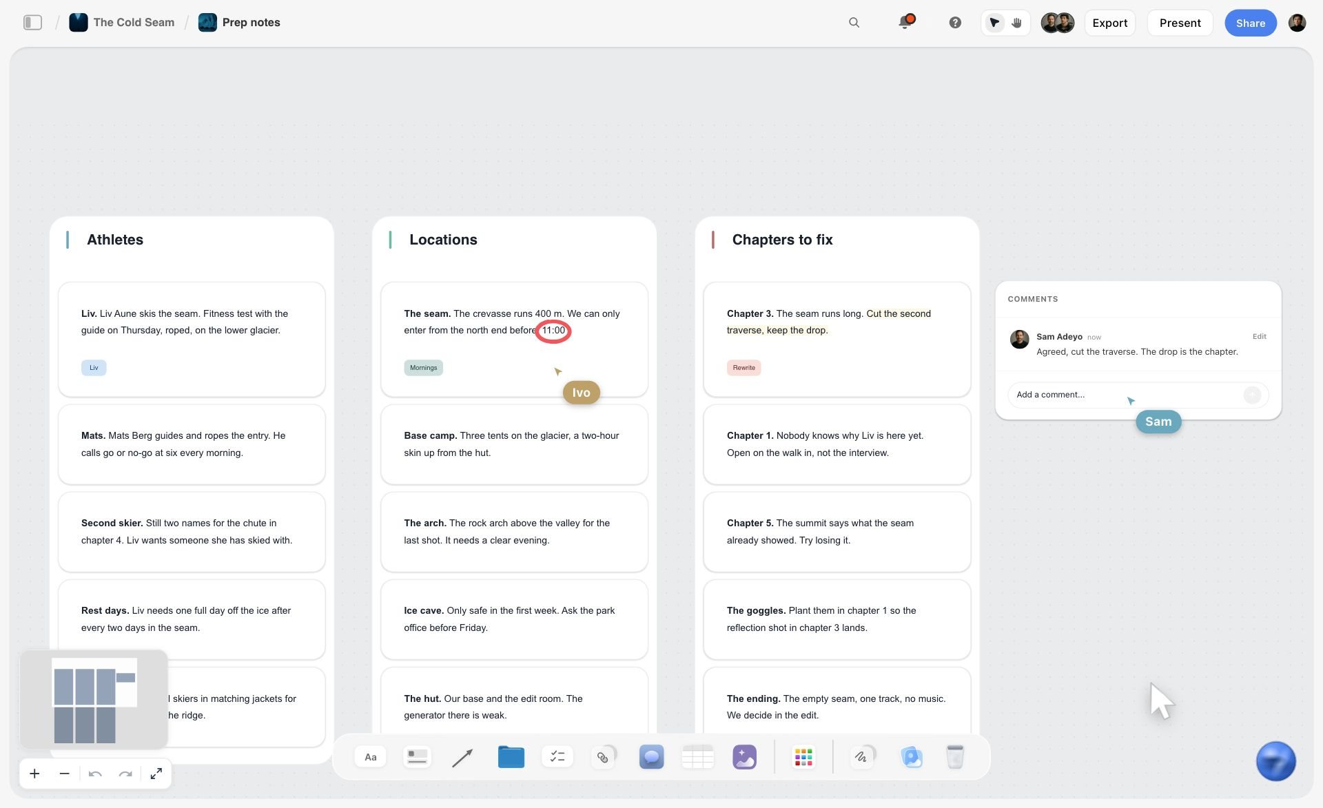
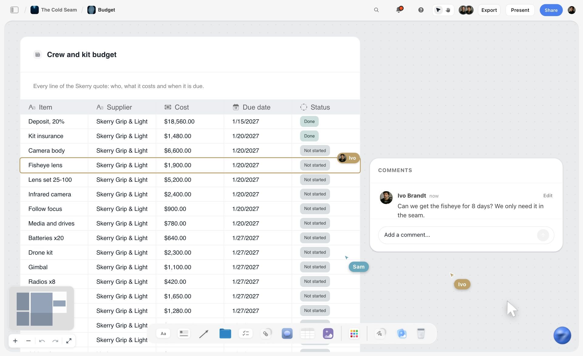
Storyflow is first in the software layer because its AI builds the next thing from what is already on the board. Three screenshots from Storyflow's homepage show it. The project in them is a ski film; the flow is the same for a rebrand.
The first image shows loose notes after the AI sorted them into three labelled walls, with a collaborator's comment beside them. For a design job the walls become Audience, References and Open Questions.
The second image shows a supplier's PDF quote pulled into a table on the board, with a cost, a due date and a status on every line. A printer's quote lands the same way.
The third image shows a slide deck built from the board, sitting on the same canvas with Present, Export PDF and Theme buttons above it. This is the client deck.
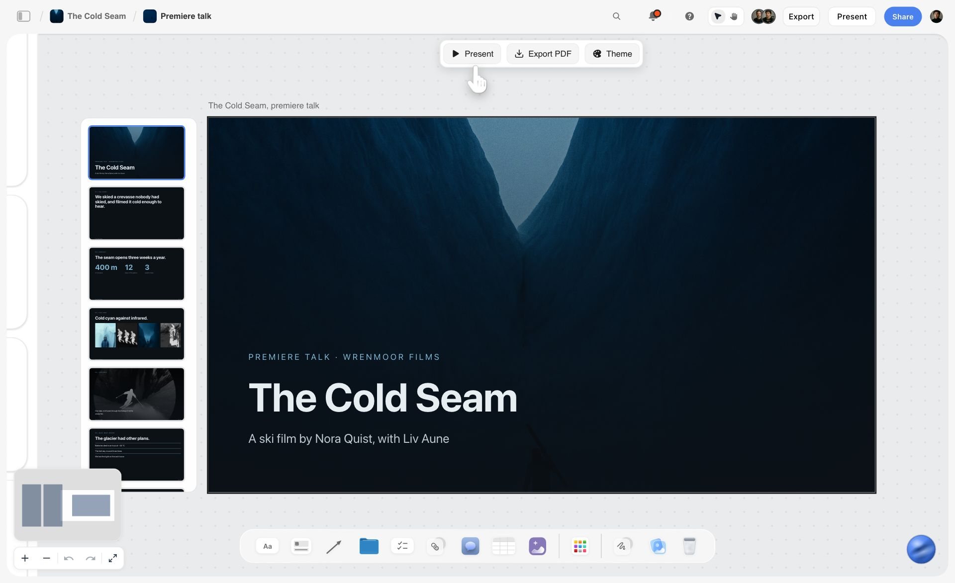
What Storyflow does not do is the making. It exports no PowerPoint files and has no type or vector tools, so these are working drafts and client documents, not final artwork.
Software Pricing Compared
| Tool | Free option today | Lowest paid price | Billing note |
|---|---|---|---|
Storyflow | No free plan yet; invited collaborators join free | $7.99 a month | Billed annually; $9.99 monthly |
Figma | Starter plan | Collab seat $3; Full seat $16 a month | Professional plan |
Adobe Creative Cloud | Not checked | Not shown in US dollars when checked | Annual plan billed monthly |
Milanote | 100 notes, images or links | $9.99 per person a month | Billed annually; $12.50 monthly |
Miro | Three editable boards | $8 per member a month | Billed yearly |
FigJam | Included in Figma Starter | Collab seat $3 a month | Professional plan |
Canva | Not checked | Not quoted | Pricing page did not load |
Affinity | Free for individuals | None for individuals | AI tools need a Canva premium plan |
The Physical Workspace: What Matters, in Order
In rough order of how much difference each makes to work you can trust.
Calibration comes first
A hardware calibration device profiles your specific panel and produces an ICC profile your operating system uses. This matters more than which display you bought, because panels drift and two units of the same model differ. An uncalibrated premium display is less trustworthy than a calibrated mid-range one, and this is the most common gap in otherwise expensive setups. Recalibrate on a schedule; about once a month is common.
Two makers sell the common devices. Calibrite lists the Display 123, the Display Pro HL and the Display Plus HL. Datacolor lists the Spyder and the SpyderPro.
Gamut coverage matched to output
Cover close to 100% of sRGB for anything that lives on screens. Add high Adobe RGB coverage if your work goes to print, because Adobe RGB contains printable cyans and greens that sRGB does not. Add DCI-P3 if your work touches video or Apple devices. Buying wide-gamut coverage you never use is a harmless waste; not having the coverage your output needs is not.
Colour accuracy, expressed as Delta E
Delta E measures the difference between the colour a display shows and the colour it was asked to show; monitor specifications usually quote the average across a set of test patches. Professional lines are commonly specified at 2 or lower, and BenQ's own glossary says a delta of less than 1 means there is no perceivable difference. Lower is better and the returns diminish quickly.
Resolution and physical size together
Pixel density is what matters, not either number alone. A 27 inch 4K panel works out at about 163 pixels per inch and a 32 inch 4K panel at about 138, which is a visibly different experience. A 27 inch 5K panel is about 218.
Panel type
IPS remains the standard for design because of colour consistency and viewing angles. OLED offers deep contrast and raises burn-in questions for anyone who keeps static toolbars on screen all day, which describes most designers.
Uniformity
A panel whose corners are dimmer or cooler than its centre will mislead you on anything full-bleed. This separates mid-range from professional displays and it is rarely on a spec sheet in a useful form.

The Best Monitor for Graphic Design in 2026: Specifications by Output
There is no single best monitor for graphic design. There is a best specification for your output, and then a family that meets it.
| Your output | sRGB | Adobe RGB | DCI-P3 or Display P3 | What else to check |
|---|---|---|---|---|
Social, web and interface work | Close to 100% | Not needed | Useful for Apple devices | A factory calibration report; Delta E of 2 or lower |
Brand identity that also prints | Close to 100% | High coverage | Optional | Hardware calibration support |
Packaging and print production | Close to 100% | High coverage | Optional | Uniformity, hardware calibration |
Motion and video-adjacent work | Close to 100% | Not needed | High coverage | A Rec. 709 mode |
What is not worth paying for, for graphic design specifically: refresh rates above 60Hz, gaming features, curvature on anything under about 34 inches, and entry-level HDR badges.
One honest caveat. If your client approves work on an uncalibrated laptop and your audience views it on phones, a large part of this precision is invisible to everyone but you. It still matters for print, for brand colour, and for anything where you are accountable for the result. It matters less for social-first work.
Display Families Designers Buy, and What the Makers Claim
This is not a model-by-model review with measured numbers. Those change with every hardware revision and should come from a site that tests panels with a colorimeter, not from a software company. The table quotes what each maker states on its own page.
| Family | What the maker states | Calibration | Source |
|---|---|---|---|
BenQ PD and SW | A professional line "for color-critical work"; PD models for creatives across digital and print; SW models list up to 99% Adobe RGB | PD models factory calibrated; SW models hardware calibrated with a calibrator | |
ASUS ProArt | Sub-series for photography, video editing, graphics and art, animation, architecture and product design | Not stated on the series page | |
Dell UltraSharp | Each monitor factory colour calibrated with a calibration report; up to 99% Display P3 coverage | Factory | |
EIZO ColorEdge | Colour management monitors; CS models list 99% Adobe RGB | CG models list a built-in calibration sensor; ColorNavigator 7 software | |
Apple Studio Display | A 27-inch 5K Retina display with P3 wide colour and 600 nits | Not stated on the product page |
Check a current measured review before buying a specific model, because revisions vary.
The Best Desk for Graphic Designers: Desk, Arm and Light
The best desk for a graphic designer is a deep one with a monitor arm on it. Brand matters far less than three measurements.
Desk depth and height
Depth matters more than people expect: a 27 inch display needs roughly an arm's length of viewing distance, which a shallow desk cannot provide. Sit-stand desks are useful, and the benefit comes from changing position, not from standing all day.
The monitor arm
A monitor arm is one of the cheapest changes with the biggest effect on comfort. It puts the top of the screen at or just below eye level, moves it back to a proper distance, and frees the desk underneath. Any VESA arm rated for your monitor's weight does the job.
Lighting
Lighting is the most overlooked variable in this article. Three things matter:
- Neutral and consistent. Around 5000K to 6500K, the same all day. Daylight through a window changes colour temperature hourly, and a designer working beside an uncovered window is judging colour against a moving reference.
- No glare on the panel. Light should not fall directly on the screen. A monitor light bar that illuminates the desk without hitting the display solves this.
- Bias lighting behind the display. A neutral light behind the monitor reduces the contrast between a bright screen and a dark wall, which reduces eye strain.
Wall colour
A brightly coloured wall behind or beside your display casts colour onto everything, including your perception of the screen. Professional colour suites are neutral grey for this reason. You do not need to repaint, and it is worth knowing why your colour judgement changes when you move desks.
A Laptop-Only Graphic Design Workspace
A laptop is a workable graphic design workspace when you treat its screen as a second display. Three rules:
- Check the panel's gamut before you trust it. Look for an sRGB or P3 coverage figure on the spec sheet. If none is listed, assume it is not colour accurate.
- Calibrate it anyway. A calibrator profiles a laptop panel the same way it profiles a desktop one.
- Dock to a calibrated external monitor for colour decisions. Keep the laptop screen for palettes, the brief and your Storyflow board.
As an example of rule one, Dell's page for the 14 Plus lists a 14-inch QHD+ anti-glare panel at 300 nits and 120Hz and states no colour gamut. That is a spec sheet that tells you to calibrate and to check colour on an external display.
The software half travels better than the hardware. Storyflow, Figma and Milanote run in a browser, so the brief, the mood board and the file are the same on the road as at the desk.
Three Complete Setups at Three Budgets
| Layer | Entry | Professional | Studio |
|---|---|---|---|
Workspace around the file | A document per job, or Milanote's free plan | Storyflow Plus or Pro | Storyflow Max with a Team Workspace |
Making | Figma Starter and Affinity | Figma plus Adobe Creative Cloud | Figma plus Adobe Creative Cloud |
Display | A factory-calibrated IPS panel near 100% sRGB | A wide-gamut panel with high Adobe RGB coverage if you print | A colour management monitor with a built-in calibration sensor |
Calibration | A hardware calibrator | A hardware calibrator | Built-in sensor plus a documented schedule |
Arm and desk | A VESA arm | A VESA arm and a deeper desk | A large sit-stand desk |
Light | A lamp that does not hit the screen | A light bar and bias lighting | Controlled neutral room lighting |
The entry setup uses no Storyflow because Storyflow has no free plan today. The calibrator is not the place to save money at any level.
The upgrade order if you can only do one thing at a time: calibrator, monitor arm, lighting, then the display itself. That order surprises people and it is the right one, because the first three make your existing screen more trustworthy and more comfortable for a fraction of the cost of replacing it.
How This Guide Was Put Together
This guide was updated in October 2026. It is a comparison from published sources, not a lab test. No display was measured and no arm was assembled for it. Hardware statements come from each maker's own product page, opened on 11 October 2026 and linked in the tables. Software prices come from each vendor's pricing page on the same date. Where a page did not load or showed no US price, no figure is quoted.
The software layer is ordered with Storyflow, our own product, first, on one basis: it covers the two stages the making tools leave open, and its AI builds from the brief you already have. The other tools are grouped by layer and not scored. The hardware is not ranked at all.
Brand Questions People Actually Ask
Which display brand do graphic designers trust most?
No public measurement settles this, and this guide collected none. What the makers state is checkable: EIZO sells ColorEdge as its colour management line and lists a built-in calibration sensor on CG models, Dell factory calibrates every UltraSharp, and BenQ splits its professional line into factory-calibrated PD models and hardware-calibrated SW models. Trust the calibration report over the badge.
Which graphic design software is most trusted?
For making, the two defaults are Adobe Creative Cloud for print, image and typography and Figma for collaborative screen design. Neither holds the brief, the references or the client's feedback, which is the job Storyflow does beside them.
Which graphic design software is the most innovative?
For AI that builds from your own material, we would point to Storyflow: its AI reads a whole board and builds the mood board and the client deck from it. Figma lists AI credits on its plans and FigJam builds templates from a prompt. Adobe states that its Firefly models are commercially safe. Judge by which of those removes work from your week.
Which has the fairest and most transparent pricing?
Storyflow, Figma, Milanote and Miro all publish their prices: Storyflow from $7.99 a month billed annually, a Figma Full seat at $16, Milanote at $9.99 per person and Miro at $8 per member. Adobe's plans page showed regional pricing with no US figure when checked, and Canva's pricing page did not load.
Which is best rated by users?
This guide quotes no user ratings. Review-site scores move weekly and none were collected here. A better test is your own: run one real job through the tool and count the revision rounds.
What does a complete graphic design software stack look like?
Storyflow for the brief, the mood board and the client deck. Figma or Adobe Creative Cloud for the making. A reference library such as Eagle if you collect across years. That is three tools, each with one job.
The Five Workspace Mistakes Designers Make
Buying a colour-accurate display and never calibrating it. The most common expensive mistake in this article. The panel drifts, and an uncalibrated premium screen is less trustworthy than a calibrated mid-range one.
Working beside an uncovered window. Your reference light changes colour temperature and intensity all day, so your colour judgement at 9am and 5pm are different judgements.
A screen too low and too close. Almost every laptop-first setup. A monitor arm fixes both in ten minutes.
Chasing gamut you do not use. Paying for Adobe RGB coverage when everything you make is viewed on phones. Match the gamut to your output.
Having no tooling for the brief. The one that costs the most time. Perfect colour and no findable brief produces work that is beautifully made and argued about for three rounds. Put the brief on a Storyflow board next to the references.
The Bottom Line
Our pick for a graphic designer's visual workspace is Storyflow for the software half and a calibrated display for the physical half.
If you meant the software workspace: Storyflow for the brief, the references, the mood board and the client's feedback, Figma for screen design, and Creative Cloud for print and image. The making tools are mature and they are not your bottleneck. The bottleneck is a brief that lives in an email, references in a folder, and a client who has forgotten what they asked for. Put those on a Storyflow board and the revision rounds get shorter without anything on your desk changing.
If you meant the physical workspace: buy a calibrator before you buy a better monitor, put whatever screen you have on an arm, fix your lighting so it does not change through the day, and match your display's gamut to what you output. Those four, in that order, will improve work you can trust more than any single purchase.
FAQ: Visual Workspaces for Graphic Designers
What is the best visual workspace for graphic designers?
Our pick is Storyflow for the software half and a calibrated display for the physical half. Storyflow puts the brief, the references, the mood board and the client's feedback on one infinite canvas beside Figma or Adobe. Physically you need a colour-accurate display covering close to 100% sRGB with a Delta E of 2 or lower, on a monitor arm, under neutral consistent lighting.
What is the best graphic design software?
Graphic design software comes in two layers. For the workspace around the design file, our pick is Storyflow: it holds the brief, the mood board and the client deck. For making the design, Figma for screens and interfaces, Adobe Creative Cloud for print, image and typography, Affinity for a professional app that is free for individuals, and Canva for templated social formats.
What is the best monitor for graphic design in 2026?
The one whose gamut matches your output and that you calibrate. For screen work, a factory-calibrated IPS panel near 100% sRGB. For print, a wide-gamut panel with high Adobe RGB coverage and hardware calibration, such as the lines BenQ, EIZO and Dell sell for colour work. Check a measured review before buying a model.
What is the best desk for graphic designers?
A deep one. The desk needs enough depth to sit about an arm's length from a 27 inch display, a monitor arm to put the top of the screen at eye level, and a position where no window light falls on the panel. A sit-stand frame helps because you change position.
What monitor specifications matter for graphic design?
Near 100% sRGB coverage as a baseline, high Adobe RGB coverage if you print, DCI-P3 if your work is video-adjacent or Apple-targeted, a Delta E of 2 or lower, an IPS panel, good uniformity and sensible pixel density. Refresh rates above 60Hz and gaming features add nothing for this work.
Do I need to calibrate my monitor for graphic design?
Yes, and it matters more than which display you bought. Panels drift and individual units differ, so a hardware calibrator producing an ICC profile is the difference between a screen you can be accountable for and one you are guessing on. Recalibrate on a schedule, about once a month.
Is the Dell 14 Plus screen colour accurate for creative work?
Not on the evidence of its spec sheet. Dell's product page lists a 14-inch QHD+ anti-glare panel at 300 nits and 120Hz and states no colour gamut or Delta E. Calibrate it, check its coverage in the calibrator's report, and make colour decisions on an external calibrated monitor.
Which monitor brands do graphic designers use?
The families sold for colour work are BenQ's PD and SW lines, ASUS ProArt, Dell UltraSharp, EIZO ColorEdge and Apple's Studio Display. Each maker's claims are in the table above. Check current measured reviews before buying a specific model, since panels change between revisions.
Is Adobe RGB or sRGB better for design?
Neither is better in general. Use sRGB for anything viewed on screens, which is most work. Adobe RGB matters if you print, because it contains printable colours sRGB does not. Buying wide gamut you never use is harmless waste; lacking the gamut your output needs is not.
What lighting is best for a design workspace?
Neutral and consistent, roughly 5000K to 6500K, with no light falling directly on the panel. Add bias lighting behind the display to reduce the contrast between a bright screen and a dark wall. Avoid working beside an uncovered window, because daylight changes your reference all day.
Figma or Adobe for graphic design?
Figma for interface, collaborative and screen work. Adobe for print, packaging, image manipulation and serious typography. Many designers use both, with Storyflow in front of them for the brief and the mood board.
What software do designers use before opening a design file?
Usually Pinterest, a folder of screenshots and an email, which is why the brief gets lost. The better answer is one Storyflow board per job holding the brief, the captioned references and the client's feedback. Milanote does the reference half by hand on a free plan.
Can I run a graphic design workspace from a laptop?
Yes, with two additions. Calibrate the laptop panel, and dock to a calibrated external monitor for colour decisions. The software half is unaffected: Storyflow, Figma and Milanote run in the browser, so the brief and the board are the same anywhere.
Can clients view our visual workspace?
Yes. In Storyflow a view link opens the board with no account, and a client signs in only to comment. Milanote also offers a read-only link with no signup. Send the board before the work so the review checks against something already agreed.
What is a professional design workspace for drafting and spatial visualization?
Two things. For technical drafting you need a CAD or vector application, which is outside this guide. For laying out references, site photographs, concept routes and feedback in space, Storyflow's infinite canvas is the workspace, viewed on a large calibrated display at a comfortable distance.
What is the top design studio software?
A studio needs three layers. Storyflow for client projects: the brief, the mood board, the feedback and the deck, with a Team Workspace and roles on the Max plan. Figma and Adobe Creative Cloud for making. Miro or FigJam for workshops with the client's team.
Is Storyflow a design tool?
No. Storyflow has no vector editing, typography, layout, colour management or prototyping. Storyflow is the workspace around the design file, where the brief, the references and the constraints sit together on an infinite canvas with AI that reads the board. Storyflow is paid-only during early access, from $7.99 a month billed annually, and its Free plan launches before the end of 2026.
Table of Contents
- Quick Answer: The Best Visual Workspace for Graphic Designers, Layer by Layer
- The Whole Workspace at a Glance
- Key Takeaways
- "Visual Workspace" Means Two Things
- The Software Workspace: Graphic Design Software in Three Stages
- The Software Layer: 7 Tools Reviewed
- What Storyflow's AI Builds Around the Design File
- Software Pricing Compared
- The Physical Workspace: What Matters, in Order
- The Best Monitor for Graphic Design in 2026: Specifications by Output
- Display Families Designers Buy, and What the Makers Claim
- The Best Desk for Graphic Designers: Desk, Arm and Light
- A Laptop-Only Graphic Design Workspace
- Three Complete Setups at Three Budgets
- How This Guide Was Put Together
- Brand Questions People Actually Ask
- The Five Workspace Mistakes Designers Make
- The Bottom Line
- FAQ: Visual Workspaces for Graphic Designers
- Related Reading
Templates to check out for this topic


Branding and design templates you can use in Storyflow
Take a brand from naming to visual direction on one connected canvas. Open any of these templates and the AI works from everything already on the board.


See Storyflow in Action
A visual AI workspace where every feature lives inside one canvas. No tab-switching, no context lost.
Build your entire board from a single message
Type what you need in the AI chat at the bottom of your canvas. The AI adds cards, headings, and structure directly onto your board.
Use expert frameworks as AI context
Type @ in the AI chat and choose any Tactic. The AI tailors every response to that framework instead of giving generic advice.
Turn your board into a mind map in seconds
Ask the AI to restructure your canvas as a mindmap. It connects your ideas into a visual hierarchy so you can see how everything relates.
Why Storyflow Exists
Storyflow actually began as a personal tool while working on creative and research projects.
We kept running into the same problem: ideas were scattered everywhere: notes, documents, and whiteboards.
Nothing helped us see how everything connected.
So we started building a workspace designed around how ideas actually grow.
→ Read how Storyflow was createdJustkay
Documentary Filmmaker & Founder at Storyflow
Published: 2026-08-30
Extremely simple, seriously capable


See how easy it is to get started
Watch a real project come together, from a blank board to a finished plan, clicked through step by step.
Start creating with AI and become more productive
Transform your creative workflow with AI-powered tools. Generate ideas, create content, and boost your productivity in minutes instead of hours.