The 11 Best Moodboard Tools for Art Directors in 2026
A moodboard shows examples. An art director has to ship rules. Eleven tools ranked by whether the board survives being handed to someone else.

Category
Creative Process
Author

Sara de Klein
Head of Product at Storyflow
Topics
2026-08-10
•
17 min read
•
Creative Process- best moodboard tools for art directors
- best moodboard app
- art direction handoff to designers
- moodboard constraints and rules
- Eagle reference manager
- best moodboard maker for creative projects
What are the best moodboard tools for art directors in 2026?
An art director's moodboard has a job that a designer's does not: it has to survive being handed to other people. A board that produces one beautiful execution from you and twelve different interpretations from twelve designers has failed, however good it looks. Storyflow ranks first here because a board only becomes a system when the constraints and the reasoning travel with the images, and it is the only tool that holds both and can be questioned as a whole. Figma is where the system gets built once it exists. Frontify is where it gets enforced at scale. Eagle is the reference library nobody talks about and many art directors should own.

Full disclosure: Storyflow is our own product, and we rank it #1 here for one job: keeping the constraints, the intended ratio and the decision rules beside the images, so direction survives a handoff to someone who was not in the room. Storyflow is not a design tool. It has no components, no tokens, no version history on assets, no brand portal, no asset permissions and no colour extraction or contrast checking. Figma, Frontify and Adobe Color own those. We link to every tool so you can judge the fit.
Quick Comparison
These four map to the art director's real sequence: specifying the direction, systematizing it, enforcing it, and keeping the reference that feeds all three.
| Tool | Best For | AI Features | Price |
|---|---|---|---|
| Storyflow | Direction that survives a handoff | Canvas-wide context AI | $7.99 mo annual (free plan late 2026) |
| Figma | Components and design tokens | Standard AI | Free / from ~$16 per seat mo |
| Frontify | Brand governance at scale | Light AI | Enterprise, quoted |
| Eagle | Reference library with colour search | None | One-time ~$30 |
Key Takeaways
- A moodboard shows examples. An art director has to ship rules. The gap between those two is where most brand inconsistency originates.
- Three things convert a board into a system: the constraint, meaning what is not allowed, the ratio, meaning how much of each element, and the decision rule for the case nobody anticipated.
- Storyflow ranks first for holding constraints and reasoning alongside the images, not for building the system. Figma builds it and Frontify enforces it.
- Storyflow has no design tools, no component library, no tokens, no version history on assets and no brand portal. Figma and Frontify own all of it.
- The most expensive failure is not a bad board, it is a good board interpreted twelve different ways by twelve competent designers who each did nothing wrong.
- Reference libraries organized by project decay into uselessness. Organized by visual property, they compound over a career.
- Every moodboard should include at least one image labelled as explicitly out of bounds, because negative examples resolve ambiguity faster than positive ones.
Ship rules, not just references
A board that produces one execution from you and twelve from twelve designers has failed, however good it looks. Storyflow keeps the out-of-bounds examples, the intended ratio and the decision rules beside the images, and can tell you what the board still leaves ambiguous. Paid-only during early access; the Free plan lands before the end of 2026.

A Moodboard Shows Examples. An Art Director Has to Ship Rules.
There is a specific moment familiar to every art director. You build a board that captures exactly the feeling. Everyone approves it. Then the work comes back from three designers and none of it looks like what you meant, and none of it is wrong.
That is not a communication failure in the ordinary sense. It is a category error about what a moodboard is.
A moodboard shows examples. An art director has to ship rules. A designer's moodboard is a private artifact that only has to align one person's execution with their own intention. An art director's board is a specification handed to other people, frequently people who will not be in the room when questions arise.
Examples underdetermine rules. Show six images that share a warm, grainy, slightly overexposed quality and you have communicated a feeling and left almost everything unspecified: whether the grain is acceptable on typography, whether warmth means the palette or the light, whether overexposure is a treatment or an accident you liked.
Three things convert a board into a system.
The constraint. What is explicitly not allowed. This is the highest value and most commonly omitted content on any board. Every moodboard should include at least one image labelled as out of bounds, because a negative example resolves ambiguity faster than three positive ones. "Warm, but never this orange" does more work than six more warm images.
The ratio. How much of each element. A board containing one bold typographic image and eight photographic ones reads to a designer as a photographic system with occasional type, when you may have meant type led work with photographic support. Proportion on a board is read as proportion in the output, whether you intended it or not.
The decision rule. What to do in the case the board does not cover, which is most cases. "When in doubt, choose the quieter option" is a sentence that resolves a hundred future questions without you being present.
The 11 tools below are ranked by whether they can carry rules, not just images.
At a Glance: The 11 Tools Compared
| Tool | Best for | What it carries | Shape |
|---|---|---|---|
Storyflow | Constraints and reasoning alongside the images | Rules | AI canvas |
Figma | Turning the direction into an actual system | Components | Design tool |
Frontify | Enforcing the system across an organization | Governance | Brand platform |
Eagle | The reference library organized by visual property | Reference | Asset organizer |
Milanote | The board that gets presented | Examples | Visual notes board |
Are.na | Long-horizon reference across a career | Reference | Connected collections |
Fast sourcing and client contribution | Examples | Discovery feed | |
Notion | Written direction and the decision log | Rules | Docs |
Adobe Color | Extracting and testing palettes properly | Palette | Colour utility |
Canva | The version non-designers will follow | Examples | Design |
Dropbox | The asset archive behind everything | Assets | File storage |
How I Ranked These
I art direct my own documentary work and I have handed direction to other people and watched it come back as something else. Over the last two years I have run real direction, including handoffs to designers who were not in the original conversation, through every tool here.
Five criteria, in order.
1. Can it carry a constraint? Can an image be marked as explicitly out of bounds, with a reason, so that a designer seeing it understands it is a boundary and not a reference?
2. Does it survive a handoff to someone who was not there? The real test. Give the board to a competent designer with no verbal briefing and see what comes back.
3. Does reasoning travel with the image? Why this reference is here matters more than the reference. Boards that carry only images require you to be present forever.
4. Does it scale past one project? An art director's reference library is a career asset and most tools let it decay into project folders.
5. Cost for one person versus a team. Many art directors are buying their own tools regardless of what the organization runs.
Pricing is as of August 2026 and changes frequently. Verify with each vendor.
Quick Picks by Job Type
- Best for direction that survives a handoff: Storyflow. Constraints, ratios and reasoning attached to the images.
- Best for building the system: Figma. Components, tokens and the actual artifacts.
- Best for enforcing it: Frontify. Brand portal and asset governance across an organization.
- Best reference library: Eagle. Local, fast, organized by visual property.
- Best presented board: Milanote. When the board itself is the deliverable.
- Best long-horizon collection: Are.na. Cheap, calm, correctly shaped for reference.
- Best palette work: Adobe Color. Extraction plus accessibility checking in one place.
1. Storyflow
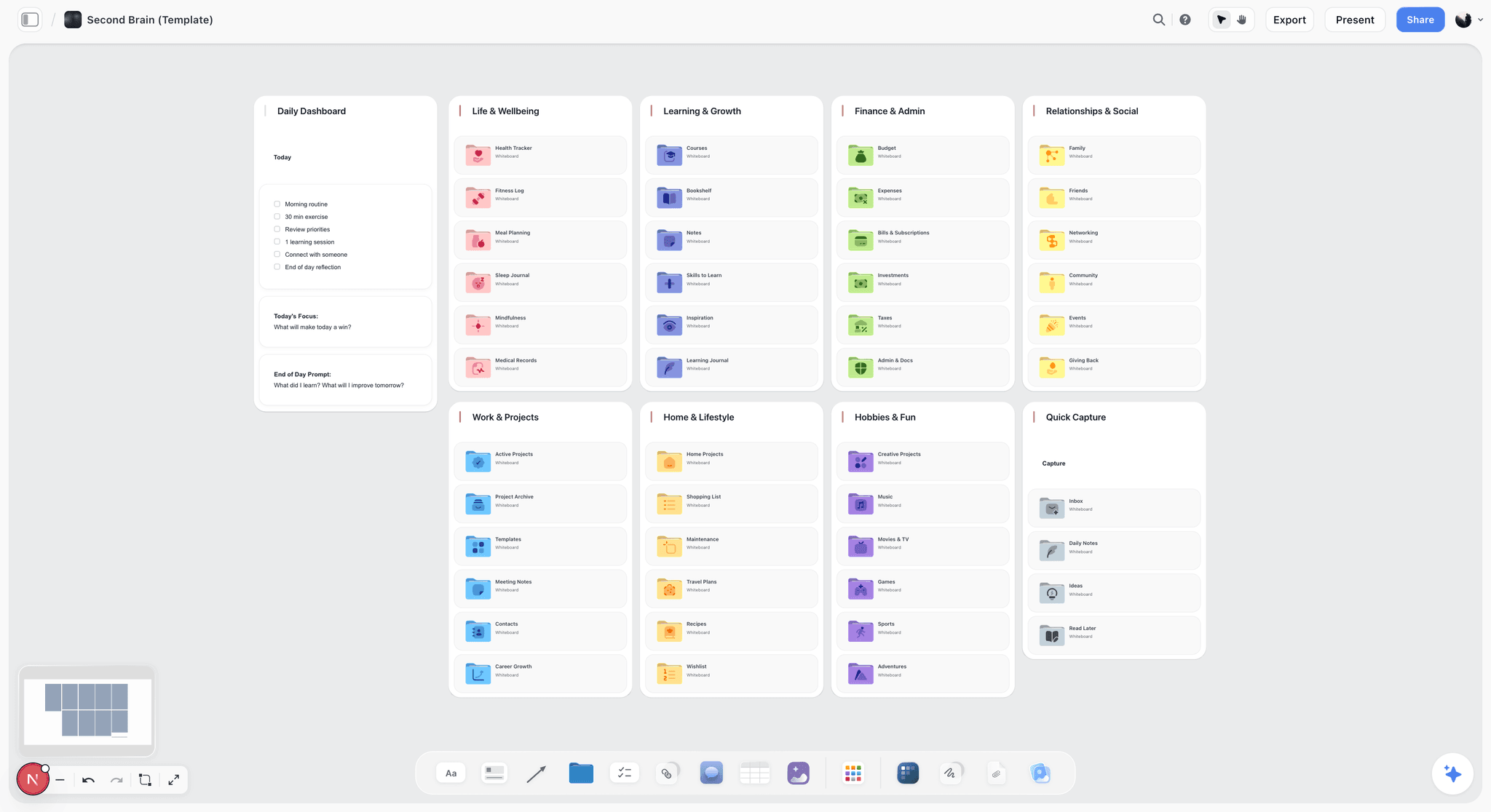
The verdict. The only tool here where the rule and the image occupy the same surface, which is what makes direction survive without you.
Best for. Art directors handing direction to designers, agencies or production partners.
Pricing. Paid only early access today. Plus is $7.99 per month billed annually or $9.99 monthly, with 200 plus Blueprint Tactics and unlimited file uploads. Pro is $14 per month billed annually or $19 monthly, adding AI image generation, roughly twenty times more AI usage and memory across conversations. Max is $39 per month billed annually or $49 monthly, adding Team Workspace with permissions and roles. Pricing is flat per account rather than per seat, and anyone a paid member invites joins free. The Free plan launches before the end of 2026.
Why it ranks here. Most moodboard tools are optimized for arrangement, which is the wrong optimization for this job. An art director's board needs to be legible as an argument, and an argument has structure: this is the direction, these are its boundaries, this is the proportion, and here is what to do when the situation is unclear.
On a canvas that structure is expressible spatially. A direction region with the positive references. A boundary region with images explicitly marked out of bounds and the reason next to each. A ratio note stating that this is a type led system with photographic support, regardless of how many photographs happen to be on the board. And a rules region carrying the decision rules in plain sentences.
Because Storyflow's AI reads your full active canvas board by default, plus up to one Tactic and up to three Documents you @-mention, the board can also be interrogated in a way that catches the failure before it ships. The single most useful query for an art director is asking what this board leaves ambiguous, or which references contradict each other, and it takes ten seconds. In testing that reliably surfaced the contradiction pattern this discipline is prone to: a board that had drifted to include both a maximalist and a restrained typographic reference with no indication of which governs.
The second advantage is that rejected directions stay adjacent with dated reasoning, which matters because art direction gets relitigated by new stakeholders constantly.
Strengths.
- Constraints and out of bounds references can sit on the same surface as the direction.
- Reasoning travels with each image, so the board works without you present.
- Whole board AI can surface what the board leaves ambiguous.
- Rejected directions stay visible with dates.
- Invited collaborators join free, so designers and partners cost nothing.
Limitations.
- Not a design tool. No components, no tokens, no variables, no actual system building. Figma owns this entirely.
- No brand portal, no asset governance, no permissions on individual assets, no usage tracking. Frontify owns that.
- No version history on assets, which a real brand system needs.
- No colour extraction or contrast checking.
- Weaker as a pure presentation surface than Milanote.
- Newer platform, so no art direction specific templates.
The trade off. Storyflow holds the direction and its rules. The system gets built in Figma and enforced in Frontify, and those are ranked next for exactly that reason.
2. Figma
The verdict. Where a direction becomes a system that other people can actually use.
Best for. Building components, tokens and the artifacts a team works from.
Pricing. Free starter tier. Paid seats from roughly $16 per full seat per month as of August 2026, with free viewers.
Why it ranks here. A moodboard communicates intent. A component library removes the need to communicate it, because the decision is embedded in the artifact rather than described in a reference.
That is the deepest answer to the twelve interpretations problem: not a better brief, but fewer decisions left open. Variables and tokens make spacing, colour and type systematic rather than interpretive, and a designer using the component cannot get the spacing wrong.
For art directors working on digital output, moving from board to component library as early as possible is the single highest leverage sequencing decision available.
It ranks second because it is a poor place to explore. Figma's precision encourages resolution before the direction is settled, and a board built in Figma tends to be tidier and less honest than one built somewhere loose.
Strengths.
- Components and tokens remove interpretation rather than guiding it.
- Free viewers, so stakeholders and partners cost nothing.
- Real version history, which no canvas tool here matches.
- Where the work will happen anyway for digital output.
Limitations.
- Encourages premature resolution during exploration.
- Seat pricing at team scale.
- Weak for print and film direction.
- Non designers participate awkwardly.
The trade off. Explore elsewhere, systematize here, as early as the direction allows.
3. Frontify
The verdict. Where a system stops depending on people remembering it.
Best for. Enforcing brand consistency across a large organization or many partners.
Pricing. Enterprise, typically quoted, commonly starting in the hundreds of dollars per month, as of August 2026.
Why it ranks here. Once a brand is used by people you will never meet, including regional teams, agencies and print partners, consistency stops being a direction problem and becomes a distribution problem.
Frontify provides a brand portal with guidelines, approved assets, templates and permissions, so the correct logo is the easiest one to find, which is the only mechanism that reliably works. Asset governance, including who may use what and in which markets, is genuinely useful and genuinely tedious to do any other way.
It ranks third because the price restricts it to organizations, and because a portal is worthless if the underlying direction was never clear. Enforcing an ambiguous system just distributes the ambiguity faster.
Strengths.
- Makes the correct asset the easiest to find, which is what actually drives compliance.
- Guidelines, assets and templates in one governed place.
- Permissions and usage rules per asset and market.
- Scales to partners you will never brief directly.
Limitations.
- Enterprise pricing and implementation.
- Useless if the direction underneath is unclear.
- Portals go stale without an owner.
The trade off. The right answer above a certain organizational size, and premature below it.
4. Eagle
The verdict. The reference library most art directors should own and most have never heard of.
Best for. A personal reference collection organized by visual property rather than by project.
Pricing. One time purchase of roughly $30 as of August 2026.
Why it ranks here. Art directors accumulate reference constantly and lose almost all of it, because it gets filed by project and retrieved by visual property. You will not remember which client the layout was for; you will remember that it was an asymmetric grid with a heavy serif.
Eagle is a local reference manager built for this: fast browser capture, tagging, colour based search, and genuinely quick browsing of tens of thousands of images. Colour search in particular is the feature that makes a large library usable, since finding every reference in a particular muted green is otherwise impossible.
It is a one time purchase, local, and does not depend on a company staying in business, which matters for an archive meant to last a career.
It ranks fourth because it serves the input side only. Nothing in Eagle helps you communicate direction.
Strengths.
- Organized by visual property, which is how retrieval actually works.
- Colour based search across a large library.
- One time purchase, local storage, no subscription.
- Very fast browser capture.
Limitations.
- Local only, so sharing and team use are awkward.
- No communication or presentation capability.
- Windows and Mac desktop, with limited mobile.
The trade off. Thirty dollars once for an asset that compounds over a career.
5. Milanote
The verdict. The best looking board, when the board itself is what you are presenting.
Best for. A single considered board presented to a client or team.
Pricing. Free tier limited to 100 notes, images or links. Paid roughly $12.50 per month billed annually or $14.99 monthly as of August 2026.
Why it ranks here. When the moodboard is the deliverable, Milanote produces the best looking one here with the least effort, and its shareable link needs no account from the recipient.
For an art director the caution is precisely the article's thesis. Milanote optimizes for a beautiful arrangement of examples, which is the artifact that produces twelve interpretations. It can carry notes, but its visual defaults quietly discourage the annotation and the negative examples that make direction survive a handoff, because those make the board less pretty.
Strengths.
- Best looking presented board with minimal effort.
- Fast capture and pleasant arrangement.
- Shareable with no account.
Limitations.
- Optimizes for beauty over specification.
- Free tier cap reached inside one project.
- No system building or governance.
- Weak across many projects.
The trade off. Excellent when the board is the deliverable. Add the constraints deliberately, because the tool will not prompt you.
6. Are.na
The verdict. The long-horizon collection, correctly shaped and very cheap.
Best for. Reference that spans years and crosses projects.
Pricing. Free tier with a monthly block limit. Premium roughly $7 per month or $60 to $70 per year as of August 2026.
Why it ranks here. Are.na's model, where one image lives in many channels simultaneously without duplication, matches how visual reference actually behaves. A single image can sit in "asymmetric grids", "muted green" and "editorial 1970s" at once.
It also has a culture of attribution and context that Pinterest lacks, and its public channels are a real research resource rather than an algorithmic feed.
It ranks sixth because it serves reference collection and nothing else, and because Eagle is faster for a large personal library while Are.na is better for a shared or public one.
Strengths.
- Many to many organization matching how reference is retrieved.
- Calm, no algorithmic interference.
- Cheap, with a workable free tier.
- Strong public research culture.
Limitations.
- Not a direction or presentation tool.
- No annotation model worth the name.
- Cloud dependent.
The trade off. Are.na for shared and public reference, Eagle for the fast local library. Owning both is reasonable.
7. Pinterest
The verdict. Fastest sourcing, weakest provenance, and useful for one specific thing.
Best for. Rapid discovery and getting stakeholders to show you what they mean.
Pricing. Free.
Why it ranks here. Two genuine strengths. Discovery speed, and the fact that non designers will actually contribute to a shared board, which is the fastest way to find out what a marketing director means by "premium".
That stakeholder contribution step is worth doing regardless of what you build the real board in, because people recognize far better than they describe.
The weaknesses are familiar: broken attribution, algorithmic drift toward the generic, and an increasing volume of unlabelled generated imagery. For an art director the attribution problem is worse than for most, because you frequently need to trace a technique back to its maker.
Strengths.
- Fastest discovery available.
- Stakeholders will contribute without instruction.
- Free.
Limitations.
- Attribution frequently broken.
- Feed drift toward the generic.
- Growing volume of unlabelled AI imagery.
- No annotation or constraint capability.
The trade off. Use it to extract intent from stakeholders. Do not present from it.
8. Notion
The verdict. The written direction, which is where constraints and decision rules end up if the board cannot hold them.
Best for. Written guidelines and the log of direction decisions.
Pricing. Free personal tier. Paid from roughly $10 per user per month as of August 2026.
Why it ranks here. The three things that turn a board into a system, constraints, ratios and decision rules, are all sentences. If your visual tool cannot hold sentences well, they belong somewhere that can, and Notion is fine for that.
A direction decisions log is also the cheapest defence against relitigating. When a new stakeholder asks in month four why the palette avoids blue, a dated entry ends the conversation.
It ranks eighth because splitting images and rules across two tools is exactly the separation that causes the handoff failure. A designer reads the board and does not open the document.
Strengths.
- Holds constraints and decision rules well.
- Decisions log prevents relitigating.
- Free tier is sufficient.
Limitations.
- Separating rules from images is the root failure this post describes.
- Poor visual surface.
- Documents go unread.
The trade off. Better than not writing the rules down. Worse than keeping them beside the images.
9. Adobe Color
The verdict. Free, precise, and the accessibility checking makes it non optional for digital work.
Best for. Extracting palettes from reference and checking contrast.
Pricing. Free with an Adobe account.
Why it ranks here. Art directors describe colour imprecisely and designers implement it precisely, and the gap is a common source of drift. Extracting an actual palette from your reference images, with hex values, removes the interpretation entirely.
The accessibility tools matter more than the palette generator. Contrast checking against WCAG thresholds and colour blind simulation turn a preference into a specification, and for any digital output that check is an obligation rather than a nicety.
It ranks ninth because it is a utility rather than a system, but it is free and it eliminates a whole class of ambiguity.
Strengths.
- Free.
- Extracts precise palettes from reference imagery.
- Contrast and colour blindness checking built in.
- Syncs to Creative Cloud libraries.
Limitations.
- Single purpose utility.
- No board or direction capability.
The trade off. Put hex values on the board. It costs nothing and removes an entire category of misinterpretation.
10. Canva
The verdict. The version a non designer will follow, which is sometimes the version that matters.
Best for. Direction handed to people who will execute in Canva anyway.
Pricing. Free tier available. Pro roughly $15 per month for one person, with team pricing above, as of August 2026.
Why it ranks here. A large amount of organizational output is now made by non designers in Canva, and an art director who ignores that is directing only a fraction of what ships.
Brand kits and locked templates are the practical mechanism: rather than briefing a regional marketing team on the system, give them templates where the wrong choice is not available. That is the same logic as a Figma component library, applied to the people who will never open Figma.
Strengths.
- Templates make the correct choice the default for non designers.
- Brand kits enforce palette and type.
- Universally accessible.
Limitations.
- Template aesthetics can undercut a distinctive brand.
- Weak as a direction surface.
- Limited control compared with real design tooling.
The trade off. Direct the templates rather than the people. It scales and briefing does not.
11. Dropbox
The verdict. The asset archive, which is unglamorous and load bearing.
Best for. Storing masters, approved assets and the reference archive.
Pricing. Free tier with limited storage. Paid from roughly $12 per user per month as of August 2026.
Why it ranks here. Direction generates assets and assets need a home that outlives the project, particularly the masters and the layered files that make future adaptation possible.
It ranks last because it has no structure of its own and no governance, which is exactly what Frontify exists to add. For a small team it is enough, provided the folder convention is set and enforced.
Strengths.
- Universal and reliable.
- Version history on files.
- Survives projects and staff.
Limitations.
- No governance or permissions per asset.
- No searchability by visual content.
- Costs climb with image volume.
The trade off. Fine as an archive. Not a brand system.
What to Actually Pay For
Pay thirty dollars for Eagle. It is a one time purchase and it converts a decade of collected reference from a liability into an asset you can actually search by colour and property.
Pay for Figma if your output is digital. Not for moodboarding, for the component library, because embedding decisions in artifacts beats communicating them in references every time.
Do not buy Frontify for a small team. It solves distribution and governance at organizational scale, and below that scale a clear board plus a shared drive delivers most of the value. Buying it to fix an unclear direction just distributes the confusion faster.
Tools to Avoid for This Job
A board with no negative examples. The single most common omission and the cheapest fix. One image marked out of bounds does more than six more positive references.
A board whose proportions you did not intend. Designers read the ratio of image types on your board as the ratio of the system. If you have eight photographs and one typographic reference, say explicitly which governs.
Rules in a document and images on a board. Designers read the board. The document is opened once, if at all, and this split is the most reliable way to have your constraints ignored.
Pinterest as the presented direction. Attribution is unreliable, the feed drifts, and an increasing share of the imagery is generated and unlabelled.
What No Tool on This List Does
None of them will make a direction good. A board that clearly specifies a mediocre direction produces consistent mediocrity, which is arguably worse than inconsistency.
None of them will replace the conversation. Handing over a board without twenty minutes of discussion means the designer is working from your artifact and not your intent, however well annotated it is.
None of them, including Storyflow, will write the constraint you did not think of. The AI can tell you the board is ambiguous about typography; it cannot know that you would hate a particular treatment you never considered. Direction is the act of deciding, and the tools only carry the decisions.
The Bottom Line
Art direction fails at the handoff, not at the board, and it fails because a moodboard is a set of examples being asked to function as a specification.
Buy Eagle for thirty dollars, because the reference library is a career asset and organizing it by visual property rather than by project is what makes it retrievable. Move to Figma components as early as the direction allows, because embedding a decision beats communicating it. Put hex values on the board, using a free tool.
But the board itself has to carry what the images cannot: what is out of bounds, what the ratio is, and what to do when the situation is unclear. Keeping those beside the references, rather than in a document nobody opens, and being able to ask the board what it still leaves ambiguous, is the narrow ground on which Storyflow ranks first here.
FAQ: Moodboard Tools for Art Directors
What is the best moodboard tool for art directors?
Storyflow ranks first for art direction specifically, because an art director's board has to survive being handed to other people, and that requires the constraints and reasoning to travel with the images rather than living in a separate document. Milanote produces the best looking presented board. Figma is where the direction should become a component library as early as possible, because embedded decisions beat communicated ones.
Why do designers interpret the same moodboard differently?
Because examples underdetermine rules. Six images sharing a warm, grainy quality communicate a feeling and leave unspecified whether the grain applies to typography, whether warmth means palette or light, and what to do in cases the board does not cover. Adding constraints, stating the intended ratio, and writing one or two decision rules resolves most of it.
What should an art direction moodboard include beyond images?
At least one image marked explicitly out of bounds with the reason, since negative examples resolve ambiguity faster than positive ones. A statement of ratio, because designers read the proportion of image types on the board as the proportion of the system. And a decision rule for unforeseen cases, such as choosing the quieter option when in doubt, which answers questions you will not be present for.
What is the best free moodboard tool for art directors?
Pinterest is free and unmatched for discovery and for getting stakeholders to show you what they mean. Are.na's free tier is the best free option for building a thematic long term collection. Adobe Color is free and eliminates colour ambiguity with real hex values and contrast checking. Figma's free tier will build a basic component library.
How should art directors organize a reference library?
By visual property rather than by project, since you will remember that a layout used an asymmetric grid with a heavy serif and not which client it was for. Eagle handles this well locally with colour based search, and Are.na handles it well in a shared and public form with its many to many channel model. A folder tree named by client is the arrangement that guarantees the library decays.
Is Frontify worth it for a small team?
No. Frontify solves distribution and governance across an organization with partners you will never brief directly, and its pricing reflects that. Below that scale, a clear direction plus a shared drive with a folder convention delivers most of the benefit. Buying a brand portal to compensate for an unclear system only distributes the ambiguity faster.
Does Storyflow replace Figma for art direction?
No. Storyflow holds the direction, the constraints and the reasoning while those are still being decided, and it has no design tools, no components, no tokens and no version history on assets. Figma is where the direction becomes a system other people can use without interpreting anything, which is the more durable solution to inconsistency. The handoff between them is a normal part of the workflow.
How do you stop a brand drifting over time?
Reduce the number of open decisions rather than increasing the amount of guidance. A component library, a locked template or a brand kit removes the interpretation entirely, whereas a longer guidelines document adds reading that busy people skip. Where interpretation is unavoidable, a written decision rule covers more future cases than more examples do.
What is the difference between an art director's and a designer's moodboard?
A designer's board is private and only has to align one person's execution with their own intention, so it can be pure feeling. An art director's board is a specification handed to other people, often people who will not be in the room when a question comes up, so it must carry constraints, ratios and decision rules. Treating the second like the first is the origin of the twelve interpretations problem.
Should moodboards include AI generated images?
Only when labelled clearly as generated. They are genuinely useful for communicating an abstract quality of light or mood that you cannot find a real reference for, and actively harmful when a designer or photographer tries to reproduce details that are not physically achievable. Labelling is what separates a useful abstraction from a brief nobody can execute.
How do you get a client to articulate what they want visually?
Give them a shared Pinterest board and ask for five images plus one they dislike, since people recognize far better than they describe and the disliked image is usually the most informative. Then translate what they gathered into direction rather than presenting their board back to them, because a client's collection is raw material and not a creative direction.
How specific should colour direction be?
Hex values, always, plus a contrast check for anything digital. Describing a colour as warm terracotta produces a range of interpretations wide enough to look like a mistake when placed side by side, and it costs nothing to extract exact values from your reference with a free tool. Accessibility contrast thresholds turn colour from a preference into a requirement.
Do art directors need a separate tool from designers?
Yes for the direction stage and no afterwards. Direction requires holding constraints, reasoning and rejected options together while things are unsettled, which design tools handle badly because their precision encourages premature resolution. Once the direction is set, the art director should be working in the same system as the designers, ideally in components.
What is the single change worth making on the next brief?
Add one image marked as out of bounds, with a sentence explaining why. It takes two minutes, it is the highest information content you can add to a board, and it will prevent at least one round of work in the wrong direction.
Table of Contents
- Key Takeaways
- A Moodboard Shows Examples. An Art Director Has to Ship Rules.
- At a Glance: The 11 Tools Compared
- How I Ranked These
- Quick Picks by Job Type
- 1. Storyflow
- 2. Figma
- 3. Frontify
- 4. Eagle
- 5. Milanote
- 6. Are.na
- 7. Pinterest
- 8. Notion
- 9. Adobe Color
- 10. Canva
- 11. Dropbox
- What to Actually Pay For
- Tools to Avoid for This Job
- What No Tool on This List Does
- The Bottom Line
- FAQ: Moodboard Tools for Art Directors
- Related Reading
Templates to check out for this topic


Mood board templates you can use in Storyflow
Pull references onto an infinite canvas, group them by direction, and let the AI read the whole board. Open any of these mood board templates and start dropping in images.


See Storyflow in Action
A visual AI workspace where every feature lives inside one canvas. No tab-switching, no context lost.
Build your entire board from a single message
Type what you need in the AI chat at the bottom of your canvas. The AI adds cards, headings, and structure directly onto your board.
Use expert frameworks as AI context
Type @ in the AI chat and choose any Tactic. The AI tailors every response to that framework instead of giving generic advice.
Turn your board into a mind map in seconds
Ask the AI to restructure your canvas as a mindmap. It connects your ideas into a visual hierarchy so you can see how everything relates.
Why Storyflow Exists
Storyflow actually began as a personal tool while working on creative and research projects.
We kept running into the same problem: ideas were scattered everywhere: notes, documents, and whiteboards.
Nothing helped us see how everything connected.
So we started building a workspace designed around how ideas actually grow.
→ Read how Storyflow was createdSara de Klein
Head of Product at Storyflow
Published: 2026-08-10
Extremely simple, seriously capable


See how easy it is to get started
Watch a real project come together, from a blank board to a finished plan, clicked through step by step.
Start creating with AI and become more productive
Transform your creative workflow with AI-powered tools. Generate ideas, create content, and boost your productivity in minutes instead of hours.