How to Present Design Concepts to Clients in 2026 (Get a Decision, Not Opinions)
Showing design work invites opinions. Presenting design work invites a decision, and the difference is entirely in the preparation. A concept sent as a PDF with no presenter gets responded to by whoever opens it first, against criteria they invented.

Category
Design
Author

Justkay
Documentary Filmmaker & Founder at Storyflow
Topics
2026-09-06
•
18 min read
•
Design- best tool for presenting design concepts to clients
- how many design concepts should you present
- how to handle client design feedback
- should you send design work before the meeting
- design presentation structure
What is the best tool for presenting design concepts to clients?
Showing design work invites opinions. Presenting design work invites a decision, and the difference is entirely in the preparation. A concept sent as a PDF with no presenter gets responded to by whoever opens it first, in whatever mood they are in, against criteria they invented. A concept presented against a restated brief, with one recommendation and a named decision-maker, gets approved or rejected for reasons you can work with. The single most common failure is presenting three routes as equals, which hands the decision to the least confident person in the room and reliably produces the safest option. Figma and Canva build the deck; the method decides the outcome.
Full disclosure: Storyflow is our product. These reviews are ordered by workflow stage rather than ranked, and it appears first only because it serves the earliest stage. It has no presenter view, no slide master, no transitions, no prototyping, no client-ready deck export and no comment threads with approval states, so it cannot present. The article recommends Figma for product work, Keynote when the room matters and Canva when it does not.
Quick Comparison
Six parts, and the design does not appear until part four.
| Tool | Best For | AI Features | Price |
|---|---|---|---|
| Restated brief | Last chance to fix the problem | Stop if they disagree | Part 1 |
| Principles | Agreement before the artefact | Legibility governs, not clean and modern | Part 3 |
| The recommendation | One route, fully, in context | Not a menu | Part 4 |
| The ask | Named person, named date | The slide most decks omit | Part 6 |
Key Takeaways
- Never send design work without presenting it. A deck with no presenter is a different and much weaker document, and the first person to open it sets the agenda.
- Present one recommendation, not three equals. Three equal routes transfers the decision to the client and clients under uncertainty pick the safest thing.
- Restate the brief first. If the client disagrees with your restatement, stop, because everything after it is built on a problem they no longer hold.
- Show design in context, never in isolation. A logo on a white slide is a logo nobody can judge, and it invites judgement anyway.
- Convert taste statements into problem statements. "I don't like the blue" is unusable; "it feels colder than our customers expect" is a brief for the next round.
- Name the decision-maker and a deadline before you present, and write down that silence past the deadline is approval.
- Never show work you are not prepared to make. The route you included as a foil is the one they will choose.
Showing Versus Presenting
The distinction sounds like semantics and it decides most design projects.
Showing is making the work visible: a PDF, a Figma link, a folder of images. The client encounters it alone, forms an impression, and responds with what they notice. Because nothing frames the work, the response is uncontrolled: someone comments on a colour, someone else on the typeface, and a third person forwards it to a colleague who was not in any prior conversation.
Presenting is placing the work inside an argument. The client sees the problem restated, the reasoning, and then the artefact, and their response is to the argument rather than to the surface.
A design concept has no inherent meaning. It acquires meaning from what surrounds it, and if you do not supply that, the client supplies it themselves. That is the whole case for presenting, and it is why sending work ahead of a meeting so people can "have a look first" is the most damaging convenience in the process.
Send after, never before. The document you send afterwards is a written version of the argument, not the deck you spoke over.
The Order That Gets a Decision
Six parts, and the design does not appear until part four.
1. The restated brief. One slide, in your words, tighter than you received it. This proves you listened and, more importantly, is your last chance to correct the problem definition before anything depends on it. If the client disagrees here, stop the presentation and resolve it, because every subsequent slide is built on a problem they no longer hold.
2. What we learned. Two or three things you discovered that they did not tell you: from their customers, their competitors, their own materials. This is where credibility comes from, and it is the part most designers skip in a hurry to show work.
3. The principles. Three or four decisions that will govern the design, stated as principles rather than as descriptions. "Legible at fourteen pixels because most of your traffic is mobile" is a principle. "Clean and modern" is not.
Getting agreement on principles before showing work is the highest-leverage move in the entire process, because a client who has agreed that legibility governs cannot later object that it looks plain without contradicting themselves.
4. The recommendation. One route, presented fully and in context.
5. The territories you did not take. One slide each, showing you considered and rejected them, with the reason. This does two things: it demonstrates range without offering a menu, and it pre-empts the "did you consider" question that otherwise arrives after the meeting.
6. The ask. What you need decided, by whom, by when.
How Many Routes to Show
Three equal routes is the industry default and it is usually wrong.
The reason is behavioural rather than aesthetic. A client facing three unfamiliar options with real money attached does the rational thing under uncertainty: they select for safety. So the studio presents its bravest work beside two safer routes and is surprised when a safer route wins.
Better structures:
One recommendation, fully worked. Highest conviction. Appropriate when the brief was tight or the relationship is strong. It says you did the deciding, which is what they are paying for.
One recommendation plus two territories at one slide each. The most reliable winning structure. The client sees range, the meeting still contains an answer, and the two territories are explicitly not offered as choices.
Two genuinely different routes, both worked. Only when the underlying strategic question is actually open, in which case the decision is legitimately theirs. Say so out loud: "these represent different bets, and that choice is yours."
Never show work you are not prepared to make. The route included to make another look better is the route they will choose, reliably enough that it should be treated as a law rather than a risk.
Show It in Context
The most consistent unforced error in design presentation is showing work in isolation.
A logo centred on a white slide is not a logo, it is a shape. Nobody can judge whether it works, so they judge whether they like it, which is a different and much less useful question.
Context to build before the meeting:
- A logo: on a sign, on a business card, on a phone screen, at 16 pixels in a browser tab, in one colour on a delivery van.
- A web design: on a real device, with real content lengths, including the awkward ones. A long product name breaking to two lines is worth showing rather than hiding.
- An identity system: applied to three artefacts the client actually produces, not to generic mockups. Their invoice, their pitch deck, their packaging.
- A campaign concept: in the placements they buy, at the sizes they buy.
- A product interface: with a realistic data state and, critically, with an empty state and an error state.
The rule underneath: show the work where it will live, including where it will live badly. A client who sees the design at its most constrained trusts the version at its best.
Converting Taste Into a Brief
Clients say "I don't like it". Junior designers hear a verdict; experienced ones hear an unstarted diagnosis.
The move is converting a taste statement into a problem statement, and it is a question rather than an argument:
- "What is it not doing that it needs to?" Reframes from preference to function.
- "Who were you imagining looking at it?" Frequently reveals they were picturing themselves rather than the audience.
- "Is it wrong, or is it unfamiliar?" Asked gently, this is the most useful question in the category, because most first reactions to distinctive work are unfamiliarity wearing the costume of dislike.
- "Which part specifically?" Often the objection is one element and the whole is being condemned for it.
What not to do: defend. Explaining why the client is wrong converts a design conversation into a status contest, and you will win the argument and lose the round.
What to do with genuinely unusable feedback: write it down, restate it back as the problem you heard, and get agreement on the restatement. "So the concern is that it reads as premium and your customers are price-sensitive" is something you can design against. "I don't like the blue" is not.
The Approval Mechanics
Presenting well is wasted if nobody decides.
Name the decision-maker before the meeting. Not the room, a person. Ask directly: "who signs this off?" A meeting where everyone has an opinion and nobody has authority resolves by compromise, and compromise in design produces the beige middle nobody chose.
Set a deadline in the meeting. "We need a decision by Thursday to hold the timeline." Vague follow-up is where projects lose weeks.
Write down that silence is approval. No response by the deadline means approved and work proceeds. Enforce it once and slow approvals largely stop.
Get feedback consolidated. One person collects, resolves contradictions between stakeholders, and sends you a single list. Six people commenting independently asks you to arbitrate between them, which you cannot do and should not try.
Agree the round count. Two included, third billable. The point is not billing the third round, it is making the cost of indecision visible while it is still small.
A Worked Example: An Identity Presentation
A brand identity for a mid-size client, three stakeholders, presented in week five of an eight-week project.
Before the meeting. The designer asks who signs this off and gets a name, which turns out to be the marketing director rather than the founder everyone assumed. That single question changes who the presentation is aimed at.
Part 1, the restated brief. One slide. The written brief said "modernise the brand". The restatement says the real problem is that the company now sells to procurement teams rather than to founders, and the current identity was built for the old buyer. The marketing director corrects one word and agrees, which means the rest of the presentation is built on something they have just endorsed.
Part 2, what we learned. Three things, one from their own sales deck and two from customer calls. The most useful is that their customers describe them as "the safe choice", which nobody in the room had said out loud.
Part 3, the principles. Four, including that the mark must work at 16 pixels because most first impressions happen in a browser tab, and that the palette must survive being reproduced badly on partner sites.
Part 4, the recommendation. One route, shown on a browser tab, a business card, a sign, a slide template and a one-colour vinyl. Ten minutes of context before any discussion.
The reaction. The founder says the mark feels "cold". Rather than defending, the designer asks whether it is wrong or unfamiliar, and then who they imagined looking at it. The founder says their customers, and the conversation lands on the fact that "cold" was closer to "professional", which is what the principles agreed. The objection dissolves without anybody being told they were wrong.
Parts 5 and 6. Two rejected territories at one slide each, then the ask: decision by the following Wednesday, from the marketing director, and no response by then means approved.
The outcome. Approved on the Tuesday. The presentation contained one route and took thirty-five minutes, and the work that made it succeed happened in parts one to three, before anything was shown.
Comparison Table: What to Present In
| Figma | Canva | Milanote | Keynote | ||
|---|---|---|---|---|---|
Design already lives here | Yes, strongest | No | No | No | No |
Presentation quality | Adequate | Good | Good | Yes, strongest | Adequate |
Reliable over video call | Poor | Good | Good | Yes, strongest | Yes, strongest |
Client can view, no account | Limited | Yes | Yes, strongest | No, export | Yes, strongest |
Comments on the work | Yes, strongest | Adequate | Yes | No | Adequate |
Prototype and interaction | Yes, strongest | No | No | No | No |
Speed to produce | Yes, strongest | Good | Good | Adequate | Depends |
Best for | Product and web work | Teams with no designer | Image-led concepts | High-stakes pitches | The leave-behind |
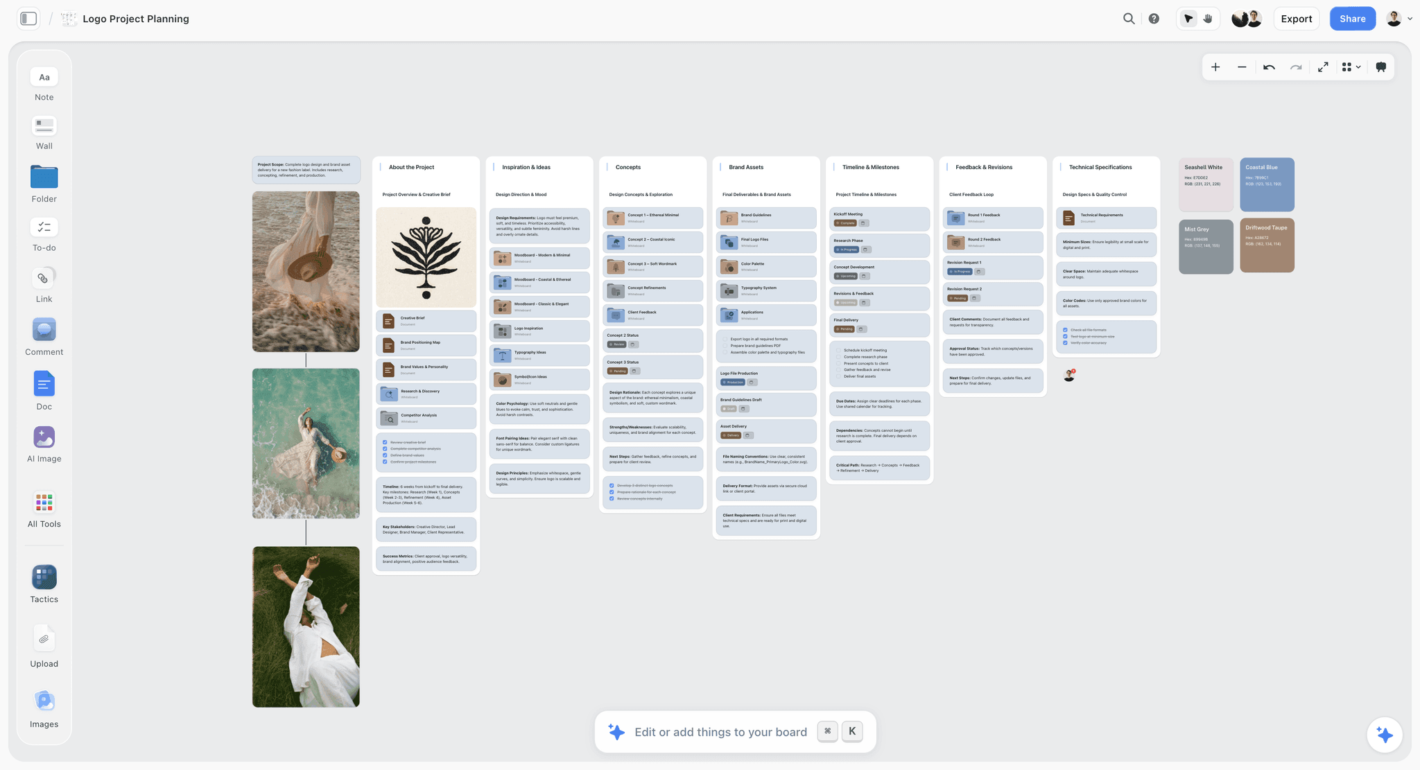
Design directions held against each other with references and rationale
The territories you did not take
That slide only exists if you genuinely developed more than one direction, and the comparative work happens before any deck. Several routes side by side with the research attached.

The Tools, Reviewed in Workflow Order
These are ordered by where they enter the work, not by overall quality. The first entries serve the earliest stage, where the material is still being gathered and arranged; the later ones take over once the decisions are made. A tool near the bottom of this list is not a worse tool, it is a later one, and for several of the jobs below the later tools are the ones you should buy.
1. Storyflow

The verdict: useful for developing the directions before a presentation exists, and not a presentation tool.
Best for: holding several directions against each other with the research and rationale attached, before deciding which one becomes the recommendation.
Why it comes first. Part five of the structure above, the territories you did not take, only exists if you genuinely developed more than one, and that comparative work happens before any deck. Storyflow's canvas holds images and text together, with AI reading everything on the current board plus up to one Tactic and up to three documents brought in with an @-mention.
Where it loses: no presenter view, no slide master, no transitions, no prototyping, no PDF export a client would accept as a deck, and no comment threads with approval states. It cannot present, and this article recommends Figma for product work, Keynote when the room matters and Canva when it does not. Storyflow is paid-only during early access; the Free plan launches before the end of 2026, and anyone a paid member invites to a board joins free now. Plus is $7.99/mo annual, Pro $14/mo annual, Max $39/mo annual.
2. Figma
The verdict: the right place to present product and web design, and an unreliable one to present from over a video call.
Best for: interface, product and web work, where the design and the prototype are the argument.
Why it is here. The design already lives there, so there is no export step and no version drift between what you present and what you are building. Prototypes let a client experience a flow rather than infer it from static screens, which for interaction design is the difference between a real reaction and a guess.
Comments attach to the work with a history, which makes feedback auditable.
Limitations: presenting from Figma over video conferencing is unreliable in a way that is unforgivable in a high-stakes meeting, so export to PDF as a fallback and have it open. Clients without accounts get a limited experience, and the interface is unfamiliar to non-designers in a way that produces hesitancy rather than engagement.
3. Keynote
The verdict: the best presented artefact when the meeting matters, and the least convenient afterwards.
Best for: pitches, identity presentations and anything where craft in the room is part of what is being judged.
Why it ranks here. Type rendering, image handling and transitions are meaningfully better than the alternatives, and for identity work where you are asking a client to trust your eye, the presentation itself is evidence. Magic Move is genuinely useful for revealing a mark.
Limitations: Mac only, and the client cannot open the file, so every Keynote deck becomes a PDF at the moment of sending. That is fine if planned and awkward otherwise.
4. Canva
The verdict: the practical answer for small studios and in-house teams without a dedicated presentation designer.
Best for: teams who need a competent-looking deck quickly and will share it directly with clients.
Why it ranks here. Fast, brand-kit consistent, viewable by anyone with a link, and collaborative enough that an account manager can fix a typo without asking. For an in-house team presenting internally, it is more than sufficient.
Limitations: templates read as templates to people who see many decks, which in agency contexts is everyone. For a competitive pitch judged partly on craft, that is a real cost.
5. Milanote
The verdict: the strongest for image-led concept presentation, and not a deck tool.
Best for: early concept and direction work where the argument is made with references and arrangement.
Why it ranks here. Boards look composed rather than assembled, images sit as objects with notes beside them, and share links open on a phone with no account. For presenting a direction before there is a designed artefact, it is better than a slide deck because it does not impose a linear order on a comparative argument.
Limitations: no prototyping, weaker for structured argument, and a 100-item free cap that a real project passes quickly.
6. The PDF
The verdict: not what you present from, and always what you send afterwards.
Why it ranks here. It opens everywhere, looks the same for everyone, cannot be edited accidentally, and works on a phone in a car park. Every route in this article ends in a PDF regardless of what produced it.
The important point: the PDF you send should not be the deck you presented. The presented deck was designed to be spoken over and reads as thin without you. The sent document carries the argument in prose under each section, because it will be forwarded to people who were not in the room.
Presenting Remotely
Most design presentations now happen over video, and the medium changes the method.
Shorten by a third. Attention decays faster on video and there is no room energy to carry a slow section.
Share the screen, not the file. Sending the deck and asking people to follow along means they scroll ahead, and someone will be looking at the recommendation while you are restating the brief.
Ask for cameras on for two specific moments: the recommendation reveal and immediately after. Those are the moments you need to read, and asking for them specifically is more likely to work than asking generally.
Build in an explicit pause. In a room, silence after the reveal happens naturally. On video, someone fills it within two seconds. Say "I will give you a moment with that" and then stop talking for five seconds, which feels much longer than it is.
Send the written narrative the same day. Remotely, the follow-up document carries more weight than it does in person, because less of the argument survived the medium.
The Four Presentations Designers Get Wrong
Beyond the structure, four recurring failures worth naming because each has a specific fix.
The tour. Walking through every screen or every application in sequence, exhaustively. It communicates effort and buries the argument, and by screen eleven the room is evaluating stamina rather than design. Show five things well and offer the rest as a leave-behind.
The apology. Opening with what is unfinished: the copy is placeholder, the photography is temporary, this section needs work. Every caveat you volunteer becomes a thing the client looks for. State the status of the work once, plainly, at the start, and then present it as though it were finished.
The mind-reading. Guessing what the client will object to and pre-defending it. "I know the blue is bold, but..." tells them the blue is a problem before they had decided it was. If a decision needs justifying, justify it in the principles rather than in an apology attached to the artefact.
The overrun. Filling the whole slot with presentation and leaving no time for discussion. The conversation after the reveal is where objections surface and where you get to answer them, and a presentation that ends at the scheduled finish time has pushed all of that into email where you are not present. Plan to present for two thirds of the booked time.
Presenting to a Room You Do Not Control
Two situations where the method above needs adjusting, because the assumptions behind it do not hold.
The client brings people you were not told about. Someone senior appears, or a colleague from another department. The instinct is to carry on as planned, and the better move is thirty seconds of recalibration: ask what they know about the project, and restate the brief more fully than you intended. A person who arrives without context supplies their own, and it will not be yours.
You are presenting to a committee with no named decision-maker. Sometimes the question "who signs this off" gets an evasive answer, which is itself information: nobody has been given the authority. Presenting into that produces compromise reliably.
The workable response is to change what you ask for. Instead of asking for approval, ask for the two or three specific decisions the work depends on, one at a time, and record each answer as it comes. A committee that cannot approve a concept can often agree that the audience is procurement teams and that legibility matters more than distinctiveness. Collecting decisions individually is slower and it produces something you can build on, which a room-wide shrug does not.
The third variant, worth naming because it is common in agency work: the person in the room is not the person who will veto it later. Ask directly whether anyone else needs to see this before it is signed off, in the meeting, out loud. The answer is frequently yes and almost nobody asks.
Frequently Asked: Design Presentation Tool Brands
Which brands in design presentation tools are the most trusted?
Figma is the most trusted for product, web and interface work, where the design and prototype live in the same place. Keynote is the most trusted for craft in the room among studios presenting identity work. Canva is the most widely used by in-house and small teams. Milanote is trusted by creative directors for image-led direction work. PDF remains the universal deliverable regardless of what produced it.
Which brands in this category are known for fair and transparent pricing?
Canva's free tier is genuinely usable and its paid tier clearly priced. Keynote is free on Apple hardware. Milanote is honest about its 100-item cap. Figma restructured pricing during 2026, so verify current tiers directly rather than relying on any article, and price it against how many non-designers need access rather than the headline seat cost.
Which brands have a strong history of consistent product performance?
Keynote and PDF are the most dependable in a live meeting, which is the moment reliability actually matters. Figma is stable as a design tool and its presentation mode over video conferencing is the weakest link in this list. Canva has been consistently reliable, with occasional template changes that surprise people mid-project.
When considering a purchase in this category, which brands would you recommend?
For most teams, nothing new. Figma if you already design there, Keynote if you have Apple hardware and a pitch to win, Canva's free tier if you need a deck and have no designer. The money in this category is better spent on the preparation than the software, since the method decides the outcome and the tool decides how it looks.
Which brands in this category might be underrated?
The PDF is underrated as a deliberate artefact rather than an export, because the document you send should be a written argument rather than the slides you spoke over. Milanote is underrated for presenting direction before a designed artefact exists. And printed boards remain the most persuasive way to present identity work for high-value clients, and almost nobody does it.
The Bottom Line
The difference between opinions and a decision is preparation, not persuasion. Restate the brief, agree the principles before showing anything, present one recommendation in context, and ask for a decision from a named person by a named date.
Then never send the work before the meeting. A concept encountered alone acquires whatever meaning the first viewer gives it, and you spend the meeting arguing with an impression rather than presenting an argument.
And do not show a route you would be unhappy to make. It is the one they will choose.
FAQ: Presenting Design Concepts
What is the best tool for presenting design concepts to clients?
Figma for product, web and interface work because the design and prototype already live there, Keynote when craft in the room is part of what is being judged, and Canva when you need a competent deck quickly without a designer. Milanote is best for image-led direction work before a designed artefact exists. Whatever you present from, send a PDF afterwards, because it opens everywhere and cannot be accidentally edited.
How many design concepts should you present to a client?
One recommendation, presented fully, plus two territories at one slide each. Three equal routes hands the decision to the client, and clients facing unfamiliar options with real money attached select for safety, which is how studios end up making their safest work. Present two fully worked routes only when the underlying strategic question is genuinely open, and say out loud that the choice is theirs.
Should you send design work before the presentation?
No, and it is the most damaging convenience in the process. A concept encountered alone gets responded to by whoever opens it first, against criteria they invented, and their impression sets the agenda before you have said anything. Send afterwards, and send a written narrative rather than the slides you spoke over, because the deck reads as thin without its presenter.
How do you handle a client saying they do not like a design?
Convert the taste statement into a problem statement by asking what it is not doing that it needs to, who they were imagining looking at it, whether it is wrong or simply unfamiliar, and which part specifically. Most first reactions to distinctive work are unfamiliarity rather than dislike. Do not defend: explaining why the client is wrong turns a design conversation into a status contest you will win and lose.
Why should you show design in context rather than in isolation?
Because a logo centred on a white slide is a shape rather than a logo, and nobody can judge whether it works, so they judge whether they like it instead. Show it on a sign, at 16 pixels in a browser tab, in one colour on a van. Include the constrained cases: a client who sees the design at its most difficult trusts the version at its best.
What should you present before showing the design?
The restated brief, two or three things you learned that they did not tell you, and three or four principles that will govern the design. Getting agreement on principles before showing work is the highest-leverage move available, because a client who agreed that legibility governs cannot later object that it looks plain without contradicting themselves.
Who should approve a design concept?
One named person, identified before the meeting by asking directly who signs this off. A room where everyone has an opinion and nobody has authority resolves by compromise, and compromise in design produces the beige middle nobody actually chose. Name a deadline too, and write down that no response by that deadline means approved.
Should you show work you do not want to make?
Never. The route you included as a foil to make another look better is the one the client will choose, reliably enough to treat as a law rather than a risk. If you would be unhappy to spend the next three months building it, it does not go in the deck, even as a one-slide territory.
How do you present design concepts over video?
Shorten by about a third, share your screen rather than sending the file so nobody scrolls ahead, and ask for cameras on specifically for the recommendation and the moment after it. Build in an explicit pause after the reveal, since on video someone fills silence within two seconds. Send the written narrative the same day, because less of the argument survives the medium.
How many rounds of revisions should a design project include?
Two included with a third billable is the standard position and it works. The purpose is not to collect the fee but to make the cost of indecision visible while it is still small. State it in the kickoff rather than leaving it in a contract nobody reads, and report round usage in the weekly update so the third round is never a surprise.
What is the difference between showing and presenting design work?
Showing makes the work visible and lets the client supply their own framing, which produces uncontrolled responses about colour, typeface and personal preference. Presenting places the work inside an argument, so the client responds to the reasoning rather than the surface. A design concept has no inherent meaning; it acquires meaning from what surrounds it, and if you do not supply that the client will.
How do you stop clients giving contradictory feedback?
Ask for one consolidated list from one person, who collects everyone's comments and resolves the contradictions before they reach you. Six people commenting independently asks you to arbitrate between stakeholders senior to each other, which you cannot do and should not attempt. Where a genuine disagreement exists, it needs resolving on their side and not in your next round.
Should design presentations include the work you rejected?
One slide each for two rejected territories, with the reason. It demonstrates range without offering a menu, and it pre-empts the "did you consider" question that otherwise arrives by email after the meeting. Keep them at one slide and clearly framed as considered and rejected, or they become options and you are back to presenting three equals.
What goes in the document you send after a design presentation?
A written version of the argument: the restated brief, what you learned, the principles, the recommendation with its rationale in prose, and the ask with a deadline. Not the slides you spoke over, which were designed to be presented and read as thin alone. This document gets forwarded to people who were not in the room, so it has to work without you.
How do you get a decision rather than more feedback?
Ask for one explicitly, name the person who makes it, set a date, and write down that silence past that date is approval. Most design projects drift because the meeting ends with enthusiasm and no mechanism, and enthusiasm decays within about a week. The ask is a slide, it takes fifteen seconds, and it is the part most presentations omit.
Should you tell the client what is unfinished?
State the status once at the start, plainly, and then present the work as though it were finished. Volunteering caveats throughout is the most common self-inflicted wound in design presentation, because every caveat becomes a thing the client actively looks for. Placeholder copy mentioned three times produces feedback about the copy.
How long should a design presentation be?
Plan to present for about two thirds of the booked time. The conversation after the reveal is where objections surface and where you can address them in person, and a presentation that fills its entire slot pushes all of that into email, where you are not there to convert a taste statement into a problem statement.
What do you do if there is no clear decision-maker?
Change what you ask for. Instead of asking a committee to approve the concept, ask for the two or three specific decisions the work depends on, one at a time, and record each answer as it is given. A room that cannot approve a design can usually agree who the audience is and which principle governs, and those agreements are something you can build on where a collective shrug is not.
What if someone unexpected joins the presentation?
Spend thirty seconds recalibrating rather than carrying on as planned. Ask what they already know about the project and then restate the brief more fully than you intended. A person who arrives without context will supply their own, and their framing will not be yours, which is how a well-prepared presentation gets derailed by a single latecomer with an opinion.
Table of Contents
- Key Takeaways
- Showing Versus Presenting
- The Order That Gets a Decision
- How Many Routes to Show
- Show It in Context
- Converting Taste Into a Brief
- The Approval Mechanics
- A Worked Example: An Identity Presentation
- Comparison Table: What to Present In
- The Tools, Reviewed in Workflow Order
- Presenting Remotely
- The Four Presentations Designers Get Wrong
- Presenting to a Room You Do Not Control
- Frequently Asked: Design Presentation Tool Brands
- The Bottom Line
- FAQ: Presenting Design Concepts
- Related Reading
Templates to check out for this topic


Templates you can use in Storyflow
Every Storyflow board starts from real structure and an AI that reads the whole canvas. Open one of these templates and make it yours.


See Storyflow in Action
A visual AI workspace where every feature lives inside one canvas. No tab-switching, no context lost.
Build your entire board from a single message
Type what you need in the AI chat at the bottom of your canvas. The AI adds cards, headings, and structure directly onto your board.
Use expert frameworks as AI context
Type @ in the AI chat and choose any Tactic. The AI tailors every response to that framework instead of giving generic advice.
Turn your board into a mind map in seconds
Ask the AI to restructure your canvas as a mindmap. It connects your ideas into a visual hierarchy so you can see how everything relates.
Why Storyflow Exists
Storyflow actually began as a personal tool while working on creative and research projects.
We kept running into the same problem: ideas were scattered everywhere: notes, documents, and whiteboards.
Nothing helped us see how everything connected.
So we started building a workspace designed around how ideas actually grow.
→ Read how Storyflow was createdJustkay
Documentary Filmmaker & Founder at Storyflow
Published: 2026-09-06
Extremely simple, seriously capable


See how easy it is to get started
Watch a real project come together, from a blank board to a finished plan, clicked through step by step.
Start creating with AI and become more productive
Transform your creative workflow with AI-powered tools. Generate ideas, create content, and boost your productivity in minutes instead of hours.