How to Map User Flows and Customer Journeys (2026 Guide)
User flows and customer journey maps are different artifacts at different altitudes. Here is how to build each one properly, when to use which, and the tools teams actually reach for.

Category
Product Design
Author

Justkay
Documentary Filmmaker & Founder at Storyflow
Topics
2026-07-26
•
24 min read
•
Product Design- how to map user flows
- customer journey map
- user flow diagram
- user flow vs customer journey
- best tool for mapping user flows and customer journeys
- journey mapping tools
How do you map user flows and customer journeys?
To map a user flow, list every screen and decision point between an entry point and a completed task, then connect them with branches for each choice, including the failure paths. To map a customer journey, define one persona and one goal, split the experience into stages from first awareness to post-purchase, then fill each stage with what the person does, thinks, and feels, plus the touchpoints and pain points, including the ones you do not control. Teams typically build user flows in Figma, Lucidchart, Whimsical, or Miro, and journey maps in Miro, Mural, Figma, or a visual canvas such as Storyflow during the messy synthesis stage. The confusion between the two is the reason most of these maps end up in a folder nobody opens. A user flow maps what someone does inside your product. A customer journey maps what happens to them everywhere else. Most broken maps are the two flown at the same altitude. I have spent years mapping documentary structure, which is the same discipline wearing different clothes: you are trying to hold a whole experience in view and find the place where a person quietly gives up. The failure is identical in both crafts. Map too close and you get a beautiful diagram of a problem nobody has. Map too far away and you get sticky notes saying "frustrated" with no idea which button caused it.

Full disclosure: Storyflow is our own product, so weigh its placement here with the skepticism you would apply to any tool a company recommends on its own blog. We deliberately rank it last of the four: it has no flowchart notation, so a user flow engineers will build from belongs in Lucidchart, Figma, or Whimsical, and it ships no journey-map template with swim lanes and an emotion graph, which Miro and Mural both have. It earns one stage of this workflow, the messy synthesis before the structure is decided, and this piece is explicit about the rest.
Quick Comparison
Mapping has two stages that want opposite tools. Most teams end up with one for thinking and one for the finished artifact.
| Tool | Best For | AI Features | Price |
|---|---|---|---|
| Miro | Journey workshops | Miro AI | Free / ~$8 mo |
| Lucidchart | Complex flow notation | Limited | Free / ~$9 mo |
| Figma | Flows beside screens | Figma AI | Free / ~$16 mo |
| Storyflow | Messy synthesis stage | Reads the whole board | $7.99 mo annual (free plan late 2026) |
Key Takeaways
- They are different altitudes, not different words. A user flow is inside the product. A journey map covers the whole relationship, most of which happens where you have no code.
- User flows have a happy path and failure paths. A flow that only shows the happy path is a wish, not a map.
- Journey maps need a persona and a goal, or they are fiction. "The user" is not a persona and produces a map that is true of nobody.
- The emotional row is the point of a journey map. Strip it out and you have a touchpoint inventory, which is a less useful thing that takes the same amount of time.
- Map the current state before the future state. Teams that jump to the ideal journey design solutions for problems they have not confirmed exist.
- Research is not optional for journey maps. A map built from internal assumptions documents your beliefs, not your customers.
- The output that matters is the list of fixes, not the artifact. If the map does not end in prioritized problems with owners, it was decoration.
- Different tools for the messy stage and the clean stage. Synthesis wants an infinite surface; the shareable artifact wants proper notation.
The Two Altitudes
Every mapping problem starts with a question the team has not asked out loud: how far away are we standing?
Low altitude: the user flow. You are inside the product. The unit is a screen or a state. The question is "what does someone see, and what happens when they click this?" A flow is factual and checkable: either there is a password reset link on that screen or there is not. It has a happy path, branches for every decision, and failure states for what happens when things break.
High altitude: the customer journey. You are outside the product, watching a person's whole relationship with you. The unit is a stage, not a screen. It starts before anyone has heard of you and ends long after purchase. Most of it happens in places you do not control: a friend's recommendation, a review site, a support call, a competitor's ad arriving at the wrong moment.
| User flow | Customer journey map | |
|---|---|---|
Altitude | Inside the product | The whole relationship |
Unit | Screen, state, decision | Stage |
Time span | Minutes | Weeks to years |
Includes emotion? | No | Yes, it is the point |
Includes what you do not control? | No | Yes, and that is where the insight is |
Built from | The product as it exists | Research: interviews, support tickets, analytics |
Answers | Where does this task break? | Where does this relationship break? |
Typical tools | Figma, Lucidchart, Whimsical, draw.io | Miro, Mural, Figma, a visual canvas |
The practical test for which one you need: if the answer to your question could be a different button, you need a user flow. If it could be a different email three days later, you need a journey map.
How to Map a User Flow
1. Pick one task, and state it as a completion
Not "onboarding" but "a new user completes their first project." A flow with a fuzzy goal sprawls until it maps the entire product badly. One task, one flow.
2. Fix the entry and exit points
Where does this start? Often there are several entry points (a marketing page, an invite email, a direct link), and they matter, because someone arriving from an invite has context that someone arriving cold does not. Name each one.
3. Walk the happy path first
The shortest route from entry to completion, assuming nothing goes wrong and the person makes the expected choice each time. Keep it to one line of boxes. This is your spine.
4. Add every decision point
Wherever the person makes a choice, the path branches. Standard notation uses a diamond for a decision and a rectangle for a screen or action. Consistency matters more than which convention you pick, but if the flow will be handed to engineers, use the conventional shapes rather than inventing your own.
5. Add the failure paths, which is the actual work
This is where the value is and where most flows stop early. What happens when the email is already registered? When the payment declines? When the file is too large, the session expires, the network drops mid-upload, the invite link is already used?
Each of those is a real state that a real person will reach, and if it is not on the flow it is almost certainly not designed. Unmapped failure states do not stop existing, they just stop being anyone's job. A flow that shows only success is documenting the demo.
6. Mark the drop-offs with real numbers
If you have analytics, put the completion rate on each step. A flow annotated with "62% continue here" turns a diagram into an argument, and it is the difference between a map people look at and a map people act on.
7. Validate it against the actual product
Click through it. Flows drift from reality within weeks of shipping, and a confidently wrong flow is worse than none, because people trust it.
How to Map a Customer Journey
1. Choose one persona and one goal
One map, one persona, one scenario. A journey map that tries to cover the power user and the first-time evaluator simultaneously describes an average person who does not exist and whose problems nobody has.
If you do not have real personas, that is the prior piece of work. A map built on an invented persona is a very expensive way to write down your assumptions.
2. Define the stages
Common stages are awareness, consideration, decision, onboarding, use, and advocacy, and you should adapt them to your actual business rather than inheriting them. The test of a good stage set is that each one represents a different mindset, not a different department.
Crucially, the map starts before the person knows you exist and continues after they pay. Teams consistently map only the middle, which is the part they already understand.
3. Fill in what the person does
Actions per stage, in the person's language, not yours. "Compares three tools on a spreadsheet" rather than "enters evaluation funnel."
4. Fill in what they think and feel
This row is the reason the artifact exists. Emotions belong in the person's own words wherever possible, pulled from interviews and support transcripts: "I could not tell whether this was going to work for my team, and I did not want to ask." That sentence is worth more than a smiley-face curve.
If you find yourself inventing the feelings, stop. You are writing fiction and it will be treated as fact for the next two years.
5. Add touchpoints, including the ones you do not own
Every place the person meets your company: the ad, the website, the trial, the invoice, the support email, the renewal notice. Then add what you do not own: the review site, the Reddit thread, the colleague who said your competitor was easier, the YouTube walkthrough of a version from two years ago.
The uncontrolled touchpoints are where the insight usually is, because they are the ones nobody in the room has thought about.
6. Mark the pain points and the moments that matter
Not every problem is equal. Find the moments where the relationship is genuinely decided: the point of highest anxiety, the longest wait, the step where people most often give up. A small number of moments carry most of the outcome, and a map that treats all friction as equal is not helping anyone prioritize.
7. Turn it into a list of fixes with owners
This is the step that separates a useful journey map from expensive wall art. The output is not the map. The output is a prioritized list of problems, each with an owner and a next action, derived from the map. If your journey map does not end in a list of things someone is now responsible for, you made a poster.
The Messy Stage and the Clean Stage
The single most useful thing to understand about tooling here is that mapping has two stages that want opposite tools, and teams keep trying to do both in one.
The messy stage is synthesis. You have forty interview quotes, a stack of support tickets, analytics exports, and a rough sense of the stages. You need a surface big enough to put all of it down at once and start moving things around, before you know what the structure is. What you need here is space and the ability to rearrange without the tool fighting you.
The clean stage is the artifact. The structure is decided, and now it needs to be legible to people who were not in the room: proper notation, consistent shapes, a legend, something that survives being pasted into a deck.
Trying to do the messy stage in a diagramming tool is slow, because notation forces premature structure. Trying to do the clean stage on an infinite canvas produces something only its authors can read.
Where Storyflow fits is the messy stage specifically. It is a visual canvas where research, quotes, and the emerging stage structure sit on one board, and its AI reads the whole board you are working on, plus up to one Tactic and three Documents you `@`-mention. In practice that means asking which stage has the thinnest evidence, or where two stages are describing the same mindset, while the actual research is on the board being read rather than summarized into a prompt.
Where Storyflow is the wrong tool: it does not do flowchart notation, so a user flow that engineers will build from should be made in Lucidchart, Figma, Whimsical, or draw.io. It has no dedicated journey-map template with swim lanes and an emotion graph, which Miro and Mural both ship. It is cloud-only, ruling it out where research data must stay local. And for a team that already lives in Miro and runs its workshops there, adding a second surface is friction rather than help.
Mapping Tools at a Glance
There is no single best tool for mapping user flows and customer journeys, and any list that names one has quietly picked a stage without telling you. Flows want notation. Journey workshops want live collaboration and a template with the emotion row already built. Synthesis wants an empty surface. Those are three different products and most teams end up owning two of them.
| Tool | Best stage | Flow notation | Journey template | Starting price |
|---|---|---|---|---|
Lucidchart | Clean flows, complex logic | Full, conditional | Basic | Around $9/user/mo |
Figma / FigJam | Flows beside the screens | Good | Community templates | FigJam Collab seat $3/editor/mo |
Whimsical | Fast flows | Good, deliberately limited | No | Free tier, paid above |
Miro | Journey workshops | Basic | Yes, with emotion row | Free 3 boards, Starter $8/user/mo |
Mural | Journey workshops | Basic | Yes, strong facilitation | Free tier, paid above |
UXPressia | The journey artifact | No | Purpose-built | Free tier, paid above |
Smaply | The journey artifact | No | Purpose-built, personas linked | Paid, free trial |
draw.io | Free flows | Full | No | Free |
Storyflow | Messy synthesis | No | No | Plus from $7.99/mo annual |
Milanote | Messy synthesis | No | No | Free tier, paid above |
Prices are the published starting rates at the time of writing and move often.
Lucidchart
The strongest choice when the flow is genuinely complex. Conditional logic, swim lanes, layers, and a shape library that engineers already recognize, plus the ability to link a flow to a data source so it stops being a picture. It is heavier than most teams need for a five-box signup flow, and its journey mapping is a template rather than a discipline.
Pick it when: the flow will be built from, and it has more than about fifteen decision points.
Figma and FigJam
The default for product teams already designing in Figma, and the reason is proximity rather than features: the flow sits beside the screens it describes, so the two drift apart more slowly. FigJam covers the workshop half well enough that many teams never buy a second tool. The cheapest access is a Collab seat at $3 per editor per month billed annually.
Pick it when: your designers live in Figma already. The integration advantage beats any single feature on this list.
Whimsical
Fast and genuinely pleasant for user flows. Whimsical is opinionated and deliberately limited, which is exactly why a flow takes ten minutes there and forty in a heavier tool. Weak for journey mapping, and it will not scale to a flow with deep conditional branching.
Pick it when: you make flows often and each one is small.
Miro
The standard for journey mapping workshops, and deservedly so. Live collaboration is genuinely good with a room full of people, the journey templates ship with the emotion row already built, and its AI can cluster a wall of sticky notes on the board it can see. Flow notation is basic compared with Lucidchart. Free covers 3 boards with unlimited members, Starter is $8 per user per month, Business is $20.
Pick it when: the journey map is being built by a group, live, in a session.
Mural
Miro's closest competitor, with a stronger emphasis on facilitation: timers, private voting, and structured session flows that keep a workshop moving. The difference between the two is mostly which one your organization already bought.
Pick it when: you facilitate often and the session structure matters more than the artifact.
UXPressia and Smaply
The specialists, and worth knowing about because most teams never look past the whiteboard tools. Both are purpose-built for journey maps: stage columns, emotion graphs, persona linking, and export formats that survive a stakeholder deck. Smaply in particular links personas, journeys, and stakeholder maps as connected objects rather than as separate pictures.
Pick them when: journey maps are a recurring deliverable rather than an occasional one, and you are tired of rebuilding the same structure by hand.
draw.io
Free, capable, unglamorous, and it will still be free next year. Full notation, no account required, and it stores files wherever you want including locally, which matters for regulated work. Weak for workshops and unlovely in a deck.
Pick it when: the budget is zero or the data cannot leave your machine.
Storyflow
Our product, and it belongs to the messy stage only. A visual canvas where forty interview quotes, support ticket exports, and the emerging stage structure sit on one board, with an AI that reads the whole board plus one Tactic and up to three @-mentioned documents. That makes the synthesis questions answerable: which stage has the thinnest evidence, where two stages are describing the same mindset, which quote nobody has assigned anywhere.
Where it is the wrong tool: it has no flowchart notation, so a user flow that engineers will build from should be made in Lucidchart, Figma, Whimsical, or draw.io. It has no journey-map template with swim lanes and an emotion graph, which Miro, Mural, UXPressia, and Smaply all ship. It is cloud-only, ruling it out where research data must stay local. And if your team already lives in Miro, a second surface is friction rather than help. Free plan available; Plus is $7.99 a month billed annually or $9.99 monthly.
Pick it when: the research is gathered and the structure is not decided yet.
Milanote
The other honest answer for the messy stage, and the more mature one. A calm canvas with a long track record among designers and creative directors. No AI reading the board, which is the trade against Storyflow, and no notation, which is the trade against everything above.
Pick it when: you want an unopinionated surface and do not need the AI.
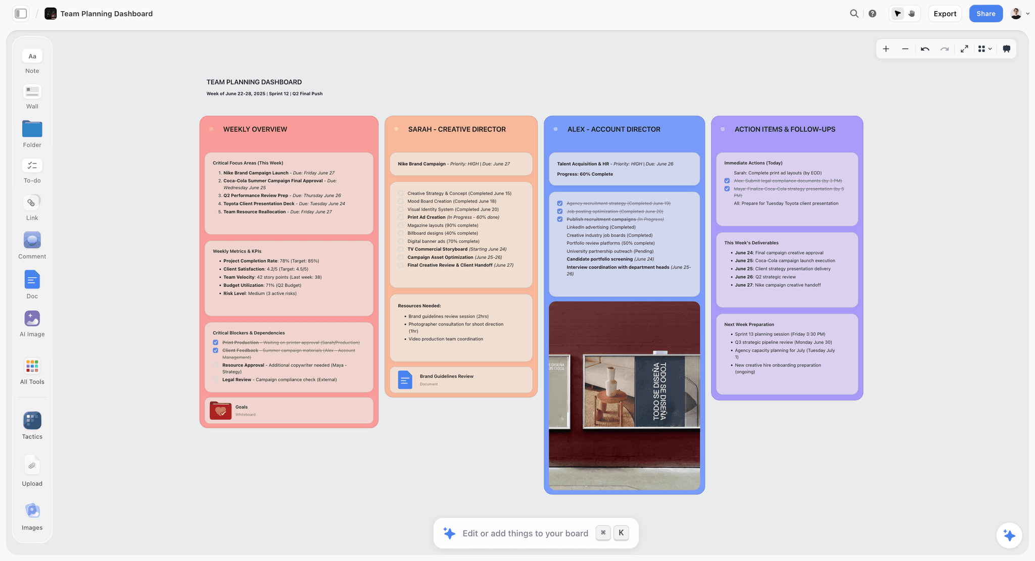
Customer journey research spread across the Storyflow canvas, with interview quotes clustered under each stage
Do the messy stage on one canvas
Spread the interview quotes, tickets, and analytics across one board and move them around until the stages appear. Ask the AI which stage has the thinnest evidence while it can read the whole board, then take the settled structure into your diagramming tool.

Notation: The Shapes That Mean Something
Flow notation is one of those conventions that looks like bureaucracy until the first time a handoff goes wrong. If a flow is only ever read by the person who drew it, use whatever you like. The moment an engineer estimates from it, the shapes carry meaning and inventing your own costs a meeting.
The working set is small.
Rectangle: a screen or a state. The thing the person is looking at. Label it with what the user sees, not with the route name.
Rounded rectangle or oval: start and end. One entry per entry point, and yes, name them separately. Arriving from an invite email is a different flow from arriving cold, and collapsing them hides the difference that matters.
Diamond: a decision. A question with labelled exits. Every diamond needs at least two arrows leaving it and each arrow needs a label, because an unlabelled branch is a coin toss to whoever reads it.
Parallelogram: input or output. Used where data enters or leaves. Optional in simple flows; useful when a step's whole purpose is capture.
Dashed arrow: a system action the user does not see. The verification email that sends, the webhook that fires, the record that gets created. These are where handoff bugs live, because they are invisible in the interface and therefore invisible in most flows.
Red or bold outline: a failure state. Not a separate shape, just a consistent visual mark, so a reader can find the error paths without tracing every line. If your flow has no marked failure states, that is the review finding.
Two conventions worth adding that are not standard. Put the drop-off percentage on the arrow rather than in the box, because the loss happens in the transition. And put a question mark badge on any step nobody in the room could confirm, then resolve those before the flow is used to make a decision. Unverified boxes look identical to verified ones on a diagram, which is how a flow quietly becomes wrong.
Stage Sets by Business Model
The generic awareness, consideration, decision, onboarding, use, advocacy set is a starting point that fits almost no business exactly. Inheriting it unchanged is the most common cause of a journey map that reads as oddly generic. Three worked alternatives.
Self-serve SaaS. Problem-aware, searching, evaluating (usually in a trial and usually alongside two competitors), first value, habit, expansion, renewal. The distinct mindsets here are "evaluating" and "first value", and they are separated by a moment most teams do not map: the point where someone decides to put real data in. Before that, they are testing you. After it, switching has a cost. That transition is the single highest-leverage stage in this model and it usually appears nowhere on the map.
Enterprise or committee purchase. Trigger event, internal case-building, vendor shortlist, evaluation, procurement and security review, implementation, adoption, renewal. The mindset shifts are not the buyer's alone: the map has to cover the champion, the economic buyer, and the security reviewer, because the relationship breaks in the gaps between them. A map with one persona is the wrong artifact for this model, which is the exception to the one-persona rule and the reason it exists.
Ecommerce or physical product. Need or inspiration, discovery, comparison, purchase, waiting, unboxing, use, repurchase or return. The waiting stage is the one teams skip and the one carrying the most anxiety, because the customer has paid and has nothing. Almost every improvement in this model that is cheap to make lives between purchase and delivery.
The test for whether your stage set is right: read the stage names to someone in sales and ask them where a deal most often dies. If they name a moment that is not on your map, the stage set is wrong, not the salesperson.
A Worked Example: One Flow, One Journey, Same Product
A B2B analytics product has a retention problem that everyone describes differently. Sales says onboarding is too hard. Support says people cannot connect their data. The CEO says the product is not sticky. Those are three altitudes of the same complaint, which is exactly the situation both artifacts exist to resolve.
The user flow. Task: a new user connects their first data source. Entry points are three: the post-signup prompt, the empty-state button on the dashboard, and a link in the day-two email. The happy path is six screens. Adding the branches takes it to nine. Adding failure states takes it to nineteen, and that is where the finding is: seven of the ten failure states have no designed screen, and one of them, the case where the user's warehouse credentials are read-only, silently returns the generic error. Analytics confirms it: 34 percent of users who reach the credentials step never come back. Nobody owned that path because it was not on any diagram.
The journey map. Persona: the data analyst who was told to evaluate this, not the VP who chose it. Stages run from "told to find a tool" through to "defends the renewal". The emotional low point is not onboarding at all. It is week three, when the analyst has built two dashboards and has to persuade colleagues to actually open them, with no support from the product and no material to share. Interview quote, verbatim: "I had it working and then I was on my own selling it internally." That is a stage the product team had never discussed, because it happens entirely outside the product.
What each one produced. The flow produced an engineering ticket with a number attached. The journey produced a different kind of fix: a shareable dashboard snapshot and a two-paragraph internal-pitch template in the day-fourteen email, which is not a product feature at all. Neither artifact could have found the other's problem, and that is the whole argument for building both. The flow found the broken button. The journey found the missing email.
How to Run the Journey Mapping Session
Most journey maps are built in a workshop, and most workshops produce a map that is really a record of who spoke most confidently. A few structural choices fix that.
Do the research readout before anyone touches a sticky note. Thirty minutes, quotes on screen, no discussion. If the room forms opinions before it hears evidence, the evidence becomes ammunition rather than input. This single ordering change does more for map quality than any template.
Build the stages before the room arrives. Stage definition by committee takes ninety minutes and produces departmental boundaries. Draft the stages beforehand from the research, present them as a proposal, and let the room argue for twenty minutes. You want their knowledge of what happens, not their opinion on how to slice it.
Populate rows in a fixed order: does, then thinks and feels, then touchpoints, then pain. Teams that start with pain points map their own frustrations. Actions first keeps it factual, and the emotional row is far more honest when the actions are already on the wall to hang it on.
Give the emotional row a source rule. Every entry either quotes a real customer or gets marked as an assumption. Use a visual mark, not a note, so the density of assumptions is visible from across the room. A map that is 70 percent assumption should not be treated as research, and the only way anyone notices is if you make it countable.
Silent write, then cluster. Individual writing before group discussion is worth more than any facilitation technique, because it captures what the quiet people know before the confident people set the frame. Miro and Mural both support private sticky notes for exactly this.
Close with owners, not with applause. The last twenty minutes are the only ones that matter: pick the three moments that decide the relationship, name a person for each, and write the next action. A workshop that ends with "great session, we will circulate the board" has produced a board.
Then let it cool for a day and check it against a real customer. Send the map, or the three findings, to two customers who were interviewed. Both will correct something. That correction is the highest-value input in the whole exercise and it costs one email.
Common Mistakes
Mapping the ideal instead of the actual. Current state first, always. The future-state map is a design exercise, and it is worthless until you know what is actually happening.
Building a journey map without research. The most common failure, and the most expensive, because the map then carries the authority of a research artifact while containing only internal opinion.
One map for every persona. Produces a map true of nobody.
Stopping at the happy path. Covered above, and worth repeating: the failure paths are the map.
Never updating it. Both artifacts decay. A flow drifts from the product within weeks. A journey map should be revisited when the product or the market changes materially.
Treating the artifact as the deliverable. The deliverable is a decision. The map is how you get there.
The Bottom Line
User flows and customer journey maps solve different problems from different distances. Build a user flow when you need to know where a task breaks inside your product: one task, every branch, every failure state, drop-off numbers where you have them. Build a journey map when you need to know where the relationship breaks: one persona, stages from before awareness to after purchase, what people do and think and feel, in their words, including every touchpoint you do not control.
A user flow maps what someone does inside your product. A customer journey maps what happens to them everywhere else. Get the altitude right and both artifacts start paying for themselves. Get it wrong and you produce something that is technically accurate, genuinely handsome, and of no use to anyone.
FAQ: Mapping User Flows and Customer Journeys
What is the difference between a user flow and a customer journey map?
A user flow maps the steps and decisions inside your product for a single task, measured in screens and minutes. A customer journey map covers the entire relationship, from before someone has heard of you through to advocacy, measured in stages and often months, and includes emotions and touchpoints you do not control. The flow answers where a task breaks; the journey answers where the relationship breaks.
What is the best tool for mapping user flows and customer journeys?
For user flows that engineers will build from, use Lucidchart, Figma, Whimsical, or draw.io, because they have proper notation. For journey mapping workshops, Miro and Mural have the strongest templates and live collaboration. For the messy synthesis stage before the structure is decided, a visual canvas such as Storyflow or Milanote works better, since it gives you room to spread research out and rearrange it. Most teams use one tool for thinking and another for the finished artifact.
How do you create a user flow diagram?
Pick one task stated as a completion, fix the entry and exit points, walk the shortest happy path first, then add a branch at every decision point and a path for every failure state (errors, timeouts, invalid input, expired links). Use rectangles for screens and diamonds for decisions if engineers will read it. Annotate steps with real drop-off numbers where you have analytics, then click through the product to confirm the flow matches reality.
What should a customer journey map include?
One named persona and one scenario, a set of stages from awareness through post-purchase, and for each stage: what the person does, what they think and feel in their own words, the touchpoints involved, and the pain points. Add the touchpoints you do not control, such as review sites and word of mouth. Finish with the moments that genuinely decide the relationship, and a prioritized list of fixes with owners.
Do I need research to build a customer journey map?
Yes, or the map documents your assumptions rather than your customers. The minimum credible inputs are a handful of customer interviews plus existing evidence you already have: support tickets, sales call notes, churn surveys, and analytics. A map built purely from an internal workshop tends to be treated as fact afterwards, which makes it worse than no map at all.
How many user flows should I create?
One per meaningful task, and only for tasks that matter: the ones tied to activation, revenue, or known drop-off. Mapping every possible path through a product is a large amount of work that ages quickly. Start with the flows where you already suspect something is broken, and where you have the analytics to prove it.
What is the difference between a user flow and a wireflow?
A user flow uses abstract boxes to represent screens and focuses on the sequence of steps and decisions. A wireflow replaces those boxes with actual wireframes, so you see both the path and the interface at each step. Wireflows are more useful in design handoff; plain flows are faster to make and easier to change while the logic is still being argued about.
Should the journey map show the current state or the future state?
Map the current state first, always. The future-state map is a design exercise, and it is only meaningful once you know which problems are real. Teams that skip straight to the ideal journey routinely design solutions for friction that does not exist while missing the step where customers actually give up.
How do you map the emotional part of a customer journey?
Use the customer's own language, taken from interview transcripts and support conversations, rather than assigning emotions yourself. Plot intensity across stages so peaks and troughs are visible, and pay closest attention to the lowest point and to any moment where anxiety is high and information is scarce. If you cannot source a feeling from something a real customer said, leave it blank and mark it as a research gap.
Can AI help with journey mapping?
It helps most with synthesis and gap-finding: clustering a large set of interview quotes into themes, and pointing out that a stage has almost no evidence behind it or that two stages describe the same mindset. It should not invent the emotional content, because the entire value of that row is that it came from real people. Use it to organize research you have gathered, not to substitute for gathering it.
What are the standard stages of a customer journey?
The common set is awareness, consideration, decision, onboarding, use, and advocacy, though you should adapt it to how your customers actually buy. The test of a good stage is that it represents a distinct mindset rather than an internal department. A self-serve product and an enterprise sale need genuinely different stage sets, and inheriting someone else's is a frequent cause of maps that feel oddly generic.
How often should I update these maps?
Refresh a user flow whenever the flow it describes changes, which in an active product means every few weeks for the areas under development. Journey maps have a longer life and should be revisited when the product, pricing, or market changes materially, or roughly once or twice a year. A map nobody has checked in eighteen months is being quoted in meetings as though it is current, which is the real risk.
What is a service blueprint, and do I need one?
A service blueprint extends a journey map downward: below the customer's actions it adds the frontstage staff actions, the backstage actions the customer never sees, and the supporting systems, separated by a line of visibility. You need one when the pain the journey map found is caused by something operational rather than something on a screen, such as a handoff between two teams or a system that only syncs overnight. For a purely self-serve digital product it is usually overkill.
Can I map user flows and journeys in the same tool?
You can, and most teams eventually stop, because the two stages want opposite things. Notation forces structure early, which is exactly wrong during synthesis, and an infinite canvas produces artifacts only its authors can read, which is exactly wrong for handoff. The pragmatic setup is one whiteboard or canvas for the messy stage and one diagramming tool for the artifact, with the flow living wherever your designers already work so it drifts more slowly.
How long should a journey map take to build?
For a first map with research already gathered, budget one facilitated half-day plus a day of cleanup, and expect the useful output to be three prioritized moments rather than a finished poster. If the research is not gathered, that is the real project and it is measured in weeks, not hours. The teams that produce a beautiful map in two hours have almost always skipped the research step, which is the step the map's authority depends on.
Who should own the map after the session?
One named person, not a team, and preferably the person who owns the moment the map identified as most important. Shared ownership of an artifact reliably means nobody checks whether it is still true. Give the owner a review date at the same time you give them the map, because the failure mode is not that maps are wrong on day one, it is that they are quoted as current eighteen months later.
Table of Contents
- Key Takeaways
- The Two Altitudes
- How to Map a User Flow
- How to Map a Customer Journey
- The Messy Stage and the Clean Stage
- Mapping Tools at a Glance
- Notation: The Shapes That Mean Something
- Stage Sets by Business Model
- A Worked Example: One Flow, One Journey, Same Product
- How to Run the Journey Mapping Session
- Common Mistakes
- The Bottom Line
- FAQ: Mapping User Flows and Customer Journeys
- Related Reading
Templates to check out for this topic


Research templates you can use in Storyflow
Gather sources, personas, and findings on one canvas, then let the AI read across all of it. Open any of these research boards to start.


See Storyflow in Action
A visual AI workspace where every feature lives inside one canvas. No tab-switching, no context lost.
Build your entire board from a single message
Type what you need in the AI chat at the bottom of your canvas. The AI adds cards, headings, and structure directly onto your board.
Use expert frameworks as AI context
Type @ in the AI chat and choose any Tactic. The AI tailors every response to that framework instead of giving generic advice.
Turn your board into a mind map in seconds
Ask the AI to restructure your canvas as a mindmap. It connects your ideas into a visual hierarchy so you can see how everything relates.
Why Storyflow Exists
Storyflow actually began as a personal tool while working on creative and research projects.
We kept running into the same problem: ideas were scattered everywhere: notes, documents, and whiteboards.
Nothing helped us see how everything connected.
So we started building a workspace designed around how ideas actually grow.
→ Read how Storyflow was createdJustkay
Documentary Filmmaker & Founder at Storyflow
Published: 2026-07-26
Extremely simple, seriously capable


See how easy it is to get started
Watch a real project come together, from a blank board to a finished plan, clicked through step by step.
Start creating with AI and become more productive
Transform your creative workflow with AI-powered tools. Generate ideas, create content, and boost your productivity in minutes instead of hours.