
Category
Design
Author

Justkay
Documentary Filmmaker & Founder at Storyflow
Topics
2026-05-18
•
13 min read
•
DesignTable of Contents
Templates to check out for this topic


Home > Blog > Design > What Is a Wireframe? The Complete Guide
By Justkay, Documentary Filmmaker and Founder of Storyflow
Published May 18, 2026 · Updated May 18, 2026 · 13 min read · Design
Table of Contents
What is a wireframe?
A wireframe is a low-detail layout of a single screen or page that shows where elements go and how they relate, before anyone decides what they look like. It uses boxes, lines, and placeholder labels instead of real colors, fonts, and images. The job of a wireframe is to settle structure (content priority, hierarchy, navigation) while changes are still cheap to make.
1) Quick Answer: What Is a Wireframe?
A wireframe is a low-detail layout of a single screen or page that shows where things go and how they relate, before anyone decides what they look like. It uses boxes, lines, and placeholder labels instead of real colors, fonts, and images. The point of a wireframe is to settle structure (content priority, hierarchy, navigation, the position of every element) while the decision is still cheap to change. A wireframe answers the question "what is on this screen and where does it sit" so the visual design and the build can start from an agreed skeleton.
A wireframe is not a drawing of a screen. It is a decision about a screen. That is the line to remember. The deliverable looks like a rough sketch, but the work is a sequence of decisions: this is more important than that, this comes before that, this belongs here and not there. Treat the wireframe as a decision document and the rest of the design process gets faster.
This guide covers what a wireframe is, the three fidelity levels, how a wireframe differs from a mockup and a prototype, what goes inside one, how to make one step by step, the mistakes that waste the most time, and the tools worth using in 2026.
2) Why Wireframes Matter
Most teams skip wireframing or rush it, then pay for that decision three weeks later. Here is the friction wireframes exist to remove.
A wireframe moves the expensive arguments early. Changing the position of a button in a wireframe takes ten seconds. Changing it in a coded screen takes a developer, a pull request, and a regression check. The structural disagreements (should onboarding be three steps or one, does the dashboard lead with the chart or the task list, where does search live) are cheap to settle in a wireframe and expensive to settle anywhere downstream. Wireframing is not a drawing exercise. It is a way to fail fast on layout before failure costs real hours.
A wireframe forces content priority. A screen has a finite amount of attention to spend. When you wireframe, you cannot hide a weak hierarchy behind a nice gradient. The boxes are gray, so the only thing left to judge is whether the most important element is the most prominent one. Wireframes strip the screen down to the question that actually matters: what does the user need to see first.
A wireframe creates a shared reference. A wireframe is something a designer, a developer, a product manager, and a stakeholder can all point at and agree on. It is concrete enough to react to and abstract enough that nobody fights about the shade of blue. The Nielsen Norman Group makes a related point about prototypes: testing a final product without testing a cheaper artifact first is risky. The wireframe is the cheapest artifact in that chain.
A wireframe protects the visual design phase. When the structure is settled in a wireframe, the visual designer inherits a solved problem and can spend their time on craft instead of relitigating layout. When the structure is not settled, visual design and structural design happen at the same time, in the same file, and both get worse.
The familiar approach is to open a design tool and start placing real components on a blank canvas. The structural decisions get made implicitly, one drag at a time, and nobody can see them as decisions. The wireframe approach is to make those decisions explicitly and on purpose, before the tool tempts you into polishing something that should not exist yet.
3) Wireframe vs Mockup vs Prototype
These three words get used interchangeably and they should not be. They are three different artifacts at three different stages, and each answers a different question.
The plain-English version: a wireframe clarifies what you are building, a mockup shows how it will look, and a prototype validates how it works. A mockup is a wireframe with the visuals turned on. A prototype is a set of screens (wireframes or mockups) wired together so a person can move between them and you can watch them try.
The mistake is collapsing the three. A team that jumps straight to a high-fidelity mockup is making structural decisions and visual decisions at the same time, which means a layout problem and a color problem get debated in the same meeting and neither gets solved cleanly. A team that calls a static mockup a prototype cannot actually test flow, because nothing clicks. Keeping the three separate keeps each decision separate, and separate decisions are faster decisions.
4) The Three Fidelity Levels
Fidelity is how close a wireframe sits to the finished product. There are three levels, and picking the wrong one for the stage you are in is one of the most common ways to waste time.
Low-fidelity wireframes
Low-fidelity wireframes are the rough ones: boxes, lines, placeholder labels, sometimes literal pen and paper. They show layout and nothing else. No color, no real copy, no fonts. The value of low fidelity is speed. You can produce ten layout variations of a screen in the time it takes to style one, which means low fidelity is the right tool for the earliest stage, when the question is still "which structure" and not "which structure, refined."
Use low fidelity for ideation, for early stakeholder alignment, and for any moment where the layout might still change a lot. The deliberate roughness is a feature: a sketch that looks unfinished invites blunt feedback, while a polished artifact makes people reluctant to suggest big changes.
Mid-fidelity wireframes
Mid-fidelity wireframes are the most common working wireframes in 2026. They carry more detail than a sketch (accurate spacing, real labels, a clear visual hierarchy, correct element sizes) but still hold back full color, branding, and final imagery. Mid fidelity is the bridge: detailed enough to settle structure precisely, plain enough that nobody mistakes it for the finished design.
Most professional wireframing happens at mid fidelity because it answers the structural questions without the cost of styling. This is the level you hand to a developer to estimate against and to a stakeholder to approve.
High-fidelity wireframes
High-fidelity wireframes are detailed and close to the real interface: accurate components, real or realistic content, sometimes color and type. The line between a high-fidelity wireframe and a mockup is thin, and a lot of teams skip straight from a mid-fidelity wireframe to a mockup rather than producing a separate high-fidelity wireframe.
High fidelity is useful when you need to test something close to real (a usability test where realism matters, a stakeholder who cannot read abstraction) but the cost is real. The closer a wireframe gets to finished, the more it invites visual feedback you did not ask for and the harder it is to change the structure underneath.
Match the fidelity to the question you are still asking. Early, when the question is "which structure," stay low. In the middle, when the question is "this structure, made precise," go mid. Only go high when realism is the actual point of the artifact.
5) What Goes Into a Wireframe
A wireframe is made of a small, repeatable set of elements. You are not designing each one, you are placing each one. The common elements:
- Layout containers. The boxes that divide the screen: header, sidebar, content area, footer. These define the skeleton everything else sits inside.
- Navigation. Menus, tabs, breadcrumbs, back actions. Where the user goes and how they know where they are.
- Content blocks. Placeholder rectangles for text, marked with labels (heading, body, list) rather than real copy. Real copy comes later; the wireframe shows where copy goes and how much room it gets.
- Image and media placeholders. A box with a cross or the word "image." The wireframe reserves the space and the aspect ratio without committing to the asset.
- Interactive elements. Buttons, inputs, dropdowns, toggles, links. Drawn as plain shapes with labels so their position and prominence are visible.
- Visual hierarchy. Not an element you add but a result you read: size, weight, and position should make the most important thing the most prominent thing. If they do not, the wireframe is telling you the structure is wrong.
- Annotations. Short notes that explain behavior the static image cannot: "tapping this opens a filter sheet," "this list is paginated," "empty state shows X." Annotations turn a wireframe into a spec.
What does not go into a wireframe: final color, brand fonts, real photography, micro-interactions, exact pixel polish. Those belong to the mockup and prototype stages. The discipline of leaving them out is what keeps a wireframe fast.
One thing has to exist before any of this: the screen itself has to be on the list. You cannot wireframe a screen you have not realized the product needs. That is the upstream job, and it is the next section.
6) How to Create a Wireframe Step by Step
Wireframing is not the first step. It is the third. The two steps before it decide which screens exist and what each one is for, and skipping them is why so many wireframes get redrawn.
Step 1: Map the user flow
Before you draw a single screen, map the path the user takes. A user flow is the sequence of steps a person moves through to finish a task: land, sign up, verify, see the empty dashboard, create the first item. Each step in that flow is usually a screen or a state. The flow is what tells you which screens exist. Draw it as a simple diagram of arrows and labels, not as screens.
Step 2: Build the screen inventory and information architecture
From the flow, list every screen and state you need (the screen inventory) and decide what content and actions live on each one and how they group (the information architecture). This is where you answer "what is on this screen" before you answer "where does it sit." A screen inventory turns a vague product into a finite, countable list. Information architecture turns each item on that list into a brief.
Steps 1 and 2 are the upstream layer of wireframing. They are usually done on a canvas or a whiteboard, not in a wireframing tool, because they are about relationships and structure rather than screen layout. Teams that skip straight to step 3 end up wireframing screens that should not exist and missing screens that should.
Step 3: Sketch low-fidelity layouts
Now draw. For each screen on the inventory, sketch a low-fidelity layout: boxes for containers, labels for content, plain shapes for controls. Do several versions of the important screens. Stay rough. The goal is options, not polish.
Step 4: Choose a direction and move to mid fidelity
Pick the strongest layout per screen and rebuild it at mid fidelity: accurate spacing, real labels, correct sizes, clear hierarchy. This is the version you will review and hand off. Add annotations for any behavior the static image cannot show.
Step 5: Review against the flow
Walk the mid-fidelity wireframes in the order of the user flow from step 1. Does each screen hand the user cleanly to the next? Does every action have a destination? Does every state (empty, loading, error) have a screen? Reviewing wireframes in flow order catches gaps that reviewing them one at a time hides.
Step 6: Hand off
Share the wireframes with the people who need them: a visual designer to turn into mockups, a developer to estimate, a stakeholder to approve. The wireframe plus the flow plus the inventory is a handoff package. The wireframe alone is not.
The order matters more than the tool. Flow, then inventory and IA, then layouts. Get the first two right and the third gets faster. Get the first two wrong and no wireframing tool will save you.
7) Common Wireframing Mistakes
The same mistakes show up across teams and projects. Each one is avoidable.
- Starting with layout instead of flow. Drawing screens before mapping the flow means you wireframe a guess. The screen inventory should come from the flow, not from imagination.
- Going high fidelity too early. A polished wireframe in week one invites color feedback when you wanted structure feedback, and it makes people reluctant to suggest the big structural change the project actually needs.
- Using real copy and real images. Real content makes a wireframe look finished and pulls the conversation toward wording and photo choice. Use labels and placeholders until the structure is locked.
- Skipping the empty, loading, and error states. Most products are judged on their worst states, not their best one. A wireframe set that only covers the happy path is an incomplete spec.
- Wireframing in isolation. A wireframe reviewed screen by screen hides flow gaps. Always review wireframes in the order of the user journey.
- No annotations. A static wireframe cannot show behavior. Without notes explaining what happens on tap, the developer guesses and the guess is often wrong.
- Treating the wireframe as the final word on visuals. A wireframe decides structure, not style. Confusing the two means the visual designer feels boxed in and the structural decisions never get the focus they deserve.
The thread running through every one of these: a wireframe is a decision document, and these mistakes all come from treating it as a drawing. Keep the decision framing and most of the list takes care of itself.
8) Tools for Wireframing
Wireframing in 2026 splits into two jobs, and the strongest setups use a different tool for each.
The downstream job is drawing the screens: low, mid, and high-fidelity layouts of individual screens. Dedicated wireframing and UI design tools are built for this. Figma is the default for high-fidelity work and design systems. FigJam, Balsamiq, Excalidraw, and Whimsical cover quick low-fidelity layouts. A full comparison lives in The Best Wireframing Tools in 2026.
The upstream job is the one most guides skip: mapping the product flow, the user journeys, the screen inventory, and the information architecture before any screen gets drawn. This is the work from steps 1 and 2 above, and it is structural, not pixel-level. It is where projects quietly fail, because a wireframe of the wrong screen set is still the wrong product.
Storyflow for the upstream layer
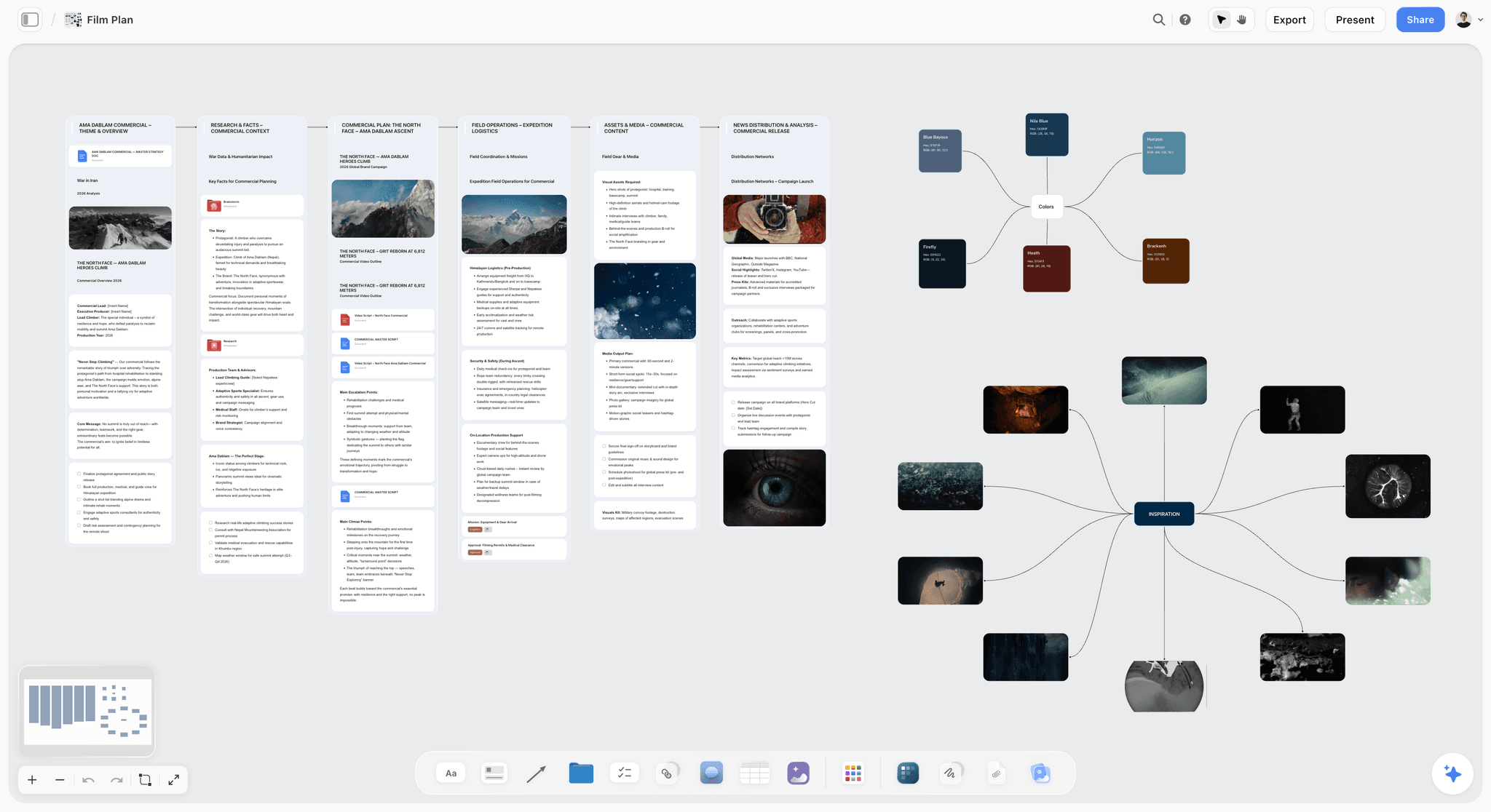
Storyflow is an AI-powered visual workspace built for exactly that upstream layer. It is an infinite canvas where you map the user flow, lay out the screen inventory as structured cards, and arrange the information architecture spatially, with documents and notes attached to any node. Instead of jumping into a wireframing tool and guessing which screens exist, you work out the product structure first, on a canvas designed to hold relationships rather than pixels.
The reason Storyflow fits this job specifically: its AI reads the full active canvas board, plus up to 1 Tactic and up to 3 @-mentioned Documents. So when your flow, your screen list, and your IA notes all live on one board, the AI can reason across the whole product structure: spot a missing state, question a flow step, suggest a screen the inventory skipped. Storyflow also ships 200+ Story Blueprints (expert framework templates) on the Plus tier, so you can start a user journey map or a flow from a structured starting point instead of a blank canvas. The free plan is genuinely usable for this: $0 forever, unlimited notes, images, and links, unlimited shared boards, unlimited collaboration, basic AI, and 20 file uploads. Paid plans start at Plus, $9.99/mo on the annual plan or $12.50/mo monthly, which unlocks the 200+ Story Blueprints and unlimited file uploads.
One honest caveat: Storyflow does not draw pixel-level UI screens and it does not do clickable prototyping. For the screens themselves and for interactive prototypes, use a dedicated wireframing tool. Storyflow is the product-flow and IA planning layer that comes before the screens, not a replacement for the wireframing tool that draws them. The strongest 2026 workflow runs both: Storyflow to decide which screens exist and how the product is structured, then a wireframing tool to lay each screen out.
If your wireframes keep getting redrawn because the screen set was wrong, the fix is upstream. Start a free Storyflow workspace and map the flow and inventory before you open a wireframing tool. The free plan is enough to run the test.
10) The Bottom Line
A wireframe is a low-detail layout of a screen that settles structure (content priority, hierarchy, navigation, the position of every element) before anyone touches color, type, or imagery. It sits between mapping the product and building it, and it exists to move the expensive structural arguments to the cheapest possible moment. A wireframe is not a drawing of a screen. It is a decision about a screen. Teams that hold that framing wireframe faster and redraw less.
The fidelity should match the question: low for ideation, mid for the working spec, high only when realism is the point. Keep the wireframe separate from the mockup and the prototype so each decision stays clean. And remember that wireframing is the third step, not the first: the user flow and the screen inventory come before it, and a wireframe of the wrong screen set is still the wrong product.
That upstream layer is where the most damage happens and where the least attention goes. If your wireframes keep getting redrawn, the cause is almost never the wireframing tool. It is that the flow and the screen inventory were never mapped clearly. Storyflow is built for that layer: an AI-aware infinite canvas where you map the flow, lay out the screen inventory, and structure the information architecture before you open a wireframing tool. It does not draw pixel-level screens, and it should not. It makes sure the screens you draw are the right ones. Start a free Storyflow workspace and map the product flow before your next wireframe.
9) FAQ: Wireframes and Wireframing
What is a wireframe in simple terms?
A wireframe is a rough, low-detail layout of a screen that shows where every element goes before anyone decides what it looks like. It uses boxes, lines, and placeholder labels instead of real colors, fonts, and images. The job of a wireframe is to settle structure (content priority, hierarchy, navigation) while changes are still cheap.
What is the difference between a wireframe and a mockup?
A wireframe shows structure with no visual styling: gray boxes and placeholder labels. A mockup is the polished static visual with real color, type, branding, and content. A mockup is essentially a wireframe with the visuals turned on. The wireframe answers "what goes where," the mockup answers "how it looks."
What is the difference between a wireframe and a prototype?
A wireframe is a static layout of one screen. A prototype is a set of screens wired together so a person can click through them. The wireframe answers "what is on this screen," the prototype answers "does the flow make sense in motion." A prototype can be built from wireframes or from mockups.
What are the three levels of wireframe fidelity?
Low fidelity (rough boxes and labels, used for fast ideation), mid fidelity (accurate spacing and hierarchy but no color or branding, the most common working level), and high fidelity (detailed and close to the real interface, sometimes with color and real content). Match the fidelity level to the question you are still trying to answer.
Do I need to wireframe before designing?
In almost every case, yes. Wireframing settles structural decisions while they are cheap to change. Skipping straight to visual design means structure and style get decided at the same time, which makes both worse and makes structural changes expensive. The exception is a tiny single-screen change where the structure is already obvious.
What should a wireframe include?
Layout containers (header, sidebar, content, footer), navigation, content blocks shown as labeled placeholders, image placeholders, interactive elements like buttons and inputs, a clear visual hierarchy, and annotations explaining behavior the static image cannot show. It should not include final color, brand fonts, or real photography.
Can you wireframe on paper?
Yes. Paper is an excellent low-fidelity wireframing tool: it is fast, free, and its roughness invites blunt feedback. Many designers sketch on paper first and rebuild the chosen layout digitally so it can be shared, annotated, and stored. Paper works for early layout exploration; digital tools take over for handoff.
How long should wireframing take?
It depends on product size, but the rule is that low-fidelity wireframing should be fast (hours, not days) and the time should go into iteration, not polish. If wireframing is taking a long time, the cause is usually fidelity creep: the wireframes are being styled when they should still be rough.
What comes before wireframing?
Two steps. First, map the user flow: the path a person takes to finish a task. Second, build the screen inventory and information architecture: list every screen and state and decide what lives on each. The flow tells you which screens exist; the IA tells you what each one contains. Wireframing is the third step, not the first.
What is information architecture in wireframing?
Information architecture is the decision about what content and actions live on each screen and how they group and relate. It is the "what" that a wireframe then arranges into a "where." Settling IA before wireframing means each wireframe starts from a clear brief instead of a guess.
Is wireframing still relevant with AI design tools?
Yes, though the workflow is shifting. AI tools can generate high-fidelity screens from a prompt quickly, which changes the low-fidelity stage for some teams. But the structural decisions (which screens exist, what flow connects them, what each screen prioritizes) still have to be made by a person. AI accelerates drawing the screens; it does not replace deciding what to build.
What tool should I use to wireframe?
For drawing the screens, use a dedicated wireframing tool: Figma, FigJam, Balsamiq, Excalidraw, or Whimsical. For the upstream layer (mapping the flow, screen inventory, and information architecture before any screen is drawn) use a canvas tool like Storyflow. The strongest setups use one tool for each job.
Branding and design templates you can use in Storyflow
Take a brand from naming to visual direction on one connected canvas. Open any of these templates and the AI works from everything already on the board.


See Storyflow in Action
A visual AI workspace where every feature lives inside one canvas. No tab-switching, no context lost.
Build your entire board from a single message
Type what you need in the AI chat at the bottom of your canvas. The AI adds cards, headings, and structure directly onto your board.
Use expert frameworks as AI context
Type @ in the AI chat and choose any Tactic. The AI tailors every response to that framework instead of giving generic advice.
Turn your board into a mind map in seconds
Ask the AI to restructure your canvas as a mindmap. It connects your ideas into a visual hierarchy so you can see how everything relates.
Why Storyflow Exists
Storyflow actually began as a personal tool while working on creative and research projects.
We kept running into the same problem: ideas were scattered everywhere: notes, documents, and whiteboards.
Nothing helped us see how everything connected.
So we started building a workspace designed around how ideas actually grow.
→ Read how Storyflow was createdJustkay
Documentary Filmmaker & Founder at Storyflow
Published: 2026-05-18
Start creating with AI and become more productive
Transform your creative workflow with AI-powered tools. Generate ideas, create content, and boost your productivity in minutes instead of hours.
Ask Storyflow to