The Campaign Map in 2026 (The 5 Layers That Turn Strategy Into a Visual Plan)
A campaign map is a single visual showing five layers stacked: the objective, the audience, the message, the channels, and the assets. It is not a calendar and not a project plan, and confusing it with either is why most campaigns are planned as a list of deliverables with no argument connecting them.

Category
Marketing
Author

Justkay
Documentary Filmmaker & Founder at Storyflow
Topics
2026-09-06
•
19 min read
•
Marketing- simple ai tool for mapping out marketing campaigns
- what is a campaign map
- campaign map vs content calendar
- can ai plan a marketing campaign
- campaign planning layers objective audience message
What is a simple AI tool for mapping out marketing campaigns?
A campaign map is a single visual showing five layers stacked: the objective, the audience, the message, the channels, and the assets. It is not a calendar and not a project plan, and confusing it with either is why most campaigns are planned as a list of deliverables with no argument connecting them. The map exists to make one thing visible: whether every asset traces back to a message, every message to an audience, and every audience to the objective. Assets that cannot trace back are the ones to cut. AI drafts this structure well and cannot supply the one input that matters, which is a real understanding of who you are talking to. Miro is the most-used surface for it and a whiteboard alone will not keep it current. The visual half of the map is the [campaign visual direction](/campaign-visual-direction).
Full disclosure: Storyflow is our product. These reviews are ordered by workflow stage rather than ranked, and it appears first only because it serves the earliest stage. It has no connection to execution, no campaign reporting and no copy generation at Jasper's level, and it does not solve the staleness problem any better than Miro. The article recommends Miro for the mapping session and HubSpot or Airtable for a map that stays current.
Quick Comparison
Five layers, built top-down and audited bottom-up. The audit is where the value is.
| Tool | Best For | AI Features | Price |
|---|---|---|---|
| Objective | One number and one date | Three objectives is three campaigns | Layer 1 |
| Audience | Job, trigger, alternative, objection | Interviews, not AI | Layer 2 |
| Message | One per audience per stage | A claim plus a reason to believe | Layer 3 |
| Channel and asset | Everything traceable upward | AI drafts these well | Layers 4 and 5 |
Key Takeaways
- Five layers: objective, audience, message, channel, asset. Every asset should trace upward to the objective through all four, and the ones that cannot are the ones to cut.
- A campaign map is not a calendar. A calendar answers when; a map answers why this and not something else.
- Build it top-down once, then read it bottom-up to audit. Reading upward is where you find the three assets nobody can justify.
- One message per audience per stage. A campaign with four messages aimed at everyone is four half-campaigns.
- AI is genuinely good at drafting the channel and asset layers and cannot supply the audience insight the top of the map depends on.
- Map the messy middle rather than a clean funnel. Buyers loop between exploration and evaluation, and a linear funnel map plans for a journey nobody takes.
- The map goes stale in about two weeks unless it lives where the work lives. This is the most common reason mapping exercises are abandoned.
What a Campaign Map Is, and What It Is Not
Three documents get called a campaign plan and they answer different questions.
A calendar answers when. Dates, channels, what goes live on which day. Essential for execution and useless for deciding what to make.
A project plan answers who and by when. Tasks, owners, dependencies, status. Essential for delivery and silent on whether the deliverables are the right ones.
A campaign map answers why this and not something else. It is the argument, laid out visually, connecting a business objective to the specific assets you are about to spend money producing.
Most teams have the first two and not the third, which is why campaigns become a list of deliverables that individually make sense and collectively do not add up to a case. The map is the document that catches the fourteen-asset campaign with no coherent message, before the fourteen assets exist.
The Five Layers
Build them top-down. Each layer is derived from the one above it, and nothing appears in a lower layer without a parent above it.
Layer 1: The objective
One business objective. Not three.
Written as a number and a date wherever possible: "400 qualified trials by 31 March", "reduce churn in the first 90 days from 22 percent to 17 percent", "shift unaided awareness among operations managers from 8 to 15 percent".
A campaign with three objectives is three campaigns sharing a budget, and the practical result is that none of them gets enough weight to move. If leadership insists on three, map them separately and let the resource conversation happen honestly rather than inside one confused plan.
Layer 2: The audience
One to three audience segments, defined by situation rather than demographics.
The useful definition is a job and a trigger: "operations managers at 50 to 200 person logistics firms who have just lost a major account" is a segment you can write to. "Millennials interested in efficiency" is not, because it does not tell you what they are trying to do today.
For each segment, capture four things on the map:
- The job they are trying to do.
- The trigger that makes it urgent now. Campaigns work on people who have a reason to act this month, not on people who might one day.
- The alternative they will pick if not you, which is frequently doing nothing rather than a competitor.
- The objection that stops them, stated in their words.
That last one is the highest-value box on the entire map and it is the one most often filled with a guess.
Layer 3: The message
One message per audience per journey stage.
A message is a claim with a reason to believe it, not a slogan. "Your ops team spends a day a week on manual reconciliation, and this removes it" is a message. "Efficiency, redefined" is a headline for a message that has not been written yet.
The discipline that makes this layer work: one message per audience per stage. If two messages sit at the same position for the same audience, one of them is the real message and the other is a thing somebody liked. Choose, and put the loser in a parking area on the map so nobody re-proposes it in week five.
Layer 4: The channels
Where the message meets the audience, chosen against where they actually are rather than where you have an account.
Two tests before a channel goes on the map:
- Is the audience there in a relevant state of mind? Your buyer being on a platform is not the same as being reachable there for this.
- Can you sustain it? A channel that requires three posts a week for twelve weeks and you have capacity for six posts total is not a channel, it is a plan to fail publicly.
Mark each channel as owned, earned or paid, and note the realistic lead time. Paid can start next week; earned takes months and cannot be scheduled.
Layer 5: The assets
Only now, at the bottom, do specific deliverables appear. Each asset hangs off exactly one channel, which hangs off one message, which serves one audience, which serves the objective.
This is the layer where a campaign map earns its existence. When the map is complete, read it bottom-up: pick an asset and trace it to the objective. Assets with no path are the ones somebody wanted to make. Cutting them is the cheapest decision available and it happens before production.
Mapping the Messy Middle, Not a Funnel
Most campaign maps are drawn as a funnel, and the funnel is a poor model of how buying actually works.
Buyers do not progress linearly. They loop between exploring options and evaluating them, they leave for weeks, they come back and re-open questions you thought were settled, and they consult sources you have no control over. Google's research on the "messy middle" describes this looping between exploration and evaluation, and it is a better planning model than a funnel for anything with a considered purchase.
What this changes on the map, practically:
- Plan for re-entry, not just progression. Someone returning after three weeks needs to find the evidence quickly, not be re-introduced to the category.
- Weight the evaluation loop heavily. Comparison content, pricing clarity, objection handling and proof do more work than another awareness asset, and are chronically underfunded because they feel unglamorous.
- Assume the decisive content is not yours. Reviews, communities, a former colleague's opinion. Map where those conversations happen and whether you are present, rather than pretending the journey runs through your funnel.
Draw the map as loops between exploration and evaluation, with your assets placed where the loop touches something you control. It is less tidy and much closer to true.
What AI Actually Does Here
AI is genuinely useful on this task and it helps at the bottom of the map, not the top.
What it does well:
- Drafting the channel and asset layers. Given an objective, an audience and a message, a model will produce a channel mix and an asset list that is a reasonable starting point and saves an hour of blank-page work.
- Generating message variants. Ten ways to say the same claim, which is a real accelerator when you need copy across formats.
- Structuring what you already know. Turning a messy brief into the five layers is close to an ideal task for a language model.
- Finding gaps by interrogation. Asking a model which stage of the journey is thinnest on your map produces useful answers because it is a structural question.
What it does badly, and it matters:
- The audience layer. A model will produce a plausible segment description that is a composite of marketing writing rather than a description of your buyers. It will confidently generate the objection box, and the generated objection is the single most dangerous artefact on the map, because everything below inherits it.
- The trigger. Knowing what makes a buyer act this month requires talking to buyers.
- Channel realism. A model does not know you have one person and no video capability.
The rule: use AI below the message layer and use conversations above it. Fifteen customer calls will produce a better audience layer than any model, and the map built on them will be right in a way no amount of drafting speed compensates for.
Comparison Table: Where to Build a Campaign Map
| Miro | Canva | HubSpot | Jasper | Notion | Airtable | |
|---|---|---|---|---|---|---|
Free-form spatial mapping | Yes, strongest | Limited | No | No | No | No |
AI drafting of structure | Yes | Yes | Yes | Yes, strongest | Yes | Limited |
Message and copy generation | Limited | Yes | Yes | Yes, strongest | Yes | No |
Connects map to execution | No | No | Yes, strongest | No | Limited | Yes |
Stays current automatically | No | No | Yes | No | No | Yes |
Presentable to leadership | Adequate | Yes, strongest | Adequate | No | Adequate | Adequate |
Simple enough for one person | Yes | Yes, strongest | No | Yes | Yes | Adequate |
Cost (2026, verify) | Free tier, 3 boards | Free tier | High, tiered | Subscription | Free tier | Free tier |
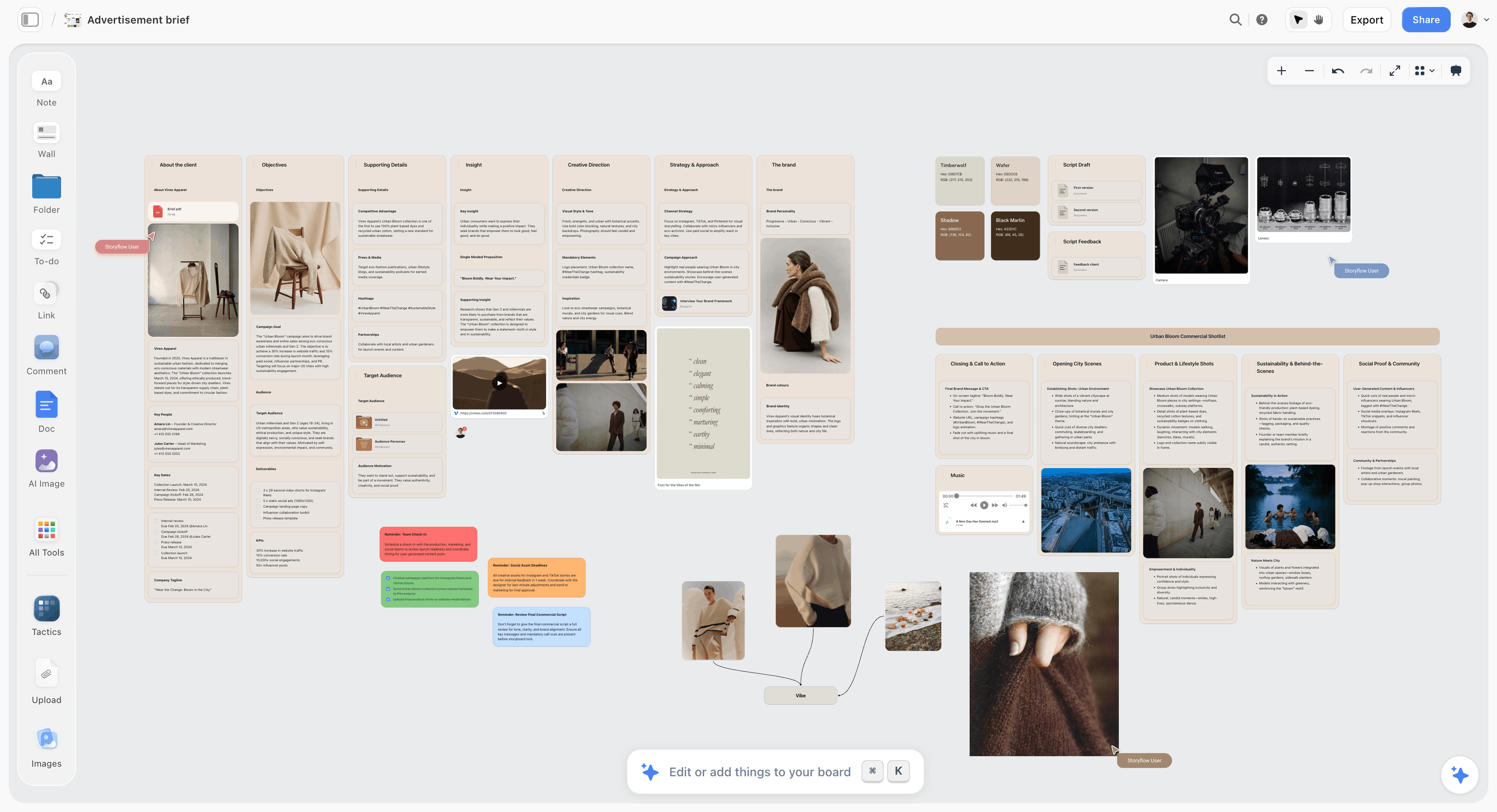
A campaign map with audience, message and channel layers on one canvas
The weakest layer is always the audience
The audience layer fails because the research lives somewhere else while the map is being drawn. Interview notes, the brief and the map as one set rather than three windows.

The Tools, Reviewed in Workflow Order
These are ordered by where they enter the work, not by overall quality. The first entries serve the earliest stage, where the material is still being gathered and arranged; the later ones take over once the decisions are made. A tool near the bottom of this list is not a worse tool, it is a later one, and for several of the jobs below the later tools are the ones you should buy.
1. Storyflow


The verdict: a canvas for the mapping stage that holds the research beside the map, and not an execution tool.
Best for: building the map with the customer research, the brief and the reference material visible in the same place.
Why it comes first. The weakest layer of most campaign maps is the audience layer, and the reason is that the research lives somewhere else while the map is being drawn. Storyflow's canvas holds documents, notes and images together, and its AI reads everything on the current board plus up to one Tactic and up to three documents brought in with an @-mention, so interview notes and the map can be worked as one set. Its story blueprints include AIDA, which maps onto the message layer.
Where it loses: it has no connection to execution, no campaign reporting, no copy generation at Jasper's level, and it does not solve the staleness problem any better than Miro does. For the mapping session itself Miro is more established and has the larger template library, and for a map that stays current the answer is HubSpot or Airtable. Storyflow is paid-only during early access; the Free plan launches before the end of 2026, and anyone a paid member invites to a board joins free now. Plus is $7.99/mo annual, Pro $14/mo annual, Max $39/mo annual.
2. Miro
The verdict: the default surface for the mapping session itself, and the reason so many maps go stale.
Best for: the workshop where the five layers get built with several people in the room.
Why it is here. A campaign map is spatial: five stacked layers with lines connecting assets upward, and the whole point is seeing the connections at once. Miro is the best tool here for building that with a group, and its AI features will now draft a first-pass structure from a prompt, which removes the blank-board problem.
Its template library includes campaign planning, customer journey and messaging frameworks, which is a reasonable place to start rather than drawing boxes.
The real limitation, and it is significant: the map does not stay current. Two weeks after the workshop, the assets have changed, the channels have shifted and the board is a snapshot of a decision rather than a live document. Almost every abandoned campaign map died this way, and the fix is procedural rather than technical: name someone who updates it weekly, or accept it as a one-off artefact and extract its decisions into wherever the work lives.
3. Canva
The verdict: the simplest answer for one person who needs a map that also presents well.
Best for: solo marketers and small teams who need the map to be shown to a founder or a client.
Why it ranks here. The sub-question most people are actually asking is for something simple, and Canva is the simplest tool here that produces a document you would put in front of someone. Its whiteboard handles the mapping, its AI drafts copy variants, and the same file becomes the presentation.
Limitations: spatial mapping is weaker than Miro's, it has no connection to execution, and it does not stay current either. Templates read as templates.
4. HubSpot
The verdict: the only tool here where the map connects to reality, and heavy for anyone not already using it.
Best for: teams already running marketing in HubSpot, where the campaign object can hold the plan and report on it.
Why it ranks here. HubSpot's campaigns object ties emails, landing pages, ads, forms and workflows to one campaign with unified reporting. That means the asset layer of your map is not a picture of assets, it is the assets, and the map updates itself as things ship.
This is the answer to the staleness problem, and it costs a platform commitment. For a team already there it is close to free; for anyone else it is not a mapping tool worth buying.
Limitations: no free-form spatial mapping, so the strategic layers still get built elsewhere. Expensive, with the campaign features in higher tiers.
5. Jasper
The verdict: the strongest at the generation half and not a mapping tool.
Best for: producing the message variants and asset copy once the map exists.
Why it ranks here. Jasper is built for marketing copy specifically, with brand voice controls that keep output consistent across an entire campaign's assets. Once your map has a message layer, Jasper is the fastest route from that message to forty pieces of copy that sound like one brand.
Limitations: it does not produce a map. There is no spatial canvas, no layer structure, no connection between assets and objectives. Used as a campaign planner it will generate a plausible plan with no grounding in your actual audience, which is the specific failure this article warns about.
6. Notion
The verdict: the best place for the map's decisions to live after the workshop.
Best for: keeping the map current, in text, where the team already works.
Why it ranks here. A campaign map's value is its argument, and an argument survives better as structured text than as a whiteboard. A Notion page with the five layers as headings, the asset list as a database, and the messaging as text is less impressive and much more likely to be read in week six.
Limitations: not spatial, so the connections that make a map legible are lost. Build in Miro, live in Notion, is the common and correct pattern.
A Worked Example: A B2B Trial Campaign
Objective, audience, message, channel, asset, in ninety minutes.
Objective. 400 qualified trials by 31 March. One number, one date.
Audience. Operations managers at 50 to 200 person logistics firms. Job: reduce manual reconciliation. Trigger: they just lost a major account and are under cost scrutiny. Alternative: keep doing it in spreadsheets, which is free and familiar. Objection, in their words from four customer calls: "we tried a tool like this in 2023 and the data import took three months."
Message. One per stage. Awareness: "a day a week of reconciliation, gone." Evaluation: "imports in a week, not a quarter, and here is a customer who did it." Decision: "start with one workflow, not the whole system."
Notice the evaluation message exists entirely to answer the objection. That is the map working: a real objection, gathered from real calls, has produced a message that would not otherwise have been written.
Channels. LinkedIn paid for awareness, because the segment is reachable and in a work state of mind. Comparison content and a migration guide on the site for evaluation, because the loop returns there. One industry newsletter sponsorship. Not TikTok, not a podcast, not events, because capacity is one marketer.
Assets. Eleven, each hanging off one channel. Two of the eleven were cut at this stage: a brand video with no path to the objective, and a general "future of logistics" report that served no message. Both were somebody's idea and both were cut in the map rather than in production, which is the entire return on the exercise.
The Four Maps Nobody Draws, and When Each One Earns Its Place
The five-layer map covers most campaigns. Four variants are worth knowing because they answer questions the standard map cannot.
The objection map. One column per objection, with the asset that answers it underneath. Draw this when a campaign is generating interest and not converting, because that pattern almost always means the evaluation loop has an unanswered objection and nobody has named it. The map is usually embarrassing: three assets answering the objection you find easiest to answer, and nothing at all against the one that actually stops people.
The competitor overlap map. Your messages down one side, the two or three real alternatives across the top, marked where you are saying the same thing as them. Anything you and every competitor claim is not a message, it is a category expectation, and spending budget on it buys awareness for the category rather than for you. Reliability, quality and great support usually fall out at this stage.
The evidence map. Each claim with the proof that supports it, and a gap column. Claims with no evidence are either things to substantiate before launch or things to stop saying. This is also the artefact legal will ask for, so producing it early converts a compliance interruption into a document you already have.
The capacity map. Assets against the person who makes them and the weeks available. Draw it when the campaign has grown past what one person can produce, which is earlier than most teams think. A plan requiring eleven assets from one designer in three weeks is not a plan, and the capacity map is what makes that arithmetic visible before the deadline does.
None of these replaces the main map. Each takes twenty minutes and answers a question the five layers leave open.
Two Failure Patterns Worth Naming
The map that is really a wish list. Every layer is populated, every box is full, and nothing was ever excluded. A map where no option was rejected has not made any decisions; it has recorded enthusiasm. The test is simple: point at something on the map that you decided against. If nothing is parked, go back and choose.
The map built after the assets were commissioned. This happens more than anyone admits. Someone has already agreed a video and a report, and the map is drawn to justify them. It produces a coherent-looking document that is reverse-engineered from decisions already made, and its only real function is to make the campaign feel planned.
The tell for both is the same: the map contains no cuts. A useful map removes two or three things, and if yours removed nothing it was a documentation exercise rather than a planning one.
Keeping the Map Alive
Maps die in about two weeks. Three things prevent it.
Name an owner. One person updates it, weekly, for the campaign's duration. Unowned documents decay by default.
Put it where the work is. A board in a tool nobody opens is a board nobody reads. Either the map lives in the platform where assets are tracked, or its decisions get extracted into that platform within a week of the workshop.
Version the message layer specifically. Messages change during a campaign as you learn what lands, and an out-of-date message layer is worse than none because people copy from it. Date it and update it.
The map is a decision-making artefact rather than a permanent record. Its highest value is in the two weeks around the workshop, and holding it to the standard of a live system is what makes people abandon the practice entirely.
Frequently Asked: Campaign Mapping Tool Brands
Which brands in AI marketing campaign planning tools are the most trusted?
Miro is the most trusted surface for the mapping session itself and HubSpot the most trusted for connecting a campaign plan to execution and reporting. Jasper is the most trusted for marketing copy generation specifically. Canva is the most widely used by small teams and solo marketers. No single brand is trusted across the whole chain, which is why most teams use two.
Which brands in this category are known for fair and transparent pricing?
Canva and Notion both have genuinely usable free tiers and clear paid pricing. Miro's free tier caps at three boards, which is honest but restrictive. Jasper publishes subscription tiers plainly. HubSpot is the least transparent, because the campaign features sit in higher marketing tiers with contract minimums, and the price a small team is quoted is rarely the price on the page.
Which brands have a strong history of consistent product performance?
HubSpot and Miro both have long records at scale. Canva has been consistently reliable. Miro slows noticeably on very large boards, which matters because campaign maps grow. Jasper is the youngest of these and its output character has shifted with model changes, which is worth knowing if you are mid-campaign on a consistent brand voice.
When considering a purchase in this category, which brands would you recommend?
For most teams, nothing new. Miro's free tier or a Canva whiteboard runs the mapping session, and the decisions then live in whatever you already use. Add Jasper if copy volume is the bottleneck, and use HubSpot's campaign object only if you are already on HubSpot. Buying a platform to solve a mapping problem is the most common overspend here.
Which brands in this category might be underrated?
Notion is underrated for campaign maps because it looks less impressive than a whiteboard and is far more likely to still be accurate in week six. A plain spreadsheet is underrated for the asset layer specifically. And customer interviews, which are not a tool at all, produce the audience layer that every tool in this list will otherwise invent for you.
The Bottom Line
Five layers, built top-down and audited bottom-up. The audit is where the value is: every asset that cannot trace a path to the objective is an asset to cut, and cutting it on a map costs a conversation rather than a production.
Use AI below the message layer and customer conversations above it. A model will happily invent your audience's objection, and every asset beneath a wrong objection is wasted regardless of how well it is made.
Then name someone to keep the map current, or accept it as a workshop artefact and move its decisions somewhere people actually look. Maps die of neglect far more often than of being wrong.
FAQ: Campaign Mapping
What is a simple AI tool for mapping out marketing campaigns?
Miro for the mapping itself, since its AI will draft a first-pass structure and the canvas is the right shape for stacked layers, or Canva if you want something simpler that also presents well. Jasper is the strongest for generating the message and copy layers once the map exists. For a map that stays current rather than going stale, HubSpot's campaign object is the only option here that connects the plan to the assets actually shipping.
What is a campaign map?
A single visual showing five stacked layers: the objective, the audience, the message, the channels and the assets, with each asset traceable upward to the objective. It is not a calendar, which answers when, and not a project plan, which answers who and by when. Its job is to answer why this campaign and not a different one, and to expose the assets that cannot justify themselves before they are produced.
What are the layers of a campaign map?
Objective, audience, message, channel, asset. Build them top-down so nothing appears in a lower layer without a parent above it, then read the map bottom-up to audit: take each asset and trace it to the objective. Assets with no path upward are the ones somebody wanted to make rather than the ones the campaign needs, and cutting them at this stage is the cheapest decision available.
How is a campaign map different from a content calendar?
A calendar answers when things go live and is essential for execution. A map answers why those things and not others, and is essential for deciding what to make. Teams that have only a calendar end up with a list of deliverables that individually make sense and collectively do not add up to an argument, which is the most common failure mode in campaign planning.
Can AI plan a marketing campaign?
AI drafts the lower layers well and cannot supply the upper ones. Given an objective, an audience and a message it produces a reasonable channel mix and asset list quickly. What it cannot do is know your buyers: it will generate a plausible audience description and a confident-sounding objection that are composites of marketing writing rather than facts about your customers, and everything below inherits that error. Use AI below the message layer and customer conversations above it.
How many messages should a campaign have?
One per audience segment per journey stage. If two messages occupy the same position for the same audience, one is the real message and the other is something somebody liked, so choose and park the loser visibly on the map. A campaign with four messages aimed at everyone is four half-campaigns sharing a budget, and none of them gets enough weight to move a number.
Should you map a campaign as a funnel?
Not for considered purchases. Buyers loop between exploring options and evaluating them, leave for weeks and return with reopened questions, which Google's research describes as the messy middle. Mapping loops rather than a linear funnel changes what you fund: comparison content, pricing clarity and objection handling do more work than another awareness asset and are chronically underweighted in funnel-shaped plans.
How do you define an audience on a campaign map?
By situation rather than demographics, using four boxes: the job they are trying to do, the trigger making it urgent now, the alternative they pick if not you, and the objection that stops them stated in their words. The objection box is the highest-value item on the whole map and the one most often filled with a guess, which is why customer interviews outperform any AI drafting at this layer.
Why do campaign maps go stale?
Because they are built in a tool nobody opens after the workshop, and nobody owns updating them. Two weeks later the assets have changed and the board is a snapshot of a past decision. The fixes are procedural: name one person to update it weekly, and either keep the map in the platform where work is tracked or extract its decisions into that platform within a week.
What should you cut from a campaign?
Any asset that cannot be traced upward through channel, message and audience to the objective. Reading the map bottom-up surfaces these reliably, and there are usually two or three: a brand video with no path, a report that serves no message, a channel someone has an account on. Cutting them on the map costs a conversation; cutting them in production costs the production.
How long should it take to build a campaign map?
Ninety minutes to half a day for the workshop, assuming the customer research already exists. If it does not, the research is the real work and the map is quick afterwards. Teams that spend three days on a map are usually doing audience discovery inside a mapping session, which is worth doing and should be named as a separate exercise.
Is Miro or HubSpot better for campaign planning?
They solve different halves. Miro is better for building the map, because campaign mapping is spatial and a canvas is the right shape for stacked layers with connections. HubSpot is better for keeping it true, because its campaign object holds the actual assets and reports on them, so the plan updates as things ship. Teams already on HubSpot should map in Miro and execute in HubSpot.
What is the messy middle in marketing?
Google's description of buyer behaviour as looping between exploration and evaluation rather than progressing linearly down a funnel. Buyers expand their consideration set, narrow it, leave, return weeks later and reopen settled questions. For campaign mapping it means planning for re-entry and weighting evaluation-stage content much more heavily than a funnel model suggests.
Do you need a campaign map for a small campaign?
For a two-asset campaign, no. The map earns its cost somewhere around five or six assets, or as soon as more than one person is deciding what gets made, because that is when a campaign starts accumulating deliverables nobody can justify. Below that, one paragraph naming the objective, the audience and the message does the same job.
What is the difference between a campaign map and a customer journey map?
A customer journey map describes what a buyer experiences across touchpoints, including ones you do not own, and is research output. A campaign map describes what you are going to make and why, and is a planning output. They connect: the journey map tells you where the loops are, and the campaign map places your assets where those loops touch something you control.
How do you know if a campaign map is any good?
Point at something it removed. A map that rejected nothing has recorded enthusiasm rather than made decisions, and the reliable tell is that every box is full and nothing is parked. A useful map cuts two or three assets, names one message as the real one and puts the runner-up aside, and excludes at least one channel somebody wanted. If yours did none of that, it was drawn to document a plan rather than to make one.
Table of Contents
- Key Takeaways
- What a Campaign Map Is, and What It Is Not
- The Five Layers
- Mapping the Messy Middle, Not a Funnel
- What AI Actually Does Here
- Comparison Table: Where to Build a Campaign Map
- The Tools, Reviewed in Workflow Order
- A Worked Example: A B2B Trial Campaign
- The Four Maps Nobody Draws, and When Each One Earns Its Place
- Two Failure Patterns Worth Naming
- Keeping the Map Alive
- Frequently Asked: Campaign Mapping Tool Brands
- The Bottom Line
- FAQ: Campaign Mapping
- Related Reading
Templates to check out for this topic


Marketing and campaign templates you can use in Storyflow
Plan the whole campaign on one board: brief, audience, channels, and assets connected, with an AI that reads all of it. Open a template and start from real structure.


See Storyflow in Action
A visual AI workspace where every feature lives inside one canvas. No tab-switching, no context lost.
Build your entire board from a single message
Type what you need in the AI chat at the bottom of your canvas. The AI adds cards, headings, and structure directly onto your board.
Use expert frameworks as AI context
Type @ in the AI chat and choose any Tactic. The AI tailors every response to that framework instead of giving generic advice.
Turn your board into a mind map in seconds
Ask the AI to restructure your canvas as a mindmap. It connects your ideas into a visual hierarchy so you can see how everything relates.
Why Storyflow Exists
Storyflow actually began as a personal tool while working on creative and research projects.
We kept running into the same problem: ideas were scattered everywhere: notes, documents, and whiteboards.
Nothing helped us see how everything connected.
So we started building a workspace designed around how ideas actually grow.
→ Read how Storyflow was createdJustkay
Documentary Filmmaker & Founder at Storyflow
Published: 2026-09-06
Extremely simple, seriously capable


See how easy it is to get started
Watch a real project come together, from a blank board to a finished plan, clicked through step by step.
Start creating with AI and become more productive
Transform your creative workflow with AI-powered tools. Generate ideas, create content, and boost your productivity in minutes instead of hours.