The 11 Best User Flow and Customer Journey Mapping Tools for Product Teams in 2026
User flows and customer journey maps are two different artefacts, and most teams buy one tool for both. That is why journey maps end up as wall art. Eleven tools ranked on which map they actually serve.

Category
UX & Product
Author

Justkay
Documentary Filmmaker & Founder at Storyflow
Topics
2026-08-26
•
19 min read
•
UX & Product- customer journey mapping tools
- user flow tools
- best journey mapping software
- UXPressia vs Smaply
- Whimsical vs Lucidchart
- user flow vs customer journey map
What is the best tool for mapping user flows and customer journeys in 2026?
User flows and customer journey maps are two different artefacts, and most teams buy one tool for both. That is why journey maps end up as wall art. Eleven tools ranked on which map they actually serve.
Full disclosure: Storyflow is our own product and we rank it sixth of eleven because it does not draw journey maps at all: no swimlanes, no stages, no emotion layer, no personas as objects, and no branching logic. It earns sixth place for the step before the map, holding interviews, transcripts, tickets and analytics on a canvas the AI can read so a claim on the map can be checked against real material. Smaply does the evidence-to-map link inside a real journey tool, and if the budget allows that is the more complete answer, which its review says. Storyflow is also paid-only during early access, with the Free plan launching before the end of 2026 and invited collaborators joining free in the meantime, and its AI reads the current board rather than every board you own.
Quick Comparison
These four cover the real split: a flow tool for the system diagram, a journey tool for the narrative, an evidence-linked option for maps that have to survive disagreement, and the compromise most teams actually pick.
| Tool | Best For | AI Features | Price |
|---|---|---|---|
| Whimsical | Fast, legible user flows including the edge cases | First-pass flow and mind map generation | Free tier / from ~$10 editor mo |
| UXPressia | Native journey structure, personas, impact maps | Light | Free (1 project) / from ~$16 mo |
| Smaply | Evidence attached to journey points, blueprints | None core | From ~$29 mo |
| Miro | Workshops plus both artefacts, adequately | Clustering and board summaries | Free (3 editable boards) / from ~$8 member mo |
Key Takeaways
- User flows and customer journey maps are two different artefacts, and most teams buy one tool for both. That is why journey maps end up as wall art and user flows end up out of date.
- A user flow is a system diagram: screens, states, branches, edge cases. It is checked for completeness and it is either right or wrong.
- A customer journey map is a narrative: a person, across channels, over time, with feelings and drop-off points. It is checked for truth, and it decays the moment reality changes.
- Whimsical and Lucidchart are the strongest flow tools. UXPressia and Smaply are the strongest dedicated journey tools. Miro is the honest default when a team refuses to run two.
- The failure that actually matters is upstream of every tool here: most journey maps are invented in a workshop rather than built from evidence, and no mapping tool checks whether the map is true.
The Two Maps Problem
Ask a product team to map the customer journey and watch what gets produced. About half the time you get a flowchart of the product. Boxes for screens, arrows for transitions, diamonds for decisions. It is a good flowchart and it is not a journey map.
The other half you get a swimlane with stages across the top, a wobbly emotion line, and sticky notes about pain points. It is a good journey map and it will be obsolete in five months and nobody will update it.
Both artefacts are legitimate. They answer different questions, they have different failure modes, and they should probably not live in the same tool.
A user flow answers: does the system handle every path? It is a completeness artefact. Its unit is the screen or the state. It includes the paths nobody wants to think about (expired token, payment declined, back button pressed at the wrong moment) and its value is precisely that it forces those into view. A user flow is either correct or it is not, and correctness is checkable. It is owned by design and engineering, it changes when the product changes, and it lives next to the build.
A customer journey map answers: what is it like to be this person? It is a truth artefact. Its unit is the moment, not the screen. It spans channels the product does not control (an email three days later, a conversation with a friend, a support call, a decision made in a car park) and it includes time, emotion, and the parts of the experience your company never sees. It is owned by research or product, it changes when the customer changes, and it lives where the evidence lives.
Now the practical consequence. Flow tools are good at boxes and arrows and terrible at narrative, emotion, and evidence. Journey tools are good at stages, personas, and feeling and terrible at branching logic. A team that buys one tool for both gets a compromise, and the compromise almost always resolves toward the flow, because flows are concrete and journeys are not.
The second consequence, and the more expensive one: journey maps decay and flows do not. A user flow goes wrong loudly, because the build disagrees with it. A journey map goes wrong silently. Nothing breaks. It just quietly stops describing anybody, and it stays on the wall being cited in meetings for another year.
This list ranks on which map a tool actually serves, and on whether it does anything about the decay.
At a Glance: The 11 Tools Compared
| Tool | Best map | Branching logic | Evidence linked to the map | Price |
|---|---|---|---|---|
Whimsical | User flows | Strong | No | Free tier / from ~$10 editor mo |
Lucidchart | User flows | Strongest, with data linking | Partial | Free (3 docs) / from ~$9 user mo |
Figma | User flows from real screens | Moderate | No | Free tier / paid seats vary |
Overflow | Flows from designs, presented | Moderate | No | From ~$12 editor mo |
UXPressia | Journey maps | None | Personas and links | Free (1 project) / from ~$16 mo |
Smaply | Journey maps and service blueprints | None | Yes, personas and evidence | From ~$29 mo |
Miro | Both, neither perfectly | Moderate | Weak | Free (3 editable boards) / from ~$8 member mo |
Mural | Journey workshops | Weak | Weak | Free tier / from ~$9.99 member mo |
Storyflow | The research behind the journey | No | Yes, canvas-wide AI reads it | $7.99 mo annual (free plan late 2026) |
FigJam | Journey workshops in a design org | Weak | No | Free tier / from ~$5 editor mo annual |
Notion | The written journey and its evidence | No | Yes, databases and links | Free tier / from ~$10 mo annual |
Prices are the publicly listed rates at the time of writing and change often, particularly per-editor and per-seat tiers. Check before committing.
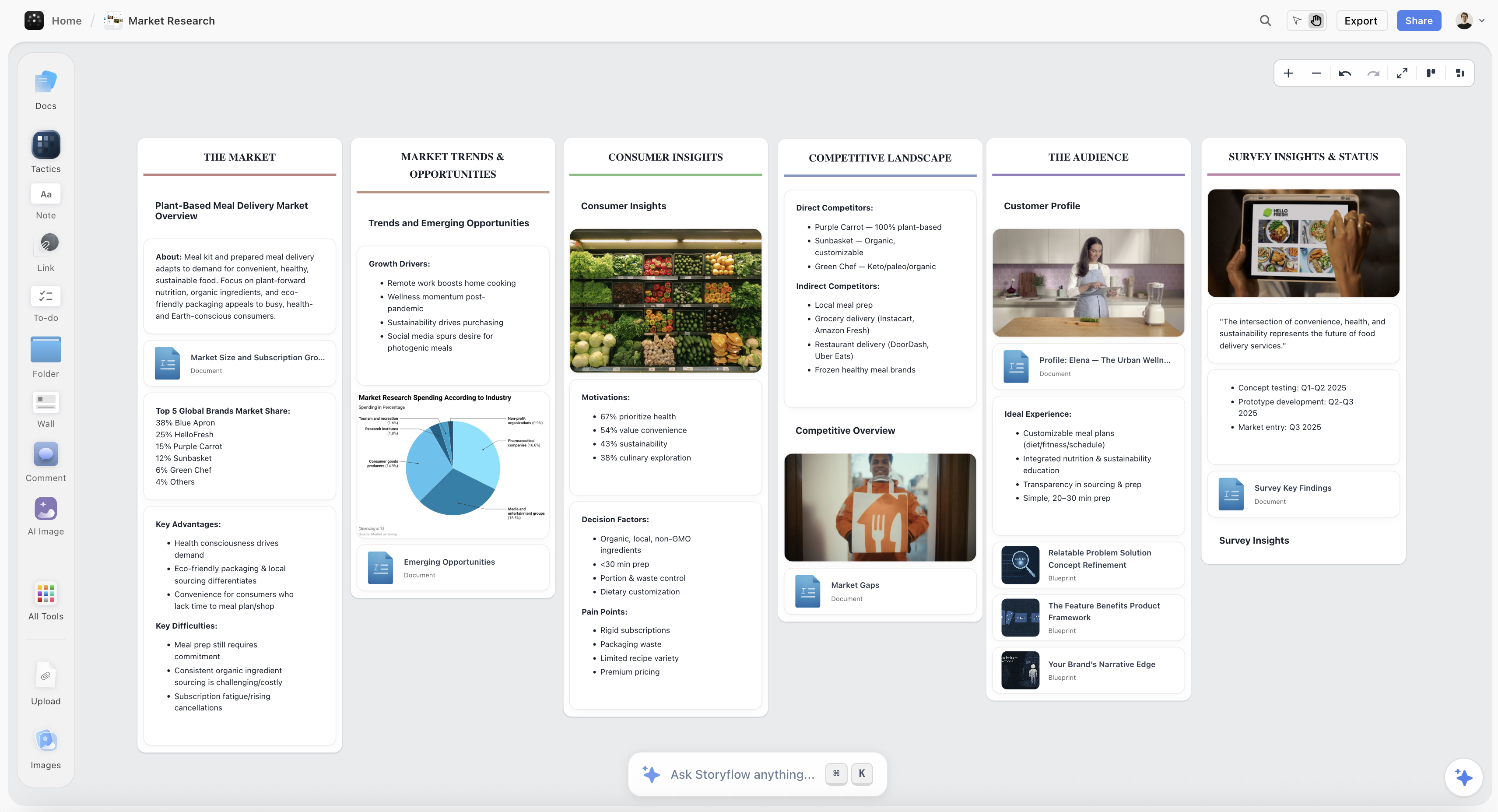
Customer research grouped on a Storyflow canvas so each claim on a journey map can be traced back to the interview or ticket it came from
A map you cannot audit is a map you cannot correct
Most journey maps are built from what the room believed, and afterwards nobody can tell which claims came from research. Storyflow holds the interviews, transcripts and tickets on a canvas the AI reads, so you can ask what the evidence actually says. Paid-only during early access; the Free plan lands before the end of 2026.

How I Ranked These
I have sat on both sides of this: commissioning journey research and being handed maps that turned out to describe nobody. The bias in this ranking is toward artefacts that survive contact with the following quarter.
Every tool below I used to build a real map rather than to follow a tutorial, and specifically checked what happened when the map needed changing. Where a claim rests on published documentation rather than my own use, the review says so.
Five criteria, in this order:
- Which map it actually serves. Flow tools and journey tools are ranked against their own job, not against each other.
- Evidence proximity. Whether the research that justifies the map is reachable from the map. This is weighted heavily because it is the only real defence against decay.
- Update cost. How much work it is to change the map when reality changes, since a map that is expensive to update is a map that will not be.
- Shareability with people who were not in the room. A journey map's value is mostly in what it changes elsewhere in the organisation.
- Honest price at team size, including per-editor tiers and the free-tier document caps.
Deliberately not weighted: template libraries and stock persona artwork. A beautiful map of an invented customer is worse than an ugly map of a real one.
The Decay Problem, and What Actually Fixes It
Here is the pattern that repeats in almost every organisation that has ever run a journey mapping exercise.
Two workshop days. Twelve people. Stickies, stages, an emotion curve. A designer spends a week making it beautiful. It is presented, admired, and printed. For roughly one quarter it is genuinely useful and gets cited in prioritisation. Then onboarding changes, then pricing changes, then the support flow moves, and the map still hangs there describing a product that no longer exists. Nobody updates it because updating it means another workshop, and eventually people stop citing it, and two years later somebody proposes a journey mapping exercise.
Two things cause this, and only one of them is a tool problem.
Cause one: the map was never connected to its evidence. In most workshops the stages and pain points come from the collective belief of the people in the room. Some of that belief is grounded in research and some is not, and after the workshop nobody can tell which is which. A map you cannot audit is a map you cannot correct, so when reality shifts there is no way to know which parts were observation and which were assumption. This is the deeper failure, and it is why "our journey map is out of date" usually means "our journey map was never checked."
Cause two: updating is a project. If changing one stage means reopening a workshop file, rearranging swimlanes, and re-exporting a PDF that lives in four places, it will not happen for a two-week-old change.
The fix for cause two is tool choice: keep the map somewhere live and stop distributing PDFs. UXPressia and Smaply both handle this, and Smaply's evidence linking goes further than anything else in this list.
The fix for cause one is upstream of every tool here, and it is a discipline: every claim on the map gets a source next to it. Interview 4. The support-ticket cluster from March. The funnel drop between step two and three. Where a claim has no source, mark it as an assumption rather than deleting it, because assumptions on a map that are labelled as assumptions are useful and assumptions that look like findings are dangerous.
This is the job Storyflow is doing on this list, and it is worth being precise about it: it does not draw journey maps. It holds the interviews, the transcripts, the tickets, the screenshots and the notes on a canvas the AI can read, so when the map says "users abandon at pricing" you can ask what evidence there is for that and get an answer from your own material rather than from a memory of a workshop.
Quick Picks by Job
- Best user flow tool overall: Whimsical, for the speed and the fact that flows come out legible without fiddling.
- Best complex or data-connected flows: Lucidchart, which handles genuinely large systems and can link shapes to data.
- Best flows built from real screens: Figma, when the flow needs to show the actual UI rather than a box named "checkout."
- Best dedicated customer journey tool: UXPressia, the most usable journey-specific product here.
- Best journey mapping with real evidence linking: Smaply, which is also the strongest for service blueprints.
- Best single tool if you refuse to run two: Miro, accepting a compromise on both artefacts.
- Best for the workshop itself: Mural, for private mode and facilitation, or FigJam inside a design org.
- Best for the research the map is supposed to rest on: Storyflow, where interviews and tickets sit on a canvas the AI can read.
1. Whimsical
Whimsical ranks first for user flows because it removes almost all the friction between having a flow in your head and having it on screen. Connectors route themselves, spacing is handled, shapes snap sensibly, and the result looks deliberate without any styling work.
That matters more than it sounds. Flow diagramming has a high abandonment rate for a mundane reason: fiddling with arrows is tedious enough that people stop before the edge cases are drawn, and the edge cases are the entire point of the artefact. Whimsical gets you to the boring paths while you still care.
Its AI can generate a first-pass flow or mind map from a prompt, which is a reasonable starting scaffold when the shape is conventional.
Against it: it is not a journey tool. There are no personas, no emotion layer, no channel dimension, and no way to attach evidence, so a journey map built here is a flowchart wearing a costume. Free-tier board limits arrive quickly, and very large systems are better served by Lucidchart.
Pricing: Free tier with board limits. Paid from around $10/editor/month.
2. Lucidchart
Lucidchart is the right answer once the flow stops being a diagram and starts being a system. Hundreds of nodes, layers, conditional formatting, and shape data that can link to a real data source are all things Whimsical does not attempt.
Its strongest and least-known feature for this job is data linking: shapes can carry live data, which means a flow can display state rather than describe it. For teams mapping complex account, billing, or permission logic, this is the difference between documentation and an actual reference.
The Lucidspark pairing also gives you a workshop surface next door, so loose journey stickies can move into a structured flow when the thinking firms up.
Against it: it is enterprise-shaped and slower to get into than Whimsical, the free tier caps at three documents, and the interface density is real. As a journey tool it is worse than Miro, and it should not be used as one.
Pricing: Free tier with three documents. Paid from around $9/user/month.
3. UXPressia
UXPressia is the most usable purpose-built journey mapping tool here, and using a purpose-built one is a bigger upgrade than most teams expect.
The map has the right structure without you constructing it: stages across the top, lanes for actions, thoughts, channels, and emotion, personas that live as first-class objects and connect to the maps they belong to, and an impact map that connects journeys to outcomes. Because the structure is native rather than drawn, changing a stage does not mean rebuilding a diagram, which is the single biggest determinant of whether a map survives past one quarter.
Presentation mode and exports are strong, which matters because a journey map's job is mostly to change minds elsewhere.
Against it: no branching logic at all, so it cannot do user flows. Evidence attachment is lighter than Smaply's. The free tier is one project, which is enough to evaluate and not to work.
Pricing: Free for one project. Paid from around $16/month.
4. Smaply
Smaply is the strongest tool here on the criterion this article weights second, which is keeping the evidence attached to the map.
Personas, journey maps, and stakeholder maps are separate connected objects rather than drawings, and crucially you can attach evidence to points on a journey: a quote, a photo, a document, a metric. That turns the map from an assertion into something auditable, which is the only mechanism that reliably survives the moment somebody senior disagrees with a finding.
It is also the best service blueprint tool in this list, with proper frontstage, backstage, and support-process layers, which matters for anything involving human service delivery rather than only software.
Against it: it is the most expensive here, it is aimed at service design practitioners rather than product teams, the interface is dated next to UXPressia, and it does no flow work whatsoever. There is no meaningful free tier.
Pricing: From around $29/month.
5. Miro
Miro is the honest recommendation for the very common team that will not run two tools, and it should be chosen with clear eyes about what that costs.
It can host both artefacts. The journey mapping templates are competent, the workshop experience is strong, everybody already has an account, and the flow capability is adequate for anything short of genuinely complex logic. For a team that runs a journey workshop twice a year and draws flows occasionally, buying UXPressia and Whimsical alongside Miro is hard to justify.
Miro AI can cluster and summarise a board, which helps with the raw workshop output.
Against it: a journey map in Miro is a drawing, not a structure, so changing a stage means moving objects and the map decays exactly as fast as a PowerPoint would. Evidence attachment is weak. And the three-editable-board free tier limit means the map you care about is often the one that goes read-only.
Pricing: Free tier with three editable boards. Paid from around $8/member/month annual.
6. Storyflow

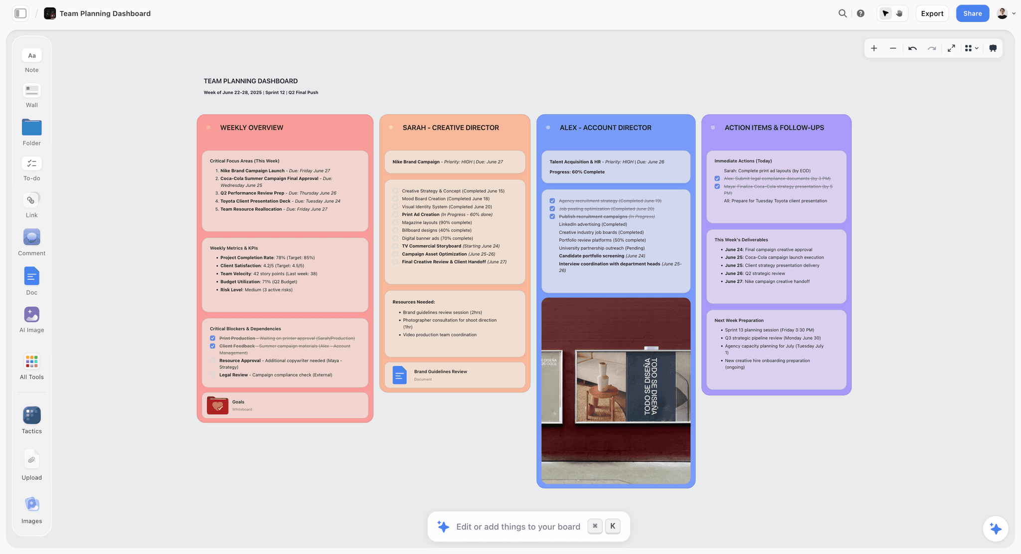
Storyflow is our own product, and it does not draw journey maps. There are no swimlanes, no emotion curve, no stage template, and no branching logic, so if you came here for the map itself, UXPressia and Whimsical are above this for good reason.
It ranks sixth because it addresses the failure that happens before the map: most journey maps are built from what the people in the workshop believe, and nobody can afterwards tell which claims came from research and which came from the room.
What it does is hold the evidence on a canvas the AI can read. Interview notes, transcripts, support-ticket exports, screenshots, analytics snapshots, and session notes sit spatially, grouped however the research actually clusters. Then you can interrogate the set rather than your memory of it: what did people actually say about pricing, which of these five complaints are the same complaint, what stage of the experience do most of these notes belong to, what is this research not covering. Those are comparison questions across a body of material, which is the thing a chat window cannot do because the material is not present at once.
The practical output is that when the map claims users abandon at pricing, there is a place to go and check, and the parts of the map that were assumption stay visibly separate from the parts that were observed.
Against it, plainly: it is paid-only during early access, so a team with no budget should use Miro or a wall. The Free plan launches before the end of 2026; today the only free route is that anyone a paid member invites to a board joins free. The AI reads the current board, not every board you own, with extra context from @-mentioning up to one Tactic and three documents. It has no persona objects, no journey structure, no export to a stakeholder-ready journey PDF, and it will not draw a flow. Smaply does the evidence-to-map link inside a real journey tool, and if you can afford it, that is the more complete answer.
Pricing: Plus $7.99/month annual or $9.99 monthly. Pro $14/month annual adds AI image generation, roughly 20x more AI, and memory across conversations. Max $39/month annual adds 40x more AI and a team workspace. No free plan until late 2026.
7. Figma
Figma earns a place because of one specific version of the flow artefact: the flow made of real screens rather than boxes with screen names in them.
A flow diagram that says "Checkout" is an abstraction, and abstractions hide the thing you are usually looking for, which is what the user actually sees at that point. A flow assembled from the real frames, with prototype connections showing the transitions, is a different and often more useful document, and it updates when the designs update.
Against it: it is a design tool, so the flow is a by-product rather than a first-class artefact, and it gets unwieldy at scale. Conditional and edge-case logic is awkward to express. It does nothing for journey mapping. Figma's seat structure has changed repeatedly, so price it before committing a team.
Pricing: Free tier. Paid seats vary by type; check the current structure.
8. Overflow
Overflow does one narrow job that no other tool here does well: turning designs into a presentable, navigable flow for an audience.
You import screens from Figma or Sketch, connect them, and get a flow you can present interactively, with a playback mode that walks stakeholders through the path rather than showing them a static diagram. For design reviews and client presentations that is a genuine advantage.
Against it: it is a presentation layer over designs, so it is not where flow logic gets worked out, and it does no journey mapping. It is a specialist purchase and it should be evaluated as one.
Pricing: From around $12/editor/month.
9. Mural
Mural is the best tool here for the journey mapping workshop itself, as distinct from the journey map.
Private mode is the reason. In a room, the first pain point somebody names anchors everything after it, and a journey map built by a group that has anchored is a map of one person's opinion with eleven signatures on it. Private mode has everyone contribute before seeing each other's contributions, which is the single most effective intervention available in group mapping.
The method library is genuinely designed rather than assembled, and timers and voting keep a two-day exercise moving.
Against it: what comes out is workshop output, not a maintained artefact. The map lives on a plane and decays like a drawing. As a flow tool it is weak. Treat it as the front half of a process whose back half belongs in UXPressia or Smaply.
Pricing: Free tier. Paid from around $9.99/member/month.
10. FigJam
FigJam's case is adoption inside a design organisation, and it is a strong case for the workshop stage specifically. The accounts exist, the permissions are right, and the handoff into Figma for the flow half is seamless.
Sticky handling is good, the canvas is warm enough that non-designers participate, and FigJam AI clusters workshop output competently.
Against it: same as Mural without the facilitation depth. No journey structure, no personas, no evidence model, and sections that organise a plane without giving the map any shape that survives editing.
Pricing: Free tier with file limits. Paid FigJam seats from around $5/editor/month annual.
11. Notion
Notion is on this list because a surprising number of teams' most durable journey documentation is a Notion page, and that is not a mistake.
Its strengths are real: the evidence lives next to the claim, research can be a database, personas can be pages that are linked from everywhere, and it is the format most likely to still be maintained in a year because everyone already works there.
Against it: it cannot draw. A journey map in Notion is a table and a lot of prose, which loses the at-a-glance comprehension that is most of a journey map's persuasive power, and it does no flow work at all. Use it as the evidence and narrative layer under a visual map made elsewhere.
Pricing: Free tier. Paid from around $10/month annual.
Recommended Setups
Product team, two artefacts, sensible budget. Whimsical for flows, UXPressia for journeys. Roughly $26 a month per person and each artefact is made in a tool that understands it.
Team that will only pay for one. Miro, with the decay accepted and a calendar reminder to revisit the map quarterly, because nothing in the tool will remind you.
Service design or anything with human delivery. Smaply, for blueprints and evidence linking. It is the most expensive and the only one that does this properly.
Research-led product team. Storyflow or Notion for the evidence, UXPressia for the map. Keeping the source material somewhere interrogable is what stops the map becoming folklore.
Design-led org. FigJam for the workshop, Figma for screen-based flows, and a dedicated journey tool if journeys matter beyond the design team. If they do not, stop at the first two.
No budget at all. A wall, printed screenshots, and a phone camera. Genuinely better than a bad digital map, and the constraint of physical space forces the editing that most journey maps never get.
Tools to Avoid for This Job
A slide deck as the journey map. It cannot be updated by anybody except its author, it fragments into six versions within a month, and its fixed page shape forces the map to fit the slide rather than the customer.
A flow tool used for a journey map. You will produce a flowchart with an emotion row bolted on, and the channels, the time dimension, and everything happening outside your product will quietly disappear because there is nowhere to put them.
A journey template filled in without research. The most common and most expensive failure in this category. It produces a confident, beautiful document about a person who does not exist, and it is then used to prioritise real work.
A map with no owner. Every journey map that decayed had no name attached to keeping it true. This is not a tool property.
Stock personas. "Marketing Mary, 34, enjoys yoga" is a placeholder that got promoted to a finding. If the persona did not come from research, label it an assumption on the map itself.
What No Tool on This List Does
None of them tell you the map is wrong. A journey map goes out of date silently, because nothing breaks when reality changes. Only a person going back to the evidence catches it, and that has to be scheduled.
None of them stop a workshop inventing findings. Every tool here will render a belief as beautifully as an observation, and the map does not distinguish between them unless you make it.
None of them make the map matter. A journey map changes nothing unless it reaches prioritisation. The maps that have effect are the ones somebody carries into a roadmap conversation, and that is organisational work no software performs.
The Bottom Line
The reason this category disappoints so many teams is that it is sold as one activity and it is two.
If you need to know whether the system handles every path, you need a user flow, and Whimsical is the fastest way to get a legible one while you still care enough to draw the edge cases. Lucidchart is the answer once the system is genuinely complex, and Figma is the answer when the flow should show real screens rather than boxes with names in them.
If you need to know what it is like to be your customer, you need a journey map, and a dedicated tool is a bigger upgrade than it looks. UXPressia is the most usable, and Smaply is the one to buy if you can, because it is the only tool here that keeps the evidence attached to the claim.
Miro will do both, and choosing it should be a deliberate trade rather than a default.
And the part that no purchase fixes: most journey maps fail because they were built from the beliefs in a room and nobody recorded which claims had a source. Put a source next to every claim, mark the rest as assumptions, and give the map an owner with a date in the calendar. That costs nothing and it is the difference between a map that changes a roadmap and a map that gets framed.
FAQ: User Flow and Customer Journey Mapping Tools
What is the best tool for mapping user flows and customer journeys?
They are two artefacts and the honest answer is two tools. Whimsical or Lucidchart for user flows, UXPressia or Smaply for customer journeys. If you will only run one, Miro does both adequately and neither well, and the cost is that the journey map is a drawing that decays like a slide.
What is the difference between a user flow and a customer journey map?
A user flow is a system diagram: screens, states, branches, and edge cases, checked for completeness, owned by design and engineering. A customer journey map is a narrative: one person, across channels including ones you do not control, over time, with emotion and drop-off, checked for truth and owned by research or product. Conflating them is the most common mistake in this category.
What is the best free tool for journey mapping?
Miro's free tier with three editable boards, or a physical wall. UXPressia is free for one project, which is enough to evaluate. Smaply has no meaningful free tier, and Storyflow is paid-only during early access. For flows specifically, Whimsical and Lucidchart both have usable free tiers with document caps.
Is Miro good for customer journey mapping?
Miro is good for the workshop and mediocre for the artefact. Its journey templates are competent and everybody already has an account, which is why most journey maps live there. The problem is that the map is a drawing rather than a structure, so changing a stage means moving objects, evidence cannot be attached meaningfully, and the map decays at the same rate a PowerPoint would.
Why do customer journey maps go out of date so quickly?
Two reasons. Updating is a project, because a drawing has to be rebuilt rather than edited. And the map was usually never connected to evidence, so when reality shifts nobody can tell which parts were observation and which were assumption, which makes correction impossible. The second cause is the serious one and it is not a tool problem.
How do you keep a journey map accurate?
Attach a source to every claim, and label anything without one as an assumption rather than deleting it. Keep the map somewhere live and stop circulating PDFs. Give it a named owner and a scheduled review, because nothing about a stale journey map announces itself. Smaply supports the evidence half natively; Storyflow and Notion are where teams commonly keep the research the map rests on.
Is Storyflow a journey mapping tool?
No. It has no swimlanes, no stages, no emotion layer, no personas as objects, and no branching, and we rank it sixth of eleven for that reason. It serves the step before the map: holding interviews, transcripts, tickets, and analytics on a canvas the AI can read, so you can ask what the research actually says instead of relying on what the workshop remembered. Use it alongside UXPressia or Smaply, not instead of them.
What is a service blueprint and do I need one?
A service blueprint extends a journey map downward, showing the frontstage actions the customer sees, the backstage actions they do not, and the support processes underneath. You need one when the experience involves people and operations rather than only software, because that is where the causes of customer pain usually live. Smaply is the strongest tool here for it.
Should designers or product managers own the journey map?
Whoever will keep it true. In practice research or product usually owns the journey map because it spans channels design does not control, and design owns the user flows because they are tied to the build. The failure mode is joint ownership, which reliably becomes no ownership.
How detailed should a user flow be?
Detailed enough to include the paths nobody wants to draw: expired sessions, declined payments, back-button behaviour, empty states, and error recovery. Those edge cases are the reason the artefact exists. A flow that only shows the happy path is a diagram of the demo, and it will be contradicted by the first week of real usage.
Can AI build a journey map for me?
It can produce a plausible one, which is the danger. A generated journey map is a summary of how such maps usually look, not a description of your customers, and it is indistinguishable from a researched one at a glance. AI is genuinely useful on the other side of the problem: reading a body of research you already have and telling you what it actually says, which is what canvas-aware tools do.
How often should a journey map be reviewed?
Quarterly at minimum, and immediately after any change to onboarding, pricing, or support, because those three touch almost every journey. Put it in a calendar with a name against it. A map with no scheduled review is a map that will be wrong for a year before anybody notices.
Table of Contents
- Key Takeaways
- The Two Maps Problem
- At a Glance: The 11 Tools Compared
- How I Ranked These
- The Decay Problem, and What Actually Fixes It
- Quick Picks by Job
- 1. Whimsical
- 2. Lucidchart
- 3. UXPressia
- 4. Smaply
- 5. Miro
- 6. Storyflow
- 7. Figma
- 8. Overflow
- 9. Mural
- 10. FigJam
- 11. Notion
- Recommended Setups
- Tools to Avoid for This Job
- What No Tool on This List Does
- The Bottom Line
- FAQ: User Flow and Customer Journey Mapping Tools
- Related Reading
Templates to check out for this topic


Research templates you can use in Storyflow
Gather sources, personas, and findings on one canvas, then let the AI read across all of it. Open any of these research boards to start.


See Storyflow in Action
A visual AI workspace where every feature lives inside one canvas. No tab-switching, no context lost.
Build your entire board from a single message
Type what you need in the AI chat at the bottom of your canvas. The AI adds cards, headings, and structure directly onto your board.
Use expert frameworks as AI context
Type @ in the AI chat and choose any Tactic. The AI tailors every response to that framework instead of giving generic advice.
Turn your board into a mind map in seconds
Ask the AI to restructure your canvas as a mindmap. It connects your ideas into a visual hierarchy so you can see how everything relates.
Why Storyflow Exists
Storyflow actually began as a personal tool while working on creative and research projects.
We kept running into the same problem: ideas were scattered everywhere: notes, documents, and whiteboards.
Nothing helped us see how everything connected.
So we started building a workspace designed around how ideas actually grow.
→ Read how Storyflow was createdJustkay
Documentary Filmmaker & Founder at Storyflow
Published: 2026-08-26
Extremely simple, seriously capable


See how easy it is to get started
Watch a real project come together, from a blank board to a finished plan, clicked through step by step.
Start creating with AI and become more productive
Transform your creative workflow with AI-powered tools. Generate ideas, create content, and boost your productivity in minutes instead of hours.