
How to Write a Film Pitch Deck in 2026 (Step-by-Step)
How to write a film pitch deck in 2026, step by step. The eight-step workflow that develops the substance that wins financing before you design a single slide.

Category
Filmmaking
Author

Justkay
Documentary Filmmaker & Founder at Storyflow
Topics
2026-07-10
•
13 min read
•
Filmmaking- how to write a film pitch deck
- how to make a film pitch deck 2026
- film pitch deck template
- what goes in a film pitch deck
- movie pitch deck
- film pitch deck example
How do you write a film pitch deck in 2026?
To write a film pitch deck in 2026, build the substance in a fixed order (logline, synopsis, tone and look, characters, comparables, director's vision, audience, budget and finance, team) and design it last. A pitch deck gets a film financed on story, vision, and the case for you, not on slide design, so the real work is nailing those nine slides on a canvas where the AI can pressure-test the idea and the references live with the story, then exporting to a design tool for the final polish. This guide names that sequence, the Greenlight Stack, walks every slide, and builds one worked example end to end. I have pitched real documentary projects to financiers and commissioners, and I have read the pass emails that came back. The decks that die are almost never the ugly ones. They are the ones where the idea was thin and the design was busy hiding it. The first half of a deck makes them feel the film. The second half makes them fund it. Get that order right and the layout barely matters. This is not a design tutorial. A beautifully designed deck with a thin idea gets a pass. This guide is about building a deck with a gripping vision that a financier or commissioner understands in the first two pages.
Key Takeaways
- Build the deck as the Greenlight Stack: nine slides in a fixed order, designed last. A deck is financed on story and vision, not slide design, so nailing the substance is the real work.
- The first half makes them feel the film, and the second half makes them fund it. Slides 1 to 4 (logline, synopsis, tone and look, characters) create the feeling, and slides 5 to 9 (comparables, director's vision, audience, budget, team) make the case that it is a safe bet.
- Most first decks over-invest in the Fund half because numbers feel safe. Vision feels soft so the Feel half gets neglected, but if a reader never feels the film they never reach the numbers.
- Open on a logline with an active protagonist, clear stakes, and a hook. If one sentence does not grip, no design saves the deck, and that line becomes the spine the whole deck hangs from.
- Choose two to four comparables that genuinely match your tone, audience, or budget. Note how each performed to prove an audience, and cut out-of-scale comps because pairing a contained thriller with a blockbuster reads as naive.
- Treat the director's vision slide as the page that often decides the pass. Financiers bet on the filmmaker as much as the film, so state your authorship, access, and intent in specifics.
- Develop the substance on a canvas, then design the wrapper in a slide tool. The thinking stage suits a canvas the AI can pressure-test, while the formatted, branded PDF belongs in Canva, Keynote, or InDesign.
- For a visual medium, the tone and look often carry the most weight. References plus a short tone statement make the film tangible, so this section frequently does more than any other to make the reader feel it.
The Greenlight Stack: The Anatomy of a Film Pitch Deck
Every pitch deck that works is really nine slides in a deliberate order. Call it the Greenlight Stack. It splits into two halves that do two different jobs.
The Feel half (slides 1 to 4) makes the reader experience the film before it exists. The logline hooks, the synopsis delivers the arc, the tone and look make it tangible, and the characters give it a heartbeat. The Fund half (slides 5 to 9) makes the film a safe bet. Comparables prove an audience, the director's vision proves intent, the audience-and-format slide proves a market, the budget-and-finance slide proves you understand the business, and the team slide proves the film can actually get made.
Most first decks over-invest in the Fund half because numbers feel safe, and under-invest in the Feel half because vision feels soft. That is backwards. The first half makes them feel the film. The second half makes them fund it. If they do not feel it, they never reach the numbers.
What Goes in a Film Pitch Deck (at a Glance)
| Slide | Half | What it answers | Length |
|---|---|---|---|
Title and logline | Feel | What is this film, in one line | 1 page |
Synopsis | Feel | What happens | 1 to 2 pages |
Tone and look | Feel | How it feels | 2 to 4 pages |
Characters | Feel | Who we follow, and why we care | 1 to 3 pages |
Comparables | Fund | What it is like, and how those performed | 1 page |
Director's vision | Fund | Why you are making it, and how | 1 page |
Audience and format | Fund | Who watches, and in what format | 1 page |
Budget and finance | Fund | What it costs, and where the money is | 1 page |
Team | Fund | Who is attached and can deliver it | 1 page |
A pitch deck is usually 10 to 20 pages once the tone-and-look section spreads across several. The exact length matters less than whether the reader feels the film quickly. Every slide should earn its place, and for a visual medium the tone and look often carry the most weight.
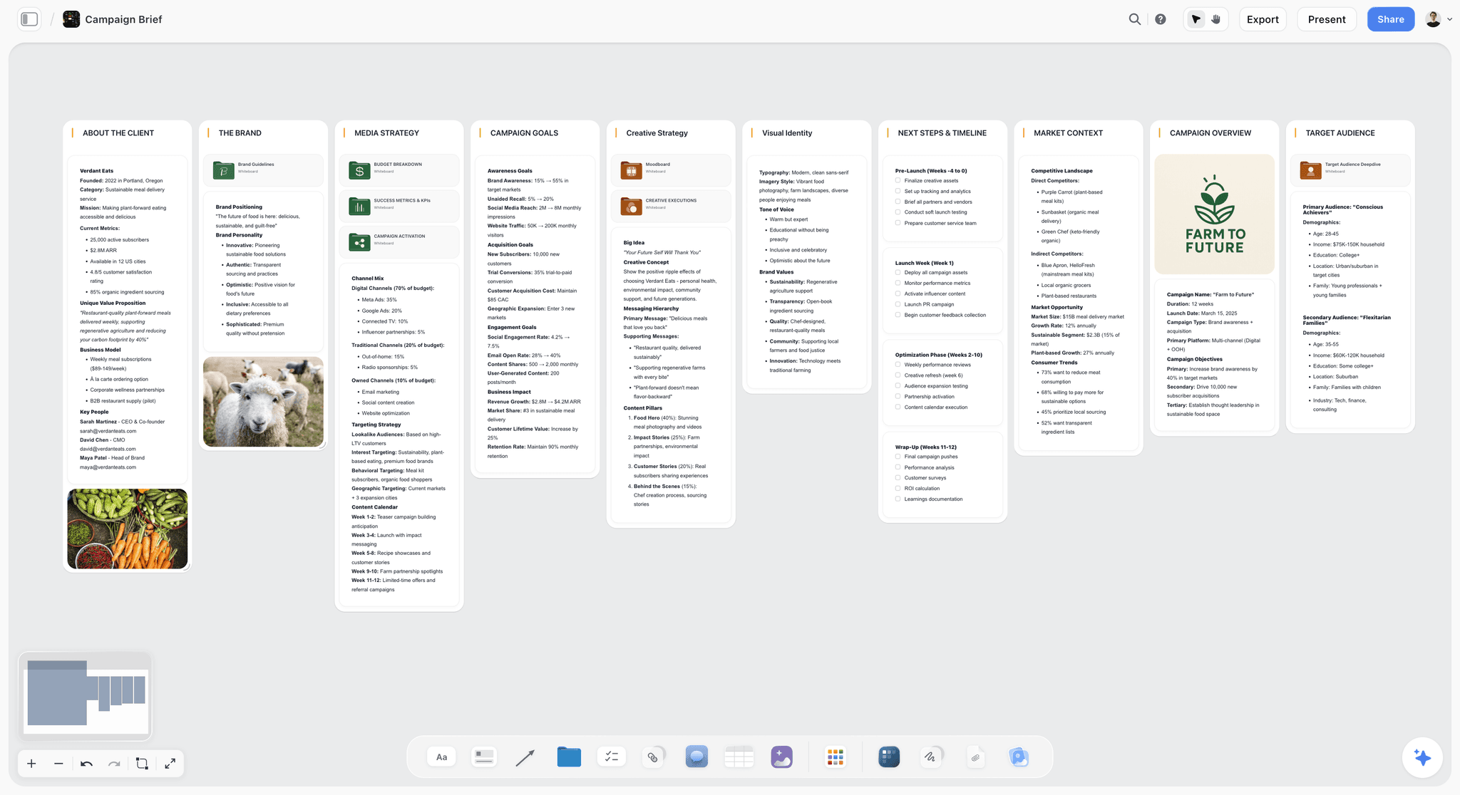
Storyflow canvas developing a film pitch's logline, synopsis, tone, characters, and comps the AI can read
Develop the substance before you design the deck
Storyflow holds your logline, synopsis, tone, characters, and comps on one canvas the AI pressure-tests, so the idea that wins financing is solid before you touch a template. Free to start.

Why Most Film Pitch Decks Fail
Most film pitch decks fail for the same reason: the filmmaker polishes the slides before the idea is sharp. Financiers and commissioners read a lot of decks, and they reject them on substance, not design.
The failure pattern is consistent:
- The filmmaker opens a design tool and starts laying out beautiful pages.
- The design looks professional, but the concept underneath is generic.
- The deck goes out polished and forgettable, and the pass comes back.
It is not that the design was bad. It is that the design finished the Fund half while the Feel half stayed empty. A pitch deck wins when it makes a reader feel the finished film before it exists, and that feeling comes from the idea and the vision, not the layout. The comps, the tone, the director's vision, the specificity of the world: those separate a deck that gets a meeting from one that gets a pass. The design only has to not get in the way. Develop the substance first, then design. Storyflow is built for that substance stage, because the story, references, and comps develop on one canvas the AI can pressure-test. For the tool comparison, see the best film pitch deck tools in 2026.
Slide 1: The Logline (Feel)
Everything starts with the logline: one sentence that captures the protagonist, their goal, the obstacle, and the hook. If the logline does not grip, no design saves the deck.
Write your logline, then pressure-test it against three questions. Is the protagonist active rather than acted upon? Are the stakes clear? Is there an irony or a hook that makes it distinctive rather than a genre placeholder? On a canvas, the AI can read your logline and flag where it is passive or generic, and you rewrite until one sentence makes someone want the next page. This single line does more work than any other slide, and it becomes the spine the whole deck hangs from.
Slide 2: The Synopsis (Feel)
The synopsis tells the reader what happens in one to two pages, with enough to feel the arc without every detail. It should read as a story, not a list of events.
Write it to escalate: the setup, the turn that starts the story, the rising complications, the climax, and where it lands. Keep it in present tense and in the tone of the film itself, so a horror synopsis reads tense and a comedy synopsis is actually funny on the page. Use the AI to check that the arc holds: "Read my synopsis. Where does the momentum stall, and is the central conflict clear the whole way through?" The synopsis is where the reader decides whether the story holds together, so it is worth more rewrites than any other prose in the deck.
Slide 3: The Tone and Look (Feel)
For a visual medium, the tone and look often carry the most weight. This is where you show, with references and a short tone statement, how the film will feel: the palette, the cinematography, the texture of the world.
Gather reference stills and clips that capture the target look, write a short tone statement naming the feeling in plain language, and arrange them so the visual language reads as coherent rather than a scrapbook. Cut anything that does not fit, because a stray reference confuses the read. On a canvas, the references live next to the story instead of in a separate folder, and on Storyflow's Pro plan ($14/month annual) the AI can generate reference frames for a specific look you cannot source anywhere. This section is what makes the film tangible. See the best lookbook tools for filmmakers in 2026 for the visual side.
Slide 4: The Characters (Feel)
Introduce the characters we follow, focused on who they are and why we care, not their whole biography. One to three pages, weighted heavily to the protagonist.
For each key character, give the want, the flaw, and what makes them compelling, ideally with a casting-vibe reference image so the reader can picture the person. Keep every character page tied to the story: a character page should make the reader want to watch this specific person's journey, not read a dossier. Use the AI to check that the characters read as distinct from each other and that the protagonist's arc is legible from the pages alone. By the end of slide 4 the reader knows who they are following and why it matters.
Slide 5: The Comparables (Fund)
Comparables, or comps, tell the reader what your film is like and, crucially, how similar films performed. They position the film in the market and de-risk it for a financier.
Choose two to four comps that genuinely match your film's tone, audience, or format, and note how each did (festival launch, specialty theatrical, streaming pickup) where you can speak to it honestly. Avoid comps that are wildly out of your budget range, because pairing a contained thriller with a blockbuster reads as naive and sinks your credibility. The right comps say "there is an audience for this, and here is the shape of it." Choosing them is strategic judgment, so use the AI to brainstorm and stress-test options, then decide yourself.
Slide 6: The Director's Vision (Fund)
This slide answers why you are the right person to make this film, and how you will make it. For many financiers, this is the deciding page, because they are betting on the filmmaker as much as the film.
State your authorship in specifics: your connection to the material, your access, your relevant work, and why this story matters now. Then say something concrete about the how, one or two lines on the shooting approach or the emotional register you are chasing, so intent reads as craft rather than a mission statement. Be honest; a genuine, specific director's vision beats a grand generic one. This is the argument no tool can make for you, though the AI can help you articulate it clearly. It is often what separates two decks with similar ideas.
Slide 7: The Audience and Format (Fund)
Financiers need to know who watches and how it reaches them. State the target audience in specifics, the format (feature, limited series, short, and the intended platform), the genre, and where the project sits in development.
Keep this concise and confident. "Genre fans and festival audiences, feature, theatrical then streaming" is a clearer read than a paragraph hedging every possibility. The point is to prove there is a defined audience and a realistic path to it, not to promise everyone will watch. This slide signals that you understand distribution, not just production, which quietly reassures a financier that the money has somewhere to go.
Slide 8: The Budget and Finance (Fund)
State the practical shape: a budget range that matches your comps, what is already in place (development funds, attached equity, soft money, a broadcaster in conversation), and what you are asking this reader for. Keep it to about a page.
The mistake here is either hiding the number or inventing false precision. A believable range tied to comparable films reads as competence. If you have any financing in place, name it, because momentum attracts money. This slide is where a strong Feel half pays off: once a reader wants the film, a credible finance plan turns want into a conversation about terms. Do not let it overshadow the vision, but do not skip it either.
Slide 9: The Team (Fund)
The last slide proves the film can actually get made. List the key attached talent and crew (producer, director, and any cast, cinematographer, or department heads worth naming) with one line each on relevant credits.
If the team is thin because the project is early, say so honestly and frame the roles you are still attaching. A short, real team beats a long, aspirational one padded with names who have not agreed to anything. Financiers know the difference, and an inflated team slide undoes the trust the rest of the deck built. End with clear contact details so the reader can reach you in one step.
A Worked Example: Building the Greenlight Stack for "THE WARD"
Abstract advice is easy to nod along to and hard to apply, so here is the whole stack built for one film. THE WARD is a contained psychological horror set over a single night in a decommissioned hospital wing, following a night-shift care worker who begins to suspect the last patient never left. It is invented for this guide, but the reasoning is exactly what I would run on a real project.
Logline (Feel): "A night-shift care worker alone in a shuttered hospital ward realizes the building's final patient was never discharged, and that it wants her to take its place." Active protagonist, clear stakes, a hook in the last clause. The AI flagged an earlier draft as passive ("strange things happen to a care worker"), which was the tell that the concept was not yet gripping.
Synopsis (Feel): One page in present tense that escalates from routine (the empty ward, the flickering intake log) to the turn (a patient file that should not exist) to the climax (the choice to stay or run). Written in the film's own clipped, dread-heavy register so the page feels like the film.
Tone and look (Feel): A tone statement of "institutional decay and intimate dread," three pages of reference stills of green-tiled corridors and cold fluorescent light, and one generated frame for a specific shot I could not source. On a canvas these sit beside the synopsis, so the look reads as one idea, not a separate mood board.
Characters (Feel): Two pages, weighted to the care worker (want: to finish the shift and keep her job; flaw: she cannot leave anyone behind), with a casting-vibe image. The patient is described through absence, which is its own character note.
Comparables (Fund): THE WARD is positioned against contained, festival-launched horror with strong specialty runs. The comps say "single-location horror with a specialty audience is a proven, financeable shape," which is exactly the read a genre financier wants. Out-of-scale comps would have read as naive and were cut.
Director's vision (Fund): My connection to the material and a two-line note on shooting it almost entirely handheld in one real location to keep the dread claustrophobic and the budget contained. Craft and intent in the same breath.
Audience and format (Fund): Genre and festival audiences, a contained feature, theatrical-then-streaming path. Specific, not "everyone likes horror."
Budget and finance (Fund): A low seven-figure range consistent with the comps, a note that a portion of development funding is in place, and a clear ask. Believable, tied to comparable films, no false precision.
Team (Fund): Producer and director attached, a cinematographer in conversation, cast still to attach and framed honestly as such. Contact details at the bottom.
Built this way, the deck makes a genre financier feel the film across the first four slides, then hands them five slides of reasons it is a safe bet. That is the whole move: the first half makes them feel it, the second half makes them fund it.
Where to Build the Deck vs Where to Design It
A pitch deck has two stages that want two different tools, and conflating them is the most common workflow mistake. The thinking stage (developing and pressure-testing the nine slides, gathering references, arriving at the one-page look) suits a canvas. The design stage (turning that substance into a formatted, exportable PDF) suits a slide or layout tool.
| Job | Canvas (Storyflow) | Slide or PDF tool (Canva, Keynote, InDesign) |
|---|---|---|
Develop logline and synopsis | Strong, with AI pressure-testing | Weak, it is a layout surface |
Gather and arrange references | Strong, references live with the story | Limited |
Pressure-test the whole pitch with AI | Strong, the AI reads the board | None |
Rough out the one-page look | Strong | Strong |
Produce a formatted, branded PDF | Not the tool for it | Strong |
Print-quality typesetting | No | InDesign, yes |
Here is the honest accounting, because a deck guide that pretends one tool does everything is not worth reading. Storyflow is a canvas for assembling the deck's thinking, references, and one-page look, and its AI reads your full active board plus up to one Tactic and three documents you @-mention, which is what makes it strong for pressure-testing the pitch. It is not a polished slide-export or PDF design tool. For the final formatted, branded deck you still move to Canva, Keynote, or InDesign, and you should. Second, Storyflow is cloud-only, so there is no offline or local-first option if you need to work fully disconnected. Third, it is a newer platform, and while its Story Blueprints library (200+ creative templates on the Plus, Pro, and Max plans) is broad, it is thinner on niche deck-formatting templates than a dedicated design tool's deck gallery. And the AI reference-frame generation is a Pro-and-up feature, so on Free or Plus you source references manually. Use the canvas for the part that wins the room, the substance, and pair it with a design tool for the wrapper.
Pitch Deck vs Treatment vs Lookbook
These three documents get conflated constantly, and sending the wrong one wastes a financier's attention. They overlap in content but do different jobs.
| Pitch deck | Treatment | Lookbook | |
|---|---|---|---|
Primary job | Sell the whole project | Prove the story works | Sell the visual world |
Length | 10 to 20 pages | 2 to 20+ pages | 5 to 30 image-led pages |
Core content | Story, vision, market, team | Prose narrative of the film | Reference imagery and tone |
Who reads it | Financiers, commissioners | Financiers, collaborators | Financiers, HODs, cast |
When | To raise money or greenlight | Alongside or inside the pitch | Alongside or inside the pitch |
Most filmmakers build all three, and they share a spine. The treatment is the story argument in prose (see how to write a treatment with AI in 2026), the lookbook is the tone-and-look slides extracted and expanded, and the pitch deck wraps the whole case. Keeping the substance consistent across them matters, because a financier who reads all three will notice if the tone drifts. A canvas that holds the pitch substance and the lookbook references together keeps the three aligned as they evolve.
Where a Pitch Deck Wins or Loses
Honest accounting. A deck wins or loses on these, not on design.
- The concept. A film worth financing starts with an idea worth telling.
- The vision. How vividly the Feel half makes the reader feel the film.
- The comps. Whether they credibly show an audience without over-reaching.
- The director's vision. Your specific authorship, access, and intent.
- The clarity. Whether the reader gets it in the first two pages.
The right way to write a pitch deck in 2026 is to develop these first and design last. The vision and the case for you are the whole pitch. The slides are the wrapper.
The Bottom Line
To write a film pitch deck in 2026, build the Greenlight Stack in order (logline, synopsis, tone and look, characters, comparables, director's vision, audience, budget and finance, team) and design it last. The first four slides make the reader feel the film, and the last five make the case that it is a safe bet. A deck is judged on whether the reader feels the film, which comes from the vision and the case for you, not the slides. The first half makes them feel it. The second half makes them fund it.
The move that changes the most is to stop designing before the idea is sharp. Develop the logline, tone, and comps on a canvas the AI can pressure-test, then design the deck. Start a Storyflow board for your pitch's substance, and finish the design in Canva, Keynote, or InDesign.
FAQ: Writing a Film Pitch Deck
What goes in a film pitch deck?
A film pitch deck includes nine core slides: a title and logline, a synopsis, a tone-and-look section with references, character introductions, comparables with their performance, the director's vision, audience and format, budget and finance, and the team. The first four make the reader feel the film, and the last five make the case that it is a safe bet. The tone and look often carry the most weight for a visual medium, and the director's vision is frequently the deciding slide.
How many slides should a film pitch deck have?
A film pitch deck usually runs 10 to 20 pages, built from the nine core slides, with the tone-and-look section spreading across several pages. Length matters less than impact: a tight, vivid 12-page deck beats a padded 30-page one every time. Documentary and series decks sometimes run longer to cover access or season arcs. The rule is that every page earns its place. If a page does not add to the vision or the case for funding, cut it.
What is the difference between a pitch deck and a treatment?
A pitch deck sells the whole project (story, vision, market, and team) in a visual, slide-based format, usually 10 to 20 pages. A treatment proves the story specifically, told as prose narrative of the film from opening to ending, and can run from two pages to twenty or more. The deck is the case; the treatment is the story argument inside that case. Financiers often want both, and the treatment frequently sits inside or alongside the deck.
What is the most important part of a film pitch deck?
The concept and the vision are the most important, because a deck is judged on whether the reader feels the film. For many financiers, the director's vision slide is the deciding factor, since they bet on the filmmaker as much as the film. The tone and look carry heavy weight for a visual medium. Design is the least important; it only has to not get in the way. Invest your effort in the Feel half first, then prove the Fund half.
How do I write a film pitch deck with AI?
Use AI to develop and pressure-test the substance, not to design the slides. Develop the logline, synopsis, tone, characters, and comps on a canvas where the AI reads the whole pitch, and ask it to sharpen the logline, check the synopsis arc, and stress-test your comps. On Storyflow's Pro plan the AI can also generate reference frames for the look. Then design the deck in Canva, Keynote, or InDesign. The concept and the director's vision stay yours; AI helps you sharpen and articulate them.
What are comparables in a film pitch deck?
Comparables, or comps, are existing films or shows your project resembles in tone, audience, or format, listed with how they performed. They position your film in the market and show a financier there is an audience, which de-risks the investment. Good comps genuinely match your film and its budget range; comps that are wildly out of scale read as naive. Two to four well-chosen comps that show a proven, financeable shape are more persuasive than a long, aspirational list.
How long should a film pitch deck be?
Most film pitch decks run 10 to 20 pages, but impact beats length. The reader should feel the film in the first two pages and understand the business case by the last. A contained genre feature might need 12 tight pages; a documentary with complex access or a series with a season arc may run longer. The test for every page is whether it moves the reader toward feeling the film or funding it. If it does neither, it is padding.
Do I need a pitch deck and a lookbook?
Often both, and they do different jobs. A pitch deck argues the whole project (story, vision, market, and the case for you), while a lookbook focuses purely on the visual world and tone. For visually driven projects, the lookbook may do much of the selling, and its pages frequently appear inside the pitch deck. The two share a spine, so keep the substance consistent across them. A canvas can hold the pitch substance and the lookbook references together so they stay aligned.
How do I make a film pitch deck if I am not a designer?
You do not need to be a designer. Develop the substance (logline, synopsis, tone, characters, comps, and the case for funding) first, which is the hard part, then use a template-based tool like Canva or a slide tool like Keynote to design a clean deck quickly. These tools produce professional layouts without design skill. A strong idea in a simple, clean deck beats a weak idea in a beautiful one, so put your energy into the Greenlight Stack and let a template handle the wrapper.
What should the first page of a film pitch deck be?
The first page should be the title and the logline, and nothing else competing for attention. A single striking image, the title, and one sentence that captures the protagonist, their goal, the obstacle, and the hook. This is the page that decides whether the reader continues, so it does more work than any other. If your logline is passive or generic, fix it before you touch the layout, because no first-page design rescues a logline that does not grip.
How much does it cost to make a film pitch deck?
Building the deck itself can cost nothing beyond your time if you develop the substance on a free canvas and design it in a free-tier tool. Storyflow has a Free plan at $0, with paid plans (Plus at $7.99/month annual, Pro at $14/month annual, and Max at $39/month annual) adding AI usage, image generation, and the Story Blueprints library. Design tools like Canva and Keynote have free tiers. The real cost of a deck is the development time, not software.
Table of Contents
- Key Takeaways
- The Greenlight Stack: The Anatomy of a Film Pitch Deck
- What Goes in a Film Pitch Deck (at a Glance)
- Why Most Film Pitch Decks Fail
- Slide 1: The Logline (Feel)
- Slide 2: The Synopsis (Feel)
- Slide 3: The Tone and Look (Feel)
- Slide 4: The Characters (Feel)
- Slide 5: The Comparables (Fund)
- Slide 6: The Director's Vision (Fund)
- Slide 7: The Audience and Format (Fund)
- Slide 8: The Budget and Finance (Fund)
- Slide 9: The Team (Fund)
- A Worked Example: Building the Greenlight Stack for "THE WARD"
- Where to Build the Deck vs Where to Design It
- Pitch Deck vs Treatment vs Lookbook
- Where a Pitch Deck Wins or Loses
- The Bottom Line
- Author
- FAQ: Writing a Film Pitch Deck
- Related Reading
Templates to check out for this topic


Filmmaking templates you can use in Storyflow
Skip the blank canvas. Open one of these filmmaking boards in Storyflow and the AI builds on the structure that is already there, from research through the shot list.


See Storyflow in Action
A visual AI workspace where every feature lives inside one canvas. No tab-switching, no context lost.
Build your entire board from a single message
Type what you need in the AI chat at the bottom of your canvas. The AI adds cards, headings, and structure directly onto your board.
Use expert frameworks as AI context
Type @ in the AI chat and choose any Tactic. The AI tailors every response to that framework instead of giving generic advice.
Turn your board into a mind map in seconds
Ask the AI to restructure your canvas as a mindmap. It connects your ideas into a visual hierarchy so you can see how everything relates.
Why Storyflow Exists
Storyflow actually began as a personal tool while working on creative and research projects.
We kept running into the same problem: ideas were scattered everywhere: notes, documents, and whiteboards.
Nothing helped us see how everything connected.
So we started building a workspace designed around how ideas actually grow.
→ Read how Storyflow was createdJustkay
Documentary Filmmaker & Founder at Storyflow
Published: 2026-07-10
Extremely simple, seriously capable


See how easy it is to get started
Watch a real project come together, from a blank board to a finished plan, clicked through step by step.
Start creating with AI and become more productive
Transform your creative workflow with AI-powered tools. Generate ideas, create content, and boost your productivity in minutes instead of hours.