
How to Make a Lookbook for a Film in 2026 (Step-by-Step)
How to make a lookbook for a film in 2026, step by step. The eight-step workflow that develops a coherent, distinctive look before you design a single page.

Category
Filmmaking
Author

Justkay
Documentary Filmmaker & Founder at Storyflow
Topics
2026-07-10
•
12 min read
•
Filmmaking- how to make a film lookbook
- how to make a lookbook for a film 2026
- film lookbook template
- what goes in a film lookbook
- director lookbook
- film lookbook example
How do you make a lookbook for a film in 2026?
To make a lookbook for a film in 2026, develop the look first and design it second. A film lookbook is the visual document that sells your film's tone and world before a frame is shot, and it works when the references cohere into a distinctive visual language, not when the layout is pretty. The eight steps below build that language in order: a tone statement, references, palette, cinematography, locations, characters, then sequencing and design. The efficient way to do it is on a canvas where references move freely and an AI can help find the through-line, then export to a design tool. On Storyflow, the references, palette, and tone develop on one board the AI reads, and Pro can generate reference frames for a look you cannot source. A lookbook is not a mood board dump or a pretty PDF. It is a visual argument that makes a reader feel the film. This guide is how to build one that lands, whether for a pitch, a crew, or a client. I have built lookbooks to sell real documentary projects, from research through pre-production, and the pattern that separates the ones that worked from the ones that fell flat is not the design software. It is whether the images agreed with each other. A coherent look reads as vision. An incoherent one reads as a person who gathered nice pictures and hoped. Everything below is written to get you to the first outcome and keep you out of the second.
Key Takeaways
- Develop the look first and design it second. A lookbook's power comes from a coherent, distinctive look, and design tools only package a look you have not finished developing.
- Build the look from the five layers of the Look Stack: Tone, Color, Light, Texture, Motion. They are a stack, not a list, running from the most abstract feeling to the millimeter of glass on the lens.
- A lookbook works when every layer of the Look Stack tells the same story. When one layer fights the rest, the reader senses something is off before they can name it.
- Write a one-line tone statement first, and make it the test for every image. "Intimate and warm, then coldly clinical as the trust breaks" filters everything you choose.
- Gather references widely, then cut ruthlessly against the tone. A lookbook is defined as much by what you leave out as by what you include.
- Sequence the references into a narrative, not a random gallery. A well-sequenced lookbook feels like the film, invisible when it works and obvious when it does not.
- Coherence matters more than length, and most lookbooks run 8 to 20 pages. A tight, coherent 10-page lookbook beats a padded 30-page one.
- The taste, the cut, the through-line, and the sequence stay human. Tools gather and design; your eye decides which references cohere into a look.
What a Film Lookbook Contains (at a Glance)
| Section | What it shows | Typical length |
|---|---|---|
Tone statement | The feeling, in a line or two | Part of a page |
Reference stills | Frames that capture the look | Several pages |
Palette | The color world | 1 page |
Cinematography | Lensing, lighting, movement | 1 to 2 pages |
Location and design | The physical world | 1 to 2 pages |
Character and wardrobe | How people look | 1 to 2 pages |
Sequence | How the look evolves | Woven throughout |
A film lookbook is usually 8 to 20 pages. Length matters less than coherence: every image should reinforce one visual language. The tone statement and the sequencing are what turn a pile of references into a lookbook.
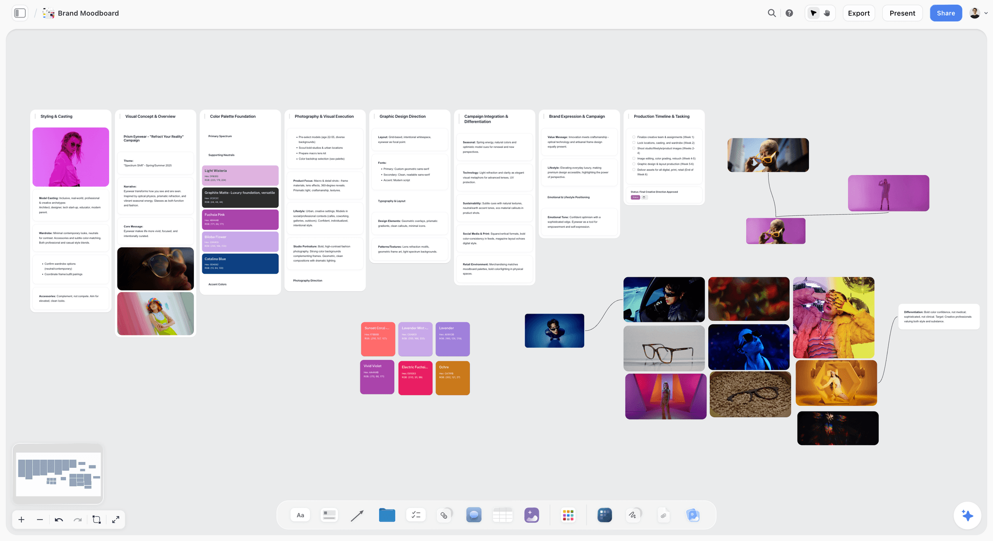
Storyflow canvas developing a film lookbook's references, palette, and tone into a coherent look the AI can read
Develop the look before you design the lookbook
Storyflow holds your references, palette, and tone on one canvas the AI reads, so a coherent look emerges before you lay it out. On Pro the AI generates reference frames. Free to start.

The Look Stack: The Five Layers of a Film's Look
Most lookbook advice hands you a list of sections and leaves you to guess how they relate. They are not a list. They are a stack. A film's look is built from five layers, each sitting on the one below it, and a lookbook works when all five agree.
I call this the Look Stack, and it is the mental model behind every step in this guide:
- Tone. The feeling, named in a sentence. The layer everything else serves.
- Color. The palette that carries the tone. Felt instantly, before the reader reads a word.
- Light. How the world is lit. Hard or soft, warm or cold, high-key or shadowed.
- Texture. The physical world. Locations, production design, wardrobe surfaces, the grain of the place.
- Motion. The camera and lens language. Handheld or locked, long lens or wide, still or restless.
The layers run from the most abstract (Tone) to the most physical (Motion). Tone is the feeling; Motion is the millimeter of glass on the lens. A change in one layer ripples up and down the others. Cold color pulls toward hard light. Handheld motion pulls toward intimate texture. When the layers pull in the same direction, the look holds. When one fights the rest, the reader senses something is off before they can name it.
A lookbook works when every layer of the Look Stack tells the same story. That sentence is the whole job. The eight steps below are how you build the five layers in an order that keeps them agreeing, and the worked example later in this guide shows the stack assembled for a single short film so you can see the layers lock together.
Why a Lookbook Is Development First, Design Second
Most people make a lookbook by opening a design tool and laying out nice images. That skips the stage that determines whether it works: developing a coherent look.
The failure pattern is consistent:
- You gather references and start designing pages.
- The pages look clean, but the images do not cohere into one visual language.
- The lookbook ships polished but generic, and it does not convey a specific vision.
A lookbook's power comes from a coherent, distinctive look, and design tools help you package a look you have not finished developing. The tone statement, the ruthless cutting of references that do not fit, the through-line that connects the palette to the cinematography to the world: that is the work. The design only has to present it cleanly. Develop the look first on a surface where references move and an AI can help find the through-line, then design. Storyflow is built for that development stage. For the tool comparison, see the best lookbook tools for filmmakers in 2026.
Step 1: Write a One-Line Tone Statement
Before gathering a single image, name the feeling. This is the Tone layer of the Look Stack, and it is the filter for everything above it. Write one or two sentences that capture the film's tone: not the plot, the feeling. "Intimate and warm, then coldly clinical as the trust breaks." This statement is the test for every image you choose.
A tone statement does two things: it forces you to know what you are going for, and it gives you a test for every reference (does this image serve this feeling?). Without it, a lookbook becomes a pile of images you like rather than a coherent argument. Use the AI to sharpen the statement: "Here is my film and my tone idea. Give me three sharper ways to name the feeling."
By the end of step 1 you have a tone statement that filters everything else.
Step 2: Gather References Widely, Then Cut Ruthlessly
Now gather references, widely at first, then cut hard. Pull film stills, photography, art, and anything that captures the target look, from ShotDeck, Pinterest, or your own captures. Over-gather; you want options.
Then cut ruthlessly against the tone statement. This is the most important and most skipped step: a lookbook is defined as much by what you leave out as what you include. Every image that does not serve the tone weakens the whole. On a canvas, arrange the references and cut until only the coherent ones remain. The AI can help you spot the through-line: "Which of these references do not fit the tone, and what is the visual pattern in the ones that do?"
By the end of step 2 you have a tight set of references that cohere into one look.
Step 3: Find the Palette
Pull the color world out of your references. This is the Color layer, and it is one of the fastest ways to convey tone. Warm and saturated reads differently from cold and desaturated.
Identify the dominant colors across your chosen references and present them as a palette: swatches, or a grid of images that share the color world. Note how the palette might shift across the film if the tone evolves. The palette page is small but powerful, because color is felt instantly. Keep it consistent with the references, not an idealized version.
By the end of step 3 you have a palette that captures the film's color world.
Step 4: Define the Cinematography
Show how the film will be shot: the lensing, the lighting, the camera movement. This is where the Light and Motion layers get built, and it is where a lookbook speaks to a cinematographer and signals you know how the look is achieved, not just what it looks like.
Choose references that show the cinematographic approach: wide and static, or handheld and close; hard light or soft; long lenses or wide. Add short notes on the intent. This section makes the look achievable rather than aspirational. See the best film moodboard tools in 2026 for sourcing cinematography references.
By the end of step 4 you have a cinematography section that shows how the look is shot.
Step 5: Cover Location and Production Design
Show the physical world: the locations, the sets, the textures, the production design. This is the Texture layer. It grounds the film in a specific place and period, and it helps a reader picture the world.
Gather references for the environments the film lives in, the architecture, the textures, the level of detail, and the period if relevant. Note the design intent: lived-in or pristine, grand or claustrophobic. This section is especially important for genre and period films, where the world is a character. Keep it coherent with the tone and palette.
By the end of step 5 you have a location-and-design section that grounds the film's world.
Step 6: Add Character and Wardrobe References
Show how the people look: casting vibes, wardrobe, hair, and makeup. Wardrobe is part of the Texture and Color layers both, because clothing carries surface and hue at once. This helps a reader picture the characters and adds a human dimension to the visual language.
For key characters, gather references for their look, wardrobe palette, and overall vibe, tied to who they are in the story. Keep the character references consistent with the film's palette and tone; wardrobe is part of the color world. This section connects the visual language to the people we follow.
By the end of step 6 you have character and wardrobe references that show how the people look.
Step 7: Sequence It Into a Narrative
A lookbook is not a random gallery; it should flow. Sequence the references so the look tells a small story: how the visual language evolves across the film, or how the tone builds. This is what separates a lookbook from a mood board.
Order the pages so they build: open with the strongest tone-setting images, move through the sections, and let the sequence mirror the film's emotional arc if it has one. On a canvas, rearrange freely until the flow feels right. The sequence is invisible when it works and obvious when it does not; a well-sequenced lookbook feels like the film.
By the end of step 7 your lookbook flows as a coherent visual narrative.
Step 8: Design the Document
Only now do you design. With the look developed and sequenced, lay it out in a clean document that lets the images carry the tone. This is the mechanical stage.
Move your developed look into a design tool: Canva for a fast polished PDF, InDesign for print quality, or present from a visual board. Keep the design minimal, big images, little text, so nothing competes with the look. Add your tone statement and short section notes. Export a shareable PDF. The design should be invisible; the look is the point. See the best lookbook tools for filmmakers in 2026 for the design tools.
By the end of step 8 you have a finished film lookbook built on a coherent look.
A Worked Example: Building the Lookbook for "Last Shift"
Abstractions are easy to nod at and hard to use. So here is the Look Stack assembled for a single short film, layer by layer, the way I would actually build it on a canvas.
The film is a short called "Last Shift." A night-shift nurse forms a quiet bond with a dying patient, then discovers the patient has been lying to her, and the warmth curdles into something clinical and cold. The tone statement writes itself from the story: intimate and warm, then coldly clinical as the trust breaks. Every layer below serves that one sentence.
Tone. The tone splits the film in two. Act one and two are hushed, tender, close. Act three goes sterile. So the lookbook is built as a diptych: the same world, warm then cold. The reader should feel the temperature drop between the halves.
Color. Warm sodium amber runs through the early scenes: the glow of a bedside lamp, skin lit gold, the yellow-brown of an old blanket. As the trust breaks, the palette shifts to green-white fluorescent, the color of an empty corridor at 4 a.m. The palette page shows two rows: amber references on top, fluorescent references below. The shift IS the story, so I show it as a shift, not two unrelated grids.
Light. Early scenes are lit by practicals: a single warm lamp, pools of light with soft falloff into shadow, faces half-lit. The clinical half is flat overhead fluorescent, no shadow to hide in, everything exposed. References: intimate low-key hospital photography for the first half, harsh even institutional light for the second.
Texture. The physical world tells the same story. Warm half: rumpled sheets, worn linoleum, a chipped mug, a cardigan over scrubs. Cold half: polished steel, a stripped bed, a waxed corridor floor that reflects the fluorescents. The tone words I pin to the board are intimate, hushed, tender for the first half and antiseptic, exposed, sterile for the second. Wardrobe follows: a soft worn cardigan and cotton scrubs early, a crisp starched uniform once the warmth is gone.
Motion. Lens and camera language make the split physical. The warm half is a 40mm handheld, close, breathing slightly with the operator, the intimacy you feel in your body. The clinical half is a locked-off 28mm, static, wide, the camera as detached as the nurse has become. The lens language page names both explicitly so the cinematographer reads the intent, not just the vibe.
Assemble those five layers and the lookbook is not a gallery of hospital pictures. It is an argument: this is a film about warmth turning cold, and you can feel the turn in the color, the light, the surfaces, and the way the camera moves. A lookbook works when every layer tells the same story, and here every layer tells the story of trust breaking. That is the difference between a reader who says "nice images" and a reader who says "I can see the film."
Lookbook Tools at a Glance
Different stages of the lookbook want different tools. Development wants a flexible canvas; design wants a layout engine; sourcing wants a searchable library. The honest stack uses one of each rather than forcing one tool to do all three.
| Tool | Best for | Stage | AI help | Starting price |
|---|---|---|---|---|
Storyflow | Developing the look on a canvas the AI reads | Development | Finds the through-line; generates frames on Pro | Plus $7.99/mo annual |
Milanote | Gathering references on a visual board | Development | None for the through-line | Free tier; paid plans |
Canva | Fast, polished PDF layout | Design | Template and layout assists | Free tier; paid plans |
InDesign | Print-quality layout and typography | Design | None | Subscription |
ShotDeck | Sourcing film stills by look | Sourcing | Searchable, tagged library | Subscription |
The pattern most working filmmakers land on: a canvas for development, a reference library for sourcing, and a design tool for the final PDF. For the full breakdown of each, see the best lookbook tools for filmmakers in 2026.
Where Storyflow Fits, and Where It Does Not
Storyflow is a strong home for the development stage: the tone statement, the reference gathering and cutting, the palette, and the sequencing all live on one board, and the AI reads that full active canvas board (plus up to 1 Tactic and up to 3 Documents you @-mention) so it can flag references that fight the tone and name the through-line in the ones that fit. On the Pro plan and above, it can also generate reference frames for a look you cannot source anywhere. That is the layer of the job where an AI-read canvas genuinely saves you hours.
It is not the whole job, and pretending otherwise would cost you trust. Three honest limitations to plan around:
- It is a canvas for developing the look, not a dedicated design or print tool. Storyflow assembles the references and the intent. For a print-ready, typeset PDF with precise page layout, you still export to Canva or InDesign. Do not expect it to replace a layout engine.
- Reference generation is a Pro-and-up feature. On Free and Plus you source every reference yourself from ShotDeck, Pinterest, or your own captures. AI image generation starts on the Pro plan ($14/mo annual, $19 monthly).
- It is cloud-only and newer. There is no local-first, offline mode, so a lookbook lives in the cloud. And Storyflow is a general visual-thinking canvas, not a film-industry-specific tool, so it does not ship with pre-built film lookbook page templates the way a niche pitch product might.
The move that makes Storyflow worth it is not that it designs the document. It is that it develops the look, which is the part that actually decides whether the lookbook lands.
Where a Lookbook Still Needs Your Eye
Honest accounting. Tools gather and design; your eye makes the look.
- The taste. Which references cohere is a visual judgment no tool makes.
- The cut. Knowing what to leave out is what makes a lookbook sharp.
- The through-line. The connecting idea across the images is yours.
- The sequence. How the look builds is a creative choice.
The right way to make a lookbook in 2026 is to develop the look with your eye, using tools to gather, arrange, and design. The vision stays human.
The Bottom Line
To make a lookbook for a film in 2026, develop the look first and design it second. The eight steps, tone statement, references, palette, cinematography, location, character, sequence, then design, build the five layers of the Look Stack into a coherent visual language before you touch a layout. A lookbook works when every layer tells the same story, and that coherence comes from your eye and ruthless cutting, not from the design.
The move that changes the most is to develop and cut before you design. Gather references on a canvas the AI can read, find the through-line, sequence it, then design the document. Start a Storyflow board for your film's lookbook, and finish the design in Canva or InDesign.
FAQ: Making a Film Lookbook
How do you make a film lookbook?
You make a film lookbook by developing the look first and designing it second. Write a one-line tone statement, gather references widely and cut ruthlessly against that tone, pull the palette, define the cinematography, cover location and production design, add character and wardrobe references, sequence it into a narrative, and then design the document in a tool like Canva or InDesign. The key is coherence: every image should reinforce one visual language, which comes from the development and cutting, not the layout.
What should a film lookbook include?
A film lookbook should include a tone statement, reference stills that capture the look, a palette, a cinematography section (lensing, lighting, movement), location and production-design references, and character and wardrobe references, all sequenced into a coherent flow. It usually runs 8 to 20 pages. The tone statement filters every choice, and the sequencing turns the references into a visual narrative rather than a random gallery. What you leave out matters as much as what you include.
What are the five layers of a film's look?
The five layers of a film's look are Tone, Color, Light, Texture, and Motion, and together they form what this guide calls the Look Stack. Tone is the feeling named in a sentence. Color is the palette that carries it. Light is how the world is lit. Texture is the physical world of locations, design, and wardrobe. Motion is the lens and camera language. A lookbook works when all five layers agree and point at the same tone.
What is the difference between a lookbook and a mood board?
A mood board is a loose, exploratory gathering of references that capture a feeling, often an early step. A lookbook is a finished, sequenced document that presents a coherent visual language to others, with a tone statement, sections, and a flow. In practice you often start with a mood board to explore, then develop and cut it into a lookbook to communicate. The lookbook is more deliberate: coherent, sequenced, and designed to make a reader feel the film.
How do I make a film lookbook with AI?
Use AI to help develop the look, not to replace your eye. Gather references on a canvas where the AI reads them, and ask it to spot the through-line and flag references that do not fit the tone. On Storyflow's Pro plan, the AI can generate reference frames for a look you cannot source. Then design the document in a template tool. The taste, the cutting, and the sequencing stay yours; AI helps you find the pattern and fill gaps in the references.
How long should a film lookbook be?
Most film lookbooks run 8 to 20 pages, but coherence matters more than length. A tight, coherent 10-page lookbook beats a padded 30-page one, because every image should reinforce the visual language and extra images dilute it. The right length is whatever presents a complete, coherent look without repetition. For a pitch, keep it focused; for a crew reference, it can be more detailed. In all cases, cut anything that does not serve the tone.
How do I write a tone statement for a film lookbook?
Write one or two sentences that name the feeling, not the plot. Aim for a line that captures the emotional temperature and how it shifts, like "Intimate and warm, then coldly clinical as the trust breaks." Avoid genre labels and story summary; a tone statement is about how the film feels to watch. Test it by asking whether it could filter your references: a good statement makes some images obviously wrong. Sharpen it against an AI by asking for three tighter ways to name the same feeling.
Do I need a lookbook and a pitch deck?
Often both, and they do different jobs. A pitch deck argues the whole project (story, vision, market, why you), while a lookbook focuses purely on the visual world and tone. The lookbook's pages often appear inside the pitch deck, and for visually-driven projects the lookbook may do much of the selling. Many filmmakers build both and keep them consistent. A canvas can hold the pitch substance and the lookbook references together so the two stay aligned. See our film pitch deck guide for the deck.
What tools do I use to make a film lookbook?
For developing the look, a canvas like Storyflow or Milanote lets references move and cohere, with Storyflow adding an AI that finds the through-line. For sourcing references, ShotDeck and Pinterest are strong. For designing the final document, Canva offers templates, InDesign gives print quality, and Gamma generates layouts with AI. The efficient stack is a canvas for development, a reference library for sourcing, and a design tool for the final PDF.
How much does it cost to make a film lookbook?
You can make a film lookbook for free. A canvas like Storyflow has a $0 tier for developing the look, Pinterest is free for sourcing references, and Canva has a free tier for laying out a PDF. Paid upgrades buy convenience, not necessity: Storyflow Plus is $7.99/mo annual for more AI usage, and Pro at $14/mo annual adds reference-frame generation. A dedicated stills library like ShotDeck is subscription-based. The cost is your time and eye, not the software.
How is a film lookbook different from a photography lookbook?
A film lookbook sells motion, tone, and how a story evolves visually, so it includes cinematography, camera movement, and how the look shifts across the film. A fashion or photography lookbook presents a fixed set of styled images, usually to showcase a collection or a photographer's style, with no narrative arc. The film version is an argument for a moving world; the photography version is a curated gallery. The Look Stack's Motion layer is unique to film and has no equivalent in a still-image lookbook.
Table of Contents
- Key Takeaways
- What a Film Lookbook Contains (at a Glance)
- The Look Stack: The Five Layers of a Film's Look
- Why a Lookbook Is Development First, Design Second
- Step 1: Write a One-Line Tone Statement
- Step 2: Gather References Widely, Then Cut Ruthlessly
- Step 3: Find the Palette
- Step 4: Define the Cinematography
- Step 5: Cover Location and Production Design
- Step 6: Add Character and Wardrobe References
- Step 7: Sequence It Into a Narrative
- Step 8: Design the Document
- A Worked Example: Building the Lookbook for "Last Shift"
- Lookbook Tools at a Glance
- Where Storyflow Fits, and Where It Does Not
- Where a Lookbook Still Needs Your Eye
- The Bottom Line
- Author
- FAQ: Making a Film Lookbook
- Related Reading
Templates to check out for this topic


Filmmaking templates you can use in Storyflow
Skip the blank canvas. Open one of these filmmaking boards in Storyflow and the AI builds on the structure that is already there, from research through the shot list.


See Storyflow in Action
A visual AI workspace where every feature lives inside one canvas. No tab-switching, no context lost.
Build your entire board from a single message
Type what you need in the AI chat at the bottom of your canvas. The AI adds cards, headings, and structure directly onto your board.
Use expert frameworks as AI context
Type @ in the AI chat and choose any Tactic. The AI tailors every response to that framework instead of giving generic advice.
Turn your board into a mind map in seconds
Ask the AI to restructure your canvas as a mindmap. It connects your ideas into a visual hierarchy so you can see how everything relates.
Why Storyflow Exists
Storyflow actually began as a personal tool while working on creative and research projects.
We kept running into the same problem: ideas were scattered everywhere: notes, documents, and whiteboards.
Nothing helped us see how everything connected.
So we started building a workspace designed around how ideas actually grow.
→ Read how Storyflow was createdJustkay
Documentary Filmmaker & Founder at Storyflow
Published: 2026-07-10
Extremely simple, seriously capable


See how easy it is to get started
Watch a real project come together, from a blank board to a finished plan, clicked through step by step.
Start creating with AI and become more productive
Transform your creative workflow with AI-powered tools. Generate ideas, create content, and boost your productivity in minutes instead of hours.