The 10 Best Usability Testing Tools in 2026
A highlight reel is not a finding. Recruiting and recording became commodities, so the tools that matter now are the ones that carry you from nine hours of sessions to something a team will act on.

Category
Tools & Software
Author

Sara de Klein
Head of Product at Storyflow
Topics
2026-08-14
•
22 min read
•
Tools & SoftwareTable of Contents
- Key Takeaways
- The Bottleneck Moved and Most Tool Comparisons Did Not Notice
- At a Glance: The 10 Tools Compared
- How I Ranked These
- Quick Picks by Job Type
- 1. UserTesting
- 2. Maze
- 3. Dovetail
- 4. Lookback
- 5. UserZoom
- 6. Optimal Workshop
- 7. PlaybookUX
- 8. Useberry
- 9. Hotjar
- 10. Storyflow
- What to Actually Pay For
- Tools to Avoid for This Job
- What No Tool on This List Does
- The Bottom Line
- FAQ: Usability Testing Tools
- Related Reading
Templates to check out for this topic


- usability testing tools
- moderated usability testing
- unmoderated usability testing
- UX research platform
- research synthesis
- prototype testing
- tree testing
- session recording
What are the best usability testing tools in 2026?
Recruiting participants and recording their screens were the two hard problems in usability testing for twenty years, and both are now commodities you can buy in an afternoon. The hard problem left is analysis: turning nine hours of sessions into a finding a product team will act on. UserTesting ranks first because its post-session layer is the deepest on the market, Maze ranks second because it aggregates unmoderated results into patterns automatically, and Dovetail ranks third despite recording nothing, because it is where findings get made rather than merely clipped. Storyflow ranks tenth and last, and it does not do usability testing.

Full disclosure: Storyflow is our product, and it ranks tenth and last on this list because it does not do usability testing. It has no participant recruiting or panel, no session recording or screen capture, no task success metrics, no click tracking or heatmaps, no prototype testing, and no transcription or tagging. Its narrow ground is the synthesis wall after the sessions are over, where scattered moments become clusters on a canvas, and even there Dovetail is the stronger answer because it keeps the link from a claim back to the quote, participant and timestamp. Storyflow does not maintain that provenance.
Quick Comparison
Ten tools ranked by what happens after the recording stops, not by how large the participant panel is. Recruiting and recording are commodities now, and the distance between having sessions and having a finding is where a research programme actually fails.
| Tool | Best For | AI Features | Price |
|---|---|---|---|
| UserTesting | Continuous research with recruiting, recording and analysis in one platform | AI study summaries, sentiment and friction indicators, transcript search | Quote based enterprise contracts |
| Maze | Unmoderated prototype and live flow testing on a weekly cadence | AI summaries of open text responses, automatic metric aggregation | Free tier; paid from about $99 mo annual |
| Dovetail | Turning tagged highlights into findings that keep their provenance | AI tag suggestions and summarisation across the whole corpus | Free tier; paid from about $30 per user mo |
| Storyflow | Affinity mapping research clusters spatially after the sessions are over | AI reads the full active canvas board, plus 1 Tactic and 3 Documents you @-mention | $7.99 mo annual (free plan late 2026) |
Key Takeaways
- Recruiting and recording are solved. Analysis is not, and that is where a research programme quietly fails.
- A highlight reel is not a finding. A reel of nine painful moments is evidence that something happened, not an argument about what to change.
- Rank usability testing tools by what happens after the recording stops, not by panel size. Panel size only determines how fast you accumulate unwatched footage.
- Moderated and unmoderated testing answer different questions. Moderated buys you the follow up question. Unmoderated buys you sample size and speed.
- The "five users is enough" heuristic comes from Jakob Nielsen's writing on discount usability, applies to formative qualitative testing with one user group, and is genuinely contested. It does not transfer to quantitative benchmarking or to several distinct user segments.
- Tools that make clipping frictionless can make a team feel finished at exactly the point where the work starts.
- Storyflow does no participant recruiting, no session recording, no task success metrics, no click tracking, no prototype testing and no transcription. Dovetail beats it at synthesis for provenance and this post says so plainly.
Build the finding, not another highlight reel
Storyflow does not run usability tests. It gives you a canvas for the part that comes after, where twenty three scattered observations become four clusters you can argue with and turn into findings a team will act on. Paid-only during early access; the Free plan lands before the end of 2026.

The Bottleneck Moved and Most Tool Comparisons Did Not Notice
Running a usability test used to be an operations problem. You needed a recruiter, a screener and an incentive budget, plus a lab or at minimum a screen recorder that did not crash. Getting five people in front of your product was the achievement.
None of that is hard now. A panel of screened participants is a purchase. Screen and face recording is a browser permission. Transcription is included in the base tier of almost everything on this page.
So the constraint moved, and it moved somewhere tool marketing does not like to talk about. You can generate nine hours of session footage in an afternoon for a few hundred dollars. Watching nine hours takes more than nine hours, because you rewind. Turning them into three things the team changes next sprint is a different skill, and no vendor sells it.
That is the axis this list ranks on. Here is the framework it uses.
The Evidence Ladder has four rungs, and every usability tool stops somewhere on it.
Rung one is the clip. A participant hesitated for eleven seconds on the shipping step, then clicked the wrong control. You have a timestamped moment, and every tool here reaches rung one.
Rung two is the pattern. Four of seven participants hesitated at that same step. You have repetition, which is what separates a story from a signal. Unmoderated platforms reach rung two automatically because they aggregate identical tasks. Moderated platforms leave it to you.
Rung three is the finding. The pattern has a named cause, a specific location in the product, and a cost. "Four of seven participants missed the shipping threshold because the free shipping message sits below the fold on the cart page, and three abandoned rather than scroll." That sentence has a mechanism and a consequence. It is arguable, which is the point.
Rung four is the decision. A person owns the finding, a change is scheduled, and a way of knowing whether it worked exists.
Most tools here are excellent at rung one, decent at rung two, and abandon you between two and three. A highlight reel is not a finding. A reel of nine painful moments is a rung one artifact presented with the confidence of a rung three artifact, and it is dangerous because it is persuasive in the room. Stakeholders wince, everyone agrees the experience is bad, and nobody leaves knowing what to change.
The ten tools below are ordered by how far up that ladder they carry you.
At a Glance: The 10 Tools Compared
| Tool | Testing model | Recruiting | Highest rung it reaches unaided |
|---|---|---|---|
UserTesting | Moderated and unmoderated | Own panel, large | Rung two, close to three |
Maze | Unmoderated, prototype and live | Own panel plus your list | Rung two, automatic |
Dovetail | None, analysis only | None | Rung three |
Lookback | Moderated, live observation | Bring your own | Rung one |
UserZoom | Moderated, unmoderated, quant | Own panel, enterprise | Rung two with benchmarks |
Optimal Workshop | IA methods, tree and card | Bring your own or buy | Rung two, method specific |
PlaybookUX | Moderated and unmoderated | Own panel, pay per person | Rung two |
Useberry | Unmoderated prototype testing | Bring your own mostly | Rung two, visual |
Hotjar | Behavioural analytics, not testing | Not applicable | Rung one, at scale |
Storyflow | None, synthesis canvas only | None | Rung three, manually |
How I Ranked These
I come from documentary, where the same problem exists under a different name: you return from a shoot with forty hours of footage and a 52 minute slot, and the craft is deciding what those forty hours mean before you touch an edit. Over the past two years I have run moderated and unmoderated studies in every tool on this list and synthesised the results in most of them.
Five criteria, in order of weight.
1. What happens after the recording stops? The test: hand the tool nine hours of sessions across seven participants and see how much of the distance to a written finding it covers. Grouping the same moment across participants is where tools separate.
2. Does it distinguish a clip from a pattern? The test: can you see, without watching anything, that four participants failed the same task, and jump straight to those four moments side by side.
3. Does the finding keep its provenance? The test: take any claim in the report and click back to the exact quote and timestamp behind it. Losing that link is how research becomes opinion with production values.
4. Moderated depth or unmoderated scale, honestly labelled? The test: can you ask a follow up question in the moment. If not, the tool answers a different question and should say so.
5. Cost at real volume. The test: the price of a study with eight participants including incentives, run monthly, not the price of the seat.
Pricing is as of August 2026 and changes frequently. Verify with each vendor.
Quick Picks by Job Type
- Best overall for teams with a budget: UserTesting. Panel, recording and the deepest post-session layer in one place.
- Best unmoderated at speed: Maze. Prototype and live site testing that aggregates into patterns without you.
- Best analysis layer: Dovetail. It records nothing and it is where findings actually get written.
- Best moderated sessions on a small budget: Lookback. Live observation with a backroom, at a price a two person team can carry.
- Best information architecture testing: Optimal Workshop. Tree testing and card sorting, done properly.
- Best pay per participant: PlaybookUX. Recruiting and analysis with no annual commitment.
1. UserTesting
The verdict. The deepest post-session layer on the market, priced so that only funded teams get to use it.
Best for. Product organisations running continuous research who need recruiting, recording and analysis in one system.
Pricing. Quote based with annual contracts, as of August 2026. There is no public price list, and reported contracts commonly run into the tens of thousands of dollars per year. Assume a procurement process rather than a credit card.
Why it ranks here. UserTesting is the tool the others are measured against, and the reason is not the panel. It is that UserTesting understood earlier than anyone that the footage is the raw material, not the output.
Sessions arrive transcribed and indexed. You can search every session in a study for a phrase, jump to that moment in each recording, and build a clip from the transcript rather than by scrubbing. Sentiment and friction indicators surface moments worth watching, cutting the review pass from nine hours to something a person will complete. The AI summarisation layer produces a study level digest that is a legitimate starting point rather than a novelty.
On the Evidence Ladder, UserTesting gets you comfortably to rung two and puts rung three within reach. It groups moments across participants and preserves the link from a clip back to its session, which is what rung three depends on.
The honest caveat is the one this whole post is about. UserTesting also makes highlight reels most effortless, and effortless reels are how teams stop at rung one while feeling finished. The reel plays, the room reacts, and the finding never gets written because the video seemed to speak for itself. A highlight reel is not a finding. The better the clipping experience, the more inviting the trap. The second caveat is cost: at this price the tool has to be used continuously to justify itself, and a quarterly study buyer pays a great deal per insight.
Strengths.
- Transcript-first review, so you search text instead of scrubbing video.
- Friction and sentiment indicators that shorten the first review pass.
- Grouping the same task moment across participants, which is rung two by construction.
- Clip provenance survives into the shared library, so claims stay traceable.
Limitations.
- Quote based enterprise pricing with an annual commitment and no self serve path.
- The clipping experience is good enough to encourage stopping at rung one.
- Panel participants are practised test takers, which changes how they narrate.
- Overkill for a team running fewer than one study a month.
The trade off. The shortest distance from raw footage to a defensible pattern, at enterprise prices.
2. Maze
The verdict. The fastest way to turn an unmoderated study into rung two, and the easiest place to mistake rung two for rung three.
Best for. Product teams validating prototypes and live flows on a weekly cadence.
Pricing. Free tier with limited studies and responses. Paid plans start at roughly $99 per month billed annually, with organisation tiers quoted, as of August 2026. Panel participants are purchased separately per response.
Why it ranks here. Maze is built around a specific insight: when every participant does the identical task without a moderator, the results are comparable, and comparable results aggregate. That is rung two delivered automatically, and it is the biggest analysis saving available in this category.
You define tasks against a Figma prototype or a live URL. Participants complete them unsupervised. Maze returns misclick rates, time on task, drop off per step, path deviations against your expected route, and heatmaps per screen. You did not watch anything and you already know that step four is where people leave. The AI layer also summarises open text responses.
What Maze cannot do is tell you why. It knows that eleven of thirty participants deviated from the expected path on the shipping step. It does not know the free shipping threshold sits below the fold, because nobody was there to ask, and unmoderated participants rarely narrate their reasoning unprompted. Rung three requires a mechanism, and the mechanism comes from a follow up question.
The failure mode is common. A Maze report is visually convincing: percentages, funnels, heat. It looks like a conclusion. Teams present it, ship a change against it, and discover the metric moved for a reason nobody predicted, because the diagnosis was never made. Use Maze to find where. Use a handful of moderated sessions to find why.
Strengths.
- Automatic aggregation across participants, which is rung two with no manual work.
- Figma prototype testing before anything is built, at real sample sizes.
- Misclick rates, path deviation and time on task per step, computed for you.
- Results back within hours, which fits a sprint rather than a quarter.
Limitations.
- No follow up questions, so the cause of a failure is inferred rather than observed.
- Reports look like findings and are patterns, which is the most expensive confusion in this category.
- Panel responses are billed per participant and add up quickly at scale.
- Prototype testing on a Figma file tests the prototype's limits as much as the design's.
The trade off. Maze answers where and how often at speed, and hands you the why as homework.
3. Dovetail
The verdict. It runs no sessions, recruits nobody and records nothing, and it is still the tool where findings actually get written.
Best for. Teams with research coming in from several sources who need one place where evidence turns into claims.
Pricing. Free tier for individuals with limited projects. Paid plans start at roughly $30 per user per month billed annually, with enterprise tiers quoted, as of August 2026.
Why it ranks here. Ranking an analysis tool third on a usability testing list needs a defence, and the defence is the framework. If the bottleneck is the distance between rung two and rung three, the tool specialising in that distance belongs near the top even though it never sees a participant.
Dovetail takes transcripts, notes and recordings from anywhere, including exports from every other tool here, and gives you highlighting and tagging over the whole corpus. You mark the moment, apply a tag, and the tag accumulates across every session and study. Twenty three highlights tagged "shipping cost surprise" across four studies and eleven months is something no single study could have shown you.
The capability that matters most is provenance. Every claim in a Dovetail insight links back to the highlighted quote, the participant and the source. When a stakeholder disputes a finding six weeks later, you click through to the person who said it. That is the difference between research and a persuasive slide, and it is the specific thing Storyflow cannot do.
The honest limitation is that Dovetail is only as good as the discipline around it. An untended project becomes a tag graveyard: forty overlapping tags, none used consistently, and a search that returns everything. It needs an owner and a taxonomy, and teams that treat it as a dumping ground get an expensive dumping ground.
Strengths.
- Tags accumulate across studies and months, surfacing patterns a single study cannot.
- Every claim links back to the exact quote, participant and timestamp.
- Ingests from every other tool here, so it does not compete with your testing platform.
- Insight documents are structured as arguments rather than as collections of clips.
Limitations.
- No recruiting, no recording, no task metrics. It is deliberately half the pipeline.
- Per user pricing, and analysis genuinely wants several people in it.
- Tag taxonomies rot without an owner, and a rotted taxonomy is worse than no tags.
- The blank insight document is still a writing problem, and the tool cannot write for you.
The trade off. You are paying for the rungs nobody else covers, and you still need something else to generate the sessions.
4. Lookback
The verdict. Moderated sessions done properly at a price a small team can carry, with an analysis layer that stops at rung one.
Best for. Teams running live moderated sessions with their own participants and a backroom of observers.
Pricing. Solo plans from roughly $25 per month, team plans from roughly $99 per month billed annually, with enterprise quoted, as of August 2026. No participant panel is included.
Why it ranks here. Moderated testing is where rung three usually comes from, because the follow up question is the mechanism finder. A participant hesitates, you ask what they expected, and the answer is frequently the entire finding. No unmoderated platform can buy that.
Lookback is the cleanest implementation at this price. Live sessions with screen, face and voice, an observer room where stakeholders watch without joining, and timestamped notes the whole observing team can drop during the session. That last feature is worth more than it sounds: a note taken at minute fourteen by a designer is a rung one artifact created for free, during the session, by someone other than the moderator. It handles native mobile app recording, which several competitors treat as an afterthought.
It ranks fourth because after the session ends, Lookback hands you recordings and notes and steps back. Clipping is manual. There is no cross participant grouping, no aggregation, no tag corpus. Everything from rung two upward is your labour, usually exported into Dovetail. That is defensible at the price, and it is exactly the gap this list ranks on.
Strengths.
- Live observer room, so stakeholders watch without contaminating the session.
- Timestamped notes from every observer during the session, not after.
- Native mobile app session recording that actually works.
- Priced for a small team rather than a procurement cycle.
Limitations.
- No participant panel, so recruiting is entirely your problem.
- No cross participant grouping, so rung two is manual work.
- Clip creation is scrubbing, not searching a transcript.
- Analysis effectively happens in another tool, which you also pay for.
The trade off. Excellent at capturing the moment where the cause becomes visible, and uninterested in what you do with it afterwards.
5. UserZoom
The verdict. The enterprise mixed method platform, now part of UserTesting, and the strongest option here for quantitative benchmarking.
Best for. Large organisations that need to track usability scores across releases and defend them to executives.
Pricing. Enterprise, quote based, annual contracts, as of August 2026. UserZoom was acquired by UserTesting and its capabilities are sold as part of that platform, so the two pricing conversations are increasingly one.
Why it ranks here. UserZoom's distinct contribution is quantitative usability at sample sizes where statistics mean something: task success rates, time on task, standardised scores such as SUS, and benchmarking studies you rerun each quarter.
This is where the five participant heuristic stops applying, and it is worth being precise about why. The idea that five users are enough comes from Jakob Nielsen's writing on discount usability, built on a model of how quickly repeated testing resurfaces the same problems. It is a reasonable planning heuristic for formative qualitative testing with a single user group, where you are hunting for problems to fix rather than measuring anything. It is also genuinely contested, it does not transfer to quantitative benchmarking, where you need enough participants for a confidence interval that is not embarrassing, and it does not transfer to products with several distinct user segments, where each segment needs its own sessions. UserZoom is built for the case where five is nowhere near enough.
It ranks fifth because scores are a peculiar place on the Evidence Ladder. A benchmark tells you the number moved, and rarely what to change. A declining SUS score has generated more anxious meetings than product decisions. Benchmarks work best as instrumentation pointing you at qualitative research, not as findings.
Strengths.
- Quantitative task metrics at sample sizes that support statistical claims.
- Benchmark studies you can rerun and trend across releases.
- Mixed method in one platform, so quant and qual sit against each other.
- Enterprise governance, permissions and participant data handling.
Limitations.
- Quote based enterprise pricing and a long procurement path.
- Scores identify movement, not cause, so qualitative work is still required.
- Heavy setup per study, which discourages the small fast test.
The trade off. The right tool for proving usability improved, and the wrong one for knowing what to fix on Thursday.
6. Optimal Workshop
The verdict. The specialist for information architecture, and the best example on this list of a tool whose narrow scope makes its analysis genuinely good.
Best for. Testing navigation, labels and category structures before or after a redesign.
Pricing. Free tier with participant limits per study. Paid plans start in the region of $150 per month billed annually, with team and enterprise tiers above that, as of August 2026. Panel recruiting is available and billed separately.
Why it ranks here. Optimal Workshop does not try to be a general usability platform. It does tree testing, card sorting, first click testing and surveys, with analysis built specifically for those methods.
That specificity is the point. A tree test produces a directness score, a success rate per task and a path analysis showing where people diverged in the hierarchy. That is not a generic dashboard, it is analysis that understands what a navigation failure looks like. Card sort results come with similarity matrices showing which items participants consistently grouped, a rung two artifact you could not build by hand.
Because the method is narrow, the tool reaches rung two reliably and gets closer to rung three than most general platforms. A path analysis showing that most participants looked for warranty information under Support rather than Products is close to a finding already: it has a location, a mechanism and an implied fix. It ranks sixth because information architecture is one part of usability, and it says nothing about whether your checkout form is comprehensible.
Strengths.
- Tree testing and card sorting analysis built for those methods specifically.
- Path analysis shows where in the hierarchy people diverged, not just that they failed.
- Similarity matrices turn card sort data into structure automatically.
- Free tier is enough to run a genuine first tree test.
Limitations.
- Scope is information architecture only, so it is one tool in a stack.
- No session recording or moderated capability.
- Paid tiers are expensive relative to how often most teams test IA.
The trade off. Narrow, and the narrowness is exactly why the analysis is worth having.
7. PlaybookUX
The verdict. Recruiting and analysis without an annual contract, which is the gap the enterprise platforms leave wide open.
Best for. Small teams and consultants who need panel participants for one study, not a subscription.
Pricing. Pay per participant for panel recruiting, commonly in the region of $50 to $90 per person depending on audience specificity, plus self serve plans for using your own participants, as of August 2026.
Why it ranks here. The structural problem with UserTesting and UserZoom is that they are sold to organisations with a research budget line. Everyone else runs studies sporadically and needs participants without signing anything.
PlaybookUX serves that case directly. You define the audience, they recruit, you run moderated or unmoderated sessions, and you pay per person. Sessions come back transcribed with sentiment analysis and AI summaries, and you can tag and clip in the platform. That post-session layer is not as deep as UserTesting's, but the gap is narrower than the price gap.
It ranks seventh for two reasons. Panel depth and screening precision fall short of the largest panels once your audience gets specific, and if you need enterprise network administrators who use a particular CRM, expect the recruit to take longer or fail. And the analysis layer leaves the jump from rung two to rung three entirely to you, with no cross study tag corpus of the kind Dovetail maintains.
Strengths.
- Pay per participant with no annual commitment.
- Moderated and unmoderated in the same platform.
- Transcription, sentiment and AI summaries included rather than upsold.
- Works with your own participants if you have them.
Limitations.
- Panel depth falls off for narrow professional audiences.
- No cross study tag corpus, so patterns across months stay invisible.
- Per participant costs add up fast past a handful of studies.
The trade off. The right economics for sporadic research, with a panel that thins out when your audience gets specific.
8. Useberry
The verdict. Prototype testing at a price that makes testing early genuinely routine.
Best for. Designers who want quantitative feedback on a Figma prototype before engineering starts.
Pricing. Free tier with limited responses. Paid plans start at roughly $25 per month billed annually, with higher tiers for larger response volumes, as of August 2026. Recruiting is mostly bring your own.
Why it ranks here. Useberry connects to Figma and similar prototype sources, wraps tasks around them, and reports what participants did per screen: click heatmaps, path flows, time per screen, misclicks, drop off and first click.
The visual output is the strength. A path flow diagram showing that participants took four distinct routes to the same screen, two of which you never anticipated, is a rung two artifact that reads instantly. The price is the other strength. When a test costs almost nothing to run, teams test more often, and testing a rough prototype twice beats testing a polished one once.
It ranks eighth because the ceiling is low. No moderation, no follow up, no cross study analysis, and no recruiting to speak of, which means you test on whoever you can reach. Testing a prototype on your own Slack community produces results shaped by your own Slack community, reported with the same confidence as any others.
Strengths.
- Direct Figma prototype testing with tasks and metrics.
- Path flows and heatmaps that non researchers read correctly at a glance.
- Cheap enough that testing twice on a rough prototype is the default.
- Free tier covers a real first study.
Limitations.
- Recruiting is essentially your problem, and convenience samples skew results.
- No moderation, so no follow up and no mechanism.
- Analysis is per study, with no accumulation across studies.
The trade off. Cheap enough to test early and often, shallow enough that it should not be your only evidence.
9. Hotjar
The verdict. Not a usability testing tool, and the most useful non testing tool a usability programme can own.
Best for. Finding out where in a live product to point an actual study.
Pricing. Free tier with a daily session cap. Paid observation and ask plans from roughly $32 per month, with business tiers from roughly $80 per month, as of August 2026.
Why it ranks here. Hotjar records real sessions from real users doing real tasks with real stakes, at a volume no moderated study can approach. Heatmaps show where attention and clicks land, recordings show rage clicks and dead clicks, funnels show where people leave. That is rung one at scale: thousands of clips, unprompted and unstructured.
It ranks ninth for definitional reasons rather than critical ones. Hotjar tells you what happened and never why. There is no task, so no success criterion. No participant profile, so you do not know who that was. No follow up, so a rage click is a mystery with a timestamp. Watching Hotjar recordings for insight is the purest form of the rung one trap: hours of compelling footage that generates hypotheses and settles nothing.
The correct use is diagnostic triage. Funnels and heatmaps tell you which three screens deserve a proper study, and you run that study somewhere else on this list.
Strengths.
- Real user behaviour at volume, with no recruiting and no incentives.
- Funnels and drop off identify where a study should be pointed.
- Rage click and dead click detection surfaces broken interactions fast.
- Free tier is genuinely usable on a small site.
Limitations.
- No tasks, so no success or failure, only activity.
- No participant context, so behaviour cannot be attributed to a segment.
- Watching recordings is the highest hours to insight ratio on this page.
The trade off. The best instrument for deciding what to study, and no substitute for the study.
10. Storyflow
The verdict. Storyflow does not do usability testing, and it ranks last here for that reason. Its narrow claim is the synthesis wall, and Dovetail beats it there.
Best for. Building the argument out of findings you already have, when the argument is spatial rather than linear.
Pricing. Paid only during early access, as of August 2026. Plus is $7.99 per month billed annually or $9.99 monthly, adding the 200 plus Story blueprints and unlimited file uploads. Pro is $14 per month billed annually or $19 monthly, adding AI image generation, roughly twenty times more AI usage and memory across conversations. Max is $39 per month billed annually or $49 monthly, adding forty times more AI and Team Workspace with permissions and roles. Pricing is flat per account rather than per seat, anyone a paid member invites joins free, and the Free plan launches before the end of 2026.
Why it ranks here. Start with what is absent, because it is most of the category. Storyflow has no participant recruiting and no panel. No session recording or screen capture. No task success metrics, time on task or completion rates. No click tracking and no heatmaps. No prototype testing, so it cannot open a Figma file and watch someone use it. No transcription and no tagging system. Every method that defines usability testing happens somewhere else.
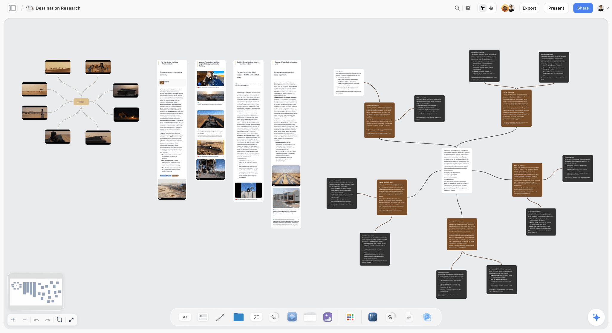
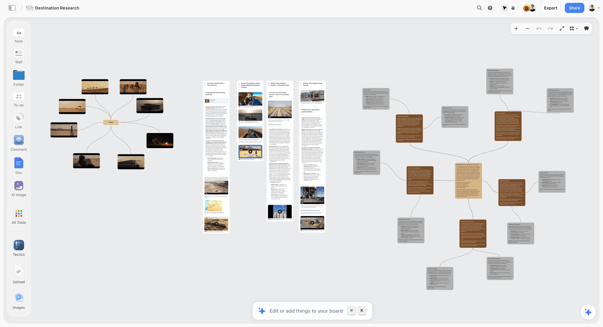
What is left is one specific wall, and it is the wall this whole post is about. You have watched the sessions. You have twenty three moments that felt significant. You know four of them are the same thing wearing different clothes and you cannot see which four. Rung two to rung three, and it is a spatial problem more often than a linear one.
A canvas is a reasonable shape for that. Moments become notes you can move, clusters form because you drag things near each other and then argue with the arrangement. Anyone who has done affinity mapping with sticky notes recognises the process, and it survived the move to digital badly because most digital tools made it a list again. The AI reads your full active canvas board, plus up to one Tactic and up to three Documents you @-mention, so you can ask whether three groups describe the same underlying failure.
But Dovetail wins this ground on provenance and the gap is not close. In Dovetail, a claim links to the quote, the participant and the timestamp. In Storyflow, a note is text you typed, and its connection to the participant who said it is whatever you wrote down. When a stakeholder challenges a finding, that link is the entire defence, and Storyflow does not maintain it.
Strengths.
- Affinity mapping as a genuinely spatial activity rather than a nested list.
- Whole board AI answers questions about the cluster set, not one note at a time.
- Flat per account pricing, and invited collaborators join free, so a workshop costs nothing extra.
- Documents and images sit on the same surface as the clusters, so context stays visible.
Limitations.
- No participant recruiting and no panel of any kind.
- No session recording, screen capture or video hosting.
- No task success metrics, completion rates or time on task.
- No click tracking, heatmaps or behavioural analytics.
- No prototype testing, so it never sees a Figma file being used.
- No transcription, no tagging system and no cross study tag corpus.
- No provenance link from a claim back to a quote, participant or timestamp, which Dovetail has and which matters more than anything else in this list.
The trade off. It handles one wall in the process and is nowhere near the rest of it, and if provenance matters to your organisation, Dovetail is the better answer for that same wall.
What to Actually Pay For
Pay for the analysis layer before a bigger panel. More participants produce more footage, and unwatched footage has no value at any sample size. If your last study ended with recordings nobody opened, the constraint is not recruiting.
Pay per participant until you run more than one study a month. PlaybookUX or Maze panel credits beat an annual contract at low volume, and the break even is the point where a monthly study becomes routine.
Pay for Optimal Workshop only when you are changing navigation. Run the tree test during the redesign, then pause the plan.
Pay for moderated sessions when you need the mechanism. Six unmoderated participants plus three moderated ones costs less than nine of either and reaches rung three far more often.
Tools to Avoid for This Job
A/B testing platforms used as usability tools. An experiment tells you which variant performed better on a metric. It cannot tell you why the losing variant failed, and it needs enough live traffic that you are testing on customers rather than before they arrive. Swapping one method for the other is the most common category error in this space.
Analytics dashboards presented as research. A funnel drop off is a location, not a finding. Naming a drop off as a usability problem without a session behind it is guessing with a chart.
Internal colleagues as participants. They know the product, the vocabulary and what you want to hear. They will find typos, miss the conceptual failure, and be polite about it.
A shared folder of clip links as the deliverable. Rung one packaged as a deliverable, which pushes the analysis onto whoever opens the folder, which is nobody.
What No Tool on This List Does
None of them will write the finding. Every tool here helps you gather evidence and none will make the claim, because the claim requires deciding what matters, and that is a judgment with your name on it.
None of them will tell you whether you tested the right thing. A flawlessly executed study of a feature nobody needs is a well made mistake, and no analysis layer detects it.
None of them will make the team act. A finding with no owner and no scheduled change is rung three forever, and the most consequential part of the process happens in a planning meeting no research tool attends.
Storyflow specifically does not maintain provenance: a note on the canvas is text you typed, disconnected from the participant who said it, and if a stakeholder challenges the claim six weeks later that link is the only defence you have. Dovetail keeps it. Storyflow does not. That is a real gap in the tool this post publishes under, and pretending otherwise would make the rest of this list worthless.
The Bottom Line
The category solved its original problems. Participants are purchasable, recording is free, transcription is included. Any comparison that ranks these tools by panel size is ranking them on a problem that stopped being hard a decade ago.
What did not get solved is the distance between having sessions and having findings. Buy UserTesting if you can afford the deepest post-session layer and will run studies continuously enough to use it. Buy Maze if you test weekly and want patterns without watching anything. Buy Lookback plus Dovetail if you want moderated depth and an analysis layer that keeps provenance, which is the configuration most small research teams should default to.
Whatever you buy, write the finding. A highlight reel is not a finding. The tools have made it effortless to produce something that looks like research and settles nothing, and the only defence is a written claim with a mechanism, a cost and somebody's name against it.
FAQ: Usability Testing Tools
What is the best usability testing tool in 2026?
UserTesting, if you have the budget, because its post-session layer covers more of the distance from raw footage to a defensible pattern than anything else available. Maze is the better answer for teams testing weekly on prototypes and live flows, since it aggregates unmoderated results into patterns automatically. If your bottleneck is analysis rather than data collection, which it usually is, Dovetail is the highest value purchase on this page despite recording nothing.
What is the difference between moderated and unmoderated usability testing?
Moderated means a researcher is present and can ask follow up questions when something unexpected happens. Unmoderated means participants complete predefined tasks alone while the tool records them. Moderated buys you the mechanism behind a failure, because you can ask what someone expected. Unmoderated buys you sample size, speed and comparability, since everyone did the identical task. Effective programmes run unmoderated first to find where the problems are, then moderated to find out why.
Is five users really enough for a usability test?
Five is a planning heuristic, not a rule, and it is genuinely contested. It comes from Jakob Nielsen's writing on discount usability, based on a model of how quickly repeated sessions resurface the same problems. It applies to formative qualitative testing, meaning you are hunting for problems to fix, with a single user group. It does not apply to quantitative benchmarking, which needs enough participants for a meaningful confidence interval, and it does not apply when your product serves several distinct segments, since each needs its own sessions.
What is the difference between usability testing and A/B testing?
Usability testing observes individual people attempting tasks and produces explanations for why something is hard. A/B testing exposes live traffic to two variants and produces a statistical answer about which performed better on a chosen metric. Usability testing works before launch with a handful of participants and tells you why. A/B testing needs substantial live traffic and tells you which, without telling you why the loser lost. They are complementary rather than substitutes.
How many usability testing tools does a team actually need?
Two, in most cases: one that generates sessions and one that turns them into findings. A single platform can cover both, which is what UserTesting charges for. The cheaper configuration is a testing tool plus an analysis layer, for example Maze or Lookback feeding Dovetail. A third tool is justified when you need a method the others lack, which in practice means information architecture testing in Optimal Workshop.
Can you run usability testing for free?
Partly. Maze, Useberry, Optimal Workshop, Hotjar and Dovetail all have free tiers that support a genuine first study, and you can recruit from your own users or customer list at no cash cost. What free tiers do not give you is panel participants, session volume or seats for a team. Recruiting is the expense that resists being free, since screened participants expect an incentive and specific ones expect a larger one.
What should a usability test report contain?
A written finding for each problem, not a clip collection. A finding names the pattern, how many participants exhibited it, the location in the product, the probable mechanism, and the cost of leaving it alone. Supporting clips sit underneath the claim as evidence, not in place of it. A highlight reel is not a finding, and a report built from clips pushes the analysis onto the reader, who will not do it.
How long should a usability testing session be?
Thirty to sixty minutes for moderated sessions, and fifteen to twenty for unmoderated. Beyond an hour, participant fatigue changes behaviour and the data degrades. Unmoderated sessions run shorter because there is nobody maintaining engagement, and completion rates fall past twenty minutes. Three well constructed tasks generate more usable evidence than eight superficial ones rushed through.
Can you do usability testing on a Figma prototype?
Yes, and it is the cheapest useful research available. Maze and Useberry both connect directly to Figma prototypes, wrap tasks around them, and report misclicks, paths and drop off per screen. The limitation is that a prototype only supports the paths you built, so a participant who tries something unanticipated hits a dead end that is an artifact of the prototype rather than the design. Note where those dead ends occurred, because they are frequently the interesting part.
What is affinity mapping and do I need a tool for it?
Affinity mapping is grouping individual research observations until clusters emerge, the standard route from scattered moments to a pattern. A wall and sticky notes remains the fastest method when everyone is in one room. A tool becomes necessary when the team is distributed or the clusters need to survive past the session. Dovetail does it with provenance intact, Storyflow does it spatially without provenance, and both beat a document with nested bullet points.
How do you get a product team to act on usability findings?
Give the finding a cost and an owner in the same sentence it is presented. "Four of seven participants abandoned at the shipping step because the threshold sits below the fold" invites a fix. A clip of someone looking frustrated invites sympathy and nothing else. Present findings during planning rather than in a dedicated readout, since a readout ends with agreement and a planning meeting ends with a ticket.
Does Storyflow replace a usability testing tool?
No, and it is not close. Storyflow does no participant recruiting, no session recording, no task success metrics, no click tracking or heatmaps, no prototype testing and no transcription or tagging. It handles one part of the process, the synthesis wall between having sessions and having findings, and even there Dovetail is the stronger answer because it maintains the link from a claim back to the quote and participant.
Templates you can use in Storyflow
Every Storyflow board starts from real structure and an AI that reads the whole canvas. Open one of these templates and make it yours.


See Storyflow in Action
A visual AI workspace where every feature lives inside one canvas. No tab-switching, no context lost.
Build your entire board from a single message
Type what you need in the AI chat at the bottom of your canvas. The AI adds cards, headings, and structure directly onto your board.
Use expert frameworks as AI context
Type @ in the AI chat and choose any Tactic. The AI tailors every response to that framework instead of giving generic advice.
Turn your board into a mind map in seconds
Ask the AI to restructure your canvas as a mindmap. It connects your ideas into a visual hierarchy so you can see how everything relates.
Why Storyflow Exists
Storyflow actually began as a personal tool while working on creative and research projects.
We kept running into the same problem: ideas were scattered everywhere: notes, documents, and whiteboards.
Nothing helped us see how everything connected.
So we started building a workspace designed around how ideas actually grow.
→ Read how Storyflow was createdSara de Klein
Head of Product at Storyflow
Published: 2026-08-14
Start creating with AI and become more productive
Transform your creative workflow with AI-powered tools. Generate ideas, create content, and boost your productivity in minutes instead of hours.