The 10 Best Empathy Map Tools in 2026 (We Tested Them All)
Every empathy map is built in one room and used in another. The tool you pick decides how much of it survives the trip: access, evidence and argument.

Category
Creative Process
Author

Sara de Klein
Head of Product at Storyflow
Topics
2026-08-13
•
18 min read
•
Creative ProcessTable of Contents
- Key Takeaways
- The Empathy Map Is a Synthesis Artifact, Not a Research Artifact
- At a Glance: The 10 Tools Compared
- How I Ranked These
- Quick Picks by Job Type
- 1. Storyflow
- 2. Miro
- 3. FigJam
- 4. Mural
- 5. Dovetail
- 6. UXPressia
- 7. Lucidchart
- 8. Milanote
- 9. Whimsical
- 10. Canva
- What to Actually Pay For
- Tools to Avoid for This Job
- What No Tool on This List Does
- The Bottom Line
- FAQ: Empathy Map Tools
- Related Reading
Templates to check out for this topic


- empathy map tools
- empathy map template
- empathy map generator
- empathy mapping software
- says thinks does feels
- UX research synthesis tools
What are the best empathy map tools in 2026?
An empathy map is a four quadrant synthesis artifact covering what a user says, thinks, does and feels, and the tool matters less for the ninety minutes you spend filling it than for the six weeks afterwards, when people who were not in the research session have to act on it. Storyflow ranks first on one narrow ground: the finished map can be interrogated later by someone who missed the workshop. Miro has the deepest template library and the best voting. FigJam is the cheapest serious canvas. Dovetail beats everything here at proving where a quote came from.

Full disclosure: Storyflow is our product, so here is the narrow ground it wins on and nothing wider. An empathy map is a spatial quadrant artifact that has to survive being handed to people who were not in the research session, and Storyflow is the only tool here whose AI reads the full active canvas board, so a stakeholder who missed the workshop can question the map instead of the researcher. Flat per account pricing and free invited collaborators mean the second room does not need a seat purchase. What it genuinely cannot do: it ships no empathy map template (the 200 plus Story blueprints are film and production oriented), it has no dot voting, no timer and no anonymous submission, it stores no transcripts and cannot link a sticky to a named participant, it has no PDF or PowerPoint export and no presenter mode, realtime collaboration with permissions and roles is Max only at $39 per month billed annually, and it is cloud only with no offline mode and no native app. Miro beats it on templates and voting, Mural beats it on facilitation, and Dovetail beats it outright on evidence provenance.
Quick Comparison
Ten empathy map tools scored on the Second Room Test: can someone who was not in the research session open the map, trace its evidence, and argue with what it concluded.
| Tool | Best For | AI Features | Price |
|---|---|---|---|
| Storyflow | Maps that get questioned after the workshop ends | AI reads the full active canvas board, plus 1 Tactic and 3 Documents you @-mention | $7.99 mo annual (free plan late 2026) |
| Miro | Running the session, with the deepest template library and dot voting | AI clusters and generates stickies during the session | Free tier, Starter approx $8 per member mo |
| FigJam | Design teams who want the map next to the wireframes | AI sorts and summarises stickies | Free tier, approx $3 per editor mo annual |
| Dovetail | Proving a finding six months after you made it | AI transcription, tagging and theme summarisation across a study | Limited free tier, approx $29 to $39 per user mo |
Key Takeaways
- An empathy map is a synthesis artifact, not a research artifact. The quadrants are where evidence goes to become a decision.
- Every empathy map is built in one room and used in another. Rank tools by what survives the trip.
- Three things go missing in transit: access, evidence and argument. Most tools solve one of the three.
- Storyflow ranks first because its AI reads the full active canvas board, so someone who missed the session can question the map instead of the researcher.
- Storyflow ships no empathy map template, no dot voting, no timer and no research repository. Miro, Mural and Dovetail each beat it on one of those.
- Dovetail is the only tool here where a quote traces back to a timestamped transcript.
- A PNG export is a screenshot of a conclusion. Nobody can argue with it, so it stops being referenced a month later.
- Four maps for four segments beats one averaged map, and most teams build the averaged one because it is faster.
Build an empathy map that still answers questions next month
Draw the four quadrants on a Storyflow canvas, keep the interview material and the brief within scrolling distance, and let anyone who missed the session ask the board what it concluded. Paid-only during early access; the Free plan lands before the end of 2026.

The Empathy Map Is a Synthesis Artifact, Not a Research Artifact
The common mistake is treating the map as a place to put research. It is a place where research becomes a position the team can act on.
The distinction sounds academic until you watch it fail. A team runs eight interviews, transcribes them, then pastes quotes under Says, Thinks, Does and Feels. The board fills up. Nothing has been decided, because the quadrants were used as buckets rather than as an argument, and the map is a prettier version of the transcript pile it came from.
A working map makes a contradiction visible: this person says price decides it, then does the more expensive thing. The gap between Says and Does is not an inconsistency to tidy up. It is the finding. The artifact is spatial precisely because the contradictions between quadrants are the payload.
The Second Room Test
Every empathy map is built in one room and used in another.
The first room is the synthesis session. The researcher is there, the interviews are fresh, and the map makes sense because half its meaning is narrated aloud while it is assembled.
The second room is everywhere else: sprint planning three weeks later, the engineer who joined in October, the client, the new head of product. Nobody there was in the first room, and the map has to work anyway. Three things fail in transit.
Access. Can they open it without a seat being purchased? Excellent maps die here, inside a per seat tool procurement will not clear this quarter.
Evidence. Can they tell where a note came from? A sticky reading "does not trust automated pricing" is a strong claim, and whether one outlier or six of eight participants said it changes what you build.
Argument. Can they see what the map concluded and push back? A map arriving as a flat image is a conclusion with no handles, so nobody engages and it stops being referenced.
At a Glance: The 10 Tools Compared
| Tool | Best for | Strongest second room answer | Weakest second room answer |
|---|---|---|---|
Storyflow | Maps questioned after the workshop | Argument: board level AI answers newcomers | Evidence: no transcripts or participant tags |
Miro | Running the session and voting | Access: largest template library, link sharing | Argument: sprawl buries the map |
FigJam | Design teams already in Figma | Access: cheapest editor seat here | Evidence: nothing beyond typed text |
Mural | Facilitating twelve people live | Argument: private mode forces independent thinking | Access: per member pricing for readers |
Dovetail | Proving a quote is real | Evidence: every tag links to a transcript | Argument: weak visual artifact |
UXPressia | Handing a client a polished file | Access: PDF, PNG and PowerPoint export | Argument: exports freeze the map |
Lucidchart | Enterprises with a security review | Access: SSO clears procurement | Argument: shapes force structure early |
Milanote | Solo researchers and small studios | Argument: reasoning sits beside visuals | Evidence: no research features |
Whimsical | A legible map in fifteen minutes | Access: fast free tier, instant sharing | Evidence: nothing beyond sticky text |
Canva | The handout version for a deck | Access: anyone can open the link | Argument: a graphic, not a surface |
How I Ranked These
I come from documentary, where the job is representing people who are not in the edit suite when decisions about them get made. The artifact is not the transcript log. It is what you hand a commissioner who never met the contributor, and they still understand what that person wanted. Over two years I built these maps in every tool here, then watched what happened to them a month later.
Five criteria, in order.
1. Does the map survive access? Send the link to someone with no licence. See if they can read and comment without you on a call.
2. Does a note carry its evidence? Pick a sticky and ask how many participants said it. If answering means opening another document, the map has leaked.
3. Can it be questioned by someone who was not there? Ask the artifact which quadrant is thinnest. Most tools cannot be asked anything.
4. Does it help the first room converge? Timers, dot voting and private mode stop the loudest person writing the map alone.
5. What does four maps in front of eight people cost? Per seat pricing multiplies once stakeholders need to read it.
Pricing is as of August 2026 and changes frequently. Verify with each vendor.
Quick Picks by Job Type
- Best overall empathy map tool: Storyflow. The map stays askable after the session ends.
- Best for running the workshop: Mural. Private mode and timers are the real facilitation mechanics.
- Best template library: Miro. Dozens of empathy map variants, plus dot voting.
- Best value for design teams: FigJam. Roughly three dollars per editor per month.
- Best evidence trail: Dovetail. The only tool linking a quote to who said it.
- Best client deliverable: UXPressia. Purpose built, exports to PDF and PowerPoint.
- Best for enterprise procurement: Lucidchart. SSO and admin controls that clear security review.
- Best free option: FigJam. Storyflow is not a free option today.
1. Storyflow
The verdict. The only tool here where the finished map can be asked a question by someone who was not in the room when it was made.
Best for. Empathy maps that must keep working for the six weeks after the workshop, in front of people who missed it.
Pricing. Paid only during early access. Plus is $7.99 per month billed annually or $9.99 monthly, adding the 200 plus Story blueprints and unlimited file uploads. Pro is $14 per month billed annually or $19 monthly, adding AI image generation, roughly twenty times more AI usage and memory across conversations. Max is $39 per month billed annually or $49 monthly, adding forty times more AI and Team Workspace with permissions and roles. Pricing is flat per account, not per seat, and anyone a paid member invites signs up free. The Free plan launches before the end of 2026. Pricing as of August 2026.
Why it ranks here. The Second Room Test has three questions and this is the only tool with a real answer to the third. Storyflow's AI reads your full active canvas board, plus up to one Tactic and up to three Documents you @-mention. The map is not a picture of a conclusion. It is something you can talk to.
A product manager who missed the session opens the board and asks what the sharpest Says versus Does contradiction is, or which quadrant has the thinnest evidence. Those are whole board questions. Miro's and FigJam's AI generate and cluster notes, which is first room work.
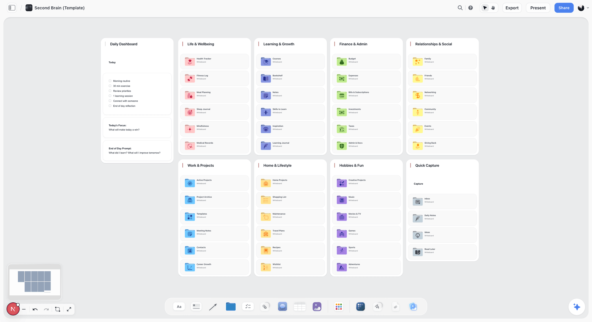
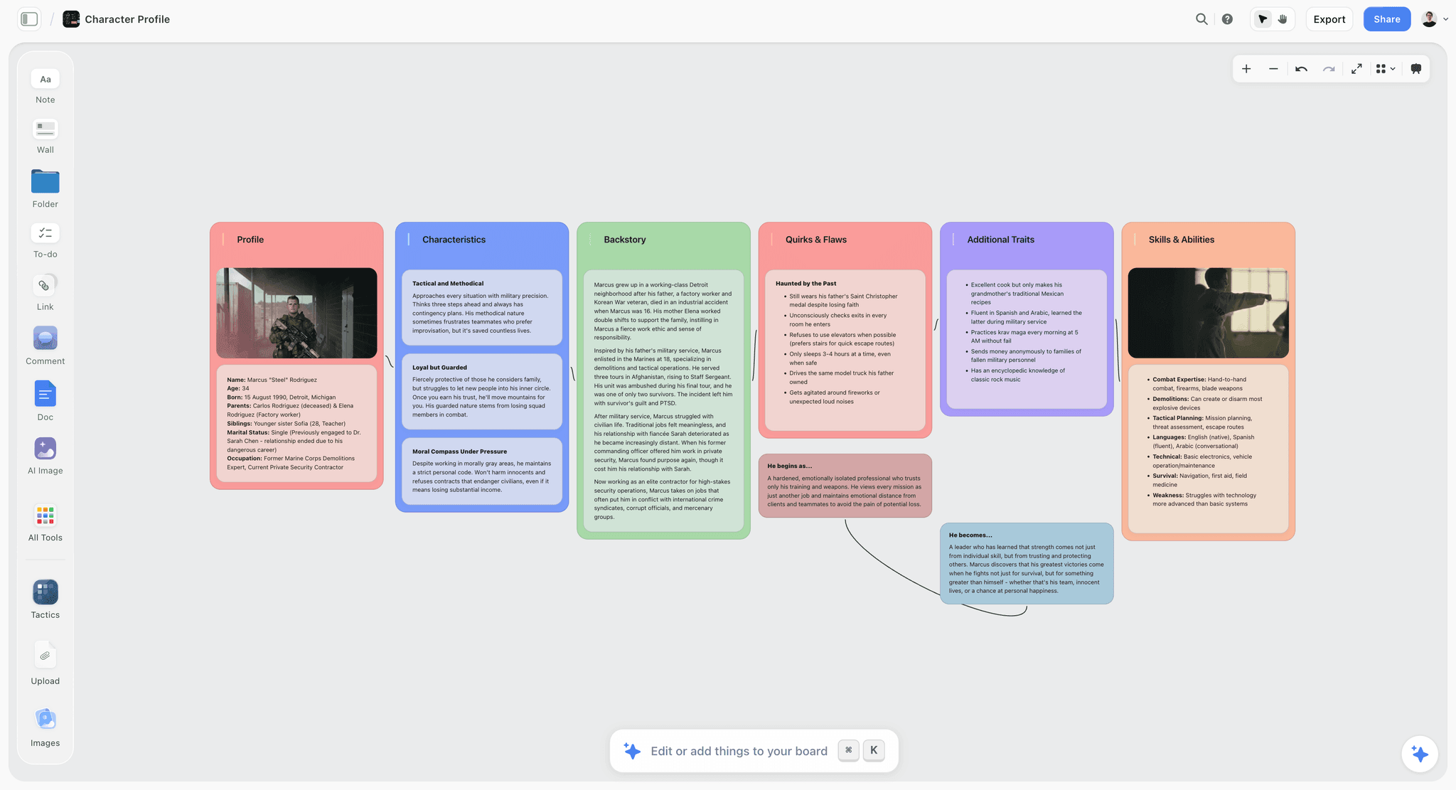
Second, the justification lives on the same surface: quadrants in the middle, interview screenshots left, the brief above, four segment maps side by side. Maps decay fastest when the map sits in one tool and its support sits in three others.
Third, access, which here is pricing structure rather than a feature. Flat per account pricing and free invited collaborators is the difference between the client reading the map and being sent a PNG of it.
Strengths.
- Board level AI lets people who missed the session question the map directly.
- Flat per account pricing, and invited collaborators join free, so stakeholders need no seat.
- Map, interview material, brief and references live on one surface instead of four.
- Four segment maps sit side by side, which is how you catch two segments being one person.
- @-mentioning a Document pulls a research summary into the AI's context.
Limitations.
- No empathy map template. The Story blueprints are film and production oriented, so you draw the quadrants yourself.
- No dot voting, no timer, no anonymous submission. Workshop convergence mechanics are absent and Mural has all three.
- No research repository: no transcripts, no participant tagging, no linking a sticky to a timestamped quote.
- Realtime collaboration with permissions and roles needs Team Workspace, which is Max only at $39 monthly billed annually.
- No PDF or PowerPoint export and no presenter mode, so the client deliverable is assembled elsewhere.
- Cloud only. No offline mode, no native desktop or mobile app.
The trade off. Storyflow holds the map as a living argument. For voting or an evidence trail you run Mural or Dovetail alongside it.
2. Miro
The verdict. The default, defensibly so, with the deepest template library and the voting Storyflow lacks.
Best for. Running the workshop and the synthesis in one tool, with a large group.
Pricing. Free tier with three editable boards. Starter roughly $8 per member monthly billed annually, Business roughly $16, as of August 2026.
Why it ranks here. Miro's empathy map library is the best here. Not one template but dozens: the classic four quadrant, the version with the goal in the centre, the six section layout with Pains and Gains.
The voting matters more than the templates. Dot voting turns forty stickies into the six findings the team agrees on. Without it, prioritisation happens by whoever spoke last, and Storyflow has no equivalent.
Miro loses ground in the second room. The map sits on an infinite canvas beside a warm up exercise and a retro from March, so someone arriving in November has to be told where to look.
Strengths.
- The largest empathy map template library here, with several distinct variants.
- Dot voting and timers turn a full board into an agreed shortlist live.
- Everyone in UX has used it, so training cost is zero.
- Comment and view sharing works without a paid seat.
Limitations.
- Boards sprawl and nothing helps a newcomer find the map that matters.
- Per member pricing across a team plus clients adds up fast.
- AI clusters notes rather than answering questions about a finished board.
The trade off. The best room to run the session in, and a hard room to find anything in later.
3. FigJam
The verdict. The cheapest serious canvas for this job, and effectively free if your team already pays for Figma.
Best for. Product design teams who want the map beside the screens it will change.
Pricing. Free tier with three FigJam files. Collab seats roughly $3 per editor monthly billed annually, $5 monthly, included with Figma design seats, as of August 2026.
Why it ranks here. FigJam wins the access question on cost. Three dollars an editor is close enough to free that nobody builds a case for it, and anyone with a view link can read and comment.
The real argument is adjacency. The map lives beside the wireframes and the design system, so when a finding says users do not trust automated pricing, the screen where trust breaks is two clicks away. That does more for follow through than any feature here.
It sits below Miro on templates and below Storyflow on argument. FigJam's AI sorts and summarises stickies but cannot be asked about the board, and stamps are a lightweight vote rather than a real allocation.
Strengths.
- Roughly $3 per editor monthly, or included with existing Figma design seats.
- The map sits beside the actual screens, shortening the distance from finding to change.
- Free tier with three files covers a first project.
- Comment access for viewers without a paid seat.
Limitations.
- Fewer empathy map templates than Miro, and community quality varies.
- Stamps are not real dot voting with a per person allocation.
- No research features, so provenance is whatever you type by hand.
The trade off. Best value here, and the map inherits Figma's habits for better and worse.
4. Mural
The verdict. The best facilitation mechanics in the category, which is a first room strength rather than a second room one.
Best for. Running a live workshop with ten or more people without it becoming a monologue.
Pricing. Free tier available. Team roughly $9.99 per member monthly billed annually, Business roughly $17.99, as of August 2026.
Why it ranks here. Private mode justifies Mural for this job. Everyone writes without seeing anyone else's stickies, then the board reveals at once. That is the difference between eight independent readings of the research and eight variations on whatever the first person wrote.
Around it sits a real facilitator toolkit: timers, a summon that pulls everyone to the same spot, and locking so the map is not dragged into the void by a stray click.
It ranks fourth because those are first room advantages. What Mural produces has the same second room problems as any canvas: no evidence trail, no way to be questioned, and pricing that makes wide readership expensive.
Strengths.
- Private mode prevents the anchoring that ruins most group synthesis.
- Genuine facilitator controls: timers, summon, lock and follow.
- Solid empathy map templates with facilitation guidance attached.
- Enterprise grade admin and security for regulated clients.
Limitations.
- Per member pricing for anyone who needs more than view access.
- Its advantages evaporate the moment the workshop ends.
- No evidence provenance and no board level questioning.
The trade off. Buy Mural for the session, not for the artifact.
5. Dovetail
The verdict. The only tool here that answers the evidence question properly, and it is not close.
Best for. Research teams who will be asked to prove a finding six months later.
Pricing. Limited free tier. Professional plans commonly around $29 to $39 per user monthly, enterprise quoted separately, as of August 2026.
Why it ranks here. In Dovetail a finding is not a sticky someone typed from memory. It is a tag on a specific span of a specific transcript, with participant and timestamp attached. Click the theme and every highlight behind it appears.
The effect is that a stakeholder challenge stops being a debate about credibility. Someone says users do not really care about that, you click through to eleven highlights across six participants, and the conversation moves on.
It ranks fifth because the map itself is weak inside Dovetail. It is a repository, not a spatial canvas, and reading four quadrants against each other is the kind of reading it is not built for. It is also the most expensive tool here.
Strengths.
- Every claim traces to a timestamped highlight and a named participant.
- Automatic transcription and tagging across a whole study.
- Findings stay searchable across projects, so old research keeps paying.
- The strongest defence against a stakeholder challenging a finding.
Limitations.
- The empathy map is not a first class visual artifact, so you still need a canvas.
- Per user pricing at the top of the range on this page.
- Tagging discipline must be maintained or the repository rots.
The trade off. Pair it with a canvas. Dovetail holds the evidence, the canvas holds the argument.
6. UXPressia
The verdict. Purpose built for personas, journey maps and empathy maps, with the least fighting required to produce a client ready file.
Best for. Consultants and agencies whose deliverable is a document rather than a board.
Pricing. Free tier covering one persona and one map. Starter around $16 monthly, Pro around $36 per user monthly, as of August 2026.
Why it ranks here. UXPressia knows what an empathy map is, which sounds trivial and is not. The quadrants are structured fields, not rectangles you drew, and personas link to journey maps link to empathy maps so a segment carries through without being retyped.
For agency work the export path is worth real money. The client wants a file, the file goes into a deck, and nobody screenshots a canvas at the wrong zoom level at eleven at night.
It ranks sixth because structure cuts both ways. Rigid fields make messy synthesis harder, and messy is where the thinking happens. An exported map is a frozen conclusion: readable, unarguable, stale within a month.
Strengths.
- Purpose built empathy map, persona and journey map templates that link together.
- PDF, PNG and PowerPoint export produces a presentable deliverable.
- Segment consistency is enforced rather than left to discipline.
- Free tier is enough to evaluate it properly.
Limitations.
- Structured fields make early messy synthesis harder than a blank canvas.
- Exports freeze the map, so the second room cannot push back.
- No general canvas, so anything outside the template needs another tool.
The trade off. The best deliverable here and the weakest thinking surface among the serious options.
7. Lucidchart
The verdict. The empathy map tool that clears a security review, which is sometimes the only criterion that matters.
Best for. Enterprise teams whose tool choice is made by IT rather than by the researcher.
Pricing. Free tier with three editable documents. Individual around $9 monthly, Team around $10 per user monthly billed annually, as of August 2026.
Why it ranks here. SSO, SCIM provisioning, admin controls, audit trails and the compliance documentation procurement wants before anyone looks at the product. If your employer has a vendor questionnaire, Lucidchart is often the canvas you are allowed to have.
The product is competent for the job. Templates exist, shapes snap, output is tidy, and Lucid's whiteboard side has closed most of the gap with Miro on freeform work.
It ranks seventh because the diagramming heritage shows. Everything wants to be a shape with a connector, and empathy mapping wants an ugly pile of contradictory quotes sorted late.
Strengths.
- SSO, provisioning and compliance posture that clears enterprise procurement.
- Integrations with Atlassian, Google Workspace and Microsoft 365.
- Tidy output that survives being pasted into a formal document.
- Free tier is usable for a single map.
Limitations.
- The diagramming model pushes toward premature structure.
- Weaker workshop mechanics than Mural or Miro.
- No research features and no evidence provenance.
The trade off. Chosen for governance rather than synthesis, and that is a legitimate reason to choose it.
8. Milanote
The verdict. The nicest place to think alone about a person, with no team mechanics at all.
Best for. Solo researchers and small studios whose map needs images as much as quotes.
Pricing. Free tier with 100 notes. Pro roughly $12.50 monthly billed annually or $14.99 monthly. Team plans around $49 monthly for ten people, as of August 2026.
Why it ranks here. Milanote treats a board as something you compose rather than something you fill. That suits empathy mapping when the user's context is visual and screenshots of their workspace and tools belong beside what they said.
It handles the argument question better than expected, because there is room for prose next to the stickies. One paragraph explaining what the Says and Does gap means is worth more to the second room than any number of coloured squares.
It ranks eighth because there are no research features, no voting and no timers. It is a single practitioner tool that stretches to three people and stops.
Strengths.
- Images and quotes coexist naturally, which suits context heavy research.
- Room for actual prose alongside the quadrants.
- Free tier of 100 notes covers one full map.
- Calm interface that people voluntarily keep open.
Limitations.
- No workshop mechanics: no voting, no timers, no private mode.
- No research or evidence features of any kind.
- No empathy map template, so the structure is yours to build.
The trade off. Excellent for one person thinking carefully. Wrong for eight people deciding together.
9. Whimsical
The verdict. The fastest route from nothing to a legible empathy map, with nothing underneath it.
Best for. Getting a first pass map made in the fifteen minutes you actually have.
Pricing. Free tier with starter boards. Pro roughly $10 per editor monthly billed annually, as of August 2026.
Why it ranks here. Whimsical is unusually fast. Stickies, arrows and text behave the way you expect on the first try, and output is clean with no styling effort. For a map you need before a meeting in twenty minutes, that speed is the whole value.
The speed also fits an underrated use: the hypothesis map. Before any research, build the map you expect in fifteen minutes and keep it. When the real research lands, the difference between the two is the most valuable output of the study.
It ranks ninth because there is no depth behind the speed. No research features, no facilitation mechanics, no board level AI.
Strengths.
- Fastest tool here from blank board to readable map.
- Clean default output with no styling work required.
- Genuinely good for the pre research hypothesis map.
- Simple enough that non designers contribute without a tutorial.
Limitations.
- No voting, no timers, no facilitation features.
- No evidence trail beyond the text you type.
- Free tier limits arrive fast for team use.
The trade off. Perfect for the fifteen minute version, wrong for where the map lives afterwards.
10. Canva
The verdict. The handout, not the map. Useful for exactly one step and misused for all the others.
Best for. Turning a finished empathy map into a slide a stakeholder will actually look at.
Pricing. Free tier available. Pro around $15 monthly for one person, Teams around $10 per user monthly, as of August 2026.
Why it ranks here. There is a real job at the end of this process: making the map presentable for an audience that gives it forty seconds inside a longer deck. Canva does that well, with templates more designed than anything else here.
It ranks last because the polish is actively harmful earlier. A beautiful empathy map looks finished, and a finished map is one nobody edits. Synthesis needs to look provisional for as long as it is provisional.
Treat it as the final hour of the project and it earns its place on the list.
Strengths.
- The best looking output for a stakeholder deck by some distance.
- Non designers produce a consistent, presentable artifact.
- Free tier is workable for a single map.
- Sharing works for anyone with a link.
Limitations.
- Design polish makes provisional work look decided too early.
- No collaboration mechanics for real synthesis.
- No research features and no evidence trail.
The trade off. Use it in the last hour of the project, never in the first.
What to Actually Pay For
Pay for the canvas, not the template. Templates are the cheapest part of this category and the easiest to replace with four rectangles and ninety seconds. You are buying where the map lives afterwards and who can open it.
Pay for Dovetail at roughly twenty interviews a quarter. Below that a spreadsheet of participant IDs against claims does the same job free. Above it you will lose findings you paid to produce.
Pay for Mural only if you facilitate. Private mode and timers are worth real money at ten or more people, regularly. Twice a year, run it in the canvas you already have.
Do not pay per seat for readers. The second room is four to ten people who need to read and comment, not edit. Any tool charging full price for that is charging you for the most valuable part of the artifact's life.
Tools to Avoid for This Job
A slide template as the map. PowerPoint and Slides templates produce a fixed grid of text boxes. The value of the artifact is spatial adjacency and moving a note between quadrants when you realise a claim is a feeling. A slide freezes both.
A spreadsheet of quotes tagged by quadrant. The information is technically present and unreadable as a shape, and the Says versus Does contradiction is invisible in a column.
A document with four headings. Common, and the worst of both worlds. It reads as a report nobody finishes and cannot be worked on collaboratively at speed.
Any tool whose output is only a PNG. A screenshot of a conclusion cannot be argued with. If your deliverable is an image, ship the live board beside it.
One averaged map for all users. Averaging four segments produces a person who does not exist and whose contradictions cancel out.
What No Tool on This List Does
None of them will do the research. A map built from three internal opinions looks exactly like one built from twelve interviews, and nothing here can tell the difference or will warn you.
None of them will stop you averaging. Every tool will happily let you build one map for four distinct segments. The tool has no idea your Feels quadrant is describing two different people.
None of them, including Storyflow, links a sticky back to the participant who said it, except Dovetail. That is a real gap and it is why a canvas and a repository are still two products in 2026. Storyflow stores no transcripts, tags no participants and ships no empathy map template, so the quadrants and the evidence discipline are both on you.
And none of them will make anyone care. A map nobody asked for, presented to a team that already decided, is a well organised document about a decision already made.
The Bottom Line
The empathy map is a synthesis artifact, and almost every tooling decision in this category is made as though it were a research artifact. That is why teams optimise for the ninety minutes of the workshop and then watch the output become irrelevant by the following month.
Buy Miro if you run big sessions and want the templates and the voting. Buy FigJam if your team lives in Figma and you want the map beside the screens. Buy Mural if you facilitate for a living. Buy Dovetail once losing a finding costs more than the subscription, and accept that you still need a canvas beside it.
Every empathy map is built in one room and used in another. The narrow ground Storyflow ranks first on is the second room: a board that can still be asked a question by someone who was not there, with the evidence and the four segment maps within scrolling distance, and no seat to buy before a stakeholder can read it. It ships no template, no voting and no transcripts, and if any of those three is your binding constraint, the tool that beats it there is the better buy.
FAQ: Empathy Map Tools
What is an empathy map?
An empathy map is a synthesis artifact organising what you learned about a user into four quadrants: what they say, think, do and feel. Some versions add Pains and Gains or place the user's goal in the centre. The purpose is not storing research. It is making contradictions visible, particularly the gap between what someone says matters and what they actually do, which is usually where the real product opportunity sits.
What is the best tool for making an empathy map?
Storyflow ranks first because the finished map can be questioned later by someone who was not in the research session, which is where most maps fail. Miro is better if you want the deepest template library and dot voting during the session. FigJam is the best value at roughly three dollars per editor monthly. Dovetail is the only tool tying every claim back to a timestamped transcript. Most teams combine two of these.
Is there a free empathy map tool?
Yes. FigJam gives three free files, Miro gives three editable boards, Whimsical has a free starter tier and Milanote allows 100 free notes, each of which covers a single map comfortably. Canva's free tier handles the presentation version. Storyflow is not one of the free options: it is paid only during early access, though anyone a paid member invites signs up free. The Free plan launches before the end of 2026.
What are the four quadrants of an empathy map?
Says, Thinks, Does and Feels. Says is what the user stated out loud, ideally quoted verbatim. Thinks is what they believe but did not say, inferred from hesitation and contradiction. Does is observed behaviour rather than reported behaviour, and that distinction matters enormously. Feels is emotional state, including emotions they would not admit to. The extended version adds Pains and Gains around the outside with the goal in the centre.
What is the difference between an empathy map and a user persona?
An empathy map captures one person's inner state at one moment, usually a real research participant. A persona is a composite built from several people, with demographics, goals and behaviours, meant to be referenced repeatedly across a project. Empathy maps normally come first: you make several, look for patterns, and the persona is what survives that comparison. Skipping the maps and writing the persona directly is how teams end up with fictional users.
Do I need a template to make an empathy map?
No. The template is four labelled rectangles and takes about ninety seconds to draw in any canvas tool. Templates help for variants you would not think of yourself, like the six section version with Pains and Gains, and Miro has by far the most of those. But template availability is a weak reason to choose a tool. Where the map lives afterwards, and who can open it, matters far more.
How many empathy maps should you make?
One per meaningful segment, so typically three to five, and never one averaged map for everyone. Averaging four segments produces a person who does not exist, and the contradictions that make the artifact valuable cancel out. If your Feels quadrant contains both anxious about overpaying and unconcerned about price, you have two users on one map. Reading four maps side by side is how that becomes obvious.
Can AI generate an empathy map?
It can generate a plausible one, which is the problem. An AI generated map with no research behind it is a well formatted set of assumptions and looks identical to one built from twelve interviews. Where AI genuinely helps is after the research: clustering fifty quotes into themes, drafting a first pass you then correct, and answering questions about a finished board. Storyflow's AI reads your full active canvas board, which makes that last use work.
What is the difference between an empathy map and a customer journey map?
An empathy map is a snapshot with no time axis, describing a state of mind. A journey map is sequential, tracking a person through stages from awareness to purchase, with emotions plotted along the way. They are complementary: the journey map tells you when something goes wrong and the empathy map tells you what the person was thinking when it did. Journey maps built without empathy maps behind them describe the process, not the person.
How do you run an empathy mapping workshop remotely?
Send the research summary a day ahead so nobody reads transcripts live. Open with silent independent writing, ideally in Mural's private mode so nobody anchors on the first sticky posted. Reveal everything at once, cluster together, then dot vote to shortlist. Timebox each quadrant to about eight minutes. Finish by writing one plain sentence stating what the map concluded, because that sentence is what the second room will read.
Does Storyflow have an empathy map template?
No. Storyflow has 200 plus Story blueprints on the Plus plan, but they are story, film and production oriented rather than UX research artifacts, so there is no empathy map among them. You draw four labelled rectangles, which takes about ninety seconds. If a ready made template library is a requirement, Miro has the deepest one in the category and that is a fair reason to pick it instead.
How do you keep an empathy map from going stale?
Keep it live rather than exported, and note beside each quadrant how many participants supported the claims in it. A map arriving in the second room as a flat image is a conclusion with no handles, so nobody questions it and nobody references it after about a month. A map people can open, comment on and ask questions about stays in use. Revisit it after the next research round, not on a calendar.
Templates you can use in Storyflow
Every Storyflow board starts from real structure and an AI that reads the whole canvas. Open one of these templates and make it yours.


See Storyflow in Action
A visual AI workspace where every feature lives inside one canvas. No tab-switching, no context lost.
Build your entire board from a single message
Type what you need in the AI chat at the bottom of your canvas. The AI adds cards, headings, and structure directly onto your board.
Use expert frameworks as AI context
Type @ in the AI chat and choose any Tactic. The AI tailors every response to that framework instead of giving generic advice.
Turn your board into a mind map in seconds
Ask the AI to restructure your canvas as a mindmap. It connects your ideas into a visual hierarchy so you can see how everything relates.
Why Storyflow Exists
Storyflow actually began as a personal tool while working on creative and research projects.
We kept running into the same problem: ideas were scattered everywhere: notes, documents, and whiteboards.
Nothing helped us see how everything connected.
So we started building a workspace designed around how ideas actually grow.
→ Read how Storyflow was createdSara de Klein
Head of Product at Storyflow
Published: 2026-08-13
Start creating with AI and become more productive
Transform your creative workflow with AI-powered tools. Generate ideas, create content, and boost your productivity in minutes instead of hours.