The 10 Best Survey Design Tools in 2026 (We Tested Them All)
The question writes the answer. Everything after it is distribution. Ten survey tools ranked by what they do at the question-writing stage, not by how their dashboards look.

Category
Tools & Software
Author

Sara de Klein
Head of Product at Storyflow
Topics
2026-08-14
•
22 min read
•
Tools & SoftwareTable of Contents
- Key Takeaways
- The Three Drafts of a Question
- At a Glance: The 10 Tools Compared
- How I Ranked These
- Quick Picks by Job Type
- 1. Qualtrics
- 2. SurveyMonkey
- 3. Alchemer
- 4. Maze
- 5. Typeform
- 6. Jotform
- 7. Fillout
- 8. Tally
- 9. Google Forms
- 10. Storyflow
- What to Actually Pay For
- Tools to Avoid for This Job
- What No Tool on This List Does
- The Bottom Line
- FAQ: Survey Design Tools
- Related Reading
Templates to check out for this topic


- survey design tools
- best survey software
- survey question wording
- Likert scale midpoint
- double-barrelled question
- acquiescence bias
- non-response bias
- Net Promoter Score criticism
- free survey tools
- survey pilot testing
What are the best survey design tools in 2026?
Every tool on this list will collect responses, apply skip logic and draw you a chart, and not one of them will tell you that the question was unanswerable. Qualtrics ranks first because it is the only platform here that reviews your wording before you send. SurveyMonkey ranks second for its bank of questions written by methodologists rather than by you at 4pm. Alchemer is the pick for teams running the same instrument every quarter, Maze is the one built for research rather than forms, and Google Forms and Tally are the honest free answers. Storyflow ranks last, does not do surveys, and is here for the hour before the first question exists.

Full disclosure: Storyflow is our product, and it ranks tenth of ten here because it is not a survey tool. It has no form builder, collects no responses, has no skip logic, piping, randomisation or quotas, no distribution, email collector or participant panel, no response storage or export, and draws no charts from response data. It also has no integration with any survey platform, so a question list moves by copy and paste. The narrow ground it holds is the session before the survey exists: deciding what you need to learn and which questions would actually change a decision. For everything after that, use one of the nine tools above it.
Quick Comparison
Every tool here collects responses and draws charts. The differences that matter happen earlier, in the gap between the question you wrote and the question a respondent actually reads.
| Tool | Best For | AI Features | Price |
|---|---|---|---|
| Qualtrics | Research that has to hold up under scrutiny | Scores question wording, length and type in the editor | Quoted, annual contract |
| SurveyMonkey | Sending something good this week without a researcher | Question bank of pre-written, reviewed wording | Free tier, paid from about $25 per month |
| Maze | Piloting with real participants before the real send | Per question timing, drop off, automatic follow up probes | Free tier, paid from about $99 per month |
| Storyflow | Deciding what is worth asking before the builder opens | Whole board AI questions the assumptions in a question list | $7.99 mo annual (free plan late 2026) |
Key Takeaways
- Survey tools compete on distribution, logic and dashboards. None of those repair a leading question, and the data you get is decided before anyone clicks send.
- Acquiescence bias is the documented tendency of respondents to agree with statements as put to them. Any survey written entirely as "Do you agree that..." statements is measuring agreeableness alongside opinion.
- A double-barrelled question asks two things and accepts one answer. "How satisfied are you with the speed and accuracy of our support?" cannot be answered by anyone who found it fast and wrong.
- The midpoint debate on a Likert scale is unresolved and both sides are defensible. What is not defensible is arriving at a midpoint by accident because the tool's default scale had one.
- Non-response bias is the reason a 4.6 average can be wrong rather than imprecise. The people who did not answer are not a smaller version of the people who did.
- Net Promoter Score is a real proprietary metric associated with Fred Reichheld and Bain & Company, and the statistical criticism of it is real and ongoing. Both things are true at once.
- A pilot with five people, watched, will find more problems in twenty minutes than a dashboard will surface in a quarter.
Decide what to ask before you open a survey builder
Storyflow does not collect responses. It holds the decision you are trying to make, the things you already believe, and the small set of questions that separate them, so the survey you build somewhere else is shorter and more pointed. Paid-only during early access; the Free plan lands before the end of 2026.

The Three Drafts of a Question
Every survey question exists three times, and almost every survey failure is a gap between them.
Draft one is the question you wrote. It is clear to you because you already know what you meant, which is the worst qualification there is for judging clarity.
Draft two is the question the respondent read. This is the only draft that generates data. It includes the scale as rendered on their phone, the questions that came before it and set an expectation, the option they wanted that was not there, and the tone that told them which answer you were hoping for.
Draft three is the question the chart answers. By the time a number reaches a slide, it has been relabelled. "Percentage who agreed that onboarding was easy" becomes "onboarding satisfaction", and the gap between the two is invisible to everyone in the room.
The question writes the answer. Everything after it is distribution.
The characteristic failure of this category is not a bad chart. It is a beautiful dashboard built on a question nobody could answer honestly. It looks exactly like insight. It is worse than having no data, because no data leaves a decision visibly unsupported, and a clean bar chart of a broken question closes the discussion. The number is now in a slide, and slides do not carry their own caveats.
So the tools below are ranked by what they do between draft one and draft two: whether they show you the question as a respondent sees it, whether anything pushes back on your wording, and whether you can pilot it with five people and watch where they hesitate.
At a Glance: The 10 Tools Compared
| Tool | Best for | What it does before you send | Entry price |
|---|---|---|---|
Qualtrics | Rigorous research where the question must hold up | Scores wording, length and question type in the editor | Quoted, enterprise |
SurveyMonkey | Fast surveys you did not have time to write well | Offers pre-written questions from its methodology team | Free tier, paid from about $25 per month |
Alchemer | Repeatable instruments run every quarter | Deep logic testing and a reusable question library | Paid from about $55 per month |
Maze | Product research with real participants | Unmoderated pilots that show hesitation per question | Free tier, paid from about $99 per month |
Typeform | Long surveys people actually finish | One question per screen, so you see what they see | Free tier, paid from about $25 per month |
Jotform | Operational forms with conditional paths | Live preview and a very large template library | Free tier, paid from about $34 per month |
Fillout | Modern logic on a small budget | Branching preview and generous free response volume | Free tier, paid from about $15 per month |
Tally | Free surveys without a response ceiling | Document style editing, minimal question guidance | Free, Pro about $29 per month |
Google Forms | Getting an answer today at zero cost | Preview only, no wording help of any kind | Free with a Google account |
Storyflow | Deciding what to ask before a survey exists | No survey features at all, it is the session before | Plus $7.99 per month annual |
How I Ranked These
I come from documentary, where the whole craft of an interview is that a badly phrased question produces a rehearsed answer, and you do not find out until the edit. A survey is the same failure with more decimal places. Over the past two years I have written, piloted and shipped surveys in every tool here, including several that had to be pulled after the pilot.
Five criteria, in order.
1. Does it show you draft two? The test: open the survey on a phone before sending, and look at whether the scale labels fit, whether the neutral option is where you thought, and whether question three has already told the respondent what you want to hear.
2. Does anything push back on the wording? The test: type "How satisfied are you with the speed and accuracy of our support?" into the editor and see whether the tool says a single word about it. One tool here does.
3. Can you pilot and see hesitation? The test: send to five people and find out not just what they answered but where they stopped, reread, or dropped out. Completion time per question is the cheapest diagnostic in research and most tools bury it.
4. Does it make you decide about the scale on purpose? The test: create a rating question and see what you get by default. A five point scale with an unlabelled middle is a methodological choice, and it should not be one the software made for you.
5. What does it cost to reach the people who did not want to answer? The test: price the panel, the reminders and the incentives, not the seat. Non-response is the expensive part, and the seat price is the part vendors advertise.
Pricing is as of August 2026 and changes frequently. Verify with each vendor.
Quick Picks by Job Type
- Best overall for question quality: Qualtrics. It is the only tool that reviews the wording rather than the layout.
- Best when you have to send it today: SurveyMonkey. Its question bank is a shortcut past your own first draft.
- Best free with no response cap: Tally. Unlimited responses on the free plan is genuinely unusual.
- Best free and universal: Google Forms. Everyone can open it, nobody needs an account, it costs nothing.
- Best completion rate on a long survey: Typeform. One question per screen changes how far people get.
- Best for product and UX research: Maze. Pilots with real participants, with timing per question.
- Best repeatable quarterly instrument: Alchemer. Version the survey, keep the question library, compare waves.
- Best conditional operational forms: Jotform. Deep branching without a research budget.
- Best modern builder under $20: Fillout. Logic that behaves like the expensive tools.
- Best for deciding what to ask: Storyflow. Not a survey tool. The session before the survey.
1. Qualtrics
The verdict. The only platform tested that reads your question and tells you something is wrong with it before a respondent ever sees it.
Best for. Research where the finding will be defended, quoted, or acted on with money.
Pricing. Quoted rather than listed. There is a free account tier with tight limits, and the research products are sold as annual contracts negotiated per organisation. Budget for a contract, not a seat, as of August 2026.
Why it ranks here. Qualtrics ranks first on one criterion and it is the criterion this post is about. Its survey review feature scores a draft in the editor and flags the specific structural problems that produce unusable data: questions that carry two ideas, batteries that are too long to be answered attentively, matrix grids that will collapse on a phone, and question types that do not match what you are trying to measure. Nothing else here does that. Every other tool in this list treats your wording as a given and competes on what happens afterwards.
That maps directly onto the gap between draft one and draft two. The tool cannot read a respondent's mind, but it can catch the mechanical faults that reliably cause draft two to diverge: the double-barrelled question, the grid nobody will scroll, the fourteen item agree scale that produces acquiescence bias because by item nine the respondent has stopped reading and started agreeing.
The second thing Qualtrics does that matters is panel and quota work. Non-response bias is the failure mode nobody budgets for: your responses come disproportionately from people who like you enough to answer, and the tool that only handles distribution will report their view as everyone's view. Qualtrics lets you set quotas against a target profile and buy sample to fill the cells you cannot reach organically. That is expensive and it is the correct expense.
It is also genuinely heavy. A two question pulse survey in Qualtrics is a worse experience than the same survey in Tally, and paying an enterprise contract to ask your team where to hold the offsite is absurd.
Strengths.
- Reviews and scores question wording and structure inside the editor.
- Mobile rendering preview that shows what a grid actually does on a phone.
- Quotas and panel access, which is the only real answer to non-response bias.
- Versioning and audit trail, so a finding can be reconstructed months later.
- Logic depth that holds up on a long instrument with many branches.
Limitations.
- Priced and sold for organisations, with no meaningful self serve middle tier.
- Too heavy for anything short, internal, or casual.
- The interface takes real training, and one trained person tends to become a bottleneck.
- Automated wording review catches structure, not bias in your framing.
The trade off. You are buying methodology support and sample access. If you only need a form, you are paying for neither.
2. SurveyMonkey
The verdict. The fastest legitimate route past your own first draft, because someone else already wrote the question.
Best for. Teams who have to send something this week and have no researcher.
Pricing. Free tier capped at around ten questions and a small response allowance per survey. Paid individual and team plans from roughly $25 per user per month billed annually, as of August 2026.
Why it ranks here. SurveyMonkey's question bank is the single most underrated feature in this category. It is a library of pre written questions with tested wording and response options, organised by topic, that you drop into a survey instead of typing your own. That is not a convenience feature. It is the only mechanism on this list that reliably improves draft one, because it replaces your wording with wording that was already scrutinised.
SurveyMonkey is also where most teams meet Net Promoter Score, and it is worth being precise about it. NPS is a real proprietary metric associated with Fred Reichheld and Bain & Company, built on the eleven point likelihood to recommend question, with responses grouped into promoters, passives and detractors and the score expressed as promoters minus detractors. It is widely used, it is comparable across organisations, and executives understand it without a preamble. It also attracts real and ongoing statistical criticism, chiefly that collapsing an eleven point scale into three buckets discards information, that the resulting score is noisy on small samples, and that published claims about its link to growth have been contested. Both of those paragraphs are true. Use it if you need an external benchmark, and pair it with the open follow up question, because the reason is where the value is.
Strengths.
- Question bank with pre written, reviewed wording by topic.
- Templates that include the follow up questions people forget.
- Low friction for non researchers, so surveys actually get sent.
- Benchmarking against external data on standard metrics.
Limitations.
- Free tier is too limited for a real study.
- Per seat pricing across a team adds up quickly.
- Analysis stops well short of what a research team needs.
- Nothing in the editor warns you about a question you wrote yourself.
The trade off. Borrow the question bank even if you build the survey elsewhere. It is the cheapest quality improvement available.
3. Alchemer
The verdict. The tool for a survey you will run again, which is a different problem from a survey you will run once.
Best for. Quarterly trackers, research ops, and instruments that must stay comparable across waves.
Pricing. Paid plans from roughly $55 per user per month billed annually, rising steeply for the tiers with full API and workflow access, as of August 2026.
Why it ranks here. A repeated survey has a constraint one off surveys do not: if you improve the wording, you break the comparison. Alchemer is built around that tension. It keeps a reusable question library at the account level, it versions surveys properly, and it lets you test complex logic paths before launch rather than discovering at wave three that a branch has been silently skipping a segment.
This is where the third draft becomes the dangerous one. A tracker reports a trend line, and a trend line is draft three several times over: nobody rereads the wording after wave one, and the label on the chart quietly drifts from what was asked. Alchemer's version history is the only defence, because it lets you answer whether the dip in wave four is a change in sentiment or a change in the question.
The scale editor also deserves credit for a small thing. It makes you set every point label explicitly rather than accepting a default, which forces the midpoint decision to be a decision. Whether a Likert scale should have a neutral midpoint is genuinely unsettled: including one respects people who have no opinion, and omitting one stops respondents parking there to avoid thinking. What is indefensible is not having chosen.
Strengths.
- Account level question library that keeps trackers consistent.
- Version history that answers whether the question changed or the answer did.
- Logic tester that simulates each path before launch.
- Explicit scale point labelling rather than a silent default.
Limitations.
- Per user pricing that climbs sharply across tiers.
- Interface feels a generation behind the newer builders.
- Overpowered for a one off survey.
- No wording review, so a bad question is versioned faithfully forever.
The trade off. Worth it the moment you are on your second wave. Wasted on your first.
4. Maze
The verdict. The research specific one, and the only tool here that shows you where people hesitated.
Best for. Product and UX teams testing questions, prototypes and concepts with real participants.
Pricing. Free tier for small volumes. Paid plans from roughly $99 per month, with organisation pricing quoted, as of August 2026.
Why it ranks here. Maze is not primarily a survey tool. It is an unmoderated research platform that includes surveys alongside prototype testing, card sorting and concept tests, with access to a participant panel. That combination makes it the best answer to criterion three, which is the one most teams skip.
The pilot is where draft two becomes visible. Send a survey to five recruited participants in Maze and you get more than five sets of answers. You get time spent per question, drop off point, and the open ended text where someone explains that they could not answer question four because they use two of your products. Twenty minutes of that will kill more bad questions than a quarter of dashboard review, and it is the practice this whole post is arguing for.
Where it is weaker is as a general survey instrument. Question type coverage is narrower than Alchemer or Qualtrics, complex quota and weighting work is not its territory, and if you need a 40 question tracker with branching by segment, this is the wrong tool. Its participant recruitment is also priced per participant, which is correct and still surprises teams who budgeted for software.
Strengths.
- Per question timing and drop off, which is the cheapest diagnostic in research.
- Participant recruitment built in, so a five person pilot takes a day.
- Automatic follow up probing on thin open responses.
- Surveys, prototype tests and concept tests in one place.
Limitations.
- Narrower question type coverage than a dedicated survey platform.
- No serious quota, weighting or panel management for representative samples.
- Participant costs sit on top of the subscription.
- Built around product research, so it fits awkwardly for market or employee work.
The trade off. Buy it for the pilot, not the send. Then send the corrected survey wherever you like.
5. Typeform
The verdict. The best completion rate on this list, achieved by a design choice that also quietly changes your data.
Best for. Longer surveys to a warm audience where finishing matters more than neutrality.
Pricing. Free tier with a low monthly response cap. Paid plans from roughly $25 per month, with the response allowance being the real variable, as of August 2026.
Why it ranks here. One question per screen is the strongest respondent experience decision any tool here has made. A respondent never sees a wall of forty items and abandons before starting, the mobile rendering is correct by construction, and the scale you designed is the scale they see. On criterion one, showing you draft two, Typeform is second only to Qualtrics and it gets there by having almost nothing on screen.
The honest caveat is that Typeform's conversational register is not neutral. Its templates and defaults nudge toward a warm, friendly voice, and a warm voice is a leading voice. "How much did you love the new dashboard?" is a Typeform sentence and an unusable question. Because respondents see one item at a time, they also cannot compare it against the others to calibrate, which reduces some anchoring effects and increases the influence of the immediately preceding question.
Strengths.
- One question per screen, which lifts completion on long surveys.
- Mobile rendering is correct without checking, because there is nothing to break.
- Logic jumps and piping that non technical people can build.
- The best looking survey a respondent will receive this year.
Limitations.
- Response caps rather than seats drive the real cost.
- Conversational defaults push toward leading wording.
- Respondents cannot see the full instrument, which matters for some designs.
- Analysis is thin and effectively assumes you will export.
The trade off. Use it for the presentation layer and write the questions somewhere colder.
6. Jotform
The verdict. The widest form builder here, which makes it excellent for operations and mediocre for research.
Best for. Conditional intake forms, applications and registrations that need to branch and integrate.
Pricing. Free tier with monthly submission limits. Paid plans from roughly $34 per month, priced on submissions and storage rather than seats, as of August 2026.
Why it ranks here. Jotform's conditional logic is strong and its template library is the largest on this list. If your instrument is really a process (an application that routes by applicant type, a booking that collects different fields per service) it handles that without a developer.
For survey design specifically it sits in the middle of the pack because it optimises the wrong half of the problem. Every feature is about what happens after the answer: routing, notifications, approvals, integrations. Nothing in the builder addresses the wording. The template library is broad rather than validated, so a template question is somebody's draft one that got published, and it carries no more authority than yours.
The specific risk with Jotform is scope creep in the instrument. Because adding a field is trivial and conditional logic makes it feel free, forms grow. A 30 field form with branching is a respondent burden regardless of how few fields any one person sees, and the drop off does not show up as a data quality problem. It shows up as non-response bias, silently, in whoever had the patience to finish.
Strengths.
- Conditional logic that non technical teams can build and maintain.
- Very large template library across operational use cases.
- Payments, e-signature and file upload handled natively.
- Submission based pricing works well for one heavy form.
Limitations.
- Templates are unvetted, so template wording is not validated wording.
- No question quality guidance anywhere in the builder.
- The interface encourages forms to grow past what anyone will finish.
- Analysis is reporting, not research.
The trade off. Right tool when the form is a process. Wrong tool when the form is a measurement.
7. Fillout
The verdict. The best value modern builder, with logic that behaves like tools costing three times more.
Best for. Small teams who need real branching and a clean respondent experience on a small budget.
Pricing. Free tier with a monthly response allowance that covers most small studies. Paid plans from roughly $15 per month, as of August 2026.
Why it ranks here. Fillout is the tool most likely to surprise someone who last looked at this category three years ago. Multi page forms, conditional branching, calculations, answer piping and a genuinely clean respondent view, at a price that does not require a business case. It also integrates directly with the databases teams already keep responses in, which removes the export step where survey data usually goes to die in a downloads folder.
Its branching preview is the reason it ranks above Tally and Google Forms. You can walk the logic as a respondent and see the actual path, which catches the classic error where a skip pattern excludes exactly the group you were trying to study. That is a draft two problem and Fillout surfaces it.
Where it stops is guidance. Fillout will build whatever you specify, precisely and attractively, including a question that cannot be answered. There is no question library, no wording review and no piloting instrumentation. The gap between draft one and draft two is entirely yours to close, and the tool's speed makes it easier to skip that step, because a survey that took eleven minutes to build feels like it did not need review.
Strengths.
- Branching preview that walks the real respondent path.
- Logic, calculations and piping at an entry level price.
- Direct writes into the databases teams already use.
- Free tier that covers a genuine small study.
Limitations.
- No question library and no wording guidance at all.
- No participant panel or recruitment.
- Reporting is basic and assumes you will analyse elsewhere.
- Smaller company, so fewer integrations than Jotform.
The trade off. You save the licence cost and spend it back in the pilot you now have to run yourself.
8. Tally
The verdict. The most generous free plan in the category, in an editor that gets out of the way.
Best for. Free surveys where response volume is unpredictable and budget is zero.
Pricing. Free with unlimited responses on the core plan. Pro is roughly $29 per month for branding removal, custom domains and advanced integrations, as of August 2026.
Why it ranks here. Tally works like a document. You type, and question types appear as you need them, which means writing a survey feels like writing rather than configuring. That is a real advantage for question quality, and it is one nobody markets: when the interface is a form builder, you think in fields, and when it is a document, you think in sentences.
The free plan is the headline. Unlimited responses without a monthly cap is unusual, and it removes the specific failure where a survey stops collecting mid study because the allowance ran out and nobody was watching. For a student, a solo founder or a community group, this is the correct answer and it costs nothing.
It offers no help with the question itself, which is why it sits eighth. The question writes the answer. Everything after it is distribution. Tally is very good distribution, free, with no ceiling, and that is worth being clear eyed about rather than dismissive of. Most surveys that fail do not fail because the tool was free.
Strengths.
- Unlimited responses on the free plan.
- Document style editor that keeps you writing sentences, not configuring fields.
- Logic, calculations and hidden fields included free.
- Fast enough that a pilot version costs nothing to build.
Limitations.
- No question guidance, library or review.
- Reporting is a summary, not analysis.
- No versioning, quotas or panel access.
- Smaller integration surface than the established players.
The trade off. Take the free plan and spend the saved subscription on incentives for a five person pilot.
9. Google Forms
The verdict. Free, universal, instantly openable by anyone, and completely silent about whether your question is any good.
Best for. Getting an answer today from people who already trust you.
Pricing. Free with a Google account. Included with Workspace, as of August 2026.
Why it ranks here. Google Forms is on this list because it is honest about what it is. It has no pretensions to research, and for a large share of real world surveys (a team retro, an event RSVP, a quick internal poll) it is the right tool and everything above it is overkill. Distribution is frictionless because the link opens for everyone with no account, no app and no load time, and that matters more for response rate than any feature.
It ranks ninth because it does nothing at all in the space this post is about. There is no question library, no wording review, no logic testing worth the name, no per question timing and no versioning. Its default rating question hands you a linear scale with endpoints you label and a middle you did not think about, which is exactly how an accidental midpoint enters a study.
Use it deliberately. The twenty minutes you save here is borrowed against the quarter you spend acting on a number that was never measuring what you thought.
Strengths.
- Free, with no response limits or expiry.
- Opens for anyone, on anything, with no account.
- Direct connection to Sheets for analysis.
- Zero learning curve, so it actually gets used.
Limitations.
- No question guidance, library or review of any kind.
- Branching is section based and awkward beyond simple cases.
- Default scales make the midpoint decision for you.
- No timing, drop off or pilot instrumentation.
The trade off. The right tool for low stakes questions and the wrong one the moment a number will be quoted.
10. Storyflow
The verdict. Storyflow does not do surveys, and it ranks last for exactly that reason. Its only claim is the hour before the survey exists.
Best for. Deciding what you actually need to learn, and which questions are worth asking, before anyone opens a survey builder.
Pricing. Paid only during early access. Plus is $7.99 per month billed annually or $9.99 monthly, adding the 200 plus Story blueprints and unlimited file uploads. Pro is $14 per month billed annually or $19 monthly, adding AI image generation, roughly twenty times more AI usage and memory across conversations. Max is $39 per month billed annually or $49 monthly, adding forty times more AI and Team Workspace with permissions and roles. Pricing is flat per account rather than per seat, and anyone a paid member invites joins free. The Free plan launches before the end of 2026.
Why it ranks here. Be clear about what is missing, because it is nearly everything this category is made of. Storyflow has no form builder. It cannot collect a response. It has no skip logic, no piping, no branching, no quotas. It has no distribution, no email invitations, no link collector and no participant panel. It does not store responses, cannot export them, and will not draw a chart from response data because it never holds any. If you need a survey, you need one of the nine tools above and Storyflow does not compete with any of them.
What it holds is the session that produces the question list. The recurring pattern behind bad surveys is that the instrument was written directly into the builder, which means the first artifact anyone created was already draft one of nine questions. The decision that should have come first (what would we do differently depending on the answer) never got made, so the survey collects a set of things that are interesting and none that are decisive.
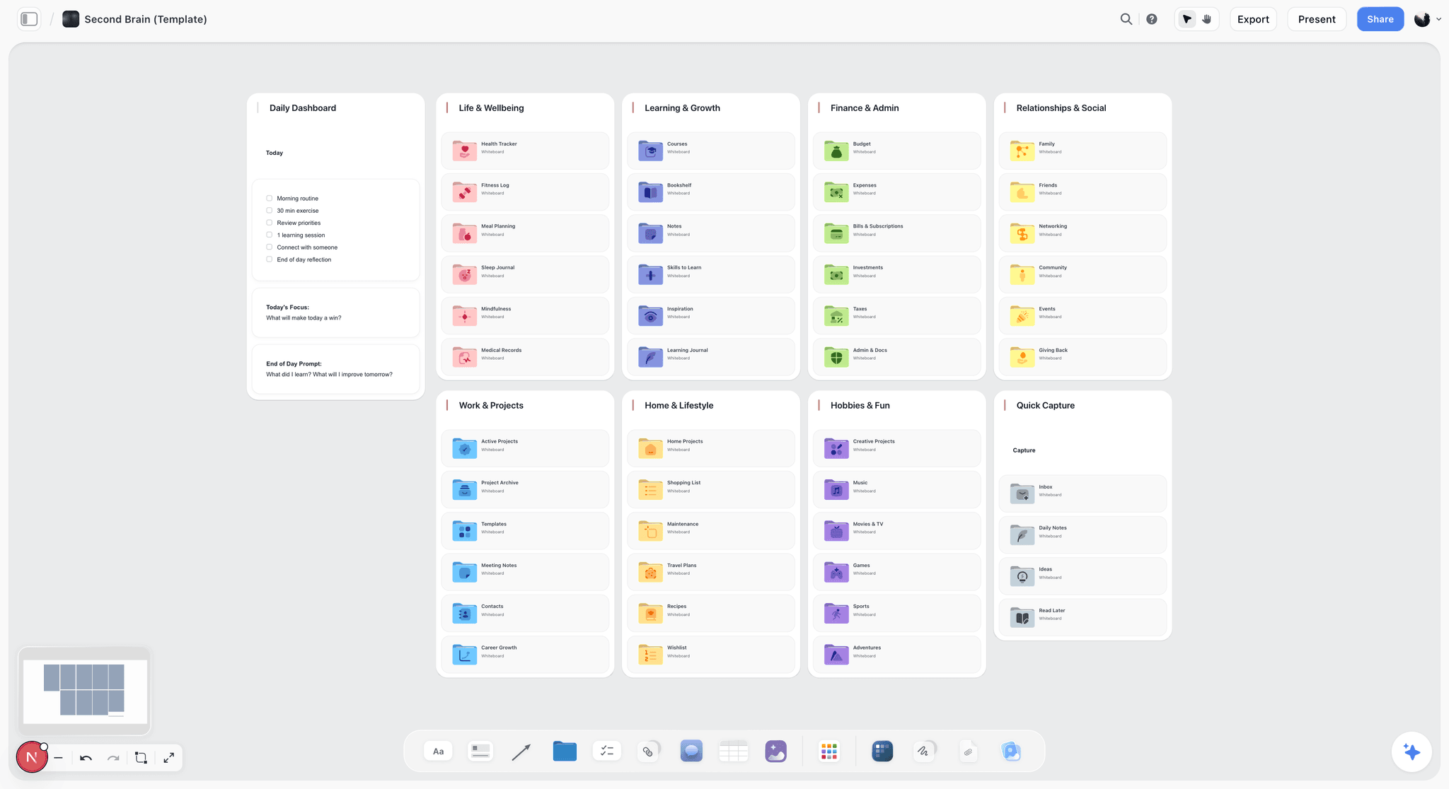
The AI reads your full active canvas board, plus up to one Tactic and up to three Documents you @-mention, which is useful for one thing here: asking what a question list implies you have already assumed. That is a critique of framing, not a wording review.
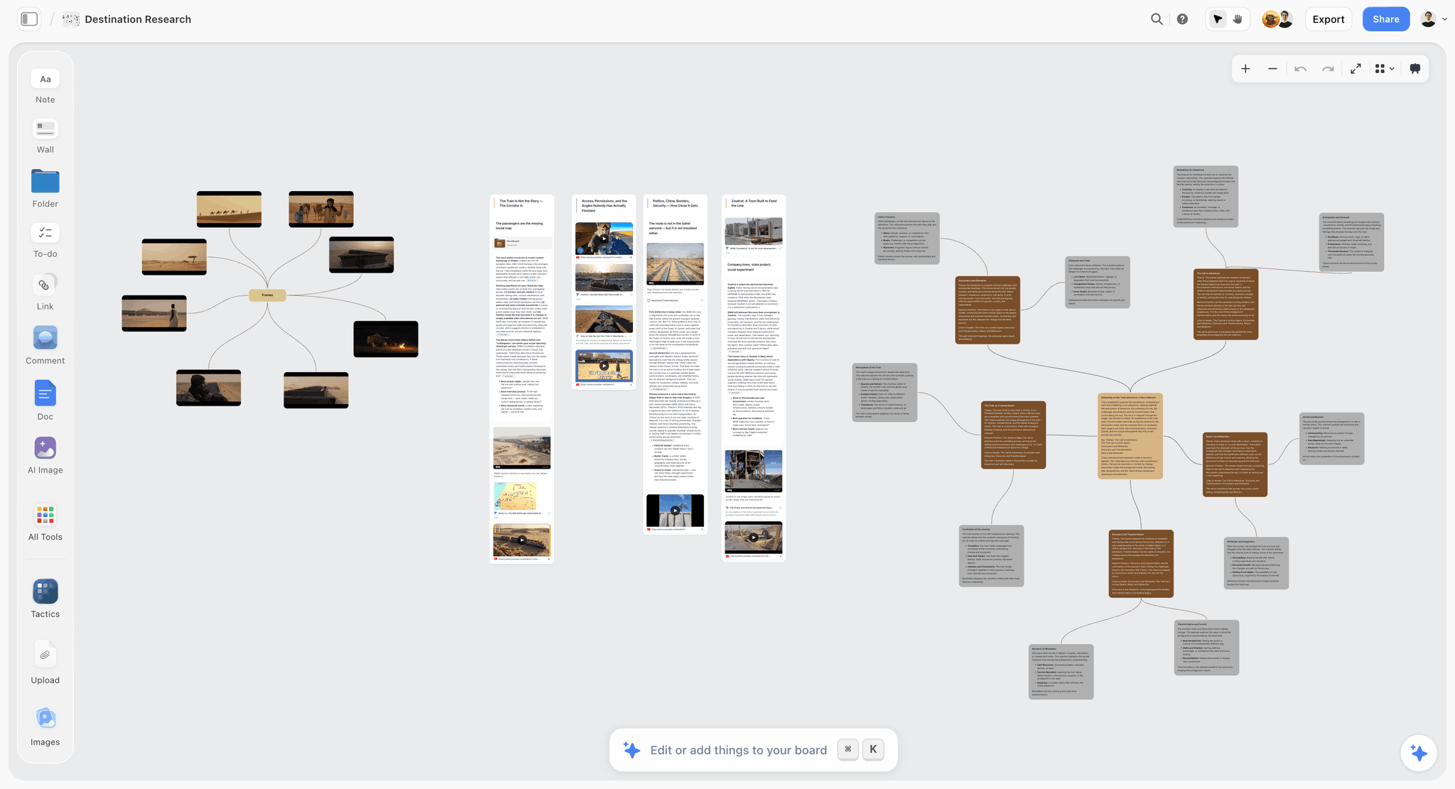
A canvas suits that session because the inputs are not a list. They are a decision you are trying to make, the things you already believe, the things you would be embarrassed to be wrong about, and the small number of questions that separate those states. Laying them out spatially makes the redundancy obvious: two questions that would produce the same action are one question, and a question whose answer changes nothing is a question to cut before it costs someone ninety seconds.
Ranked tenth, honestly. It is a planning surface adjacent to this category, not a member of it.
Strengths.
- Holds the decision the survey is meant to inform, next to the questions themselves.
- Spatial layout exposes redundant and non actionable questions before they are written.
- Whole board AI can surface the assumptions a question list is carrying.
- Invited collaborators join free, so a planning session costs one subscription.
Limitations.
- No form builder and no way to collect a single response.
- No skip logic, piping, branching, randomisation or quotas.
- No distribution, no email collector, no link collector, no panel.
- No response storage, no export, and no charts from response data.
- No question library, no wording review and no methodology guidance.
- No integration with any survey platform, so the question list moves by copy and paste.
The trade off. It replaces nothing on this list. It only makes the thing you build in one of them shorter and more pointed.
What to Actually Pay For
Pay for review, not for features. The only paid capability on this list that improves the data rather than the workflow is Qualtrics scoring your wording before you send. Everything else you are buying is speed, polish or scale applied to a question you wrote unaided.
Pay for participants before you pay for software. A five person pilot with a small incentive costs less than a month of most plans here and will change more questions. Maze bundles recruitment, and paying per participant is the right shape of cost.
Tools to Avoid for This Job
A template library treated as validated questions. Templates in most builders are somebody's draft one that shipped. SurveyMonkey's question bank is the exception because the wording was reviewed, and the distinction matters more than the word "template" suggests.
An AI that writes your survey from a prompt. It will produce fluent, plausible, double-barrelled questions at speed, because fluency is what it optimises and answerability is not something it can check. Use it to critique a draft, not to generate one.
Any instrument you have not answered yourself, on a phone. Ten minutes of taking your own survey outperforms every quality feature listed on this page.
A survey when you needed five interviews. If you cannot yet name the answer options, you do not have a survey question. You have an open question, and a survey is the wrong instrument for it.
What No Tool on This List Does
None of them will tell you that the answer is not worth having. A perfectly written question about something you would not act on either way is still wasted, and every tool here will collect it enthusiastically.
None of them, including Qualtrics, will catch bias in your framing. Automated review catches structure: two ideas in one question, a grid too wide for a phone, a battery long enough to trigger acquiescence bias. It cannot catch that you asked how helpful the new feature was rather than whether it was used.
None of them will fix non-response bias by trying harder. Reminders raise the count without changing who is systematically absent, and a higher response rate from the same self selecting group is a more confident version of the same distortion.
None of them, including Storyflow, connects the planning session to the survey. Storyflow will not push a question list into SurveyMonkey, Typeform or anything else, has no integration with a single tool on this page, and the handoff is copy and paste. That is a real gap and this post is not going to pretend otherwise.
The Bottom Line
Survey platforms compete on the half of the problem that begins once the data exists, and that competition is real. It also happens downstream of the only decision that determines whether the data means anything.
The question writes the answer. Everything after it is distribution. Qualtrics ranks first here because it is the one tool that intervenes upstream of that, scoring your wording before a respondent ever sees it. SurveyMonkey ranks second because a reviewed question from a library beats your unreviewed question written between meetings. Maze earns its place by making the five person pilot cheap enough that you will actually run it.
If your budget is zero, take Tally or Google Forms without apology, and spend the twenty minutes you saved answering your own survey on a phone. That habit will do more for your data than any subscription on this page. And if you find yourself unable to say what you would do differently depending on the answer, stop writing questions: that is a planning problem, and it is the narrow ground Storyflow is on this list for, ranked last, doing none of the survey work at all.
FAQ: Survey Design Tools
What is the best survey design tool in 2026?
Qualtrics, if question quality is the thing you are optimising, because it is the only platform that reviews your wording inside the editor and flags the structural faults that make answers unusable. SurveyMonkey is the better answer for teams without a researcher, because its question bank replaces your first draft with reviewed wording. For product research, Maze is stronger than either, since it lets you pilot with real participants and see where they hesitated.
What is the best free survey tool?
Tally for volume and Google Forms for reach. Tally's free plan collects unlimited responses, which removes the failure where a study stops mid collection because an allowance ran out. Google Forms is free forever, opens for anyone without an account, and connects straight to Sheets. Neither offers any help with your wording, so budget the time you saved into piloting the survey with five people before you send it.
How do you write a good survey question?
Write the decision first, then the question that changes it. If both possible answers lead to the same action, cut the question. Then check three things: that it asks one thing rather than two, that a reasonable person could give any of the offered answers without embarrassment, and that the wording does not signal which answer you want. Finally, answer it yourself on a phone before anyone else sees it.
What is a double-barrelled question?
A double-barrelled question asks about two things and accepts a single answer. "How satisfied are you with the speed and accuracy of our support?" cannot be answered by anyone who found it fast and wrong, so they pick something in the middle and the number means nothing. The fix is always to split it into two questions. It is one of the most common and most easily avoided faults in survey design.
What is acquiescence bias?
Acquiescence bias is the documented tendency of respondents to agree with a statement as it is put to them, independent of its content. It is why a survey built entirely from "Do you agree that..." items measures agreeableness alongside opinion, and why long agree scale batteries degrade as respondents tire. Common mitigations include mixing the direction of statements so agreement is not always the positive answer, and using specific behavioural questions instead of attitude statements.
Should a Likert scale have a middle option?
This is genuinely unsettled and both positions are defensible. Including a neutral midpoint respects respondents who truly have no opinion, and forcing them off it manufactures a preference that does not exist. Omitting it stops people parking in the middle to avoid thinking, which inflates neutrality. What is not defensible is arriving at a midpoint because the tool's default scale had one. Decide deliberately, and consider offering an explicit "no opinion" option separate from the scale.
Is Net Promoter Score still worth using?
It depends on what you need it for. NPS is a real proprietary metric associated with Fred Reichheld and Bain & Company, it is understood without explanation in most boardrooms, and it allows comparison across organisations. It also attracts real, ongoing statistical criticism: collapsing an eleven point scale into three groups discards information, the score is noisy on small samples, and claims linking it to growth have been contested. Use it for external comparability, and treat the open follow up as the actual finding.
How many people should you pilot a survey with?
Five is enough to find most wording problems, and it is the step teams skip. Watch them answer rather than just collecting their responses, because the value is in where they paused, reread, or asked what a question meant. Maze instruments this directly with per question timing and drop off. If you are piloting manually, a twenty minute screen share with a colleague who is not close to the project finds nearly as much.
What is non-response bias?
Non-response bias is the distortion created when the people who did not answer differ systematically from those who did. It is why a 4.6 average satisfaction score can be wrong rather than merely imprecise: the strongly dissatisfied often leave rather than fill in a form. Reminders raise the count without fixing it, since they pull more of the same responsive group. The real answers are quota sampling against a known profile, panel access, and being honest in the write up about who is missing.
How long should a survey be?
Short enough that the last question gets the same attention as the first, which in practice means under five minutes for most audiences. Length is not measured in questions but in effort: five open text boxes cost more than twenty single choice items. The test is whether every remaining question would change a decision. Long batteries of agree statements are the worst offender, because response quality degrades exactly where acquiescence bias is strongest.
Does Storyflow replace SurveyMonkey or Qualtrics?
No, and it is not close. Storyflow has no form builder, cannot collect a single response, has no skip logic, piping or quotas, no distribution or participant panel, no response storage or export, and draws no charts from response data. It ranks tenth on this list because it is not a survey tool. It sits before one, holding the decision you are trying to make and the question list while both are still changing.
What is the biggest mistake teams make when designing surveys?
Opening the builder first. Typing questions into a form makes the instrument the first artifact, which means the wording was drafted before anyone decided what the answers would change. The result is a survey full of interesting questions and no decisive ones, and a dashboard that reads well and settles nothing. Decide the action first, write the smallest question set that separates the options, then choose the tool.
Templates you can use in Storyflow
Every Storyflow board starts from real structure and an AI that reads the whole canvas. Open one of these templates and make it yours.


See Storyflow in Action
A visual AI workspace where every feature lives inside one canvas. No tab-switching, no context lost.
Build your entire board from a single message
Type what you need in the AI chat at the bottom of your canvas. The AI adds cards, headings, and structure directly onto your board.
Use expert frameworks as AI context
Type @ in the AI chat and choose any Tactic. The AI tailors every response to that framework instead of giving generic advice.
Turn your board into a mind map in seconds
Ask the AI to restructure your canvas as a mindmap. It connects your ideas into a visual hierarchy so you can see how everything relates.
Why Storyflow Exists
Storyflow actually began as a personal tool while working on creative and research projects.
We kept running into the same problem: ideas were scattered everywhere: notes, documents, and whiteboards.
Nothing helped us see how everything connected.
So we started building a workspace designed around how ideas actually grow.
→ Read how Storyflow was createdSara de Klein
Head of Product at Storyflow
Published: 2026-08-14
Start creating with AI and become more productive
Transform your creative workflow with AI-powered tools. Generate ideas, create content, and boost your productivity in minutes instead of hours.