The 11 Best Tools for UX Writers in 2026
Design tools show screens. Users experience flows. Eleven tools ranked by whether they can show you a whole journey's copy at once.

Category
UX & Product Design
Author

Sara de Klein
Head of Product at Storyflow
Topics
2026-08-10
•
18 min read
•
UX & Product Design- best tools for UX writers
- best tool for mapping user flows and customer journeys
- UX copy management
- Ditto vs Figma copy
- terminology consistency product copy
- content design tools
What are the best tools for UX writers in 2026?
The best tool for a UX writer is the one that lets you read a whole flow at once, because users experience flows and design tools only ever show you screens. Storyflow ranks first here for that reason: it is the only tool on this list where every string in a signup journey can sit on one canvas an AI reads end to end, which is how terminology drift between screen 2 and screen 7 becomes visible before it ships. Ditto is the correct answer for keeping copy attached to components. Figma is where the words are designed. Lokalise is where they actually ship. This ranking judges all 11 tools on one fact: a string lives in three places, and your job is keeping them in agreement.

Full disclosure: Storyflow is our own product, and we rank it #1 here for one job: reading a whole flow's copy at once so terminology drift between distant screens becomes visible. It is not a string management system. It does not attach copy to design components, does not sync to code, has no developer API, no character-limit enforcement and no localization. Ditto, Lokalise and Figma own those, and getting copy onto a Storyflow board is a manual step today because there is no Figma plugin. We link to every tool so you can judge the fit.
Quick Comparison
These four map to the three places a string lives plus the flow-level view none of them provide: review, copy management, design context, and the shipped build.
| Tool | Best For | AI Features | Price |
|---|---|---|---|
| Storyflow | Flow-level copy review | Canvas-wide context AI | $7.99 mo annual (free plan late 2026) |
| Ditto | Strings attached to components | Light AI | Free / from ~$19 per editor mo |
| Figma | Copy in visual context | Standard AI | Free / from ~$16 per seat mo |
| Lokalise | Shipped strings and localization | Translation AI | From ~$120 mo |
Key Takeaways
- Every piece of product copy lives in three places at once: the design file, the production build and the style guide. UX writing is the discipline of keeping those three in agreement, and they drift by default.
- Design tools show screens. Users experience flows. An error message that is perfectly written in isolation can still be wrong because of what the previous screen promised.
- Storyflow ranks first for the flow level view specifically, because whole canvas AI can read every string in a journey at once and surface terminology that changes halfway through.
- Storyflow is not a string management system. It does not attach copy to components, does not sync to code, and does not handle localization. Ditto and Lokalise own those and this post says so.
- Terminology drift is the most common and least noticed UX writing defect. "Account" on screen 2 and "profile" on screen 7 costs support tickets that nobody traces back to copy.
- The design file is not the source of truth for shipped copy. The build is. Any process that assumes otherwise produces strings that were changed by an engineer in a hurry and never reviewed.
- Testing terminology is cheap and almost nobody does it. Optimal Workshop's tree testing will settle a naming argument in a day for less than the argument costs.
Read the flow, not the screens
Every screen can be individually well written and the sequence still call one object three names. Storyflow puts a whole journey's copy on one canvas the AI reads end to end, so terminology drift surfaces in a query instead of in support tickets. Paid-only during early access; the Free plan lands before the end of 2026.

The Three Places a String Lives
A UX writer writes one sentence. That sentence immediately exists in three separate systems with three separate owners.
The design file. Where the string is written, sized, and looks correct in context. Owned by design. This is where most UX writing tooling lives, and it is the only one of the three where the writer usually has direct edit access.
The production build. Where the string actually ships, in a codebase, a CMS, or a localization platform. Owned by engineering. This is the only version a user will ever read.
The style guide. Where the rules live: voice, tone, terminology, capitalization, whether you say "sign in" or "log in". Owned by the writer, and consulted by almost nobody.
These three drift apart continuously and asymmetrically. An engineer shortens a string to fit a container and does not tell anyone. A designer copies a component and the old copy comes with it. The style guide is updated and nothing downstream changes.
The design file is not the source of truth for shipped copy. The build is. Any workflow that treats the Figma file as authoritative is producing an increasingly fictional record of what your product says.
Then there is the failure that sits above all three, and it is the one this article is really about.
Design tools are organized by screen. Products are experienced as flows. A UX writer reviewing a signup journey in Figma looks at eleven frames, one at a time, and each one can be individually excellent while the sequence is incoherent. The screen that says "create your account" leads to one that says "complete your profile" and later to an error that says "we could not update your record". Three nouns for one object, each defensible alone.
Terminology drift is the most common and least noticed UX writing defect, because it is invisible at the unit of work everyone actually reviews.
The 11 tools below are ranked by which of the three places they serve, and whether they can show you a flow rather than a screen.
At a Glance: The 11 Tools Compared
| Tool | Best for | Place it serves | Flow-level view |
|---|---|---|---|
Storyflow | Reading every string in a journey at once | Style guide | Yes |
Ditto | Copy attached to components, with variants | Design, build | Partial |
Figma | Writing the copy in visual context | Design | No |
Lokalise | Strings in the build, and localization | Build | No |
Writer | Enforcing voice and terminology at scale | Style guide | No |
FigJam | Mapping the journey before the screens exist | Design | Yes |
Whimsical | Fast user flow diagrams | Design | Yes |
Optimal Workshop | Testing whether your terminology is understood | Style guide | No |
Maze | Testing copy variants with real users | Build | No |
Notion | The written style guide and decision log | Style guide | No |
Google Sheets | The string inventory nobody admits to | Build | Partial |
How I Ranked These
I write for a product and I have made every mistake in this article, including shipping three different nouns for the same object across one onboarding flow. Over the last two years I have run real copy work through every tool here.
Five criteria, in order.
1. Can you see a whole flow's copy at once? The test: put eleven screens of a signup journey into the tool and try to spot a terminology inconsistency without opening each screen separately. Most tools fail this immediately.
2. Does the copy stay attached to the thing that ships? A string that exists only in a design file is a suggestion. Tools that connect design copy to the build are doing the hard, unglamorous work.
3. Does it handle variants and states? Real product copy is empty states, error states, loading states, plural forms and character limits. A tool that only handles the happy path is a toy.
4. Can engineers use it without resenting it? UX writing tooling fails politically more often than technically. If it adds friction to a developer's day it will be routed around.
5. What does it cost for a team of one? Many UX writers are the only writer in the company, and enterprise pricing is not available to them.
Pricing is as of August 2026 and changes frequently. Verify with each vendor.
Quick Picks by Job Type
- Best for flow level review: Storyflow. Every string in a journey on one canvas the AI reads whole.
- Best copy management: Ditto. Strings attached to components, with variants and a real single source of truth.
- Best writing context: Figma. Where the words meet the container they have to fit.
- Best for the build: Lokalise. Where strings live once they are real, with localization handled.
- Best voice enforcement: Writer. Terminology rules applied automatically across a large team.
- Best journey mapping: FigJam or Whimsical. For the structure before the screens exist.
- Best terminology validation: Optimal Workshop. Tree testing settles naming arguments with data.
1. Storyflow
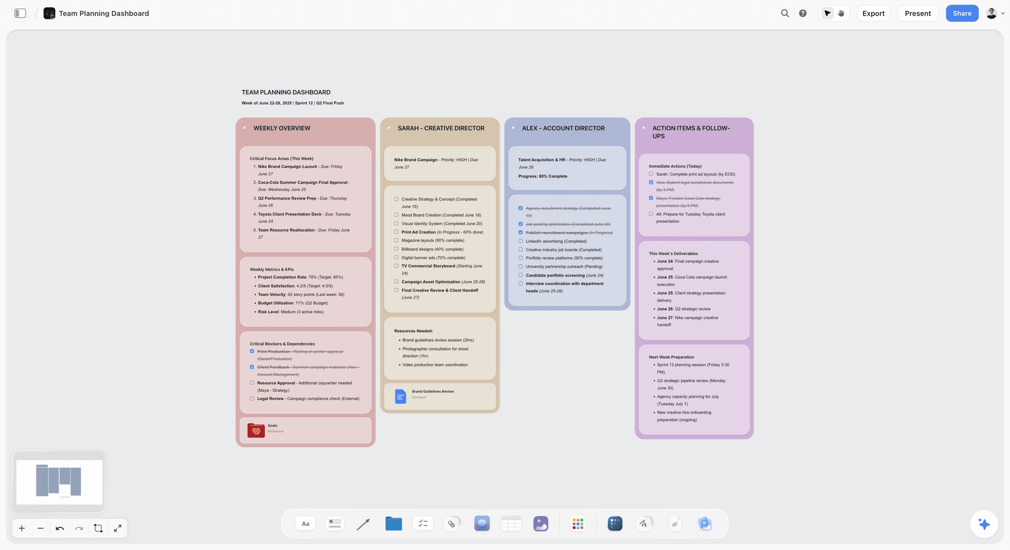
The verdict. The only tool here that treats the flow rather than the screen as the unit of review.
Best for. UX writers responsible for whole journeys rather than individual components.
Pricing. Paid only early access today. Plus is $7.99 per month billed annually or $9.99 monthly, with 200 plus Blueprint Tactics and unlimited file uploads. Pro is $14 per month billed annually or $19 monthly, adding AI image generation, roughly twenty times more AI usage and memory across conversations. Max is $39 per month billed annually or $49 monthly, adding Team Workspace with permissions and roles. Pricing is flat per account rather than per seat, and anyone a paid member invites joins free. The Free plan launches before the end of 2026.
Why it ranks here. The flow level problem is a context window problem, and it has a specific technical shape. Storyflow's AI reads your full active canvas board by default, plus up to one Tactic and up to three Documents you @-mention. Put an entire signup journey's copy on one board, screen by screen in sequence, and you can ask a question about the whole thing rather than about the frame you have selected.
The queries that matter are unglamorous and immediately useful. Which nouns refer to the same object across this flow. Where does the tone shift. Does any screen promise something a later screen contradicts. Is the error copy consistent with the success copy about what just happened.
Those questions are answerable by a careful human with two hours and a printout, which is exactly why they do not get asked. Making them a thirty second query changes how often the review happens, and frequency is the whole game with terminology drift.
The second advantage is spatial. A journey is a graph, not a list, and it has branches: the happy path, the error path, the expired link path, the already have an account path. Laying those out spatially, with the copy on each node, is how you notice that the branch nobody designed for has no copy at all. That is also why this surface doubles as a customer journey mapping tool rather than only a copy review one.
Flat per account pricing means a designer, a PM and an engineer can be in the board without three more seats, which matters because copy review is a conversation.
Strengths.
- Whole flow AI review, so terminology drift across distant screens becomes visible.
- Spatial branching matches the real shape of a journey including error paths.
- Invited collaborators join free, so review is not gated by licence count.
- Holds screenshots, strings and rationale on the same surface.
- Doubles as a journey and customer flow mapping surface.
Limitations.
- Not a string management system. It does not attach copy to design components, and Ditto does exactly that.
- No sync to code, no API for developers, no CI integration.
- No localization capability whatsoever. Lokalise or Phrase own that.
- No character limit enforcement against real component widths.
- Copy has to be brought onto the board, which today is a manual step rather than a Figma plugin.
- Newer platform, so no UX writing specific templates yet.
The trade off. Storyflow is the review and consistency surface. It is not the pipeline. A team shipping real product copy runs Ditto or Lokalise for the pipeline and uses a canvas for the thinking.
2. Ditto
The verdict. The most serious attempt at solving the three places problem, and the closest thing this discipline has to a purpose built tool.
Best for. Teams who want one source of truth for copy across design and development.
Pricing. Free tier available for small projects. Paid plans start around $19 per editor per month, with team tiers above that, as of August 2026.
Why it ranks here. Ditto attaches strings to Figma components, holds variants and states, keeps a component library of reusable copy, and exposes the strings to developers through an API and CLI. That is the actual architecture the problem requires: the string is the object, and the design file and the build are both views of it.
Its variant handling is the underrated part. Real copy has states, and a system where the empty state, error state and success state of a component are siblings rather than three unrelated text layers is a genuine structural improvement.
It ranks second rather than first only because it is still organized around components and screens. Ditto will tell you every place the string "Continue" appears. It will not tell you that the journey uses three different nouns for the same object, because that requires reading the sequence rather than the inventory.
Strengths.
- Strings as first class objects, synced between Figma and the build.
- Genuine variant and state handling.
- Developer API and CLI, so engineers can actually consume it.
- Component library for reusable copy patterns.
- Change history on copy, which no design tool provides.
Limitations.
- Component and screen oriented rather than flow oriented.
- Per editor pricing adds up on a design team.
- Setup requires real buy in from both design and engineering, which is the hard part.
- Figma dependent, so a team on another design tool is out of luck.
The trade off. If you can get engineering to adopt one tool from this list, make it this one.
3. Figma
The verdict. Where the words meet the container, which is where a lot of bad copy dies deservedly.
Best for. Writing in visual context, at real size, in the real component.
Pricing. Free starter tier. Paid seats from roughly $16 per full seat per month as of August 2026, with free viewers and cheaper collaboration seats.
Why it ranks here. UX copy written in a document is fiction. A sentence that reads beautifully in Google Docs and then wraps to four lines in a 280 pixel button is not good copy, it is a problem you have handed to a designer.
Working directly in Figma removes that entire category of failure, and its content plugins, variables and component text properties have made this genuinely workable rather than a hack.
It ranks third because it serves exactly one of the three places, it has no memory of why a string was chosen, and reviewing eleven frames one at a time is precisely the failure mode this article opens with.
Strengths.
- Copy in true visual context at real dimensions.
- Variables and component properties support systematic copy.
- Free viewer seats let stakeholders comment without cost.
- Universally adopted, so no political battle to fight.
Limitations.
- Screen oriented by construction.
- The file is not the shipped truth and drifts from the build.
- No rationale or decision history for copy choices.
- Version control on text is weak compared to a real string system.
The trade off. Write here, review elsewhere.
4. Lokalise
The verdict. Where strings become real. Unglamorous, and closer to the truth than any design file.
Best for. Managing shipped strings, especially across languages.
Pricing. Paid plans start around $120 per month for teams as of August 2026, with a free trial. Pricing scales with keys and contributors.
Why it ranks here. Once a product ships in more than one language, the string management system becomes the authoritative record of what your product says, and everything else is commentary. Lokalise handles keys, translations, context screenshots, character limits and developer integration, and it plugs into CI so the build and the strings stay in sync.
For a UX writer, the important realization is that this system, not Figma, is where your work lives after launch. Getting edit access to it changes your job from proposing copy to owning it.
It ranks fourth because it is expensive, engineering owned, and completely uninterested in whether a flow reads well.
Strengths.
- Authoritative record of shipped strings.
- Real localization workflow with context and character limits.
- CI and developer integration that engineers accept.
- Screenshot context for translators.
Limitations.
- Expensive, and priced for organizations rather than individuals.
- Owned by engineering in most companies, so access is political.
- No flow level or narrative view at all.
- Overkill for a single language product.
The trade off. If your product is localized, ask for edit access. It is the highest leverage permission a UX writer can hold.
5. Writer
The verdict. Terminology enforcement at a scale humans cannot police manually.
Best for. Large teams where many non writers produce customer facing copy.
Pricing. Team plans start around $18 per user per month, with enterprise pricing above that, as of August 2026.
Why it ranks here. A style guide that lives in a document is read once during onboarding and never again. Writer turns it into an active checker that flags "log in" when your standard is "sign in", inside the tools where people actually write.
For a lone UX writer at a company where forty people write customer facing strings, this is the only mechanism that scales, because you cannot review everything and you should not try.
It ranks fifth because it operates on rules and sentences rather than journeys, and because it is priced for organizations that already have a terminology problem worth paying to solve.
Strengths.
- Turns a passive style guide into active enforcement.
- Works inside the tools where people write.
- Scales terminology consistency past what review can cover.
- Good analytics on which rules are broken most.
Limitations.
- Rule based, so it cannot judge whether a flow makes sense.
- Priced for teams, not individuals.
- Overzealous rules create resentment and get disabled.
- Requires real effort to encode a style guide properly.
The trade off. Worth it above roughly twenty people writing copy. Pointless below five.
6. FigJam
The verdict. Where the journey gets mapped before there are any screens to write for.
Best for. Collaborative journey mapping with designers and PMs.
Pricing. Generous free tier. Paid collaboration is roughly $3 to $5 per editor per month as of August 2026.
Why it ranks here. A great deal of UX writing damage is done before a word is written, when a flow gets designed with a missing state or an unnecessary step. A writer in the room at the journey mapping stage prevents copy problems that no amount of later wordsmithing fixes, because you cannot write your way out of a step that should not exist.
FigJam is the lowest friction place to do that with a product team, and it sits next to the Figma file the screens will live in.
It ranks sixth because it is a pre production tool with no role once the copy is real.
Strengths.
- Lowest friction collaborative mapping.
- Adjacent to the design file.
- Free tier is genuinely sufficient.
- Everyone on a product team can already use it.
Limitations.
- No copy management capability.
- Boards go stale immediately after the workshop.
- Thin structure for complex branching flows.
The trade off. Get in the room at this stage. It is worth more than any review later.
7. Whimsical
The verdict. The fastest way to draw a user flow that is actually legible.
Best for. Clean flow diagrams with branches, produced quickly.
Pricing. Free tier with an item limit. Paid plans start around $10 per editor per month as of August 2026.
Why it ranks here. Whimsical is opinionated and fast, and for user flow diagrams specifically it produces cleaner output with less effort than any general canvas tool. For a UX writer trying to establish what states exist before writing for them, that speed matters.
Its particular value is making missing branches obvious. Drawing the flow properly is how you discover there is no copy for the expired invite case, which is the state that will generate support tickets.
It ranks seventh because it holds diagrams rather than copy, and its item limits bite on real product flows.
Strengths.
- Very fast, clean flow diagrams.
- Branch structure makes missing states visible.
- Low learning curve for non designers.
Limitations.
- Not a copy tool.
- Free tier item limits are restrictive.
- Diagrams drift from the product immediately.
The trade off. Draw the flow, find the missing states, then move to a copy tool.
8. Optimal Workshop
The verdict. The cheapest way to end a terminology argument, and almost nobody uses it.
Best for. Testing whether users actually understand your labels and navigation terms.
Pricing. Free tier for small studies. Paid plans start around $109 per month, with annual discounts, as of August 2026.
Why it ranks here. Naming arguments consume enormous amounts of senior time and are usually settled by whoever is most senior or most stubborn. Tree testing and card sorting settle them with data from actual users in about a day.
For a UX writer this is the strongest available source of authority. "I prefer account" loses every argument. "Sixty eight percent of users failed to find billing under profile" ends them.
It ranks eighth because it is a research instrument used occasionally rather than a daily tool, and its price is hard to justify for a single writer.
Strengths.
- Turns terminology opinions into evidence.
- Tree testing is fast, cheap and decisive.
- Free tier is enough for a small study.
Limitations.
- Occasional use, hard to justify continuously.
- Requires recruiting participants.
- Answers labels and navigation, not sentences.
The trade off. Run one study before the next big naming decision. The free tier may be all you need.
9. Maze
The verdict. Copy testing with real users, at the point where it is still cheap to change.
Best for. Validating that a flow's copy produces the behaviour you intended.
Pricing. Free tier available. Paid plans start around $99 per month as of August 2026.
Why it ranks here. Copy is not decoration, it is instruction, and whether it works is an empirical question. Maze runs unmoderated tests on a prototype and reports where people hesitate, misclick or drop out, which frequently traces to a word rather than a layout.
It ranks ninth because it tests a prototype rather than the product, and because most teams reach for it after the copy is written rather than to choose between options.
Strengths.
- Behavioural evidence rather than opinion.
- Fast unmoderated testing on prototypes.
- Integrates with Figma directly.
Limitations.
- Tests prototypes, which behave differently from products.
- Pricing is high for occasional use.
- Results need careful interpretation to separate copy from layout effects.
The trade off. Use it to choose between two candidate flows, not to grade one.
10. Notion
The verdict. The style guide's home, and the decision log nobody else keeps.
Best for. Voice and tone documentation, terminology decisions and their reasoning.
Pricing. Free personal tier. Paid from roughly $10 per user per month as of August 2026.
Why it ranks here. Every UX writer needs a written record of what was decided and why, because the same terminology argument recurs annually with new participants. A decisions database with the term, the chosen form, the date and one line of reasoning is the cheapest institutional memory available.
It ranks tenth because a style guide in a document is passive. It informs people who look, and almost nobody looks. Writer exists precisely because this fails.
Strengths.
- Free and universally available.
- Databases make terminology decisions filterable.
- Good home for the reasoning behind decisions.
Limitations.
- Passive. Nobody reads a style guide voluntarily.
- No enforcement.
- Drifts from the product silently.
The trade off. Keep the decision log. Do not expect the style guide to change behaviour on its own.
11. Google Sheets
The verdict. The string inventory almost every team actually runs, and nobody puts in a case study.
Best for. A copy deck when there is no budget and no tooling.
Pricing. Free with a Google account.
Why it ranks here. The honest reality is that most product copy in most companies lives in a spreadsheet with columns for key, screen, current copy, proposed copy and status. It is free, engineers will accept it, and it can be exported into anything.
It ranks last because it has no connection to the design file or the build, so it becomes stale the moment it is written, and because a spreadsheet of strings sorted by key is the least flow legible artifact possible.
Strengths.
- Free, universal, and immediately usable.
- Engineers will accept a CSV export without negotiation.
- Good enough for a small single language product.
Limitations.
- No connection to design or build, so it is always drifting.
- No variant or state handling.
- Sorted by key, which is the opposite of a flow.
The trade off. The correct starting point at zero budget, and the thing to escape once copy volume grows.
What to Actually Pay For
Pay for the string pipeline before you pay for anything else. If you can get one paid tool, make it Ditto, because the three places problem is structural and no amount of careful review fixes it. Every other tool on this page improves your work; this one changes what your work is attached to.
Do not pay for Writer as a team of one. Rule enforcement at scale solves a problem you do not have when you review everything yourself. Spend that budget on the pipeline instead.
Use the free tiers for research. Optimal Workshop's free tier will run a tree test that settles a naming argument, and Maze's free tier will validate a flow. Neither needs to be a standing subscription for most teams.
Tools to Avoid for This Job
A copy document with no visual context. Sentences written outside their container are guesses about length, and half of them will not fit.
Reviewing copy screen by screen in a design file. This is the specific failure this article is about. It cannot surface flow level inconsistency because it never shows you the flow.
Comments in the Figma file as the record of decisions. Comments get resolved and vanish, taking the reasoning with them, and the argument recurs in six months with nobody able to cite the original decision.
Any process that treats the design file as the shipped truth. It is not, and building on that assumption means your record of what the product says is quietly fictional.
What No Tool on This List Does
None of them will get you into the room early. The largest single improvement available to most UX writers is being present at journey mapping rather than receiving screens to fill, and that is an organizational negotiation rather than a purchase.
None of them will fix a bad flow with good words. If the journey has a step that should not exist, the copy job is to argue it away, not to make it pleasant.
None of them, including Storyflow, will review copy you never brought together. There is no Figma plugin today, so putting a whole journey's strings on a board is a manual step. That step takes twenty minutes and it is the entire mechanism by which flow level problems become visible.
The Bottom Line
UX writing is not a wordsmithing discipline. It is a consistency discipline practised across three systems that drift apart by default.
Get access to wherever strings actually ship, because that is the only version users read. Push for Ditto if you can get engineering and design to adopt it together, since it is the only tool here that makes the string rather than the screen the object. Run a tree test before the next naming argument.
But the defect that survives all of that is the one produced by reviewing screens when users experience flows. Reading a whole journey at once, and being able to ask it whether it contradicts itself, is the narrow ground on which Storyflow ranks first here.
FAQ: Tools for UX Writers
What is the best tool for UX writers in 2026?
For flow level review, Storyflow ranks first, because its AI reads the whole canvas and can surface terminology that changes between distant screens, which is the defect design tools structurally cannot show you. For copy management, Ditto is the strongest purpose built option, attaching strings to components with variants and a developer API. Most teams need both kinds of tool, because reviewing a flow and shipping a string are different problems.
What is the best tool for mapping user flows and customer journeys?
Whimsical is the fastest for clean flow diagrams with branches, and FigJam is the best for collaborative mapping with a product team. If you want the flow and the copy on the same surface, so you can review what each state actually says, an infinite canvas such as Storyflow does both and lets you question the whole journey at once. The key requirement is that branches are visible, since missing states are where copy gaps hide.
How do UX writers keep copy consistent across a product?
Three mechanisms, in increasing order of reliability. A written style guide, which is passive and read rarely. Automated terminology enforcement such as Writer, which scales but only checks rules. And regular flow level review, which is the only method that catches the case where every screen follows the rules and the sequence still uses three nouns for one object.
What is terminology drift and why does it matter?
Terminology drift is when the same object is called different things at different points in a product, such as account, profile and record. It matters because users build a mental model from your words, and changing the word implies a different thing, which produces hesitation, misclicks and support tickets that are rarely traced back to copy. It goes unnoticed because review happens screen by screen and each individual word is defensible.
Is Ditto worth it for a small team?
If you have a designer and an engineer who will both adopt it, yes, because the three places problem gets worse as the product grows and retrofitting a string system later is painful. If adoption is uncertain, a spreadsheet is the honest starting point, since a copy management tool that only the writer uses provides no benefit over a document. The blocker is almost always organizational rather than financial.
Where should product copy actually live?
In whatever system feeds the build, which means a localization platform such as Lokalise, a copy management tool such as Ditto, or a repository of strings owned by engineering. The design file is a view of the copy, not the copy itself, and any process that treats Figma as authoritative will produce a record that diverges from the product within weeks of launch.
Does Storyflow replace Figma for UX writing?
No. Copy has to be written in visual context at real dimensions, or you produce sentences that do not fit their containers, and Figma is where that happens. Storyflow sits before that, for mapping the journey and its states, and after it, for reviewing whether the flow reads coherently end to end. It is a review and thinking surface rather than a design or delivery tool.
How do you test whether your terminology is understood?
Tree testing, which presents users with your navigation structure and asks them to find something, is the fastest and cheapest method, and Optimal Workshop's free tier can run one. It produces a completion rate per term, which converts an opinion into evidence and ends naming arguments quickly. Most teams never do this, which is why the same debates recur every year.
What should a UX writer do first at a new company?
Find out where shipped strings actually live and get edit access. Most UX writers spend their first months working in the design file and discover later that the real copy is in a localization platform they cannot touch, which means engineers have been changing their words without review. That access is worth more than any tool on this list.
How do you review copy for an entire flow rather than screen by screen?
Bring every string in the journey onto one surface in sequence, including the error and edge case states, and read it as a script rather than as a set of screens. The specific checks worth running are which nouns refer to the same object, where the tone shifts, and whether any screen promises something a later screen contradicts. Whole canvas AI makes those checks a thirty second query instead of a two hour manual pass, which is what makes them actually happen.
Do UX writers need to know localization?
You need to understand its constraints even if you never manage it, because German is routinely thirty percent longer than English and a string that fits your button will break someone else's. Writing with expansion in mind, avoiding concatenation, and providing context for translators are the three habits that matter. If your product is localized, the localization platform is your real system of record.
What is the difference between UX writing and content design?
In practice content design is the broader remit, including whether a screen should exist and what information architecture serves the user, while UX writing is often scoped to the words on screens that have already been designed. The distinction matters for tooling because content design work happens at the flow and journey level, which most copy tools do not serve, and UX writing scoped to strings is well served by component based tools such as Ditto.
How do you argue for copy changes without data?
Reframe from preference to mechanism. "I prefer this" loses; "this word implies the action is reversible and it is not" wins, because it names a consequence. When the argument is genuinely about naming rather than clarity, stop arguing and run a tree test, since a day of research is cheaper than three weeks of senior people disagreeing.
What is the single change worth making this quarter?
Take your most important flow, put every string in it onto one surface in sequence including error states, and read it aloud as one continuous script. Most writers find at least one terminology inconsistency and one promise that a later screen breaks, and both have been shipping for months.
Table of Contents
- Key Takeaways
- The Three Places a String Lives
- At a Glance: The 11 Tools Compared
- How I Ranked These
- Quick Picks by Job Type
- 1. Storyflow
- 2. Ditto
- 3. Figma
- 4. Lokalise
- 5. Writer
- 6. FigJam
- 7. Whimsical
- 8. Optimal Workshop
- 9. Maze
- 10. Notion
- 11. Google Sheets
- What to Actually Pay For
- Tools to Avoid for This Job
- What No Tool on This List Does
- The Bottom Line
- FAQ: Tools for UX Writers
- Related Reading
Templates to check out for this topic


Templates you can use in Storyflow
Every Storyflow board starts from real structure and an AI that reads the whole canvas. Open one of these templates and make it yours.


See Storyflow in Action
A visual AI workspace where every feature lives inside one canvas. No tab-switching, no context lost.
Build your entire board from a single message
Type what you need in the AI chat at the bottom of your canvas. The AI adds cards, headings, and structure directly onto your board.
Use expert frameworks as AI context
Type @ in the AI chat and choose any Tactic. The AI tailors every response to that framework instead of giving generic advice.
Turn your board into a mind map in seconds
Ask the AI to restructure your canvas as a mindmap. It connects your ideas into a visual hierarchy so you can see how everything relates.
Why Storyflow Exists
Storyflow actually began as a personal tool while working on creative and research projects.
We kept running into the same problem: ideas were scattered everywhere: notes, documents, and whiteboards.
Nothing helped us see how everything connected.
So we started building a workspace designed around how ideas actually grow.
→ Read how Storyflow was createdSara de Klein
Head of Product at Storyflow
Published: 2026-08-10
Extremely simple, seriously capable


See how easy it is to get started
Watch a real project come together, from a blank board to a finished plan, clicked through step by step.
Start creating with AI and become more productive
Transform your creative workflow with AI-powered tools. Generate ideas, create content, and boost your productivity in minutes instead of hours.