The 10 Best Decision Matrix Tools in 2026
The weights are the decision, and everything after them is arithmetic. Ten decision matrix tools ranked on whether they make that manipulability visible.

Category
Productivity
Author

Sara de Klein
Head of Product at Storyflow
Topics
2026-08-14
•
22 min read
•
ProductivityTable of Contents
- Key Takeaways
- The Order of Moves
- At a Glance: The 10 Tools Compared
- How I Ranked These
- Quick Picks by Job Type
- 1. Google Sheets or Excel
- 2. Airtable
- 3. Coda
- 4. Notion
- 5. Mural
- 6. Storyflow
- 7. Miro
- 8. Lucidspark
- 9. ClickUp
- 10. Priority Matrix
- What to Actually Pay For
- Tools to Avoid for This Job
- What No Tool on This List Does
- The Bottom Line
- FAQ: Decision Matrix Tools
- Related Reading
Templates to check out for this topic


- decision matrix tool
- weighted decision matrix
- weighted scoring model
- Pugh matrix
- sensitivity analysis
- prioritization matrix
What are the best decision matrix tools in 2026?
A weighted decision matrix is arithmetic, so the best tool for it is the one that does arithmetic in public: Google Sheets or Excel ranks first, Airtable second for teams who need each person's scores kept separate, and Coda third when you want the scoring to behave like a small application. Every whiteboard on this list is worse at the maths and better at the conversation. Storyflow ranks sixth, and it has no formula cells at all, which means it cannot compute a weighted total and should never be the place the number lives.

Full disclosure: Storyflow is our product and it ranks sixth here, not first. This job is arithmetic, and Storyflow has no formula cells: it cannot compute a weighted total, cannot sort a table by a computed column, does nothing when you change a weight, and collects no per person scores or votes. Google Sheets, Airtable, Coda, Notion and Mural all serve the matrix itself better. Storyflow's narrow ground is the argument around the matrix, which is holding criterion definitions, exclusions and the reasoning behind each weight, with AI that reads the whole board and can flag two criteria measuring the same thing. It also has no CSV or spreadsheet import, and realtime multiplayer requires the Max Team Workspace tier.
Quick Comparison
Ranked on three tests: does it compute a weighted total, can you see who entered which score, and does the ranking move when you change a weight.
| Tool | Best For | AI Features | Price |
|---|---|---|---|
| Google Sheets or Excel | The arithmetic, sorting and sensitivity in one grid | Gemini or Copilot assist, no native scoring AI | Free, Workspace from about $7 user mo |
| Airtable | Multi scorer evaluations kept separate | Airtable AI fields on paid plans | Free tier, Team about $20 user mo |
| Mural | Blind scoring with a simultaneous reveal | Mural AI clustering and summarising | Free tier, paid from about $12 member mo |
| Storyflow | Defining what each criterion actually means | AI reads the full active canvas board plus 1 Tactic and 3 mentioned Documents | $7.99 mo annual, paid only during early access |
Key Takeaways
- The weights are the decision. Whoever sets them has already picked the winner, and the scores that follow ratify it.
- Rank these tools on three things: whether you can see who entered which score, whether you can move a weight and watch the ranking move with it, and whether there is a record that the weights were fixed before anyone saw an option.
- Google Sheets and Excel win because this job is arithmetic, and both do it instantly with named edit history showing who changed a weight and when.
- A matrix is most useful not for picking the winner but for exposing that two people mean different things by the word "cost".
- The weighted matrix is often called a Pugh matrix, after Stuart Pugh, whose concept selection method compared options against a baseline datum. The Analytic Hierarchy Process is Thomas Saaty's separate method using pairwise comparison and a consistency ratio, and no tool here implements it natively.
- Storyflow has no formula cells, no weighted totals, no sensitivity analysis, no per person scoring and no sorting by a computed column. Its ground is the argument around the matrix, not the matrix.
- Priority Matrix is a quadrant tool in the Eisenhower tradition, not a weighted scoring tool, despite what the name implies.
Define the criteria before anyone scores them
Most decision matrices fail because two people meant different things by the word cost. Put each criterion on a Storyflow canvas with its definition, what it excludes and the evidence behind its weight, then score the numbers in a spreadsheet. Paid-only during early access; the Free plan lands before the end of 2026.

The Order of Moves
Every decision matrix is built from three moves.
You name the criteria. You set the weights. You enter the scores.
That is the whole method, and the honesty of the result depends on the order those moves happen in and on whether anybody can check that order afterwards. Call it the Order of Moves. It is the frame this article ranks against.
The rule it produces: the move made last is the move that decides. Fix the criteria and weights first, then score cold, and the scores decide. Know which vendor you want and tune the weights until it wins, and the weights decide while the scores become decoration. The weights are the decision, and everything after them is arithmetic.
The dishonest sequence is rarely a conspiracy. Someone has spent three weeks with the options and formed a view. They build the matrix to communicate the view, not to test it. Integration depth goes to 30 percent because their preferred tool integrates well, price goes to 10 percent because their preferred tool is expensive. Nobody lies and nobody enters a false score, and the answer was still determined before the first cell was filled.
That is why a matrix produces such reliable false confidence. The output is a number with a decimal point in it, reached through a procedure, presented on a grid. It looks like measurement. It is a set of preferences wearing measurement's clothes.
Three tests follow, and they are what this article ranks on.
Sequence. Is there a record that the weights existed before the options were scored? A timestamped version, a locked sheet, a document dated a week earlier. Without it you cannot distinguish a rigorous process from a rationalized one.
Attribution. Can you see who entered which score? An averaged cell hides the two people who disagreed violently and produced a comfortable middle. Their disagreement was the most valuable thing in the room and the average destroyed it.
Sensitivity. Can you move a weight and watch the ranking change? If shifting price from 15 to 25 percent flips the winner, your decision is not about the options. It is about how much price matters, and that is the argument to have instead.
The honest use of all this is not the ranking. The matrix earns its place when two people discover they have been using the same word for different things. One person's "cost" is the licence line on the invoice. The other's is the licence plus migration plus six weeks of nobody knowing where anything is. They agreed on the criterion and agreed on nothing.
The ten tools below are ranked by whether they make the Order of Moves visible.
At a Glance: The 10 Tools Compared
| Tool | Computes weighted totals | Shows who scored what | Live sensitivity when a weight moves | Record of weights before scores |
|---|---|---|---|---|
Google Sheets or Excel | Yes, formulas | Yes, named edit history | Yes, instant recalculation | Yes, version history |
Airtable | Yes, formula fields | Yes, one field per scorer plus cell revision history | Yes, on edit | Yes, per cell history |
Coda | Yes, formulas and buttons | Yes, one row per scorer | Yes, on edit | Yes, version history |
Notion | Yes, formula property | Partial, one property per scorer | Yes, on edit | Partial, page history |
Mural | No | Yes, private mode then reveal | No | Partial, timestamps only |
Storyflow | No | No | No | No, board history only |
Miro | No | Yes, voting results and named cursors | No | No |
Lucidspark | No | Yes, voting and Collaborator Colors | No | No |
ClickUp | Yes, formula field | Partial, one custom field per scorer | Yes, on edit | Yes, activity log |
Priority Matrix | No, quadrants not weights | Yes, owner per item | No | No |
How I Ranked These
I came out of documentary, where every commissioning decision is a weighted matrix nobody writes down: this story or that one, with budget, access, timeline and whether the subject is still talking to you in nine months all pulling against each other. I have since built scoring matrices for tool selection, vendor choice and hiring in every tool here, and watched several get quietly rebuilt after the answer came out wrong.
Five criteria, in order.
1. Does it compute? Enter a weight of 0.25 and a score of 4 and see whether a weighted total appears without mental arithmetic. Four tools pass. Six do not.
2. Can you sort by the computed column? Click the total column header and see the options reorder. A matrix you have to read manually to find the winner is a picture of a matrix.
3. Is scoring attributable? After the session, can you tell that Priya gave the incumbent a 2 and Marcus gave it a 5? If the tool stores only an average, the most useful signal it collected is gone.
4. Does sensitivity cost anything? Change one weight and count the actions before the ranking updates. One action is right. Rebuilding the sheet is a failure.
5. Does it leave an auditable trail? Six weeks later, can you prove the weights were agreed before the vendor demos, or only assert it?
Pricing is as of August 2026 and changes frequently. Verify with each vendor.
Quick Picks by Job Type
- Best overall decision matrix: Google Sheets or Excel. The arithmetic is the job, and both do it in one formula with named version history.
- Best for team scoring kept separate: Airtable. One field per scorer, rolled up rather than averaged away.
- Best for building a scoring app: Coda. Buttons, per person rows and formulas that behave like software.
- Best for blind independent scoring: Mural. Private mode hides contributions until everyone has committed.
- Best for the argument about criteria: Storyflow. The canvas holds the definitions and the disagreement, not the totals.
- Best for live voting in a workshop: Miro. Configurable votes with attributable results.
- Best when the decision becomes work immediately: ClickUp. The formula field computes and the winner turns into tasks.
- Best Eisenhower quadrant tool: Priority Matrix. Urgent against important, which is not a weighted matrix.
1. Google Sheets or Excel
The verdict. The job is arithmetic performed in public, and a spreadsheet is arithmetic performed in public.
Best for. Any weighted decision matrix where you want totals, sorting and sensitivity in the same ten minutes.
Pricing. Google Sheets is free with a Google account, with Workspace plans from roughly $7 per user per month. Excel comes with Microsoft 365 Personal at roughly $10 per month or Business Standard at roughly $12.50 per user per month, as of August 2026.
Why it ranks here. Nothing else on this list passes all three Order of Moves tests at once. SUMPRODUCT across a weight row and a score row gives a weighted total in one formula. Sorting by that column is a click. Changing a weight recalculates every option instantly, so sensitivity analysis is not a feature you buy, it is the default behaviour of the grid.
The sequence test is the one people miss. Both tools keep named version history, so if you build the weights sheet on the third and score the options on the tenth, that gap is provable rather than claimed. Lock the weight row before demos start and the lock itself becomes evidence. Protected ranges plus the version timeline do more for the integrity of a decision than any purpose built scoring product I have used.
Attribution takes deliberate structure, and this is where most teams fail. Do not use one score column and let five people fight over it. Give every scorer their own column, compute the spread alongside the average, and sort by disagreement before you sort by total. The widest spread rows are where two people are using the same criterion word for different things, which is the reason to run a matrix at all.
Excel adds the two analysis tools nobody uses. Data Table under What If Analysis produces a grid of outcomes across a range of weights, and Scenario Manager stores competing weight sets side by side, so "how does this look if we care more about migration cost" becomes a saved scenario rather than an argument.
Strengths.
- One formula produces the weighted total, and sorting by it is a click.
- Changing a weight recalculates instantly, so sensitivity is free.
- Named version history proves when the weights were set.
- Protected ranges let you lock a weight row before scoring starts.
- Excel's Data Table and Scenario Manager do genuine multi weight analysis.
Limitations.
- Blank grid, so the structure is entirely on you and most people build it wrong.
- Nothing stops a weight being edited mid scoring, and nothing flags that it was.
- Per person scoring columns get unwieldy past about six scorers.
- The artifact is unreadable to anyone who was not in the session.
The trade off. It does everything and guides you through none of it, which is the right trade when the computation is this simple.
2. Airtable
The verdict. The right answer when several people score independently and you refuse to lose their individual numbers.
Best for. Multi scorer evaluations where each person's view has to stay recoverable.
Pricing. Free tier available. Team is roughly $20 per user per month billed annually and Business roughly $45, as of August 2026.
Why it ranks here. One record per option, one field per criterion, and a formula field that multiplies each score by its weight. Views sort by the computed total, which satisfies the second test cleanly.
Where Airtable pulls ahead of a spreadsheet is attribution at scale. Use a linked scores table with one record per person per option and both the average and the spread stay derivable, with neither destroyed. Interfaces then hand each scorer a form showing only their own fields, so nobody anchors on what the last person entered. Anchoring is the quiet killer in group scoring and structural separation is the only reliable fix.
The sequence test is handled by cell level revision history. Hover a weight, see when it changed and who changed it. That is stronger than a spreadsheet's document level history because it is per value, and it makes the awkward question answerable: was that weight raised after the demo.
Sensitivity is the weak spot. Weights live in a separate table or in the formula itself, so changing one is an edit rather than a slider, and there is no way to sweep a weight across a range and watch the ranking flip.
Strengths.
- Per scorer records preserve individual scores instead of averaging them away.
- Cell level revision history answers who changed which weight and when.
- Interfaces give each scorer a private form, which prevents anchoring.
- Views sort by the computed total without extra work.
Limitations.
- Per seat pricing gets expensive for a decision that takes one week.
- No slider or sweep for sensitivity, so weight changes are manual edits.
- Formula syntax is fiddlier than a spreadsheet's for straight arithmetic.
- Setup is a genuine half day if you build the linked scores table properly.
The trade off. More structure than most decisions deserve, and exactly right when six people score nine vendors.
3. Coda
The verdict. The tool for when the matrix should behave like a small application rather than a grid.
Best for. Repeatable scoring processes you will run again next quarter.
Pricing. Free tier available. Pro is roughly $10 per Doc Maker per month and Team roughly $30, with viewers and editors free, as of August 2026.
Why it ranks here. Coda's pricing model matters for this job. You pay for makers, not for everyone, so handing a scoring doc to twelve people costs nothing extra and the argument about seats disappears.
Formulas do the arithmetic properly, including lookups across tables, so a weights table and a scores table join into a totals view without duplicating numbers. Buttons are the part worth building around: a button that stamps the weights table as locked, with a timestamp and a name, puts a sequence record inside the document rather than in a version menu. That is the closest thing here to a purpose built integrity control, and you have to build it yourself.
Sensitivity is decent. Put the weights in a table with a slider control and the totals recalculate as you drag. It is the only tool here where weight adjustment is a physical control rather than a typed value, which changes how a group behaves around it. People drag. They do not retype.
The cost is complexity. Coda docs sprawl, and a matrix built by one person tends to be unmaintainable by the next.
Strengths.
- Free viewers and editors, so wide scoring groups cost nothing.
- Formulas across linked tables keep weights and scores in one place.
- Buttons can stamp a locked weights record with a name and timestamp.
- Slider controls make sensitivity a physical action rather than a retype.
Limitations.
- Slower to build than a spreadsheet for a single decision.
- Docs become hard for anyone else to maintain.
- Formula language is its own thing to learn.
- Performance degrades on large multi table docs.
The trade off. Worth it if you will run this process again. Overkill if you will not.
4. Notion
The verdict. Competent arithmetic attached to the document where the reasoning already lives.
Best for. Decisions where the write up matters as much as the score.
Pricing. Free personal plan. Plus is roughly $10 per user per month billed annually and Business roughly $20, as of August 2026.
Why it ranks here. A Notion database with one row per option, number properties for criterion scores and a formula property for the weighted total handles the first two tests. It computes and it sorts. That puts it ahead of every whiteboard here.
Its real advantage is context. Each option is a page, so the vendor's pricing PDF, the demo notes, the reference call transcript and the score live in the same object. When someone asks in November why the runner up lost, the answer is one click away instead of scattered across a spreadsheet and a Slack thread. Decisions rot because their reasoning is stored somewhere different from their conclusion, and Notion is the one tool here that fixes that by default.
The weaknesses are all on the Order of Moves. Weights get hardcoded into the formula, so changing one means editing a formula rather than a cell, and doing that four times across a sensitivity run is tedious enough that nobody does it. Page history is coarser than Airtable's per cell revision history. Per person scoring means one number property per person per criterion, which becomes an unmanageable column count fast.
Strengths.
- Formula property computes the weighted total and views sort by it.
- Each option is a page, so evidence and score sit together.
- The write up and the matrix are the same artifact.
- Free personal plan handles a solo decision completely.
Limitations.
- Weights hardcoded in formulas make sensitivity analysis tedious.
- Per person scoring explodes the property count.
- Page history is coarser than cell level revision history.
- Formula editing is awkward compared to a spreadsheet cell.
The trade off. Best arithmetic to context ratio here, and the worst sensitivity story of the four tools that compute.
5. Mural
The verdict. The only tool here with a native feature that directly attacks the biggest failure mode in group scoring.
Best for. Facilitated sessions where scores must be independent before they are shared.
Pricing. Free tier available. Paid plans from roughly $12 per member per month billed annually, as of August 2026.
Why it ranks here. Private mode. Everyone writes their scores and nobody sees anyone else's until the facilitator reveals them all at once. That is the fix for anchoring, and anchoring is what makes most group matrices worthless: the first number spoken sets the range and everything after it clusters within a point.
Reveal the scores simultaneously and the spread is visible immediately. The row where four people scored a 4 and one scored a 1 is the row worth the next twenty minutes, and it would have been silently averaged into a 3.4 in any tool that collects scores in the open. Mural ranks fifth rather than tenth entirely on this, because it is the one facilitation feature here that changes what the matrix discovers.
Everything else is weaker. Mural does not compute. Weighted totals are mental arithmetic or a sticky note someone typed a number into. There is no sorting by total, no sensitivity, and no record that the weights came first beyond timestamps you would reconstruct by hand.
So the honest shape of its use is: run the scoring session here, reveal, argue about the outliers, then move the agreed numbers into a spreadsheet. The tools are doing different halves.
Strengths.
- Private mode gives genuinely independent scoring before reveal.
- The spread across scorers is visible the moment scores appear.
- Facilitation controls keep a large group moving through a grid.
- Free tier covers a single decision session.
Limitations.
- No formulas, so no weighted totals at all.
- No sorting by any computed value.
- No sensitivity analysis of any kind.
- The artifact is a picture of a matrix, not a working one.
The trade off. Score here, compute elsewhere, and accept that the handoff is manual.
6. Storyflow
The verdict. Good at the argument that surrounds a matrix, and not equipped to hold the matrix itself.
Best for. The criteria conversation, before any scoring happens.
Pricing. Paid only during early access. Plus is $7.99 per month billed annually or $9.99 monthly, adding the 200 plus Story blueprints and unlimited file uploads. Pro is $14 per month billed annually or $19 monthly, adding AI image generation, roughly twenty times more AI and memory across conversations. Max is $39 per month billed annually or $49 monthly, adding forty times more AI and Team Workspace with permissions and roles. Pricing is flat per account rather than per seat, and anyone a paid member invites signs up free. The Free plan launches before the end of 2026.
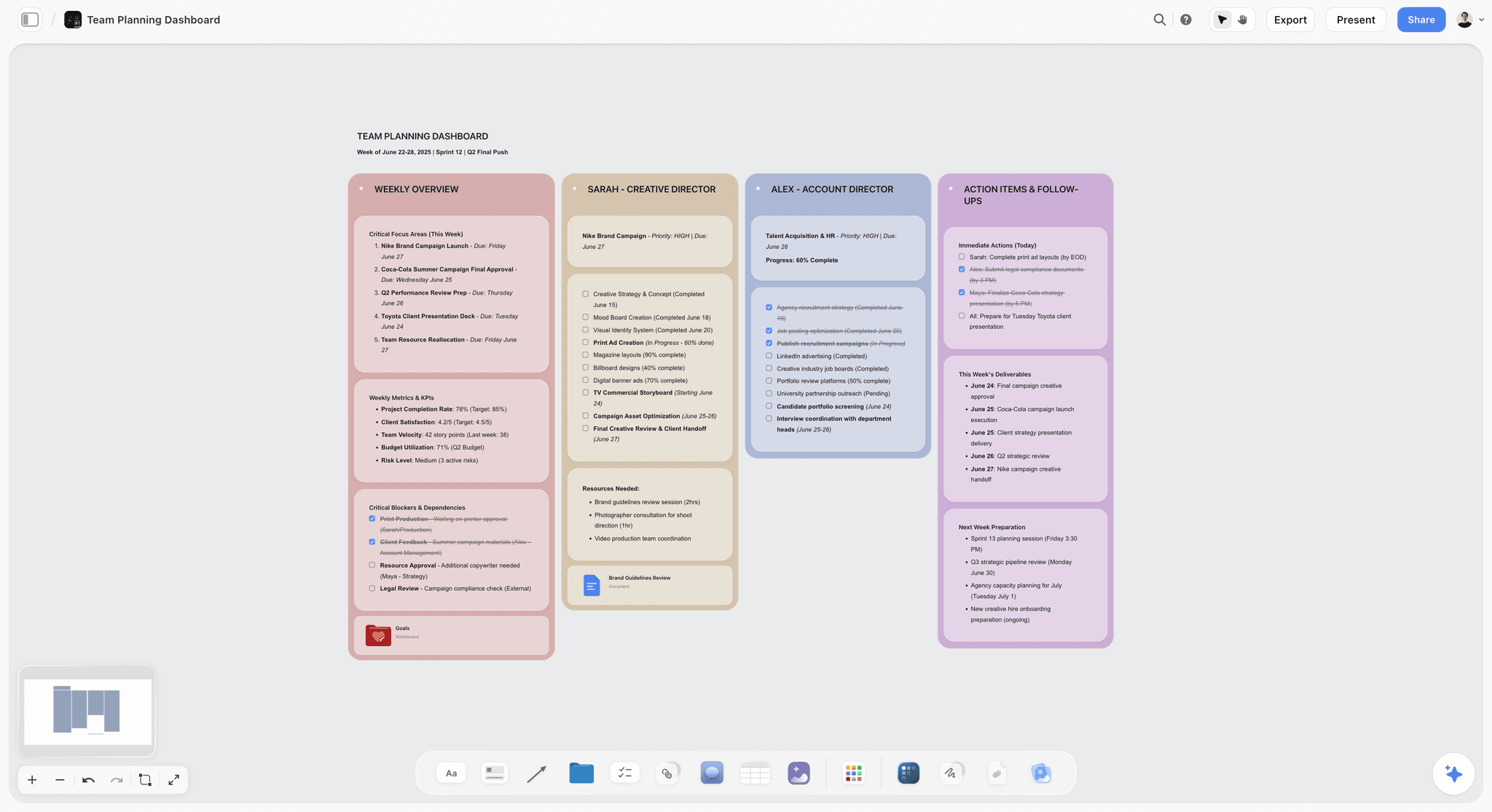
Why it ranks here. Storyflow is our own product and it is sixth rather than first for a plain reason: it has no formula cells. You cannot compute a weighted total in it, sort a table by a computed column, run sensitivity when a weight changes, or collect one score per person. Five tools here do the actual job better. If you need a place to put the numbers, use Google Sheets.
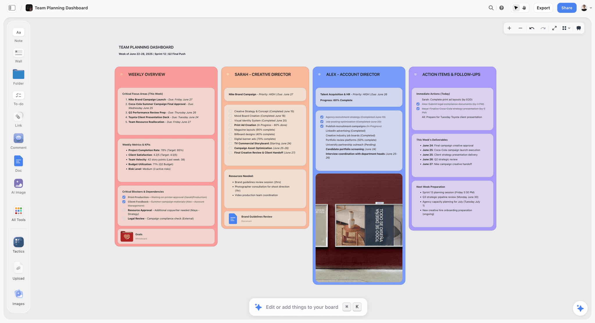
What it is good at is the move before the numbers, which is deciding what the criteria mean. Put each criterion on the canvas with its definition written out, the evidence that produced it, and what it explicitly excludes. "Cost" becomes "licence plus migration plus twelve weeks of reduced throughput, excluding training time we would spend anyway." That sentence is where the disagreement lives, and writing it down is the highest value fifteen minutes in the process.
The AI helps in one specific way. It reads your full active canvas board, plus up to one Tactic and up to three Documents you @-mention, so you can ask whether two criteria measure the same thing, whether a criterion was ever defined, or what a definition excludes. Overlapping criteria are the most common structural flaw in a homemade matrix: double counting integration under both "fit" and "technical risk" doubles a weight without anyone choosing to.
It also holds what spreadsheets throw away, which is why. A weight of 30 percent on speed to deploy has a reason behind it, usually a commitment to a specific customer, and that reason survives next to the criterion in a way it never survives in a cell comment. The weights are the decision, and everything after them is arithmetic, so the reasoning behind them is the part worth keeping.
Strengths.
- The canvas holds criterion definitions, exclusions and the evidence behind each weight.
- Whole board AI can flag overlapping or undefined criteria before scoring starts.
- Invited collaborators join free, so the criteria session costs nothing extra per head.
- Flat per account pricing rather than per seat.
- The reasoning behind a weight survives in a readable form.
Limitations.
- No formula cells. Weighted totals cannot be computed, only typed in by hand.
- No sorting a table by a computed column, so the ranking is manual.
- No sensitivity analysis. Changing a weight changes nothing automatically.
- No per person scoring, no voting and no reveal mechanic, so anchoring is unmanaged.
- Realtime multiplayer requires the Max Team Workspace tier.
- No CSV or spreadsheet import, so scores cannot round trip from Sheets.
The trade off. Define the criteria here, score and compute in a spreadsheet, and do not pretend the canvas is doing the maths.
7. Miro
The verdict. The strongest workshop voting on this list, attached to no arithmetic whatsoever.
Best for. Large group prioritization sessions that end in a ranked shortlist.
Pricing. Free tier available. Starter is roughly $8 per member per month billed annually and Business roughly $16, as of August 2026.
Why it ranks here. Miro's voting session gives each participant a set number of votes with a timer, and results are attributable rather than anonymous by default. For narrowing twenty options to five before you build a matrix, that is the right instrument, and it beats most tools here on the attribution test.
Its prioritization matrix templates and 2x2 grid apps are useful and are a different thing from weighted scoring. Placing items on an impact against effort grid is a relative judgment. A weighted matrix is an absolute one across several criteria. Teams substitute the first for the second and end up with a two dimensional answer to a five dimensional question.
Miro sits below Storyflow on a narrow point. Its voting is genuinely better and I would use it for the shortlist step over anything else here. But the characteristic failure of a decision matrix is not counting votes badly, it is criteria that were never defined, and a sticky note surface does nothing to force that definition. If your problem is running a workshop, Miro wins. If your problem is that "risk" means two things, it does not.
Strengths.
- Voting sessions with configurable votes, timers and attributable results.
- Enormous template library including prioritization grids.
- Free tier is workable for a single session.
- Comfortable for large remote groups.
Limitations.
- No formulas and no weighted totals.
- 2x2 grids get mistaken for weighted matrices constantly.
- No sensitivity analysis.
- Boards sprawl and the decision becomes unfindable within a month.
The trade off. Best shortlisting tool here, and a dead end the moment you need a computed total.
8. Lucidspark
The verdict. Miro's approach with tidier facilitation and a shorter path to the diagramming tool next door.
Best for. Teams already in Lucidchart who want the workshop in the same account.
Pricing. Free tier available. Individual is roughly $9 per month and Team roughly $9 per user per month, as of August 2026.
Why it ranks here. Voting works, Collaborator Colors make attribution visible without a reveal step, and Gather and Sort tidies a chaotic board faster than dragging sticky notes by hand. For the divergent half of a decision, generating criteria and options before you narrow them, it is a clean surface.
The Lucidchart integration is the real argument. If the decision produces an architecture or a process that has to be diagrammed properly afterwards, moving from the messy board to the precise diagram inside one account is a genuine workflow.
It ranks eighth for the same reason Miro ranks seventh, one notch worse. No formulas, no totals, no sorting, no sensitivity, and no private mode equivalent, so it does nothing about anchoring that Mural does not do better.
Strengths.
- Voting with visible attribution through Collaborator Colors.
- Gather and Sort speeds up clustering criteria.
- Tight path into Lucidchart for what follows the decision.
- Straightforward per user pricing.
Limitations.
- No arithmetic of any kind.
- No private or blind scoring mode.
- Smaller template ecosystem than Miro.
- The board is not a record anyone revisits.
The trade off. Choose it over Miro only if you are already paying for Lucidchart.
9. ClickUp
The verdict. The arithmetic works and the room is wrong.
Best for. Decisions that turn into assigned work the same day.
Pricing. Free Forever plan available. Unlimited is roughly $7 per user per month billed annually and Business roughly $12, as of August 2026.
Why it ranks here. On pure arithmetic, ClickUp beats Mural, Storyflow, Miro and Lucidspark outright. Custom number fields per criterion, a formula field for the weighted total, and list views sorted by that field. It passes tests one and two, and its activity log passes test five.
It ranks ninth anyway, for two reasons. Per person scoring requires one custom field per scorer per criterion, so a five criteria matrix scored by four people needs twenty number fields on every task, which is not a structure anyone maintains. More important, a task tracker is where work goes, not where deliberation goes. The matrix becomes a list of tasks, the discussion becomes comments on a task, and within a month it is buried under actual work.
The genuine case for it is continuity. If the decision starts a project immediately, having the scored options and the resulting tasks in one workspace removes a handoff. That is worth something, and it is not worth conducting the argument inside a tool whose gravity pulls everything toward assignees and due dates.
Strengths.
- Formula fields compute weighted totals and views sort by them.
- Activity log gives an auditable trail of field changes.
- The chosen option becomes assigned work without a handoff.
- Free plan covers a small team's evaluation.
Limitations.
- Per person scoring needs one custom field per person, which does not scale.
- No sensitivity analysis beyond editing a formula.
- The decision record gets buried under operational work.
- Heavy interface for a five row grid.
The trade off. Use it when the decision is really the first task of a project, not when the decision is the point.
10. Priority Matrix
The verdict. A capable Eisenhower quadrant tool that most people searching for a decision matrix do not actually want.
Best for. Sorting existing workload by urgency and importance.
Pricing. Roughly $12 per user per month, with higher business tiers, as of August 2026.
Why it ranks here. The name is doing work the product does not. Priority Matrix, from Appfluence, implements the four quadrant Eisenhower model. It does that well, with Outlook and Teams integration, delegation and reporting.
It is not a weighted decision matrix. There are no criteria you define, no weights, no scores, no totals and no sorting by a computed value. It answers what should I do first about work that already exists. A weighted matrix answers which of these options we should choose, across criteria we chose deliberately.
It ranks tenth because of the mismatch, not the quality. If you searched for a decision matrix tool, landed on a two by two quadrant and started dragging options into boxes, you replaced a five criteria decision with a two axis one and lost the three criteria that were probably the interesting ones.
Strengths.
- Solid, focused implementation of the Eisenhower quadrants.
- Outlook and Microsoft Teams integration is genuinely deep.
- Delegation and reporting for managers triaging a team's load.
- Clear, uncluttered interface.
Limitations.
- Not a weighted scoring tool despite the name.
- No user defined criteria, weights or totals.
- No multi person scoring of options.
- Per user pricing for a narrow job.
The trade off. Buy it for workload triage. Do not buy it because you need a decision matrix.
What to Actually Pay For
Pay nothing. Google Sheets is free, does the arithmetic correctly, sorts by the total, recalculates on every weight change and keeps named version history. For most decision matrices that is the complete answer, and any spend above it buys facilitation rather than capability.
Pay for Airtable above roughly five scorers. The threshold is when averaging starts destroying information you needed. Below five people, individual columns in a spreadsheet stay readable. Above that, structural separation is worth the seats for the month you need it.
Pay for a whiteboard only if the session is remote and large. Mural's private mode is the one facilitation feature here with a direct effect on the quality of the numbers, because it kills anchoring. Everything else a whiteboard adds to this job is atmosphere.
Do not pay for a dedicated decision matrix product. The maths is a multiplication and a sum. What is hard about decisions is not the arithmetic, and no product has solved the hard part.
Tools to Avoid for This Job
Any tool where the weights are not visible on the same screen as the scores. If a reader has to click through to learn that speed was weighted at 35 percent, the presentation is hiding the load bearing part of the decision.
A 2x2 grid used as a substitute for a weighted matrix. Impact against effort is a fine instrument for triage and a poor one for choosing between five vendors on seven criteria. Collapsing seven dimensions into two is a decision to ignore five of them, usually made accidentally.
An anonymous polling tool for scoring. Anonymity is right for surfacing dissent about a plan and wrong for a scoring matrix, because the value is in knowing whose score was the outlier so you can ask them why.
AI generated weights. Asking a model to assign the weights outsources the only genuinely value laden step to something with no stake in the outcome. Use AI to check the criteria for overlap, not to decide what your organization cares about.
What No Tool on This List Does
None of them run a sensitivity sweep across every weight simultaneously. Excel's Data Table gets closest and handles two variables. Beyond that you are writing a script, and the useful question, across what range of plausible weights does the winner stay the winner, is unanswerable inside all ten products.
None of them implement the Analytic Hierarchy Process. Saaty's method uses pairwise comparison of criteria and produces a consistency ratio telling you whether your judgments contradict each other. That check is the most useful thing missing from the category, because it catches the person who rates A above B, B above C and C above A.
None of them enforce the sequence. Every tool can record that the weights were set first. Not one can require it. There is no software substitute for a facilitator saying the weights are locked and we are not reopening them.
Storyflow does the least of any tool here on the mechanics. No formula cells, so a weighted total is typed by hand and will be wrong within one edit. It cannot sort by a total, cannot recalculate when a weight changes, and collects no per person scores. Change a weight on the canvas and nothing happens, which is a real gap rather than a positioning choice.
The Bottom Line
The arithmetic in a decision matrix is trivial, which is why the tool that does it best is a spreadsheet you already have. Google Sheets or Excel, one SUMPRODUCT, a locked weight row and a version history that proves when it was locked. Airtable when several people must score independently, Coda when you will run the process again.
The whiteboards do a different job and should be judged that way. Mural's private mode is the only facilitation feature here that improves the numbers themselves, by removing the anchoring that makes group scoring converge on nothing. Miro runs the best shortlisting vote. Storyflow, our tool, ranks sixth and cannot compute a total, sort by one, or react to a weight changing, which is why it should never be where the matrix lives.
What matters is smaller than any of these products. The weights are the decision, and everything after them is arithmetic. Set them first, write down what each criterion means, keep individual scores instead of averages, and test whether a plausible change to one weight flips the answer. Do those four things in a free spreadsheet and you will decide better than a team with a paid tool doing none of them.
FAQ: Decision Matrix Tools
What is the best tool for a weighted decision matrix?
Google Sheets or Excel, for almost everyone. The job is a multiplication and a sum, both compute it instantly with one SUMPRODUCT formula, both sort by the computed total with a click, and both recalculate the whole matrix the moment you change a weight, which makes sensitivity analysis free. Both also keep named version history, so you can prove the weights were set before the options were scored. Airtable is better only when five or more people score independently and their individual numbers must be preserved.
What is a weighted decision matrix?
A weighted decision matrix is a grid where options are rows, criteria are columns, each criterion carries a weight reflecting its importance, and each option gets a score per criterion. Multiply score by weight, sum across the row, and the highest total is the recommendation. It is sometimes called a Pugh matrix, after Stuart Pugh, whose concept selection technique compared options against a baseline datum using plus, minus and same ratings. Weighted variants of that approach are now the common form in product and vendor selection.
Is a decision matrix actually objective?
No, and treating it as objective is the main way it causes harm. The weights encode a value judgment about what matters, and whoever sets them has substantially determined the outcome before any option is scored. The weights are the decision, and everything after them is arithmetic. A matrix is honest when the weights were fixed and recorded before the options were examined, when you can see who entered each score, and when someone has tested whether a plausible change to one weight flips the winner.
What is sensitivity analysis in a decision matrix?
Sensitivity analysis means changing a weight and observing whether the ranking changes. If moving price from 15 to 25 percent flips first and second place, the decision is not about the options at all, it is about how much price matters, and that is the conversation to have. In a spreadsheet it is free because the grid recalculates automatically. Excel's Data Table under What If Analysis will sweep two variables across ranges. No whiteboard on this list does it in any form.
How do you stop people gaming a decision matrix?
Fix the sequence and make it provable. Agree criteria, write their definitions out, set weights, then lock the weight row using protected ranges or a timestamped version before anyone scores. Score independently, ideally blind, then reveal all scores at once. Keep individual scores rather than averages so outliers are visible. None of this prevents someone tuning weights to a preferred answer, but it makes the tuning visible in the version history, which is usually enough to stop it.
Should everyone score the matrix together or separately?
Separately, then reveal together. Scoring in the open produces anchoring: the first number spoken sets a range and subsequent scores cluster around it, which is why group matrices so often come out suspiciously smooth. Mural's private mode does this natively, and Airtable Interfaces achieve the same by giving each scorer a form showing only their own fields. After the reveal, spend your time on the rows with the widest spread, because those are where two people are measuring different things.
Can Storyflow build a decision matrix?
Not really, and this article ranks it sixth for that reason. Storyflow has no formula cells, so it cannot compute a weighted total, cannot sort by one, and does nothing when you change a weight. It also has no per person scoring or voting. Its useful contribution is earlier: holding the criteria definitions, what each criterion excludes, and the evidence behind each weight, with AI that reads the whole board and can flag two criteria that measure the same thing. Score in Sheets.
What is the Analytic Hierarchy Process?
The Analytic Hierarchy Process is Thomas Saaty's decision method that derives weights from pairwise comparisons rather than having people assign percentages directly. You compare each criterion against each other criterion, and the method produces weights plus a consistency ratio indicating whether your judgments contradict each other. The consistency check is its distinctive value, because it catches circular preferences. None of the ten tools here implement it natively, though it can be constructed in Excel with a moderate amount of formula work.
How many criteria should a decision matrix have?
Between four and seven in practice. Below four you are usually collapsing distinct concerns into one word, and a two axis grid is doing that by definition. Above seven, weights get so small that individual criteria stop influencing the total meaningfully, and the exercise becomes data entry. More useful than the count is the overlap test: if two criteria would move together for every option, they are one criterion counted twice, and that quietly doubles its weight.
What is the difference between a decision matrix and a prioritization matrix?
A weighted decision matrix chooses between options across several criteria you defined and weighted yourself. A prioritization matrix, usually a 2x2 like impact against effort or the Eisenhower urgent against important grid, sorts existing items along two fixed axes. The first is for choosing, the second is for sequencing. Substituting a 2x2 for a weighted matrix discards every criterion beyond the two axes, which is usually where the difficult trade offs were.
Is Priority Matrix a weighted decision matrix tool?
No. Priority Matrix from Appfluence implements the Eisenhower four quadrant model, sorting tasks by urgency and importance, and it does that well with deep Outlook and Teams integration. It has no user defined criteria, no weights, no scores and no computed totals. If you need to triage a workload it is a reasonable purchase. If you searched for a decision matrix tool because you are choosing between five vendors on seven criteria, it will not do that job.
What should you do when the matrix picks an answer you dislike?
Treat the discomfort as information about the weights, not about the options. A gut objection to the computed winner almost always means a criterion is missing or underweighted, so name it explicitly, add it, and rerun. What you must not do is quietly adjust weights until the total agrees with you, because that converts a genuine process into a rationalization while leaving the evidence in the version history. If the weights were wrong, say they were wrong, and record the change.
Templates you can use in Storyflow
Every Storyflow board starts from real structure and an AI that reads the whole canvas. Open one of these templates and make it yours.


See Storyflow in Action
A visual AI workspace where every feature lives inside one canvas. No tab-switching, no context lost.
Build your entire board from a single message
Type what you need in the AI chat at the bottom of your canvas. The AI adds cards, headings, and structure directly onto your board.
Use expert frameworks as AI context
Type @ in the AI chat and choose any Tactic. The AI tailors every response to that framework instead of giving generic advice.
Turn your board into a mind map in seconds
Ask the AI to restructure your canvas as a mindmap. It connects your ideas into a visual hierarchy so you can see how everything relates.
Why Storyflow Exists
Storyflow actually began as a personal tool while working on creative and research projects.
We kept running into the same problem: ideas were scattered everywhere: notes, documents, and whiteboards.
Nothing helped us see how everything connected.
So we started building a workspace designed around how ideas actually grow.
→ Read how Storyflow was createdSara de Klein
Head of Product at Storyflow
Published: 2026-08-14
Start creating with AI and become more productive
Transform your creative workflow with AI-powered tools. Generate ideas, create content, and boost your productivity in minutes instead of hours.