The 10 Best Stakeholder Mapping Tools in 2026
The person who kills your project is rarely in the room when it dies. A stakeholder map is a live political document, so rank tools by update speed and by who can see it.

Category
Productivity
Author

Sara de Klein
Head of Product at Storyflow
Topics
2026-08-13
•
22 min read
•
ProductivityTable of Contents
- Key Takeaways
- The Third Axis Nobody Plots
- At a Glance: The 10 Tools Compared
- How I Ranked These
- Quick Picks by Job Type
- 1. Storyflow
- 2. Miro
- 3. Mural
- 4. Lucidchart
- 5. FigJam
- 6. Smaply
- 7. Airtable
- 8. Notion
- 9. DemandFarm
- 10. Excalidraw
- What to Actually Pay For
- Tools to Avoid for This Job
- What No Tool on This List Does
- The Bottom Line
- FAQ: Stakeholder Mapping Tools
- Related Reading
Templates to check out for this topic


- stakeholder mapping tools
- power interest grid
- stakeholder map template
- stakeholder analysis software
- org chart mapping
- stakeholder register
What are the best stakeholder mapping tools in 2026?
Stakeholder mapping tools are ranked here by the question most reviews skip: how fast and how safely can you change the map when the politics change, which is usually between two meetings on the same afternoon. Storyflow ranks first on the narrow ground that a power and interest grid is a spatial artifact you argue with and rearrange constantly rather than file. Miro and Mural are the strongest picks for a facilitated mapping workshop with real template libraries and voting. Lucidchart wins if you need an org chart generated from live HR or CRM data instead of typed by hand. Notion and Airtable win on the part everyone underestimates, which is controlling who can see what you wrote about a named colleague.

Full disclosure: Storyflow is our product, and it ranks first here on one narrow ground: a stakeholder map is a spatial grid that has to be rearranged during an argument rather than stored, and dragging a name to a new quadrant costs nothing. It genuinely cannot do several things on this list. There is no org chart import and no HRIS or CRM integration, so every name is typed by hand while Lucidchart builds the same chart from a CSV. There are no per-object permissions, so sharing is board level and you cannot hide a sensitive quadrant from a viewer. There are no structured stakeholder fields, so no influence score, no last-contact date and no filterable register. There is no voting, no anonymous input and no private mode, which Mural has and which materially changes how honest a group is. Storyflow is paid only during early access; the Free plan lands before the end of 2026.
Quick Comparison
Ten tools ranked on three things most reviews skip: how fast you can rearrange the grid while people are talking, whether you can control who sees which quadrant, and whether the map is still being updated six weeks in.
| Tool | Best For | AI Features | Price |
|---|---|---|---|
| Storyflow | The grid you argue about and move constantly | AI reads the full active board and answers coverage questions | $7.99 mo annual, flat per account (free plan late 2026) |
| Miro | Facilitated mapping workshops with templates and voting | AI clustering and summaries on paid tiers | Free tier, paid from about $8 per user per month |
| Lucidchart | Org charts generated from live HR or CRM data | AI diagram generation, plus data-linked conditional formatting | Free tier, paid from about $9 per user per month |
| Notion | Private assessments of named people, kept separate from the map | Notion AI as a paid add-on for writing and summarising | Free tier, paid from about $10 per user per month |
Key Takeaways
- The standard power and interest 2x2 has a hole in it. The third axis is veto latency: who can stop this quietly, without a meeting and without ever saying no.
- People high on that third axis score low on interest and low on visible power, which files them in the "minimal effort" bin. That bin is where projects die.
- A stakeholder map is a live political document containing written judgments about named colleagues, so "who can see this" is a ranking criterion.
- Storyflow ranks first because the map is a grid you rearrange during the conversation, not a diagram you store after it.
- Storyflow has no org chart import, no HRIS or CRM integration, no per-object permissions and no structured stakeholder fields.
- Lucidchart is the only tool here that builds the org chart from Salesforce, BambooHR or a CSV, then recolours it from shape data.
- Mural's private mode is the most useful feature in this category, because people rate power differently when their name is attached.
- Most stakeholder maps are abandoned in week two. Check the last-modified date on yours before buying anything.
Map the people, not just the plan
Build the power and interest grid on a canvas you can rearrange mid-conversation, mark the quiet blockers who never appear in a standard 2x2, and keep the brief next to the politics it depends on. Paid-only during early access; the Free plan lands before the end of 2026.

The Third Axis Nobody Plots
Every stakeholder mapping guide teaches the same 2x2. Power on one axis, interest on the other, four boxes: manage closely, keep satisfied, keep informed, monitor with minimal effort. Useful, and incomplete in a way that gets projects killed.
The grid measures how much authority someone has over your outcome and how much they care. It does not measure the thing that actually stops work: whether someone controls an input you need and can withhold it without ever taking a position.
Call it the third axis: veto latency. Not "can they say no" but "can they stop this without saying anything at all".
Consider who sits high on it. The legal reviewer with no opinion on your campaign and a four week queue. The security lead who owns the vendor approval gating your launch. The brand compliance manager who will not attend your kickoff and will reject the artwork in week nine. None has authority over your outcome and most have zero interest in it, so on a classic grid they all land in the bottom left box, the one labelled minimal effort.
The person who kills your project is rarely in the room when it dies. They kill it by not responding, by queueing it behind something else, by asking a reasonable question in week nine that had a cheap answer in week one. There is no meeting and no decision to appeal. The project just arrives late and everyone agrees it was badly scoped.
The fix is small. Keep the two axes, then add a mark that cuts across all four quadrants. I use a black dot. Anyone who can delay or block an input gets the dot regardless of their scores, and dotted stakeholders get an early, specific ask with a date attached rather than a place on a communications plan. A tool is good at this job if it can hold two axes and a cross-cutting mark, and if you can move all of it while eight people argue about whether the head of legal belongs in the top right.
Why the update problem beats the template problem
Most reviews treat this as a template selection exercise. Every tool here can draw a 2x2 in ninety seconds, so that is not the constraint.
The constraint is that the map is out of date almost immediately. A reorg lands. A sponsor moves. The person you marked as an enthusiastic supporter was overruled by their own director. A new procurement policy adds a reviewer nobody knew existed. So the real test is whether the map is cheap enough to update that somebody updates it. Six weeks into your last project, what was the last-modified date on your stakeholder map?
And the part nobody writes about
Then there is the sensitivity problem, which is why many stakeholder maps are never written down at all.
A useful map contains sentences you would not say out loud. "Nominally the sponsor, actually has no budget authority." "Supportive in private, will not defend this in the steering committee." "Blocker. Will not say so directly." Those are candid judgments about named colleagues, and they are the entire value of the artifact. A stakeholder map with the politics removed is an org chart, and you already have one of those.
So access control is a first class ranking criterion. Can you share the map with a client-side sponsor while hiding one quadrant, does the share link default to "anyone with the link", and can you keep a private version and a presentable version without maintaining two documents by hand. Almost nothing here passes the first test, including our own product.
At a Glance: The 10 Tools Compared
| Tool | Best for | Sensitivity control | Re-arrange speed during a live call | Price as of August 2026 |
|---|---|---|---|---|
Storyflow | The grid you argue about and move constantly | Board level, no per-object hiding | Immediate, drag anything | $7.99 mo annual, flat per account |
Miro | Facilitated workshops with voting | Board and project level | Immediate, plus template overhead | Free tier, from about $8 per user |
Mural | Honest input from a cautious group | Private mode hides input until reveal | Immediate | Free tier, from about $10 per user |
Lucidchart | Org charts from live HR or CRM data | Document and folder permissions | Slower, shape-based editing | Free tier, from about $9 per user |
FigJam | Teams already inside Figma | File and project level | Immediate | Free tier, about $5 per editor |
Smaply | Maps tied to journeys and personas | Project level | Moderate, structured editor | Free tier, from about $20 per month |
Airtable | The register you filter and sort | Field and view level permissions | Slow, it is a table | Free tier, from about $20 per seat |
Notion | Private notes on named people | Page level, private pages | Slow, it is a document | Free tier, from about $10 per user |
DemandFarm | Account teams mapping a buying committee | Salesforce record permissions | Slow, CRM-bound | Enterprise quoted |
Excalidraw | A map that leaves no trace | Local file, no account needed | Immediate | Free and open source |
How I Ranked These
I come out of documentary, where a film lives or dies on access, and access is a stakeholder problem wearing a production hat. A regional press officer with no authority, no interest and the ability to sit on a location permit for five weeks is what loses you a shoot. That is the third axis, learned expensively. Over the last two years I have built real stakeholder maps for agency accounts, product launches and internal change projects in every tool here.
Five criteria, in order.
1. Can you rearrange it while people are talking? The test: move six named stakeholders into different quadrants in under sixty seconds without opening a shape library or a properties panel. Diagramming tools mostly fail. Canvases mostly pass.
2. Can you control who sees which part? The test: share the map with a client-side sponsor while hiding one quadrant. Only Notion and Airtable pass cleanly. Everything else, including Storyflow, makes you share the whole thing or maintain a sanitized copy.
3. Can it hold the third axis? The test: can you mark "can stop this quietly, low interest, no formal authority" as a property that reads across all four quadrants rather than a note buried in a shape. Tags, shape data and colour layers pass. Plain text does not.
4. Does it get updated after week one? The test: check the last-modified date six weeks into a project. That tracks friction more than features, which is why a tool with fewer capabilities frequently beats one with more.
5. Who has to have a seat. The test: can a freelance strategist and a client sponsor both open the map without you buying them a licence. Per-seat pricing across an agency plus a client roster is how stakeholder maps end up as screenshots in email.
Pricing is as of August 2026 and changes frequently. Verify with each vendor.
Quick Picks by Job Type
- Best living map: Storyflow. The grid stays a grid you can argue with.
- Best facilitated workshop: Miro. Templates, voting and facilitator control for fourteen people.
- Best honest input from a cautious group: Mural. Private mode changes what people write.
- Best org chart automation: Lucidchart. Generate the chart from Salesforce, BambooHR or a CSV.
- Best if you already live in Figma: FigJam. Cheapest good canvas, no new tool to adopt.
- Best structured register: Airtable. Influence scores, last contact dates, an owner per stakeholder.
- Best for sensitive notes: Notion. Private pages keep the candid version unshared.
- Best for enterprise account teams: DemandFarm. Relationship maps on Salesforce records.
- Best no-trace map: Excalidraw. A local file, no account, no share link to forget.
1. Storyflow
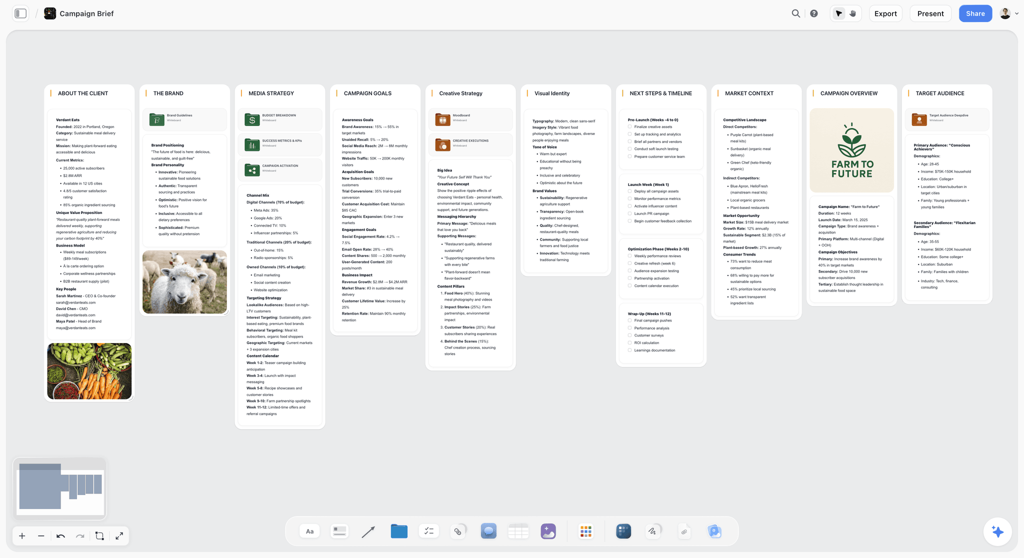
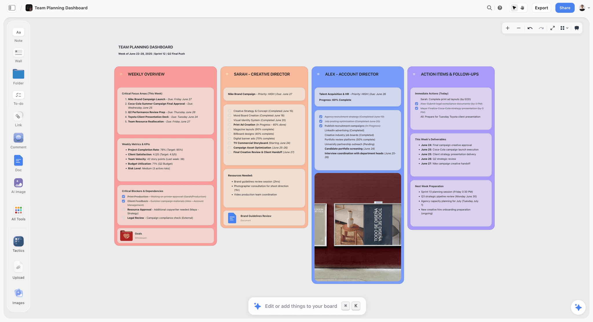
The verdict. A stakeholder map is a spatial grid you rearrange during an argument, and this is the tool that treats it that way rather than as a diagram to be stored.
Best for. Keeping a live power and interest grid that changes between meetings, and working out who controls your inputs.
Pricing. Paid only during early access. Plus is $7.99 per month billed annually or $9.99 monthly, adding 200 plus Story blueprints and unlimited file uploads. Pro is $14 annual or $19 monthly, adding AI image generation, roughly twenty times more AI usage and memory across conversations. Max is $39 annual or $49 monthly, adding forty times more AI and Team Workspace with permissions and roles. Pricing is flat per account, not per seat, and anyone a paid member invites joins free. The Free plan launches before the end of 2026. As of August 2026.
Why it ranks here. Almost every stakeholder map I have been shown lives in one of three places, and all three are the wrong shape. A slide, which is a photograph of a moment and is never edited again. A spreadsheet, which holds names and scores but cannot show that your three most powerful supporters all sit in one department. Or a diagramming tool, where moving a person between quadrants means selecting a shape and watching a connector reroute itself somewhere unhelpful.
The canvas is the right shape because the artifact is two-dimensional by definition: two axes, four regions, names positioned within them, position carrying the meaning. So the interaction that matters most is the one you do most, which is picking up a name and putting it somewhere else while someone is mid-sentence explaining why the head of legal is not the blocker, their deputy is. Update friction is the entire reason these maps go stale, and dragging a card is close to zero friction.
The third axis works here because colour and shape are free. A black dot on any card reads instantly across the board regardless of quadrant. You can also keep a cluster off to the side, outside the grid, holding people who own an input you need without being stakeholders in the formal sense. That off-grid cluster is usually the most valuable region of the board and no template has a place for it.
The AI is useful on one job. Storyflow's AI reads your full active canvas board, plus up to one Tactic and up to three Documents you @-mention, so you can ask whole-map questions: which department has nobody in the high-power region, which named approvals have no owner. It does not read all your boards or your whole workspace, so the context has to be on the board in front of you.
Strengths.
- Names are draggable objects on a real grid, so re-positioning during a live discussion costs nothing.
- Colour and shape make the third axis readable across all four quadrants without a new panel.
- Whole-board AI answers coverage questions: which function is unrepresented, which approval has no owner.
- Flat per-account pricing and free invited collaborators, so a freelance strategist or client sponsor costs nothing.
Limitations.
- No org chart import and no HRIS or CRM integration. No Workday, BambooHR, Salesforce or HubSpot connection, so all forty names are typed by hand. Lucidchart builds the same chart from a CSV in a minute.
- No per-object permissions. Sharing is board level, so you cannot hide a sensitive quadrant from a viewer. If the client-side sponsor gets the board, they get everything written on it.
- No structured stakeholder fields. No influence score, last-contact date, owner field or filterable register, so you cannot sort by anything or produce a "not contacted in 30 days" view.
- No voting, no anonymous input and no private mode, so calibrating power ratings happens out loud with everyone's name attached.
- No RACI primitive and no typed relationship data on connections, so "reports to" and "influences" look identical.
- Team Workspace with permissions and roles only arrives on Max at $39 per month.
The trade off. Storyflow holds the living, arguable version. The moment you need it generated from HR data, filtered by score, or hidden from one viewer, you need a second tool.
2. Miro
The verdict. The strongest choice for a facilitated stakeholder mapping session with more than five people in it.
Best for. Running the workshop where the map gets built in the first place.
Pricing. Free plan with three editable boards. Starter from roughly $8 per member per month annual, Business from roughly $16, Enterprise quoted. As of August 2026.
Why it ranks here. Miro's template library is deeper than ours and it matters more than a Storyflow post is supposed to admit. Miroverse holds dozens of stakeholder mapping frames: power and interest grids, salience models, influence and impact matrices, RACI boards, onion diagrams. If you have never run this exercise, that library is worth real money.
The facilitation mechanics are the other reason it ranks second. Dot voting is the correct way to set power ratings, because one person's confident assertion that the CFO is the real decision maker is worth much less than eight people converging independently. Miro has voting, timers, private frames and follow-me controls. Storyflow has none of those.
The costs are per-seat pricing and a free plan whose three-board limit will not survive a real client roster. Sensitivity control is board level: you cannot give a viewer three quadrants and not the fourth, so teams keep a private board and a sanitized one, and the sanitized one drifts.
Strengths.
- Deepest template library for stakeholder mapping frames specifically, not just generic diagrams.
- Dot voting is the right mechanic for calibrating power and interest across a group.
- Timers, private frames and follow-me controls make a fourteen person session workable.
- Strong integrations, including Jira and Confluence, so actions leave the board.
Limitations.
- Per-seat pricing across an agency plus clients gets expensive fast.
- No per-object visibility, so hiding one quadrant from a viewer means a second board.
- Heavy boards drag noticeably, which is exactly the friction that kills updating.
The trade off. Run the workshop in Miro. Whether the map lives there afterwards is a question about friction, not features.
3. Mural
The verdict. The best tool here for getting honest ratings out of a group that has a reason to be careful.
Best for. Sessions where people will not write what they think if their name is visible.
Pricing. Free plan available. Team from roughly $10 per member per month annual, Business from roughly $18, Enterprise quoted. As of August 2026.
Why it ranks here. Mural's private mode is the most relevant single feature in this category and it is underrated because it looks like a small facilitation toggle. Turn it on and participants add contributions without seeing anyone else's. Turn it off and everything appears at once.
That changes what people write. Ask a room to place their own director on a power grid with names attached and you get a polite map. Run it in private mode and you get the real one, including the three people who independently placed the same quiet operations manager in the high-blocking region. That is the third axis surfacing, and it surfaces because nobody had to be first to say it.
It ranks third because outside a live session it is the same shape as Miro with a smaller ecosystem and the same per-seat problem. When the map needs a ten second update because a sponsor changed, opening Mural feels like opening a workshop.
Strengths.
- Private mode produces materially more honest stakeholder ratings than open placement.
- Facilitator controls are the best-designed of any tool here for a live room.
- Strong method guidance around running the exercise, not just the template.
- Accessibility support is a genuine differentiator for mixed client groups.
Limitations.
- Per-seat pricing and a smaller template and integration ecosystem than Miro.
- Still no per-object visibility for viewers.
- Session-shaped, so it is less natural for a small update between meetings.
The trade off. If your problem is that people will not tell you the truth about power, this is the tool. If your problem is that nobody updates the map, it is not.
4. Lucidchart
The verdict. The only tool here that builds the org chart for you instead of making you type forty names.
Best for. Large stakeholder landscapes where reporting structure is the map, and account teams working from CRM data.
Pricing. Free plan with three editable documents. Individual from roughly $9 per month, Team from roughly $10 per user, Enterprise quoted. Data linking sits on higher tiers. As of August 2026.
Why it ranks here. Lucidchart's org chart automation is real and Storyflow has nothing like it. Import a CSV, or connect Google Workspace, BambooHR or Salesforce, and it generates the hierarchy for you. Shape data plus conditional formatting then lets you tag every person with an influence rating and have the chart recolour itself. For a 200 person account that is the difference between having a map and not.
The Lucid Sales Solution also pulls Salesforce contacts into an account map, writes back to the CRM, and shows white space where the buying committee has no relationship owner.
It ranks fourth because the interaction model fights the exercise. Lucidchart is a diagramming engine, so objects want to be connected, snapped and routed, and moving six people between quadrants takes more clicks than dragging six cards. That is fine for a chart you maintain quarterly, and wrong for a document that changes between two meetings on the same Tuesday. Permissions are document and folder level, which beats a shared canvas and is still not per-object.
Strengths.
- Org charts generated from CSV, Google Workspace, BambooHR or Salesforce data.
- Shape data plus conditional formatting turns influence ratings into automatic visual states.
- Salesforce write-back and account white space analysis for enterprise sales teams.
- Handles genuinely large stakeholder landscapes without becoming unreadable.
Limitations.
- Diagram-shaped editing is slower than card-shaped editing for a live discussion.
- Connectors and auto-routing get in the way of freeform positioning, and data linking sits on higher tiers.
- The chart it generates is a hierarchy, and hierarchy is not the same thing as influence.
The trade off. Generate the org chart here, then map the politics somewhere you can move things quickly. The reporting line and the power line are different diagrams.
5. FigJam
The verdict. The cheapest good canvas, and the correct answer if your team already opens Figma every day.
Best for. Product and design teams who want the map next to the work it affects.
Pricing. Free plan available. Included with Figma Collab seats at roughly $5 per editor per month billed annually. As of August 2026.
Why it ranks here. FigJam does the core job well: fast sticky notes, fast dragging, decent stamps and voting, and a rendering engine that stays smooth as the board gets busy. Its voting is simple enough that people use it without instruction.
The structural advantage is adjacency. If your product spec, design files and stakeholder map sit in one tool, the map gets reopened. Tool switching is a real tax on maintenance and FigJam avoids it for teams already inside Figma.
It is not higher because it is deliberately light: the stakeholder-specific template ecosystem is thinner than Miro's, permissions are file and project level, and there is no facilitation depth beyond timers and voting.
Strengths.
- Very fast canvas that stays responsive as objects accumulate.
- Cheapest credible paid option here at roughly $5 per editor.
- Voting and stamps are simple enough that groups use them without instruction.
- Lives beside the design and product work, so it gets reopened.
Limitations.
- Thin stakeholder-specific template ecosystem compared with Miro or Mural.
- File and project level permissions only, no hiding a quadrant.
- No private mode, so honest input needs a separate mechanism.
The trade off. Excellent value and fast. It is a canvas, not a method, so bring your own framework.
6. Smaply
The verdict. The only tool here where stakeholder maps are a first-class object, not a shape you arrange.
Best for. Service design and CX teams connecting stakeholders to journeys and personas.
Pricing. Free tier for a single project. Paid from roughly $20 per month for an individual, team pricing higher. As of August 2026.
Why it ranks here. Smaply builds structured stakeholder maps: entities with attributes, relationships with types and directions, and hub-and-spoke or concentric layouts that update when the data changes. Because a stakeholder is a record rather than a rectangle, the same person appears across a journey map and a persona without being retyped, and a relationship carries a type rather than an arrowhead.
For service design that is the correct model. Mapping a public service with fourteen organizations involved, the relationships between stakeholders matter more than their grid position, and Smaply expresses those properly.
It ranks sixth because the structure that helps in service design gets in the way of an argument. Editing a record is slower than dragging a card.
Strengths.
- Stakeholders are structured records with typed relationships, not free shapes.
- Connects directly to journey maps and personas without duplicating people.
- Concentric and hub-and-spoke layouts suit multi-organization service ecosystems.
- Purpose-built, so the vocabulary matches how service designers work.
Limitations.
- Slower to edit than a canvas, which hurts the live discussion.
- Narrow scope, so it is a dedicated subscription for one artifact type.
- Small ecosystem, fewer integrations, and project level permissions only.
The trade off. Right tool if stakeholder maps are a recurring deliverable in a service design practice. Overhead otherwise.
7. Airtable
The verdict. The stakeholder register, which is the half of this job a grid cannot do.
Best for. Tracking influence scores, owners, contact dates and outstanding asks across a long list.
Pricing. Free tier available. Team from roughly $20 per seat per month annual, Business from roughly $45. As of August 2026.
Why it ranks here. Once a stakeholder list passes about twenty five people the visual map stops being the primary artifact. What you need is one record per person with fields for role, organization, power rating, support level, relationship owner, last contacted and the outstanding ask.
Two views do most of the work. Everyone marked as a potential blocker with no owner assigned. And everyone not contacted in thirty days whose support level is anything but clearly positive. That second view is the operational version of the third axis, because a quiet veto is preceded by a long silence.
Airtable also does the arithmetic no canvas does: sorting by influence, filtering by department, counting how many high-power stakeholders are supportive rather than neutral. Field and view level permissions are the best access control here alongside Notion, so you can hide the candid assessment column from a shared view. It ranks seventh only because nobody has ever had a productive argument about politics while looking at a table.
Strengths.
- Structured fields make the register sortable, filterable and countable.
- Field and view level permissions genuinely hide sensitive columns from shared views.
- "No owner assigned" and "not contacted in 30 days" views catch quiet vetoes before they land.
- Free tier is adequate for a single project with one stakeholder base.
Limitations.
- Per-seat pricing gets expensive across an agency and its clients.
- A table cannot express spatial proximity, so clustering and coverage gaps stay invisible.
- Nobody rearranges a table during a heated meeting.
The trade off. Airtable holds the register, the canvas holds the map. Above twenty five stakeholders you need both, and they will not stay in sync.
8. Notion
The verdict. The best answer to the sensitivity problem, because the candid version never has to be shared.
Best for. Private written assessments of named individuals, kept alongside the project documentation.
Pricing. Free personal plan. Plus from roughly $10 per user per month annual, Business from roughly $20 with more granular sharing controls. As of August 2026.
Why it ranks here. Notion is the only tool here where "who can see this" is solved at the level the problem occurs. Pages are permissioned individually and a private page stays private inside a shared workspace, so you can keep a project space everyone reads and a page underneath it that only two people can open. The second page is where the honest assessments go.
That matches the work. There is a map you present, and there are the notes explaining why the deputy director has to be briefed before the director. Most tools force you to publish both or maintain two documents by hand.
The other strength is the record over time. A dated entry per interaction turns "I think they are unhappy" into "they have raised the same concern in three consecutive meetings". It ranks eighth because it is a document tool: no grid, no dragging, no visual expression of position. You can embed an image of the map, and it goes stale the moment the map changes.
Strengths.
- Page level permissions and private pages are the only real solution to the sensitivity problem here.
- Databases with relations give you a dated interaction history per stakeholder.
- Cheap, familiar and already present in most teams.
- Guest access at the page level for client-side collaborators.
Limitations.
- No spatial map at all, so the grid has to live elsewhere.
- Embedded images of the map go stale immediately.
- Permissions are only as good as the discipline of whoever creates the pages.
The trade off. Keep the map on a canvas and the sentences you would not say out loud in a private Notion page. That split solves more than any single tool does.
9. DemandFarm
The verdict. Purpose-built relationship mapping for enterprise account teams, sitting on Salesforce.
Best for. Key account managers mapping a buying committee inside a large client organization.
Pricing. Enterprise, quoted, annual contracts with seat minimums. Expect a procurement process rather than a checkout. As of August 2026.
Why it ranks here. Account-based stakeholder mapping is a different job from project stakeholder mapping and it has its own category of tools. DemandFarm builds org charts and relationship maps on top of Salesforce records, so the buying committee is CRM data rather than a picture. Influence lines, sentiment and white space analysis all render from contact records.
For a team managing eight strategic accounts that integration is the point. The map is not a separate artifact somebody has to remember to update, it is a view of data the account team maintains anyway. That is the cleanest answer to the staleness problem here, and it is only available because the tool gave up being general.
It ranks ninth because most readers are not enterprise account teams and it requires Salesforce. If that describes you, move it to the top.
Strengths.
- Relationship maps generated from Salesforce contact data, so they stay current.
- White space analysis shows which decision makers have no relationship owner.
- Influence and sentiment are structured fields, not annotations.
- Fits the account planning cadence rather than adding a separate ritual.
Limitations.
- Requires Salesforce and an enterprise procurement cycle.
- No use for internal project stakeholder mapping.
- CRM-bound editing is slow for a live strategy conversation.
The trade off. The right answer for enterprise account teams, irrelevant to everyone else here.
10. Excalidraw
The verdict. The map that leaves no trace, which is occasionally exactly what you need.
Best for. A candid map you draw once and do not want living on a company server.
Pricing. Free and open source, self-hostable. Excalidraw Plus from roughly $6 per user per month billed annually for collaboration and cloud features. As of August 2026.
Why it ranks here. Every other tool here creates a durable, discoverable, shareable object, and sometimes that is the problem. A candid assessment of your own leadership is not something you want indexed in workspace search or inherited by whoever joins next quarter.
Excalidraw saves to a local file. No account, no workspace, no share link defaulting to "anyone with the link", no admin who can open it. It is open source and self-hostable, which is a real answer if your organization will not allow the map anywhere else.
It ranks last because it is a drawing tool: no templates, voting, structured data, AI or permissions model beyond the filesystem. But on the criterion most reviews ignore, which is who can see this, it scores higher than anything else here.
Strengths.
- Local files with no account, so nothing is discoverable in a workspace search.
- Free, open source and self-hostable.
- Instant to draw in and pleasant to look at.
- No share link to forget about, which is the most common leak in this category.
Limitations.
- No templates, structured fields, voting or AI.
- Local files get lost, and there is no version history unless you provide it.
- Nothing helps you maintain the map over months.
The trade off. Wrong for a maintained artifact, right for the conversation you do not want on record.
What to Actually Pay For
Pay for org chart automation above about forty stakeholders. Lucidchart's data-linked chart, generated from a CSV or an HR system, catches people you would have forgotten. Below forty names, typing them beats configuring the import.
Pay for private mode if the group will not speak freely. Mural's version earns its seat cost in any organization where placing your own director on a power grid, in public, is a career decision.
Do not buy a dedicated stakeholder mapping product for one project. Smaply and DemandFarm both assume this is a recurring part of your practice. If you build two maps a year, a canvas and a spreadsheet cover it.
Spend on the register before the visualization above twenty five stakeholders. At that size the failure mode stops being "we drew the wrong map" and becomes "nobody contacted the compliance lead for six weeks". A filtered view catches that.
Tools to Avoid for This Job
A slide as the living map. The map on slide 14 of the kickoff deck is never updated, because editing a deck feels like a formal act requiring a reason. It becomes a historical document people keep citing as current. Export to a slide for the steering committee if you must, and keep the real one somewhere you can drag things.
Any tool where the share link defaults to "anyone with the link". This is how candid assessments of named colleagues escape. Check the default before you write anything real, not after.
A generic RACI matrix as a substitute. RACI describes accountability for deliverables. It says nothing about influence, sentiment, history or the ability to stall an input, which is exactly what the third axis measures. Use both, and do not let the matrix stand in for the map.
What No Tool on This List Does
None of them will tell you the truth. Every one of these maps is built from the beliefs of the people in the room, and the most common error is a confident, wrong assessment of who actually decides. No tooling substitutes for asking someone senior, privately, who really signs this off.
None of them will find the stakeholder you have never heard of. The compliance reviewer, the works council, the regional partner with a contractual approval right: these surface through conversation, not a template. The person who kills your project is rarely in the room when it dies, which means they are also rarely in your first draft of the map.
None of them, including Storyflow, will let you show one quadrant to a viewer and hide another. Only Notion and Airtable come close, and they do it by not being spatial. Every canvas here, ours included, shares at the board or file level, so the honest version and the presentable version are two documents that drift apart. That is a real gap and this post is not going to pretend otherwise.
None of them do the follow-up either. The map's value is in what it makes you do next, which is an early, specific ask to someone with a black dot next to their name.
The Bottom Line
Stakeholder mapping fails in two ways, and neither is a template problem. The map goes stale because updating it has friction, and it misses the person who can quietly stall an input because the standard 2x2 has no place to put them.
Fix the second with a mark that cuts across all four quadrants: anyone who controls something you need gets a dot and an early specific ask. Fix the first by keeping the map somewhere you can rearrange in seconds, and the sentences you would not say out loud somewhere with page level permissions, which realistically means Notion or a restricted Airtable view.
Use Miro or Mural to run the workshop, and Mural if the group needs private mode to be honest. Use Lucidchart if the organization is big enough that typing the org chart wastes an afternoon. But the artifact that governs the project is a two-dimensional grid that changes between meetings and has to be argued with rather than stored, and holding it somewhere you can pick up a name and move it mid-sentence is the narrow ground on which Storyflow ranks first here.
FAQ: Stakeholder Mapping Tools
What is the best stakeholder mapping tool in 2026?
For a living map that changes between meetings, a canvas is the right shape, and Storyflow ranks first because names are draggable objects on a real grid rather than shapes in a diagram. For a facilitated workshop, Miro's template library and dot voting are stronger. For a large organization, Lucidchart generates the org chart from CSV, Google Workspace, BambooHR or Salesforce data instead of making you type it. Most teams use two of these.
What is a stakeholder map and why does it matter?
A stakeholder map plots the people who affect or are affected by a project, usually on a grid of power against interest, so you can decide who to manage closely, keep satisfied, keep informed or monitor. It matters because project failure is more often political than technical: work stalls at an approval nobody owned, or a decision maker who was never briefed intervenes late. The map turns that into something you planned around.
What are the three axes of stakeholder mapping?
Power and interest are the standard two. The third, which most templates omit, is veto latency: whether someone can stop or delay your project without formal authority, without attending a meeting and without ever stating a position. Legal, security, procurement, brand compliance and calendar owners score high on it while scoring low on power and interest, which puts them in the "minimal effort" corner. Mark them separately and give each one an early, specific ask.
How often should you update a stakeholder map?
After every event that changes the organization: a reorg, a sponsor change, a new approval requirement, or a meeting where someone's position visibly shifted. The honest test is the last-modified date. If your map has not changed since kickoff, it describes an organization that no longer exists. That is why update friction matters more than template quality when choosing a tool.
Is Miro or Storyflow better for stakeholder mapping?
Miro is better for the workshop where the map gets built, because of its stakeholder template library, dot voting and facilitator controls, none of which Storyflow has. Storyflow is better for the map that stays alive afterwards, because dragging a name to a new quadrant costs nothing and flat per-account pricing means invited collaborators are free. Neither has per-object permissions.
How do you keep a stakeholder map confidential?
Keep two things apart. The grid, with names and positions, can be shared reasonably widely. The sentences explaining why someone is positioned there belong somewhere with page level permissions, which means Notion private pages or a permissioned Airtable view. Check that your canvas share link does not default to "anyone with the link", audit workspace guests, and assume any board you share will be screenshotted. For genuinely sensitive maps, a local Excalidraw file leaves no trace.
Does Storyflow have stakeholder mapping templates?
Storyflow ships 200 plus Story blueprints on the Plus plan and up, covering planning, briefing and creative structures you can adapt into a power and interest grid. There is no dedicated stakeholder mapping template with pre-built quadrant labels and salience models the way Miro's community library has, and that is a real gap. Building the grid manually takes a couple of minutes, but if you want ready-made variations to choose between, Miro and Mural are better served.
What is the difference between a stakeholder map and an org chart?
An org chart shows reporting lines. A stakeholder map shows influence, interest and the ability to block, which frequently do not follow reporting lines. The most powerful person on a project is often two levels below the named sponsor, and the person who can stall it for a month usually sits in a function that never appears on your org chart. Generate the chart from HR data, then build the influence map by talking to people.
Can AI build a stakeholder map for you?
Not from nothing, because the useful content is private organizational knowledge no model has. What AI does well is interrogate a map you have already built. Storyflow's AI reads your full active canvas board, plus up to one Tactic and three @-mentioned Documents, so you can ask which functions are unrepresented, which approvals have no owner, and which quadrant is suspiciously empty. Coverage questions are where omissions surface.
What free tools can you use for stakeholder mapping?
Excalidraw is free, open source and self-hostable, and works well for a one-off map. Miro, Mural, FigJam, Lucidchart, Airtable and Notion all have free tiers adequate for a single project, with limits on editable boards or documents. Storyflow is paid only during early access, though anyone a paid member invites joins free and can invite others, and the Free plan launches before the end of 2026.
How many stakeholders should be on a map?
However many genuinely affect or are affected by the work, which is usually more than the first draft contains and fewer than the second. Past about twenty five people the grid stops being readable on its own and needs a filterable register behind it, which is where Airtable earns its place. The useful discipline is not limiting the count but making sure every approval, budget sign-off and required input has a person attached.
What is the biggest mistake teams make with stakeholder mapping?
Treating it as a kickoff deliverable rather than a live political document. The map gets built in a workshop, photographed onto a slide, and never touched again, so by week six it describes an organization that has changed. The second mistake follows: only plotting power and interest, and so filing the quiet blockers under "minimal effort". The person who kills your project is rarely in the room when it dies.
Templates you can use in Storyflow
Every Storyflow board starts from real structure and an AI that reads the whole canvas. Open one of these templates and make it yours.


See Storyflow in Action
A visual AI workspace where every feature lives inside one canvas. No tab-switching, no context lost.
Build your entire board from a single message
Type what you need in the AI chat at the bottom of your canvas. The AI adds cards, headings, and structure directly onto your board.
Use expert frameworks as AI context
Type @ in the AI chat and choose any Tactic. The AI tailors every response to that framework instead of giving generic advice.
Turn your board into a mind map in seconds
Ask the AI to restructure your canvas as a mindmap. It connects your ideas into a visual hierarchy so you can see how everything relates.
Why Storyflow Exists
Storyflow actually began as a personal tool while working on creative and research projects.
We kept running into the same problem: ideas were scattered everywhere: notes, documents, and whiteboards.
Nothing helped us see how everything connected.
So we started building a workspace designed around how ideas actually grow.
→ Read how Storyflow was createdSara de Klein
Head of Product at Storyflow
Published: 2026-08-13
Start creating with AI and become more productive
Transform your creative workflow with AI-powered tools. Generate ideas, create content, and boost your productivity in minutes instead of hours.