The 10 Best Impact Mapping Tools in 2026 (We Tested Them All)
An impact map you never prune is just a wish list with branches. Ten tools ranked by whether the map stays connected to the goal after the first workshop ends.

Category
Tools & Software
Author

Sara de Klein
Head of Product at Storyflow
Topics
2026-08-14
•
22 min read
•
Tools & SoftwareTable of Contents
- Key Takeaways
- The Disposable Fourth Level
- At a Glance: The 10 Tools Compared
- How I Ranked These
- Quick Picks by Job Type
- 1. Miro
- 2. Mural
- 3. Storyflow
- 4. Lucidspark
- 5. FigJam
- 6. Whimsical
- 7. MindMeister
- 8. Xmind
- 9. Milanote
- 10. Notion
- What to Actually Pay For
- Tools to Avoid for This Job
- What No Tool on This List Does
- The Bottom Line
- FAQ: Impact Mapping Tools
- Related Reading
Templates to check out for this topic


- impact mapping tools
- impact map software
- Gojko Adzic impact mapping
- impact mapping workshop
- goal actor impact deliverable
- impact mapping template
What are the best impact mapping tools in 2026?
Impact mapping is a four level mind map connecting a business goal to the actors who can move it, the behaviour changes you need from them, and only then the things you might build. Miro ranks first because it holds all four levels, lets a group vote on the third, and links the fourth into Jira so a deliverable becomes tracked work. Mural is a close second and runs the better session. Storyflow ranks third because a branching map on an infinite canvas is the right shape and its AI reads the whole board, though it has no branch collapse and no tracker link. Xmind and Whimsical win on pruning. Notion ranks last.

Full disclosure: Storyflow is our product, so here is the honest position. It ranks third, not first, and Miro is the top pick. Storyflow wins on one narrow ground: a four level branch is a spatial object, an infinite canvas with real connectors is the right shape for it, and the AI reads your full active canvas board so you can ask structural questions about the map rather than about one node. What it genuinely cannot do: there is no impact map template in the Story blueprint library, no branch collapse or fold or subtree operation, no link from the deliverables level to Jira, Linear or Asana, and no voting to prioritise impacts. Realtime co-editing is part of Team Workspace on the Max tier only. Storyflow is paid-only during early access.
Quick Comparison
Ten tools ranked on two mechanical questions: can you prune a whole branch in one action, and does the deliverables level link to whatever your team actually plans in.
| Tool | Best For | AI Features | Price |
|---|---|---|---|
| Miro | The full session plus a live link to Jira | AI clustering and summaries on board content | Free tier, from about $8 per user per month |
| Mural | Facilitated workshops with senior stakeholders | AI summarising and clustering of sticky notes | Free tier, from about $9.99 per user per month |
| Storyflow | Interrogating the map as a structure after the workshop | AI reads the full active canvas board plus 1 Tactic and 3 @-mentioned Documents | $7.99 mo annual (free plan late 2026) |
| Xmind | One owner pruning and filtering the map over months | Limited AI assist on branch generation | Free version, Pro about $60 per year |
Key Takeaways
- Impact mapping was developed and popularised by Gojko Adzic in his 2012 book Impact Mapping: Making a Big Impact with Software Products and Projects. The structure is Why, Who, How, What.
- The fourth level, the deliverables, is the cheapest level and the only one a room argues about. That inversion is the problem the technique exists to fix.
- The map earns its keep by making deliverables provisional. Each hangs off a testable behaviour change, so when the behaviour does not move, the branch goes.
- An impact map you never prune is just a wish list with branches.
- Rank tools on one question: does the map stay connected to the goal after the first workshop ends. Two capabilities decide it, pruning and the tracker link.
- Miro and Mural are the only tools here combining live voting on impacts with a real link from the fourth level into a tracker.
- Storyflow ranks third on narrow ground: the branch is genuinely spatial and the AI reads the whole map, but there is no collapse, no tracker link and no voting.
- A map drawn once, screenshotted into a deck and never revisited is an org chart with hope attached.
Map the behaviour change before you map the backlog
Draw the four levels on an infinite canvas, keep the evidence beside the impact it justifies, and ask the AI which actors have no impacts attached and which impacts are carrying too many deliverables. Paid-only during early access; the Free plan lands before the end of 2026.

The Disposable Fourth Level
Open any impact map a team actually built and count where the argument happened.
It happened at the bottom. The goal took four minutes because someone had already written it in a quarterly plan. The actors took ten and produced a list matching the org chart. The impacts got a fast pass, because behaviour is awkward to write down. Then the room spent seventy minutes on deliverables, the level that costs nothing to change and everything to build.
That is the inversion this technique corrects, and it is why I call the bottom row the disposable fourth level.
Adzic's structure asks four questions in order. Why: the goal, expressed as a measurable business change, not a feature. Who: the actors who can produce that change or obstruct it, including people outside your company. How: the impacts, meaning behaviour changes you need from those actors. What: the deliverables you could build to encourage those behaviours. Adzic credits the Swedish effect mapping practice as an antecedent.
The point is not documentation. It is that every deliverable is now attached to a testable claim. You are not building a referral widget. You are betting that existing customers will invite colleagues, and a referral widget is one guess at how to cause that. If invitations do not go up, the widget was wrong, and so was everything else on that branch. Deliverables are supposed to be provisional, and supposed to be crossed out. A team that treats the What level as a commitment has rebuilt a backlog with extra ceremony.
An impact map you never prune is just a wish list with branches.
The failure mode nobody writes about is not the workshop, which usually goes well. The problem starts on day two: the map gets screenshotted into a slide, the deliverables get copied into Jira with the assumption stripped off, and within three weeks the team is executing a backlog nobody can trace back to a behaviour change. The map is still there. It is no longer connected to anything.
So the ranking axis is whether the map stays connected to the goal after the session ends, and that resolves into two mechanical questions.
Can you prune? When an assumption dies you need to remove an actor and everything beneath it in one gesture, or fold it out of view without destroying the record. If pruning means dragging forty shapes into a bin one at a time, nobody does it, and dead branches accumulate until the map is unreadable.
Does the fourth level connect? A deliverable on a canvas and a ticket in a tracker are one intention stored twice, and two stores drift. Without a live link to the Jira, Linear or Asana item, someone maintains the correspondence by hand, and that person stops.
At a Glance: The 10 Tools Compared
| Tool | Shape it gives the map | Branch pruning | What level to tracker | Group prioritising | Price signal |
|---|---|---|---|---|---|
Miro | Free canvas, templates | Frames, manual | Two way Jira cards | Dot voting built in | Free tier, from about $8 per user |
Mural | Free canvas, facilitation | Areas hold contents | Jira, creates issues | Voting plus private mode | Free tier, from about $9.99 per user |
Storyflow | Infinite canvas, whole board AI | Manual multi select | None | None | Paid only, $7.99 per month annual |
Lucidspark | Canvas, converts to Lucidchart | Real collapse in Lucidchart | Jira and Azure DevOps | Voting and gather | Free tier, from about $7.95 |
FigJam | Canvas, design adjacency | Sections, manual | Plugins only | Stamps and plugins | Free tier, seats from about $3 |
Whimsical | True mind map hierarchy | One click subtree fold | Static links only | Comments only | Free tier, from about $10 |
Xmind | Map and outline pair | Fold, filter, drill down | None | None | Free version, Pro about $60 a year |
MindMeister | Mind map, task handoff | One click collapse | MeisterTask handoff | Voting in collaboration mode | Free for three maps, from $3.50 |
Milanote | Boards and visual notes | Nested boards, manual | None | None | Free tier, Pro about $12.50 a month |
Notion | Database, not a branch | Filters and rollups | Jira and GitHub sync | A voting property | Free tier, from about $10 per user |
How I Ranked These
I come from documentary, where the same four levels have different names and the same inversion wastes the same time. The goal is what the film should change in whoever watches it, the actors are the people on screen and the audiences who might act, the impacts are what those people do differently, and the deliverables are scenes. Scenes are the cheapest thing on a production and the only thing anyone argues about. I have run sessions in every tool here and rebuilt maps three months later to see what survived.
Five criteria, in order.
1. Does the fourth level stay provisional? The test: cross out a deliverable and see whether anything protests. Where deliverables have become tickets with owners and estimates, crossing one out is a political act.
2. Can you prune a whole branch in one action? The test: take an actor with three impacts and nine deliverables and fold or remove the subtree. Under five seconds is a tool that gets pruned. Over thirty accumulates dead wood.
3. Does the What level link to where work is planned? The test: click a deliverable and see whether you land on the Jira, Linear or Asana item with a current status. A hyperlink pasted by hand counts for little, because it does not survive a re-scope.
4. Can a group prioritise the impacts in the session? The test: eight people each place three votes on the How level in two minutes, results visible. That level is where prioritising matters and where most tools give you nothing.
5. Does the map survive a cold read three months later? The test: open it without the facilitator and see whether you can tell which assumptions were tested, which died, and what shipped.
Pricing is as of August 2026 and changes frequently. Verify with each vendor.
Quick Picks by Job Type
- Best overall: Miro. Four levels, live voting on impacts, two way Jira cards on deliverables.
- Best facilitated workshop: Mural. Private mode stops the loudest voice setting the actor list.
- Best for interrogating the map afterwards: Storyflow. Whole board AI answers structural questions.
- Best pure pruning: Xmind. Fold, filter and drill down on a genuine hierarchy.
- Best free solo draft: Whimsical. One click collapse and a clean four level tree.
1. Miro
The verdict. The only tool that holds all four levels, lets a group vote on the third, and gives the fourth a live connection to a tracker.
Best for. A distributed team running a real session and then keeping the map alive against a Jira backlog.
Pricing. Free tier with three editable boards. Starter roughly $8 per member per month billed annually, Business roughly $16, as of August 2026. The Jira Cards app is included on paid plans.
Why it ranks here. Impact mapping is a workshop technique before it is an artifact, and Miro is the tool most likely to already be open when the workshop starts. A technique that needs a tool migration to try does not get tried.
You get a branch without the tool pretending to be a mind map. Connectors are real, so moving an actor drags its lines with it, and community impact map templates save the ten minutes of grid drawing that otherwise starts every session badly.
Voting is why it beats every mind mapping tool here. Prioritising deliverables is a trap. Prioritising impacts is the actual decision, because the behaviour change you chase this quarter determines everything below it. A timed vote on the How level turns an argument into a decision in ninety seconds.
The Jira Cards app then closes the loop every other canvas leaves open. A deliverable node carries the real issue key, status and assignee, and it updates. Three months later you can see that four of nine deliverables under one impact shipped, that the impact did not move, and that the branch was wrong.
Strengths.
- Impact map templates a facilitator can open cold.
- Dot voting on the impacts level, where prioritising belongs.
- Two way Jira and Azure DevOps cards with live status on deliverables.
- Frames and groups move or hide a whole actor branch.
Limitations.
- No true collapse. A frame hides, but a subtree does not fold.
- Per member pricing gets expensive once you invite stakeholders who attend once.
- Board sprawl. Without an owner the map is lost among forty artifacts within a quarter.
The trade off. You pay per seat and accept board sprawl, and you get the only complete path from behaviour change to tracked ticket.
2. Mural
The verdict. The better facilitated session, one integration short of the top spot.
Best for. Workshops that include senior stakeholders, where you need the quiet people's actors on the board too.
Pricing. Free tier with three murals. Team roughly $9.99 per member per month billed annually, Business roughly $17.99, as of August 2026.
Why it ranks here. Mural is built around facilitation, and impact mapping lives or dies on it. The most common way a map goes wrong is not a missing feature. It is that the most senior person names the actors and everyone else fills in beneath them.
Private mode fixes that. Everyone adds actors and impacts without seeing anyone else's, then the facilitator reveals all at once. The difference in the actor list is not subtle. Open sessions produce the org chart. Private sessions produce customers, support agents, procurement, the partner's integration team and the regulator.
Areas are a better pruning primitive than Miro's frames, because an area holds its contents. Moving one moves the whole actor branch, and you can park a dead branch in a corner without destroying the record that it existed. An assumption that died is information.
It ranks second because the Jira integration is thinner. It links and creates issues, but the deliverable node does not carry live status back with Miro's fidelity, so the cold read three months later tells you less.
Strengths.
- Private mode produces a materially better actor list than an open round.
- Areas hold their contents, so a branch moves or parks as one object.
- Facilitation controls keep a remote room together through the hard middle section.
- Jira integration creates real issues from nodes.
Limitations.
- Weaker than Miro on live status, which is what the cold read depends on.
- No subtree collapse, only moving and hiding.
- Per member pricing, same stakeholder problem as Miro.
The trade off. Run the session here for a better map, and do slightly more manual work keeping it alive.
3. Storyflow
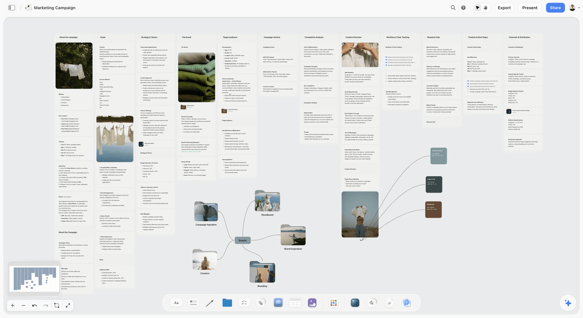
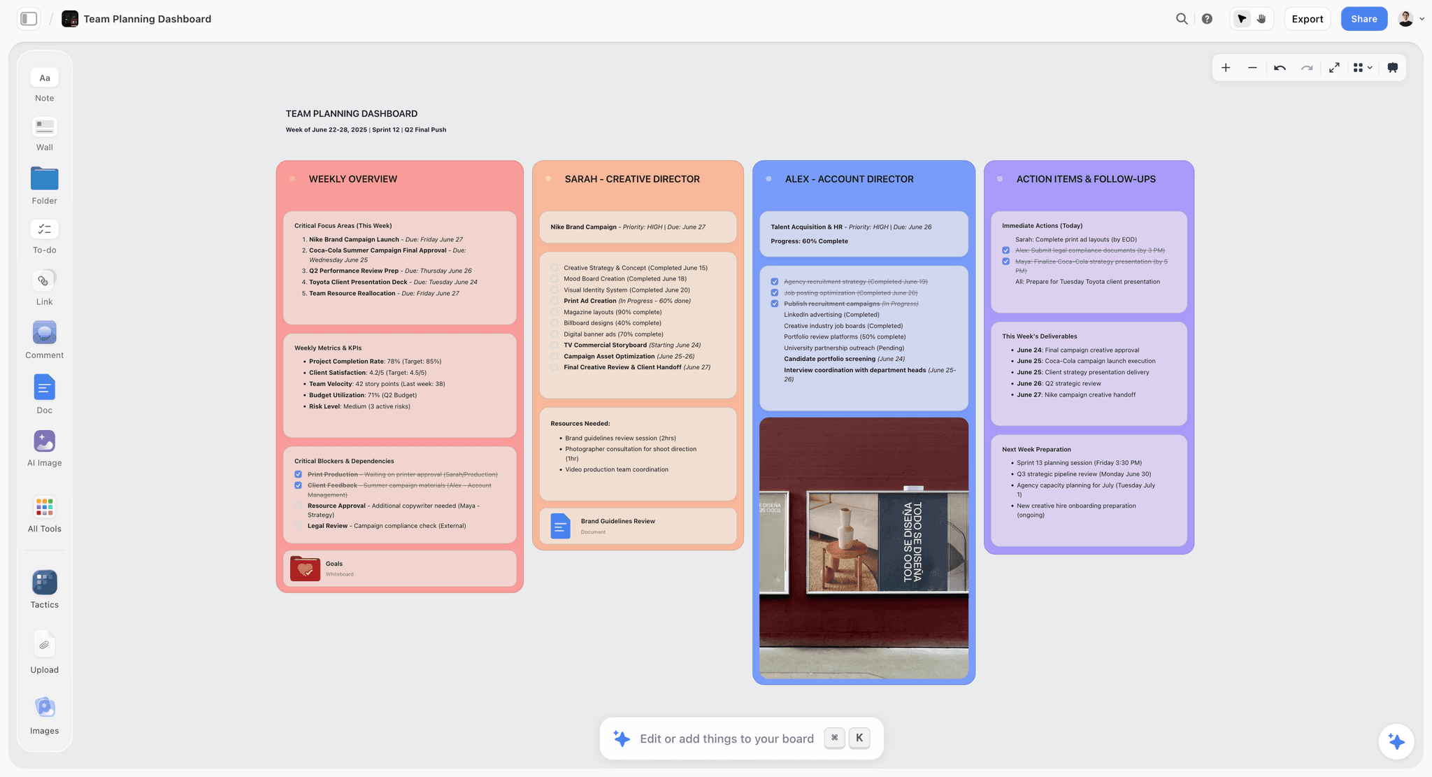
The verdict. The four level branch is genuinely spatial and the AI interrogates the map as a whole, but there is no branch collapse and no link from deliverables to any tracker.
Best for. A small team that wants the map to stay a thinking surface rather than becoming a backlog.
Pricing. Paid only during early access. Plus is $7.99 per month billed annually or $9.99 monthly, adding the 200 plus Story blueprints and unlimited file uploads. Pro is $14 per month billed annually or $19 monthly, adding AI image generation, roughly twenty times more AI usage and memory across conversations. Max is $39 per month billed annually or $49 monthly, adding forty times more AI and Team Workspace with permissions and roles. Pricing is flat per account rather than per seat, anyone a paid member invites signs up free, and the Free plan launches before the end of 2026. As of August 2026.
Why it ranks here. Storyflow is ours, and the honest case here is narrow. A four level branching map wants an infinite canvas with real connectors, and that is what the whiteboard is: the goal at the left, actors fanning out, impacts from those, deliverables at the edge. Miro and Mural do that too.
What differs is the AI's scope. Storyflow's AI reads your full active canvas board, plus up to one Tactic and up to three Documents you @-mention, so you can ask about the map as a structure rather than about a node. Which actors have no impacts attached. Which impacts carry four or more deliverables, usually a sign the room skipped the behaviour and went straight to building. Whether a deliverable appears under two impacts, which is either real leverage or a node attached to whatever branch was nearest. Elsewhere you answer those by squinting.
It also holds evidence next to the claim. An impact is a bet about behaviour, and bets should carry their reasons. The support ticket screenshot, the interview clip and the analytics chart sit beside the impact they justify.
Now the honest part. An impact map you never prune is just a wish list with branches, and Storyflow gives you no pruning primitive: no collapse, no fold, no subtree operation. Removing a dead actor branch means selecting nodes and connectors by hand, exactly the thirty second operation criterion two says will not get done. There is no impact map template in the Story blueprint library either, so you draw the four levels yourself every time. And the fourth level connects to nothing: no Jira, no Linear, no Asana. On that criterion Miro, Mural, Lucidspark and MindMeister all beat it.
It ranks third because the shape is right, the structural AI questions are useful at this size, and flat per account pricing means inviting six stakeholders costs nothing extra. It ranks no higher because two of five criteria are outright failures.
Strengths.
- Infinite canvas with real connectors, the correct shape for a four level branch.
- Whole board AI answers structural questions about the map, not just one node.
- Evidence, clips and screenshots sit beside the impact they justify.
- Flat per account pricing, so stakeholders and clients do not multiply the bill.
- Invited collaborators sign up free and can invite others, the only genuinely free path today.
Limitations.
- No impact map template in the Story blueprint library. You draw the four levels from scratch.
- No branch collapse, fold or subtree operation. Pruning is a manual multi select.
- No link from the What level to any tracker. No Jira, no Linear, no Asana.
- No voting, so prioritising impacts happens verbally or in another tool.
- Realtime co-editing is part of Team Workspace on the Max tier at $39 per month, so live multi person sessions are unavailable on Plus and Pro.
- Paid only during early access, with no live free plan until later in 2026.
The trade off. It holds the thinking better than the process, so pair it with your tracker and accept a hand maintained deliverable level.
4. Lucidspark
The verdict. The strongest path from a messy workshop map to a formal diagram that survives review.
Best for. Teams whose map must end up legible to people who were not in the room.
Pricing. Free tier with three editable boards. Individual roughly $7.95 per month, Team roughly $9 per user per month, as of August 2026. Lucidchart is priced separately or bundled in the Lucid Suite.
Why it ranks here. Lucidspark is the whiteboard and Lucidchart the diagramming tool, and the handoff between them is why the pairing is here. Run the session in Lucidspark with sticky notes, then convert to a Lucidchart diagram with containers and a hierarchy that holds.
That matters because an impact map has two audiences. The room needs a loose, argumentative surface. The executive reading it in three weeks needs the four levels visually distinct and the branch structure unambiguous. Most tools make you pick one.
Containers in Lucidchart come closest of the canvas tools to real pruning. A container holds its children, collapses, and takes conditional formatting, so you can grey out a branch whose assumption failed rather than deleting the record. The Jira integration is comparable to Mural's, and data linking can pull status back onto shapes, though that is configuration work rather than a click.
It ranks fourth because the two product handoff is a real cost. Buy only Lucidspark and you get a competent whiteboard without containers. Use only Lucidchart and the workshop stage is stiff.
Strengths.
- Workshop surface and formal diagram in one family, without redrawing.
- Lucidchart containers collapse and hold their children, the closest thing to real pruning on a canvas.
- Jira and Azure DevOps integration on the deliverable level.
- Conditional formatting retires a dead branch visually instead of deleting it.
Limitations.
- The best pruning lives in Lucidchart, not Lucidspark, so you need both.
- Live status linking is configuration, not a one click app.
- Denser interface than Miro's, which slows newcomers during a session.
The trade off. Extra setup and a second product, in exchange for the only canvas where a branch genuinely collapses.
5. FigJam
The verdict. A fast, cheap canvas whose real advantage is sitting one tab from the design files the deliverables become.
Best for. Product and design teams already inside Figma who want the map next to the work.
Pricing. Free tier with a limited number of files. Collab seats roughly $3 per editor per month billed annually and about $5 monthly, and FigJam is included with Figma Professional at roughly $15 per editor per month, as of August 2026.
Why it ranks here. The cheapest way to keep a map connected to the work is to store it where the work already is. For a product design team that is Figma, at a fraction of Miro's or Mural's per editor price.
The canvas is good. Connectors are quick, sections group a branch, and the multiplayer feel during a live session is the best here. Cursor chat and stamps make a remote workshop less flat.
It falls behind at the fourth level. There is no native two way tracker sync, and the Jira and Linear plugins range from useful to abandoned. A plugin dependency inside an artifact you keep for a quarter is a liability. Voting happens through stamps or plugins rather than a timed vote with a tally, which makes the impacts pass less crisp. Sections give branch level movement but not collapse.
Strengths.
- Cheapest per editor pricing of the collaborative canvases here.
- Best live multiplayer feel, which keeps a remote workshop energetic.
- Sits beside the design files the deliverables level turns into.
- Sections move and organise an actor branch as a unit.
Limitations.
- No native tracker sync. Jira and Linear depend on plugins of varying quality.
- Voting is a stamp or a plugin, not a timed vote with a tally.
- No collapse, and boards get noisy as the map grows.
The trade off. If your deliverables become Figma files, the adjacency outweighs the missing integrations. If they become Jira tickets, it does not.
6. Whimsical
The verdict. The cleanest four level tree of any collaborative tool here, with one click collapse and nothing else.
Best for. A solo or two person draft of the map before you take it into a room.
Pricing. Free tier with a limited number of boards. Pro roughly $10 per editor per month billed annually, as of August 2026.
Why it ranks here. Whimsical's mind map is a real hierarchy, not shapes with lines between them. Tab creates a child, enter creates a sibling, and a node folds with one click taking its subtree. On pruning, it beats every canvas here.
That discipline has a second benefit: level confusion becomes impossible. On a free canvas an impact and a deliverable are both rectangles, and a room under time pressure will write a deliverable in the impacts row. In a strict hierarchy a node's level is its position, so a feature name at depth three is visibly wrong.
Speed is the other reason. A first draft alone takes about eight minutes, and doing that draft first makes the workshop better, because the room argues with a strawman instead of an empty board.
It ranks sixth because it is not a workshop tool. No voting, no timer, no private mode, no tracker sync, and less room for evidence than a free canvas gives you.
Strengths.
- Genuine node hierarchy with one click collapse of a whole subtree.
- The strict structure stops deliverables being written in the impacts row.
- Keyboard driven, so a full solo draft takes minutes.
- Clean enough to paste into a document without reformatting.
Limitations.
- No voting, timers or facilitation features for a live group.
- No tracker integration. Links are manual and static.
- Limited space to attach evidence, clips or screenshots to an impact.
The trade off. Best structure, no process. Draft here, run the session elsewhere.
7. MindMeister
The verdict. A capable mind map whose distinctive advantage is that the fourth level can hand off to tasks without leaving the vendor.
Best for. Teams already on MeisterTask who want deliverables to become work items in one action.
Pricing. Free tier limited to three maps. Personal roughly $3.50 per month, Pro roughly $5.50 per user per month, Business roughly $8.50, billed annually, as of August 2026.
Why it ranks here. MindMeister has the collapse behaviour Whimsical has plus a presentation mode that walks a stakeholder through the map one branch at a time. Presenting linearly, goal first, then one actor with its impacts and deliverables, then the next, is the right way to explain an impact map to someone who missed the session, and most tools make you do it by zooming around a canvas.
The MeisterTask handoff is the real differentiator. Turning a deliverable node into a task inside the same vendor's tracker is one action and the connection persists. It is not Jira, and if your engineers live in Jira or Linear it does not help. It does mean MindMeister is one of the few tools where the fourth level has somewhere to go.
It ranks seventh because the canvas is confined, evidence attachment is limited, and the default radial layouts are slightly wrong for a technique that reads better left to right by level.
Strengths.
- Real hierarchy with reliable collapse and drill down.
- Presentation mode walks one branch at a time, which is how you brief a stakeholder.
- MeisterTask handoff gives deliverables a destination.
- Cheapest paid tier of any dedicated mind mapping tool here.
Limitations.
- The task handoff only helps on MeisterTask. No Jira, Linear or Asana equivalent.
- Radial layouts encourage a shape that reads worse than a strict left to right map.
- Limited evidence attachment compared with a free canvas.
The trade off. A good map and a real deliverable destination, if your tracker is MeisterTask.
8. Xmind
The verdict. The best pure structure on this list and the worst collaboration, which is an unusually clean trade.
Best for. Building and maintaining the map as a personal thinking artifact.
Pricing. Free version with watermarked export. Pro roughly $60 per year as of August 2026, as a flat purchase rather than per seat.
Why it ranks here. Xmind treats a hierarchy as a first class object in a way the web canvases do not. Fold, filter by label, drill into a subtree so the rest disappears, and switch between map and outline view instantly. The outline view is underrated: reading the four levels as an indented list exposes gaps a radial map hides, particularly actors with no impacts and impacts with no deliverables.
Labels and markers record what happened to a branch. Marking an impact as tested and failed, then filtering to live branches only, is the closest thing here to a map that carries its own history, and it makes the cold read three months later genuinely informative.
It ranks eighth because impact mapping is a group technique and Xmind is a single player application. Collaboration exists in limited forms but there is no facilitation, no voting and no tracker integration. If one person owns the map and the workshop happens on a physical wall, Xmind is the best place to keep it afterwards.
Strengths.
- Fold, filter, drill down and outline view, the strongest inspection toolkit here.
- Labels record which assumptions were tested and which died.
- Flat annual price rather than per seat per month, and fast on very large maps.
Limitations.
- Not a workshop tool. No live facilitation, no voting, no private mode.
- No tracker integration of any kind.
- Sharing usually means exporting an image, which is how maps become screenshots.
The trade off. The best place for one person to maintain a map, the wrong place to build one with eight.
9. Milanote
The verdict. A pleasant visual board that holds the evidence beautifully and the hierarchy poorly.
Best for. Impact maps for brand, campaign or content work where the deliverables are visual.
Pricing. Free tier limited to 100 notes and 10 file uploads. Pro roughly $12.50 per month billed annually or $14.99 monthly, as of August 2026, with per person team pricing.
Why it ranks here. Milanote is built for creative planning and gives an impact map something the mind mapping tools do not: a real image, a link preview and a note beside a node without the layout collapsing. For a marketing team mapping a goal like reducing churn in a segment, the impacts are behavioural and the evidence is qualitative, and Milanote holds that material better than Xmind or Whimsical.
Nested boards give a crude pruning mechanism. An actor can be a board containing its impacts, which contain their deliverables, so a dead branch is archived rather than deleted.
The problem is that hierarchy is secondary. Lines exist, but the tool does not understand parent and child relationships, so the four levels are a convention you maintain rather than a structure the tool holds, and conventions decay. There is no tracker integration and no voting.
Strengths.
- Best handling of images, links and reference material beside a node.
- Nested boards allow a branch to be archived rather than deleted.
- Genuinely pleasant to revisit, which matters for the cold read.
Limitations.
- No enforced hierarchy, so the four levels are a convention that decays.
- No tracker integration and no voting.
- Weak for a live multi person workshop, and free tier note limits arrive fast.
The trade off. Excellent for the evidence, unreliable for the structure that gives the evidence meaning.
10. Notion
The verdict. The wrong shape for this technique, and the tool most likely to quietly convert your map back into a backlog.
Best for. Recording the decisions that came out of an impact map, not building one.
Pricing. Free personal tier. Plus roughly $10 per user per month billed annually, Business roughly $18, as of August 2026.
Why it ranks here. Notion can represent an impact map. Build four linked databases and every deliverable has a parent impact, every impact a parent actor, every actor a parent goal. Rollups will even count deliverables per impact. Its Jira and GitHub sync properties mean the fourth level can carry live external status, which is more than FigJam, Whimsical, Xmind or Milanote manage.
So why last? Because an impact map is a spatial argument and Notion cannot draw it. You cannot see that one actor has eleven deliverables while three others have none. The gestalt read that makes the technique work in a room does not exist in a table.
There is a worse problem. A database of deliverables with owners, statuses and dates is a backlog, and within two weeks it gets groomed like one. The disposable fourth level stops being disposable the moment it acquires a status field, because deleting a row with an owner and a due date feels like cancelling work rather than discarding a guess. Notion accelerates the exact failure this technique prevents.
Strengths.
- Rigorous relational structure with real parent and child integrity across four levels.
- Rollups count deliverables per impact, a useful imbalance signal.
- Jira and GitHub sync properties give the fourth level live external status.
- Free personal tier, and everyone already has an account.
Limitations.
- No spatial view, so the gestalt read that makes impact mapping work is unavailable.
- Database properties turn deliverables into committed work, destroying the provisional fourth level.
- No workshop mode, no voting, no live facilitation.
The trade off. Excellent memory, no eyes. Use it for what the map decided, never for the map.
What to Actually Pay For
Pay for one collaborative canvas, not two. Miro and Mural are close enough that owning both is waste. Miro if your team lives in Jira and you want live status on deliverables, Mural if your sessions include senior stakeholders and private mode will improve the actor list.
Do not pay per seat for observers. Sessions attract attendees who contribute once, and on per member products that is where the bill grows. Use guest access, or hold the map somewhere with flat per account pricing and share a read only link.
Spend sixty dollars on Xmind if one person owns the map. A single owner maintaining a map between quarterly sessions gets more from fold, filter and labels than from another canvas seat.
Do not buy anything until you have run one session. Every tool here has a free tier sufficient for a first workshop, the technique succeeds or fails on facilitation, and buying early is how you end up subscribed to a screenshot.
Tools to Avoid for This Job
Your issue tracker. Building the map directly in Jira, Linear or Asana as an epic tree looks efficient and destroys the technique. Every node acquires a status, an assignee and an estimate, so every node is committed work, and a tracker makes disposal a process.
A slide deck. An impact map in a presentation tool is a picture of a map. It cannot be pruned or linked, and it will be out of date within a sprint while still circulating as current. This is where dead impact maps live.
A spreadsheet. Four columns for goal, actor, impact and deliverable hold the data and hide the shape. The imbalance signal, one actor with eleven deliverables while another has none, is the most useful thing the map tells you and it is invisible in rows.
An unstructured brainstorm. If you do not enforce that the How level contains behaviour changes rather than features, you produce a feature list with a goal above it, which is worse than nothing because it now carries the authority of a workshop.
What No Tool on This List Does
None of them stops you writing features in the impacts row. This ruins more maps than anything else and it is a facilitation problem. When someone offers "a better onboarding flow" as the impact, that is a deliverable wearing a behaviour's clothes, and no software will ask who does what differently.
None of them tells you whether an impact actually moved. The map says you are betting that support agents will resolve tickets without escalating. Whether that happened lives in your analytics, and a human has to go and look, then update the branch. The Jira integrations only report what shipped, which is a different question.
None of them, including Storyflow, prunes the map for you. Storyflow is the weakest here: no collapse, no fold, no subtree operation, so removing a dead actor branch is a manual multi select of nodes and connectors. Xmind, Whimsical, MindMeister and Lucidchart all do this properly and Storyflow does not, which is a genuine gap rather than a roadmap promise.
None of them makes the second session happen. The value is entirely in the revisit, and a calendar invite does more work there than any feature on this page. An impact map you never prune is just a wish list with branches, and no tool has fixed a scheduling problem.
The Bottom Line
Impact mapping works because it makes building things provisional. Every deliverable hangs off a claim about human behaviour, claims can be wrong, and when they are wrong the branch goes. Nothing else in common planning practice gives you a legitimate mechanism for deleting work you already agreed to.
That is why the tool matters more than it should. The value is in what happens after the workshop, and that depends on whether pruning is a gesture or a chore, and whether the deliverables are connected to where work is tracked. Miro passes both and ranks first. Mural passes one and a half and runs better sessions. Lucidspark gets you the only real collapse on a canvas, at the cost of two products.
Storyflow ranks third on narrow and honest ground: a four level branch is a spatial object, the canvas is the right shape for it, and AI reading the whole board answers structural questions you would otherwise answer by squinting. It has no impact map blueprint, no branch collapse, no tracker link and no voting, and realtime co-editing arrives only on Max. If your maps live and die on Jira status, use Miro. If they live and die on whether anyone reopens them, put them somewhere you enjoy reopening, and book the second session before you leave the first.
Either way, prune it.
FAQ: Impact Mapping Tools
What is impact mapping?
Impact mapping is a collaborative planning technique connecting a business goal to the deliverables you might build, through two levels most planning skips. It is a four level mind map answering Why, Who, How and What: the goal, the actors who can affect it, the behaviour changes you need from them, and what you could build to encourage those changes. The purpose is to make every deliverable provisional rather than committed.
Who invented impact mapping?
Gojko Adzic developed and popularised impact mapping in his 2012 book Impact Mapping: Making a Big Impact with Software Products and Projects. Adzic credits the Swedish effect mapping practice as an antecedent, so the roots run older than the book, but the four level Why, Who, How, What structure as practised today comes from that work. The book is short, which is part of why the technique spread.
What are the four levels of an impact map?
Why is the goal, stated as a measurable business change rather than a feature. Who are the actors who can produce or block it, including customers, partners and regulators outside your organisation. How are the impacts, meaning behaviour changes you need from those actors, written as things people do differently. What are the deliverables you might build to cause those behaviours. The order matters: starting at What produces a justification, not a map.
What is the difference between an impact and a deliverable?
An impact is something a person does differently. A deliverable is something you build. "Support agents resolve billing questions without escalating" is an impact. "A billing FAQ in the agent console" is a deliverable. The test is whether the statement describes a human behaviour or a piece of software. A room that writes "improved onboarding" at the impacts level has written a deliverable in disguise, and the map has become a feature list.
What is the best tool for impact mapping in 2026?
Miro, because it is the only tool combining all four levels on a canvas with live voting on impacts and two way Jira cards on deliverables, which keeps the map connected to real work. Mural is a close second and runs better sessions thanks to private mode. Storyflow ranks third for canvas shape and whole board AI, though it lacks branch collapse and tracker links. For pruning, Xmind and Whimsical beat all three.
Can you do impact mapping in Miro?
Yes, and it is the most common way teams run it. Miro has impact map templates, real connectors so branches hold together when you move them, dot voting for prioritising impacts, and a Jira Cards app that turns deliverable nodes into live tickets. Two weaknesses: a subtree does not fold the way a mind map node does, and boards accumulate until the map is lost.
Is impact mapping the same as user story mapping?
No. User story mapping, from Jeff Patton, arranges what a user does across a horizontal backbone with detail hanging below, and it is about slicing a release. Impact mapping decides whether the work should exist at all, by attaching each deliverable to a behaviour change in a named actor. They stack: impact map first to choose the behaviour, then story map what you chose.
How do you run an impact mapping workshop?
Book ninety minutes, no more. Write the goal on the board before anyone arrives and get agreement in ten minutes or stop, because a vague goal makes every level beneath it meaningless. Generate actors privately and reveal together. Spend the largest block on impacts, policing that each one is a behaviour. Vote, pick one or two, then generate deliverables. Book the revisit before people leave.
How often should you update an impact map?
Revisit it whenever you learn whether an impact moved, and at minimum once per planning cycle. The update is not a redraw. It is three actions: mark which assumptions were tested, prune the branches whose behaviour did not move, and add deliverables under the impacts still live. That takes twenty minutes in a tool that supports pruning and an hour in one that does not.
Do you need a special tool, or is a whiteboard enough?
A physical whiteboard is excellent for the session and terrible afterwards, because the value is in the revisit and a wall cannot be pruned, linked or read by anyone remote. A photograph of a wall is a screenshot, and screenshots are where maps go to die. If your team is co-located, run the session on the wall and rebuild it the same day somewhere branches can be removed.
Can impact mapping work for non-software projects?
Yes, and the structure holds without modification. A documentary has a goal about what changes in an audience, actors who might act on it, behaviours you want from them, and scenes as deliverables. A marketing campaign, a policy change, a hiring plan and a fundraising drive all fit the same four levels. The only adjustment is that the deliverables level holds whatever your discipline produces, so the tracker criterion matters less.
What is the most common impact mapping mistake?
Treating the deliverables as commitments. The fourth level is the cheapest thing on the map and where every room spends its time, which is the inversion the technique corrects. Once deliverables acquire owners, estimates and statuses, removing one feels like cancelling work rather than discarding a guess, and the map becomes a backlog with a goal above it. An impact map you never prune is just a wish list with branches.
Templates you can use in Storyflow
Every Storyflow board starts from real structure and an AI that reads the whole canvas. Open one of these templates and make it yours.


See Storyflow in Action
A visual AI workspace where every feature lives inside one canvas. No tab-switching, no context lost.
Build your entire board from a single message
Type what you need in the AI chat at the bottom of your canvas. The AI adds cards, headings, and structure directly onto your board.
Use expert frameworks as AI context
Type @ in the AI chat and choose any Tactic. The AI tailors every response to that framework instead of giving generic advice.
Turn your board into a mind map in seconds
Ask the AI to restructure your canvas as a mindmap. It connects your ideas into a visual hierarchy so you can see how everything relates.
Why Storyflow Exists
Storyflow actually began as a personal tool while working on creative and research projects.
We kept running into the same problem: ideas were scattered everywhere: notes, documents, and whiteboards.
Nothing helped us see how everything connected.
So we started building a workspace designed around how ideas actually grow.
→ Read how Storyflow was createdSara de Klein
Head of Product at Storyflow
Published: 2026-08-14
Start creating with AI and become more productive
Transform your creative workflow with AI-powered tools. Generate ideas, create content, and boost your productivity in minutes instead of hours.