The 10 Best Curriculum Planning Tools in 2026
A curriculum is a dependency graph pretending to be a list. The calendar forces one order; the prerequisite structure decides which orders survive.

Category
Tools & Software
Author

Sara de Klein
Head of Product at Storyflow
Topics
2026-08-14
•
24 min read
•
Tools & SoftwareTable of Contents
- Key Takeaways
- The Prerequisite Graph: Why Week Nine Is Always Where It Breaks
- At a Glance: The 10 Tools Compared
- How I Ranked These
- Quick Picks by Job Type
- 1. Atlas by Faria
- 2. Storyflow
- 3. Chalk
- 4. Notion
- 5. Airtable
- 6. Miro
- 7. Planbook
- 8. OneNote Class Notebook
- 9. Google Sheets
- 10. Trello
- What to Actually Pay For
- Tools to Avoid for This Job
- What No Tool on This List Does
- The Bottom Line
- FAQ: Curriculum Planning Tools
- Related Reading
Templates to check out for this topic


- curriculum planning tools
- scope and sequence software
- curriculum mapping
- backward design tools
- unit planning software
- standards alignment tools
What are the best curriculum planning tools in 2026?
Curriculum planning is not lesson planning at a larger size, and the tools built for one fail badly at the other. A lesson is a container you fill. A term, a year or a whole programme is a structure you order, and what orders it is not the calendar but the prerequisite: this concept cannot land before that one, and an assessment cannot come before the skill it tests. Atlas by Faria ranks first because it is the only tool here that tracks an outcome across five years of a programme and tells you where it is taught, retaught and never assessed. Storyflow ranks second because a prerequisite is an arrow between two things, and a canvas is the only shape on this list where you can draw one. Chalk is the lighter standards-first option for a single school. Google Sheets is where most scope and sequence documents live, and where the dependencies quietly disappear.

Full disclosure: Storyflow is our product, and it is ranked second here rather than first. The narrow ground it wins on is that a prerequisite is an edge between two units, and a canvas is the only surface on this list where drawing that edge is the primary action rather than a workaround. It genuinely cannot do several things this job needs: there is no standards alignment and no curriculum standards database (no Common Core, no NGSS, no national curriculum mapping), no gradebook and no LMS integration with Canvas, Schoology or Google Classroom, no reporting a department review or accreditation visit will accept as evidence, and no scheduling against a real academic calendar with term dates, holidays or exam windows. Realtime co-editing arrives with Team Workspace on Max at $39 per month. Atlas by Faria is ranked first because coverage, articulation and accreditation reporting are jobs Storyflow does not do at all.
Quick Comparison
Ten curriculum planning tools compared on one axis: whether the tool can represent a prerequisite between two units, or only place them in weeks.
| Tool | Best For | AI Features | Price |
|---|---|---|---|
| Atlas by Faria | Whole programme mapping and articulation across years | No AI planning layer; strength is standards coverage and gap reporting | Quoted annual school or district licence |
| Storyflow | Drawing the prerequisite map and questioning the order | AI reads the full active canvas board plus 1 Tactic and 3 Documents you @-mention | $7.99 mo annual (free plan late 2026) |
| Chalk | Standards-first unit planning inside one school | Planning assistance around standards tagging, not structural analysis | Quoted per school |
| Google Sheets | Contact hours, assessment dates and the document everyone can open | Gemini assistance on cells and formulas, nothing curriculum aware | Free with a Google account |
Key Takeaways
- A curriculum is a dependency graph pretending to be a list. The calendar forces one order; the prerequisite structure decides which orders survive.
- Rank tools by one question: can it represent an edge between two units, or does it only give you weeks in a row?
- A scope and sequence built in a spreadsheet looks complete on the day you write it and hides every dependency, so the gap appears in week nine when half the class cannot do the task.
- Atlas by Faria is first because vertical articulation across a programme is a whole-graph question, and nothing else here answers it.
- Storyflow is second, and carries real gaps: no standards database, no LMS integration, no accreditation reporting, no term-dated academic calendar.
- Backward design (Wiggins and McTighe) is a graph-building instruction, not a template: desired results, then evidence, then the learning plan.
Map the prerequisites before you map the weeks
Put every unit on one canvas, draw the edges between them, and see which units are load-bearing and which ones you can move when you lose a week. Then flatten it onto term dates knowing the order holds. Paid-only during early access; the Free plan lands before the end of 2026.

The Prerequisite Graph: Why Week Nine Is Always Where It Breaks
Open any scope and sequence document and you will see a list. Unit 1, weeks 1 to 3. Unit 2, weeks 4 to 6. It reads as a sequence because the calendar is a sequence and the file you were given has one row per week. That list is a lie of format. What you built is a graph.
A curriculum is a dependency graph pretending to be a list. Every unit has edges running into it from the units whose ideas it assumes. Ratio work has an edge from fractions. Designing a controlled experiment has an edge from understanding a variable. Those edges are the structure. The week numbers are the flattening.
Three orderings sit inside every scope and sequence, and teams confuse them constantly.
Calendar order is week 1 then week 2, set by term dates and exam windows. It is arbitrary in the strict sense: it could be different next year and nothing would break. Prerequisite order is unit B assuming unit A. Reverse it and the teaching still happens, the slides still get delivered, and the learning does not.
Evidence order is what backward design is actually about. Wiggins and McTighe's Understanding by Design runs in three stages: identify the desired results, determine acceptable evidence, then plan the learning experiences. Stage two sits before stage three on purpose. Write the assessment after the activities and you get an assessment that tests what you happened to teach. John Biggs called the same principle constructive alignment: outcomes, activities and assessment tasks have to point at one thing or the system rewards the wrong behaviour.
Now the failure mode. Flattening a graph into a list throws away the edges: the order survives and the reason for it does not. Six months later someone swaps unit 4 and unit 5 because a field trip moved. Nothing complains. A spreadsheet has no opinion about which cell comes first.
The gap surfaces in week nine. The task assumes a skill the plan delivers in week eleven, half the class cannot start, you lose two lessons back-filling, and the next unit gets compressed. That is not a pacing problem. It is a topological sort nobody checked.
So the ranking question below is narrow: can this tool represent a prerequisite at all? Tools that can sit at the top. Tools that give you weeks in a row and call it a curriculum sit at the bottom, however pleasant they are.
One scope note. This post covers the level above the lesson: the term, the year, the programme. If your problem is the single lesson plan, our curriculum planner page covers that job directly.
At a Glance: The 10 Tools Compared
| Tool | Best for | Can it represent a prerequisite | Standards database | Pricing shape |
|---|---|---|---|---|
Atlas by Faria | Whole programme mapping and articulation | Indirectly, via shared standards across units | Yes, extensive | Quoted annual school or district licence |
Storyflow | The prerequisite map you can actually see | Yes, as a drawn edge on a canvas | No | Flat per account from $7.99 per month |
Chalk | Standards-first unit planning in one school | Indirectly, via standards coverage | Yes | Quoted per school |
Notion | A built-from-scratch curriculum database | Yes, via self-relations between units | No | Free tier, then per user |
Airtable | Arithmetic across units, hours and outcomes | Yes, via linked records | No | Free tier, then per seat |
Miro | Workshopping the sequence with a department | Yes, as arrows with no data behind them | No | Free tier, then per user |
Planbook | The daily and weekly delivery calendar | No | Attachable to lessons, not mapped | Low annual per teacher |
OneNote Class Notebook | Distributing content to students | No | No | Free with education accounts |
Google Sheets | The document everyone can open | No | No | Free |
Trello | A visible board of unit status | No | No | Free tier, then per user |
How I Ranked These
I come from documentary, where an audience cannot understand a reveal before the setup that makes it a reveal, and no amount of good footage fixes a sequence built in the wrong order. Over the past two years I have built term plans, year-long scope and sequence documents and a three-year programme map in every tool here.
Five criteria, in order.
1. Can it store an edge? Record that unit 7 depends on unit 3, move unit 7 earlier, and see whether the tool says anything. Most say nothing, because they never held the relationship.
2. Does it show the programme as a whole? Ask where one outcome is taught across three years and how often it is assessed. Accreditation reviews ask exactly this, and it is unanswerable in a per-course document.
3. Does it handle the second teacher? Hand the plan to someone who was not in the room and see whether they can infer why unit 5 follows unit 4.
4. Does it survive a real academic calendar? Term dates, exam weeks and lost days are most of the year, and a tool needing a manual rebuild after each one gets abandoned by November.
5. Cost at the unit that pays. One teacher, a department of six and a school of ninety are three different buying decisions.
Pricing is as of August 2026 and changes frequently. Verify with each vendor.
Quick Picks by Job Type
- Best whole programme map: Atlas by Faria. Vertical articulation, gap and repetition analysis, reporting a review board accepts.
- Best prerequisite map: Storyflow. Draw the edges, see the structure, ask what breaks if you reorder.
- Best standards-first planning for one school: Chalk. Faster to adopt than a district system.
- Best build-your-own database: Notion. Self-relations give you real prerequisite links for an afternoon of setup.
- Best daily delivery: Planbook. The only tool here that absorbs a lost Tuesday gracefully.
1. Atlas by Faria
The verdict. The only tool here that answers whole-programme questions, which is what curriculum planning above the course level is.
Best for. Schools and districts mapping outcomes across multiple years, subjects and teachers.
Pricing. Faria does not publish list pricing. Expect an annual licence quoted per school or district against enrolment, as of August 2026, and budget it as a system purchase with an implementation period rather than a signup.
Why it ranks here. Everything below this entry plans one course at a time. Atlas plans a programme, and the difference is not size but the class of question you can ask. Vertical articulation puts it first: where an outcome appears across the years of a programme, and where it is actually assessed rather than mentioned. That is a graph query, and twelve separate course documents cannot produce it, because the information lives in the relationships between them.
The reports that matter are the unhappy ones. Gap analysis shows outcomes appearing in nobody's unit, which is how a school discovers in March that a strand was assumed to be somebody else's. Repetition analysis shows the outcome taught four years running because each teacher assumed it had not been covered. Both are invisible from inside a course. It is also the only tool here whose output survives an accreditation visit, because a report generated from live curriculum data is a different artifact from a PDF assembled the week before.
Where it is weaker is the axis this post is built on. Atlas represents dependency indirectly, through shared standards and year structure, not as an edge between two units. You can see that unit 7 and unit 3 touch the same outcome. You cannot record that unit 7 collapses without unit 3 and be warned when someone moves it. The other caveat is adoption: a mapping system half the department fills in badly produces reports that are confidently wrong.
Strengths.
- Vertical and horizontal articulation across a whole programme, which nothing else here attempts.
- Gap and repetition analysis that surfaces errors invisible from inside one course.
- Deep standards support across international, national and state frameworks.
- Reporting that holds up in accreditation and department review.
Limitations.
- Quoted enterprise pricing, out of reach for an individual teacher or small programme.
- Dependency is implicit through standards rather than explicit between units.
- Value depends entirely on consistent data entry across a department.
The trade off. Atlas answers the questions a whole school has to answer, priced accordingly. Below a certain size it is the wrong purchase.
2. Storyflow
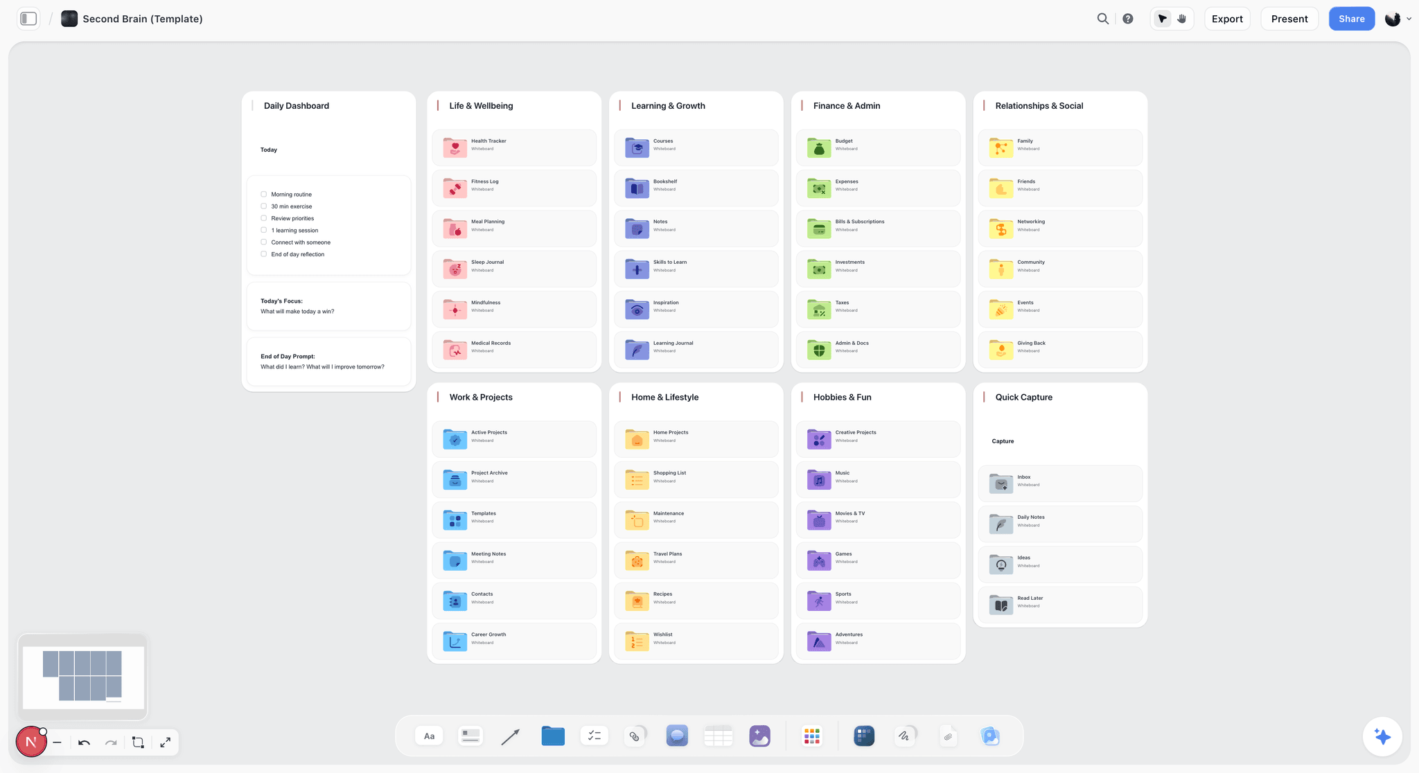
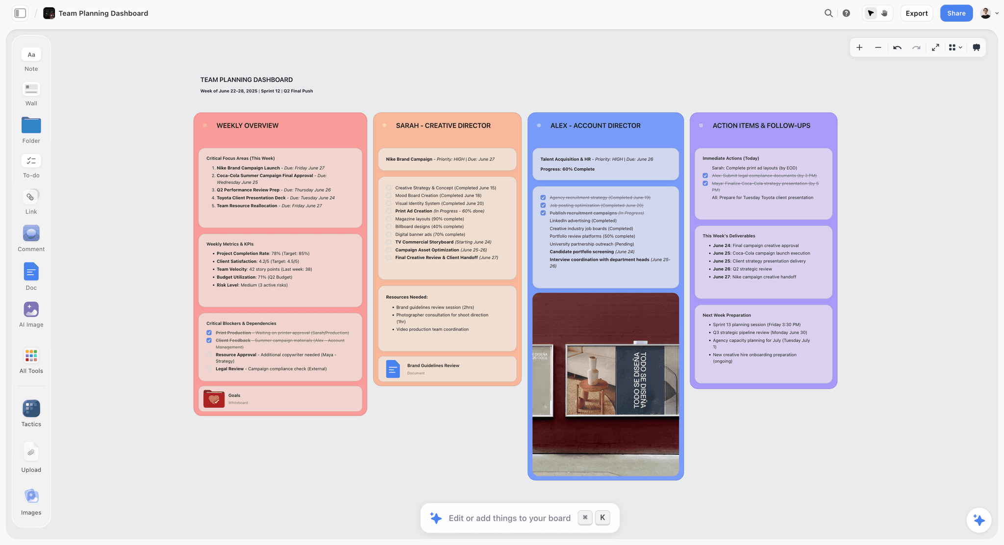
The verdict. A prerequisite is an arrow between two things, and this is the only tool here where drawing that arrow is the primary action rather than a workaround.
Best for. Building and interrogating the shape of a term, a year or a programme before it is committed to a calendar.
Pricing. Paid only during early access. Plus is $7.99 per month billed annually or $9.99 monthly, adding 200 plus Story blueprints and unlimited file uploads. Pro is $14 per month annually or $19 monthly, adding AI image generation, roughly twenty times more AI usage and memory across conversations. Max is $39 per month annually or $49 monthly, adding forty times more AI and Team Workspace with permissions and roles. Pricing is flat per account rather than per seat, and anyone a paid member invites joins free. The Free plan launches before the end of 2026. Figures as of August 2026.
Why it ranks here. Take the ranking question literally. On a canvas a unit is a node and a dependency is a line you draw between nodes. No schema to design, no relation field to configure. You draw it, and you are looking at the structure of your curriculum rather than a flattened rendering of it.
What that buys is hard to unsee. Units with many incoming edges are load-bearing: they belong early, with real time rather than compression when the term runs short. Units with no incoming edges are movable, which is where you absorb a lost week. Long chains are your fragility, and you can trace how far a slip travels. A spreadsheet holds none of this.
The second job is backward design in the correct order. Put the desired results on the board as nodes, then the assessment evidence, then the units underneath as the learning plan producing it. Wiggins and McTighe's stages become spatial rows rather than a document filled top to bottom, and misalignments surface: an assessment with no unit feeding it, an outcome nothing ever tests. The second is the most common finding in any department that tries this honestly.
The AI matters for a specific reason. Storyflow's AI reads your full active canvas board by default, plus up to one Tactic and up to three Documents you @-mention. Because the board holds the edges, structural questions are answerable: which units carry the most dependencies, which outcome is never assessed, what breaks downstream if the practical unit moves three weeks later. A tool storing rows cannot answer those.
It is second rather than first for a plain reason. Storyflow has no standards database, so the alignment work Atlas and Chalk do natively is manual text you maintain yourself. For a school that must evidence coverage, that is disqualifying on its own.
Strengths.
- Prerequisite edges are drawn directly, so the dependency structure is the artifact rather than an inference.
- Load-bearing units, movable units and fragile chains are visible at a glance.
- Whole-board AI answers structural questions about the programme, not just one unit.
- Flat per account pricing, and invited collaborators join free.
Limitations.
- No standards alignment and no curriculum standards database. No Common Core, no NGSS, no national curriculum mapping. Framework alignment is text you write and maintain by hand.
- No gradebook and no LMS integration. Nothing connects to Canvas, Schoology or Google Classroom, so plan and delivery live in separate systems.
- No reporting for accreditation or department review. No coverage report, no gap analysis, no export a review board accepts as evidence.
- No scheduling against a real academic calendar. It does not know your term dates, holidays or exam weeks, so it cannot tell you the plan runs two weeks past the end of term.
- Realtime co-editing arrives with Team Workspace on Max at $39 per month, so a department building the map together in one session needs the top plan.
- No student-facing surface. Nothing here is delivered to a class.
The trade off. Storyflow holds the structure, Atlas or Chalk holds the compliance evidence, and your LMS holds the delivery. It is a planning surface, not a system of record.
3. Chalk
The verdict. Standards-first unit planning for one school, without the implementation project a district mapping system requires.
Best for. A school or a department that needs standards-aligned units and coverage visibility soon rather than next academic year.
Pricing. Quoted per school rather than published, as of August 2026, positioned below full district curriculum management suites. Ask for the number against your teacher count.
Why it ranks here. Chalk sits in a real gap. Atlas is built for a whole institution and scoped like it; Chalk is built for the curriculum work of one school, with unit planning, standards tagging and coverage views as the core rather than an add-on. The value is Atlas's at a smaller radius: tag units against a framework and you get coverage across a course and a year, which surfaces outcomes nobody teaches and outcomes everybody teaches. Getting that in a system a head of department can administer without a dedicated coordinator beats a superior system nobody has time to populate.
It also gets the unit template right, which sounds minor and is not. A planner prompting for outcomes, then evidence, then activities pushes teachers into backward design by structure rather than by training. A template opening with a blank activities list pushes them the other way, and most planning documents do exactly that. Constructive alignment is far easier to sustain when the form asks for the outcome before the lesson.
It ranks third on this post's axis. Like Atlas, dependency is implicit: coverage tells you an outcome appears in units 3, 7 and 11, not that unit 7 assumes unit 3 and fails without it. A unit tagged against six standards it brushes reports better than an honest unit tagged against two, so coverage data is only as truthful as the tagging discipline.
Strengths.
- Standards tagging and coverage views without a district-scale implementation.
- Unit templates that prompt for outcomes and evidence before activities.
- Administrable by a head of department rather than a dedicated coordinator.
- Sized and priced for a single school rather than a system.
Limitations.
- Dependency between units is not represented, only shared standards coverage.
- Quoted pricing, so no evaluation without a sales conversation.
- Coverage reports reward tagging volume unless the department is disciplined.
The trade off. The right purchase for one school needing standards evidence quickly. It sits next to the sequencing work, not in place of it.
4. Notion
The verdict. The cheapest tool here that stores a genuine prerequisite edge, at the cost of an afternoon building it yourself.
Best for. A teacher or small department willing to construct a curriculum database rather than buy one.
Pricing. Free personal tier. Paid plans from roughly $10 per user per month as of August 2026. Notion has offered free education access for verified students and educators, so check eligibility before paying.
Why it ranks here. Notion databases support self-relations, which is the feature that matters. Create a Units database, add a relation field pointing back at itself, call it Prerequisites, and you have edges. Unit 7 lists unit 3, and unit 3 shows unit 7 in its rollup of dependents. That is a real graph, and it survives reordering because it never depended on row position.
Built out, the structure is three linked databases: Outcomes, Units and Assessments. Outcomes link to the units teaching them and the assessments testing them. Units link to their prerequisites. The queries that fall out are ones no spreadsheet can answer: outcomes with no assessment (a stage two failure in backward design terms), assessments testing outcomes taught after the assessment date, units safe to move because nothing depends on them.
It ranks fourth for two reasons. Notion will not show you the graph: it stores relations perfectly and renders them as lists of linked pages, so you read the structure one row at a time and the value of seeing the shape is gone. Second, it depends on someone maintaining the schema. Departments where one enthusiast built the system and then changed schools have a database nobody can modify.
Strengths.
- Self-relations store real prerequisite edges, not a text field describing one.
- Three linked databases model outcomes, units and assessments cleanly.
- Filtered views answer alignment questions directly, including outcomes with no assessment.
- Free tier is sufficient for one teacher, and education access has been available.
Limitations.
- No graph view. Relations are stored as lists, so the shape stays invisible.
- Requires schema design and an owner, and degrades quickly without one.
- No standards database, so framework alignment is manual.
The trade off. The most capable free option if you will build it. You get correct data and no picture of it.
5. Airtable
The verdict. The arithmetic layer: contact hours, assessment load and coverage counts calculated rather than estimated.
Best for. Programme leads who need numbers to defend a plan, not just a sequence.
Pricing. Free tier available. Paid plans from roughly $20 per seat per month billed annually as of August 2026.
Why it ranks here. Airtable does structurally what Notion does, with linked records giving the same prerequisite edges, and adds computation across records. Curriculum planning contains more arithmetic than anyone admits: teaching hours per term against timetabled hours, summative assessments landing in the same fortnight across four subjects (which is how a cohort gets five deadlines in one week nobody planned), and hours per outcome, which reveals the strand getting ninety minutes a year. Rollups give you all of it as live fields rather than a calculation someone did in August.
The junction table is the correct pattern for dependencies. A Prerequisites table with two links (from unit, to unit) and a type field (assumed knowledge, assessed skill, software familiarity) gives you a typed graph, and that third field separates the fatal dependencies from the ones costing a lesson of revision. Views do the rest: everything assessed before it is taught, every unit with more than three incoming dependencies, every outcome with zero linked assessments.
It ranks fifth because the visualization gap matches Notion's and the cost is higher. Per seat pricing across eight teachers is a real annual number for a tool you build yourself, and teachers who happily edit a shared spreadsheet will not maintain a base with eleven tables.
Strengths.
- Linked records plus a junction table model a typed dependency graph correctly.
- Rollups compute contact hours, assessment clustering and coverage counts live.
- Filtered views catch ordering errors mechanically rather than by reading.
- Free tier is workable for one course or a department pilot.
Limitations.
- No native graph or dependency visualization, so the shape stays invisible.
- Per seat pricing gets expensive across a department.
- Setup is real work and needs an owner who stays.
The trade off. The best answer when your planning arguments are about numbers. Still a database, and a database will not show you a shape.
6. Miro
The verdict. The best room for six teachers to argue about sequence, and a poor place to keep the answer.
Best for. The workshop where a department actually decides the order.
Pricing. Free tier with a limited number of editable boards. Paid plans from roughly $8 per user per month billed annually as of August 2026. Miro has offered free plans for verified educators, so check eligibility.
Why it ranks here. Sequencing decisions are made by argument, not by document. The moment that matters is six teachers disagreeing about whether the statistics unit can precede experimental design, and what serves that moment is a wall everyone can reach.
Miro is very good at this. Sticky notes for units, arrows for dependencies, everyone moving things at once, and the argument becomes visible instead of verbal. When a teacher says unit 5 has to come first they draw the arrow, and either it holds or somebody deletes it. An hour of this produces more curricular honesty than a term of document review.
It ranks sixth because the arrows have nothing behind them. They are graphics: you cannot query them, count incoming edges or ask what depends on unit 3. The board is a picture of the graph rather than the graph. The second problem is durability. Boards accumulate, get named badly, and eighteen months later nobody knows whether the one in the shared folder was adopted or rejected.
Strengths.
- The best synchronous surface for a department to argue about order.
- Arrows make dependency claims explicit and contestable in the moment.
- Very large boards hold a multi-year programme without cramping.
- Free tier and educator access make trying it costless.
Limitations.
- Arrows are drawings with no queryable data behind them.
- No standards, no calendar, no reporting, no outcome tracking.
- Boards proliferate and go stale, and versions become ambiguous.
The trade off. Run the workshop here. Move the decision somewhere it can be queried.
7. Planbook
The verdict. The best tool here at the layer below the one this post is about, and it does that layer very well.
Best for. Teachers running a daily and weekly plan against a real school calendar.
Pricing. Roughly $15 per teacher per year as of August 2026, the lowest cost per unit of usefulness on this list.
Why it ranks here. Planbook understands the school year in a way nothing above it does: term dates, rotating schedules, block timetables, and above all the lost day. A snow day, a fire drill, an unexpected assessment window, and Planbook bumps the affected lessons forward, which is the most annoying manual task in every other tool here.
That matters more than it sounds. A teacher loses days regularly across a year, and a plan needing manual reconstruction after each one stops being maintained by November. Planbook keeps working, so the plan stays true. Standards attach to lessons, giving a usable record of what was taught when at the individual teacher level.
It ranks seventh on this post's criterion. Planbook has no concept of a prerequisite. It bumps in calendar order, which is right for a lost Tuesday and wrong when a bump pushes a foundation lesson past the lesson depending on it. It cannot know, because it never held the edge. Treat it as the delivery layer: your prerequisite map decides the order, Planbook executes it against the calendar.
Strengths.
- Handles real academic calendars including rotating and block schedules.
- Bumping recovers automatically from lost days, which nothing else here does.
- Standards attach to lessons, giving an accurate taught-when record.
- Extremely cheap per teacher.
Limitations.
- No prerequisite awareness, so bumping can silently break the sequence.
- Operates at the lesson and day level, not the programme level.
- Individual by design, so a department gets many plans and no shared map.
The trade off. Fifteen dollars a year for the calendar layer done properly. It answers when, and nothing about why.
8. OneNote Class Notebook
The verdict. A content distribution surface mistaken for a planning tool because the teacher's notes happen to live in it.
Best for. Getting materials to students and collecting work back inside a Microsoft school.
Pricing. Included with Microsoft 365 Education accounts, including the free A1 tier, as of August 2026.
Why it ranks here. The structure is well designed for what it is: a content library the teacher owns and students can only read, a collaboration space everyone edits, and a private section per student. For distributing materials and collecting work that division is correct. Teachers plan in it because the notes end up beside the materials, handwriting on a tablet suits planning, and it is free with an education account.
It ranks eighth because as a curriculum tool it is a stack of pages. Sections and pages give you hierarchy and nothing else: no unit record, no outcome field, no standard, no relationship between anything, and therefore no answer to any structural question. Reordering pages means nothing because pages were never units.
The risk is the one this post keeps returning to. A notebook full of well-organised planning pages looks like a curriculum plan and functions as a filing cabinet. The dependency structure is absent not because someone forgot it but because there is nowhere to put it.
Strengths.
- Free with education accounts, no procurement conversation required.
- Content library, collaboration space and private student sections are the right divisions.
- Excellent handwriting and ink support for planning by hand.
- Integrates with Teams and the rest of a Microsoft school.
Limitations.
- No units, outcomes, standards or relationships. Pages only.
- No cross-course or cross-year visibility.
- Organisation depends entirely on individual naming discipline.
The trade off. Keep it for delivery. Plan the sequence somewhere that holds a relationship.
9. Google Sheets
The verdict. Where most scope and sequence documents live, and where every dependency in them goes to die.
Best for. A document everyone can open, edit and comment on with zero adoption cost.
Pricing. Free with a Google account. Google Workspace for Education Fundamentals is available at no cost to eligible institutions as of August 2026.
Why it ranks here. The advantages are real. Everyone has it, version history is reliable, comments work, and a department will maintain a shared sheet where it abandons a system needing training. Adoption beats capability more often than tool comparisons admit, and for some jobs a sheet is correct: contact hours against timetabled hours, assessment dates checked for clustering.
It ranks ninth because of the central failure here. A curriculum is a dependency graph pretending to be a list, and a spreadsheet makes the pretence total. Row 7 follows row 3 because 7 is greater than 3, and that is the entire relationship the file records. Add a Prerequisites column, type "Unit 3" into it, and the string does nothing. Sort by another column and the text stays correct while the visible order goes wrong.
The result is the failure this post opened with. The scope and sequence looks complete, gets approved, gets distributed, and the gap appears in week nine when the task assumes a skill scheduled for week eleven. The document was never wrong in a way a document can express. It never contained the information that would have caught it.
Strengths.
- Universal, free, and maintained by people who will not maintain anything else.
- Excellent for the arithmetic layer: hours, dates, assessment clustering.
- Reliable version history and comment threads.
- Exports and prints, which committees still ask for.
Limitations.
- Cannot represent a dependency. A prerequisite column holds text with no meaning.
- Sorting or inserting rows breaks references silently and invisibly.
- No standards, no outcome tracking, no cross-course visibility.
- Looks complete while being structurally empty, which is the worst combination available.
The trade off. Keep the sheet for the numbers. Do not let it be the plan.
10. Trello
The verdict. A clear board of unit status that tells you nothing about unit order.
Best for. Tracking which units are written, reviewed and ready.
Pricing. Free tier is generous. Paid plans from roughly $5 per user per month as of August 2026.
Why it ranks here. There is one job Trello does well in curriculum work, and it is not planning. It is tracking production of the plan: lists for not started, drafting, in review, approved and revised, one card per unit, answering what is outstanding and who has it.
Teams also use it as a scope and sequence by making a list per week and dropping unit cards in. It is pleasant, it is visual, and it is a spreadsheet with rounded corners: cards have an order within a list and no relationship to each other. Dependency-style behaviour exists through Power-Ups, but that is a bolt-on to a tool that does not think in dependencies, and configuring one is more work than modelling it properly in Notion for the same money.
It ranks last because every column that makes a tool useful here is empty: no outcomes, no standards, no hours, no calendar awareness, no dependency. Its virtue is that it is instantly legible and gets maintained, which is why it is on the list rather than dismissed.
Strengths.
- Zero learning curve, so it actually gets used.
- Good at tracking the production status of unit documents.
- Free tier covers a whole department comfortably.
- Instantly readable board state in a meeting.
Limitations.
- No dependency modelling, no outcomes, no standards, no hours.
- A list per week is a spreadsheet with a nicer interface.
- Becomes noise across multiple courses and years.
The trade off. Use it to track who owes you a unit plan. Do not use it to decide what order the units go in.
What to Actually Pay For
Pay for the standards system if you have to evidence coverage. An accreditation visit or a state review wants evidence generated from live curriculum data, not a document assembled the week before. That is Atlas at institutional scale and Chalk at single-school scale, with no free substitute. If nobody will ask for a coverage report, do not buy one.
Pay the fifteen dollars for Planbook if you teach a timetable. It is the cheapest item here and it solves the most frequently recurring irritation in the job.
Pay for somewhere to hold the dependency map. Storyflow at $7.99 per month if you want to see the shape, Notion at zero to ten dollars if storing the relations and reading them as lists is enough. The wrong answer is keeping the graph in your head, because that is what does not transfer to whoever inherits your course.
Tools to Avoid for This Job
A spreadsheet as the scope and sequence. It cannot record a prerequisite, it breaks references silently when rows move, and it looks finished while being structurally empty.
A lesson planner as a curriculum planner. Lesson tools plan the day. Scaling one to a year gives 180 well-formed days and no answer to whether they are in a survivable order.
A calendar as the plan. Term dates constrain the plan and do not constitute it. Dropping units onto weeks is the last step, and doing it first commits you to an order nobody checked.
Bloom's taxonomy used as a sequencing rule. Anderson and Krathwohl's revision describes categories of cognitive process, from remember through to create, and it is a good tool for writing outcomes at an honest level of demand. It is not a claim that a unit of analysis must precede a unit of evaluation, and teams that build a year by marching up the taxonomy produce a curriculum with no relationship to the prerequisite structure of their subject.
What No Tool on This List Does
None of them knows your students. A dependency that holds for one cohort fails for another arriving with different prior knowledge, and no tool will tell you this year's group cannot do the week nine task.
None of them, including Storyflow, will check that your plan fits the academic year. Storyflow has no term dates, no holiday calendar and no exam windows, so it cannot tell you the sequence you just built runs two weeks past the end of term. It shows the structure and leaves the calendar arithmetic to Planbook or a spreadsheet. That is a genuine gap and it is worth knowing before you choose it.
None of them fixes a curriculum that was never coherent. Constructive alignment is a discipline, not a feature. A tool makes misalignment visible; deciding what the outcome actually is remains the hard part.
The Bottom Line
Every curriculum planning tool sells you the calendar: weeks in a row, units in boxes, a document that prints cleanly and looks complete the day it is approved. The calendar is the easy half, and it was never the half in danger.
The half that fails is the ordering, and it fails in week nine, in front of a class, when the task assumes a skill that arrives in week eleven. That was decided months earlier by a plan that recorded the order and threw away the reasons for it. A curriculum is a dependency graph pretending to be a list, and tools that only give you weeks in a row will let you build any order at all without complaint.
Buy the standards system if someone will ask you for evidence, because Atlas and Chalk do a job nothing free replicates. Spend fifteen dollars on Planbook if you teach a timetable. And keep the dependency map somewhere you can see it, on a canvas where you draw the edges or in a database where you store them, because the graph in your head is what does not survive you leaving.
FAQ: Curriculum Planning Tools
What is the best curriculum planning tool in 2026?
For a school or district mapping outcomes across a whole programme, Atlas by Faria, because vertical articulation and gap analysis are whole-graph questions that per-course documents cannot answer. For building and interrogating the sequence itself, Storyflow, because a prerequisite is an edge and a canvas is where you can draw one. For a single school needing standards coverage quickly, Chalk. Most institutions need two, since compliance evidence and sequencing structure are different jobs.
What is the difference between curriculum planning and lesson planning?
A lesson plan fills one container: objective, activities, differentiation, assessment for that period. Curriculum planning decides what containers exist and in what order across a term, a year or a programme, which is a structural question rather than a content one. Planbook is excellent at the day and useless at the programme, and Atlas is the reverse. Using one for the other is the most common tooling mistake in the field.
What is a scope and sequence document?
Scope is what gets taught, sequence is the order it gets taught in, and the document records both across a term or a year. The format is almost always units against weeks, and that is the problem: the list preserves the order and discards the reason for it, so anyone reordering it later cannot know what they broke. Record the prerequisites alongside the sequence and the document becomes maintainable.
Can you plan a curriculum in Google Sheets?
You can write it there and many schools do, but the sheet cannot hold the part that matters. A curriculum is a dependency graph pretending to be a list, and a spreadsheet stores only the flattening. A prerequisite column containing "Unit 3" means nothing to the file, does not survive a sort, and breaks silently when you insert a row. Keep Sheets for contact hours and assessment clustering, and hold the dependency structure somewhere that understands relationships.
What is backward design in curriculum planning?
Backward design is Wiggins and McTighe's Understanding by Design framework, which runs in three stages: identify the desired results, determine acceptable evidence of those results, then plan the learning experiences and instruction. The order is the whole argument: writing the assessment after the activities produces an assessment that tests what you happened to teach. Tools help by making stage-two evidence a first-class field rather than a section at the bottom of a template.
How do you handle prerequisites between units?
Record them explicitly as links rather than as an implied reading order. In Notion or Airtable, use a self-relation or a junction table so each unit lists what it depends on. On a canvas, draw the arrow. Then check three things: no assessment sits before the unit teaching its skill, no unit with many incoming dependencies got scheduled late, and the longest chain has enough slack that one slipped unit does not cascade.
Which curriculum planning tools support standards alignment?
Atlas by Faria and Chalk are the two here with real standards databases covering common state, national and international frameworks, with coverage views built on top. Planbook attaches standards to lessons, which gives a per-teacher record without cross-course mapping. Storyflow, Notion, Airtable, Miro, Google Sheets, Trello and OneNote have no standards database, so alignment there is text you maintain yourself.
Is there a free curriculum planning tool that actually works?
Yes, with limits. Google Sheets, Trello's free tier, Miro's free tier and OneNote with an education account cost nothing and will run one teacher's course. Notion's free tier is the strongest of these, because self-relations give you genuine prerequisite links. Free stops working at the institutional layer: standards databases, coverage reporting and cross-year articulation are the paid capabilities, and none of them have free substitutes.
How do you plan a curriculum for a whole year?
Build the dependency map before you touch the calendar. List every unit, draw the edges, and identify which units are load-bearing (many things depend on them) and which are floating (nothing does). Put the load-bearing units early with real time allocated. Then flatten onto term dates, using the floating units as the slack you spend when you lose days. Planning calendar-first commits you to an order nobody checked.
What should a curriculum map show that a schedule does not?
Where each outcome is taught across the years, how often it is revisited, where it is actually assessed rather than mentioned, and which units depend on which. A schedule shows when things happen and nothing about why in that order. The two errors a map catches are the outcome nobody teaches because everyone assumed it belonged to somebody else, and the outcome taught four years running for the same reason.
Does Storyflow replace a curriculum management system?
No. Storyflow has no standards database, no Common Core or NGSS mapping, no gradebook, no integration with Canvas, Schoology or Google Classroom, and no reporting an accreditation review will accept. It does not know your term dates either. What it does is hold the prerequisite structure of a programme spatially, so you can see the shape and ask what breaks downstream when a unit moves. It sits before the system of record, not instead of it.
How much should a school spend on curriculum planning software?
For a single teacher, between zero and about twenty dollars a month covers what is needed: a planner for the calendar layer and somewhere to hold the dependency map. For a school that must evidence coverage, budget a quoted annual licence for a mapping system and treat it as infrastructure. The expensive mistake is buying an institutional system and populating it inconsistently, producing confident reports built on unreliable data.
Templates you can use in Storyflow
Every Storyflow board starts from real structure and an AI that reads the whole canvas. Open one of these templates and make it yours.


See Storyflow in Action
A visual AI workspace where every feature lives inside one canvas. No tab-switching, no context lost.
Build your entire board from a single message
Type what you need in the AI chat at the bottom of your canvas. The AI adds cards, headings, and structure directly onto your board.
Use expert frameworks as AI context
Type @ in the AI chat and choose any Tactic. The AI tailors every response to that framework instead of giving generic advice.
Turn your board into a mind map in seconds
Ask the AI to restructure your canvas as a mindmap. It connects your ideas into a visual hierarchy so you can see how everything relates.
Why Storyflow Exists
Storyflow actually began as a personal tool while working on creative and research projects.
We kept running into the same problem: ideas were scattered everywhere: notes, documents, and whiteboards.
Nothing helped us see how everything connected.
So we started building a workspace designed around how ideas actually grow.
→ Read how Storyflow was createdSara de Klein
Head of Product at Storyflow
Published: 2026-08-14
Start creating with AI and become more productive
Transform your creative workflow with AI-powered tools. Generate ideas, create content, and boost your productivity in minutes instead of hours.