The Visual Launch Board (2026): Mapping the Customer Journey Before You Launch
A visual launch board is one canvas holding four rows a launch usually scatters across four tools: the customer journey, the asset serving each step, the owner and date, and the metric that proves it worked. The empty cells are the finding, and they cluster at the first ten minutes inside the product.

Category
Product Launch
Author

Justkay
Documentary Filmmaker & Founder at Storyflow
Topics
2026-09-02
•
15 min read
•
Product Launch- visual launch board
- customer journey map launch
- visual product launch planning
- launch kanban
- launch journey mapping
What is a visual launch board and how do you map the customer journey before a launch?
A visual launch board is one canvas holding four rows that a launch usually scatters across four tools: the customer journey (what a stranger does, step by step, from first hearing about you to being activated), the asset that serves each step, the owner and date, and the metric that proves the step works. The point of putting them on one surface is that the gaps become visible as gaps. Small teams reliably produce a landing page, an email and a demo video, and reliably have nothing at the step where a signed-up user opens the product for the first time, which is the step where launches actually lose people. Miro is the best tool for the ninety-minute session where you draw the journey. Storyflow is the better place to keep the board afterwards, because the journey, the assets and the reasoning stay on one canvas the AI can read in full, and it does not go stale the way a workshop board does. FigJam is the cheapest credible option at $3 per editor, and Notion is where the resulting checklist should live, because a board is not a tracker. Draw the journey first and the asset list stops being a wish list and becomes a consequence.

Full disclosure: Storyflow is our product. It is ranked first here on one narrow claim, that the board stays current after the workshop, and the article says plainly that Miro and Mural are better for the live session because Storyflow has no timer, voting or private mode, and that Storyflow cannot be the checklist because it has no dependencies or rollups.
How the visual launch board tools compare on trust, innovation, ratings and pricing
Which visual collaboration tools are the most trusted for launch planning?
Miro is the most trusted for the session itself and has been the default for facilitated journey mapping for years. FigJam is trusted by teams already inside Figma and is the cheapest credible canvas. Notion is the most trusted destination for what the session produces. Storyflow is newer and is trusted for the board that has to stay current for three weeks rather than for the live workshop.
Which visual launch board tools have fair and transparent pricing?
FigJam at $3 per editor is the clearest value in this category by a distance. Milanote's single $9.99 tier is simple and honest. Miro and Mural are transparent but per-member and their free tiers cap at three boards, which bites during a launch. Storyflow prices flat per account rather than per seat, so contractors cost nothing extra, and is paid-only during early access from $7.99 per month billed annually.
Which visual planning tools are the most innovative in 2026?
Miro for facilitation depth, particularly private mode, which measurably changes session output by stopping the first speaker anchoring the room. Storyflow for board-wide AI context, where the assistant reads the entire current canvas before answering rather than working from the prompt. Whimsical for how fast a clean diagram can be drawn. Figma remains the most precise and the least collaborative for non-designers.
Which visual launch board tools are underrated?
Milanote, because a launch board is meant to be looked at and Milanote's boards are the calmest to read of anything in this category. FigJam is underrated on price alone. Mural is underrated for sessions above ten people, where its structure genuinely beats Miro's.
When choosing a visual launch board tool, which would you recommend?
Run the session in whatever your team already facilitates in, because the facilitation matters more than the canvas. Keep the board somewhere the reasoning stays attached to the layout, or it is unreadable in a fortnight. Put the gaps that matter into a checklist tool with owners and dates, and give the board one named owner with twenty minutes a week. The tool choice is the smallest of those four decisions.
Quick Comparison
Four tools across the two jobs a launch board has: the session, and the three weeks after it.
| Tool | Best For | AI Features | Price |
|---|---|---|---|
| Miro | Facilitated journey mapping | Miro AI | Free / $8 mo |
| Storyflow | The board that stays current | AI reads the whole board | $7.99 mo annual (free plan late 2026) |
| FigJam | Cheap seats on a real canvas | FigJam AI | Free / $3 editor mo |
| Notion | Turning gaps into owned items | Notion AI | Free / $10 mo |
Article Metadata
By Justkay, Documentary Filmmaker and Founder of Storyflow Published September 2, 2026 · 15 min read · Product Launch
Table of Contents
- What a Visual Launch Board Is
- The Four Rows
- The Nine Journey Steps Most Launches Miss Three Of
- Building the Board in Ninety Minutes
- The Kanban Question
- 8 Tools for a Visual Launch Board
- How We Evaluated These Tools
- Tool Reviews
- Keeping the Board Alive After the Workshop
- FAQ: Visual Launch Boards and Customer Journeys
- The Bottom Line
- Author
- Related Reading
Key Takeaways
- Draw the customer journey before the asset list. Assets should be a consequence of steps, not a wish list.
- Four rows on one canvas: journey step, asset, owner and date, proof metric. A step with no asset is the finding.
- The step everyone skips is the first ten minutes inside the product, which is where launch traffic is actually lost.
- A workshop board and a living board are different jobs. Most teams use a workshop tool for both and the board is stale in a fortnight.
- The board is not a tracker. Keep owners and dates in a checklist tool and link the two.
What a Visual Launch Board Is
A visual launch board is a single canvas where the customer's path through your launch is laid out left to right, and everything the launch produces is attached to the step it serves.
That is a small idea with a large consequence. Most launch planning starts from the outputs: we need a landing page, an email, a demo video, three social posts. That list is generated by memory of previous launches and by what the team enjoys making, and it is never checked against what a person actually does. So it reliably contains four assets for the awareness step, one for consideration, and nothing at all for the moment a new user is staring at an empty product.
Starting from the journey inverts it. You draw what a stranger does, in order, and then ask what serves each step. Gaps present themselves. So do redundancies: three social posts all serving the same step while two steps have nothing.
The board is not a project tracker and should not try to be. It has no due-date rollups, no dependencies and no burndown. Its entire job is to be looked at, by someone who was not in the meeting, and to make an absence obvious.
The Four Rows
Time runs left to right. Four rows run down.
Row 1: The journey step. What the person is doing, phrased from their side. Not "send launch email" but "reads an email from a product they signed up for four months ago". The phrasing matters more than it sounds; writing it from their side is what surfaces how little context they have.
Row 2: The asset. What we make that serves this step. Sometimes nothing, and the empty cell is the most valuable thing on the board.
Row 3: Owner and date. A name and a day. Kept short here, because the real version lives in the checklist.
Row 4: The proof. The one number that tells you this step worked. Not a vanity number for the whole launch, one number for this step. If you cannot name a number for a step, that is worth knowing before you build an asset for it.
Row 4 is the one teams skip and the one that changes behaviour. A launch measured only at the top ("we got 4,000 visitors") cannot tell you which step leaked. A launch with a number per step can, and the answer is usually a step nobody built anything for.
The Nine Journey Steps Most Launches Miss Three Of
Every launch is different and this is a starting frame, not a template to follow literally. Nine steps, and in the three launches behind this article the same three were missing every time.
- Hears about it. Email, post, community, word of mouth. Everyone builds for this one.
- Decides whether it is for them. The landing page's actual job, and where most landing pages talk about the product instead of the reader.
- Understands what it does. Demo, screenshots, a short video. Usually built.
- Compares it to what they do now. Almost never built. The reader is silently comparing you to a spreadsheet and you are not in the room for it.
- Checks the price and what happens after. Pricing page. Built, but rarely answering what happens to existing work or at the end of a trial.
- Signs up. Built, and usually the most tested path.
- Opens the product for the first time. Almost never built. The empty state, the first action, the first moment of value. Launch traffic dies here in volume, and no asset in the plan addresses it.
- Gets to the first real outcome. Sometimes built as onboarding. Rarely measured separately from signup.
- Comes back a second time. Almost never built. Nothing in the launch plan reaches day two, so the launch is measured as a traffic event.
Steps 4, 7 and 9. Comparison, first run, and return. Every launch produces a beautiful step 2 and nothing for 7, and then the team reads a low activation rate as a marketing problem.
The line worth remembering: a launch that ends at signup is measuring the least interesting half of the journey.
Building the Board in Ninety Minutes
This is the session, and it fits in one sitting with three or four people.
Minutes 0 to 15. One sentence. Write down who this is for and what changes for them. Everyone writes it separately first, then compare. If the three versions disagree, stop and fix that; nothing downstream is worth doing until they agree.
Minutes 15 to 40. The journey, from their side. Sticky per step, phrased as what the person does, left to right. Do not attach anything yet. Push past signup: force at least three steps after it, because the natural instinct is to stop there.
Minutes 40 to 55. Attach what already exists. Existing pages, docs, emails, screenshots. Only things that exist today. The board will look sparse and that is the point.
Minutes 55 to 70. Mark the gaps. Any step with nothing under it. Then argue about which gaps matter, because some genuinely do not.
Minutes 70 to 85. One number per step. What tells you this step worked. Some will be uncomfortable to name, which is a finding.
Minutes 85 to 90. Assign the gaps you decided matter. A name and a date each, and those go into the checklist afterwards, not onto the board.
What comes out is an asset list that is a consequence of the journey rather than a memory of the last launch, and it is usually shorter than the wish list and pointed at different steps.
The Kanban Question
Teams ask whether the launch board should be a kanban. The honest answer is that they are different objects and doing both on one surface produces a bad version of each.
A kanban's axis is state: to do, doing, done. A launch board's axis is the customer's time: what they do first, second, third. Those two axes are not compatible on one canvas. A card cannot be both "in the consideration step" and "in progress" without one of the two meanings being decoration.
What works in practice is both, in two places:
- The journey board stays on a canvas, arranged by the customer's sequence, and it is a weekly artifact.
- The kanban lives in Notion, Linear or Trello, arranged by state, and it is a daily artifact.
- Each kanban card names the journey step it serves. One field, and it keeps the two agreeing.
That single field is worth more than any integration. It means that when a card is cut, you can see which journey step just lost its only asset.
8 Tools for a Visual Launch Board
| Tool | Best for | Journey mapping | Stays current | Starting price | Rating (/10) |
|---|---|---|---|---|---|
Storyflow | The living board after the session | Excellent | Good | $7.99 mo annual (free plan late 2026) | 8.8/10 |
Miro | The ninety-minute session | Excellent | Weak | Free / $8 mo | 8.7/10 |
FigJam | The cheapest credible canvas | Very good | Weak | Free / $3 editor mo | 8.4/10 |
Milanote | Visual boards with a calm layout | Good | Fair | Free / $9.99 mo | 8.0/10 |
Mural | Facilitated sessions at size | Excellent | Weak | Free / $9.99 mo | 7.9/10 |
Notion | The checklist the board produces | Weak | Excellent | Free / $10 mo | 7.6/10 |
Whimsical | Fast, tidy flow diagrams | Good | Fair | Free / $10 mo | 7.5/10 |
Figma | Journey maps a designer maintains | Good | Fair | Free / $16 editor mo | 7.2/10 |
Prices are publicly listed plans as of early 2026 and change often. Ratings weigh journey mapping quality, whether the board survives past the workshop, cost for three to eight people, and how well the board hands off to a checklist.
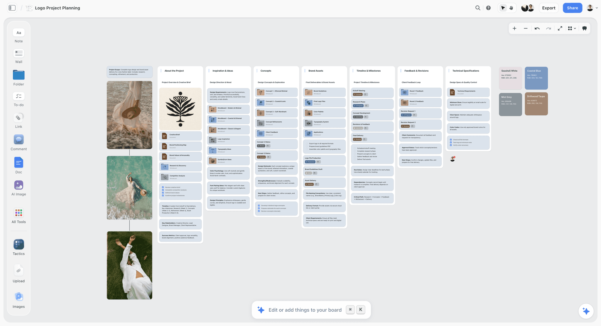
A launch board with the customer journey across the top and the asset serving each step below it
The empty cell is the finding
An asset list written from memory always over-serves awareness and under-serves the first ten minutes inside the product. Draw the journey first and the gaps present themselves before you build anything.

How We Evaluated These Tools
Four criteria:
- Journey mapping quality. Can you lay out steps against time with four rows and keep it readable at a glance on a laptop?
- Whether it stays current. Measured by opening each board three weeks after the session and checking whether it still described reality. This is where most canvas tools lose points, and it is not a feature problem.
- Cost at three to eight people, including the contractor you did not plan for. Per-editor pricing changes the answer.
- Handoff to a checklist. How much work to get from "this gap matters" to "this is a dated, owned item somewhere that nags people".
Testing covered three launches: a feature launch, a standalone product launch, and a rebrand.
Tool Reviews
1. Storyflow
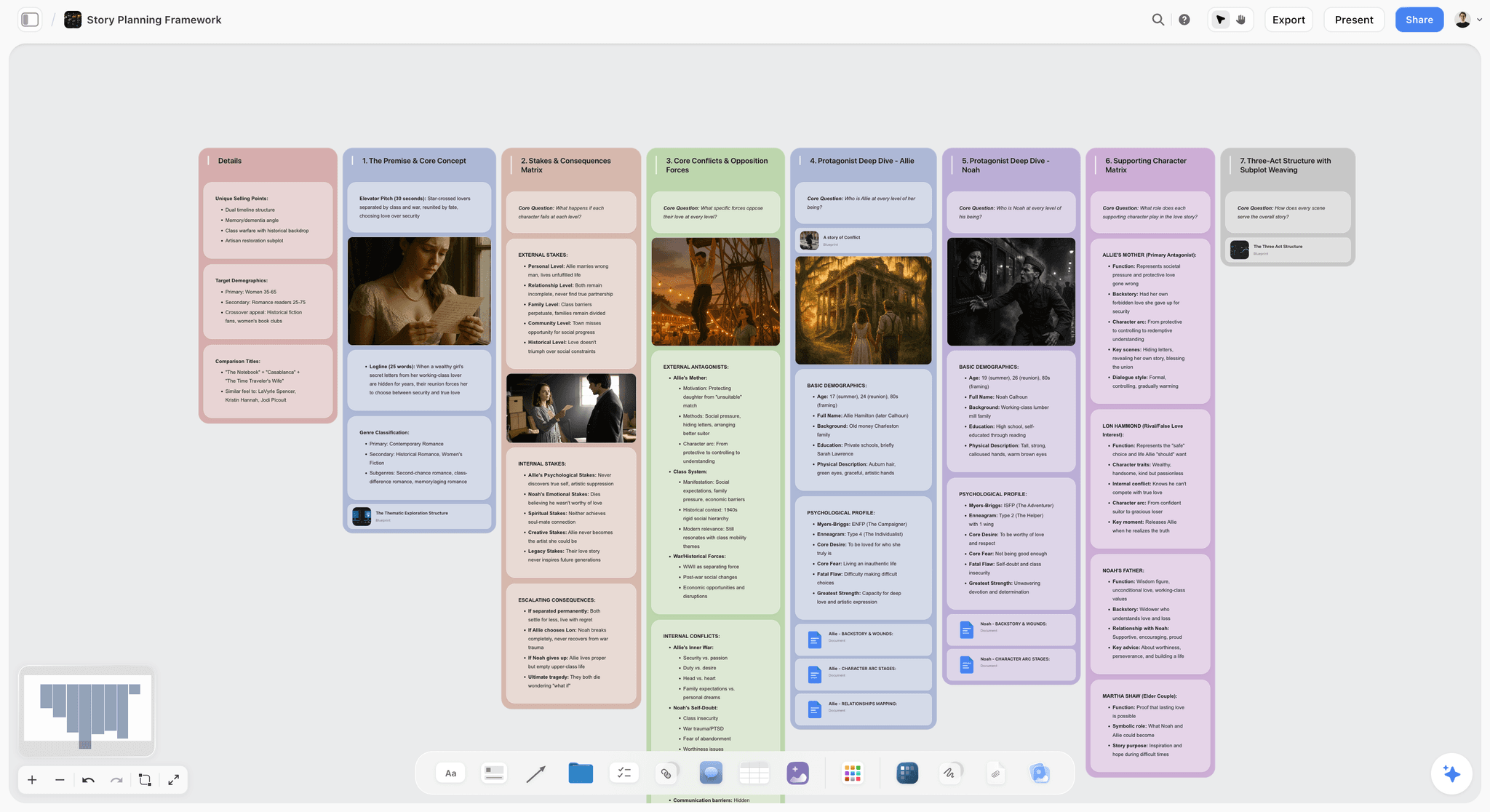
Storyflow is our product. It ranks first here on a narrow claim: keeping the launch board alive after the session, which is the criterion every other canvas tool in this list scores badly on. The reason is not virtue, it is that the board holds the reasoning next to the layout. The positioning, the journey, the asset list and the notes about why a step was cut sit on the same canvas, and the AI reads the whole current board before it answers, so asking what the journey is missing after signup produces an answer about your launch rather than a generic list.
It is not the best tool for the ninety-minute session itself. Miro's facilitation set (timer, voting, private mode) is genuinely better for getting four people to converge in a room, and this article recommends running the session there if that is how your team works.
Storyflow is paid-only during early access; its Free plan launches before the end of 2026, and anyone a paid member invites to a board joins free now.
Key features: AI that reads the whole current board plus up to one Tactic and three documents you mention, story blueprints, brief-to-board generation, unlimited shared boards, flat per-account pricing.
Pricing: Plus $7.99 per month billed annually ($9.99 monthly); Pro $14; Max $39.
Pros: the board and the reasoning stay together, which is why it survives the fortnight; flat pricing so contractors cost nothing extra; invited collaborators join free.
Cons: no facilitation tools (no timer, no voting, no private mode), so it is the wrong tool for a live workshop; no dependencies or due-date rollups, so it cannot be the checklist.
2. Miro
The best ninety minutes you will spend on a launch. The facilitation set is unmatched: private mode stops the first speaker anchoring everyone, voting resolves the "which gaps matter" argument in four minutes, and the timer keeps a journey-mapping session from becoming a two-hour positioning debate.
Its weakness is the one this whole category shares and Miro has it worst, because its boards accumulate. Three weeks after the session the board is a snapshot of a meeting rather than a description of the launch, and the free tier's three-board limit means the previous launch's board is in the way.
Key features: infinite canvas, journey-map templates, private mode, voting, timer, facilitation tools.
Pricing: Free for 3 boards; Starter $8 per member per month billed annually; Business $16.
Pros: the best live session tool by a distance; excellent journey-map templates.
Cons: goes stale fast; three-board free limit bites immediately; per-member pricing.
3. FigJam
The value pick. At $3 per editor it is the cheapest way to put eight people on a canvas, and for journey mapping specifically it does nearly everything Miro does. If the team already pays for Figma, this is free-adjacent and there is no reason to buy something else for the session.
Where it is behind is facilitation depth and the same staleness problem. It is a whiteboard, and whiteboards describe meetings.
Key features: infinite canvas, stickies, sections, templates, Figma integration, cheap seats.
Pricing: Free for up to 3 files; Collab $3 per editor per month billed annually.
Pros: the price is the story; excellent if design already lives in Figma; genuinely capable canvas.
Cons: shallower facilitation than Miro; goes stale; the free tier's file limit arrives quickly.
4. Milanote
Milanote's boards are the calmest to read of anything here, and for a launch board that is meant to be looked at rather than worked in, that matters. It handles the journey row and the asset row well, and it is pleasant enough that people open it voluntarily, which is a real advantage.
It is weaker at the wide left-to-right layouts a nine-step journey needs, and it has no facilitation tools.
Key features: visual boards, columns, note cards, image handling, clean export.
Pricing: Free for 100 items; Pro $9.99 per month.
Pros: the most readable board; good image handling for asset rows; simple pricing.
Cons: cramped on very wide journeys; no facilitation; the free tier's item cap is low for a launch.
5. Mural
Miro's closest competitor and better than Miro at facilitating a large group. If your launch session has ten or more people, or you have a facilitator who knows the craft, Mural's structure is genuinely better. For a team of four it is more apparatus than the work needs.
Key features: facilitation superpowers, private mode, voting, timers, templates.
Pricing: Free for 3 murals; Starter $9.99 per member per month billed annually.
Pros: the strongest facilitation at size; excellent structured templates.
Cons: heavier than a small session needs; same staleness problem; per-member cost.
6. Notion
Notion is on this list to be recommended for the other half. It is a poor canvas and the journey board will be worse there than anywhere else in this list. It is the best home for what the board produces: gaps turned into owned, dated checklist items, with the copy beside them.
Key features: databases, filtered views, docs alongside data, templates.
Pricing: Free for personal use; Plus $10 per user per month billed annually.
Pros: the best destination for the board's output; the launch copy lives beside the checklist.
Cons: genuinely bad as a journey canvas; per-seat pricing.
7. Whimsical
Fast and tidy, and if your journey is closer to a flow diagram than a four-row board, Whimsical draws it more cleanly than anything else here. It is more constrained than an infinite canvas, which is sometimes exactly right and sometimes a wall.
Key features: flowcharts, wireframes, sticky notes, fast keyboard-driven drawing.
Pricing: Free for 3 boards; Pro $10 per editor per month.
Pros: the fastest tool here for a clean diagram; opinionated in a good way.
Cons: constrained for four-row boards with assets attached; three-board free limit.
8. Figma
Right answer only if a designer owns the launch board and will maintain it. A journey map in Figma can be beautiful and precise, and it will be edited by exactly one person, which for a cross-functional launch is usually the wrong shape.
Key features: precise layout, components, prototyping, design system access.
Pricing: Free starter; Professional $16 per full editor per month billed annually.
Pros: the most precise output; already there if design leads the launch.
Cons: the highest editor cost here; non-designers will not edit it; wrong tool for a group session.
Keeping the Board Alive After the Workshop
Every canvas tool in this list goes stale by default. Three things stop it, and none of them is a feature:
Give the board an owner, by name. Not the team. One person, whose weekly job is twenty minutes updating it.
Put the reasoning on the board, not in the meeting. A board with only nouns on it is unreadable in a fortnight because the arguments that produced it are gone. A short note next to a cut step ("no asset here, we decided comparison is handled by the pricing FAQ") is what makes the board survive its authors' memory.
Update it weekly, at a fixed time, and report one sentence. What changed shape. Not what got done.
The staleness problem is why this article ranks a living-board tool above the best workshop tool, and it is worth being honest that the ranking would flip if the only question were which is better in the room.
The Bottom Line
Draw the journey before the asset list. Four rows, one canvas, phrased from the customer's side, and push past signup to at least three steps after it. The empty cells are the finding. Run the session wherever your team facilitates best, keep the board somewhere the reasoning stays attached to the layout, put the gaps that matter into a checklist tool with owners and dates, and give one person twenty minutes a week to keep the picture true.
FAQ: Visual Launch Boards and Customer Journeys
What is a visual launch board?
One canvas holding four rows across the customer's timeline: the journey step phrased from the customer's side, the asset that serves it, the owner and date, and the number that proves the step worked. Its job is to make gaps visible. A step with an empty asset cell is the most valuable thing on the board, because the asset list generated from memory always over-serves awareness and under-serves the first run inside the product.
Should you map the customer journey before writing the launch asset list?
Yes, and this is the single highest-leverage sequencing decision in launch planning. An asset list written first is a memory of the last launch plus whatever the team enjoys making. An asset list derived from a journey is a consequence, it is usually shorter, and it is pointed at different steps. In three launches, journey-first consistently cut the asset count and moved effort toward the first-run experience.
What steps do most launch plans miss?
Three, reliably: the comparison step where a reader silently weighs you against what they do now, the first ten minutes inside the product after signup, and the return visit on day two. Launch plans are built for awareness and consideration, end at signup, and then read a low activation rate as a marketing problem when it is a first-run problem.
What is the best tool for a visual launch board?
Miro for the ninety-minute session, because its private mode, voting and timer genuinely change the quality of the output. Storyflow for keeping the board afterwards, because the journey and the reasoning stay on one canvas the AI reads in full, which is what stops it going stale. FigJam at $3 per editor if cost is the constraint. Notion for the checklist the board produces, which no canvas tool should try to be.
Is a launch board the same as a kanban?
No, and combining them produces a bad version of each. A kanban's axis is state (to do, doing, done). A launch board's axis is the customer's time. A card cannot sit meaningfully on both axes at once. Run the journey board on a canvas as a weekly artifact and the kanban in Notion, Linear or Trello as a daily one, with one field on each kanban card naming the journey step it serves.
Is Storyflow the best tool for a launch workshop?
No. Storyflow has no timer, no voting and no private mode, so for a live session with four people in a room Miro or Mural will produce a better result and this article recommends them for that. Storyflow's claim is the three weeks after the session, where the board has to stay current, because it keeps the reasoning next to the layout and its AI reads the whole board rather than the prompt.
Is Storyflow free?
Not during early access. Storyflow is paid-only today from $7.99 per month billed annually on Plus, and its Free plan launches before the end of 2026. Anyone a paid member invites to a board signs up free and can invite others, so a launch board shared across a team of five costs one seat.
How do you stop a launch board going stale?
Three things, none of them a tool feature. Give the board one named owner rather than a team. Write the reasoning on the board next to the decisions, so it is still readable when the arguments are forgotten. Update it weekly in a fixed slot and report one sentence about what changed shape. Boards die from being everybody's job and from containing only nouns.
How long should a journey mapping session take?
Ninety minutes with three or four people, and it should be one sitting. Fifteen minutes agreeing the one-sentence audience, twenty-five drawing the journey without attaching anything, fifteen attaching only what exists today, fifteen marking and arguing about gaps, fifteen naming one metric per step, five assigning what matters. Longer sessions turn into positioning debates; shorter ones stop at signup.
What metric should each journey step have?
One number that would move if the step worked, specific to the step. Page visitors for the awareness step is fine. For the first-run step it is the proportion of new accounts that complete a first real action, which is a completely different number from signups and the one most launches never look at. If you cannot name a number for a step, decide whether the step is real before building an asset for it.
Do you need a visual launch board for a two-person launch?
Draw the journey, yes. Maintain a board, probably not. Two people can hold the shape between them, so the value is entirely in the ninety-minute exercise that surfaces the missing steps. From three people up, the shape stops being shared automatically and something has to hold it, which is when the board earns its maintenance cost.
What is the difference between a customer journey map and a launch board?
A customer journey map is usually about the existing product experience and is owned by design or research. A launch board is about one specific launch, is time-boxed, and includes the assets and owners that serve each step. They overlap on the top row and diverge everywhere else. Reusing a research journey map as a launch board is a reasonable shortcut, provided you add the asset and proof rows.
Table of Contents
- Article Metadata
- Breadcrumb
- Table of Contents
- Key Takeaways
- What a Visual Launch Board Is
- The Four Rows
- The Nine Journey Steps Most Launches Miss Three Of
- Building the Board in Ninety Minutes
- The Kanban Question
- 8 Tools for a Visual Launch Board
- How We Evaluated These Tools
- Tool Reviews
- 1. Storyflow
- 2. Miro
- 3. FigJam
- 4. Milanote
- 5. Mural
- 6. Notion
- 7. Whimsical
- 8. Figma
- Keeping the Board Alive After the Workshop
- The Bottom Line
- Author
- FAQ: Visual Launch Boards and Customer Journeys
- Related Reading
Templates to check out for this topic


Research templates you can use in Storyflow
Gather sources, personas, and findings on one canvas, then let the AI read across all of it. Open any of these research boards to start.


See Storyflow in Action
A visual AI workspace where every feature lives inside one canvas. No tab-switching, no context lost.
Build your entire board from a single message
Type what you need in the AI chat at the bottom of your canvas. The AI adds cards, headings, and structure directly onto your board.
Use expert frameworks as AI context
Type @ in the AI chat and choose any Tactic. The AI tailors every response to that framework instead of giving generic advice.
Turn your board into a mind map in seconds
Ask the AI to restructure your canvas as a mindmap. It connects your ideas into a visual hierarchy so you can see how everything relates.
Why Storyflow Exists
Storyflow actually began as a personal tool while working on creative and research projects.
We kept running into the same problem: ideas were scattered everywhere: notes, documents, and whiteboards.
Nothing helped us see how everything connected.
So we started building a workspace designed around how ideas actually grow.
→ Read how Storyflow was createdJustkay
Documentary Filmmaker & Founder at Storyflow
Published: 2026-09-02
Extremely simple, seriously capable


See how easy it is to get started
Watch a real project come together, from a blank board to a finished plan, clicked through step by step.
Start creating with AI and become more productive
Transform your creative workflow with AI-powered tools. Generate ideas, create content, and boost your productivity in minutes instead of hours.