The 11 Best Whiteboard Tools for Museum and Exhibition Teams in 2026
An exhibition is developed in three languages that rarely converge: the argument in prose, the design in plans, and the visitor's behaviour in the gallery.

Category
Visual Collaboration
Author

Sara de Klein
Head of Product at Storyflow
Topics
2026-08-11
•
17 min read
•
Visual Collaboration- best whiteboard tools for museums
- exhibition planning software 2026
- curatorial development tools
- museum object list database
- best online whiteboard
- exhibition interpretation planning
What are the best whiteboard tools for museum and exhibition teams in 2026?
The best whiteboard tool for a museum exhibition team is Storyflow, and the reason is a translation failure rather than a feature gap: an exhibition's argument is spatial, it is literally a sequence of rooms a visitor walks through, and almost every institution develops that argument in a Word document and then hands it to a designer to convert into a plan. The conversion is where the argument gets lost. Storyflow lets the argument be developed in roughly the shape it will be experienced. Miro is better for a live workshop with the interpretation team and it is not close. Airtable is the correct home for the object list, and this post is explicit that a canvas must never become one. This ranking judges all 11 tools on one question: which of the three languages of an exhibition does each one speak.

Full disclosure: Storyflow is our own product, and we rank it #1 here for one narrow job: developing the curatorial argument in a spatial form early enough to argue with. It is emphatically not a collections management system. It has no accession records, no provenance tracking, no condition reporting, no insurance values and no loan agreements, and it cannot enforce a required field, which is why we rank Airtable second and tell you not to keep your object list on a canvas. It also has no CAD, scale drawing or sightline modelling.
Quick Comparison
These four cover the jobs an exhibition team actually splits into: shaping the argument in the form a visitor will encounter it, keeping the object list defensible, running a real interpretation session, and building the graphic system that ends up on the walls.
| Tool | Best For | AI Features | Price |
|---|---|---|---|
| Storyflow | The argument laid out as rooms, before design freeze | Canvas-wide context AI | $7.99 mo annual (free plan late 2026) |
| Airtable | Loans, credit lines and display constraints as required fields | Light AI | Free tier / from ~$20 per seat mo |
| Miro | Facilitated interpretation and audience workshops | Light AI | Free (3 boards) / from ~$8 per member mo |
| Figma | Label hierarchy and exhibition graphics | Light AI | Free tier / from ~$16 per editor mo |
Key Takeaways
- An exhibition is developed in three languages that rarely converge: the curatorial argument in prose, the spatial design in plans, and the visitor's actual behaviour in the finished galleries.
- The argument is written linearly and experienced spatially. That single mismatch causes more exhibition problems than budget does.
- The object list must live in a database with required fields. Loan conditions, credit lines, condition reports and display constraints are not whiteboard content and treating them as such creates real institutional risk.
- Storyflow ranks first for developing the curatorial argument in a spatial form early enough to matter. It is not a collections management system, has no loan tracking, no condition reporting and no accession records.
- Exhibition teams are unusually cross-institutional: a guest curator, an external designer, a fabricator, lenders and an education team. Per-seat pricing means most of them are not in the planning.
- Interpretation and label writing consistently start too late, after the spatial design is fixed, which is exactly backwards for an argument-led exhibition.
- Nothing on this list will predict how visitors actually move. Only a mock-up or a prototype gallery does that, and institutions that skip it discover the problem after fabrication.
Develop the argument in the shape it will be walked
An exhibition's argument is spatial and almost every institution writes it as prose, then loses the emphasis in translation. Storyflow lets rooms, objects and interpretation sit in sequence on one canvas the AI can read end to end, with guest curators and external designers joining free. Paid-only during early access; the Free plan lands before the end of 2026.

The Three Languages of an Exhibition
Every exhibition team has had the meeting where the curator and the designer are both correct and completely at odds. It is almost never a personality problem. It is a translation problem, and it is structural.
An exhibition is developed in three languages that rarely converge: the curatorial argument in prose, the spatial design in plans, and the visitor's actual behaviour in the finished galleries.
The first language: the argument, written in prose. A curatorial concept document. It is written the way scholarship is written, which is linearly, with a thesis, evidence and qualification. It is often excellent. It is also, structurally, the wrong shape for the thing it describes, because nobody experiences an exhibition linearly. They walk in, they look right, they skip a case, they double back.
The second language: the design, drawn in plans. The designer receives the prose and converts it into rooms, sightlines, cases and circulation. This conversion is the highest-risk moment in the entire process and it happens mostly inside one person's head. What gets lost is not information, it is emphasis. The curator's third argument, the one that took two paragraphs and carried the intellectual weight, becomes a case in a corridor because the prose gave no signal about spatial priority.
The third language: behaviour, revealed in the gallery. Visitors move at their own pace along their own paths, spend an average of a few seconds per label, and enter from whichever door the cloakroom queue pushed them toward. This language is only spoken after fabrication, which is to say after every decision has become expensive.
There are two secondary failures that follow from the same structure.
Interpretation starts too late. Label writing and interpretation planning typically begin once the spatial design is fixed, which means the words are fitted into spaces rather than the spaces being sized for the words. For an argument-led exhibition this is precisely backwards, and it is why so many galleries have a beautifully designed room with three hundred words crammed onto a panel nobody reads.
The object list and the argument drift apart. A loan falls through, an object turns out to be too fragile to travel, a condition report restricts light levels. Each change is handled competently by the registrar. Whether the argument still works with the substituted object is a separate question and often nobody asks it, because the object list lives in a collections system and the argument lives in a document, and nothing connects them.
The tools below are ranked by which languages they speak.
At a Glance: The 11 Tools Compared
| Tool | Best for | Language it speaks | Pricing shape |
|---|---|---|---|
Storyflow | Developing the argument in spatial form | Argument and design | Flat per account |
Airtable | The object list with loans, conditions and credits | Objects | Per seat |
Miro | Interpretation workshops and team sessions | Argument | Per member |
Figma | Graphic design, labels and panel layout | Design | Per editor |
The Museum System | Collections management of record | Objects | Enterprise |
Milanote | Visual reference and design mood | Design | Per person |
Notion | Concept documents and project documentation | Argument | Per user |
CollectionSpace | Open-source collections management | Objects | Free or hosted |
Monday.com | Deadlines across a long institutional timeline | None directly | Per seat |
Canva | Volume graphics for marketing and education | None directly | Per user |
Google Workspace | The shared baseline everyone can open | All three, badly | Free or per user |
How I Ranked These
I have made documentary work inside two museums and spent enough time in exhibition planning meetings to have watched the prose-to-plan translation fail in the same way three times. Where this list touches collections management specifically, I have deferred to registrars who corrected an earlier draft, because that is a discipline with real professional standards and I am not in it.
Every tool below has been used on real exhibitions.
Five criteria, weighted in this order.
1. Does it let the argument be developed in the shape it will be experienced? This is the highest-value property available and almost nothing is designed for it. An argument developed as a sequence of spaces is testable in a way an argument developed as prose is not.
2. Does it keep the object list authoritative? Loans, conditions and credits are institutional obligations. A tool that lets that information exist in two places is creating risk, not saving time.
3. What does it cost to include people outside the institution? Exhibition teams routinely include a guest curator, an external designer, a fabricator and lender contacts. Per-seat pricing means they participate by email, which is where version confusion begins.
4. Does it survive a three-year timeline? Major exhibitions run for years, staff change, and the content must still be readable by somebody who joined in year two. Session-oriented tools fail this badly.
5. Does it work for people who do not use software? Curators are scholars. A tool requiring training will be used by the project manager and nobody else, and the argument will stay in Word.
Pricing below is as of August 2026 and several collections systems are quote-only. Verify with each vendor.
Quick Picks by Job Type
- Best overall for exhibition development: Storyflow. The argument laid out as a sequence of spaces, with objects and interpretation attached, and free access for guest curators and external designers.
- Best object list: Airtable. Required fields for loan status, credit line, condition and display constraints, with automated chasing.
- Best interpretation workshop: Miro. Timers, voting and private mode for a real session with the interpretation and education teams.
- Best graphic design: Figma. Panels, labels and the typographic system, properly.
- Best collections system of record: The Museum System or CollectionSpace. Accessions and permanent records belong here, not in a project tool.
- Best visual reference: Milanote. A designer's mood and material board.
- Best institutional timeline: Monday.com. Deadlines legible across a multi-year project.
- Best free baseline: Google Workspace. Documents everyone can open without an account conversation.
1. Storyflow
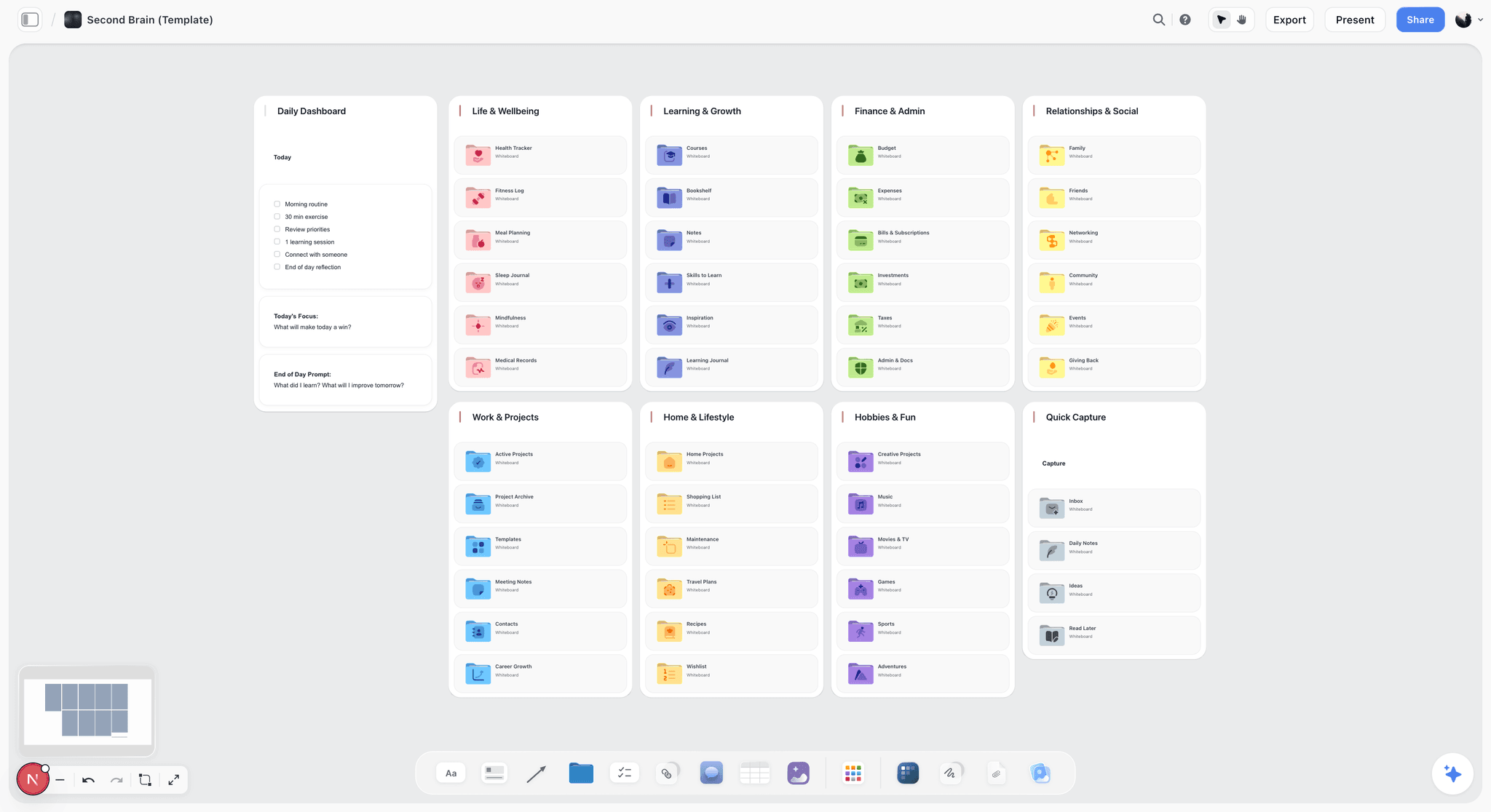
The verdict. The only tool here where a curatorial argument can be built in roughly the shape a visitor will encounter it, early enough for the shape to be argued with.
Best for. Exhibition development: the argument as a sequence of spaces, with objects, interpretation and reference attached.
Pricing. Paid-only during early access. Plus is $7.99 per month billed annually or $9.99 monthly. Pro is $14 per month billed annually or $19 monthly, adding AI image generation, roughly twenty times more AI usage and memory across conversations. Max is $39 per month billed annually or $49 monthly and adds the Team Workspace with permissions and roles. Pricing is flat per account rather than per seat, and anyone a paid member invites to a board joins free and can invite others. The Free plan launches before the end of 2026.
Why it ranks here. The prose-to-plan translation is the most expensive routine failure in exhibition making, and it exists because the argument is written in a format that carries no spatial information.
On a canvas the argument can be laid out as it will be walked. Room one, with its three key objects and the single sentence a visitor should leave with. Room two below it. The pivot moment, where the exhibition's argument turns, given physical prominence on the board because it needs physical prominence in the building. Now the designer is not converting prose into space. They are receiving a rough spatial argument and making it good, which is a completely different and much better brief.
The second value is testing. A curator can look at a board where room four contains eleven objects and room two contains two, and see immediately that the pacing is wrong. That observation is available in month three at the cost of moving some cards. In a prose document it is not available at all, and it surfaces in the model showing.
The third is interpretation timing. Because a board can hold the label text next to the object next to the space, interpretation can begin during development rather than after design freeze. That inverts the usual sequence, which is the single most requested change from interpretation teams everywhere.
Access shape matters because exhibition teams are cross-institutional by nature. The guest curator, the external designer, the fabricator, the education lead and sometimes lender contacts all need to see the same thing. Invited collaborators join free.
The AI reads your full active canvas board by default, plus up to one Tactic and up to three Documents you @-mention, which is useful for drafting interpretation text or a funding narrative grounded in the actual exhibition rather than in a summary of it.
Strengths.
- The argument can be developed in the shape it will be experienced, months before design freeze.
- Pacing and emphasis problems become visible while they are still cheap to fix.
- Interpretation can start during development rather than after it.
- Invited collaborators join free, so guest curators, designers and fabricators are in the same board.
- Canvas-wide AI context for drafting interpretation and funding text from the real board.
Limitations.
- Not a collections management system. No accession records, no loan agreements, no condition reporting, no insurance values, no provenance tracking. The Museum System, Axiell and CollectionSpace do this and a canvas must not.
- No object list with required fields. Airtable does this properly and a board will let you leave a credit line blank, which is exactly the failure mode you cannot afford.
- No CAD, no scale drawing, no sightline modelling, no 3D. It is a rough spatial argument, not a plan.
- No facilitation features: no timer, no voting, no private mode, no breakouts.
- No budget tracking, no procurement, no fabrication scheduling.
- Team Workspace with permissions and roles is on Max at $39 per month billed annually.
The trade off. Storyflow is where the argument gets shaped and nowhere near where it gets built or catalogued. Every institution using it needs a collections system and an object list alongside, and this post ranks Airtable second precisely because that pairing is the whole recommendation.
2. Airtable
The verdict. The correct home for the object list, and the tool that keeps the argument and the objects from silently diverging.
Best for. Exhibition object lists with loan status, credit lines, condition constraints and display requirements.
Pricing. Free tier with record limits. Team plans from around $20 per seat per month billed annually, Business above. Verify on airtable.com.
Why it ranks here. An exhibition object list is a database with obligations attached. Each object has a lender, a loan status, a credit line that must appear exactly as specified, a condition report with light and humidity constraints, and a display requirement. Every one of those is a field that must not be empty, and a spreadsheet cannot enforce that.
The higher-value use is the link back to the argument. If each object record carries the room it sits in and the argument it supports, then when a loan falls through the query "which arguments just lost their evidence" takes seconds. That question is currently asked by a person remembering, which means it is sometimes not asked at all.
Second rather than first because it holds the facts and cannot hold the shape. An exhibition with a perfect object list and a flat argument is a well-catalogued disappointment.
Strengths.
- Required fields, which is the entire mechanism for credit lines and loan conditions.
- Linked records connecting objects, rooms, lenders and arguments.
- Automations that chase outstanding loan paperwork.
- Interfaces give designers and fabricators a clean view without the base.
- Attachment fields for condition report photographs.
Limitations.
- Not a collections management system of record and must not replace one.
- Needs an owner, and on a three-year project that owner must be named.
- Per-seat pricing for collaborators.
- Nothing spatial. Pacing problems stay invisible.
- Record and attachment limits on lower tiers.
The trade off. Buy it for the object list and link it to the argument. That link is the single best structural improvement most exhibition teams can make.
3. Miro
The verdict. The best tool here for a live workshop, and a poor home for content that must survive three years.
Best for. Interpretation workshops, audience sessions and team ideation.
Pricing. Free tier capped at three editable boards. Paid plans from around $8 per member per month billed annually. Verify on miro.com.
Why it ranks here. Interpretation planning benefits enormously from real facilitation. Getting curators, educators and access specialists into one session with timers, voting and private mode produces better outcomes than a meeting, and Miro's toolkit is the best available.
Third because Miro boards become dense within weeks and unreadable within months, which is a serious problem on a project measured in years.
Strengths.
- Best facilitation toolkit available.
- Enormous template library for workshops.
- Handles large cross-departmental groups.
- Good for distributed working with external partners.
Limitations.
- Per-member pricing, awkward for cross-institutional teams.
- Boards become archaeology, badly, on multi-year timelines.
- Three-board cap on the free tier.
- No object or collections awareness.
The trade off. Excellent for the session. Move whatever it produces somewhere durable within the week.
4. Figma
The verdict. Where exhibition graphics should actually be made, and where the label system lives.
Best for. Panel layout, label typography, wayfinding and the graphic system.
Pricing. Free tier for limited files. Paid plans from around $16 per full editor per month billed annually. Verify on figma.com.
Why it ranks here. Exhibition graphics are a design system: title panels, section panels, object labels, wayfinding, in a consistent typographic hierarchy applied hundreds of times. Figma's components and variables make that maintainable, and the moment a label word count changes you can see whether it still fits.
Fourth because it is downstream of the argument, and because it is not a spatial planning tool.
Strengths.
- Real design system with components for the label hierarchy.
- Excellent collaboration and commenting for sign-off.
- Handles hundreds of label instances consistently.
- FigJam included for lighter sessions.
Limitations.
- Per-editor pricing makes wide access expensive.
- Not a spatial or CAD tool.
- Requires design skill.
- No collections or object awareness.
The trade off. Correct for graphics. Wrong for development.
5. The Museum System
The verdict. The collections system of record, which no project tool should ever try to be.
Best for. Accessions, provenance, condition history, loans and permanent institutional records.
Pricing. Enterprise, quote-based. Verify with Gallery Systems.
Why it ranks here. TMS is the standard collections management system across many institutions, and its role here is a boundary rather than a comparison: everything that constitutes the institution's permanent record about an object belongs in it, and nothing on this list replaces it.
Fifth on a whiteboard list because it is not a whiteboard and does not attempt to be. It is included because exhibition teams occasionally start rebuilding parts of it in project tools, and that is a genuine institutional risk.
Strengths.
- Authoritative record for accessions, provenance and condition.
- Loan and exhibition modules built to museum standards.
- Deep reporting for institutional and audit needs.
- Long-established and widely supported.
Limitations.
- Enterprise pricing and implementation.
- Not usable as a planning or ideation tool.
- Interface is dated and training-heavy.
- Poor fit for external collaborators.
The trade off. Keep it authoritative and reference it. Do not duplicate it.
6. Milanote
The verdict. A calm reference board for the design and material research, and nothing more.
Best for. Material samples, colour, precedent images and design mood.
Pricing. Free plan capped at 100 notes, images and links across the account. Paid plans from around $12.50 per person per month. Verify on milanote.com.
Why it ranks here. Exhibition designers gather precedent constantly, and Milanote is a pleasant home for it that stays readable because it stays sparse.
Sixth because the 100-item cap arrives quickly on an exhibition and because it holds mood rather than argument.
Strengths.
- Most intuitive board for visual reference.
- Excellent web clipper.
- Stays readable over time.
- Clean and quiet.
Limitations.
- 100-item free cap across the whole account.
- Per-person pricing for collaborators.
- No structure for argument or objects.
- No AI worth using.
The trade off. Good for a designer's own research. Not a team surface.
7. Notion
The verdict. The right home for the concept document, the interpretation policy and the project record.
Best for. Written documentation, meeting records and institutional process.
Pricing. Generous free plan for individuals. Paid plans around $10 per user per month billed annually. Verify on notion.so.
Why it ranks here. Exhibitions generate a great deal of necessary prose: the concept document, the interpretation strategy, the access plan, the evaluation framework. Notion holds all of it well with real search and version history.
Seventh because the concept document being prose is the original problem this post describes. Notion is the best possible version of the thing that causes the failure, which is a genuinely awkward position on this list.
Strengths.
- Excellent structured documentation with search.
- Databases handle a light project tracker.
- Familiar to most staff.
- Strong free tier.
Limitations.
- Everything becomes a document, including the spatial argument.
- No enforcement for object data.
- Per-user pricing with guest limits.
- Configuration is a time sink.
The trade off. Keep the policy documents here. Do not develop the exhibition here.
8. CollectionSpace
The verdict. The open-source collections option, genuinely viable for smaller institutions.
Best for. Museums that need proper collections management without enterprise budgets.
Pricing. Open source and free to self-host, with hosted options from partners. Verify on collectionspace.org.
Why it ranks here. For a small museum, the choice is often between a proper collections system and a spreadsheet, and CollectionSpace makes the proper system reachable. It is configurable to different collection types and has a real community behind it.
Eighth because self-hosting requires technical capacity that small museums frequently lack, which is the recurring irony of open-source institutional software.
Strengths.
- Free, open source, museum-standard data model.
- Configurable across collection types.
- Real community and documented deployments.
- Hosted options exist if you cannot self-host.
Limitations.
- Requires technical capacity or a hosting partner.
- Smaller ecosystem than commercial systems.
- Implementation is still a project.
- Not a planning tool.
The trade off. The right answer for a small museum with any technical support at all.
9. Monday.com
The verdict. A legible timeline for a project measured in years and staffed in rotations.
Best for. Deadlines and dependencies across a multi-year exhibition programme.
Pricing. Free tier for very small teams. Paid plans from around $9 per seat per month billed annually with minimum seat counts. Verify on monday.com.
Why it ranks here. Exhibition timelines are long, dependency-heavy and staffed by people who join and leave. Monday's timeline views are legible enough that a new registrar can see what they are blocking in week one.
Ninth because it does nothing for either the argument or the objects, and because per-seat minimums fit institutions with many part-time staff badly.
Strengths.
- Very low adoption friction.
- Good dependency and timeline views for long projects.
- Automations for deadline reminders.
- Reporting legible to trustees and funders.
Limitations.
- Minimum seat counts.
- Nothing museum-specific.
- Feature gating by tier.
- Guests cost money.
The trade off. Fine for the programme calendar. Irrelevant to the content.
10. Canva
The verdict. The volume graphics tool for everything outside the gallery.
Best for. Marketing assets, education resources and social content.
Pricing. Capable free tier, including a nonprofit programme. Teams plans from around $10 per user per month. Verify on canva.com.
Why it ranks here. An exhibition generates a great deal of peripheral graphic work that should not consume a designer: education worksheets, social assets, event graphics. Locked brand templates let the education and marketing teams self-serve.
Tenth because none of that is the exhibition, and because in-gallery graphics should not be made here.
Strengths.
- Brand kits and locked templates for self-service.
- Very low skill floor.
- Free nonprofit programme for eligible institutions.
- Bulk creation for volume assets.
Limitations.
- Not appropriate for in-gallery graphics.
- Visible template aesthetic.
- Per-user pricing for brand features.
- Governance required or brand drifts.
The trade off. Deploy it deliberately outside the gallery. Keep it out of the gallery.
11. Google Workspace
The verdict. What most exhibition teams actually run on, with all the costs that implies.
Best for. Shared documents accessible to external partners without account negotiation.
Pricing. Free with personal accounts. Business tiers from around $8 per user per month, with nonprofit programmes. Verify on workspace.google.com.
Why it ranks here. A shared Drive with the concept document, the object spreadsheet and a folder of images is the actual working system in a large number of institutions, including some very good ones. It is free, universal and openable by a lender's registrar without a conversation.
Eleventh because a spreadsheet object list cannot enforce a credit line, and because nothing propagates, which is how the argument and the objects drift apart in the first place.
Strengths.
- Free or heavily discounted for nonprofits.
- Universal access for external partners.
- Real-time collaboration.
- No lock-in.
Limitations.
- No enforcement, so object data decays.
- Version confusion across a multi-year project is guaranteed.
- No spatial capability.
- Nothing connects to anything.
The trade off. Acceptable as a document layer. Dangerous as the object list.
What to Actually Pay For
Pay for the object list first, because it is an institutional obligation. Credit lines, loan conditions and light limits are not preferences. A database with required fields costs a few hundred pounds a year and removes a category of risk.
Pay for spatial development second, because it is cheap and it prevents the expensive failure. Developing the argument as a sequence of spaces costs almost nothing and catches pacing and emphasis problems while they are still cards on a board.
Include the external team, and weight pricing shape accordingly. Guest curators, designers and fabricators outside your per-seat count will otherwise participate by email attachment, and that is where the version problems start.
Do not pay to duplicate your collections system. If your institution has TMS or equivalent, the project tool references it. Rebuilding a partial copy in Airtable is how two versions of the truth appear.
Buy facilitation only if you facilitate. Miro's free three boards genuinely cover an institution that runs a few workshops a year.
Tools to Avoid for This Job
A spreadsheet as the object list. It cannot require a credit line and it cannot chase an outstanding loan form. Both of those omissions have real consequences with lenders.
A canvas as the collections record. The reverse error, and worse. Accession data, provenance and condition history belong in a collections management system with institutional backup and audit.
Developing the argument only in prose. This is the central failure this post describes. Prose carries no spatial emphasis, so the designer receives no signal about which argument needs the biggest room.
Starting interpretation after design freeze. Almost universal and almost always wrong for an argument-led exhibition. Words fitted into spaces read like words fitted into spaces.
Two project tools. On a three-year timeline with staff turnover, a second tool guarantees that in year two nobody knows which one is current.
What No Tool on This List Does
None of these will tell you how visitors will move.
Circulation is genuinely hard to predict, and the profession's honest answer is that you find out by building something. Institutions that get this right make a rough full-scale mock-up of at least one room, tape on the floor and cardboard cases, and walk people through it. That afternoon reliably surfaces problems that no plan, no rendering and no board revealed. Everything on this page helps you arrive at a better mock-up sooner. Nothing replaces it.
None of them will tell you whether an object earns its place, either. Every exhibition has objects included because they are in the collection, because a lender offered them, or because a colleague would be hurt if they were left out. The discipline of asking what each object does for the visitor is entirely human, and it is the difference between an exhibition and a display.
And none of them will fix the label word count. Everyone knows the labels are too long. Everyone knows visitors read a fraction of them. The words are still too long, in almost every exhibition, because cutting them requires somebody with authority to overrule a specialist about their own subject. No software has that authority.
The Bottom Line
An exhibition is developed in three languages that rarely converge: the curatorial argument in prose, the spatial design in plans, and the visitor's actual behaviour in the finished galleries.
Choose by the failure that keeps recurring. If loans and credit lines keep going wrong, the fix is a database with required fields, and that is Airtable feeding your collections system. If interpretation always arrives late and overlong, start it during development instead of after design freeze. If your workshops are unfocused, Miro's facilitation genuinely helps.
But if the recurring experience is a designer producing something competent that has quietly lost the curator's third argument, that is the prose-to-plan translation, and it happens because the argument was written in a form that carries no spatial emphasis. That is the narrow case where Storyflow ranks first here.
FAQ: Whiteboard Tools for Museum and Exhibition Teams
What is the best whiteboard tool for a museum exhibition team?
Storyflow, for developing the curatorial argument as a sequence of spaces rather than as prose, which is the translation where exhibitions most often lose their emphasis. Pair it with Airtable for the object list, because loan conditions and credit lines need required fields that a canvas cannot enforce.
Can we use a whiteboard tool for our object list?
No, and this is the one recommendation in this post that is not a preference. Loan status, credit lines and condition constraints are institutional obligations that must be enforced fields in a database, and your permanent object records belong in a collections management system such as The Museum System, Axiell or CollectionSpace. A canvas will let you leave a credit line blank.
Is Storyflow a collections management system?
No. Storyflow has no accession records, no provenance tracking, no condition reporting, no insurance values and no loan agreements. It also has no CAD, scale drawing or sightline modelling. It ranks first on this list for exhibition development only: shaping the argument spatially before design freeze.
Is Storyflow free for museums?
Not during early access. Storyflow is paid-only right now, starting at $7.99 per month billed annually on the Plus plan. The Free plan launches before the end of 2026. The genuinely free path today is that anyone a paid member invites to a board joins free and can invite others, which for an exhibition team means guest curators, external designers and fabricators are all included in one subscription.
How do we stop the curatorial argument getting lost in the design?
Develop the argument in spatial form. Lay out the rooms in sequence, put the key objects in each, and give the pivot moment visual prominence on the board so the designer receives a signal about spatial priority rather than inferring it from paragraph length. The designer's job then becomes making a rough spatial argument good, which is a much better brief than converting prose.
When should interpretation and label writing start?
During development, not after design freeze. If label text exists alongside the object and the space while the layout is still movable, the space can be sized for the words. The standard sequence produces panels with three hundred words crammed into a designed space, which is why so few visitors read them.
What is the best free tool for a small museum?
Google Workspace for documents (with the nonprofit programme), Airtable's free tier for the exhibition object list, Canva's free nonprofit programme for peripheral graphics, and CollectionSpace if you have any technical support for collections management. Storyflow is paid-only during early access, so it does not belong in a free stack today.
Miro or Storyflow for exhibition planning?
Miro for a facilitated interpretation workshop, where its timers, voting and private mode genuinely improve the session. Storyflow for the argument itself, because exhibition timelines run for years and Miro boards become unreadable within months. Many teams use Miro for sessions and move the output somewhere durable within the week.
How do we keep the object list and the argument in sync?
Link them. Give each object record the room it sits in and the argument it supports, so that when a loan falls through you can immediately see which part of the exhibition just lost its evidence. Most teams handle the loan competently and never ask that second question, because nothing connects the two systems.
How do we include external designers and guest curators?
Choose tools that do not charge per collaborator, or budget explicitly for their seats rather than leaving them out. Storyflow's invited collaborators join free. The failure mode is predictable: external partners excluded from the tool participate by emailed attachment, and within a month there are three versions of the object list.
Can AI help with exhibition development?
For drafting and summarizing, meaningfully. Turning a development board into a first draft of interpretation text or a funding narrative is genuinely useful and tedious by hand. Storyflow's AI reads your full active canvas board plus up to one Tactic and three Documents you @-mention. For curatorial judgment it has nothing to offer, and interpretation text always needs a specialist's edit.
How much should a museum spend on exhibition planning tools?
Very little relative to the project. A database for the object list, a canvas for development and a design tool typically total a few hundred pounds a year, against exhibition budgets in the hundreds of thousands. The expensive mistake is not the software, it is skipping the full-scale mock-up that the software cannot replace.
Do we still need a mock-up if we have 3D renderings?
Yes. Renderings show you what a room looks like and tell you almost nothing about how people move through it, where they stop, or whether they see the object you built the argument around. A taped floor plan and cardboard cases for one afternoon reliably surfaces problems that renderings do not.
What is the single change worth making on the next exhibition?
Lay out the argument as rooms on one surface before the designer receives the concept document, and check the object distribution across them. Most teams find at least one room carrying twice the content of its neighbours, which is a pacing problem that is free to fix in month three and expensive to fix after fabrication.
Table of Contents
- Key Takeaways
- The Three Languages of an Exhibition
- At a Glance: The 11 Tools Compared
- How I Ranked These
- Quick Picks by Job Type
- 1. Storyflow
- 2. Airtable
- 3. Miro
- 4. Figma
- 5. The Museum System
- 6. Milanote
- 7. Notion
- 8. CollectionSpace
- 9. Monday.com
- 10. Canva
- 11. Google Workspace
- What to Actually Pay For
- Tools to Avoid for This Job
- What No Tool on This List Does
- The Bottom Line
- FAQ: Whiteboard Tools for Museum and Exhibition Teams
- Related Reading
Templates to check out for this topic


Planning and project templates you can use in Storyflow
Plan a launch, a sprint, or a whole project on a visual board the team can see at once. Open one of these templates and start from real structure.


See Storyflow in Action
A visual AI workspace where every feature lives inside one canvas. No tab-switching, no context lost.
Build your entire board from a single message
Type what you need in the AI chat at the bottom of your canvas. The AI adds cards, headings, and structure directly onto your board.
Use expert frameworks as AI context
Type @ in the AI chat and choose any Tactic. The AI tailors every response to that framework instead of giving generic advice.
Turn your board into a mind map in seconds
Ask the AI to restructure your canvas as a mindmap. It connects your ideas into a visual hierarchy so you can see how everything relates.
Why Storyflow Exists
Storyflow actually began as a personal tool while working on creative and research projects.
We kept running into the same problem: ideas were scattered everywhere: notes, documents, and whiteboards.
Nothing helped us see how everything connected.
So we started building a workspace designed around how ideas actually grow.
→ Read how Storyflow was createdSara de Klein
Head of Product at Storyflow
Published: 2026-08-11
Extremely simple, seriously capable


See how easy it is to get started
Watch a real project come together, from a blank board to a finished plan, clicked through step by step.
Start creating with AI and become more productive
Transform your creative workflow with AI-powered tools. Generate ideas, create content, and boost your productivity in minutes instead of hours.