The 12 Best Timeline Maker Tools in 2026
Timeline maker is one phrase covering three different products. What breaks when a date moves tells you which timeline you are buying.

Category
Tools & Software
Author

Sara de Klein
Head of Product at Storyflow
Topics
2026-08-13
•
24 min read
•
Tools & SoftwareTable of Contents
- Key Takeaways
- The Three Timelines Nobody Distinguishes
- At a Glance: The 12 Tools Compared
- How I Ranked These
- Quick Picks by Job Type
- 1. Office Timeline
- 2. TeamGantt
- 3. Preceden
- 4. Storyflow
- 5. Aeon Timeline
- 6. Canva
- 7. Miro
- 8. Microsoft Project
- 9. Monday.com
- 10. Tiki-Toki
- 11. Visme
- 12. Notion
- What to Actually Pay For
- Tools to Avoid for This Job
- What No Tool on This List Does
- The Bottom Line
- FAQ: Timeline Maker Tools
- Related Reading
Templates to check out for this topic


- timeline maker
- timeline creator
- timeline software
- gantt chart tool
- historical timeline maker
- project timeline tool
- story timeline software
What are the best timeline maker tools in 2026?
Timeline maker is one phrase covering three different products, and buying the wrong one is the actual failure. Office Timeline ranks first because most people typing that query need a graphic that lands in a deck by Friday. TeamGantt wins the project schedule job with real dependencies and a critical path. Preceden owns the historical and narrative timeline. Storyflow ranks fourth as the thinking timeline, the canvas you use while the order is still an argument, and it produces no Gantt chart, no dependencies and no critical path.

Full disclosure: Storyflow is our product, so read its placement with that in mind. It ranks fourth here, not first, and it wins on one narrow ground only: holding a timeline while the order of events is still contested, where rearranging must be free and nothing should recalculate. It genuinely cannot do the other two jobs. There is no Gantt chart, no task dependencies, no critical path and no automatic date shifting. There is no scaled time axis, so a five year gap and a five day gap look identical unless you label them. There is no duration arithmetic, no BC dates and no fictional calendar support, all of which Aeon Timeline handles. There is no timeline graphic export, no .pptx and no deck ready timeline image. There is no Jira, Asana or Google Calendar integration. Storyflow is paid only during early access, and permissions and roles arrive only on the Max tier.
Quick Comparison
Three unrelated jobs share the phrase timeline maker. These four cover each of them, so start by deciding what should happen when a date moves.
| Tool | Best For | AI Features | Price |
|---|---|---|---|
| Office Timeline | The picture timeline for a presentation | None. Imports from Project, Excel, Smartsheet and Wrike instead | Free add-in; Pro approx $149 per year |
| TeamGantt | The schedule timeline with dependencies and a critical path | Minimal. Scheduling logic rather than AI | Free for 1 project; approx $19 per manager per month |
| Preceden | Historical timelines with layers and BC dates | Light AI event generation; spreadsheet import does the real work | Free tier; approx $8 to $15 per month annual |
| Storyflow | The thinking timeline before the order is fixed | AI reads the full active canvas board plus 1 Tactic and 3 Documents you mention | $7.99 mo annual (free plan late 2026) |
Key Takeaways
- Three products share one search term: the schedule timeline, the picture timeline and the thinking timeline. Almost every bad purchase here is a category error, not a feature gap.
- The diagnostic is one question. Ask what breaks when a date moves: everything downstream shifts, you re-export an image, or nothing breaks at all.
- Office Timeline ranks first because it outputs native, editable PowerPoint shapes instead of a pasted picture.
- TeamGantt gives you dependencies and a critical path from roughly $19 per manager per month.
- Storyflow ranks fourth and makes no Gantt chart, no dependencies, no critical path and no scaled date axis.
- Aeon Timeline beats Storyflow at narrative chronology because it does real date arithmetic across invented and historical calendars.
- Canva and Visme make the best looking timelines and understand nothing about time. The axis is decoration, not data.
- Most teams need exactly two tools: one that recalculates and one that renders from it.
Build the timeline while the order is still a question
Storyflow is the canvas for the stage before a schedule exists: place events provisionally, attach the document or clip behind each one, and rearrange freely as the evidence changes. The AI reads your full active board, so you can ask where the chronology has a gap and which events carry no source. It builds no Gantt chart and no critical path, and it is not trying to. Paid-only during early access; the Free plan lands before the end of 2026.

The Three Timelines Nobody Distinguishes
Search "timeline maker" and you get project software, infographic generators, history education tools and video editors on one page. That is not the search engine being confused. Three unrelated jobs share one word.
The schedule timeline answers when this finishes and what happens if a piece slips. It needs durations, dependencies and a critical path that recalculates. TeamGantt, Microsoft Project and Monday.com live here.
The picture timeline answers how you show this to somebody who was not in the room. It needs milestones, styling and export in the format the audience expects. Office Timeline, Preceden, Canva, Visme and Tiki-Toki live here.
The thinking timeline answers what came first, and whether that order holds up. It needs space, free rearrangement and evidence attached to events. Storyflow, Miro and Aeon Timeline live here.
One test separates them. What breaks when a date moves tells you which timeline you are buying.
Move a date in a schedule and everything downstream shifts and the finish date changes. That cascade is the product. Move a date in a picture timeline and nothing happens except that you re-export the image. Move a date in a thinking timeline and nothing breaks at all, because the order was never fixed and arguing about it was the point.
The failures follow directly. A product team buys Canva for the templates, then cannot answer in month three whether the launch date is still real. A historian buys Microsoft Project because it says timeline, then fights software built to level a construction crew. A founder renders a beautiful roadmap before anyone agreed the sequence, and the graphic becomes the argument instead of the record of one.
At a Glance: The 12 Tools Compared
| Tool | Which timeline | Dependencies and critical path | What you walk away with |
|---|---|---|---|
Office Timeline | Picture | Neither | An editable PowerPoint slide |
TeamGantt | Schedule | Both | A live plan with a finish date |
Preceden | Picture | Neither | A layered web timeline, PNG or PDF |
Storyflow | Thinking | Neither | Rearrangeable events with evidence attached |
Aeon Timeline | Thinking | Dependencies only | A chronology with duration arithmetic |
Canva | Picture | Neither | A styled graphic in any format |
Miro | Thinking | Neither | A workshop artifact with everyone's input |
Microsoft Project | Schedule | Both, plus resource levelling | A plan that survives audit |
Monday.com | Schedule | Dependencies and baselines | A Gantt view over live work |
Tiki-Toki | Picture | Neither | An interactive timeline on a website |
Visme | Picture | Neither | A brand controlled infographic |
Notion | Schedule, lightly | Dependencies only | A time axis over a database you keep |
How I Ranked These
I come from documentary, where the timeline is three things at once and you learn the expensive way that they are not the same file: the shoot schedule with hard dependencies, the story chronology that is genuinely contested, and the timeline graphic in the funding deck.
Five criteria, in order.
1. Does it recalculate? Link task B to task A, move A by four days, see whether B moves. If it does not, you own a drawing.
2. Does the output land? Can the recipient edit your timeline without your source file. If not, somebody rebuilds it by hand at 11pm.
3. Does it hold a contested order? Can you place an event provisionally, attach the source supporting it, and move it later without breaking anything.
4. Does it handle real dates? Enter an event running 1347 to 1351 and check whether the spacing is proportional or decorative.
5. What does one person with one timeline pay? Most timeline searches are a single deliverable due this week, not a platform adoption.
Pricing is as of August 2026 and changes frequently. Verify with each vendor.
Quick Picks by Job Type
- Best graphic for a deck: Office Timeline. Native PowerPoint shapes the recipient can edit.
- Best schedule on a small budget: TeamGantt. Dependencies and a critical path without Project's weight.
- Best historical timeline: Preceden. Layers and overlapping eras.
- Best surface before the order is fixed: Storyflow. A canvas with AI that reads the whole board.
- Best fiction and case chronology: Aeon Timeline. Duration arithmetic across invented calendars.
- Best enterprise schedule: Microsoft Project. Resource levelling and formal reporting.
- Best embeddable public timeline: Tiki-Toki. Interactive, hosted, pleasant to browse.
- Best free option you already have: Canva. As long as you accept the axis is decorative.
1. Office Timeline
The verdict. The most common real intent behind this search is a slide, and this is the only tool producing an editable PowerPoint slide rather than an image pasted into one.
Best for. Project managers and consultants whose timeline must survive being edited by a stakeholder.
Pricing. Free add-in with styling and milestone limits. Pro roughly $149 per year, Pro Plus roughly $199 per year, as of August 2026.
Why it ranks here. Every other graphic tool exports a picture. Office Timeline generates PowerPoint shapes, so the recipient can drag a milestone or retype a label inside the deck they own. That decides whether the timeline gets updated next quarter or rebuilt from scratch.
It imports from Microsoft Project, Excel, Smartsheet and Wrike, which is the correct architecture: the schedule recalculates somewhere real and the picture regenerates from it.
It is not a scheduling tool and never pretends to be. The honest limit is that this is a Microsoft ecosystem product, and on Google Slides most of the advantage evaporates.
Strengths.
- Native PowerPoint shapes, editable without your file.
- Imports from Project, Excel, Smartsheet and Wrike.
- Swimlanes and grouped milestones read well at executive level.
- The free add-in covers a simple milestone slide.
Limitations.
- No dependencies, no critical path, no recalculation.
- Value is tied to PowerPoint, so Google Slides teams get much less.
- Steep annual price for one person making one timeline.
The trade off. The best answer for a timeline that gets presented, and no answer for one that gets managed.
2. TeamGantt
The verdict. The cheapest honest entry into real scheduling, with dependencies and a critical path a non specialist can use.
Best for. Small teams and agencies needing a plan that recalculates without adopting Microsoft Project.
Pricing. Free tier covering one manager, one project and around 60 tasks. Paid from roughly $19 per manager per month billed annually, as of August 2026.
Why it ranks here. It passes the recalculation test cleanly. Set a finish to start link, drag the predecessor, everything downstream moves. Turn on the critical path and you see which slippage costs the finish date and which is absorbed by slack.
Someone untrained can build a workable plan in an afternoon: drag to create, drag to link, drag to reschedule. Project cannot say that.
Charging per manager rather than per participant means the plan gets shared properly instead of as a screenshot, and a screenshot cannot recalculate. Limits appear at scale: basic resource levelling, thin portfolio views, no cost tracking.
Strengths.
- Genuine dependencies and a visible critical path.
- Per manager pricing keeps collaborator cost near zero.
- Baselines show planned against actual on one bar.
- Learnable in an afternoon.
Limitations.
- Resource management is basic next to Microsoft Project.
- Portfolio and cross project reporting is thin.
- Exported graphics are functional, not presentation grade.
The trade off. Buy it when what breaks on a moved date is the finish date, and you do not want to learn Project to find out.
3. Preceden
The verdict. The purpose built historical timeline maker, and the only mainstream tool treating overlapping eras as a first class idea.
Best for. Historians, teachers, legal case chronologies and company history graphics.
Pricing. Free tier limited to a small number of events. Paid roughly $8 to $15 per month billed annually, as of August 2026.
Why it ranks here. It solves what general tools get wrong: layers. Real chronologies run parallel tracks, and the point is seeing what overlapped with what.
It also handles time properly. Events can be points or spans, spacing is proportional to duration, BC dates work, and you can zoom from a century to a month without the layout collapsing. Try that in Canva and you will spend the afternoon nudging rectangles until they look proportional.
Output is a web timeline plus PNG and PDF: right for a report, wrong for a slide somebody senior needs to restyle.
Strengths.
- Layers make overlapping eras and parallel tracks readable.
- Proportional spacing across centuries, including BC dates.
- Point events and duration spans both handled properly.
- Spreadsheet import moves bulk chronologies quickly.
Limitations.
- Styling is limited and dated next to Canva or Visme.
- No PowerPoint export, so deck use means pasting an image.
- No collaboration beyond sharing a link.
The trade off. Right when the timeline is about history, wrong when an executive needs to restyle it.
4. Storyflow
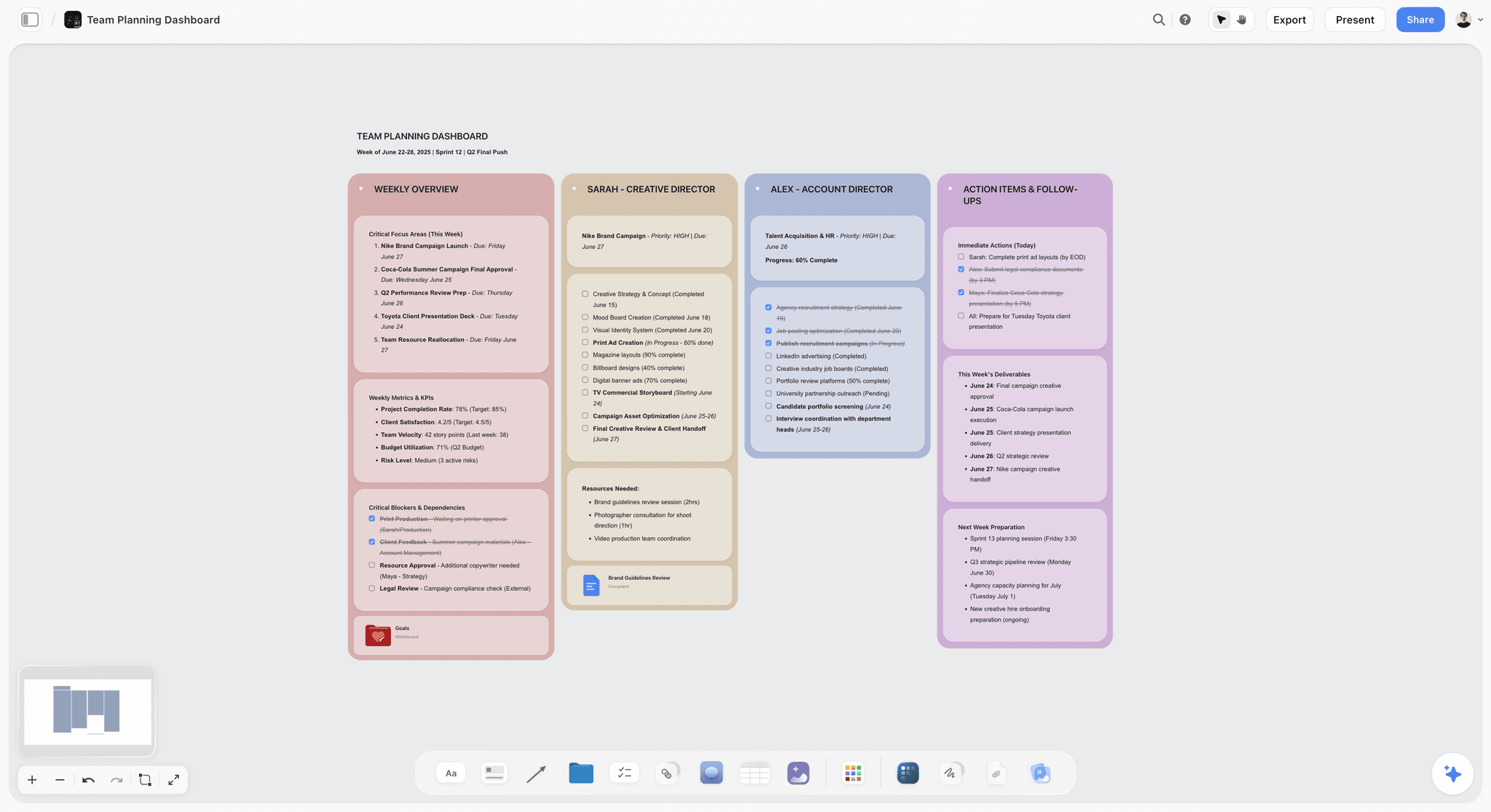
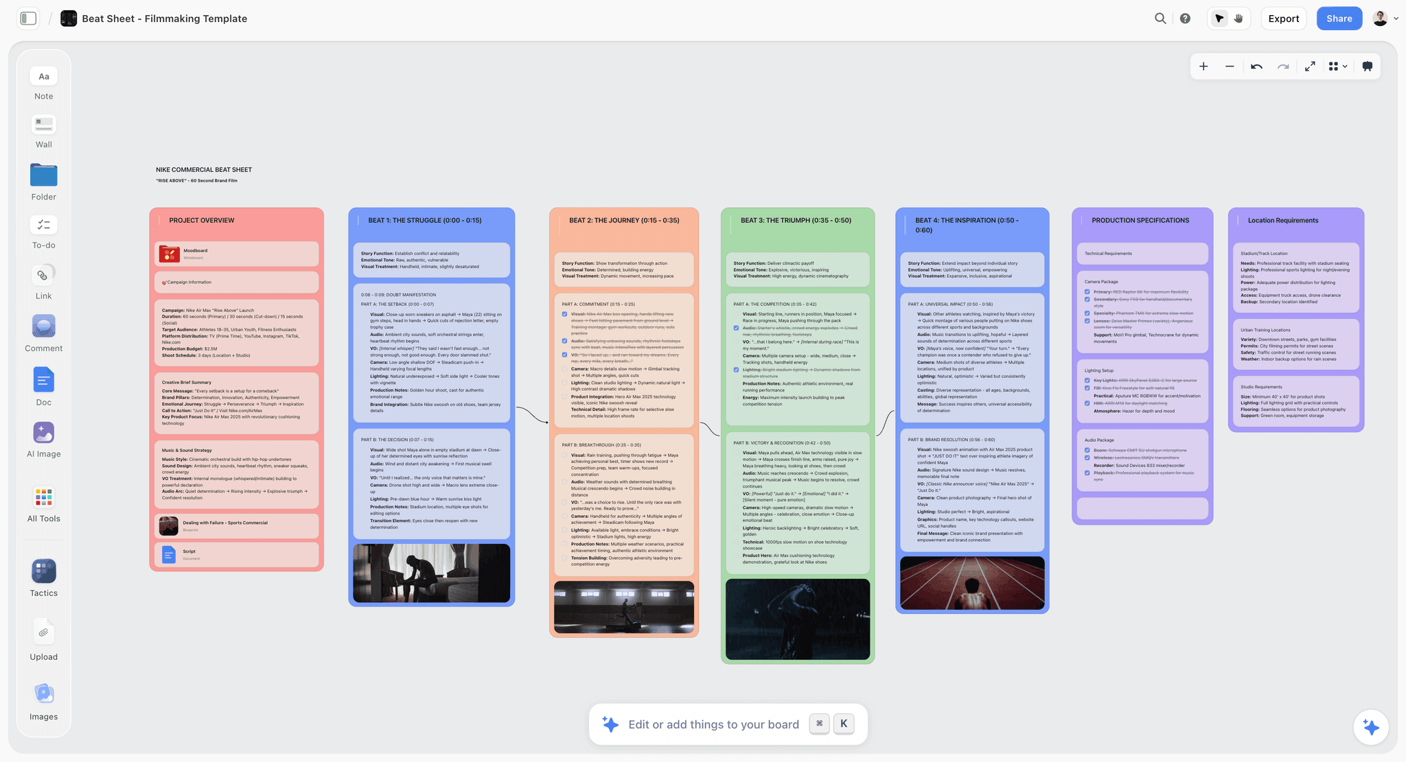
The verdict. The thinking timeline: a canvas for the stage where the order of events is still an argument, with AI that reads the whole board and can be asked whether the sequence holds.
Best for. Story chronologies, research timelines and campaign narratives you have not agreed yet.
Pricing. Paid only during early access. Plus is $7.99 per month billed annually or $9.99 monthly, adding the 200 plus Story blueprints and unlimited file uploads. Pro is $14 per month annually or $19 monthly, adding AI image generation, roughly twenty times more AI usage and memory across conversations. Max is $39 per month annually or $49 monthly, adding forty times more AI and Team Workspace with permissions and roles. Pricing is flat per account, not per seat, and anyone a paid member invites signs up free. The Free plan launches before the end of 2026. Prices as of August 2026.
Why it ranks here. Storyflow is ours, and it ranks fourth because it does not compete for the two jobs most timeline searches represent. No Gantt chart. No dependencies, no critical path. No scaled date axis, so a timeline here is a sequence you arrange rather than a chronology plotted against a ruler. If you need a finish date, buy TeamGantt. If you need a slide, buy Office Timeline. Neither is close.
What it owns is the stage before both. Most timelines get built twice: once badly, in a hurry, while people still disagree about what happened, and once properly after that is settled. The first version almost always goes into the wrong tool, because scheduling software demands dates you do not have and graphics software makes provisional events look decided.
A canvas fits that stage because rearranging is free. An event is a card. You place it where you think it goes, attach the source document or interview clip behind it, and move it when the evidence changes. Nothing recalculates, and that is correct. What breaks when a date moves tells you which timeline you are buying, and here the answer is nothing, because the order is the open question.
The AI earns the ranking rather than excusing it. Storyflow's AI reads your full active canvas board, plus up to one Tactic and up to three Documents you @-mention. You can ask about the sequence as a whole: where the chronology has an unexplained gap, which events carry no supporting source, whether two events could have happened in the other order. A tool that only sees the row you clicked cannot answer those.
Strengths.
- Rearranging is free, so a provisional order stays provisional instead of hardening into a plan.
- Evidence lives on the event: attach the document, image or clip behind each card.
- AI reads the entire active board, so you can ask about gaps across the whole sequence.
- Flat per account pricing, and invited collaborators join free rather than costing a seat.
- 200 plus Story blueprints on Plus give real starting structures for narrative sequencing.
Limitations.
- No Gantt chart, no task dependencies, no critical path, no automatic date shifting.
- No scaled time axis. A five year gap and a five day gap look identical unless you label them.
- No duration arithmetic, no BC dates, no fictional calendars. Aeon Timeline does all three.
- No timeline graphic export. No .pptx, and no one click timeline image built for a deck.
- No Jira, Asana or Google Calendar integration, so dates entered here live only here.
- Paid only today, and permissions and roles arrive only on Max at $39 per month.
The trade off. Storyflow holds the timeline while it is still a question. The moment it becomes a commitment or a graphic, move it to TeamGantt or Office Timeline.
5. Aeon Timeline
The verdict. The most serious chronology tool here, and the one that beats Storyflow whenever the chronology itself is the artifact.
Best for. Novelists, screenwriters and legal teams building case chronologies.
Pricing. Roughly $65 to $90 for a perpetual desktop licence, with a lower cost subscription option, as of August 2026.
Why it ranks here. This is a timeline tool built for people whose whole job is chronology. Fictional calendars work, so a fantasy novel with a 400 day year behaves correctly. It calculates ages and durations, so it will tell you a character is eleven in a scene you wrote as an adult.
For narrative work it beats Storyflow and this post will not pretend otherwise. Across a 400 page manuscript, Aeon catches errors a canvas cannot see, and Scrivener sync is why novelists stay.
Where it loses is at the front. Aeon wants dates, because computing over them is its value, which makes it weakest when your chronology is a pile of maybes.
Strengths.
- Fictional and historical calendars with correct age and duration arithmetic.
- Relationships between characters, events and locations, not just dates on a line.
- Scrivener sync makes it practical inside a real writing workflow.
- Perpetual licence option, so no ongoing subscription is required.
Limitations.
- Desktop only, with no meaningful real time collaboration.
- Dense interface with a genuine learning curve.
- Weak at provisional, undated events, which is where chronologies start.
The trade off. Unmatched once the chronology is real and complex, frustrating while it is still guesswork.
6. Canva
The verdict. The timeline most people will actually make, in a tool that understands design perfectly and time not at all.
Best for. A one off graphic that must look good and need not be right about duration.
Pricing. Free tier is genuinely usable. Pro roughly $15 per month for one person, as of August 2026.
Why it ranks here. Canva has hundreds of timeline templates that look better than anything Preceden or Office Timeline produces by default. For a milestone graphic or a classroom handout, that is the entire requirement.
The failure mode is worth naming precisely. Canva timelines are drawings: the space between 2019 and 2020 is whatever looked balanced, not a year, and nothing stops you placing events out of order.
Harmless in marketing, misleading in a board roadmap, because an axis that looks proportional and is not reads as data.
Strengths.
- The largest template library and the best default aesthetics here.
- Free tier covers most single graphic needs completely.
- Brand kit keeps colours and fonts consistent across a team.
- Export to almost any format, including print ready PDF.
Limitations.
- No proportional time axis, so spacing is decorative.
- No dependencies, no recalculation, no useful data import.
- Editing a complex timeline means nudging dozens of elements by hand.
The trade off. Perfect for a picture, dangerous as a plan.
7. Miro
The verdict. The workshop timeline: the right surface when a room of people has to build the sequence together in ninety minutes.
Best for. Collaborative sessions where fifteen versions of events go onto one wall.
Pricing. Free tier with three editable boards. Starter roughly $10 per user per month billed annually, Business roughly $20, as of August 2026.
Why it ranks here. Miro has the best multiplayer story in the category: timers, voting, cursors, private mode and a timeline widget giving a rough axis to place notes against.
For extracting a shared chronology from a group who each remember it differently, nothing here is better.
It ranks seventh because the timeline is a widget on a general canvas, not a considered feature. The axis is loose, there is no arithmetic, and large boards get slow.
Strengths.
- The strongest real time collaboration here, including voting and timers.
- Usable timeline and roadmap frames in a vast template library.
- Jira, Asana and Azure DevOps integrations push outcomes into real systems.
- Works well on a large touch display in a physical room.
Limitations.
- The timeline is a widget with a loose axis and no arithmetic.
- Per user pricing across a workshop group adds up fast.
- Large boards degrade and become hard to navigate.
The trade off. Buy it for the session, then move the result somewhere that can hold it.
8. Microsoft Project
The verdict. The heavyweight schedule timeline, still correct when a plan has to be defended rather than shared.
Best for. Construction, engineering and regulated programmes with shared resources.
Pricing. Plan 1 roughly $10 per user per month, Plan 3 roughly $30, Plan 5 roughly $55, as of August 2026.
Why it ranks here. Project levels resources so one person is not scheduled at 180 percent, handles calendars and work against duration, and produces plans that survive contractual scrutiny. Nothing else here attempts that.
It ranks eighth because most people searching for a timeline maker need none of it. The classic failure is a team adopting Project, building an elaborate plan nobody maintains, and reverting to a spreadsheet within a quarter.
Pair it with Office Timeline: Project owns the schedule that recalculates, Office Timeline renders the executive picture.
Strengths.
- Resource levelling and capacity management, which almost nothing else offers.
- Full constraint and calendar handling, not just finish to start links.
- Baselines, earned value and cost tracking for formal reporting.
- Office Timeline and Power BI read from it cleanly.
Limitations.
- Steep learning curve and concepts that punish casual use.
- Expensive for small teams at Plan 3 and above.
- Total overkill for anyone making a milestone graphic.
The trade off. Right when a plan is a contract, wrong when a plan is a conversation.
9. Monday.com
The verdict. A Gantt view layered over work you already track, which is right when the timeline should be a view rather than a document.
Best for. Teams already running operations in a work platform who need scheduling on top.
Pricing. Free tier up to two seats. Standard roughly $12 per seat per month billed annually is where the Gantt view begins, Pro around $20, as of August 2026.
Why it ranks here. The timeline is not a separate artifact. The tasks are the work, the Gantt is a view, and when somebody marks an item done the timeline is already current.
Every standalone timeline tool has a maintenance problem and this design removes it. Dependencies work, baselines exist higher up, and automations shift dates when a predecessor moves.
It ranks ninth because the Gantt is gated behind Standard, per seat costs compound, and critical path handling is less rigorous than TeamGantt.
Strengths.
- The timeline updates itself because it is a view of live work.
- Dependencies with automations that shift dates downstream.
- Strong integrations and a very approachable interface.
- Calendar and kanban views over the same data.
Limitations.
- The Gantt view requires Standard, so cheaper tiers cannot do this job.
- Per seat pricing across a whole team is the real cost.
- Poor fit for historical, narrative or presentation timelines.
The trade off. Excellent if you already live there, hard to justify if you do not.
10. Tiki-Toki
The verdict. The best interactive public timeline, and the only output here that is genuinely enjoyable to browse.
Best for. Museums, schools, company history pages and any timeline that lives on a website.
Pricing. Free tier with one public timeline. Paid roughly $65 to $155 per year depending on timeline count and privacy, as of August 2026.
Why it ranks here. Tiki-Toki produces a hosted, embeddable, scrollable timeline with images and video on events, and a well judged zoom.
For a history department or a brand's twenty year story page, that beats a static image comfortably.
Its output format is also its constraint: the timeline lives on their platform, privacy needs a paid tier, and there is no PowerPoint export.
Strengths.
- Genuinely interactive output with media embedded on events.
- Embeds into any website via iframe.
- Categories give a usable equivalent of layers.
- The free tier produces a real, shareable public timeline.
Limitations.
- Hosted on their platform, so you depend on it staying available.
- Slow bulk entry with weak import at lower tiers.
- No PowerPoint, PDF or high resolution image output worth using.
The trade off. Buy it when the timeline is a web page, ignore it otherwise.
11. Visme
The verdict. Canva's more corporate sibling: better brand control, equally unaware of what a date is.
Best for. Marketing and comms teams producing branded timeline infographics at volume.
Pricing. Limited free tier. Starter roughly $29 per month, Pro roughly $59 per month billed annually, as of August 2026.
Why it ranks here. Visme beats Canva at two things that matter for corporate timelines: brand kit enforcement, so a team cannot drift off palette, and data widgets that pull from a spreadsheet.
Its animated output also suits web embedding better than a static export.
It ranks eleventh because it costs roughly double Canva for an advantage most people do not need, and shares Canva's core limitation: the axis is decorative and nothing recalculates.
Strengths.
- Brand kit enforcement keeps team output consistent.
- Data linked charts and widgets alongside the timeline.
- Interactive and animated output for web embedding.
- Analytics on shared projects, which Canva does not offer.
Limitations.
- Roughly double Canva's price for a narrow advantage.
- No proportional time axis and no scheduling logic.
- The editor is slower and less intuitive than Canva's.
The trade off. Worth it for a comms team with brand rules, not for one person and one graphic.
12. Notion
The verdict. A timeline view over a database you already keep, which is the cheapest schedule timeline and the least capable.
Best for. Small teams already in Notion who want a Gantt style view without another subscription.
Pricing. Free personal tier includes the timeline view. Plus roughly $10 per user per month billed annually, as of August 2026.
Why it ranks here. Notion turns any database with date properties into a horizontal bar chart of work, and dependencies between linked items are supported.
For a five person team already using Notion for everything, this is a legitimate free answer to a question others charge for.
It ranks last because it is the weakest version of every job here: no critical path, no resource view, no baselines, and no output you would send externally.
Strengths.
- Included free, with no additional tool to adopt.
- The view never goes stale because it renders tasks you already maintain.
- Dependencies between linked items are supported.
- Sub items and grouping give a usable work breakdown.
Limitations.
- No critical path, no resource management, no baselines.
- Presentation output is poor, so it is not shareable externally.
- Useless for historical or narrative timelines.
The trade off. The best free schedule timeline for people already there, and no reason to sign up.
What to Actually Pay For
Pay for Office Timeline only if the recipient will edit the slide. For a one off picture nobody touches again, Canva's free tier is sufficient and $149 buys nothing.
Pay for scheduling the moment a date has money attached to it. Below that, a picture timeline is honest and cheap. Above it, TeamGantt at roughly $19 per manager is the right first purchase, and Microsoft Project only when you level shared resources or report formally.
Do not pay for a timeline tool while the order is still contested. That stage needs rearranging, not recalculating. Storyflow at $7.99 is the paid version of it, and only worth buying if a canvas already earns its place in your work.
Never pay twice for the same timeline. Teams maintaining a Project plan, a Monday board and a Canva graphic of one schedule pay three times to be wrong in three places.
Tools to Avoid for This Job
A spreadsheet with conditional formatting as a Gantt chart. It looks like a schedule and cannot recalculate, so the first slip silently invalidates every cell to the right of it.
A graphics tool as a project plan. A decorative axis shown to a board reads as data, and you have argued for a schedule nobody verified.
A scheduling tool for a contested chronology. Project will demand dates you do not have, and inventing them converts guesses into commitments.
A video editor because it says timeline. Premiere and Resolve timelines are frames on a track, not events in history.
Any timeline living in one person's local file. It stops being updated the week they go on leave, and nobody notices until the dates are wrong.
What No Tool on This List Does
None of them will tell you whether your dates are realistic. Every scheduling tool here computes a flawless critical path from durations you invented optimistically, and the estimates are the hard part.
None of them bridge the three timelines automatically. Office Timeline importing from Project is the best bridge available and everything else is manual re-entry. Building the same timeline three times in three tools is still normal in 2026.
None of them, including Storyflow, will render a presentable graphic and recalculate a critical path from one source. Storyflow does neither: no Gantt chart, no dependencies, no critical path, no scaled date axis, no timeline image export. That is why this post ranks it fourth rather than pretending the gap is a design choice covering every job.
None of them will make people agree on what happened. The best a tool can do is make the disagreement visible rather than hide it in somebody's draft.
The Bottom Line
Timeline software is not a category with a best product. It is three categories sharing a search term, and almost every complaint about timeline tools is somebody using the wrong one of the three.
Ask what breaks when a date moves. If everything downstream shifts, you need a schedule: TeamGantt is the cheapest honest entry, Microsoft Project sits above it when resources and formal reporting matter. If nothing breaks except that you re-export a picture, you need a renderer, and Office Timeline wins because it hands the recipient something editable.
If nothing breaks at all, the order is still an argument. Storyflow ranks fourth because it serves only that third case: no Gantt chart, no dependencies, no critical path, no scaled axis. It holds a sequence while the sequence is still a question, with AI that reads the whole board and finds the holes. One useful stage out of three, and pretending otherwise would only cost you the afternoon you spend discovering it.
FAQ: Timeline Maker Tools
What is the best timeline maker in 2026?
It depends which of three jobs you mean. For a graphic in a presentation, Office Timeline wins because it generates editable PowerPoint shapes rather than a pasted image. For a project schedule with dependencies and a critical path, TeamGantt is the cheapest honest option and Microsoft Project the most capable. For a historical timeline with overlapping eras, Preceden is purpose built. Decide the job first, because most bad purchases here are category errors rather than feature gaps.
What is the best free timeline maker?
Canva's free tier is the most capable free option for a timeline graphic, with hundreds of templates and unrestricted export. For a project schedule, TeamGantt's free tier covers one manager and one project with real dependencies, and Notion's free personal tier includes a timeline view over any database with dates. Tiki-Toki's free tier hosts one public interactive timeline. Storyflow is paid only during early access, so it is not a free option today.
Can I make a Gantt chart in Storyflow?
No. Storyflow produces no Gantt chart and has no task dependencies, no critical path and no scaled date axis, so nothing recalculates when a date changes. It is a canvas for the stage where the sequence is still being decided, with AI that reads the whole board and can surface gaps across it. If you need a schedule that recalculates, use TeamGantt or Microsoft Project. This post ranks Storyflow fourth for exactly that reason.
What is the difference between a timeline and a Gantt chart?
A Gantt chart is a specific timeline for project work, showing tasks as bars with durations, dependencies and usually a critical path. A general timeline shows events on an axis with no logic connecting them. The practical distinction is recalculation: move a task in a Gantt chart and downstream tasks move, whereas moving an event on a general timeline changes only that event. What breaks when a date moves tells you which timeline you are buying.
What is the best tool for a historical timeline?
Preceden, because it handles layers, proportional spacing across centuries, BC dates and duration spans, none of which general graphics tools do. Tiki-Toki is better when the timeline must be interactive and embedded on a website, since it hosts a scrollable timeline with images and video on each event. Avoid project scheduling software here: it is built around resource allocation and will fight you over anything before 1900.
How do I make a timeline for a PowerPoint presentation?
Use Office Timeline, which runs as a PowerPoint add-in and generates native shapes, so whoever receives the deck can edit milestones without your source file. That editability is the difference between a timeline updated next quarter and one rebuilt from scratch. If you need it prettier than Office Timeline's defaults, Canva and Visme look better, but their output is an image and nobody downstream can change it.
What do writers use to build a story timeline?
Aeon Timeline is strongest for fixed narrative chronologies, because it does duration and age arithmetic across historical and invented calendars and syncs with Scrivener. It will catch a character being the wrong age in a scene, which no canvas can see. A canvas tool like Storyflow or Miro is better at the earlier stage, when the order of events is still an argument and you want to rearrange without committing to dates.
Is Canva good enough for a project timeline?
For a graphic, yes. For a plan, no. Canva timelines are drawings: the space between two dates reflects what looked balanced in the layout, not elapsed time, and nothing recalculates. That is harmless in a marketing milestone graphic and misleading in a board roadmap, because an axis that looks proportional and is not reads as data. Use Canva to communicate a schedule decided somewhere with real logic.
What is the cheapest tool with real task dependencies?
Notion's free personal tier supports dependencies between linked database items and includes a timeline view, making it the cheapest option if you already use Notion. Among dedicated tools, TeamGantt's free tier covers one project with dependencies and a critical path, and its paid plans start around $19 per manager per month rather than per participant, which keeps team cost far below per seat platforms.
How many timeline tools does a team actually need?
Two, in most cases. One scheduling tool where dates recalculate and dependencies live, and one renderer that produces the picture from it. Office Timeline importing from Microsoft Project is the cleanest version of that pairing. Teams maintaining three versions of one schedule, typically a plan, a board and a slide graphic, end up with three answers to the same question and no way to tell which is current.
Does Storyflow replace Miro for timeline workshops?
Not for the live session. Miro has timers, voting, private mode and stronger facilitation controls, and permissions and roles in Storyflow arrive only on the Max tier at $39 per month billed annually. Storyflow's advantage comes afterwards: its AI reads the entire active board plus mentioned documents, so you can ask about gaps and contradictions across the whole sequence rather than reading a wall of notes yourself.
What should I use for a research or investigation timeline?
Use a surface where an event can sit undated and provisional, because forcing a date to satisfy the software turns a guess into a commitment. A canvas works well: place the event, attach the document or clip supporting it, and move it when the evidence changes. Once the chronology settles, move it to Aeon Timeline for duration arithmetic if the case is complex, or to Preceden if the output is a layered graphic.
Templates you can use in Storyflow
Every Storyflow board starts from real structure and an AI that reads the whole canvas. Open one of these templates and make it yours.


See Storyflow in Action
A visual AI workspace where every feature lives inside one canvas. No tab-switching, no context lost.
Build your entire board from a single message
Type what you need in the AI chat at the bottom of your canvas. The AI adds cards, headings, and structure directly onto your board.
Use expert frameworks as AI context
Type @ in the AI chat and choose any Tactic. The AI tailors every response to that framework instead of giving generic advice.
Turn your board into a mind map in seconds
Ask the AI to restructure your canvas as a mindmap. It connects your ideas into a visual hierarchy so you can see how everything relates.
Why Storyflow Exists
Storyflow actually began as a personal tool while working on creative and research projects.
We kept running into the same problem: ideas were scattered everywhere: notes, documents, and whiteboards.
Nothing helped us see how everything connected.
So we started building a workspace designed around how ideas actually grow.
→ Read how Storyflow was createdSara de Klein
Head of Product at Storyflow
Published: 2026-08-13
Start creating with AI and become more productive
Transform your creative workflow with AI-powered tools. Generate ideas, create content, and boost your productivity in minutes instead of hours.