The 10 Best Value Stream Mapping Tools in 2026
A value stream map is a process map with a stopwatch attached. The boxes are where the work happens. The arrows are where the time goes.

Category
Tools & Software
Author

Sara de Klein
Head of Product at Storyflow
Topics
2026-08-14
•
22 min read
•
Tools & SoftwareTable of Contents
- Key Takeaways
- The Two Rungs: Why the Boxes Were Never the Problem
- At a Glance: The 10 Tools Compared
- How I Ranked These
- Quick Picks by Job Type
- 1. eVSM
- 2. Lucidchart
- 3. iGrafx
- 4. Minitab Workspace
- 5. Microsoft Visio
- 6. Excel
- 7. Draw.io
- 8. Miro
- 9. Storyflow
- 10. Mural
- What to Actually Pay For
- Tools to Avoid for This Job
- What No Tool on This List Does
- The Bottom Line
- FAQ: Value Stream Mapping Tools
- Related Reading
Templates to check out for this topic


- value stream mapping software
- VSM tools
- process cycle efficiency
- lead time
- timeline ladder
- lean process mapping
- current state map
- future state map
What are the best value stream mapping tools in 2026?
A value stream map is a process map with a stopwatch attached, and most tools sold for this job can draw the process but cannot hold the stopwatch. eVSM ranks first because it is built around the timeline ladder and computes total lead time and process cycle efficiency instead of leaving you to add up delays by hand. Lucidchart is the best general diagramming tool here because shape data lets a number live on the shape rather than in a floating text box beside it. iGrafx turns the map into a model you can simulate. Excel ranks above every generic whiteboard on this page, for the uncomfortable reason that the arithmetic is the actual deliverable.

Full disclosure: Storyflow is our product and it ranks ninth here, which is where it belongs. It has no value stream mapping notation or icon set, no data boxes, no timeline ladder, no computed lead time or process cycle efficiency, no arithmetic of any kind including unit conversion, no simulation and no export to Visio. Its narrow ground is the stage before measurement, when you are still establishing what the steps are from scattered notes and contradictory accounts. Once you have times against steps, move to Lucidchart, Excel or eVSM.
Quick Comparison
Ten tools, ranked by two questions: can a wait time live on the arrow as structured data, and does the tool compute total lead time and process cycle efficiency instead of leaving you to add up delays by hand.
| Tool | Best For | AI Features | Price |
|---|---|---|---|
| eVSM | Serious VSM with real ladder maths | None, but full notation and automatic lead time and PCE totals | Quoted licence, plus a Visio licence |
| Lucidchart | Most teams doing this properly on a budget | AI diagram generation, plus shape data on connectors | Around $9 to $10 per user monthly |
| iGrafx | Modelling and simulating the future state | Process mining and simulation rather than chat AI | Enterprise, quoted |
| Storyflow | The walk-the-process conversation before measuring | Whole-board AI reads the active canvas, no VSM notation or arithmetic | $7.99 mo annual (free plan late 2026) |
Key Takeaways
- A process map answers what happens. A value stream map answers how long it takes and how much of that time was worth anything.
- Process cycle efficiency is value-added time divided by total lead time. In most office processes the result is a single-digit percentage, because the queues between steps are longer than the steps.
- The timeline ladder has two rungs: process time on the lower rung, wait time on the upper rung. Teams stare at the lower rung and improve the wrong thing.
- Rank tools by whether a number can live on the arrow, not only in the box. Almost every whiteboard fails that test, which is why whiteboard value stream maps become wall art.
- eVSM and iGrafx compute the rollup. Lucidchart, Visio and Minitab Workspace hold structured data with setup. Miro, Mural, Draw.io and Storyflow make you do the sums elsewhere.
- Excel cannot draw a legible map and still beats four drawing tools here, because a spreadsheet with real cycle times is more useful than a beautiful diagram with none.
- Storyflow ranks ninth. No value stream mapping notation, no data boxes, no timeline ladder, no arithmetic. Its narrow claim is the walk-the-process conversation before anyone measures.
Work out what the process actually is, before you measure it
Storyflow will not draw your timeline ladder or compute your process cycle efficiency. It is good at the hour before that: holding interview notes, screenshots and contradictory accounts of the same handoff on one canvas, with AI that reads the whole board and lists every step it can find. Paid-only during early access; the Free plan lands before the end of 2026.

The Two Rungs: Why the Boxes Were Never the Problem
Value stream mapping came out of the Toyota Production System, where it was known as material and information flow mapping. It reached the West through Womack and Jones in Lean Thinking, then through Mike Rother and John Shook's Learning to See, which is still the book that teaches the notation. That lineage matters, because the notation was designed around one claim: the time between the steps is where the waste lives.
Here is the shape of a real map. Process boxes run left to right, each with a data box under it carrying cycle time, changeover time, uptime, batch size, operator count, and in office processes the percent complete and accurate figure. Between the boxes sit the queues: inventory triangles on a factory floor, or a shared inbox, an approval queue, a legal review. Information flow runs along the top and the customer sits top right.
Underneath all of it runs the timeline ladder, which is the part most teams draw last and understand least.
The boxes are where the work happens. The arrows are where the time goes.
The ladder has two rungs. The lower rung carries process time, one segment per box. The upper rung carries wait time, one segment per gap. Add the lower rung and you get total process time. Add both and you get total lead time. Divide the first by the second and you have process cycle efficiency, the number the whole exercise exists to produce.
In an office process the two rungs are not comparable. The lower rung might total four hours of work. The upper rung might total eleven days of sitting in queues, waiting on an approval that takes ninety seconds once someone opens it. The map is mostly waiting. That is the normal finding, and the notation exists to make it undeniable.
What teams do instead is instinctive and wrong. They map the work, because the work is what they know, then optimise the boxes. Shave three minutes off step four and total lead time moves by nothing measurable, because step four was never the problem in a stream whose dominant term is a four-day approval queue.
Tooling decides whether you repeat that mistake. A tool with rich structured fields inside the box and a plain line between boxes will collect your careful numbers in the wrong place. So the ranking axis here is two questions. Can a number live on the arrow as structured data rather than a label you nudge into position? And does the tool compute the rollup, meaning lead time, process time and PCE, instead of leaving arithmetic in a corner of the canvas that goes stale when anyone moves a box?
There is a companion failure worth naming, because it is the usual outcome of a mapping workshop. A gorgeous current-state map with no numbers on it is a process diagram, not a value stream map. It photographs well and cannot tell you where your lead time went. Every generic whiteboard here encourages that artifact so pleasantly that nobody notices until someone asks for the PCE.
If your question is who hands off to whom and where the ball gets dropped, that is a different diagram, and we ranked those in the best swimlane and process mapping tools. Lanes answer ownership. Ladders answer time. This post is about the ladder.
At a Glance: The 10 Tools Compared
| Tool | Best for | Number on the arrow | Computes lead time and PCE | Price signal |
|---|---|---|---|---|
eVSM | Serious VSM with real ladder maths | Yes, native | Yes, automatically | Quoted licence, plus Visio |
Lucidchart | Most teams doing this properly on a budget | Yes, via shape data | Partly, with formula setup | Around $9 to $10 per user monthly |
iGrafx | Modelling and simulating the future state | Yes, as process attributes | Yes, plus simulation | Enterprise, quoted |
Minitab Workspace | Lean Six Sigma teams already in the suite | Yes, in the VSM tool | Yes, within the map | Four figure annual licence |
Microsoft Visio | Regulated shops standardised on Microsoft | Yes, via shape data | No, not without add-ins | Around $5 to $15 per user monthly |
Excel | The arithmetic, honestly and instantly | Not applicable, it is a row | Yes, trivially | Included with Microsoft 365 |
Draw.io | Free maps with correct lean notation | No, labels only | No | Free |
Miro | The workshop where the map gets built | No, labels only | No | Free tier, around $8 upward |
Storyflow | The walk-the-process conversation before measuring | No | No | $7.99 monthly annual, paid only |
Mural | Facilitated remote lean workshops | No, labels only | No | Free tier, around $10 upward |
How I Ranked These
I came to this from documentary, where the equivalent discipline is the post schedule: an edit is not slow because the editor is slow, it is slow because a cut sits with a broadcaster for nine days waiting on notes. Over two years I have built current-state maps for editorial, procurement and onboarding in every tool below, and rebuilt three after discovering the first version had no numbers on it.
Five criteria, in order of weight.
1. Can a number live on the arrow? Select the connector between two process boxes and try to attach a wait time as structured data. If the only answer is a floating text box you position by eye, the tool cannot model the dominant term in your lead time.
2. Does it compute the rollup? Change one wait time from two days to five and see whether lead time and PCE update anywhere. If you recalculate by hand, you will not recalculate, and your future state will contradict itself within a week.
3. Does it ship the notation? Look for process box with data box, queue triangle, push arrow, FIFO lane, supermarket, kaizen burst, information flow, and a ladder that draws both rungs. Approximating these with rectangles makes every map illegible to anyone trained in the method.
4. Does it survive the future state? Current state is mapped before future state, always. A tool earns points if you can branch a copy, change the queue times, and compare two lead times side by side without rebuilding anything.
5. Can a room build it together? Maps are built by walking the process with the people who do it, and the first draft is usually pencil on paper. Transcription has to be quick and the result has to survive being questioned out loud.
Pricing is as of August 2026 and changes frequently. Verify with each vendor.
Quick Picks by Job Type
- Best overall for real value stream mapping: eVSM. The ladder, the data boxes and the maths, all native.
- Best general tool most teams will actually buy: Lucidchart. Shape data on connectors.
- Best for simulating a future state: iGrafx. Distributions rather than single numbers.
- Best for Lean Six Sigma programmes: Minitab Workspace. The VSM sits next to the fishbone.
- Best free option with correct notation: Draw.io. Lean shapes, no cost, no arithmetic.
- Best for the workshop itself: Miro. Where the walk-through happens.
- Best for the arithmetic: Excel. Unglamorous, instant, correct.
- Best for the conversation before measurement: Storyflow. Only that, and it ranks ninth accordingly.
1. eVSM
The verdict. The only tool here built for value stream mapping rather than adapted to it, and it shows where it counts: the ladder totals itself.
Best for. Practitioners doing repeated, quantitative mapping where the numbers have to be defensible.
Pricing. Licensed per user and typically quoted rather than listed, as of August 2026. It runs as an add-in on Microsoft Visio, so budget the Visio licence too. Reduced tiers exist for academic and training use.
Why it ranks here. Everything else on this list makes you carry the method in your head. Place a process box in eVSM and it arrives with a data box. Place a queue and the tool knows that gap has a time. Ask for the timeline and it draws both rungs, sums each, and reports lead time, process time and process cycle efficiency without a calculator.
That reads like convenience. It is the difference between a map that stays true and a map that rots. The moment your rollup is handwritten in a text box, every later edit silently invalidates it. Someone changes a wait time from three days to six in a review, nobody updates the total, and the map you take to the steering group is internally inconsistent in a way that is hard to spot and painful when spotted.
It also handles units. Real streams mix seconds, minutes, hours, days and shifts, and a surprising share of hand-built maps contain an error caused by adding minutes to days. eVSM treats conversion as part of the calculation, and supports takt time against available working time.
Strengths.
- Native timeline ladder with automatic totals for lead time, process time and PCE.
- Full standard notation including queues, push arrows, FIFO lanes, supermarkets and kaizen bursts.
- Unit handling across seconds, minutes, hours, days and shifts.
- Current and future states as comparable objects rather than duplicate files.
Limitations.
- Requires Visio underneath, so real cost and platform constraints exceed the headline.
- Windows-centric, with no meaningful browser experience for collaborators.
- Quoted pricing slows small-team adoption.
- Nobody uses it for the workshop, so it becomes the transcription destination.
The trade off. The most capable tool for the job and the least likely to be in the room when the map is first drawn.
2. Lucidchart
The verdict. The best general diagramming tool for this job, because shape data turns a number into an attribute rather than a caption.
Best for. Teams who want a properly quantified map without specialist software or an enterprise contract.
Pricing. Free tier with a document limit. Individual around $9 per month, Team around $10 per user per month billed annually, as of August 2026.
Why it ranks here. Lucidchart's advantage over Miro, Mural and Draw.io is not the shape library, which any of them approximate. It is shape data. Every shape, including connectors, carries named fields whose values can be surfaced on the canvas, used in conditional formatting, and driven from a linked dataset.
That answers criterion one. A wait time between "submitted" and "reviewed" becomes a field on that connector rather than a text box parked nearby. Move the box and the number moves. Conditional formatting then earns its keep: colour every connector where wait time crosses a threshold, and the map shows you where to look before anyone reads a figure.
The rollup is where it stops short of eVSM. It will not draw a ladder or compute PCE out of the box, so the honest workflow is a spreadsheet of steps, process times and wait times feeding the shapes, with totals computed on the spreadsheet side. Strengths.
- Shape data works on connectors, so wait time lives on the arrow as structured data.
- Conditional formatting makes threshold breaches visible at a glance.
- Data linking supports a spreadsheet-driven map that updates rather than rots.
- Usable in a browser by everyone who needs to comment, at team pricing.
Limitations.
- No native timeline ladder, so both rungs are drawn by hand.
- No computed process cycle efficiency without external formulas.
- Lean notation is approximated rather than shipped complete.
- Real-time editing on large maps slows faster than Miro does.
The trade off. Most of the value of a proper VSM tool with a fraction of the friction, provided you build the ladder yourself.
3. iGrafx
The verdict. The right answer when the future state has to be argued with a model rather than an opinion.
Best for. Process improvement functions where the map feeds simulation, compliance and process mining.
Pricing. Enterprise, quoted, typically an annual platform contract rather than a per-seat subscription, as of August 2026.
Why it ranks here. iGrafx treats a process as data first and a picture second, which is the correct order and the opposite of how whiteboards work. Steps carry durations, costs, resources and branch probabilities, and because those attributes are real the platform can do what spreadsheets cannot, which is simulate.
Simulation matters more than practitioners expect, because single-point estimates lie. Saying an approval takes two days summarises a distribution where seventy percent come back in four hours and the rest take a fortnight because the approver was on leave. A future state built on the average under-delivers predictably. A model built on distributions shows you that first.
It also addresses what happens after the workshop. Maps are snapshots and snapshots age, and iGrafx connects mapped processes to system data so a current state can be refreshed rather than re-walked from scratch. It ranks third because it is a platform decision, not a tool decision, and because it leans toward BPMN-style modelling, so a Learning to See purist will prefer eVSM.
Strengths.
- Attributes on steps are real data, enabling simulation rather than annotation.
- Distributions instead of single-point estimates, which is how queue times behave.
- Connects mapped processes to operational data so the current state can be refreshed.
- Governance, versioning and permissions that hold up in a regulated environment.
Limitations.
- Enterprise pricing and an implementation project, not a purchase.
- VSM sits inside a broader modelling platform rather than being its focus.
- Learning curve measured in weeks, which excludes the people who do the work.
- Overwhelming for one team mapping one stream.
The trade off. The strongest analytical answer on this page and the least accessible one.
4. Minitab Workspace
The verdict. The pragmatic pick for a Lean Six Sigma programme, because the map lives next to every other tool the belt already uses.
Best for. Green belts and black belts running structured projects where the map is one artifact among many.
Pricing. Subscription licensing, commonly a four figure annual figure per user depending on bundle and region, as of August 2026. Trials are available.
Why it ranks here. A value stream map is rarely the whole project. It is one deliverable in a DMAIC cycle that also holds a charter, a SIPOC, a fishbone, a capability analysis and a control plan. Workspace argues those should not live in seven applications with seven exports, and that is a good argument.
The VSM tool inside it is real, not decorative. Steps carry data fields, the map produces the time calculations rather than leaving them to you, and outputs match the rest of the suite so a project review reads as one document instead of a scrapbook. It ranks fourth because the map is better in eVSM and the modelling is better in iGrafx, so it is second best in both directions, and the licence only makes sense inside the wider methodology.
Strengths.
- Value stream mapping is a first-class tool with computed time metrics, not a shape library.
- Sits alongside SIPOC, fishbone, FMEA and control plans in one project file.
- Data carries between tools, so map and analysis cannot silently disagree.
- Output matches the reporting a belt programme already produces.
Limitations.
- Four figure licence that only pays back inside a structured programme.
- Less faithful to full Learning to See notation than eVSM.
- Collaboration is weaker than any browser-first tool here.
- Not something you hand to frontline staff for review.
The trade off. The best answer if you already run Lean Six Sigma and a strange purchase if you do not.
5. Microsoft Visio
The verdict. Standard, licensed, defensible, and it will hold your numbers without ever adding them up.
Best for. Organisations standardised on Microsoft where the map has to be an auditable, controlled document.
Pricing. Plan 1 around $5 per user per month, Plan 2 around $15 per user per month, with perpetual desktop licences still sold in the low hundreds of dollars, as of August 2026.
Why it ranks here. Visio's shape data model is the underrated part of the product. Shapes carry defined fields, fields display as data graphics, and shape data links to an external source so a map reflects a maintained spreadsheet. That satisfies criterion one, with more configuration than Lucidchart and more durability once configured.
What it does not do is arithmetic. No ladder object, no lead time total, no PCE. You build the ladder from rectangles, compute totals in Excel, paste them in as text, and that text is wrong within two edits unless someone owns keeping it right. This is precisely why eVSM exists as a Visio add-in: the platform is right and the maths is missing. Editing is also desktop-first, so the coordinators whose knowledge validates the map often cannot open the file.
Strengths.
- Mature shape data with data graphics, so numbers are attributes rather than captions.
- External data linking ties a map to a maintained source.
- Fits document control, retention and audit requirements out of the box.
- eVSM sits on top of it, so it is an upgrade path rather than a dead end.
Limitations.
- No timeline ladder, no computed lead time, no PCE. All arithmetic is yours.
- Desktop-first editing excludes the frontline people who should validate the map.
- Configuring shape data properly is an afternoon, not a minute.
- Licensing is confusing across plans, perpetual versions and web viewing.
The trade off. The most defensible file on this page and the least helpful about the thing that makes a VSM a VSM.
6. Excel
The verdict. It cannot draw a legible map and still outranks four tools that can, because it is the only cheap thing here that gets the numbers right.
Best for. The ladder maths, the unit conversions, and the current-versus-future comparison.
Pricing. Included with Microsoft 365, from roughly $7 per user per month for business plans, as of August 2026.
Why it ranks here. Watch a real mapping exercise and Excel appears whether or not it was in the plan. Somebody has a sheet with one row per step, a process time column, a wait time column and a total at the bottom. That sheet is the deliverable and the map on the wall is the illustration.
A spreadsheet models the two rungs natively, because a row represents a gap as easily as a step. Sum both columns, divide, and process cycle efficiency falls out of a formula you can audit. Nothing below Visio on this page can do that at all.
What it cannot do is show the shape. Rother and Shook drew the ladder rather than tabulating it because the visual asymmetry between the rungs is the argument. Four hours of work under eleven days of waiting ends a debate; the same figures in cells B2 to B14 get politely ignored. That loss is why Excel ranks sixth rather than second.
Strengths.
- Computes total lead time, total process time and PCE in three formulas.
- Handles unit conversion explicitly, preventing the most common VSM arithmetic error.
- Current and future state side by side with a computed delta.
- Already licensed and already understood, so adoption cost is zero.
Limitations.
- No map, so the visual asymmetry that makes the case is lost entirely.
- Rows lose their relationship to the flow, so the sheet ages badly.
- Nothing enforces notation, so two analysts produce incomparable sheets.
- Useless as a workshop artifact with a room full of people.
The trade off. Pair it with something visual. Alone it is correct and unpersuasive, which in improvement work is close to useless.
7. Draw.io
The verdict. Free, offline-capable, and it ships lean mapping shapes that most paid whiteboards do not.
Best for. Teams who want a notation-correct current state map at zero cost.
Pricing. Free, including the desktop application. Confluence and Jira apps are licensed at Atlassian marketplace rates, as of August 2026.
Why it ranks here. Draw.io includes a lean mapping shape library, which puts it ahead of Miro and Mural on notation fidelity while costing nothing. You get recognisable value stream shapes rather than rectangles you relabelled, so the map is legible to anyone trained in the method.
It ranks seventh because the shapes are all you get. No shape data model worth the name, no rollup, no ladder, no way to make wait time a property of a connector. You type numbers into labels, position them by hand, and total them elsewhere.
Strengths.
- Lean mapping shapes at no cost, beating every paid whiteboard here on notation.
- Files are XML you control, stored wherever you choose.
- Desktop application works offline, which suits plant floors.
- Confluence and Jira embedding puts the map where documentation lives.
Limitations.
- No structured shape data, so every number is a positioned label.
- No timeline ladder and no computed totals of any kind.
- Weak multi-author editing, so it is not the workshop tool.
- Interface density makes it unfriendly for occasional contributors.
The trade off. The best free way to produce a correct-looking map, and it will not stop that map from being numberless.
8. Miro
The verdict. The best room on this page and one of the weakest maps, which is a genuinely useful thing to be.
Best for. The workshop where you walk the process with the people who run it, before anyone formalises anything.
Pricing. Free tier with a board limit. Starter around $8 per user per month, Business around $16 per user per month billed annually, as of August 2026.
Why it ranks here. Mapping starts as a conversation with people who do the work, and Miro is the best tool here for that conversation. Twelve people on a board, sticky notes for steps, someone from finance pointing out the approval queue is eight days at quarter end rather than three. Miro also has value stream mapping templates, which is where the trouble starts. A template supplies the visual grammar without the semantics. The boxes look like data boxes and they are text. The arrows look like flow and they are lines. Any ladder in the template is a drawn shape that does not know it is a ladder and will never total itself.
So you produce the artifact this post warns about: a gorgeous current state map with no numbers on it, which is a process diagram, not a value stream map. Miro makes that outcome so pleasant that teams leave believing they finished. They did not finish. They gathered the inputs.
Strengths.
- The best real-time multi-person editing on this list by a distance.
- Everyone already has an account, so frontline validation actually happens.
- Enormous board area suits a long stream without pagination.
- Comments and voting handle the disagreement part of a walk-through well.
Limitations.
- No structured data on shapes or connectors. Every number is a text label.
- No ladder, no lead time total, no PCE, no arithmetic anywhere.
- Templates imply capability the tool does not have, which is actively misleading here.
- Large boards get heavy, and value stream maps get large.
The trade off. Build the map here with people, then move it somewhere that can count.
9. Storyflow
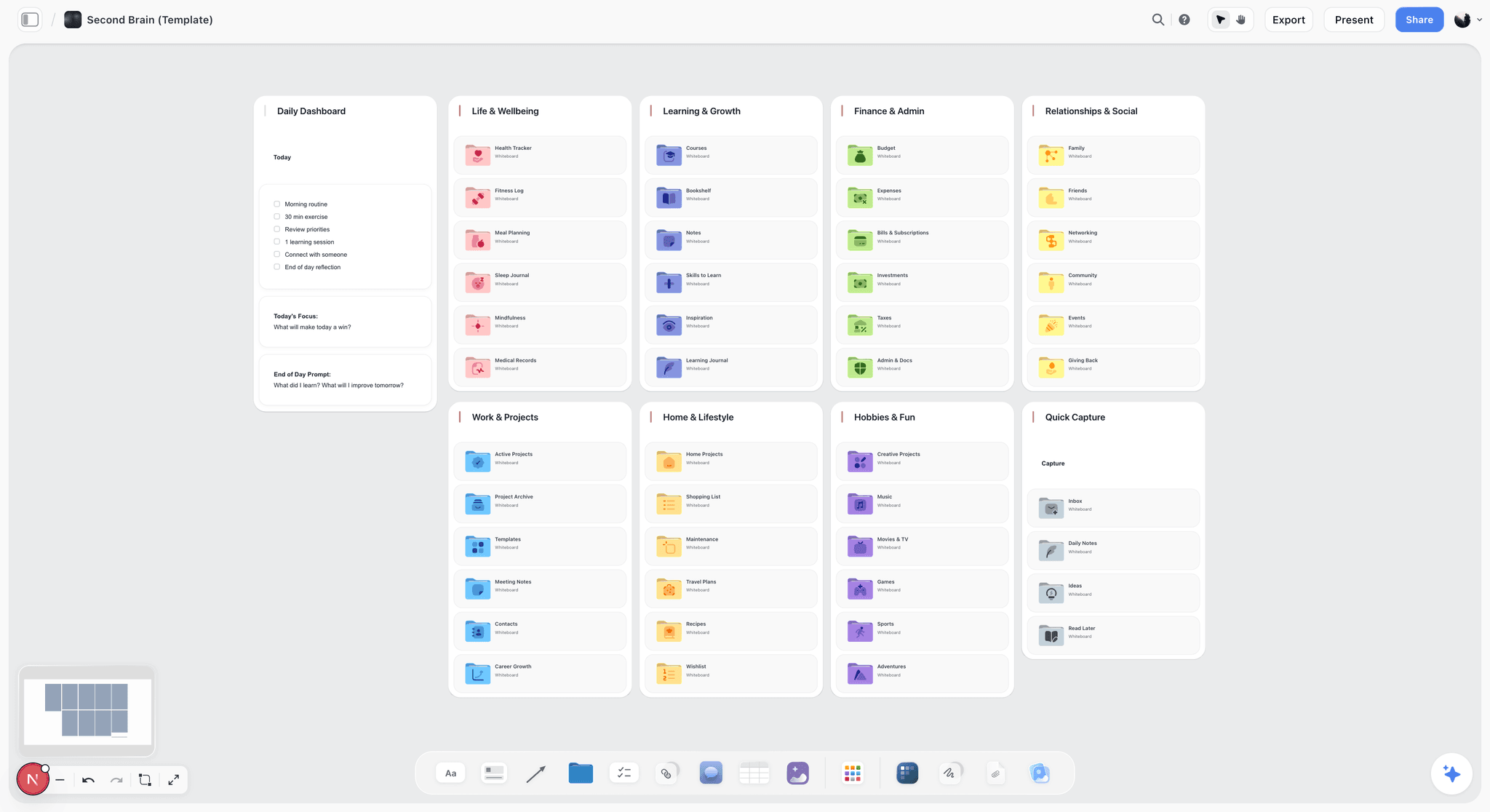
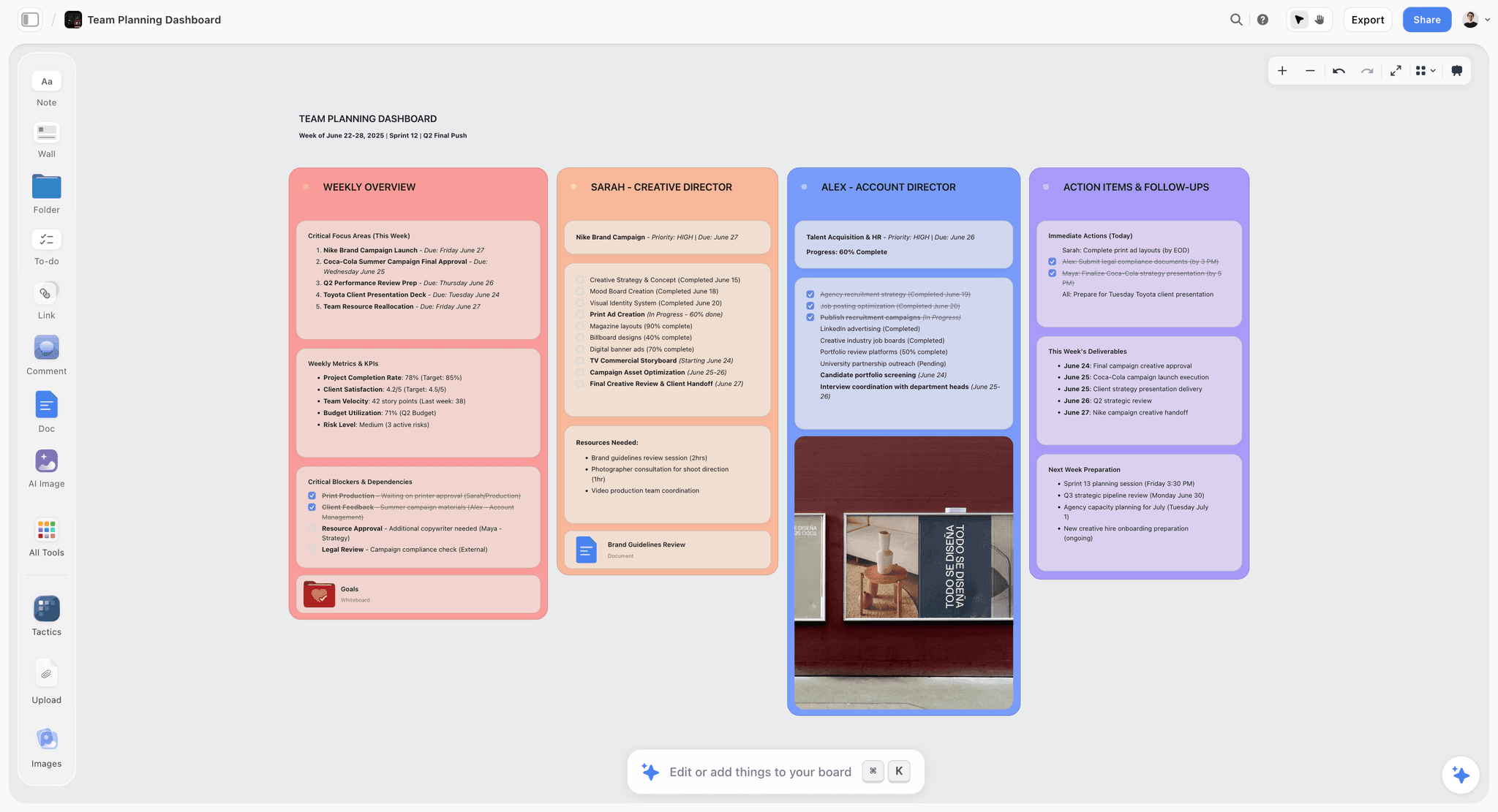
The verdict. Ours, and ninth on purpose: it has no value stream mapping capability at all, and one narrow, real use in the conversation that precedes measurement.
Best for. The walk-the-process session where you are still establishing what the steps are and where people believe the delays live.
Pricing. Paid only during early access. Plus is $7.99 per month billed annually or $9.99 monthly, adding 200 plus Story blueprints and unlimited file uploads. Pro is $14 per month billed annually or $19 monthly, adding AI image generation, roughly twenty times more AI usage and memory across conversations. Max is $39 per month billed annually or $49 monthly, adding forty times more AI and Team Workspace with permissions and roles. Pricing is flat per account rather than per seat, and anyone a paid member invites joins free. The Free plan launches before the end of 2026. All as of August 2026.
Why it ranks here. Be clear about what this is not. Storyflow has no value stream mapping notation and no icon set. There are no data boxes. There is no timeline ladder object, no upper rung, no lower rung. It computes nothing: not lead time, not process time, not PCE, not a unit conversion, not a sum. There is no arithmetic anywhere in the product, and no export to Visio for anyone who wants to finish the job properly elsewhere. On the two criteria carrying the most weight here it scores zero twice, which is why it sits at nine rather than somewhere flattering.
The narrow ground it does have is upstream of all that. Before a stream can be measured it has to be described, and describing it is messy: nobody agrees where a step ends, two departments use different names for the same handoff, and half the delays are folklore until someone checks. An open canvas holds that better than a structured tool does, and Storyflow's AI reads your full active canvas board plus up to one Tactic and up to three Documents you @-mention, so you can ask it to list every step mentioned anywhere on the board or flag where two accounts of a handoff disagree. That is the entire claim.
The moment you have steps and need times against them, leave. Take the list to Excel for the maths, or Lucidchart or eVSM for the map. The boxes are where the work happens. The arrows are where the time goes, and Storyflow cannot hold a number on either.
Strengths.
- Genuinely good at holding messy, mixed-format process research in one place.
- Whole-board AI lists steps and surfaces contradictions across scattered notes.
- Invited collaborators join free, so interviewing eight people across departments costs nothing extra.
- Flat per-account pricing, and fast enough to keep up with a live conversation.
Limitations.
- No value stream mapping notation or icon set. No data boxes, queue triangles, push arrows, FIFO lanes or kaizen bursts.
- No timeline ladder. Neither rung exists as an object, so the defining artifact of the method cannot be drawn correctly.
- No computed rollups. Lead time, process time and process cycle efficiency are calculated nowhere.
- No arithmetic of any kind, including no unit conversion between minutes, hours and days.
- No export to Visio, and no path into eVSM, iGrafx or Minitab Workspace.
- No simulation and no current-versus-future comparison as a feature.
The trade off. Use it for the hour when you are working out what the process even is, then move to a tool that counts. Ninth here is the correct position.
10. Mural
The verdict. The strongest facilitation experience on this page and identical to Miro on every criterion that decides this ranking.
Best for. Structured remote lean workshops where facilitation quality is the bottleneck.
Pricing. Free tier available. Starter around $10 per user per month and Plus around $18 per user per month billed annually, as of August 2026.
Why it ranks here. Mural's facilitation tooling beats Miro's and it is not close. Timers, private voting, summon-participants and a facilitator mode that controls what the room is looking at are real advantages when you are running a walk-through with fourteen people across three sites in a fixed two hours. None of which moves it up this list, because on criterion one it is a text label and on criterion two it is nothing. A wait time on a Mural arrow is text near a line. Change it and no total updates, because there is no total.
It ranks last rather than eighth for a narrow reason: Miro's larger installed base means the coordinators you need are likelier to already have an account, and attendance is worth more here than facilitation polish. If your organisation already runs on Mural, invert those two and lose nothing.
Strengths.
- Facilitation features that genuinely improve a two-hour remote workshop.
- Strong lean and agile template library with real session guidance.
- Private voting removes seniority bias when prioritising kaizen opportunities.
- Free tier is usable for a single mapping exercise.
Limitations.
- No structured data on shapes or connectors, so no number lives on the arrow.
- No ladder, no lead time, no PCE, no arithmetic.
- Templates suggest a rigour the tool does not provide.
- Smaller installed base than Miro, which costs you attendance.
The trade off. The best facilitated room, delivering the same numberless artifact as the second best facilitated room.
What to Actually Pay For
Pay for structured data on connectors before anything else. That is Lucidchart at around $10 per user per month, and it is the purchase that changes map quality, because it stops the wait time from being a caption.
Pay for eVSM when you map more than about four streams a year. Below that the licence and the Visio dependency are hard to justify. Above it, the hours lost to manual ladder arithmetic and the errors it introduces exceed the licence cost, and the unit handling alone saves you one embarrassing steering group meeting.
Do not pay for a quality suite to draw one map. Minitab Workspace pays back inside a belt programme with charters, capability analyses and control plans. Bought for mapping alone it is a four figure spreadsheet.
Spend nothing on the workshop tool. Free tiers of Miro and Mural are sufficient for the walk-through, and the walk-through is where accuracy comes from, not where money should go.
Tools to Avoid for This Job
Any whiteboard template called "value stream map" that you treat as finished. The template supplies the look. You supply the numbers, and if you do not, the artifact is a process diagram with a misleading title.
A BPMN modeller as a substitute. BPMN is excellent at logic: gateways, events, exception paths, branch conditions. It has no opinion about how long anything waits. You can produce a flawless BPMN diagram of a process containing eleven days of queue time and the diagram will not contain that fact anywhere.
A swimlane diagram used as a value stream map. Lanes are the right tool for ownership and handoff, which is why we ranked those separately. A lane boundary tells you the work changed hands. It does not tell you it then sat for six days, and in most administrative processes those six days are the finding.
Mapping a future state before the current state is measured. Not a tool, a discipline failure, and the most expensive one. A future state built on guessed baselines cannot demonstrate improvement afterwards, and you will be asked to.
What No Tool on This List Does
None of them will walk the process for you, and the walk is the method. Rother and Shook's instruction is to go and see the flow yourself, and every tool here is a transcription destination for what you learned doing that. None of them will get you honest wait times. People underestimate queue durations, remembering the day an approval came back in an hour rather than the fortnight it usually takes. The reliable sources are system timestamps and a tally kept over a few weeks, and no tool here will tell you your numbers are folklore.
None of them will tell you whether the process should exist. Four percent process cycle efficiency on a workflow that adds nothing for the customer is an argument for deletion, and every tool here will happily help you optimise a stream that should be removed.
And Storyflow specifically will not compute a single thing. It will not sum a ladder it cannot draw, convert your minutes to days, flag that your current state map has no numbers on it, or export anywhere that can do those things for you. Read that as the boundary of the claim rather than a modest disclaimer.
The Bottom Line
Value stream mapping has one job and it is not drawing. It is producing a defensible number for how long a process takes and what fraction of that time was worth anything, so the improvement work aims at the part of the stream that actually holds the time.
That gives a short list. eVSM if you do this seriously and often, because the ladder totals itself. Lucidchart if you want most of that at a fraction of the friction. iGrafx if the future state has to survive a challenge, Minitab Workspace if a belt programme already owns the work, and Excel underneath all of them because someone has to add up.
Everything else here, our own product firmly included, is a tool for the conversation that precedes measurement. That conversation is worth having and Miro and Mural are excellent rooms for it. Do not confuse the room with the result. The boxes are where the work happens. The arrows are where the time goes, and a tool that cannot hold a number on the arrow was never going to tell you where your lead time went.
FAQ: Value Stream Mapping Tools
What is the best value stream mapping software in 2026?
eVSM is the strongest tool for genuine value stream mapping, because it ships the standard notation, draws the timeline ladder and computes total lead time and process cycle efficiency automatically instead of leaving you to add up delays by hand. For teams unwilling to take on a specialist licence and a Visio dependency, Lucidchart is the best general alternative, since shape data lets a wait time live on the connector as structured data.
What is the difference between a process map and a value stream map?
A process map answers what happens and in what order. A value stream map answers how long the whole thing takes and how much of that time added value, which requires data on every step and, more importantly, on every gap between steps. The distinguishing artifact is the timeline ladder underneath, with process time on the lower rung and wait time on the upper rung. Without numbers and a ladder, what you have drawn is a process map.
How do you calculate process cycle efficiency?
Process cycle efficiency is value-added time divided by total lead time, expressed as a percentage. Total lead time is the sum of both rungs of the ladder: all process times plus all wait times. In practice most maps approximate value-added time with total process time, which is a simplification, since not every minute spent working is value-adding from the customer's point of view. In office and service processes the result is commonly in the single digits.
What is the timeline ladder in a value stream map?
The timeline ladder is the stepped line drawn beneath the process boxes with two rungs. The lower rung carries process time, one segment per process box. The upper rung carries wait or delay time, one segment per queue between boxes. Summing the lower rung gives total process time and summing both gives total lead time. Most teams draw the ladder last, and it is the part that decides whether the map can answer anything.
Can you do value stream mapping in Miro or Mural?
You can build the picture and you cannot build the map. Both handle the workshop beautifully, and both store every number as a text label rather than structured data, so nothing totals and no process cycle efficiency is calculated anywhere. Use them for the walk-through with the people who do the work, then transcribe into Lucidchart, Excel or a dedicated tool for the arithmetic.
Is there free value stream mapping software?
Draw.io is free, includes a lean mapping shape library and runs offline as a desktop application, which makes it the best zero-cost option for a notation-correct map. Miro and Mural have free tiers adequate for a single workshop. None of them do any arithmetic, so pair whichever you choose with a spreadsheet holding process time and wait time per step, and compute lead time and process cycle efficiency there.
Do you map the current state or the future state first?
Current state first, always, and it must be measured rather than assumed. The future state exists to be compared against a baseline, and one drawn from guessed current-state numbers cannot demonstrate improvement afterwards. Walk the process, gather real times from system timestamps where you can, draw what actually happens including the ugly parts, then design the target. A future state without a measured baseline is a proposal rather than an improvement plan.
Why does wait time matter more than cycle time?
Because in most office and service value streams the wait time is far larger than the process time, so improvements to the boxes barely move total lead time. Teams instinctively optimise the work, since the work is what they understand and control, and shaving three minutes off a twenty minute step changes nothing in a stream containing a four day approval queue. The boxes are where the work happens and the arrows are where the time goes.
What tools do Lean Six Sigma teams use for value stream mapping?
Minitab Workspace is the common answer inside formal belt programmes, because the map sits alongside the charter, SIPOC, fishbone, capability analysis and control plan in one project file with data flowing between them. eVSM is preferred by practitioners who map frequently and want full notation fidelity with automatic ladder calculations. Teams working outside a formal programme usually get further with Lucidchart and a spreadsheet than with either licence.
Can Excel be used for value stream mapping?
Excel cannot draw a usable map and is genuinely good at the part most tools get wrong. One row per step and per queue, a process time column, a wait time column, and three formulas give you total process time, total lead time and process cycle efficiency that recalculate when anything changes. Pair it with a visual map, because a spreadsheet cannot show the asymmetry that wins the argument.
Does Storyflow do value stream mapping?
No. Storyflow has no value stream mapping notation, no data boxes, no timeline ladder, no computed lead time or process cycle efficiency, no arithmetic of any kind and no export to Visio. It ranks ninth on this list for those reasons. Its narrow use is the stage before measurement, when you are still working out what the steps are from scattered notes and contradictory accounts. Once you have times, move to Lucidchart, Excel or eVSM.
How long should a value stream mapping exercise take?
The drawing is the fastest part and usually takes a couple of hours. Gathering honest data is the slow part, and if you need real queue durations rather than remembered ones, that means pulling system timestamps or keeping a tally over two to four weeks. Teams that compress the exercise into one workshop are, almost without exception, producing a map built from beliefs about the process rather than measurements of it.
Templates you can use in Storyflow
Every Storyflow board starts from real structure and an AI that reads the whole canvas. Open one of these templates and make it yours.


See Storyflow in Action
A visual AI workspace where every feature lives inside one canvas. No tab-switching, no context lost.
Build your entire board from a single message
Type what you need in the AI chat at the bottom of your canvas. The AI adds cards, headings, and structure directly onto your board.
Use expert frameworks as AI context
Type @ in the AI chat and choose any Tactic. The AI tailors every response to that framework instead of giving generic advice.
Turn your board into a mind map in seconds
Ask the AI to restructure your canvas as a mindmap. It connects your ideas into a visual hierarchy so you can see how everything relates.
Why Storyflow Exists
Storyflow actually began as a personal tool while working on creative and research projects.
We kept running into the same problem: ideas were scattered everywhere: notes, documents, and whiteboards.
Nothing helped us see how everything connected.
So we started building a workspace designed around how ideas actually grow.
→ Read how Storyflow was createdSara de Klein
Head of Product at Storyflow
Published: 2026-08-14
Start creating with AI and become more productive
Transform your creative workflow with AI-powered tools. Generate ideas, create content, and boost your productivity in minutes instead of hours.