How to Turn User Research Into a User Flow
You turn research into a user flow by extracting the decisions people actually made, not the steps they took, because a flow built from observed steps reproduces the current product and a flow built from decisions can improve it.

Category
Design
Author

Justkay
Documentary Filmmaker & Founder at Storyflow
Topics
2026-08-29
•
12 min read
•
Design- how to turn user research into a user flow
- user research
- user flows
- ux design
- product design
- customer journeys
- Storyflow
How do you turn user research into a user flow?
You turn research into a user flow by extracting the decisions people actually made, not the steps they took, because a flow built from observed steps reproduces the current product and a flow built from decisions can improve it. Every screen a user passes through exists to help them answer a question: can I trust this, is this the right one, what happens if I am wrong. Extract those questions from your research, sequence them by when they arise, and design the flow to answer each at the moment it comes up. Storyflow is what I use because the research quotes stay attached to the flow steps they justified, so six weeks later the flow can still explain itself in a review instead of becoming one person's opinion.
Key Takeaways
- Extract decisions and questions, not steps. Steps describe what exists; questions describe what users need.
- Every step in a flow should answer a question the research showed people actually ask.
- Keep the evidence attached to the step. A flow separated from its research becomes an opinion within a month.
- Map the unhappy paths from real observed failures rather than imagined edge cases.
- Distinguish what users did from what they were trying to do. Workarounds look like behaviour and are evidence of a missing path.
- A flow with no research behind a step is a hypothesis. Label it as one.
Keep the evidence on the flow
A flow diagram separated from its research becomes an opinion within a month. Storyflow keeps the quotes and observations attached to the steps they produced, so the flow can still defend itself in a review.

Steps Are Not the Unit
The common approach is to watch what people do, write down the sequence, and draw it. The result is an accurate diagram of the existing product, including its problems, presented as a design artifact.
The problem is that observed steps are a mix of three things: what the user wanted to do, what the interface required them to do, and what they did because they could not find the thing they wanted. Only the first is a genuine requirement. The second is your current design and the third is a defect.
A flow built from all three preserves all three.
Decisions are the durable unit. Underneath the steps, the user is making a sequence of decisions: is this the right product, do I trust this company enough to give them a card, is the cheap plan enough for me, can I undo this if I am wrong. Those decisions are stable across redesigns. The screens are not.
The reframe: instead of "user clicks Compare Plans", write "user needs to decide whether the cheaper plan will run out". The first tells you what exists. The second tells you what has to be answered and leaves the solution open.
A useful diagnostic: take any step in your current flow and ask what question the user is answering there. If the answer is "none, it is just how the product works", that step is a candidate for removal.
Extract the Questions
Go through your research (interviews, session recordings, support tickets, sales calls) and pull out every moment a user hesitated, asked something, backed out or did something unexpected.
For each one, write the question they were trying to answer.
Hesitation before entering a card: "will I be charged now?" Backing out at plan selection: "which of these am I?" Opening a second tab: "is this cheaper elsewhere?" Contacting support after signup: "did that work?" Abandoning at an upload step: "what happens to my file?"
Keep the quote. The exact words matter, because a paraphrase drifts and because in a review three months later, a real quote settles an argument that a summary cannot.
Note frequency and severity. A question asked by one participant out of eight is not the same as one asked by seven, and a question that caused abandonment is not the same as one that caused a pause. You will use both to decide what the flow must answer prominently and what can be a link.
Cluster and Sequence
Group the questions. Twenty extracted questions usually reduce to six or seven distinct concerns, because people ask the same thing in different words.
Then sequence them by when they arise, which is rarely the order your current product presents them.
This is where most flows are wrong. Products routinely ask for commitment before answering trust, or ask users to choose a plan before they have any basis for choosing. The research will show this clearly: the questions people ask early are frequently answered late in the current flow, or not at all.
Order the questions by when they occur in the user's head. Then design steps to answer them in that order.
Two rules for sequencing. Answer trust questions before you ask for anything irreversible. And answer "which one am I" before you ask someone to choose, which usually means the choice needs a recommendation rather than a comparison table.
Draw the Flow

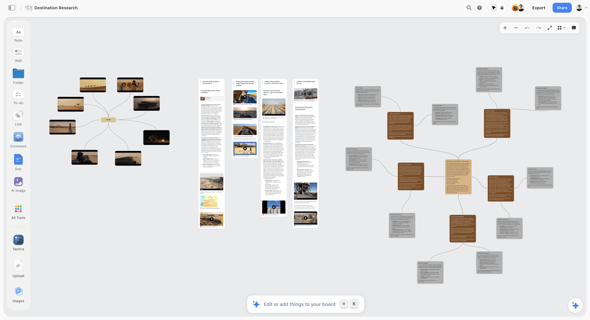
Now the diagram. Each step is a place where one or more questions get answered.
Attach the evidence to the step. This is the part almost every workflow drops, and it is the difference between a flow that survives a review and one that does not.
Six weeks after you draw it, someone senior will ask why the plan selection comes after the workspace is created. If the flow carries the three quotes showing that people could not choose a plan before seeing what the product was, that is a thirty-second conversation. If it does not, it is your opinion against theirs, and the flow gets changed.
This is where a diagramming tool and a canvas differ in practice. Lucidchart and Whimsical produce clean flows and treat research as something that lives elsewhere, so the link is maintained by hand or not at all. On a Storyflow canvas the quote sits next to the step it justified, and because its AI reads the whole board you can ask which steps have no supporting evidence, which is the review question you want to answer before someone else asks it.
Label unsupported steps as hypotheses. Some steps will have no research behind them, because you have not tested that part. That is fine and it should be visible. A flow where the evidenced and the assumed look identical invites everyone to treat the whole thing as evidenced.
Map the Unhappy Paths From Real Failures
Most flows draw the happy path in detail and gesture at errors. The research usually contains the opposite emphasis, because the interesting material is where things went wrong.
Use observed failures, not imagined ones. Teams invent edge cases that never occur and miss the ones that happen constantly. Your support tickets are a list of the real ones, and they are usually a short list.
For each observed failure, three questions: how does the user find out, what can they do about it, and can they get back to where they were.
Recovery is the commonly missing piece. Flows show the error state and not the route out of it. In the research, the moment where someone realises they made a wrong choice and cannot see how to undo it is where trust is actually lost, more than the original mistake.
| Research signal | What it usually means | What the flow needs |
|---|---|---|
Hesitation before an action | An unanswered question about consequence | Say what happens before they commit |
Opening a second tab | Comparison or verification need | Bring the information in |
A workaround | A missing path | Design the path they were improvising |
Contacting support after success | No confirmation | Confirm clearly |
Backing out at a choice | No basis for choosing | Recommend rather than compare |
Repeating an action | No feedback that it worked | Acknowledge the first attempt |
Workarounds Are the Best Signal
When a user does something the product did not intend (exporting to a spreadsheet to do a thing your product should do, keeping a separate list, using a field for something other than its purpose), that is the highest-value observation in the whole research set.
A workaround is a user telling you a path is missing, and telling you precisely enough that the design is nearly specified. They have already worked out what they need; they just had to build it from parts.
The mistake is treating workarounds as user error or as power-user behaviour. They are unmet requirements, and they are more reliable than anything a user says when asked what they want, because the workaround cost them real effort.
What Goes Wrong
The flow reproduces the current product. Built from observed steps rather than extracted questions.
Research is summarised, not attached. The flow cannot defend itself in a review, and the most senior opinion in the room wins.
Edge cases are invented. Time spent on failures that never happen while real ones stay unhandled.
Hypotheses look like findings. Unsupported steps drawn identically to evidenced ones, so the whole flow gets treated as validated.
Only the happy path is detailed. Recovery routes missing, which is where trust is lost.
Trust questions answered late. Commitment requested before the user has a reason to commit, which the research almost always shows.
The Bottom Line
Extract the decisions, not the steps. Pull every hesitation, workaround and question out of the research, cluster them, sequence them by when they actually arise, and design steps that answer each one at the right moment.
Keep the quotes attached to the steps, mark the parts you are guessing, and build the unhappy paths from failures you observed rather than ones you imagined. A flow that carries its evidence is a flow that still exists in six months.
FAQ: Research to User Flows
How much research do I need before drawing a flow?
Five to eight interviews or session recordings is usually enough to surface the recurring questions, because the same six or seven concerns repeat quickly. What matters more than volume is that you extract questions rather than steps, since a hundred sessions analysed as steps will still produce a diagram of the current product.
What is the difference between a user flow and a journey map?
A user flow is a specific path through an interface with branches and decision points. A journey map is broader, covering the whole relationship over time including moments outside the product. Flows are for designing screens; journey maps are for finding where the experience breaks between channels.
How do I keep research attached to a flow?
Put the quote next to the step it justifies rather than in a separate research document. The specific failure you are preventing is a review three months later where nobody can say why a step exists, at which point the flow gets redesigned from opinion.
Should every step have research behind it?
No, and the ones that do not should be visibly marked as assumptions. A flow with unmarked hypotheses invites the team to treat the whole thing as evidenced, which is how an untested guess ends up defended as a finding.
Is Storyflow free for user flows?
Not during early access. Storyflow is paid-only right now, with Plus at $7.99 per month billed annually, and the Free plan launches before the end of 2026. Anyone a paid member invites to a board joins free, so stakeholders can review the flow and its evidence without paying. If you need a free flow tool today, the Figma and Whimsical free tiers both handle diagramming.
How do I handle contradictory research?
Contradiction usually means you have two user segments rather than one confused signal. Split them and check whether the questions differ by group. If they genuinely differ, one flow will not serve both well, and that is a finding worth surfacing rather than averaging away.
Table of Contents
Templates to check out for this topic


Research templates you can use in Storyflow
Gather sources, personas, and findings on one canvas, then let the AI read across all of it. Open any of these research boards to start.


See Storyflow in Action
A visual AI workspace where every feature lives inside one canvas. No tab-switching, no context lost.
Build your entire board from a single message
Type what you need in the AI chat at the bottom of your canvas. The AI adds cards, headings, and structure directly onto your board.
Use expert frameworks as AI context
Type @ in the AI chat and choose any Tactic. The AI tailors every response to that framework instead of giving generic advice.
Turn your board into a mind map in seconds
Ask the AI to restructure your canvas as a mindmap. It connects your ideas into a visual hierarchy so you can see how everything relates.
Why Storyflow Exists
Storyflow actually began as a personal tool while working on creative and research projects.
We kept running into the same problem: ideas were scattered everywhere: notes, documents, and whiteboards.
Nothing helped us see how everything connected.
So we started building a workspace designed around how ideas actually grow.
→ Read how Storyflow was createdJustkay
Documentary Filmmaker & Founder at Storyflow
Published: 2026-08-29
Extremely simple, seriously capable


See how easy it is to get started
Watch a real project come together, from a blank board to a finished plan, clicked through step by step.
Start creating with AI and become more productive
Transform your creative workflow with AI-powered tools. Generate ideas, create content, and boost your productivity in minutes instead of hours.